#breaking out the posca markers
Text
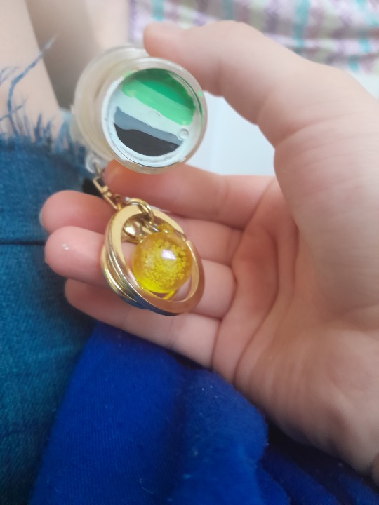
psst i made my keychain gay
#aromantic#aspec#lgbtq#i dont remember where i got it#all i know is that i pointed it out to my mom and she let me get it#posca markers are useful for making things gay#i know from experience#oh and the top of it is gonna have the agender flag#i just have to wait for the base coat to dry#thanksgiving break caused some self discovery lol
8 notes
·
View notes
Note
Hello! I absolutely LOVE your heartsteel Kayn headcanons, you capture his character so well. What kinds of headcanons would you have for Kayn going for a night out (esp. with the heartsteel boys)?
Ty!! <3
♡♡♡♡♡♡♡♡♡♡♡♡♡♡♡♡♡♡♡♡♡♡♡♡♡♡♡♡♡♡♡
GIF by thedemonlady
♡♡♡♡♡♡♡♡♡♡♡♡♡♡♡♡♡♡♡♡♡♡♡♡♡♡♡♡♡♡♡
HEARTSTEEL KAYN: NIGHT OUT HEADCANONS
♡ TW's: Alcohol usage
♡ SFW
♡ Thank you!!! This one's not for Kayn/reader, just single Kayn (if Kayn's in a relationship with u imagine this all as the exact same except he's calling you 3,000 times at random points during the excursions)
♡♡♡♡♡♡♡♡♡♡♡♡♡♡♡♡♡♡♡♡♡♡♡♡♡♡♡♡♡♡♡
KAYN
Kayn will often flake on plans if they're made in advance, so it's best to blindside him with a night out. He's much more likely to attend if someone texts him, "Party at 10, u in?" than if they let him know a week prior. That being said, he usually goes out with his bandmates either way. He's trying to be a team player, at least a little bit, and he knows that means he can't bail on guys' night out. (Plus, he has enough fun with Heartsteel to make it worth going—not that he'd ever admit he actually likes partying with them.)
Even though he pretends he 'woke up like this', Kayn spends waaaaay too much time in front of the mirror before a night out. Gotta make sure his nail polish isn't chipped and his hair's swept back in that perfect 'I don't give a fuck' type way, you know?
Kayn stashes extra jewelry in his pockets before heading out to a party—he knows he's probably about to lose a hand of rings and a bracelet within two hours. Best to keep stocked up so he can maintain his carefully-curated look.
Dressed to kill. Kayn likes to play with textures, silhouette, and bursts of neon color. His going-out fits lean towards techwear and the tamer side of cybergoth.
You already know Kayn pregames like a motherfucker. Expect him to be a few shots deep before the night even starts. And, once he's buzzed, he's not about to let himself get even halfway to sober. Doesn't matter what, he drinks whatever Ezreal puts in front of him. He also keeps a flask tucked in a side pocket, and he's surprisingly willing to pass it around. If they promise to buy him a drink at the next bar, he lets any of his bandmates take a generous gulp.
After getting a little tipsy, the guys like to scribble graffiti tags all over everything, so Kayn keeps a handful of paint markers on him in everyone's preferred colors. Of course, he won't hand them out for free. Often, Ezreal and Sett can be convinced to split Kayn's chores for the next two weeks in exchange for the Poscas.
Starting out at a bar or club is just fine but Kayn's surprisingly opposed to bar-hopping. There's way too many people in way too small of a space. A few hours in, Kayn prefers to duck out of the sweaty bodies and pounding music. At this point, he just wants to wander around and get in trouble with his boys. City streets, grocery stores, empty parking garages—anywhere is fine, though Kayn gets extremely annoyed (and slightly more inclined to property destruction) whenever they're asked to leave somewhere. For this reason K'sante and Yone try to make sure wherever they end up is relatively isolated. Less of a chance of getting kicked out that way. An abandoned building where they can bring a huge speaker and chill out is a prime place to close an evening out.
If you're a fan, this is probably the worst time to approach Kayn for an autograph. When he's trying to let loose the LAST thing he wants is to get bugged by groupies. He won't even give you a second look, scoffing: "I don't do autographs." If Sett notices him being mean, he'll offer to sign two things for you to make up for his friend's rudeness. It helps, of course, but still. Don't approach Kayn in public unless you want your dreams shattered.
Of the group Kayn's the most likely to break something. This ranges from everything like accidentally shattering a shot glass to absolutely intentionally wrecking one of those public-use electric scooters. (How was he supposed to know you're not supposed to do quint whips on those, he asks. He ignores Ezreal when he points out that crashing full speed into a dumpster has nothing to do with pulling off tricks.)
As everyone's winding down for the night, Kayn's been known to smoke a cigarette or two on the apartment stairs or balcony. He never smokes otherwise, but it's a bit of a ritual at this point. When Kayn ducks out for a smoke, then the rest of the guys know not to bother him anymore. He's done.
Kayn refuses to drink water or change into pajamas after returning from a night out. Best you're gonna get from him is him taking his clothes off before passing out. No teeth-brushing, no shower, nothing. All routines are abandoned and he falls straight into a thirteen hour coma.
It doesn't matter how much he did, or didn't drink, Kayn's an absolute zombie the morning after a night out. Don't expect him to leave his room until three pm, and even then, he's probably only getting up so he can go on a McDonald's run (his signature hangover order: two fish filets, fries, and a large Sprite).
#heartsteel#heartsteel headcanons#heartsteel kayn#kayn#sheida kayn#kayn headcanons#kayn lol#kayn league of legends
34 notes
·
View notes
Text
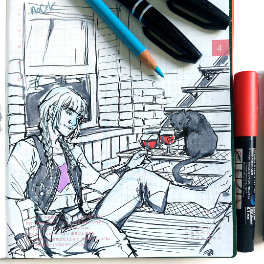
After all the previous super detailed drawings I did, I kinda started to feel a little burned out and I just felt restless while opening my laptop to draw. So I took a break to just journal. Drawing little ramen bowls or ice creams or random shit (dandelion cosmonaut XD) just for me actually helped. I guess I just missed traditional media.
So here is quick doodle with barely any sketch done. It's helps to be not so precious about everything all the time :)
The only downside is that pentel sigma brushes, while awesome, are very NOT waterproof so I can't add watercolor ore even really a lot of posca markers :S (I want to color her hair but it will bleed so much :S)
120 notes
·
View notes
Text
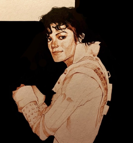
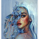
When I was eight, I went to Disneyland for the first and only time in my life. While there, we saw the short film directed by George Lucas called Captain EO. From the beginning, I was utterly infatuated with who I thought to be the beautiful spacewoman lead. She moved in such a peculiar and wonderful way, and her soft-spoken command of the room was amazing. I walked out of that theater with my gay awakening. I said to my mother, “she was so cool. I love her.” To which, of course, my mother asked, “who?” After she realized I was talking about Captain EO, she had to break the news to me that it wasn’t actually a woman. She promised when we got home, she’d play me Michael Jackson so I could see and hear more of my lovely spacewoman. (Who sadly turned out to be a man.) It’s been ten years since that life-changing day, and I thought there was no better way to honor my space wife than with a drawing. Forgive some of the oddly blank spaces—I never actually completed it, but figured it was close enough to share. Materials were literally just a sepia Copic pen and a black Posca marker. However, I’m happy with how she came out.
#michael jackson#captain eo#george lucas#mjj#mj art#michael jackson fanart#king of pop#disneyland#star wars#mj fanart
74 notes
·
View notes
Text
I was hoping that bg3 would break me out of this godforsaken artblock that had lasted months, but apparently not. Anyway i decided to try my hand at doing something with my posca markers
13 notes
·
View notes
Note
hi raven, how are you? <33 ❤️
Helloo!!! I'm currently suffering,, i have chores to do!!! Ew!!!
Although I'm planning a couple ficlets that i wanna work on... AND IM ALMOST DONE WITH A TRADITIONAL DRAWING THAT I WANNA POST!!!
Here's a little sneak peek!!! BINK ghoul helmet!!!
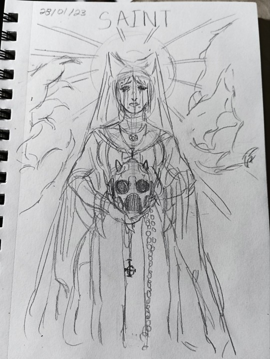
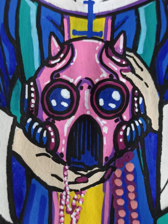
One of my art professors gave us an assignment of writing one word in our sketchbook every day, so I've kinda been trying to draw every day even if it's not ghost related!!! Sometimes it just happens to overlap, but I'm glad that I'm doing it like this!!
I very much needed a break from digital i think, it was staring to stress me out and there's nothing like poscas markers to make me feel better!!! Color go brrr
18 notes
·
View notes
Text
heavy hearts (2021)
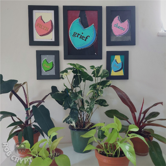
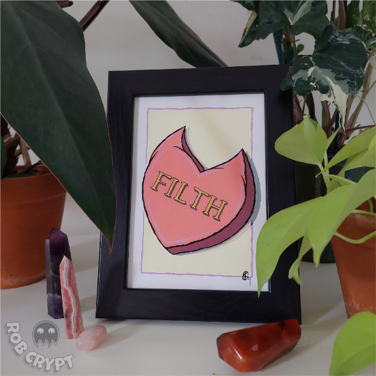

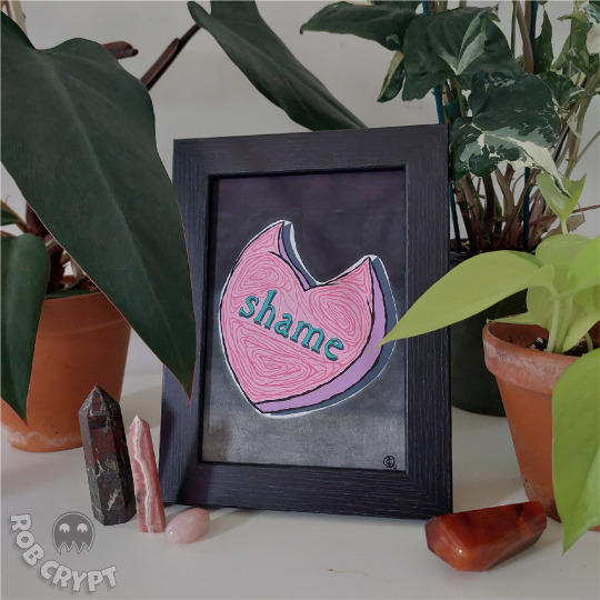
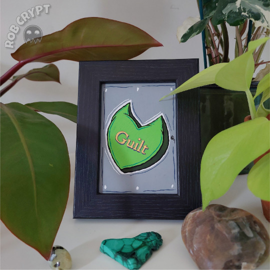

whenever i set out to make a new set of pieces i aim to create 100 of them. i've been working on 100 skulls since around 2019, and my new project is plant pot people.
across 2020 and 2021 i made 100 love heart pieces, featuring phrases like "hail satan" and "eat the rich" inside love hearts. initially they didn't have horns, then some had horns, but by the end they all had horns.
of my 100 hearts, these were the final 5. i made them towards the end of 2021 and wanted to include negative feelings and emotions as a way of leaving those things behind as we moved into a new year. the previous year i made my first plant pot people, painting them on wooden hands with positive affirmations and sigils, so when the end of 2021 came around i felt the need to do the opposite.
not all of these 5 have direct colours or themes to the word itself but i knew i wanted grief to be the largest one. it had been a wild couple of years for everyone and i felt like that should take centre stage, with the background starting off a nice vibrant red but descending into darkness. i also wanted the colours inside the heart to feel quite icy to reflect the numbness that comes with loss. i feel like fear is the other one i put the most thought into. the background is deliberately coloured and shaped like an alien abduction is taking place to represent fear of the unknown. i wanted it to be ambiguous and also feel a bit like a beam of sun breaking through the surface of an ocean but in retrospect i don't feel like that was portrayed very well.
these were all made with posca markers, with added details using coloured pencils, charcoal, and gold acrylic paint in the case of "filth."
i'll stop talking now. thanks for reading if you got this far
instagram | twitch | store
#art#artist#artists on tumblr#artistic#love hearts#heart#traditional art#poscapens#posca#artists#my art
9 notes
·
View notes
Text
Ch. 2: The Anatomy of Typography & Project #1 Logo Design

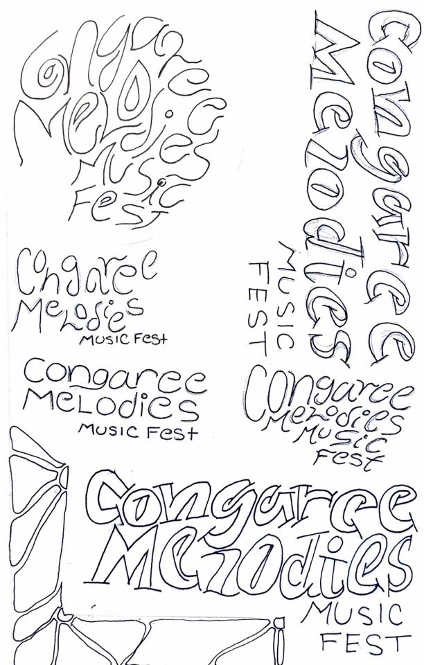
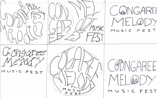


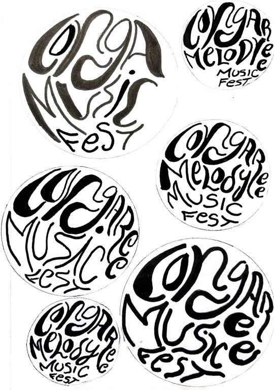

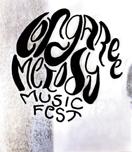
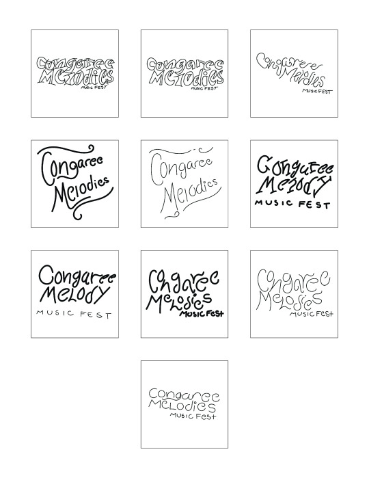
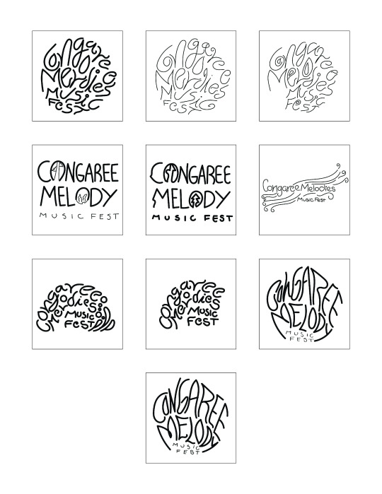
I spent this week finalizing the logo for the music festival design systems project. My main focus was on the concept and design of the logo. To start the process, I was given the task of creating 40 sketches of hand-drawn and digital logos. In our previous class, we were shown various videos that provided tips on creating logos. Out of those Squarespace tutorials, I picked three tips that stood out to me. The first one was to use a shape and work within its boundaries to experiment with letter form, style, and width. The second tip was to use tracing paper to figure out which components of the initial sketch stood out and to rework those elements for a more solid design. The third tip was to use traditional tools like paint brushes, ink, and markers, as these materials tend to be unpredictable and can help create unique, organic, and unpredictable marks and lines.
During our first meeting, the professor applied these tips and instructed me to push my logo design in a more circular direction that encouraged more free-flowing, bold shapes to make up the words. Out of the 40 sketches, I chose to pursue the more circular design that fit the overall vibe of Conagree National Park. To experiment with the circular design, I traced various circular objects like the bottom of a water bottle, a case of mints, and a circular tape measure using a pencil or pen. Then, I used my Posca paint pens to play around with different strokes, line widths, and marks. This exercise encouraged me to view the letters in my logo as shapes rather than lines.
During our second meeting, the professor advised me to alter the spacing between the letters and break away from the confined circular space to enhance the clarity and legibility of the logo. This direction also fits the vibe of Congaree, as the national park is a fluid, swamp land that is not stuck or confined to space.
My favorite component of this process was having the opportunity to break away from my normal pen and paper and experiment with various markers and paint pens. By next week, I plan to have 90% of my logo complete, vectorized, and ready to incorporate into the poster design portion of the project. I am still exploring different typefaces and font families to find the best fit for my logo, but I find the san serif bold and cursive type to be the most eye-catching and suitable for the overall vibe and feelings I am trying to convey through the design system.
After reviewing the readings for this week, I reviewed the basics of the anatomy of typography. Chapter 2 has a detailed explanation of the parts of a letterform with helpful diagrams that I will refer to in the future, as I tend to forget these elements sometimes. I found the transition from handwritten lettering to the letterpress and then to technology such as typewriters and digital computers fascinating. Although these machines help keep written elements consistent and professional, handwritten letters have a unique charm that a computer cannot replicate. In typography, I prefer handwritten projects or digital projects that have a vectorized handwritten component. I strive to capture the same feeling and style in my logo work. Handwritten type has a uniqueness that attracts the spectator to gaze at a design, whether that is print or digital. I will follow my professor's advice and complete his revisions to create a vectorized logo that fits the look and feel of Congaree Melody Music Fest. It may take some time, practice, and many tutorials, but I am willing to work with the design until I achieve my goal.
0 notes
Text
Graffiti outcome planning and making
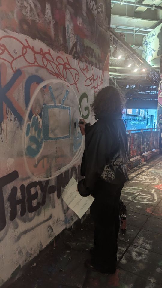
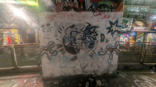


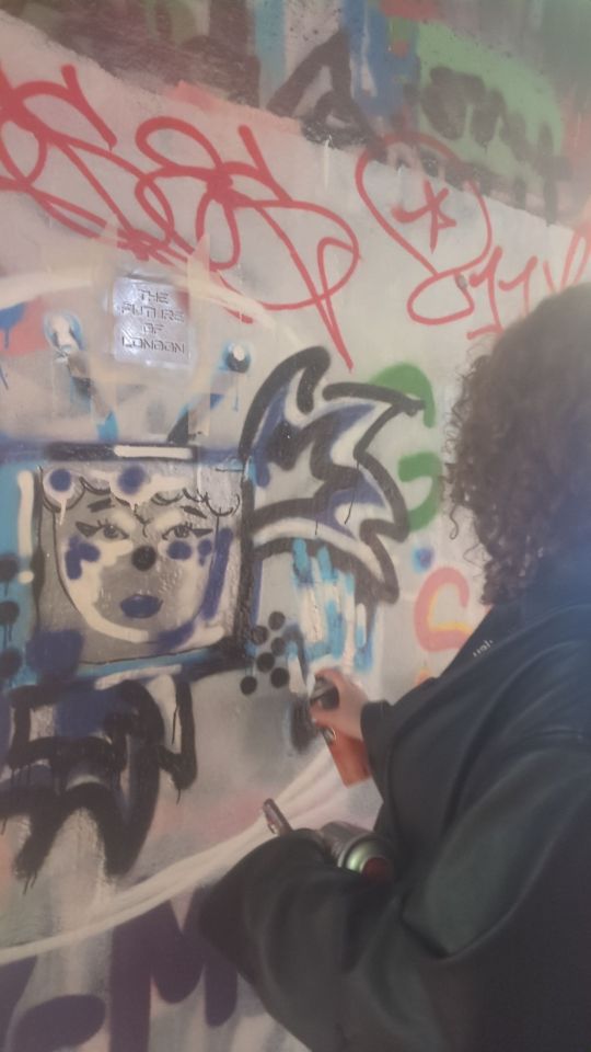


After gaining feedback on my designs i finally made a decision and went for the design i made in the session. On this slide are some photos of making my final mural in waterloo.Continuing from before i use the blue, purple , black and white colours but i also added silver into the design as i believe this would fit with th futuristic look of the outcome and give it an almost robotic feel. I am overall pleased with the colours i have used. During the making process i was quite worried about how this mural will turn out as i haven't done this before but it went so well for a first attempt i believe. I decided to use the white as a base for my design soi could make it proportional to the design in my book. When i got to waterloo ,i purposely tried to find a place that looked like it would be walked down a lot and so more people will see the mural and be pulled in from it. I had an issue with the amount of graffiti that was around my design when i started painting as it was making my mural not clear and a bit lost .luckily a painter was next to me and he kindly gave me some wall paint that got rid of a lot of the designs around my design. I think i was underprepared for this so it is definitely something i need to consider if i go mural painting again and bring some wall paint so i can make my own space . the wall paint didnt get rid of the graffiti underneath fully as i only used one layer but this was okay as i believed when i had done the painting this added some layers into my mural that looks interesting and gave off ideas of the history of the paintings that are here and how they all get covered and replaced. I think the main focus of my mural was the portrait inside so i made this the focal point of the piece and be centralised in the wall. When painting , even though i liked the futuristic colours, when i painted these all together, i did look a little lost and im thinking to develop and in the future that i do mayb indeed a contrasting colour just to break it down more.
To create fine details i used a posca marker , this worked successfully in making lines clean and facial features stand out. I used the stencils i made and these worked especially well especially the dots texture one. This gave the piece that extra technological glitchy feel and gave it more aesthetics. The title stencil worked well too, creating hidden messages within the artwork. I think if i was to use these again i would make these slightly bigger though or a variety of sizes so the text could be collaged around and more clear and draw the audience in more but i do think the hidden messages work well too. When painting the text i got feedback when talking to sam of asking a question to the viewers to walk past. Asking them ARE YOU THE FUTURE OF LONDON. Asking this question made my whole piece come together more and solidified my ideas in my work.
Overall this piece is a reflection of whoever walks by from the future showing them what the future will be like, looking through the technology of the world. Asking the viewer if they want to be part of the future of london
0 notes
Text

Here is my final piece so far - a work in progress. I decided that I'd like it to be a mixed media piece and on a larger scale. I'm using an A3 sized piece of Fabriano paper, watercolour paints, coloured pencils, posca paint pens and alcohol markers. I'm still deciding whether I want to outline in black fine liner or white gel pen; I'm thinking of filling in the sections with pattern much like my previous project that this is developed from.
I adore the varied textures and the contrast of the opaque and the translucent; this allows the image to breathe and open up so that it's not one block of colour after another. I also was inspired by one of my previous digital images where the colours were inverted; it brought out reds, oranges and blues. These contrasting colours break up each shape so that the tear drop imagery I've based this on comes through. I'm excited to see it all come together at the end.
0 notes
Text
pwee pwee
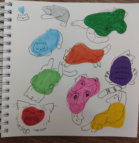
#breaking out the posca markers#i hate my dark blue marker her marker pussy so dry#furry#furry art#fur#posca#traditional#peepy#doodles
322 notes
·
View notes
Text
Bnha and their favorite stationary/art supplies
✎As an artist I thought this would be fun to write.
✎ Denki Kaminari- Bingo Dabbers/daubers: He probably found them at a dollar store and bought them out of pure nostalgia from his childhood.
✎ Tenya Iida- Blue Ballpoint Pen: This is self explanatory.
✎ Tsuyu Asui- Posca Paint Pens: Tsu used to paint a lot when she was a kid and she just got back into it. When Ochako told her about Posca pens she bought some right away.
✎ Hanta Sero- Washi Tape: Sero has a collection of washi tape. The collection ranges from metallic to aesthetic patterns.
✎ Momo Yaoyorozu- Origami Paper: When she was you she used to fold origami. Her room has paper cranes hanging from the ceiling.
✎ Minoru Mineta- Pom Poms: He specifically likes the purple colored ones.
✎ Koji Koda- Animal Erasers: He has a bunch of small erasers shaped like animals but he doesn’t use them because of animal cruelty.
✎ Toru Hakagure- Sticky Notes: It makes her feel organized (she isn’t) and she likes to sneak around putting random notes in public places.
✎ Katsuki Bakugo- Scissors: Think Jade West from Victorious.
✎ Eijiro Kirishima- Bendy Ruler: Kirishima got a red bendy ruler when he was a kid and he was amazed how it didn’t break when he bent it.
✎ Ochako Uraraka- Multicolor Ballpoint Pen- Since her parents aren’t financially well, they can’t afford fancy gifts. When Ochako was a kid she was given a multicolor ballpoint pen as a gift and she loved it. She still keeps it even though it ran out of ink.
✎ Mashirao Ojiro- Air Dry Clay: Ojiro likes to sculpt things and play with the clay. He also likes how it doesn’t need an oven.
✎ Izuku Midoriya- Notebooks: Not only does he have his hero note book, he also has tons of others. Deku has no use for them but keeps them all because they look nice.
✎ Mezo Shoji- Calculator: It sounds boring but he likes to fiddle with the buttons when he’s bored or studying.
✎ Mina Ashido- Liquid White-Out: She uses the white out to paint her nails, Bakugo and Iida always yell at her for it.
✎ Kyoka Jiro- Calligraphy /Fountain Pen: It’s purely for aesthetics of the calligraphy.
✎ Hitoshi Shinso- Pencil Case: Shinso has a Pusheen the cat pencil case that he takes to school. (But he would never admit it)
✎ Shoto Todoroki- Hot Glue: It’s his solution to everything. Break a vase? Fix it with hot glue. Did a gem fall off of your favorite bracelet? Use some hot glue.
✎ Fumikage Tokoyami- Craft String: He spent one night with the 1A girls and they taught him how to make friendship bracelets. He would NEVER admit it but he enjoys making them.
✎ Rikido Sato- Scented Markers: Sato likes the root beer smelling ones.
✎ Yuga Aoyama- Glitter Glue: Do I even need to explain this one?
#bnha headcanons#bnha#my hero academia#mha#new blog#headcanon#anime#yuga aoyama#sato rikido#kyoka jiro#katsuki bakugo#hitoshi shinso#fumikage tokoyami#shoto todoroki#mina ashido#mezo shoji#izuku midoriya#ochako uraraka#ojiro mashirao#eijiro kirishima#denki kaminari#tenya iida#tsuyu asui#koji koda#momo yaoyorozu#hanta sero#minoru mineta#toru hagakure
9 notes
·
View notes
Text
gonna take a 2hr break from doing comms by trying out the new posca markers :D
1 note
·
View note
Photo

Moonlight Mandala
Hello, unexpected experimentation :D
I'm chipping away at other, bigger projects that won't be ready for a little while longer, but I've had a fairly decent upload rhythm lately and I don't really want to break momentum so I whipped this up fairly quickly last night to fill the slot.
I've had a mandala grid (think, essentially, a circular grid; you can find a few dozen variations if you Google "mandala grid") printed out for quite some time now, sitting in my swatch/resource book and waiting to be used. After cycling through some ideas--among them a "quick" Animal Crossing thing since that's topical right now (which I tried and turned out to not be very "quick" at all, which is why this is here instead, but perhaps I'll revisit that idea some other time), watercolor, gouache, and desperately wishing I had a set of paint pens/posca markers on hand because I've been really wanting to try playing with those lately, I remembered that the Gelly Roll Moonlight pens are fairly opaque and paint-like for gel pens, and I very briefly considered trying a paint-marker type illustration on a much smaller scale with them before remembered the aforementioned mandala grid and also realizing I could use some of this toned-gray paper, too!
For context, the gray paper is nice, but I don't use it very much because it can be hard to see lines that aren't particularly thick or black through it, even using my lightbox on the brightest setting. It's just not usually very practical for me.
But the mandala grid has nice, thick black lines so I didn't have that problem here.
So I cut the gray paper down to size (it's 9" x 12" in the sketchbook, I cut it down to 8.5" x 11" so it would fit the grid and my scanner better), picked out four Moonlight Gelly Rolls, the Classic Black Gelly, and my white Uni-ball Signo, taped the grid to the back of the paper, and then got to work.
Honestly, there's not much to describe about the process of actually drawing the mandala. I started in the center and worked my way out, alternating colors as I went and trying to pick shapes/motifs that I thought worked with whatever I already had. I did do a little back-and-forth where I'd do a new ring/row and then go back to add a little to previous ones, but the biggest change I made was simply when I would go back and fill spaces in with color and a couple of times when I added dots/lines to fill space.
I have some adult coloring books that focus on mandalas, as they tend to be one of my favorite types of things to color, and a few of them go into greater detail about the origins of mandalas, specifically mentioning how they're supposed to be very meditative and symbolic creations and it's more about the process of making them than the end result (if I remember correctly, traditional mandalas are made with salt/sand and completely brushed away after they've been completed, but don't quote me on that). And I have to say, drawing this one out was pretty meditative for me. I don't think I'd go so far as to say relaxing, necessarily, at least not any more than making art usually is relaxing for me, but it did set my mind at ease a bit after a day that didn't start off the greatest. (Not the worst, either, but not the greatest.) If nothing else, it was pretty fun and relatively quick. (I think it took a little over an hour because I got interrupted a few times and I'm sure I was going a bit slower because this was my first time doing this.)
I think on a subconscious level, one of the reasons I've been avoiding trying to draw a mandala, despite having the idea in the back of my mind for at least as long as I've had the grid printed, is because I'm usually not a fan of very technical drawing that relies heavily on perfect symmetry/spacing/geometry to look right. (Contrary to what my sea of swatch charts might have you believe.) Mandalas are usually so structured and perfectly lined down to the last dot; I think I was worried that even using the grid it would still come out looking horribly wonky if I did it by-hand, traditionally, and without the aid of digital symmetry tools.
Much to my relief, because of the circular design, the lines draw your eye outward and around so that, while yes it is definitely wonky in some places, it's a lot harder to notice. It still looks really pleasing and the mistakes don't stand out as much. This is very encouraging for me.
Also, I have to point out that I think a lot of areas with the white stripes and black dots look almost like buttonholes and thread, which is a really cool effect I hadn't planned on. I actually was going to add more white lines to the outer most "white ring" connecting to the black dots, but after I did the ones you see here, I noticed the button/thread thing and decided to leave it like that instead, and I'm still very happy I did.
Honestly, this makes me want to do more experimenting with mandala-making, especially at times like this one where I could really use something relatively simple to make to fill out my upload schedule. Gives me an excuse to use up this gray paper, too, why not? So there's a good chance there will be more of these from me going forward. Especially considering that Sakura just came out with 15 new Moonlight colors that I very much want to get my hands on at some point
____
Artwork © me, MysticSparkleWings
____
Where to find me & my artwork:
My Website | Commission Info + Prices | Ko-Fi | dA Print Shop | RedBubble | Twitter | Tumblr | Instagram
2 notes
·
View notes
Text

Delikate Doll WIP
This is my first time drawing houndstooth and I was dreading it but once I figured out how to break it down (from one of many online tutorials) I had a lot of fun with it!
Materials: posca pens, winsor and newton inks, copic sketch and ciao markers, Derwent graphik marker
5 notes
·
View notes
Photo
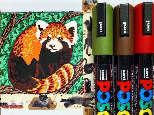
The @poscaoficial markers arrived today! Finally breaking out the new canvas paper sketchbook for these! (Also feat. @taaarte's Squashi Tape!) . #art #artsupplies #artist #redpanda #drawing #painting #paintmarker #markers #posca #poscamarkers #acrylicpainting #artistoninstagram #artistonig https://www.instagram.com/p/CZiQQGVMkTj/?utm_medium=tumblr
#art#artsupplies#artist#redpanda#drawing#painting#paintmarker#markers#posca#poscamarkers#acrylicpainting#artistoninstagram#artistonig
0 notes
Last Seen Blogs