#brightness layer on top basically just giving me values
Text
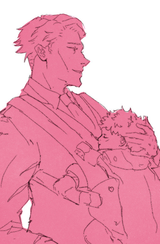
also like, why not, in-pprogress shots. here
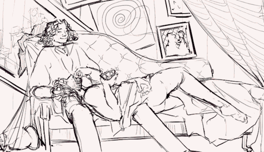
finished piece here!
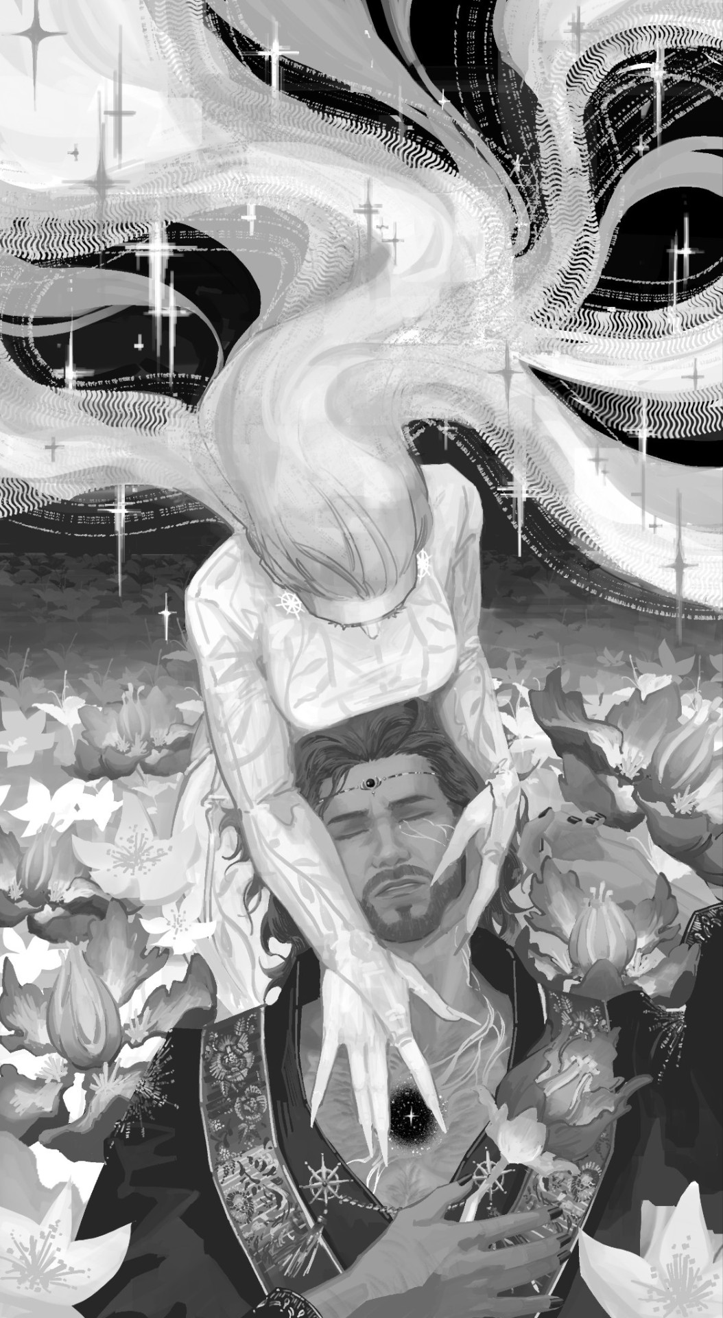
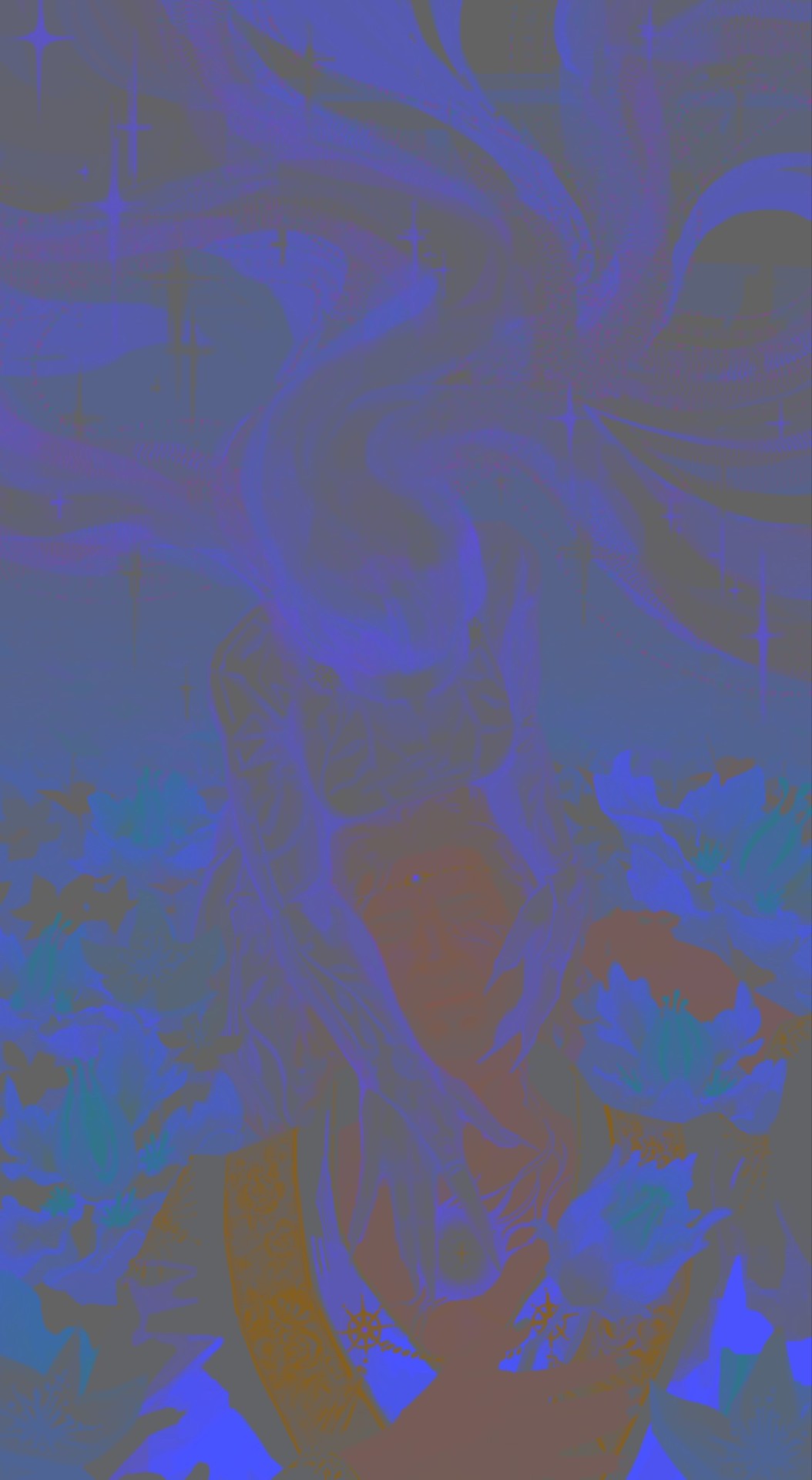
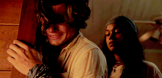
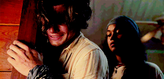
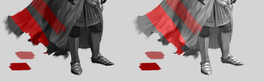
#as it is a gif this will kill all proper gradients and theres a lot of colors that appear by the end. so#work in progress#process#wip#contents: flashing#also not tagging this properly bt thats more a feature of it flashing like that - im going to give it like three days or so so the tags can#fill up before i put this one in#you can sort of see how i thin about these things but this is not my usual process and im not really sure why i did it like this#i keep thinking about turning the entire thing into a brightness layer calling it basically quits and recoloring it the normal way with the#brightness layer on top basically just giving me values#but i want the purple effect.....#also my colorblind ass fully drew a monochrome picture and went 'this is intense orange and purple' huh lmfao
8 notes
·
View notes
Note
hey, how are you? i love your art! i am just learning how to use procreate, and i was wondering what brushes or canvas do you use to get the paper effect when you’re drawing? sorry, i hope you don’t mind me asking. thank you. ☺️
hehe well i’m gonna do a basic comprehensive tutorial on my drawing process and general guidelines i follow when doing art (hope you dont mind im using ur ask), i’ll start with my process first
brushes i use:
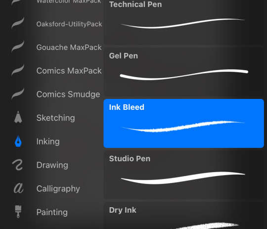
lineart: “ink bleed” brush that comes preprogrammed in procreate
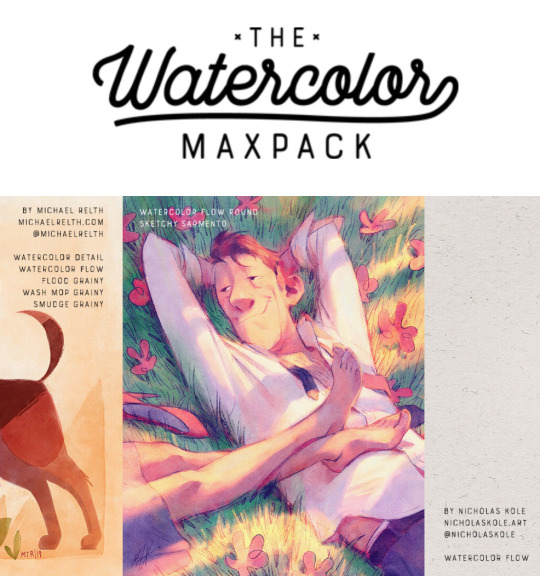
coloring/texture: maxpacks watercolor set (while in the pricy range, ive been using it for years and i think its a worthy investment, he also has sales occasionally)
for sketching: HB pencil that comes with procreate but you can use whatever
so my lineart, i typically duplicate my original layer, “color fill” the new layer with a dark red (or any dark color of ur choice), gaussian blur it @ 3% and set it to multiply and that just gives it some depth (for this piece i actually copied my dark red lineart and adjusted the opacity to make it a little darker so there’s 3 layers in total here)
now on to COLORING, i start off with a solid bright color (usually one that goes with the general palette you’d like to use, i wanted something warm so i went with a pink base)
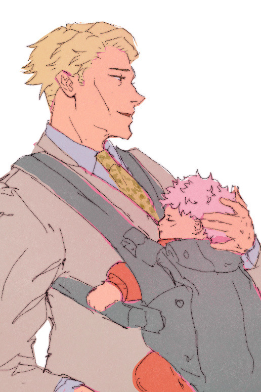
create a new layer and thats where the colors come in, i typically do a rough estimate of the colors i want to use at this point, cause they can be adjusted later in the “color balance” setting under “adjustments” once you have your coloring done (this is all on one layer)
now my SECRET is i use the WASH GRAINY brush as an ERASER and lightly go over my color layer so the pink base comes through a little and unifies the colors and gives it that yummy texture. sometimes i erase the base color too for a little more texture but thats not necessary for every single drawing. once i erase enough, i go to “color balance” adjustment tool and mess with the hues till i get the result i want.
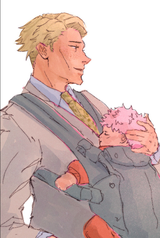
after that i create a multiply layer and with my WASH GRAINY brush i do shadows/face rendering. and with this piece specifically i did an add layer to simulate sunlight on them (i do extra layers at my own discretion, so have fun with it :)
as a final cherry on top i create another multiply layer, fill it with white and then set a noise filter on it @ 17% (dont ask why that number it just works for me lmao) and thats it!
if i need to clarify anything dont hesitate to ask! like i said we dont gatekeep here
and some general tips: dont over-articulate your drawing, cause i find the more i fuss with details the more stiff my drawings look, so i suggest being a little more loose with lineart/sketching and dont sweat the small stuff
same goes for coloring, the more simplistic your shapes are the more cohesive ur drawing will look
another coloring tip: if you’re having trouble with ur drawings looking “muddy” i recommend starting off with a black and white render so you can get a handle on your values before you worry about hue (i do this with my more rendered portraits but i find it helps you focus on the depth of your drawing)
38 notes
·
View notes
Note
Whats your art process and what would you reccomend for someone who would like to achieve a style similar to yours? i love this mix of cartoonism and realism. your work is such an inspiration >.<
oh gosh! thank you?! 💞 i'll do my best to explain it, but even I have a difficult time trying to understand my own art process/style because of how inconsistent it is;; (i still have a lot to learn!) this is gonna be a long reply so i'll place it under the cut
process:

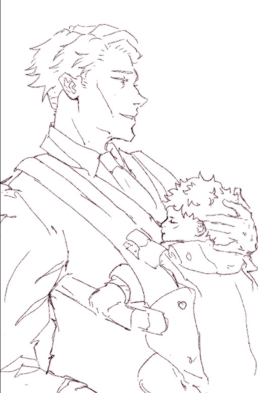
I start loose with a more gesture type rough sketch. I mainly just do lineart in the same layer as my sketch and erase away parts I don't like. Sometimes I'll lower the sketch's opacity and on a new layer do my lineart (which is what i did for the drawing above). But regardless doing that loose gesture sketch helps keep my drawing dynamic even as I refine over top of it!
- I duplicate layers A LOT for safekeeping my previous progress, especially if I'm thinking of making a big change (ex. changing limb position)
If I wanna put colors down underneath it I set my lineart to Multiply. For coloring I'm very inconsistent with the process, but recently I've been using a more subjective coloring style, where I pick my own shadows and highlights to try relying less on blending modes (which is gonna be too long to get into here;;) Finally if I feel like it, I make a layer on top of my lineart layer where I render everything
Oh this is something that helps me a lot for colors! I have 2 layers that are a mid-gray tone placed above all my other layers. One I set to the Color mode (to make the drawing black and white), and the other I set to the Luminosity blending mode (to make the drawing's brightness the same..?not sure)
The Color layer helps me check if I have enough contrast in values, and the Luminosity layer helps me check if I have enough contrast in color hue and saturation!
style:
This is really difficult to answer because style encompasses so many different aspects of art, but I'll try to focus my answer on the mix of cartoonism and realism that you mentioned!
I struggled trying to explain what my style is like so I just broke down one of my drawings that exemplifies a lot of my stylizations! Hopefully these can give you some pointers about what I tend to think about when I draw (click for higher quality)
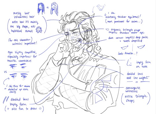
(+to add to this i use a brush with no size pressure, only opacity pressure)
What I recommend for stylizing a realistic character: The way I learned to stylize a more realistic character like this one was to import a reference of his face, then trace over it very deliberately, making sure to stick to big shapes and characterizing details I thought were important to achieve his likeness! Then I'd turn the reference layer off and freehand it over and over, comparing and redrawing until I managed to get the mix of accuracy and stylization I liked!
What I recommend to find a style: I basically ended up with my style subconsciously as an intersection between the things I like to see in art + the things I like to draw! Most of my inspiration comes from anime (😔) and artists online. I'll see a very specific stylization I like in others' art, and try replicating it to see if I like how it fits with my style + if I enjoy drawing it in that way. I did this a lot over the years, accumulating into a big mosaic of inspiration from all the artists whose work I personally enjoy and learn from! I know this isn't exactly answering how to get a style like mine, but I think knowing this general process may help you out in the long run!
ahh i think that's it! i tried to be as comprehensive as i could without being too verbose (my bane). i hope this is the answer you were looking for and that it can help you! 💞 and thank u for the ask! it was a good exercise for myself to analyze my own art
#my asks#anonymous#tutorial#...? art info? not sure what to tag this#i spent a very intense day mulling over this ask#hopefully i answered this correctly...!#art resources
44 notes
·
View notes
Note
hi! first of all, i want to say that i love your gifs so much, you always make such beautiful things. i recently started giffing, and i was wondering if you have any tips about settings or process you usually use in your coloring psds? i'm struggling on what steps i should follow :(
hello ! thank you for taking the time to say this !
i usually never know what to say off the top of my head because i am generally chaotic & do things by whim and instinct rather than any real process, but !!! luckily, i was just talking to a friend about it recently so here's what i got.
photoshop settings- i've mentioned this in my main blog before, if you're not already doing this, load all your giffing steps into an action. if you don’t know how to make an action this handy tutorial tells you how.
- change your most used commands into easily reachable keyboard shortcuts on the keyboard. for example, assuming you're right handed, your right hand will be cropping and colouring so you could switch command + (w) to open file>export>save for web to see your saving settings / command + ( ` ) to select the next tab. (i'm on a mac so imagine i used windows alternatives ) by using your left hand.
gif saving settings
you might have your favourite go-to settings i.e. selective/pattern & bicubic etc. but just like not all sharpenings are created equal, different gif save settings work better for different sharpening styles. try different combis, the results may surprise you. for example, i used to swear by selective pattern+bicubic sharper when saving gifs, but i switched my sharpening style, and started going for a smoother, cleaner, glowier look, and realised after a lot of trial and error that adaptive/diffusion + bicubic smoother works best for the high value sharpening+gaussian blur settings i'm using to create what i want. the big lesson here is don't be afraid to strip everything down and go back to basics sometimes, it's tedious, but it usually pays off. i tried to find the post that taught me this for you and i can't but this one is an alternative !
colouring
- the main things you'll be doing to colour a gif are (i don't always follow these in order but usually i do):
a) brighten ( i.e. curves, levels, brightness, i used to add a white balance filter but stopped doing that years ago )
b) deepen ( these would be your contrast/gamma correction & offset on exposure adjustment layer/left arrow thingy of the levels adjustment layer )
c) colour correct, the hardest part ! it's like doing makeup. you'll end up using probably everything, colour balance, curves in the rgb setting (i need to learn to get comfy with this bc i'm not yet, but! soon.), selective colour my bff, hue/saturation & vibrance. there are great tutorials out there, but my most recent game-changer is i've finally figured out how to use the channel mixer adjustment. it helps to focus on a neutral colour in the background of your gif when it has an awful orange/green/whatever filter when using channel mixer (like a white wall or blue sky that has turned gross looking bc of the film's base filter), then adjust and play around until it turns into the colour it's supposed to be. then it will be easier to pile on layers over to colour your fc. i am ofc still learning, i have no idea how colour lookup works (i've read tutorials and still don't understand jvhakjx).
d) final adjustments. this is when after the above, you decide whether you want to stylise your colouring, make it more vibrant, less vibrant, give it a tint, brighten again or enhance certain colours before saving!
- a great way i got the hang of colourings is to open up colouring psds other people have made and toggle each adjustment layer on and off to see what difference they make to the base, you'll start to understand what the purpose of each thing is and why the layers are in that specific order.
last but not least, it took me 10 years to make gifs the way i do now ! my early gifs were all experimental, i went through so many phases (some i'm quite ashamed of, like the low vibrance/high saturation + high brightness trick i used to abuse. why did i do that.), and i did in fact master each adjustment layer (by this i mean learn to use them to their best potential) one by one. don't get discouraged, be patient with yourself and don't be afraid to try things !
9 notes
·
View notes
Text
"Color Palette Calculator"

Context
ALRIGHT so basically I wanted to try out making more "limited" color palettes but I was very tired of having to try find approximate colors to what my original references looked like, so I started wondering if there was an "easier" way (for me at least)
This "calculator" method allows you to get the equivalent of a regular color you have to a more limited palette based on the primary CMYK + white primary colors you choose!
Disclaimer 1: You need a program that can give you CMYK values from a color you pick.
Disclaimer 2: This method MAY be VERY limited and it's not a replacement to like - ACTUALLY knowing color theory, I'm just very lazy and I want to help other people who don't want to burn their brain with palettes like me.
Anyways I'll be using this template I uploaded to drive. But if you want to make your own you just need a white layer, and a folder which will contain 4 layers: one for Cyan, other for Magenta, other for Yellow, and one for "Key" (Black). Make them in that order and make sure the colors are INSIDE the folder and the white OUTSIDE of it and set the CMY layers to "Multiply"
Under a readmore cuz it's gonna get long LOL
the idea is that you change all of the colors on these channels to fit the kind of palette you want - warm, cold, pastel, low saturation, etc.
I have made a more in depth explanation on how this works

To begin with, the color wheel on the file looks kind of like this. It is divided in 4 channels (CMYK) whenever you edit one of the channels it'll change all of the colors that are influenced by it. This first wheel is MOSTLY for previewing purposes, just to make sure that your palette is looking the way you like.
There's some limitations to it though: I advice to AVOID full saturation and too dark tones for the CMY channels, try make sure that the combination of all three of them doesn't make Pure Black
For this example, I want to have a light and warm palette, so I lower the saturation for the Cyan channel and also move it around to a warmer hue, I also adjust the brightness and saturation of the Magenta and Yellow channels.

Here's how all of these colors would look like on top of each other- as you can see its a very dark brown.

THEN. You get your "Key" color - AKA black, and your white. What are the darkest and lightest tones you want your palette to get? For this one I decided to choose a very light yellow and and a very dark purple. You can totally skip this step if you want your palette to be able to reach pure black and white.

THEN. you pass on all your CMYK and White colors onto the other folder (swatches) which looks a bit like this:

Now onto the fun part! take your character that you want to transform to this palette! Here I drew a cranboo with his base colors!

Pick a color! any of them, for this instance I picked the red of his tie,

You may notice that the CMYK sliders give you percentages that go from 0 to 100. Go back to the swatches and match the opacities of your layers with the percentages!

Pick that color, transfer it to your character! Here he is with all his colors changed with that same procedure!

Due to how CMYK channels display and pick colors, you could technically do this with ANY color!
But also due to how CMYK sliders and the multiply effect work you can't even make the original colors even if you kept the CMYK channels the same and I'm not willing to figure out how to "work around" that so I'll just conform to this lol (this is the reason why you have to make sure the combination of all three colors you choose doesn't give you black btw)
133 notes
·
View notes
Text
jujutsu kaisen x off-duty looks [hcs] pt. 2
characters: inumaki toge, kamo noritoshi, miwa kasumi, fushiguro megumi
genre: freeform
warning(s): probably swearing idk
overview: another analysis of more jjk characters and how they might dress off the clock!
notes: it’s the part 2 that nobody asked for but I made anyway! tagging: my fellow fashion queens @wasabito, @mi-yams, and @softkuna, as well as my fav inumaki stan @inum4ki, the loml who listens to me rant about how much I love noritoshi (and many, many more) on the daily @ackerhoe, and my other jjk babies @aloeechan and @3rdgymbros!
PART 1 ⭐︎ you are here ⭐︎ PART 3

INUMAKI TOGE -> limits his vocab but not his range

inumaki is the master of skillful layering. since he can’t express himself verbally he likes to do so with his outfits instead and let his clothes speak for him! he loves experimenting with colors/patterns and textiles by throwing on a silky button up with a chunky knit sweater or wearing a fuzzy turtleneck under a denim jacket. and even though it’s all completely intentional, it never really appears that way, and that’s exactly how he likes it! usually finishes off his look with a pair of chelsea style boots of some description and maybe a beanie to keep his noggin toasty if it’s chilly or if he just feels more like keeping to himself on a given day. he’s like the unspoken fashionista amongst his peers, and maki, panda, and yuuta are often lying in wait, seeing what outfit he steps out in for the day so they can take notes.
featured designers: uniforme paris, ami, isabel marant, aimé leon dore, bottega veneta, staffonly studio
MIWA KASUMI -> these looks were made for chasing a bag, not a man

miwa is an effortlessly chic vision. she embraces a more androgynous style with baggier silhouettes and more traditionally masculine pieces that she spruces up. she’s very much a fan of wearing button up shirts and trousers, but giving them an edgier twist with utility belts or throwing a graphic tee to contrast the more mature nature of her fits. color is also a fun concept that she enjoys experimenting with and will break up the dark or neutral shades of her outfits with bright yellows, greens, blues, or oranges just because she can. it’s her way of commanding the attention she deserves! and as if her look wasn’t elevated enough already, she literally takes it to the next level with platform boots that are 100% made for stompin on cursed spirits (or anyone who decides they need an ass beating) 😤 nobody else knows aside from mechamaru/koukichi, but miwa and noritoshi often end up having photoshoots together to show off their looks since they can vibe with each other’s similar senses of style. koukichi only knows because he’s the one who takes said photos.
featured designers: margaret howell, virgil abloh/off-white, lemaire, maison margiela, stella mccartney
KAMO NORITOSHI -> people wear just one shirt? couldn’t be him

noritoshi is another king who values movement without restriction! like inumaki, he also enjoys layering, but often with the same silhouette or style, just a different color. the long sleeve under short sleeve trend? he’s all over it and he can work it! he loves a strong color block and, while he often favors more neutral or muted colors, enjoys tossing a shock of something else into the mix, whether it’s in his base layer, top layer, pants, or shoes. the man is a shoe collector and has a secret stash of high end kicks that only miwa knows about (since she wouldn’t leave him alone after witnessing him meeting up with other sneaker collectors to close a deal), so he has no issue with being a little extra in terms of his footwear--and he will be extra. and if that wasn’t enough he just casually accessorizes with some bling, like a chain bracelet or maybe a single ring since he’s edgy like that. he regrets it though when he suddenly has to use his cursed technique and ends up with that metal to knuckle action. does he stop wearing the ring though? no!
featured designers: robert geller, jacquemus, valentino, rick owens
FUSHIGURO MEGUMI -> always cool, never cold
megumi has this power to make any sweater look good (really not surprising given how cute he is), which is great, since they’re about 90% of his wardrobe! like the others, he enjoys an easy, effortless look. the only difference, though, is that his look actually is effortless because he literally doesn’t think about it. he sees a sweater and he wears. he sees comfy silk pants and he wears. he sees shoes that fit his personal aesthetic and don’t hurt his feet and he wears. overall, though, he favors neutral colors and simple silhouettes: a sweater, pants, and running shoes/sneakers are really all he needs to feel complete, as well as a lil crossbody bag or waist pack of some description not because they’re fashionable but because they’re ✨functional✨ of course! he always ends up being the one who carries everyone’s things, especially gojou’s, since he’s basically a child and always needs someone to hold his stuff anyway while he gets into mischief (if nanami’s not there, then the baton is automatically passed to poor gumi), and yuuji and nobara are usually right there with him, so megumi gets stuck with his hands full and his bag overflowing
featured designers: dior, nike, acronym, jacquemus
#jujutsu kaisen#jjk#jjk headcanons#fushiguro megumi#inumaki toge#miwa kasumi#kamo noritoshi#jjk imagines#fran writes jjk!!#jjk x off-duty looks
123 notes
·
View notes
Note
your last post made me think about how I loooove how you use color in your art, it's so vibrant and full of life and movement and expression! I was wondering if you had any advice on how to do color studies? perhaps doing drawings with limited palettes? or anything similar?
First things first, thank you, I really do appreciate comments like these!
this post now also has a follow up for finish limited palette pieces
I'm obviously very fond of limited palette art and color studies/color thumbnailing are great ways to get that done. When people think limited palette there's often the association of unrealistic and fantastical color palettes, but learning to limit your color use absolutely applies to semirealism and just builds stronger color theory in general. I was planning to talk about limited palettes in more realistic color use in this post, but this already ended up way too long. If that's something people want to hear about I can talk about it later.
Color theory basics crash-course! I'm sure almost anyone who has colored anything is familiar with this, so I'll be SUPER brief, but I want everyone to be on the same page for this. Color has three qualities you need to take into account: Hue, saturation, and brightness. Hue is what we think of as the 'color'. Saturation is the vibrancy of this color; how bold or dull it is. Brightness is how light or dark the color is. Here's this all labeled on a color picker I stole from google.

As a rule of thumb, things that look good in color should look good in grayscale. Having a strong range of values (brightness) makes for a strong image. Keep this in mind when you're picking colors – knowing what areas need to be light and what areas need to be dark before you start coloring will make your life easier. I'm going to teach you when and how to break this rule later, but for now let's just talk about picking a palette. I've found five to seven different colors to be a really nice sweet spot for working with limited palettes.
There are three main types of color palettes ill work with and ill provide examples each of them. I expect you to all politely refrain commenting on the amount of homestuck fanart that's here.
Monochromatic, where the piece is all within one color family with slight variations in hue, and larger variations in brightness and saturation

Accent, which is essentially the same as a monochromatic type with the addition of a strong, contrasting secondary color in one or two variants. Normally the accent color is lighter and serves as a highlight. This is not any kind of a hard rule, but is instead just what I like.
Split. There are two (or more) main colors at play, each with a couple of different shades.

Cool. Now lets see how we'd go about making one of these palettes.
I'm grabbing an inconsequential sketch i've already got and we're gonna slap some color on it. Let's start monochromatic – I've gone and just tossed six pretty random shades of green on it, picking what goes where based on what I want to be light and what I want to be darker.
Keep in mind, by monochromatic, I don't mean just picking one color and making it lighter or darker! Adjust your hue within the same color family – some of these are very blue, definitely more blue than green, and some are much warmer and yellower. Play around. In this stage I like to have every color on a distinct layer, so I can just recolor the entire layer at once as I tweak the palette.
On the right, I have each color lined up in order of lightest to darkest just so I can get a sense of what I'm working with. Lets go ahead and call this one thumbnail. Now I'm gonna group the layers, duplicate them, and flatten the copy. I'll shrink it down and shove it off to the side so I can compare it to the other ones I make later.
Okay, I did a few more almost completely arbitrary monochromatic palettes. Here they are compared with their grayscale counterparts.
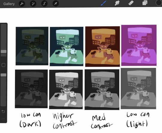
All of them have the same number of colors, and lights stay lights, darks stay dark, midtones stay mid consistent between all of them, but the range of values is different between them all. The difference in light or dark between each tone is different and it gives a different mood that you can see even in black and white. None of them is more 'correct' than any other, and it's all about establishing the tone and atmosphere you want. Experimentation is key.
Now lets try making this a complimentary palette. With a strong accent color, your accent should be placed at areas of importance. People are naturally drawn to contrast and when using an accent color in a piece it'll make that area stick out, so make sure you're placing your colors with intent. For this I went back to that first set of greens I had because it was my favorite. Since this palette is over all very dark, I am going to make my accent the lightest color, because that'll stand out more. In a lighter palette, try making your accent the darkest color. Once again I must stress these are not hard rules – there are very few hard rules in art at all – but these are very useful tips for getting emphasis in the right place. This is just an example piece so I'm not being huuugely thoughtful with how I'm placing the color.
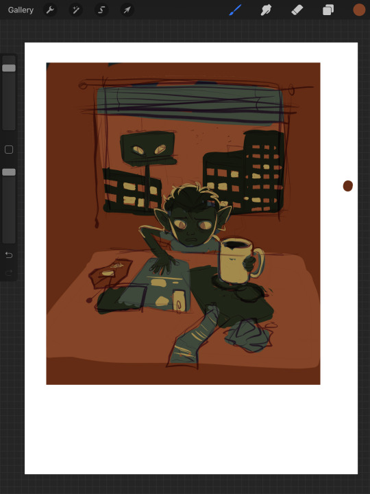
Here's the same image but with the lightest green just swapped out for a far more vibrant accent of yellow. Looks pretty terrible. I don't want all of the papers and blinds to seem so prominent. So let's scrap this and try a different approach. We're gonna instead add our accent as a sixth color to our palette.
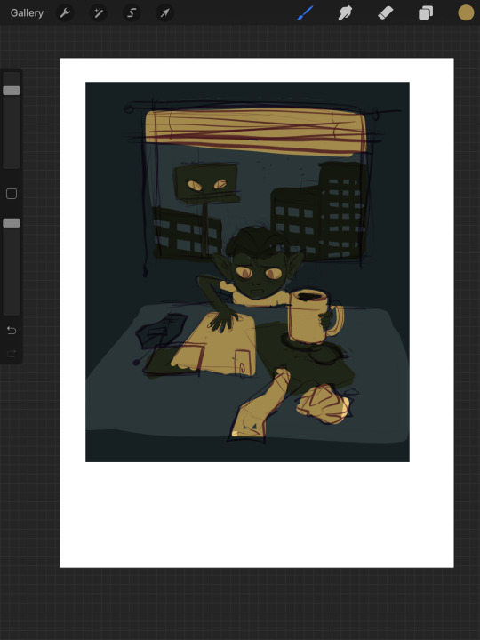
By adding another color, I've added another level of detail. Figuring out how to manage detail isn't just dependent on how many colors you have, but this is already going to be ridiculously long so I'll spare you that spiel. This is another one of those things I'll talk about more later if people want to hear my #thots. Using the new yellow accent, I emphasized the eyes, the mug, and added some interior detailing to the objects on the table. I also decided to place yellow in some of the windows of the outside buildings, to add a bit more interest in that area, and to justify giving yellow back lighting to our little goblin lad here, which makes him stand out nicely.
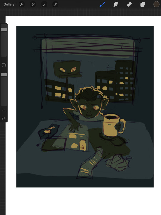
A split palette makes things a whole lot more complicated. Now that you're gonna be working with two different base colors you don't just only have to worry about which one is lighter or darker, you have to worry about how the hues look next to each other. Lets work with an orange on top of our original green here. I picked two of the greens and replaced the darker one with a darker orange, and the lighter one with a lighter orange. Now our palette is six colors split 50/50 between orange+yellow, and green.

But now something interesting is happening. Let's take a look. If you're particularly keen eyed, you might have noticed that there's a third set of colors here, using a greyish brown in place of the oranges. What's up with that?
Well, what's up with that is, they are orange. The palette on the far right is what happens if, instead of choosing my own oranges, I simply hue-shifted the bluegreens until they were technically orange in hue.


The oranges I chose just based on how they looked without actually checking the value and saturation of actually changed the value hierarchy of the whole piece. The table, instead of being in between the objects stacked upon it in terms of brightness, is lighter than either. This isnt bad at all – there's absolutely nothing wrong here. It's just important to be aware of things like this! This is why I said a split palette is the most complicated of the three I'm talking about here – in many occasions, the hue hierarchy can top the value hierarchy. Keep that in mind for slightly later.
I think split palettes work really well for comics, and I like to make my comics with split palettes. Whereas with a single illustration, you can just putz around with your color thumbnails until you get something good, for a comic you're locked into your palette once you've done the first page. Unless you're some sort of insanely meticulous person, in which case I envy you, you probably don't have every single page of your comic blocked out with respective values and can't apply your palette to the whole thing at once to test it. This means you'll need a palette that's pretty versatile. Having a split palette where one of the hue sets is lighter than the other overall allows you to decide whether you're going to create an overall light panel with dark accents, or vice versa. I'm gonna compare two palettes I'm using for comics to make this point.
Here's a sampling of the comic pages in full color, at 0% saturation, and adjusted for grayscale respectively. You'll notice a slight difference between the desaturated colors and the grayscale colors – grayscale seems to hold truer to the full color version, doesn't it?
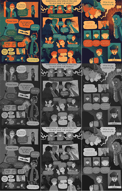

Now, here are the palettes themselves, and some grids showing the relationship between every pair of colors. When you don't know exactly what you're going to be using any given palette for, the relationship between any two colors becomes more important than ever. The bottom palette is split three ways, red yellow and blue each with a light and a dark, and then a completely neutral dark gray color. I'm using it for a long ongoing ace attorney comic I'm drawing. The top one has 4 shades of blue that go from darker and cooler to lighter and warmer, then 3 shades of orange that get yellower as they get lighter. Underneath is just the values – you'll notice that the top palette has a larger value range, with its lightest color being lighter than that of the bottom palette, and it's mid tones spaced further apart.


What you'll also notice about the bottom palette is that instead of the reds being lighter than the blues and darker than the yellows, the value alternates dark red dark yellow light red light yellow. Take a look at the color grids. You'll notice that for the most part, every color in the palette on the right looks good with every other color. That's not nearly as true for the palette on the left. The light blue has a weird vibration where it meets either of the reds, and a few of the pairings just aren't particularly pleasant. Honestly, from any objective ideas of color theory, this palette kind of sucks shit. Lets make some adjustments to it.

I've changed the dark yellow and light red hues so now the light red is slightly darker than the dark yellow. That's the palette that's on top now. Looks better, doesn't it? But so now the question becomes why am I using a palette that looks awkward, disharmonious, and visually strained when I know exactly how to fix it? The simple answer is because I wanted a color palette that's awkward. I wanted that visual strain. I have trouble working on comics and general, especially anything as long as this one, and I wanted a color palette that already meant things would come out looking a little bit wonky, so I wouldn't be as concerned with nitpicking all the details and making everything pretty. I think the sort of visual upset also fits the tone I'm keeping with a lot of the comic.
Remember earlier when I said I'd talk about breaking the rule of stuff looking good in gray scale and in color? That's now. Take a look at this image.
Which of the three colors is darker: the red, blue, or yellow? The stupid truth of it is that there's not really a proper way to tell. All three are technically the same 'brightness' but our brain tells us that the blue is the darkest, and the yellow is the lightest. Why do our brains do this? Let’s make em gray now.
On the bottom you can see what the colors look like when they are set to 0% saturation; as you'd expect it's a homogeneous gray blob. So then what the fuck is going on with the grayscale one? The grayscale one is closer to the way our brains interpret the colors, but we know this to be an improper rendering of their respective values. Which is the correct version, then – the grayscale or the desaturation? Luckily, we're using a computer, so we can have photoshop tell us the exact balance of hue, saturation, and brightness of any given pixel. Let's take a look now.
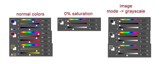
Wait, huh? We can plainly see that all three of the colors are at 49% brightness. But neither the desaturated value or any of the 3 grayscale values have a brightness of 49%. So what does a brightness of 49% look like?
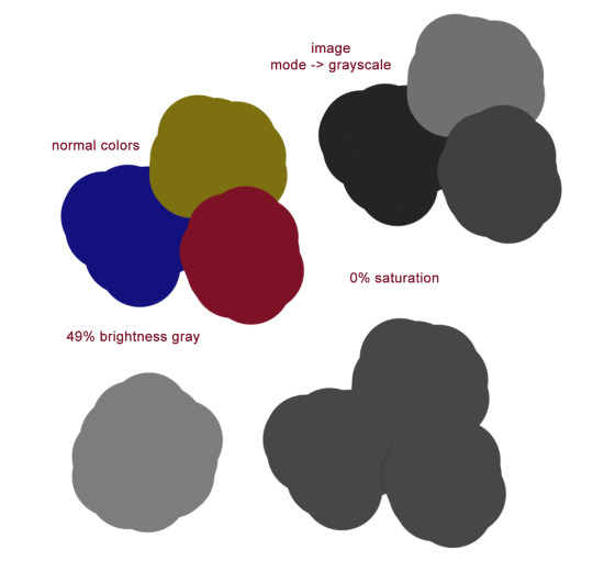
Okay. Sure. Why not.
All of what I've just shown you regarding grayscale is to emphasize the point that your best judgment for which colors look good is a far better measuring stick for a good color palette than any technicalities. Even if the value is the same, the hue can differ enough that you can still get a beautiful finished drawing. Color and our perception of it is so, so vastly technically complex. You can not allow yourself to be bogged down by this. Simply practice, and color will become intuitive to you over time. I have a lot more I could say on the subject of picking and using your colors, but this is already insanely long. Feel free to ask any follow up questions, I hope this was of literally any use!
451 notes
·
View notes
Note
psst share your outer banks coloring secrets
ah, yes, one of the worst shows to color lmaoooo. i'll try to give some tips but im sure as anyone who has tried to color this show knows each scene is diff and has it's own flavor of awful yellow/green/red shading.
some tips on how to go from this to this......


............under the cut! (warning v long and idk if i'm the best at explaining things lmao)
so firstly, i use this psd i made ages ago for everything (alecbaenes was my url many moons ago i just am too lazy to change and reupload). usually i will go into each individual layer of that psd and see how they work with the scene, and will change the opacity or turn off the layer depending on what looks best. generally for obx, i will lower the opacity on the gradient map layer, as well as certain vibrancy/curves/levels layers, ones that make the gif brighter and more vibrant. i will usually bring back some vibrancy and brightness later but when im first getting the base coloring, some layers just heighten the yellow/red and we need to kinda bring that down before we make adjustments to get aspects like skin color more accurate.
so, just with my psd/adjustments made to the psd layers, the gif may looks something like this: (going to use this gif bc i made it more recently so i remember some of the stuff i did better, and is the most accurate to my current process--plus it sucks to color lmao)
ususally still way to red/yellow for my liking, both for the skin tones and to be able to manipulate the colors for a vibrant coloring! so the next step is to get colors as close to how they are normally. warning, you will have to make 345435354 adjustment layers and just keep tweaking and tweaking... and tweaking. sometimes i will have like 20+ adjustment layers at the end of the process. i usually put all my adjustments under my psd--i also always add a vibrance and brightness layer above. sometimes it helps to do final tweaks above the psd if you just cant get anything right bc of course the psd will change how colors normally look.
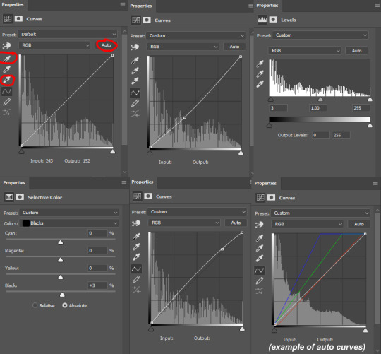
anyways, usually my base fixes will be some sort of combination of curves, levels, color balance, and selective color. so like, if the gif needs more depth/darkness, or is way too bright, i will bring the curve down or up respectively. levels, and also increasing the black selective color layer will also add depth. i will also use auto curve sometimes! the first image i have below i circled some of the extra tools i may use--auto for auto curves, the top black eyedropper you select the darker points in your gif and it will adjust based on that, the bottom one for the lightest--if i use those i will either use the black one only, or the black and then the white. the other three are examples of how my curve layers may look--i already have S curves in my psd, so when i do extra curve adjustments, it's just one single point, and i don't move it that much. same with levels, i dont make a super dramatic change, when it's under the psd it's enough to just move a bit to make a big difference. sometimes i'll also bring these layers to a lower opacity.
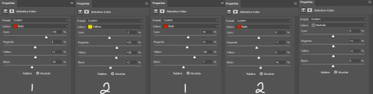
generally my first step is color balance though, especially if the gif seems mostly fine lighting wise. for obx, i usually shift it towards cyan and blue to cancel out the red tones. magenta and green depends, if its more green i may move towards magenta and vice versa, but usually i dont shift it that dramatically and often leave it alone. i will usually move the bottom bar towards blue, to soften the yellow tones. color balance helps shift the overall colors of the gif. notice that it's on mid tones in these pictures:
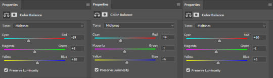
as you can see, i shift the cyan/red one more dramatically than the yellow/blue, and with magenta and green i usually just move it 1-3 points over. in the last one, i actually shifted towards red above my psd layer, because after all my adjustments i lost some of the red/warmth, so i brought back in red.
with color balance/curves, the gif may looks something like this
less of a completely red/yellow filter over everything! but still not great, their skin is too red, and overall still not the best base to try colorings. so next up is selective color, which can really help you fine tune things, but because of that.... SUUUUPER tedious. i will have 3495874 selective color layers and sometimes like 5 of them will be half canceling each other out just to get something okay. but this is a hobby i've chosen so we must suffer LKRGJRG. generally, my realm revolves around red, yellow, and at times magenta or neutral. if you think back to how we fixed some of the colors with color balance, kind of a similar principle, just with the individual colors. and lots of experimenting. so with color balance i would cancel out reds by making them more cyan--on the red selective color, im also gonna turn up the cyan. for yellow, i'm gonna make it more magenta, to make the yellow tones warmer. i will tweak the other tones too, just kinda experiment to see how changing it affects the gif, and then soon you will kind of intuitively know how to change the values based on whats going on in the gif lighting. magenta selective color helps for red values that are more pink, so make them more red or yellow based on what you need--i don't use this as much, hence i didnt have an example in the crop of psds i opened, but it's helpful sometimes. with neutral selective color, it usually affects the whole gif, so again, only minimal changes--usually i will bring the black levels down if it got to bright, or add just a tinge or yellow or cyan or whatever i need. here's some pics to show examples of what mine looked like for this gif:
there were many more, but i just chose a few. the '1' and '2' i wrote to demonstrate that these layers were sequential, how they balance each other, and how selective color can be a tedious balancing act-- the second example it's like basically the opposite but it balances it out. also, if you have two characters with different skin tones, or the lighting is different for them, etc, you can use layer masks to erase certain adjustments so it only affects one of the subjects. some of these tweaks will be inbetween me transforming the gif to be colorful, and noticing how the colors interact, etc. so between this i was also making it colorful and it's not exactly the finished product at this stage: but this is kind of what the gif would look like after all the adjustments just to get it looking... normalish:

not totally perfect but MUCH better, and also will look a little different when surrounded by the colors i want to turn it into. i have some stuff about how i color in this tag, i can do a lil other tutorial or smth if needed but bc i have limited photo space on the ask and already wrote so much i wont get super into it here. but for shows like obx, it helps to work with a group of colors that will work with the show--yellows/oranges are easier bc of all the yellow already found in the show. pinks can be harder because there is so much yellow in the show, but doable. greens are good because of all the green in the show, and thus blues are good because its easy to go from green to blue with selective color and stuff. thus, purples are good too because its easy to go from blue to purple! stuff like that makes it easier. some work with selective color, hue and saturation, gradients, and voila!

you can see how maybe some of the issues like it being still a little too yellow/greeny toned balances out with the surrounding colors.
also, a big part of it is just practice! i've been giffing for yeaaaaaars and with media that has just the most god awful lighting so i've gotten good at understanding what to do and sometimes i'm just on auto pilot.
hopefully that helped, i know it was long winded and it can be hard to explain/understand photoshop. if y'all want some more in depth explanation about a part of the process i can try, or with other examples!
9 notes
·
View notes
Text
My GIF making process!

I’ve been asked many times for a tutorial, but because I get really detailed, I always get overwhelmed by the idea. But I finally decided to buckle down!
Just so you know: I don’t use PSDs in this, and I don’t import layers to frames or anything like that. I like the hard way—at least in gif making, I believe you get higher quality gifs. Join me as I show you how to make gifs by loading videos directly into the Photoshop timeline and my coloring and sharpening techniques.
Tools used:
Mac OS X (only necessary for the first step, and there are other ways around it with a PC)
Adobe Photoshop
YouTube Purchases (any streaming service will work)
Topics covered:
Obtaining the Source Material
Loading the video file into Photoshop
Prepping, Cropping, and Resizing the Media
Adjustment Layers
Sharpening
Exporting
Obtaining the Source Material
There are a few different methods for obtaining video to work with. Proper YouTube videos are nice, but finding any major motion picture in that format is difficult, if not illegal.
Once I realized I could get really great quality video by doing screen recordings from streaming services, I stopped worrying about finding (and pirating) high resolution video files. So now, I just go to whichever streaming service I need to, pick out the movie or show, find the spot, and record small snippets.
Mac screen recording instructions:
On a Mac, Command+Shift+5 will bring up the screen recording dialogue.
Resize the frame of what you want to record within the browser.
Go to a second or two before, press the “record” button, and then begin playing the video, remembering to keep your cursor out of the recording box.
Use the Space bar to pause your video when you’ve gotten the snippet you need. Stop the screen recording by clicking the ⏹ button that is in your menu bar at the top of the screen.
Important: when the recording appears in the bottom right of your screen, click on it, and then trim the video on either end. This will help your computer convert the video file to the type that can be opened by Photoshop.
Click “done” and it will appear on your desktop, ready to be used!
PC Users: ??? Here’s a Google search I did for you
Loading the video file into Photoshop
Lots of people use this process for making gifs (a great tutorial!). I didn’t even know it existed until last summer, when I’d already been giffing for years. I wish I could still do something like that with these screen recordings, but the files are absolutely HUGE, especially on Macs with double retina displays, which actually increase the dpi by a lot. Making screencaps of them fills up my hard drive, almost immediately—even when I’ve got 20 gigs of free space to work with. So what do we do? We just. Open the file. In Photoshop. Et voila!
You can do this with any type of video, not just screen recordings.
Prepping, Cropping, and Resizing the Media
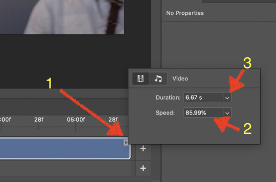
When Photoshop loads your videos up, it makes the video hilariously fast (something about frame conversion). You must slow it down for it to look natural. THIS MUST BE DONE BEFORE YOU RESZE. Your Photoshop timeline window should be at the bottom of the screen. See that little triangle in the top right of the video?
Click on it, and a menu will appear to change speed and duration.
Change the speed first- usually between 80-85% will seem realistic. (I actually went a little faster than I usually would on this at almost 86%—I don’t recommend this)
Press the button next to duration and pull the toggle all the way to the far right (if you don’t do this, full length of the video will be cut off).
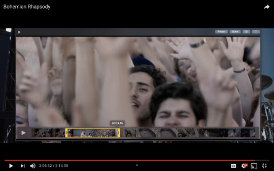
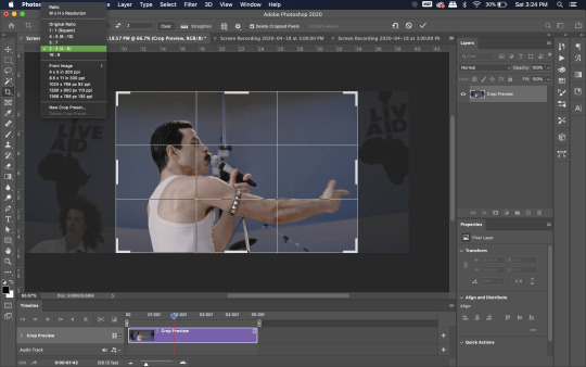
Now you’ll want to crop it. Ever since Tumblr upped its GIF size limit, I have been playing around with 7:5 ratios, but let’s go with 3:2 for now. Use the Crop tool, pick out 3:2 in the top left (it may say 2:3, but you can switch that) and then find the most suitable spot in your gif for that. Hit enter on your keyboard.
Some things to keep in mind when cropping:
Most videos come in 16:9 ratio (BoRhap is even wider). If it’s a wide shot, you’ll need to do the full 16:9 to not lose anything. Of course, experiment and find what’s right for you!
As you can see above, I moved forward in the timeline and made the crop to a point in the video when the broadest movement was happening.
Certain videos WILL have a black or red bar that may be imperceptible until you’ve already exported the gif. Just crop in a little tighter on top and bottom to avoid them.
Now you’ll need to resize your gif to be the correct size for Tumblr. If you don’t use Tumblr’s exact dimensions, your gifs (as uploaded) will appear blurry or pixellated. We’re doing a full-width gif here, which is 540px. On a Mac, I use Command+Option+I (for “Image Size) to open the resize dialogue. You can also find it under Image->Image size...
Make sure to also have “Resample” checked. Lately I’ve been playing around to see if different options are better. Most GIF makers use “Bicubic Sharper (Reduction)” and they are not wrong to do so. I’ve just been unhappy with it lately, so I have been trying this other setting out, “Bicubic (smooth gradients)”.
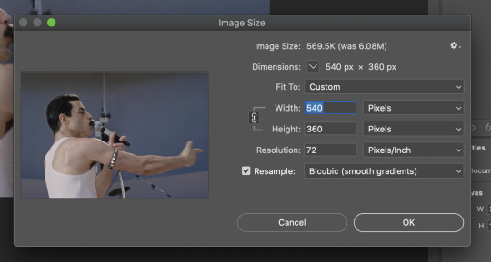
Click OK. A dialogue may come up that asks if you want to convert to a Smart Object. The answer is yes, okay, do it. The only major caveat is that you can’t go back and change the timeline speed. That’s why we did it first. But you can preview the speed now that it’s smaller, and if you don’t like it, use Command+Z (or “Undo”) and go back a couple steps to get the speed you like.
You may find, especially on a Mac screen (and possibly other displays), that at 100% your gif looks too small to be 540px. That is the curse and blessing of working with super-high resolution hardware. Zoom in to 200% and proceed about your business. This is what it will look like on Tumblr.
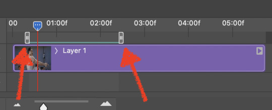
You may find it helpful at this point to begin by defining the beginning and end of your gif by moving around these bumpers. It’s safe to keep gifs under 02:00f in length. Under half of 01:00f will be way too short. (I tend to overshoot in length and then trim the beginning and the end once I see how big the gifs are upon exporting.)
Adjustment Layers
Now the creativity and fun begin!
There are a LOT of ways to get creative here. I’m going to keep it simple, very simple, but I strongly recommend opening up a new adjustment layer of each type and trying to figure out what each does!
You’ll find the adjustment layer menu at the bottom of the Layers window.

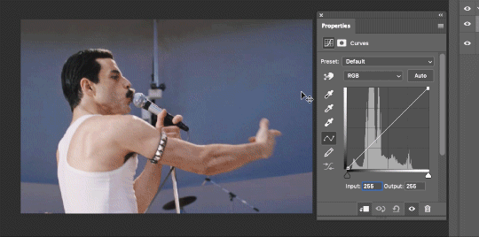
Curves
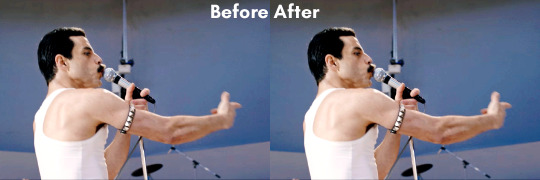
There are a lot of ways to make Curves work for you! It can do the job of Brightness/Contrast, it can do Levels, it can do Color Balance! We’re going to use it mainly to help with brightness here, but also to level out some of the tones. One of the quick tricks you can do is use the droppers on the left side of the Properties window. There are three- one with a white tip, one gray, one black. These can help define what your white tones are (and whether they need to be more of one color or another), and so on with your blacks. Sometimes it works, sometimes it doesn’t; in this case, I think it doesn’t:
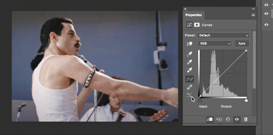
That looks totally blown out and somehow also too dark!
So instead, we’re going to use that little hand with the finger pointing out and some arrows pointing up and down. This lets you define which sections you want to get brighter or darker, and how much. It doesn’t do color correction. In the example below, you can see I dragged up on a white spot and down on a dark spot. Then, I moved points around on the curve itself to refine (which the gif here doesn’t show...).
Vibrance/Saturation x2
Next, I’ve been using @gwil-lee‘s Vibrance/Saturation trick (I know you said you learned it from someone else, but I learned it from you!).
Create a Vibrance Adjustment layer, bump the values up a bunch, and then change its Fill to somewhere between 2-9%. Change the Blend Mode to Color Burn. Then make a copy of that layer keeping everything the same, but make it Color Dodge. I can’t quite define what these do, but it makes it punchier!

Color Balance
Most people are familiar with this. For this gif, I’m going to make the shadows more Cyan/Blue and the highlights more Red/Yellow. Just a few points each.
Exposure
I brought the Exposure up a bit, but not enough for you to need to read about, haha.
Selective Color
Here’s where you make fine adjustments to colors. This particular scene is extremely simple, color-wise, so keep it simple. I’m going to bump up the cyans/blues, take up the black by just a point or two, and maybe bump up the yellows and reds a tiny bit. (And as always, remember, the “opposite” of cyan is red, the opposite of magenta is green, and the opposite of yellow is blue. CMY/RGB!)
I think at this point I’m going to call it with the adjustment layers. You can go absolutely hogwild with more of them! But at this point, I’m ready to start sharpening!
Sharpening
I do three sharpening filters these days. These are all under Filter->Sharpen. Make sure your media layer (default called Layer 1) is selected as we go through this! (Also, this can really take a toll on your processor, so don’t say I didn’t warn you.)
Sharpen- This layer does the basic job
Smart Sharpen (Amount: 10%, Radius: 10, Reduce Noise: 4% Gaussian Blur)- This layer gives texture
Smart Sharpen (Amount: 500, Radius: 0.3, Reduce Noise: 12% Gaussian Blur)- This layer gives refined sharpening and smoothing
Fiddle with these as needed! Let your gif play all the way through- this may go slowly as your processor works on it. Make sure the beginning and end points make sense.
Exporting
After You’re going to have to use File->Export->Save For Web (Legacy)... or use the shortcut of Shift+Option+Command+S. This could take some time for the dialogue to pop up! Be patient.
In my opinion, these are the best gif export settings for crisp edges and no noise:
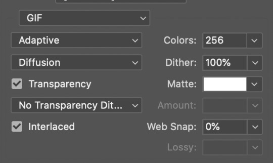
Now you see how big the file is in the bottom left. Tumblr won’t let you upload anything bigger than 10MB and it’s safer to stay under 9MB, in my experience. When your gif is too big, you have a couple options. You can close the dialogue and change the length of your gif.
OR, you can uncheck “Interlaced” and bump up the lossy to 1 or or more. This will create noise. Sometimes, that’s a good thing!
Here’s without lossy:
Here’s WITH lossy: (Honestly in a fast moving gif like this, it’s almost imperceptible, but I can see it!)

And now that I’ve exported, I can see what there’s a little black line on the bottom! So I’m going to trim that off and call it good! You can see the full gifset here.
Hope you enjoyed! Reblog if you try this out or learned anything. Feel free to reach out with questions any time!
328 notes
·
View notes
Note
i am SO sorry that i'm asking you so many questions! i've seen a lot of methods for coloring over black and white, but i was wondering what method you use? i'm a bit colorblind so i do my work initially in b/w and color it in when i'm done, because it's easier for me to work with the values that way. I'm still experimenting with methods of adding color.
Hey anon, no worries! Seriously, I like answering these kind of questions, so pls throw them at me any time.
Personally I start out in color, simply because some hues are value-bound. That means you either have to be clear about the colors you want to lay on top of your b/w painting before you start painting, or match the colors to your b/w painting - so you might not get the result you had in mind. (Or you can play around with layer modes for hours until you get there somewhat.)
Reds are especially finicky when it comes to it and not everything that looks good in b/w will read well in color.Case in point:
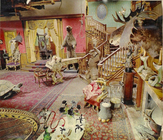
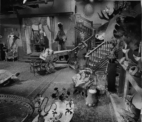
The set designers of the Addams Family had the opposite problem - the house was supposed to look dark and morbid but they also had to make the set read and not have it drown in shadows. If you were to put the b/w image into photoshop and tried to color it with reds and dark browns you would probably not get far, because again -
Colors are Value-Bound
Here’s a chroma value chart by James Gurney that shows what chroma corresponds to which value:
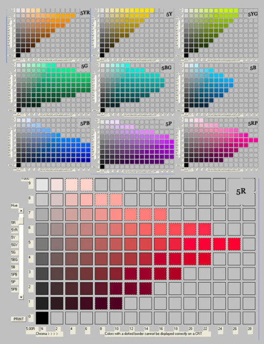
As you can see, bright oranges/yellows/greens are on top of the scale and blues and purples on the bottom.
That’s the thing most people don’t realise when they lay colors over a b/w image. It’s fine when you’re exploring and are not stressed about which color goes where, but once you have an established character for example, or just want that piece of cloth to be that shade of red, you might get into trouble if you didn’t keep the value/chroma relation in mind.
Layer Mode - Color: The chroma reacts to the underlying value.
Layer Mode - Overlay: The chroma and value react to the underlying value - which means you might get value shifts in your overall composition which can unbalance the whole thing 👌
If you already know which one of the eight shades of red you want/need, you have to make sure to pick the right value for the right layer mode before you do anything. It’s all very technical and requires a lot of planning and foresight so I usually don’t directly color over my b/w sketches/paintings.
I do often start out with a value sketch so I know if the composition reads well, then put it into a different file and paint the actual painting from scratch in color. (Here’s a step-by-step thingy.)Generally, I begin very desaturated and build up the colors as I go along. (Here’s a how-I-pick-my-colors.)
SO, I can’t really give you any secret tips on how to effectively use layer modes because I too, am an idiot when it comes to that haha
If you’re struggling with color, read James Gurney’s ‘Color and Light’ (I know I already said it a thousand time BUT I WILL SAY IT A THOUSAND MORE) and study artists that use a very limited palette (18th-19th century is always good). You don’t have to jump straight into landscape painting and shit, that can be super overwhelming if you’re already having a hard time.
In most cases, starting out in b/w will give you a bit of a ‘washed-out’ look no matter what you do, but if that’s what you like then roll with it! (len-yan f e does wonderful stuff ♥ )
Basically it’s just another method that will give a specific look to your painting, and if that’s what you want then yay. But I honestly wouldn’t use it as a crutch. If colors are your worst enemy, try to understand them first!
Thanks for coming to my TED Talk. ♥
324 notes
·
View notes
Text
Hilleberg brand story
Hilleberg tent measured experience, the top tent in the outdoor brand
I believe everyone is no stranger to the outdoor brand Hilleberg. Hilleberg Hilleberg, which is famous in the mountain world, is like the LV of the fashion industry. Among them, the most famous tent series is its tunnel tent Anjan series. If the tent is a home in the forest, then the Anjan series is undoubtedly a single-family mansion! But the reality is cruel, not everyone can afford a luxury house, so consider the same exquisite villa in the elite area-Anaris series.
Hilleberg brand story
Hilleberg Hilleberg has been voted as the best tent by the European industry in 1995. It is known as the king of European tents. The most well-known one is the tunnel tent Anjan series, but Hilleberg is actually the first The keb series sold by Ding Commercial is also the first tent in the world that combines the inside and outside of the tent. The tent’s inner tent and canopy are integrated into one design, which is convenient for erection and shortens the erection time. The prototype of Anaris Mountain Lodge is from Keb, which can be said to be the classic of the classics!
Why Hilleberg, which is not cheap in the tent market, can stand so unwaveringly, and there will still be Shanyou investing in this brand of tents? Hilleberg uses six basic principles to build the best functional tent, namely reliability, adaptability, ease of use, durability and comfort. Even if it achieves the ultimate lightweight, it will not reduce the six major tents. High performance.
Hilleberg color code system explanation
In 2013, in order to make it easier for consumers to choose the right tent, Hilleberg integrated four 'color label' tents: black label, red label, yellow label or blue label. Each color code represents a category distinguished by the material or structure of each tent. In the yellow label family, in addition to the original Anjan and Rogen, new members Anjan GT and Anaris have also been added.
Black label
The most durable series, suitable for all users in all seasons, any environment. The black mark indicates the easiest tent series to use, and it is also very suitable for novices to engage in high-intensity expeditions.
Red label
The four-season tent has an absolute advantage in lightweight and still has a bright performance in terms of strength. Suitable for users who value lightweight and are willing to sacrifice a little comfort and strength
Yellow label
Give priority to lightweight groups, suitable for use in warm and snow-free environments. Suitable for users who prioritize lightweight and are willing to sacrifice a little comfort and strength
Blue label
Tent with special needs and specifications
Four advantages and disadvantages of Hilleberg Anaris
1. Lightweight
Hilleberg Anaris belongs to the ridge tent (also known as the A-type tent), this tent is not self-supporting, so the whole tent does not have a skeleton (camp column), but uses trekking poles and camp nails to build the tent, eliminating the overall tent of the camp column The weight is lighter again! If it is an A-shaped tent supported by a trekking pole, it can also be called a pyramid tent, while Anaris is a trekking pole at the front and rear doors, which is built up like a ridge. The traditional A-type tent is an early boy scout tent, so it is heavier, but Anaris Mountain Lodge completely overcomes this shortcoming!
The Anaris mountain hut is regarded as the rising star of Hilleberg, just like the SE of the iPhone series. The sparrow is small but has all the internal organs. It is the thinnest and lightest of the Hilleberg series of tents. It contains only 1.4 kg of internal and external tents + camp nails. What is the concept of 1.4 kg? It is about the weight of a Mac Book Pro 13-inch laptop.
What's more, this tent is still the most intimate in the Hilleberg series!
Speaking of the word flimsy, it sounds fragile at first glance, but Hilleberg is most proud of the extremely strong Kerlon fabric. Kerlon fabric has three layers of 100% silicon coating, which is completely waterproof and lighter. So even if it’s light and thin, don’t underestimate it. The yellow label Anaris tent fabric is Kerlon 1000, with a tear resistance of 10kg. The common tent fabrics on the market, especially those with polyester coating, have a strength of only 2. To 3kg.
The black label tent uses Kerlon 1800 fabric, and the minimum tear strength reaches 18kg; the blue label tent uses Kerlon 2000 fabric, and the tear resistance is 20kg; Kerlon 1200 fabric is used on the red label tent, and the strength reaches 12kg. Kerlon 1000 and Kerlon 600 have strengths of 10kg and 6kg respectively. They are used in all Hilleberg tents. Among the lightest yellow-label tents, most of the tents are designed with three-season tents.
2. Two-pronged ventilation and wind resistance
Ventilation
The inner tent of Anaris is made of breathable gauze material, which makes the air flow smoother. It is suitable for all three seasons. The stability of this kind of non-self-supporting tent relies heavily on trekking poles and camp nails. In sunny and mild suburbs with shelter, the camp nails should not be full, leaving a little height gap to help air circulation; on the contrary When the wind speed is strong or even the weather is not good, it is highly recommended that the nails must be fully loaded so that your home will not be blown off.
Intimate reminder: No matter what the tent is, if the camp nails are not full, don't step on it! Hilleberg's camp nails are actually divided into strength, if you think you want stronger camp nails, you can go here Shop around.
Anaris is a detachable tent with inner and outer tents. The advantage of connecting the inner and outer tents is that when you are in strong wind, you can quickly set up the tent. Hilleberg also used tunnel tents at a speed of 100 per hour. Tested in strong winds of kilometers!
In addition to the four-legged camp rope, the front and rear doors of the tent can be fixed with trekking poles, and there are also camp ropes on the top, which can be pulled down under strong winds to make the tent more stable and have better wind resistance. Off-topic ~ Non-self-supporting tents also have the advantage that no matter how strong the wind is, there is no need to worry about the camp pillars being blown crooked. If the self-supporting tents are set up for a long time, the camp pillars are blown crooked, but it will be bad!
3. Spatial
In addition to the weight of the tent, space is also a condition that many mountain friends care about. In terms of space, the Anaris climbing tent has three major features: a double-door system, a double vestibule, and a zero-frame storage.
Two-door system-when you first started camping, the rented tent was a single door, and you had to wait for entry and exit. If it is a multi-person account, it is acceptable because of the large space, but if it is a tent for 2-3 people, the entire It's very small. Later, after I started climbing the mountain, I realized that the tents are also made of double doors! I personally think that double doors are the kingly way, just like a car, only one door is really annoying. On the mountain, every second counts. When I arrive at the camping site and set up a tent, I will go into my den immediately. Waiting for any second will make the whole uncomfortable. You don’t have to wait for the double doors. You can spread your sleeping bag back to back with the mountain friends and inflate. Sleeping mats don’t need to be crowded at all. Because of the double doors, your feet can stretch out of the tent comfortably. The whole VIP feel is here.
Double vestibules-The most annoying thing about hiking or camping is rainy days, because cooking can become troublesome. If there is a canopy, it's okay, but like me and Matt climbing the mountain, we are not taking the canopy, because we take the lightweight route, and one more thing is one more weight, NO! (But I want to buy it recently, because the windshield is very useful haha). When there is no sky and it rains, the double vestibule is really an invention of the Buddha's mind. Just like a home with a courtyard, you have an extra space to put your belongings. On the mountain, you can put hiking bags in the vestibule. Don’t let the rain wet your bag; you can cook in the forecourt and prevent the strong wind from disturbing your hair. It seems like a concept of a protective cover, giving you the most perfect protection!
Zero-frame storage-As mentioned earlier, A-type tents like Anaris are mainly built by trekking poles and camp nails, so the weight of the camp pillar is basically reduced. In addition, this tent has a design that integrates the inner and outer tents. Do not disassemble it when collecting the account. Fold it in half and then fold it into the bag. It is very convenient and fast to store. And if you have good storage skills, you can have Help reduce storage volume. Then when you open the tent next time, just put down the four-legged camp nails and prop up the trekking poles to set up the tent. Isn’t it very fast?
4. Diversity
I talked about the fast-deteriorating internal and external tents, and it also provides the diversity of Hilleberg Anaris tents. There are as many as six ways to build a tent alone, so many people think you have six tents!
Having finished talking about the advantages above, then I will share with you what we think needs to be improved!
1. Large area
Anaris is a two-person account, but the required floor space is about the size of a three-person account. So if you usually go to a very popular hiking route, you need to find a larger place to camp. But to put it another way, the large area actually means that Anaris has more space in terms of double tents, especially the vestibule!
2. Building skills
It was written earlier that if the internal and external tents are not opened, the next time you use the tent will be very fast, but the premise is that you have experience and feel after multiple operations, and you can quickly set up after practice makes perfect. But in fact, most people use self-supporting tents (with skeletons), so if they are used to self-supporting tents, suddenly changing to this kind of camping nails and camp ropes will require a little adaptation period.
For example, we spent some time studying where the camp nails should be placed, how to tighten the camp ropes, how high the height of the trekking poles should be adjusted... and other issues, and if in a strong wind environment, we need to constantly confirm that the camp rope is enough It’s not tight enough and the camp nails are not full enough. After all, it’s like a self-supporting tent (with a skeleton). Even if your camp nails fly off, the overall tent structure will still be intact; but if it’s a non-self-supporting tent (without skeleton, relying on trekking poles and camping poles). Nail), if it falls, it will be rebuilt.
It is recommended that if you buy a non-self-supporting tent, you can try to build it in a suitable place such as a suburban mountain or a camping area before going up the mountain, so that you will not feel rushed to set up for the first time after going up the mountain, especially for novices, because you will be very broken.
3. Eat terrain
Since Anaris is built on trekking poles and camp nails, it is more suitable for building on soft soil. If you want to build on hard soil, it will be a little harder to nail it; if you want to build on a concrete floor, make sure that the weather is not bad enough to blow away your home, please take a big rock and press it down!
4. High barriers to entry
As mentioned at the beginning of the article, Hilleberg is the LV of the fashion industry, so it is assumed that the price of tents is not cheap, so most mountain friends want (need), but hesitated to see the price. But it has to be said that Hilleberg is made in Europe, hand-made, and the materials are the best, so it really gets what you pay for.
Of course, if you are a novice, like a newcomer who just came out of society, I sincerely suggest that you can buy an elementary tent first. When you are sure to fall in love with camping, camping, mountain climbing, etc., you will use tents for outdoor activities. In the future, consider whether to rush to the highest level.
If you are a beginner and love outdoor sports, just like a motivated social person who has just left society for 3-5 years and has little savings and is full of energy, I suggest you rent and try Hilleberg’s tent, just like you Buying a car will test it, and you will know its goodness after sitting in a Tesla. The tent should also be tested! Like it, fall in love at first sight, it is necessary, you can start planning to save money to buy it
If you are a veteran, those with experience usually know how to enjoy pulling. If you feel right, you have assessed that it meets your needs, and you can place an order with your eyes closed!
Hilleberg Hilleberg Anaris Five Ways
Ridge
The ridge style, the inner tent and the outer tent are combined, and the overall shape is like a ridge.
The method of setting up the mind: the camp nails must be full and the camp rope must be tightened to look good. If it is not tightened, the tent will look loose and wrinkled!
Timing: when sleeping, when the wind is heavy and rainy.
Half house
Half-house style, pull up one side of the tent, revealing half a small house, the vernacular is half-house style
Set-up method: turn the tent from the left to the right, the camp rope can be put on the right camp nails, no need to hit again.
Timing: Set up camp in the woods in the hot summer. The sun rises and the temperature gradually rises. Pull up half of the tent for ventilation, and there are trees to block the sun to prevent too much exposure.
Chalet style
In the style of a wooden house, the doorways on both sides of the front courtyard are rolled up, and the inner tents are subtlely exposed. The outer tents are like the roof, and are as lovely as small wooden houses in the mountains and forests.
Set-up method: roll up from top to bottom, and fix it with the buckle on the tent. If you roll it up randomly, the rolled up vestibule will hang down!
Timing: When you want to take a beautiful photo of a mountain hut
Transparent
Through the sky, pull up the bilateral outer tents, showing the entire inner tent, the whole is breathable and fresh
Set-up method: roll up the tents neatly on the roof ridge separately. If you close it in disorder, it will be messy, so you must roll it up neatly. After finishing, tie a knot at the end of the roof, or bring your own rope The tent is tied and fixed, and it will look cute when taken from the front.
Set up time: When you want to sunbathe in the mountains and forests.
Cover type
Cover type, separate the inner and outer tents, and use the outer tents as a kind of canopy
The method of setting up the mind: remove the inner tent and set up the outer tent, and there is a doorway on this canopy! Turn on and off
Set-up time: when you want to blend in with nature, single-day wild river hot spring itinerary
Camping experience
I borrowed this tent from a friend, but we didn't know that there was a thunderstorm in the afternoon. We arrived at the scene and waited for the rain to stop, and hurriedly set up Anaris in full swing.
The first step of the construction is to fix the four-legged inner tent with camp nails, and then insert the trekking pole into the camp column cover of the outer tent. It can be seen from the photo that this double tent needs a large hinterland, and the foreign tent has not been fixed at this time. In addition, we agreed that at least two people are required to build together, and it will be a bit hard for one person to build!
The trekking poles need to be the same height on both sides. In this way, the tent can be stretched tightly and beautifully.
Anaris' tent can also be used as a sort of canopy. If the weather is too hot and you want to ventilate, you can prop up the tent and tie it to the tree with camp ropes. There is gauze in the inner tent, which can speed up air circulation. It is a tent that can have various changes.
Because it was too late to arrive at the destination, the larger camp in the hinterland was already full of people, so I found a smaller camp in the hinterland, so Anaris could still build it, but it was slightly crowded.
The super large vestibule, 160cm tall, my feet can be fully straightened, and there is plenty of space for a camping chair, hiking bag, and cooking in the vestibule when it rains!
The space in Anaris is big and cool. After a day's sleep like this, we feel that this double tent has no problem if we have to sleep three people (visual inspection, in fact, we haven't tried it). If two people sleep in a spacious room, they will not disturb the friends next door if they turn over. However, our previous tents had storage bags. This one is not so I am a little uncomfortable. If there are storage bags equipped with storage, it will be more systematic.
When you get up in the morning when the sun is in the sun, it will not get too hot. It may be because there are trees blocking it and there is no direct sunlight. In addition, we forgot to bring sleeping bags when we went to bed at night, but it was not as cold as we imagined, and we thought that the windshield effect was good. Of course, if it is a strong wind without shelter, you must test again~
Summarizing the thoughts of this equipment test: Anaris' advantage is that the space is super-explosive, and the top gauge of the tent material is waterproof, wind-resistant and tear-resistant. Although Anaris is the cheapest and only discounted tent in the Hilleberg series, I believe that the unit price is still high for users. What I like most is that the Anaris external tent can be used as a canopy-like design, which can be used in different occasions at any time, as well as the super large vestibule and internal tent space. The above is what we share about Anaris Mountain Lodge. We hope to help you get to know the brand of Hilleberg and Anaris Mountain Lodge. There is no need to buy any equipment, the important thing is the equipment that suits you and your favorite.
1 note
·
View note
Photo
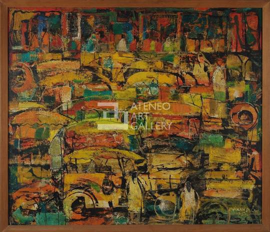
Jeepneys by Manansala
1951
Enamel on fiberboard
51 cm x 59 cm
Born on January 22, 1910 in Macabebe, Pampanga, Vincente Silva Manansala is an acclaimed Filipino painter and artist. In his youth, he considered his hobbies, kite-making and creating charcoal sketches on paper, as fun, temporary escapes from his labor-intensive jobs of being a newsboy and shoe shiner in Intramuros. At the age of 15, he found that his inclination to the arts brought him under the mentorship of Ramon Peralta to learn the fundamentals of painting at a sign and poster shop. A year after, he enrolled at the University of the Philippines School of Fine Arts. When he graduated in 1930, not only was he able to master the basics of oil-painting, but he was also able to merit a great deal of financial aid, scholarships, and grants from art establishments around the world due to the artistic prowess and prodigious creativity he displayed during his stay in the institution. Later in his career, he received multiple awards and held positions in esteemed local and international art establishments.
The education and training he took up in countries like France, Canada, the United States of America, and Germany, was reflected in his approach to his artworks, which were obviously products of international influence. It was refreshing in the local art scene at that time, which drew in a massive audience for his exhibits. Rapidly gaining popularity, Vicente’s eccentric aesthetic made him a pioneer of modernism of the arts in the Philippines. His style could be referred to as “transparent cubism,” which involves scattered facets of varying hues across the painting. His paintings created lasting impact to their audience, as his technique seamlessly blended geometry with expressionism, calculation with spontaneity. His genius as an artist transcends beyond his technical innovation, as the subject matter in his paintings, centered on the post-war urban experience, spoke to a new Filipino audience. The end of World War II sparked a type of social awareness that Vicente tastefully incorporated into his artistry. As he took inspiration from his immediate surroundings, Vicente’s paintings revolved around the life of the commoner. He took everyday scenes, objects, and places, like family gatherings, cockfights, native delicacies, the slums in the urbanized areas of the country, religious figures, and painted them in his slightly more westernized fashion that somehow made them iconically Filipino (Paras-Perez, 1980).
Jeepneys is the title given by Vincente to his work. Based on the title, and the painting itself, the image he intended to create was the daily traffic congestion in the metropolis. Given that the jeepney is one of the most affordable means of transportation readily available to the masses, Vicente probably wanted to cement the theme of daily Filipino encounters as the core of his collection. This work was made in 1951, just six years after the war ended. It is known that jeepneys quickly surfaced as a makeshift, creative way in an effort to re-establish inexpensive public transportation, much of which had been destroyed during World War II. This was done by repurposing and decorating the surplus jeeps from American troops in order for it to be suitable to accommodate several passengers and look visually appealing, colorful, and eye-catching as it traveled on the road (Platino, 2014). The popularity and the history of the jeepney during that time may have also prompted Manansala to create this artwork. The painting is currently displayed in the Ateneo Art Gallery as a gift from Fernando Zobel.
Jeepneys is a painting done on a fiberboard using enamel. A wash of white and bright yellow was laid down first, before hasty, daubs of other colors in varying saturations, like orange, red, and brown were applied. The use of enamel on fiberboard allowed for the different-colored strokes to be semi-translucent and glassy without the need for tedious modification of the paint, permitting the yellow hue to penetrate through the secondary layer of pigments. This mimicked a filter of warmth throughout the piece and brought about a more cohesive color palette. The presence of the different colors also distinguish one entity in the painting from another, allowing for clarity of scenery despite the expressive style employed by Manansala. This clarity is also achieved through the use of actual, irregular, black lines that serve as outlines of the subjects in the painting. The inconsistency and coarseness of these lines give a sense of spontaneity to the piece. On top of these outlines, smudges of warm blues were added as accent colors to impart variety against the otherwise unified, chromatic value scale of only varying shades of red and yellow; this makes the painting more interesting and more captivating of the attention of its viewers. Slivers of white highlights also creep through the painting.
With the guidance of the chromatic value and the black outlines in the painting, I can identify many jeepneys and people as subjects, which makes me infer that the setting is an urbanized area, like Metro Manila. In the upper portion of the painting, I can see even more people, lined up, probably waiting for a ride to get where they want to be. I deduce that these are common Filipinos, patiently queuing for transportation to get home from work. The reds and yellows make me believe that it is sunset, or time for people to return to their homes after a day at their jobs. The primary colors of the painting may also signify the colors of the Philippine flag, in order to place emphasis on the Filipino origins of the jeepney, and on just how routine the scenario depicted in the painting is in the country.
Unlike the vast majority of Manansala’s works, this particular painting of his makes use of more organic shapes than geometric ones, a hallmark of his signature “transparent cubism” style. Similar to his other paintings, this painting is composed of superfluous shapes of different colors that contribute to an overall puzzle-like look. The distribution of these shapes and visual weight is more or less uniform across the entire work, which makes the painting balanced. The irregularity of the shapes, formed by both colors and lines, also evoke a touch of movement and life to the whole piece to be perceived by the viewer. There is also very minimal negative space in the painting; the fiberboard is saturated with different objects and characters. This gives the piece an disorganized rhythm which almost makes the conveyed scene feel chaotic to the viewer. The seemingly rough texture of the painting, probably achieved through the use of a fiberboard with grooves and indentations as its canvas, gives the painting a rustic, undone edge. There is also an absence of a defined vanishing point in the painting, which makes the elements appear very packed and arranged in a collage-like manner.
In my opinion, all of these elements reinforce the mayhem and frenzy of the traffic scene in the painting. Manila is known for its notorious traffic; streets are rarely peaceful in the midst of the relentless honking of vehicles, the reckless attempts of drivers to beat a red light, and the rowdy crowds of people on the street desperately trying to find a good deal or any sort of transportation to get where they need to be. The dynamism and movement in this painting, that I was able to immerse myself in, was successful in transporting me into the legendary Manila traffic. Given that this painting was made just a few years after the end of World War II, the Philippines was eager to rebuild its economy that had suffered tremendously during the war. This could have led to more Filipinos joining the workforce, and the subsequent increase in the number of people that had to be on the road to earn a living. The work of Manansala, Jeepneys, through its elements and composition, has successfully communicated the essence of a bustling city, brimming with vitality just as it is with madness.
I have utmost respect for Filipino artists like Vincente Manansala, who use their acquired techniques from other parts of the world to help in the progress and development of their own country. Jeepneys, along with Manansala’s other paintings and illustrations, is a carving etched on the history of art in the Philippines, as he spearheaded the rise of modernism in the local field of art. Other artists like Mauro Malang Santos, Antonio Austria, Angelito Antonio, and Mario Parial have been inspired to experiment with their own distinct, unconventional styles in painting because of the contributions of Manansala. His artistry birthed a new generation of artists that embraced their personal aesthetics. Beyond his mastery of art, I commend him for the common thread of daily, purportedly hackneyed conventions in the lives of everyday Filipinos that is firmly woven throughout his series of paintings. He shows that the average Filipino is worth creating art for. An image of the traffic-bombarded roads of the city are just as enthralling as extravagant portraits of doñas and dons, paintings of picturesque views that only the upper class can afford to see in a lifetime, and illustrations of glamorous novelties. I believe that in a way, Manansala’s work was able to open the once inclusive, intimidating realm of art to other people who resonate with his work that captures the unfeigned, honest heart of the Filipino.
To me, this painting does not necessarily pass the classic standards of rhythm, harmony, balance, and proportion, as it does in fact look disarrayed at first glance, especially when I consider that Manansala did in fact intend for this painting to represent a scene of jeepneys. It might even be difficult for some to make sense of the painting at first. In spite of this, I cannot help but be in awe when I look at this painting, maybe because a sight that I am so familiar with, has been transformed into a expressive impasto of color, with details that take my gaze from one impressive fragment to another. The more I look at the painting, the more things I am able to find that make the work even more fascinating. I do find significant cultural value in this painting as well. The use of primary colors keeps the painting grounded in its Filipino roots, and it also allows for a more graphic projection that the jeepney is a mode of transportation unique to the Philippines. Its history of it being a product of Filipinos’ resourcefulness and resilience after the war makes it a cultural staple in the country. There is a deep heritage and origin to something deceivingly simple like a humble jeepney, like there is a hidden complexity and masked grandeur and to the everyday, seemingly mundane, themes of Manansala’s works.
References:
Paras-Perez, R. (1980). Manansala. PLC Publications.
Platino, M. (2014). Philippine jeepney: World War II surplus vehicle that became a cultural icon. Retrieved from https://globalvoices.org/2014/04/20/philippine-jeepney-world-war-ii-surplus-vehicle-that-became-a-cultural-icon/
3 notes
·
View notes
Text
8.
The body swap au a surprising amount of people asked for, actually.
Read on AO3 / Summary
Pairings: Eddie Kaspbrak / Richie Tozier
Warnings: swearing, sexual references, drug references
Chapter 8/?
Prev | Next
Word Count: 4121
Eddie’s playlist
Eddie was sure he was doing a substantial job of appearing calm and collected as Mike's car made an unexpected detour on their way to school the next morning, at least considering the circumstances.
They turned down a street, and then a couple more, until they were driving past a stretch of storefronts. Mostly small businesses, a few 'for lease' signs, minimal parking space. God, they were probably going to make him play hooky. Sit in a dirty, empty lot all day and smoke a bong, or whatever you call it.
He hadn't been paying much attention to what the two in the front seats were talking about, only catching fragments about homework and some guy Beverly was into and other trivial things that seemed stupidly unimportant. Eddie almost felt offended, how dare people worry about such things while he was going through the most traumatic and hellish experience that had ever happened to anyone.
The car rolled to a stop in front of an outdated looking diner he had never been to, though he vaguely recognised. Sadie's, as the unlit neon sign above the door told him, Open 24 hours. The one trashcan he could see was overflowing onto the sidewalk with burger wrappers and plastic cups and there was graffiti littering the outside walls of the establishment and oh jesus was that a rat what the fu-
Beverly jumped out of the car quickly, Mike driving off before the door was even completely closed. Eddie watched her, twisting his head around to look out the rear window until she was inside, then whipped back around and straightened himself in his seat. Mike was now singing along to the song that was playing, drumming on the steering wheel as he circled the block. As they drove Eddie couldn't help but keep frantically glancing at the clock on the small radio display. If it was accurate – which maybe it was and maybe it wasn't, he hadn't gotten a good grip on Mike's time-keeping habits yet, – then they were absolutely going to be late if they didn't get a move on.
“Something eatin' you Rich?” Mike asked, peering back at him through the rearview mirror. The thought ran through Eddie's mind that there very well might be, considering the itchiness of the sweatshirt he had picked up off the floor of Richie's wardrobe. He was bombarded, suddenly, with the mental image of hundreds of bugs crawling up and down his arms. He pushed his sleeves up to his elbows and forced the idea down.
“No, I don't think so,” Eddie replied, starting to pick at a bit of peeling skin around his thumb. He had already chewed up his other one to the point he had to wrap a bandaid around it. Mike's expression shifted.
“You've been acting weird lately,” he said, his voice somehow sounding genuinely concerned and casual at the same time, “ain't been seeming like yourself. Quiet.”
You should be thanking me for that, Eddie thought, because surely even these people, that willingly spent time with and around Richie five days a week and sometimes weekends, would be relieved that he suddenly changed his entire demeanour. Surely.
But Mike didn't look relieved, glad, or unbothered. He had the same look on his face that Ben often wore, when Eddie came to him ranting about grades or track or medication or whatever new thing was plaguing his brain this week. It was the expression Bill showed him when he had broken his arm a few years back, and when someone had taken to writing the word 'faggot' in permanent marker on his locker. It was a look his mother faked a lot and one he hadn't gotten the hang of yet.
Basically, Mike looked the way a person does when they actually gave a crap.
It might have sparked some sort of meaningful realisation if Eddie hadn't been distracted by a pigeon pecking at a half eaten hot dog someone had dropped on the sidewalk.
They circled back around to where Beverly was now standing on the curb in front of the diner, balancing a cardboard tray with three large, white cups in one hand and a fourth in the other. She was also holding a white paper bag between her teeth. Something greasy had made semi-transparent patches at the bottom of the bag. The car rolled to a stop and she made a few attempts to open the door using her foot, swinging her leg up to try and lift the handle with the toe of her converse. It carried on for half a minute before Mike reached over and opened the door for her, biting back laughter as she got in. Beverly mumbled something that sounded vaguely like “you're a douchebag,” though it was completely muffled by the bag still hanging from her mouth. Once she was back in her seat she let it drop into her lap, exposing the spit-covered bite mark now embedded into it. Mike pulled away from the curb, grabbing one of the cups at the same time. Eddie would have yelled at him for not doing a head-check, but then there was a cup being thrusted in front of his face.
He blinked at it for a moment. Some of the thick, off-white liquid it contained was leaking out – he watched a line of it drip down the side and over Beverly's fingers. He could already feel his hands getting sticky just by looking at it, his stomach starting to churn at the thought of drinking it.
Eddie didn't often indulge in food that didn't have the nutritional value and ingredients printed on the back. He knew what was safe to eat – things that would give him enough energy through the day without leaving him restless, and he knew how to adjust his intake if he had PE or a track meet or if he was planning on staying up later than usual. He'd tell himself that it was necessary to be careful, that if he wanted to be on top of his game, he had to be on top of his diet, too. It wasn't the real reason, but it was the one he could live with.
Beverly cleared her throat.
“Earth to Richie,” she said, tipping the cup towards him again, “arm is getting tired.”
He took it tentatively, avoiding the side where the leak had run. It was heavy and cold and wet with condensation, and as he lifted the lid to further inspect the concoction, he was hit with a waft of sugar and vanilla and cream and it was so sweet he honestly felt dizzy. When he tilted the cup to one side the contents held firm, undisrupted, and moving the straw left a gap that took nearly ten seconds to fill back in. Eddie had made smoothies before, and on his last birthday he had bought a strawberry frappe from the ice-creamery in town, but this was a whole different level. Gluttony itself had risen up from the third layer of hell and was now on sale for a dollar seventy-five a pop.
It hit him, suddenly, how he recognised the logo. He'd seen Richie walking around with one of these things nearly every day! He ingested this muck on a regular basis – the boy's metabolism must be running like a bullet train on steroids.
In the front of the car, Beverly was throwing bits of hash brown at Mike as he tried to catch them in his mouth, most of the pieces falling into his lap or disappearing onto the floor. There was a spot of grease on his cheek that shone when he turned his head, and several stains from his collar down the front of his shirt. Her fingers were covered in a similar shine, crumbs collecting on her skirt as she tore more pieces off. Someone sounded their horn as they swerved onto the other side of the road, Mike swearing as he corrected himself but they were both still laughing, and as Eddie was screaming at them in his head for reckless driving and making a mess and playing with their food and a whole list of other things, he took a sip. Maybe it was just muscle memory, or his stomach taking control after he'd skipped breakfast twice now, or if it was just a new Thing about inhabiting a body that wasn't your own that he had to deal with now on top of all the other Things, but-
“Holy fuck.”
The words came out of nowhere, and for a second he wasn't even sure if it was him that said them. It was good. Like, really fucking good – he felt disgusting because it tasted like pure sugar and so many calories, but he was sure in that moment that he could have finished the entire thing three times and still go back for more. One taste and he knew he could drink that shit until he puked, and oh god, this was how addiction started. He had never understood it too much before, why people smoked, or jumped out of planes, or did crack, but hell, if crack was as good as this milkshake he'd probably be the biggest crackhead ever.
Beverly looked back at him over her shoulder.
“He speaks,” she spoke around the straw that she had between her teeth, “you good?”
Eddie nodded, and she grinned and winked at him before turning back around in her seat. He sucked at the straw again, taking a big gulp of the stuff, eyes falling closed in a tiny moment of peace. When they opened again they caught Mike's in the rearview. He was smiling, his eyes crinkled in the corners and bright. Eddie found himself smiling too, only a little, but genuinely. And while he did stop himself, because come on, these people are the enemy! Get it together, he couldn't rid his stomach of the warm fluttering that had manifested.
At least he could blame it on the sugar.
The pleasant feeling came and went, as they often do. Upon their arrival to the student car park, he was tuning back into the regularly scheduled anger, confusion, and hysteria that he was starting to become accustomed to. He scurried off before Mike had even locked the car, chucking his empty cup into a bin outside the school steps without actually looking to see if it went in.
He had barely taken five steps into the building before he was being shoulder-checked into the row of lockers, the barge nearly sending his knees out from under him, a shock of pain shooting up his elbow where it collided with a padlock. He winced, then groaned as a rough hand gripped his other shoulder, manhandling him so his back was fully pressed against the metal.
"Good morning, Hamlet,” Henry jabbed, leering at him while digging his chipped, dirt-filled fingernails into Eddie's shoulder.
Eddie blinked incredulously at him – harassment was nothing new to him, especially from Henry and his goons, and he had gotten his fair share of insults and injuries over the years but they were mostly in passing. Someone would knock his books out of his hands in the hallway or tape a 'kick me' sign to his back, but they didn't touch him, never cornered him. At least not after he had accidentally broken Bradley Donovan's nose when they were doing wrestling in PE. Or maybe they were scared of catching something off the kid with a backpack full of pills and ointment tubes. Either way, he wasn't complaining. He'd take the remarks and the rumours over this any day.
“You gonna say good morning back?” Henry's breath was hot and rotten, masked only slightly by the smell of juicy fruit gum, and he was leaning in so close that his glasses started to fog up. Belch Huggins, who Eddie now realised was also standing there, shuffled closer. He was grinning in much the same way Henry was, the pair of them doing an outstanding impersonation of every bully from every movie involving teenagers ever. “Say it, tall-ass!”
Henry slammed his fist into the locker next to Eddie's head. The sound made him jump, and caused a few passerby to look in their direction, but no one actually stopped what they were doing. He even caught someone roll their eyes – they've all seen this before, he realised. Of course they had. God, he was an idiot. He'd spent so much time hating Richie Tozier that it had never occurred that other's did too.
“L-l-lay off, Bowers,” an unmistakable voice appeared from behind Henry. Eddie lifted his head to peer over his shoulder, seeing both Bill and Ben standing in the corridor. The latter was holding a precarious stack of library books, which to Eddie seemed like a years worth of reading but for Ben would last two weeks, if that. Bill had a new blonde streak in his fringe that meant he had either been rejected again or had gotten into a fight with his parents – he assumed the second, because Bill was very bad at being low-key around girls and he hadn't picked up on any new crushes in the past couple of weeks.
“This doesn't concern you, Denbrough,” Henry warned, glancing back at them. His grip tightened in Eddie's shirt and he swore he heard a seam rip. “I'll get to you queers later.”
Bill stepped forward; if it was a spat with his parents that led to the late night bleach job, then Eddie knew the boy would be looking for a way to relieve some anger, and he wasn't about to stand there and watch him get his underwear pulled over his head.. again.
“Henry,” he coughed, drawing the bully's attention back with a sharp turn of his head. An audible crack emitted from his neck and Eddie cringed. Henry sucked his teeth, eyebrows lifting in an unspoken taunt.
Welp, he was going to regret this.
“If you're gonna make the choice to have an outdated haircut, you could at least use some fucking conditioner.”
The speed at which he was pulled forward and slammed back would surely have given him a killer case of whiplash, but luckily for him the back of his head was smashed against the locker hard enough to leave a dent, and the resulting headache would be agonising enough to distract him from the neck pain. He sunk to the ground, vision spinning violently. He felt someone reach down and take the glasses off his face, which only worsened the distortion.
More things happened that he barely registered – someone kicked his leg, another dropped a heavy glob of spit onto his sleeve. He heard something clatter to the ground next to him and when he felt around to pick it up, he came up with the two halves of Richie's spectacles, snapped right at the bridge.
Fucking christ.
Richie had only seen the end of the altercation, coming in through the west entrance to the sight of Mullet-head Bowers nearly knocking him out and breaking the glasses he had just replaced the month before and had been so careful with, because his parents had sworn it was the last pair they would pay for. But now it was back to tape and wonky lenses like when he was thirteen and couldn't keep them intact to save his life.
He'd caught the bus in and sat next to Ben Hanscom, whose name he was now aware of because it was written in blue glitter pen on a label on his walkman, and because the first thing that he noticed when he got on the bus was that This Kid Has An Actual Walkman! Ben also had a hoard of novels on his lap that he was going to return to the library after school in exchange for different novels. Ben also spent the bus ride giving Richie brief but enthusiastic reviews on each of the books he had brought with him, but Richie was too distracted by the portable CD player and the Backstreet Boys song he could hear faintly coming out of Ben's headphones that he didn't retain a single piece of information.
After getting off the bus, he had made a beeline for this one smoking spot behind the dumpsters. Not the best location, he tried not to make a habit out of going there, but it was close and secluded and there were never many people around. He'd nicked the emergency carton from under his bed before Eddie banished him to casa de Kaspbrak, and dragged two cigarettes down to the filters before heading inside, finishing them both in record time if you didn't count the minute he took in the middle to cough up a lung.
The first bell rang, and Henry and Belch fled the scene, falling in with the crowd of students bustling towards their morning classes, but not before Belch could slap the books out of Ben's hands with one downward swoop. They scattered to the ground with a clamour of thuds and flaps. The hallway gradually emptied. Richie stood back and watched as Bill tried to help Eddie to his feet, only for him to start swaying precariously and sit himself back down again.
“Oh, shit,” Mike appeared beside him, suddenly, walking in through the doors with both Beverly and Stan in tow. They had been laughing about something, he didn't know what but he felt jealous already, and Stan was drinking a shake and oh, man, he could use on of those right now. The three of them rushed over, Beverly shooting Richie a confused glance as she went past. Mike knelt down beside Eddie, inspecting his face for bruises, and Stan set down the cup, picked up the broken glasses in one hand and used the other to swing his backpack around to his chest.
“Bowers?” he asked, turning to Bill and reaching into a side pocket of his bag. He nodded and Stan sighed, pulling out a roll of masking tape.
“Y-y-you always carry that ar-r-around?” Bill tittered, taking the frames as they were passed to him and holding them together so Stan could start taping them up.
“It comes in handy,” he replied, “knowing this idiot.”
Beverly finished helping Ben gather his stuff, placing the last novel on top of the tower. He had to crane his neck to rest his chin on it, thanking her sweetly and failing to hide his flustered-ness.
The second bell rang, meaning class had started and they were all getting tardies at this point. Ben apologised to the lot of them and hurried off. Stan handed the glasses back and quickly followed suit.
“I'm fine,” Eddie insisted as he tried to stand for the third time, “lemme up. I'm good.”
“Dude,” Mike said, forcing him to sit back down for the third time, “you could have a concussion.”
“Concussion?” Eddie repeated, slumping back down and looking at Mike in horror, his eyes taking up half his face with how wide they were. Richie groaned, gaining the group's attention and receiving four different types of weird stare.
“E-Eddie,” Bill called over to him, and gee, that hairstyle was really something, “you know stuff a-a-about conc-c-concussions?”
He walked over, until he was standing over Eddie. No, he thought, but I'm getting a pretty good grasp on migraines.
“He'll be fine, probably,” he muttered, hooking a hand under his elbow and yanking him to his feet. Eddie paled, leaning all his weight on Richie and nearly toppling them both over.
“I don't feel so good,” he wheezed, his breathing suddenly shallowing. For a moment, Richie thought he might actually pass out.
“You're fine,” Richie said, sounding and feeling a lot less confident about it. He turned to the others. “I'll take him to the nurse.”
“I'll come with you,” Beverly offered, looking up at Eddie with alarm.
“No,” Richie interjected, too quickly and too loudly, and was met with even more confusion. “I mean, it's okay. I-” say something convincing “-have a punch card.”
He left then, rushing out before he or anyone could say something else, as fast as he could manage while trying to keep Mr. Drama Queen upright.
Bill, Mike, and Beverly exchanged looks as the two of them stumbled down the hall.
“That was weird, right?” Beverly asked, just as they turned the corner. Mike let out a nervous, breathy laugh. Bill ran a hand through his hair, and sighed.
“It's r-Richie and Eddie,” he said, “I'm starting to get used to it.”
“You're not having an asthma attack.”
Richie had dragged Eddie into the boys bathroom, and after checking it was vacant and locking the door, proceeded to finally start losing his shit on the outside as well as the inside. Eddie was sitting with his knees up to his chest on the floor, heaving in rasping breaths and mumbling unintelligibly about brain damage and asphyxiation.
“I am,” he insisted, for the umpteenth time, “I'm having a fucking- I can't breathe. I can't fucking breathe.”
Richie ran his hands down his face, then knelt down in front of him.
“Dude, again, you can't be having an asthma attack, because I do not have asthma,” his voice was brimming with frustration; everything was a mess and the only person he could find an ounce of solidarity in was an overdramatic asshole who wouldn't even play his part right.
“I think I'd know if I'm having a fu-” another gravelly inhale, and Eddie's hand came up to grip at the collar of his own shirt, pulling it away from his neck, “fuck, I need my inhaler.”
“You don't have it with you?” He was sure he couldn't have even pretended to sound sympathetic at this point.
“No, asshole,” Eddie snapped, and Richie had half a mind to just leave him there to deal with this shit himself, but he had too many things he needed to say to him that wouldn't be properly conveyed in a strongly-worded letter. “I can't get into my own room.”
“Well, that's not my fault, is it?”
“I haven't decided yet.”
“You really think you're funny, don't you,” he stood up, distancing himself so he wouldn't feel as much of an urge to punch him. He took a deep breath in, then exhaled slowly. “What's your locker combo?”
Eddie blinked up at him, eyebrows knitted together.
“What? Why?”
“Because I assume you have more than one fucking inhaler,” he replied, “and I also assume you keep at least three spares in your locker, correct?”
“Fuck you,” Eddie coughed, starting to realise that cooperation might have been a good plan and that he wasn't getting anywhere with the bickering route, but also feeling like he had already thrown the brakes out the window and was too far gone to stop now. He was starting to get dizzy again. He let his head roll back against the wall.
Richie let out a heavy sigh.
“Combination,” he said, “or you choke to death on the bathroom floor.” He moved towards the door, pulling his bag back onto his shoulder, “I couldn't give less of a shit which one you choose.”
Eddie hesitated, grinding his teeth. Choking to death wouldn't be the absolute worst way to go, but it still wasn't ideal. The door creaked as Richie began to push it open.
“Six eleven twenty-two,” he croaked. Richie walked out without so much as a nod of confirmation, and as the door swung shut behind him Eddie started to worry that he hadn't heard him at all.
So here he was, sitting in filth, stripped of dignity with a throbbing ache echoing around his skull, and feeling very much like a bad person. But despite the haziness and discombobulation, he was starting to come to terms with the fact that this whole thing was real. He hadn't before now – had felt disconnected, trapped in a limbo since the previous morning, somewhere outside of reality, and he truthfully had expected it to just end at some point. It had to, he thought. It was a dream state, and nothing he was going was actually happening and when it was over things would go back to the way they were. But now, god. He was in the midst of a lot of pain and panic, and it had shocked him to the point of realisation, and some clarity.
This was real. This was real. He really truly believed that now.
And because it was real, so were his actions, and therefore the consequences that they resulted in.
The pinhole got tighter. The door opened again. Wordlessly, Richie handed him his aspirator.
Tag list (bolded won’t tag): @fanficisgoodforthesoul @i-is-gazebo@dandeliontozier@panicatbakerst@howellhxlic@musicalsaftermusicals@bernaynay@bust-a-move-bev@reddie-to-go@richietoaster@omgboiledcabbages@reddietofall@flowersiren@lousytrashmouth@get-fcking-reddie@finnwollfhards @bjrdies@steve-harringtwin@thecastlebyers@books-and-donuts@valenschmidt@grasshoppper@80s-trashmouth@beepbeeprichiellc@little-miss-hellraiser@okay-i-get-it-alreddie@finn-trashmouth@kaspbrakseggo @lolahood @sad-synth@turtleneckrichie@reddieforanything @vitomire @its-stranger-than-you-think@spooky-risley @ohheydatsme@hoteltozier@holystanlon@apatheticphotos@dewdropseddie @ill-float-too@peterparkerwithoutacause@sir-furry @ailecstuff @bird-uris@iamworried7@beepbeepbitchard@trashcanonlegs@11leggomyeggo11@bisexual80scliffjumper @reddieseggrolls @rediietoship @starryeyedstanley @beepbeep-losers @richiefuckfacetozier
#writing#vice versa fic#reddie#richie tozier#eddie kaspbrak#reddie fic#reddie fanfic#it 2017#in which bill dyes his hair and eddie has another breakdown in a bathroom#also hello its been a WHOLE ASS YEAR
47 notes
·
View notes
Text
How Do I Make Gifs? - A Photoshop CC Giffing Tutorial
(for @elektrawwf, and anyone else interested in how I make gifs I guess, lol)
So, I feel like I should preface this by saying that I'm certainly no expert on this, nor am I a Professional Giffer™, but I’ve been making gifs for a few years now, and have developed a pretty standard system for doing so. Hopefully it works for you like it’s worked for me! :)
Basic Tutorial Steps:
Step 1 - Recording the scene you want to gif
Step 2 - Importing, deleting, and cropping your gif frames
Step 3 - Adding adjustment layers
Step 4 - Resizing your gif and setting the frame delay
Step 5 - Converting and sharpening your gif
Step 6 - Trimming and saving your gif
BONUS STEP - Adding text (OPTIONAL)
-
Programs Used/Needed:
- QuickTime Player
- Photoshop CC 2018
-
The finished gif that I’ll be making:
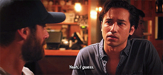
This tutorial is VERY screenshot-heavy, so the rest of it will be below the cut. Happy giffing!
STEP 1 - Recording the scene you want to gif.
All gifs start as videos. I use the Screen Recording feature on QuickTime Player to create videos of whatever scenes I want to gif. If you have a Mac, you can find QuickTime in the Applications folder:
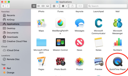
Right click, then select New Screen Recording.

You can then play the scene you want to gif on your computer, and your screen with the video on it will be recorded. Hit the stop button when you want to end the recording, and then save the video.
It’s best to not record more than a minute or two at a time - basically, just record the exact scene that you’re looking for - because the longer the video is, the harder it’ll be to select the portion of it that you need for giffing.
You can technically screen-record any type of video, but I (and most giffers) vastly prefer videos that are 1080p, which is the best kind of HD. That’s why I usually don’t gif things unless I can find them either on Netflix, Youtube (in HD) or the CW site (or NBC, CBS, whatever). There are definitely other (less legal) ways to get your hands on HD videos, but I’m just not super comfortable using those lol.
That being said, 720p videos are usually okay for smaller (268px-wide) gifs - they’re just less ideal (I wouldn’t really recommend using them to make 540px-wide gifs, but you can still technically do it).
STEP 2 - Importing, deleting, and cropping your gif frames.
Now that you have your video, you have to import it into Photoshop. Once you open Photoshop, you need to go to File > Import, then select Video Frames to Layers.
A window will pop up, where you can set the amount of frames that you want Photoshop to import, and select the exact section of the video that you want to import. Here are my settings:
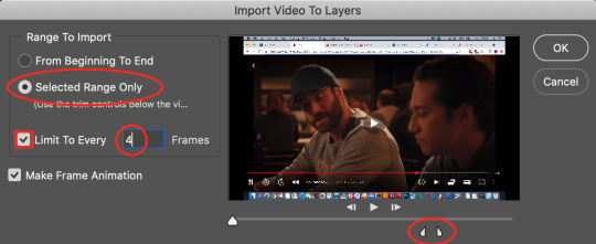
The two little toggles below the video are meant to be dragged around, and you use them to section out the specific Range of the video that you want to turn into a gif. Once you have all of this set up to your liking, hit OK.
-
NOTE: The selection of Limit To Every 4 Frames is more my personal preference than anything else. If you want Really Smooth Gifs, then you can uncheck that box and simply import every single frame in your Selected Range. This is what High Quality Giffers always say to do. Unfortunately, while those gifs do end up really smooth, they also end up being really short, which I don’t particularly like.
So basically, I’m personally willing to sacrifice some smoothness in favor of an increased gif length, but you do NOT have to do that if you don’t want to. Choose whichever option you like best - these Steps work no matter which one you do. (We’ll come back to this later though, once we get to setting the frame delay in Step 4).
-
Okay, back to the tutorial.
Once the scene is imported, you can delete any extraneous frames at the beginning and end of the frame animation Timeline, which can be found at the bottom of the screen.
As you can see, I have the first 6 frames selected. Those are the ones I ended up deleting (among some others at the end of the Timeline).
You can also go to the Layers panel on the right, and delete the corresponding layers from there, once you’ve deleted the frames. This isn’t technically necessary, but it might help free up some computing space if you’re deleting a lot of frames.
Next, you need to click the Selection Tool in the top left corner of the screen. Then, set your selection preferences (circled below) as follows:

Style: Fixed Ratio
Width: 540
Height: 250
This is specifically the ratio to set for a 540 x 250px sized gif, which are the dimensions of the example gif I’m making. If you want to place two gifs beside each other in a gifset, each gif needs to be 268px wide. (The heights can be whatever you want them to be.)
Use the Selection Tool to select the area that you want to be your gif, and then go to Image > Crop.
STEP 3 - Adding adjustment layers.
Now it’s time to make your gif look pretty™. For this part, you’ll be using the Adjustments panel above the Layers panel.
Adjustments will affect all the layers below it, so you want to make sure that your adjustment layers are placed above all of your gif layers.

These are the adjustment layers that I used for this specific gif, but they’re also just generally the same three adjustments that I use for every gif I make. (I also usually add a Hue/Saturation adjustment to my gifs, which I set to +15 Saturation, but since this scene was already so heavily saturated, it didn’t need it.)
Here are the specifications for the Brightness/Contrast and Levels adjustment layers:

Regarding the Curves adjustment layer (pictured below), if you click on the RGB dropdown menu, you can single out specific colors in order to color-correct the gif, which I did here (by removing a lot of extra reds and yellows).
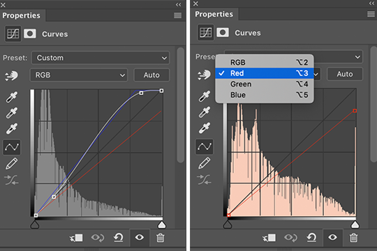
While these are good general adjustment examples, just take note that the values pictured here won’t be exactly the same for every gif, and you need to toggle and play around with them to make every new gif look its best.
Here’s the example scene before any adjustments:
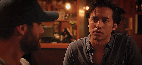
And here’s the scene after my adjustments:
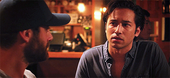
STEP 4 - Resizing your gif and setting the frame delay.
To resize your gif, go to Image > Image Size, and then change the gif’s width (in this example, I change the gif’s width to 540px).
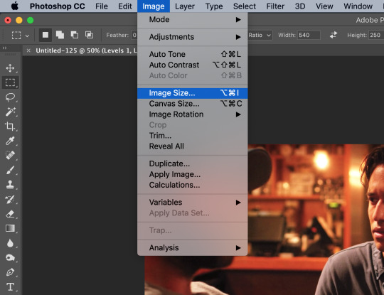

As long as Resample is checked the you’re working with Pixels, the gif should resize properly. Hit OK.
Next, to change the Frame Delay of the gif (basically how fast it goes), look for this button in the right corner of your Timeline, then click it and Select All Frames.

Once all the frames are selected, you can hit one of the little downward arrows next to the 0.02 values, and select Other.
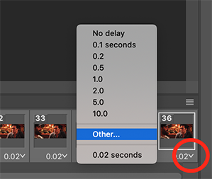
Now you can set your new frame delay. I always set my delay to 0.09 seconds, which produces gifs that are a bit slower than the Professional Gif Standard™. This is due to a combination of personal preference (I just like slower gifs) and an effort to maintain as much smoothness as possible, given how I choose to import my frames.
-
NOTE: Remember the NOTE from Step 2? Now, if you chose to import every frame, rather than “Every 4 Frames” like I do, then you should set your frame delay to 0.04.
Doing so will produce a final gif that looks like this:

Notice how this gif is smoother and faster, but also shorter than my example gif? Yeah. Like I said, whichever style of gif you choose to make is up to your own preference.
STEP 5 - Converting and sharpening your gif.
You never quite realize how blurry a gif really is until you Sharpen it. To do this, you first need to convert your Timeline from a Frame Animation to a solid Timeline. You can do this by making sure all your frames are still selected, and then clicking the Convert to Timeline button in the bottom left corner of the Timeline.

Now your Timeline should look purple, like it does in the picture below.
Next, you need to select all of your layers (MINUS the adjustment layers) on the right side of the screen. Once all of your layers are selected, go to Filter > Convert for Smart Filters.
Once your gif layers have been compressed into a Smart Object (see circle below), you can select Filter > Sharpen > Smart Sharpen.
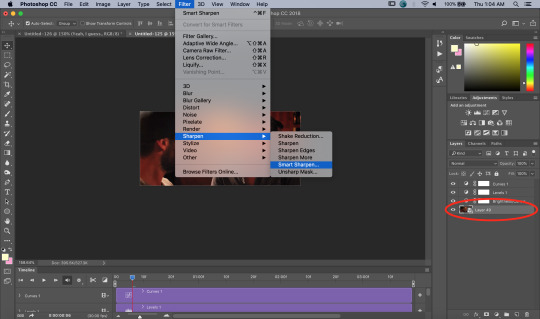
The first time you select Smart Sharpen, you need to set all the parameters for it. But once you do that the first time, you shouldn’t have to set them again. Basically, make sure your window looks exactly like this one:
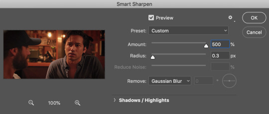
Then hit OK.
You’re going to do this TWICE (so you’re going to end up with TWO Smart Sharpen layers below your Smart Object layer). Then, you need to click the button to the right of the top Smart Sharpen layer, and change the opacity of that layer to 30%. (Otherwise, your gif will be way over-sharpened.)
STEP 6 - Trimming and saving your gif.
You’re almost done! It’s time to save your gif.
To save a gif, you must go to File > Export > Save For Web (Legacy).
However, this gif has a problem.


This number in the bottom left corner of the Save For Web window tells you the current size of your gif. As you can see, this gif’s size is currently 3.541 MB. That size wouldn’t be a problem if you were intending to upload this gif to Twitter, because Twitter has a gif size limit of 5 MB.
Tumblr, however, only has a size limit of 3 MB. So, to get your gif to work on tumblr, you need to Trim it.
Trimming is the process of changing the length of a gif without actually deleting any part of it permanently. This gives you the freedom to edit your gif and pick the portion of it that you like best.
You can easily trim your gif in the Timeline, by clicking the dragging the Gray Sliders at each end of it (see the arrows below). Wherever you leave the stoppers will become the new beginning and end of the gif. You can make this process more precise by using the Blue Slider (circled below) to choose where you want your stopper to go before you drag it there.
The Timeline pictured here has already been trimmed.
Trimming your gif will often require some trial and error. Whenever you want to check the length of your gif, simply go to Save For Web again and check the amount of MBs in your gif. (Click Cancel if your gif is still too big.)
Once your gif falls below 3 MB, you can finally save it!

The last thing you need to do before saving is change your Looping Options from Once to Forever in the bottom right corner of the window. Then, click Save.
You now officially have a finished gif!
Mine looks like this:
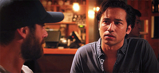
-
BONUS STEP - Adding text (OPTIONAL)
Now, I’ve just shown you how to make and save a gif. But what if you want to add text to that gif? I’ll show yow how to do that too.
First off, you should only add text after the rest of your gif is completely done and ready to be saved (basically, once you’ve already completed Steps 1-5). Then, before you save it, you can click on the Text button on the left side of the screen.
Click on the gif to create a new Text layer, and then type whatever you want. Generally, dialogue captions are placed in the middle of a gif towards the bottom, while other, more artistic types of Text can go wherever you want.
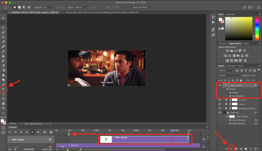
Now that you have a Text layer, you want to make sure of a few things. First, make sure that your Text layer is your TOP layer on the right side of the screen, above all of the Adjustment layers.
Next, you want to make sure that your Text layer spans your entire gif Timeline. Notice how my Text layer (depicted as a purple rectangle in the Timeline) doesn’t reach the Gray Slider on the left? To fix this, simply click and drag the Text layer until it extends past both Gray Sliders.
And finally, I always add Effects to my Text. You can do this by hitting the fx button in the bottom right of your screen. Specifically, I use the Stroke and Drop Shadow effects to make my gif stand out from whatever background it happens to be on.
My Stroke is always set to 1px thick, and my Drop Shadow settings are as follows:

As a final note, if you want your text to look exactly like mine, then you need to use the font Myriad Pro in size 14, which I then italicize and bold. You can also open Window > Characters, and make sure that your preferences look like this:

ALRIGHT. Now that you’ve added your extra text, you can FINALLY go to Step 6 and save your gif.
Now, your finished gif should look like this:

I hope this tutorial was helpful! I tried to be as thorough as possible to avoid any confusion, but if you have any additional questions, you should always feel free to ask me!
Have fun giffing!! :)
#my tutorials#my gifs#idk what else to tag this lol#gif tutorial#personal shit#long post#I'm so sorry to anyone on mobile with no read more
55 notes
·
View notes
Text
A Complete Beginner’s Guide to Masking in Photoshop
Several years ago a friend of mine asked me to teach him how masks work in Photoshop. This is my incredibly late response.
We’ll go over the basics of what masks are, what they’re used for and how wielding them properly will take your Photoshop skills to an entirely new level.
What Is a Mask?
Layers are probably the single most important addition to Photoshop since the original version, but layer masks are a close second. I would posit that until you thoroughly understand how and why to use masks, you simply don’t understand the power of Photoshop.
The term “mask” isn’t immediately understandable to someone outside the realm of graphic design. At its simplest definition a mask is a way to apply something to a very specific portion of an image.
There are two primary types of masks: clipping masks and layer masks. These two tools are closely related in concept, but very different in application. Let’s start by discussing layers masks, which are generally what people are referring to when you hear them discuss Photoshop masking.
Layer Masks
A layer mask is something that you apply to a given layer to control the transparency of that layer. Where layer opacity controls the transparency of the entire layer at once, a mask gives you more precise controls over very specific areas. If you want the entire layer to be at 30%, you would lower the opacity, if you want just the left side of a layer to be at 30%, you would use a mask.
When you add a mask to a layer, it covers the entire thing with an invisible grayscale canvas. There are ways to see it that we’ll check out later but just know that as a general rule, applying a mask to a layer won’t cause any immediate visual differences unless you have an active selection at the time.
On this invisible canvas, you can paint white, black or any level of gray in-between. The color that you paint tells Photoshop how opaque to make the pixels at that point. White means 100% opacity and black means 0% opacity.
With this in mind, try to imagine what the mask below would do to a layer:
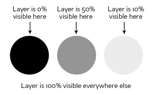
As you can see, if our mask was all white with the three circles shown above, we would have a completely visible layer where in all the white areas, and spots of transparency in the circles. If we apply this mask to a layer, this is the result:
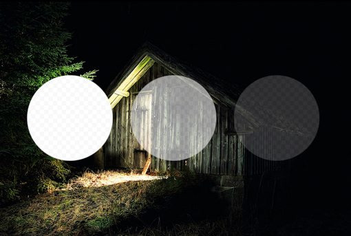
Clipping Masks
Clipping masks are very similar to layer masks only they use one layer to determine the transparency of another. In this scenario, you stack two layers on top of each other with the bottom being the determining factor of the transparency of the top.
Instead of using black and white values though, clipping masks simply borrow transparency from the layers used to make them, namely the bottom layer. If the bottom layer has some areas that are opaque and some areas that are transparent, a clipping mask will apply these values to the top layer.
This one is hard to explain without an example, but becomes crystal clear when you see it in action. Let’s use the two layers shown below and say that our goal here is to cut or “clip” the wood layer to be in the shape of the letters. Notice that, at this point, the wood is the bottom layer and the text is the top layer.

To achieve the effect that we want, simply swap the position of the layers so that the wood is on the top, then go to the Layers menu at the top of your screen and select “Create Clipping Mask” (Command-Option-G). Voila, we now have the effect we were going for. Where the text layer was opaque, the wood layer is now opaque and where the text layer was transparent, the wood layer is now transparent.
There’s some really interesting functionality here. You can still position and make changes to each of the two layers independently. By dragging around the wood layer, you move the position of the texture inside the bounds of the letters while the letters themselves stay stationary.
Also, you can apply layer effects to the compilation via the bottom layer. For instance, here’s what happens if we select the text layer and add an Inner Shadow.
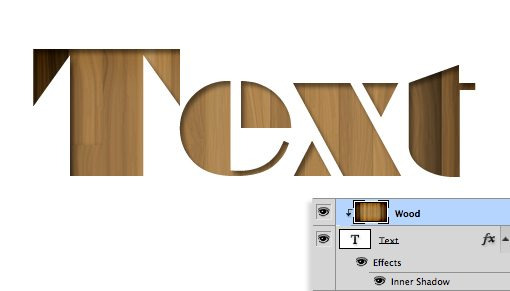
Clipping masks fun, functional and underrated, but the truth is that layer masks are far more common in every day use. The information above should be enough to get you off and running with clipping masks so from here on out we’ll focus purely on layer mask functionality.
How Do I Make a Layer Mask?
Now that we have a strong grasp of exactly what masks are and how the two different types of masks differ, let’s see how to create and work with a layer mask.
The first thing we need is two layers. I grabbed the two images below from photographers Adrian Durlea and Erik Soderstrom. The shack image is on the bottom and the fire is on the top.

The general idea here is to take some, not all, of the fire and apply it to the shack. The first step is to stack the two images as we see above and set the fire layer’s blending mode to Screen. This will make all of the black pixels transparent, which blends the two images together nicely.
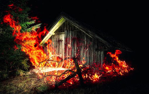
With that one change, this is already a pretty decent image! Let’s say though that we want to only have fire near the door of the shack. To accomplish this, we’ll need to add a mask to the fire layer. Select the fire layer and click the mask icon shown in the image below.
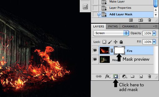
Now, with the mask selected in the layers palette, we grab a soft, black brush and paint out the portions of the fire that we don’t want to see. As we do this, the fire begins to disappear. To bring it back, we simply paint white.
As you can see in the image below, with just a little painting, our fire is now much more centralized to the portion of the image that’s already lit up and therefore looks decently natural.
To see the actual mask, Option-Click (Alt-Click on a PC) on the little mask preview in the layers palette (Shift-click to hide the mask completely). After painting out some of our fire, this brings up the following:
Notice that we’re not just constrained to hard edges. The beauty of masks is that you can do anything you want with them as long as you can pull it off in values of gray. This means you can paint, clone, create and fill selections, copy and paste, and all kinds of other actions you perform on the main canvas.
Why Not Just Erase?
Upon first learning how to use masks, most rookies think the same thing: “I can already do all of this with the eraser tool.” Wrong! In fact, as far as I’m concerned, once you learn to mask, you should literally never pick up the eraser tool again because it tends to be so destructive.
What do I mean by destructive? Think about what happens when you use the eraser tool: it erases pixels. Mind you, it doesn’t hide them for a while until you want them back, it “destroys” the pixels. The changes that you make by deleting portions of a layer are permanent and can’t exactly be tweaked later.

This is simply a horrible way to work. With every new iteration of Photoshop, Adobe gives us more and more ways to make non-destructive edits, meaning those that don’t truly alter the original pixel data. For instance, Filters used to be a permanent and destructive change, if you blurred a layer, it was stuck that way! Now, with Smart Filters, you can always go back and adjust or even delete the blur.
This same concept gave birth to masks many years ago. With a mask, you not only have the ability to make remarkably detailed decisions about the transparency of a layer or group of layers, even better, you have the freedom to go back and refine or scrap those changes at any time. If I had erased my fire in the example above, it would be gone forever and bringing it back would involve importing the layer all over again. However, because I used a mask, all I have to do is fill that mask with white and immediately all of my fire detail returns.
To use the metaphor of an actual mask, imagine that you want to change your appearance for Halloween. You have two options: the first is to undergo plastic surgery to permanently change your face to look like that of a scary creature and the second is to wear a mask. In this scenario, the eraser tool is plastic surgery. It’s simply a bad choice when you’re not sure that you want the changes to be permanent. Go with the mask instead.
Advanced Masking Techniques
The information above is an absolute beginner’s guide to masks. Odds are, if you’ve been using Photoshop for a while, not a single piece of this was news to you. In fact, you may be thinking that masks are so incredibly simple that they barely merit conversation.
However, masking techniques go from simple to wickedly complex really fast. It’s easy enough to paint some broad strokes to erase large portions of an image, but what if you want to do something more complex? For instance, let’s say we want to take the cat below off of its white background.
Furry animals make particularly difficult masking subjects. All of that fine hair detail means making an accurate selection will be time consuming. The Magic Wand or even the Pen Tool are of no use to us here. So how do the pros start with the image above and create a mask like the one below?
If you’re ready to find out, keep reading as we undertake this feat!
Change the Channel
The good news about the cat image is that there is plenty of contrast to work with. The key to making a good mask is finding contrast and knowing how to pull it out. Here we have a fairly dark cat on a bright white background, which means all we have to do is figure out how to leverage our good fortune and convert the contrast already present into a suitable mask.
The first step in a project like this is to jump over to the Channels Palette and look for the channel with the most contrast. So in our case, we want the channel with the darkest cat and the brightest background, which turns out to be the blue channel.
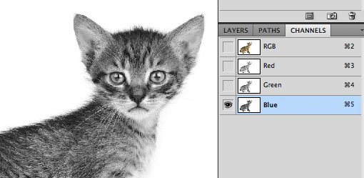
Make a copy of the blue channel, select it and hit Command-L to bring up a Levels Adjustment. Darken the shadows and the midtones so that there is a crazy amount of contrast like in the image below. Be careful to no go too far with this adjustment. You’ll want to zoom in and watch the hair detail on the fringes of the fur to make sure you’re not clipping too much. It doesn’t have to be perfectly black and white at this point, some dark grays are acceptable.
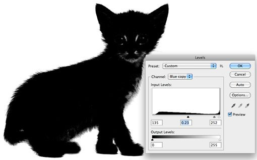
At this point you encounter one of the trickiest steps of the entire process. The goal is to get as much of the cat as closest to black as you can. This is easy for the face potions and other random spots near the center, just grab a black brush and fill them in. But what about the edge of the hair?
It turns out one of the best ways to handle this task is to use a couple of unlikely candidates: the Dodge and Burn Tools. The reason these work so well is that they can accurately target certain ranges of gray extremely accurately. I set the Dodge Tool to target the highlights and the Burn Tool to target the shadows, grab a medium size soft brush and make my way around the edges of the image, burning shadows and dodging highlights until I like the level of detail that I’m seeing.

This may sound like a time-intensive task, and it can be for some images, but in truth the Dodge and Burn Tools feel like magic when you’re using them and take much of the work out. I was able to come up with a great looking silhouette in only a minute or two.
Once you’re done here, hit Command-Shift-I to inverse the channel so that the cat is white and the background is black like in the image below. Remember that, in masking, white is opaque and black is transparent.
Converting the Channel to a Mask
Now that we have a channel that accurately represents what we want from a mask, how do we convert it? There are a few ways to do this but the easiest is just to Command-click on the channel to load a selection. With a selection loaded, return to your cat layer and click the New Mask button. That’s all there is to it!
Defringing the Mask
As you can see, despite a super detailed mask, we still have some white fringing occurring around the edges. Getting rid of this can literally take hours of tedious work if you don’t know what you’re doing. For starters, we can use the fantastic new Masks Palette in conjunction with Refine Edge to make some live adjustments to our mask.
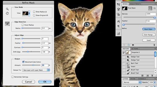
Utilizing these tools properly takes practice. I won’t cover them closely now because it would take so much time but I encourage you to dig in and play with all of the controls to get a feel for what they do. Often, you can patch up a rough edge in seconds with these sliders, but with our cat project I wasn’t really getting any results that I liked so I cancelled out this operation altogether.
Instead, I went to the Layer menu at the top of the screen and selected Matting>Color Decontaminate. This is an almost hidden command that has the ability to yield some amazing results. As you can see in the image below, it went a long way toward reducing our halo. Note that this command is actually destructive so you should always duplicate your layer before using it.
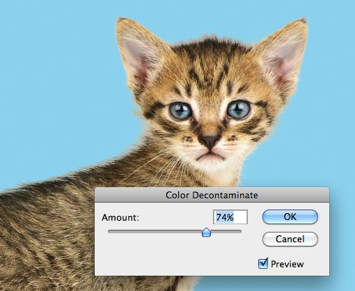
From here, the last trick I use is to look for problematic areas and actually run the clone brush over the fringes. The mask keeps everything looking nice and cloning replaces unnatural colors with those from the actual fur of the cat in other places. Compare the back and head of the cat in the image below to that above to see the improvement.
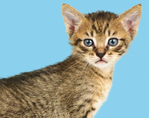
Finishing Up
From here it becomes a factor of how much time you want to spend refining your result. With complicated masks like these there is always room for improvement but you’ll find that the point of diminishing returns on your time spent becomes easier and easier to spot as your skill level improves.

The technique we just discussed is just to give you a taste of how advanced masking can become. There are a ton of different types of images to mask and therefore a million different tricks and techniques to figure out along the way which can be mixed and matched on a per-project basis. Practice makes perfect, just be bold and never become intimidated by a masking job that seems too complex. Think through the process one step at a time and find ways to pull out the detail you need.
Conclusion
To sum up, there are two primary types of masks in Photoshop: layer masks and clipping masks. Layer masks use values of gray to assign levels of transparency to specific portions of a layer or group of layers while clipping masks use the transparency of one layer to define that of a different layer or group of layers.
Also, while masking in simple in concept, the actual art takes considerable time, education and practice to master. Leave a comment below and let us know if you learned anything from the information above. Also be sure to share any unique masking techniques or tricks you might have!
Photo Credits: Adrian Durlea, Erik Soderstrom, and Sergiu Bacioiu.
4 notes
·
View notes
Text
Marvel Cinematic Universe: Guardians of the Galaxy (2014)

Does it pass the Bechdel Test?
No.
How many female characters (with names and lines) are there?
Six (31.57% of cast).
How many male characters (with names and lines) are there?
Thirteen.
Positive Content Rating:
Three.
General Film Quality:
Entertaining, but overrated.
MORE INFO (and potential spoilers) UNDER THE CUT:
Passing the Bechdel:
Though Nebula and Gamora trade a couple of lines on a few occasions, they invariably speak about either Thanos, or Ronan.
Female characters:
Meredith Quill.
Bereet.
Nebula.
Gamora.
Carina.
Nova Prime.
Male characters:
Mr Quill.
Peter Quill.
Yondu Udonta.
Ronan.
Korath.
Rocket.
Groot.
The Broker.
Drax.
Thanos.
The Collector.
Denarian Saal.
Denarian Dey.
OTHER NOTES:
Seatbelts on spaceships should really be mandatory.
Aahahahaha Peter has a woman on his ship whose name he can’t remember and whom he forgot was even there! Oh, it’s so funny and charming! What a classic misogynistic cliche intro! Garbage.

Rocket chastises Groot to ‘learn genders’, and I don’t think the irony of a raccoon (a species with almost no visually-evident sexual dimorphism) saying that to a tree-person (whose species - if sexually dimorphic at all - certainly has no reason to adhere to the humanoid/mammalian model) is deliberate. The other alien higher-life-forms they encounter in the film are pretty uniformly human in appearance (not much effort going on in the ‘alien’ department besides just painting people in bright colours), but lack of imagination from the creative team doesn’t mean that the binary gender system we’re accustomed to on Earth has any broad bearing on the galaxy at large.
Aaahh, and now Peter is explaining his scars to Drax, with lovely stories of women he cheated on in the past because he’s ~such a stud~.
Thanos tells Ronan off for his dull political raging and whiny behaviour, but he’s sitting on a shiny floating throne himself, so I’m not sure he’s earned the right to criticise what other people have got going on.
Rocket suggests that Gamora trade sexual favours to get things from other prisoners, because we’re being Like That with this movie.
The Collector keeps female slave ‘assistants’, whom he evidently treats so nicely that Carina commits suicide by infinity stone at the first opportunity in order to escape him. We’re just doing so well for the ladies in this film.
As a great comedic beat, Drax calls Gamora a “green whore”. It’s both a shitty line, and nonsensical, since Drax isn’t supposed to comprehend metaphors and he has no reason to believe Gamora is a literal ‘whore’ (nor is he likely to use such a colloquial term, considering the calibre of his standard vocabulary). Basically, it’s a rubbish line from every angle, and all in service of a misogynistic joke.
This film is a terrible waste of Djimon Hounsou.
Ronan is very theatrically over-the-top in his pronouncements, but Lee Pace does his damnedest to make it work on delivery.
Why does Ronan’s flashy purple infinity stone weapon not kill people when he shoots them with its energy blast? Obviously it would be terribly inconvenient to the story if he just casually killed all the good guys, but honestly. It doesn’t make much sense. They coulda at least pretended there was a reason.
The part of me that is susceptible to acts of heroism is affected by the guardians all joining hands to share the stone’s power. Not enough to feel that the film or the character relationships actually connected on an emotional level, but enough that this ending doesn’t feel totally unearned.

Drax patting Rocket’s head while he’s crying over Groot is a lovely touch. THAT is the strongest character interaction of the film.
So. I’ll be honest: I don’t like this movie. I don’t think it works. I think it’s essentially just a string of gimmicks, loosely attached, entertaining enough on the surface but with no meaningful depth to hold in the mind or keep the audience engaged once the credits kick in (it’s also much heavier on the sexist tropes than any other MCU film previous). I don’t hate it, but it doesn’t give me anything that I value in a viewing experience, it just happens and then ends and that’s it. And the reason it doesn’t work is, frankly, the writing is lazy as shit. It makes a sub-par effort at establishing character and thus relies heavily on cliches, it rarely bothers to incorporate relevant plot and motivations and such into the story at early points in order to generate narrative pay-off, and the world-building is hazy at best and, like the characterisation, trades predominantly on expectation of stereotypes rather than actually creating anything original.
Let’s start in the obvious place: with our lead character. I’m tempted to just say ‘Peter Quill is garbage’ and then move on, because it’s true and also, he’s just not complex or interesting at all, which is ridiculous because he’s got that whole ‘alien abduction’ origin story and there should be like, literally any layers at all to his story instead of him just being an obnoxious Lothario who makes pop culture references like that counts as having a personality. But, here we are. I’m not familiar with the comics so I don’t know if this is a common complaint from fans who can’t believe their boy got all his nuances deleted in favour of such an inane cliche, but if this is exactly what Quill is like in the comics too? That’s no excuse. Part of the magic of adaptation is the opportunity to improve upon things the source material did wrongly or badly. The Quill we’ve got here in this movie is such a bland template he’s almost functionally useless; he barely impacts the story at all, especially in any way that is relevant to his personality or skills and necessitates his presence (the dance-off distraction is the only good Quill moment, and it’s also one of the few inspired choices in the whole film). At the end of the day, Quill exists so that the story has a Main Guy, being a straight white American male (and making sure we all, excessively, know about it), because God forbid we be expected to identify with anyone else. I have heard people sing the praises of the film for ‘subverting cliche’ by not having Quill and Gamora actively hook up by the end, as if that somehow makes it better that every single other aspect of that tedious forced romance plot is still squarely in place and set to play out in future films (pro tip: if the main guy still ‘gets the girl’, only it doesn’t happen in the first film, that’s not subversive. That’s still playing the trope dead-straight). Quill not immediately being shown to be rewarded with sex is not some incredible feat of original storytelling, and it certainly doesn’t absolve him of being a dime-a-dozen pig of a character. If that’s the most ‘unexpected’ character element you can cite, you’re in dire straits.

Now, I’m not gonna talk about every character individually, because in most cases there’s not much to talk about; Drax is the big warrior guy with the Fridged Family backstory we’ve seen so many times before it elicits zero (0) emotions now; Groot - though an interesting idea on paper - is basically just a Deus Ex Machina of whatever ability is most useful at any given moment, too ill-defined to have boundaries to his powers and conveniently not using his full potential whenever it would allow the characters to win too easily; and Rocket, well, Rocket is actually the only one of the leads who manages any meaningful nuance, which is unfortunate because most of the time he’s just used for sarcastic comic relief. The other character I am going to talk about is Gamora, and it’s because she’s a prime example of how this movie fails to establish things so that they feel like they actually matter or the character’s motivations are understandable, etc. We are introduced to Gamora when she overrides Ronan’s order for Nebula to retrieve the orb from Xandar; as it turns out, Gamora’s introductory moment (literally the first time we see her or hear her speak) is also her act of rebellion when she puts into action her plan to escape Thanos’ clutches and go her own way. The problem, obviously, is this is her introduction. We’ve never seen this character before, we’ve only just met Ronan and Nebula as well, Thanos is barely more than a concept, as is the planet Xandar and the politics around it. Nothing has been established yet about the life that Gamora occupies, so her ploy to escape it? Meaningless. We don’t even find out that Gamora was not planning to retrieve the orb for Ronan until she tells us so after she’s been arrested, and we have literally no reason to believe her because we don’t know her yet because her character has not been established at all. The traditional way to do this would be to show her in her old life, doing as she’s told and/or witnessing terrible things being done by her compatriots, and showing the audience that she has clear misgivings so that when she turns, we understand the context and can believe that’s a logical character decision based on established personality and morals (think of Finn’s introduction in The Force Awakens for a textbook example). Because no time or effort is ever invested in establishing who or how Gamora is, everything we know is delivered to us directly in dialogue, all tell, no show, and what could easily have been the film’s most dynamic character is instead hampered by having her development choked off to avoid spending time on letting her origins matter (despite the fact that those origins are essential to the plot).

On which note, lets talk bad guys. Thanos first, because there’s not much to say, and that’s not a good thing: Thanos is actually pointless to this film, the only reason he’s there is so that the MCU can use him to actual purpose in later films and his relation to Gamora and Nebula and the hunt for the Infinity Stones needs to be established first, but as with everything else this movie is terrible at establishing things effectively. Consequently, Thanos...just floats around on a chair, and then Ronan tells him to piss off and we don’t see or hear from him again in the rest of the film, and there’s no real effort made to integrate Thanos into the story so that he seems like anything other than a dead-end subplot cluttering up the movie for no reason. The closest Thanos gets to anything notable is when he chides Ronan for his boring politics, but even that is symptomatic of the wider problem with this movie’s lazy writing: Ronan’s whole character is essentially just another dull archetype - in this case, the extremist villain - and a solid nothing at all is done to establish his politics or what they mean, other than death for the people we’re told are the innocents. This is a problem with the world-building of the film as a whole, because none of the galaxy’s politics is fleshed out, there’s no context to why the Kree have a problem with Xandar or why we should care, and Xandar kinda gets treated like the centre of the universe but it also seems that’s just for convenience sake so that the plot can return to a previous location for the final act. Hell, I haven’t the faintest fucking idea where Earth is supposed to fit in to all of this, other characters talk about it so it’s clearly a known quantity to the rest of the galaxy, and yet no one knows any details about it and Quill never bothered to go back there for reasons which really SHOULD be explored and yet are not even mentioned (that would seem like some of that characterisation he doesn’t have), so I don’t know what we’re supposed to interpret from that. I’m not confident that the creative powers bothered to think about it, considering how much they didn’t think about anything else. This is a movie where ‘human, but painted’ passes for ‘alien’ and society apparently functions exactly like Earth, tedious misogyny and all, despite the absence of cultural sharing to explain the Earthlike similarities (and boy oh boy do I HATE the laziness of science fiction where everything being identical to Western culture on Earth is treated like it’s ‘just the natural order’ that should be expected to develop in any sentient species, instead of a complex system shaped by unique and varied influences over thousands of years and dependent upon environment, religion, philosophy, and a myriad of other factors not replicated in these poorly-drawn ‘alien’ cultures. I get that you’ve gotta employ at least some shorthand in order to get on and tell your story within time constraints, but come on. If you’re not gonna think about world-building at all, don’t set the story on an alien planet). Above all else, we know that Ronan is the villain because he’s painted (literally) as one; he’s the bad guy through visually-indicated othering, because we all know good guys don’t look like that (whereas most of Ronan’s enemies on Xandar are just regular-looking white folks. Curious...). Sure, Ronan is also introduced spouting rhetoric and then smashing a dude with a hammer, and that seems like villain behaviour, but that only reinforces the point: Ronan’s role is made unmistakable through age-old tropes, and it’s never explored or subverted or made dynamic from there. Like Quill as the ‘hero’, Ronan is a dime-a-dozen cliche.

So anyway. Lets talk plot. This one goes like so: Quill collects the orb from Morag, where he coincidentally runs into Korath and company who just-so-happen to be after the orb at the same time (how it is that multiple interested parties only just found out that one of the most powerful destructive forces in the universe is just chillin’ on this abandoned planet, they don’t bother to explain). Quill runs into both Gamora, and Rocket and Groot, the other parties happening to be after him for different reasons and coincidentally converging on Xandar at the same point. Everyone gets arrested and sent to prison, where they meet Drax and promptly escape and fly to Knowhere so that The Collector can exposition-dump about Infinity Stones. Drax calls Ronan up, just literally straight-up calls the bad guy to come and find them because I guess figuring out a normal plot reason for the villain to catch up with the good guys was too hard, so we had to go for extreme stupidity instead. Ronan gets the orb and goes back to Xandar to destroy it, and our main characters figure they should stop that, so they do. Roll credits. Now, you can make pretty much any story sound basic and stupid by breaking it down into its component pieces, but the important thing to note about this layout is how many convenient or just plain stupid aspects there are. There are almost no character meetings or story developments that come about logically through the sensible development of plot driven by character’s motivations springing from established narrative, etc, and part of that problem is absolutely because there’s so little established character/world-building to begin with, but it’s also because whatever there is tends to apparate when it is needed without any sign of existing beforehand; that is, very little of the story is seeded early on so that it can come to fruition later in a narratively satisfying fashion. The Nova Corps sentence the characters to the Kyln prison as if it’s a big scary concept, but we’ve never heard of it before so we have no reason to consider it trouble. Drax appears and other characters literally tell us why we should pay attention to him, instead of him being, say, pre-established (SUCH AS by having his family tragedy shown on screen as a dual-establishing event for him and Ronan, or something to which Gamora was privy in some way in order to intro her misgivings as discussed above, or even just having someone reference the legend of Drax the Destroyer BEFORE getting to the Kyln (you could also, y’know, establish the Kyln itself in talking about how Drax was sent there. Just saying)). Intro the idea of Knowhere and/or The Collector BEFORE heading there so that it’s less convenient for Gamora to just-happen to have a buyer already set up for the item we didn’t even know she had planned to steal as part of the escape plot we didn’t know she was hatching. For the love of everything, establish some actual REASON for Ronan to follow our characters to Knowhere, instead of just ‘Drax got drunk and called him’. Link the pieces of your story together with concepts and developments that build upon each other in a narrative progression. That’s the difference between having a plot, and having a string of chronological set pieces (some of which - like Morag and the Kyln - don’t even have a purpose anyway beyond providing some action-scene opportunities).
Before I close this out, I just want to run through a little exercise to demonstrate something that you never, ever want to happen in a story. You never want to have a lead character who can be deleted from the plot without leaving a hole too big to be easily filled by the rest of the cast. But what happens if Peter Quill is removed from this story? Well, pretty much all of the misogyny disappears, so that’s a plus. Someone else is gonna have to retrieve the orb from Morag, but we could easily send Rocket and Groot to do that. Gamora can still fight with them on Xandar exactly as it happens in the actual movie, only this time it’s not just pure coincidence that they conflict. We saved vital time that the film spent on Quill’s inconsequential childhood abduction (and we could save more on trimming the pointless action on Morag), which is time that could be better spent on all that other establishing crap I was talking about earlier, tightening up the narrative. Quill doesn’t serve any important purpose in the Kyln, so we can remove him from that no problem, nor does he matter on Knowhere other than a frankly stupid and ultimately pointless moment when he saves Gamora (definitely unnecessary when we’re removing the romantic subplot bullshit along with Quill). And then what? The characters agree that not letting Ronan destroy the galaxy is probably a good call (not Quill-relevant), they head back to Xandar, fight some bad guys, hold hands, win the day. We lose Quill’s only good moment in the form of the dance-off, but it’s an acceptable loss in order to strengthen the entire rest of the film by deleting the most meaningless character: the lead. We also arguably lose the Ravagers in the process, but as much fun as Yondu is, the plot can also survive completely intact without him (the only time the Ravagers matter is for the previously-identified useless damsel contrivance with Quill saving Gamora, and then they do help out on Xandar in the end, but they aren’t necessary for that - the Nova Corps could have been expanded just a smidge and taken care of everything). On the other hand, if you remove Gamora, you lose the connection to Ronan/Thanos as well as the moral compass of the Guardians; some other character would have to be significantly altered to fill the gap. You lose major Deus Ex Machina skills without Groot, and without Rocket someone else’s narrative has to change in order for Groot to have a buddy (plus you need a new mastermind for various plans, though that’s an easier hole to fill). You skip Drax and you do lose a major plot development in the form of him drunk-dialling Ronan, but admittedly that’s one of the worst things in this whole dumb waste of a movie, so maybe it’s not such a loss. You could ditch Drax. But, that’s not important, because Drax isn’t packaged as the leading man: Quill is. If you delete Drax, you don’t really streamline or improve the story (you could fix the one big flaw in his character very easily, he doesn’t have to disappear for that). You delete Quill...I know, comic book adaptation, dropping the main character is not considered an acceptable alteration when you’re improving the story for the screen. But come on. The least they could do is make him actually matter, not just be a perfunctory inclusion for the sake of sticking this ‘weird sci-fi’ as firmly in the centre of over-done cliche as a lazy gimmick story ever could be. There are a few chuckles to be had with this film, and it’s not entirely boring, but it’s not half as endearing nor even an eighth as inspired as it thinks it is. I’m not impressed by any of it.
11 notes
·
View notes
Last Seen Blogs

kennettshippersclub
Kennett Shippers Club

durablewill-blog
☆ RED RIOT !!!

huntunlimited
Untitled

themahmoudoo
7oda Elawy

florriekeating-blog
Minimize,Merge,Mix Extract Convert Audio Apk Obtain Newest Versi