#but for desaturating the shit out of the colors in my drawings
Text
day 21: 100% saturation
ok so if you wanna see the drawing but don't like looking at/can't really look at bright colors for long here's a pastel version of it

as for the actual drawing for day 21 that's below the cut :]
MASSIVE EYESTRAIN WARNING! HOLY SHIT ARE THE COLORS HERE BRIGHT AF
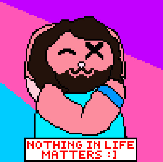
wellness center nandor my beloved
I saw an opportunity and I had to take it
for those who don't know this is a parody of this meme

I tried making nandor bunny's fur color itself neon af buuut I couldn't find a way to do it that I liked so I only made it slightly brighter
#shout out to my laptop for not only having a low ass brightness even at 100%#but for desaturating the shit out of the colors in my drawings#normally I fucking hate it but this time it saved my eyes while drawing this lol#what we do in the shadows#wwdits#wwdits fanart#nandor the relentless#cringetober#cringetober 2023#*funny tag for my art*#bun stuff#kinda looks like he has a sun burn LMAOOOO#I'm going to go look at anything but my laptop for a bit
8 notes
·
View notes
Text

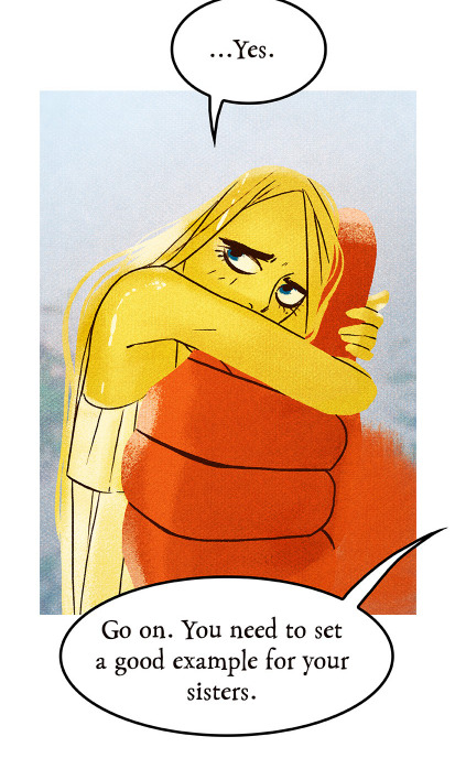
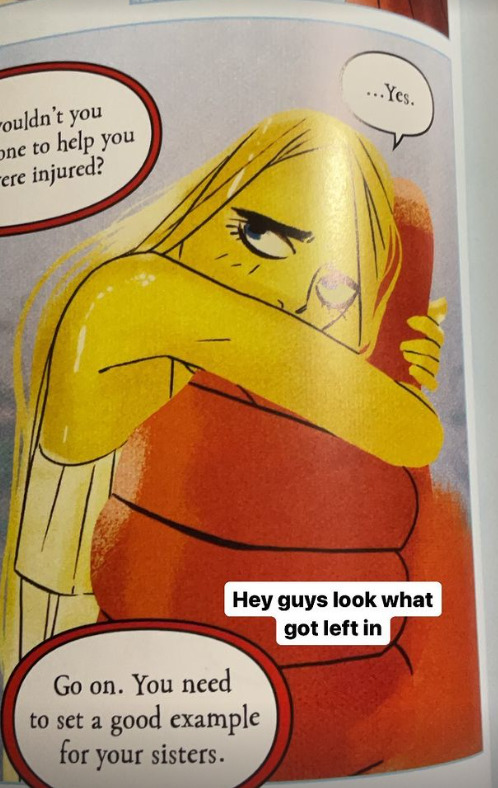
in celebration of my/our love Angel being introduced this past week I’ve been working on a re-paint of the Handkerchief Moment and not to toot my own horn, but I’m really proud of how the background came out and particularly of these two
Ignore the big ol’ hole it’s for Aki (heh)
#uggghhhhh I don’t want to tag this bc I simultaneously do not want anyone to see it and want to show it off#This Is For Me And My 60 Followers And For Us Alone#i spent So long on this fucking background. So Long. i could NOT figure out how I wanted to render it#tried a whole bunch of shit and then pulled a Karina ‘‘Delete Your Art’’ Farek#(though I guess it’s more of a Julia ‘‘Do Some Freak Shit’’ Lepetit move)#and just smudged and splattered and threw random shades everywhere#and after that I was like….oh. this works perfectly#after I’ve painted in The Gays I might do some more value work#try to make it a little more varied without drawing the eye too much#potentially add in some random color bits? very desaturated ones?#i dunno! point is I Made Progress and Did Something Scary#also I’m doing the entire thing on one layer which is also terrifying.#okay have I done enough tags for this shit to be buried#you used to just have to worry about the first 5!!!!!#now anything can show up in the followed tags page!!!!!!!!#it’s terrifying!!!!!!!!!!#anyways#chainsaw man#i thought of ‘oRYginals’ for an original post tag but idk how I feel about it#feel like it works better verbally than when it’s just text lmao#a n y w a y s.#if this does show up in the tag pls be nice I haven’t posted my digital art in at least half a decade#oryginals
6 notes
·
View notes
Text
sitting there like has my art gotten better over time or do I just add way too much unnecessary detail now
#but lineart becomes honestly really meditative for me at times especially if im adding texture to something#i will say at least i dont pick such ugly colors anymore. i used to always have reslly bright colors and then i thought it was too much#and overcorrected imo so everything was desaturated and boring#oh i also used to color in the lines for like every single color on the character? idk how to describe it but it was tedious#i like it on other people's art but i dont have the patience and i dont like how it looks when my lines are “cleaner”#sometimes i do miss how i used to not care if what i drew was “cringy”#but i think im coming back out of that considering all i draw is like. gay shit and elves and various iterations of myself and also my ocs#i should redraw some really really old art after what im working on maybe#i almost started working on a redraw of when i drew yavanna in likr 2017-18 but i dont like the design i gave her at all#minus the weird branch ears those were cool#mostly im just frustrated it still takes me hours to draw lol. i dont know why i get insecure about it or about art in general#i guess bc no one in my family really does so they have this idea im good at it#and i wanna grab them and shake them sometimes and explain all the reasons im actually not and all the mistakes i regularly make#i dont know if that makes any sense and i dont know why i struggle to just take the compliment#i guess because i know im not good enough at it for it to be a job? except thats not it either because ive almost always wanted to write#its very dumb and weird. especially considering i dont really draw for other people. i mean i like when people like my art but unless its#for somebody specific im not necessarily going to take it very hard at all if its not to their taste. i just do it because i enjoy it#and because there are things i only know how to express through writing or drawing. and when one doesnt work sometimes its the other#maybe i just get frustrated i cant be good at everything#its not realistic but i always end up wanting to do so many things and getting frustrated when i dont pick them up right away#because OF COURSE i dont#ok where was i going with this#its nearly 2am and my head is pounding again i dont even know what day this makes it. at least a week?#i dont know
1 note
·
View note
Text


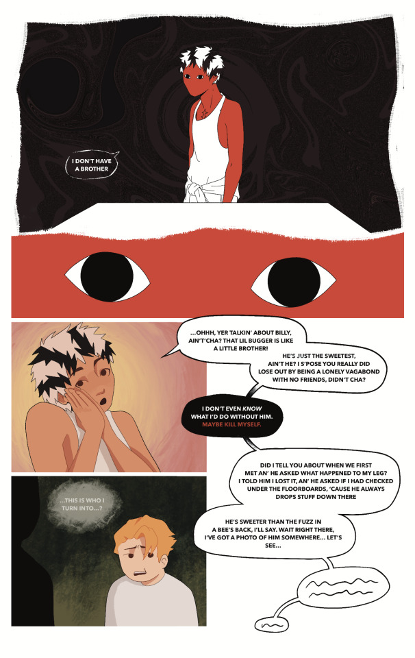
Day meeting his prototype. Not a fan
[ID: A three-page comic of an OC, Day, and his previous design, Protoday. Day is smaller in stature, has short, black and white striped hair, and is chinese. Protoday is taller, has pushed back purple and yellow hair (Starting and purple and turning yellow through the comic), and is white.
The first page has warm and red tones. Day says "Hmm..." while staring at Protoday. The former is swearing profusely. Dat says "So... Yer sayin' that yer me, just... with color changing hair... white as the damn snow... an ass of the personality...". At this point Protoday thinks to himself, "How am I the asshole...?". His hair, previously entirely purple, now has hints of yellow.
Day continues, beginning to yell "And worst of all, yer like 15 manos?! Fuck is wrong wi'cha?! Sure, it ain't as tall as Yoki an' Ish, but really?! I mean, shit, I barely hit 13! And yer sayin' I coulda been 15 manos? The fuck kinda 'redesign' does that? The artist is just bein' lazy! An' the others are freakishly tall so it just makes me look shorter! What the hell?!"
In the corner of the page is text reading "1 mano = 12cm, 15 manos = 180cm, 13 manos = 156cm"
Page two begins with a simplified drawing of Protoday, now with even more yellow in his hair. Day is in the foreground still yelling, and Protoday thinks "This guy's a total cunt". Next, he looks to the side and says to Day, "But you have a brother, don't you? That's something good that you got. I'm an only child so..."
Day pauses. The colors suddenly become cool and slightly desaturated. Day looks horrified, staring at the camera and saying "What... Are you talking about?". It cuts to a fractured glass-style panel. Within the broken pieces are various images of Day's brother. It shows his hand cooking something, him looking forward, a stuffed animal plushie, him laying weakly on the ground, a zoom-in on his eye, looking scared, and finally his partiallt-decomposed body.
The third and final page has a more zoomed-out view of Day, with only his eyes drawn for facial features, staring directly at the viewer. The only colors are his skin, a bright red, and the darkness of the background. Day says "I don't have a brother". It cuts next to his eyes only, still staring.
Suddenly, Day looks normal again, saying "...ohhh, yer talkin' about Billy, ain't'cha? That lil bugger is like a little brother! He's just the sweetest, ain't he? I s'pose you really did lose out by being a lonely vagabond with no friends, didn't cha?".
The speed bubble suddenly turns black as he says "I don't even know what I'd do without him. Maybe kill myself." The last sentence is colored red.
The bubble goes back to normal as Day continues, "did I tell you about when we first met an' he asked what happened to my leg? I told him I lost it, an' he asked if I had checked under the floorboards, 'cause he always drops stuff down there. He's sweeter than the fuzz on a bee's back, I'll say. wait right there, I've got a photo of him somewhere... let's see...".
Protoday grimaces, his hair now entirely yellow, and thinks to himself "...This is who I turn into...?" /End ID]
#SOBS. I FUCKED UP ONE OF DAYS LINES BUT I DONT WANT TO GO BACK AND EDIT IT#Then id have to redo all the text n format it n email it to myself AUGH its a whole hassle#rain art#ocs#pastex#day#gore tw#child death
75 notes
·
View notes
Text
Rachel "Retcon" Smythe Strikes Again!
Okay, so I've been seeing pictures of Volume 4 of Lore Olympus floating around, and people are ALREADY FINDING RETCONS.
Most notably so far, some added panels in the Hades and Apollo confrontation that happens outside Artemis' house (when Persephone steals Apollo's lyre) in Episode 81.
This is the original scene, for anyone who needs a refresher:


Aaaand here are the panels that were added.
(all pictures of Volume 4 are courtesy @iwannagutyou on IG!!! thank you for giving me permission to use these! <3)
First of all, the art. It's so noticeably bad. You can tell Rachel has completely lost her ability to draw these characters in the S1 style, I'm fairly certain she took the panel of Hades from the old version and just copy pasted it to try and get around it (look at the posing) but it's incredibly obvious looking at that third panel that LO is not and can never be what it was back in 2017-2019. Those first two panels seem like they were copy pasted from the previous ones, which is just sad if those are the lengths she has to go to to come even close to replicating the older style.
Now, this just might be due to camera translation, it could very well look better IRL, but the colors just look so incredibly desaturated and the lines blurred out, to the point that people are doing double takes over whether or not panels have been directly changed - they haven't been, they've just been so sucked dry of their colors that they look off enough to cast suspicion.
If anything it's a harsh reminder that LO has kinda always had art problems, especially with its lazy humor and stupid meme faces.
Of course, to be fair, color loss can happen in print, but seeing how slapped together these books tend to be, I wouldn't be surprised if they just didn't put in the effort to convert the page art to CMYK or at least tinker with the saturation in editing some more to ensure it would come out more vibrant in print.
Now. Excuse me while I go on a bit of a crackpot rant here. Newbie puff pals beware, because this is gonna get dicey and you're about to learn where my tinfoil-hat rep comes from but I just have to talk about it.
Back to the added Apollo panels, where Persephone asks Hades not to hurt him and he looks nervous before she says "I just want him to leave".
Maybe it's just me, but it's a little weird that THESE are the panels they decided they needed to add. It's weird that she's asking Hades not to hurt Apollo when she's about to break into his car and steal his lyre just a few moments later. It's weird that the implication seems to be that she's referring to Hades' act of violence towards Tori... but Persephone doesn't know that's happened yet. So this feels like an unnecessary retcon that's doing more harm than good.
But I feel like the timing of this is kinda messed up as well, as this book released just days after the release of the last FP episode in which Apollo has his 'side' of the assault story told through his perspective, which is often considered a HUGE no-no in writing assault stories because it often comes with the implication that it's asking for empathy from the audience. We already know Apollo is delusional, we already know he thinks him and Persephone are meant to be despite her constant rejection of him, we didn't need a flashback from his own warped perspective explaining that very thing, the only purpose to do such a thing this late in the game would be to try and get the audience to 'connect' with him (it's giving S3 Bryce from 13 Reasons Why vibes). Now we have this scene of Persephone asking Hades not to hurt him (despite the structure of the episode being literally fine before, this change wasn't needed) getting snuck into the physical book release just a couple days after the newest FP tried to present Apollo in an empathetic light (and let me tell you, that's a whole essay and a half that I'll be getting into eventually).
Shit, if I wanted to get REAL Pepe Sylvia with it, I might say that hypothetically, the whole point of the random Leuce abuse episode - despite Persephone having no way of knowing what she attempted as Hades hadn't told her and she wasn't there to see it and we weren't shown her overhearing them in any way - and the following episode that was mostly padding of Hades and Persephone having sex - no consequences or follow-up whatsoever to the Leuce scene - was just to pad out the episode release schedule and buy time until the book came out so that Rachel could release that Apollo POV episode right before the book came out and revealed those new added scenes of Persephone asking Hades not to hurt Apollo, in what could be a sly artificial attempt at minimizing the SA plot so Rachel can finally just brush aside the one major plot point she regretted writing the most. After all, it wouldn't be the first time Rachel's controlled the pace of her comic to release certain moments at certain times that line up with IRL events.
But, y'know. I'm gonna quit on that thought while I'm ahead because it's probably making my credibility meter drop into the red. My ADHD has been real bad lately and it's really starting to show LMAO All ima say is that IDK who Rachel thinks she's fooling here, this kind of shit is stupid easy to fact check when the digital version of the comic is available online to read.

To end on a much funnier and lighter note, remember how Rachel tried to retcon the Demeter/Hera/Hestia relationship by changing the line "I miss my sisters" to "I miss my friends"? Well, there was one panel that had been missed in the webtoons version that still refers to them as sisters. You can still find this unedited line in Episode 78.
And uh. They forgot to fix it again for the book.
It's permanent now. That's permanent marker. It would have cost them nothing to find this in the webtoon version and fix it before it got sent to the book editors. Now it's gonna cost them thousands because the book editors didn't bother (or know) to check.
There's also this... weird shit going on with the speech bubbles. Like, they're REALLY FUCKING OVERDOING IT with the speech bubble outlines. I don't know who made this choice but it was a bad one. Gross. Don't do that. It looks so cheap.
But let's be real, at this point I feel like the book editors are just outright sabotaging Rachel because who the fuck calls themselves a professional when they do this shit-

Oh, and there's no bonus episode, just sketches. Which is fine. But it makes me chuckle to think that Rachel just didn't have time in her already razor-thin buffer to draw up a new episode to pass off as "cut content".
#i'm fired for that whole conspiracy bit aren't i#can you blame me when the wedding was lined up with valentine's day and dio's birth was lined up with mother's day#i swear to christ rachel does this on purpose it's so unhinged#just write a story#it doesn't make your comic 'deep' to line it up with real world dates that aren't gonna matter in 3 weeks anyways when they go up for free#it's just so unnecessary and pointless to do#lore olympus critical#lo critical#antiloreolympus#anti lore olympus
206 notes
·
View notes
Text
BoSS Dami is like the same character but rather than serious and grumpy they play up his arrogance into him being boastful and cocky and I love it. He's having so much fun in the film, he loves fighting. He's bloodthirsty in a way that makes the audience happy for him which is pretty funny. I love the way they animate his facial expressions it's so good, and I love his voice. It's a little bit serious and broody while still being arrogant and youthful it's great. Jon sounds a little too old to be ten but I like his voice other than that. I love how Jon thinks he's cool and how quickly they bond despite clashing early on. And they're so cute. So. Cute.
The colorism thing is a big problem and it's par the course for Damian, when given the full range of color options for a character of his heritage they will always choose the lightest unless they're actively fighting their subconscious racism and colorism.
I went off on a rant on DC colorists colorism under the cut this post really got away from me, but READ THIS IF YOU DRAW DAMIAN!!↓
I get that you draw what you see and if you see a lot of white and lightskinned people you end up getting good at only drawing white people, and light skin has been purposely highlighted in visual media for centuries in this country, but USE GOOGLE IMAGE SEARCH GOD DAMNIT, FOLLOW POC ON SOCIAL MEDIA, HIRE POC. Go out of your damn way to learn this shit. If you can't do it good now, learn!
I went through this with homestuck, all the human characters have #00000 skin so you're free to have whatever race headcanons you want of them, but that's not actually representation. I was influenced by this style because coloring skin is hard so I just shaded it with my pencil and left it uncolored but then I realized by refusing to color the melanin in someone's skin, that's colorism. Fuck that. So I decided to learn, and mess up a lot of otherwise pretty works, because it would be worth it in the end. I'm still learning but I've learned so much already.
For example a lot of colorist societies draw pale skin far too desaturated. If you compare actual skin to the skin in anime, nearly all Asians that aren't photoshopped or wearing make up/bleaching look so much darker. Bleached paper being what we draw on and light skin being the presumed default in our culture has made white people (and others) way too comfortable doing the bare minimum in coloring skin. You don't still use the yellow crayon for blonde hair so why do you still use the very light peach/tan as the default skin tone? You're not even coloring light skin right let alone approaching properly drawing dark skin right.
I'm so fucking tired of every company doing this when I learned how to do better in middle school. Get out of your fucking comfort zone and draw diversely, or you're a coward and you're not doing anything to combat your culturally inherited racism.
Most DC artists are good at drawing 1 or 2 skin tones, maybe 3. There are so many more undertones and shades than that. I'm not counting rainbow colors. If you want Damian to be paler than his mother to reflect his mixed heritage that's totally fine! But it should be darker than Bruce's and Jon's. I've compared them and paid attention to the shadows being cast and he's really not darker than Jon and only rarely darker than Bruce because they drew Bruce especially pale.
I want you to understand that removing melanin from a character is erasure of their identity and actively harmful. There's a broad range of skin tones that the son of Talia and Bruce might have but choosing the lightest possible option is favoring white skin over dark skin, not realism. Just because you've seen more light skinned mixed kids doesn't mean there aren't darker skinned ones. The light skinned ones get more attention on social media and commercially because of social bias + algorithms + intentional racism. Most people who are colorist think that they're not racist because they're representing nonwhite people not bothering to notice that the people they represent have the most european features and light skin in their group. Yes those people are oppressed too but you're not fixing anything by only showing racially ambiguous people.
Mariner on star trek is a relevant example from animation. Both her parents have dark skin but she has much lighter skin because she's a main character. Stop it. Stop it. Don't think just because you see something highlighted a lot that it's the most common thing that's so dumb. How many mixed people do you think you see that you assume aren't mixed? There's confirmation bias at play.
I just wish I could beam this message into everyone's thick fucking skulls. Dark skin is beautiful. My number one coloring tip for any artist is this: don't be afraid to go too dark. You'll ruin the contrast and legibility and dynamic if you keep everything light and mid tones.
If you go too dark, you can filter it later.
I hate the argument "there are plenty of mixed people who dadadadada" stop. there are such a variety of people in numbers you literally cannot fathom with your human brain. You cannot picture all of the people that look exactly like whatever it is you're saying is more uncommon. Race is made the fuck up but its impact and cultural significance is real as hell. Genetics are so fucking diverse. I know a biologically related pair of siblings, one super tall dark skinned black dude and one super short freckled white girl, they have the same parents you cannot tell that they are related if you're thinking that mixed race children are like taking the skin tones and mixing them like paint.
Colorism is physically dangerous. People will assume that a mixed race child is being kidnapped by their parent because they so look different to them.
Damian could look the spitting image of Talia, I can tell you that with 100% certainty. He also could look the spitting image of Bruce, or Thomas Wayne, or Martha, or Ra's. All we know is that he's Arab, Chinese and white, he has black hair and green eyes, and he's short and good looking. Taking that and making the most european looking version of that guy as possible is fucking racist. I'm so serious.
If you want to do your part to combat racism and make a society where everyone can get attention and be seen as beautiful regardless of skin tone, then draw Damian with dark skin.
If you don't want to do that.... I don't understand you. Learn empathy, it will be useful to you.
#battle of the super sons#damian wayne#damian al ghul wayne#text post#jonathan samuel kent#jon kent#super sons#supersons#dc comics#damian al ghul#remember how i said i didn't come on here to rant about colorism “yet”? well the time has come#it will not be the last time im sure. i care about this a lot#batfam#batman
55 notes
·
View notes
Note
might be a bit of a controversial take? But imo I feel like antis who are either poc or black seemingly make the color of their skin the only redeeming quality of themselves, or just want EVERYTHING to revolve around that
Someone’s OC or anime character is not black? Let’s edit them into a black character! And mind you I have absolutely nothing against black edits. I even agree, black people are unfairly underrepresented in games/anime and this has only recently become a little bit better
but the edits I saw were mostly poorly done or gave the characters blurry oversized Afros that cover 90% of the face and colors that will clash with everything else going on, like backgrounds. Or they would “fix” someone’s art and then claim desaturated art pieces or pastel color palettes were “whitewashing”
Whitewashing is a serious problem that happens and shouldn’t happen so often in media but I’m begging people to understand that lighting, pastel and saturation as color options exist
Oh no I fully agree.
That and folks nitpick every piece of poc art but then get mad when artists start only drawing white characters because they're sick of the nitpicking. Personally, I just don't post original human characters anymore because you can do everything right and folks will still pitch a fit.
Also, fixing art is literally art theft and people who 'fix' art without permission from the artists are scum. I will die on this hill.
Draw your own art. And make it look good, God dammit. If I see another copy-pasted afro I may cry. So many creative hairstyles out there. And learn color theory, lads. Please. I beg.
(Not going to touch too much on the 'my skin tone is my only redeeming quality' note just because I just KNOW that's going to drag in some stinkies and I'm too eepy from my drive yesterday to deal with them. I do agree, though. Or the 'support me because I'm a [insert trait here] artist' thing. Like I'm sorry but if your art or product is shit I'm not spending money on it, idc how much of a minority you are. Trying to guilt-trip and frame anybody who doesn't support you as 'bad' because your art or product sucks is stinky.)
#proshippers against censorship#jackal barks#proship please interact#proship positivity#proship#proshipping#proshipper#proshippers please interact#proshipper safe#anti anti#ask#asks
21 notes
·
View notes
Text
#3: Surprised Link
One of my better work for ZeLink. I experimented with more saturated colors than usual with some desaturated on others for some nice contrast.
Below this art are some of the stages I went through.

I was browsing youtube when I saw this thumbnail. A vision flashed through my mind the moment I saw it. So I immediately went to work with it.
Noticed how there is more line weight on the hands. I was very careful about, took a good amount of time and in return nobody noticed it. Until I pointed it now, of course. It's the same reason why you can't see LInk hands behind Zelda cuz I was conscious about it. Now in hind sight, adding the hand might had added a more feeling of surprised and embarrassment.
Adding the brown hand as Ganon's would had also been funny as well.
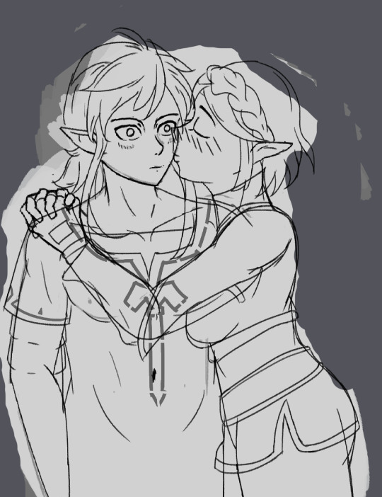
Here is the line art. You'll see a some text faded in. Those are my notes.I tend do my art stuff in small intervals cuz I have other shit to do so often I have a layer called notes to remind future me on what to do and what other cool ideas to think of. It's been helpful and sometimes, I kinda like how it looks. Like it reminds me I'm some kinda of scientist peering through human anatomy, it's fault and how to improve it.

The in between rendering. Here you can see that Link is finished but not Zelda. I start with the slightly desaturated flat colors first then make a simple gradation based on lighting. Even with just the gradation only, it gives so much more 3D look of it. Since I started with some desaturation, when I do a more saturared color shapes, it pops out more. At least in theory.
Also added that red line. Like in those manga to convey motion and stuff. I like it. It's quite neat-o.
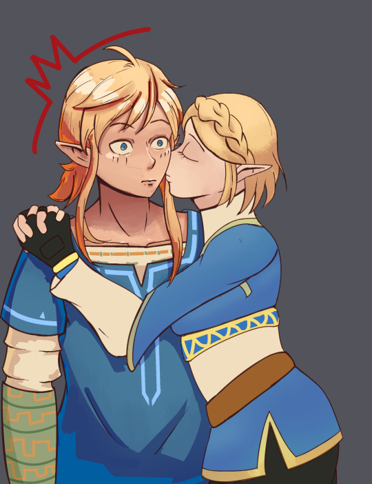
Here is the finished product you saw at top. My way of picking gradient background it usually just picking they're 2 most dominant color.
I then needed something to contrast the heads better since I want the focal point to be there stronger, I added a neutral color to it as contrast. Great at adding some marks there as well. That's why I added my signature and I had some fun and made a korok and a hearth looking stickers. Took like 20 minutes top. Though I do feel like the korok could be cuter.
Here all the of them at them side by side.
Last of my better looking art. Hopefully by next week, I'm done cooking something up. I'm also doing an secret santa art gift so my time are quite split between. I draw slow, so that's why I only add stuff here weekly cuz I'll run out of content here fast.
#loz fanart#zelink#digital art#legend of zelda#loz botw#artists on tumblr#art blog#zelda botw#sleepy_blogging#sleepy_blogging_known
33 notes
·
View notes
Text


Black Brothers sketches (I have no clue if ppl could tell but just in case yall can't Reg is the one with a red and gold ribbon)
(yes Sirius wears a necklace with the moon phases)
I really like Sirius' look but I have so much trouble putting Regulus' look down on a drawing/sketch for some reason bfubwrfkubqefcu so ill have to put him in a grinder and rebuild him again.
For the hair thing: I hc them both as Chinese which sadly reduces their hair volume and curls (because Asian hair is like that) 😔 the only reason why Sirius' curly is because I fully believe he would get a perm. At the same time, Regulus sticks to his naturally straight (and no volume) silk hair.
Appearance HCs!!:
-Regulus' face is a lot more rounder compared to the rest of the family (except Andromeda)
-Trans Regulus has my heart (typically it's ftm but I also really like mtf) and Sirius is cis. Still, it isn't to say that he's strictly masc since I believe him to be very open to makeup and other typically feminine attire/styles (this is actually because I find the picture of a muscular Sirius wearing a pink lacy slip absolutely hilarious) (I'm sorry but can you actually be sad and picture that) (I'll let your mind wander)
-The Black family is always very tall, so naturally, Regulus is actually taller than Sirius but since Sirius fucking struts around his platforms it switches the height difference (aka balances it out a bit)
-Sirius' eyes are def like a desaturated pale blue and really unsettling, it makes you feel as if you are being stalked and judged heavily. While Regulus' is fully grey, darker, and less creepy, I can't explain but it's preferable to look into Regulus' eyes compared to Sirius'.
-While Regulus has freckles, Sirius has more moles scattered about
-Never shutting up about this, but Sirius is one of the (very) few members of the family to not gain white streaks/patches. Regulus on the other hand has sections of his hair that are white, but unlike Narcissa's hair, which grows in patches but is hidden underneath so most don't really notice it except when she ties her hair up, Regulus' white patches are displayed on top of his head of hair. Makes him feel as if he looks older
-Sirius smells like a variety of cheap perfumes (especially those strawberry cake ones from Bath and body works) and Regulus smells like a specific expensive cologne that he only uses and nothing else (he buys that shit in bulk)
-Regulus rarely paints his nails but Sirius does and it's a different color everytime (he loves variety) (same)
#i talk so much omg#they never leave my head i love them#regulus black#marauders era#sirius black#regulus arcturus black#sirius orion black#the black brothers#sirius and regulus#headcannons#I’m obsessed with them#you don’t understand#trans regulus black#art tag
17 notes
·
View notes
Text


mysterion design >:D
notes under the cut
-i'm imagining for this au everyone's middle school aged, so still like, kids, just a bit older
-ignore the fact that i fucked up the colors on all the text i SHOULD have had the colors shift between lines it helps legibility but i didn't fsr??? i'll figure that out in later art dw
-GOD THESE COLORS TOOK FOREVER the og colors are SUPER desaturated and also more on the pink side of purple but I prefer to use saturated colors and wanted to go more towards the blue side of purple (than the colors are closer to complimentary colors between mysterion and kenny)
-ended up going with a very soft look (rounded edges and ovals and softer lines) i was thinkng off of the batman inspo actually and thinking about that scene in the lego batman movie where the brick notes batmans design isn't very hero looking, i mean it is by western standards but like when i think of a good hero and symbol of justice and hope i think of twintaild magical girls with ultra frilly skirts and cute mascots and sparkles and stars everywhere but like.. i'm biased.... anyway I chose the softer lines to make him feel softer and instead relied any edgy vibes on the colors and body language rather than the shapes (i mean i still used triangles but yeah)
-I ended up not going with brown boots cause i didn't want to have to tie in another color, and i had the epic idea of the little question mark symbols on the soles of the shoes and the m logo on the ... toungue i think it's called?
-so I originally wasn't gonna show his hair but I thought it would help to balance the colors more as the white shorts felt too bright
-i didn't plan to post this or else i would've tried to better phrase all the writing lmao
-i went with rounded feet to make him feel like, floaty?
-one smaller challenge was keeping a short stature for kenny while still making him look like, menancing and powerful, another reason why i went with the graceful floaty feet, I also had the shorts flair out with that triangle shape like they do to emphasize and blend together the general shape of the body
-miiight have accidentally made him more androgynous~ my ass spent years studying and learning how to make characters appear masculine than said 'yeah no thankyou everyone is going to be at least a LITTLE bit pretty <3'
-ah look how nice and not over crowded the doodles are... yeah say goodbye to empty space cause Cartman/theCoon's completely lacks it. I like drawing fluffy animal ears and found the need to label all the drawings "furry" or "menance" so yeah
-i'm that one bitch that says fuck canon even canon doesn't give a shit bout canon so why should i? and never draws kenny with blue eyes, always either light brown or preferrable purple. mostly cause i feel blue + blonde is too basic and I find that the purple makes for a nicer contrast and overall pallete. Cause brown kinda just blends in, cause then his entire color scheme is all within the same hue range, but purple sticks out better + leaning into the magenta side of it looks great with orange
-petition for the southpark fan wiki to acknowledge how fuckign similar Mysterion and the mysterious mare do well are
-funfacts!! considered having the buckles be silver instead of gold (changed to balance with the blonde hair and tie back in the orange/yellow hues) considered having the inside of the cape be a lighter shade of purple either pulling in more pink or blue tinted shades, changed cause it made the overall color scheme to bright
-in case you were wondering 90% of my art has the same stupid level of thought put into it as posts i do add notes onto, I just figured most people don't want a ramble about shape launguage and colors on their silly blorbo fanart posts lmao. but if you find any of this interesting or heck if you ever have a ramble about your own art my inbox is always open~ i love getting to discuss drawing :D
#[redacted] is south park btw but i'm not giving up on the [redacted] bit so pretend you don't know this#yes this means there exists a southpark fanfic where two characters get married in hell#south park#kenny mccormick#mysterion#kyukyudraws#should i tag this tfbw? probably#sp tfbw
41 notes
·
View notes
Text


hi i realize i don't talk as much here as much as i do on twitter which. maybe i SHOULD talk here more because there are no character limits. okay so.
first image (aug 2022) i think was like. one of the first times i actually tried to reference and i had to trace bits of it and i didn't know HOW to reference. and i barely understood charlie as a character. did not understand how he would dress had not even settled on his tattoos. could not get the colors to look right so i think i like. put him at 90% opacity to make it work.
between that and the second one (sept 2023) not only has there been SO much character development (future version with a beard now exists. he has been electrocuted. he is now jacked. he is transgender.) but i have done so many anatomy sketches that i didn't have to reference at all. yes i still should / do / will but i didn't feel like i needed to just to get it done.
and i picked all the colors by hand i didn't use any layer modes. the shadows here are actually the base / local colors and the lighting is added in on top and i used actual color knowledge to do that. like how i learned that if you use a desaturated warm tone against a more saturated warm color, it makes the desaturated one look blue and that's how you get 'blue' light on warm colors without it looking weird.
i found a message from last year when i sent the first image as an example of how i "have clothing folds figured out in my style, maybe not realistically but they look good" and looking at the folds on that versus the new one is like...no i did not. i don't know why i thought that.
this obviously isn't like a 100% fair comparison since i didn't bother to shade the first one and i'm pretty sure i was experimenting with a different lineart brush / style (which is why i'm not commenting on that here) and i did actually redraw the chair image one-to-one already but. i was looking through charlie's gallery and this just stuck out to me like WOW. holy shit dude. jesus christ.
i will never ever ever get over how much just becoming deeply obsessed with a character makes you improve. to give you an idea he hit 69 images on toyhouse (lol nice) in october 2022. it is SEPTEMBER just under a year later and he is now at THREE HUNDRED SIXTY (360). I AM NOT JOKING. not all of those are by me but a lot of them are! i did studies SPECIFICALLY so i could draw him better. please note i had literally never done studies before and like i said did not know how to reference. i have never been so obsessed with a character before charlie and it's the best thing that ever could've happened to my art. AND me.
#art improvement#long post#stanley says stuff#stanley does art#charlie grimms#NOT TO MENTION my friends for#1. fueling the insanity making me bonkers over silver city and all the characters there#2. giving me art inspo!!! making me jealous of your art enough that it makes me want to do better!!!#please for the love of god if you want to get better at art 1. become obsessed with one character 2. MAKE SOME ARTIST FRIENDS ON GOD#literally tysm yall know who you are
11 notes
·
View notes
Note
Okay but in all seriousness the way you use color just shifts something in my brain whenever I see it, ESPECIALLY when you choose vibrant colors for the entire piece or only add one vibrant color because just AAAAAAAAAHHHHHHH the way I'm SOBBING every time because it's so damn good
Also when you opt for more pastel colors????? It's been a while but back during ✨️our Kirby days✨️ you posted an art piece of Meta Knight sitting in the moonlight and just. The lines, the moon popping out thanks to the limited color pallet, the pastels, the way you made him So Fucking Shaped. It's literally the first thing that comes to my mind whenever I think of Meta. It's just such a stunning artwork like hhhhnnnnggggggGGGGGGHHHHHHHHH IT'S SO GOOD YOU HAVE NO IDEA HOW MUCH I LOVE IT
AAGHHHHH THANK YOU SO SO MUCH
this made me smile sm
im rlly proud of that meta knight ur talking about.. it was originally a physical sketch but i liked it sm i turned it digital and then i got silly with the colors
ive always been proud of my colors, but in the past (like idk 7 years ago) i had a weird limited approach to things. i figured out the trick of like,, taking something whose base color is pink and shading with purple. and then that was all i would do, because it pretty consistently made stuff that was pleasing to look at
and i developed a bit on that sorta style for years until my spamton era happened. i started using mspaint a TON and it radically changed my approach to coloring. having to both go into a seperate menu to select colors AND having the black/white slider be required to color pick Made it so that i had to experiment a lot more. mess around, maybe try a lower saturation. and after a while i started getting obsessed with grey tones.
my old old art was all super colorful, but in a sorta predictable way. its nice but didnt leave much of an impression
but in like my current era i use a lot of toned down colors. desaturated, greyish in betweens, playing with warm greys v cool greys, actually appreciating complementary colors
butyeah thats all to say. uh. i like colors a lot and i think about them alot
there r always new ways to approach coloring something and u can make some crazy stuff
ill admit that i feel like alot of my doodles n stuff look a little samey atm. u can tell what colors i default to when im feelin lazy lmao (cream, teal, green, warm pink, etc. all desaturated of course) but then again i havent been drawing much lately, the sample size isnt super big
i wanna make more shit i just never have the ideas or motivation.. i jsut end up doodling fish furries lol
uh i got distracted. anyways. thank u sm.....
2 notes
·
View notes
Text
this is just a half-finished post or some shit i was planning on wrapping into an actual tutorial with like video and image steps to post to itch.io for a pay what you want type booklet. it's about using layers and tricks to make your art look cooler once it's already done and you cannot be fucking bothered to keep drawing shit but you want it to look more interesting than it does currently, ie, probably how everyone feels at the end of every drawing ever
How to take a mediocre drawing and make it Really Pop: the Bitegore Ooze And Goo Red Dragon Art guide to easily adding effects to your art without changing anything else!
Before anything else, let’s go over: what catches attention?
Strong composition. In this guide we will not do anything to strenghthen your composition. That requires you to draw different, which isn’t lazy and easy. Besides, we love not putting hard work in here. Let’s move on.
Interesting subjects. You get to work that one out, I’m sure you know what interests you more than I do.
High contrast. This is the BIG one we’re going to zero in on.
Bright colors, even if they’re not necessarily high contrast. This is another we can focus on, though, like… less.
The purpose of this is not to tell you how to draw different to make your art better. There’s ways I can tell you to do that, but fuck it, we love easy solutions. Don’t change your art style. Don’t change your process at all! This is all “after the fact” advice.
Before we get into the actual stuff, let’s cover layer settings very quickly. If you want to know how these work in more detail, just play with them or google them because I’m not here to #Learn You A Thing TM about layer settings, just run through them super fast in terms of how they work.
Lighteners:
Screen: makes things lighter. Black is invisible, white is white, everything in between just gets lighter on top by math. Who gives a shit how it works? Not me. The important thing to know is that everything gets desaturated when it gets lighter with screen layers.
Glow Dodge/Color Dodge: makes things lighter again. This time they get more saturated. 100% saturation generally doesn’t change from its most intense color value, and black underneath the lightening layers generally doesn’t get hidden by color or glow dodge layers. These will emphasize any reds, blues and yellows in the image somewhat aggressively, even if your lightening layer is in grayscale.
Add: makes it lighter again! Black is invisible, white is white, everything in between gets lighter on top by math. Different from screen because it makes things brighter faster. This one also desaturates your colors.
Add Glow: This might be a clip studio exclusive, I have no idea. Anyway it’s like Add but it saturates your image pretty intensely, which means I think it’s the best. I use this one in everything for my shading and often for filters as well.
Lighten: Compares this layer to the layers underneath and uses only the colors that make the image lighter. Sometimes adds values together to create an interesting look.
Lighter Color: Compares this layer to the layers underneath and only uses the colors that make the image lighter. There is no blending on this one; it’s essentially a “visible or invisible” logic gate. Tends to look crunchier than lighten layers but preserves colors better.
Darkeners:
Multiply: makes things darker. White is invisible, black is black, everything in between just gets darker because of math. This will saturate things if you use a saturated color and doesn’t desaturate them when you use grays.
Darken: Compares this layer to the layers underneath and uses only the colors that make the image darker. Sometimes adds values together to create an interesting look.
Darker Color: Compares this layer to the layers underneath and only uses the colors that make the image darker. There is no blending on this one either; it’s essentially a “visible or invisible” logic gate. Tends to look crunchier than darken layers but preserves colors better.
Linear Burn and Color Burn: the glow/color dodge of darkening layers. White is invisible, the darker colors will saturate reds, yellows and blues regardless of shading layer color, and the biggest difference is just that linear burn is slightly less saturate-y than color burn.
Other effects:
Overlay: White is white, black is black, everything else gets emphasized. I consider it sort of a blend of color burn and color dodge; that’s basically how it works. It’s excellent for boosting contrast.
Hard Light/Soft Light: Overlay with tweaks. Usually hard light looks darker and more saturated and soft light looks lighter and less saturated.
Difference, Subtract, Divide, Exclusion: four different methods of comparing one layer to the layer below it to create an inverted image along some method or another. The calculations are different, but all of them sort of do the same thing. Play around with them if you want to see what to do with them. Can create some really cool effects when used well. When you put the same image over itself on these settings, Subtract and Difference turns black, Exclusion turns gray, and Divide turns white.
Pin Light: this one is definitely a clip studio ex exclusive, but I love it. If you have csp ex you should play around with it. Mid gray is invisible, white is white, black is black, and saturated colors become that color range. Pin light is weird because it pulls the colors underneath it into a close-to-color range on the color wheel, and the more saturated the color, the more effective it does at this. It never desaturates colors to gray unless it’s completely hiding them. It can mimic an “old polaroid” warm-black effect when the color is lighter than 50% black, and it brings highlight colors down when the color is darker than 50% black. It looks best in middle-saturated middle-brightness values, but you can mess around with it.
Color Correction:
Hue: Changes your colors’ hue, ie, just the part of the color wheel it’s on. Doesn’t tweak saturation at all. Gray will remain gray, 100% saturation will remain that saturated. Good for small color corrections and on-top filters.
Color: Changes your colors’ hue and saturation. Regardless of whatever saturation the image below is, the color you’re using up top is will change every color into that hue and that level of saturation as well as that hue. Useful for coloring on top of grayscale images; usually way too strong for post effects though.
Saturation: Changes your values’ saturation to be whatever this layer’s saturation value is. Doesn’t change the actual hue or anything though. Good for popping some colors up and correcting overly-saturated areas from using stuff like color dodge layers.
Brightness: Changes your values’ brightness to be whatever brightness is up top. Useful for fixing things that your other color effects have broken, such as blown-out areas of shadow from overusing overlay layers.
Presumably your art is finished and you like it. Great! Maybe it’s finished and you don’t like it very much. Still great! Doesn’t matter much really. What’s important is that it’s like, colored or shaded or whatever, there’s some kind of stuff going on in there, and you have no further intention of adjusting the “base” elements. If you do, this will start looking weird, but feel free to mess with it anyway; rules are fake and you can do what you like. More importantly, you can make a “flat” version of it to start adding effects to.
#posting every fic in my notepad++ to make myself do homework tag#not that this one is a fic really.
5 notes
·
View notes
Text
Ummmmmm I knew something was up with tumblr's colors, because they're VERY desaturated. Like holy shit it's bad. BUT ohmygod I saw my Andy drawing on Stevie's phone and !?!?!?!? Quite literally jaw drop ITS EVEN MORE DESATURATED. WHAT IS GOING ON.
Also why did tumblr's colors change out of no where? I've noticed that when I posted my Andy leaned over on my main. And now that's all I see. Holy shit. This sucks for artists or any kind that share visual works.
2 notes
·
View notes
Note
any advice on character color palettes?
A lot of my color stuff is primarily driven out of laziness, I'm pretty indecisive when it comes to it and so I try to limit my overall palette, which is why you'll see the same colors constantly in my art work. You can argue it leads to a consistent look/identity, but the real reason is what I mentioned earlier.

Same thing extends to character colors. If I'm going to be drawing someone a lot I don't like having to select 8+ base colors to fill in everytime I make them. One of the other reasons Poppin and Jupa share 3 colors lol. I think though I benefit from drawing abstract, cartoony mascot characters. If you're going for a different aesthetic, like realism or fantasy, I think your general palette is going to be different as well as getting more complex with coloring.
But generally speaking, you want to have 1-3 colors dominate a character's design with secondary and tertiary colors to accent them. Helps with giving them a clear look, I guess.

I think each person has aspects of art they're more into versus doing out of obligation, and I don't really play with color theory. But I do like making characters, so with colors if I know a part of them is green, I'd rather put down a green from a handful of 4-6, rather than spending a ton of time on finding the right shade of green itself when I likely won't even know if I'll keep that part of them green or not... you'd want to pick out all the colors of them at once to get their overall look down.
Sometimes I'll set the color layer to grayscale. As a *general guideline* this can help with seeing if the shade of a color has enough contrast with the others. You can sorta see below that some characters have more contrast than others from base color alone, and I... *assume* it helps them with standing out and pose readability.

But I wanna stress it's kind of a guideline. Different programs desaturate colors differently so it's not like this 100% reliable, but it's been helpful when I'm unsure if a color is too dark or light and needs to be pushed more.
But y'know, if I really just like how it looks anyway I'll do that and not give a shit. Colors used to be way more difficult for me and they would always look super desaturated and dull due to unconfidence. I think there's gotta be a balance between drawing what you know (which is good for speed) and going out of your comfort zone (which is good for growth).
I'm pretty satisfied with a chunk of my cast right now, but it's good to experiment with them now and again to see if you can get more contrast or something else you like.
1 note
·
View note
Text


ghost enneson-freasas whose names start with J
#em draws shit#art#digital#digital art#half heart#jessique enneson#john freasa#blood#the blood feels excessive but tbf they both bled out so its justified#johncat is also there cause why would john travel around without his host#original#when coloring john all my brain could think of was how his ears+yellow eyes+desaturated skin made me think of homestuck
108 notes
·
View notes
Last Seen Blogs

who-am-i-maam
what is this anymore

abhivanan
Untitled

fantasticdonutponyflap-blog
Untitled

nugu-bgs
for lesser known kpop boys
nugu-bgs
for lesser known kpop boys