#color contrast
Text

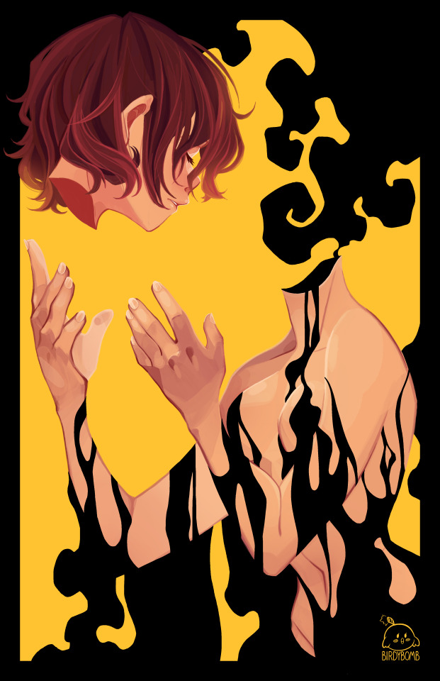
I had a dream that I went on a date with a nerdy goth rat twink so I tried to recreate his design lol
(Also it's world rat day somehow??? Did rats invade my brain and make me have this dream...)
#digital illustration#digital art#rat furry#furry#furry art#furrydrawing#furry character#neon colors#neon purple#color contrast#cartoony art#cartoonstyle#anthro#anthro rat#anthro mouse#furry rat#goth#goth furry#character#oc#oc artwork#oc drawing#oc design#original character#character design#cute art#cute character#furry chibi#furryart#furry fandom
2K notes
·
View notes
Photo
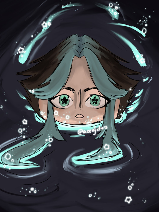
“The earliest point in her history that is known is the day she woke up to find her head was missing”
(Celty Sturluson from Durarara!!)
#durarara!!#durarara#drrr#drrr!!#celty#celty sturluson#dulahan#dullahan#irish folklore#anime#fairy#irish fairy#black rider#digital art#digital painting#color contrast#black#smoke#durarara fanart
2K notes
·
View notes
Text

A panel from a wip comic I'm working on.
#artists on tumblr#color contrast#rabbit#wild hare#animal bones#surreal#illustration#folk gothic#wildlife gothic#my art#digital ilustration
100 notes
·
View notes
Text

Mexican color game
#mexico#red and blue#blue and red#red & blue#colors#color contrast#complementary colors#photographers on tumblr#photography#fujifilm#travel#curators on tumblr#street#fujixt2#stairs#window#orange roof
98 notes
·
View notes
Text
I really hope that when Rey gets an apprentice they have a purple lightsaber because I love that yellow-purple color contrast
#wooloo-writes#wooloo writes#star wars#sw#lightsabers#lightsaber#yellow#purple#colors#color contrast#yellow lightsaber#purple lightsaber#jedi#rey#rey skywalker#this is also why i want to make a time travel fic where rey becomes mace's apprentice
36 notes
·
View notes
Text

"November Leaves" - Taken by me during the end of 2021. I love the contrast of the blue sky and orange leaves.
24 notes
·
View notes
Text
Haia peepin out of that one glowy river (you know what I'm talking about)
Filtered version and eventually timelapse under the cut

Please do not repost my art without permission! Tracing is also not okay, but you may use as a reference or set as your pfp with credit :)
#demon slayer art#demon slayer oc#my art#color contrast#im just tagging anything at this point#bright#idk#blue#cute#aceofart
17 notes
·
View notes
Text
Accessibility PSA #2
Hey kids! It’s time for another tip on making your blogs accessible (ie useable) for disabled individuals!
Let’s talk about color contrast. Did you know that you can actually make your blog inaccessible for some vision impaired user by using the wrong combination of colors on your page?
Best practice is to use text, background, and accent colors that contrast against each other enough to be easily visible to everyone. If you have to squint to see your bio, chances are that there’s someone out there who can’t read it at all.
here’s a neat tool that you can use to check if you’re blog’s color scheme is fully accessible.
Next time, we’ll talk about fonts and accessibility 🖋
#accessibility#accessibility tools#accessibility psa#psa#color contrast#web aim#web accessibility#wcag
17 notes
·
View notes
Photo
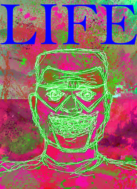
SET GOALS. HAVE A TEN YEAR PLAN. INVEST. WAKE UP EARLY. CEO MINDSET.
#life#cruelty squad#boomer shooter#indie games#consumer softproducts#digital illustration#digital painting#eye bleed#color contrast#wtfart
32 notes
·
View notes
Text
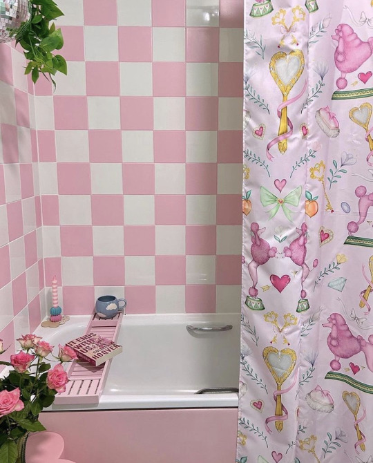
<3
#uploads#aesthetic#interior#bathroom interior#bathroom decor#plants#pink#pink bathroom#mint green#color contrast
5 notes
·
View notes
Text
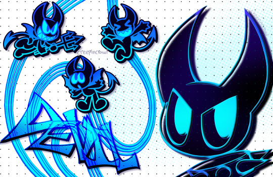
DEVIL
#neon blue#neoncore#neon colors#color contrast#devil oc#demon oc#oc demon#devil wings#devil horns#demon horns#demon art#digital art#digital illustration#art#illustration#original character#toony art#cartoon style#cartoon drawing#cute art#character#character design#devil character#demon character#blue art#creepincrawl#ocart#oc art#sona art#artist sona
321 notes
·
View notes
Text
🪰Bugging Me🪰

#bug#moth#bugs#old art#bugging me#irritated#annoyed#annoying#mad#artists on tumblr#digital art#art#littleevil0ne#digital painting#painting#expression#color contrast#insects
25 notes
·
View notes
Text

Battle cats fanart! Immortal Yukimura.
#my art#digital art#digital drawing#artists on tumblr#illustrators on tumblr#battle cats#fanart#digital illustration#digital painting#bird#furry#drawing#wings#talons#armor#blue sky#feathers#cool#color contrast#colorful#dramatic lighting
32 notes
·
View notes
Text

IT’S A COLOR-COORDINATED FREAKY FRIDAY!
#freaky friday#so freaking hot#color contrast#color correction#designer#for all to see#see clearly#seethrough#look at me#love the look
28 notes
·
View notes
Text
There are seven color options for text available in the post editor on mobile. How readable these colors all depends on what tumblr color palette your readers are using.
There are many factors that go into accessible text color, but one of the most important is color contrast. Using Web AIM Color Contrast Checker, I've compiled a list of the color contrast ratios for all seven text color options against the various backgrounds tumblr offers via its different color palettes.
Keep in mind that the minimum contrast needed to be accessible for large (14pt font or larger if bold, 18pt font or lager if not bold) text is 3:1. The minimum contrast needed for any text smaller than that is 4.5:1.
The System Default, True Blue, and Pride color palettes provide a post background of white (#ffffff). Against this background:
Default Text (#000000) — 21:1
Red Text (#ff4930) — 3.36:1
Orange Text (#ff8a00) — 2.36:1
Green Text (#06cf36) — 2.1:1
Blue Text (#00b8ff) — 2.25:1
Purple Text (#7e5fff) — 4.22:1
Pink Text (#ff62cf) — 2.65:1
The Dark Mode color palette provides a very dark gray (#222222) post background. Against this background:
Default Text (#ffffff) — 15.9:1
Red Text (#ff4930) — 4.73:1
Orange Text (#ff8a00) — 6.73:1
Green Text (#06cf36) — 7.56:1
Blue Text (#00b8ff) — 7.04:1
Purple Text (#7e5fff) — 3.76:1
Pink Text (#ff62cf) — 5.98:1
The Low Contrast Classic color palette provides a low-contrast blue (#35465c) post background. Against this background:
Default Text (#d6dade) — 6.84:1
Red Text (#ff4930) — 2.86:1
Orange Text (#ff8a00) — 4.07:1
Green Text (#06cf36) — 4.57:1
Blue Text (#00b8ff) — 4.26:1
Purple Text (#7e5fff) — 2.27:1
Pink Text (#ff62cf) — 3.62:1
The Goth Rave color palette provides a black (#080808) post background. Against this background:
Default Text (#9e78e6) — 5.99:1
Red Text (#ff4930) — 5.95:1
Orange Text (#ff8a00) — 8.47:1
Green Text (#06cf36) — 9.52:1
Blue Text (#00b8ff) — 8.86:1
Purple Text (#7e5fff) — 4.73:1
Pink Text (#ff62cf) — 7.53:1
Keep this in mind when creating posts.
72 notes
·
View notes
Text

satan smiting job with sore boils by william blake
c. 1826; ink and tempura on mahogany
#satan smiting job with sore boils#william blake#ink#tempura#mahogany#art#painting#beauty#history#classical art#love#19th century art#aesthetic#satan#color contrast#book of job#stunning#contrast#wood painting#classical#biblical#the sun#power#wings#dynamic#pain#pen#wood
34 notes
·
View notes
Last Seen Blogs
meh-meh-art
Lamb do art something what

biotinel
Biotinel 🍏 mangez bio & local !

zefronholic-blog
never stop looking.

ericws1-blog
Eric Sanders
s-tellans
certified tired lesbian