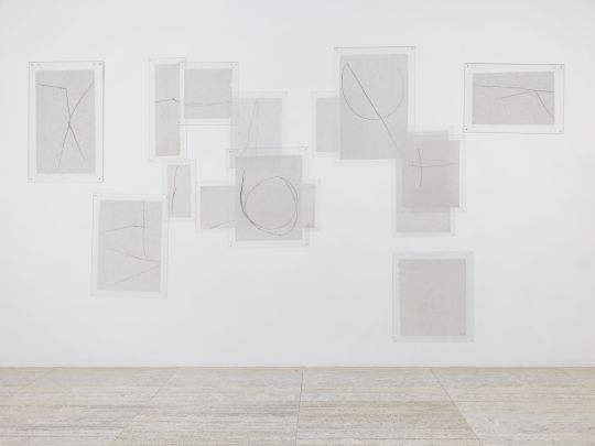
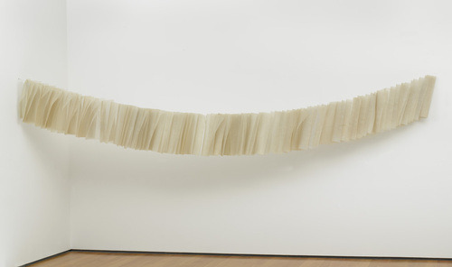
#dark field monotype
Text
SwSh HC's I've had in the Vault for the past few years (removing various minor OCs)
Full Names
Leon Hart Eudios
Hop Astralis Eudios
Soren “Skyler” Griffin Eudios (The boys' dad)
Amelia Katharine Paganous (The boys' mom) (she use to be the major league flying type gym leader of Hammerlocke! :D)
Raihan Vouivre (Wyvern) Laburn (Laburn from a friend on the Champion Time Server)
Nessa Locke (hehhe loch ness monster joke)
Oleana Delila (I don't recall from where)
Malcolm Rose (I don't recall from where)
General Hcs (straight from my notes)
Raihan’s been all over the world, travelling seven regions before settling on Galar because its close to home and because he made the most amount of friends there
The process in which a new Champion is chosen if the current one dies or retires is complicated. They have to have a list of at least four trainers who they would recommend for the Champion position in such cases ready, and then those selected trainers would have to battle with the Gym Leaders and Elite Four (assuming that the people on the list isn’t a Leader or Elite)
Mustard’s successor was a Poison, Ice, and Psychic type specialist who hailed from Galar’s Tundra
Leon wrote down Sonia and Raihan as who would be the ones to take his crown should anything tragic befall him, but he also has Mustard on that list just in case
Ages: 12 (Allister), 14 (Hop), 15 (Marnie, Bede), 17 (Bea, Avery, Klara, Hyde), 20 (Sonia, Leon, Milo), 21 (Raihan, Piers, Nessa), 22 (Gordie)
Had the roles been reversed a bit, Sonia would've been Galar's Champion
That's due to Sonia being a potential Sword to Leon's potential Shield, the wolves choose people who were always set to be on even playing fields in terms of combat capabilities. But if there was ever a point where that balance is tipped over to the favour of one, then the synergy between the Sword & Shield together in combat would be disastrous
Kabu's Team when he was a lad: Pelliper, Relicanth, Vileplum, Dusclops, Altaria, Manectric, Linoone, Mightyena, Magcargo, Camperupt, Shiny Ninetales, and Blaziken
A lot of trainers generally have monotype teams due to the easier training, food, and care requirements
Marnie had a surprisingly normal Gym Challenge, outside of telling off Team Yell every now and then, she was pretty much just Vibin’
Isle Of Armor Hc's
Leon & Sonia both got a Kubfu but Sonia gave up too soon and Leon got lost
Sonia would’ve chosen the Tower of Water and Leon would’ve chosen the Tower of Darkness
Sonia thought that since she’s friends with Nessa and thus familiar with water types, it would’ve been easier on her to go through the Water Tower
Leon thought the Tower of Darkness sounded tougher, but after getting a bit too lost he decided that either would work but he would’ve preferred the Tower of Darkness
Raihan started his battle practice with Sandstorms in the Isle, which continued to happen once he found a place that would regularly have and be accustomed to Sandstorms (ex: the Desert in Hoenn)
Despite that, he caught his Tyranitar in Kalos and brought it along for his journey through Unova
Klara and Avery are siblings who hail from one of the settlements on the Tundra. To try and bring more fame and attention to their precious home, Klara tried to become a popstar and Avery tried to become a famous Psychic alongside some distant relatives
They quickly switched to try and become Gym Leaders once those goals prove to be too difficult, but after finding a more than worthy challenger in the MC & Co.
The Master Dojo is actually a multi-story building but also an extremely wide one, not as wide as most would except but wider than they think
When not used to be a trail for the one who has the Isle’s Sacred Armour, its a regular training building
But if one requests it, they can have the special training activated for them and a few others for a session
Mustard did use to be the Stow-On-Side Gym Leader, but that was years before Bea’s time so she doesn’t even know it until she visits the Isle for training
Hyde’s a teenager, he’s just really short
He half-assedly participated in the Gym Challenge and got his ass kicked by her in the Cup
Honey is still part of her old Company, but as a distant investor and consultant
Mustard only allows himself to go all out on Four trainers: Leon, Honey, Sonia, and Opal
Sonia doesn’t know that she’s one of them because Self-Esteem Issues
He adds Marnie, Bede, and Hop to this list once he sees their potential
He also adds Raihan when that boy finally becomes Leon’s official Rival, Piers when he finally finds confidence in his battling skill, and Nessa
Leon, surprisingly, didn’t get lost in the Isle except for the one time when he was going to the Tower with Kubfu, but that was due the raging Sandstorms
Sonia also had a Kubfu, but due to storm she gave up and returned it, no objections
Leon & Sonia’s starters are actually from Mustard, but due to someone pulling some strings, they got them as their first Pokemon
Leon’s capable of hand-to-hand combat, Sonia’s an expert on disarming someone with a weapon
Despite this, Leon’s a Shield and Sonia’s a Sword
They returned their Kubfu to Mustard because they felt like they failed
In another timeline, Mustard would give those two to the next Sword and Shield, to— Hop
In another timeline, Mustard would give those two to the next Sword and Shield, to— Victor
In another timeline, Mustard would give those two to the next Sword and Shield, to— Gloria
Mustard wasn’t the Champion Leon had to battle to be crowned, but Mustard knew that if Leon could match him— and eventually beat him— that that boy could become Galar’s Champion
Mustard’s lost partner Pokemon is not known by the press of current times, only Opal truly knows what it was. As does Honey. Some guess it was an Eevee, many more suggest an Eeveelution
The only way Sharpedo don't go after you while in the water is either to use a boat or have several water type Pokemon out and around for your own safety
Don't use red boats though, they confuse it for prey. Leon and Piers learned the hard way
Nessa refuses to train any of the Psyduck line because back in the Isle as a challenger, she saw one sneeze in a cave and released a bit shockwave that punted her to a wall and knocked her out
Honey terrifies everyone of the young Adult Crew (Piers, Leon, Sonia, Raihan, Nessa, Milo, and Gordie) as much as they adore her
Crown Tundra Hcs
Malcom was the one who always looked out for both of them, him and Peony, when they were kids so Peony could have a childhood
This, in turn, made Malcom a lot more serious and ‘mature’ at a younger age while Peony is a bit too naive as an adult
The Mayor of the settlement is Klara and Avery’s grandfather, who raised them alongside the settlement after he took them in after their parents died
Avery and Klara practically inhaled and ate up every piece of information they could find on the King, because he could make their home better, right? He could make it so their friends don’t have to leave with their parents to the big city, right?
Calyrex watched Klara and Avery grow up, the two kids being it only source of power for years, but then they left, not long after giving up on believing it’s ‘fairy tale’
That doesn’t stop the two siblings from trying to restore the faith in the lost King, especially after hear two kids younger than they speak vividly and furiously about myths and legends and gods
#pokemon#pokémon#pokemon sword and shield#pokemon swoshi#pokemon swsh#pokemon headcanons#pokemon headcanon#pokemon swosh
5 notes
·
View notes
Text
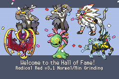
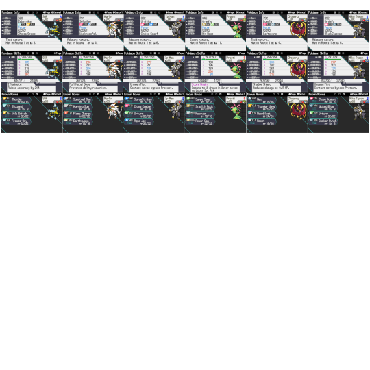

Radical Red v3.1 Random Encounters (Route 1 only).
Yeah, this randomizer was cracked. Four legendary Pokémon and they're all insanely powerful. For reference, this was on scaled, so the species were randomized to match equal strength (I don't know why the game won't acknowledge it though), but it's insane that I got both Kubfu and Cosmog, albeit Kubfu was a day time exclusive only. It's insane you can get Urshifu-Rapid Strike as early as before Mt. Moon because of a lone Water Stone, and he was doing most of the carrying while the Cosmogs took nearly halfway to fully evolve. Lunala is absolutely cracked, to no one's surprise, being able to survive any one hit even facing down +2 enemies from full and inducing burns or paralysis back—depending on what the situation requires. Most of the lategame was heavily dependent on wearing down physical attackers with Wisp + Roost until they were in range to a boosted Hex or inducing paralysis as one of the very few speed control users. MVP easily. Solgaleo has the bulk to abuse Weakness Policy and slam enemies down with +2 Sunsteel Strike. I just wish it had access to something like Rock Polish or Autotomize because it had so much potential to sweep, but was held back by it's lackluster speed. Scarfed Urshifu-Rapid did a lot of the late game cleaning, picking off sashed leads with Surging Strikes. Not a lot of Rocky Helmet/Rough Skin abusers around really benefitted him and Urshifu-Dark. Cradily and Zebstrika were only there for the Lorelei rain matchup, but otherwise, the legendary quartet did most of the heavy lifting. At points I wanted to use the other mons and box the Legendaries because it was getting too easy, but I ultimately crutched on them for most of the run, heh. Never look a gift horse in the mouth. I still don't know if the randomizer is consistent; I've heard the encounter pool changes every day, but once I caught all the available mons with DexNav, I never really bothered to look back.
29 losses—2 to the Ariana & Archer tag battle, 2 to Silph Giovanni, 1 to May, 1 to Blaine, 3 to Cerulean Cave Giovanni, 1 to Lorelei, 5 to Bruno, 7 to Agatha, 2 to Lance, and 5 to Blue. I absolutely despise Agatha's Marshadow, being basically a perfect counter to my whole team with Ghost/Fighting dual STAB and being generally faster than my whole team. Spectrier, despite having the most one dimensional movepool ever and Scarf, two shotted Urshifu-Single even resisted. I found the Urshifu-Rapid lead to be more favorable for my team against Bruno than the Infernape lead. As for Blue, the faster matchups were just really annoying, and the AI clearly is smarter than at times—even my Scarf Urshifu-Rapid couldn't outrun Pheromosa. Crazy. Whenever I used Surging Strikes, it would U-turn out, but if I went for U-turn, it would go for Close Combat. Primal Groudon was arguably the biggest problem, being incapable of being statused by paralysis or burn and paralyzing the whole team outside of Zebstrika, who gets oneshot by any of its moves anyway. The goal was not for rocks to get up on my side on the field, which really hampered Lunala's Shadow Shield ability, even with Roost. It came down to Lunala being able to survive a Dark Hole from Yveltal on a damage roll, even at full, then chipping with Moonblast + Thunder from Zebstrika, otherwise it would get destroyed by Sucker Punch if Rocks are up. Mega Metagross is a strange one; it would go for Bullet Punch at times to fail Urshifu-Single's Sucker Punch even when the latter was healthy and Urshifu-Rapid wouldn't be able to take it out.
Anyway, this is kind of a way for me to practice a little but of writing between fics XD I get to tear my brain out because of bad RNG have fun playing Pokémon while getting my word count up by a bit. I'm not sure what kind of themed runs I wanna do. Monotype is overdone, Mono-region seems the most promising but the pool is extremely vast, but whichever way the wind blows for me, I guess.
7 notes
·
View notes
Text
Bad photos of Grease Fire (dark field monotype)
1 note
·
View note
Text
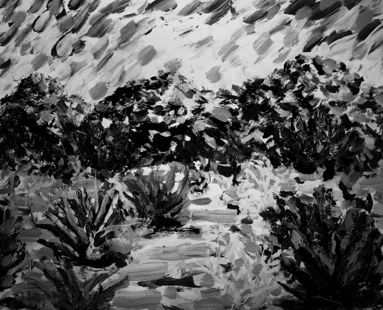
digital, B&W conversion of #1, “Palm Desert” series, 4-16, 2022, Reginald Brooks
Color vs B&W
It is said that the primary office of color is to distinguish, secondarily to emote.
And the primary office of B&W is to pick out that which hides in the dark (low light). Emotion naturally follows, as well.
The former gives more information as the energy signature(s) include(s) not only the tone and density found in the B&W, but additionally a profiling footprint of the type of energy (wavelength x frequency = c the velocity of light), a.k.a. hue, or commonly as color.
Starting with one and converting to the other will almost universally illicit both “new information” and a “new response.”
The “new information” when converting from B&W to color is actually one of absence — removing the profiling footprint of color allows one to perceive the same visual field in a “new light” — now with the emphasis on the more skeletal energy relationships between the forms within.
Thus Color and B&W renderings in whatever medium — analog or digital — play upon our own visual sensing system of cones and rods to make sense of the world.
Aside from where our renderings lie on the spectrum between pure abstraction and figurative, don’t we just have so much fun tweaking them in every way imaginable!
Below is simply one such tweaking: conversion to B&W of the original acrylic, color paintings.
Those of you who enjoy old B&W movies, footage, photos, etchings, monotypes, etc. will know exactly what I mean.
Thanks for viewing!
Ongoing “Color Studies”
10 notes
·
View notes
Photo

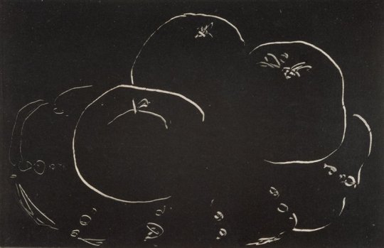
Three Apples and Plate, Henri Matisse, 1914-1915, Minneapolis Institute of Art: Prints and Drawings
The creation of a monotype involves drawing a design in ink on a smooth, nonabsorbent printing plate. While the ink is still wet, a sheet of paper is applied to the plate, which is then run through a press to transfer the image to the sheet of paper. Unlike other printing processes, the monotype technique allows for only one unique impression to be taken from the plate. Matisse monotypes all date from a short period during the mid-teens, when he produced a total of about seventy. Artists frequently use monotype to create their images by building up desired areas of the dark ink on the surface of the plate. Matisse, however, reversed the process. He began with a plate completely covered in black ink, and subsequently scratched lines of varying width through the field of wet ink. The resulting white lines in his printed monotypes electrify and seem to quiver against the deep black ground.
Size: 3 5/8 x 5 5/8 in. (9.21 x 14.29 cm) (image) 10 5/8 x 14 3/8 in. (26.99 x 36.51 cm) (sheet)
Medium: Monotype on chine paper
https://collections.artsmia.org/art/67513/
15 notes
·
View notes
Text
oc trope challenge feb 8- friendly rivalry
Nova grinned victoriously as her lunatone took down someone’s eternes. It wasn’t the first time and she doubted it would be the last. She’d been using local play to anonymously battle the nerds at Ba Sing Se university for a month now. You’d think the ones she’d battled over and over again would have learned the weaknesses of her team and changed their’s accordingly, but it had yet to happen.
Her phone chirped a reminder that the drama club needed her. Well they didn’t need her, more like she needed them for some extra credits, but she felt better thinking someone needed her. Nova shook her head really wishing pokemon had a chat function so she could tell her opponent BRB the Drama nerds request my presence, or something equally cheesy and dumb. But since it didn’t she put her system to sleep and slipped it into her bag. She could play more after she got to the auditorium.
She stood with a long stretch before shouldering her bag. She headed for the drama nerds. They were well into their adaptation of The Boy in the Iceberg When she arrived. She dropped into a chair and pulled out her game. The trainer who only used fire-types was up. They were good, but their typing left them at a disadvantage. At least they didn’t use monotypes.
“Hey, that’s Mako’s team.” Bolin said as he joined her.
“What?” Nova faltered, hitting one of the psychic type moves instead of rock. “Since when does Mako play pokemon?”
“Since Ash won the league.”
“So he’s a total noob.” No wonder he only used fire types.
“Hey, go easy on him.”
Nova shook her head. “Nah, he’s actually holding his own pretty well. And that Volcorona of his is an actual threat. I’m just wondering how he got through the water and rock gyms at such a disadvantage.”
Bolin shrugged before getting distracted by what was going on on stage. “Oh my big scene’s coming up.”
Nova waved as Bolin left, focus still on her game. Now that she knew the fire type user was Mako she was going to destroy him.
Mako groaned in frusteration. It seemed like every trainer in the Ba Sing Se university area had turned against him, going after his team twice as hard as before, especially Ace Trainer Nox who had always given trainers a chance before utterly stomping their teams.
“Is someone using a lombre against your charzarid? I thought lombre was a grass type.”
“It’s a grass and water type.” Mako answered. He used wing attack to smack some hp out of the lombre, but it didn’t seem to faze it much, especially with the rain on the field activating the lombre’s ability dry skin at the end of every turn. “Ace Trainer Nox is using it, someone who really knows their type match-ups. I think their trying to prove a point.”
“Ace Trainer Nox.” Bolin trailed off. “Hey, that’s Nova!”
Nova? Of course stars and darkness. That was just the sort of thing Nova would do. Oh Mako was going to get her.
“You should definitely train up your volcorona. It’s probably your most dangerous pokemon aside from your houndoom.” Nova said, pointing to Mako’s screen.
“Are you two done trying to kill each other?” Bolin asked as he joined them at the table where they always ate breakfast.
“We weren’t trying to kill each other. We were trying to destroy Each other.” Nova explained brightly. With a grin that would put Ash Ketchum himself to shame.
“Now it’s more like a rivalry.” Mako added. Bolin knew they were doing this on purpose. Mako had that look where he was trying not to laugh.
“Friendly even.” Nova said with a nod.
Well Bolin was certainly glad they’d cleared that up.
#ocappreciation#oc trope challenge#oc trope challenge 2021#lok oc#legend of korra#legend of korra au
1 note
·
View note
Text
Monotype from Plexiglass - with Watercolors and Water Soluble Crayons
Monotype from Plexiglass – with Watercolors and Water Soluble Crayons
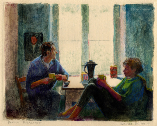
Berlin Breakfast 7×10 Light Field Monotype (sold) Monotype Video Course
I’ve been listening to podcast interviews with other artistswhile filming a dark field monotype course. Hearing other artists discuss their journey reminds me about what I didn’t know when I first started printmaking. It’s important to roll time back, and recall the minutiae of our own beginnings with any art process,…
View On WordPress
1 note
·
View note
Photo
Monotype
This reminds me of how it feels to be a woman of colour in SA.
And I am one of the luckier ones.
The recent and traumatic social history of South Africa is still in dire need of collective conscious healing. The collective consciousness is extremely harsh, negative, violent, aggressive and separated. It is hard to avoid these energies when participating in any social fields, as there is also very few consciousness movements, and the culture of apartheid has left the general society as very commercialised and there is little to interest in the fields of arts and culture.
Positive, healing art and interest in culture, the creative industries, consciousness and healing is one of the most powerful techniques of social upliftment. However, the art market in SA is practically non existant - and where it is, it is still heavily colonised. Art and culture spaces are still heavily racialised and closed to people of colour, meaning that speaking out on social issues from a disadvantaged perspective - leaves artists of colour exiled, excluded and unsupported within the art market. There is a lack of funding in all cultural arenas. Many South African artists have protested this culture, but with growing racial tensions, an increase in the 2nd highest rates of separation and inequality in the world, it is not a profitable or supported industry.
We find that artists who make relevant social art are doing it for the social passion rather than profits. As an artist attempting to work in positive arenas of social reform, I have found extreme isolation and rejection and disinterest in my work. I feel that my style of work, my soul language, will not be received in South Africa for some time. South Africa is an unsuitable environment for my art and dancing work, as a result of the social structures and traumatised social perspectives. I do not have enough social and community support in my work here. Unfortunately, creating darker art does not serve my own well being positively and easily leads me into depressive and melancholic phases.
It is essential, for my own wellbeing, career, and soul work, that I am able to make art about healing and love and find a suitable environment in which to do such. I have spent much of three years working on linking with similar artists and forming these communities but it is just not happening in SA and i feel my energy wasting to this effort. I have turned my energy towards finding a place and way to live out of SA and continue my work in a more accepting and nurturing environment.
I have been made aware, throughout this experience, of the limited access I have to leaving the country and working abroad with a South African passport. In combination with some of the highest costs of living in the world and the weakness of the Rand to other currencies, it has proven a challenge that is almost overwhelming at times, simply to make enough money to survive basically - before I can even begin saving money.
As a woman, I have found the working spaces extremely harsh and violent. No universities or workspaces make concessions for women who have menstrual difficulties - we are expected to perform as men. I have been told on numerous occasions, in every workspace, to shave my armpits, wear make up and tie up my hair and smile. I am not encouraged to own my beauty or rock natural - in these cases I have been removed.
Also, since the majority of wealth is still held by the beneficiaries of apartheid, I am expected to perform ‘whiteness’ in order to be accepted into workspaces. By people of all colours!
I understand that it will take much time for the consciousness to raise as the end of apartheid was so recently and all the social structures which upheld apartheid still exist and have not really been broken down yet - so i do not expect people to understand my social behaviour and consciousness.
I simply plan to move to a more nurturing and loving space. I have finally found a position as a waitress and do tattooing and modeling part time. None of these are my preferred work, yet they are the only options that have made themselves available to me and my current situation requires urgent funding so I have to do what I can for now.
I am hoping i make enough to buy a bed and pay my rent and deposit for the room i have found next month, and even more so hoping i will have enough for food. Saving to leave SA will be a long term stretch, with the weakness of the rand and the fact that I am not making so much at all in the first place.
I am quite upset to be wearing make up, using my body commercially, especially with so much creative ability and that I am well educated and qualified in the arts, but they are the only options i have right now other than corporate arenas which are definitely not within my energy or skills.
In the meantime I am studying for a TEFL course from december and researching ways and places to make a living out of SA that are accessible to me financially and as soon as possible.
I really hope i make the R7000 I need for the new place i want to move into from next month so that i can have a better home environment, than my present one, and have wifi and express my creativity and share a positive home environment. It seems a bit impossible to do in a week... but i have no choice but to keep going and hold onto faith. unfortunately my parents are both in arears and i have no alternatives for financial support.
Sometimes we go through hardship in life, and it reawakens us to the harder things in the world. I am using this opportunity to be humble, appreciate what I have and take note of ways to improve myself, and learn what things are not good for me and what to try avoid later in life. In these moments we should always turn to gratitude... even when things seem really dark, i hope that gratitude can water the seeds of positivity and positive attraction and manifestation.
At the beggining of November, i finally advanced into being able to easily get into Full Lotus position in Yoga. This is such an awesome achievement for me and I have been waiting for this for many years. Spiritually, the timing is great as it is the lotus that arises out of the mud - the idea that we can make it through hard times and emerge a beautiful and radiant flower - which i know i will.
my mercury is in Pushya - symbolised by the blue lotus flower and so the potential to heal through communication and expression is what I am hpoing to manifest and remaster. I have found that my intellect and ability to speak and write were much better when I was abroad and feels as though it is detriorating while I am stuck here. But surely anything is conquerable.
I am annoyed to be having to be a macho man, ‘I can do it’ vibes, while people prefer to watch and steer me on rather than just offer a helping hand or leg up, a favour which can easily be returned once i am back on my usual prosperous and abundant energy.
I identify this as the result of too much masculine or patriarchal energy - where the feminine is the mother and nurterer, sensitive and compassionate - people think its good to be hardcore and shit here. Everyone doing it for themselves - a total lack of the understanding of community and feminine energy that the world needs right now. The poisen of the western mind and world, operating from logic and trying to teach hard lessons and favouring independance - rather than working together as community, sharing resources and aid and moving forward together peacefully.
People want to see you in a boxing ring, getting fucked up by life and hurting each other to get to the top and be a victor. That’s how they want you to learn lessons, cos they feel if they struggled then you have to struggle too. This is cold and why our world is in inequality, divide, and war.
We do not heal from this. We should share and help each other wisely. Where I am strong and you are weak. let me share what i have to lift you up. Without expectation of making some return for helping another person ... because always the universe brings that generous energy back to you! So when my friend is homeless, i house her until she can get on her feet. Where my friend is broke, i can feed her until she has her own job. etc etc. These are the social ideals of community. These are the things that no one is willing to do anymore - and I had to experience being the person in need of community to have my eyes re-opened to the coldness of western contemprary culture.
The commercialisation of community taking place in festival arenas has also carried this energy - on the outside there is the facade of love and unity and helping one another to build better communities, yet on the inside, these are the people who have the most judgment and are the most elitist and exclusionary with who they allow into their worlds and who they will offer aid to.
This is the mistake in attitude I am seeing many people building communities doing as well. They are mirroring the attitude of ‘you can’t sit with us’ under the name of ‘world peace and unity’.
People can’t put their greed aside to help one another - even in love and relationships, clinging onto the weak, patriarchal ego of the hard teacher. In my case, this is no longer a teaching I need, having endured being cast out by my family and having to be a nomad from age 13 already.
I really miss the experience of backpacking, being with people who are totally happy to share space and who offer helping hands simply from the good inside of their being. I miss being able to be this person as well.
All i know is that as soon as i am well off again, i will forgive but still remember those ‘brothers and sisters’ who turned a blind eye to me when I was in need of community, and remember to always never try to be that person. That person who refuses to share and let go of self-entitlement, who prioritises the needs of the patriarchy before those of family and community, who is not there for a friend or lover when i know i have the means to be and that person has no one else to turn to.
The world is backwards, and its up to us to be better people and lovers guys, really. lets return to community, lets return to sharing and less ego, lets be better to each other and move away from the selfishness of the western mind which is only obsessed with climbing and conquering more land, more possessions, more money, more ego, more possessions. Ambition and drwams of empires - the typical patriarchal colonial conquest that fucked the whole world into war. This is weakness, this takes us further away from manifesting love. With love, all else comes true in the best way possible. With love, we all become better, work harder, achieve easier, and are able to give to each other constantly more and more, and recieve more and more. Love will never lead us astray. Go where love calls. Trust it.
I beg this of humanity. Come back into touch with the divine feminine, nature, community. This begins with showing kindness and compassion and helping one another. Remove the colonial ideas from your sense of community. Love and be free eternally!!
3 notes
·
View notes
Photo

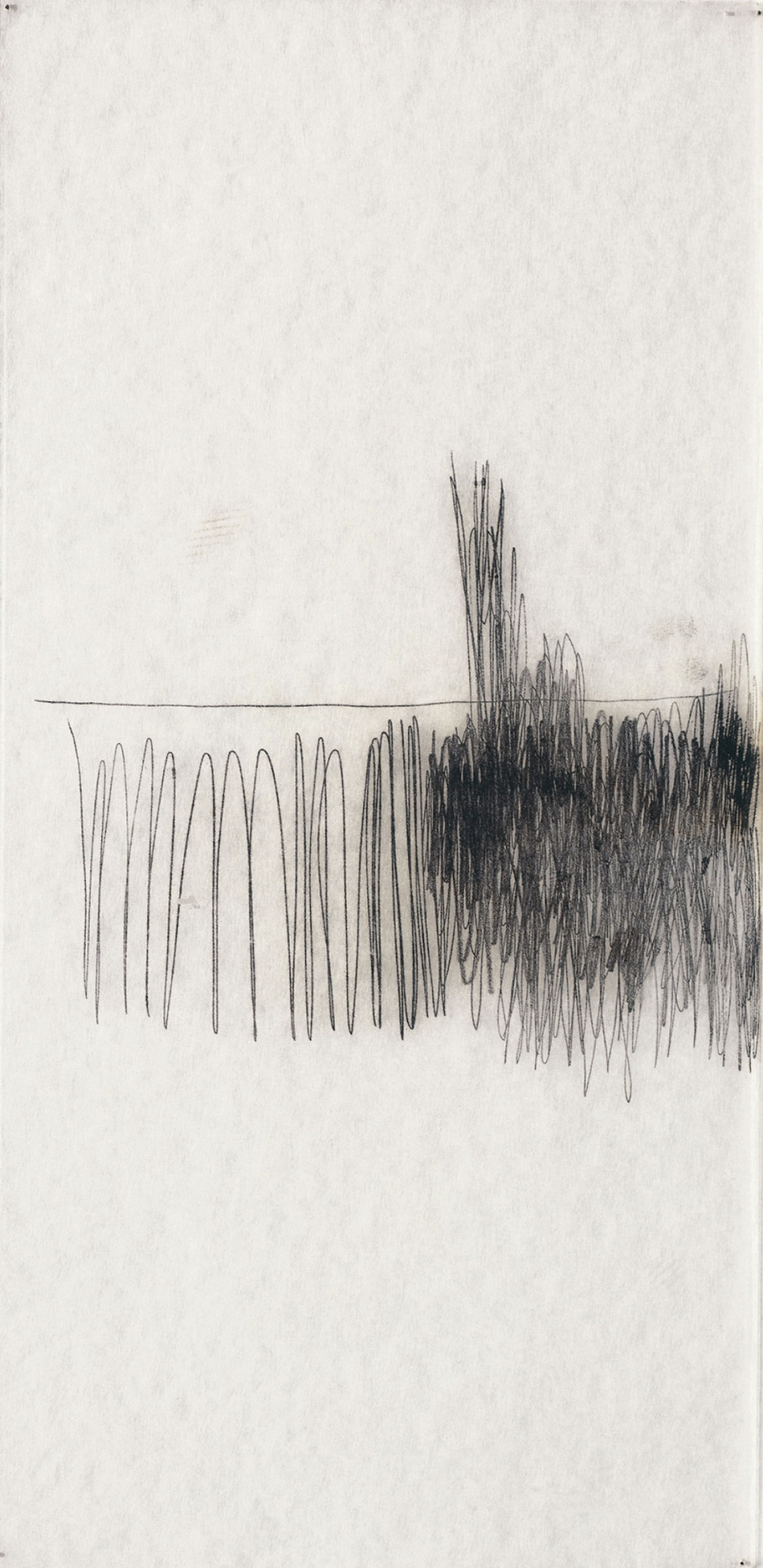
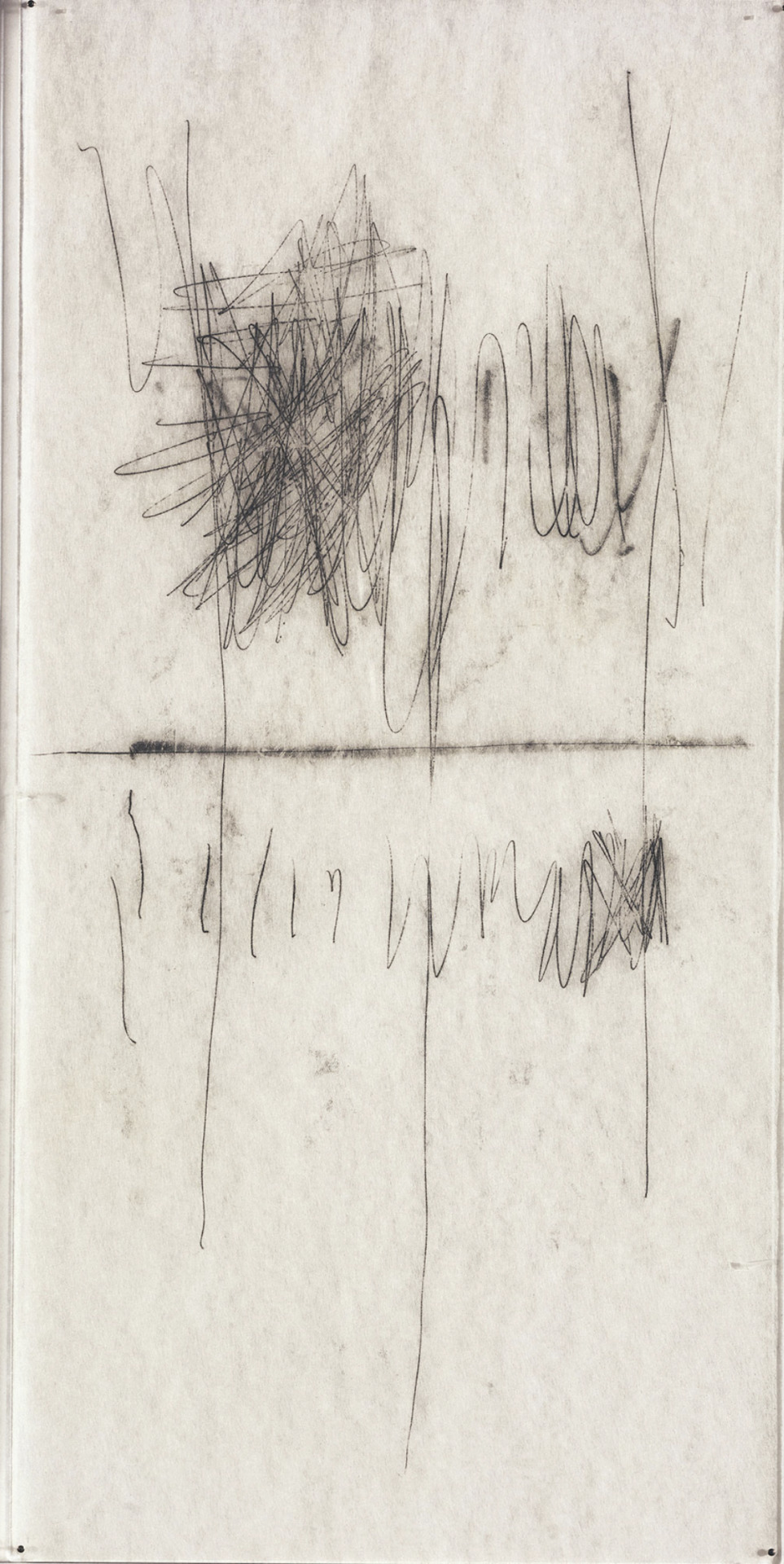
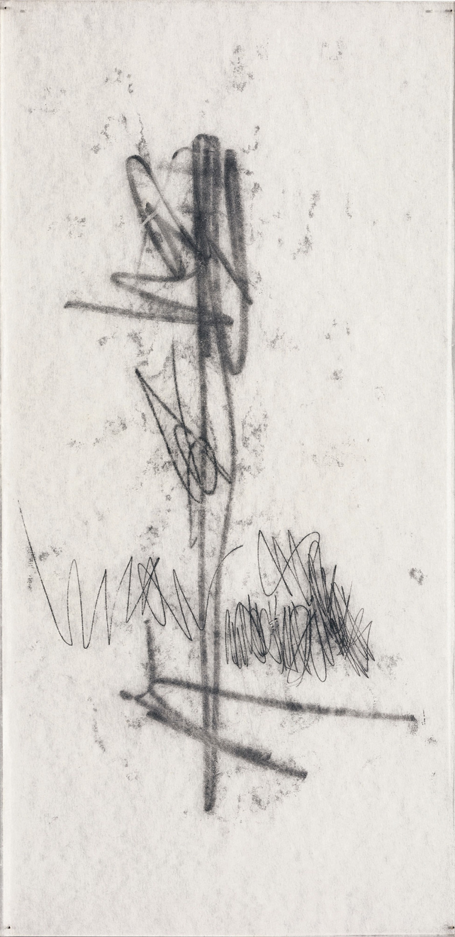
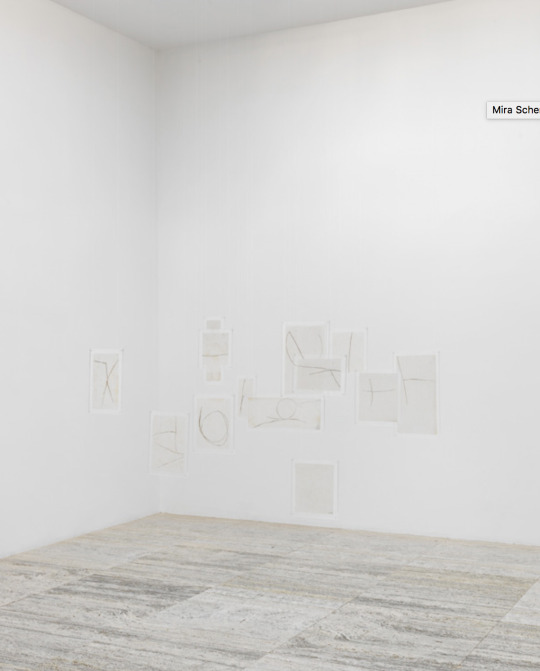

Mira Schendel Monotype series
Schendel was given a stack of fine Japanese rice paper that was too delicate to be drawn on or take any kind of water based paint and so, after meeting a woman who’s practice inspired her, began to experiment with monotype techniques. By adding a base coat of black oil paint to a sheet of glass and then covering it with a layer of talc, she was able to lay the paper on top and draw on it. As the oil paint seeped through, the moment was recorded.
‘The Monotipias initiated what the artist would later call the ‘problematic of transparency’ in her production. If one is able to perceive her interest in the relationship between opacity and translucency in the early paintings and gouaches of the 1950s, in which the contrast between light and dark, between fields of sparse and dense matter, was explored through asymmetrical geometric compositions, it was with these drawings that Mira would dress the issue of ground zero: in the specific physicality of Japanese paper she found fertile ground to experience the potency of ‘invisible visibility’.
This ‘invisible visibility’ is important in the articulation of my own themes of the trace of voice. It is like capturing the condensation on the glass that obscures the view to the street from the warmth of bodies inside a warm cafe on a cold day in December. Voice energy remains in the body, even after the sound has dissipated. As the people leave the cafe, the trace of their existence remains on the glass, slowly evaporating like a fading memory.
[W]ith a fingernail or sharp object she would ‘draw’: the trace materialized between the slightest friction between the body, the paper and the ink, in contract to the direct intentionality of drawing with graphite on paper. The delicacy of Japanese paper allowed the mark to be ‘recorded’ instantly on both sides, without the need of a press. This crossing of lines is critical to understanding how the artist discovered, through these oil drawings, which is key to the understanding of her poetics; namely that the process of ‘making visible’ is closely related to the thinness, no matter how subtle, of the matter.’
(Taisa Palhares, Mira Schendel: Monotypes. 2015, Pp. 419-421)
I will explore the monotype printing technique using the same method as Schendel to allow the trace of voice energy to take its own development.
#Mira Schendel#invisible visibility#the problematic of translucency#drawing#trace of existence#installation
0 notes
Photo


Mira Schendel Monotype series
Schendel was given a stack of fine Japanese rice paper that was too delicate to be drawn on or take any kind of water based paint and so, after meeting a woman who’s practice inspired her, began to experiment with monotype techniques. By adding a base coat of black oil paint to a sheet of glass and then covering it with a layer of talc, she was able to lay the paper on top and draw on it. As the oil paint seeped through, the moment was recorded.
‘The Monotipias initiated what the artist would later call the ‘problematic of transparency’ in her production. If one is able to perceive her interest in the relationship between opacity and translucency in the early paintings and gouaches of the 1950s, in which the contrast between light and dark, between fields of sparse and dense matter, was explored through asymmetrical geometric compositions, it was with these drawings that Mira would dress the issue of ground zero: in the specific physicality of Japanese paper she found fertile ground to experience the potency of ‘invisible visibility’.
This ‘invisible visibility’ is important in the articulation of my own themes of the trace of voice. It is like capturing the condensation on the glass that obscures the view to the street from the warmth of bodies inside a warm cafe on a cold day in December. Voice energy remains in the body, even after the sound has dissipated. As the people leave the cafe, the trace of their existence remains on the glass, slowly evaporating like a fading memory.
[W]ith a fingernail or sharp object she would ‘draw’: the trace materialized between the slightest friction between the body, the paper and the ink, in contract to the direct intentionality of drawing with graphite on paper. The delicacy of Japanese paper allowed the mark to be ‘recorded’ instantly on both sides, without the need of a press. This crossing of lines is critical to understanding how the artist discovered, through these oil drawings, which is key to the understanding of her poetics; namely that the process of ‘making visible’ is closely related to the thinness, no matter how subtle, of the matter.’
(Taisa Palhares, Mira Schendel: Monotypes. 2015, Pp. 419-421)
I will explore the monotype printing technique using the same method as Schendel to allow the trace of voice energy to take its own development.
0 notes
Photo

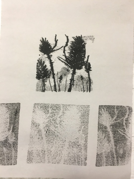


Table Top Monoprinting
Jeff Geib led this past Sunday’s workshop through a variation on monotype that was experimental and engaging throughout. Participants were asked to bring an image for reference of their choice, whether it be a master copy, sketchbook, photograph or an art book off of the shelf at SOCA, and all other supplies were provided.
Covering historical context for the process in relation to Gauguin’s use of it and breaking down the dynamics present in printmaking into “image, field and paper,” Jeff touched on aspects of each that ultimately translate into the print. Asking questions that encourage innovative moments natural to the process like: What is the permeability of the paper? How thickly have you applied the ink? What happens when you go too dark too soon? and, What is the surface of the paper your printing on like?
Participants started with a stencil guard, giving a sharp clean edged graphic and then were invited to push past the cleanliness to create bleeding edge and noisy, borderless prints.
Check out our website http://kingstworkshops.com for more workshops and information!
0 notes
Video
youtube
Edgar Degas: A Strange New Beauty
History of the Monotype
by William Jung
Monotypes are primarily a painter's medium. Although it originated in the printshop it was born through the painter's imagination and restlessness. It also became a perfect tool for exploring improvisation. Historically the first monotype by Castiglione was in the dark field also known as reduction or subtractive monotype. The basic technique entailed the rolling up of a non-porous surface and in the case of Castiglione most likely a copperplate normally used for etching at the time, with printing ink. Most likely it was first printed in the same manner as the etched plate due to its historic relationship to the etching with damp paper and an etching press. Similarly the plate was most likely prepared in much the same manner as an intaglio plate before "wiping". In the dark field or reductive method the image is wiped with rags, finger or sticks which may very well have been the back of paintbrushes that can be used later to brush back into the image, to correct an edge or build tone. The removed or wiped areas would appear white in the finished print.
The second method that was probably realized from trial and error was that you can also approach the monotype from the additive or "light field" manner. Here a clean plate is used as an empty field or canvas and printing ink is applied much like oil paints. While the ink was quite thick and viscous in the dark field monotype, in the light field it is thinned with solvent making the ink resemble something like watercolor. Where more tone was desired more ink was added, when softer tones were desired, more solvent was used.
Intrinsic to monotype is the bit of ink left over after the 1st print is taken. Second and even third pulls result in fainter images known as "cognates", or "ghosts". While all printing processes can yield lighter impressions their ghosts in monotype play a special role because they create a new set of tonal values, which can be, reworked or merely used references for the next image or series.
The technique of monotype is quite varied and its beginnings has not been taught as much as rediscovered and reinvented by each artist who uses it. The artist in turn emdows the technique with his or her own style, technique and artistic concerns.
The question arises as to why a monotype and not a painting or watercolor? Why a "print"? The answer may be that a great deal of surprise is built into the printmaking process where the image is: reversed, the image varies depending on how it's inked, how much pressure is applied, is it printed by an etching press or by hand using a baren? There are a lot of unpredictables involved and the spontaneity of the process demands energy, improvisation, gesture, expressiveness and directness. The artist must also appreciate the lushness and sensuality of working with ink.
text link
0 notes
Text
Consolidating practice- Studio Practice 2
Drawing inspiration from Hurvin Anderson nature paintings, particularly Ascension. The aim of todays session was to explore painting more loose, experimenting with different mediums and build up layers within a painting. The goal was to create a painting that feature lavender, St John Wort and Chamomile similar to a meadow. This would relate back to a theme within my project proposal featuring plants that can aid with mental health.
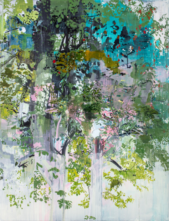
Hurvin Anderson. Ascension. 2017. Acrylic, oil on canvas.
Starting the painting

I started off with a light wash of Oil paint on primed canvas, prepped from a previous class. I wanted to start light to build up layers on.
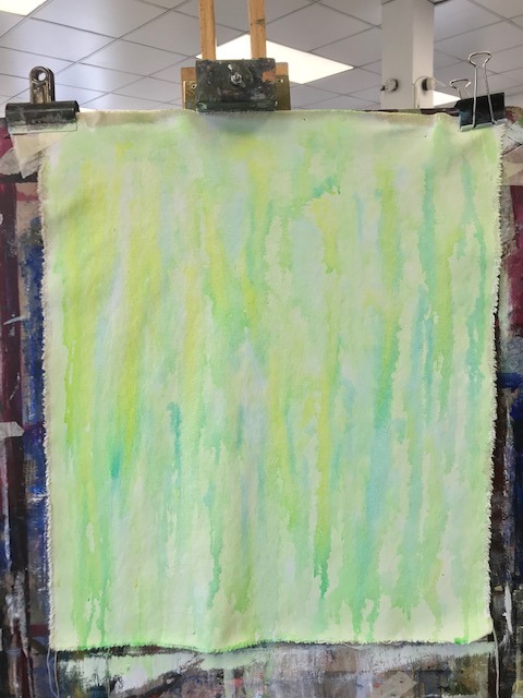
Next I used ink of yellow, greens and blues and let it drip down.

I moved onto adding marks of oil paint with a paintbrush to depict a field. However I wasn’t sure if I wanted to feature prominent mark making yet so went over it with another wash.
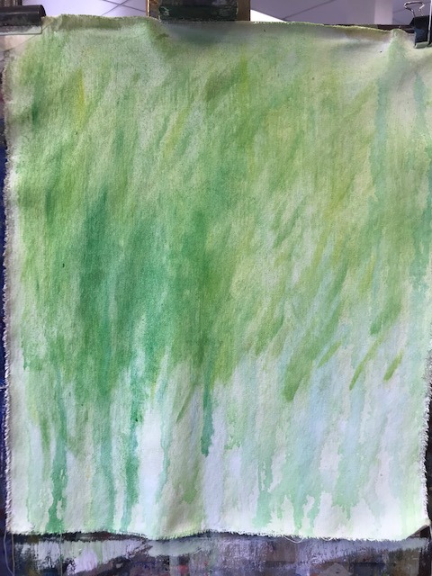
I added more drips with the ink and mark making with ink.
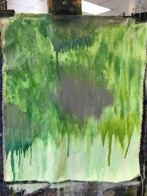
Happy with the background I began adding more oil paint in segments but still diluted down enough to drip. I began adding purple to depict areas lavender would be but also inspired by Anderson’s use of purple in Ascension. The painting was pretty wet by then and needed to let it dry before working more on it.

It was coming towards the end of the lesson and I had some left over mixed oil paints so applied it onto unprimed canvas to see how it would paint. The paint absorbed into the fabric but created interesting brush marks.
Reflection
What I wanted to do - I was a bit wary to use oil paints as I knew it takes a while to dry and also more work in terms of clean up. However I wanted to push myself and explore this paint so decided to use it for this session. I decided to use inspiration for Hurvin Anderson to experiment with oil paints and creating layers.
What went well and what I’ve learnt- I began using the oil paint as a thin base and work up from there. It is best to start thin with Oils and work your way up. I feel this was a good experiment to practice painting with Oils as it does differ to using acrylic. It was also a good exercise from building up light to dark, as well as blending and building up layers. I also wanted to use different mediums, particularly Ink as I had enjoyed using that last session. It was interesting to see how the ink reacted with the oil paint, separating but still successfully marking the canvas. Cleaning up was also good practice as oil paints needed to be thoroughly cleaned with linseed oil and rags. *Health and safety* The rags need to be disposed of safely to stop them combusting from potential heat. I did have to factor more time for clean up as it took longer than expected.
What didn’t go well/ I could improve on- Unfortunately oil paintings take a while to try, so was not able to work in more details, however it was a good starting point. I believe there’s a hairdryer in the studio, perhaps I could use that to help speed up the process? (Although I’m not sure if that would work or how it will affect the paint!). It also too me a while to start. As an improvement I could do some mark making exercises in my sketchbook could help loosen up or breaking down parts of Anderson’s painting and what I would like to recreate.
Next Steps
For the next studio practice class I would like to continue building this painting up, using oil paints, oil pastels and ink. It could also be interesting to do a painting like this on a larger scale and how that would impact create marks (ie broader strokes). I would also carry this over to printmaking and possibly explore mark making. Perhaps through trace monotype on fabric I would create a print depicting different consistencies of etching ink and how that would look.
0 notes
Text
5 Easy Font and Text Tricks to Modernize Your Website
June 26, 2020 5 min read
Opinions expressed by Entrepreneur contributors are their own.
Fonts and text sizes are overlooked features on many websites. The default settings on CMS platforms like WordPress and Wix are 14 pixels (px) and single spacing. Some premium themes have custom fonts, though they are almost always too small. But by modifying your site’s text size, spacing, and font family, you can increase your user’s time on site, page views, and readability — which all leads to lower bounce rates and higher search engine rankings.
Below are five ways to improve your website’s readability and rankings by updating the appearance of your content.
1. Text size
While there is no magic font size, Google may devalue your website if you use font sizes smaller than 12px. More and more, Google values usability and user experience, and if you have to pinch-zoom a website in order to read it, that’s anything but user friendly.
A font size of 12px is acceptable and is a common default for email and document software like Word. Webpages, however, benefit from larger font sizes like 18px or even 20px.
Before you or your developer start messing around with font sizes on your live website, it’s important to make sure it looks good. There’s no easier way to test font size changes on your website than by simply pressing ctrl and + on a Windows PC or command and + on a Mac, to zoom in. To zoom back out, press ctrl and – or command and -.
You will find that your website’s content may look good, and possibly better, at 110 percent, or even 125 percent. If so, have your developer change the font size to 125 percent of the original. If the original is 14px, 125 percent would be 17.5px, for example, which could be rounded down or up with minor changes.
Text size example:
The following image illustrates using the browser zoom function on a Wikipedia page about Google.
Related: How to Make Your Small Business Website Really, Really Effective
2. Text sizes for mobile devices
Since mobile devices offer much less screen space, your font sizes need to be mobile-friendly. For regular content in paragraph form, my recommendation of 18px to 20px for a website will work on any device, from a desktop computer to a cell phone. But for headers on the True Blue website, we occasionally go big — in some cases 40px to 50px, or even larger. If you do this, you’ll need to scale it down for mobile devices, or your readability will suffer. The same is true for small fonts. Perhaps your website form shows a small label above the field at a font size of 12px. On a mobile device, this could be way too small to read, especially for older people.
Example of a mobile-friendly versus not-mobile-friendly website:
3. Text/font family
Readability is a must, but that doesn’t mean you’re restricted to using font families such as Arial, Helvetica, or Times New Roman. While it might not be the best idea to use your personal favorite font on your website, like Comic Sans (yikes!), there are tons of great-looking, cloud-served fonts readily available, for free.
Fonts like Roboto or Open Sans have become very popular. Using a different font like one of these helps your website, and your brand, to stand out a bit from the competition. And, when used properly, a non-typical font can enhance the overall aesthetics and readability of your website. Here’s an interesting fact: Roboto was created by Google to be the main font for Android devices. While it received a lot of criticism at first release, the font has since been used by over 40 million websites.
Related: This App Lets You Build a Fully Functioning Website in Seconds
4. Text color and contrast
To be readable, the color of your fonts must be clear and provide sufficient contrast. A lot of websites play it safe and go with a white background and black font. But that’s not ideal.
Many people have a condition called Irlen syndrome, which causes difficulties in processing visual information, including contrast sensitivity. When you have contrast sensitivity, black text on a white background looks something like this:
That red text on a blue background isn’t very readable, is it? It’s important to find a middle ground. On a white background, a safe bet for the font color is a dark shade of gray, such as #30303a. This hexcode is the specific color of the font we use on our website, True Blue Life Insurance.
5. Text spacing
Apply proper spacing on all elements throughout your website by using margins and paddings. These are the gaps of white space below a header, for example, or the white space above and below the menu items in a header.
Along with spacing between elements, line height, a CSS property that determines the amount of white space between each line of text in a paragraph, is equally important.
Line height example:
As with text size, there is no magic number for line-height, but I find that a value of 1.5em or 150 percent is ideal. Take a look at the following graphic that illustrates the impact line-height has on readability.
Bonus tip:
The best content is content you can read. Not everyone has perfect eyesight. Let’s make it easy for our customers to read our content without having to squint. Take the time to test your website’s font family, text size, and spacing. By implementing these recommendations, your website’s user stats and search engine rankings will soar.
Related: Broaden Your Branding with These Fonts From Monotype
loading…
Website Design & SEO Delray Beach by DBL07.co
Delray Beach SEO
source http://www.scpie.org/5-easy-font-and-text-tricks-to-modernize-your-website/
source https://scpie.tumblr.com/post/622044467927678976
0 notes
Photo
Three Apples and Plate, Henri Matisse, 1914-1915, Minneapolis Institute of Art: Prints and Drawings
The creation of a monotype involves drawing a design in ink on a smooth, nonabsorbent printing plate. While the ink is still wet, a sheet of paper is applied to the plate, which is then run through a press to transfer the image to the sheet of paper. Unlike other printing processes, the monotype technique allows for only one unique impression to be taken from the plate. Matisse monotypes all date from a short period during the mid-teens, when he produced a total of about seventy. Artists frequently use monotype to create their images by building up desired areas of the dark ink on the surface of the plate. Matisse, however, reversed the process. He began with a plate completely covered in black ink, and subsequently scratched lines of varying width through the field of wet ink. The resulting white lines in his printed monotypes electrify and seem to quiver against the deep black ground.
Size: 3 5/8 x 5 5/8 in. (9.21 x 14.29 cm) (image) 10 5/8 x 14 3/8 in. (26.99 x 36.51 cm) (sheet)
Medium: Monotype on chine paper
https://collections.artsmia.org/art/67513/
10 notes
·
View notes
Text
5 Easy Font and Text Tricks to Modernize Your Website
June 26, 2020 5 min read
Opinions expressed by Entrepreneur contributors are their own.
Fonts and text sizes are overlooked features on many websites. The default settings on CMS platforms like WordPress and Wix are 14 pixels (px) and single spacing. Some premium themes have custom fonts, though they are almost always too small. But by modifying your site’s text size, spacing, and font family, you can increase your user’s time on site, page views, and readability — which all leads to lower bounce rates and higher search engine rankings.
Below are five ways to improve your website’s readability and rankings by updating the appearance of your content.
1. Text size
While there is no magic font size, Google may devalue your website if you use font sizes smaller than 12px. More and more, Google values usability and user experience, and if you have to pinch-zoom a website in order to read it, that’s anything but user friendly.
A font size of 12px is acceptable and is a common default for email and document software like Word. Webpages, however, benefit from larger font sizes like 18px or even 20px.
Before you or your developer start messing around with font sizes on your live website, it’s important to make sure it looks good. There’s no easier way to test font size changes on your website than by simply pressing ctrl and + on a Windows PC or command and + on a Mac, to zoom in. To zoom back out, press ctrl and – or command and -.
You will find that your website’s content may look good, and possibly better, at 110 percent, or even 125 percent. If so, have your developer change the font size to 125 percent of the original. If the original is 14px, 125 percent would be 17.5px, for example, which could be rounded down or up with minor changes.
Text size example:
The following image illustrates using the browser zoom function on a Wikipedia page about Google.
Related: How to Make Your Small Business Website Really, Really Effective
2. Text sizes for mobile devices
Since mobile devices offer much less screen space, your font sizes need to be mobile-friendly. For regular content in paragraph form, my recommendation of 18px to 20px for a website will work on any device, from a desktop computer to a cell phone. But for headers on the True Blue website, we occasionally go big — in some cases 40px to 50px, or even larger. If you do this, you’ll need to scale it down for mobile devices, or your readability will suffer. The same is true for small fonts. Perhaps your website form shows a small label above the field at a font size of 12px. On a mobile device, this could be way too small to read, especially for older people.
Example of a mobile-friendly versus not-mobile-friendly website:
3. Text/font family
Readability is a must, but that doesn’t mean you’re restricted to using font families such as Arial, Helvetica, or Times New Roman. While it might not be the best idea to use your personal favorite font on your website, like Comic Sans (yikes!), there are tons of great-looking, cloud-served fonts readily available, for free.
Fonts like Roboto or Open Sans have become very popular. Using a different font like one of these helps your website, and your brand, to stand out a bit from the competition. And, when used properly, a non-typical font can enhance the overall aesthetics and readability of your website. Here’s an interesting fact: Roboto was created by Google to be the main font for Android devices. While it received a lot of criticism at first release, the font has since been used by over 40 million websites.
Related: This App Lets You Build a Fully Functioning Website in Seconds
4. Text color and contrast
To be readable, the color of your fonts must be clear and provide sufficient contrast. A lot of websites play it safe and go with a white background and black font. But that’s not ideal.
Many people have a condition called Irlen syndrome, which causes difficulties in processing visual information, including contrast sensitivity. When you have contrast sensitivity, black text on a white background looks something like this:
That red text on a blue background isn’t very readable, is it? It’s important to find a middle ground. On a white background, a safe bet for the font color is a dark shade of gray, such as #30303a. This hexcode is the specific color of the font we use on our website, True Blue Life Insurance.
5. Text spacing
Apply proper spacing on all elements throughout your website by using margins and paddings. These are the gaps of white space below a header, for example, or the white space above and below the menu items in a header.
Along with spacing between elements, line height, a CSS property that determines the amount of white space between each line of text in a paragraph, is equally important.
Line height example:
As with text size, there is no magic number for line-height, but I find that a value of 1.5em or 150 percent is ideal. Take a look at the following graphic that illustrates the impact line-height has on readability.
Bonus tip:
The best content is content you can read. Not everyone has perfect eyesight. Let’s make it easy for our customers to read our content without having to squint. Take the time to test your website’s font family, text size, and spacing. By implementing these recommendations, your website’s user stats and search engine rankings will soar.
Related: Broaden Your Branding with These Fonts From Monotype
loading…
Website Design & SEO Delray Beach by DBL07.co
Delray Beach SEO
source http://www.scpie.org/5-easy-font-and-text-tricks-to-modernize-your-website/
0 notes
Last Seen Blogs

cleavage
Cleavage Lover

boneinlayartsblog
Untitled

angelstate
ִֶָ ⊹ 𝑺𝒆𝒍𝒆𝒏𝒆 ⊹ ִֶָ
cleavage
Cleavage Lover

tamilcoach
Untitled