#digital art tips
Text
DEAR ARTISTS, PLEASE READ THIS POST I STUMBLED ACROSS
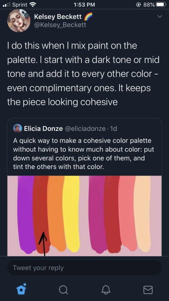
IF YOU ARE NOT DOING THIS ALREADY, YOU SHOULD TRY IT
I even tested it out myself, it works great
#art#artist tips#artist tip#digital art#colors#color pallete tips#color pallete#art tip#art tips#drawing tip#drawing tips#digital art tips#digital art tip
61K notes
·
View notes
Text
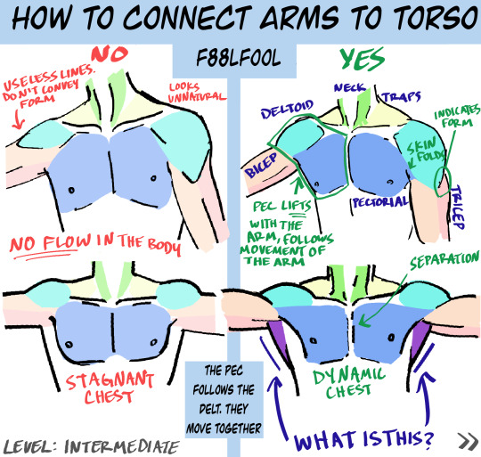
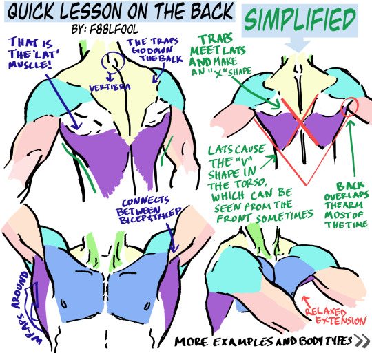
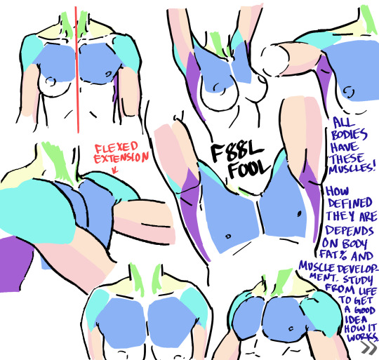
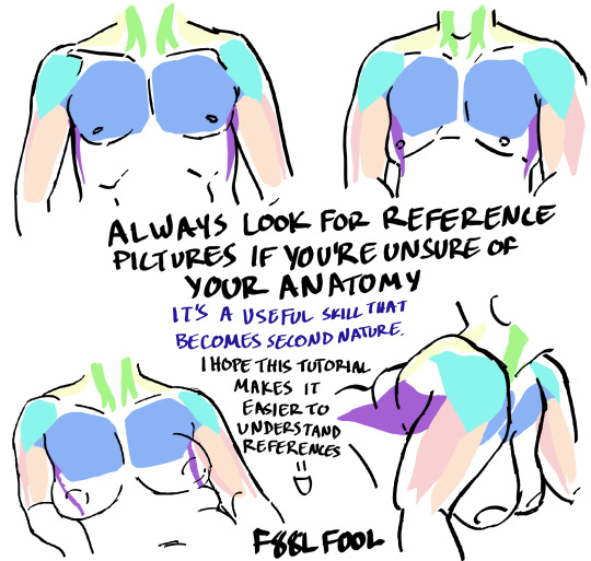
My first anatomy tutorial. How I connect arms to the torso. Simplified the muscles for better comprehension
PS. Pectoral is misspelled as “pectorial” in the picture. Don’t make that mistake haha
And I’d love to see the art made from using these as reference, you can message or tag me.. whatever you want
Edit: The extended names of the muscles:
Neck - Sternocleidomastoideus
Traps - Trapezius
Lats - Latissimus Dorsi
#pec-torial#pec tutorial#there i said it#also keep in mind each body (even the leanest ones) have fat on them#a reblog pointed this out and I thought it was a good reminder#none of these bodies have 0-1% bodyfat#art tutorial#anatomy#anatomy tutorial#drawing tutorial#drawing tips#muscles#muscle tutorial#art study#digital art tips#anatomy tips#art ref#art#reference#tutorial#art references#titorial#f88lfool
27K notes
·
View notes
Photo
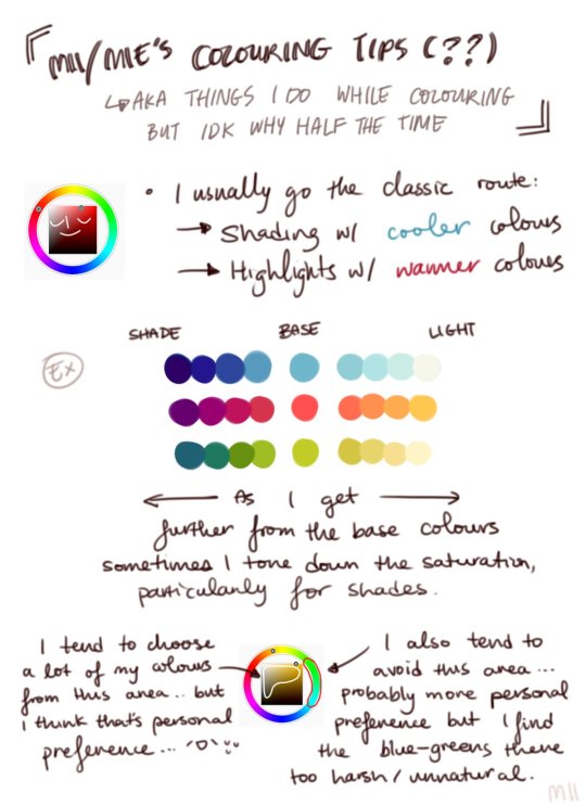

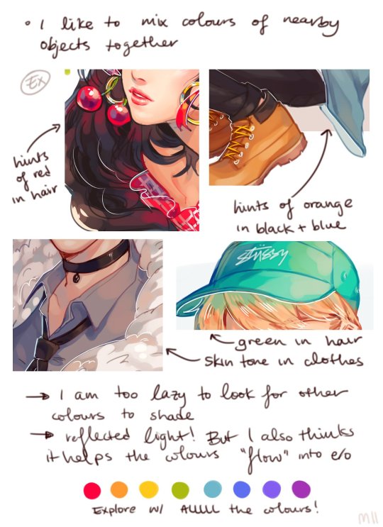
Digital Coloring Tutorial by Mii
5K notes
·
View notes
Text
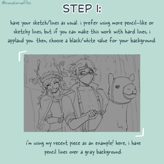
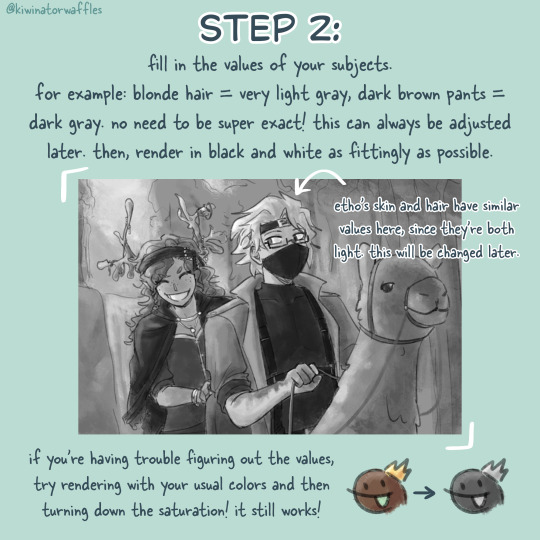
HOW I PAINT WITH GRADIENT MAPS

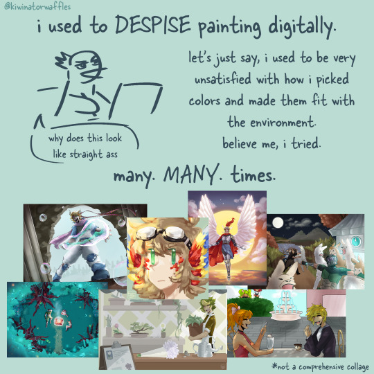
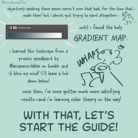
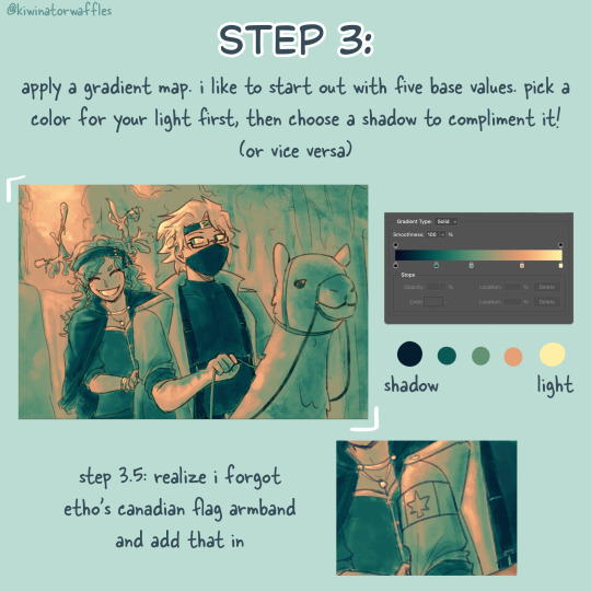

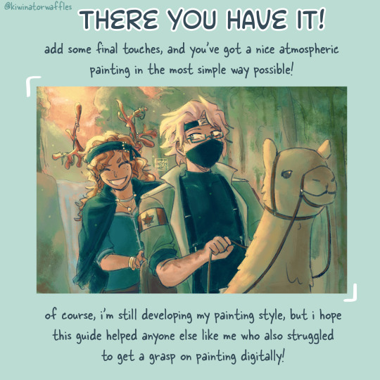
the post by arcanescribbles where i learned this technique! check out their works!
an even simpler version of this is to just lightly brush colors over a base color in the background and then go off of that. otherwise, i hope this can help!
a full version of my example piece here
#congrats to etho for being in all 3 of my gradient map paintings so far#art tip#art tips#art tutorial#painting tutorial#digital art tips#art help#drawing tips#digital art#kiwi’s scribbles#kiwisonator
419 notes
·
View notes
Text
How I draw: Silver Metallic Buttons for Sims 2 Textures
As we all know, Sims 2 doesn't really appreciate large file sizes/dimensions for it's textures, so sometimes you have work very closely with the individual pixels. Here is how I draw buttons. Video is sped up so don't feel like you need to draw as fast as me!
Side note: this tutorial is created on the basis that you already know how to use the basic functions of Sims BodyShop to extract the texture file. There's plenty of tutorials out there explaining that so please don't ask me to clarify on that part. Anyway, on to the buttons...↓↓↓
What you need:
A PC
Digital Drawing app (like Photoshop, Krita etc)
A Graphics Tablet with pen - you could try this with a mouse but I wouldn't recommend!
And obviously Sims 2/Sims 2 BodyShop
First off, create a new layer - we don't want this button permanently stuck to our base texture. Then I get a standard hard edge brush (I use Krita as my drawing software, so just use whatever hard brush is available in your preferred software/app). Because I'm making relatively small buttons, I make my brush 7.09px in size. Select a mid to light grey colour as the base. Make a single circle.
Then decrease the brush size to be nice and small. As a comparison to my 7.09px circle, I decrease to 0.01px for this next step. Choose a slightly darker grey colour and lightly sketch in a 'semi-circular line' about 3/4 of the way around just in from the edge of the circle. By lightly sketching - and not pressing down hard, you'll get varying tones on each pixel to represent different reflections on the 'metal'.
Next choose a darker grey again, and lightly sketch around the similar area as the last colour, but don't be too fussy on hitting the same pixels - we want varying tonal values for our shadows.
Then choose white and lightly sketch the 'catch light' part of the button. This doesn't need to be right in the centre, in fact it's better if it's off to the side, or towards the top more. We're not always facing directly towards a light source so this creates a more realistic lighting effect. You'll see me select the same mid to light base grey I used just to lightly dust over the edges of the white area to soften it a tiny bit (only do this if your white edge is a little to crisp).
After that I go back and forth between a few different tones of grey to lightly sketch over the parts we haven't really drawn on yet. This just helps create some gradual shading that enhances the 'roundness' of our very flat, very 2D button texture.
Once you're happy with the shadowing (remember it looks somewhat janky this close up, but you can always zoom out to see if the button looks more smooth when further away), you can then make another layer, and drag it below your newly made button layer in the layer menu. Select a soft edge brush and increase the size to slightly wider than your buttons overall size (I chose 9.14px compared to my 7.09px button)
Choose black from the colour wheel/palette and lightly build up the shadow underneath the button, gradually increasing size and opacity until desired tone. If the colour of the 'garment' in this texture is light then keep the shadow to a minimum, if it's dark then the shadow needs to be deep enough to show up.
Zoom out and inspect how this button looks further out. If you're satisfied, then merge the button and shadow layers together, copy/paste it as many times as needed for the garment you're texturing and Voila! You made buttons for a Sims 2 Texture!!
Feel free to ask any questions below - I'm definitely no professional, especially in creating tutorials so I'm more than happy to clarify if something didn't make sense.
#sims tutorial#digital drawing#retexture#drawing tutorial#ts2#the sims 2#digital art tips#lraerosesims#lraerosesims-tutorials
86 notes
·
View notes
Note
Hey dunno if you already answered that but how do you manage to put the glowy/sparkly/ethereal effects on your panel edits and lore rekindled posts? It's just so good and I'd like to incorporate this in my art but I'm not sure how
Have a nice day!
If you're using a standard drawing software, it should come with a layer blending mode called Add (Glow) or something worded similarly! Pick a brush, pick a light-toned color, and have at it! <3
#altho always remember that less is more!#use it like perfume#it should complement your art not compete with it!#ama#anon ama#anon ask me anything#ask me anything#art tips#digital art tips
65 notes
·
View notes
Note
hey e-vay! so glad to have u back! in fact i literally got so so excited that you updated my gal i had to read it right away even though it was 3am! lol
anyway, here’s my question which isn’t too interesting: i’m pretty new to procreate and my dream is to post stuff online for my friends and share my interests with others! i was wondering if you could share a bit about your process with that. in fact, i’m struggling with making my drawings not look blurry and figuring out how to export them to be able to post 🥲 thanks in advance and, welcome back once more! <3
Thank you so much! I'm happy to be back and I'm so happy you enjoyed My Gal!
I'm relatively new to Procreate as well, but you'll get the hang of it in no time! The main thing you need to know is that Procreate is a raster-based program, not vector-based. I won't go into the nitty gritty of that; raster just means that once you start drawing, what you see is what you get. You won't be able to make it bigger or smaller without damaging the art.
So because of that, you need to get all your preferences set up before you start drawing. You want your canvas to be a large size and you may even want a higher resolution. You'll have to experiment, but I do most of my drawings at 2400x1500 in size and I draw in anywhere from 150 DPI to 300 DPI. You don't need 300 DPI if you're just making casual art for online use only :) Here's a video showing how to change these settings. And here's an image where you can find the canvas tools:
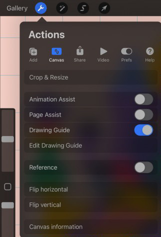
Now you can start drawing and it shouldn't be blurry!
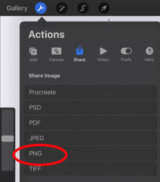
When you're ready to share it, I recommend exporting it as a PNG. PNGs are much better at preserving the quality of your art instead of JPGs. Here's where you can find that:
Don't feel discouraged. It took me years of practicing and experimenting and looking up tutorials when I first switched from traditional art to digital art. But these tips should help you significantly!
65 notes
·
View notes
Text
Lilith singing🤩

guys plz I’m so ready for her to actually be in the showwwwww
Click for quality 🥳
#hazbinhotel#hazbin hotel fandom#Drawung#illustration#art#illustrator#Lilith#lilith morningstar#lucifer#lucifer and lilith#hazbin lucifer#lucifer magne#hazbin hotel lucifer#lilith magne#lucifer morningstar#writers of tumblr#aspiring writers#Digital Art#Digital Art Tips#art tips#art community
29 notes
·
View notes
Text
is your sketch looking absolutely fabulous but then you do the lineart and it just looks so weird and clunky? solution: don't do lineart; just go in with the eraser and clean up the sketch. absolute lifesaver.
#this is just what works for me :)#art#artist#art tips#art advice#digital art#digital artist#digital art tips#random ass art tip#lol
33 notes
·
View notes
Note
What art program(s) do you use? I wanna learn how to do digital art but idk where to start.
I use procreate now (it's only for iPad).
When I worked on PC I used Krita and PainToolSAI
And when I had a samsung tablet I used Autodesk Sketchbook premium version
The style tecnique
For the digital art part, for me it was trial and error all the way. I experimented with styles and tecnhiques. When I saw a style that I liked I tried to mimic it. For example I tried to develop a similar style to the Dishonored concept arts for years, and I learnt so much with it.


My tecniques:
The one layer
I have a skecth layer, and I draw on it.
Colored shaded base + Flat colours in overlay mode

Flat colours + shading on hard light layer

This is the tecnhique I use the most right now.
Just packing everything on each other, see what comes out of it

Everything with everything xd
What (almost) I always have: a sketch layer and a background color
59 notes
·
View notes
Text
Source + CC under cut
CC: If you're an artist who tends to love your sketches but hate your final product, these tips might help.
First lighten your sketch and change it to a different color so it's really easy to see how your ink lines are actually looking.
Next, take time to find a brush that you actually like, don't just stick with the default ones. I tend to like inky brushes that have a little bit of this texture on the edges, I feel like it just makes it have more personality.
Don't be afraid to keep your actual lineart a little sketchy too. I feel that it often gives the art pieces a little more of that hand-drawn quality, and it can just make your lines look more interesting. It's really not a bad thing.
Hatching can make it look more hand-drawn.
If your colors aren't looking harmonious, put one unifying color underneath and then lower the popacity. It'll make them kind of blend together.
Lastly, overlaying some texture onto your art can really give it some personality.
Hope this helped!
#lavendertowne#art tutorial#art tip#art tips#digital art tips#digital art advice#tiktok#tiktok video#art appreciation#artists of tumblr#tiktoks#advice#art advice#art help#advice for artists#artist help#cc provided#captioned
91 notes
·
View notes
Text

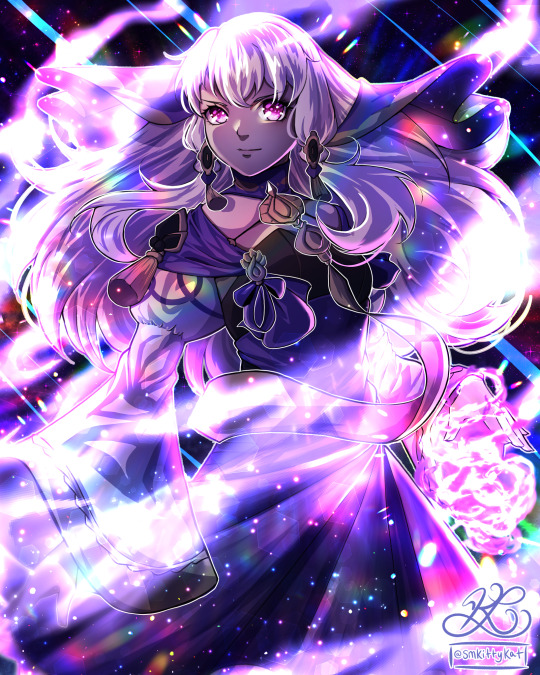


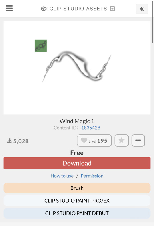
One of my favorite brushes for wind magic effect!
42 notes
·
View notes
Text
So, I know people struggle with self-criticism of their own art like me. I have some tips! These help me. Check below! ☺️🥰❤️
- Finish the product with all your small mistakes. Why? Because after you look at it, you’ll be like, “Ugh, This sucks” and want to fill in detail and whatnot. Don’t do it. Use it as a learning experience for the next time. (NO ART IS BAD BTW)
- Try different approaches if one way doesn’t work. Don’t force THAT way to work or you’ll get burned out.
- TAKE. BREAKS. PLEASE. (BURNOUT IS REAL)
- If digital? ALWAYS MAKE A COPY OF YOUR OUTLINE! (Rename it, too). So if you mess up, you can start over without COMPLETELY starting over.
- Remember: There is NO such thing as BAD art. It’s all about interpretation and perception. Remember Picasso, Da Vinci, Normal Lewis, Van Gogh, Bob Ross, and so many other amazing artist.
- Don’t think just because pen and paper our outdated that you have to switch. If you want to, awesome. But people still buy and adore physical art.
- We are OUR OWN WORST CRITICS. Yes, our opinion should always come first, but not if it’s just negativity. Remember: No art is bad. It’s only bad when you don’t bother try.
- Tutorials! Tutorials! They are HELPFUL! No harm in asking for help.
#art tips#digital art tips#self taught artist#small artist#digital artist#photoshop#procreate#pen and paper#theres no such thing as bad art#gimp#handrawn#illistrator
10 notes
·
View notes
Note
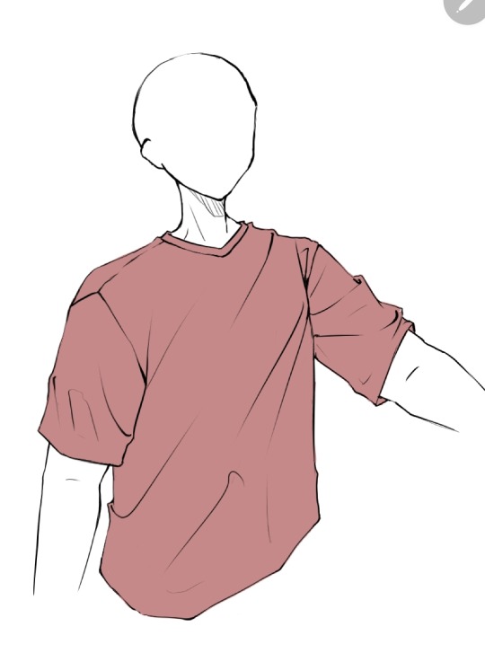
How do you sketch & render your clothing folds, if i may ask? They look very pretty!
I am the least qualified person to give a tutorial but sure let's do this.
No I'm a self taught artist so a lot of this is just me using the good ol' "Fuck around and Find out" technique. So the example I'll might not be the best but it will give a general idea.
First you get your sketch/lineart + flat color. As you can see I've already drawn the fold lines. It's best to know where the shirt is getting pulled more from because that's the general direction that the folds start from and where fore folds are.
Next, on a clipping layer, I just draw with a darker color the places that will be shaded with a watercolor brush or pencil brush, just a brush that kind of fades works. This doesn't have to be accurate coloring it can be just messy blobs. But always keep in mind were the light is hitting the shirt so you'll know which direction to draw the shadows bigger and darker at
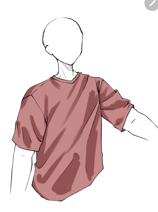
Than with a soft eraser I start erasing the shading and fixing it by going back with the brush. This is a lot of back and forth between the eraser and brush until you get to a point where it looks good in your eyes (i lowered the opacity a bit here because I thought the shade color was too dark)
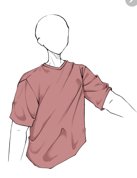
(Note: during more detailed drawings I like to go in with a darker shade color at the deepest corners for more depth and detail)
On a new clipping layer, by using an airbrush or the gradient tool, with the same colour I used for the shading, I darken the top and bottom. Why? Because it looks cool idk.

And usually that's where I leave it but sometimes I might add a lighter color for some lighting on the cloth by using the same steps as for the shading, this may depend on the fabric you imagine the clothes have. Or I've seen some people airbrush the parts of the outfit near the skin and that gives off a cool effect too
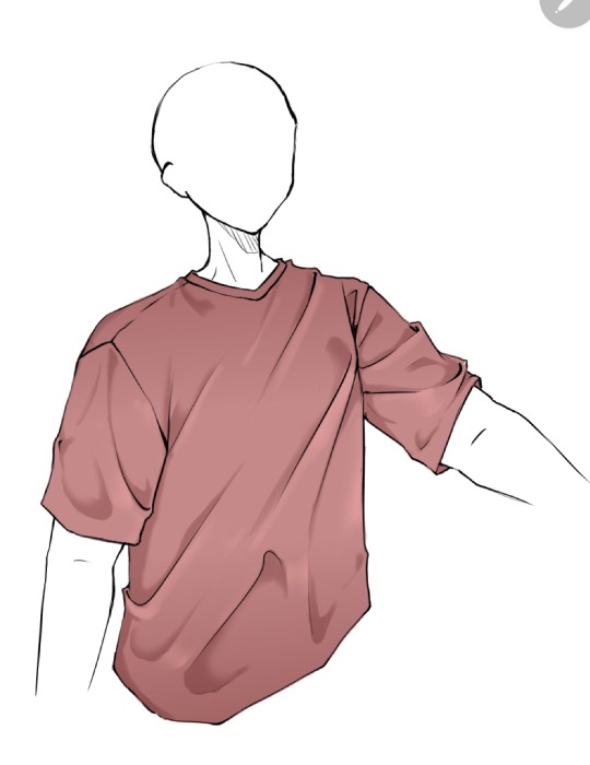
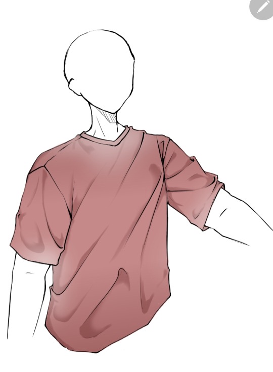
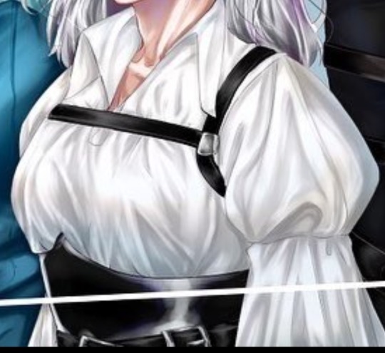
Now as you might have noticed this is the ugliest shirt ever. And that's because I did this in 10 minutes from my ✨️imagination✨️. Usually I have reference pics when drawing which give me a general idea of how the folds should look like and that is a life saver. This was just to give a general idea of how it works. Here are some examples of actual good shading I've done
Hope this helps👋✨️
#mura answers asks#shading#shading tutorial#art tutorial#digital art tutorial#digital art tips#digital artist#digital drawing#digital art#artist#artist on tumblr
15 notes
·
View notes
Text
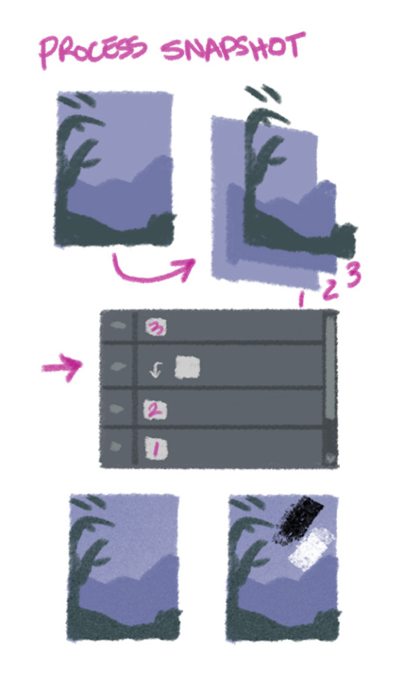
Process snapshot!
Here is a look at something I've been doing a lot lately: keeping my major compositional elements on their own layers.
When doing a digital painting, I put the background, midground, foreground and fine detail on their own layers. Then I use a clipping mask to paint over one element at a time. I can turn the clipping layer on and off to check my progress, then merge it into the element layer once I'm happy.
Bonus: for a quick start, I use black and white on clipping layer above my element layer, and set the clipping layer to "Overlay" blending mode! I use this for some basic depth and texture before I start adding colour variation.
#process snapshot#digital art tips#layers in photoshop#layers in procreate#probably layers in most art programs tbh
29 notes
·
View notes
Text
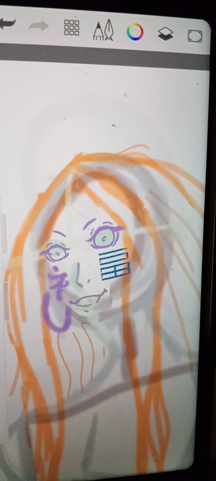
Something looks off and I can figure out what

#art help#artists on tumblr#art tips#digital art tips#shuumatsu no valkyrie#record of ragnarok#krixa15#fanart#my art#artwork#art wip#current wip#wip#wip wip wip#wip wednesday#work in progress
7 notes
·
View notes
Last Seen Blogs
mmk-xo
ωαи∂єяєя
jimnyung-blog
#여권제작 #여권위조 #여권제작 #여권위조 ▷주

latinstock-es-blog
Latinstock.es

vinedication
Vine Facts
hornyacademia
Tired Hades