#dyke kitsch
Text

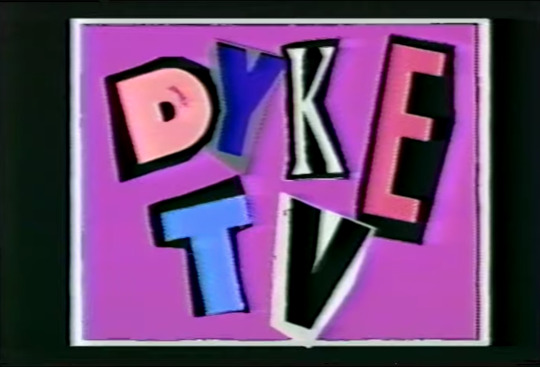
Dyke TV, 1993
468 notes
·
View notes
Text
SKYSCRAPER - 1959: 666 Fifth Avenue, NYC
“It takes a lot of men a lot of time to put a scraper in the sky” – Song from the film
film by: Shirley Clarke, William Van Dyke, Irving Jacoby | music: Theo Macero

The Oscar-nominated, mostly B&W short film shows the construction of 666 (or 660) Fifth Avenue; the Tishman Building. The movie is half narrated and half sang as it follows the design and development process of the construction of the skyscraper between 1955 and 1957. The building itself is infamous for its ownership and tenants over its years, it undeniably holds a prominent place in culture and society.
57. Camp taste nourishes itself on the love that has gone into certain objects and personal styles. The absence of this love is the reason why such kitsch items as Peyton Place (the book) and the Tishman Building aren't Camp. (Sontag, 1964 p.13)

The film goes through the design phases like architectural drawings, modelling and then the engineering calculations that were (still are) necessary for building a skyscraper.

The modelling of the interior was done in the same detail-specific way as the rest of the building like a typical office space interior is modelled on a small scale to demonstrate the proportions.

The final interior is shown in a re-coloured version, where a period typical mid-century modern design dominates the furnishing and design choices in the offices.

The design for the larger spaces would not stand out from modern corporate architecture, the lobby creates a spacious and well-lit interior with marble flooring and a wave-like illuminated ceiling, while the office space is separated by a divider which – due to its design – lets the light from the floor to ceiling windows through.
Full movie:
https://www.youtube.com/watch?v=r4u4MBCANFM
Sources:
Susan Sontag: Notes on "Camp" (1964)
https://en.wikipedia.org/wiki/660_Fifth_Avenue
0 notes
Text

#there it isssss#in all its glory#mine#fashion#kitsch#kawaii#lgbt#lesbian#pride month#rainbow#80s#90s#aesthetic#dyke#pride#necklace#sapphic
1K notes
·
View notes
Photo

Recently watched: Young Man with a Horn (1950). Directed by Michael Curtiz (Casablanca, Mildred Pierce), it covers the rise and fall of an idealistic, uncompromising young jazz trumpeter Rick Martin (Kirk Douglas) in the hard-bitten, dog-eat-dog neon jungle of New York’s nightlife. Doris Day co-stars as Jo, the wholesome and sympathetic big band singer who’s in love with Rick. If he only he could see she’s perfect for him! The dramatic black and white film noir photography is spectacular and it gets wildly, pleasurably overwrought as it progresses, encompassing alcoholism, nervous breakdowns and pneumonia. Note: your enjoyment of Young Man with a Horn will depend on how much you can tolerate watching Douglas mime playing trumpet in the frequent musical sequences.
BUT mid-way through the film Lauren Bacall – that smoky-eyed Siamese cat-in-human form – rocks-up as Amy North, Douglas’ frosty, frigid rich bitch socialite wife and blows everything apart. Perennially wreathed in cigarette smoke and meant to represent the polar opposite of Doris Day, Bacall’s sleek and soignée appearance belies a roiling, wildly dysfunctional (possibly mentally ill) interior. Amy is cultured and worldly, sexually ambivalent, independent, speaks Latin and is studying to be a psychiatrist: in the context of the film, her intellect is depicted as off-putting and unappealing. Worst of all – she admits she doesn’t actually like jazz! There are hints of repressed lesbianism: Rick and Amy are seen to sleep in separate single beds, and she’s subtly coded as queer recognizable to contemporary 1950 audiences in the way that characters played by, say, Peter Lorre or Sydney Greenstreet would also have been understood as gay. As Ian Scott Todd writes in his blogPrimal Scenes:
“Amy is neurotic, withholding, passive-aggressive, and anal-retentive, to name only four of her “symptoms.” All of the other familiar lesbian signifiers are here, too, in her elegant but mannish suits, her stand-offish demeanor, and the sophisticated décor of her apartment. Bacall’s Amy North is what Halberstam might classify as a predatory dyke: calculating, urbane, aloof. She matches her interior space, with its hard, sleek, coldly elegant surfaces, off-set by touches of the bizarre, such as a pet cockatoo to which she refers—ominously—as her “best friend” … Amy is an example of the predatory dyke as femme fatale, trapped within the gilded cage of her own sexual “perversity,” someone to run away from, preferably into the arms of a “real” woman. And yet, like all femme fatales, Amy’s dangerous sexuality makes her infinitely more attractive than the blandly chipper Jo, whose normality is, indeed, terrible.”
Towards the end, Amy casually tells Rick, “I’ve met a girl – an artist. We might go to Paris together.” Here Bacall suddenly anticipates Cate Blanchet in Carol (2015). “You’re a sick girl, Amy!” Rick finally shouts as their marriage unravels. “I’m sick of you trying to touch me!” she screams. The ostensibly unsympathetic but compelling and complex Amy represents the late Bacall’s strangest, most intense performance and she steals the film from Douglas and Day. I don’t recall her ever being asked about Young Man with a Horn in any interviews. I’d love to know how Curtiz and Bacall conceived and discussed the part. Did Bacall even know her character was meant to be gay? In any case, her portrayal should be included as at least a footnote in any discussion about LGBTQ representation in Golden Age Hollywood cinema.
#lauren bacall#young man with a horn#lesbian#queer#dyke#lgbtq#predatory dyke#femme fatale#melodrama#film noir#gay and lesbian#kirk douglas#michael curtiz#doris day#golden age hollywood#bitterness personified#graham russell#lobotomy room#lobotomy room goes to the movies#kitsch#retro#camp#gay
10 notes
·
View notes

Photo

Muuuuushrooooooms 🍄 shop link in bio • NeverwareDesigns.etsy.com 🍄 . . . . . . . . . . #mushrooms #mushroom #mushroomart #mushroomlove #shroomstagram #shroom #mushroomjewelry #kitsch #statementearrings #availableonetsy #etsyshop #queerbusiness #lesbian #lesbianearrings #dyke #lipsticklesbian #femme #nonbinaryfashion #nonbinaryartist #nonbinary #bi #bipride #missfrizzle #msfrizzle #shopsmall #shopsmallbusiness #shophandmade #neverwaredesigns https://www.instagram.com/p/CGnF7bvpS1Y/?igshid=1l8kpmvkkakt
#mushrooms#mushroom#mushroomart#mushroomlove#shroomstagram#shroom#mushroomjewelry#kitsch#statementearrings#availableonetsy#etsyshop#queerbusiness#lesbian#lesbianearrings#dyke#lipsticklesbian#femme#nonbinaryfashion#nonbinaryartist#nonbinary#bi#bipride#missfrizzle#msfrizzle#shopsmall#shopsmallbusiness#shophandmade#neverwaredesigns
0 notes
Text
Putting together some of my favourite fantasy/scifi book covers. Most of these won’t be in any particular order except for the first one
The Priory of the Orange Tree. I have this book at home but I still haven’t read it cause its really fucking big but this is literally the perfect book cover (by Ivan Belikov)

Literally every non italian Dune covers cause they are all amazing and the italian ones are atrocious (also the american 90s editions arent that good either tbh). Like putting aside the content of the book, all the graphic work is amazing
(here in order of how much i like them)
(Matt Griffin - Jim Tierney (all his serie for Dune is spectacular) - Sean O’Connel - Nancy Stahl - Bruce Pennington - John Schoenherr (second edition))

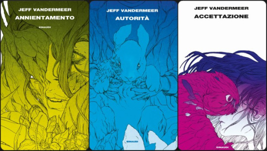
Then theres the italian edition of the Southern Reach Trilogy and Borne

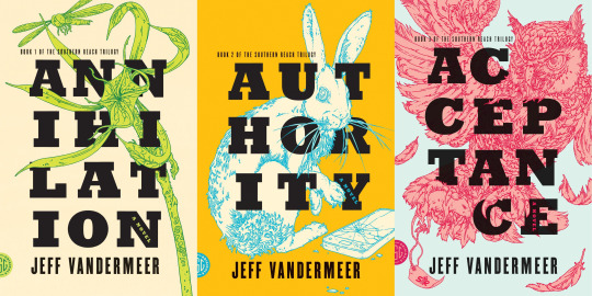
But I also love the original ones (+ dead astrounauts)

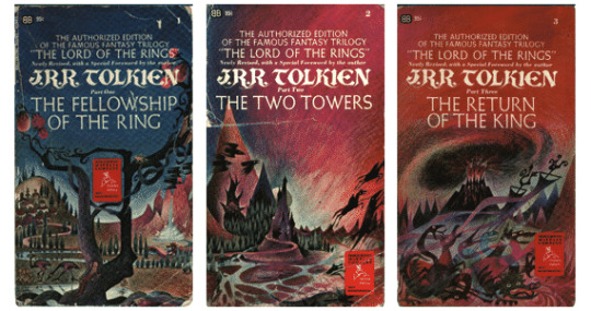
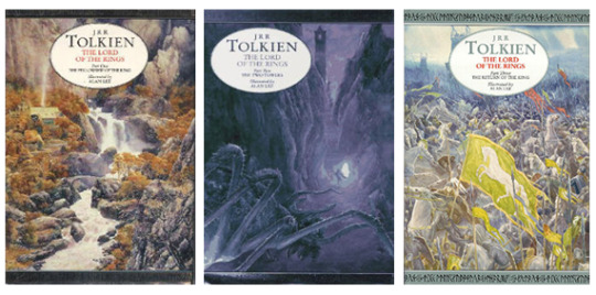
When it comes to Lord of the Rings its a little hard because it had so many editions and so many covers and so many different designs and there are very few i dont like actually, so I’ll just show some of my favourites
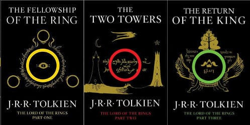
These that are redesign of Tolkien’s original work for the covers by Harper Collins
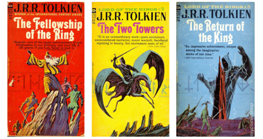
Atrocious, old and kitsch, i love these. Also this is an unauthorized edition and its so funny, they shouldve authorized it just because of the cover
These by Barbara Remington
Harper and Collins again but illustrated by Alan Lee
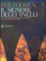
And the Bompiani cover for the entire trilogy. Maybe its not that great but its the one i grew up with
La Passe-miroir absolutely stunning covers by Laurent Gapaillard

The Books of Earthsea which unfortunately I have a different, uuugly edition (by Charles Vess)

And this 2005 edition of a Wizard of Earthsea which like... i know it has static bitch on cover disease

But listen to me. This is iconic. This is fucking Gianni de Conno (RIP well miss u king) which is my favourite italian illustrator for children books (and a great surrealist artist). Here some of his other (of my favourite) covers

Also this new italian Earthsea edition *SMACK*
The Book of Babel is really good BUT if it had more a Russian Avant-garde style it would have been perfect (idk why it gives me russian avant garde vibes maybe its just me maybe my brain is broken maybe its just because the first cover is red) (illustrated by Ian Leino)
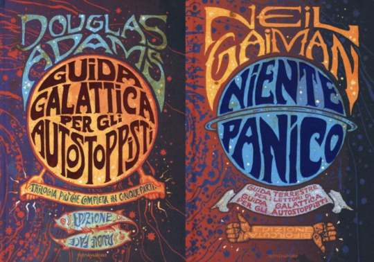
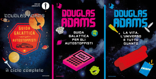
The job that mondadori did with The Hitchhiker’s Guide to the Galaxy is STUNNING. Too bad they didnt do it first cause i have the UGLY editions......
I dont know if these are inspired by the british/american/whatever edition I know them in italian so ill show those

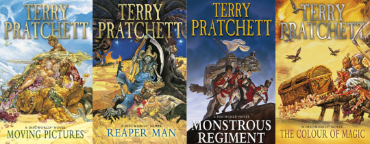
All the Discworld illustrated covers by Josh Kirby are iconic and funny
Descendant of the Crane, im not really interested in reading it but the cover art is AMAZING (cover by Feifei Ruan)

Now listen......... you don’t have to like Lindsay Ellis. I fucking hate that bitch. I bet her Noumena books are atrocious. But whoever designed the covers....... omg

these are so retrò, pop... i just love them so much. I can’t seem to find the artist or graphic who did the covers, but if i discover she did those im gonna KMS. If instead of filling the back of the book with people praising this idiot they would have put a fucking cover artist i would have been happier.
Going on, whatever the fuck Fazi is doing at any given time cause the graphic work is AMAZING

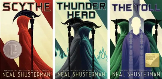
Another serie I have no interest in but that has amazing graphic work is the Scythe trilogy (covers by Kevin Tong)
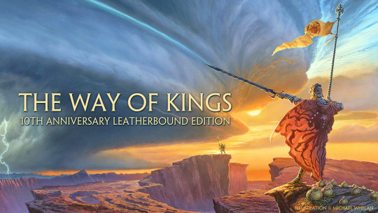
The Way of Kings, the other covers from the Stormlight Archive serie are fine but i really like this one (by Michael Whelan)
The super iconic (original?) Neverending Story edition (theres also in red but i prefer it in green) (by Roswitha Quadflieg)

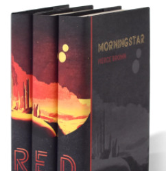
I dont know anything about Red Rising except that a youtuber has it, and the covers arent the most inspired
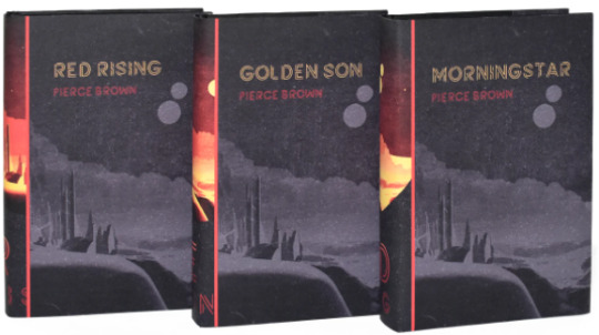
but they do this!
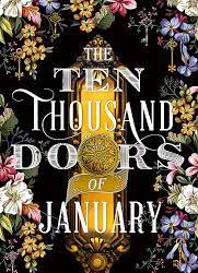
The thousand doors of January is one of the books I wanted to buy before reading the reviews on goodreads
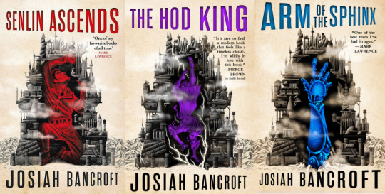
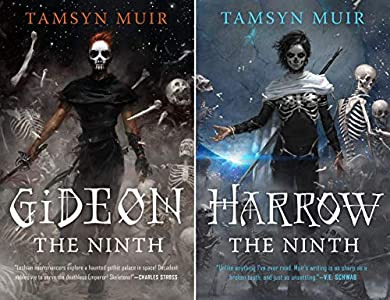
Ok lets put the dykes in here, The Locked Tombs covers are my favourite static bitches <3 (by Tommy Arnold)
I had to go check out library catalogue cause I did not remember the title of this book (La chute du soleil de fer italian edition) but I only remembered the cover lol (i cant find the cover artist tho ill have to check the actual book)

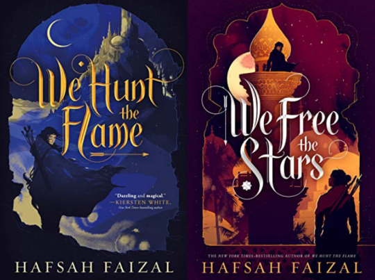
the Sands of Arawiya duology (?) original edition (by Simon Prades)
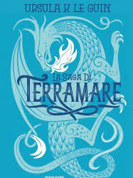
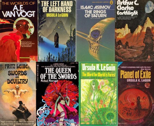
And in general I really just love vintage scifi and fantasy covers specifically from the 60s-80s and think this should make a comeback as a marketing strategy idk in the italian publishing world cause whatever the fuck they are doing with scifi books right now... is not working. its really not working. All of Le guin’s books look so fucking ugly. Idk resurrect Moebius and De Conno or something im so tired of ugly covers.
#ok this is one long list but i have fun doing lists lol#also i didnt accidentally see any d*ltarune spoiler all day cause i was busy doing this :)#if you want send me your favourite covers or lets discuss what makes a good cover#im having fun#books
21 notes
·
View notes
Text
Like absolutely nothing about Rita Hayworth was kitsch or ironic she was a very genuine lady and the one movie where she had to play a bitch her performance was panned because she wasn’t mean enough...she made a movie where the main plot was entirely devoted to the fact that she hated men and refused to get married...she played softball and then DIED...she didn’t get her hair bleached and dyed twice a week to be called anything less than DYKE CAMP sorry gays she’s OURS
14 notes
·
View notes
Text
Op Pebble Beach laat Infiniti de Prototype 9, een voorbeeld van hoe een raceauto van het merk in de jaren ’40 eruit had kúnnen zien. Voer voor discussie natuurlijk: is het mooi dat het Japanse merk ook oog voor klassiekers en klassiekerevenementen heeft, of is het pure kitsch?
Het luxemerk van Nissan is trots op het rijdende prototype, vertelt designer Alfonso Albaisa. ‘Met de Prototype 9 vieren we de traditie van vindingrijkheid, vakmanschap en passie van onze voorgangers bij Nissan Motor Corporation — met ons merk staan we op hun schouders. Het begon als een discussie: wat als Infiniti een raceauto had gebouwd in de jaren ’40? Als je je een Infiniti eenzitter voor zou stellen op de beroemde circuits uit die tijd, zoals de Tamagawa Speedway, hoe zou dat er dan uitzien? De schetsen waren geweldig en het idee was zo fascinerend dat we wel een prototype móesten maken. Toen andere divisies binnen ons bedrijf daar lucht van krijgen, wilden ze meedoen, zodat we een rijdende auto konden creëren.’
Twintig minuten
De techniek is overigens bepaald niet uit de jaren ’40. De Prototype 9 is voorzien van een elektromotor, afkomstig van Nissans Advanced Powertrain Department. Die motor levert 120 kW (163 pk) en een koppel van 320 Nm. Zoals het een klassieke raceauto betaamt heeft hij achterwielaandrijving. Een sprint van 0 naar 100 kost 5,5 seconden, de topsnelheid bedraagt 170 km/h. Infiniti belooft dat je met de Prototype 9 twintig minuten op het circuit kunt rijden (‘under heavy track use’) voordat de batterij leeg is.
Geboorte van een automerk
Zo’n raceauto bouwen die je nooit had, waar hebben we dat eerder gezien? Natuurlijk, bij Studebaker. Dat merk bouwde in de jaren ’60 ook zo’n neoklassieker, geïnspireerd op de Mercedes SSK. Het plan was om dé showstopper van de beurs te hebben. Vlak voor de auto te zien zou zijn op de New York City Auto Show van 1964, bedacht Studebaker zich: het publiek zou maar gaan denken dat Studebaker overwoog een dergelijke auto in productie te nemen.
Designer Brooks Stevens besloot om de auto dan maar zelf op de beurs te zetten, als een Special Project van Brooks Stevens Design Associates. De belangstelling bleek overweldigend en de lijst met potentiële kopers was enorm. Stevens kón uiteindelijk weinig anders dan de auto daadwerkelijk bouwen: de geboorte van het automerk Excalibur.
In de loop der jaren werden de auto’s steeds kitscheriger, maar dat weerhield talloze beroemdheden er niet van om een Excalibur te kopen. Onder hen waren Frank Sinatra, Steve McQueen, Dick van Dyke, Dean Martin en de koning van Spanje.
Rest de vraag: blijft het voor Infiniti bij dit ene prototype, of gaat het merk de weg van Excalibur op? En is het mooi dat zo’n jong merk ook oog voor klassiekers en klassiekerevenementen heeft, of is het pure kitsch?
Nieuw: een klassieke Infiniti Op Pebble Beach laat Infiniti de Prototype 9, een voorbeeld van hoe een raceauto van het merk in de jaren ’40 eruit had kúnnen zien.
0 notes
Text


Rebel Dykes (2021) dir. Harri Shanahan & Sian Williams
#rebel dykes (2021)#rebel dykes#harri shanahan#sian williams#lust & politics#dykes on film#documentary#dyke kitsch etagere
683 notes
·
View notes
Text
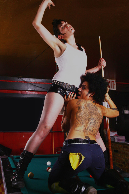
Chaz Del Diablo with Syditious by Sara Hart, 2008
#chaz del diablo#syditious#switch n play#sara hart#drg#drag king#2000s#2008#dyke kitsch étagère#flickr#uploaded
563 notes
·
View notes
Text

chazthenomad, 2007
436 notes
·
View notes
Last Seen Blogs

broccoliboix5peepeeman
It's Our Power

asladykikasan13666
Sem título

k1tty-katz
Misguided Ghosts

menghuotgmk
GameR

scorpiosub
Your_Scorpio_Sub