#edit: changed aspect ratios!
Text


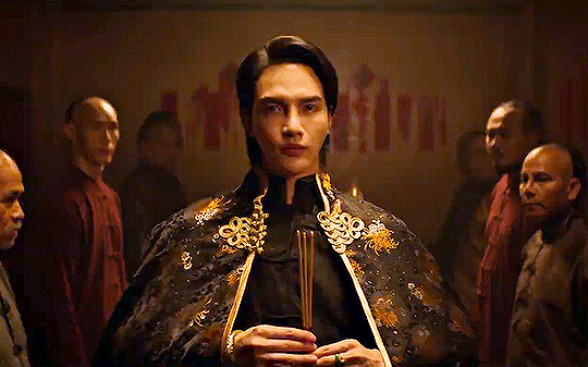
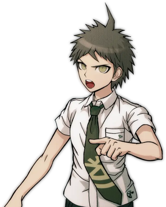
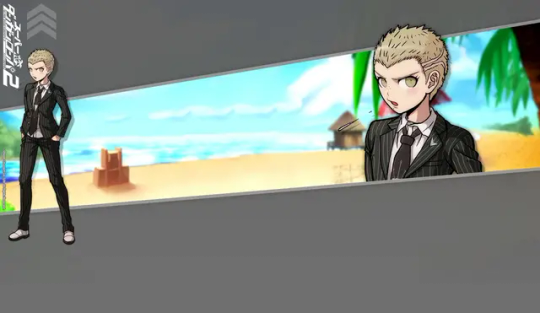
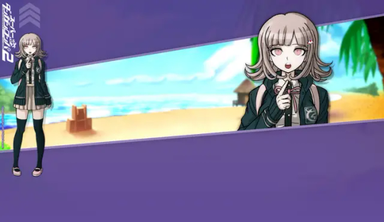
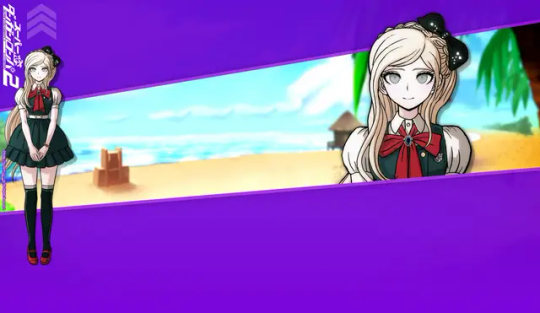
Tong Thanayut in the Man Suang (แมนสรวง) trailer
#[chanting] TONG TONG TONG TONG!#edit: changed aspect ratios!#tong thanayut#man suang#be on cloud#แมนสรวง#kinnporsche cast#man suang trailer#darcey.gif#mansuang.gif#darcey.txt
454 notes
·
View notes
Text
gravity falls but it’s actually twin peaks
#gravity falls#twin peaks#i think i’m so funny#my edit#dipper pines#mabel pines#multifandom edit#crossover#music + aspect ratio changes everything
77 notes
·
View notes
Text


sakigumi teasers and chirashi
#yukigumi#takarazuka#ayakaze sakina#takarazuka revue#asami jun#asazuki kiwa#yumeshiro aya#hhhhhhhhhhhhhhhhhhhhhhhhhhhhhhhhhhhhhhhhhhhhhhhhhhhhhhhhhh#was waiting for last mission to post this jfdjhfgd#please excuse the diff aspect ratios jfdgjhdfg#the ones without white bars r higher quality i just couldnt find higher quality versions for all of them so o7#if i find them ill probably come back and edit the post to change the images
44 notes
·
View notes
Text
youtube
if you want to see how i got to the field with the tree from aloy's dream, here's a quick video!
#horizon forbidden west#hfw#video#hfw out of bounds#out of bounds exploring#hfw pc#i 110% give up on thumbnails or making videos look good here lmao#why is it so cropped on embed? aspect ratio wrong? that's just my screen! is it tumblr's fault? or should i change it in editing? ugh#recording from my computer is no joke either. i had to tweak so many settings to get this watchable#sorry for any mushy textures but i had to put most stuff to medium#then the nvidia recorder thing kept being all choppy and i don't know WHY#what i was seeing was totally smooth but the video ended up stuttering all over the place#console is so much easier wahhh wah wah
31 notes
·
View notes
Text
2-D Fancam with a song from The Midnight
#2d gorillaz#stuart pot#💊beloved bluebird💊#heard this not too long ago and... its just him#I'm not really good at editing this sort of thing but it was fun for a first try#sorry for the constant changing aspect ratio#i also see this song as an OC thing... so maybe this could be how they see him? i dunno- im rambling
4 notes
·
View notes
Text
ok so here’s the situation. so i saw a tiktok the other day that showed the scene in catching fire where they enter the arena, and the aspect ratio changes, and i watched that and was like huh that’s weird i never noticed that all the times i’ve watched that movie? and i just watched that movie again literally just now. and i can tell you with 100% certainty that the aspect ratio did not change at all. so who is lying is my question. what is going on.
#is it different on streaming vs a dvd? cuz i have the dvd#idk why they would have different versions of a movie for an aspect ratio change tho#was it edited for streaming? does anyone know.
8 notes
·
View notes
Text
youtube
I made an Awakening vine compilation
#dragon age#dragon age origins#dragon age awakening#dragon age vines#vine compilation#tag urself I’m the wildly inconsistent aspect ratio#IDK how to change them I’m an editing noob
3 notes
·
View notes
Text
damn the new mean girls movie kinda sucks
#its actually so weird because like#its just a musical done badly#the editing team does not know#what a musical lookslike#its crazy the set design is actually good. the outfits are fine. the performances are okay.#the mixing of the music is shit . the way the songs enter is shit . the bg score is barely there#the new direction they took with this musical just sucks ass#and angourie rice...if the only redhead you can find cannot belt or project her voice why cast her in the first place 😭#just get a wig#also the aspect ratio is so inconsistent at first i thought it just changed with every song but no??#hmmmm#its weird bcs#the beginning of the movie is actually fine#regina's entry is fine too#it just looks like its trying too hard to appeal to a non-musical fan audience?
1 note
·
View note
Text
before i write a long post ab how much that special means to me like identity wise i just wanna highlight that i love it when media utilizes its form to the fullest and this did exactly that. i loved wandavision because i love sitcoms and the way it utilized the sitcom format with wanda's escapism, the aspect ratio changing depending on what was happening, etc, and That Part in chris grace as scarlett johansson (yall know if you watched it) hit perfectly for me who is constantly up to date on every single thing dropout is doing at any given moment. im about to spoil it under the cut so do not read it if you haven't seen it trust me on this
seeing the make some noise stage pop up made me genuinely scream and it took me 10 minutes to finish the whole sequence bc i kept pausing and freaking out. erasing his name on the make some noise podium is such a good detail to show how he has no idea who he really is. and then very important people came up and i lost my shit and the detail of the vip cards being the dirty laundry cards???????? so good. i loved this so much. and when he's introducing the dropout presents stuff it's the actual format of dropout's app oh i was so happy.
edit also the fact that the gastronauts trailer JUST came out probably to set up for this???????? all of these with the exception of vip s2 came out so recently to provide context for this and it makes me want to explode. they planned this for us
131 notes
·
View notes
Text
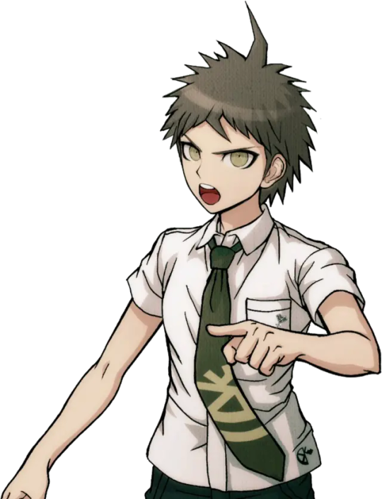
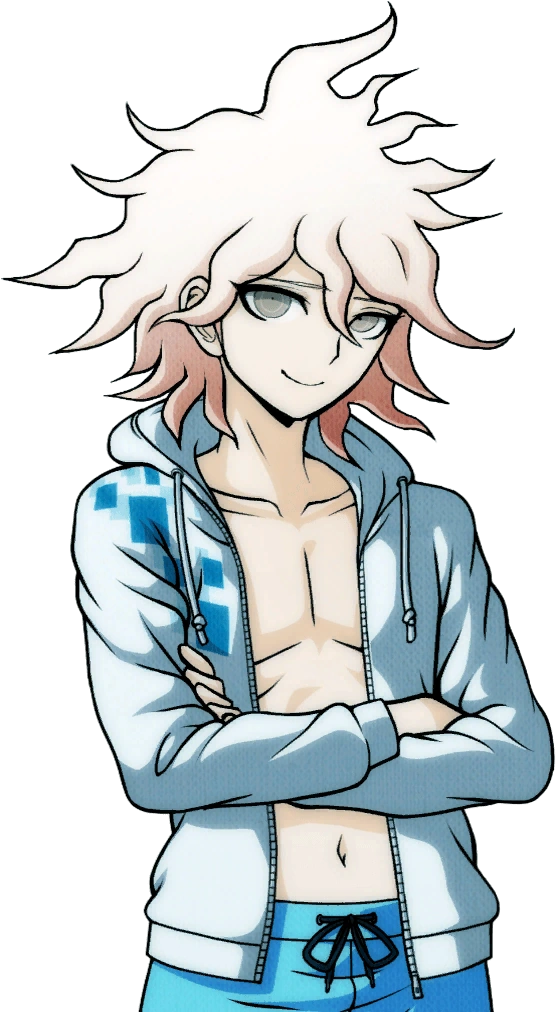
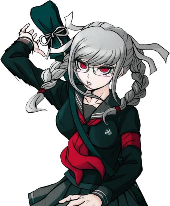
So, when Danganronpa S was released (and V3's UTDP but I'll get to that later...) Hinata and Komaeda were given noticeably different versions of their pre-existing sprites for their swimsuit versions:
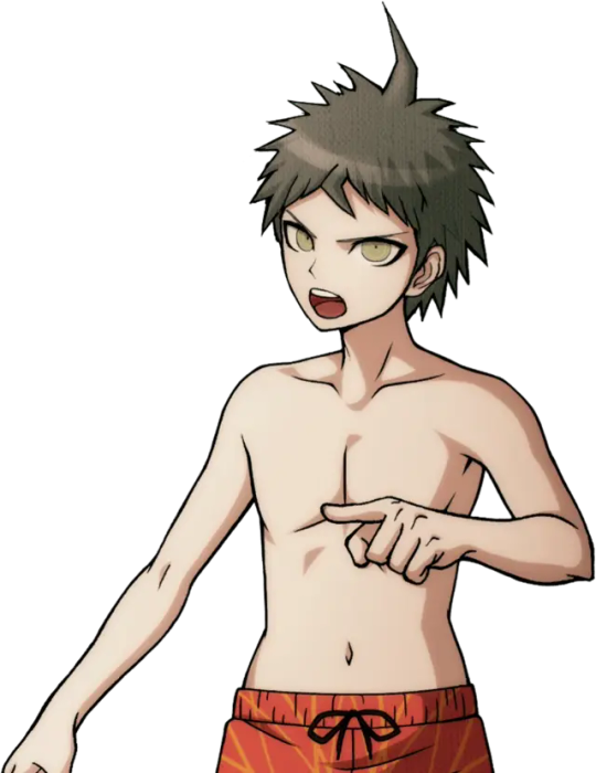
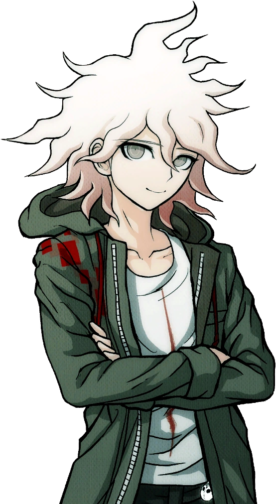
If you struggle to see a difference, note Hinata's wider mouth in the swimsuit ver., and Komaeda's narrower eyes and more outlined smirk in his swimsuit ver.
I, along with many people, always wondered, why? Why change these already perfectly fine sprites and, honestly, make them worse? What gives?
Then, I stumbled across something. Back in 2012, before the Japanese release of Super Danganronpa 2, you could play an online monomono machine to win little goodies like desktop backgrounds and profile pictures. Please note these pre-release desktop backgrounds for Hinata and Komaeda:
...So, wait a minute. The sprites used in Danganronpa S aren't new edits, but beta sprites? Older than the ones featured in the original SDR2? Turns out, this website features desktop backgrounds using beta sprites for nearly every character that otherwise never saw the light of day.*
I'm going to go through them one by one, gif comparisons included. This won't be the only post, either! UTDP also has some very interesting likely beta art used in it, too. As well, some of the other sprites featured in Danganronpa S may also be reused beta sprites!
As such, this log will be broken into three parts. This is part 1.
[Part 2 - UTDP (not made yet!)] [Part 3 - DRS (not made yet!)] [Part 4 - Dangan Island (not made yet!)]
*with the exception of UTDP in some cases, as well as some other things I will get to in Part 4.
As said, semi-flashing gifs will be included in this post. They are meant to swap between the beta and final sprites at a fast pace to illustrate the differences (2 frame, half a second each). Be cautious if you have epilepsy.
Also, because of Tumblr's stupid image limit, this post will have a reblog with the rest of the sprites! So please check this post's reblogs, it should be the first one!
Firstly, how do we know these are actually beta sprites? These images are sourced from the Danganronpa fandom wiki, and while I generally trust the wiki's credibility, it's always imperative to fact-check. So, I went ahead and searched Danganronpa's old website on the Wayback Machine and uncovered this:

A character intro page for Hinata, using this same beta sprite. Now, granted, the only capture of this page is from 2015. Still a year before V3 and a few more before S, but still, it's not the 2012 original. That said, a character intro page for Mioda circa early 2014 looks exactly the same, including the usage of her beta sprite.
And, when you click on the button that says スクリーンショット(Screenshot)...
You're offered a very obviously beta trial shot. As is common with Danganronpa trials, in development, the actual character portraits are not put in until later, and to substitute, their art reference photos are used, as seen on the left.
With that out of the way, I think it's safe to say these sprite we are about to look at are indeed betas.
It's only fair, then, we focus on Hinata first.
(Please note for all the comparison gifs I had to manually size the final sprites to get them as close as possible in aspect ratio. Very minor size difference between sprites is likely a result of this and not an actual detail change.)

A lot is revealed with a simple gif. Hinata's entire face shape was changed (including ears), not just his mouth. In fact, not just the shape of his face, but the face itself is drawn very differently in the end. The neck of his shirt was raised, as well as tie being redrawn (you can actually see where the new part begins somewhat sloppily). Less notable but still apparent are his bangs being redrawn and shaded differently.
Keeping with consistency, let's check out Komaeda next.
Yet again, the differences are striking when flipped back and forth. Komaeda's face shape and ear was redone much like Hinata, but not to nearly the same dramatic extent. As well, his entire face was redrawn, notably erasing the black shading under his chin and shortening his eyelashes. Less noticeable, the hair touching his neck is shortened a bit, and the crease line on his hood is more well-defined. They also slightly changed the line art for the first fold in his shirt, the neck at the back of his shirt, as well as his leftmost bang. Interestingly, they either forgot or didn't care to fix the shading to reflect the new placement of these lines. His jacket also has some changes in line art weight.
With Hinata and Komaeda out of the way, let's touch on Kuzuryuu.

This one honestly shocked me. Besides the added detail of him spitting, I didn't notice any difference right off the bat until I overlayed the images, but the differences are night and day. His eyes are made to be less mean and more skeptical. His mole was shrunk and his nose is more 3-dimensional. Extra detail is added to his ear while his hair is redrawn in whole, including it being slightly shorter. What's most interesting is the fact the body was sized up and moved down several pixels, I imagine to change the perspective. Some minor line changes are made to the white undershirt of his suit.
It would be improper not to do Pekoyama next.

Again, just like Kuzuryuu, I didn't notice half of these changes at first. Pekoyama's whole face is slimmed. The outer outline of her hair remains the same, but almost every outline inside of it, including her bangs, changes. (Although, her right twin-tail has a slightly longer end to it.) Her outfit receives minor touch-ups, including a clothes fold on her breast and darker shading by her collarbone. Speaking of, her neck muscles and such have been redrawn. Most interesting to me is the fact Pekoyama's outline is noticeably thicker with action lines in the original beta sprite, but lack them in the final sprite as if somebody used the magic wand tool to edit the background out, editing away some of the jagged black lines in the process. She is the only character where this happens.
Since she is a major character, let's do Nanami now.

I wasn't surprised to find Nanami has virtually no difference about her. Her design was pretty much set in stone early on. That said, it's not entirely the same. Though very minor, the thickness of her left eye was increased at the top. As well, shading across her pinky finger was removed. There is also a chance her body is slightly bigger, but that's more likely to be a result of me failing to perfectly match up the two images.
I want to focus on Souda now as he was the first one I did this test with.

You know, when I first played SDR2, I thought Souda looked kind of scary. His beta is even scarier looking! I can see why they changed it...Every detail on his face is redrawn including his chin, notably his pupil was enlarged and his eyebrows were quirked. Funnily, it seems the clip on his beanie was redrawn, but like Komaeda, they didn't edit the color layer to match the new outline. Some minor line art changes were made to his back hair. The lines for his neck and collarbone were lessened, and the jacket zipper is made more three dimensional. His thumb was fixed too, as well as the lines on his hand.
Also, here's a fun little thing I noticed while replaying SDR2 just a few days ago!

The sprite used for Souda in the Dangan Island opening is the exact same as the beta sprite! This would be the only time Westerners would catch a glimpse of some beta sprites until UTDP, as keep in mind, these wallpapers were exclusive to the Japanese Danganronpa website.
In fact, Souda isn't the only one with a beta sprite in the Dangan Island opening. I will also be covering that in part 4.
Moving on...
I guess it's only natural we look at Sonia's sprite next.

Changes like these ones are very interesting to me, because if you did not do a side-by-side like this, you may never see how many minor details were changed. A lot of Sonia's line art was redrawn to be more detailed, such as more lines in her hair, thinner outlines for her braid, and redrawn creases in her shoulders and bow (as well as a redrawn button). Her face is interesting as some very minor changes were made. Some detail is added to both ears (thicker outline on the right, changed line art on the left) and her left eyebrow is slightly edited. She was also given extra eyelashes on both sides. When it comes to such minor changes, it makes you wonder why they bothered at all. I wonder what the development looked like.
Anyways, please check the reblog for the second part! That's where the rest of the characters will be!
#hajime hinata#nagito komaeda#fuyuhiko kuzuryu#peko pekoyama#chiaki nanami#kazuichi souda#sonia nevermind#akane owari#gundham tanaka#nekomaru nidai#mahiru koizumi#hiyoko saionji#mikan tsumiki#byakuya twogami#teruteru hanamura#ibuki mioda#danganronpa#sdr2#;noxiatalksia#dr#;resource
98 notes
·
View notes
Text
Tutorial: Manga Banners
Basic Manga Text Change/Coloring/GIF creation in PS
Hey, so as promised making a very basic tutorial for making banner gifs in photoshop for fics/drabbles/layouts, etc.
I'm going to keep things super simple here for beginners.
END RESULTS↴

(NOTE: This gif I made will be used for an unreleased story of mine so please don't use this exact gif/images but you are free to follow the tutorial to create your own).
All I ask is if you find this helpful to REBLOG! :)
No need to credit me.
For this tutorial you will need ↴
Photoshop
At least 2 manga panel images (non-transparent*)
Optional: Manga fonts. I mostly use CC Wild words (speech bubbles) & Manga Temple (narrator boxes)
Basic knowledge of photoshop layout/where tools are.
*this tutorial is essentially the same if working with transparency but if you do work with transparency you will need to have knowledge of clipping masks which i do not cover here.
Tutorial ↴
(optional) Prepwork: so i didn't think to include this do this but you are going to need to crop and resize your image. make sure the width is either 540 or 1080px. This is the recommended width for pictures in tumblr. Height can be what you want it to be. This is done image > image size (make sure the link-chain is pressed for aspect ratio)
Step 1
This is what you want your setup to look similar to. Delete locked background layer.

Steps 2 & 3
Make a new layer. It might be helpful for beginners to re-name all their layers so instead of "Layer 2" you might name this ⇢ "White fill layer or Text cover up". (doubletap layer name to change it).
Use rectangular marquee to select text you want to change. If you are just replacing a word or two you dont need to white out everything. But you could choose to cover up all if you wish. I just wanted to remove "senpai".

Steps 4 & 5
Use Paint Bucket Tool to fill in selection area with white (make sure the new layer you made is selected when you do this).
Select Text Tool. There is no need to make a new layer as once you are done typing it will become a text layer. I used CC Wild Words bold font for this for emphasis. If you do multiple lines of text use a new text layer for each line.

Step 6 - Optional Step - Highly recommended if you did multiple lines of text.
Rasterize Type by right clicking the layer. This is an optional step. I tend to do it out of habit and rasterizing lets you use the move tool to give you exact px distances between other rasterized elements but nothing we are doing requires this tbh and if you do decide to do it you can't go back and edit text.
If you did multiple text layers you cause space them out evenly using the move tool (zoom into 200%-400% if necessary to get exact pixel distances). Tip: Manga text is centered in the bubble and leaves a good distance away from the edge.
When you are done ctrl/cmd to select all text layers then right click and merge the layers. This is so incase you have to move the text layer for whatever reason they are all on one layer now, evenly spaced and you won't accidentally mess that up.

Step 7
Create an exposure layer (half filled in circle in layer bar for menu). This is important as it can lighten/darken image to make the colors we will add later pop by playing with the sliders for each setting.

Step 8
Apply exposure settings. On the right-hand side there will be 3 slider bars. The screenshot shows my settings but your settings will vary depending on the image. The one that gives the biggest benefit for manga is Gamma Correction which affects the midtones to make them lighter/darker and adds better contrast to the image so it doesn't look as muddy, often in black and white images it is easy for midtones to look muddy. Offset affects mid to dark tones of an image. Exposure affects midtones to highlights to make brighter or darker, overall use this the least.
TIP: If you want to make an image brighter or darker you usually want this to apply equally to the overall image so then you would create a brightness/contrast layer instead. most manga images skew muddy and need a midtone and dark adjustment rather than highlights. the better the manga scan images the less adjustments you will need.

Step 9 - Optional
Apply a gradient map (half filled in circle in layer bar for menu). This is optional. a Gradient map adds gradient but preserves the shading in the image so essentially adds a gradient to the shading. I do this in black and white. But if you are happy with how it came out in the exposure phase you don't need to.

Step 10 & 11 -
Apply a gradient (half filled in circle in layer bar for menu). So when you add a gradient there are a ton of preset color combos you can use or you can create your own. I think this one is a preset but can't remember. I like a diagonal gradient from light to dark depending on where the light source on the image is but it is completely up to you. I tend to set the gradient angles near these 4 settings: -145, -45, 45, 145 depending on what corner I want the lighter part in.
One thing to note is brighter colors work better with a darker background. Lighter backgrounds can get washed out. One you add this as you can see it will be solid color.
*note* once this layer is applied any edits such as moving text, etc. around you want to do to the lower layers beneath it click the "eye" button to hide the gradient (same for the map) or there's a good chance it will move the gradient layers around and not the layer you want.
Change layer blending mode. By default it's set to "normal". You can play around with these. Depending on the effect you want and whether the image has darker or lighter colors will decide the blending mode. My typical blending modes are screen, overlay, hard light, vivid light or pin light. You can duplicate this gradient layer and play around with multiple settings and opacities to create something you like.

Step 12 - Optional
Add a Brightness/Contrast layer (half filled in circle in layer bar for menu). Brightness/Contrast on this step will look wildly different than if you added it right after the exposure step. It's not necessary but if you want more overall contrast or brightness then you can add it.
You can see my settings below on the sliders on the right-hand side.

Step 13
Create new layer for highlights. (also good check point to see how your layers are organized).

Step 14
Select the brush tool and ensure brush settings are a soft round brush with a hardness of 0% for the highlight effect. (if you click the brush image you can see my settings better)


Step 15
Select the dropper tool and pick a color from the gradient image. I usually pick the darkest colors available as it will have the best dodge effect for highlights. Since this is pink/redish I only have one highlight color but if you were doing a green/blue gradient you would pick the darkest from both. (ignore the purple here its not being used)


Step 16
Create highlights with brush tool. Do a few tests placements randomly around the image for positioning and then swap the blend mode to either color dodge or linear dodge. I usually do color dodge. You will get awesome highlights like below. You can play with the sizing of the brushes and opacity to decrease the effect.

Step 17 & 18
Export as PNG. Do this even if you want to make a gif as I always recommend a clean canvas for gif making. If you want to be done here and don't want a gif thats fine too. File > Export > Quick Export as PNG (do not save as jpeg/gif you will lose image quality).
Repeat for second image. You don't need to open a new file unless it helps you to not get confused. You can just make a new layer and paste your new image into that layer (if you just right click copy the file in the window/finder folder you can directly paste it into a layer in PS) and use the transform tool to resize. However you can totally just open the image in PS. The benefit of same canvas is you save yourself some time as you can just duplicate gradient layers/adjustment layers and move them. But this is kinda more advanced so if you aren't comfortable with photoshop just make a new image.

Step 18-19
Create new file/open one of the PNG in PS (more advanced can just create new layer, select image, then copy > copy merged and paste on new file for each. Otherwise open one file, create a new layer then copy the other file. The bottom later will be the first image in the gif.
Create Frame Animation on the timeline window. (if the timeline window does not appear then window > timeline) *note* if this is your first time working with the window it may be set to "create video timeline", if that's the case create it then from the frame menu (in step 23 theres an example of where this is) select "convert to frame animation".
If done correctly your setup should look like the below with two images. One for each layer and one for each frame.
MAKE SURE PROPAGATE FRAME ONE BOX IS CHECKED IN THE LAYERS WINDOW.
lmao, not to be dramatic but this ensures most effects you would add to frame 1 (which corresponds to layer 1) is applied to all frames. I'm not too sure its super vital for this super basic gif I'm showing you but its better to get in the habit of always having it checked. otherwise it will fuck you over later down the line in my next tutorial where I show how to add frames to gifs.

Step 20
Select both layers, then select both frames (ctrl/cmd) and finally select tween from the timeline window. It is the multi-faded dot option on the bar below.

Step 21
Add Frames to Tween. Tween is the fading effect adding more frames is the longer the fading effect is. I added 20 for this step, you can play around and add more or less.
Once you do that you can see 20 new frames being added onto the timeline. This will not automatically add new layers, this is fine. Frames and layers don't need to be a 1-to-1. (Another reason why propagate frame 1 needs to be checked as you can still adjust those layerless frames by adjusting frame 1's layer)

Step 22
Adding delays. Automatically the delay on every frame is at zero. But especially if you have text you want people to be able to read that so you need to add in a delay. Your delays can be in increments of 1/10th of a second. I add a 1 second delay to the first frame only.

Step 23
Select and Copy the first frame and then select the last frame and Paste. A paste window will appear in this case we want to paste after selection. I circled where the menu for frames are. (sorry used a different gif as an example so ignore everything but the circled menu)


Step 24
Adding additional delays. I add a 1 second delay to the last two frames.

Step 25
Add more Tween I added 5 frames this time as we want the transition to be much quicker to reset the image. You can see frame 23 in the previous step are now frame 28.
You can add more images in than 2 and follow these steps to add tweening.

DONE! Now to save.
Step 26
Export your gif. File > Export > Save for Web (Legacy) and the screen below should pop up. Here are the settings I use for gifs. You can play around with it but I really wouldn't lol. (again ignore image size, this is from a different gif) it will also tell you how big in file weight your gif is. This isn't something you have to worry about for something simple but the bigger the image size and the more transitions/images you use the more frames you will have. Reducing image size (make sure chain link is on like in the below) will take off more sizing then removing frames will and I would recommend that. But tumblr allows 10MB MAX per gif so just something to keep in mind.

Let me know how this was! If you have questions just drop me an ask. ❤
#✩𝓀𝒾𝓏𝓏𝒶𝓉•𝔱𝔲𝔱𝔬𝔯𝔦𝔞𝔩𝔰#✩𝓀𝒾𝓏𝓏𝒶𝓉•𝕘𝕗𝕩#gfx#fic banners#tutorials#resources#photoshop tutorial#manga edit#edits#fan fic writing#fic writing#anime edits#manga edits
76 notes
·
View notes
Text
public service announcement: the nhl website recently changed their photo hosting service to something that makes it much easier to scrape the full 4k images off the site. if u want pics of your blorbos in beautiful hd, right click to open image in new tab and then edit the url following this 👇
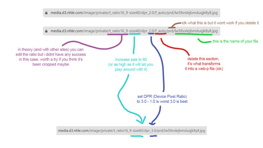
update: since posting this i have discovered that if you think a photo is cropped and you want to get whatever's been trimmed off, insert "-c_pad" after the "size60". so that one section should read /t_ratio16_9-size60-c_pad/ (or whatever the ratio is, but in my experience it seems to always be 16x9) it will have white borders bc the aspect ratio will be the same but youll get the full image and you can just crop it yourself. theoretically you should be able to change the ratio directly but every time i have tried on the nhl site it has just given me an http error, but if anyone wants to do some experimenting themselves to see if they can figure it out, please do :)
#for some reason this is not a thing many people know how to do but similar methods work on a lot of websites#i wrote a long ass tutorial thread on twt forever ago about how to do this in general... if ppl want i could try to migrate it here#it's not one size fits all you just have to do a bunch of case by case testing usually. but this should work for anything on the nhl websit#i hope this helps ppl :)#nhl#hockey
241 notes
·
View notes
Text
Making Baldur’s Gate 3 GIFS Tutorial
TOOLS USED:
Nvidia or alternate game video recording software
PotPlayer
GIMP (Optional)
Adobe Photoshop
PART 1: Recording
I personally use the Nvidia recording software that came with my computer to capture videos of the game, but there are plenty of video recording options out there. I know OBS Studio is a popular one, for example. Whatever your choice may be, here are three important tips for when capturing video:
Use the least amount of compression settings your recording software can output, and I recommend at least 30FPS, though 60 is better
Press F10 to hide the Baldur’s Gate 3 UI and capture the entire screen
Give about three seconds worth of video before and after the section you want to record, as safety buffers, if you can
PART 2: Frame Extraction
Open the video you’ve recorded in PotPlayer in window mode (not full screen), and pause a little bit before where you want to start your GIF. Press Ctrl + G to open up the Consecutive Image Capturer window, and drag it to the side of the video player. These are the settings I recommend in general:
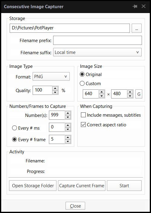
HOWEVER, I suggest playing around with the “Every # frame” option to your own liking. I have a pretty high framerate for this video I’m using, so 5 is fit for me, but if you have a lower framerate, you may want a lower number, like 2.
With your settings in place, click “Start” and unpause the video. Pause the video again after you’ve captured all the frames you want, then click “Stop”. If you’re making a gifset, I recommend then storing each set of frames in a single folder at a time.
PART 3: Resizing
I personally use GIMP to resize/crop the images because I find it easier, then export the image as a PSD for the next steps in Photoshop. But you can use Photoshop for this step too, if you’re more comfortable with that.
The number of frames you can get away with in a single GIF for Tumblr depends on the aspect ratio you plan on saving it as—for example, 270x200 obviously can handle more frames than 540x300 while still fitting within Tumblr’s size limit.
PART 4: Sharpening
In Photoshop, use the Filter > Sharpen > Smart Sharpen tool on each layer. The settings are your choice, but I usually use 200 for the Amount and 0.5 for the Radius.
PART 5: Animation
If you don’t yet have the timeline set up in Photoshop, click on Windows > Timeline to bring it up. Then from the arrow, choose “Create Frame Animation” and click on the button to do so. This will insert the first frame into your timeline. Click on “Make Frames from Layers” in the timeline options menu to add them all.
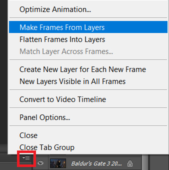
Click on frame 1, then hold down Shift and click on the last frame to select them all. Then click on the drop-down arrow from the last frame and set the delay between each frame changing. I usually use 0.1 seconds.
Change the “Once” option to “Forever” to make the GIF repeat itself ongoing.
PART 6: Editing/Colouring
Click on frame 1. Then click on the top layer, while still keeping frame 1 visible.
You can use a variety of tools in Photoshop to editing the colours, brightness, contrast, etc. of the gif. Make sure the filters are the top layers to apply them to all the frames. If you test out your gif and see that the filters are not applied to all the frames, toggle the visible option on them off and on again.
I’m not going to go into detail of how to edit your GIF here, because each one is different. But I will say the tools I most typically use are Brightness/Contrast and Curves.
PART 7: Export
Click on File > Save for Web. These are the settings I like to use:
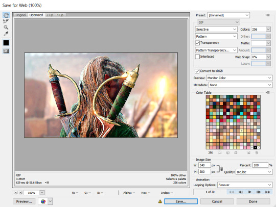
Congratulations, you’ve made a GIF!
146 notes
·
View notes
Note
Computer q. For otherwise identical monitors, is a 4000:1 contrast ratio noticeably better from 1000:1? I don't mean for fancy art but like if I'm watching a movie, could I see the difference in a dark scene? I looked into oled's, but those are expensive and I think the way I use my stuff would cause burn in.
I hope you don't mind, but I got carried away and answered pretty much every computer monitor question anyone has ever had. And since this turned into a whole thing, I thought I'd share it for everyone to benefit.
For a computer monitor I would say the most important aspect is actually the viewing angle. This is how far off-axis you can look at the monitor before the image degrades.
We sit very close to our displays and at that distance, even a change in height in your chair can affect the image. Move a little bit left or right and a cheap display could completely wash out and look terrible. And if you get a display that is 27" or above, even if you sit dead center, the edges of the screen will appear dark and washed out with a bad viewing angle.
The two best display technologies to get a good viewing angle are IPS (in-plane switching) and OLED. If you are interested in a display without these technologies, be sure it has a decent viewing angle. You can read more about viewing angles here and here.
IPS has very little concern for burn-in, but it is still a concern with OLED. In recent years OLED has greatly improved and image retention and burn-in can be avoided with regular maintenance. Displays will have pixel shift features and noise modes that work out all the pixels evenly. You can run these features every once in a while to prevent burn-in. You can also play special anti-burn-in videos on YouTube (full screen) to exercise the pixels to uniformity.
So if you don't mind the hassle, you can manage an OLED with low risk.
That said, OLED was almost exclusively for TVs and has only recently been introduced for computer displays. The current options are quite large and fairly expensive, as you alluded to. So if you are trying to stay within a budget, it might be best to seek out an IPS display.
Another consideration is resolution. Everyone is obsessed with everything being 4K now. But I think increasing the resolution brings diminishing returns with regard to increased detail you can actually notice. So if you don't mind going with a 1440p monitor (about 2.5K), you can save some money on resolution and get higher quality in more noticeable areas. Personally, I feel 1440p gives you a nice, noticeable bump in detail over 1080p. Whereas going from 1440p to 4K (2160p) is less noticeable unless you have very good vision.
Another benefit to 1440p is that video games are much easier to run on high quality settings with a reasonable GPU. And you can use technologies like super sampling (Nvidia calls this DLSS) to increase the detail you may lose from not going 4K.
The only concern I'd have with not going 4K is if you edit 4K video. It will be difficult to do a pixel level analysis of your footage otherwise. But other than that, you can still watch 4K content on a 1440p monitor and because it is being downsampled, you will still notice a nice bump in detail.
So if you don't have a reason to get a 4K display, I think 1440p is worth considering.
The next concern would be color. Or color gamut. This is how many colors the display can accurately reproduce. If you don't do any art or video color grading, you'll at least want something that does 95 to 100% of sRGB. That is the color space the entire internet uses. And if you are going to be watching HDR movies, you might want a display with a decent percentage of the P3 color space as well. Doesn't need to be 100%, but the higher the better. And for those who do art, a good percentage of Adobe RGB is recommended.
Also, many manufacturers offer displays that come pre-calibrated from the factory. If color accuracy is important, I would seek out one of these displays with a Delta E rating of 3 or less (lower is better).
A newer factor in displays is peak brightness. This is measured in "nits." In standard dynamic range (SDR), video only needed to reach 100 nits. Most HDR content is mastered to reach 1000 nits. In the future, that number will be 4000. And if micro LED technology ever becomes affordable, we may go up to 10,000 nits. But almost everything is around 1000 at the moment, so that is a good number to shoot for.
HOWEVER, because HDR is tone mapped (the brightness of your display is factored in and the content is adjusted accordingly), you can still get some benefits of HDR, even if you cannot do the full 1000 nits.
All monitors can do 100 nits for SDR content. But with more things being displayed in HDR, having more nits will give you a better experience. This does not mean your display will blind you. Usually bright stuff only takes up a small portion of the screen. But having more nits allows highlights to really pop and feel immersive. A lightsaber might actually feel hot and dangerous on a bright enough screen.
Computer displays are often rated as HDR400 or HDR600 or HDR1000 based on their nits. The HDR400 isn't great for HDR content. If you can do 600 or above within your budget, you'll get a better experience. If you are going to watch movies, this may be a feature you prioritize.
I know you mentioned contrast ratio, but I'm afraid that is a little complicated to answer. It can depend on other aspects of the monitor and the viewing environment. So I'll try to give you the info you need to figure out if the display you select will suit your needs.
Manufacturers can use tricks to fudge their contrast ratio in product descriptions, so it is best to go to an independent review website like RTINGS to see what they measured. (They do good TV and monitor reviews too.) You'll see that OLED displays are said to have "infinite" contrast ratio, due to being able to turn off pixels completely. Which means it is probably time to move to a new metric because that gives very little info on the dynamic range of the display (the difference between the darkest and brightest thing it can show).
You definitely want a decent contrast ratio for your display, but this can be subjective. If you have a nice bright screen, your brain may feel the contrast is fantastic, even if the actual darkest black point of the monitor isn't great. If something is really bright, then dark things will *seem* darker by comparison. And if you are viewing in a dark environment, the contrast will look even better. So this is where seeking out a professional reviewer's experience of the monitor can be helpful. One monitor's 4000:1 ratio might be a different experience than another with the same measurement.
Because TVs are generally larger and can have more backlighting zones, they can get decent black levels without OLED. But smaller computer displays have more difficulty in reasonable price ranges. So manage your black level expectations if you go with an affordable IPS display. They can get bright, but they aren't great at blacks like OLED. I'm afraid that is just a limitation of the tech. In fact, getting a brighter display might be preferable to a better contrast ratio. And it will be easier to see if you are in a bright environment.
Most IPS displays are going to be between 1000:1 and 5000:1 and while it does make a difference, if you sit it next to an old plasma or an OLED, you're going to be disappointed. So I would not make contrast ratio a super high priority with IPS, because non-OLED computer displays just aren't going to give you inky blacks. I would say 2000:1 or better is going to give you a decent experience. But, again, I would seek out reviews rather than trust the official product specs when it comes to the quality of the blacks.
And one final consideration you may want to factor in is the refresh rate. This is mostly for gaming. Most displays will give you at least 60 Hz or 60 "refreshes" per second. Gamers tend to like 120 Hz or higher. This won't affect movie watching very much as nearly everything except Gemini Man is 24 fps.
TLDR overview...
Get an IPS or OLED display for a good viewing angle. I personally feel this is the most important feature.
Choose a resolution. 1440p can allow you to increase quality in other areas to maximize your budget. Only get 4K if you have a legit reason or you have fighter pilot vision.
Color gamut or number of colors. Try to get 100% of sRGB for web content, 90% or above of Adobe RGB for art/photography, and 90% or above of P3 for HDR movies and video editing.
If color accuracy is important, look for pre-calibrated displays that have a Delta E of 3 or less. (Lower is better)
HDR brightness. If you want to experience good HDR, you'll want the brightest screen possible (measured in nits). HDR600 or HDR1000 are great. If you don't care about HDR, then don't worry about the rating.
Contrast ratio and black levels. It's going to be meh on pretty much anything but OLED. 2000:1 or better is a good goal to shoot for, but be sure to check independent reviews for the subjective experience of the black levels. Dark viewing environments help too.
Refresh rate. 60 Hz is fine for most things. Gamers prefer 120 Hz or faster. And if you are a competitive gamer, you may want to seek out more info on "variable refresh rate" and "pixel response time."
Pick the variables above that seem most important to you and then seek out a display that does those things decently within your budget.
77 notes
·
View notes
Text
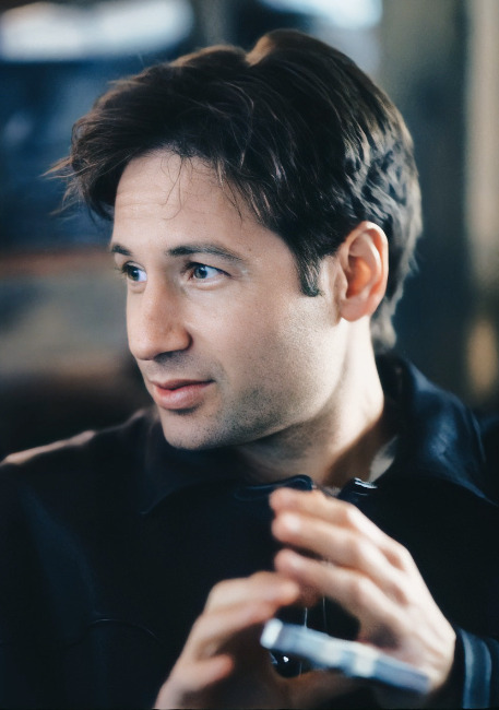
David Duchovny's Face: an Aesthetics Study
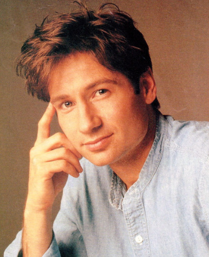
(Courtesy of: Deborah Feingold)
Wanting to learn more about fashion and knowing I retain information better by mapping it onto areas of previous interest, I've decided to craft a post analyzing David Duchovny's face-- specifically, its Masculine vs. Feminine dynamic.
In this incredible video by dear peachie (whose research is far superior to and more knowledgeably vast than most other beauty or fashion sources out there), the Masculine vs. Feminine attributes of the face are examined to highlight physical traits and others' perceptions; and how that balance shifts and changes with personal styling, colors, techniques, and ultimately age.
**Disclaimer**: I am a noob.
MASCULINE AND FEMININE AESTHETICS
dear peachie begins Part 1 by stating:
"Our face is inarguably the first thing people notice."
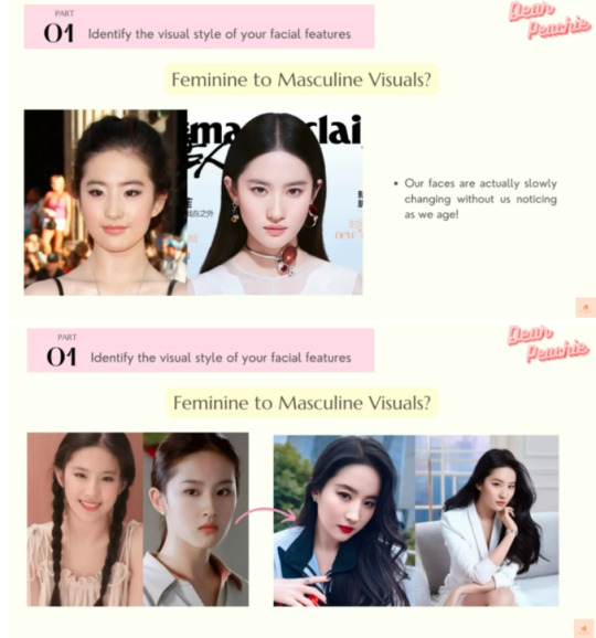
The video then explains the Japanese method of identifying one's overall "vibe" by Masculine or Feminine attributes to the face, and specifying up front that Masculine does not equate to a "manly" appearance (and leaving the audience to assume the same rule applies to Feminine and "womanly" respectively.)
The screenshots below illustrate the basics of this concept; but know that I'm just scratching the surface because of the "only 30 images per post" Tumblr mandate.
COMPARING MASCULINE AND FEMININE VISUAL AESTHETICS
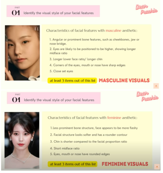
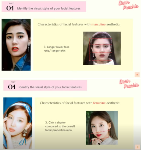
Masculine Aesthetics have angular or prominent bone features to their cheekbones, jaw, or nose bridge while Feminine Aesthetics have fleshy or less prominent bone structures.
Masculine Aesthetics have eyes likely positioned higher on the midface ratio whereas Feminine Aesthetics have eyes likely positioned lower.
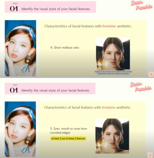
Masculine Aesthetics have a long lower face ratio with a longer chin compared to the Feminine Aesthetics short midface and shorter lower chin ratio.
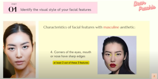
Masculine Aesthetics sports sharper corners to their eyes, mouth, or nose; and usually accompanies this well-defined structure with closer set eyes. Feminine Aesthetics, meanwhile, have no particular structure to their rounded eyes, mouth, or nose; and usually have moderate or farther set eyes.


A simple and easy comparison of the two main (we'll get to that) Aesthetics:
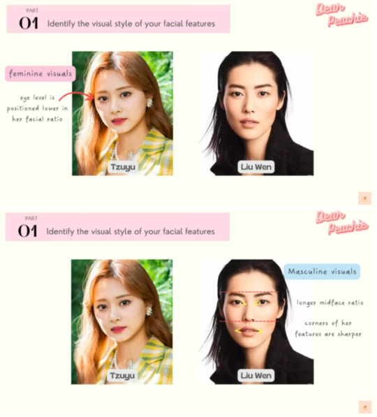
Tzuyu on the left has a Feminine Aesthetic: eyes positioned lower on her facial ratio, a shorter lower face ratio, and softer, rounder, "fleshier" contouring to her cheekbones, eyes, and jaw.
Liu Wen on the right has a Masculine Aesthetic: eyes positioned higher on her facial ratio, a longer midface ratio, and sharper contouring to her cheekbones, eyes, and jaw.
OUR SUBJECT
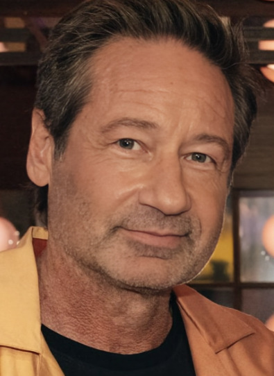
If we divide David's face into thirds, four facts become swiftly clear:
His bone structure-- cheekbones, jaw-- is softer and less prominent overall, a Feminine aspect.
His eyes sit on the lower half of his midface ratio, a Feminine aspect.
His nose-to-chin ratio is small (shortening his midface ratio as well), a Feminine aspect.
His eyes, mouth, and nose have rounded or softened corners, a Feminine aspect.
(Curtesy of @scullyblues's edits here)
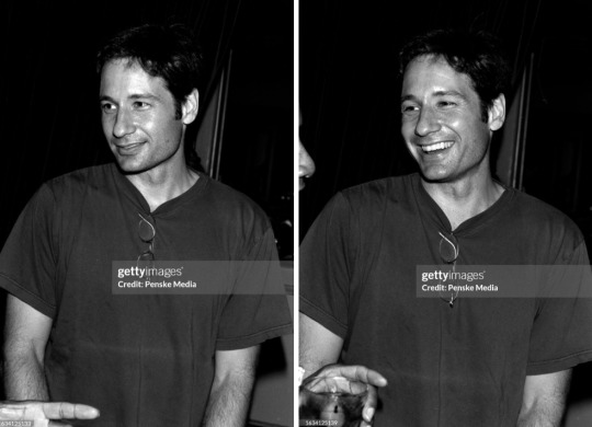
With these facts in mind, it makes perfect sense why David was able to use his softer features fluidly between Denise Bryson and Fox Mulder within a few, short years.
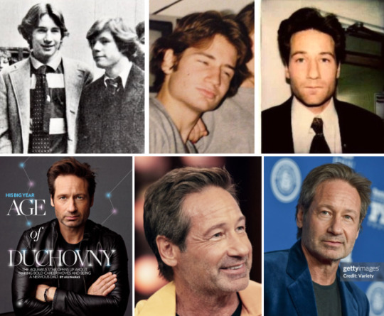
Changing with Age?
An interesting note: personal styling can temporarily disguise the dynamics of one's face aesthetic, but aging might do so more permanently-- the Masculine Aesthetic becomes more prominent with the loss of the natural, youthful facial fat; and shifts a potentially Feminine Aesthetic into a more Masculine one.

As you can see, David hasn't changed all that much as he's aged; but the youthful plumpness to his face has winnowed, exposing more of his cheeks and jaw and adding a touch more Masculine Aesthetic as the years ticked by.
HOW DAVID CAN SHIFT BETWEEN THE VISUAL AESTHETICS
It's possible for a person to shift their Masculine vs. Feminine contrast.
To enhance his Feminine Aesthetic, David (or his stylist) must pinpoint his most Feminine feature and build upon it: since makeup isn't DD's style, cutting and styling his hair into softer, rounded edges highlights the softness present in his facial features.
To shift his Feminine Aesthetic, David's most Feminine feature must be identified and shifted to a Masculine one. Makeup is the easiest way to do so-- applying eyeliner to "sharpen" a rounded eye shape, drawing straight brows into arches to "lengthen" the midface ratio, etc.-- but since that's not DD's style, cutting his hair into shorter or more jagged edges brings more sharpness to his appearance, tipping the balance a little more favorably in the Masculine Aesthetic direction.

High and Low Visual Weight
Technically, the Masculine vs. Feminine Aesthetic doesn't end there, breaking the classification further into four subcategories.
Visual weight is a popular point of discussion in Asian beauty and fashion, trickling over to the West via Tik Tok and promptly getting butchered by the well-intentioned but misinformed masses. Visual weight has nothing to do with a person's weight gain or loss nor an ability to tell their future or fortune based on those features-- it simply maps the regions of one's face where the most "weight" rests, i.e. the "sturdiest" or most prominent part of the facial region. Visual weight is how heavy or light and delicate the facial bones appear.
High Visual Weight has more prominent facial features: higher cheekbones, higher-positioned eyes, and a natural "lift" upward to the face as if the skin were being gently pulled back by a high ponytail. Low Visual Weight has less prominent facial features: lower cheekbones, with the widest point of the face settling down in the lower facial region near the lower cheeks, jaw, and mouth. Neither is more beautiful than the other, of course.
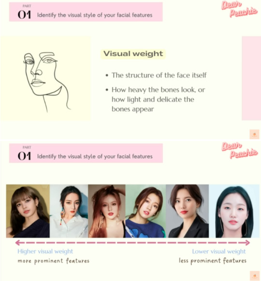
Besides personal styling aesthetics, High Visual Weight and Low Visual Weight affect how others perceive or judge a person's overall "personality": High Visual Weight exudes a charisma that easily attracts attention, seeming more magnetic or vibrant or alluring. Low Visual Weight exudes a lighter, calmer, and refreshing aura, seeming more down-to-earth, mellow, and welcoming or friendly to others.

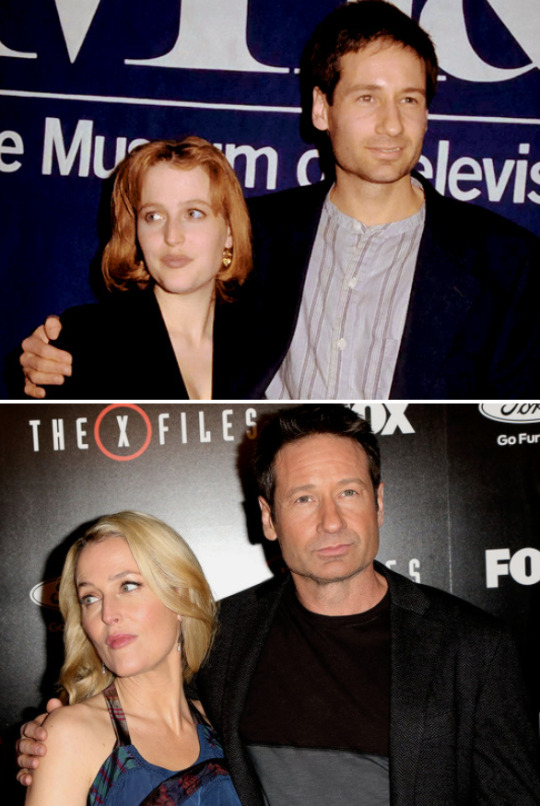
We need only to look at David with longtime costar and friend Gillian Anderson to see the contrast between High Visual Weight (Gillian) and Low Visual Weight (David.) With age, Gillian's Visual Weight became more prominent-- revealing her sharper cheekbones and chin-- while David's Visual Weight stayed relatively the same (thanks @slayerbuffy for the original comparison here.)
How does this combine with Masculine and Feminine Aesthetics?
Well, Masculine and Feminine combines with High Visual Weight and Low Visual Weight to create four subtypes: Low Visual Weight, Feminine; Low Visual Weight, Masculine; High Visual Weight, Feminine; and Low Visual Weight, Masculine.

How to both High Visual Weight and Low Visual Weight types change back and forth from Masculine to Feminine Aesthetics?
Low Visual Weight types do not have prominent features to counterbalance, meaning their primary visual weight needs only to be enhanced by a personal touch here or there-- the "Maximize" method. Like a chameleon, one feature at a time can be is focused in and amplified to shift an Aesthetic.
However, maximizing High Visual Weight types prominent facial features would create an "overkill" or excessive appearance; therefore, these types need to introduce a contrast in their overall look-- the "Counterbalance" method. For example, if a High Visual Weight Feminine Aesthetic wants to achieve a more Masculine Aesthetic, dyeing their hair a darker color would be a quick way to add more "heaviness" to the visual weight, directly contrasting the lighter, more delicate features they naturally have.
How does this apply to David Duchovny? Because David has Feminine Low Visual Weight, it is easy for him to enhance his more feminine features to skillfully pull off the role of Denise Bryson.

Short but Fun Aside: Exploring David's "Personal Types"
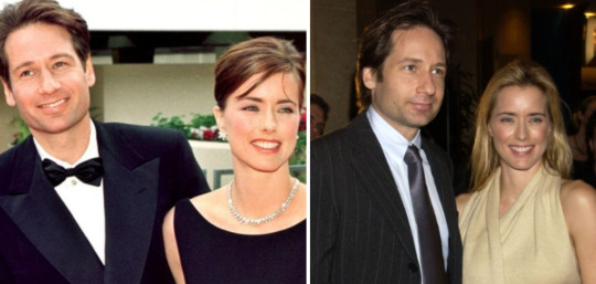
I've heard or read (or both) here and there that David is attracted to women that look like himself; and, whether those conjectures were meant maliciously or affectionately, it piqued my curiosity.
So, in the name of science, I've pulled up his past girlfriends, ex-wife, and current girlfriend to compare and contrast.
An important note: these are respectful comparisons, and are not meant to shame, demean, or unfairly juxtapose these women against each other. Unfortunately, this world is such that I must put a preface up first.
The conclusion? Might surprise you.
While David does have an aesthetic type, he's actually drawn to women with predominantly Masculine Aesthetics, the opposite of his own Feminine Aesthetic.
Maggie Wheeler, Lisa Loeb, Perry Reeves, and Lucy Liu-- and more, but I'm not spamming this post with too many examples-- were his 80s and 90s love interests, respectively. Not only do they have prominent bone structures, higher-set eyes, and sharper corners to said eyes, mouths, and noses, but they also have longer midface and lower face ratios.
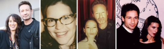
Tea Leoni and Monique Pendleberry also have all of these aspects, as well as the close-set eyes typified by the Masculine Aesthetic.

Fun Fact from dear peachie:
"Feminine Visuals are usually selected as the main girl in Asian drama series while the Masculine Visuals are frequently picked as the supporting character due to the unique charisma and individuality of their looks. They can give a strong impression on their audiences."
Conclusion
While none of this information is too surprising, it was a nice little walk down Fashion Lane. Hope you had fun as well!
Thank you for reading~
Enjoy!
#txf#but not#DD#fashion#randomfashiontiger#is this a new tag?#David Duchovny#dear peachie#Part I#their videos are amazing#and a very brief#GA#meta#mine#thoughts#analysis#Masculine v. Feminine Aesthetics#aesthetics
28 notes
·
View notes
Note
hi sry if this is random or if u already talked about this but how did you set it up so that when you go to a link with your old url it tells you to switch the link to the new url .... 👉👈
no need to apologize! i'm not sure which part you're specifically asking for help with so here are all the steps i took
change the blog's url to a new url
make a new blog with the old url
now you have your actual blog with the new url and an empty blog with the old url
go to the blog settings of the blog with the old url (should be https://www.tumblr.com/settings/blog/url) and click on edit appearance
change your header image to one that says the message you want to include (for me i just opened up an image editing program and wrote out "change the url to go to the correct page etc etc", saved it, and then uploaded it)
to make sure the message is visible in all possible aspect ratios, turn off the "stretch header image" option
click save
hopefully that helps! if you're still confused, feel free to send another ask and i can explain in more detail
25 notes
·
View notes
Last Seen Blogs

suddenly-think
Untitled

gold-intentions-great-aspiration
Antjawn

dlctbunny
Soft delicate

alastairen
alastair
micjimbles777
Wanda Maximoffs MALEWIFE