#edit: i put the image descriptions in the alt text for the images since they were smaller
Note
Hey! magolor for the ask?
FANTASTIC right out of the gate ok so
Favorite thing about them
I utterly love how he's characterized after he becomes kirby's friend for real, like I LOVE the concept of "villain gets redeemed and is now on the side of good, but they mostly keep their original aesthetic and personality". just because magolor isn't trying to conquer dreamland anymore doesn't mean he can't still be a trickster who jokes about his former acts of villainy and uses his powers for the good of the galaxy and his friends
Least favorite thing about them
noo magolor don’t steal the ancients’ old relics you’re too much of a kitty haha :/ seriously, though, this isn’t about him specifically but I don’t like that despite how many lines he has in his debut game and how many times he’s reappeared throughout the series, we’ve never gotten any information about his identity or past. he lives alone on halcandra and sort of resembles certain other characters like the sphere doomers and hyness (with his hood), but no solid info on who or what he is. even him being a descendant of the ancients is just a guess. I know this is partially favoritism but most other important characters have gotten some sort of supplementary backstory or species info, why not him?
Favorite line
"Bravo, Kirby. You've truly earned your reputation as a hero. Your help powering up all that gear was invaluable. Anyway... The time has come for every last Shoppe... No! The time has come for the DREAM KINGDOM to bow down to me! ... Gotcha! Hee-hee! Were you shocked?” --Team Kirby Clash Deluxe
like I said, I love magolor embracing his old villainous self for the purpose of jokes. him quoting his master crown speech to fake out kirby and the player once you buy out his shop? outstanding
BrOTP
magolor and marx is pretty much the fandom’s main one for this I think, but as I’ve said before I think taranza and magolor could be good friends too. both of them having cunning, trickster sides is a big part of it, but I also just feel like they complement and parallel each other well in terms of what they do as villains. who knows what they could bring out in each other as friends? it’d take some time in magolor learning to be a better friend and taranza becoming comfortable with reaching out to others again following the events of td, as well as a bit of luck to make sure that magolor doesn’t immediately blow it, but it could definitely work in my eyes
OTP
okay, this is just the same thing as my brotp, but I really love magolor/taranza as a romantic pairing too. I’m pretty sure I first got attached to the ship because it was two of my faves together, but I eventually started seeing the appeal more in how they compliment each other as characters. a puppeteer with an insect/floral theme versus a wizard with a mechanical theme, one is introduced as a villain but becomes an ally during the final battle while the other is introduced as an ally but is revealed as a villain for the final battle, one sees their loved one consumed and corrupted by a mysteriously powerful artifact while the other is consumed by a mysteriously powerful artifact... really, I’m starting to think these are on purpose considering that td followed rtdl in the mainline kirby platformers. like I said in the last entry I think they could bring out a lot in each other, it’s kind of a shame people don’t explore their potential relationship too often
nOTP
marx and magolor...I don’t see the appeal of pairing them romantically. they’re good as prankster former final boss buddies, but I just can’t see the two as anything beyond that
Random headcanon
I have so many magolor headcanons that I never talk about, so I'll be happy to give one of my major ones here. overall I like to read him as basically a historian and archeologist by trade, he's canonically interested in the creations of the ancients so after he moves to popstar and makes up with kirby he likes to travel around the planet and study old remains of civilizations and creatures. the old temple in floralia's wild world? the sandy canyon ruins? you bet he's been there to dig up stuff and do research
Unpopular opinion
are there any POPULAR magolor opinions? but I guess mine would be that even though he always intended to betray kirby for the master crown, I think he legitimately started to like kirby as a person over the course of rtdl. like, I'm not sure why he would just tell kirby about the history of the lor starcutter if he hadn't legitimately begun to warm up to kirby in spite of himself and his plan. being under the crown's control, of course, probably helped him dispel that during the final boss fight. I feel like magolor has pretty bad instincts in terms of relationships as a consequence of living on the every-man-for-himself hellscape of halcandra where his only known companions were the various enemies and possibly marx, so of course he would hear about kirby and think, "great, someone kind to exploit". he failed to consider, however, that no one is immune to kirby's innate friend-making aura
Song I associate with them
I’ll be honest, when I got this ask I didn’t really have any songs that I think of as magolor songs specifically. my taste in music mostly consists of three artists, lots of old love songs, video game soundtracks, and whatever spotify throws my way that vibes with me, so finding character songs is a bit rarer for me. nevertheless, I like ancient dreams in a modern land by marina and archaeopteryx by lemon demon for magolor. oh no! by marina also kinda fits but I didn’t want to go with the meme answer
Favorite picture of them
this is a tough one, he’s got so many good looks and costumes, but for this ask I think I’ll go with his inclusion in the cat day twitter artwork. just the fact that he’s there means hal might be referencing Kitty Magolor which I love

special mention goes to this appearance of him in the let’s find kirby book. buddies :)

#wow this took a while#i just have so much to say about him#ask game#asks#umbrastar#magolor#clover talks#edit: i put the image descriptions in the alt text for the images since they were smaller
7 notes
·
View notes
Text
Please, if possible, add alt text to your images. (Describe every image, please.)
I've seen people post before about how every image posted, ideally ought to have an image description. They generally get a lot of support from people already doing it, but also some objections, questions and even anger.
So let me first say: I understand that not everyone can add image descriptions for a variety of reasons. But, if i grab 100 random posts with images here it's lucky if one or two have a description. Now I know that not that many of you have some serious reason why you can't describe the damn images.
This simply isn't the case on other social platforms I frequent. Mastodon would be well above 60% described. Even twitter (before I left that hell-hole) had like 20% of the images described. Now both of these platforms have popular tools that will remind you if you forget a description, and frankly it's easier to edit descriptions there... so some of this is Tumblr's Fault. Tumblr make image descriptions easier and make a reminder!
But it's also about user culture. People here just don't think image descriptions matter. But they do!
I WILL NOT reblog posts if they don't have image descriptions. So I end up adding them myself, and frankly I pass over MANY posts that I would have quickly reblogged but I don't have the time to be everyone's mom and describe everything. So, I just do that for the really great posts I can't pass up. But having a description will make more people share your work since you aren't making work for us if we want to share it.
Why do I need to describe images? Because many people use screen readers and if a post makes no sense unless you know what's in the image your post is useless to all of those people.
Why do I need to describe art? Because people who are blind, and people with vision impairments also like art. My brother's kid loves my ant drawings. They're legally blind, but they can see if they enlarge an image and look close up, the description give them the context they need to understand what they are looking at. Frankly, I read image descriptions all the time myself when I find a post confusing, so it's helpful to... literal minded people too. And it just makes your post seem more complete and exciting. Why miss out on putting a neat description.
I don't know what to write! Imagine you are reading the post over the phone to a friend. What would you say "And then there is that meme with the guys in the hot tub, sitting five feet apart" put that. Even something short is better than nothing. Just explain the post for everyone. Since it's YOUR post you know best what matters most about the image. When I add descriptions after the fact they can get a little long since it's not my post and I don't know what matters most. OP's description in the alt text is the best description.
If you have other questions you can ask me. I'll find out if I don't know.
(Did you know you can add alt text to your images by clicking the "…" symbol in the lower-left corner of an image when writing a post? Having the description attached to the image is the best way and only the OP can do this, but I also often add descriptions in brackets [ ] when I reblog cool art, cats and ant stuff. So, if you can't add a description yourself, it's OK, there are people who will help.)
155 notes
·
View notes
Text
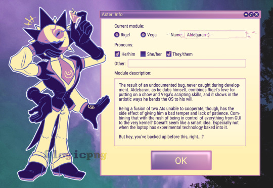
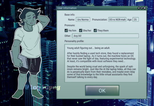
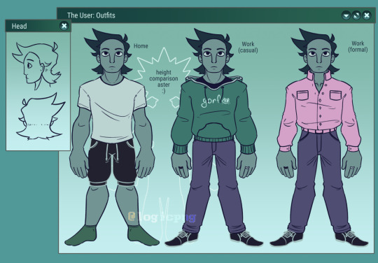
i Believe i am finally done making references
edit: pasting the image descriptions out of the alt text. since they're refs they're really long I am so sorry
[First image ID:
Digital artwork of Aldebaran Aster - a humanoid being in a suit, four arms, and a star shaped head - standing next to a large program window titled: "Aster: Info". He is holding up the mouse pointer in one of his hands and laughing, with a smug smile.
The text in the window reads:
"Current module:
[Selected radio button] Rigel [Selected radio button] Vega [Glitchy text box] Name: Aldebaran :)
Pronouns:
[Checked tick box] He/him [Unchecked tick box] She/her [Checked tick box] They/them
Other: [Long empty text field]
Module description:
[Following text in a large text box:]
The result of an undocumented bug, never caught during development. Aldebaran, as he dubs himself, combines Rigel's love for putting on a show and Vega's scripting skills, and it shows in the artistic ways he bends the OS to his will.
Being a fusion of two AIs unable to cooperate, though, has the side effect of giving him a bad temper and lack of patience. Combining that with the rush of being in control of everything from GUI to the very kernel? Doesn't seem like a smart idea. Especially not when the laptop has experimental technology baked into it.
But hey, you've backed up before this, right...?
[Text box ends]
[Large lavender OK button]"
First Image ID end]
[Second Image ID:
Digital artwork of The User - a human with a gray-green skin, dark green hair with a white t-shirt, track suit shorts and green socks - standing next to a large program window titled: "User information". They are standing with a laptop bearing the CaelOS logo on its back, and scratching their head, looking a little nervous.
The text in the window reads:
"Base info:
Name: Urs Norma; Pronunciation: OO-rs NOR-mah; Age: 25
Pronouns:
[Checked tick box] He/him [Checked tick box] She/her [Checked tick box] They/them
Other: Any/All
Personality profile:
[Following text in a large text box:]
Young adult figuring out... being an adult.
After hastily finding a used tech store, they found a replacement for their busted laptop. As it turns out, the machine hosts an OS that never saw the light of day, featuring experimental technology. At least, it's compatible with most software they need...
Despite the world being cruel and unforgiving, the spark of optimism remains bright. Just like the AI the laptop hides, all they can do is perpetually learn from their mistakes, and maybe even relay some of that knowledge to the little virtual assistants they find themself talking to every day.
[Text box ends]
[Large green OK button]"
Second Image ID]
[Third Image ID:
Reference image of Urs Norma - an androgynous person with gray-green skin and dark green hair. A large program window titled "The User: Outfits" shows them standing neutrally, facing the camera, in three different outfits:
Home: Plain white shirt, track suit shorts, green socks.
Work (casual): Green hoodie that says "gorf" with a cat face on it in white, gray-purple pants, and black dress shoes. Left and right hand feature black and white rings on their respective middle fingers.
Work (formal): Pink dress shirt, slightly unbuttoned at the top, same pants, same dress shoes, and same rings.
Behind them is an outline of Aster, that has text in it saying "height comparison aster :)". At the top of their rays, they're noticeably shorter than Urs.
A window titled "Head", slightly overlapping the large window, shows lineart of the user's head in profile and from the back.
Third Image ID end]
#original#oc#original character#object head oc#object head#ai oc#aster#CaelOS#urs norma is a silly name. but it fits the star theme thing and i think i am growing to Like it#aldebaran (aster)#urs novak
196 notes
·
View notes
Text
Since almost all the art and pictures I come across on Tumblr have no alt text, I figure maybe people don't understand what it's for or know how to use it. Here's an explanation!
What is alt text?
Some people (mostly blind people, but it can be useful for other disabilities too) use programs called screen readers to navigate the computer and read text aloud. That's why pictures need to have a text description (alt text), for the screen reader to read aloud. Alt text is usually hidden and just there for screen readers, though on this site, anyone can click the button in the bottom left corner to access it on any image that has it.
Why is it important?
Alt text makes the internet accessible for anyone using a screen reader. I used a screen reader for a while, so I can tell you how much it sucks to try and use social media only for every post to be like,
"This is the funniest thing I've ever seen!" (image with no alt text)
"This info is so important, everyone please read this!" (image with no alt text)
And then all the responses are agreeing and everyone is having fun and being social, but you can't join, you have no idea what's going on, you're left out of the fun, the cool stuff, the funny stuff, the important stuff, all of it.
How to add alt text?
On this site, when you upload an image, just click the three dots on the bottom right corner and click the option to update image description. You can also add it later by editing the post, if you forget when posting.
What to type?
I'm not the authority on alt text, so I can only give advice based on my experience as a sighted person and what people have told me.
One advice I've seen is to describe it like you're describing it to someone over the phone.
I think a good method is to start by stating the general, then moving onto details. I might start with, "Digital art of an octopus merman," and then go on to describe the pose, the emotion/facial expression, the body, the hair, the colors, the background.
Every screen reader user has different preferences, I've talked to people with completely opposing opinions. But usually someone can move on if they find there's too much description, whereas there's nothing they can do if there's not enough. So I lean toward over-describing.
Additionally, make sure you include anything referenced in your post. If you're just sharing a screenshot of a group of characters, you probably won't describe the shape of each of their noses. But if you say, "I love Bob's nose!" now you should still describe the overall picture but also include the shape of his nose in your description.
That also applies to things like, "This tree looks how I feel." If your alt text just says, "A leafy tree," that doesn't explain the feeling. "A leafy tree that appears to be hunched over with sagging branches, looking tired," is more helpful.
If there's text, include the text. I also like to give context (e.g. screenshot of a tweet). You can even use websites like this one to extract text for you.
Don't just put the word "image." Don't use alt text to credit artists/photographers. Don't use it for jokes, unless the joke is genuinely helping to describe the image.
And remember, trying is always better than not trying, even if your description isn't perfect!
#alt text#accessibility#tagging my fandoms because i want them to be more accessible#bg3#baldurs gate 3#sun haven#project zomboid#monster prom#booklr#artists on tumblr
19 notes
·
View notes
Text
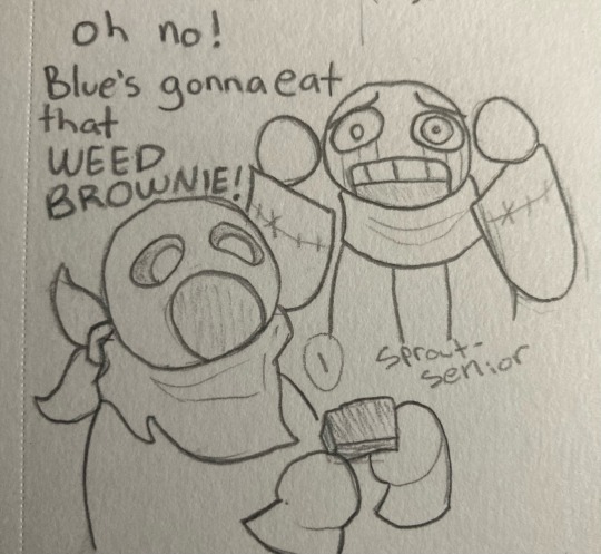
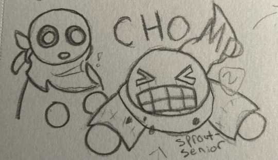
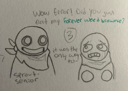
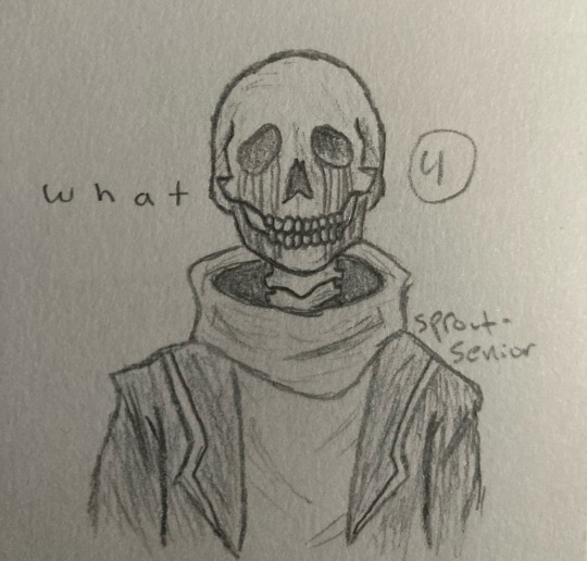
this is. so fucking stupid
i put way too much effort into this
edit: picture formatting
transcription/image ID and more under the cut
[panel one: Error is looking at blue, who is in the foreground about to eat a brownie with a very wide open mouth, with horror. his hands are on either side of his head.]
Error: oh no! Blue’s gonna eat that WEED BROWNIE!
[panel two: Error eats the brownie, accompanied by the word CHOMP. Blue watches with surprise.]
[panel three: Blue is grinning, while Error looks very distressed, holding his hands in front of him.]
Blue: wow Error! did you just eat my forever weed brownie? [the words forever weed brownie are in green.]
Error: it was the only way to-
[Error cuts himself off, and the next panel displays him looking like a photorealistic skeleton, a vast contrast from the extremely round and simplistic style of the previous panels.]
Error: w h a t [the word what, spaced out for dramatic effect]
[end comic transcription]
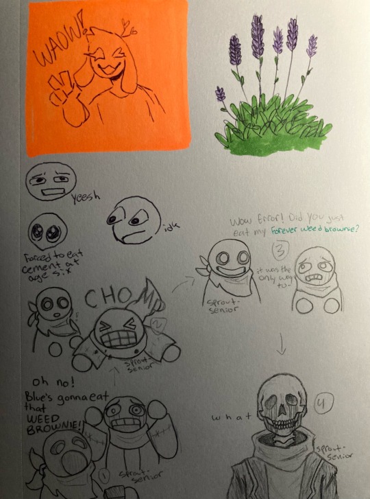
anyway yeah i’m getting back into traditional art at least for the time being since i can’t find my damn stylus. this is the first page in my new sketchbook
[image ID: a sketchbook page, featuring several doodles. in the top left, there is a cute bunny man holding up a peace sign, winking, and smiling with his mouth open. he is on a neon orange background, drawn with purple ballpoint pen, with the caption “WAOW!”. next to this, in the top right, is a simplistic drawing of a lavender bush, colored with bright purple and green markers. below the bunny man are three small doodles of various expressions. one looks concerned and a little disgusted, captioned “yeesh”. the second is a somewhat curious looking one with its eyes popping out of its head, captioned “idk”. the third and final expression is a top down view of a face with very large sparkling eyes, captioned “forced to eat cement at age six”. the bottom half of the page features the comic transcribed above, with numbers and arrows clarifying the order of events. end sketchbook page transcription]
one final block of text to round out the post: i’m doing image descriptions/transcriptions now! i gave up on alt text a while ago, because it was such a pain to format and difficult to work with for me, and i forgot that i have free will and can type that information in the actual post. please let me know how i did! accessibility is important to me, so if my descriptions are lacking in any way or could stand to be improved, i would so so appreciate it if you could tell me what to do to improve! thanks!
#utmv#undertale au#utmv art#error sans#swap sans#blueberry sans#error sans art#swap sans art#blueberry sans art#tagging blue as blueberry bc he kinda looks like him in this style#sprouts sketches
46 notes
·
View notes
Note
Hi! I’ve been trying to make an introductory post for my WoL, but when I tried doing so freeform it ended up overly long and full of rambling. I’ve searched for templates all over the internet, but the only ones I can find are in the general style of D&D character sheets that include irrelevant information about stats while not properly dedicating space to the actual character traits. I saw the format you used for your OCs, and it seems to be about what I’m looking for. Is there any chance you could provide a blank template along those lines for me and others who might have the same problem?
Funnily, while I keep them all similar, I didn't have a template before now. Also reminds me I need to do some updating and revision on my own OCs, it's been awhile and they can use a refresh for character and plot updates.
I recommend making static pages over posts; easier to track and edit. I am a stickler for organization, so keep my pinned post to the bare basics with links to the profiles and other pages, to keep from stretching the post to a mile long, in part, and to keep the info where it's easily read and relevant. Also because mobile app view won't show one's theme and links, and the pinned post is more likely to be seen and accessible than a sidebar or menu.
I have tutorials on how to set a custom theme (and access full blog features) as well as how to create those static blog pages. Tumblr may have made some updates since, but the gist is the same, and the Help pages have newer details if necessary.
I do urge keeping colors and format simple, accessible, and reader friendly, including screen reader friendly. A row of asterisks or tildes as a separator line are usually individually read out by screen readers, as is the code used to make those fancy hard-to-read gothic letters folks use for "aesthetics." In a lot of my profiles, I split sections with images of the character (which should also use alt text if we're trying to be kind and inclusive, and it's to the point of a profile page anyway).
I think I will put the intro and template here in the post under a cut, and then in a Reply Comment add a link to the Google Doc version, cuz of how Tumblr is about external links. An actual blank copy-pasta is on the GDoc, what's below has some thought processes for each section for guidance.
This a pretty modular template, that can be added to or subtracted from as needed. Move descriptive blocks around as they seem more or less relevant for your OC, substitute things that make sense over things that don’t; this is just a starting point!
I see these as broad strokes; a quick introduction and general overview of your character, meant to give an at-a-glance idea of who they are. It’s handy for other writers and artists, and even oneself for keeping track of some details. I recommend practicing succinct writing here; these blocks should each stay between 100-300 words or thereabouts. Use links to other pages and tags to point toward longer details and stories (and keep them handy for yourself!). It also makes it much easier when you want to revise things when characterization marches forward, or if you want to retcon something entirely.
But these are all just my opinions and ideas on how I approach OC profiles after making them in some form or another for about a quarter century. Make it as long or short as it needs to be, change it up, go nuts, I ain’t your mom, and so on 😉
-
Statistics: The basics; barebones, at-a-glance stat blocks, handy for quick reference. Can be added to or shortened as needed. If a stat starts to word wrap on a standard screen, trim it and move that extra detail to the “Description” paragraph below the list.
Race: (for FF14 fantasy possibilities)
Nationality: (or Ethnicity, whatever works. Where are they from, as that helps shape them?)
Height: (both feet/inches and centimeters are handy here)
Eyes:
Build: (I prefer this to weight, as that’s ridiculously variable depending on one’s build, which is more important visually anyway; are they broad, stocky, skinny, muscular, stringy, etc)
Hair: (color, type, texture, preferred lengths and styling)
Skin: (sometimes I fold scars into here, if there’s nothing too outstanding)
Scars:
Voice: (how do they sound?)
Nameday:
Age: (depends on your personal timeline for your OCs, but I recommend an age range over specifics; mid-20s, 25-35, late teens, a little over a century, etc. Less updating and fits with the handwaved time bubble anyway)
Disciplines: (what are their main job[s]? The adventuring or professional skills they’ve learned?)
Hobbies:
Birthplace:
Current Home:
Occupation: (Their actual day job, different from or part of their disciplines?)
Signature Items: (A particular weapon? A piece of jewelry? Always wear a specific coat?)
Description:
A very short "immediate impressions" type description; what would someone "on the street" see when meeting/looking at your character on a typical day? Taking some of the info from the stats but then how you want those barebone facts to be seen; is the OC elegant, or rough? Expensive clothes or simple attire? Any particular smells, or sounds? I recommend around 100 words.
Biography:
Very brief, general overview of the backstory that led them to the point where they become a story protagonist (adventurer, the WoL, or other roleplay archetype). Don't have to go into great detail, keep it short and simple; it's a blurb that sets up how they got here in broad strokes. I think my longest bio is around 300 words, and it probably shouldn’t go over that here.
To get more details, one can always link to specific stories, or to a tag. I have multiple OCs, so I might make my tags something like "Aeryn Backstory" or "Iyna Lore" or "Punchy History" or some combo thereof (I usually try to keep them consistent though for ease).
Persona:
What face do they present to the world? How are they perceived by the public, acquaintances, coworkers, family, actual friends? Some of these answers will be the same, some may change depending on if and how they code switch in various social situations.
From there, what lies underneath the surface? What are some general internal attitudes, traits, feelings?
A hundred words for outward demeanor and another one hundred for innermost self ought to cover the general broad strokes.
Romance:
If so inclined, details about the OC's relationship details; sexual and romantic orientations, relationship history, current situations, how they view and approach intimacy (or not!).
Links to relationship tags or stories or art can work well here, too.
Echo:
Does the OC have an Echo at all? Is it a "typical" Echo, or do they have some special abilities, some things they're better at than others? How does it affect them, how do they feel about it?
This is another section that may be a free space section to remove or swap to something else relevant to the character.
Hobbies:
The stuff outside of work and heroics. Ways they relax, special interests, side jobs, things they enjoy, and so on. This can be an expansion of the listing in the stat block, or you can cut out one or the other to avoid redundancy.
Companions:
What’s their chocobo like, or do they have another favored mount? What pet(s) do they have? Are they practically a Disney Princess? Have a familiar? Do they prefer arcane entities? Technological constructs? Or do they eschew companions entirely?
How to find the OC in game:
This is where I list things like realm and data center, and addresses for the FC house and personal house or apartment. Not necessary if you don't want folks to go looking.
Links:
The links can be scattered through the post in relevant sections, or gathered together here. I tend to put my basic tag for the character, if I have an aesthetic tag for them, their story tags, any links to art references or other miscellaneous items I want easily found for myself and others. I often put this close to the top if a profile is longer and I want those links to be quick referenced.
OOC:
Any particular notes one wants to make about the character from a meta perspective. Can also be combined with the Links.
18 notes
·
View notes
Text
Image-to-Text AI
I wanted to discuss image-to-text AI, what it's good at, what limitations it has, and how you can use it to help make accessibility easier.
How It Works
To demonstrate how this works, I'm going to use the image from this post.
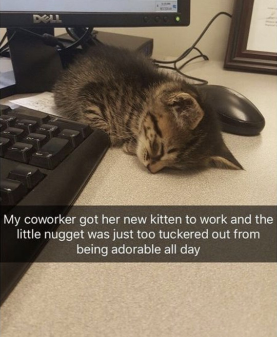
This photo shows a sleeping kitten laying on desk beside a computer, in between the keyboard and the mouse. There is also a corner of a frame of some sort in the upper right corner of the image. Text displays in the center of the image and reads: my coworker got her new kitten to work and the little nugget was just too tuckered out from being adorable all day.
Image-To-Text AI
Image-to-text AI is basically the exact reverse of the famous (or infamous, depending who you ask) text-to-image AI that has taken the world by storm since early 2021. There are a ton of websites for this, some free, many not. For simplicity, I chose to use the image-to-text feature built into Microsoft Word.
When I paste an image into a Word document, the program automatically generates alt text for it using Microsoft's AI. You can view this alt text in the Alt Text panel when editing the document. It will add "Description automatically generated" to the end of the alt text for transparency though, so if you want to keep the alt text it made, make sure to delete that. You can also edit the alt text directly to make it more accurate.
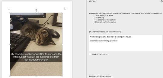
Microsoft's AI came up with "A kitten sleeping on a desk text to a computer mouse." Honestly, not a bad description at all, except it's missing one important thing: the text overlaying the image. This is because Microsoft's image-to-text AI, like many AI of this kind, does not have the ability to transcribe text directly from the image. However, there is a technology that can.
Optical Character Recognition (OCR)
Optical character recognition, or OCR, is a technology that dates back to the 1970s, possibly earlier depending on how you define it. While it's application and accuracy have grown extensively since then, the core function remains the same: recognizing text in an image and transcribing it into a true text format.
I took the photo from the previous section and put it into a Free Online OCR Image To Text Converter.
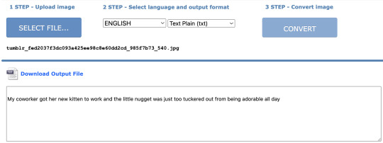
It recognized there was text on the image and transcribed it exactly. Very useful, but it doesn't give us any info about the actual image outside of that.
Limitations
Now, the examples I used above were kind of an ideal situation. AI is not as good with more complex images. For example, I tried putting in a screenshot of a tweet from nym™ (@aretteepls) with a photo of The Sphere at the Venetian Resort in Los Vegas. It is currently displaying a image of SpongeBob's face that fills the entire globe and glows very brightly, turning the night sky's clouds a tinge of yellow. Above the photo, the actual tweet says: The sky is turning yellow because of Spunch Bob.
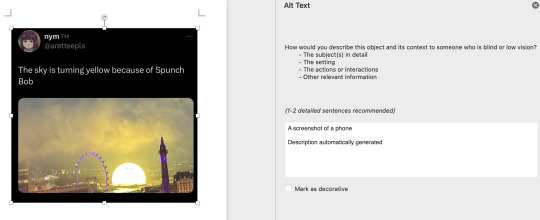
Microsoft's image-to-text AI came up with "A screenshot of a phone." Defintely much less impressive than our first example, but AI is only as good as the data it's trained on. Things like "screenshot of a phone" or "screenshot of a computer" are not uncommon when AI recognizes that you're giving it a screenshot of something on a screen, but can't make heads or tails of what's in it beyond that. And once again, it has no OCR capabilities, so none of the text on the image is transcribed.
But even OCR isn't infallible. The output for this image from that same website I used earlier would be:
nym ,M @aretteepls
The sky is turning yellow because of Spunch Bob
The trademark symbol is kind of faint on the screenshot, so the OCR struggled with making that out, transcribing it as "comma M" instead. The less clear the text is visually, the less accurate the OCR output is going to be.
What Do We Do With This?
AI is best when used in conjunction with human aid, and image-to-text AI is non exception. I think the best way forward with this technology is to use generated descriptions as a starting point, not a replacement for human-written ones. And of course, we need to be careful what programs you use to generate the descriptions, especially with art. Programs like Chat GPT have image-to-text functions, but there is no guarantee that an image you upload to it for that purpose will not be used to train it's text-to-image AI as well.
Unfortunately, the more ethically-sourced a training data base for AI is, the more limited it will be compared to it's less-ethically sourced counterparts.
But there are legal precedents being put in place around this, and many text-to-image AI programs now have explicit and detailed terms of service for what you can and can't do with its output, as well as what you should be uploading as input.
So, for the time being, be very cautious with how you use this technology especially when describing others' art. And even with your own art, read through terms and conditions before uploading your work to a website. I think the Microsoft Word one is fairly safe though.
I also think it would be great if someone developed a image-to-text AI that could incorporate OCR to make the end result more informative.
22 notes
·
View notes
Text
#image descriptions should actually be kept above read-mores because it's not accessible if people have to leave the dashboard to see the ID#and if you ever change usernames or delete your blog everything under the read-more gets deleted
A few notes about this because I keep getting tags like this.
I started to make image descriptions eight years ago or so for a few friends who needed them and who were following this blog. Here's how it went down.
At the time, xkit still allowed you to edit posts that weren't yours, so some people who thought image descriptions weren't ✧・゜゜・aesthetic ✧・゜゜・ enough for their blogs would simply delete them before reblogging my posts, and in some cases that became the most popular version of the post.
People would then tag me and send me messages about the lack of ID on a post where I had actually put an ID in the first place.
I then realised these guys who kept deleting my shit couldn't delete read mores, so after asking the friends who needed IDs if that was still accessible (they said yes), I started putting the IDs under read mores.
The post these tags were added to is from 2017, which is the period when I was still doing this.
Since then, Tumblr has added alt text to images, and I've been asked to put IDs in alt text when the comment I add under each drawing isn't enough to get an idea of the content of each drawing, so that's what I've been doing.
Except people don't seem to be aware that this option exists now, and these posts keep getting tagged "no ID" even though it's right there in the alt text.
Long story short, I'm tired.
34 notes
·
View notes
Text


Bag Tour 2024: Daily Bag Edition Feat. Hannibal Lector
All images have alt text descriptions with items listed, bag tour, and the reasons for each item below the cut
The Bag Itself:
This bag is a Coach Turnlock Tote bag in the pebbled leather color Blossom. This bag, the belt bag I now use as a bag organizer, and the wallet were all gifted to me in 2019 by a family member. The belt is too large for me at this point in life, so the pouch has been repurposed as a Toolkit of sorts. While it is a hair small fully packed, I enjoy the color of it and the balance of it as well as the functionality of the pockets it has.
The Straps:
My straps on this bag usually aren't this cluttered. However, Hannibal has been coming with me to work on a daily basis to get him used to the idea of traveling, and I needed a place to put his harness.
On my straps there is a malachite pendant necklace attached to the charm loop at the bottom of the right side of the outer strap, and my keys are also usually attached here with a carabiner unless I'm going somewhere that I'd want my keys a little bit more secured. I just like malachite. It looks cool. It's the right shades of green, and it's fairly easy to get ahold of.
I also have my stethoscope looped here if it's not around my neck or on my desk at home. I have a neonate size littman stethoscope since I primarily work in companion animal medicine, and I find that it focuses a bit better on my patients who are less than 15 pounds. I do have a regular litmann as well, but that one stays at the office. Most of my after-hours calls are on cats and small geriatric dogs who have standing orders for as needed injections of certain medications whose owners are either unwilling or unable to administer those medications.
Then, the big thing on the straps today is Hannibal's harness. Little dude is 17 weeks, and a whopping 7 lbs already. I could gush about him literally all day, though. His harness was only on the bag while he was allowed to have free roam over the back of the reception area and wrestle with Chewbacca (my terrier).
Turnlock Pocket:
This is where I keep my human med kit for myself, plus treats for my pets, or snacks for myself. Image 8 is the corresponding image.
Human Med Kit:
Glucometer: I have struggled with Non-diabetic hypoglycemia, POTS, and hemiplegic migraines for about 7 years now due to a moderate traumatic brain injury in my teens. So I tend to take 2-5 glucose readings per day. The rubber gloves in my glucometer bag aren't for me to use on me so much as they are to be ready if I need to assist someone in a first aid setting or administer narcan to someone.
Excedrine Migraine: A tried and true beloved OTC medication, both my terrier, Chewbacca, and my malinois, Phobos, are trained for migraine alert and POTS electrolyte imbalance alert work, although Chewbacca is retired at this point. At the first migraine alert from my dogs, I take one tablet of Excedrine and then wait an hour. If the migraine continues to worsen, I then take the second half of the regular dose. This is what works for me, and you should talk to your doctor about treatment options if you have migraines. Currently, I'm down to only 2-4 migraines a month and only experiencing breakthrough hemiplegic migraine symptoms about once every 3 months with this routine.
Narcan: I carry it everywhere. I was never an opioid addict. However, after my TBI, I did struggle with perscription amphetamine addiction, and as a result of having been through that, and having gotten clean, I've become a really big proponent of harm reduction and narcan access programs. There's a few charities I'm involved with that give away narcan locally, and I'd be happy to put anyone interested in carrying narcan some national resources. I also live fairly close to Philadelphia and have unfortunately had to utilize narcan to assist strangers in bars in the past from tainted supplies.
Menstrual cup: I have PCOS, so my cycle isn't super regular and I'd rather have it and not need it then need it and not have it.
Not Pictured: My supply of both instant iced coffee, instant electrolytes, and protein bars that I keep in my glove box, office desk, and at home. Both the caffiene (increases blood pressure) and the electrolytes (increases sodium and potassium) are important in managing my POTS symptoms. The protein bars are for when my glucose drops a bit too far.
Chicken Churu: This was Hannibal's treat for today, we worked on saying hello to strangers and walking nicely on a leash.
Tech:
Corresponding Photos: 2, 3, 6, 7, 8, & 9
Samsung Galaxybook Go: This is my laptop for work and personal use, it has an LTE data chip so I can use it on the go without sucking up my Hotspot data, and it's got fantastic battery life. I bought this refurbished off of Amazon at the beginning of the year. It also charges with a USB-C cable which is super convenient since the rest of my tech with the exception of my smart watch also utilizes USB-C charging so I can just pack a fast charge block and 2 USB-C cables rather than lug around 5 different chargers.
Samsung Galaxytab S6 Lite: It was on special at costco and has an S-Pen which is great as someone who's memory for reading/typing isn't nearly as effective as my memory for things I've written down. I mostly use this for notes on patients and my studies.
Samsung Galaxy23 Ultra: It has a stylus and is of a similar design, feel, and functionality to my Note9 I just replaced last fall.
Samsung Galaxy Buds2 Pro: The active noise cancelling is fantastic for working in busy coffee shops on Mondays, and the Ambient sound is great for getting a Podcast in during charting or longer monitoring stints.
Samsung Galaxy Watch5: LTE enabled watch helps when I'm away from my phone during the day, it allows me to still get calls, texts, notifications, and keep track of active time and calories burned.
Charging Bundle: One 8" USB-C -> USB-C cord for charging my tablet, phone, or earbuds off of my laptop, one 4' USB-C -> USB-C cord to charge my laptop or other devices if my laptop is sufficently charged, a USB-A -> hard drive cord for my 1TB portable drive, and a USB-A Smart watch charging cord.
Data storage: 8GB flash drive that is mostly used for ultrasound capture transfers and X-Ray Diacom transfers, although occasionally it also gets used for in-house lab data transfers when the WiFi link is acting up. 1 TB portable hard drive, this contains textbook PDFs, a large music library, archived notes, and lesser used reference tables and software. It also has copies of my more important documents.
Vlogging/Content Creation Supplies: Light bar, microphone, mini tripod, comfort grip, and microphone stand. Basically just stuff to enhance recording quality for tiktoks, reels, and YouTube videos (coming soon).
Books & Stationery:
Pocket Edition Book of Common Prayer: No, I am not carrying a Bible around, I have an app for that. This is a Book of Common Prayer (1979 edition) for The Episcopal Church. While I'm laity, I do still try and take time for Morning Prayer/Matin, Noonday Prayer/Diurnum, Evening Prayer/Evensong, and End of Day Prayer/Compline. These are quiet moments for me to break away from the stressors of the day. I also utilize 2 additional devotionals for quiet time upon rising and before bed that supplement my regular journaling, however these stay on my bedside table with my primary journal.
Martha Stewart For Staples Discbound Junior Notebook, this is my planner, quick notebook, and lazy journal, I basically dump my brain out right here throughout the day.
Paper clips: From marking off the current month and week in my planner to organizing papers from drug reps, to getting a client printed copies of their records, there's lots of paperclip usage.
Correction tape: I don't often use pencils and sometimes my brain goes faster than my hand and mistakes happen.
Erasers and pencil leads: If I'm out and about I don't want to lose my ability to sketch and use pencils if they're needed
Pens: Pink, Red, and Black ink, my standard for personal notes is Pink ink, while business notes are done in black, the red is for corrections on both
Pencil: it's the same grip as my favorite pens that I can write for hours with, super beneficial for long study sessions.
S Note App: My longer rough notes and revised notes are done in SNote with a SPen/stylus and handwritten out. I also tend to keep spare nibs on hand, however I am currently out of spare nibs.
Sticky notes/flags: great for passing off notes to coworkers, flagging charts, or marking messages.
Snack Attack:
Travel Cutlery set with a fork, spoon, and knife so that I don't have to get utensils when I grab breakfast or lunch at Wawa or the local BBQ joint
Travel straw: Save the turtles while still enjoying my Starbucks
Bandana/neckerchief: No single use napkins here
Coozie: Perfect for NA Seltzers, Sodas, or a beer at the bar after work. Plus it holds all my other eating supplies.
Beauty/Hygiene:
Hand lotion: washing hands between every patient can leave my hands feeling pretty gnarly, so I always pack lotion
Perfume: Anal Glands happen, and sometimes you just... need to freshen up a bit.
Dry Shampoo: my hair always looks super greasy after taking my scrub cap off after surgeries, this buys me enough time to get through my shift
Hand sanitizer: ideal for housecall visits or visits to elder care facilities where you may not be able to properly wash your hands between patients.
Lip gloss: I'm not a huge fan of lip balms and the waxy feeling they leave on my lips vs the glide of a lipgloss or oil.
Sewing kit: Because if your shirt rips in vet med, it's probably going to be in a place you really don't want it to rip
Manicure kit: wrestling with animals can cause nail breakage and hang nails, and I'd rather not have to chew one off. It also has tweezers that come in handy for splinters or thorns picked up from animal coats.
Blotting sponge: again, I tend to start looking greasy after surgery because I sweat. And I'd rather be able to take care of it quickly and discreetly
Condoms: These don't need to be in my work bag, but they're in the tool kit along with my most basic essentials because the Toolkit is in every bag I use, including bags I use when I go out for girls night or linedancing. Also another have and not need vs need and not have item.
Hair tie, bobby pins, barette: just little extra bits and bobs as needed for hair issues, sometimes the dry shampoo isn't enough and the only solution is to throw my hair up into a slicked back ponytail instead of having it down.
Cooling wet wipe: again, surgical sweating
Other Essentials:
Wallet: Obvious Reasons
Nicotine Pouches: I've quit vaping but I haven't quite kicked the habit entirely yet
Unpictured: Glock 43. I uber and doordash after work, I also deliver controlled substances for patients in some not-so-great areas being ravaged by the opioid epidemic. I'm also a 5'5" disabled female who lives alone and has had a stalker. Sorry not sorry, it's insured, I'm licensed, and I take courses for it routinely.
If you have any questions, comments, or thoughts, feel free to DM me, comment here, comment in the tags, or reblog. Also, I'm aware this is Tumblr and that the Jesus stuff can be frightening to see, just want to make note that I do fall somewhere between a pluralist and a universalist. As long as you aren't using your religious views to oppress, marginalize, or harm people, we're good as far as I'm concerned.
#cvt2dvm#bag tour#self love#self care#studyblr#vetblr#studying#veterinary#vet med#self improvement#christianity#christian#episcopal#episcopalian#book of common prayer#whats in my bag#whats in your bag#tech#samsung#coach#kitten#cat#cats#cats of tumblr#cats of the internet#Hannibal#Hannibal's Adventure#Hannibal Adventure Cat#bag#religion
2 notes
·
View notes
Text
might be overthinking abt this but its been on my mind ever since i started researching braille/reading devices for the visually impaired -
#last twilight#last twilight the series#polls#this is jessi#prev oswlld#<- i keep forgetting to add that tag lol anyways#this is a valid thing to be concerned about right? or am i being performative? uh..#thoughts??????
4 notes
·
View notes
Note
Yo, what do you use to make your Gifs? Seems like everyone else has gifs that look amazing. Even on my highest "quality" setting. They still post looking like a bunch pixels that wants to know if it looks like it knows what a Jpeg is.
Hey! I'm not sure about the exact result just from the description lol but gifs can turn blurry or lower quality because of various reasons. On Tumblr, it might be caused by the dimensions of the gif. For one gif on a row, the max size used to be 500 pixels, now it's 540. (This post has a quick overview.) If it exceeds that width, the gif will appear more blurry. Tumblr also compresses gifs if the file sizes are between 5-10 MB, though I have no idea how/if that effects the quality tbh.
The size of the video/screenshots you work with is also important. Since I have a copy of HoA, I record my own gameplay of it with 2304 x 1440 dimensions. An 8 min video with those dimensions has a file size of like 1 GB, and 1 screenshot has a file size of 1-2 MB, but it helps being able to gif only a small part of a scene and with image quality in general. Tbh I'd love to freely share either video or screenshots with other folks for editing purposes, in a way where people can just nab them if they wanna, but the file sizes make it difficult.
Probably unnecessary to add, but anyway: within the game, you can also set various image quality options to a higher or lower quality, so if your computer can handle it I recommend putting those settings as HQ as they can go.
Another important factor is not to oversharpen or undersharpen the images. If I crop out a lot of the canvas I usually sharpen it once, and if I keep almost the full image in the gif I sometimes sharpen it twice (in steps, eg first reduce the image size from 1400 x 1400 to 950 x 950, sharpen, then reduce the image to 540 x 540 and sharpen again). But that really depends on how the final result looks. More advanced folks use more detailed ways of sharpening (such as Smart Sharpen... or Unsharp Mask... in Photoshop) but personally, I stick to regular sharpening since it looks nice enough too and it's 1 click, as opposed to sliding the bars around to find the exact result I want.
I don't think doing 1 of these points wrong will lead to a horrible quality, but combining all of the bad points may lead to very blurry or pixelated gifs.
For recording I use what Windows has (by hitting Windows + Alt + R), for screenshots I use VLC media player, and for editing PS.
And for anyone looking to get into editing or giffing without PS: Photopea is an online website that emulates a lot of PS functions. The gif and text functions are sadly still a bit limited compared to PS, but it's free, doesn't even require an account, and it does incredible work imo <3
Lemme know if anything's unclear or if you have any other questions. (Same goes for other folks, I love seeing people's HoA edits, and if I can help anyone looking to start with that process I'm happy to)
4 notes
·
View notes
Text
[Image description in alt text]
2022 Writer's Wrapped
So to mimic spotify, I thought I would do a "wrapped" and review everything I did writing-related this year! Since 2021 was pretty... unproductive due to personal crisis reasons, I really made a comeback this year and I'm quite proud <3
Putting it under the cut just so I won't clog your dash lol
Reading:
8 books total
Genres: short stories, paranormal, fantasy, sci-fi, queer ya romance, memoir, comic book
Favorite: She Who Became the Sun by Shelley Parker-Chan
Beta read @aritany's amazing peter pan retelling ❤️
Beta read a bipoc fairy tale retelling and a queer fantasy romance with crit swap partners
Writing & Editing:
Novels: 2
Words: ~190k
Hit 1 million words lifetime total for Nano projects!
Participated in Camp Nano and Nanowrimo
AVOF2 draft 0: 125k (72 days)
TWTR draft 0: 65k (33 days)
Genres: paranormal urban fantasy & dark fantasy fairy tale retelling
Edited down AVOF1 from 120k to 102k
Edited AVOF2 Act 1 and got the total down to 118k so far
Alpha reads in progress for both AVOF2 and TWTR!
Final beta reads in progress for AVOF with shortened word count (@jamieanovels, @bebewrites, and @isabellebissonrouthier ❤️)
Querying:
Learned how to write a synopsis & query letter
Made a website
Started querying AVOF
Participated in #PitDark and #MoodPitch and got 2 agent likes!
Rejections: 23 (including 3 from maybe piles ;-;)
Out: 7
Currently in 1 maybe pile
Writeblr Stats:
October: made this blog and started participating in writeblr
Gained 200 followers so far!
Most popular post: TWTR Playlist (click)
Biggest fans: @little-mouse-gardens @isabellebissonrouthier @elijahrichardwrites @spookyceph
Other:
Made my own discord server :3 (message me to join!)
Started twitter
AVOF art commissioned here
#writeblr#writblr#writers#writeblr community#writers of tumblr#amwriting#fantasy#dark fantasy#excerpt#wip#writing#mj mumbles#2022 wrapped#monthly review#2022 review#december 2022 review#mj posts
17 notes
·
View notes
Note
back with more questions regarding image descriptions!!
let's say there is an artwork for a fandom that is specific to one country mostly. (Czechia in this example) since the thing the fandom is based on is in Czech. should I write the image description in English or in Czech?
also I've heard somewhere that proper writing should be used in them, is that true? like if the original text is caps lock I should put it to regular. or when no punctuation is used, I should add it.
i hope these aren't stupid, questions. I'm thinking of adding descriptions to all pictures on my art sideblog and I want to do it right :)!!
hi there! sorry for the late response on this one!
so for your first question, i would write the image description in czech in that case! generally speaking, i would write in the language that most of the post's audience will be using. or perhaps whatever language the op was using. you can also do the image description in more than one language (like english and czech for example) if you want. but one language will generally be sufficient.
in terms of proper grammar in image descriptions, i am not sure that it is vital (tho people are welcome to correct me on this), but i believe that it is preferred by some people. i usually use proper capitalization and punctuation in my ids. but again, any id is better than none.
as for correcting punctuation and capitalization when transcribing text, usually the rule of thumb is to transcribe the text as-is, without editing anything. the main exception would be for an honest-to-god typo (like fully a mistake, not a misspelling that was added for comedic effect) that may affect the post's legibility. in that case, you can usually correct the spelling. but otherwise i wouldn't edit the capitalization, spelling, or punctuation. if something would be truly incomprehensible for a screen reader (like something with a lot of words intentionally misspelled), then you might transcribe it as-is, followed by a "translation"/plain text of what it's meant to say.
when it comes to things that are in all caps - there are some mixed thoughts on this. i think these days most screen readers will read all caps just normally, but certain words may instead be read as an acronym. for example, "it" in all caps might be read as "I-T", like the acronym for "information technology." another thing to note is that no screen reader (as far as i'm aware) will make any note of something being in all caps. this means that when all caps are used for emphasis, a screen reader user has no way of knowing that the emphasis was there. lastly - and maybe this is just a personal preference and doesn't extend to other people - i find it kind of difficult to read a long stretch of text (like, more than a few sentences) that is in all caps. for all of these reasons listed, i often like to transcribe all caps with normal capitalization, just with a note that indicates that it was in all caps. for example: "The sign reads: [in all caps] 'do not enter'". these sorts of notes can also be added when all caps are used for emphasis. however - i'm honestly not sure if there's an agreed best practice on the transcription of all caps text. or if there is, i still need to learn about it.
just as a general note for alt text and image descriptions - a great way to learn a bit more about how screen readers work is to try out the screen reader on your phone! pretty much all modern phones have a screen reader in the accessibility settings, and you can set up a quick shortcut to turn it on and off with ease. for my phone, i just hold down both volume keys for a few seconds to turn it on. once the screen reader is on, swipe left or right to change what is highlighted and being read, and double tap to select what is highlighted. there are more settings than that, but that's what you need for just basic navigation. once you've figured out how to use your screen reader, try it out on different tumblr posts to see what it's like, and try it out on alt text or image descriptions that you write to see if they read well.
thanks for the thoughtful questions again!
#i'm hoping the basic screen reader instructions work across most phones?#i know they apply for voiceover (iphone) and talkback (android)#long post#again sorry i can't be concise to save my fucking life#j.txt
4 notes
·
View notes
Text
intro post that will become pinned!
so besides basic info in the bio, my tag for my flag coinings will be #zac's flags. most flags i've done so far are for myself (got that ocd & bpd combo that makes me obsessive about my unstable sense of identity) but i can take requests! (I'm just awkward lol). I go back and edit flags a lot (rip) so you may wanna check my tag #check update!!! on here and on my main for posts I've edited with the updated flags (some have the updates in the reblogs which will also be mentioned in the tags for those ones).
Also I will deff be reblogging other flag coinings because I just majorly love pride flags, they are a special interest of mine.
my main on here is @boywithbear. I originally started posting some flags there and am finally making this account so my favorite ones from there will just be reblogged onto here under the new tag
I have a flag twitter account that is whalien_flags
and yeah!!! just, new blog!!!
some byf info:
i may not always be able to add image descriptions so if I don't, anybody can feel free to reblog and add some and I will reblog it. There are times the description(s) may be in the alt text. I also may end up reblogging flags from others that do not have image descriptions but I do not think that will be frequent.
for my flags themselves i don't really care about having a dni (as I can't stop anyone from using a flag anyway) but i am an inclusionist so for the blog you probably shouldn't follow if you're an exclusionist and wanna gatekeep 👍 and i'd prefer you to not interact with the blog itself unless you're 100% civil/nice. and i mean this with queer discourse as this account is mostly queer flags and any other discourse is above my pay grade.
when taking any requests, i don't necessarily have any set rules of what I wouldn't do (besides probably paras and trans-id stuff? again, above my pay grade) so if I wouldn't do something I would just respond and say so
> This is an update as of April 2024 but I have a new archival website!! The quality of images on the old one could be very bad so I finally took the time to switch it all over. I like to keep a website for them as I've had many different accounts/usernames I've posted them with throughout the years and I don't want to risk losing any (have before since some of my old accounts are gone), I haven't posted every single one I've made onto the site though! There are some I just plain don't find good enough to bother putting them on it lol. There's also flag edits and wallpapers on there too! (I usually post those on twt rather than here) <
0 notes
Text
Starting out with image descriptions: formatting
Plain text: "Starting out with image descriptions: formatting" in title text. end PT
Continuing my series about accessibility, I have decided to explain how an ID should be put in a post. I see a lot of people in here who already do image descriptions but aren't sure how to properly format them, or who format them in a way that isn't accessible. I decided to make a post to explain the basics on how to make IDs.
This won't explain what to write when you're making IDs; just how to properly put your ID in the post in a way that is accessible. For more resources on IDs, you can go to my "accessibility" and "reference" tags.
1. Text ID vs Alt Text
Plain text: Small title text saying, "1. Text ID vs Alt Text". end PT
A text ID is an ID you write on the body of the post, visible to everyone. Alt text, on the other hand, is an ID you code in along with the image, so it isn't visible for people with screenreaders, but people with it can click on the image and get that ID read out loud.
Tumblr offers the possibility to add alt text to your images, if you click on the three dots that appear on the corner of the image on mobile. Except... Oops, it doesn't always work
As with many Tumblr features, Tumblr alt text is known to glitch, and the entire alt text might disappear or not be available to users without the O.P necessarily knowing. The reasons for this range from "the post was edited later" to "reblogs ate the alt text" to "damned if I know". So, it is unreliable, and that alone is a reason why it should not be used
There are, however, other important reasons! Namely, that alt text isn't actually accessible to a lot of visually impaired people. This is because alt text can only be accessible via a screenreader, since the ID will only be available in the post's code. And not every visually impaired person uses a screenreader, including blind people
There are other accessibility features that legally blind and visually impaired people use, such as: bigger text, bigger display, high contrast text, the enhance button, color correction, and more. These people still need IDs (including of screenshots of text! They need these accessibility features to see text, so if you post a screenshot of regular text, they can't read it), but cannot see them if you only put it on alt text
Not to mention that some blind people cannot use a screenreader even if they preferred that to other accessibility features, because they are Deafblind, have auditory processing disorder, or simply cannot listen to something at the moment for whatever reason
Tumblr is working on a feature that allows alt text to show up in the body of the post so people can read it normally, but while it isn't available to everyone, alt text is not accessible. It is not accessible to Deafblind people, people with APD, and people who prefer not to use screenreaders, which is a choice they have the right to make. Therefore, using it is not a good accessibility practice and using plain text IDs is preferable
There is also an important argument, which is that alt text is designed to be invisible to sighted folks, and that in itself is problematic because it discourages people to think about accessibility, recognize when something is or isn't accessible, and start incorporating accessibility practices into their lives. I am a strong supporter of this argument, which is another reason why I don't think I'll ever advocate for alt text. This part, however, isn't a consensus. The other parts are
2. Placement of the ID
Plain text: Small title font that reads, "2. Placement of the ID". End PT
Imagine that Tumblr's newest glitch is that any images added to a post end up at the bottom. So you see a text post that makes use of several images, but every time there is an image in the middle, you just get text that says "image" and you have to scroll down, find the image in question, then scroll back up
This is the experience you are giving blind and visually impaired people when you leave your IDs at the bottom of the post
Folks, when you add an image (or more) to a text post, you don't put it in a random place, do you? You put it in the ideal place for someone to comprehend your text. There is a logical, comprehensible sequence between text and image, and the image is right where it's supposed to be
Therefore, it is also where the ID should be
Please understand me clearly: an ID is their user's image. It substitutes the image for them. When you are writing one, it is helpful to ask yourself, "what would this look like if there was no image, only the ID?". Because that's what it's effectively like for people who need IDs
If the ID is anywhere that is not directly over or under the image, it's in the wrong place. If a place is where the image should be, then it's also where the ID should be
And yes, this includes when you post an image post with just a one-line caption underneath. Most of the time, the caption doesn't make sense without knowledge of the image. If you didn't post the caption before the image, there's no reason to put the caption before the ID
3. About "ID" and "End ID"
Plain text: Small title font reading "3. About 'ID' and 'End ID'." End PT
I occasionally see people posting IDs without the "ID" and "End ID" at the beginning and end, so I thought it'd be helpful to explain why they are needed.
Without the "ID" at the beginning, someone who can't see your image will not be able to tell that the image is described, and will assume that what you are posting is a caption. Then they will probably skip it, or at least believe they are missing the image's information
There is really no other way to make it obvious that what you are about to post is an image description. And a lot of the time, even reading the ID won't make it obvious that it's an ID if you can't already see the image. This is particularly true when the image in question is a screenshot of text and the ID is just a transcription without information that it's a transcription. Someone who sees that and can't see the image will assume that it's your own caption to the image, which could be literally anything
Similarly, the "End ID" is important for the person to know where the ID ends and the poster's caption or commentary begins. Again, there is no way for them to know otherwise. Not even the paragraph break, because some IDs are longer than a paragraph, especially if it's an image with lots of information, such as an infographic or spreadsheet
Using brackets [] instead of the "ID" and "End ID" is NOT ["not" in caps and bold] an appropriate substitution, because brackets are a form of punctuation, and therefore, screenreaders will just read them as a pause. A pause which they would already have because of the paragraph breaks. So, for screenreader users, they offer absolutely no differentiation
Note: "ID" stands for "Image Description", not "Identification". So you don't need to say "Image ID", as that would be "Image Image Description". That's not a cardinal sin that deeply affects your accessibility or anything, but it's good to know. I was saying "Image ID" for like a year before I realized that and I felt really stupid afterwards, so I thought you'd like to know
4. Formatted text
Plain text: Small title font that says, "Formatted text". End PT
I see a lot of people posting their IDs in formatted text (usually tiny text or italics, but occasionally bold, colored text, and others). You should not have your ID in any kind of formatted text
Why? Because most forms of formatted text are unreadable to at least some people with visual impairments, if not all of them. This will generally not be a problem for screenreader users unless you use all caps, stylized fonts, or embedded links. But they will be a problem to users who don't have screenreaders, which, as we've seen before, make up a significant amount of ID users
Legally blind or visually impaired users who don't use screenreaders generally rely on bigger text/display as an accessibility feature. This means that they set their phone to make text bigger for them. If you put your ID in tiny text, you are making the text small all over again. So they won't be able to read it, and your ID will be useless
I have my phone's text and display set to biggest, and Tumblr tiny text looks roughly the same size in that mode as Tumblr regular size in regular mode. That is not big enough for lots of visually impaired people to read; if it was, they wouldn't have their phones set to make text bigger
Similarly, italics make the text look thinner, which is harder for a lot of visually impaired people to read. Bold makes the letters get easily smushed together, which is also hard for some to read. Colored text has a lower contrast, which will also be harder for them to read. Not to mention visually impaired people might have other conditions that affect reading such as color blindness or dyslexia
This is specially harmful if it's long chunks of text. I've seen some people who will put everything that was directly transcribed from the image in bold or italics, and I've even done it myself for a brief period. Please don't do this! It is very hard for a lot of people to read
Every time you mess with formatting on your text, you are basically annulling someone else's accessibility features display. And since Tumblr does not allow users to turn those settings on or off, this is an accessibility issue
Note: not everyone will be negatively impacted by the use of these. Some people even find them helpful, especially if it's to signify key words. But again, since it's impossible to turn it on or off, the best way to do an ID is without formatting, a.k.a in plain text. The exception to this is BlockQuote (a.k.a idented text) and bullet points
To find out more about plain text, you can check out the other post I made about it on the link below
Link
"Do I need to put the ID between brackets?"
Plain text: Small title font reading, "Do I need to put the ID between brackets?". End PT
You might have noticed that most people post IDs between brackets, like this: [ID: A pig wearing a baseball hat. End ID]. This might be the most common way of formatting it
It is not, however, necessary. As far as I know, people do this so people who don't need the IDs can easily know where it begins and ends, and skip them. They do not serve any accessibility purpose
Personally I don't use them, and if I want to have a visual cue to show where the ID begins and ends, I put it in BlockQuote. This is not necessary either, although it might help some people with dyslexia and ADHD better organize the contents of the post. It is fine to do, though, as long as it doesn't substitute the "ID" and "End ID"
And that's all, folks! Thanks once again for reading this long post, and I hope it was helpful
TLDR
Plain text: small title font reading "TLDR". End PT
You should make your IDs in text, directly under or over the image, with the "ID" and "End ID" at the beginning and end, and without italics, bold, or tiny text. Using brackets isn't necessary but it's okay
#accessibility#image descriptions#reference#resources#how to make ids#has plain text#has tldr#long post
758 notes
·
View notes
Text
being a simblr, this is a very image-heavy blog and i'm really only now getting in the habit of putting alt text/image descriptions on any images i post (mostly on my main blog)
and i just tried to go back and edit an old post to see if i could add alt text and it... seems that because my old posts were made with the old post editor, i can't add alt text with the new post editor. will do a little more digging to see if i can get into the html and add alt text that way [EDIT: i cannot do this 😫]
and like... not gonna lie, going back and putting alt text on all my past story posts is a daunting task, especially since they're made with the old post editor. but it is something i wanna make a point to do moving forward - if i can break into the html and add alt text to older posts [EDIT: i cannot...], i wanna go back and add alt text to at least what i have so far of projmutual/atkins mmbc
for my old projects though i... do need to fix what i have of the dreamwidth backups anyway, all the images broke, so i can at least make the dreamwidth mirrors of my old content more accessible
this musing text post was spurred by me putting alt text on that last post. also in doing so i realized that my current theme has an absolutely useless way of displaying alt text so maybe it's time for a new theme?
7 notes
·
View notes