#especially the visual/character design you should really take a look
Text
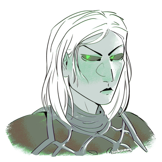

aunt Sveltana my beloved
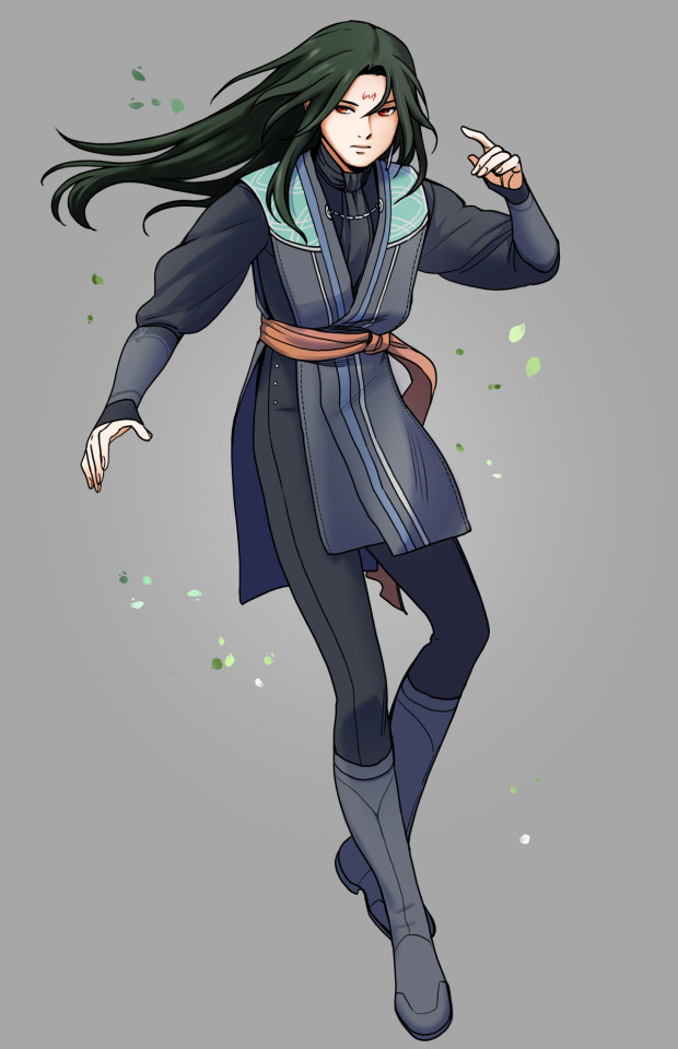
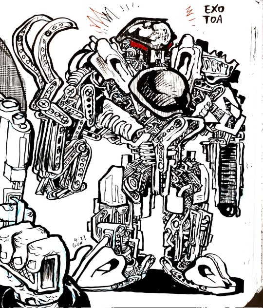
#homm#homm 6#heroes of might and magic#heroes of might and magic 6#sveltana#my art#probably nobody out there gives a crap about homm6 but Sveltana is so cool and so everything#oh yeah and the game itself is as awesome as I remembered it when I was 11#especially the visual/character design you should really take a look#homm fans give h6 a lot of shit because it doesn't live up to h5's success (and bc of uplay bullshit) but it's still a good standalone game#camera controls and updated hotkeys are hard to get used to and new ability tree and combat system take away some enjoyment#but newly introduced mechanics are very fun#I drew the top drawing last october.. I left it to rot in my drafts for quite some time
47 notes
·
View notes
Text
holy crap okay so
I'm two episodes into Kaos
normally I keep my expectations pretty minimal because, let's be real, the Internet - and especially Tumblr - has a tendency to severely overhype new series to be way better than they actually are and it often leaves me sitting there like "that's it? that's what people were freaking out over for weeks?? that was just a bunch of cheap ships and tropes that i've seen 123785902380 times before" LMAO
BUT thankfully compared to other series like Hazbin Hotel and The Amazing Digital Circus, I haven't been worn out on excessive fandom exposure prior to watching Kaos, so I didn't really know what to expect going in besides what folks have told me so far - it's a modern-day Greek epic, and it stars Jeff Goldblum as Zeus (which is, unsurprisingly, peak casting).
That said, I'm very pleased to say that so far, the show is absolutely blowing me away. The set designs, characterizations, weaving of all the players into a central narrative led by a very coy narrator, all of it feels both refreshing and respectful to the source material at the same time.
so uh yeah that LO animated TV show... we have reason to believe now that it's gotten picked up by Amazon Prime, at least according to the showrunner's LinkedIn and posting history from February of this year that seems to imply LO may have been picked up by Amazon-

(but still, nothing's really been confirmed because they're being so tight-lipped about this you'd almost think it's because there isn't a show happening at all cough)
But even then, that means at best we still won't see anything of the LO TV show adaption for another 2-3 years, depending on how production goes.
Why am I talking about LO right now? Well it should be obvious - Kaos double-whammied LO by beating it to the punch at its own game.
I mean, just look at the creative choices alone in the design of the Underworld and its rulers, our beloved Hades and Persephone.
And yes, the entire Underworld is color-graded like this, something so simple and yet effective in communicating the nature of the Underworld and what it stands for - a place where the past lives on through the dead, paused in time, devoid of the vibrant color grading found in Olympus - or "Olympia" as its been named in this retelling - which is, by the way, a visual treat to take in every time it's featured.

(and yes, that is S-tier-companion Billie Piper on the left, but I will not tell you who she's playing, you actually really should go into this show as blind as possible for the thrill of figuring out these characters as they're introduced <3)
That's not even getting into the narrative structure of the plot itself or the phenomenal casting and acting, but again, I don't want to spoil too much as the show is quite new, and I want to actually finish watching the show myself before I get more into the details of its story and how it delivers it (I'm very much hoping I will still be singing this show's praises at the end of its 8 episodes, please for the love of god don't jump the shark, I don't think my heart can take that kind of pain again.)
All that's to say though, Kaos is, so far, exactly what us disappointed fans of LO deserve after all these years, and frankly, I feel like whatever is coming for the LO animated TV show is really gonna have to step up to the plate to both live up to the bar that Kaos has set as well as stand on its own without being affiliated as a cheap Amazon knockoff living in its shadow. Sounds a little familiar and a bit ironic, doesn't it?
300 notes
·
View notes
Text
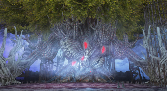
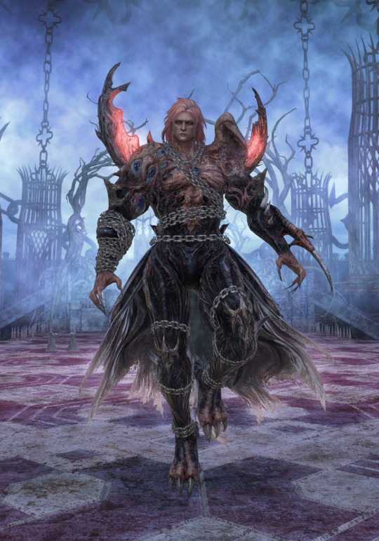
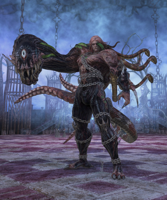
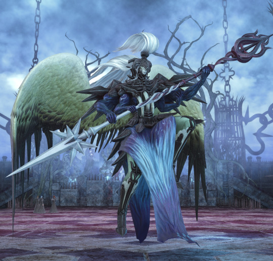
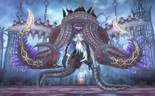
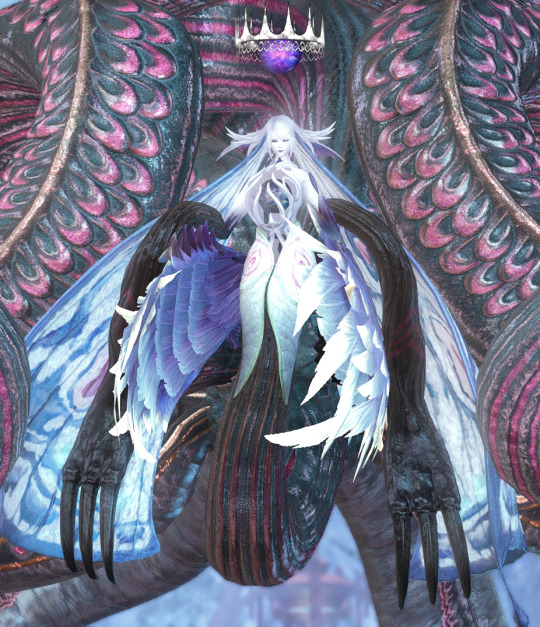
These aren't full ref sheets but I was trying to take some clear pictures of Hephaistos for later art reasons and then got side tracked doing all of the Pandaemonium bosses so here they are in order. Also for anyone following who doesn't play FFXIV and knows it as the catgirl game, enjoy this instead? VISUAL SPOILERS obviously.
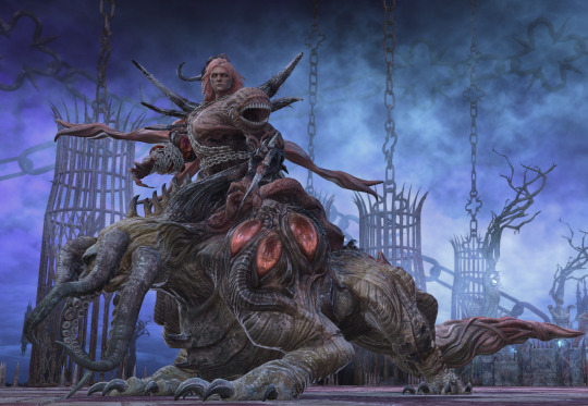
Asphodelos
Warder of the Condemned: Erichthonios
Mythic Creation: The Hippokampos
Mythic Creation: The Phoinix
(+ familiars)
Hemitheos: Hesperos
(+ sexy fanfic redesign by Nemjiji)
To be brutally honest I never really liked either of these designs compared to every other Hemitheos we get, I think the really brutal black and red of the Phoinix is weakened by gold accents, but I still am always down for gay vampire surf rock. The Savage version kind of looks like Ultimalius as well if you've played XVI.
Abyssos
Mythic Creation: Proto-Carbuncle
Hrgrhhgrhrgrh
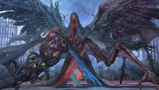
Hemitheos: Hegemone
^ My favourite detail on this is you can see the parasite's outlines in her robes and in her legs, then right through the eye holes on the mask to wrap around the torso. I'm convinced this version of Hegemone is functionally an ant being piloted by a cordyceps infection.
Hemitheos: Agdistis
She's very big
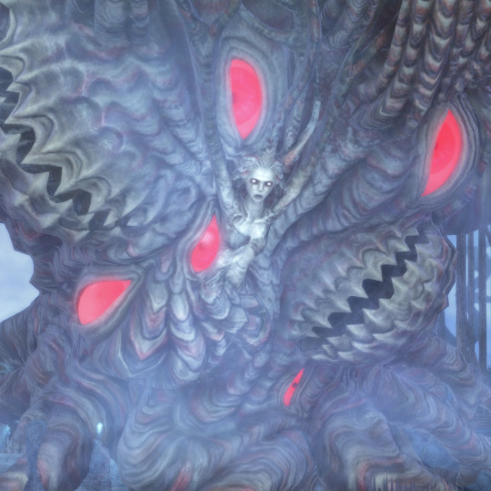
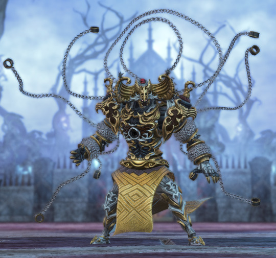
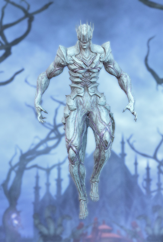
Perfect Imperfection: Hephaistos
I'm probably biased by Abyssos being the first raid I was there for day of release but these really are all fantastic. It's also when the story abandons all pretense of not being (at least partly) about family abuse and is loudly using the body horror and shackle motifs to talk about that. It's great. Hephaistos specifically is constantly bulging and twisting in and out of different forms like a highly unstable chimera and the more I look at these the more I notice parts that just should not be there. He's giving everything.
As for the Savage design It's a hard thing to rate as such but my favourite part is the veins that grow down from the eyeholes in his mask like bloody tears.
Thanks Abyssos I love you
Anabaseios
Mythic Creation: Kokytos
Dæmoniac Dungeon: Pandæmonium
It's really hard to communicate how huge this nasty tumor crab I zoomed out as far as physically possible in the game engine and subsequently ended up at a goofy angle staring up his nose.
Ephemeral Justice: Themis
Best boy. The double ended lance and second pair of arms are fantastic for this character.
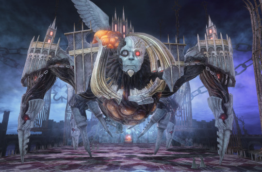
Theos: Athena
In.. almost every final fantasy adventure you're fighting the real villain not at the very end but a little beforehand, the big iconic end boss is often more a metaphorical figure representing everything wrong with that first person's ideals. Athena cut out the middle man and became her own JENOVA.
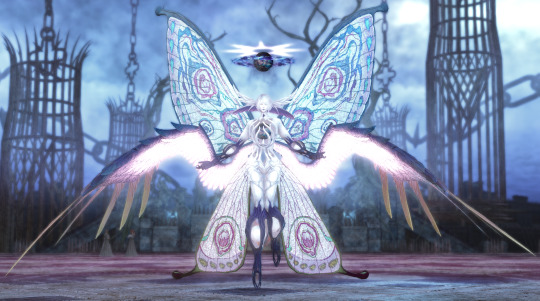
I do like the moth angel, especially the hollow body full of dubious orbs, but with her eyes closed all the time it gives off the impression of this not even being the true body but some kind of anglerfish lure in the shape of a fairy... which might be true because this exists:
I really really love her twitchy anemone feelers and how the moth body ends up grafted to the rest of it waist down.
Anyway there's the gang I did not specifically intend for this to be design reviews I just wanted to have clear photos because when you actually see them in game there's other things to focus on. In hindsight I can appreciate more the theming of each tier and then the series as a whole, but my only (extremely obvious) observation for now is that every character Athena had a personal hold over is decorated in chains somehow and so I should have seen the Hegemone thing coming lmao. Heph and Aggy are still my favourites I don't think that's changing any time soon. I'm also noticing that Anabaseios is now just old enough for random DF parties to fuck up severely and I find that fun so I'm going to go fight the crab mansion now.
#ffxiv#endwalker spoilers#pandaemonium#ff14#let him speak#dante plays catboy simulator#Erich's transformation is unlike everyone else here he can just do that normally#none of the body horror is present that's just what he looks like when he's not a little guy in a robe#but I do find it really fascinating that you get with these Ancient characters a second symbolic body#and his is completely wrapped up in chains there's a hole in his heart#and the little plinth on his head where his dad's mask sits#Heph's designs are all very unnatural though and I think the reason I love it so much is just how much all of it screams pain and misery#Not an outwardly depressive character but just look at this dude#fun in comparison to athena who has made herself into a glowing white angel with three different halos and one has a crown#it's such an egotistical design lmao
312 notes
·
View notes
Text
So for those that are planning to watch Twilight of the Gods and haven't yet. My review is the following:
It's very much a Zack Snyder plot but without the bad Snyder tropes of past movies (thinking especially of 300 here). It's edgy, has beautiful visuals (Snyder projects often do), and has plenty of equal opportunity sex scenes. Plenty of bi characters. Do they look like they'll kiss? They will and much more...
There are very interesting designs. I loved the voice acting and I'm glad Thor sounds much better than in the trailer (I think they edited what he actually says to avoid spoilers).
My main disappointment is the cliffhanger ending. I hope there's a S2 with some non-cliffhanger ending. I fear for the possibility of Netflix not renewing it and think all Netflix series seasons should never on cliffhangers.
It was definitely made with a lot of research. It takes its liberties, as there's some major differences, but I love how they adapted and altered things from the myths for the story's purposes. A lesser "not-like-Marvel" adaptation would have made Loki a Fire Giant/God a la Wagner. But they had the spider association instead!!
Something I really liked is that they made Loki sympathetic without turning him into an actual child. It's something I've seen a lot, and I'm just like "Cowards, there's plenty to work with without turning him into a child!" Loki feels very much like myth!Loki. He's very sympathetic, but you'll never forget that if he's helping, it's because the goals currently align. You'll be crying at the club for Loki, then go like "Oh shit! WTF Loki!?"
GOW has done antagonist Thor the best so far. For people whose Thor is their blorbo-from-myths (because some follow me), I must warn he's currently very much like Homelander (murderous, physically abusive, predatory) but without a fully developed reason to why he's like that YET. They implied interesting things, such as a fear of eternity and wants to die. If there's a second season, I hope it develops that further to make Thor more interesting. I didn't understand his weird fucked up relationship with Jormungandr, and don't think it was necessary to turn Jormungandr into a sexy snake lady to make Loki and his family sympathetic.
I thought his powers were very cool though and you're like "No wonder this guy is so hard to defeat." Like do you ever go like "How the fuck can this guy with a hammer defeat so many people? The plot armor is ridiculous." Here you won't. Actual storm good powers. And there's some very cool shit like he can do. Fight scenes are great.
#twilight of the gods#totg#review#norse mythology#totg!loki#totg!thor#LokiInMedia#totg!jormungandr#zack snyder
67 notes
·
View notes
Text
woag character design notes

[i.d.: a drawn line up of the half life vr ai characters, from left to right, gordon, dr. coomer, tommy, bubby, gman, and benrey. /end i.d.]
yeah i skipped some guys , i dont draw some of them enough to have much unique designs and some of them are a png of a dog
trust me i am just surprised as the rest of yall that i am doing hlvrai art . design notes below (very long, mind your step)
gordon:
wow this guy dont got no head
i didnt want to give gordon a face because of how unexact the person is as the fandom engages with it. is it wayne rtvs? (well as presented to an audience, yes) is it gordon freeman? (well as seen from an in game perspective, yes) is it a whole new guy entirely? (well as
i cut the confusion and took it a whole new direction: guillotine
hlvrai being treated as a very broken game is fun to me as a design perspective, so if you (the audience) are not supposed to see his face, what happens when you see it anyways? missing texture time
there are eyes drawn over because i did not have confidence in my expressions at first and then it grew on me
i think if i were to draw (and i have drawn) an actual person under the mask i would still censor the eyes because that is where the vr headset sits!!
(i do not like putting an actual flesh to gordon though)
though i really like seeing how other people interpret gordon hlvrai it is not . my gordon ? we are talking about the same guy . but this is my gordo . i made this one . this guy my guy . maybe i should draw other gordon designs
i can draw the hev suit from memory and it is also the entire reason why i can render metal confidently
i liked how people changed the lambda to read ai :] i also have no clue if i wrote the lambda correctly
(i did, i just checked)
dr coomer:
as much as i draw/drew him i find it more fun to not stick to one set design :)
so a lot of my takes on dr coomer tend to jump from idea to idea, especially from what other people are doing, though they could be fitted to the left and right designs!
the left design is mainly based off what i saw in fandom spaces
we see rounder shapes, making for a more friendly and welcoming appearance
i think of this as straying from the more professional uniform of the actual scientist models
enter swimming shorts and bright yellow socks, for some reason
so now he kind of looks like a cool science teacher :)
it might be the lab coat
the right design is mainly based off thumbnails for hlvrai itself
these use a more angular appearance
i want to push how comically buff he is because of strength he shows at times, especially since his left design seems to completely down play it as a comically not buff man who is still very strong
the shadows on right design coomer get so much more harsh and exaggerated because i have comic books on the mind :)
he really does look like a dehydrated comic book character huh
tommy:
stick bug (he gets it from his dad) (this thought process is explained at gman section)
i pushed a lot of the saturation of colours in her design because i think tommy gets to be a little silly with it
fun art story of the day! when you color, try messing with hue! you might notice you can get away with a lot as long as your values are about right
i like pushing this with white because you can get away with a lot of things reading as “off white”
old faithful for me is cool shadows with a warm transition colour to keep things visually interesting
i keep making white objects the trans flag
happy pride
tommys design looks a little like a school boy, with the tucked in button up shirt+suspenders+shorts+jacket tied around the waist . and the primary colours . but like it is really fun to dress up so brightly
i actually was strongly inspired by medieval babies if that is a weird descriptor? i wanted him to both be a middle aged man but also a young adult
do not be like tommy, who has their finger on the trigger of the gun while not even looking at where it is pointing and good god he is squeezing the trigger . top ten firearm safety of all time
bubby:
the absurd part is that i think bubby is tall . he is just between tommy and gman who are exaggeratedly lanky .
i wanted to make bubby a pointy kinda guy, so he is the only one actually wearing the lab coat proper . and the only one actually wearing dress socks but not even wearing dress shoes
i wanted to give him a novelty tie but i was running low on ideas and running high on boreds so we dont get a tie
he does have crocs though!! in attack mode!!
i do think we all kind of saw his model and collectively decided it works for him because i have honestly not seen major divergences from his model?
gman:
stick bug
i wanted to stress the more spooky and unknowable nature of him and took it in the dark souls direction of “make bigger than player character”
maked too bigger
he cannot walk through any doorways but you will have to crane your neck to look up at him
in the opposite direction of tommy, i pulled a lot of the saturation in gmans design
it feels important to make them both not fully match the rest of the slightly less broken npcs because there was so much work to make them look cool so i have to respect that
actually a lot of gmans and tommys designs are made in opposite to one another
gman has a largely stationary face and very stiff line work
while tommy is pushed to expressive as possible
thats pretty fun, way to go me
benrey:
benrey also has two designs
and in both of these i keep getting too lazy to use a reference so the vests are super plain (forgetting the badge and black mesa logo) . i think the helmet is supposed to be darker actually .
the design ethos of benrey was “built like a brick shithouse”
a friend of mine took this cooler and interpreted it as a shield/wall/barrier as a physical (and narrative) obstacle
again the first uses fandom designs
most notably the overcast shadow (seen in video thumbnails but i never noticed it or understood why so many people did it until someone pointed it out to me)
i think hlvrai is such a great medium because it acknowledges it is a game and is able to play into that to great effect! i think the shadow is fun to imagine as solid black as a small reminder of the impossibility of the space :]
benrey is a smug cat in the body of a human . to be honest . and this is the full range of emotion i have ever drawn him with
the second was mostly because as fun as taking creative liberties are, i just really wanted to see benrey as is: the half life security guard model in all its slight wonk :]
i actually do prefer this design . it is a little more uncanny because i choose the worst translations of the model . i like it because it is a little more uncanny !
that can be said for like . every single design in this line up huh .
#hlvrai#my art#gordon feetman#dr coomer#tommy coolatta#dr bubby#gman coolatta#benrey#half life vr but the ai is self aware
422 notes
·
View notes
Text
Like a lot of people I sometimes ponder what my favorite characters might look like if they were allowed to grow older. I've been seeing a lot of good designs for older Soren specifically so of course I got to thinkin' about my own take!
Some notes on design process under the cut cause I think we should all share our thought process once in a while:
So, for this I didn't want to just want to go with "Soren, exactly the same but older". My thought was "if I was actually in charge of designing for a fire emblem game, one that takes place in a future Tellius perhaps and featuring this character as a guest (a la Tiki or the Awakening trio, which they should keep doing BTW) how would I go about doing that".

You have to think of course, about what the character is actually doing and what their role is. It seems pretty likely that after RD Soren is either traveling the world with Ike or wandering around (probably the former) so "traveler" was the theme. As far as the overall shape and the outer layer especially it seemed obvious to reference the dragons, who are also travelers:
I don't want to just straight up copy the look of the robes though for a couple of reasons. 1) that's boring and the idea here is for an updated visual style 2) I wanted to combine different elements to evoke a feeling of mixing cultures. I figure if this scenario takes place say, 80 years in the future or something, fashions will have moved forward and perhaps you would see elements of beorc and laguz fashions mixed together. Especially for Soren given what he is. So I went with an inner layer that looks more Victorian puffy sleeves (which you don't actually see a lot of in PoR or RD since the characters favor more stiff looking tunics, but they are there and I figured its the future and maybe Crimea has entered its puffy shirt era) with the outer layer looking more like what the dragons wear. 3) Staying with robes seems kind of stagnant. I imagine that a much older Soren who's lived a good life along side his love has probably chilled out a little bit. A little bit. 4) I think having more leg visible gives a more adult silhouette.
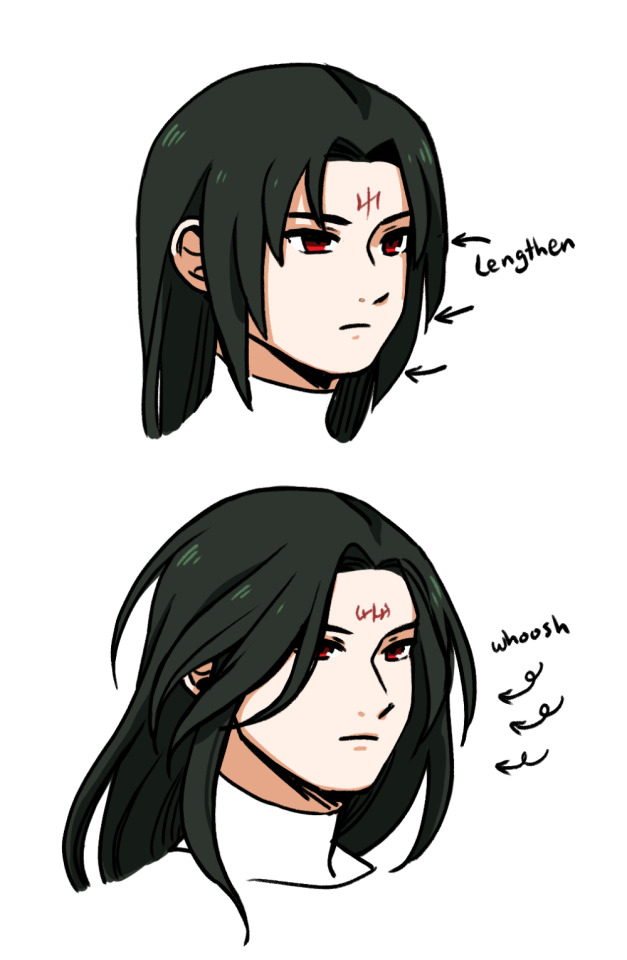
The other consideration is the hairstyle. As much as I love Soren being a carbon copy of Rajaion, it wouldn't be the most interesting design choice if I was the character designer of a game to just copy a past design 1 for 1. So I decided to just lengthen his hair a little bit and give it a look like its been blown around in the wind. Soren is the windy guy and I'm assuming he would be more chill here so why not let it be loose and free? This also helps avoid him just looking like Sephiran cause I see that a lot too lol.
Yes I also changed the shape of his brand. I've always been fascinated by the fact that it changed shape between games. I know it was likely just a design oversight but what if it changed because he isn't an adult yet and it changes more as he ages?
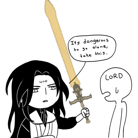
Lastly there's the why. Why would your fav show up as a guest character? What would he even do?? Well I think Soren could be really fun actually if we assume he went with Ike and that Ike kept Ragnell with him. I'm picturing a situation where Ike has lived out his natural life and died, leaving Soren to return to Tellius alone in order to tell Mist's family what happened (cause Ike just left without telling anyone anything lol), and to return Ragnell to them. Instead some conflict breaks out, you know how it is, and the more chilled out Soren is convinced to bestow the sword onto the new starry-eyed lord who reminds him of his beloved.
Oh yeah. I can see it now.

#did I waste time thinking about this? Yes#no regrets cause I can alter this design and use it for my own stuff later#fire emblem#tellius#soren#au#ideas and theories#character design#saying I want to see my favs age but then this one has just barely aged at all#dang dragons#let soren be an adult#future tellius au
438 notes
·
View notes
Text
okay y'all seemed to like the last one so here's a few more Horizon 3 thoughts:
Aloy won’t die. It would completely upend the series’ themes and just be really nihilistic.
Since Nemesis is a gestalt entity I think it’s a safe bet that we’ll see Sam Witwer, Carrie-Anne Moss, etc again. I’m curious how they’re going to do it because at least structurally, it’s basically a reaper. Maybe it’ll use different Avatars when communicating like the Leviathan in ME3.
It's gonna take some work to make a flashback/dream/vision not contrived but I would love to see Varl and Rost again. I think we deserve that.
Minerva is gonna have its work cut out for it blocking access to both the dormant Faro Swarm and the ZD terraforming system.
I wouldn’t be surprised if Nemesis has some sort of corruption function that becomes the equivalent of the corruption in HZD. It would be a really fun tech showcase if GG uses Zenith nanotech for machine corruption and leans into mechanical body horror.
If we’re going to Ban-Ur I really really hope they do the work to make the Banuk less problematic and more fleshed out as a culture. A quasi-Spartan society absolutely would not survive in an extreme environment, *especially* without megafauna to hunt. The Banuk characters are lovely and well-written; they deserve a society as well thought out as the Utaru or Carja. I’m honestly fine if there’s retcons or revamps to the cultural lore because the whole “outsider barges in and becomes chief” is rooted in racist, colonial tropes and we just don’t really need that imo.
The most recent footage of Death Stranding 2 (also running on Decima) has me SO excited for the visuals. GG’s gonna knock it out. The facial rendering and animation that Kojima Productions are doing looks industry-peak and I’m sure GG’s gonna match that. Aloy’s Gay Panic™️ scene on the beach in HBS is already top-tier nonverbal storytelling through animation. Digital Foundry actually just posted a really cool tech breakdown of the current Decima engine. I’m especially excited about the environmental stuff. The ocean simulations in HFW are already incredible and I hope they increase verticality in the world. I can’t wait to see the Sacred Lands in current gen graphics.
I really love Kotallo’s DIY arm and it’s so so important to his development but Beta and Gaia now have access to Zenith nanotech, maybe give your buddy a sick upgrade hmm?
Speaking of, I can’t wait to see Beta come into her own. She’s one of the best parts of HFW and Aloy’s character absolutely shines in a sibling dynamic.
I wouldn’t get your hopes up for a romance mechanic. Everyone’s feelings on that aside, it would be really odd from a game development perspective to just overhaul part of how the narrative develops Aloy’s character in the last act of the story. Yeah, there are flashpoints but I would argue that the presence of choice in Horizon is smoke and mirrors- cosmetic at best. Kentucky Route Zero (which you should play) does something similar where the player is given a certain amount of control over the substance of individual conversations and scenarios and it does absolutely nothing to alter the plot, by design. I think it’s the same here - this isn’t really a choice-based RPG, the flashpoints don’t really affect anything plot-wise or for Aloy’s character development. Olin is still out of the story, Nil lives, Regalla still dies one way or another. Aloy’s character development is pretty firmly on rails (think Jin Sakai, not Shepard - you get to guide some momentary character reactions but that’s it). I don’t think HBS is a testing ground either - If they were gonna introduce a romance mechanic I think they’d just do it, and not spend two years making a direct continuation of HFW’s main quest and establishing a specific romance hard-baked into the plot, complete with multiple leitmotifs for the character relationship (which is something they haven’t done before afaik) just to introduce a side quest mechanic coming in 5 years. I genuinely can’t think of any game or dev that has beta tested a major alteration to upcoming game mechanics that way - it doesn’t really make any sense in terms of developer resources, and these games are extremely time-consuming to make. I know this is a thing a bunch of people want and I can totally empathize with that! I just think it’s probably not on the table.
I would bet money the series will bookend itself and the epilogue will involve a) the naming of Zo and Varl’s kid and b) Lis’ pendant.
Mostly I'm just looking forward to being surprised. One of my favorite things that Horizon does is use carefully established elements in the world to pull the plot in unexpected directions and keeping the world grounded while they lean into speculative science fiction. I can't wait to see what Guerrilla is cooking up
#horizon 3#horizon zero dawn#horizon forbidden west#horizon#hfw#aloy#guerrilla games#hzd#horizon burning shores#horizon theories#well not so much theories as observation and vague speculation#and some zesty takes#I love this world though#erend#sylens#varl#kotallo#beta#alva
131 notes
·
View notes
Text

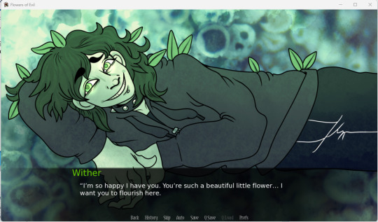
Flowers of Evil (Visual Novel)
Created by: boyinajar
Genre: Romance/Horror
Just like a lot of games, I've been having my eye on this one for a bit. Flowers of Evil was made for the #yanjam, and I think as of writing this, the current demo could just be an entire game if some of the options were removed. It's really cool to have non human yandere characters in games, so it was pretty fun playing this one and seeing Wither in action. If you are curious about this game, please check out more at @flowersofevilvn, and they are creating another game called @darlingdollhousevn if you enjoyed this one.
The default name for the MC is Buttercup, so I will refer to them as such through this review.
Buttercup wakes up one day like any other to head to their class in university. Walking through the forest to get to campus, the find out that class is not in session, with a note that states there won't be class today instead of an email. With their new free time, they decide to head into the library and starts to read some poetry when they are interrupted by a man named Wither, who seems interested as well. Buttercup can either try to converse with him or try to leave after first meeting with him.
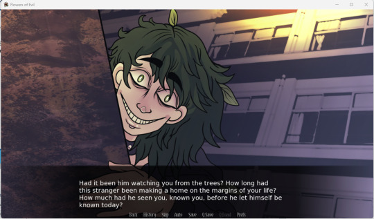
If Buttercup decides to converse with them, Wither will ask them out on a date. Buttercup will initially refuse because of their classes, though coincidentally, the class is cancelled due to car problems relating to plants. With this, Buttercup accepts Wither's invitation, and the two go walking in the town. After going through the flower shop, Wither suggests going into the woods next. As the two walk, Buttercup suddenly feels really anxious, and tries to leave, however, Wither grabs them. They realize too late that he's not quite human, and Wither explains himself as some sort of lichen. Wither drags Buttercup into the meadow, stating that he created it just for them, just to protect them from the rest of the world.
If Buttercup attempts to leave, Wither will be annoyed, stating that this isn't what was suppose to happen, attempting to sing more poetry to lure them back in. As they leave, they get a notification stating that their next class is cancelled due to some plant problems with the professor's car. Here they can either decide to go home through the path or through the town, freaked out by Wither's presence.
If they decide to go through town, Buttercup feels rather unnerved, and they see Wither following them around. They start to freak out, believing that he might have been following them for some time, even before their initial meeting. Buttercup decides to run home to safety, paranoid that no one can help them, not even the police. After falling asleep, they wake up to the sound of breaking glass only to find Wither, breaking open the window with their hand which has turned into a sharp branch. As the plants capture Buttercup, Wither ends up taking them with him, likely back to the forest.
Going through though the path, Buttercup starts to realize that they've been walking for a lot longer than they should have, and noticed that the path behind them is completely gone. Not able to try to go back, Buttercup tries to keep on going forward, until they reach a meadow that they've never seen before. They end up meeting Wither there, who reveals himself as a lichen. The plants grab at Buttercup onto the floor, with Wither happily lying down with them. Wither captures them, happy that they will be together.
I gotta say that this creator makes pretty good creepy designs, whether it be purposeful or not. I think it really adds to the dangers that yanderes have, and it's especially good for the scenes where Wither breaks into Buttercup's house or when he's stalking them around the town. I think that the design with it's leaves is pretty neat too, though it does kind of look like he's fallen down in the forest and forgot to clean himself up a bit. If he does have a more monstrous form, I think it would be neat to have holes in his face or hands to show off the more decayed side to him, but that's just an idea.
I think that this game does a pretty good job of horror, especially the idea of the plants coming to basically take Buttercup into the meadow, and the way that they're not able to escape. The choice of music makes some scenes feel very tense, especially when Wither reveals himself to not be what he seems. I think the notions of using poetry are pretty nice and it does make me wonder where he learned all of it or how he was able to make a human body in the first place. I assume that he fell for Buttercup because he saw them walking in the forest and tried to make something that would appeal to them.
In terms of yandere behavior, Wither pretty much made their physical appearance based off what Buttercup likes, cancelled two classes to get them to hang out with him (possibly killing one of them, considering the note), stalks them in certain endings, breaks into their house with one and kidnaps them to a meadow filled with their favorite flowers. There's actually quite a lot going on in terms of yandere things, and it does make me curious how Wither was able to pick up on what kind of things Buttercup likes and again, how they got into poetry in the first place. From what I recall reading, it is stated that he has a bit more of chivalrous personality that he bases on the books that he's read, thus leading to all of the ways that they act towards Buttercup. That kind of idea is always pretty cool, with a yandere that tries to become what their lover wants to be.
Overall, a pretty fun and short game. This is technically a demo (though I feel that it could just be it's own full but short game if the other options were removed) and I am curious to see what will happen next. I am excited to see how this one and their other game will develop in the future.
116 notes
·
View notes
Note
What are your inspirations for drawing? Like other artists or things
I'll start with my biggest inspiration, which got me into art as a whole: Adam Adamowicz. I got introduced to him through Skyrim concept art, but I honestly think his Shivering Isles concepts are some of the best concept art out there. You can see how much he just takes an idea and completely sores with it. A torrential stream of beautiful sketchy goodness.
I love Oblivion's flat ass dough faces and early Xbox 360 charm, but this shit is simply crazy. Look at this, it makes you wish to dedicate your life to bringing this to life, as all good concept art should. It inspires more of itself.
I could post all the images there are out there, because I sincerely think this is the type of work that has stuck with me the most. It's something to strive for. You can see it for yourself instead.
That was what got me started. After that, and through my journey on Tumblr and Twitter, I think what stuck to me the most was the art done by small artists, my "compatriots". The things you don't see. There is so much love in little things, and maybe in another universe there are entire cultures dedicated to them. I wish we had time to explore each and every one of the smallest pieces of media, especially narrative media, weird media.
I'll concede that it's a bit of an abstract thing to be inspired by, but once you realise how much work goes into the smallest of things, I believe you'll find inspiration anywhere you go. I think the reason why my Batter drawings are the way they are is my inspiration from just the design of letters and fonts in general. I think making something that blurs the line of symbol and representation over and over is fun.

One artist that has stuck with me is the late great Gunner Leatherwood. He passed away earlier this year. I watched this guy grow from a hundred followers to thousands. I saw his art improve. I think that inspiration transcends just the visual aspect of the art. It's a story, a lived experience, as all art is, but I felt I understood it much more. I think going after and following these small artists pay off because of this. Everyone can make something truly great, and some people have and no one noticed. Many amazing animated movies have been made, but never got to the people who would understand them, who'd have dedicated themselves to easing other people into it.
We like to think we understand media in a completely intuitive, isolated fashion, but it's not true at all. Our shared experience contributes to classics being recognised and loved. Sometimes you need the right person at the right time to understand.
Gunner was a great artist because of how intuitive and visceral his drawings were. It was like he was drawing from his entire life experience to express himself in a page. At first he had little control of it, but with time it was molded and polished so that the madness was discernable, but not gone from the drawing. His mindset for drawing was fun, and he too was always going after small artists of all kinds.
But going back to Batter drawings and abstraction, an artist that has also inspired me over the years in that aspect of bluring symbol and representation into one solid thing, and similarly started somewhat small like Gunner, is Matt Lesniewski. His hatching is out of this world, and his character design is evocative and never boring. The characters are huge balls of symbols made into physical objects. Recently he straight-up draws the belts of characters floating. It's wonderful.
Another artist that does this bluring very well, and is very inspiring, is nailgun waowao. They really, well, nail the appeal of making images that have all the defining elements of a certain scene or character, but open closer look they are fragmented and completely abstracted. It's like a bigger image overlayed with many smaller stories and symbols.
But to go back to talking about active inspirations that came before, and got to me to where I am at the moment, it's a bit harder. I can't really make it sound smart besides going "uuh I don't know like abstract stuff, cubism idk lol." Just try to appreciate the great things your friends make, and try and work together to make something even greater.
Some of the most improvement I had in art was from learning with friends. Art ultimately is a form of communication, understanding other people and yourself will make you better at it. Technical skill is fun and speaks for itself, but your experiences will reach much deeper. In a world where we can't even begin to compreehend the powers that be, loving and understanding what is close is probably gonna make your life and art much better.
115 notes
·
View notes
Note
Heyooo! It’s me again (i hope i’m not bothering you by asking questions like these) I started making a comic and I’m struggling with the typography
Any tips or recs to look? I really like your work and that’s why I am asking :)
Heyo!
I can dish out a few tips but they aren't really hard rules so take them with a grain of salt and artistic freedom.
The most important thing imo is the presentation of the text on the page. The shape and number of speech bubbles will be registered way before any of the contents so it needs to looks the part.
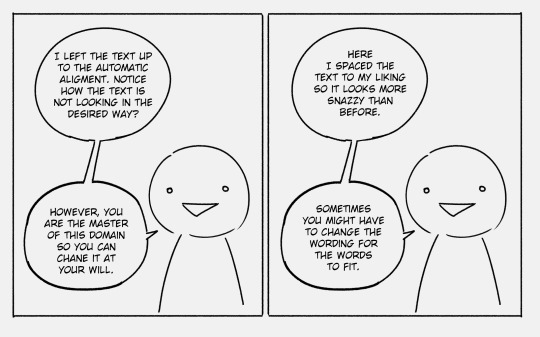
The first tip would be generally avoid the speech bubbles being overly thin and long. The example below is pretty tame but believe me, I’ve read comics with the wormiest of speech bubbles and they tend to not look good.

Sometimes the automatic alignment of the text will look closer to a square (especially if there are many short words in a sentence) so feel free to go in and move the text around via the enter key so it looks more like the rhombus. You won't always be able to achieve it especially if the first word in a sentence is long (e.g. the word "hypothetically") but a rhombus should be the goal.
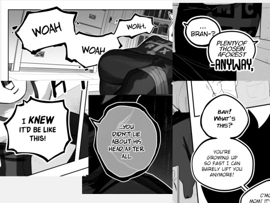
While we're on the topic of speech bubbles I like mine to have really short "tails" (the bits that indicate who is speaking), unless I REALLY want to make sure the reader knows who is speaking in a scene.

Also I always make the tails point directly towards characters mouth unless it would make the scene confusing (for example if two characters have mouths really close to each other or something, I might make one tail point a bit higher/lower/to the left/right to differentiate between the two speakers. But that’s like a super specific problem and could be avoided with proper frame layout.)
And like, never skip the tails unless its the same character monologuing at length. Nothing breaks emersion more than when you have to stop and turn into an investigator to determine who is speaking in a scene.
Now for the fonts themselves, in my opinion the size of text should be unified between speech bubbles and across pages when it comes to a single font. Example, all casual speech - arial, 14; all thought bubbles - Calibri, 15.
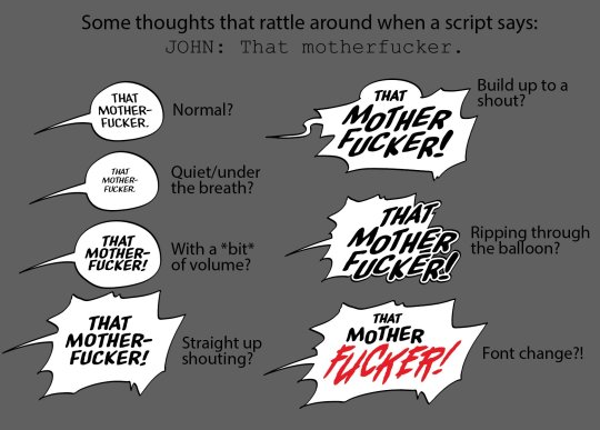
That is of course unless there is artistic merit to changing the font and/or font's size. Making someone yell, suggesting a threat or sarcasm, indicating a playful tone or something akin to that - lean into what you're trying to communicate visually.
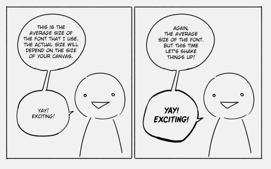
All fonts are not made equal and sometimes you will have to adjust things manually e.g. letter spacing or line spacing. Generally I try to keep the spacing the same regardless of the font, e.g. "yay exciting" had massive gaps between the lines which I've shrunk to make it look more visually cohesive with the rest of the dialogue. Same with these ones:

At the end of the day typography and everything pertaining to speech bubbles is design work and what designs do is communicate a message and serve a function. I’ve had this picture saved on my pc for years now (reverse google search doesn’t tell me who made it but it’s like the bible to me so I will share it, I am almost certain it was made by tryinghuman but I might be wrong):
Really every part of a speech bubble can be “designed” down to a single word. The position of text, fonts, the shape of the bubble etc. And every change will culminate in an effect and the goal is to have that effect reflect what you’re going for.
Make it legible or illegible, make it see-through, capitalise one word, cover speech bubbles up with other objects, make them crack or fall apart. Not every speech bubble needs special treatment! But once in a while it’s nice to throw something different in to spice things up.
Also, and this is a rule that was bestowed upon me during a graphic design class, don’t use more than 3 fonts per page (again, unless there is artistic merit to it like e.g. purposefully trying to communicate a sense of chaos. Otherwise it just looks a bit unprofessional. In my opinion anyway.)
And the last thing I will say, and this mostly applies to comics in English, is some “speech” fonts include capital “I”s both with and without serifs. The serif I should generally be reserved for the pronoun “I”.

There is so much more when it comes to text in comics like the flow of bubbles across pages, splicing text across bubbles for communicating speech patterns or intentions of the characters, and there are tutorials about it out there but I wasn’t able to find my favourites on command............. sorry................ But I’m peppering this in just so you’re on the lookout for all the other cool things that go into comic making :)
Hope this helped!
577 notes
·
View notes
Text
Brain dumping about Kane 💕
I love this character sooooo much. I feel like he is severely underrated in the WWE universe. I know people talk about how he should have had more title runs, and I agree! Glenn Jacobs is such a talented performer and he was always a hard worker.
In general , the concept of the Kane character was fantastic, and his costume design is the best probably out of most wrestlers (specifically in the early years). On the surface, his mainly red outfit has a great visual layout. The one sleeve, contrasting black flames, his mask, and boots really give him a great look. Like just visually it is pleasing.
Now in general, I don't know what it is, but something about him is just so cute. Maybe he reminds me of the winter soldier/bucky? But especially in late '98 and '99 where he was with X-pac and was betrayed by those who "loved" him, he was just such a sympathetic character.
Your whole life, you were (presumably) kept in the dark and in the shadows by Paul Bearer , your father, and as you grew up you learned to hate your brother due to what was fed to you. Then, when you try to get your revenge, you fail, and end up finding friends along the way while trying to escape imprisonment from your delusional boss. What is there not to love and care for? He was so sad and almost pathetic in some storylines that my heart exploded. Like come here baby , I'll take care of you .🫂
I'm specifically thinking of when he was sent to the mental hospital involuntarily by McMahon, when he was unmasked by DX, when Tori and X-pac betrayed him, for a few examples. Like he just needs better friends, someone who will look out for him in sincerity. He was just a sad plop sometimes. 😭😭😭
Anyways, I love this big fictional man, and I care him. 💗💓💖
Please take this photo collection of poor baby moments I’ve captured of Kane (someone help him)

#wwe kane#wwe raw#90s wwf#wwe smackdown#attitude era#kane wwe#professional wrestling#the big red machine#undertaker#paul bearer#x pac#wwf superstars#wwf#wwf attitude#brain dump#i love this man
43 notes
·
View notes
Text
Hot Take, I don't think some people take some things into consideration for redesigns.
Don't get me wrong, some people just do them for fun and there's a lot of REALLY cool ones out there, some I kind of prefer to the official designs to some degree. And I don't think it's a matter of people NOT doing research on the characters as that's absolutely false. But people just kind of neglect/forget/or don't realize some facts about the characters for one reason or another. A lot of designs don't even work great when you put it in the context that the characters would be animated. This doesn't mean redesigns people have done are lazy or anything, you can see a lot of care put into a lot of them.
I plan on doing a sort of "Batman Animated series next season" sort of redesign at some point, and by no means should MY takes and ideas be meant as superior to others. I also wouldn't say some of the critiques given about the official designs are unwarranted, but I think they DO get dogpiled on more than deserved (I mean, a lot of people do LIKE the designs, so they can't be that awful). Below are some things I think people forget or don't understand (again, this is not anything that should be taken as the bible, just my own thoughts about stuff and elements of characters people don't seem to take into consideration a lot):
Lucifer and Satan aren't the same person, so it makes sense Charlie isn't a goat. According to Viv, no part of her design was based on it, and it would be strange for her to look like the love child between Lucifer and Satin if she were. Though totally understand why people do it, goat Charlie IS adorable and also, where the heck does the hooves come from???
Many of the characters don't live in their time period, especially Vox and Angel Dust. I'll be a bit fair on this one, with characters being from different times, it would be visually more interesting to see those styles clash. But some characters, like Vox especially, wouldn't work with that as they WANT to live in the modern day. Vox's WHOLE THING is about staying with the times, so of course he's not looking like he's from the 50s. I've seen some redesigns revert the man to his box head, and that totally misses the point of his character and how he's opposing Alastor's want to stay with the past. I do think it wouldn't hurt to have some illusions about their time periods, though (whether through their clothes or the rooms they occupy).
Alastor is a cannibal, so it wouldn't make sense for his teeth to be so dull. Maybe they could've sharpened his canines with blunt teeth for the rest, but I think he isn't meant to be an approachable figure or anything, and the sharp teeth read as "dangerous". Also, if the canines are only sharp with the rest blunt, the toothy smile feels a little less iconic. To be fair though, a lot of characters have the sharp-tooth smile and the same smarmy face. I just think it makes more sense for his character with what he eats and the in-universe intimidation he's going for him to have full-on shark teeth. Just anything but only the blunt teeth smile, even if it works better with his smile mantra and is arguably creepier (and give his grin a more distinct feature from literally everyone else in the show.
I think the idea people have for Alastor’s colors being black and white or sepia-focused is both a good idea and a silly idea. On one hand, having his colors be like that out of a photograph would be neat and help aid in the idea of Alastor's ideals with the past always being superior to the future. He would literally look like he's stuck in the past. HOWEVER, there is a slight problem with these ideas. The issue with the black and white scheme is that he'd look like an old cartoon character rather than a man from a photograph. This would be a bit odd of a choice considering he's not associated with TV in general. Sepia is a bit better of a direction, but also a bit odd when you consider Alastor is not the only demon to hold the past on a pedestal. So why would he have the sepia scheme while others like Rosie do not? Again, bit of a double-edged sword. There's also the fact that Alastor is focused on AUDIO mediums, never visuals. So to have his scheme focus in visual mediums like being out of a photograph or old TV would be a bit odd. It would be more accurate to argue that he should look more like the invisible man with maybe only a radio head or something if you wanna make the argument about his colors not reading 1920s.
Making Alastor a full deer anthro, while cool and makes sense in theory, loses a bit of thought when there's a BUNCH of other anthro characters. Don't get me wrong, I think people often come up with some cool designs and, to be honest, look more deer like than Alastor's canon design (like seriously, those ears are not deer ears at all). However, it loses something when anthro sinners are quite common in Hell (Husker, Crymini, literally any crowd shot you see probably has an anthro character in there). So, while this might read as a bit of a personal take, Alastor being a straight up mix (dare I say a Kemnomimi) between a human and deer feels like it reads a bit better into how he died. That being, he was a man mistaken as a deer. So him being very humanoid but having the attributes that may have made the hunter think he was a deer with his silhouette and surroundings, come off as a bit stronger and better related to his death. Again, I don't think I'd call this out if it weren't for the fact we see so many anthro demons and really no kemnomimi-esc demons. Because of that, Alastor being a mix of human and animal comes off as more unique and stronger than if you made him a flat-out demon.
Alastor doesn't show his hooves because he's a gentleman! While I think they could get away with giving Charlie some open-toed shoes, Alastor is a man who wants to be fully dressed, so to have him lack shoes to show off his hooves doesn't really make sense for him. He's actually fully dressed up, no part of him showing skin aside from his head! His hands could be a bit of an argument on that, but they have been described as gloves while official merch would seem to contradict this. My fun theory is that they're gloves, but they look exactly the same as his actual hands.
To follow up on the clothing thing, Alastor would never willingly show something like a tail if he has one. I am of the "he does have one" group, but I think it would make sense for him to try to hide any features that would put him as a prey animal.
The following are a bit more in designs speculation territory, so take with a grain of salt:
This is a bit of a side thing and could totally be wrong, but I've seen mention that all residents in the pride ring wear/have some color of red on them. I'm not sure how true it is (I mean, when you look at all the characters seen there is some form of red on them even if it's just by eyes). This would honestly be a neat "cartoony logic you just don't question" in theory if it wasn't for the fact only the pride ring residents have this going on. If it is true, they need to have that color thing happen with other rings (so hellhounds have yellow on them, lust have purple, so on and so forth). It would be neat as then we could see where different demons come from just by their color scheme, however, that's not the case. The idea of everyone in the pride ring HAVING a bizarre dress code requiring them to wear red is more distracting and less "just accept the cartoon logic" when they're the only ring that does it. Also, I still agree that characters do not need to be drenched in color if it is a requirement in their design. Again, this is all to say this idea is true, which I cannot verify other than all the demons we see in the pride ring do seem to have some form of red on them.
Red sclera and white-ish irises might help to indicate some demons as hellborn. So this could kinda be seen as a weak argument, but I just thought it was strange how the only other times we've seen this eye trait is with hellborns: Hellhounds, Lucifer, and Charlie. And I think it would make more sense for that to be the case rather than Carmilla and her daughters happen to have fallen into Hell together. I mean it's not IMPOSSIBLE, but meh. Also, would add a bit more interest to Velvette if it was revealed she was hellborn. Thought it was a bit odd for other characters like Vox and Valentino to have confirmed death years but Velvette never got one officially (as far as I'm aware). It also would just be a nice design element that actually sort of means something (that being if you have those eyes, you're more than likely a hellborn). Especially when you take into account characters like Crymini where, if it weren't for that eye-color scheme, you would think she was a normal Hellhound.
This one is 100% headcanon territory, but I'm sharing it again because that's the power I wield. To keep it short, Alastor has high respect for women and tends to prefer their company, so maybe out of that respect/his mother possibly having it, he got himself a bob cut as that was popular with women in the 20s. The hair gets a lot of flack for understandable reasons, but I thought it'd be a bit more fun to give him a reason for having it and I also just don't think it's as bad as everyone makes it out to be. Here's the post getting a bit more into it, but pretty much the same is said just detailed.
Finally, as I've said earlier, these characters need to be animated. And most redesigns don't take that into consideration. To be fair, a lot of people also acknowledge they don't for the designs, which totally valid. It's already tricky to design characters, so to make sure they'd be animatable would be even MORE of a pain.
Again, this is just some small tidbits and by no means is this an attack on anyone or anything, just some of my thoughts and things I think people don't think about when making changes. By no means is canon perfect, I don't even think canon takes some of these considerations in to be quite honest with you and I don't think the designs are made as thoughtfully as the redesigns, but I don't really care for the "my designs are better" mantra.
All in all, just some of my thoughts on things. Lemme know if there's anything you disagree with or have your own ideas people seem to forget/not notice!
13 notes
·
View notes
Text
Semantic Error | A Jeon Jungkook Series | Chapter 4
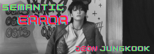
Based off of Semantic Error (bl) by J Soori
Summary: Jungkook asks to spent time with y/n as friends
Pairing: Techie inexperienced fem!reader x Artist fuck boy Jungkook
Word Count: 1.2k~
Warnings: Nothing really, Jungkook is just being annoying and flirty
a/n: This is just a tiny bite of the story since I haven't updated it in almost 5 days... oops. I'm spending time at my sister's house for the next few days but I should be able to work on posting more on Monday :)
Read from the beginning
Days after my reconciliation with Jungkook I find myself thinking of the possibility of asking him if he would consider working on the game with me again but that would require me to swallow my pride. I'm not really in favor of that option so I decide to wait until he brings it up... if he brings it up.
I could always put up a flyer in the visual arts department asking if anyone would be interested in joining. I'm saying it here and now, I will never crawl back to him, if he sees that I'm still looking for a designer and ends up being interested then he can beg me to be a part of the project again.
Either way as long as I get a new one by the end of the week then I don't care who I work with. As long as they have a good work ethic and their character design doesn't suck and they can keep to deadlines and... well maybe it might be a bit harder to find someone to fit the bill than I thought it would, knowing that people tend to be very unreliable and unpredictable creatures. I don't want to go through what I went through with Hana cancelling on me again. I guess the only way to really try to find someone is let people know about it.
Calculating all the pros and cons of what the result might be depending on my methods I decide fliers with my contact information would be my best bet. I'll just place it on some sort of bulletin board and hope for the best. If that doesn't work I'll resort to some sort of digital announcement. Opening the program I plan to use I notice that I've received a friend request on sns. Pulling it up I'm greeted with a follow request from Jungkook which I find strange but I accept it nonetheless. Soon after I get a DM from him in my inbox.
'Hey pretty, I didn't realize you had social media, I guess this means we're friends now that we're following each other :)' I roll my eyes at his pathetic excuse at flirting.
'Last I checked you followed me, I haven't followed you yet' I say putting him in his place.
'Yet ;)' shit I should've just ignored him.
'Come on y/n just follow me, I promise my account isn't some narcissistic blog or anything, plus next time we see each other I want to take a picture with you and post it! I like posting pictures of my friends!' he says and I can feel his smile through the phone and I roll my eyes at the thought.
'You have to ask for my consent before posting anything' I reply ultimately giving into him since there's no harm done with clicking a single button.
'Okay I got it. Hey can we meet up in the library tomorrow? I wanted to spend some time with you. I know you end up spending a lot of time in there anyways so I just thought that maybe we could study together, especially since we taking Chinese together' he says waiting for my permission to give him another place to annoy me in.
'What makes you think I would want to study with you?' I say hoping to brush him off.
'y/n I'm your TA , I've see all of the work you've turned in' he teases.
'What's that supposed to mean?' I ask offended at what he's implying.
'It means that you write like a child. Plus your accent when you speak isn't the best either. I could tutor you if you'd like ;)' he responds, simultaneously offering his help while also insulting me.
'Pass' I say frustrated with his attitude.
'I'm sorry I didn't mean it, I just like thinking about what you might look like while you're responding to me. You probably have your brows pinched together looking utterly offended and maybe even blushing from embarrassment'
'I'm not embarrassed!' I retort.
'Why don't you look in the mirror pretty, I've got you blushing without even being there don't I' I get up frustrated, determined to prove him wrong but to my disgust I see my cheeks with a light dusting of pink.
'Fuck you' I reply indirectly confirming his suspicions.
"Anyway do you want to meet after the class you have after Chinese?' he suggests.
'Aren't you in that class too?' I question annoyed by the memory of him taking my spot for the second time that day.
'No I dropped the class, there was no way I was gonna stay in it and bring down my gpa, I just wanted to annoy you for a bit' he admits.
'Do you have another class after Chinese?' I ask curious as to what he'll do while I'm in class.
'Oh no I'm done for the day after that :)' he sends
'So you're just gonna wait around for me until my hour and a half class ends and then spend even more time studying together? Don't you have something better to do with your life?' I question, confused as to why he would do that.
'Not really, I just wanna spend some time with you. I wanna be friends remember?' he send with no hesitation.
Is this what friends do for each other? Waste a whole day waiting for your class to finish just to then tutor them afterwards just because you want to 'spend time with them'?
'You Jeon Jungkook are an enigma' I respond not bothering to acknowledge his continued efforts to establish a friendship with me for some odd reason.
'Thank you? Anyways what's your answer pretty?' he prods, not satisfied with my evasion of his proposition.
'First off stop calling me that, second I'll be there from 3-6 are you prepared to stay for that long?' I question trying to get him to rescind his invitation.
'Yep, I'll make sure to clear my schedule, see you then pretty ;)'
I groan audibly at his antics and close out the app. I guess this whole flyer situation can wait until tomorrow since he's given me a splitting headache from all of this. Who knows maybe he'll bring up the game tomorrow so I won't have to make them or swallow my pride, therefore making him come crawling back to me since he seems so eager to spend time with me.
Taking a deep breath to clear my mind I decide to go to bed early to prepare myself for the mystery this is to be my day tomorrow. My days used to be the same week to week, month to month through out my life with minor changes to my class schedules since I've been in college but ever since Jeon Jungkook decided to walk into my life it has been anything but ordinary.
I'm used to scheduling things down to the very minute and that has worked well for me. It's set me up for success in my schooling but also as an adult. My life is what some people might call boring but I find peace in my calculated existence. Whereas Jeon Jungkook rolls with the punches and lives in chaos. My world is in black and white and his is in color, my life is routine and his life is creative. Why has someone like him taken an interest in me when I'm the exact opposite. Why can't he just leave me alone? I guess the real question I should be asking is why can't I get him out of my head?
prev / next
Series Masterlist
Taglist: @jkslipppiercing @trina864 @goddesofimortality @kaitieskidmore97 @coolbluedude @00frenchfries00 @marvelbun @coralmusicblaze @bangtans-momma @pastelpinkjoon @joonwater @j3nni-rs @evidive @beomieboi
Join my Taglist
Feel free to fill out the form or comment below to be added :)
#jungkook#jeon jungkook#bts jungkook#jungkook smut#jungkook x reader#jungkook angst#bts#bangtan#bangtan sonyeondan#park jimin#bts jimin#jimin#jimin fanfiction#jimin fanfic#jimin x reader#semantic error
56 notes
·
View notes
Text
I’ve decided to review the first TGAA case. Because why not. Spoilers ahead if you haven’t played as well^^ as a newcomer to the series.
The first case in my opinion is a great tutorial for the game. Albeit with issues. A lot of good but the flaws it has prevent it from being truly great. Let’s begin with positives:
This game looks beautiful, is it a remastered 3DS game? Yes, but that doesn’t take away how stunning it all looks. The character models are well designed and brimming with personality, not only just that but the animations are spectacular. I have played games with a presumably higher budget and none come to how satisfying and smooth the animation is. I love how when Naruhodo slams his hands onto his desk and he for a second glances at them, it gives off a feeling of anxiety and fear so well. Alongside his eyes darting around the courtroom.
The gameplay is actually quite addictive, it’s a more subdued version of Danganronpa’s trials (have not played those but this is from speculation) yet it also feels very intense and gives me a dopamine rush the moment I point out a contradiction correctly. I even adore the fact you can investigate evidence further and it adds to the experience significantly.
The dialogue in this game is shockingly well translated and is full of charm and wit, Naruhodo, Kazuma, Jezaille and even the witnesses are plenty likable. I especially adore them all as characters and seeing Naruhodo grow more and more confident throughout the trial was so satisfying to see. Even if a dumb moment or two was here, overall it’s still very good quality. I also adore the little callback to Sherlock Holmes lore with Jezaille Brett’s name being a callback to the weapon that injured Dr. Watson in the Anglo-Afghan War (The Jezail) seeing as she killed him in this case. It’s a lovely reference honestly.
The music to this game is second to none, asides the Pursuit theme, my favorite track in this game is “Trial In Disorder”. The string section swelling up and it makes the atmosphere so much more oppressive in the courtroom. Especially as events transpires. This games music should not be at the high level of quality it actually is because the music in this game beats out a lot of soundtracks in games and its for a lawyer visual novel. (Track mentioned appears at end of post.)
Here are my negatives however:
The pacing in this case was so unbelievably slow, I don’t even think it was this long of a case but it felt like I was stuck playing it for two whole days, the amount of blatant in-court BS that happened to make this case go on longer (I get why it happened though, to show off how untouchable she seemingly was.) made it feel so much worse to go through.
Alongside the slow pacing I feel like a lot of the animations made it feel so slow, they’re all very well done and smooth but they also feel too drawn out at times and like the game was spending more time showing off the animations rather than allowing the case to flow by at a marginally better pace.
The entire steak segment and some of the testimonies should have been cut. A bunch of it really was pointless meandering.
Honestly not a bad tutorial. A 7.5/10. The very slow pacing and how stupid certain things were drag it down.
#gaming#video games#ace attorney#capcom#the great ace attorney#ryunosuke naruhodo#visual novel#game review
16 notes
·
View notes
Text
OOC Post:
Hi, there! I'm @jnix-2006 and welcome to my ask blog, ask-commander-arild!! I made this blog for @pkmoth's @motherbound-askapalooza, and I plan on participating the entire month of August, but if it does well, I may continue it!! But, bear with me, because I don't use tumblr much, so this is all very new to me, haha. Before we start, I feel I should give a little bit of introduction to what exactly this is. So, firstly, what exactly is an Arild? Well, Arild is an OC I created for the game Mother 3 (Heavy spoilers btw)! He can be seen below!
Art done by @pinkalliums!!! Go check them out!!
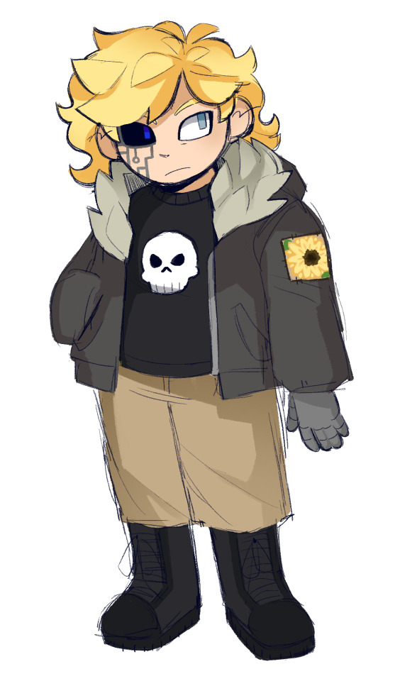
Say hello to Arild Eskildsen! A young Norwegian lad of 15 years old who, through a series of unfortunate events, was once a pigmask. I know his design may look a little... 2015, but the design quite literally came to me in a dream, and I would've been stupid not to use it. Now, as much as I'd love to go into detail about his backstory, I wanna save most of it for the asks. I guess the most basic gist is that he was taken from our time, currently in the 2010's but may change later, from a very young age, and made to be a pigmask. Yippee, child soldier! He goes on to be promoted to captain. But after yet another unfortunate event, he ends up being chimera-ified and he gets promoted to commander, but not of the pigmasks... Of what, you ask? Well, we'll get there. For now, here's him as a captain!
Art also by @pinkalliums!! Seriously, go check them out! >:)
Few things to keep in mind for this blog:
1. I don't have many artistic abilities, unfortunately, so this will be a text only blog. Some friends have kindly made a few pieces for Arild, and I will show them off, but for the most part, there won't be much in the way of visuals. If you feel like making art of him, feel free! I would actually love to see it!!
2. Quite a lot of the stuff here is going to involve my own headcanons for the Mother series, especially post-game Mother 3. For example, in my headcanon, Claus survives and becomes the leader of the army, rebranding it in the name of peace, and that is why Arild is a commander. Basically, since everyone has unique headcanons for the series, you can just consider this an AU.
3. There will be mention of a couple real life places that will have Mother-ified names. With any mention of Norway, the name will changed to Fjordland, on account of its many... fjords. Canada is also an important place within the story, and that I have decided to call Mapleland. Creative, I know. I figured I would bring it up to avoid confusion
4. Feel free to ask whatever! Though, obviously, just make sure it's on topic, of course. Silly questions are easy to answer and will usually be answered quickest! Lore relevant questions are a little trickier and may take me just a bit longer to respond to, but I will be happy to get to them!! Also, RP is okay with me, if you want to!!
5. When it comes to asking questions, please don't be weird or anything. Like... being a former pigmask, Arild is a plus-sized character, so a comment about his weight would not be great. More importantly, absolutely NO NSFW. This character is a minor, and that stuff is not okay to ask. I don't think any of this will be an issue, but it's good to mention just in case
6. I do not speak Norwegian, so if I want to sprinkle it in a little bit, I have only on option. Google Translate. I know, I know... it's not the best, but I will try my best to avoid mistranslations or misuse of phrases. I wouldn't want to be the new version of that one post about the Norwegian Butter Crisis, haha.
If you're still here, thank you for reading until the end!! As said, I've never done something like this before, so this intro is probably super chaotic in comparison to other blogs, haha. I am really excited to get started here! I've always wanted to do an ask blog, and I really needed an excuse to flesh out my OC, so I'd say this is perfect! I'd like to give thanks to all the friends, and my bf, who helped me out on this!! Thank you to Moth for setting this event up! Thank you to Hal and a few others for the art! And also thank you so much to my friend Red who helped me create this character in the first place! He didn't tell me what his tumblr was, but he is @/Doc_Glowstick on Twitter!! Alright, I think I've rambled enough now. I'll probably go through this and change it later, but for now, let the blog begin!!!
14 notes
·
View notes
Text
Character Descriptions 101 (Or, the ugly truth about what really matters)
A lot of the appeal of being able to write your own book is being able to take all the characters you dream about and put them onto paper for everyone else to drool over as much as you do. You might create a character so iconic, they can be recognized by their hazy silhouette alone.
Not everyone designs Sherlock Holmes, though.
Not everyone needs to be Sherlock Holmes.
How well you describe your characters, especially your protagonist/opening narrator, says a lot more than you’d probably like about your experience as an author. I’ve got eight years of practice with my own works, twelve if you include my early days of fanfic – and resisting the urge to describe characters in the tried and true clichés is still hard.
So here’s the ugly truth about describing your characters, and some other pointers curated from the Internet you may have seen before.
At the end of the day, what is really important?
Unless you are writing in the genres of fantasy or sci-fi, or you aren’t writing humans, your character will likely be a very average looking human. Doesn’t matter if you think your special bean’s black hair/blue eye/snow white skin combo is unique – is the shape of his face, curve of his lips, how wide his shoulders are really that important outside of, I don’t know, a steamy romance novel?
I ask this because character descriptions fall into three camps: Thematically important beats, thematically unimportant beats, and “oh damn I have too many blondes, uh, here’s a redhead” beats.
I ask this, because “this character doesn’t look like they did in the book” arguments will never stop happening and we all have our sides on what matters and what doesn’t.
These details can be height, hair color, eye color, skin color, hair style, clothing, tone of voice, accent, birthmarks, scars, and tattoos, and anything in between. Sometimes, this trait is this person’s defining trait. Sometimes, the author just felt like it – sometimes the curtains are just blue.
But sometimes, a lot of times, they’re not.
My two cents: If that piece of their design is thematically important, the adaptation should respect it and include it. If it’s not, who cares?
Thematic Character Design
Thematic character design is the intent behind the choices the author makes when deciding how they will present their character to the world. This is *why* the character looks the way they do.
Visually, you see this in anime all the time. Crazy hair colors and styles help distinguish the cast when their faces might otherwise be too similar, or when drawing them from a distance. Sometimes the protagonist will have the most unique, or the loudest hair style (think Yu-gi-oh). Or the Important Lady Character will have pink hair. Or the sad angsty anime boy will have white hair (see my post about color in fiction).
In the written medium, you can “show don’t tell” a few different ways cliché ways:
Give the villain a facial scar
Make your femme fatale a redhead
Make your hero blonde/blue-eyed
But hey, they’re tropes for a reason, everyone knows what you mean when you write them. You might give your character green eyes like their mother, a trait Very Important when a redeemed-ish villain dies. You might give your character a brunette French braid that goes on to become the style of the rebellion. You might make your Illegal Divine Children the only three black-haired major characters in a sea of brown and blonde because they are the Three Illegal Divine Children. You make all your grisled fantasy men have beards and your elves clean shaven.
The existence of these traits serve the plot and the themes of the story. It matters because these traits make them look like the villain, or the dead legacy they must live up to. These traits ostracize them from their community, or help define their culture. These traits are the hallmark of a chosen one, or a pariah. These traits are emblematic of a special power or handicap, religion, faction, rebel cause.
These are the details fans complain about when adaptations get it wrong, and it’s not without merit. But what happens when those details aren’t all that important, no matter how much you think otherwise?
Unthematic character design
Everyone lost their minds when Hunger Games was being adapted and to everyone’s unnecessary horror, Jennifer Lawrence is blonde. Everyone got mad because it’s the little details you have to get right, otherwise you’re disrespecting the source material, yada yada. Is it really so hard to wear a wig, if you can’t get this tiny thing right, what else will you mess up, etc.
Question: Was the color of her hair more important, or the style that it was in?
She dyed it anyway to stay faithful, but which detail mattered to the plot, versus just being what the author picked for her?
Dare I wade into the “this character was white in the book” cesspool? Reluctantly, yes. And all I will say is this: Does their skin color serve any legitimate purpose to the plot or how they define themselves? No? Then shush and let the actors do their thing.
… But what if race *does* matter?
Is this a slice of life novel about some plucky high schoolers in your average American town? If the story isn’t any deeper than prom dates and football games, the skin color of your character is not important. Is this a treatise on segregation and the struggles of womanhood in repressed societies? Then yeah, the skin color of your character might affect their outlook on life a little bit.
In other words: Does your character care what they look like, and does their appearance affect the trajectory of the story?
Yes, it’s disappointing when you see your favorite character on screen and have to be told that’s them because it just doesn’t look like them. But what’s important is if they fit the spirit of the character, even if they don’t quite match their looks (a lesson I, too, need constant reminding of).
Character Descriptions in Fantasy and Sci-Fi
If making sure the adaptation stays faithful to the character design matters anywhere, it’s in these two genres. Why? Because you have free reign as an author to describe your mythic creatures, your aliens, your supernatural entities however you choose, and you worked hard trying to make them distinct from every other fantasy series out there.
But hold your horses on how specific you get.
Generally speaking, the traits that most authors describe first are hair, eye, and skin color, because it’s the easiest to get out of the way and everyone knows what humans look like to fill in the blanks. When you enter the realm of non-human characters, you have a lot more legwork to do to make sure your audience imagines what you want them to.
Maybe they have slit pupils like a housecat or a snake, or they have really floppy elephant ears, or they have antennae that twitch when they’re angry, or they have wings like a bat, a bird, a dragonfly. Or they have distinctive tattoos from their tribe. They have scales or feathers or fur and you want everyone to know how fluffy it is. You want your audience to know how tall they are, how heavy, how lanky, how robust. The shape of their face, their hands, if they have fingers like a pianist or a catcher’s glove.
Or, it matters because you’ve written an allegory on race, class, colonialism/imperialism, a World War, Apartheid, what have you, and your made-up nationalities need their own traits to be bigots about.
Answer: Hire a sensitivity reader before you design an insulting stereotype.
Otherwise, feel free to add as much fluff as you’d like. You go out there and you give exact measurements, constant similes about the textures of their skin, write an essay on cultural wardrobe, take two paragraphs to describe that ballgown and masquerade mask… and accept the fact that your readers will happily go SKIP!
Because description and exposition are also entwined with tone and the purpose of the story. I am writing an 18th century royal ball scene in a steamy romance novel and my hero is about to get her man – my audience might care about things like a sweetheart neckline, perfume, what kind of flowers are in the lacework, how it hugs her body, how the pink looks so damn sexy in the candlelight, how the skirts sweep so elegantly, every piece of jewelry she's wearing and how expensive it is and exactly how she did her hair.
Or, I am writing a fantasy adventure that happens to feature a pitstop at a royal ball – Your audience does not give one flying f*ck about what flowers are on that dress. Describe the color and something cool and eye-catching and move on.
The Ugly Truth: Does. It. Matter?
You can wax poetic about the minutiae of your absolutely unique and like no other fairies no one else has ever written before. Maybe you designed them less like Tinker Bell and more like anthropomorphised flowers – that matters!
You want your hot love interest to have a cupid’s bow and to remind the audience of that detail at least four times throughout the narrative? Not important unless the narrator is weirdly obsessive over it (or, again, romance/erotica).
The same thing goes for fantastical settings.
At what point are you describing the color of the grass, the kind of marble in the walls and floors, the exact shade of blue paint they used, the gables and the roofing tiles and the scalloping on the columns to unnecessary ends?
This also affects pacing.
If your entire story is set in a beautiful castle and the heroes never leave? Describe as much as your little heart desires. Is it just a pit stop on the way? Call it a castle, maybe it’s in ruins, give one uniquely defining trait that’s thematically relevant, and move on.
Side characters too: If you don’t even bother naming the poor schmuck, give their gender and maybe one fun fact and move on.
You’d be surprised how little character descriptions, or lack thereof, are even noticed. The amount of fanart head-cannoning a character being Not-White because the author technically never clarified is everywhere. I just reread the first two PJO books and Chiron’s human half is never described beyond his age and his beard. Everyone who read it filled in the missing details with what they wanted or expected to see and that doesn’t impact his character one bit.
Pacing your descriptions
See this post about how to pace your narrative.
Everyone knows the trope of the narrator waking up, gazing into a mirror and describing themselves to the audience. It’s cheap, it’s fast, it’s dirty, it’s effective.
So why do people hate it?
I think it’s less because it’s overdone, and more because it’s robbed of potential. When I wrote about pacing, I said every scene should be pulling double duty – character descriptions fall under exposition, and should do the same.
If you really want to have your hero describe herself to you via mirror, don’t just write a textbook, give it flavor. Is she self-conscious about her looks, saying she has choppy blonde hair but wishes it was some long, luxurious brown like some girl she’s jealous of? Does she have a big nose and wish it was smaller because she’s bullied? Or, does she love her green eyes, because her late father had them and she loves the connection they share?
Good pacing isn’t about how many or how few words you take to describe something, it’s how efficiently you use those words. Short doesn’t always mean it’s bland, long doesn’t always mean it’s profound. Don’t take 300 words to say something that could be said in 30 – but some things do deserve 300 words.
Examples:
A: She woke and rolled out of bed and stared at herself in the mirror. She had hazel eyes and blonde, curly hair that she pulled up into a ponytail.
B: She woke on the third alarm and rolled out of bed. Staring back at her in her vanity were tired hazel eyes beneath a mop of dishwater blonde curls and crease marks from her pillow.
C: She woke on the third alarm and dragged herself out of bed. Her vanity mirror glared back at her – a rats nest of dishwater blonde and crease marks from her pillow. She scowled and rubbed the sleep from her hazel eyes and raked her curls up into a messy ponytail to be dealt with after coffee.
Or, go even longer, really weave those details into the action of the scene, I didn’t here because this is a blog, not a book.
No matter what, best practice is to not infodump the description, spread it out – another criticism of the mirror trope. There is no one size fits all for any writing advice but if you’re spending more than four consecutive sentences describing a single character, object, or building, break that hot pile of exposition up and look how much better it reads.
Similes for describing your character, like any comparison, should serve a purpose. Think about describing an intimidating queen with snow white skin versus bone white skin – what vibes do you get from one simple word change?
You have a long time to describe your narrator, it’s okay if we don’t know what they look like on the first page. Give the details as they become relevant. If you open en media res and the hero is in a nasty fight scene – describe their hair as it flops in their eyes, describe their skin as it’s covered in sweat or scratches or bullet holes, describe their eyes as they patch themselves up and one is now black and blue – or describe their color full of fear, hate, malice, grief.
Describe them against another character so you get two birds with one stone. Whether the narrator is jealous of, attracted to, or appreciative of their fellow character’s appearance. Describe them self-conscious about trying to impress a crush, their spouse, a superior, interviewer, parent, the public, the press. Or describe them unhappy about how they’re being forced to look compared to how they usually are, e.g. a school uniform, prisoner’s uniform, fancy dress/suit, skimpy undercover costume, bargain bin, ugly hand-me-downs, holiday costume, sleepwear, full face of makeup, or no makeup.
All of these are motivated details that will read better than halting the narration to drop textbook lines of exposition.
Lastly, do not let your characters get side-tracked describing themselves when they have more important and prescient concerns. In the above hypothetical fight scene, a “she swept her blonde hair from her eyes and got back to her feet,” is going to read smoother than “she swept her blonde hair aside. It was short and choppy, cheap highlights fading and flyaways tickling her face. She got back to her feet.”
And even then, personally, I think this reads better still: “She swept her hair from her face and got back to her feet, sweaty blonde tangles stuck to her skin.”
Have intent, make it motivated, and the less it feels like awkward exposition.
Pitfalls to avoid
Full disclosure, I am white, from a long line of the whitest white Europeans. I do not write a pasty white cast of characters. Boy, was it an eye-opening experience realizing how harmful my earlier descriptions used to be, just from the books I grew up reading and through no ill-intent of my own.
So another detail in the realm of “does it really matter”: Not all brown skin is the same shade of brown, but resist the urge to compare it to any flavor of food or chocolate. I just reread a favorite kids’ book of mine and saw “chocolate milk” and as a kid, I never noticed or cared, but you bet I zeroed in on that little beat as an adult.
Is this hard? Kind of, yeah. I suppose you could go scorched earth with the food comparisons and describe all your characters in their flavor of milk. Pale skin has a lot of options: Snow, frost, paper, bone, fair, pale, lily, sandy, fawn, etc. and of course, milk, cream and sugar to boot.
The “brown skin like milk chocolate” is tempting, but dehumanizing particularly when only brown characters are described with food. Decide if the exact shade of brown is important, then get respectfully creative with the comparisons. The same goes with hair styles and textures.
Related to skin color: Be careful with what idioms and metaphors you use when describing characters who aren’t supposed to be white, doing things only possible or noticeable with light skin.
A certain famous author really tried to tell the world Hermione wasn’t *technically* white and the HP fans went and pulled page numbers proving that she has to be based on the behavior of her skin.
I’ve caught myself (and had to be told) a few times describing a not-white character “white-knuckling” something as shorthand for being stressed and tense. Faces blanching, paling, reddening, blushing, turning green, looking sun-burnt and bruised and scarred all look different depending on how dark their pigment is.
I am not at all an expert on what you *should* do for non-white characters so I will say this once again: Do your research and get a small army of sensitivity readers. Even if you don’t think you’re being racist, you might be. Accept the constructive criticism, and change it without complaint. Do not lie down and die on a milk-chocolate hill.
The Beautiful Truth
In the written medium, unless you canonize character art and take no constructive criticism, all your audience has to go on is suggestion. That means that your audience has the freedom to imagine their favorite characters however they want.
That means you get a million variations of the hero in their fan art – that’s amazing! If you never described the protagonist’s skin color? You get an audience that makes him or her or them the hero that they want to see and how you’ve inspired them – that’s amazing!
That’s what I mean when I ask if it really matters. You will always know how your literary darlings look. Is it more important that everyone else draws a million different paintings in their mind of the exact same face like a photocopier, or that you now have an audience giving you a million unique paintings of your life’s work immortalized in the grand literary canon?
#writing advice#character design#character development#exposition#writing resources#writing tools#writing
44 notes
·
View notes
Last Seen Blogs

whatsydneesees
Valdes
umadevaa
Gift from Virgo.

latinalifter
where did the sun rise?

dakotajoyce-blog
Dakota's Blog for Party People

yan-naings-world-blog
Untitled