#exaggerated height difference for composition purposes
Text
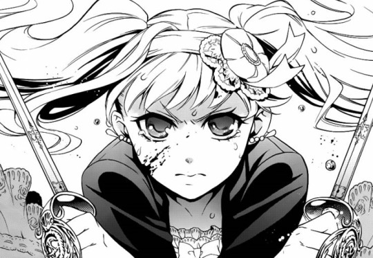
Elizabeth Midford, Dull Swords: Part 1, Building a fight scene
Despite Black Butler’s massive popularity as an anime and manga, by film standards the movie falls far beyond what the fandom would have expected. The first live action was received with heavy negative criticism and it would seem that ‘Book of the Atlantic’ fell somewhat in the same way. In less than two weeks of the Japanese release and the three days of US release the film earned less than $5,000,000 combined - in comparison, the highest grossing film of the year, ‘Detective Conan: Crimson Love Letter’ earned $11,749,652 alone on its opening weekend.
These two movies can’t be compared, due to the huge differences in the plots and narratives yet… Black Butler’s production team could learn a thing or two. The greatest fault in ‘BOTA’ was its “so-so” action, that was also said to be a fault in the previous movie. Knowing this, I’d like to analyse Elizabeth’s famous fight scene and look into why the series has been known for poor action scenes despite the great action depicted in the manga.
Long post so the rest is under the cut.
For anyone who would like to watch the fight as they read the analysis, the full fight is linked here: https://www.youtube.com/watch?v=5LfH_MLe7jI

An important thing to know about writing fight scenes is that a fight alone is not interesting. It is the weight behind that fight that makes things interesting. Superheroes fight to save the world and villains fight to accomplish their own goals. The start of this fight is not interesting because it begins with Grell wanting to fight simply for the sake of fighting - this is just Grell’s character. We know that one of her main roles in the series is to block Ciel and Sebastian from attaining their goal. Our protagonists, Ciel, Sebastian and Elizabeth want to avoid this fight instead, giving us more of a reason as to why this fight should be done with as soon as possible. This fight does however have one purpose - leading up to Elizabeth’s exposition as the swordswoman she is.
When creating a fight scene, interest is added by raising the stakes - the more danger there is of losing something, the greater the emotional payoff and tension - each fight should be a gamble that makes us feel that the characters we root for have to win. Even if they’re bound to lose, the chance that they should win should at least tempt us. Toboso changes this with how she portrays Sebastian.

Usually when Sebastian engages in battle, we expect him to win every fight, since he’s put forward as this amazing force that always succeeds his tasks. Fighting against two reapers should mean nothing to him. Yet, the extra baggage of protecting two children raises a problem. By separating them, Toboso then creates the possibility of “only one can survive” - Sebastian would choose Ciel in priority over Elizabeth. In this instance, we start to fear that Elizabeth is in danger.
Given that Ciel would “do anything to protect his fiancee”, we trust that he’ll be able to reach out to Elizabeth in her time of need. With an injured leg, Ciel is then rendered useless in his state. The fact that Ciel is pictured as further away from Elizabeth in the manga, shown by how Ciel is not in the frame, highlights her vulnerability against the Dolls that are drawn enormously in comparison to her size. Not only is he unable to protect her, but he’s unable to protect himself if Sebastian can’t shake the reapers off of him.

In the film, Ciel is pictured relatively close to her, removing this aspect of fear for Elizabeth’s state. The film makes it seem as if either one of them was able to stand, they could make it to each other in less than a few seconds. Since the idea that Ciel will always protect Elizabeth has been referred to in the film numerous times already, we believe that if she makes it to him he’ll do what he can to protect her. While one may argue that this puts Ciel in danger as well, Sebastian could come in soon and save the both of them - the distance between them in the manga is important in exaggerating that the matter of a second could literally result in Elizabeth’s death.
The manga shows her sluggish movements to get up while Ciel calls out to her quite well, since the distance between her and the Bizarre Dolls is much closer to make it seem as if they’re closer to grabbing her than they really are.
The fact that when the camera cuts to Elizabeth as she’s already propped herself up removes the aspect of vulnerability that’s shown in the manga. The way that the film only shows their legs in the foreground does play with the whole compositing of the scene, making them look larger than they are, but it ends up losing the sense of urgency that the manga had as they seem close enough to touch her.

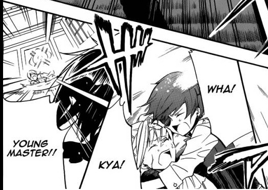
In the manga, we don’t see Ciel whip out his gun and cut straight to him shooting. This already is far more effective than how in the film we see him pull the gun out (rather slowly considering the situation) and then shoot. This panel is effective as it shows the speed of his fire - he wants to kill them as fast as he can and the futility in it shows it. The film only shows the first shot then switches to focus on Ciel shooting, rather than the targets he’s aiming at. To improve this, perhaps a shot showing his perspective as he watches Elizabeth try to scramble away with his shaking hands in the frame as shoots would be more effective.

Not to mention that as the first Doll lunges to bite Elizabeth, for some reason it gets launched sideways instead of being fired back by the force of Ciel’s gun. If you slow it down enough it even looks as if the image of the Doll being shot was just dragged across the screen instead of actually flopping from the force of the shot.

The next image of Ciel shooting is relatively basic. The team might as well have just made a gif of Ciel shooting those three shots or so and it could look the same. There lacks any variation in those few moments that we see. Comparatively, the single image in the manga of Ciel shooting at the horde without showing the Dolls being killed right before Elizabeth is much more effective. It’s made evident in the manga that this boy is in full panic as we see the large group towering over Elizabeth, once again with the distance exaggerated as much smaller to create the sense of danger. The open space around Ciel in the film also takes away from how much tension there was in the manga - while you can argue that this shows his isolation, having this sort of shot in this perspective loses the image of danger that threatens Elizabeth.

In the manga, we truly see Ciel’s terror as he realises that his gun is out of bullets because of the closeness of the panel and the tightness of the frame which follows the positioning of his arms. Not to mention how the gun is so centred in the panel, showing how it’s the centre of his focus.

Ciel’s expression in the manga shows fear by a wider mouth and the more dramatic shading over his face. In the film, his expression is much more frustrated. This choice is obviously understandable. It’s a pretty shot and all, but it does take away from some of the drama because the position is far less dynamic.
The sequence of events leading up to Elizabeth’s reveal changes, which arguably makes it less effective. In the manga, switching perspectives between Sebastian, Elizabeth and Ciel adds to the chaotic nature of this scene. Everyone has different opponents but they all need to survive. Seeing Sebastian dash towards Elizabeth emphasises that even he might not be able to save her, shown by how close the Dolls hands are to Elizabeth. The manga is able to use action lines to show and highlight the focal point of each panel. Such a thing would be harder to animate. Though used heavily in sports anime like ‘Haikyuu’ and ‘Ballroom e Youkoso’, in a setting such a ‘Black Butler’ which tries for elegant and refined style, rather than artistic interpretation, these sort of lines don’t fit as well.
Arguably, the most important part for this build-up is how Ciel reacts to believing his fiancee is about to die before his eyes. The order of focus is especially important in this. In the film, Elizabeth starts to talk, turning around just as the feet of the Dolls come into frame. This is a relatively good shot. Here, the director chose to show Elizabeth’s vulnerability more by emphasising the height disadvantage. On the floor, she lacks the escape means. In the manga, she may be sitting down, but the danger is shown in the form of hands. What the film shows is the immense force that is about to strike down on top of her. The manga does this as well, but I would give this a pass.

On the other hand, the manga highlights the panic that the both of them feel in this situation. In the film, Elizabeth is already smiling as she talks to Ciel, and then we see Ciel’s reaction, rather than how Ciel in the manga realises first and then we see Elizabeth’s struggle to hold in her tears. The film chose to show Elizabeth in a state of acceptance, which again is very powerful, making the audience think that she’s resigned to her death.
Ciel’s expression in the film is much more akin to anger, a frustration in how he’s unable to save her. The manga’s choice shows Ciel in absolute fear - the lack of colour serves to dramatise this as well. Black Butler is known for beautiful eyes and just zooming in on the empty look of Ciel’s eyes shows the rawness of his fear. His gentler brow also serves towards showing more fear than the sharper brow in the film. This, coupled with the echoed gasp and sound effect, adds to the hollow feeling that Ciel would feel upon realising the possible fate of Elizabeth.

Once again, the lack of colour in the manga adds to the dramatic panic felt in this scene. During the entire scene, Elizabeth’s blazer was coloured black, as well as her eyelashes - pretty much everything has been turned to greys. As she cries over how she can’t be cute anymore, the softened lines serve to show her in the last angelic moment that she may well have. At this point, it’s hard to tell what are water droplets and what are tears as they run down her face. Her innocence is also highlighted by lighter eyes and shaded cheeks and lips in contrast to her tangled mess of hair. This is the last image that Ciel may see of his beautiful feminine fiancee.

I have less complaints about the image of her in the film. The camera panning up to her crying face emphasises how delicate she is while also keeping the Dolls in the background to keep their threat important. There’s far less detail and her eyes are drawn wonkily, but at least they tried to make this dramatic with the camera movement.

Sebastian finally manages to escape Ronald with simple movements, but that can be forgiven since he isn’t the focal point. Instead, we have the image of him running to save Elizabeth, but all that can be seen of her is her dress between the legs of the Dolls. At this point, the film tells you that it’s all over for her.

I don’t want to pick up on this, but the way that Sebastian runs here makes me think of the spider gif. It really is a downer to what is a good scene but it had to be said. If this gif doesn’t work when I post it I’ll start crying.

Another flaw I’d point out would be Ciel’s final reach out to Elizabeth. The way this is done in the film feels far too smooth, rather than carnal and desperate - how one would normally react in absolute panic. It’s more like a dramatic flourish that someone would do in a high school play. Of course, his expression of panic is still great. Wide mouthed in a choked/silent scream. If this was animated with a greater sense of urgency, there’d be less of a problem here.

Frame tightness is especially important for the drama of this scene - the manga frame is tight and barely shows Ciel’s full face. This can symbolise how trapped he feels in not being able to do anything. His under eyes are also heavily shaded to show his distress. The open spaces and use of the background feels inappropriate for the close seriousness of the situation. The manga also showcases a look with greater desperation as we see how things are from Elizabeth’s eyes - her fiance screaming for her is the last image that she’d see.

The fact that we see Elizabeth once again as the shadows of the Dolls close up on her is a really good directorial choice. Here the camera’s closeness to Elizabeth’s form works. It almost feels as if she’s saying goodbye to her audience instead, the tighter frame making us form a more personal connection with her, making up for the lesser emotion that Ciel was drawn in beforehand. In opposition to the reactions of Ciel and Sebastian who see that they’re too late in the manga, having Elizabeth listen as her fiancee screams her name in darkness is really well done.

The blackness that fills the screen is just as effective as in the manga to make one think that Elizabeth’s finally been killed. Letting this ring for two seconds gives the audience a chance to think that a death really has occurred. For an audience member who hasn’t read the manga, this would be effective enough to make them think for a second that she’s gone. These few seconds are good and there’s little I would change and I’m glad that the director actually chose to do this. This blackness serves as an equivalent to the page turn and makes it even more surprising when we realise what happens next.
As pernickety as this analysis has gotten over the build up, it’s important to look at it because this is how fights are built up. You don’t start out in any martial arts match with the massive axe kicks and what not. Tension is built up in every fight, whether an official match or in a fictional setting, by the fighters raring up to the bigger scenes instead of coming out with them straight away. Toboso wrote the build up to Elizabeth’s revelation well, which is why this had so much of a reaction for Japanese readers - far greater than Grell’s reintroduction.
Now, despite all that we’ve looked in to so far… we’ve only scraped six or so pages - 30 seconds if you want to talk about it in the films terms. You can see clearly that there are some great points that the film has done well to adapt the manga. It can also be seen that there are some areas of the film which are “so-so” because it lacks the same depth that the manga does.
I’d love to hear your thoughts on this scene alone. I will be getting to the rest of the fight direction, where I believe things start to decline, but I can’t give too much away right now.
#black butler#kuroshitsuji#elizabeth midford#ciel phantomhive#sebastian michaelis#about black butler tag#mod sen
79 notes
·
View notes
Photo

Lovecraft: Part One | Part Two | Part Three | Coming Soon
Characters: Saeran Choi X Reader
Word Count: 4,093
Genre: Witchcraft!AU, Fluff, Angst
Warnings: Mentions of child abuse
Summary: After an unfortunate drunken night, you, a fortune teller who was cursed from a young age by an unknown witch, breaks your own creed and read your own fate. Seeing nothing but ruin and isolation in the future, you seek out an apothecary named Saeran, who gives you untested potion called Aphrodite’s Blessing, not for free though. In return, he wishes to study and document it’s effects on you. Can his creation not only save you from fate, but also break your longstanding curse?
No matter how many times Saeran rolled over, tugged the sheets above his head, and squeezed his eyes shut, the banging on the door didn’t cease. And it would’ve been a lovely morning too, with the way the sun was shining outside, and how the birds were singing their merry tune. That stupid lady just had to go and ruin his mood with her hollering at this ungodly time in the morning.
Running his fingers through the tufts of bedhead, he tried to smooth it out, make himself look presentable in some way before he greeted the irate woman screaming outside his door. He wasn’t in much of a rush, after all. Secretly he hoped that if he took long enough she’d up and leave, but considering the fact that her screeching had been going on for the better part of half an hour… Well, if she was going to leave she likely would’ve turned tail and left already. The walk downstairs seemed longer than usual, but perhaps it was just him dreading what awaited him on the other side of the door. Sighing, he reached for the door. This lady, and all the others like hers’ rapping at the door was likely why it was so rife with splinters.
“Do you realize how long I’ve been standing here?” The middle aged woman yelled as soon as the doorknob turned. Saeran wondered if the deep wrinkles on her face were caused by the excessive use of expression by her. The display she wore was far too over dramatic to be natural. Was that truly how she looked, or was she exaggerating on purpose? Her eyebrows pinched together, corners of her mouth downturned, eyes nearly bulging out of their sockets...You’d think she was auditioning for the part of evil witch in the upcoming play, not harassing a shop keep before most of the town had woken.
“Long enough to manage to wake me up,” With his long nights of mixing different compositions, reading endless page after page on herbs and their uses, and downing blue vulneraries trying to see which batch let him rest more peacefully, he tended to sleep in later, and deeper than most people. Somehow, sleeping until the afternoon did nothing to help the purple bags under his eyes that never seemed to fade.
“Whatever! Your useless potion did nothing for me!”
“Oh? And which one are you talking about?” Saeran folded his arms, leaning against the doorframe. It was freezing outdoors and he was in nothing but a thin pair of pajamas, but it was instinct to look cool and nonchalant to one up her. He knew exactly which item she had purchased too, he remembered quite well how her musky lingering perfume infested his shop a week ago, how she demanded he craft something custom for her needs rather than buying what was on the shelf, trying to bargain with him as if she couldn’t pay the price despite the gaudy jewel encrusted necklace covering the majority of her chest… This woman had already used up all his patience, and he was going to do everything he could to piss her off.
“Your anti-aging one!”
“Do you mean Hebe’s Nectar?”
“I don’t know! I didn’t read the label!” She tossed her hands in the air, continuing her dramatic display.
“Well, considering it’s the only anti-aging thing I sell, we’ll go with it. How are you using it?” Saeran had confidence in his works. Everything was tested on either him or another person, if there weren’t good results, it didn’t go on the shelf. Anything on the shelf was either his personal creation, or something passed down to him from Jihyun. He was not too fond of the implication that his potions were ineffective.
“What do you mean how am I using it? I take a spoon everyday like any other potion!” Silently, he prayed this woman would never reproduce, no child deserved to inherit a brain as small as hers. Their upbringing would be hell too, gods save any kids she may already have.
“Well ma’am, if you read the label, you’d know it’s supposed to be added to bathwater once a week, not ingested,” Saeran couldn’t believe this, just how stupid did she have to be to not read a label and then come screaming at the seller? He may not put price tags on products out of laziness, but he made sure the instructions and ingredients list was attached. Does everyone who owns a shop have to deal with people like this? Did his late teacher have to deal with this?
“W-Well you should have told me that when I bought it!”
“I tell every customer to read the label, whether you do or not, is not my problem,” The lady was flabbergasted, taken aback by his words. Her long, cracking nails dug into her balled up fists in an attempt to contain her anger.
“Well, am I going to get sick now? From drinking this stupid thing?”
“Likely not if you haven’t already, but maybe since you’ve been ingesting it, it’ll help with your ugly personality,”
“Excuse me? Are you implying something here boy?” She accentuated the final word, as if it were some insult to call him a child. He knew he was too young to be running a shop, and to be an apothecary. It wasn’t slander, it was a mere fact. He refused to let this woman use his age as a tool to demean him.
“Yes, now please leave, I’d like to get some sleep,” Saeran slammed the door in her face, far more pissed off than he should’ve been. It was people like her that made him question why he even ran a shop in the first place. He was kind enough to share his practice with the townsfolk and this is how they treated him? Abhorrent.
Judging from the position of the sun, it was too late to go back to bed. If he wanted to open up Lovecraft at a respectable time for once, he was better off just getting ready for the day. Sitting down at his desk, he opened the leather bound journal to an aged page. It was the last ingredient list he’d used for creating Aphrodite’s Blessing. Tea stains dotted the scribbled writing. All the markings were remnants of long past nights where Saeran was so sleep deprived his hands shook as he reached for yet another cup. Picking up the quill nearby, he began to jot down notes about his test subject. Your name, gender, age, basic physical traits… There was quite a bit of necessary information missing, however. Saeran made a mental note to ask you about your past experiences with potions, allergies and whatnot the next time you met. All factors in this test were equally important, from which kind of rose petals used, to your height. It was always unknown what results could turn up, so it was best to keep notes of absolutely everything to learn the properties of different ingredients, and their effects on certain people.
He moved to close the journal as he got up from his desk, but a brush of his hand sent it tumbling to the floor by accident. A detailed pencil drawing that had previously been tucked in between pages slid out. Carefully picking up the print, Saeran’s eyes took in every aspect. The tiny indents of the man’s pores, the cracks in his lips, and the shimmer in his eye.
It was of Jihyun, his former teacher. Saeran’s eyes began to well with tears as Jihyun’s charcoal mouth smiled onwards, as if trying to tell him not to cry, to smile instead. It was just like Jihyun, to want to be remembered as smiling. The portrait was the only picture he had to remember his face by. All the memories seemed to come rushing back to him whenever he looked upon the drawing, no matter how many times he told himself he was over his death. That was why it was tucked away, so he didn’t have to look at it. It was expected for him to still be upset though, Jihyun essentially raised him after all.
Saeran’s mother passed away when he was 8. It never really upset him though. He was more traumatized by the way she treated him than her death. She was a horrid lady, not unlike the one who had just visited to do nothing but complain and blame him for her woes. Bruises and cuts were no stranger to him. She had driven his twin brother to run from her when he was very young. He hardly remembered him anymore, his brother left early on in his life, leaving him behind to bear her abuse. It was by some god’s grace she was always too drunk to notice him sneaking out the window, running to the nearest potion shop, which just so happened to be Lovecraft. He remembered how he cried and begged for help, how much pain he was in. It felt like someone had placed needles under his wounds, the side of his face felt swollen, every movement put him in agony. Jihyun had nearly burst into tears himself at the sight of the small boy. What kind of monster could do that to a child? Jihyun began teaching him how to make his own salves and basic balms to treat his injuries when he couldn’t make it to the shop, whether it be because she had shackled him to the bed, or he was too weak and injured to move. After that, Saeran simply wanted to know more about what kinds of things apothecaries could create. He was enamoured by the fact that a mixture of common items could create something that could help people. He wanted to end his own pain, and perhaps, do something for his mother. Saeran wondered if she was in pain because of how often she cried into whisky glasses. Jihyun would only smile whenever Saeran would tell him about his plan to create “a really strong potion that will stop mother from hurting,” The child thought that maybe, just maybe, if she wasn’t in pain, she wouldn’t create pain for him either.
It was a serene night when his mother passed, everything was quiet for once. No screaming, no choked sobs, no broken glasses. Saeran recalled how he she didn’t move, how she didn’t snore or bolt out of her rocker to yell when he made the smallest of noises like she usually did. He poked his head out of his room, inhaling the overwhelming scent of alcohol. Half empty bottles were spilled everywhere, smashed glass littered the floor. Carefully, he had poked at her arm, just to see if she’d move. He shook her arm, nothing but a flop of her head. He reached his small hand up to her face, striking her as she had done to him countless times. No movement, no reaction. Saeran bolted out of the front door, running into the streets teary eyed. Rather than running to inform a town guard, he ran to Jihyun, frightened at his first hands on experience with death. The only guardian he had, even if she was a poor one, was gone. Jihyun cradled small boy in his arms, and cried with him. Saeran never understood why Jihyun was crying with him. He still didn’t know why, even though now he was older and wiser. From that point on, Saeran moved in with the apothecary, and learned to craft potions from him. Life seemed the brightest when he was with him. Jihyun was his sun, and since his departure from the world, Saeran had decided to carry on that feeling of warmth he was given, passing the same care to others.
Living with him meant sleeping in bed that creaked in the night as he rolled around, trying to escape the nightmares that haunted him, but that was fine. It was better than the sheetless mattress, or the cold splintered floors he was used to. In fact, having a bed with pillows was quite the luxury to him. At least he had somewhere comfortable to cry as he tried to sort out his feelings, tried to remember that he was no longer a small child who could only rely on the woman who’d strike him with broken bottles and forget to feed him for days on end. He was no longer trapped physically by her, but her presence, the damage she caused, lived on and encased him.
Jihyun had begun developing a relief for his nightmares before he passed. It typically took several years to perfect a potion, and sadly, he had passed before he was able to complete his work. Creating the elixir was his way of apologizing to Saeran, for not being able to remove him from his mother sooner. For letting this continue on rather than alerting the authorities. The very least he could do was to ease his nightmares. As Saeran ran his fingers over the edge of the drawing he still held, he wondered why Jihyun did what he did. He had faith in his choices, he was always a wise and calm man, but he just wish he got to know why he made his decisions. What did he foresee with his actions? What was he trying to avoid? Would the authorities have done nothing to save him from his mother? Why didn’t Jihyun act sooner? When Saeran took up his work on Bane of Phobetor, the elixir he had been working on until his death, along with running Lovecraft, he could only hope that by continuing Jihyun’s work, he could find the answers he was looking for.
Wiping stray tears from his eyes, Saeran tucked the picture back in the pages of his notebook. There wasn’t time to dwell any longer, he had a shop to open.
You found yourself staring at your own reflection at lot longer than usual of late. The eagerness to see any signs of change overwhelmed you, the thought occupied every hour of every day. You were paranoid about every minor thing, taking note of every twitch, your skin seeming to be a hue too pale or too dark, was your hair suddenly longer? Why were you more tired than usual? You had reason to be paranoid though, you were a test subject after all. You kept hoping that perhaps someone would bump into you on the streets, someone who’d genuinely be intrigued by you, someone who wanted to get to know you. However, nothing so exciting had happened yet.
You tugged the wide brimmed witch’s cap down, trying to shield yourself from frigid winds as you braved the walk to Lovecraft once again. A few days had passed, and like you promised, you’d meet up with him so he could take note of the effects. You weren’t sure there would be anything for him to write down though, but perhaps an apothecary would know better what to look for than you.
The bell chimed as you burst through the door, quickly shutting it to prevent any snow from getting in to warp his floorboards more than they already were.
“Ah, there you are,” Saeran poked his head out from behind a shelf filled with lilac coloured potions. They were haphazardly placed, far too many bottles crammed onto the weakening shelf. a few bottles threatening to dive off the edge, some knocked onto their sides. “I was wondering when you’d stop by,” He stood up, brushing the dust and dirt off his pants. You noticed the book he held in hand, some sort of encyclopedia perhaps? You couldn’t read the title very well from this angle and distance, but it was thick with pages surely full of knowledge, gold foiled leaves decorating the burgundy cover.
“Were you in the middle of something? I could stop by later if that’s better for you,” You didn’t want to interrupt him, and you silently needed assurance that this was a good time to drop by. It was roughly early afternoon, judging by the position of the sun hanging high in the sky, but you’d heard rumours of Lovecraft opening quite late due to the shopkeeper's sleeping habits.
“Oh no, I was just doing a little research on herbs. Come, have a seat,” He motioned to the stool by the counter. You took up his offer, wanting to rest your feet after the small journey you made to get here. It wasn’t a long walk to get to the shop, but the cobblestone roads combined with thinning soles on your boots didn’t allow you to trek with much comfort. “How have you been, noticed anything different?” His eyes eagerly looked you over, searching for any signs of physical change.
“I’ve been… the usual, I suppose,” You sighed.
“You sound a bit down,” You were caught off guard by his insight. Most people simply asked how you’d been as a pleasantry, they didn’t genuinely care how you were doing. That’s how life always was for you after all. The curse you were burdened with hung on your shoulders, as if it was scaring off anyone who perhaps wanted to ask how you really feeling that day. Someone who wanted to say more than “That’s awful,” when you explained the worst day of your life to them. Anyone who offered consolation, just… someone who listened.
“I… I’m just worried that it feels like nothing is happening,” You confessed.
“Don’t worry so much, sometimes it takes longer for certain potions to begin to take effect. And other times, the differences are so minute that you don’t even notice them,” He smiled warmly, trying reassuring you that things would be alright.
“But I’m betting everything on the hope that this concoction of yours works,” You were nervous, this was your future after all.
“I guess I’ve got high expectations to live up to,” He laughed. You appreciated how upbeat he was despite the situation you were in, he was much like a beacon in your darkest hour.
“But I suppose you’re right, I shouldn’t be worrying so much,”
“Here, let’s take a look and see if there’s any changes from my perspective,” Gently, he grabbed your chin, turning your head to the side. “Hm, Your cheeks look a bit pinker than last time…” You were taken back by his abruptness. Most strangers didn’t just grab someone’s face like that, and he was getting awfully close to you. Did he just lack decorum? Did he not understand social cues?
“I-I’m just cold, it’s freezing outside,”
“Is it? I haven’t really left the shop today,” Saeran tried to not remember how the winds whipped at his flesh while he stood in the doorway earlier in the day. Looking smug definitely had it’s cons. It’d be better for him to just forget the woman from this morning, she wasn’t worth his anger anyways. He turned your head to the other side, examining and jotting down the hue of your skin. Touching the back of his hand to your cheek, he noted how warm they were too.
“Didn’t you have to leave your house to get to the shop?” Did this guy honestly not leave his shop? If so, how did he manage to earn a reputation for opening late when he was always here?
“No, I sleep here. My room is upstairs,” He said in a matter-of-fact tone. “I’ve lived here ever since my teacher took me in, and I don’t think I’d have it any other way,”
“Isn’t this place a little too worn down for you to live in?” You went from thinking this guy was a weirdo to being concerned for his well being. The winter months were rather cold here, and he was sleeping in a barely insulated shop?
“I think it being worn down is what gives it its charm, don’t you think?” He ran his hands through your hair, examining for any colour changes in the strands. The gesture was a little odd but… Intimate, almost. It felt so relaxing, soothing. Subconsciously, you leaned into Saeran’s touch. You saw the smirk catch on his lips for the briefest of moments. “Does that feel nice?” He asked as he repeated the motion, slower this time. You weren’t sure at this point if he was still examining you or if he was toying with you.
“Ah, sorry.” You jerked upright, only now realizing your actions. “It’s just… No one ever did that and I...Uh...Yeah… It does feel quite nice. Is that a side effect of the potion?”
“Most people enjoy this, so I’m gonna go with no,” You felt your heart sink that no changes had been noted yet. He continued to tug gently at your roots, eyeing your expression.
“Well, physically, there’s not much change aside from your face being redder than usual. Emotionally, you seem slightly less reserved, but to be fair you did just meet me,”
Saeran wondered why you were so alone, and why your cards gave you such a grim reading. It’s not like you weren’t pretty, nor did you have a bad personality from what he knew about you so far. Just what was keeping people from you? And why did you being alone cause such a ruinous future? Was your problem stemming from yourself as a person, or was there a third party interfering? He didn’t believe in divination being absolute, other forms of magic such as potion, spells, curses, and enchantments could always change the future. But why were things as they were for you? It felt like he was missing a piece of the puzzle that could help him resolve your problem. There were so many questions he was trying to resolve, and you’d thrown a new quiz at him. Of course, he wanted to refine Aphrodite’s Blessing first, but he did want to assist you as well. That’s why he continued to run Jihyun’s place after all, because he wanted to help people like him, like Jihyun had done for him.
“I think I would like to try something with you,” Your head perked up, nervous at what he was about to suggest. “I’d like to go to the market with you, I want to see how you react with other people, and how they react to you,”
“Right now?”
“No no, maybe tomorrow if you’re free?” He offered. “I think I might get some better insight to how to potion is affecting you if I’m able to observe interactions with people other than myself,” He did have a point, you hadn’t really done much socializing the past few days aside from the odd reading here and there. You joked about a prince charming popping up out of nowhere when he proposed the idea of taking Aphrodite’s Blessing, but you hadn’t been acting on your own and yet you were still expecting results.
“That sounds like a good idea, but don’t you have to watch your shop?”
“I own it, I can close whenever I like. I’m not going to miss much business anyways,” Customers were few these days, and he wasn’t located in a high end of the city. The district was filled with commoners, all trying to sell their own craft to each other when no one had any money to spare. Plenty of product, yet no demand. Capitalism at its finest.
“What time did you want to meet up?”
“Noon perhaps? That’s when the market is at its busiest. The more people the better,” Saeran was scribbling away unknown notes in the journal he had laid on the counter. You were inclined to ask just what he was writing, but refrained. What if he thought you were being too nosy? Perhaps there were things you didn’t want to know.
“Sounds good to me, I’ll see you then, I suppose?” You reached for the door.
“Yep, I’ll see you tomorrow,” With a wave of his hand, you were off, braving the chill yet again.
Saeran buried his face in his palms and breathed deeply. He picked up the qull once again and began to jot more notes down.
Noticeable difference in skin hue
Skin warmer than average body temperature
Cute expression when hair is played with
No change in hair colour
Not much of an emotional/behavioural change, noted changes could be due to her warming up to me
Avoids eye contact
Glancing at his notes one last time, he realized something.
He forgot to ask about her allergies again.
#saeran choi#mystic messenger#mm unknown#mm ray#mysme#mystic messenger fic#angst#fluff#lovecraft#witchcraft!au
64 notes
·
View notes
Text
Composition
https://fstoppers.com/commercial/keys-composition-filmmaking-183577
Composition is one of the most important creative aspects of any filmmaking. Simply put, it is the act of defining the position, arrangement, and view of objects within the frame.
The subject of composition is composed of five elements: scale, angle, space, background, and colour. Here are explanations of each along with real world examples illustrating the concepts.
Scale
Scale is essentially the size of the subject in your frame. For example, are you shooting a very close up shot of just your subjects eyes or is the shot wide enough to include the entire room and everyone else in it? Scale is greatly affected by lens choice. A wide angle lens tends to distort facial features at close range as well as accelerate motion throughout your frame. For this reason, wide angle lenses are rarely used to photograph portraits but ideal for enhancing the menacing speed of a race car coming down a track.
Conversely, a telephoto lens compresses your image making the objects in frame appear to move much slower. In addition, larger faces and body types tend to benefit from a telephoto lens as it will slim down features. Also important to note is that longer focal lengths help decrease the depth of field in your image giving you those blurry backgrounds so often sought after. This is widely accepted look for cinematic purposes whereas a wider angle lends itself more to editorial work where candid moments are more commonly viewed.
Angle
The first, and most obvious, aspect of angle is camera height. How high is your camera in relation to your subject? The height of your camera can have a dramatic effect on the emotion being conveyed. A simple example is that of photographing a child. The typical placement of camera when photographing a child is from above while looking down. Subconsciously, this placement conveys a sense of superiority over your subject as being above them must mean you are in charge.
- similar to the interviews within the first purge.
On the other hand, getting down low and shooting up towards the child will convey a sense of inferiority as the subject will appear larger than life and strong in relation to the viewer. Use a wide angle lens and this effect will be exaggerated even further.
The last thought to consider is photographing someone at eye level. Doing so conveys a sense of “connection” as you are able to see directly into their eyes. Move the camera to the side of their face for a profile and the feeling now becomes a sense of “voyeurism” almost as if you are watching them without their knowledge.
Space
The Rule of Thirds is probably the most used spacial technique in photography. Imagine your 16:9 frame divided into thirds horizontally and vertically with four points of intersection. These four points are considered “pleasing” to the eye for no particular reason other than it being the general consensus amongst most cultures. Placing key elements of your subject, such as their eyes or head, at these intersecting points is ideal for most situations.
Negative space is another important consideration. Simply put, negative space is the area that surrounds your subject which does not include detail. It helps define what your subject is and leads your viewer's eye to that point. It provides breathing room and prevents visual clutter creating a more visually compelling argument.
Background/Foreground
Background and foreground. Backgrounds should complement your subject not distract you away from it. Poles sticking out of heads or crazy patterns are probably not going to achieve this. Can’t avoid the background? Pull out a telelphoto lens, open up your aperture, and get close to your subject to blur out the background.
Conclusion
The beauty of photography and filmmaking is that the latter is simply an extension of the former. Most of us start by appreciating the basics of photography and the basic concepts of this art carry over easily into the world of video. Composition is no different except you must keep in mind that your subject will be moving as you film them. Take these five tips with you and go out to practice each. Take a person and photograph them from far away. Then get so close you can see the color of their eyes. Shoot them in a cluttered forest and then an open parking lot. Examine the differences between these shots and see if the feeling or you experience is any different. By putting these concepts into practice, you will be sure and remember them time and time again.
0 notes
Text
Critical Reflection
Emily Knight 1011215
Sequential Image
The Morning Routine as a Sequence
Introduction
My main goal when starting this sequential image project was to pick a topic that all readers could relate too, as Martha Newbigging wrote ‘Telling our stories, repeating them by sharing with others, becomes a way of knowing ourselves and our relationships’ (Newbigging, 2018 para 8). I also wanted to use myself as a subject as my Observational and Experimental project was based around watching others and drawing their environments and surroundings. In this brief I wanted to observe myself. The morning routine as a subject met both these needs.
I also wanted to set my sequence in the morning as I struggle with tone, by choosing a time of day where light rapidly changes meant that being able to communicate time and tone become vital in telling the story of my frantic, fast paced routine.
Time and Panels
‘In the world of comics, time and space are one of the same’ (Mccloud,1994 p.100)
A mountain I discovered I would need to get over early on in this project was pace. More specifically how to show a quickening of time. And what tools illustrators use to communicate how time is behaving and what clues we can give the viewers about how time works within the confines of the pages.
To start with I divided my sequence into equal panels, spanning across three double page spreads. Within these panels I needed to show certain events, these where; waking up, using the bathroom, making breakfast, getting ready to leave and leaving the house. By dividing my pages into equal panels, I realised I had restricted myself and created a space where time was always moving at a steady, even pace. Which is the opposite to the frantic, quick morning I was trying to portray. It did not seem to matter how the character was acting within the panels, they were still being viewed as calm and steady.
When writing about the uses of panels, Matthew Sutherlin described new panels as causing ‘the brain to reorganise its understanding of the world through repetition and change’ (Sutherlin, 2012 p.20). I took this as by being more playful with the shape and size of my panels, I could control how quickly or slow the viewer observes time moving. For instance, ‘even though the long panel has the same basic meaning as its shorter versions, still it has the feeling of greater length’ (McCloud, 1994 p.101). The idea of repeating panels to slow down time helped me to communicate the sluggish, slow start to the morning as the character misses their alarm clock and appears to go back to sleep. This then raised the question of did I need panels at all?
Through experimenting with panels and pace I concluded that when I wanted to show the most chaotic, quick moments in my morning routine, no panels at all seemed to work best. Creating vignettes of the character interacting in the same space meant ‘The overlapping object pierces or violates the space of the other, but this also joins them together’ (Bang, 1991 p.86). These overlapping or touching versions of the character created a sense of chaos but also made each action they were doing seem rushed and overall quickened the pace of my sequence. I used this technique in my second spread, using no panels or boarders at all. I finally understood how I could convey time within my pages.
Line, Colour and Tone
‘White is effective, when used with restraint’ (Bang, 1991 p.40)
Now that I understood how to control the viewers perception of time with layout and panels, I now needed to illustrate the movement of time through line, colour and tone. The tone and colour of the characters surroundings at 6am would be quite different to the tone and colour at 8am. Also, each room in a house has different lighting, the warmer lights we have in our bedrooms are the opposite to the stark, cold lights often found in bathrooms.
As my book folded out into a map of me walking to work, I decided that observing and making colour palettes of the morning sky for the map would help me to understand how time would effect the tone of the inside of the house. If I could feel comfortable drawing the buildings of Norwich for my map, I could apply the same tonal principles to create a believable atmosphere for my character. Using similar colour palates for both sequence and map also meant that the two looked cohesive and like they are part of the same story rather than separate entities.
I found depicting tone and the change in light much easier on the map than the sequence. Although at first blending colour transitions was an issue on the map side, by turning it from landscape to portrait that issue was quickly resolved.
The biggest problem I was having in my main sequence was the darker panels showing the character first waking up, where rich in tone and atmosphere but as soon as the bathroom light gets turned on, I lost all tone and it was reading as flat and one layer. My technique for the darker panels was layering dark blue acrylic with navy inks and finishing with deeper toned pencil crayons. However I was using only one or two layers in bathroom scene, and felt restricted as I wanted it to have a cold light but felt the more layers I built when creating the room, the more I lost the artificial, stark light feeling.
The breakthrough came when I started to use vignettes and no panels. Instead of showing tone in the walls of the room and trying to create a believable space, I made a room with no walls, start or end, and gave tonal range through the character and the objects she interreacted with. By trying to give everything a tonal value I had made the world flat and had taken the main view off the character. This new composition was less restrictive; the room had a strobe light feel but the character remained warm and her space relatable and homely.
How the character moved in the space was particularly important to again show pace. The shapes the body was making added to the frantic movement and atmosphere. Looking into shape and line really helped as the character evolved from draft to draft, the more exaggerated the more hurried the character seemed. By putting her limbs at extreme angles or overly elongating her arms and legs meant the character seemed to have more movement, energy and be in complete pandemonium. Molly Bang wrote ‘Vertical shapes are more exciting and more active, vertical shapes repel against the earths gravity. They imply energy and a reaching towards the heights and heavens’ (Bang, 1991 p44), which explains why the more vertical, harsher lined character worked better in my sequence. I then carried on using this way of drawing the character for the map, not only to make them link but to also show that just because she has left the house does not mean that she is in less of a hurry or the pace has slowed.
Conclusion
Although I am not pleased with all my final artwork in every panel and spread, I feel like this brief was more to do with trying to understand sequence and the ways to tell a story through that. I think through experimenting with panels and layout I have been successful in illustrating a quick, hurried pace. Having my peers read my images at the speed I intended, shows that the purpose of my sequence was successful. Learning the ways others show the movement of time and pace has been so interesting and will hopefully make me a better storyteller in future briefs.
I also came into this project still a little scared of tone. I knew that by setting the sequence at a time of day where light changes so rapidly I would have to finally overcome this fear. Through continuing with observational drawing and bringing my findings into my fictional house, I think I am more confident in creating tone and see tonal drawing as less charcoal and rubbers and more whatever you want it to be.
I first used the layering of paints, inks and pencil crayon in the observational experimentational brief and I wanted to continue to use it in sequential. I have really enjoyed this way of working and learning its limitations and effects. It made me be more selective with colour but also experiment more in order to find the colours and textures I really wanted to use. It is making my work naturally evolve and I am excited to keep going.
word count 1426
0 notes
Text
Atiba Jefferson
Skate Photographer
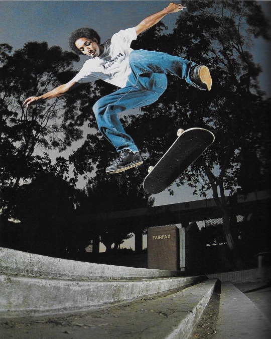
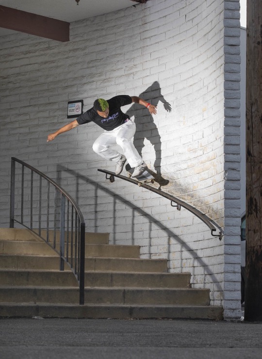
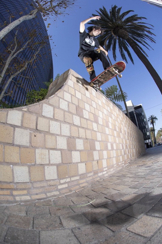
Jefferson primarily works within fashion, skate and sport photography, a lot of which I can take inspiration from for my current project. For the benefit of my own work, it’s worth looking into the equipment/techniques used by himself as well as the composition of his imagery. The majority of his skate work is shot using either a Canon DSLR (flash sync 1/250th) or a Hasselblad, which uses a leaf shutter meaning it will sync to the quickest shutter possible for the lens (1/800th in this case). In skate photography, having the fastest possible shutter is one of the most important variables as it allows you to capture the figure without blur. To compensate for the fast shutter, Atiba will also use a selection of off camera flash sources placed around the subject, often with the idea of exposing solely the subject leaving the backdrop behind slightly underexposed. This technique separating the two, emphasises the sharpness of the figure and brings them away from the setting to highlight the action in place. When shooting in film with the accuracy needed for capturing fast action with flash, he stresses that it’s important to also have the DSLR for test shot purposes due to their ease for experimentation. In terms of lenses, he’ll switch between fish eye’s, which force you to get closer to the subject, and longer distance lenses allowing him to stay clear of the path of the skater. The effect of using a fish eye works best in a setting which will emphasize the warp, and when the subject is closest, it’ll once again do the same. In order to do this, photographers like Jefferson will commonly use low to high angles, which in skating will make the skater seem higher and gaps seem larger.
The pieces of work below were selected for how they display these techniques and traits.
The first, embodies a few of the previously talked about points, as shown, the low angle really exaggerates on the height of the skater and paired with the slight fish eye effect, this is further enhanced. By shooting at night, the fill in technique using the flash is also clearly displayed. Against the black silhouette of the trees, the figure distinctly stands out within the shot as a key focal point, attracting the viewer towards the skater rather than the surrounding.
The next shot takes a completely different approach in the way that its focused towards the setting rather than the skater. Within this I was drawn to the composition in the way that aperture is used to focus in on areas, which cover such a vast distance. The image could be cropped down into certain sections creating a frame of their own, inspiring my idea previously spoken about for my boards.


0 notes
Text
Intuitive Thinking: How to find Purpose for your child

"I want to play with my friends, I hate that shirt, I can do it myself" (Age 6.5 Raina)
In psychology, Erik Erickson spoke about the 'synchronizing of the child's needs and wishes with society's demands. The achievement being a sense of purpose (age 4-7).'
When I worked with Raina I quickly became aware of her ability to see one aspect of a story; how a feeling of dissapointment or a lack of predictability could immediately set her off in a complaint or a dismissing of her parents efforts.
Jean Piaget, showed how a child at this age would see the potential height of a liquid in a jar but not the width - just one aspect at a time. So, how can we support the child to see the whole picture? How to help the child understand her purpose?
Raina, was observed to move with quickness into her interactions with her mother. She rushed to the breakfast table, she spoke before looking around, and she focussed intently at specific details.
For instance, when she woke up she immediately stomped her feet as she rushed to the table and looked at her food with a frown and pushed the plate out of sight. Before her mother could speak, she was already complaining that she had not asked for that plate of food and wouldn't eat it. Lucky for her the food was intended for her father.
The situations and examples continued. In therapy, Raina was given permission to explore her way of moving. She quickly took over the room, and remarked when I, the therapist moved just the slightest way different than her. I supported her to notice these changes and instead of becoming upset - that if she saw a discrepency, I asked if she could purposefully repeat the "error" and make it even bigger. Expanding our arms to the side, or jumping higher, she exaggerated all my "errored movements." She became the judge of the moving time. She had purpose and insight into what was her way and what was mine. She felt she was a part of a bigger project and she intuitively started to anticpate my steps with hers. She decided on her own time, that we could combined the movements together to realize that there was no "wrong way to move" and that she knew I was not intentionally trying to mess up or negate her way (it wasn’t personal) but that we had our unique choices.
We later applied this movement exploration into real life situations. We discussed slowing down to see all the parts and the whole picture before making assumptions or becoming dissapointed.
Raina shared with her mother a new plan for entering situations. She communicated an understanding about how “when someone responds or moves different from her it’s not because there is a problem or threat that she must defend against but rather a beautiful unique opportunity to notice or try.”
Everyday I work with children of all ages and their families to support their development, awareness and connections! For more ways to learn how to embody parenting and support your child through life, Email me at [email protected] or call me at (310) 966-0700 to schedule your time.
Please Note: These stories are based on real moments but all names, ages, and identifying information has been changed to ensure confidentiality and safety for all individuals involved. The events are a composite of related scenarios used to illustrate the work; bringing understanding to the benefits of supporting children through a mind/body connection.
0 notes
Text
Luxury Modern Living In Grey And Gold
Luxury and class exude from every millimetre of this 149 square metre apartment in Saint Petersburg, Russia, designed and visualised by Idol Design. Each room is a detailed composition of high-end pieces, with plush soft furnishings and designer lighting solutions. A sophisticated palette of powder greys and gold elements paint a smooth colour story that runs right through from the modern living area and glossy hallway design, to the decor of two stunning bedrooms and two fabulous marble covered bathrooms. In fact, marble is a main player in every area of the home to really ramp up the level of luxe, whilst introducing freeform pattern to feature walls and floors.
The open and airy luxury living room is a polished ensemble of designer pieces, brought together inside one colour palette with complete finesse. The grey walls and curtains draw powder grey shades down the vertical planes, whilst black anchors cross the baseline of the scheme. A black border encapsules the ceiling space, and a stretch of marble sends a storm of black and white across the back wall.
Behind the refined lounge area lies an elegant kitchen with a dining island. The flooring changes here to mark to transition of purpose, halting light wood chevrons to give way to hardy grey tiles.
To the side of the designer sofa in the lounge, two black and gold accent chairs stand as though in guard of a glass wine store. Black marble travels the width of the TV wall, mirroring the marble backsplash in the kitchen that’s on the opposite side of the room.
A gold unit slices through the seat cushions of the modern sofa, forming a convenient side table and magazine storage nook. Golden hued scatter cushions complement the precious metallic addition.
A glossy hallway runs the length of the living room, defined by its tile floor and stunning lighting solutions that integrate with sleek ceiling recesses and textured wall panels.
Low level lighting stretches along the length of the hall too, making a runway toward a dramatic bust sculpture.
Bespoke storage furniture occupies the opposite end of the hallway to the art exhibit. A seat has been built between the storage cabinet and the wall near the entry door, and it’s here that a tall mirror stretches to the ceiling. Soft lighting exaggerates every line of the custom hallway furniture design, including a small set of recessed display shelves so that the home entryway may be suitably adorned.
Divinely delicate mesh dining pendant lights have an almost supernatural presence over the kitchen island with their translucent quality.
A tinted glass vase makes a simple yet classy table centrepiece, holding dried botanics. The arrangement works beautifully with the natural vein in the marble backsplash behind.
Up on the raised prep area of the kitchen island, a modern fruit bowl set with marble bases add chic and practical decoration.
A chairs for sale online” title=”32 Comfortable Reading Chairs To Help You Get Lost In Your Literary World”>comfortable reading chair and a plant stand furnish the covered balcony area. More indoor plants grow from stone pockets installed up the height of the wall, which include ambient lighting strips.
The other end of the covered balcony is set with a round dining table, and green chairs that match the plant life.
A beautiful teapot has a regular spot in the centre of the marble dining table.
The first luxury bedroom we find is alive with the heavily marbled pattern of an illuminated headboard feature wall. Two designer bedside table lamps adds to the lighting scheme.
Two modern wall sconces brighten the area around a suave swivel chair and side tables.
A glassy TV wall bounces the light.
Every surface and every plane is clad in a different texture and edged with gold.
A dressing table and vanity mirrors descend from the ceiling near the window.
Copper legs cradle a square vanity seat cushion.
The vanity table and mirrors inside the luxury bathroom have a similar connection with the ceiling line.
Copper faucets bring out the base tone in the marble double sink bathroom vanity shelf.
Grey marble engulfs the shower area. Warm illumination spills down the back of it.
The bath tub looks fit for a queen, set into a thick marble slab base, and surrounded by the same.
A grey toilet and bidet set blend with their grey marbled area.
Storage cabinets are built in above the concealed cistern block to give a sleek level finish that is also a wise use of the vertical space available.
The second stunning bedroom sees the introduction of rich maroon, used over an exquisite bed.
The headboard feature wall has a rustic clay texture, but is fronted with smooth glass and golden strips. Wardrobes adjacent to the bed have matching gold edging and decorative plates.
A smoked glass TV mount reflects the unique headboard wall treatment.
Golden touches add panache to the dressing table and vanity mirror.
Despite its size, this small bathroom is maxed out on luxury. Every bit of the same care applied to the design of the larger rooms applies here too.
The unique bathroom sink is a black glass pedestal design, paired with a freestanding tap.
A tall vanity mirror towers to the ceiling. A black toilet balances out the black basin.
Grey marble brings texture to the shower enclosure, which is fitted with a square rainfall showerhead and ambient lighting for a relaxing shower experience.
Recommended Reading:
51 Luxury Living Rooms
51 Luscious Luxury Dining Rooms
51 Luxury Kitchens
51 Luxury Bedrooms
50 Luxury Bathrooms
Luxury Kids’ Room
For more regular updates from Home Designing, join us on Facebook.
If you are reading this through e-mail, please consider forwarding this mail to a few of your friends who are into interior design. Come on, you know who they are!
Related Posts:
Conjuring A Restful Spirit With Luxury Decor
Simple Luxury Interior With Modern Oriental Elegance
Sophisticated Small Scale Luxury With Beautiful Botanical Themed Decor
Magnificent Modern Marble Interior With Metallic Accents
30 Double Height Living Rooms That Add An Air Of Luxury
3 Luxe Home Interiors With White Marble & Gold Accents
0 notes
Text
8 Tips To Master The Art of Architecture Photography
Architecture is art — however, a deception that photographing a building is straightforward can solely lead to lackluster subject field shots. From sloped lines that ought to be straight to finding the correct lightweight, photographing design are often difficult — in spite of your capturing fashionable buildings or older buildings. To make pictures with enough awe to comprise art, subject field photography needs pre-planning, though, and some tried-and-true tricks. Here are some design photography tips to push your photos from snapshots to art buildings.
Pre-plan for the most effective natural lightweight
Light is crucial to each photograph, in any subcategory. In design photography, lightweight will add drama, obscure details or produce adulatory lines. Obtaining the shot means that finding the correct lightweight, whether or not you would like a moody silhouette, a nighttime long exposure or associate degree recent building against a sky-blue sky.
Time of day makes an enormous distinction in however the image is lit — understanding wherever the sun is going to be once you head to the building permits you to decide on the most effective sort of light for the shot. If the sun is behind the building otherwise you have low-light conditions, you’ll either get a silhouette or overexpose the sky. With the sun within the front or towards the aspect, the building is often photographed with associate degree evener exposure and close light. Of course, this directional light needs the sun to be lower within the sky, which implies heading get in the morning or evening, not within the middle of the day.
If you're traveling and have restricted time to photograph the building, realize the building’s orientation therefore you recognize whether or not to go to within the morning or evening. For buildings that you just have longer to explore, attempt visiting throughout entirely different times of day to search out the most effective lightweight.
Explore completely different angles
One of the simplest ways in which to differentiate your design photography from a shot is to prevent taking pictures like everybody else takes pictures — which means that stop defaulting to taking each image from eye level. The peak you're taking associate degree subject field image from matters. Taller heights can facilitate minimize distortion; wanting down on a building will emphasize shapes, whereas wanting up a building will create that structure look even additional dominating.
Along with considering the angle you're taking the shot from, explore all angles of the building similarly. Shop around each aspect, not simply the highly-Instagrammed front of the building. Search for attention-grabbing ceilings, down for inventive staircases and around for any price that embodies the feel of the design.
Look for lines and shapes
Architects understand the importance of lines and shapes — then benefit subject field photographers. Keep a watch out for horizontal, diagonal or vertical lines to maneuver the attention through the image. Leading lines will purpose to a structure to draw attention to the topic. Lines even have emotional associations similarly — diagonal creates a sense of movement, horizontal a way of calm, vertical a way of power or growth. actuate lines aren’t as common in design, however, produce an additional natural feel since these styles of lines are additional usually found in nature than semi-synthetic structures.
Going hand-in-hand with lines, shapes additionally add interest to subject field pictures. Once you notice a form during a structure, use angle, and composition to emphasize that form. For instance, minimize the distractions and fill the frame with the form.
Use a polarizing filter for exterior subject field photography
A polarizing filter is a cheap accent that may create a far larger impact on your pictures than your pocketbook. Polarizer’s management mirrored lightweight, which implies simply dominant reflections off windows or water in design. Even while not the apparent reflective lightweight effects, polarizer’s also will facilitate create the sky seem bluer. Merely keep in mind to require the polarizer off if you ought not to management the mirrored lightweight, notably inside or in the dead of night — these filters can scale back the quantity of natural lightweight returning into your photos.
Keep it sharp — and take a look at a rack
In design photography, detail is crucial — which implies keeping the shot sharp. Use a narrower aperture to stay the main points of the building focused, like f/8 or maybe a better f-stop.
With that narrower aperture, motion blur will begin to cause a retardant (yours, not the building’s, of course). Employing a rack can facilitate keep the shot sharp, particularly once shooting towards the tip of the day or once photographing a building’s lights in the dead of night. A camera lens may also be helpful for your subject field photography, notably if you’re operating with fairly tall buildings.
Don’t forget to go inside
Exterior subject field photography is commonly the primary issue that involves mind once considering a structure, however, a building’s interior offers even as a lot of inventive fodder. publicly buildings or with permission to photograph an enclosed, several similar tips apply. out there lightweight, however, is completely different from interior shots as a result of a combination of window lightweight and overhead lights. HDR or associate degree off-camera flash will facilitate forestall windows from being exposed in interior subject field photography.
Prevent or correct convergence lines.
Optics don’t capture everything precisely the method it exists in the real world. Convergences lines are once a line seems to curve — it’s a perspective distortion that’s usually exaggerated with low-cost lenses. to stop the buildings from wanting like it’s close to tip over, design photographers will either forestall it with tilt-shift lenses or correct the distortion in post-production with Photoshop.
Tilt-shift lenses can save avid design photographers heaps of your time, however, the lenses are price preventative for photographers that simply need to experiment with design whereas traveling. Fixing perspective distortion in Photoshop needs longer, however less investment exploitation the attitude warp tool.
Perfect with post-processing
Photoshop isn’t simply sensible for fixing the perspective distortion. Use the RAW file format and retouch pictures in Lightroom or another image editor for the most effective results. With computer code, correcting white balance is not any drawback. Frequent edits for design photography additionally embody adding distinction, jazzing up the sky, or sewing HDR photos along.
Taking a shot of a building is as simple as birth control a smartphone — however, to really move from a fast shot to art subject field photography, you've got to capture the essence of the building. Which need some pre-planning, the correct lighting, the correct tools, integrative ways, and written material technique?
0 notes
Text
Transformation in art
The theme
An exhibition entitled “Transformation”was held at the Museum of Contemporary Art Tokyo from Oct 29th, 2010 through Jan 30th, 201l.
In September 2012, the National Gallery presented the exhibition ‘Metamorphosis: Titian, 2012’.
In October 2012, All Visual Arts mounted their Autumn show, ‘Metamorphosis: the Transformation of Being’ at The Crypt. One Marylebone Road London.
Metamorphosis is an elusive and multi-layered term. In biology, it relates to a complete material change of form through successive transformative stages in the lifespan of an organism, such as caterpillar to butterfly. In art metamorphosis describes the process by which an object or scene is turned into a work of art. Certain elements are emphasised exaggerated or distorted to communicate the artist’s inner feelings about what he/she feels about what they see.
Metamorphosis also has magical connotations that relate to the inner psychological transformations of being and identity. This is the essence of Ovid’s epic poem in which the interconnectivity of humanity and the natural world is described through mythological and psychological shape-shifting. Ovid was writing in Latin about 8 CE. His ‘Metamorphosis’ is a collection of mythological and legendary stories, many taken from Greek sources, in which transformation (metamorphosis) plays a role. The stories, which are unrelated, are told in chronological order from the creation of the world (the first metamorphosis, of chaos into order) to the death and deification of Julius Caesar (the culminating metamorphosis). It collects together a large number of self-contained stories, including the tales of Daphne and Apollo, Diana and Actaeon, Daedalus and Icarus, Orpheus and Euridice, Achilles, Midas and many more. Through the ages the myth of Daphne and Apollo has had a special appeal to artists. Apollo had made one too many jokes at Eros' expense. To punish him, Eros shot Apollo with one of his golden arrows, which made Apollo fall madly in love with the nymph Daphne. Unfortunately for Apollo, Eros had shot Daphne with a lead arrow, which made her reject the god.
Apollo pursued Daphne and she tried to run away to escape him. Daphne called out to her father, the river god, for help. He changed her into a tree just as Apollo was about to catch her (Fig 1).
Fig 1

The metamorphic exhibitions
The Tokyo museum quoted its exhibition as;
“To live is to change. We change daily as our cells regenerate and we learn new things, as times change and we encounter new environments, and as we give play to our imagination.
Under the theme “transformation,” this exhibition explores the boundary between humans and non-humans. In all ages and countries, countless images and artworks have been created on the theme of transformation. Japan, in particular, is brimming with rich images on this theme, from the legends of old to the manga and anime characters of today. So, why “transformation” now? With to the spread of the Internet, the development of the global economy, advances in technology, and so on, the traditional forms “humans” take have started to become blurred, and a diversity greater than anything seen before has begun to emerge. At this exhibition, a variety of images of things that traverse the human and non-human – including animals, machines, imaginary creatures and bodies with different genetic compositions – will be unveiled through paintings, sculptures, video, archives and symposiums. Together, the “transforming” forms presented express as a single omen our hopes, dreams and fears” (Fig 2).
Fig 2
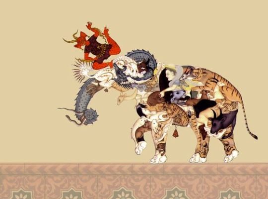
http://azito-art.com/topics/transformation-at-museum-of-contemporary-art-tokyo/
TheTransformation of Being, mounted by All Visual Arts, combined Old & Modern Masters, spanning from Albrecht Dürer to Francis Picabia, juxtaposed with the paintings, drawings and sculptures of an extraordinary collection of international contemporary artists. A selection of the works can be seen at:
http://www.allvisualarts.org/exhibitions/MetamorphosisTheTransformationofBeing/Images.aspx
The theme of the exhibition may be summarised pictorially in the following work (Fig 3). A mystery of metamorphosis is assembled in this picture. Is it the end point of a transformation, a stage in a process by which the woman emerges into the foreground or is it a snapshot of her being converted into the amorphous dark biomorphic substance looming behind her?
Fig 3
The exhibition in the National Gallery was created in collaboration with the Royal Opera House. It refers to three paintings by Titian depicting stories from Ovid’s poem. Diana and Callisto shows Diana casting out the pregnant nymph Callisto from her company. Diana and Actaeon depicts the young Actaeon out hunting and stumbling into a sacred grotto where Diana and her nymphs are bathing; and in The Death of Actaeon, we see the goddess exacting vengeance on the intruder by turning him into a stag to be torn to pieces by his own hounds.These works were the catalyst for an ambitious project involving the production of three new ballets inspired by the paintings. The costumes and sets were designed by contemporary artists – Mark Wallinger, Conrad Shawcross and Chris Ofili – who showed their designs alongside other work produced in response to Titian’s masterpieces.
Ofili chose to go to the source for inspiration. In Ovid’s epic poem, he discovered a magical realm full of passion and desire, which he conjures with psychedelic rivers of vivid colour and peopled with mythic beings such as nymphs and goddesses, stags and soothsayers. The compositional echoes are not of Titian so much as Gauguin, Picasso and Matisse, and of Japanese prints and Aubrey Beardsley’s erotica. Ofili uses these borrowings to make a unique magical brew which reveal their secrets to the viewer slowly because you sense the artist is exploring new ideas and developing new ways of working.
One of Ofili’s paintings, Ovid-Desire (Fig 4), depicts a process of multiple transformation involving a couple dancing; he wears a spangled suit, she is half naked in a dress layered with flesh pink flounces dusted with a sheen of silver. The floor, is a shifting stage patterned with emphatic diamonds, leading up to a turquoise wall and a window looking onto an Edenic landscape where naked women (Diana and her nymphs, perhaps) cavort beneath a crescent moon.
Fig 4
https://www.theartsdesk.com/visual-arts/metamorphosis-titian-2012-national-gallery
This painting highlights the aim of transformation in works of art which is to blend several pictures reaĺ or in the mind into one.
Surrealist abstraction
The procedure whereby two or more pictures are combined into one has been called surrealist abstraction. This process of fusion is illustrated in Figs 4-6. It involves ‘photoshopping’ two pictures (Figs 5 & 6), transforming them, with the help of Topaz Labs filters, into a third (Fig 7).
Fig 5

Fig 6

Fig 7

The third picture is semiabstract and has a life and meaning of its own within the viewer’s innerness. It embeds Adam and Eve’s expulsion from The Garden of Eden into our present society where the purpose of a supermarket economy is to maximize consumption. It references the Christian Bible, Genesis 2:15, which explains God’s purpose for how humankind should use Earth’s resources in ways that preserve them. The biblical reasons for stewardship are reinforced and continued from there in many ways throughout the scriptures. They imply good stewardship that avoids the devastation and loss of soil fertility that occurs in much agriculture today. However, there is no doubt that persuasive and influential misinterpretation of Christian doctrine has led to environmental destruction and lack of respect for nature.
In this transformation the representations of two material features of ‘outerness’ are metamorphosed into one representation of ‘innerness’.
Innerness and outerness
According to Ralph Rowbottam, outerness is what can be objectively observed, inspected, weighed, measured, cut into. Thus, the stone carving of The Expulsion and the display of a variety of edible plant products, express outerness. As regards ourselves , outerness includes our skin, bones, hearts, brains and so forth. Innerness is our subjectivity, whatever we feel, think, imagine: our experience, our consciousness, our inner landscape. Every human being has these two sides. So presumably do animals. Rowbottam says that perhaps even plants or stones have some sort of innerness, though infinitesimal in development compared to our own.
The transformation has produced a semi abstract image that is far richer in content and open to many avenues of interpretation.
Abstraction through transformation departs from the evaluation of a picture through its outer objectivity. This departure from accurate representation can be only slight, or it can be partial, or it can be complete. Abstraction exists along a continuum but always evokes an inner subjective response. In this context, transformation does not attempt to represent an accurate depiction of a visual reality but instead relies on shapes, colours, forms and gestural marks to achieve its effect.
Music is an abstract creation. Beethoven described his innerness when creating a new work. “....In my head, I begin to elaborate the work in its breadth, its narrowness, its height, and its depth, and as I am aware of what I want to do, the underlying idea never deserts me. It rides, it grows up. I hear and see the image in front of me from every angle, as if it had been cast…”
How does a listener or a viewer come to an understanding of an abstract work of art? As was said by a person viewing a Rembrandt, “although the image clearly makes sense as a whole, what sense it makes cannot be easily decided”. Maybe the mental process involved in trying to make sense of an abstract painting follows a kind of reverse of Beethoven’s creative pathway by first discerning significant shapes and forms in the mind which are then retrofitted to create an underlying personal idea that enhances a person’s innerness..
Both the gallery and the artwork function as interfaces to the larger systems of meanings, values, and social relations that make pictorial systems possible and interpretable. Members of communities and cultures that visit an art exhibit without prior knowledge of the style or period can be left without information that will lead to connecting the dots of interpretation. In this context the story attached to Fig 6 is only readable because the viewer is given access to the two images that were fused to make it. With no information about the elements of outerness that were fused to produce Fig 8 the viewer has to fully accept the fact that they are working outside the realm of answers and explanations. What is actually seen is in the mind of the beholder. Evaluation comes down to answering the question : would you like to see it in your house everyday?
As always, Picasso has the last word.
“Everyone wants to understand abstract art. Why not try to understand the song of a bird? …people who try to explain pictures are usually barking up the wrong tree.”
Fig 8

Go to Zygeena’s Pinterest Board to see a growing gallery of digital transformations.
https://pin.it/wze23swivsibns
Go to a Google Doc version of this blog
https://docs.google.com/document/d/1u8se74Rx2-PU7dlp9h6t0i_77XAwChGKHp0vfDDxHkg/edit?usp=sharing
0 notes
Text
sabertoothwalrus replied to your photoset “i was really trying to enjoy the ep because it was cute but. oh my...”
I always figured they exaggerated the heights for wide shots/composition purposes
I’m no animator so you probably know more about this stuff than me, but just seems odd when it’s not even a different “shot”, just a different frame, yk? every single one and in shots where it’s not needed. there are a lot of shots where connie n steven are the same height for no reason, but hey ¯\_(ツ)_/¯
#sabertoothwalrus#as long as it doesn't bother you that means you can enjoy watching more so thats good
0 notes
Link
Jason: As someone who loves to light, I am excited by this new tech and look forward to seeing it evolve over the next year or so. Not having spent a significant amount of time in this limits first hand experience, but the small amount thus far is encouraging. With any new software, tech or approach comes the learning curve. This is accompanied by a rigid physically based boundary that can be hard to break out of when trying to explore.
The long term challenge: Can we use that perfect scanned data simply as a base and springboard to a variant of that texture, while still maintaining all the physical based accuracy and detail from the scan? On top of all that...can we get the varied look that our games need?
- Twitter user Ara Carrasco asked:
What's the most important aspect of art direction for you?good lighting, good modelling & texturing...?
Jason: Practically speaking, I usually say lighting as it can alter the mood/tone of a scene with a simple dawning of the light. Theoretically speaking, I would say tonal cohesion between what the game/film/movie is trying to represent with what the art is trying to communicate.
Andrew: I'd have to say that it's the name for me. "Direction". I really like the word. I think we forget what it means sometimes behind the semantics of a job description, but directing for me is about asking the right questions rather the giving the right answers. I'm constantly amazed by how inventively creative people can solve a problem that you put in front of them. And as long as you are providing them with the right bounds and goals you get something that evolves way beyond what you could have initially anticipated. Power amplification is the name of the game. It sure is a lot of work to prevent things from going in diametrically opposite directions but to me it feels like if the artists have the room to roam within the bounds of the fictional worlds that they are creating the vision and direction get amplified tenfold providing for really rich and exciting experiences.
Greg: I would have to say that the most important part of Art Direction is the presentation. Establishing where the camera is and how the game is going to be experienced by the player is paramount to me. This is where the picture as a whole comes into focus. It allows you to concept and design elements at an appropriate detail level. In a lot of ways figuring out the presentation gives you the edges of your canvas. It is the boundary that you create the picture in. From there everything else flows.
Brian: Answer: I always start with the big picture, for environments it's Composition, Lighting, Motion and Context (What is the story of the environment) For characters, Silhouette and Motion.
Denis: That's a tough one there is so much to it. If I'd had to pick, I probably go with good communication and keeping your team motivated. Communication is key to optimize and limit iteration cycles. For that to happen it has to be a two sided dialogue, so you as AD can take in feedback and act according to it. For me personally the artistic decision making often happens during discussions with my team and I just make sure I follow through with it and keep people on track.
Motivation is essential for me because it keeps the team engaged and they will push for the best possible result, sometimes way beyond what was initially asked of them.
Both of these points in the end have direct impact on productivity, quality and efficiency - hey I'm German after all ;P
- Twitter user Evan asked:
How do you balance advanced and detail visuals supported by modern consoles with practical design that supports gameplay? As in, keep clear indicators for the players while looking natural and not contrived for gameplay purposes at the same time?
Brian: It's always a conversation about goals. On Tomb Raider we always tried to create believable worlds that the player instinctivly understood what was interactive or where they were supposed to go. We use "Visual Language" to help guide the player with consistent visual cues. We mark climbable ledges with white paint, rope coils are always used to indicate where a rope arrow can go, bright pocked walls indicated axe climb surfaces and specifically cracked walls indicated places you could open with your axe. We protect these patterns in the game so the player always knows how to interact when these examples of visual language show up in the game.
Greg: In a game like XCOM there are many design requirements that effect the art. It is beneficial to try and identify what needs to be communicated by design early so that visual opportunities are more easily identified. Being a turned based game can be seen as a huge challenge to immersion, but we saw this as one of our opportunities. The camera in XCOM is a great example of this since it can literally be anywhere while you are playing. By changing the camera we can reinforce the design mechanics and provide a tension that is difficult to convey from a more three quarter view. However, the camera changes also provide some real art challenges. We needed to make assets that read clearly from the top down view as well as in a close up cinematic camera. This led us to the initial art direction of XCOM: Enemy Unknown that focused on a “miniatures” look with slightly exaggerated forms and more chunky geometry. We didn’t want have the details be so small for the close up cameras that they would dance or shimmer from the default gameplay camera. On the flip side we couldn’t make things so chunky that they destroyed the immersion when the camera dropped down. We spent a lot of time initially balancing these issues and setting very clear modeling and texturing rules.
Andrew: Design dependencies are always a tricky subject. Confused or frustrated players can't enjoy the game so keeping them happy and their goals clear is a big part of art production. For us it's a constant back and forth. At the very beginning of a project we would iterate with design on gameplay relevant art elements to make sure we can produce art around it that integrates with it nicely. We always want to make sure not to muddy up our language. Exceptions are dangerous and confusing to the player. False positives are also a thing we have to look out for a lot especially in games like Uncharted where it's so easy to create a traversible path somewhere we don't actually want the players to go.
Sounds trivial but it's also incredibly valuable to have artists constantly play their levels. It's something that's easy to loose sight of in the heat of production.
And if all else fails it's time to break out the bird poop and yellow paint ;)
- Twitter user Will T Atkers asked:
About how long does it take for a main character to go from concept to final phase?
Andrew: Depends. I'm a strong proponent of getting something in the game as soon as possible, no matter how rough. But from then till someone rips the gold master from out of your sweaty sleep deprived hands it's continuous iteration and polish all the way. It's one of those art is never finished answers. It's important to note that it's easy to reach diminishing returns when you iterate for a very long time. And it's on you to plan and prioritize accordingly. The Pareto principle is a good example of how it usually breaks down: 80% of the work usually takes 20% of the time and the last 20% take the other 80% of time. The last percent come painfully slow, but they also provide most opportunity to grow. Taking something from 0 to 80% awesome is a relatively common skill, but the difference of 1% between 97% and 98% is almost infinitely more valuable. It is literally the "cutting edge" and sometimes takes weeks or months of work to get to.
Jason: In truth, I’ll say about 1 year. This is strictly for a front and center character like Delsin. I’ll try to break it down…
First is creative direction needs. What is the purpose of this character? What kind of attitude will they be exhibiting in the game? What kind of arc will this person have? Do they have a disarming or aggressive sensibility? All of these conversations happen before we throw down any concept art.
Next we hit up concept and begin to sketch things out. Essentially, this process is fairly iterative with our creative direction team until we’re all in a good spot. One unique thing here I have experienced has been a found footage video concept or ‘personality rip-o-matic’.
Then a fork happens.
On one road, the character team takes this into pre-production to build an in-game proxy model. The goal is to check movement, scale, and begin to work out the sass of the character through prelim animations. How do they run? How do they jump? What does this person do when in idle? What does the shape at a low poly look/feel like?
On the other road, we begin CASTING. Since we use scans and full performance capture, this is very important process to our hero character model pipeline. The creative direction team creates a character description (2 page max) document of our hero. This usually entails basic details like sex, height, weight, and age. Then the remainder of the document explains this person’s motivations, goals, flaws, potential arcs, and habits. Then we audition a ton of people in hopes that we find someone that can not only bring out the attitude we’re hoping to get, but also have a likeness that is in-line with our visual goals. In the case of Delsin, Troy Baker fit the bill nicely.
After we cast an actor, we begin the scanning process. Full body and facial expressions are scanned and sent back to our team. Our concept and character team will work with the body scan to make any edits that are needed to fit our hero; shorter, taller, thicker, etc. We take these measurements and send them to a fashion designer who makes patterns to use in Marvelous Designer. Now these two roads have largely converged and we’re onto the next steps.
From here its fairly straight forward. We create hi-poly models of our character based off concept art, bake down and replace our temp PROXY model. Then comes quality bar iteration through various scenarios. In the past we have 2 scenarios that drive the biggest feedback.
First, the in-game model must be awesome. Since inFAMOUS is a third person action game, the in-game model matters the most. Seeing them running around in the game world with good lighting performing polished versions of those proxy model animations usually highlights a few issues. Sometimes we can’t see them at night so we add better shape or increase value. Sometimes it’s simply “Delsin isn’t punk enough”, and we add some shiny flare on his vest.
Second, cutscenes will bring the personalities to life. Often cutscenes drive the high end quality bar for us. Unfortunately, cutscenes take a while to make and usually come fairly late in the game. This is where we iterate on our character specific tech like eyes, skin shading, clothes and hair.
In short, it’s a lengthy process for Hero characters. I wouldn’t be lying if I said a year… We spend a lot of time ensuring our main character is tonally sound in the marriage between Art Direction and Creative Direction. For a second tier character we are looking at 2 or so months.
Brian: Depending on the character, it varies. Heroes usually take longer. Lara took a full year to develop for Tomb Raider 2013 because we were reinventing her. Generally for principal cast models, we spend 2-4 weeks in concept development, hand sculpted realistic characters take 2+ months (High poly, Low Poly bake, textures/materials/shaders) Blend shapes for facial animation and rigging takes another month. Total time 4 months. Secondary characters usually are created faster, 2 months from concept to finish. Scanning will change these metrics, but a lot more time is spent on preparation like casting, wardrobe, scanning, processing so a fully realistic character scan can get in game in about a month, but if you scan a bunch of bodies and heads at one time, the process is much faster.
Greg: The time that it takes to go from concept to final model depends on several factors. By working with concept and design the complexity of the character gets defined and the amount of articulation can impact the timeline for production significantly. Depending on how important of a role the character has will also dictate the time spent in concept. For us we typically can take about two weeks in concept for one of our aliens in XCOM, but that can really vary and it will stay in concept until we are happy with the direction. The modeling for something like an alien can take around 4 weeks on average. With procedural characters, like the soldiers in XCOM it is much more difficult to quantify the time. A lot of effort is put into developing the systems and how all the parts interact, as well as planning for armor upgrades and customization options. This is really a huge task and quite a bit different from a character that is more self-contained. Pipelines are also much less linear than just going from concept to model and there is a ton of overlap now. We typically have the modeler, animation and rigging team involved during the finalization of the concept. All of these disciplines are able to give input before we go into real production of a final character. Once we are happy at the concept level the model is blocked in and goes to rigging and animation. Feedback is compiled and applied to the model at this stage. The major point for us is that the model isn’t finished until it is in the game and moving.
- Twitter user Travis asked:
What can you do to keep a cohesive art direction between world assets and FX?
Denis: All my projects so far have been stylized and We went through heavy iteration to find the right style. One initials setups we did on my last project was a small art ready diorama. We made several versions of VFX to see how they'd fit. We also concepted some of the VFX which was helpful. But because of the abstract nature of effects I still consider them the hardest to iterate on. In the end it boiled down to try and error for us.
Combat FVX are a Beast of its own. They have a lot of requirements like damagetype, area of effect, faction/monster affiliation and on top it has to resonate really well with combat design, sound and animation.
Having so many pieces that have to collaborate on VFX you have to make sure that everyone knows what the goal is and where we are aiming artistically. Since constantly supervising this process is something you cant afford in production.
Greg: I don’t see these as separate things. The overall rules for the look of the game directly apply to the effects just like any other element in the game. Just like a prop in the environment, effects need to be developed in context and not in isolation. Any effect is an extension of the thing it is attached to, whether it enhances the environment or a character’s ability.
Brian: I always think of them together, FX and Lighting will make every environment come to life. It's important to ensure FX only dominate a location when they are the star, like being in a level that is on fire, or flooded, etc. But always ensure the style of FX matches the Art Direction of the Environment. Zelda is my favorite example of stylized FX that match and enhance the Art Direction.
Andrew: Agreed with the gents that this issue is not specific to FX. Maintaining vision and boundaries is crucial with any aspect of art direction. And encouraging people and departments to communicate and collaborate is the timeless challenge of any production. Getting people in the same room to talk and removing middlemen is always the best remedy in my experience.
Technically there are issues with having particles look integrated and leveraging environment data is always a big help. Making sure particles light consistently and accurately under environment lighting and don't need any shader hackery is a big one. Using environment data like surface color or material for the types of squibs or fx to play also add a lot to tying it all together. There are cool geo-based particle approaches coming up so having them integrate with the world should become even easier.
0 notes
Last Seen Blogs

calling-all-gladers
Smiles of reassurance and waiting for your king

muys1970
Naamloos

etfanotebook-blog
İsimsiz

nikita-chkhaberidzeub27e-blog
Без названия

cgyasinsafak
CG Yasin Şafak