#fontdesign
Text


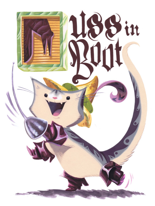
A while back I was into doing paintings that also included text. Normally I don’t like to handwrite fonts, but if it’s meant to look like something organic, like wood then it’s less intimidating for me to draw. So here's some Fantastic Mr Fox, Angry Beavers and Puss in Boots!
#fantastic mr fox#puss in boots#angry beavers#illustration#fontdesign#painting#gouache#traditional painting
486 notes
·
View notes
Text
Achievement unlocked: I created my first collection of 12 handmade custom fonts!
Backstory: I’m in desperate need of replacing my 9 year old computer and am offering these as donate-what-you-want for a limited time.
You can get them here: https://mannypdesign.gumroad.com
Thanks to those who've already bought fonts. Every bit helps! ❤️

774 notes
·
View notes
Text

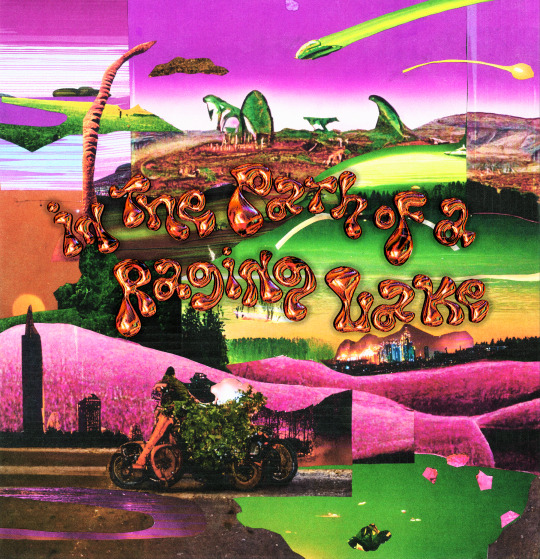
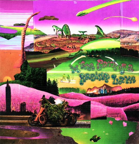


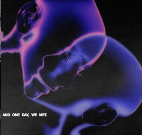
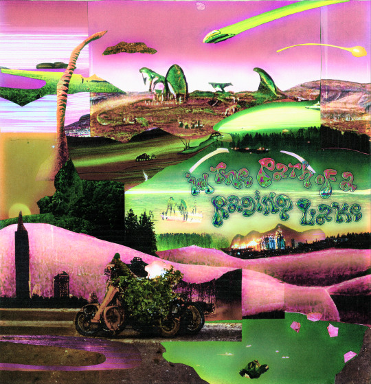
InThePathofARagingLake is a dance/techno album I released this year. It's inspired by my musical influences growing up in black church and dance music made by people like janet Jackson and Prince. Itpoarl also has themes of dungeon synth.
#technomusic#technocore#hard techno#dungeoncore#dungeon synth#dark techno#ai illustration#ai artwork#ai#graphic design#fontdesign#black music#blackdance#club music#Bandcamp
23 notes
·
View notes
Text
#soerenbaptism#soeren baptism#illustration#drawing#typography#illustrator#softgrunge#oddcore#upload#weirdcore#ventcore#diary#witchblr#typo#dank memes#memes#Font#fontdesign#handzeichnung#handwriting#hand writing#uploads#y2k#grunge#pale grunge#pastelgoth#pastelgrunge#softgoth#soft aesthetic#soft grunge
99 notes
·
View notes
Text


A brief excerpt of the main character in my upcoming novel COLOR OF A MIRROR.
Now on Kickstarter. Check it out below!
#abstractart#modernart#minimalism#minimalart#geometric#graphicdesign#layoutdesign#cyberpunk#darksciencefiction#scifinovel#futuristic#darkfuture#originalwriting#main character#novelwriting#sciencefictionauthor#typography#fontdesign#brutalism#brutalistdesign#adobeillustrator#digitaldesign
57 notes
·
View notes
Text
A⃨l⃨g⃨u⃨m⃨a⃨s⃨ r⃨e⃨c⃨o⃨m⃨e⃨n⃨d⃨a⃨ç⃨õ⃨e⃨s⃨ d⃨e⃨ b⃨i⃨o⃨ p⃨r⃨a⃨ v⃨c⃨s⃨❤️⃨🇧🇷⃨
:¨·.·¨:
`·. ⪼ 𝔉𝔢𝔯𝔫𝔞𝔫𝔡𝔞˚✶ ⋆
﹒ ℭ𝔲𝔦𝔞𝔟𝔞́/𝔐𝔗
﹒ 𝟏𝟓/𝟎𝟑
﹒ 🌊 ੈ₊˚༅༴{🧿}⿻‧₊꒰‧⁺◌༘🪡₊﹆
꒦꒷꒦꒷꒦꒷꒦꒷꒦꒷꒦꒷꒦꒷꒦꒷꒦꒷꒦꒷꒦꒷꒦꒷꒦
🥀⪼ 𝔉𝔢𝔯𝔫𝔞𝔫𝔡𝔞 𝐕𝔢𝔫𝔡𝔯𝔞𝔪𝔦𝔫𝔦˚✶ ⋆
﹒ ℭ𝔲𝔦𝔞𝔟𝔞́/𝔐𝔗
﹒~🍣 ੈ₊˚༅༴{🍓}⿻‧₊꒰‧⁺◌༘🍄₊﹆
❝𝘓𝘢𝘵𝘪𝘯𝘢 𝘢𝘮𝘦𝘳𝘪𝘤𝘢𝘯𝘢 𝘢𝘵𝘦 𝘰 𝘵𝘢𝘮𝘱𝘰 𝘦𝘶 𝘴𝘰𝘶❞~𝙵𝚒 𝙱𝚊𝚛𝚛𝚎𝚝𝚘
ᡕᠵ᠊ᡃ່࡚ࠢ⸝່ࠡࠣ᠊߯᠆ࠣ࠘ᡁࠣ࠘᠊᠊ࠢ࠘𐡏︔︉ 𓆩 ♡ 𓆪﹒[ 𝔉𝔢𝔯 ]
❱❱︔︉☕﹒[ ] ﹐▦
ᡕᠵ᠊ᡃ່࡚ࠢ⸝່ࠡࠣ᠊߯᠆ࠣ࠘ᡁࠣ࠘᠊᠊ࠢ࠘𐡏 ⋆ ࣪.* ࣪.⋆ ʚ ĭ ɞ . ゚。 ₍ 𓆩 ♡ 𓆪 ₎ 。゚.
~🍣 ੈ₊˚༅༴{🍓}⿻‧₊꒰‧⁺◌༘🍄₊﹆
#instagram#descrição#biografia#fontes#fontdesign#biopic#simbolos#softcore#soft bios#dark bios#brasil#brazil#braziers
131 notes
·
View notes
Text
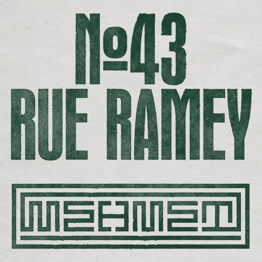
Logo design and art direction for Mehmet restaurant in Paris by Studio Jimbo 2023.
#studio jimbo#jimbo barbu#paris#graphic design#typography#studiojimbo#art direction#type#poster#design#design graphique#brandinspiration#branding#typo#typeface#typedesign#typelove#font#fontdesign#print
21 notes
·
View notes
Text
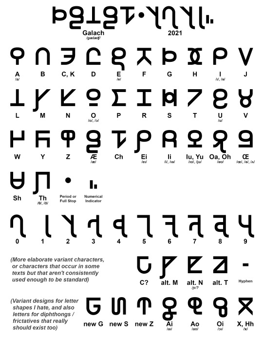
Galach Script interpreted from material shown in Dune (2021).
Over the past year in my free time I've been trying to make a simple fixed-width block letter font for the Galach script that's used in Denis Villeneuve's Dune 2021 adaption (or Dune: Part 1, as it's most likely gonna be called after the second part comes out).
Now, I didn't decode Galach– a lot of other people did independently. All the stuff in the movie is written in quasi-phonetic English (you can tell the accent of the people who wrote given segments because of it), though we have some very sparse bits of untranslated Galach in the books. It's described as descending from a anglo-slavic hybrid language, which is a very... Cold War-era anticipation of a future Lingua Franca twenty thousand years in the future. If Frank Herbert wrote it today, his 'anticipation' of Galach would probably use different root language families.
The basic structure of most letters are the same as in the movie texts. I like their weird dream-writing similarities to the Roman and Cyrilic alphabets as well as Ge'ez script, which is an absolutely beautiful abugida, and there's a vague level of featural-script level similarities between similar letters (particularly all vowels, and to a lesser extent plosives). There are a few letters in the uncial script that also look very similar (particularly the vowels and P, K, and R) and I took the liberty of adapting them from that (let's say formal) movie font into something with more distinguished letters when simplifying them to their shapes here. And I also changed the numerical system: it's not exactly as clean-cut a subdivided base 5 pattern in the movie's system as it is in this one. But hey, who's counting?
This font's called Poritrin Bold and it works, but there's a lot of snags in terms of which version I want to give to the fandom community. The first is that it's a 32-character alphabet for what's normally a 26-letter QWERTY keyboard– which shortcuts do I use? Can I just get away with enabling ligatures, when Office and most other app groups don't really support them? Do I also create a thin-letter and italicize-able version of Poritrin? Why is my brain making a clicking noise?
And that's not even addressing the issue of whether I should add those extra characters I suggested into the font, or add those replacement ones I designed. Lots of questions with arbitrary answers.
I'm all ears for suggestions!
#dune#dune part one#dune 2021#dune fandom#fontdesign#type#typeface#script font#galach#galach script#my art#“baradit nehiidit beed gwarp tau nubukt” sure thing frank that sounds like a universal language
31 notes
·
View notes
Photo
WIN the 25% discount code, play the quiz on the microsite! Link in bio. #displaay #typeface #jokker #type #typography #typedesign #typeinuse #fontinuse #font #fontdesign #graphic #design #graphicdesign #designfeed #best #sans #typefacespecimen #thedailytype (at Las Vegas) https://www.instagram.com/p/CovCJUFrx2e/?igshid=NGJjMDIxMWI=
#displaay#typeface#jokker#type#typography#typedesign#typeinuse#fontinuse#font#fontdesign#graphic#design#graphicdesign#designfeed#best#sans#typefacespecimen#thedailytype
18 notes
·
View notes
Photo

#Typography#fontdesign#best fonts#font art#font#layout#magazine layout#graphic designer#graphic design#design#designer#font design#words#punk#glam punk#fashion magazine#artwork#designforeveryone#typografia#typografie#typoart#typogram#art design#designstudio#designstyle
24 notes
·
View notes
Text
So I’ve done a thing-
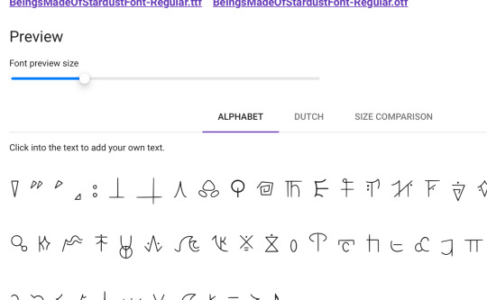
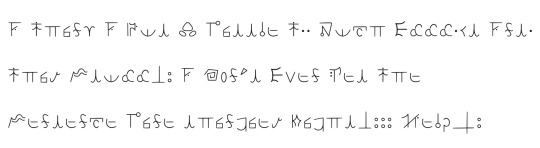
I might’ve accidentally made @maudiemoods beings made of stardust font…
Does it look good so far? Idk how to get the line thingies at the end of the sentence to go underneath so this is what I’ve got so far- should I change some stuff? What do y’all think?
21 notes
·
View notes
Text

+7 new letters
5 notes
·
View notes
Photo

@thebault_julien #packaging #packagingdesign #package #foodpackaging #coffee #illustration #typo #type #typer #typeface #typefacedesign #font #fontdesign #logo #logodesigner #logodesigns #logotype #logoinspirations #logoinspiration #icon #branding #brandidentity #graphic Typographie : @polytypefoundry - gela typeface Illustration : @pierrepoux https://www.instagram.com/p/ClaWex8StaQ/?igshid=NGJjMDIxMWI=
#packaging#packagingdesign#package#foodpackaging#coffee#illustration#typo#type#typer#typeface#typefacedesign#font#fontdesign#logo#logodesigner#logodesigns#logotype#logoinspirations#logoinspiration#icon#branding#brandidentity#graphic
16 notes
·
View notes
Text


Category is, album art.
#blackdance#graphic design#technocore#technomusic#black music#queer artist#marbcore#ai artwork#fontdesign#blender d dart art render digitalart dmodeling blendercommunity animation design cgi dmodel dartist cinema rendering drender blenderrender d#cgi render#dungeon synth#dungeoncore
13 notes
·
View notes
Text
#graphic design#design#visualdesign#kai angel#9mice#poster design#poster art#poster#typography#type#fontdesign
7 notes
·
View notes
Text


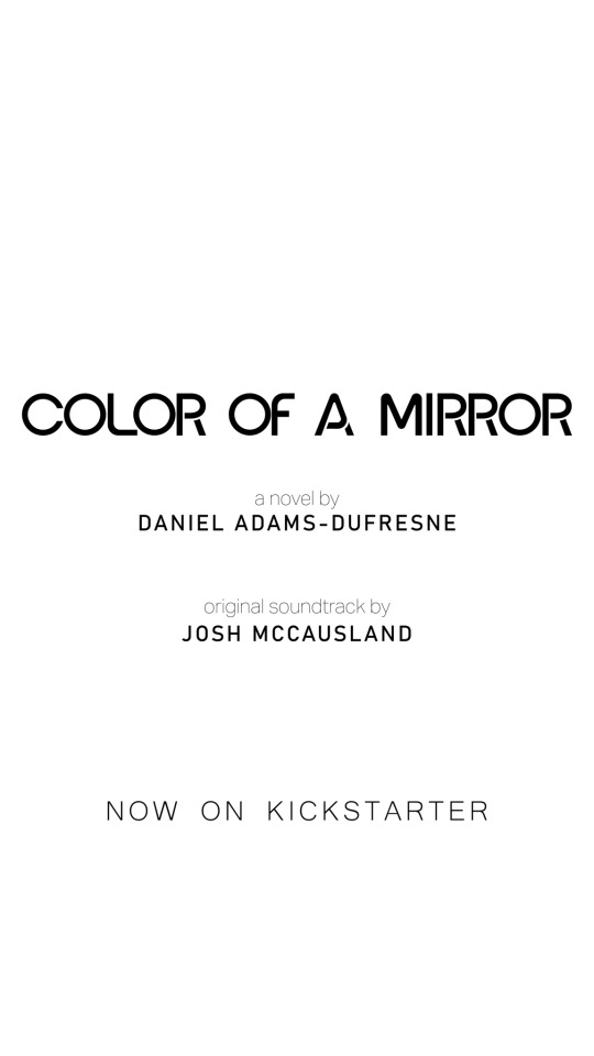
Back to taking about the book!
Check it out below:
kickstarter
#minimalism#minimalart#graphicdesign#layoutdesign#typography#fontdesign#darksciencefiction#cyberpunk#darkscifinovel#futuristic#sciencefictionauthor#brutalism#brutalistdesign#darkfuture#novelwriting#kickstarter#mentalhealth#ambientsoundtrack#moody#stylish
27 notes
·
View notes
Last Seen Blogs

roseaterougerues
La Vie En Rose

ratdriven-blog
ʳᵃᵗ ᵏᶤᶰᵍ! ( ap! )

thehelplessskeptic
Papers.Fruit.Fart

inspires-more-or-less
ACREDITAR É O INGREDIENTE MAIS IMPORTANTE NO SEU PROCESSO

kierkegarden
weren't we like a pair of thieves