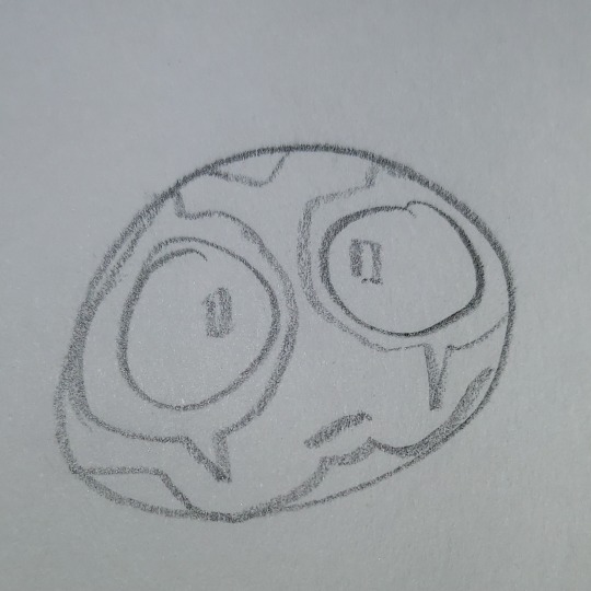
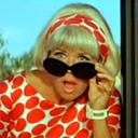
#had to change out a few of the colors and simplify the design because like. look. this is alot already ok. no way im making this harder
Text
A bunch of smaller/miscellaneous NiGHTS findings using the Free Look Camera under the read more

(Sorry if this is kind of disorganized— it was originally a thread on Twitter lol, also this might be part 1 of these because I forgot there’s a photo limit here lol)

The doors in the Dream Gate have little lions on them— kind of hard to see with the game’s usual quality lol


Bomamba’s boss area has some hidden cats that are hard to see normally. There are also fish bones on the ground 😟

The buildings in Bella’s boss area have eyes on them (???)

Chamelan’s boss area— not as interesting as I had hoped but still looks kinda cool from above

This sign in the background of Delight City seems to show some very very simplified pictures of NiGHTS and Reala along with Nightopians

Before the Nightopians appear in this cutscene, they bunch together off camera

If you zoom out during a loading screen, you can see that the regular purple void is contained inside of a larger black void

When NiGHTS gets a key, their hand doesn’t change to show them holding it. Instead it just pokes through their hand (FIRMLY GRASP IT)


Reala’s eyelids are black in cutscenes, but turn blue during his battles or in 2P mode


Most of Lost Park’s rides are very detailed, but you usually can’t see them through the clouds. You can also see inside the blimps for some reason
Also the roller coaster starts violently spinning after a few laps on the track

The 2P race mode has this cool color-changing Ideya icon (orange, purple, and pink Ideya confirmed 👀)

Not a camera thing but still kind of interesting: like the bosses, the enemies also have different file names. Most just state the animal the Nightmaren is based on, but there isn’t a bat enemy in the game, and its files correspond to attacks and features of the moth Nightmaren. Might be a remnant of an earlier idea?

Speaking of bats, the pattern on the train carts in Lost Park kind of look like bats… but the faces remind me of mandrills 😟 bat monkey Nightmaren confirmed

Also a Goodle jumpscare

When NiGHTS takes off their Persona in the intro cutscene for Crystal Castle, they remove it so hard that it goes underground twice

(Sorry this photo is really small) The glass patterns on the windows are probably just random but this one kind of looks like Jackle a little?

You can also mess with the camera to the point their eyelashes fall off :(


Icons from 2P battle mode (also used in JoD’s display at TGS 2007, with what might be a slightly earlier design)
And finally spinning 🫵 That’s all for now lol
#nights into dreams#nights journey of dreams#nights camera#mostly posting this so i can finally delete all these pictures
40 notes
·
View notes
Note
Pokemon review: Pinsir
(I don't have any Pokemon review requests right now and I actually think we're getting close to reviewing all of them, so here's one that hasn't been done yet.)

No Japanese game inspired by bug collecting and Japanese beetle fighting would be complete without a stag beetle Pokemon. Pinsir here delivers in a pretty interesting way—its counterpart Heracross is still reasonably bug-like with some monster attributes, but Pinsir is the exact opposite, being more of a monster with some bug attributes.

Having a bipedal stance, it only has four limbs—two freakishly long forelimbs and two incredibly stubby legs. The body is just an oval with a few segmented lines (the segments not resembling those of an actual beetle, if anyone was wondering), and it has this really cool gaping mouth full of horizontal teeth, as opposed to standard beetle mouth parts or the more traditional Pokemon way of giving bugs regular human-ish mouths. The horns are white in contrast with the brown body, and are covered in little "thorns", kind of a nod to how stag beetles have spikes along the inside of their mandibles.
Overall, it's a pretty neat design and I like how unique of a monster design it is. Sure, it doesn't really have a concept beyond just being a stag beetle, but the unique design really helps it to stand out. My only issues with it are that I wish the horns were even more oversized, but to be fair Gen 1 did have sprite size limitations. I also kind of wish it was just a little more colorful—stag beetles come in beautiful colors, like black and the maroon one above, so something a smidge higher contrast would've been nice, especially because there's so much brown in Gen 1.

While mega Pinsir exaggerates the horns slightly, making them longer and extending the spikes on them, it mostly adds a pair of wings. This might seem a little random relative to the horns for those who don't know what it's based off of, but actual stag beetles do in fact have wings, and given that there's only so much that can be done with the horns I think this is a logical enough direction. And look how happy it is about it!

Visually, the body makes a few adjustments that I really like. The lines on the body now match the eye shape, which feels much more natural and fills the space around the head. The mouth shape has changed subtly, and the eyes have been changed from the generic Gen 1 triangle eyes to a really cool ringed design that matches the body segments and a yellow color to match its new wings. The feet claws now face downwards (for grabbing things) and I really like the way the horn spikes are both longer and less erratic in terms of placement. The only arbitrary change is the fins on the arms, but they don't hurt anything. Great stuff here.

The wings themselves add some much needed color to the design, and are a good bug-like shape. I will say though that I think they're just a little too detailed considering how busy the body is. The random spikes go through the elytra, raising the question of how it closes its wings (I guess it doesn't necessarily need to as this is a battle-only form, but still), and the veins are hard to make out under the arms. I think the spikes could've just been dropped, and the veins greatly simplified.
Something about the wings also feel ever-so-slightly disconnected from the rest of the body—I think it's just because they're so colorful compared to the rest of it. I kind of wish the horns had just a bit of orange or yellow at the tips just so the color could be pulled through somewhere that isn't the eyes, and I also think a deeper, richer brown for the body would've accented the orange color better. However, as a whole, this design's pretty decent.

Overall, Pinsir has a pretty unique monster design that gives it a lot of flavor. Mega Pinsir improves on Pinsir's basic design quite a bit, with the only issue being a few too many details and a few minor color issues. Good stuff all around.
37 notes
·
View notes
Text
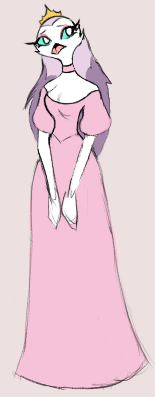
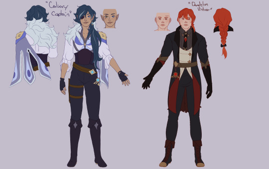
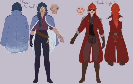
Alright so I made a Stella Re-Design, this post ‘ill be kinda long cuz I wanna explain things and such
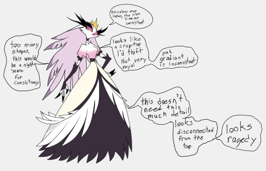
My main problems with this design are 1- Details that are unneeded that lead to inconvenience in the animation department (like seriously watch scenes with her and focus on her lashes) 2- This outfit isn’t very regal, I’m guessing the bottom of the dress is supposed to resemble feathers idk it just doesn’t look good.
Alright so we have that out of the way, I have made a few different possible re designs. You’ll see the one I prefer at the end.
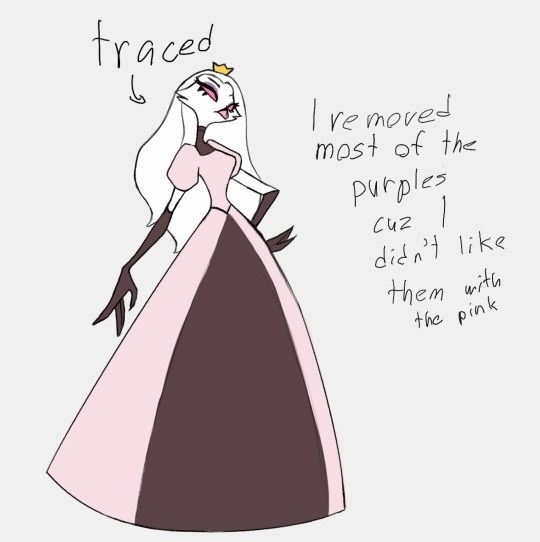
This one I tried to keep more in line with the original pink princess theme. Simplified the dress and hair (I imagine that her hair can fluff up when she’s angry) and I replaced the dark purple with a maroon. I also made her hair white. This way the only purple is her make up which should cause you to look at her face more.
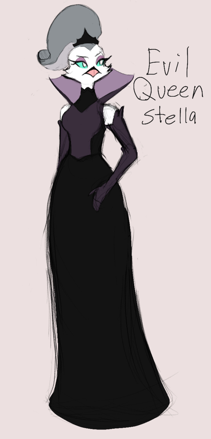
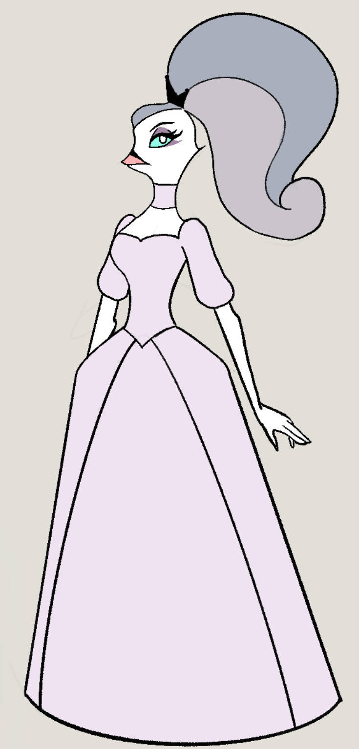
This one is a more evil Queen inspired Stella, used the purple as a main dress color, I gave her green/blue eyes and grey hair which she had in the pilot. The eyes are help tell her apart from her husband, and the hair change is to make her look older and more regal. I changed the style of dress now she looks less little girl costume princess. (No hate to princess peach)
This is a younger Stella design that I did. My canon is that she was dressed this way as to appeal more to Stolas.
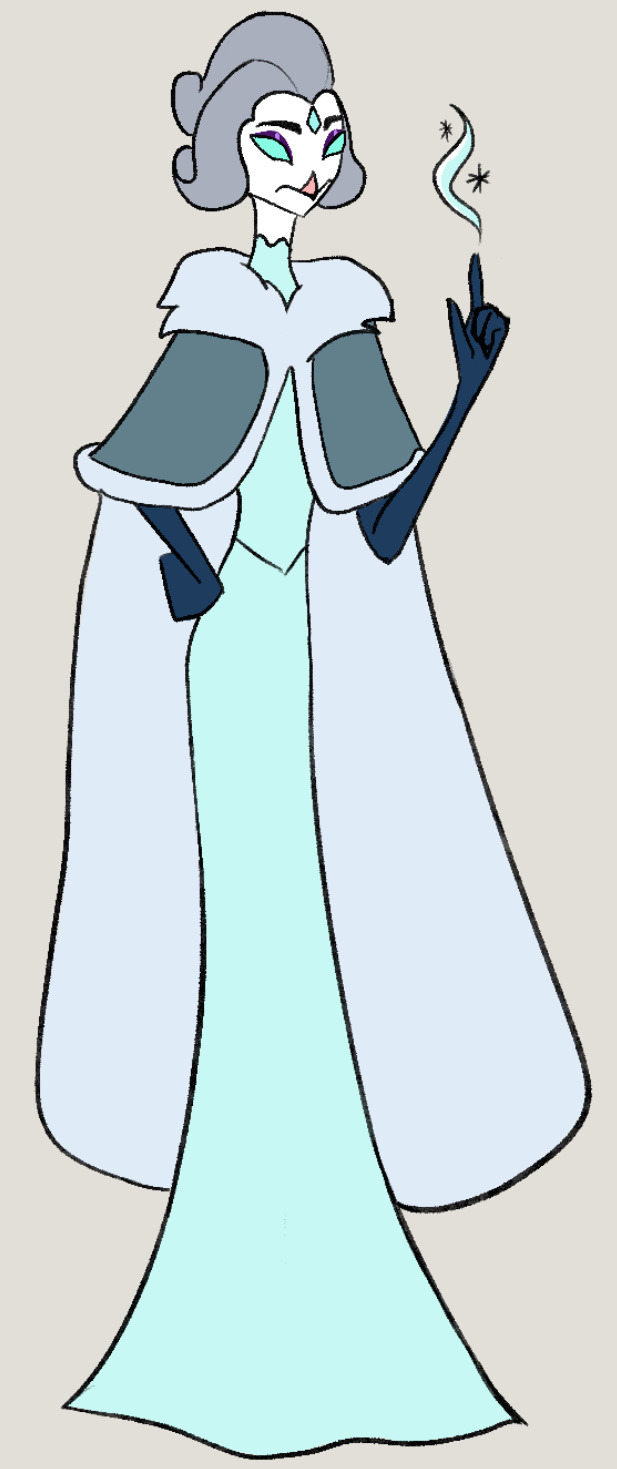
Now this is the final design that I chose. The purple is for royalty, I did away with the dark purple as to make her look less threatening. And the dress is rococo era inspired just because I those dresses no real reason
I also did a design for her brother.
His changes were simplify his outfit, and the other stuff like his hair were changed to match his redesigned sister
Alright so that’s all the art. The rest of the this is just going to be me ranting and raving about her character.
Okay so I think we should acknowledge how fucked Stella’s situation is. She’s in an arranged marriage and her only purpose in hells society was to give birth to an heir.
Stolas and her brother are shown to have magic powers, and Stolas we know he has princely duty’s so we can assume the same for her brother. Stella doesn’t have any of these she was meant to be a baby a maker. Even her name Stella compliments Stolas’s role as star prince or whatever.
Now in the first episode of season 2 we have Stella making fun of her husband how he’s bad in bed and how she’s glad she doesn’t have to fuck him because she’s given birth. I think this is Viv’s attempt at making this situation seem less fucked up.
I don’t even know it just makes me really uncomfortable that this very feminine woman in a shitty situation is being vilified. Like if I was in Stella’s situation I’d probably have anger issues too. I’m just so tired of being told that feminine outrage and displays of anger make us monstrous bitches.
Now obviously Stolas being forced into a loveless marriage also sucks and is an awful situation for him too. But he’s not that much better than Stella. Both are shown to be physically abusive to the castle staff, and Stella for all her faults isn’t black mailing someone into sex.
Now having two shitty people wouldn’t bother me if the narrative didn’t bend over backwards to make Stolas seem like such good guy, just an uwu gay bean. His wife is SO mean she won’t let the gay people be happy 🥺. Also painting abusers as cartoonishly evil monsters does a disservice to people who have been abused is all I’m saying.
Anyways I’ll hopefully have a Stolas Redesign up next
Bye now
#vivziepop critical#helluva critical#helluva boss criticism#helluva boss redesign#helluva boss critique#fuck vivziepop
102 notes
·
View notes
Note
Can we see more of the designs that you didn't post yet, pls?
Here's a few that i can post (A few i've uploaded to toyhouse, but not actually 'posted')

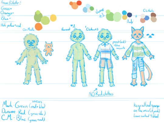
Preteen designs: Ben's shirt color pallet changed ever so slightly and Mark's shirt color was changed a bit to make the red have more of a purple undertone. I wanted purple in his design, but i felt Mark actually wouldn't wear purple around this time because he would've been like 'purple is gay and im not gay.'
Kenny and Jon didnt change they're just there lol

Child designs: New main outfits. The other ones still exist, but these are what I'll primarily be drawing them in now. Kenny didn't change at all lmao.
Also a fun fact about Ben's designs when he's younger: Prior to he and Mark's complete falling out and beginning to obsess over his appearance and stuff, his hair is drawn softer using more rounded lines, aka his 'natural' hairstyle.

Mark and Ben's Halloween costumes: Slight redesigns, they didn't change all that much but had some hue changes (I wanted Ben's to have more blue tones and Mark's to have more purple tones,) and Mark's also got more animation friendly. I really do not want to animate overlapping flannel stripes like the old design had, so I simplified them. (yes it's relevant for the show. spoiler-not-spoiler-warning)
I've got more too, but a lot aren't finalized, and some I just can't post. But there's a few that i'll post sometime later in response to another ask I got a while back!
#craftycake277world#ask#the mark side#tms#mark reed#benjamin washington#jonathon washington#kenny peterson
10 notes
·
View notes
Text


LONG POST! 💫The main character of Little Things always had a sheep esque design, even before having any meaning/adding in the sheep plushie at the end. As production went on, the sheep design came to symbolize a lamb walking towards its own slaughter. The character had to be simplified a few times. Colors were pretty difficult to choose, turquoises and blues were symbolic of life in the film, so I originally wanted to keep their hair blue, but pink was supposed to be symbolic of this "spirit realm". I went with the pinkish brown hair for the cohesiveness and also because SPOILER, the character isn't dead or alive and is somewhere in between. Plus the blue was more of an indigo anyways.

💫OKAY AND THE MONSTERS
I meant for watchers to either wonder what the monster's motives were or just think they were cute with randomly designed accessories - why are they determined to help MC? Do they want to eat them? Are they just cute little guys? Etc.
Animating 10+ characters was never going to be easy. I designed the monsters to all have the same base body shape with small changes like height. That way, it wouldn't feel like you were animating all 9 different monsters and instead it would feel like just 1. Personality traits were added which would tie into the family portrait during the void sequence, while also allowing clean-up/detailing to give the individuality. Plenty went into the designs themselves, but that will take forever to go over.
💫I'm very much an animator at heart, but I think this experience has given me more confidence and has made me realize that I actually do enjoy concept work. I love designing, but struggle with stagnancy which is why I struggle with turnarounds.
If you enjoy these BTS recaps, I have a Little Things page on my portfolio that you can check out!
#Character design#concept art#character development#Film development#Film#Animation#Animator#Animating#Animation film#Short film#Short animation#animation production#Little Things#Character#Pre production#vis dev#Visual development
16 notes
·
View notes
Text
Another Sillie had been added :D
process thoughts below cut- (WARNING- they long lol)
Has this barely changed from the wip I posted earlier????
not really but i need to talk about character design for I am FERAL so L moment i guess
SO my personal favorite brand of character design has been, for as long as i remember, drawing more complex designs from simplified mediums. Think Minecraft or roblox skins, and some chibi avatars. Hand me something that is blurry and up to interpretation and i will simply go buck-wild. Mark is of course the only character to truly appear on camera. We see both his drawing of himself and his [puppet?] form. Now you only ever see donovan and cupcake monster as drawings, which leaves their appearance more up to interpretation.
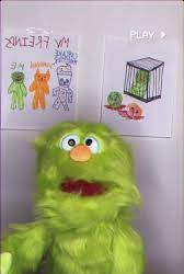
When i first translated Marks design, i tried to stay as accurate as possible. The second iteration is more of my own twist on it, elongating the body, trimming down the fluff for a clearer shape,and adjusting facial proportions slightly. Note: this isn't to throw shade at marks original design. He's a puppet irl and he looks like one, i just suck at making puppets look like they have any life behind their eyes, so design tweaks it is. Mark is adorable and its a me problem that i struggle to recreate that.
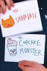
Now my Mark design is obviously based off of the puppet, (his actual self,) as opposed to the way Mark draws himself. In the drawing, there is a bit less fluff on his body, compared to the real thing. This is important as it affects some of the decisions I made for Donovan.
Donovan caused a few hurdles when i tried to work on a design for him. First, I'm working with very little information, so creative license time. Since I don't have much to go off of, I started with a real simple drawing, similar to the one from the drawing in the show, just to try and capture the vibe. The most notable things about Donovan from this first doodle, was that he had a slightly smaller nose than Mark and that it was triangular and that his eyes were slanted. This gives me two prominent facial features to work with.
Following this, i started on a more detailed design. I began by plotting his proportions out similar to marks. To make him more cat like, I tried to make him a little taller and thinner[better for slipping out of cages], so that he had an elongated appearance, and to capture that sly you-cant-contain-me- cat energy that meow meows have. I wasn't sure how cat i wanted to go originally, but then i gave him paws....
I went full anthro cat on Donovan, adding in whiskers and a tail [still questioning that decision] even though they weren't present in my reference. Now is a good time to note that all these designs are pre-Billy, so no scars or anything. I bring this up because I gave Donovan claws, and I image Billy would have at least tried to declaw Donovan.
The next problem came with Donovans eye. So Donovans eyes are two slanted lines, very simple. Since these are one of Donovans few unique canon features, I wanted to keep them. I wasn't sure how to keep them simple yet still allow emotion. Playing around with this idea, i felt i could effectively convey emotion just by changing the relative direction of the eyes. However, I changed the eyes to be more tear-drop shape as well, partially to add more interest to the face, but also so i could add more detail to the iris of the eye if desired.
Finally, all my Mark and Friends designs have the characters wearing clothes, because I work at a clothing store and see too many damn clothes every day. [everything i know about fashion is against my own will] So since this canonically takes place in 1997, my designs are based roughly off of children's clothes at the time. For the monsters clothes, I want them to all have a somewhat fun shape, flare outs, wrinkles, cuffed sleeves and pants etc.
This is where i really struggled. Not so much with the actual design of the clothes, but with colors. As you can probably tell my this illustration as compared to the reference image, I am allergic to bright colors [they hurt my eyes :,(] So i shifted most characters to a more muted/pastel pallette. Now i really wanted each of the three friends, Mark, Donovan, and Cupcake Monster, to have the others "colors" per see, present in their outfits. Mark is obviously Green coded (lol), Donovan is orang, but outlined in red, so my boy gets a red association cause primaries of light. This leaves Cupcake Monster with Blue, the color they are outlined in.
I really wanted three designs to flow together, and though i haven't finished Cupcake Monster yet, I think the first two go nicely together. By giving each character a main color, I let them stand out from each other, but by adding bits of those colors back into the others outfits, it lets them flow together better in group images and keeps anyone character's pallette from feeling out of place.
Marks outfit is mostly cream, but with accents of Blue, and Red. Donovan's is about 1/3 cream 1/3 blue and a 1/3 blue. I struggled with the color distribution on donovan, as the reddish orange and blueish green i had chosen contrasted a lot more than i wanted. The light blue and cream worked as a nice base though, and making only the stripes green [the shirt is specifically cream with green stripes] it lets the green not overpower Donovan, which was another problem I was facing.
But yeah, this are my current designs for the sillies, if you read all this thank you! have some pie :]
7 notes
·
View notes
Text
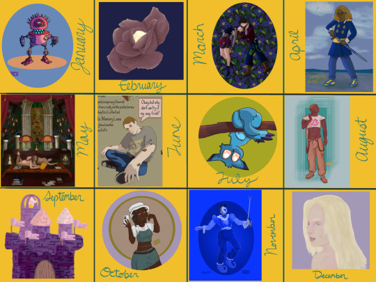
My art year in review!
I learned so much this year and made a ton of cool stuff! These are my favorites from each month, but it was so hard to choose. A lot of stuff didn't even get posted--I'll be sure to at least post the ones that made it to this list!
It's amazing to see how much I've changed and learned over this year, and to see the things that are emerging as part of "my style."
Here's to another year of delight, creation, connection and fun!
Some monthly reflections beneath the cut, but here's the highlights:
I participated in 3 art challenges, Artfight, OC-tober and Huevember.
I made fanart for the first time!
I created a piece I conceived of before I started drawing
Made some big breakthroughs in techniques and skills in April, July and November
January: My first branch into full character design, Rodd is the culmination of training on Hero Forge renders to make dnd portraits! I was doing this cool thing with neon rim lighting, I should bring that back!
February: I saw a piece on here with this amazing glowing effect, so I color picked it and experimented to figure out what relationship between the colors was making it do that! The answer was saturation. This rose is meant to be glowing from within, and I think I did a good job for my knowledge level at the time! As Chuck Tingle would tell us, it's beautiful because only I could have made it in that moment on the timeline.
March: I spent a million years on every detail of this one, it has at least 5 clipping overlay/saturation layers for lighting, multiple line work groups and I want to rework that background but! I never felt more accomplished than I did when I finished this one. I learned a lot, especially about things I could skip or simplify. And the symbolism really pops off ngl
April: I read Gideon the Ninth for the first time this month and I immediately needed to draw Jeannemary Chatur, Cavalier of the Fourth House, the worst teen to do it. She's the first fanart I ever made and posted! I also discovered a new pen tool with this one, which CHANGED THE GAME.
May: This one is an idea I had written down before I ever picked up the tablet and stylus. I thought I might commission someone to make it, the image of it came to me so clearly during our VTM session I just had to make it real somehow. Well I did it! This is one I will come back to redraw in like 5 years bc I love the concept so much. Also rife with symbolism and inside nods to the Low Kings.
June: I made a bunch of ref sheets in the run-up to Artfight in July. Caleb hadn't even been in my plans to upload, but I had time and inspiration! I will be uploading this and a few more of him <3
July: This is one of my faves from Artfight! This character is Blueberry, by way of OrchidEatsBread on artfight. I have still never played... rainworld? But I love me a slug cat. In July I drew a TON of people, it really drilled anatomy basics into me and how to get clothes looking like actual clothes a bit more. Also solidified some things I would consider "my style" at the moment, like no irises, and my approach to noses and mouths and fingers!
August: Another fanart for the Locked Tomb series, I never posted this!!! Will be rectifying that soon.
September: I got really into javascript and css this month, and I made this to be a landing page image on my neocities website XD I'll get back around to that eventually...
October: At the last minute, I discovered OC-tober and the prompts from @/bweirdart, a worthy follow up to the rush of Artfight two months previous. I developed so much stuff for the Low Kings, including this drawing/character, Amayah/Girl-Z, who has been a figment of my pintrest board for 2+ years.
Huevember: Chasing that OC-tober high, I found Huevember! I did not expect to actually do every day, but it proved to be an amazing exercise! I learned so, so much about color, discovered amazing new brushes and techniques and found I really enjoy working in those one day capsules! I loved a lot of the stuff that came out of this month, including my highest note post ever!!!, but this one is still my phone background and I'm maybe developing an OC world around it. We'll see what happens in 2024.
December: I got hit HARD with the writing bug this month, so this was my only choice for this month but I WOULDA CHOSEN IT ANYWAY. I unlocked something here that I'm really excited to visit again, in fact I'm working on a companion piece rn! This is also fanart btw, prepare for me to get even weirder about this guy in the coming months.
If you've read this far, thank you so much! I have so much fun writing these little reflections and making my posts on here.
xoxo, wren
4 notes
·
View notes
Text
some of my opinions about Graduation Day (spoilers, obviously)
I was going to post this earlier but alas I forgot
It was meh.
Art style.
It never grew on me. It felt like a colored manga. A very strangely colored manga. I list this as the first thing because style is very different depending on the person. I just didn't like that art.
The characters.
Jaime didn't really feel like Jaime.
When you put stress on someone, they do act different, but we have seen how Jaime reacts to stress in the original comic. He doesn't isolate himself. He reaches out to his father, his friends. Or they reach out to him. That's what's so different about Jaime's story- he doesn't have to go through this alone. But this time they shut him out, they don't listen to him, they toss him into another city. Paco and Brenda weren't his friends, they were side characters. We hardly see Bianca and Alberto and Milagro.
And are you going to sit there and tell me that after Jaime missing for a year in the past, his family immediately after graduation dump him on his aunts?
Bianca would have never done that. Alberto would've never done that. I guess Milagro would be happy because she gets his room now but that's beside the point.
The few characters that were introduced weren't dynamic at all. They were sloppily written. Fadeaway is a jerk. The two new scarabs are two-dimensional. They all had so much potential, but it was flushed like crap. Victoria and Ted were probably the best written, but they aren't the focus of the story.
The storyline.
There are so many things you could do to simplify it, or some parts you could take out. The one that bothers me the most is the sudden change that Dynastes has to trust Jaime. The story structure needs her to trust Jaime, but it was very fast. One second she's trying to kill him the next she's protecting him.
(What I'm trying to say, is the writer in me is screaming that when Jaime sacrificed himself for Dynastes should've been her turing point.)
Also, who is Jaime going to face in the next run? The Reach again? What's going to make it different this time?
The origin of Jaime is very jumbled. Are we sticking to the original comic? Rebirth? Batman the Brave and the Bold? Young Justice? Some strange combination of all of them? Ted is alive, so how does that fit into Jaime's origin? It was a strange place to take off at.
The dialogue.
The dialogue in here was horrible.
The amount of unfunny jokes and strange one-liners, like the green beetle calling herself a goth girl, is something that should not be officially published. I guarantee no goth girl has called herself a goth girl like this.

The Horizon.
I had really high expectations for the Horizon. They were something I never really thought about, something that could so easily be tied into all other Blue Beetle stories. They were the original enemies of the Reach, the people that stood up to them long before anyone else did.
They're a bunch of scared piss-ons?
I guess I already had a clear image of what I wanted them to be. I was expecting warrior scarbs, and I got an old Reach dude. Where are the other scarabs? Why are you so scared of the Reach, but not have a protector on board?
Few things I liked:
• COVER ART
• the horizon.
• character designs
• potential of more scarabs
• time management
I feel like the writers only skimmed the original. Or maybe read it once a long time ago. Also the random fan service didn't fit? Didn't come here to see Jaime extremely caked up.
It was short, so they couldn't do much of anything. But it should've been a solid six issues.
(Kinda thinking about rewriting it, like making a fanfiction?? That's how much all of these are bothering me.)
Thanks for reading all the way down to here. I give you these gifts.

#blue beetle#jaime reyes#dc#khaji da#dc comics#batman the brave and the bold#btbatb#batman#young justice#dc blue beetle#blue beetle movie#blue beetle 2023#blue beetle 2006#blue beetle graduation#blue beetle graduation day#blue beetle fan art
16 notes
·
View notes
Text
So I did some personal redesigns of a handful of Genshin characters, starting with Kaeya and Diluc.
As a forever Kaeya main, I couldn't help but draw something with him.
(Redesigns below the cut)
So I did a total of 4 redesigns for these two (two each). For the first two, I took their default outfits and just put a spin on them.
I also inserted some headcanons I had about them, such as their heights and some other details.
Kaeya is 5'8 (172.7cm) here. I'm headcanoning him to be around 23 years old. He is also a half-elf in these headcanons.
I simplified his outfit to some degree, with some small changes.
I emphasized the crystalfly shape on his chest and tried to add a bit more peacock imagery (his cape) onto him. I also changed up his unique vision to be unique in a different way because I wanted to emphasize his asymmetry.
I gave him heterochromia and a scar over his eye-patched eye, as I like the idea of both. He already had silver streaks in his hair, I just pulled them through the hair hanging over his shoulder, and also gave it a bit more body. He also has some added beauty marks, because all pretty men deserve them. I gave him a cooler skin tone because ice.
For Diluc, I drew him at 5'7 (170.2cm) and have him at 24 years old.
I reduced some of his "cowboy" motifs, but mostly kept him as "Diluc but in a different font" in terms of the actual design of the outfit. Like Kaeya's I simplified the upper half. I also brought a little bit more color into. I also added what was supposed to be like bird shapes on his gloves.
I added some scars onto his face too, because I figured he got into a few rough scraps when he was going on his little murder rampage. The choice to give him a braid was purely impulse but I feel like it adds some refinement to him. I tried to warm up his skin tone too because fire.
After I redid their default outfits, I decided to create some alternate outfits.
Kaeya is based on a combination of Howl Pendragon (Ghibli specifically) and Fai D. Flourite (Tsubasa Reservoir Chronicles). I swapped out his eyepatch for a golden half-mask and maintained some degree of asymmetry. I also gave him a braid here and threw it over the opposite shoulder to his default style.
Diluc's should be pretty obviously based on his "Red Dead of Night" skin, but I majorly simplified it and added back in some cowboy motifs, including a bolo tie and chaps. He also gets to have his little batman mask here.
#genshin impact#genshin impact kaeya#genshin impact diluc#kaeya alberich#diluc ragnvindr#genshin redesign#not ship#art#digital art#fanart#genshin fanart#genshin kaeya#happy birthday kaeya
25 notes
·
View notes
Text
i dont intend to say this like im putting myself down but when im burnt out or in an extended art block i do often look to what i have done in the past- maybe as a "was i doing something back then that i miss doing now?"
my art has shifted a lot over the years. im sure anyone whos followed for a long time would say so. ive gone through phases and styles and vibes of many kinds and theyre all very different. and theyre all times that sometimes i look back and think "maybe i should do that again". of course i need to avoid getting overwhelmed with the "i want to do this- no this- maybe that-".
But the hardest "change" in my art was probably a year ago when all that stuff happened with wcrp. which i wont reiterate- but it was forced. that was the big thing. and i think its whats hurt now that i have this burn out settling and i am looking at old art. I did hit a burn out last year after wcrp when i quickly dove into other fandoms like half life- i did what i often did, where i overexerted myself from hype and quickly burned out. but then i picked up mcyt which has been going strong for a year after leaving it for many years back.
when i look at whats changed about my art from then to now, i notice one big things, which i felt was obvious (and i deliberately did this)- i was going into that fandom simple. first it was a lot of lineart, no color. then i started adding some one flat color to bodies and sometimes minor effects done with the help of gradient maps. then i started using thicker brushes where i could, knocking out the need for clean details. then i started using the binary pen. i had a few detailed drawings in between but really so much of what i have done has been so simple.
and as i said, i did this on purpose. i got into this right after half life and i knew i was burnt out but i really wanted to draw anyways, so my plan was to do it like that! i wasnt very good with humans either so i didnt want to focus too hard on it anyways. and i certainly have liked this method. i enjoyed finding a way to draw that IS simple and doesnt put a lot of strain on me... it helps me no longer be a perfectionist as much as i used to
but at the same time its taken away some aspects that i liked about my art from 2020-early 2022. which was that i was so much more detailed than ever. my warriors art was very detailed, the designs were intricate, i drew a number of scenes just for the rps i loved, etc. i experimented quite a bit with coloring and shading and i still love a number of looks i tried, and i keep wanting that back. (ex 1, ex 2, ex 3)
interestingly i actually started to simplify that style too, esp as i got deeper into my own rp, and i know full well it was because i was also getting tired. used a lasso tool for markings, used less layers, dropped the texture and using a thin pen brush to make sketchier lines. (from this -> to this)
THE problem with these notes about simplifying stuff is that like. i rush things. i rush them SO much. and this has always been my biggest struggle, and what leads to annoyance with my current art and also to burn out.
Burn out, caused by how much i am drawing, because im fast. drawing fast because i want to make content for the fandom i am focused on. art block because im not happy with my art, but im also too impatient to slow down and take my time and REALLY remember and realize what it is i want out of my art!
its a never ending cycle and sorry we're at the end of the post because i dont have a solution lol
1 note
·
View note
Note
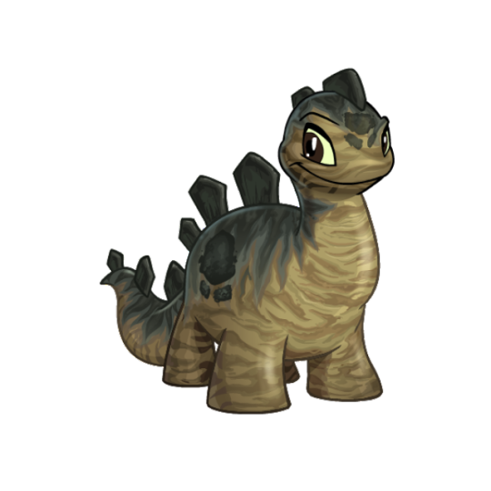
Good morning, are you still looking for neopet suggestions? If so, have you talked about Chomby? Adore that little guy, it was my first (and possibly only, I can't remember 100%) neopet!
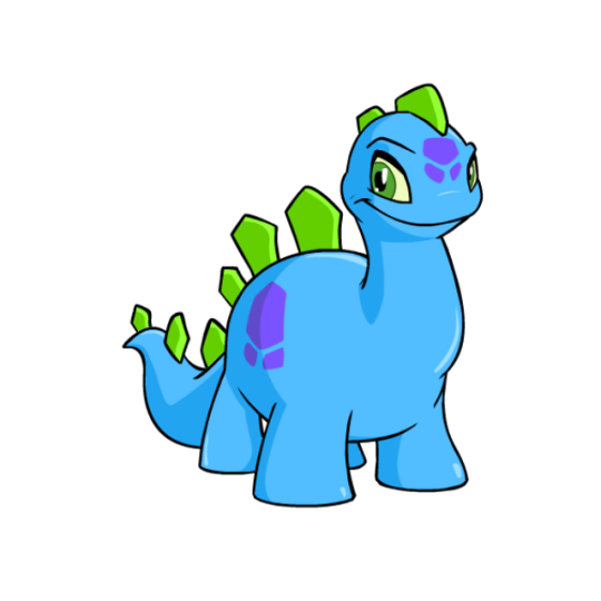

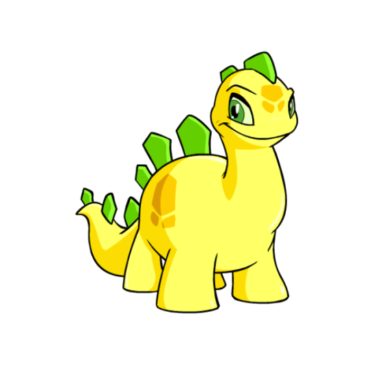
Thanks to the presence of Tyrannia, we have a few different species of dinosaur-based 'pets. Out of them, the Chomby is probably my fav. It's mostly just a simplified stegosaurus, though it only sports a singular row of plates and no thagomizer (tail spikes). It also has an upright neck and overall body shape that's closer to brachiosaurus, and a row of spots that exist to break up the body. I like how the spot shape matches that of the plates, and the overall body has a good shape to it.
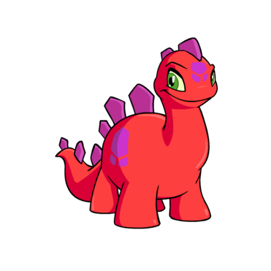
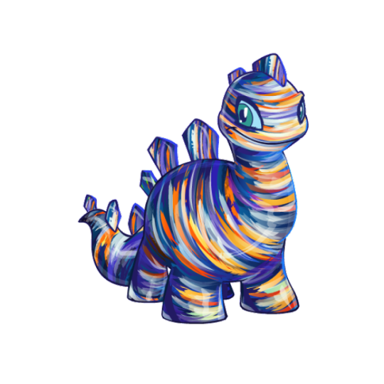
One thing the Chomby struggles with a bit is the color proportions and usage, as you can see a fair amount of variation just in the base colours alone. For the record, I prefer the handling of the yellow Chomby for the base colours, wherein the spines are an accent color that matches the eyes while the spots are a secondary shade.
The Chomby had some massively dated art that was in bad need of an update, so for the most part the customized version is a good improvement. My only issues with the converted art is that the eyebrow looks really weird, and the mouth and eyes almost go a bit too far back on the head.
Favorite Colours:

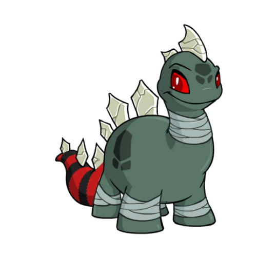
Darigan: I really like the way the Darigan Chomby plays with the base design. Fro example, the back spines have been changed into spikes and the markings have been given a sharper, more bat wing-like shape. I also really like the addition of an underbelly and how it runs up to the jagged mouth, and the semi-transparency effect on the wings. My only nitpick is that the black fin-like structures on the head feel too busy when paired with both the horns and spikes, and I would've liked the wings to be just a little bigger. Great colour overall though.
Camouflage: Probably vaguely based on stegosaurus interpretations, the naturalistic markings on the camouflage Chomby look really nice. The markings contour with the body properly, and the countershading with the darker green elements on the back adds a lot of contrast and richness to the design.
Oil Paint: Oil paint is just an inherently pretty colour, but I really like the use of it here. Like the camouflage Chomby, it carefully contours the body in a way that makes sense, and there's both a good amount of detail in the brush strokes and a nice texture. The actual color palette is also lovely, using a mix of dark purples and blues to contrast with birght oranges and yellows. I just wish the eye had also been painted, as it looks out of place compared to the rest of the design.
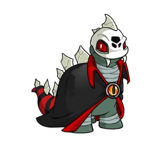
BONUS: The Halloween Chomby has it all, with skeletal elements in the head and back spines (which have been given a slightly different shape as well), a striped tail, bandages, and a cloak with an eye on it. None of it should work together, but it surprisingly comes together well due to the muted greenish-gray base combined with black, red, and white accents.
The only reason this one is a bonus is because the base colour is pretty mid. The tail wasn't made a wearable so it just suddenly becomes striped out of nowhere, and it's left with skeletal back spines despite the skull being removable.
28 notes
·
View notes
Text
Ok I want to talk about the Xiao Long names and how Chinese culture may be in Ruby and Yang's design without a lot of people realizing.
Wanted to start I'm not Chinese! I'm just learning mandarin right now and as I learn I started to understand so many things about Yang's character and I wanted to share a few things about it.
Now, if you are native or are more knowledgeable about mandarin than me and you see I'm wrong about x part you are more than welcome to correct me!
Starting of with Yang's name.
I've searched the Chinese characters of her name and it's:
阳小龙 (simplified Chinese)
陽小龍 (traditional Chinese)
Yang: 阳 sun/part of the yin yang/open/etc
Xiao: 小 small/young (as young sibling/person like '小妹' youngest sister)
Long: 龙 dragon
A rough translation of her name would be sun small dragon and a better translation would be sunny little dragon (as we all call her most of the time).
Dragons are an important symbol in Chinese culture but they are not really like fire dragons as we usually see in american movies, mostly they are bond to different elements (like in the movie Shang-Chi) but as Yang's name literally means sun it makes sense that her dragon would be a fire one and that her character is related to fire.
Now Taiyang:
太阳小龙 (simplified Chinese)
太陽小龍 (traditional Chinese)
Tai: 太 too/highest/extreme/senior (more like generational hierarchy like '太老爷' great grandfather)
The rest is the same as Yang.
Now a rough translation, which is the one I've seen the most, would be senior/elder sun small dragon.
But as we are taking 太阳 together and not separate it would be sunlight/sunshine. So a better translation should be sunlight/sunshine little/small dragon.
Why do I refer to this as better translation?
In RWBY case names are really important and Taiyang naming his kids after him doesn't make sense, specially when we have names like Weiss or Blake.
Now, in Chinese culture, names are super important as well. No Chinese parents are going to be lazy with their kids names!! And I do think Monty had this on mind when naming his Asian characters (Asia as a whole puts a lot of meaning in their names!!)
Their name is also more western like since last names are usually before their giving name just like Lie Ren (猎人) which mean it was on purpose.
If I put their name like it should be then it would change to 小龙阳 that would mean small dragon sun or 小龙太阳 that would mean small dragon elder/extreme sun, both are rough translations. Their names are better off as they are tbh cuz you can't really translated this way (not 100% about this cuz the dictionary I have isn't able to help me translate it).
I have the theory that the Xiao Longs are originally from Mistral, as this is the Asia coded kingdom of Remnant, but as they moved to Vale they changed the modality of their last name so be more Vale like (western like).
Other things I would love to point out it's Yang and Ruby colors being yellow and red which are important in Chinese culture as their meaning are highly value (I mean, China flag has red and yellow on it for a reason).
Red means mostly success and good fortune and it's a color Chinese people use a lot even outside of China (specially in their own business because they want to bring good fortune and success!)
Yellow means royalty, it's reserve for the Emperor only as symbolizes prosperity.
And I want to bring the color black because this is one of my favorites. As a latine person I've grew up to see black as the color of death but in China the color of death is white while black is mostly used as misfortune, evil or even authority.
I find this super interesting cuz Ruby only uses white once and was exactly AFTER Phyrra and Penny's death while her color scheme is both black and red which is basically a mix of good fortune and unluck, success and destruction.
And then there's purple. The color of Yang's eyes.
It symbolizes love and strength. Which in my opinion is perfect for Yang.
These are things I learned by studying Chinese mandarin and using a dictionary, if someone wants to correct me I will gladly listen.
Edit: ehe, by accident I put Teyvat (Genshin world name) instead of Remnant, I apologize 😭
#rwby#yang xiao long#ruby rose#taiyang xiao long#again im not chinese#im just someone studying mandarin#learning about chinese culture just comes with it#wish a native could speak about this cuz i feel monty did put a lot of thought in the xiao long family#and i say month cuz he's asian#and i do think ruby character design is mostly influenced not by qrow alone but japan goth scene#cuz both raven and qrow are japanese coded#in case people forget about this#they just took the last name of the tribu#thats not their actual last name
24 notes
·
View notes
Note
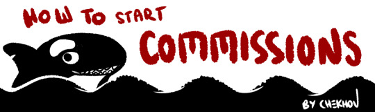
Hi Chekhov! Really enjoying your white diamond au! I had a quick art question: How do you start comissions? I've been improving my drawing skills and thinking about drawing for others after having fun in artfight, but I don't know where to start? How much to charge, how to get paid, etc. Do you have any tips? Hope you're doing well! :)
Alright, since a few people have asked, I’ve decided to put together a few things about how to get started on commissions - what you need, what you should make, and how to keep things organized.
This will get a little long, so I’ll divide it into 4 main sections:
1) Draw Art - Getting started
2) Get Commissioned - Making a commission sheet, Advertising
3) ??? - Communicating, Setting Limits, Running the Business
4) Profit - Pricing Yourself and Getting Paid
* Disclaimer: I’m an artist, so this How-To will be illustration-focused. I’m sure many of these tips can apply to ANY types of commissions, but I will be focusing on the type I know best. If you are proficient in other types of commissions for other types of art - music commissions, photography, etc - feel free to chime in and leave a comment or make your own tutorial!
1) Draw Art
I think this is probably the most obvious part, but it needs to be said:
Before you start making art for other people, you must first be comfortable making art in general.
I’m not saying your art has to be Disney-quality, or industry-level! Not at all.
BUT! You must be comfortable creating what you sell. If you try to sell something you have little confidence in, you will stress yourself out and possibly end up losing time AND money.
Don’t shoot for the moon if you haven’t landed on it even once. Sell what you know you’re good at. Your commissions don’t HAVE to include full-body illustrations if you don’t know how to draw feet/solid stances. Limit yourself to what you can do.
Things you need to should probably have before starting commissions:
1. Access to art materials or a fully downloaded art program
DO NOT - Use a free tutorial version that will expire in a month and leave you without a way to draw! If you are having trouble finding a program, try free ones like MediBang Paint Pro.
2. Free time to complete the amount of commissions you want to take.
DO NOT - Take on or offer commissions if you KNOW you’re going to be overwhelmed with school or personal life for the next 2+ months. Pace yourself, otherwise you’ll burn out, get stressed, and get discouraged.
3. A reliable way to communicate with your customers like a commissions-only email
DO NOT - Use your friend/family/college email. It’s hard to keep track of things as it is, and creating new emails is easy and free. And keep it professional if you can! Not many people will reach out to dong-wiggles20434 to ask for a design. Ideally, your email should be close to your brand - however you want to brand yourself. Usernames are fine!)
DO NOT - Use Instagram/Twitter/Tumblr to collect commission info unless you are ready to do the organizing yourself. Some people make it work, but in my experience, if you use these SNS sites to communicate with friends and network... you’re going to be losing commission inquiries right and left and accidentally ignoring people. Email is much easier to organize and sort into folders.
4. A portfolio or at least 2-3 pieces of each type of art you’re planning to sell.
DO NOT - Advertise commissions without having any examples of the art you plan to sell. People will find it difficult to trust you if you can’t even give them a vague idea of what sort of drawing they’ll be getting.
Disclaimer: These are not hard ‘do not’s. If you have had a different experience, I respect that. I’m simplifying for the sake of streamlining this advice.
.
2) Get Commissioned
So - you have your art, you have your art program, and you’ve got all the time in the world. That means.... that’s right! It’s time to let the world know you’re taking commissions.
One of the most common ways artists signal to their audience that they can do commissions is by creating a commissions sheet. There are MANY ways to make this - and they range from simple and doodly ones to VERY complex designs. For example, here’s mine!
There are many ways to organize a commission sheet. At its core, a commission sheet should display the types of art you WANT to be commissioned to make. Let’s go over a few ways they can be done!
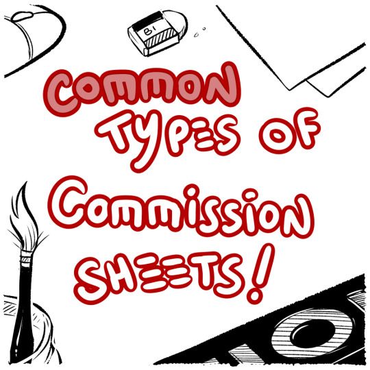
#1.... Body Portion Dividers!

This sheet is most common with those who want to capitalize on drawing people and characters. If you want to draw lots of characters, this is a great way to offer several tiers of pricing based on how much of their character your customers want to see.
#2... Complexity Scale
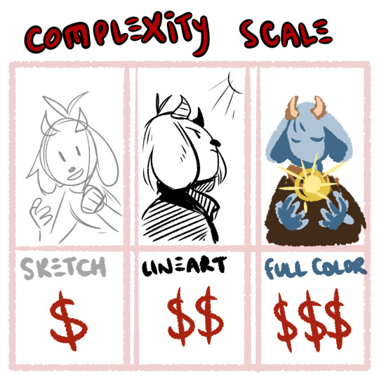
If you’re open to drawing many things but want to base your pricing off of how complex something is, you can split your tiers into done-ness. This type of commission is popular with those that draw characters AND animals, furries, etc.
#3.... Style and Type

If you’re more on the design side of things, or if you have various niche art styles that you can’t quite lump together, display a variety of your skills alongside each other! It helps if all the ones you have can be organized under a common customer - like those looking to advance their own business and get logos, websites, or mascots made for them!
.
3) ???
You got your first commission... what happens now???
Well, ideally you have the time, tools and motivation to make things happen! Now all you have to do is... sit down and... draw.......
I’m going to say something that may be a little controversial:
Commissions aren’t fun.
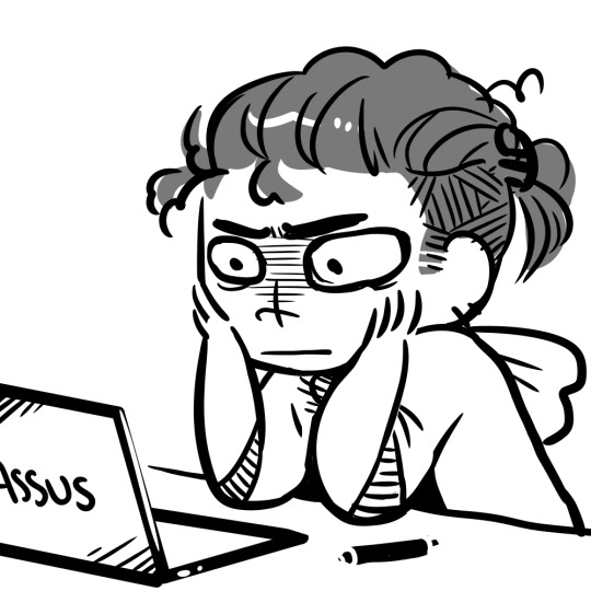
No, no, hear me out: I have fun doing commissions! I genuinely enjoy drawing characters and coming up with designs. But even with all that said, commissions are, first and foremost: WORK
I’m not saying this to discourage you, I’m saying this to keep things realistic. When I first began commissions, I thought it would be just like any other type of drawing. I would sit down, imagine a thing, draw it... it would be fun!
But then I realized that I couldn’t just draw what I wanted - another person had an idea in mind and had asked me to do it. I stressed over getting the design correct from descriptions. I stressed over not having the right reference for the pose the commissioner wanted. I stressed over not being able to draw the leg right in the way I had promised I would do. I stressed about billing. I stressed about digital money transfers. It was difficult, and time-consuming, and I did not enjoy it. At all.
And a part of that is definitely on the commissioner - we, as artists, NEED to demand proper references or descriptions. We, as artists, NEED to limit the amount of changes we’re going to make at the flick of a finger. We NEED to demand clear instructions and set boundaries. That’s also super important.
But also - don’t be discouraged if you find yourself exhausted drawing your first commission. MANY artists go through this. Adjust your rules, fix up your limits, practice putting your foot down on finicky commissioners who expect you to read their mind! It does get easier, but you have to communicate and put in the effort and act as your own manager AND your own customer service AND your own accountant. That’s what you’re looking at.
Good limits and boundaries to set:
Limit the amount of changes a person can ask to make. “I want blue hair.” Next email: “No wait, yeah, make it red.” Next email: “Actually I changed my mind, can I get the blue but like, lighter?” Next email: “No, not that light.” ... At some point, we have to stop. I personally allow 2-3 changes on the final stages of a commission before I start refusing or start asking for extra money.
Demand clear instructions and/or references. If something isn’t described, you have to take artistic liberty and design it, but that’s difficult! And if the customer is not happy with it but can’t tell you more? That’s not your problem - the burden of reference is on THEM. You cannot read their mind, and that’s not your fault.
Get at least half the payment up front! This is a good balance between the ‘pay before art’ and the ‘pay after art’ conundrum that will limit the amount of woes between artist and customer. (I’ll touch upon this a little more in the Profit section.)
Organization:
Where possible, create good habits! Tag your emails and organize your folders. I have a tag on my emails for active and finished commissions. I also keep my emails on Unread until I have time to sit down and properly look at/reply to them.
My Commissions in the folder are also organized chronologically and I mark down which ones are paid and which ones are not.
(I understand not everyone can do this, but if you want to give it a try, it does make things easier in the long run. Again, this advice is just what I have found personally helps.)
One last thing - I do not want to shame ANYONE for taking their time with commissions! Commissions are complex, and they take time and work. You can draw in 8 hours, but some things take research, materials, etc. Some illustrations realistically take up to half a year, or, depending on what’s involved, several years!!
THAT BEING SAID - it’s good manners to be upfront with your customers about how long you expect the commission to take. If you think you’re busy, just say that! Explain that you have a lot going on, and you will probably take (insert time period here).
And if your commissioners are worried, work out a system to keep them updated! I send my commissioners updates when I finish the lineart/flat colors/etc and I try to be clear about how long everything will take. I try to estimate with a +3-5 days buffer to give myself extra time... and recently I’ve been using it. Always say a bigger number than you think you’ll need.
If someone wants a rushed commission... make them pay more. If ANYONE wants a commission done ‘by the end of the week’ - that’s an automatic rush-job for me because I’m juggling an irl job and several commissions at once. I WILL charge a rush fee and I won’t feel bad about it.
If someone wants a commission within 24 hours...... Well, they better be paying you 3x your normal amount, or more. And remember - you CAN refuse! It’s perfectly reasonable to say ‘No, sorry, that sort of turnaround time is not realistic for me.’
Food For Thought - Invoicing
Many artists I’ve commissioned in the past have not used Invoicing, but I’ve recently begun to fill out invoices and file them in my Commissions folder just to keep track of things. It’s not necessary until you start getting into the Small Business side of Freelancing, but it’s not a bad idea to get into the habit early in case you might need to do it later for tax purposes.
Here’s what my Invoice looks like, for example.
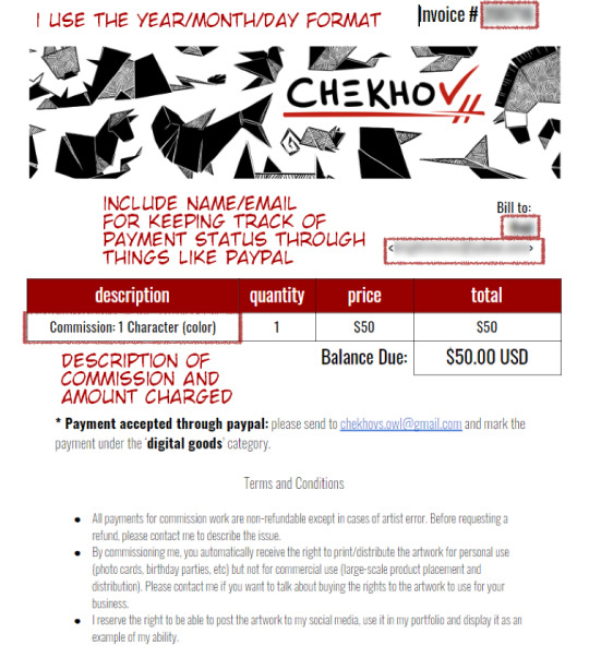
I’ve optimized it to help me remember who, what, and how much is involved! It also contains important info for my customers like where to send the money.
Which brings us to...
.
4) Profit
One of the hardest things for artists is pricing themselves. I’m not going to tell you which way is BEST - there is no BEST way, only the best way for YOU.
One of the options available to you is pricing by the hour. It includes averaging out how long it takes you to draw a specific type of art (whatever you’re offering as a commission) and multiplying that by an hourly wage you’ve decided on.

When you do this, I stress - do NOT price yourself below minimum wage if you can help it. When you first start out, aim for the $15/hour mark and adjust accordingly.
Other ways to price your art:
- Per complexity: Portraits vs full body should be scaled based on how difficult you find one vs. the other. You can also easily decide on a price for a sketch and double it for lineart, triple it for full color, etc.
- Per type: Look up for industry prices for website design and logo design. They may surprise you! You don’t have to charge that much, but it helps to keep things in perspective.
It’s okay to change your prices! Keep your commission sheet image handy so you can update the amounts as you grow. :)
Payment up front or after completion?
Some artist take full payment up front. Some only demand payment after they’ve finished and sent out the piece. I personally think these are both risky for everyone involved.
I recommend doing at least HALF of the payment BEFORE you start the commission. Calculate your full price and ask for half before you start working on it in earnest, to make sure the person can actually pay you. Then, when they receive the full piece and are satisfied, they can complete the payment.
I personally work in this structure:
> Someone emails me with their idea/reference
> I send back a rough draft sketch that shows the idea/pose (only takes me 10-20 minutes so not a huge loss if they ghost) and quote them a price
> They can pay the full thing upfront OR pay half
> I finish the commission and send updates when I do the lineart/colors to double check anything so they have multiple chances to spot any errors
> If the person paid only half on completion, I send them a low-res version of the finished thing, they finish up their payment and THEN I send them the full-res version plus any other filetypes/CYMK proofs, etc.
Many of the people who commission me pay me up front even though I offer they pay half - and I’m really flattered that they trust me that much! Because of that, I feel encouraged to update them frequently and ask for their input as I work, so they have the peace of mind knowing I’m actually doing their commission.
Great, but how do I get PAID????
There are NUMEROUS ways - these days money is relatively easy to transfer over digital means, and you have a few options.
Paypal is perhaps one of the oldest digital wallets and is geared towards businesses. By setting up a PayPal and connecting it to your debit card of bank account, you can tunnel a pathway from your online business directly into your hands in a matter of days.
Paypal also offers Invoicing - you make an invoice, price it and send it to the person’s email and they can pay whatever way they need! (It also allows partial payments.)
Pros: transfers from PayPal to bank account are free, and take a couple of business days. It also has no upper limit to the amount of money you can move in/out each month. It can force refunds due to the nature of its business-oriented payment system.
Cons: Because it’s used by businesses for larger transactions, PayPal may demand a more rigorous proof of your identity. It may also take longer to set up and be harder to get used to. I’ve also heard that they can be a hassle when it comes to closing your account.

Venmo is another type of digital wallet that acts much like paypal, except for a few key differences - it is NOT made for businesses (so depending on whether you’re officially registered as a freelancer, you may not be able to use it). I personally don’t use venmo, so I cannot speak to its usefulness, but I know a few people that use it for casual transactions. It’s easy and quick! :)
Keep in mind that you cannot force a refund over venmo! The transactions are final.
There’s also CashApp, GooglePay (which could load gift cards but also allows peer-to-peer transactions) and I’ve heard good things about Due, though I’ve never personally used it.
Other ways to pay: I’ve had people pay me over Patreon by upping their pledge, and I’ve had people pay me over Ko-Fi by donating a specific amount.
Many people even use Etsy - the website specialized for independent small businesses selling art - by listing their commission sheet and offering up several ‘slots’ of commissions, which allows you to track taxes AND allows your clients to pay using whatever they feel comfortable with.
If you’re in Canada, you can even pay by emailing money directly from bank account to bank account - check whether your country offers this type of service! There’s no shortage of ways to move money in the digital world.
Just like everything else, there’s no singular ‘Best’ way. It just depends on what works for you.
I think that just about wraps it up! I can’t quite think of what else to put here - but I’m sure other artists will chime in with their own advice. :) I’m very sorry this became so long but I hope it was helpful!
Obligatory Disclaimer: I’m not qualified to give legal or accounting counsel. Please double-check the laws in your own country/state in regards to taxation of freelancing work and do your own research. If you are underage, DEFINITELY get an adult’s permission before you start doing commissions, and have the adult help you through the process.
. . . . . . . . . . . .
OTHER POSTS YOU MAY FIND USEFUL:
An Extended Post on Pricing Yourself for Commissions
Dealing with Imposter Syndrome/Feeling ‘Not Good Enough’
Growing Your Audience
Advice for Starting Digital Art
2K notes
·
View notes
Text
Montgomery Gator ladies and gentlemen!!!!

Somehow his animal forms came out so much better than his human versions.
As always minor spoilers and my thoughts below!
BAH! GATOR GUY!! HES MY FAVORITE ANIMATRONIC! WHY? WHO KNOWSSSSS.
Anyways.
So I really kind of like this one, which I was kind of worried about doing because I don’t draw lizards a whole lot. It came out a lot better than I thought it would though!
The mixed I’m fond of if not a little confused about my own thought process. The hair came out so nice, I always manage to make it look fluffy even if it’s supposedly gelled up. I think the full gator was the closest I got to what it should probably actually look like. The chest panel was a lot more difficult to do in this one, especially because I wanted to give him the tank top to represent his colored front, so it’s just ended up as it is. Also his tail looked so cool in the mannequin but I had to segment it for the animatronic feel and it looks so much worse. I think the thing that's the... worst? Confusing maybe, is his weird pants design. I couldn’t figure out whether it was jaguar print or a weird water design maybe so I just kind went for it.
Full Gator looks so good for no reason. I spent a good ten minutes on his muzzle and then the rest was as easy as pie. His hair is probably my favorite, or maybe the simplified versions that’s his chibi gators. His glasses are definitely my favorite though. His neck twist is also surprisingly pleasing to me.
Full Human smokes. Don’t ask me why. He just does. His freckles are so fucking cute though. Originally I was going for a guarded but tired look but it just ended up more of a nonchalant thing. The blood was a last minute decision definitely. His hair is probably my least favorite though. Of course I tried to take off his glasses to give him a more human/feeling look but I don’t think it worked in this one.
Chibi human ended up great! Different from the original plan but good still in my opinion. The glasses actually add and change a lot surprisingly. His hair is dangerously close to not being a mohawk and more of a gelled back style, especially with how messy I made it. His fangs are my absolute favorite though and his concerned look became more of a surfer dude bro. Cant see his freckles as well here either.
CHIBI GATOR. YES. THE STAR OF THIS PIECE. He’s adorable for no reason. I had him drawn up and it was time to put on the star shades and I couldn’t do it. His big ol eyes were too cute and the cheeks and the little smile. Also his tail was all smooth and curled. I really only added it because I was upset about the segmented tail earlier. Also his simplistic mohawk was so much fluffier than I expected. He’s just a curious little boi.
A few extra notes and ideas are in the actual drawing itself, and if anyone needs a photo ID just comment or DM me! I hope you guys like this one, it’s fun to stretch my art muscles.
#Security Breach#Security Breach Fanart#FNAF#FNAF Fanart#Montgomery Gator#Monty for short#He's just a little guy#I don't know why hes my favorite#Is it the bad attitude#Is it the fangs#Is it the fluffy hair?#Him and the Sun and Moon twins are just such good character designs#Make my brain go brrr
53 notes
·
View notes
Text

HOOO BOY.
everyone, I would like to introduce you to my newest project/au: Furry Emblem. it’s exactly what it sounds like. each of the classes is a different type of animal - the black eagles are birds, the blue lions are cats (their designs will probably come next!), and the golden deer are ungulates. yes, that leaves out a few characters, but... eh, whatever. I’ll figure it out as I go.
(this is all a very elaborate way of saying I hate drawing humans and would rather draw anthros. also I’m a furry.)
anyway, extra design details/commentary under the cut for anyone who wants it:
some general stuff first:
this is the first time I’ve drawn these characters, birds or not, and jesus christ I didn’t realize how complicated their outfits were. I simplified them pretty heavily, since I actually plan on drawing these more and I don’t want to agonize over every pin and tassel every time.
and somehow, they still feel too messy. oh well.
none of them wear shoes! this is purely a personal thing. I can’t handle animals wearing shoes, and I cannot explain why.
Dorothea and Ferdinand both change a little over the timeskip, other than the stuff that happens in the game. I thought it would be fun to draw them a bit like juveniles, even if they’re basically adults by this point.
this only means something to people who’ve seen my bird art before, but I’m drawing them a little different than the ducks I usually draw! it’s most obvious in the beaks and hands.
tiny detail: Ferdinand, Edelgard and Hubert’s fingers are rounded because they’re wearing gloves.
those three are also the only ones with talons, because they’re the only predatory birds. you may think I had something deep and meaningful in mind with this, but no, it’s just a coincidence.
yes, these are all their canon heights.
I have no idea if I’ll make a proper sheet like this for the timeskip designs. it would be nice to have all of their heights on hand, but also... do you have any idea how exhausting it was to make this. I don’t think I’d go through this again just for some new hair and outfits.
okay, now for the character-specific stuff! gonna go from left to right with these.
Caspar
blue jay
he was the easiest species to decide on, next to edelgard.
trans of gender, lucky for him blue jays have zero sexual dimorphism aside from a size difference (most people think he’s just short).
probably the most realistic as far as colors go.
Dorothea
rose robin
after the timeskip, her chest turns pastel pink.
ignore that she has two toes. it’s... complicated, alright. pretend she has three.
Ferdinand
white-tailed eagle
“if he’s a white-tailed eagle why isn’t his tail white” only adults have white tails!
Ferdinand falls victim to what I liked to call the “fried chicken conundrum.” meaning that if you make his feathers too dull, it looks grey or brown instead of orange, and if you make it too bright, it looks like... well, fried chicken. I think I managed to find the middle ground, though.
a friend and I genuinely got into a debate on whether or not he wears a skirt. we concluded that he definitely doesn’t, but I’m going to continue to pretend that he does and draw him wearing one. (mostly out of spite. sorry ashe.)
Edelgard
bald eagle
she was the very first character I figured out the species for, way back in 2019 when I first played. this was before I knew Why she had white hair, but whatever, it still works.
she gets off easy in this because white is a perfectly natural color on a bald eagle, so no one really questions it. of course, they changed colors way earlier than most, but not many people know that.
Hubert
crested caracara
you guys have no idea how it felt to be looking at birds and going “holy SHIT that’s a Hubert”
apparently, when caracaras are with their mates, they’ll sometimes throw their heads back and just... cackle. take that as you will.
crested caracaras have a lot of exposed orange skin on their faces, and I swear to you that I tried to make it work, and it just... wouldn’t. so please ignore that discrepancy.
I was debating giving him a browner head and only making it black after the timeskip, since juvenile caracaras are brown instead of black. but he’s already, like, 20, so his adult plumage probably would’ve come in by now anyway.
Linhardt
arfak catbird
coming up with his species took the longest. unfortunately for me, birds aren’t a fan of sleeping, so I couldn’t even google “birds that sleep all day” for an easy choice. but cats sleep a lot, right? bird? catbird? good enough.
catbirds meow. that’s not relevant to anything I just think it’s funny.
Bernadetta
gambel’s quail
yeah I don’t really have anything to say about her.
Petra
indian peafowl
honestly, her design infuriates me a little because peacocks are blue, not magenta. but Petra’s hair is magenta, and it doesn’t have to be completely biologically accurate... I’ll learn to live with it.
Petra braids her tail, just like her hair, because otherwise it would drag for like, four feet behind her. using Tangled strats.
“I thought only male peafowl had the fancy tails” that’s what we call the trans of gender baby!!
her tail was a bitch to color. it was hard to get across the splendor of “HOLY SHIT A PEACOCK” while also being easy to draw. so now it’s cotton candy.
#fire emblem three houses#black eagles#caspar von bergliez#dorothea arnault#ferdinand von aegir#edelgard von hresvelg#hubert von vestra#linhardt von hevring#bernadetta von varley#petra macneary#furry emblem#fe#d.png#first art of 2022 wooo!
19 notes
·
View notes
Note
You should do one of those art reflection things with your ocs. You know like taking the first drawing you ever did of them and comparing it to their most recent art piece to see how much you’ve improved. I’d love to see your art journey. ❤️
Oh boy, time to bring out the cringy art. LOL
But I do like doing that every so often; usually don't end up posting the progress, but I do occasionally look at old art compared to new just to see how much better I've gotten over the years.
So time to pick a few OCs for this!
I suppose I shall begin with Cynthia, since she's my main OC.

Image on the left is not actually the first drawing I made of her, but it is the oldest one I still have saved. It was done in 2013, according to image file properties. The one on the right, while not the most recent drawing she's been in, is a singular frame from an animation I did of her just a few months ago.
Design-wise, she's had a few changes. Her color palette has always been the same, I just did not have the correct shades of pencils at the time when I made the first one. The most jarring change is probably the head/wing shape. I had her originally and purposefully resemble a more anthro MLP-style because of her origins, but I later decided I didn't like that and changed it to be more Sonic-like (since she's, y'know, a Sonic OC). Slightly changed her hair/tail style, swapped the watch from her right arm to her left, and changed the belt buckle from black to yellow. Rest of her is still the same. lol
She's had quite the glow-up. lol
Next is everyone's favorite wolf lady, Sabrina!
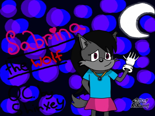

She hasn't had as much of a change as her bestie did, but still some notable ones. Left was done in 2015, and right was done early this year.
I made her really fluffy, but then thought her face resembled Tails a little too much, so I removed the fluff from her face, but left the ear floof. The next change was simplifying her hair style a bit. And the colors on her shirt/skirt are now inverted, but that's mostly because I forgot which went where, but I like the way it is now more. The only other thing that changed with her was her gloves, in which the new ones were based on a pair you can unlock in Sonic Forces that I thought were cute. :)
Pinchy's another OC that I love a lot, so how about him, too?
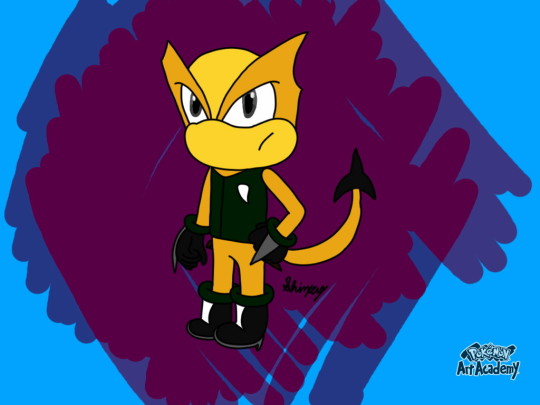
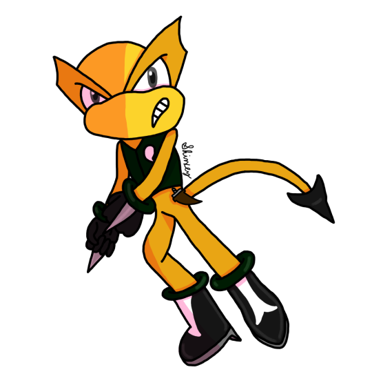
He didn't get any changes outside of an updated art style, but I still think it's neat to see how much my style improved. Left was done in 2020 and right was done only a year later!
He doesn't look nearly as squished or big-headed anymore. :)
And one more for good measure, I suppose? My girl, Cashmere.

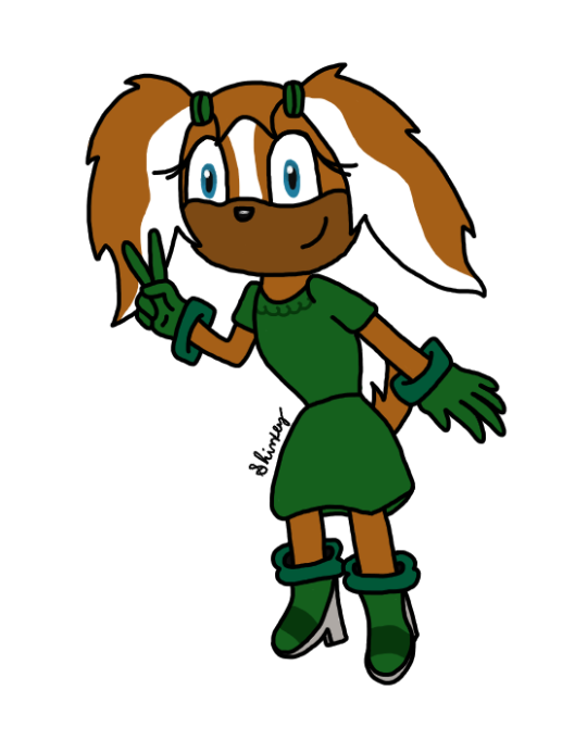
Much like the funny scorpion man, she didn't get any design changes, just an updated art style, but she's another one in particular that I feel had quite the glow-up. Left was done in 2015, and right earlier this year.
I think the biggest glow-up with all of them is the anatomy. Holy crap was it bad before... Hands, too.
I think a big part of the improvement was getting new, better digital art software. Before, all I had for digital art was Pokemon Art Academy, and while it's good, it's limited on what it can do. You can't resize the canvas and if you accidentally draw something too big, you can't just resize that; you have to start all over or deal with it. I think that's a huge part of why my PAA stuff looked so squished and why the heads looked so big. I use Krita for my digital art now and it's REALLY good; I saw immediate improvement upon my switch. And layers? REALLY great, especially for shading! PAA didn't have a layer system, so I think that really stunted any sort of art growth in that regard.
Using more references for things like hands and posing seriously helped me out a lot in improving my anatomy and hands as well. I would usually just wing it and guess from memory, which is why it would usually look really bad. Seriously y'all, use references, it's not cheating.
I don't really have much else to say on the matter atm, but yeah, this was a neat deep dive into my old, cringy art. lmao
It's really cool seeing just how much I've improved over the years.
#anon ask#shinxey's asks#sonic the hedgehog#sonic fan character#sonic ocs#shinxey's ocs#shinxey's art#cynthia the alicorn#sabrina the wolf#pinchy the scorpion#cashmere the dog#art comparison
5 notes
·
View notes
Last Seen Blogs

superherofan31
Untitled

cami37
cami
classicfilmhighway
Classic Film Highway

ali-1223
Untitled

reaboobsiewoofwoof
~boo~