#hammermill
Text
Mesin Hammer Mill Batu Jadi Pasir

Mesin Hammer Mill
Mesin Hammer Mill adalah perangkat mekanis yang digunakan untuk menghancurkan bahan mentah menjadi ukuran yang lebih kecil. Prinsip kerjanya melibatkan penggunaan palu berputar yang dipasang dalam ruang penghancur untuk menghancurkan bahan mentah menjadi partikel-partikel kecil.
Proses penggunaan mesin Hammer Mill untuk mengubah batu menjadi pasir biasanya melibatkan beberapa langkah berikut:
Pemilihan Batu: Batu yang akan diubah menjadi pasir harus dipilih sesuai dengan kebutuhan. Batu yang lebih besar akan dihancurkan menjadi partikel yang lebih kecil.
Pemrosesan: Batu dimasukkan ke dalam ruang penghancur mesin Hammer Mill. Palu-palu berputar di dalam mesin kemudian menghancurkan batu tersebut menjadi ukuran yang lebih kecil.
Pemisahan: Setelah batu dihancurkan menjadi pasir, ada langkah pemisahan untuk memastikan bahwa ukuran pasir sesuai dengan yang diinginkan. Biasanya menggunakan saringan untuk memisahkan partikel yang lebih kecil dan lebih besar.
Penggunaan Pasir: Pasir yang dihasilkan dari mesin Hammer Mill dapat digunakan dalam berbagai aplikasi, seperti konstruksi, pembuatan beton, atau bahan baku untuk industri lainnya.
Penting untuk memahami dan mengikuti petunjuk penggunaan mesin Hammer Mill dengan benar untuk memastikan keselamatan dan efisiensi dalam penggunaannya.
Komponen Mesin Hammer Mill Batu
Mesin Hammer Mill untuk mengubah batu menjadi pasir memiliki beberapa komponen utama yang penting untuk proses penghancuran. Berikut adalah komponen-komponen utama dari mesin Hammer Mill:
Rotor: Rotor adalah bagian yang berputar dalam mesin Hammer Mill. Ini biasanya terdiri dari poros pusat dan palu-palu yang terpasang padanya. Palu-palu ini akan berputar dengan kecepatan tinggi saat mesin beroperasi dan digunakan untuk menghancurkan bahan mentah yang dimasukkan ke dalam mesin.
Palu (Hammers): Palu-palu adalah komponen yang terpasang pada rotor dan berperan langsung dalam menghancurkan batu. Mereka biasanya terbuat dari baja tahan aus untuk menangani tugas penghancuran yang berat. Palu ini biasanya diatur secara radial di sepanjang rotor.
Ruang Penghancur (Crushing Chamber): Ruang penghancur adalah area di mana proses penghancuran bahan mentah terjadi. Batu dimasukkan ke dalam ruang ini dan terpapar oleh palu-palu yang berputar di dalamnya. Desain ruang penghancur mempengaruhi efisiensi penghancuran dan ukuran partikel hasil.
Kisi Pemisahan (Screen): Kisi pemisahan atau saringan terletak di bagian bawah ruang penghancur. Ini bertugas untuk mengontrol ukuran partikel yang dihasilkan oleh mesin. Partikel-partikel yang telah dihancurkan harus lolos melalui kisi ini, sehingga ukurannya dapat diatur sesuai dengan kebutuhan.
Sistem Pengumpan (Feeding System): Sistem pengumpan adalah bagian yang memasok bahan mentah ke dalam mesin Hammer Mill. Ini bisa berupa conveyor, auger, atau sistem pengumpan lainnya, tergantung pada desain dan spesifikasi mesin.
Motor Penggerak (Drive Motor): Motor penggerak adalah komponen yang menyediakan daya untuk memutar rotor. Daya motor akan mempengaruhi kecepatan putaran rotor dan kinerja keseluruhan mesin.
Sistem Pemisahan Debu (Dust Separation System): Beberapa mesin Hammer Mill dilengkapi dengan sistem pemisahan debu untuk mengurangi debu yang dihasilkan selama proses penghancuran. Ini penting untuk menjaga lingkungan kerja yang aman dan mengurangi polusi udara.
Rangka (Frame): Rangka adalah struktur penyangga utama dari mesin Hammer Mill. Ini mendukung dan melindungi komponen-komponen lainnya serta memberikan kestabilan selama operasi.
Semua komponen ini bekerja bersama-sama untuk mengubah batu menjadi pasir dalam proses penghancuran menggunakan mesin Hammer Mill. Penting untuk merawat dan memelihara setiap komponen agar mesin dapat beroperasi dengan efisien dan aman.
Temukan dan cari kami di:
WEBSITE : https://jauramesin.com/
Youtube : https://www.youtube.com/@juaramesin/
IG : https://www.instagram.com/juaramesin/
Twitter : https://twitter.com/JuaraMesin/
FB : https://web.facebook.com/juaramesin
Call/Whatapp : 085 707 300 536 (admin Muhyi)
Terima kasih atas kunjungan anda di situs Juara Mesin produsen Mesin cetak batako dan paving, mesin bata ringan, mixer dan mesin stone clusher pemecah batu serta mesin pelengkap lainnya.
1 note
·
View note
Photo

Recycling solution for Catalysts #litechgmbh #milling #hammermill #samplepreparation #recyclingcatalyst #recycling #ceramiccatalyst #metalliccatalyst #technologycenter #wastetovalue #wastetomoney https://www.instagram.com/p/Cp5evJyNxur/?igshid=NGJjMDIxMWI=
#litechgmbh#milling#hammermill#samplepreparation#recyclingcatalyst#recycling#ceramiccatalyst#metalliccatalyst#technologycenter#wastetovalue#wastetomoney
0 notes
Text

Hammer Mill Manufacturers
Are you looking for Hammer Mill Manufacturers in Mumbai? Keyul Enterprise is the best place for you. Our mills are used for shredding, grinding, and cutting aggregated material for acquiring small pieces. Don’t hesitate to give us a call - +91 9819995645.
#hammermillmanufacturers#hammermill#hammermillsuppliers#hammermillexporters#besthammermillmanufacturers#keyulenterprise
0 notes
Video
youtube
Stable Performance High Quality Feed Hammer Mill, Grain Hammer Mill for ...
0 notes
Text
Empowering Feed Manufacturers: Cremach Pvt. Ltd.'s Unmatched Legacy in Milling Machinery

Cremach Pvt. Ltd. is a leading supplier of dependable, high-quality milling machinery designed for the compound feed industry. With experience of over 4 decades, the company excels in design, fabrication, supply, installation, automation, and commissioning of animal feed process machinery.
#compundfeed#cattlefeed#feedtechnology#hammermills#pelletmillsmachinery#feedmill#aquafeedplants#design#manufacturer#machine#compoundfeed#cremach#cremachpvtltd
0 notes
Text
#Hammermills Market Size#Hammermills Market Scope#Hammermills Market Trend#Hammermills Market Growth
0 notes
Text
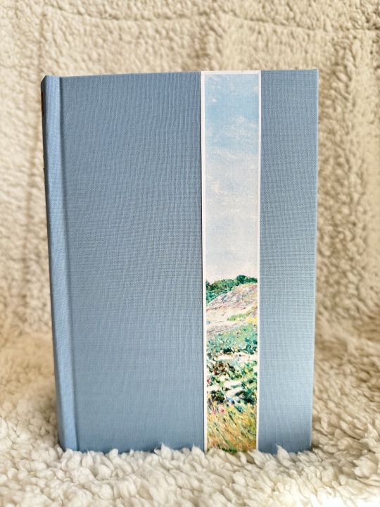
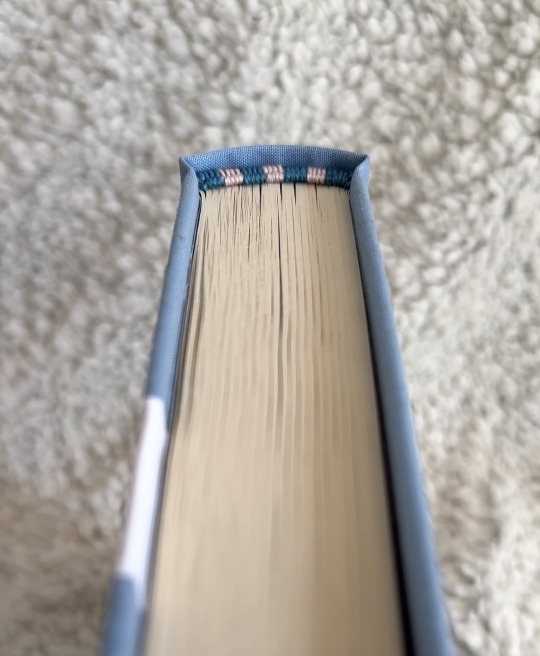
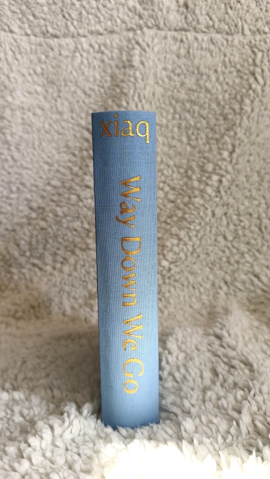
Way Down We Go by Xiaq
I absolutely adore this fic. I have read it so many times I just will never get over it. I love Xiaq and her writing.
I started working on this last summer 2023 and didn't end up finishing it until February 2024 after taking inspiration from @pleasantboatpress 's work that also had a colored strip down the front.
This bind actually came before Azoth, my other bind. So the firsts on this one were MANY
First:
Stencil
Double-Core French Endbands
Rounded & Backed Textblock
Non Bradel Case
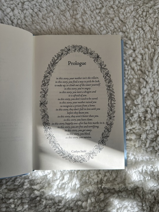
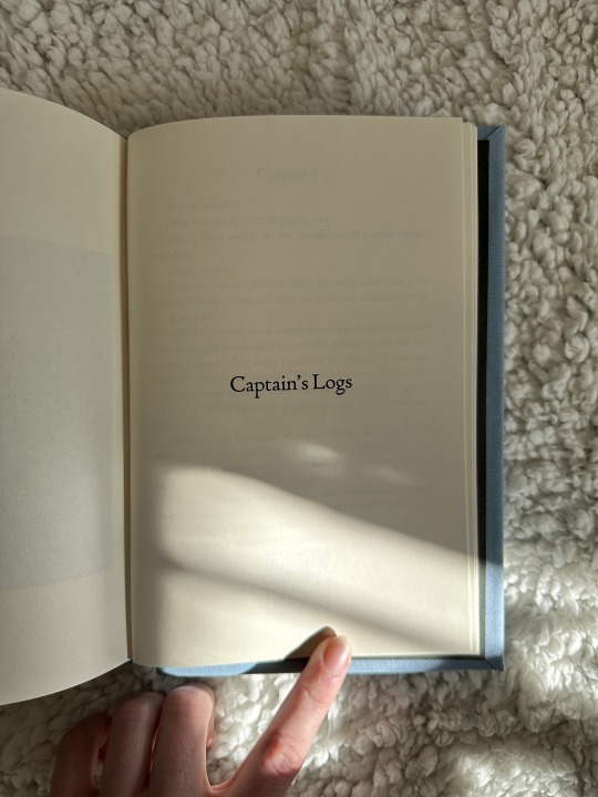
Xiaq calls her authors notes "Captain's Logs" on Ao3 so I couldn't resist putting them in the back under the title. It's just so fun
Bookcloth was DIY'd by me
Paper is Hammermill
Typeset is by me
#drarry#fanbinding#grimmauldplacepublishing#bookbinding#fanfic#ficbinding#harry potter#Harry and Draco in small town america is amazing
341 notes
·
View notes
Text


Bookbinding of Wires got the best of him by TheBigCat @perfectlynormalbooks, June 2024.
Tiny book one for this year's Renegade Tiny Books Bang! Typesetting by the author, who collaborated with me to choose the colors and cover design for the book, which I bound. Lovely to work with you :D
Materials: Text laser printed on Hammermill "cream" archival printer paper. Covers and tapes made of two different colors of blue Verona bookcloth, with cover design painted on with gold metallic nail polish. The binding uses cotton thread coated in beeswax and archival PVA glue. Endpapers are marbled Italian paper by London-based artist Stephan Parenti (Peacock Paper studio).
I have successfully used non-structural endpapers on this, I forget what it's formally called, but anyway the pages are held to the cover by the tapes and stitching. Compare this to modern mass-produced hardbacks, which are usually held in by the endpapers: that's why many books can be accidentally torn completely out of their covers, especially if the book is thick.
#tiny books bang 2024#ficbinding#bookbinding#tiny book#artists on tumblr#waited too long to get a cricut appointment at the library so I had to trace through the bookcloth to get the cover decoration.#I had intended it to be shinier but it turned out quite well I think!#described
183 notes
·
View notes
Text


So excited to share my latest bind! This is a Good Omens fic called Pray for Us, Icarus by Atalan/@brightwanderer 💐
I went a little nuts with the floral designs in this one. The cover was so much fun to put together, and I somehow managed to match the bookcloth color to the headband color perfectly. I also made the chapter headers look like Aziraphale was gathering his bouquet from Crowley throughout the years:


I can’t add another photo on mobile, but Part 7 has two wine glasses with apple slices 🥰
Technical details follow ➡️
Fonts: Glamore (title) and Sabon (body)
Cover material: Allure bookcloth in Mudpie
Dust jacket image: Abraham van Beijeren, Creative Commons usage
Endpapers: Renato Crepaldi
Text block: Hammermill 70lb Ivory
Designed in Canva and Procreate
The fic can be read at http://archiveofourown.org/series/1448647
❗️My binds are not for sale. Authors can request gift copies.❗️
#good omens#aziracrow fanfic#aziracrow#aziraphle/crowley#aziraphale x crowley#azicrow#Gomens#good omens fic#good omens fanwork#good omens fandom#good omens after dark#good omens art#gomens edit#bookbinding#ficbinding#fanbinding#book binding#bookbinders of tumblr#my bookbinding#pray for us icarus
267 notes
·
View notes
Text
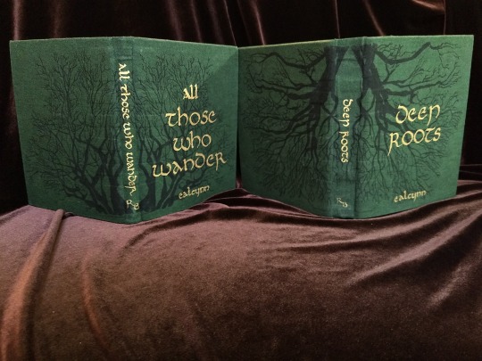


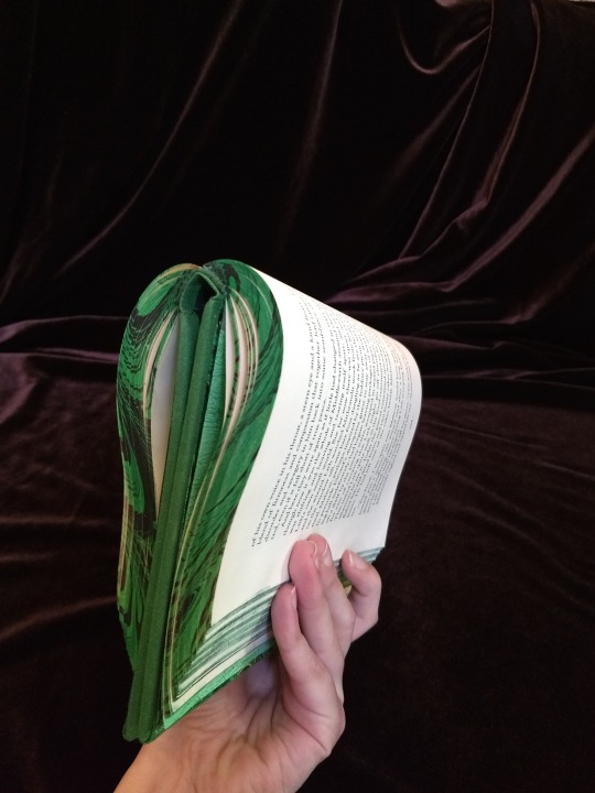
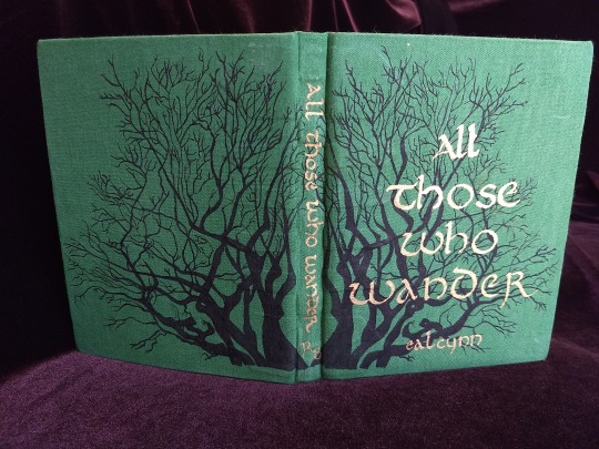
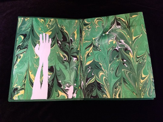
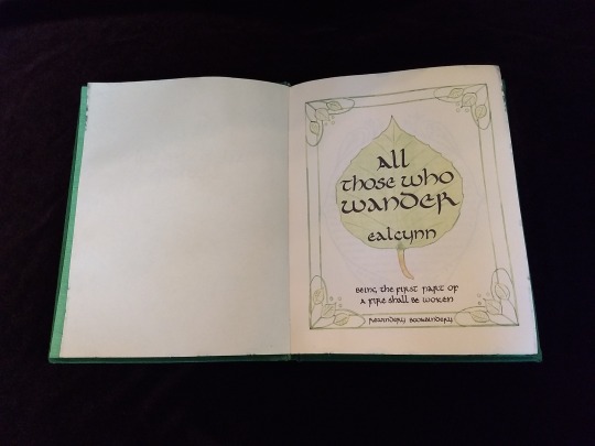
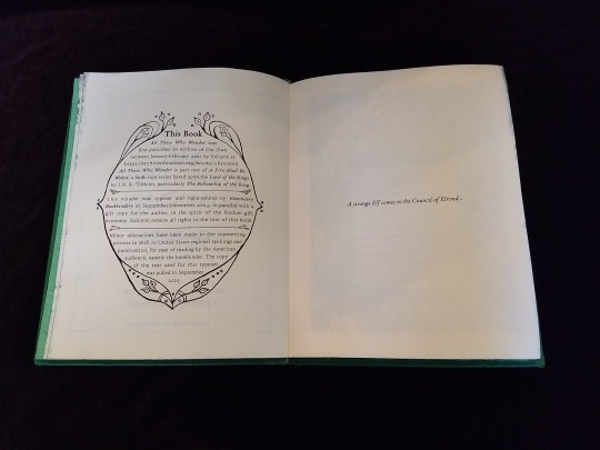

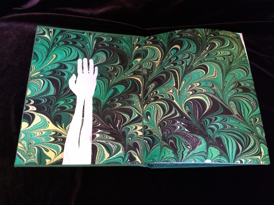
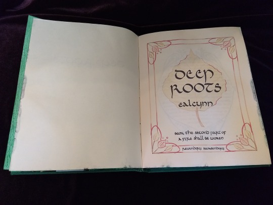
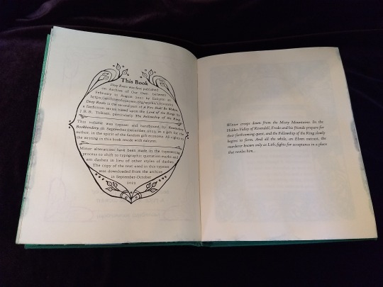


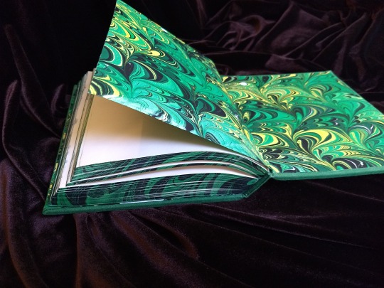

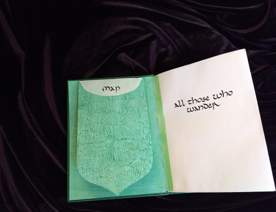

A Fire Shall Be Woken, by Ealcynn. A pair of bindings using the K118 structure, one as a gift for the author and one to keep.
Chapter page illustrations are by Alphonse Mucha, all other illustrations are hand-drawn.
I hope to make a long post later explaining the process in more depth & another to document all my mistakes, but here's the basics.
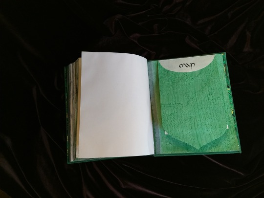
New techniques learned: Paper marbling, edge marbling, uncial calligraphy, making paste papers, drawing on bookcloth, making paste-filled cloth, fold-out maps
I began work on this project in early September and am completing the finishing touches this week.
Structures:
Binding: K118 tightback
Endpapers: Simple cloth-joined endpapers
Map fold: Turkish map fold
Materials:
Sewing supports: linen tapes
Thread: 30/3 linen thread
Spine lining: Medium weight kozo tissue bonded to linen fabric
Interior paper: Hammermill Ivory, 11x17, hand-cut to 8.5x11
Endpapers: Blick sulphite paper hand-marbled, with masked stenciled silhouettes created with freezer paper
Adhesives: Jade PVA, wheat starch paste, wheat flour paste
Covers: Davey board, laminated full thickness to half thickness
Cover fabric: Studio E shot cottons in Jungle and Emerald; filled with wheat starch paste
Cover decorations: Speedball india ink and Dr. Ph. Martin's calligraphy ink in Copperplate Gold
Inks for maps and illustrations: Speedball black india ink and a selection of watercolors thickened with gum arabic
Dip pens used for calligraphy: Combination of Brause calligraphy nibs and Leonardt tape nibs
Dip pens used for illustration: Nikko G pointed pen nib
Typesetting:
Typesetting program: Scribus 1.5.5
Body font: Coelacanth in 10 pt caption weight
Headings, titles, chapter titles, drop caps: Hand lettered uncial calligraphy, scanned
Illustrations and References:
Frames on colophon, copyright, author's notes and title page: Hand drawn, with inspiration taken from the vellucent bindings of Cedric Chivers
Frames that illustrate each chapter start: Alphonse Mucha from Cloches de Noël et de Pâques
Cover illustrations: Referenced from a photograph of an European beech tree found on iNaturalist.org
Maps of Imladris: Hand drafted with inspiration from the maps of Barbara Strachey, and Daniel Reeve
Map of Eriador: Traced from a map by Karen Wynn Fonstad, with edits made to coordinate with the geography of the fic
Frames on maps: Referenced from a drawing by Alphonse Mucha that @zhalfirin found for me
Special Thank Yous:
To the tightback council of problem-solvers in the Renegade server: Zhalfirin, Eka, @spockandawe who helped figure out many issues with the structure and technique
To the marbling experts in the Renegade server: Marissa, Aether, AGlance, Jenny, Catz, Badgertide, Rhi, and everyone else who helped me figure out beginnner marbling
To Spock for finding the K118 structure and introducing it to the server!
And to Bruce Levy, who discovered the method and shared his discoveries freely with the bookbinding and conservation world.
#bookbinding#Fanbinding#mine#bookbinding adventures#thank you to everyone i consider this a group effort#it has been 10000 years and I have loved every step#except for sanding. nasty nasty sanding. ew.#fic recs
241 notes
·
View notes
Text
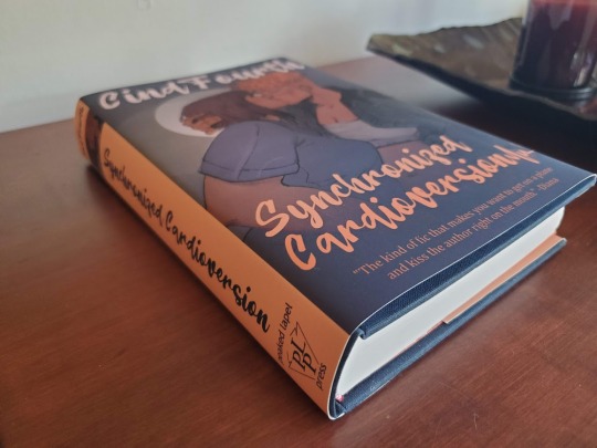
Hey guys what's up I learned bookbinding to make @cindthia a physical copy of Synchronized Cardioversion for our anniversary :3
Pics and process documentation below!
I used the following resources:
How to Make a Book by ArmoredSuperHeavy
Bookbinding Resources Master List by Renegade Bindery
r/Fanbinding
the fanbinding tag on AO3 - shoutout to r3zuri's fanbinding of a FFVII fic for their extremely informative cliff's notes version of the process
the Intro to Hand Bookbinding class at the Minnesota Center for Book Arts, an incredible resource for anyone in or near Minneapolis interested in learning how to bind their own books.
First, I typeset the fanfic. I did this by downloading it from AO3, trying to figure it out myself, checking How to Make a Book for help with a problem I was having, and realizing that I should have just used it from the beginning in the first place. I used Microsoft Word 2013.
Fonts: Palatino Linotype, Helvetica (for the characters' text messages), Beatline (for titles)
Margins: .88" top, 1" bottom, .75" inside, .75" outside, .25" gutter
Front matter:
- Title page with only the title
- "Praise for Synchronized Cardioversion" with comments from the fic
- Title page with title, author name, and a colophon I made
- Copyright page with fic copyright, fic URL, TLT series copyright, disclaimer, AO3 fic summary, first chapter author's notes, copyright for in-text art, book design credit, font info
Back matter:
- Acknowledgments (from the fic)
- "Also by CindFourth" with all their TLT fic separated into Synchronized Cardioversion Extended Universe (might make another book of this at some point); Other Camgideon, Campal, and Team 69; and Other Locked Tomb
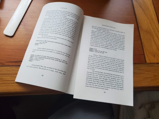
I set the page layout to "book fold" with 16-page signatures. As for the art, one of Cind's requests in last year's TLT Holiday Exchange was for art of this fic and they got not only a fantastic one-page comic from their assigned creator, our friend @anaeolist (who also did a sketch of Cam and Gideon kissing - we'll come back to that later), but also a lovely piece as a treat from our friend @kat-hikari. I got permission from both artists to include their work in the book.
The finished file was 408 pages, so I added four blank pages (two sheets) to the beginning and the end to make 26 signatures even.
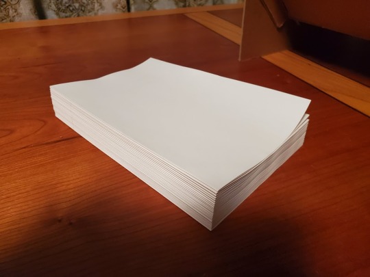
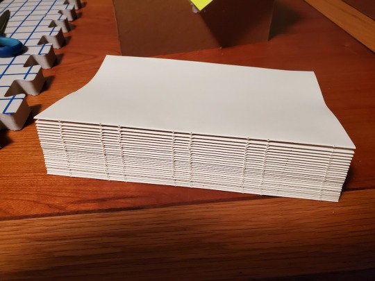
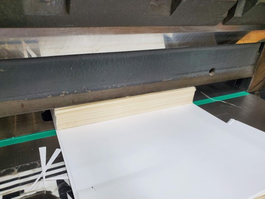
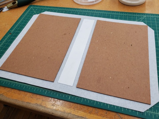
Next, I printed the pages. I used my Brother DCP-L2550DW and Hammermill 11x8.5 24/60 lb. cream bookbinding paper from Church Paper. I'd read that sometimes using short-grain paper in a regular printer could cause it to jam, but it went fine. The cream color made the pages look so professional.

I folded the pages into signatures and then pressed them overnight. Since I don't have a book press, I sandwiched them between two sheets of bookboard and put a heavy box on top, and that worked well.
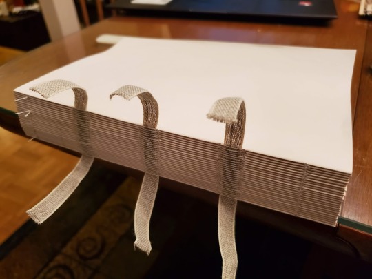
The next step, punching holes and sewing, was my favorite. I'd made a punching cradle using instructions I got in my bookbinding class. It was a lot easier than I thought it would be, and it only used bookboard and PVA glue, so I didn't even need to buy anything I hadn't already bought for the project.
I used three pieces of tape and sewed them on using a kettle stitch.
Then I went to MCBA to use their guillotine on the text block and their board shear to cut boards for the cover.
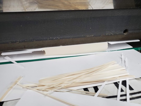
I chose orange cardstock for the endpaper, and because I am a novice making novice mistakes I unfortunately forgot to get a size of cardstock that would let me fold it on the grain, but anyway. I trimmed it to the exact size of the pages and glued it to the text block. Next I glued the spine of the text block, rounded it a bit (not the way an expert would; you learn that in Intermediate Hand Bookbinding), added a strip of super mull and headbands at either end, and sat it under a weight to dry while I made the cover.
The Bristol board I cut for the spine was probably 1/8" too wide, which makes a bigger difference than you would think. Next time I'm going to err on the side of slightly too narrow when I'm already giving myself three board widths of a buffer on either side.
Aside from that, the cover turned out great! I could have done a better job lining up the endpaper when I glued it in, but that's the kind of thing you practice I guess.
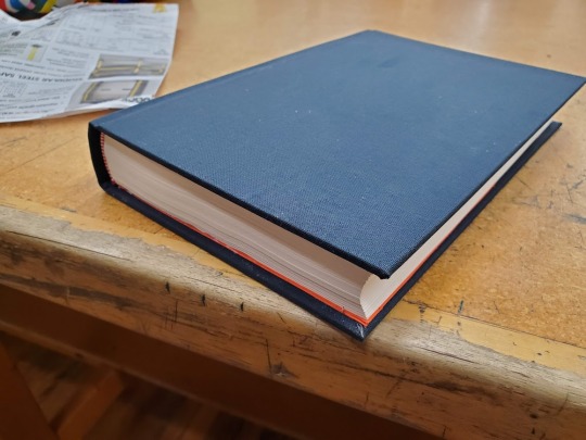
I love the way the navy blue bookcloth looks with the cream paper, the orange endpaper, and the red and white headbands.
Now that I had the exact dimensions of the book, I could finally design the dust jacket. Remember that sketch of Cam and Gideon kissing that anaeolist did for the holiday exchange? I commissioned them to turn it into a finished piece for the cover, and boy did they ever deliver. I also asked some of our other friends who had read the fic to give me blurbs for the back cover, and they delivered too. Cind's and my relationship wouldn't have been possible without the wonderful community we met in and I wanted this gift to reflect that.

I created the jacket in GIMP at a print resolution of 300ppi and saved it as a pdf. The final step was to get it printed, which I was nervous about because it was the only part of the process that I had no control over at all. Long story short, I ended up with something I was very happy with done by a small chain print shop where I had to go in and talk to a human about what I needed.
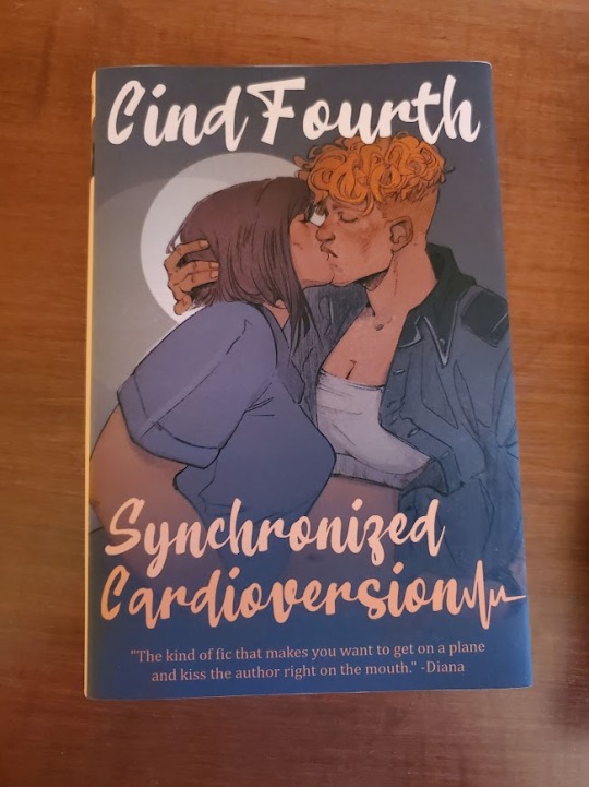
I also posted this to AO3!
110 notes
·
View notes
Text
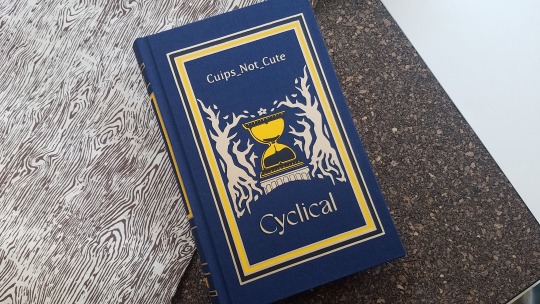


After a few months of off and on again work, @cuips-not-cute 's Cyclical is now bound!!!
489 pages, 21 signatures, and about 1.25 inches thick!
And you should read their fic here!!
{Breakdown under cut!} - Contains Spoilers!
Uhh where to start with this. My first attempt at: a more standard book size (fun), a full cloth book (no problem here), full page illustrations (okay results), and chisel trimming (uh oh!).
(Suffice to say I need more practice with that last one, the foredge could have been worse, but it coulda been better - a little wonky but we'll just say it's got character).
I think what I'm most proud of is the color cordination of it all (and the end papers, oh my what a fitting find).
Materials:
Made with Cialux bookcloth in night blue and Spanish MM marbled paper for the endpapers. The cover graphics are yellow Siser HTV, a black HTV, and Cricut metallic gold HTV (not near as shiny as one might like). Bound using linen thread and archival pva glue, endbands sewn using single strand embroidery thread in a double core style. Printed on Hammermill 20lb cream paper.

Cover:
Cuips mentions Slaughterhouse Five at the start of the fic with a quote, so I used that as a bit of a jumping point for the cover design. Specifically this edition. Only instead changing the red for the blues of the upside down and a somewhat orange-ish yellow (both colors of which we see a lot in the fic). The skull and crossbones is similarly swapped with the hourglass on its pedstal in the UD woods with a flower and petals around it. The back cover showcases a sheep dog's wolf collar hehe.
My biggest grief with this cover is that for some reason, one of the HTVs leaked glue when pressed. It doesn't look bad, just adds an odd shinyness but thankfully isn't sticky. Weird!
Title Page:
A negative space hourglass with UD vines outlining the shape (perhaps a XII hidden in there too...). In the middle is a repeatedly circled sphere with sand pouring out and the title flipped to be reflected below.
Other tidbits that I think are neat:
All timeloops in the fic end with things dissolving into sand, so I tried to add a little falling sand graphic at those sentences.
The chapter end notes are titled "notes for past self" and the next chapters summary and beginning notes are "notes for future self" because it felt like it fit the timeloop theme
"say it out loud, it'll be okay" (with the Steve and Robin sheepdog and cat) and "enter sandman" have my favorite chapter title illustrations (oh man the feelings I have for the cassette tape..)
the book notes page has the same vine graphic as the title page but this time with flowers on it!
Overall I'm really pleased with how this bind turned out! It was a lot of fun and a bit of a journey to make!


+Bonus timelapse of sewing some of the signatures 'cause I find it fun to watch:
#the book has been recieved!! so it's time to post!#stranger things#my posts#fanbinding#ficbinding#bookbinding#cyclical#cuips-not-cute#steddie#this beast weighs about 1lb 10oz or so it has such a nice heft to it!
94 notes
·
View notes
Photo

Recycling solution for mixed metal-plastic waste with LITech hammer mills #hammermill #milling #recycling #samplepreparation #litechgmbh #technologycenter #metalplastic https://www.instagram.com/p/CmTR_vQtJcd/?igshid=NGJjMDIxMWI=
0 notes
Text
Red, White & Royal Blue Rebind


[ID: Eight pictures of a hand-bound rebind of the book "Red, White & Royal Blue." The first shows the cover, which has been bound in light gray bookcloth and is decorated to look like a suit with a union jack tie. There are two cardstock buttons, one that says "Vote Claremont" and the other that says "History, huh?" On the right side, the title "Red, White and Royal Blue" is painted on in red, white, and blue paint respectively. On the left side, the author name "Casey McQuiston" is painted on in white paint.
The second shows the spine, covered also in gray bookcloth. It has the title "Red, White and Royal Blue" painted on in red, white, and blue paint respectively and the author name "Casey McQuiston" painted on in white paint.
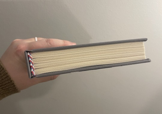
The third shows the book from the top so the headbands, sewn with red, white, and blue thread, can be seen.
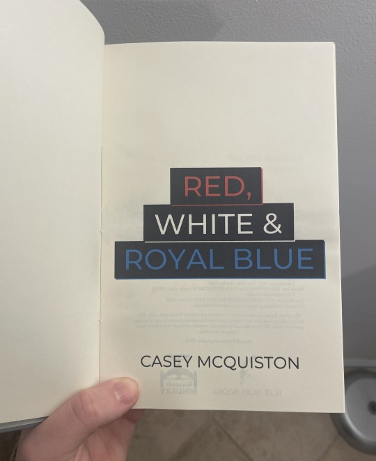
The fourth shows the title page of the book, which has the title "Red, White and Royal Blue" in red, white, and blue ink respectively, as well as the author name "Casey McQuiston" beneath it.
The fifth shows the colophon page (left) and dedication page (right). The colophon has details about the book, as well as the binder logo for Blue Skies Books (a bluejay) and the logo for Renegade Publishing (a bookpress). The dedication page says, "For the weirdos and the dreamers" in a sans serif font above a black and white drawing of a reflective lake with pine trees around it.
The sixth shows a chapter header page, which has a gray skyline that merges the skylines of DC and London across the top of it. The word "One" is in all caps in white on the lefthand side of the skyline, and body text is beneath it in a serif font.
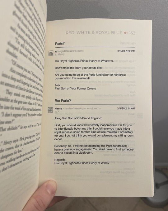
The seventh shows the inside of the book, drawing attention to the formatting of the emails throughout the book. The emails include icons for both Henry and Alex, email addresses, timestamps, and subjects.
The eighth shows the inside of the book, drawing attention to the red, white, and blue heart page divider and the handwriting fonts used within the regular body text for certain words. /End ID]
When the Red, White and Royal Blue movie came out last year, I rediscovered my love for this book and these characters and just had to do a rebind of it! This is a full rebind, so I've done the typeset myself as well as the cover. I had a delightful time coming up with the cover design (I imagine this is modeled after a theoretical Alex suit, though it could be Henry's as well!), and I had an especially fun time doing the typeset. There are so many fun formatting elements in this story, and it was great getting to put my own spin on them.
Logistics-wise, this bind uses Lumeiere fabric paint and a Silhouette-cut stencil for the words, Silhouette-cut cardstock for the decorative elements, handmade cotton bookcloth for the cover, cotton embroidery thread for the endbands, and regular Hammermill cream paper for the textblock. (Once I've saved up for it, I'm looking forward to getting some short-grain textblock paper! This is still long grain.) The body font is Cochin and the title font is Montserrat.
And finally: my bind versus my trade paperback copy!
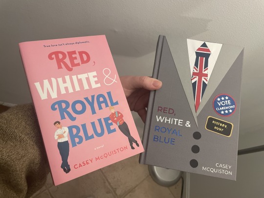
[ID: A picture of the hand-bound version of "Red, White and Royal Blue" from above held next to the mass-produced paperback version of the same book. They are made in different styles with different color schemes, but both have a fun and slightly whimsical appearance to them. /End ID]
179 notes
·
View notes
Text
Resource Post: Supplies, Equipment, and Software
So I've had some people ask about the supplies and equipment I use to make my books! This is not a comprehensive list, nor is it an official tutorial on how to make a book (for that, I recommend starting with Renegade Publishing's resource documents, DAS Bookbinding, or SeaLemon's YouTube tutorials -- all free, no patreon required!), but if you're floundering because you don't know what you need to get, hopefully this will help a little bit ❤️ If I discover more good resources or change up my style, I'll add to this post.
Of note: I'm based in the US, so this list is unfortunately pretty US-centric. Apologies!
SUPPLIES
Disclaimer #1: I have a background in book conservation, so I'm picky to a fault about the supplies I use. To make a long-lasting book, you want to look for "acid-free" or "archival" materials -- BUT, a lot of consumer craft stores have realized those are good buzzwords to slap on products even if they aren't really archival. Your best bet is to buy from stores that supply materials to libraries and archives; those tend to be higher quality and stick to actual archival standards. Talas, Hollander's, University Products, and Colophon Book Arts Supply are good places to start.
That said! If price matters more than longevity, hitting up Michaels or Joann Fabrics is totally fine. This is a hobby. The bookbinding police are not gonna come smash down your door because you didn't use archival-quality craft paper. My big recommendation, though: at least get your glue and paste from Talas. High-quality adhesive makes a huge difference in how well, and how long, a book holds together. Bad adhesives can turn brittle with time, stain your paper/cloth, and make all your hard work fall apart.
So, all that said, here's what I use:
BOARD - Davey Binder's Board, 0.098"
GLUE - Jade 403 PVA
PASTE - Zen Shofu wheat paste (you shouldn't have to buy more than half a pound -- a little goes a long way)
CLOTH - Either Arrestox or Dover bookcloth, which comes in a wide variety of colors and holds up extremely well to whatever you want to do to it
THREAD - 25/3 linen thread, which I run over a small block of beeswax to make it easier to handle and give it better "locking" properties as I sew. For bigger books of ten signatures or more, I sew onto 3/8" linen tapes for extra support.
DECORATIVE PAPER - Hollander's is a treasure trove of decorative papers for endsheets and covers; Talas has some really nice ones, too, but they tend to be pricier (since unfortunately everything at Talas has gotten a lot pricier lately)
PRINTING PAPER - Hammermill Colors paper, 20lb, in cream; 24lb is also a good weight that feels a little more substantial than regular printer paper. (I'll probably switch to 24lb once my 20lb paper runs out.) To get the right grain direction, I buy a ream of 11x17 paper and cut it in half to make standard letter-sized sheets (8.5x11). Here's a quick primer on grain direction and why it's important when making a book!
ENDBANDS - I've never had the patience to sew my own endbands (though I hope to gain that patience someday!), so I just use premade ones like these.
EQUIPMENT
Disclaimer #2: a lot of the stuff on this list is professional-grade (or close to it) with prices to match. You definitely don't have to buy everything right off the bat. It took me fifteen years to accumulate it all, and you can DIY a lot of bookbinding equipment -- a good googling will lead you to all sorts of innovative ways hobby bookbinders set up their shops. The Renegade Publishing resource documents also have a lot of A+ recommendations.
PRINTER - For text, I use a Brother B&W laser printer with auto-duplex (auto-duplex is key when printing a book); for images, both B&W and color, I use a Canon color inkjet printer set to at least 300 DPI. I fully admit having two printers is an absurd setup, but what laser printers can do well, inkjets absolutely suck at, and vice-versa -- and like I said, I'm hella picky. You can get by fine with a single laser printer! Just make sure it's got auto-duplex to save yourself a lot of pain.
GUILLOTINE - I have this model, which goes in and out of stock with some regularity. The trick with this guy is to (a) sandwich your text block between some scrap board so the clamp doesn't leave a dent, and (b) REALLY CRANK DOWN on the clamp as tight as you possibly can to keep the paper from shifting as you cut. This fixes 99% of the skewing problems mentioned in the reviews.
PRESS - I have a little cast-iron press I bought off a coworker for fifty bucks; similarly, you might have luck searching eBay, looking at Affordable Bookbinding Equipment (Jim does incredible work!), searching craft stores for a flower press, or even just using two pieces of wood and a few C-clamps. SeaLemon on YouTube also has a good video on how to DIY a book press.
PRESS BOARDS - For setting the hinges in the press, I use a pair of brass-edged boards like these. It's a good investment if you want to get really nice, crisp hinges, but it's also 100% possible to DIY brass-edged boards if you want. At my very first job, we even set our hinges by taping sewing needles to the book before putting it in the press!
FINISHING PRESS - I have this one, which I use to back my books in combination with these backing irons
BACKING HAMMER - To my chagrin, I've discovered that having an actual backing hammer makes backing a book way, way easier. Some folks have had good luck with a cobbler's hammer or just a regular old hammer from a hardware store, but I splurged on a student hammer from Hollander's, and it works fantastically. (I wouldn't recommend buying the "professional" hammers, though, because seriously, $90 for a hammer?! No.)
BONE FOLDER - I'm actually not a fan of bone folders made from real bone; I like Teflon folders a lot better for scoring and flattening. (Real bone folders tend to burnish the material, an effect I'm rarely going for.)
CUTTING MACHINE - A Silhouette Curio. This is 100% optional, but it's how I do the bulk of my cover designs, including cut-outs, embossing, foiling (with a foil quill attachment), and spine titling. The software and overall quality are way better than Cricut, and its 5mm clearance means you can fit more than just vinyl in there. Sadly, Silhouette has discontinued the Curio, but it's still possible to buy from third-party sellers -- and if you don't care about the 5mm clearance, I've heard good things about the Silhouette Cameo line.
A side note on vinyl, from the obnoxiously picky book conservator: if you're aiming for longevity with your books, using HTV in your book designs may not be the best idea. Not only can the adhesives be questionable, but the plasticizers in vinyl break down in really weird, gross ways once several decades have passed. That's why I tend to stick with cut-outs and foiling instead of HTV. But, again: if you just want to make something pretty, don't worry about it!
SOFTWARE
TYPESETTING - I use Affinity Publisher -- it's similar to Adobe InDesign, but with a flat cost instead of a bullshit subscription model. I am by no means an expert in this, since I've only been designing books for a couple years; pretty much everything I learned, I learned from Aliya Regatti's tutorial, plus or minus a lot of googling and noodling around. I've discovered that it does get cranky if your book is over 250 pages or so, meaning you may have to split longer fics into multiple files. That said, I've been really happy with it, and it goes on sale every now and then if the $70 price tag is too much.
As always, Renegade Publishing has a whole lot of tutorials for other software options, including Microsoft Word, InDesign, LaTeX, and Scribus if you already have access to one of those instead.
IMPOSITION - "Imposition" is when you lay out a book so all the pages are in order once you fold + gather the signatures. Since Affinity Publisher doesn't do this automatically on export, I use Bookbinder 3.0, which is an old but nice little Java program that breaks a single PDF into a series of properly imposed signatures. I usually set it to 6 sheets per signature.
MISCELLANEOUS
IMAGES
The Noun Project is a gigantic repository of basic SVGs and PNGs that are not only great for cutting machines, but for adding flourishes to your title page, chapter headings, and scene dividers. Every single book I've made has used at least one image from here; I pay for the yearly Noun Pro subscription, but it's not necessary to use the site.
Unsplash is perfect for photo elements
Pixabay not only has a great archive of photos, but illustrations and vector images as well
Surprisingly, Wikipedia also has a lot of good Creative Commons photos attached to their articles!
FONTS
1001Fonts is a good starting point for finding free fonts, as is FontSpace and DaFont
If you're willing to pay for fonts (and sometimes it's worth it for a well-designed font that's perfect for your project), Creative Fabrica and Pixel Surplus have some good stuff, including discounted bundles of multiple fonts
264 notes
·
View notes
Note
What happens to the bodies of Jax’s victims? Does he preserve parts for study? Does he bury the rest in the garden (meat can be very nutritional for trees)?
// He does a variety of those exact things, yes!
He also has a furnace and a hammermill in the basement for the guest’s belongings
31 notes
·
View notes
Last Seen Blogs

ningboglobaltec
NINGBOGLOBALTEC

msfilmdiary
The joys of film.

malewifemammon
it is i, the miracle tomboy witch princess!

sailoranonn
Sailor Anon

the-inkwell-variable
Talia Writes