#how do you draw so good 😭
Note

Since I’m taking forever on that fic 😩
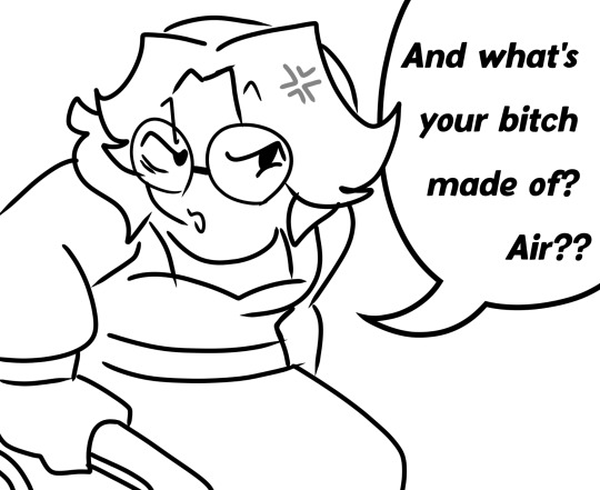
*dies* AAAADGHJKHCXX THANK YOUUUU 😭 I LOVE IT I LOVE IT I LOVE IT!!!!!!!!!!! AAAAAA YOU'RE SO AMAZING I LOVE YOU!!!!!!!!! 💖💖💖💖
#yooooo I wasn't expecting this !!!!!!!!! Holy crappppppppp#AAAAAAAAAAAAA SHE'S PERFECT 😭 💖#I LOVE YOU SO MUCH#*gently holds close to my heart*#WHERE ARE THOSE REACTION IMAGES I ALWAYS SEE HERE?!#I NEED ONE 😭#Just so you know as soon as I saw this in my inbox I immediately ran around the house#flapping my arms and running in place doing a little dance#oh my gosh I love thissssssssssaaa#you really didn't have to#i don't mind if you take long on your writing it's gonna be epic either way!!!#ask#hnnnng I love ittttttttttt#even now I'm still fidgeting around bouncing my feet and hands#not my art#how do you draw so good 😭#💖💖💖💖#you're literally the best person ever
8 notes
·
View notes
Note
HELLO i love these two so much, i couldn't not draw them

ALSO my friends and i love your art okay bye
THIS IS SO PEAK WHATTTT
#ask reply#fanart#tape girl fnaf#fnaf vanny#vanessa fnaf#YOURE SO COOL TYSMMM FOR DRAWING THIS#LIKE drawing my tape girl design and everything 😭😭#that one mater from cars image/pos#Vanny is a lil unhinged but I think she’s trustworthy#I’m gonna stare at this for hours now it’s so good#I LOVEEE how you drew everything here#even the style quirk I do with colouring under hair lighter#eating this whole thank you for your service#Toxic fnaf YURI likers win again#BTW TYSMM IM GLAD yall luke my arts!! 😭💜
1K notes
·
View notes
Text

sometimes you gotta lure your overly-studious ravenclaw gf into spending time with you 🥰 📚
( from 'Every Teardrop is a Waterfall' by Kat_12739 on ao3, GO READ IT!!! the first story is about seb falling sick and still pushing himself/not admitting he's sick until he ends up in the hospital, the second story is about the birth of seb and clora's daughter and seb's reaction to clora almost dying in childbirth, and the third is about dealing with a fussy newborn lewis😭🥹THEY'RE SO GOOD AND SWEET AND SOMEWHAT SAD (not to mention beautifully written) so go check it out!!💖💖 )
#READ SO I CAN YAP TO SOMEONE ABOUT THEM🙏😩💘#the seb sickfic made me realize how much i needed barely functioning and sick seb (but him still trying to be tough)#theres also a part that cracked me up bc at one point seb is so sick he cant even see straight but he just thinks to himself:#eh its fine.... ill just ask ominis how HE functions without vision later🤷 LMFAO#so stubborn...JUST LET CLORA TAKE CARE OF YOU MFER🤺🤺🤺#defs gonna be drawing more from it especially sick seb LMAO but also seb having a tea party with celeste🥹🥹#hogwarts legacy#sebastian sallow#sebastian sallow x oc#sebastian sallow x mc#sebastian x mc#hogwarts legacy fanfiction#sebastian sallow fanfiction#hphl#choccyart#also i was never planning on writing anything about clora giving birth or abt the kids so to be able to read it WAS AMAZING#THERES A PART WHERE SEB IS HOLDING CELESTE AND CRYING AT CLORAS BEDSIDE THAT I NEED TO DRAW😭😭#LIKE SRSLY seb being conflicted and not even wanting to HOLD celeste bc he doesnt know if clora is alive or not... IT WAS SO SAD BUT GOOD#i honestly dont know what seb would do if clora died in childbirth tbh.......i could honestly see him resenting celeste#esp since she looks so much like clora😭😭#LETS JUST NOT THINK ABOUT IT!😃👍#(still thinking about it)#like this line in the fic: “Sebastian hesitated; if this was Clora’s last gift to him he wasn’t sure he wanted it.”#😭😭😭ITS SO GOOD UGHHHHH😭 TY AGAIN FOR WRITING THESE💖IM SO TOUCHEDDD💖💖
1K notes
·
View notes
Text


I haven't drawn Floyd that much take some warmups
#rainyart#trolls#trolls branch#trolls floyd#trolls band together#ceo of drawing things a million people probably have but IDFC!!!! the song literally came into my shuffle as i was drawing the first slide#AND IT HURT REAL GOOD SO I HAD TO OKAY#i have so many thoughts about floyd i kinda tried to convey the vibe of a fucking 10-12 year old kid whos grown up in a very very fucking#disfunctional household who knows he's doing a really horrible thing but he is just SO fucking tired. SO tired and needs to get away#and man i GET IT okay. i get it. why wouldnt he wanna get away okay! of COURSE he would wanna get out and establish himself/figure out who#he is outside of a group! without a label to define how he acts!#oh my fucking GODDDD#but my boy..... branch.... branch!!!!!1! 😭😭😭💔💔💔#anyways anyways anyways. yap sesh over ill see you all next time teehee 😁💥 *kicks my feet*#if u read all that. we r kissing
226 notes
·
View notes
Text

why does every reconciliation fic go like this
#my dc posting#jason todd#red hood#jason todd fanart#ugh i forgot to change tim n dick's skin colours aa i already put my drawing stuff away whatever#bruce wayne#dick grayson#tim drake#<- main offenders#no but. jason will be making some absolutely great points#ill be cheering him on like YEAH know ur fucking value good job call them the fuck out dont fall for their shit!!#then there will be one (1) event n suddenly the author pulls a complete 180#all of jason's valid issues n complaints r swept away without ever being solved#at most he's given a few flimsy excuses or justifications#n suddenly hes all happy n dandy w them#like 🤨🤨🤨 what!!!#like nothing changes nobody makes any effort but apparently one sentence going 'omg no it wasnt like that jason 😭' is enough to sweep#everything under the rug#like why have i never read a fic where anyone actually works to change. to right the wrongs theyve done. to apolgoize and do better.#aside form of course jason going 'i see now that murder is wrong i was stupid n angry for no good reason good thing the pit madness has bee#solved/managed better n i have apologized to Poor Little 10yo Baby Tim whom i hurt and traumatized So Badly how will he ever forgive me...'#'fuck my family wtf is wrong w these assholes' 'i killed the joker for like 3 minutes' 'i love you i have no further issues aside from#Teenage Angst which will be cured via being told my anger is disproportional and of course one (1) hug form my Dearest Father'#when will i read someone 'pullin the alfred card' and jason respondin w 'fuck alfred'. he deserves to be an asshole w the way hes treated..#ok ill stop now im just. very done w this stuff
119 notes
·
View notes
Text

[ messy ass sprite edit ] youkai au, but if it was cooler & sexier ( aka they let these losers have anything besides their fuck ass bowl cuts. )
#listen. it makes sense why they still have the same hair as normal in the context of the set's event story...#but the designs would've been better with different hair I'M JUST SAYING#.... also it's an excuse to draw karamatsu with longer hair#HE LOOKS SO GOOD WITH IT.... the fact that he doesn't have more aus where he has long hair is a crime#prime example : kara as shiva in the hindu mythology set. like. dude holy shit.#( also you can tell those are late service sprites with how good the art looks )#anyways since kuroba's youkai au is set in medieval japan i'll probably use these hairstyles whenever i draw the bros in that au#sorry these aren't cleaner i did these in between working on other art 😭#i'll come back around to this and do i proper edit of them... someday...#osomatsu-san#osmt#hesokuri wars#youkaimatsu#osomatsu#osomatsu matsuno#karamatsu#karamatsu matsuno#choromatsu#choromatsu matsuno#ichimatsu#ichimatsu matsuno#jyushimatsu#jyushimatsu matsuno#todomatsu#todomatsu matsuno#mj edits
75 notes
·
View notes
Text

Little doodle practice to get back into things✨
Still struggling to draw Dagon so Micheal again for now until I figure Dagon out
#art#digital art#digital drawing#fanart#artists on tumblr#good omens#good omens michael#micheal good omens#good omens fanart#good omens art#my art#mya draws sometimes#I just wanted to finish and post this quickly before work today so it’s a bit rough😭#also how do you draw Micheal’s hair cause I’ve just been winging it so far and have no idea what I’m doing what is their hairstyle
40 notes
·
View notes
Note
how long does it take you to draw your sketches/doodles? also do you have any tips to draw faster? 🙇♀️
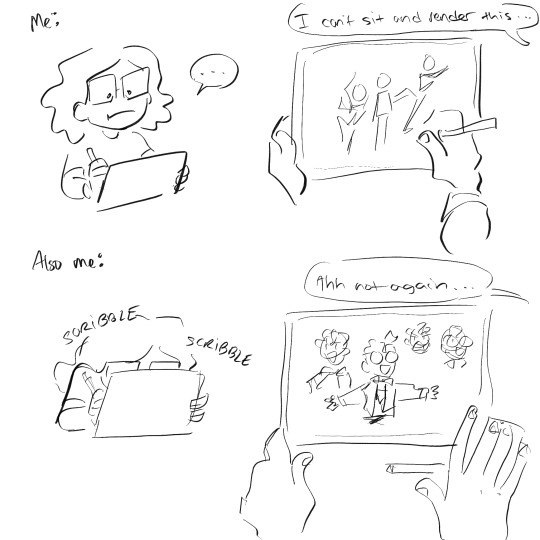
I generally take 30 - 60 minutes a sketch,,,, but honestly really depends on how detailed it is.
Like a Chibi will be done in 20 - 25 minutes (Counting in the extra time I spend on minute details like a perfectionist 😭)
I for some reason really like spending egregious amounts of time on random objects too??? Unless it’s the in the background, I’ll spend 40 minutes refining it.
Random characters that are fully colored and rendered with take like 80 minutes.
The comics take usually take an hour or two per page. (If I decide to cross hatch it, my entire day will be gone with 4 pages… so I’ve been trying to find shortcuts. But not without sacrificing the quality for time lol)
I don’t think there’s any trick or magic to drawing faster. It’s really about weaponizing your artistic knowledge, and finding what’s comfortable or convenient for you!
There was a period of time where I would spend 11 or 12 hours on an illustration, and it wASS UGLYYYYY. (Some of these artworks are still available on my tumblr,,, but it’s SO LONG AGO, AND IT WAS MY 1ST OR 2ND YEAR GETTING INTO DIGITAL ART)
Overtime I learned what worked best for me, and practiced till I felt more comfortable with what I was drawing. Eventually I managed to shorten the time to 4 hours or less! Ambition was my biggest enemy but at the same time my biggest motivator. (And it still is LMFAO) 😭
EDIT (bit more to my way too long tangent): ALSO??? BRO DON’T BE AFRAID TO USE YOUR MESSY SKETCH AS LINEART OR DRAW ON TOP OF IT. I’VE DONE IT FOR YEARS NOW AND IT ADDS SUCH A GOOD EXTRA BIT OF TEXTURE,, AT THIS POINT I DON’T EVEN USE LINE-ART ANY MORE UNLESS IT’S A COMMISSION,, (IT’LL ADD LIKE AN 2-4 HOURS TO MY WORK)

#mushyrt#asks#that word minute bothers me so much#I look at it and want to refer to it as the time minute#this sketch took about 3 minutes when it should’ve been 1 minute#BUT I WAS SO HYPERFIXATED ON THE EYESSS#i say these pretty words#but THE REAL TIP IS HONESTLY THE LASSO TOOL#LASSO TOOL IS THE BEST#IT’S MY FAVORITE TOOL FOR MAKING BACKGROUNDS OR QUICK SHADING OR COLORING#OR ALSO THE MASK TOOL#TAKE ADVANTAGE OF THEM#THEY’RE SO GOOD#Procreate mask tool kinda sucksss#SO USE ALPHA LOCK IF YOU ARE A CONFIDENT PERSON#OR NOT AFRAID TO F**K UP#Bro I sometimes draw on 1 layer and use alpha lock and my friends look at me like I’m a menace#BUT IT!S USEFULLLL AND SO EASY#This little tangent definitely should’ve been my answer for the ‘how much do you draw’ question#but I’ve been thinking about it for a long time#AND I’M A MANIAC WHEN IT COMES TO DRAWING 😭😭#even if you rob me of a paper or pencil I WILL FIND A WAY TO DRAW#I WILL SCRATCH INTO YOUR SHIRT AND ROCKS AND MAKE AN ARTWORK OUT OF WATER OR CAT FUR#YOU WILL NOT DEPRIVE ME OF MY CREATIVE ENDEAVORS#This didn’t stick out to me until one of my friends said ‘omg ofc she’s drawing’ under her breath#like I spend every second of free time I have drawing unless I find something else interesting#The only time I’m not drawing is when I’m on the toilet or doing random everyday stuff#I forgot to talk about this but greyscale to color is insanely useful too; it teaches you different values while also being super fast#i tend to use greyscale to color when I do a BW sketch I end up liking#TL;DR - Lasso Tool + Layer Mask + Alpha Lock + Sketch as lineart
52 notes
·
View notes
Text
Going to do a Nevermoor series reread in June + July + August ? if anyone else also wants to do a reread around that time, could be fun to have more of the fandom prepping for Silverborn
Did initially make a roadmap plan to split the books up into weeks on top of already being months, so that people could focus on specific parts and discuss each week….. but between the fact that I messed it up the first time, Silverborn kept getting delayed as I planned it, and I’m actually really bad at keeping to stuff like that (looking at you, Silverborn Countdown Challenge…) I’m deciding to just go for it at whatever pace happens.
#will def be June/July but we’ll have to see if I get into August. may want to keep most of that + September as Silverborn Hype Months lol#nevermoor#silverborn#if you ever followed my rereads thoughts masterpost for my (reread?) eternal reread and wondered ‘why no hollowpox’? boy is it a doozy#beginning of the year Apple Books updated and I’m not huge on it!#and since I couldn't fix I decided I would try and delete and reinstall the app.....#…..forgetting that my books and notes are tied to the app and not saved otherwise…..#so I lost all my notes INCLUDING all my reactions and thoughts from my very first reread that I was excited to look back on and share 🥲😭😭😭#so I’ve just been in mourning and never continued out of my personal beef with the app….#so this time I think I’ll take use of all my different physical copies and read them physically to give myself a break from screens lol#this summer is just grindset time of getting back into drawing and trying to get good so this reread I also want to draw stuff alongside#like try to nail some character designs and such to make it easier for Silverborn lol#I fear I will need to figure out how to draw dragons……#anyways. if you’ve read all these tags you are now required to join in on the reread with me 🫵#this also reminds me I need to keep working / actually work on the nine spreadsheet / masterpost. will do that ✍️#I have had several drafts saved of posts I want to respond to with theories that I’ve been saving for my hollowpox reread that now I’m like#do I just save them for Silverborn?? lol
30 notes
·
View notes
Text
normalest friend group
#wrong they all hate each other#except for elias only eden hates him rightfully so#he got his bestie dante exhiled anyways thats for when i design kat which might be never back to the line up#brooke looks so cute shes eliciting a omg puppy response from me. never slimming her face down again her cheeeks#the more adorable they look the eviller they are. in order brooke elias diamila eden#diamila will stab you in the back for fun and she probably has the highest vampire bodycount in the us BUT she doesnt kill humans#so that basically makes her a good person#elias and brooke would literally kill a kid the only difference is elias would only do it if he was pissed brooklyn would do it for fun😭#shes so cute#wip#ill draw a full body line up later shivers#elias and brooke are the only ones where same face syndrome kicked in but i dont mind that much there is literally no way theyd get mixed u#wait let me go back on what i didnt mention#eden is off the evil scale hes a relatively good guy.... by kindred standards tho hes still a hypocrite kind of nines style but worse#he did the most to become baron and rallies the anarchs into going to war w the camarilla basically but he cant stomach violence#back to how much they all hate each other diamila and eden used to be friends but she did her usual backstabbing when chose the vt m b#camarilla ending diamila hates brooke and brooke just dislikes her but has no reason to hate her and eden and brooke hate love each other#mostly hate by 2021 honestly#his bestie wasnt named dante i meant it dante exhiled. you know
39 notes
·
View notes
Text

Horny bisexual on horny bisexual hostility
#no none of you get the context on why i made this#man why is Henryk so easy to make fun off i fucking hate drawing him#i don't know how to make his white boy haircut look good😭#on the other hand i adore drawing Olivia even if the day i do her is hella inacurate#like i though she had one hair thingy in both sides#but it's actually just one#by the point i found that out i was too used to drawing her like this#fear and hunger#fear and hunger termina#fear and hunger Olivia#fear and hunger Henryk#fear and hunger Samarie#hyena scribbles
278 notes
·
View notes
Text
i think ive been bit by the fanfiction bug oh no
#i really wanna try to draw even a short little comic but im too busy using eddy as a paper doll to practice drawing clothes 🫣#im not great at writing but i do okay when im not overly concerned with structure and punctuation and shit#so i might try writing that way and experiment with present tense cuz that seems to flow a lot better from the stuff i've read#gettingfrilly's writing is so damn good it made me realize how mediocre mine is and sometimes you need that to happen if you want to improve#owmylasagna and eddbedandeddy are old masters too 😭 i think frilly's was the first fic i read that was in present tense though??#i could totally be wrong and i am by no means a fanfic connoisseur#idk anyway i might try writing something but im not sure the content is something anyone would enjoy 👀#it would involve edd being scandalous as hell
23 notes
·
View notes
Text
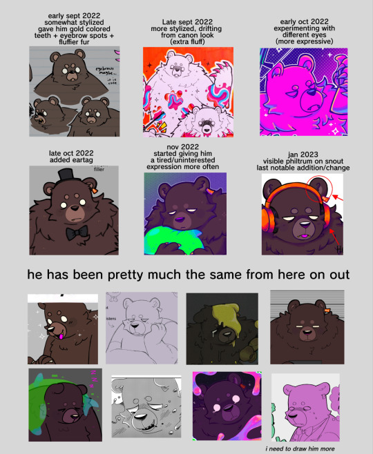
grizz stylization evolution chart 👍
#im still mixed on how i draw him but whatever ummm#i had to go through alot of old art im sick#EUGHHHHAUGHHHH#im debating making a tartar one the way ive drawn it has changed alot it took a bit for me to rlly get used to him#fixating on fictional characters is so funny. the way you draw them evolves the more you do it#you start getting more comfortable and eventually stylize them to perfection in ur mind#its good#this didnt happen to me with spamton tho i still dont know how i wanna draw him 😭😭😭 all of my spamton art is different. but thats ok#augh. fictional characters. ough#i like drawing the same guys over and over
27 notes
·
View notes
Text

Yaaay, I got to do an art swap with @kyanako5972 -- here's her wonderful oc Claire Inez, featured in her webcomic SWAP Ensemble 🎶 Claire was a blast to draw, I hope I could do her justice!!
Failed versions include trial song background that just looked lame/unreadable, and the original singing pose that just looked off for some reason...
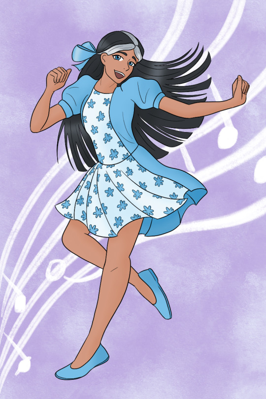

#ocs#waahhh thank you for doing the swap pal -- shes so cool ;--;#i always love seeing her pop up on your blog -- i was so excited to finally sit down and draw her :D#*offers you a cute little claire to bribe you to not Stab Me for my milgramblrgram attacks*👀👀👀#i was fully prepared to do a clarinet-playing-pose but it felt kinda static for a trade piece😭#so i figured dancing was a good mix of something fun and still musical 😎 she deserves the spotlight!!#i love all of her outfits -- i picked this one but it was hard to choose from so many cute ones haha#im impressed how many there are across the comic :0#and hairstyles!! i liked drawing hers more loose here but there were so much fun ones!!#i couldnt get her pose/face to look right in the original sketch and i wanted it to be perfect >:[#i also loved your recent dance sequence art and had to step up my game if i was going to match your dynamic poses haha!#🎶🎶🎶#claire inez#swap ensemble
27 notes
·
View notes
Text

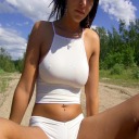
not-yet-dead-person
silly comic of a conversation in-game i thought was too funny not to make something proper for instead of a doodle ww
(timelapse + wip images (thus silly process commentary in read more if you like artist commentary :3)

i think the sketch looks silly and goofy and funny so i find it important to share with you the mere presence of the faces i drew on it. i drew it on top of the boxes without staying inside its borders because i find my proportions can get wonky if i draw them cropped in a restricted space. and I feel trapped otherwise and i will draw BAD!!! give me spaceeeee to go wild!!!!
the head circles are there for emotional support
very low res speedpaint because truth is the canvas was much bigger than the space where my comic was placed. i didnt account when exporting my timelapse in 720px that that tiny space would look so pixelated ... but it's able to be percieved, so its okay.
(i will now comment on my process and it is not brief sorry)
usually i would try to clean up my sketches and figure out what goes on top before jumping into linework, but since there are multiple panels and drawings i chose to jump into inking right away for the sake of brevity. i just went in with a brush that uses pen pressure and drew what was needed. i added extra line thickness and contrast in areas around the face because it helps direct your eyes there more easily that way.
according to her equipment rei has a chain belt but i only remembered it existed once I was going to color, and i did not like that discovery... I chose to ignore it to maintain my peace. i already have the color palettes for these characters figured out, and i didnt really want to think about a new element at the moment www I tend to overthink those things a lot so i skipped it

the rest is rather straightforward! not that anything else wasn't, but in here i could turn my brain off and sing. linework and sketching require mumbling so i cannot turn my brain off. just block in the characters with a solid color so i can have a mask (something along those lines,) where the color can stay inside. then just color in !!!

Base colors just had slight cell shading on the skin, and for the hair i airbrush a bit of the skincolor in low opacity near the forehead... I'm not sure what it means, but i can look at the faces easier with it somehow. i like the gentle subtlety it adds even if you cant really tell. it makes things look nice.
background was just me blocking in the color of the wall and floor, shade the wall a bit, then slap a noise and free use wood texture on top. work smarter not harder ! yet it took a bit to make it look stylistically fitting with the characters, and even now i think bottom middle panel looks odd. whatever!!!
for the middle panel i thought itd be funny if the background was a solid silly and colorful one to contrast the next panel's sketchy black one. a contrast to how the word widow is seen. on that note my handwritting is not pointy. i gaslighted my hand into thinking that it was indeed pointy in that moment so i could write "not-yet dead person" in letters that didn't seem cute. my hand did not fall for it but it complied anyway
that's basically it! I'm not sure what else i could say that doesn't feel barebones because it really is that straightforward. if you're curious I used clip studio paint for this. only special brush used was for linework (a brush named Lemon Brush), the rest used were just the default. my computer gets the least credit. it was trying to convince me a 20mb file was going to nuke it all the time and hardly let me save multiple times so i do not appreciate it
#re:kinder#fanart#sayaka re:kinder#rei re:kinder#OH I ALREADY RAMBLED IN MY POST WHATEVER SHOULD I TALK ABOUT NOW IN MY TAGS UEEEEEEE😭😭😭#oh yeah do you want to know a fun fact about this drawing#i started it yesterday. i wasnt meant to I DID NOT HAVE PERMISSION...FROM MYSELF... i was meant to be on break#i self imposed a one week break from doing any rekinder related project after the transcript to avoid accidental burn out#NOT THAT I GOT TIRED OF IT AFTER THAT TRANSCRIPT NOT AT ALL#but jumping straight into more hours of creativr work after over 30 hours of it is asking for disaster. it is asking for burn out#yesterday was the last day . 12 hours were left but i was going to die if i didnt draw anything it would have been OVER#(aka my period started recently so i got very gloomy and depressed so i needed to run to my favorite stress relief...drawing rekinder☺️)#(on that note seriously what the fuck please explain the evolutionary advantage to getting horribly depressed every month)#(like hello?!?! rant real quick— i get enough flashbacks everyday i DONT need them to last longer and have me more msierable ?!?!?)#(periods are so dangerous to my mental health for no reason can i get a restriction order on them or some shit what the fuck)#(anyway thats enough of that break of character DONEEEE :3333)#SO YEAH I DIDNT EVEN LAST 7 WHOLE DAYS i even played a new game in between those 6 days youd think itd het my mind of rekinder. WRONNNNGGG#not even another devastating rpg horror gamr could divert my attention for long i hsd to draw rekinder😊#using the newfound power of mt transcript i was decided on drawing rei because i dont draw her enough for how high she is on my fvaorites#i was initially doodling random lines but then i stumbled upon this interactkon and it doesnt really fit into my usual expression sheets#so i thought hey lets do it asife#i thumbnailrd it and from there i was like hey lets do it in comic format isntead of separated messy doodles in tint canvas#and the rest is hisotry .... aka i spent the last two days doing this instead of doing MY HOMEWORK!!!!!#on my defense when i wasnt drawing i was horribly depressed i had no other choice#(seriously fuck off periods WHAT what do you mean i need to be distracted 24/7 to not be struck by crippling meltdowns LEAVE ME ALONE?!?!?)#(they should be banned we as a society should find like a . cure to them it dont do me good to have a whole week where i cant function)#these tags have been more of a weird rant im sorry IVE BEEN FEELING PEEEVEDDD LATELY SO YOU GET. STRANGE DROTTER LORE ????
17 notes
·
View notes
Text

I’ve never been so obsessed with a character so bad that I literally can’t do anything else I’m like the squidward meme watching SpongeBob frolic outside the window stretching a hand out to all the pretty paintings and animations and comics I see in my head but being unable to feel any motivation for it . If only i could use the energy spent to create 20 kon doodles to sit down and concentrate on a single finished full piece I used to be able to make like 5 page comics what happened to me
#sighs yes before anyone says anything IK it’s probably adhd related 😭#BUT ITS GOTTEN SO BAD I CAN FEEL THE DIFFERENCE IN MY BRAIN HOW DID IT GET WORSE#it’s probably a mix of burnout too but I don’t get tired of drawing ?#it feels like when u get dizzy or change glasses or so#and it’s either everything is wayyy too in focus and you can see literally everything clearly that it hurts ur brain#which doesn’t help given how saturated w information the world is always#and simultaneously somehow everything is blurry or out of focus and I physically have to strain myself to hone in on one thing#I JUST WANNA READ COMICS AND FINISH A DRAWING AND HANDLE WORK AND SCHOOL AND TALK TO MY FRIENDS#ALL IN OME DAY#BUT MY BRAIN IS LIKE. TODAY IS ONLY FOR COMICS. YOU CANT DO ANYTHING ESLE#😫🫶 I’m deleting this later I’m just ranting LMAO#I’m highschool it’s crazy bc I did okay and then honestly i just think my ability to concentrate has deteriorated as the years have gone by#free me!!!#either way I want to lessen my social media and just pick One bc girl I have an Instagram a tumblr and a twitter this is horrible for me .#honestly I’ll probably pick instagram and just post on tumblr when I have art#I already do that#I mean when I have Good art.#IM RAMBLING IDK
74 notes
·
View notes
Last Seen Blogs
skype-sohbet-sitesi-canli-s-blog
skype sohbet sitesi //canli sohbet sitesi

solomids
billion dollar smile ♥

gloriamichael06
Untitled

organikselin
selinus

purity-control
#1776 •> #1984