#i guess i just know myself very well
Text
I watched Nimona and had about the exact experience I expected to have which is kinda surprising bc it was "mixed feelings bc it's probably gonna be an impressive visual spectacle and a very polished production that I'm nonetheless gonna like much less than the comic and won't find the actual writing very impressive even if I manage to not compare the two"
17 notes
·
View notes
Text
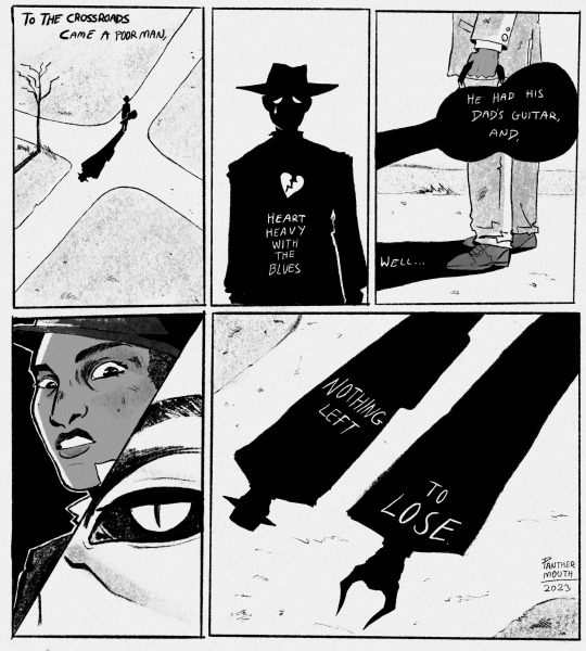
And I said, “Hello, Satan
I believe it’s time to go.”
#my art#southern gothic#been too depressed to create anything but I’ve made this today#the little rhyme has been in my head for a few weeks#spilled ink#I guess do people still use that tag for poetry or am I old lol#I’ve been writing in my journal pretty much daily and sometimes spitting out little poems like this#not much energy for art#so I’m not gonna pressure myself to keep it up#I’m just gonna enjoy the fact that I made this#I hope ur all well <33#the devil#by the way this isn’t meant to be fan art of Robert Johnson#but it’s inspired by him and the stories of musicians who sell their souls to the devil#I am still thinking very hard and have mostly drafted a cornstalk fiddle comic#god knows how long it’ll stay in a notebook haha#my comic#comics
2K notes
·
View notes
Photo
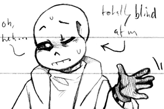
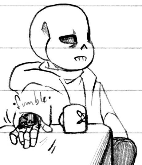
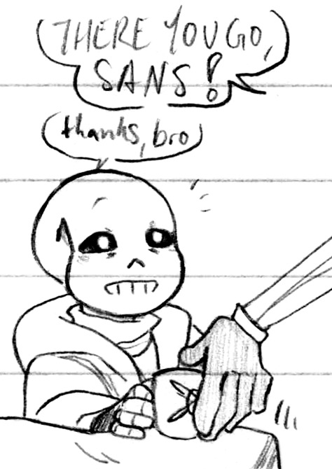
Blind side (Patreon)
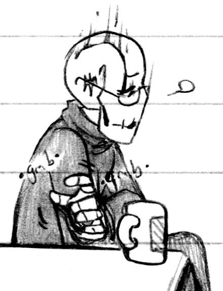
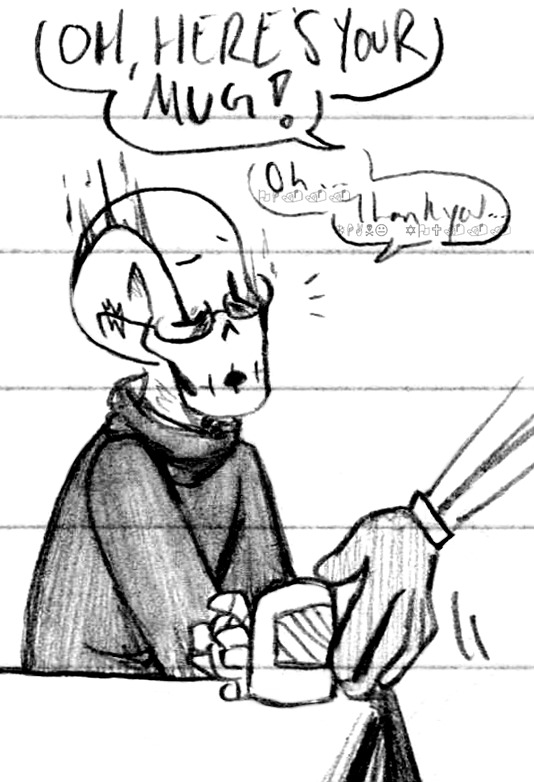
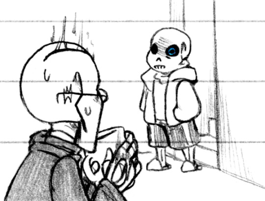
#Doodles#UT#Handplates#Sans#Papyrus#Gaster#Sans closing his good eye every once in a while and keeping his blind eye open - obviously he does so in-game as well so it's a style-match#It's just interesting in the context of him being textually-confirmed blind in Handplates hehe#There's a level of vulnerability there! Not more than closing both eyes around someone - and potentially also distrust!#''I'm baring myself blind right now but /you/ don't need to know that'' - it suits him ♪#Especially when he does it around Papyrus! Because obviously Papyrus knows about his partial blindness#But when he's trying to be duplicitous - the way he looks at him sidelong with his blind eye when he's trying to lie unsuccessfully ugh <3#And again-again it being about how much he trusts Papyrus! That he can be a little lazy or spacey and Papyrus will help him!#Also something about his entire right side being impaired - pawing around with his plated hand for something he can't see on that side#The dynamics! Internal and external! Very good like them lots#And then there's Gaster lol ♪ Throw him into the mix I'm sure it won't make a mess at all haha#I guess he's visiting? Just spacing out - he and Sans have a lot on their minds - separately haha#I do love how Sans pushes Gaster to be kind to Papyrus - very deservedly! He wants Papyrus to be happy of course#And he's obviously still angry with Gaster a lot but how might that present itself when Papyrus is Papyrus at Gaster hehe#Even just in that small jokey way of ''you tryin' to step on my turf?'' hehehe#Especially since the comparison wouldn't even come up if he had two functioning eyes hm?? Right Gaster???? Lol#Speaking of that scene and Sans' partial blindness tho ughhughuhg <3 <3 The fact that Sans stands with Gaster to his blind side#It's the vulnerability/distaste/confidence of it all! He's grown up so much it's all right there in how he holds himself#That he either trusts Gaster enough not to attack him - starting to believe him - or that he has enough faith in himself to protect himself#And only looking at him with his peripherals unless he looks directly at him hghhhgh I am Normal about shot composition I swear lol#Also I like how that last panel turned out lol - Sans just appears at the bottom of the steps like how's it going. care to gtfo thx
726 notes
·
View notes
Note
please don’t be sad little sprout, you are loved 🌱 🖤
🌱
#🌱Thank you<33🌱#I guess my latest vent art post made some of you guys worried. I'm sorry ;;n;; )#but I'm alright. well.. kind of? Like I haven't done anything to myself kind of alright?#maybe I should explain bit about my situation but at the same time I don't feel comfortable to open up too much#but simply said it's about doing art as a job and mental health#Things haven't been going well but I am getting help for my mental health#This is all what I will say for now about my situation#I apologize again that I made you guys worried#but I do warn that I might post more vent art if I get enough energy to draw#this is just one way how I deal with my emotions#but if you don't like vent art I suggest to block the words vent and vent art#I remember tumblr has this option somewhere??#and uhh.. I don't really know how to end this post but thank you everyone who has been sending support<33#I might not know how to reply to them but I have read them all and I'm very thankful for all the support what you guys have given me🌱#Thank you🌱#ask#anon#me talking
360 notes
·
View notes
Text
its so hard to watch time pass when things like careers and assignments exist. what do you mean im supposed to take that seriously
#I have an assignment that was due a week ago and I really really dont want to do it. I have to but i dont want to#im probably making it worse because my brain has built a wall around it so now i can’t do literally anything else until thats done. but#because I don’t want to do it I’m just kinda stuck. turns out this is what they meant when they said emotional regulation is part of#exec dysfunction.. I’ll have a thought like if I get a little bit of it done now i can get it over with. I can just submit something#and then not even 5 minutes later itll be like ugh but I have to draw all the assets out. I have to write things and make spreads ugh#and its just flopping between those two things. i hate it when ppl are like well how much time do you need to work on one thing#because BOY id love to know too. I’d love to know exactly when my brain wants to cooperate with me and work around that but I cant#even my period can’t decide when it wants to punch me in the stomach. which is kinda funny in the grand scheme of things but still#its so weird im just lying on my bed thinking abt all this like damn.. the time will pass anyways no matter what I decide to do.. damn….#if I submit that assignment now and take the L I literally won’t die. it’ll just be a deduction on an assignment nobody will ask me about#I know this but I’m still stressing myself about it so my thoughts aren’t really connecting to my body. weird#maybe its because Im having a hard time looking forward to things. theres definitely a lot I should be living for but I don’t really feel#a strong attachment to it I guess? it’s been like this for a while with holidays and meeting with friends so I just don’t#I kinda figured its because im pretty passionless and its more like passing interest. but it’s not very fun when it feels like I’m going to#be living distraction to distraction for the next 70 years or so lol#idk it kind of feels like slowly bleeding out. which is funny because I actually did experience blood loss this week#had a 30 minute nosebleed and literally could not stand. also it felt like someone was pinching the back of my brain which was interesting#yapping#does this count as vent#vent#Ive just been making an oc carrd and contemplate changing my blog header for the past 3 days honestly
172 notes
·
View notes
Text
WIP FRIDAY
I apologize for getting this out two days late, I’ve been busy with lots of packing and events! But I have a little reprieve, so I wanted to post another WIP; this one is from Heart Full, Bowl Empty.
BE AWARE THAT THIS SEGMENT INVOLVES A CONVERSATION REVOLVING AROUND UNWILLING BUT INTENTIONAL STARVATION. I know there are people who say they can’t read this fic because of themes like this, so be aware of this before reading this WIP!!
I included this snippet in today’s WIP because I have like three versions of the entire segment this snippet is from. I feel like it’s a really important segment with a really important conversation, and I’ve had a hard time balancing all the emotions the way I want to between Ingo and Akari, with frustration, sadness, anger, and empathy, to realistically get them to the resolution I want at the end of it.
The final version will probably only include a few parts from this particular segment.
Enjoy!!
—————
“I knew it! You’re doing it again!” Akari’s eyebrows scrunched, trying to understand through the frustration. “You said you wouldn’t!”
“Circumstances will improve soon.” Clearly done with the conversation, that was all Ingo said, but it was confession enough that he had fallen back on his word. Shame contaminated his voice, but if there was any regret, he hid it well.
“No, it won’t!” They were not even half-way through winter yet. “And you know it won’t!”
Ingo said nothing as the kits carefully moved around his slumped form, finding comfortable places to settle around him. She didn’t know if he intended to snuff the conversation out with angered silence, or if he was just too exhausted to care about arguing with her anymore. If it wasn’t for his small occasional signs of movement or acknowledgement, she’d think he was actually sleeping.
Akari carefully stepped into the nesting layers, moving to sit down next to Ingo. She settled with her back against the cavern wall, pulling her knees close as a few kits shuffled around to accommodate her. “You know I’m right.”
Huffing out an irritated sigh and nothing more, it didn’t seem like Ingo had any intentions to engage with her argument anymore.
“You couldn’t even pull yourself up over the ridge,” She prodded at him again, trying to motivate more conversation out of him. “I had to help you!”
“There are many, many factors that go into that.” A reluctant answer, perhaps a reflexive attempt to quell her worry; Ingo feebly rubbed his wrapped hand, almost as a display for his excuse.
“I’ve seen you do more when you’ve been hurt worse.” Akari retorted, a little softer now but still cold.
Ingo’s eyes remained closed, though his hardened expression implied that it came across as more accusatory than she’d intended. But perhaps it was precisely the time to be accusatory.
“Ingo, you’re so tired all the time now – you stopped coming to the training grounds because you just can’t make the trips all the time anymore! And you’re sleeping so much more than you used to, and it’s like you’re always hungry all the time, even though all I see you doing anymore is gathering food!” Akari’s voice grew more jagged as she continued to jab at him, entirely uninterrupted.
It was getting difficult. With Ingo’s tunic still sopping by the bucket, still somewhat red from the exhausted effort of washing out the blood, it could not hide the ribs that pressed out just a little bit more, or help fill out what the waistline had lost under the loosening belt. The abject dread of directly acknowledging that was too much.
“And- and look! You aren’t even willing to hold a conversation with me anymore, and I don’t know if it’s because you just won’t, or because you can’t!” The kits shifted uncomfortably as Akari retreated back into her own frustration instead. “People think you’re sick, Ingo! They’re asking me about you! What are you doing?”
The exhausted man remained where he laid in the nesting material, only moving his hands to rub at his face and sigh — a deep, forced sigh that swelled his side before releasing. Akari almost didn’t think he’d answer her, but with some effort, he propped himself up first onto his elbows, then slumped forward. The teen watched him run shaky fingers through his hair as he sat next to her.
“…I don’t know what I should do.” The guilt. The weary guilt cracked his voice and tore Akari’s anger down to heartache.
#ref for fic#BE AWARE THIS IS DISCUSSING INTENTIONAL BUT UNWILLING STARVATION#tw starvation#just in case#cause I know not everyone vibes with this story#and I’ll say it’s been weird myself returning to these segments I wrote months ago and re-reading them#AND TO BE MORE CAREFUL I talk about a personal situation sort of dealing with this below#a lot has happened in the timeframe of originally writing this and coming back to this#at the end of fall I got very very sick and it lasted well into February#I unwillingly shed thirty-five pounds because I could not eat#and I didn’t notice at all until I stopped and realized just how tight I had to make my work belt#even when family members pointed it out during the holidays when they’d hug me#it wasn’t until someone got very concerned and did something about it that I realized just how bad it was#I’m sure people remember when I mentioned I had gastritis#that’s what all this was I just never really went into detail about how bad it truely was here#so coming back and reading this segment specifically#having written it months before I went through any of this#felt really really weird and a little uncomfortable#I edited Akari’s accusations a little to fit my situation more about a month back#because I did not realize just how much more stuff like this would make you want to sleep#at least in my experience#but it’s been very very just#strange I guess coming back to this#it doesn’t make me want to not work on HFBE anymore it just feels very weird
29 notes
·
View notes
Text
so there's a reason my new job got back to me so quickly about my application and that's bc it's an absolute fucking shambles like actually perfect timing for me to decide to rewatch the bear bc i have never more felt like ive been thrown into a broke on-its-knees establishment trying to crawl its way up the ladder where i am somehow a godsend to them. my old job was crazy and shambolic in the sense that the industry is just Like That but this one?????? insanity. every 5 mins i am questioning what im doing with my life. ive already had a walk-in fridge moment
#so i explained before that there's 3 venues and on my very first shift they had me doing the restaurant venue for 2 hours#which was FINE like i was a bit cautious bc my manager is VERY stressed all the time and the place generally feels like it's falling apart#not the building itself just. the way it's run like it's just got new owners and the previous manager apparently#EMPTIED THE TILLS AND TRASHED THE PLACE like cost them THOUSANDS of pounds and on top of that#there was beef with the head chef and the new owners that meant he left and took the ENTIRE BACK OF HOUSE WITH HIM#THERE ARE NO KITCHEN STAFF ATM. I HAVE TO LIE AND TELL CUSTOMERS WE DONT HAVE FOOD ATM BC OF 'REFURBISHMENT'#WHEN IN ACTUALITY THE /RESTAURANT/ DOESNT HAVE CHEFS. DO YOU KNOW HOW CRAZY THAT IS#and then the front of house staff are very lacking aside maybe 2 people we're ALL NEW and all of them EXCEPT ME#LIKE LITERALLY JUST ME IM THE ONLY EXCEPTION. ALL OF THEM ARE UNTRAINED#so when i applied with bar training coffee training and very solid waitressing skills they genuinely treated me like a saviour#like i am FENDING off shifts tbh im in a v good position bc they need me too much to get shitty w me if i refuse hours but i can literally#have as many as i want bc they will just give me them. like they're obsessed w me im rota'd for over 60 hours this week#but anyway that very first shift after 2 hours in the restaurant i then walked to the mini golf venue on the OTHER SIDE OF TOWN#and my manager stayed for 30 MINUTES. IF THAT. and showed me around the place + how to close THEN LEFT ME THERE#FIRST DAY HE GAVE ME THE KEYS AND LEFT ME TO RUN AN ENTIRE VENUE. IT'S NOT SMALL EITHER IT'S A WHOLE BAR#AND I HAD TO CLOSE ON MY OWN TOO and ironically the shift itself went rlly well like it was so chill#it was kinda boring but honestly i kinda rated it it's v easy money and the close went perfectly nothing cropped up that i was unsure about#and then. AND THEN. i havent even ranted to my mutuals about this yet bc i was acc so horrified by it but i locked the front doors#and went to lock the gate AND THE KEY GOT STUCK IN THE LOCK. WOULD NOT COME OUT. HELLA VS KEYS ROUND 3927593#my mum even showed up and tried to help me wrestle this thing out i called my manager and he literally told me to just snap it#bc he'd rather a snapped key that NO ONE could get out than just leave it there overnight but bc of my recent house key moment#i was like AM I FUCK SNAPPING THIS KEY. WHY DOES THIS KEEP HAPPENING. so i had to just leave it and at the time#i was realllyyyyyyyyyy beating myself up but my manager is actually rlly nice he's just stretched v thin#and ive also had time to be like uhh actually they shouldnt have left a random 21 y/o girl alone with the keys on her first day#omg i havent even talked about what happened on saturday. ACTUAL SHAMBLES#LIKE THIS /\/\ ISNT EVEN CLOSE TO EVERYTHING! IM RUNNING OUT OF TAG ROOM! IM GONNA REBLOG THIS TONIGHT W MORE PROBABLY!#BC GUESS WHO IS WORKING A CLOSE LATER AT THE NIGHTCLUB THEN OPENING THE RESTAURANT AT 8AM. GUESS#hella slaves to capitalism
21 notes
·
View notes
Text
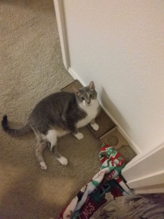
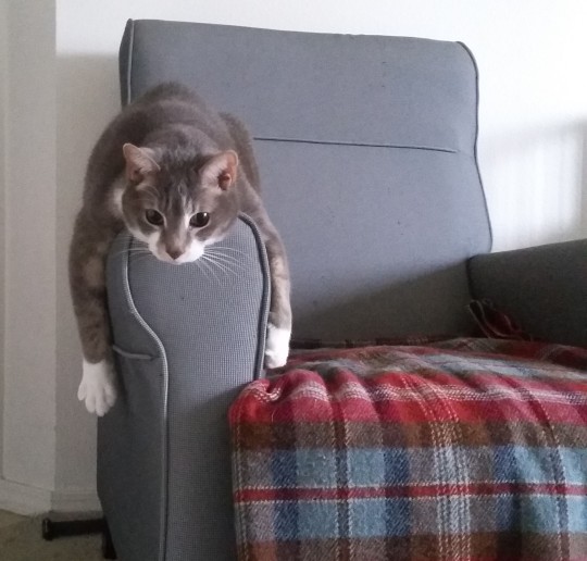
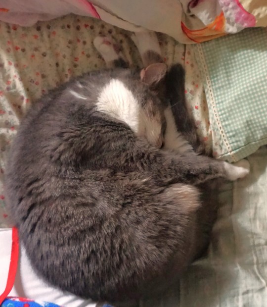
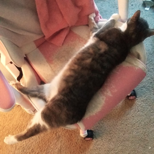
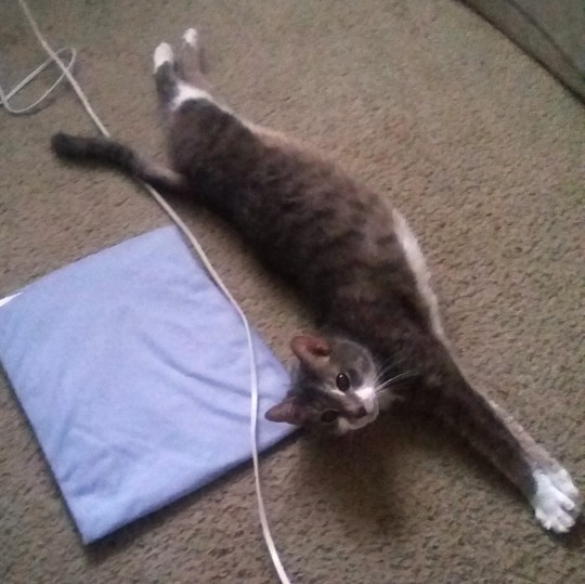
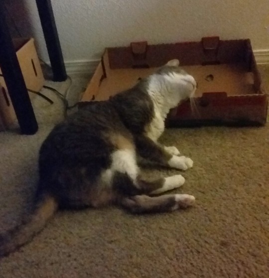
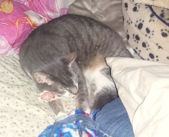
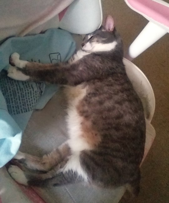
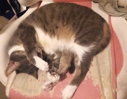
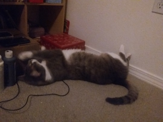
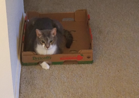
boy in silly sitting positions compilation
#cats#I especially like the last one where he just has one single paw poking out of that box for some reason lol#I still have costumes to post and like a billion other things.... grr... constantly failing at staying active on social media aughh#I think because currently my Main Focus is on trying to get my game done and stuff.. which basically just means sitting and writing all day#so there's not much to post about. Though I know the Good At Social Media thing to do would be to post about the#writing and share progress and talk about the game and characters or whatever to try to build interest or something but that is SOOO weird#to me.. I could maybe get it if it was like a tiny tiny discord groupchat of playtesters with like 5 people in#it.. But something about talking openly about things before they happen is weird to me?? Like presumptuous feeling or something#''oooo guess whats gonna happen LATER!!!'' like.. how do you know.. what if it doesnt. what if you dont finish it. what if its not the way#you think it's going to be. what if something changes. etc. Like I literally avoid movie trailers and game trailers for the same reason ghj#Even if it's not ME doing it it just feels... weird.. Maybe it has to do with my OCD and how I just don't like talking about ''future''#things in Certain Terms. Like if I was going to say ''Oh yeah sure. come over to my house in a few months''. I would have to follow it up#with like ''HOPEFULLY you can come over to my house in a few months'' or 'They'll come over in a few months MOST LIKELY''. Because just#stating that something will happen matter of factly takes for granted like.. what if somehting horrible happens and I DONT have a house#in a few months? or what if something bad happens to me. or to the person coming over? I can't ever DEFINITELY say with 100% certainty#that one could ACTUALLY come to my house in a few months. anything could change. So I have to allot for that in my phrasing. hbjjkn#There are a lot of situations where you're expected to just Assume Things but for some reason that bothers me. My brain literally does not#even Assume the most basic things.. like how do *I* know that just because it's someones birthday that they want to be wished a happy#birthday? what if they dont? everyone is different and has different preferences. I should check with them first. or wait until they public#ly announce that theyre accepting birthday wishes. I have to allot for all 5034859069 rare possibilities at any given time and never take#anything for certain. etc. ghjbjhbh.... ANYWAY.. I have been feeling a bit sick lately as usual.. but still slowly making progress on some#things. Moslty I need to edit costume photos. make sculptures. and work on the game. Going back reading some of the old writing from like#2018 and suprisingly I don't have to change that much of it? In fact I like it mostly. so that's good. I would be very interested if I were#playing the game myself. Though that doesnt mean much since my tastes are so niche lol..#Still really want to clear some of my million tumblr drafts as well... alas and aughh and ooughh and so on and so forth. Between all of my#evil appointments other such things...why cant I have one billion dollar to retire into relaxed hermit artist life of no stressors.. bleas
36 notes
·
View notes
Text

#im not dead quit asking#I'm just really really really not doing well#sorry if i scared anyone. that wasnt my intent#things got. let's say worse. for me irl. more complicated for sure#i hate to publicize my breakdown I really do. but maybe i... need this? in a weird way?#i haven't really been adjusting well to having a platform online. that's not anyone's fault but mine ofc#i feel that my 'fans' (if ive earned the right to call them that) dont and frankly cant ever care for me as a person#i dont know you and you dont know me. you dont know all of me at least. just what i make public. what i allow others to see#i had it kinda bullied into me that i need to keep my mouth shut abt my own issues. and ive spent a lot of this year trying to unlearn that#maybe publicizing this is a bad idea anyway#I just know ive been more honest abt my emotions and my personal life with my friends and my partner#and not everyone enjoys it but i know I'm not like. traumadumping so i feel somewhat assured that anyone who doesnt wanna hear abt my life-#-probably wasnt all that interested in forming a close relationship w me to begin with. even if theyre friendly at first#everyone else; the people who I know care about me; have shown me that through their actions#my point is being honest abt how youre doing w other ppl is a good idea. revolutionary i know lol#and i still don't know a lot of you personally but#parasocial or not i got some very genuine sounding messages while I was gone. and i. feel really bad that i worried those people#I guess theres my proof that people would care if i disappeared suddenly. people would notice pretty quick it seems#im never gonna kms btw. even if i didnt have the support i have im simply too stubborn to die lol. to put it lightly#and to those who thought this was abt fandom drama: it's not. those who shall not be named are genuinely the least of my problems these days#I'm on a journey of self actualization. or something. im trying to get my shit together. im trying to stop being clinically depressed lol#but god keeps throwing wrenches in my plans and. i beat myself up about it too much#but that's just life. they say you make a plan and god laughs#im. trying to be okay with just riding the wave. im impatient but if i keep trying to somehow speed up time im just gonna exhaust myself#which I think is where im at now. burnt out#and on top of all that i still feel this need to like. perform for you guys#if i dont keep making content everyone will forget i exist. if i dont make another video essay this year can i even call myself a youtuber#etc etc. its the spiral its impostor syndrome we've all been there#im trying to end this on a positive note but idk. i dont have all the answers yet#hoping i figure it out soon. i hope you dont forget me in the meantime
12 notes
·
View notes
Note
I would say you’re more of a Mr peanut butter type yeah
doggy doggy what now?
#sci speaks#i love mr peanutbutter.#i think i love especially that eventually people stopped liking him.#cute quirky doggy winds up being a JERK actually just like the rest of us.#i love him and i love that.#really need to rewatch bojack actually because i don't remember it very well but god do i remember Loving it.#i think it's probably the best adult animated series i've ever seen. just. like. i don't know. it's the kind of writing that i really love.#where all the characters are bad actually. and you think they might be outwardly put together but they're not.#bojack is a GREAT SHOW. depressing but great.#i can't even like recommend it to anybody i'm like. yeah. it'll depress you. sorry. but that's why i like it.#i like those kind of ugly sincere emotions that make me feel less alone for being an asshole sometimes.#not in a “haha this character i like is an asshole so i can be an asshole too” kind of a way but in a .#i shouldn't despise myself because this is just part of what it is to be human i guess. you'll mess up and make selfish choices.#we all have that same software and i don't know. makes me feel less alone. i love to see that nobody else has it put together either.#it's not just me floating in the world with no direction.#it do be why i hate people who point at a character and say “BAD ROLEMODEL!! why aren't they PERFECT??”#get out shut up i hate you.#try living LIFE for five days maybe.
20 notes
·
View notes
Text

redownloaded an old art program
#specifically its tayasui memopad…#sketches was like borderline unusable last i redownloaded it#which was like.. oct last year#maybe its gotten better but i dont feel like bothering with it anymore haha#memopad i never used much aside from little scribble doodles (id make a scribble and try to turn it into something)#but its changed a lot since i last used it.. which was like four years ago so i cant be too surprised i guess XD#its still pretty jank but in a more manageable way . i missed rhe sketches brushes theyre very lovely#sorry for all the rambling haha#ive been feeling really shitty lately and have barely been able to draw it feels like#a lot of what i have made ive had to really.. force myself to get out. and i havent been as satisfied with it as id like to br#this is kind of janky still but i like it and i had fun making it#everytime i draw these two its exactly the same cuz i have to remind myself what their designs even were everytime >_<‘’#hopefully i do some more stuff today. its already getting late but im feeling a little better#getting back into the swing of things or whatever#i thought someone on af was ghosting me or whatever but turns out they were just . busy. ( <- figures i need to stop assuming haha) and#they also made this amazing revenge im absolutely in love with its so cute#really made my day =)#scribbles#furry tag#good god i write way too much in these#sorry#anyways#queueing this to post again (its the 14th as im writing this) i feel like that worked alright for me last time#im kinda making this post impulsively i am. constantly going back nd forth on whether i even like posting my art nowadays#oh well#yeah queue i wanna know#mother series#<- i forgot to tag that . for blog organization mostly these r just#nothing burger npcs barely anyone cares abt (nintens sisters lol)
9 notes
·
View notes
Text
not even gonna tag this properly bc i don't wanna get Involved but i do have some Thoughts i need to get out into the void so here we go
(aaa quick edit: CW for mention/discussion of Boothill leaks)
#today's gone Badly and i'm upset but instead of venting abt it i'm gonna channel that energy into doing a bit of tag rambling abt Boothill#well. less abt Him and more abt uh. self-analyzing my anxiety surrounding contributing to fandoms. he's just today's catalyst#like. i know it's mostly a me thing. i'm hypersensitive to criticism and very conflict avoidant + socially anxious + perfectionistic etc.#so I'm the one that keeps myself from posting more stuff out of fear of being criticized or called-out for what i've made#bc inevitably Someone's gonna see it and think its OOC or a problematic take or they'll misread my intent. etc etc what have you#but like. that's inevitable. there's no way to communicate every single thing with all of the nuance required to avoid misunderstandings#and other times it's not a misunderstanding it's just a difference of opinions and that's Fine!! there's no accounting for personal taste#there's no accounting for several things actually. taste‚ bias‚ lore-knowledge‚ differing levels of chronic-online-ness‚ etc#so this isn't me complaining abt the state of fandom culture (although i do think. sometimes. ppl take shit a bit too seriously)#but anyways all of this is mostly just anxiety-fueled. it's not like i very often actually even receive negative feedback or anything#if anything ppl tend to tell me that i'm overthinking it and killing my own fun and worried that my stuff is more OOC than it is#which like. yeah. Yeah u right :) but that's just the way that i am! always losing the idgaf war i suppose#anyways what's Boothill got to do w this ur wondering. well. i've been thinking abt the quickly emerging concept that he's illiterate.#and it just. has me feeling a lot of ways. and watching ppl disagree over it has me feeling some Bad ways. bc it's def a loaded topic!#if you'll pardon the pun there. and i don't rlly have anything new to add other than that i'm conflicted abt it.#like yeah i saw the leaks days ago. of him mentioning 'not hitting the books' much as a child when we ask him why he sends voice messages#or voice Transcriptions ig. ykwim. and like. *braces for impact* ...i liked it? like. it doesn't feel right to call it endearing#i'm not trying to infantilize him. ok that's not the right word either but ugh. you know? what i mean?? who am i kidding even i don't know#it's not quite right to say that it feels like Representation either. but it's something close i guess#as a southern person myself who didn't receive a 'complete' education due to factors that weren't to do with my intelligence#the concept of seeing him as a capable force to be reckoned with and respected who also happens to have not received much formal education#i like that. i do. but there's so many issues w it at the same time. like. as i said‚ being southern myself has me Wary of the way Hoyo is-#writing him. as well as of the way that the fandom is taking the bits of his lore and running away w them. and i'm Very aware of how ppl-#will see a southern character and be All Too Eager to agree that they're lacking intelligence based on our Redneck™ stereotype#sigh. and before we even go too far with this. it's not even confirmed that hes completely illiterate. which is a valid criticism i've seen#there's Multiple reasons that could make him prefer voice to text. but regardless. i'm just worried that ppl will misconstrue my intentions#like. example: that edit i made the other day of him saying 'no thanks i can't read'. wasn't me playing into the stereotype of-#'haha dumb country boy can't read!' it was. in my eyes. something he'd say as a joke to make light of a potential insecurity#like. i think there's far more depth to Boothill's character if ppl could look past the surface. and i dont wanna contribute to the problem#but sometimes ppl Will have stereotypical traits and i wish the same could apply to characters as long as it's done Thoughtfully.
13 notes
·
View notes
Text
#manectric#i woke up at like noon today y'all i'm queuing this after work. i forgot about it all day and i was about to hop on totk#but i got the reminder to do it. so here i am. with manectric#el woowoo‚ if you will#a lot happened. yesterday. it was not a very good day. which is why i woke up so late. it was a little bit rough. but i guess it's a new day#so. it'll get better. planning on Not Doing Shit today or tomorrow to compensate for all the Bullshit that happened yesterday#hoping you all are doing well. one week from today (friday june sixteenth) i'll be hopping on a flight for the first time in 10 years#looks like according to the queue this will actually go up the day before we leave. so‚ to you guys‚ i'll be heading out tomorrow#which is scary a little bit. last time i flew i had no idea i was autistic‚ but now that i've come up with a lot of better accommodations#for myself and i understand myself a lot better and my needs‚ i'm realizing a lot of my accommodations just aren't gonna make it through TSA#plus it's a lot of unfamilarity with unfamiliar people and an unfamiliar environment which i feel like is gonna lend itself to sensory#overload like Immediately and i'm probably gonna get a headache bc that's how it manifests for me#so when we get there i'm probably gonna have to run to the nearest pharmacy. and grab some shit. which is annoying! so. i'm a little#worried. about the trip. NONE OF HTIS IS ABOUT MANECTRIC SORRY#this is a pokémon i have a hard time caring about outside of its involvement as the leader of the electrike in amp plains#that's about it#any tips from frequent flyers who are autistic would be greatly appreciated. not even just about flying but about like. going to unfamiliar#places on the other end of the country and stuff. i feel like that's what i'm most worried about even though i'm worried abt all of it#also hi i'm writing these tags from day-of. like the actual day this is going to post. me from a week ago sure did know what she was talking#about! anyway. i'm. gonna like. take my meds now goodBye see you all when this Posts in a few hours
55 notes
·
View notes
Text
feeling :( but I know it's because my back is acting up again
#went for a very light run yesterday and it felt soooo fine and safe#but today i've been in so much pain and the run is the only thing i did different#dislike this immensely#also dislike the little voice that tells me this is my own fault because i first injured myself doing something i knew was risky#aka climbing and specifically doing dynamic stuff#<- this is so obviously BULLSHIT and i know that but i'm posting in an attempt to exorcise it#anyway i'm in bed feeling sorry for myself but i think i'm gonna relocate to the couch where i can knit and watch something soon#ALSO while i'm allowing myself a good whine it's bullshit that i slightly injured myself almost a year and a half ago#and my back is still all blegh fuck you#also sprained my ankle last may and am still feeling it#and those feel like a similar genre of injury so i guess my body just doesn't handle that kind of thing well#hello people who read tag rants#applied faunology
15 notes
·
View notes
Text
This woman was talking really loudly directly behind me about how she loves dogs and hates cats and I was like Woah there thems fighting words brother! and she’s like Well I just don’t think cats feel love. And she just expects me to not be disgusted by her every second of every day
#good way to eliminate potential friends right off the bat I suppose#I said well every day my cat sits on my chest and stares into my eyes and purrs and she’s like#WHEN I WAS A KID MY GRANDMA SAID CATS SIT ON YOU TO STEAL YOUR SOUL AND I JUST CANT GET OVER IT IM SORRY!!1#and I was like well you know actually kneading is a behavior from kittenhood and they do it when they’re little to get mothers milk so#it means they think of you as Mommy it’s very sweet#and she’s like OKAY :/ THATS GREAT FOR YOU I GUESS#bitch I will kill myself in front of you#same woman I was bitching abt being unfunny in other post lmaooo
34 notes
·
View notes
Note
how do you get your colors to look so nice and your lineart so red and vibrant? i love it
omg anon thank you!! 😭 im going 2 be honest I am Not Great with color theory... but i like having my sketch pages look cohesive to me...
BUCKLE UP this is going to need a readmore bc i like talking.
I always sketch in neon colors it's a habit i picked up from an old teacher but I'll think of a color usually on a whim and draw with that. and then if i want to draw something else ill pick another color that i think goes well with the page. usually most of my color schemes r analogous (colors right next to each other on the wheel)

yanked this from recent dunmesh post; i kept most of my colors within the pink/red/orange range.
i wouldn't recommend doing everything in monochrome or analogous palettes though because it's sort of a guilty crutch of mine XD.
sometimes when im coloring ill change the layer mode of the sketch. color burn gets you either very very bright or very very deep colors depending on the color of the flats underneath. multiply and linear burn do the same thing but they're a lot tamer and generally always return darker colors. im sure there's some technical bits behind this though. ill either color my lineart afterward to compliment the color of the flats, leave it as is, or mess with layer modes if i feel like it. my favorite trick is color burn + linear burn + some combination of two lineart layers and just fiddling until i get a nice burn effect.
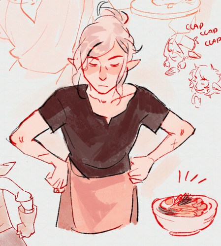
mithrun was done with crimson red on color burn.
coloring... like 999% of this is relative color which is like. kind of the idea that colors look different when placed next to each other. if you eyeball it a bit it's pretty noticeable.

what i used to do a bit ago was i would fill in the area i wanted to color with one big mask of color, make a new layer that has a clipping mask down to the flat layer of color, and then draw my actual flat colors. the color of the mask helped me pick my flat colors bc if I picked a color i think stood out too much next to the mask i could kind of just adjust it until it looked a little more cohesive.

old ish drawing next 2 a canon reference. i ignore local color a lot...mea culpa....but my overall color palette here was a light pink, so the shirt here is actually a desaturated pink? or violet i believe. if you shift sort of that purple color far enough into the gray area of your color wheel it can take on a blueish or even greenish hue. it being next to a lot of warm pinks/fuschias helps.
a neat thing that kind of helps is that if you desaturate or saturate certain colors they can kind of take on a certain hue? not sure if this makes sense. sort of how orange here turns tealish blue the grayer it gets. so if im drawing something that's predominantly orange and i have a blue color i can just take an orange color and desaturate it until i get a color that sort of looks like blue. and that way it kind of looks more harmonious? at least to me XD
shading. i don't apply serious lighting to a lot of my drawings, but a helpful bit is that the shadows tend to be the opposite of whatever color the lighting is? i try to think first about the "mood" or the main color i want to go for in the drawing and then i pick a shadow color opposite of that. so for here, i wanted the lighting to be a coolish magenta so the shadows r lime green. if there's anything off i fiddle around until i get something i like. the shadows on the skin here were too green initially so i shifted them a little more orange.
there's a "band" of color going on between the transition of the shadows to the light. generally this could be for a lot of reasons and i tend to use it differently (core shadow? overexposure? etc etc). but this is a color post so ill try not to go too off track.
but generally digital doesn't "mix" colors the same way traditional colors do if you use RGB (cmyk is a bit better with this but is kind of a pain to get used to), so to make blending a little less muddy, i sometimes add an intermediate color to smooth things out a little. for example, mixing digitally blue n yellow tends to get you gray, but generally, blue + yellow makes green, so if im making a blue->yellow transition ill slap some green color in the middle so it flows a little better.
I do a lot more cel shading nowadays. if you've been on here for a while earlier this year i have another style of coloring but it's not really accurate to how shadows really work so i wouldn't recommend looking at it. it's mostly to add zest and texture to the underlying flat colors.
coloring your lineart does a TON to helping your colors look vibrant, though its like the garnish on a dish to me (same with shadows). i think it's good to try and play with your flat colors and try to make sure those look in order first before adding flourishes. usually ill leave it a dark, saturated color that again matches my overall palette but sometimes i go in and color them by alpha locking my lineart layer and picking a color that matches the flat colors underneath? not sure how to explain it properly.

i used a darkish purple for shuro's ponytail to match the dull red of the flat colors (more relative color! trying to simulate a black/brown while keeping the pink palette there) but a lighter crimson for laios's blond. the light was this super intense like blush pink so i thought it might be cool to add this neon salmon red in the areas of that light to really give off that vibe of a very bright intense rim light.
sometimes you could also tweak with gradient maps or color balance, which adjusts hue based on how light or dark a color is. these r fun to mess with as a final touch but i need to watch using them because they can become crutches real fast XD but those are also just tools to help you. in the end just developing a good sense of how color works and how you want to use it is the best place to start.
LONGASS ramble but yeah. tldr just kind of train ur eye for color and look at what you like best. which is unhelpful and a little sucky but it really is just observation and practice and maybe some personal zest.
happy drawing!
#SORRY THIS IS THE SIZE OF CANADA I YAP A LOT#i like being thorough when explaining myself a lot XD but i think the easiest way to get good with this is just repeat practice n observing#and figuring out how stuff behaves in certain situations and what you like to do and blahblahblah#if you have artists u like that do this well looking at how they use color might be cool#...i feel this entire post is just putting my entire thought process on blast LOLLL.#“eyeball it out” -> study some actual fundamental stuff and or intake new info or art -> apply it back to just eyeballing it out#i dont think i have a natural sense for some basics#but i dont think im naturally one of those people who grind out studies all the time and breakdowns either#i guess i just kind of like knowing the mechanations behind why to do a certain thing or how stuff works and then figuring out#how that translates into what i know nerd emoji#james gurney has a good book on color and light#if you like reading. but its very informative!#quirinahscreams#ask#anon#this is mostly just me talking about how i draw i dont think this is meant to be educational or informative XD um
12 notes
·
View notes
Last Seen Blogs

batshitkinfessions
Character Hate Manditory

cybercomplx
Untitled

piriukkie
Untitled
fbpsdumbtklblog
Tigglez lol

tech-plex
Untitled