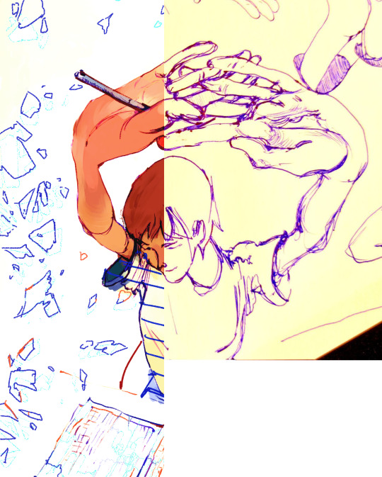
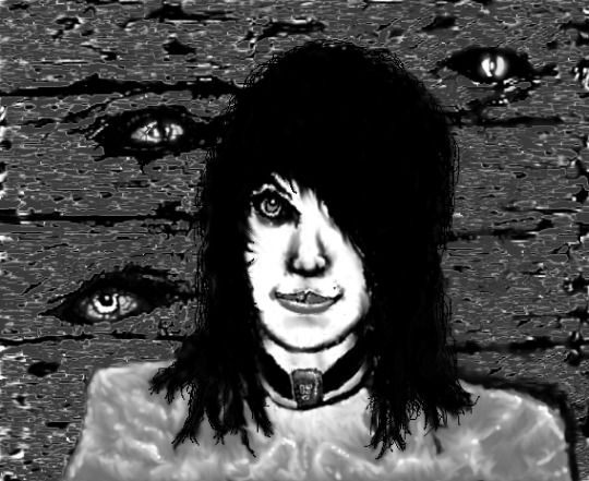
#i intend on making digital art versions of these sketches with color at some point
Text
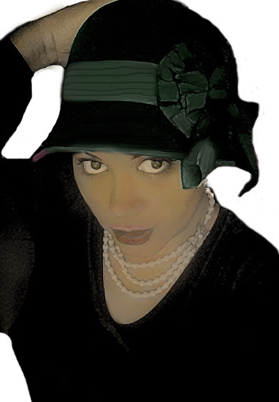
50s DINER AU (or its just a costume) FOR MY BIRTHDAY >_<
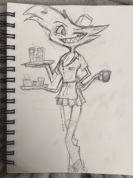
i wanted to give him roller skates but hes so fucking tall it wouldn't fit LMAO
#ive had this idea for a while#im so happy with how this turned out#:D#i intend on making digital art versions of these sketches with color at some point#but until i fix my ipad y'all r gonna half to deal with pencil :3#angel dust#angel dust fanart#angeldust#hazbin art#hazbin angel dust#hazbin hotel#fanart#huskerdust
36 notes
·
View notes
Note
your art is so wonderful! its so expressive and colorful and joyful and never overworked. your compositions also really blow my mind! if youve ever recorded any timelapses or if you ever would like to elaborate on your process ever, i would love to see it + would pay money to. have a good day!
Hi! I apologize that it took me so long to get to this ask! Thank you so much for this incredible and kind compliment!! :') <3 I enjoy having fun with compositions and everything else and I'm glad you like what comes out of it!
Thank you for being interested in process! I haven't been answering for so long because I couldn't come up with a good answer... I have never recorded any timelapses and don't intend to in the nearest future. Also every time the process looks differently, haha..
But I compiled potentially interesting pictures (for free) - under cut :)
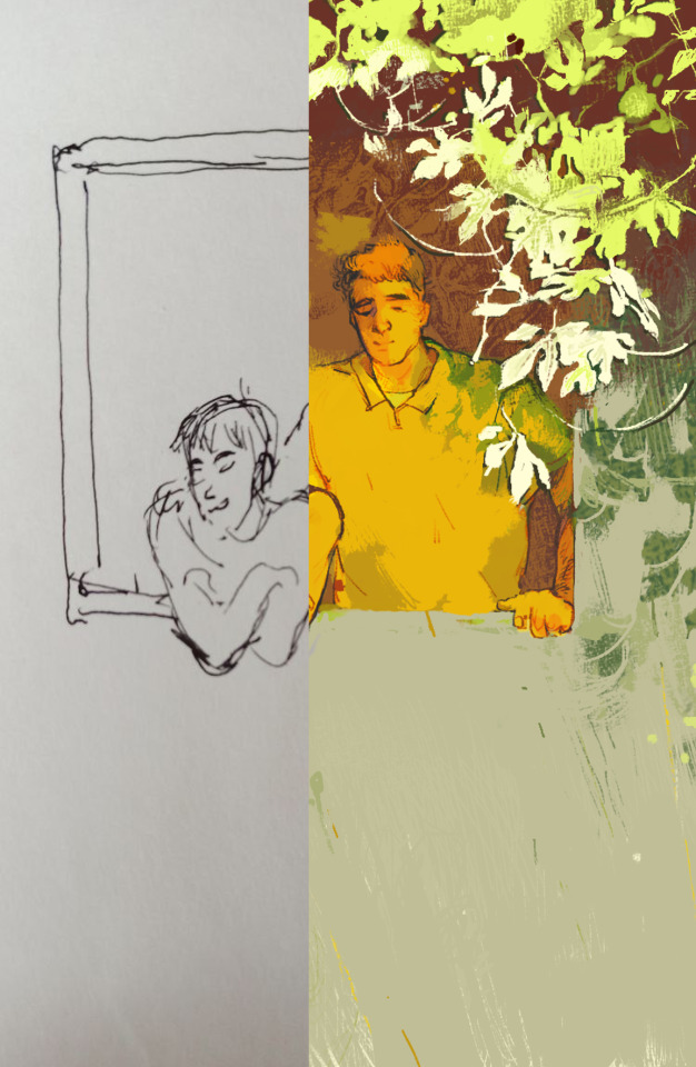
one fun thing I do quite often is that I begin something on paper and then complete digitally. Doodling in textbooks and sketchbooks was the beginning of many stuff
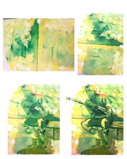
This Seri process is one of my favorites, he was born from leftover green food coloring that I splashed and smeared over pages. Then I begin my favorite game of searching for shapes and letting them "grow" naturally from what there is.. if that makes sense.
From those little monsters that were born during classes then appeared compositions, because having some starting point is helpful to me, even if it gets completely lost eventually.
I don't have a scan and use the imperfection of phone pics for my advantage, sometimes it creates additional texture or interesting colors after little bit of editing.
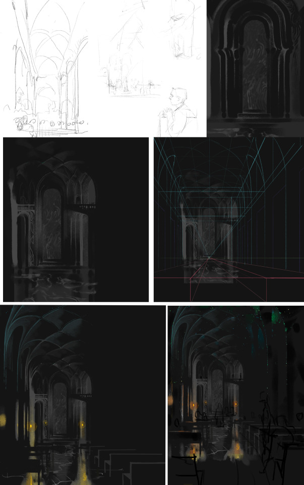
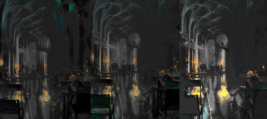
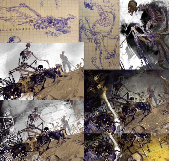
This one took longer than most of other works. (dont go after me for unrealistic architecture)
I was struggling to come up with compostition for the cathedral so again beginning with a doodle of a random arch helped. and in the end there's an infinite "yeah now it's finally done" *spends a couple of hours more*. on screenshot these are all versions I thought would be final and I sent them to look at on my phone and immediately went to fix something else :P
Beginning from a detail isn't a classic way to build a composition, and usually it's reasonable to start from defining big shapes, and that's what I do often. There are just different approaches of creating compostitions that I like using. Starting from a piece and shaping the rest from there helps me find something I maybe wouldn't have thought of doing otherwise. But it's very important to always hold a big picture in mind of course! After looking at a piece of doodle for a while, I have an approximate picture in mind of how I want to use it.
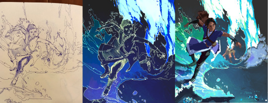
With digital doodles I usually do lineart immediately without sketching it first, then I can edit or erase it or blend with colors. Have fun and be yourself is the only rule
thank you again <3 I hope it was helpful!
34 notes
·
View notes
Photo

I Love Mew
This artwork is now available as a free Coloring Page! A version with the text: I Love Mew Coloring Page And a version without it: I Love Mew Coloring Page (No text)
____
Hmm. Does this look familiar? If so, that's because I tried remaking Watercolor Kitty, one of my first attempts at branching out into watercolor from about this time last year. I thought it would be a good opportunity to get in an appropriately seasonal piece of art and see how I've improved with my watercolor (and to a lesser extent, cat drawing) skills since then.
Last year, I intended for that image to be uploaded in time for Valentine's Day, but that didn't happen because I was a bit too optimistic about how quickly I could have it painted and prepared once my then-new paints arrived to me. This time I was determined to not let that happen again. Fortunately, this time I already had the paints, so that left me with just actually making the drawing and painting it.
Believe it or not, I used the exact same reference image for this drawing as I did for the original, but I followed the reference more closely and used the style I've been using for all my themed kitty drawings lately. It's still not a 1:1 to the reference, but I'm still pretty pleased with how it turned out.
So I made my little sketch, and then scanned it in and used the method I've been favoring lately of taking the sketch and making the clean lines digitally (in part to force myself to get more accustomed to my non-Cintiq set up) and then print them out and trace them onto the paper of my choosing.
Compared to Watercolor Kitty, this time around I had slightly nicer (not professional quality, but nicer) watercolors to work with, and I went as far as to use some of the 100% cotton watercolor paper I have in my stash, even though by this point I've been working with the same paper from the original painting (Cason XL watercolor paper) that I think I still could've seen an improvement with it all the same. But, I wanted to be sure.
I primarily used my Master's Touch 48 half-pan set watercolors (which I should mention are becoming my favorite among the watercolors I own), but I ended up grabbing a few pastel yellows from my Arteza tube watercolors around the cat's eyes and mouth. While I tried to leave the white of the paper and lift the paint as is the "proper" watercolor technique, the red color had already stained the paper a little too strongly, so I relied on the more opaque nature of the Arteza paints to bring back that lightness I wanted. It's still not as bright as it maybe should be compared to the reference, but because I prefer smooth blending this is as light as I was going to get it and still accomplish that.
Honestly, comparing the two, I'm not sure one is necessarily better than the other. Stylistically, this one feels more refined and the colors are more saturated/vibrant, but that's about it. You could argue the blending is a little better here, but part of that is just the higher quality paper doing its job.
And to be fair, I wanted to keep roughly the same idea as the original painting, but I was purposely trying to refine the overall look, including using some fonts on the computer as reference/basis for the lettering this time around. But I kept the reddish color for the cat, the purple for the background, and even the burgundy lines and gold gel pen border. (Though I did change the pawprint border to a much softer gold that almost looks silver by comparison here; it just felt like the better choice.)
It's interesting to me how the two paintings can be as similar as they are, but also be so different. And it's also interesting since I think this is the first time I've recreated a drawing so close to when I made the original. Usually, my recreations are 3+ years apart time-wise.
How much I've learned about watercolors and using them may not be readily apparent, but I know I've come pretty far since then. I've definitely come quite a ways' from the completely uninspired painting experiences I had in K-12 school. I've since found that mixed media is where my artistic heart really belongs, so I don't think I'll ever be a full-time painter, but it is nice to once in a while focus in on just one medium like this and evaluate the progress I've made since first trying it out. So perhaps in the future, I'll keep a closer eye on older pieces to re-do for just that purpose.
In the meantime, I've got a couple more Valentine-y things coming up and a couple of other projects I'm pretty excited to share with you guys...and maybe some adoptables. Maybe. I want to do them, but they might get pushed into next month or beyond. We'll see.
____
Artwork © me, MysticSparkleWings
____
Where to find me & my artwork:
My Website | Commission Info + Prices | Ko-Fi | dA Print Shop | RedBubble | Twitter | Tumblr | Instagram
1 note
·
View note
Text
Project 1: Snippets
Hooray, my first Studio Arts project! I had a great time working on this- I can't remember the last time I was so excited to work on homework.
For this project, our task was to think about weird things we've heard people say, favorite quotes, song lyrics, et cetera and create images based on those "snippets." Like the Emo trash that I am, all three of my "snippets" were song lyrics. My first one, "Is anyone there? Oh... hi," is a line from Sad Machine, my favorite song from Porter Robinson. The second, "His hair, his smoke, his dreams," is a line from Colors, my sister's favorite song from Halsey. The third, "I'm drowning in a lifeboat," is a phrase used often by death's dynamic shroud.wmv, my mom's favorite Vaporwave artist (you read that right!) I chose those lines for the second and third because I intend to give the final prints as gifts to my sister and my mom, respectively.
Here, I'll briefly break down my process for each of them:
"I'm drowning in a lifeboat"
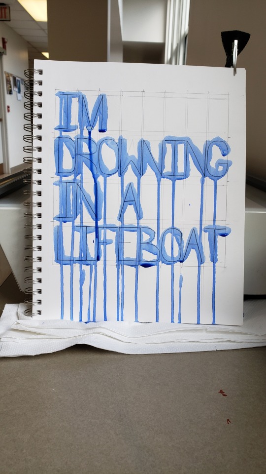
I started by creating a physical image. I sketched out the letters in pencil after very carefully drawing margin lines with a ruler. Then, I painted the letters vertically using heavy body acrylic thinned with water to make it appear like watercolor. While the paint was still wet, I photographed the page (using my hair clip to keep it from flopping over.) In Photoshop the following day, I resized and cropped the image, straightened it, added a Gaussian blur to smooth over the pixelation, then applied automatic color fixing operations.
The idea behind this image plays into my interpretation of the quote. I spent a long time painstakingly drawing out the letters and their spacing, but intentionally put very little effort into applying the paint neatly and even used the wrong kind of brush on purpose. Upon seeing this image out of context, one might think that the creator had a fair amount of skill with drawing, but next to no skill in painting. The point of all of this is to illustrate frustration. I interpret "I'm drowning in a lifeboat" to mean "I have the good foundation I need to be successful, so why am I still failing?" This image shows a good foundation in the drawn lines, but ultimately, it fails to be as neat and tidy as it set out to be.
"Colors"

I happened upon a stack of very old magazines someone left outside of McMaster and decided to use them to create a collage. I cropped the images and pieces of paper by folding and tearing, I arranged them in several different ways to see which configuration looked the best, then I pasted them in place. Despite the final image being in black and white, I used blue ink to write the text as an even deeper reference to the song. Then, I photographed the page in better lighting. In Photoshop, I resized and cropped the image, added a Gaussian blur, then applied a black-and-white filter. It didn't occur to me until days afterward that I needed to cite my images, and I'd put the magazines back in the pile where I found them! Would they still be there after several days of classes and rain? I'll cut to the chase: yes, they mostly were, but I had to do a bit of reverse image searching to find all the information needed. (This was about four days ago, and I'd written much more here, including the citations, but for some reason my post edits never saved so I've had to do all of this AGAIN.)
(Image sources: [top] Unknown historic photograph. [center] Moya, Rodrigo. "Che Melancólico." 1964. [bottom] Hopper, Dennis. "Double Standard." 1961.)
"Sad Machine"

For this one, I typed the quote into a Windows command terminal with the intent of the final image having a Vaporwave aesthetic. I tried photographing my computer screen for a more "lo-fi" look, but it looked unironically terrible and I decided to just use a screenshot. I used my computer's Snipping Tool to capture just the part that I needed, and I imported the capture into an 8"x8" blank artboard. To make the text clear and bright, I applied a very heavy-handed sharpening operation and turned down the saturation to get rid of color noise. Opening a new blank layer underneath the screencap, I created a two-color gradient and added color noise. I specifically chose to use blue with RGB values of 0, 255, 255 and magenta with RGB values of 255, 0, 255 (those colors probably have technical names that I don't know) because they're very popular in Vaporwave aesthetics and because I used those colors ad nauseam in my early days of making digital art in MS Paint and GIMP. I know that those colors don't quite print properly, though, but that's still in line with my intentions. Vaporwave aesthetics are characterized by mocking the technological ignorance of decades past and by imagery that can only truly exist on a computer. Imagine, if you will, someone amazed by the capabilities of their first home computer creating artwork to their heart's content using crazy full-saturation colors that simply cannot exist in the real world. They get their artwork printed and are disappointed in how their beautiful cyan and magenta turned out to be some sad pale blue and some dull reddish pink. And so the stark difference between the printed version and the uploaded web version of this snippet plays directly into its meaning.
2 notes
·
View notes
Text
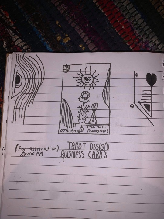
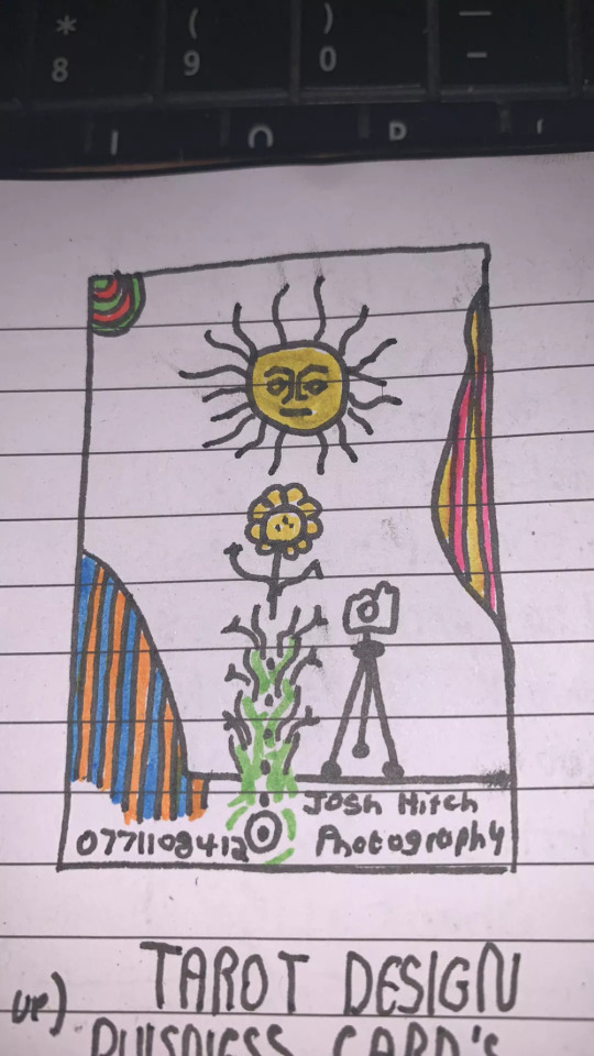
Business Card Project - Part 1
Around the time this module started, I got back into contact with someone by the name of Josh Hitchcock who I met and worked with back in college. We met when we were 16 and worked on several projects with each other during our year studying photography together, I learned a lot from Josh and we’ve stayed loosely in contact ever since leaving school but haven’t collaborated on anything for around 5 years despite having always had similar interests, styles and aesthetics. Josh is also still pursuing his passions and talents in visual communication and is beginning to build a portfolio with the aim of applying for a BA, just like I was doing this time last year. Alongside getting himself prepared to do a degree, he has been expanding his online presence and slowly establishing a business and brand identity for himself. He reached out to me originally to ask if I could potentially create him a logo that he could use across all of his platforms which he needed fairly quickly as he was building a website, unfortunately I couldn’t meet the turnaround deadline and so he commissioned someone else to do a logo, later reaching out to me again to ask if I might be able to create business cards instead.
Josh had already started sketching out ideas and so he sent me his drawings as a starting point for the design
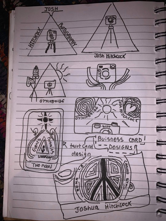
After some discussion and a little bit of time, Josh came to the decision that this was his favorite prospective card design and even began experimenting with it's colors.
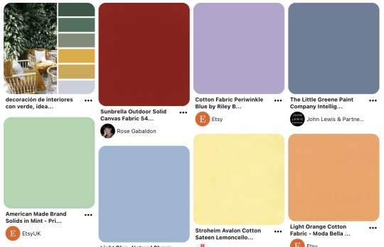
It was at this point that I asked him to create a Pinterest board to help gather all of the ideas together which he promptly delivered on. Pinterest’s description of the board “Clean, simple doodles. Photography orientated based on nature and ancient art. A perfect combination of tech, nature and aesthetic.” sums it up perfectly. This was a really strong starting point for the overall design as it includes everything from small decorative graphic details such as flowers, vines and suns; to a concise range of colors for the palette of the art itself. The board isn’t overcrowded, it's clearly well thought through and does good job of clearly communicating the kind of style that I was expected to reflect in my design.
Coincidentally around the same time I started this project, I decided to treat myself to an iPad Pro and Apple Pencil to support my University work, these have become increasing popular in the art world because they are incredibly powerful creative tools, I chose to invest in it mainly for it’s capabilities in creating digital art using the Adobe suite and Procreate using the pencil which is exclusive to iOS and has is slowly becoming the standard for digital drawings.
Having recently attended the Illustrator workshop, I thought that I would experiment with using this software both on my iPad and computer as I figured if I could learn to use them in conjunction with one another from the get go, I would be in a better position overall later on; but in doing so, I threw myself two learning curves at once as I was not only dabbling in software I wasn’t comfortable with but also using that software on a device that I am a complete beginner to which was a definite challenge for myself.
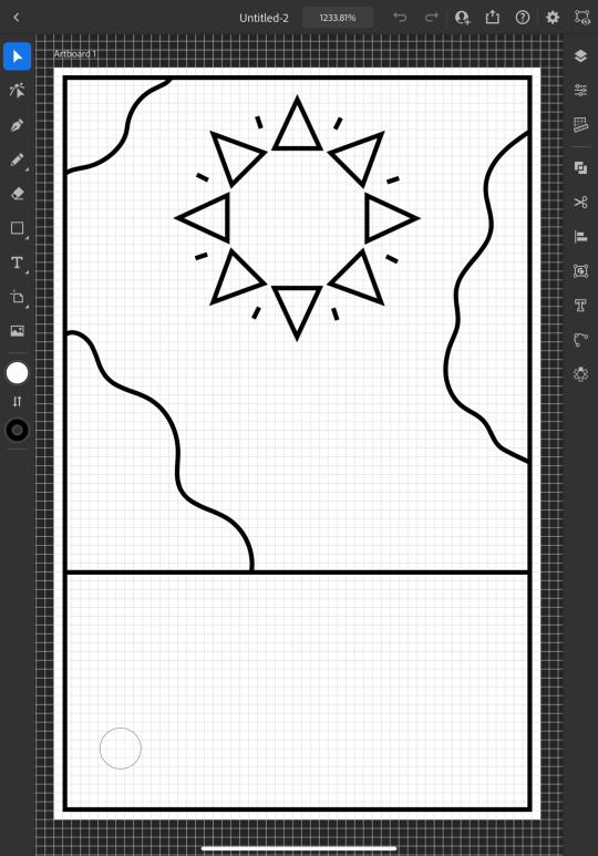
I started out by doing a Google search to find out what the standard size is for business cards and found out that is generally 3.5 x 2 inches (1050 x 600 pixels at 300 DPI, which is the standard DPI for printing). This is how I decided to set my document up which is what gives me the white rectangular shape that you see me working on to start off with.
To begin the design, I picked out my favorite things from Josh's sketch which were the wavy line details and the bohemian style sun. I created some simple outlines using the line tools on iPad Illustrator starting with the border and dividing horizontal line where I intended the design to end, from this I was able rough out where patches of lines would go and add the sun. For the sun, I originally tried to draw one with wavy points but I was struggling to get it proportionate, even when I'd figured out how to use the reflect tool to make my drawing symmetrical, it seemed to be throwing the design off and so I threw this idea out and went for a pointed sun design instead. I chose triangles for the points as a subtle reference to the exposure triangle which is a rule that dictates camera settings when it comes to photography so it ties in with the business well and was also a concept that Josh was trying to reflect in his logo. I achieved the geometrically accurate shape of the points around the sun by creating the very top triangle and then using the Radial Reflect tool whilst using my iPad which automatically created the rest of the points for me with even spacing and perfect symmetry; all I had to do then was resize the points as I pleased. Once I had done this, I decided to repeat the process but with a small line between each point to give it an extra beaming sunshine look, this also fits in with how some of the sun's and graphics are drawn on the Pinterest board that I'm referring to as I design this.
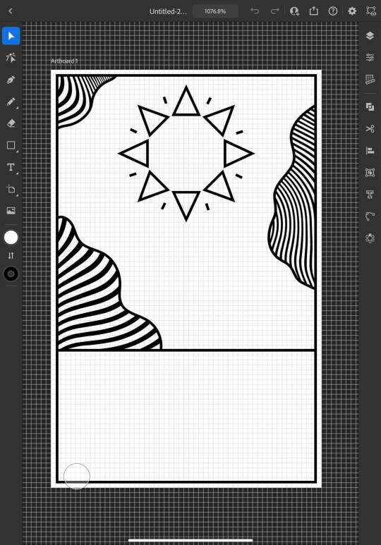
Once the outlines were complete, I started experimenting with filling in the patches with lines, this is an effect that is featured on the album art of one of my favorite albums of all time, Currents by Tame Impala which I previously learned how to do using a vector pack from Spoon Graphics as I did work inspired by it for my University portfolio. Although I have used these particularly line textures before, I have only used them in Photoshop and not Illustrator so I haven't actually used the vector versions of them up until this point. I inserted these into my work using my computer as that's where they were saved, I was able to use Adobe Cloud to sync my work between my PC and iPad making it easy and convenient to switch between the two whilst working. Adjusting the waves worked similarly to how it does when I use them in Photoshop, I just added them in as a layer and then used direct selection mode to delete the extra lines around the outlines and border that I’d drawn in leaving me with what you see above. At this point, I sent what I’d done so far to Josh so that I could begin to get his feedback and make sure that what I was doing was in line with his vision.
Whilst I was waiting for him to reply, I started experimenting with adding color to the design hoping that it would help us visualize it better; I used colors directly from the Pinterest board for my palette by taking a screenshot of the webpage, opening it up in Illustrator, swatching all of the colors and adding them to my Color Library so that they could be easily accessed whenever I needed them.
At this point, I just filled in the colors according to what made sense to me, blue for the sky, yellow for the sun and something contrasting for the wavy lines, honestly, I chose orange because it’s my favorite color and I really like the way that the purple looks next to it, especially against the blue background where it appears slightly more subtle whilst still being effective at breaking up the image in the way that it needs to.
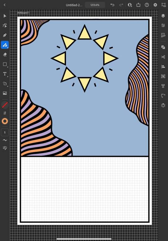
I continued to add colour, changing every other point on the sun to be red to give it more dimension and incorporate more of the colours from the chosen scheme; I then added green to the bottom section which I chose because I thought it would represent grass and fit in with the sun and sky theme that seemed to be emerging. I also added some small stars as I was experimenting with the shape tools dotting them into some small empty spaces on the design so that they line up in a triangular shape which is another subtle reference to the expose triangle.
Then I started experimenting with adding text and social media icons, Josh had told me that he wanted his name, website and social media information on the card, we decided to leave his phone number out as he only has a personal mobile number and didn’t want to risk handing it out to strangers. I chose this Art Deco style font for the name because I liked the lines in it and thought it went well with the lines in the top half of the design which are probably my favourite thing about it at this point. I didn’t use the same font for the website because it doesn’t look as good when it’s small, you can’t really see the lines and it made the website hard to read so instead I chose this glyph font which I thought Josh would like based on some of the imagery from the Pinterest board; I was unsure about this choice at first but it quickly grew on me as it’s subtle and yet it makes the website look bold on the bottom of the image which draws your eye down to it when you’re reading the information. I also added some social shapes to the front keeping Josh updated on my progress as I went along.
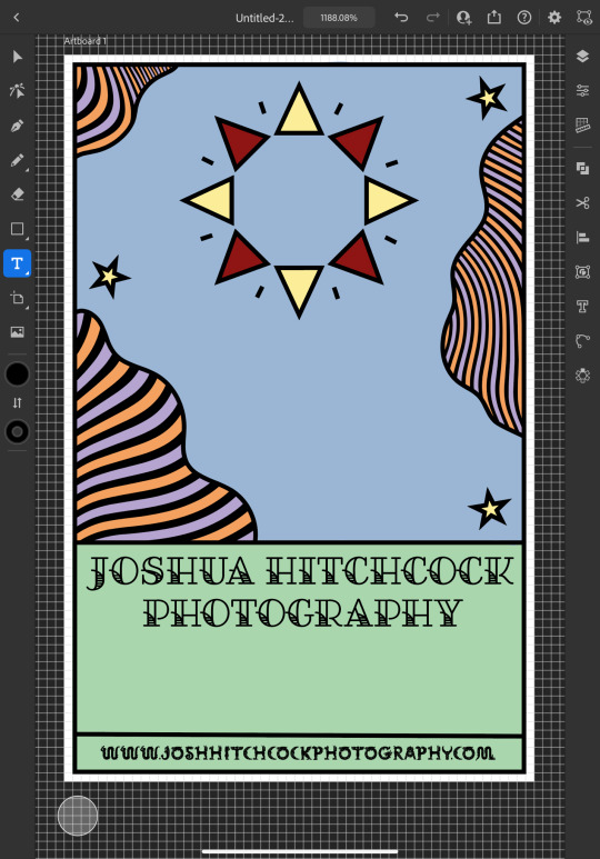
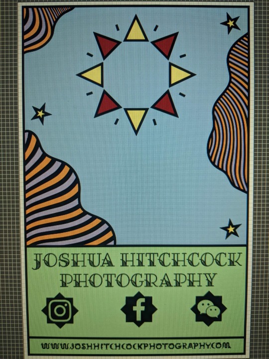
It was at this point that I started to receive some feedback from him, he was really happy with the first impressions of the design but did want to make a few changes. He started out by asking if I could change the green on the bottom to the orange colour in the waves with the hope of giving the card a more uniform look which we both agreed looked much better. He then asked me if I’d started designing the back which I hate to admit that I hadn’t actually thought about at this point and so we started discussing the layout; collectively agreeing to move the social media information to the back of the card and have that there along with some sort of bio which I much preferred the idea of as I wasn’t too keen on how the social shapes looked on the front of the card and I was worried about how I was going to fit all of the contact details on without making it look messy.

Originally we thought it might be nice to add some floral details to the front of the card where the space had now been freed up but we quickly decided that this didn’t look quite right.
0 notes
Text
The Guide to Creating Your Business Logo
A logo is one of the most important aspects of your company. It’s a symbol of your business that becomes the graphic icons of your brand connecting your message and mission to your potential client or customer.

Think about your favorite restaurant or brand. How are they different from others? Would you know who they were based on the logo alone? Probably not. Let’s take a look at the logo design process, and dive into what it takes to create a logo.
Creating a Logo
Creating a logo isn’t like assembling a coffee table from IKEA where you have a definitive set of steps. Which is why it is so important to work with a professional designer. However, understanding the process will help you work with your designer to create a logo that works for your business.
Each designer will work a little differently and should lay out their process in a set of guidelines to ensure that you don’t miss any important pieces while working with them. Additionally, different businesses may bring the designer into the logo creation process at different points.
Some businesses may have a general idea of what they want while others will start from scratch with no ideas. Either way, the goal of the end product is a design that encompasses your business vision. You want a symbol that symbolizes your company in a way that makes you proud, differentiates you from your competition, and most importantly, speaks to your target audience.
Steps to Creating and Designing a Logo
This outline is based on our internal processes for designing a logo. Your designer may work with a different structure, but the overall steps will be similar.
1: Determine the Brand.
Does your team have a firm understanding of your business goals, brand goals, and your target audience? That’s where we start. Design without intention is frivolous and will absolutely affect your bottom line.
Have a brainstorming session where you write down every place your logo will be used (from the sole of a shoe to the side of a building), and discuss the core elements of your brand.
If you haven’t developed the backbone of your brand, your designer might be able to guide you through the process. However, this can be time-consuming for both the designer and the client. Additionally, not all designers are branding experts and not all businesses can afford a branding expert. If you want to set your own pace and work through developing a brand without hiring an expert to come in, our process has been documented in the Bravvy series.
2: Develop a Concept.
Your logo concept must have a solid direction and not exist merely as a generic statement like ‘we need an image of a widget and it should be blue’. With a limited “concept” like that your designer is left with many unknowns and will be unable to deliver a quality logo for you.
What widget? How does that widget connect to your mission and vision, or to your audience? What does the color blue mean to you, your company, your industry, and to the general public? What typography coincides with the image you want to portray?…. See? Lots of questions that hinder the design process.
In order to develop a valid concept, you and your designer can work together to brainstorm icons, letter forms, colors, and social associations that match your brand. The brainstorm and lead to the discovery of concepts for your logo. We quite often brainstorm with Pinterest. (We have a great article that shows you how to do this, here). We use the boards for inspiration and to select elements targeted toward the audience and not solely based on the designer or your personal likes/dislikes.
3: Create Initial Design Comps.
Design “comps” is short for design comprehensives, which are full works ups of a logo for the client to review, provide feedback on, and select a final logo from. Behind the scenes, your designer probably started sketching ideas’ on a napkin (or a sketch app on their phone!)… and maybe even spent an hour or so dreaming up visuals while sipping coffee, petting their dog, shooting hoops, or any other “crazy artist” process that works for them.
Once a visual that portrays the concept is discovered, the comps are worked up. Typically initial comps are presented in black and white and color applications and at various sizes.
4: Publish a Graphics Standards Guide.
Once the final art is generated, a graphics standards guide will wrap up the process. This can be as simple as a two-page document that outlines how to use the logo, the approved color combinations, scaling, associated fonts, white space, and scaling.
Or it can be as complex as a hundred plus pages that outline every single approved application, variants in sizes, co-branding, internal uses, and more. It really just depends on your business needs as this guide is intended as a tool for the business owner and their marketing team.
Tips for Designing and Effective Logo
Keep in mind that large detail will be lost when the logo is used for something small like an icon for a digital app or your social media profile icon. This might result in you requiring multiple versions of your logo for various applications.
If you’re stuck in the design process, talk with a brand consultant to bounce ideas. They will help you examine it all from a different perspective.
Find a designer you trust. You want input from the beginning on the colors, size, fonts, etc. and if your trust your designer, you will be able to easily communicate your ideas to them.
Get a quote for your logo design before you begin the process. Every aspect of the design should have a cost analysis available for you.
Once the job ends, make sure you get all of the logo files you need. There is no guarantee that your designer will keep the original files.
If you’ve had a logo for a long time, don’t be afraid to change it. An entire rebranding may invigorate your business. If you didn’t go through the whole process, now could be the time to start over and build something amazing!
Logo Design FAQs
As I was writing this article, I had a few more “FAQs” that I wanted to include. I hope they help you further your understanding the logo design process!
At what point of business development does having a logo become important?
First, comes the business, then comes the brand. We recommend having a clear business plan in place and then working on the brand development. The further you are into the process of brand development, the more ideas you will have. As you move forward, your brand vision will become clearer, and you’ll be able to find a great logo that will stand the test of time. Remember that the logo is the symbol of your brand and the icon that people will visually associate with your company.
What should I choose for my logo?
It may be better to ask: “What do I want my logo to portray?” The first impression of your logo is the most powerful moment in the visual connection between your business and a potential customer or client. It is the key symbol of your company, and you want design elements that work for, and not against you. It is worth noting that this is the one place where we strongly recommend professionally designed over DIY.
Other things to consider are who are you targeting and where is your secondary audience? Knowing your audience is truly the key to success. Your secondary audiences are those who are associated with your brand. You want them to feel comfortable standing with you and your company’s design. This could be vendors, power partners or other networking connections.
Once you have your brand and create your logo, a web design (or redesign) is probably next on your list as the first implementation of your new brand icon.
If you need support with your SEO performance and Logo Designing, experts of Local SEO Company Clearwater, FL can help you, just drop your comments in the comment section.
0 notes
Text
A Walk on the Frontier of Art, Where the Sky Is the Limit
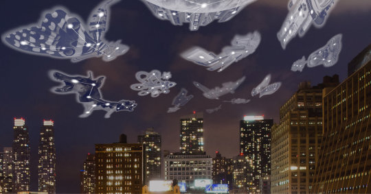
This article is part of our continuing Fast Forward series, which examines technological, economic, social and cultural shifts that happen as businesses evolve.When walking on the High Line, it’s tough to look more lost than some of the tourists, but I did a pretty good job of it last month when I tripped on a curb while looking at art. (I caught myself before falling, but still.)I was taking in an exhibition from Aery, a new augmented reality platform tailored to digital art exhibitions. Looking up to the heavens through an iPad, and not at my feet, I was using a loaner tablet to get an artwork by Richard Humann to magically appear.But it worked: On the iPad, a constellation of a rose appeared, at an angle in the sky and topped by a crown, as Mr. Humann intended. A couple of out-of-towners who were watching me seemed mightily impressed when they looked over my shoulder at the screen.The technologies known as augmented reality and virtual reality (AR and VR, for short) may seem futuristic, but they are being employed by artists more often.For me — someone who looks at art for a living, but also avoids downloading new apps — experiencing three exhibitions of augmented reality art over a couple of weeks was a crossing of a threshold, one that more and more people will experience in the years ahead.“It’s going to have a huge impact on the art world,” said Jay Van Buren, who, as chief executive and co-founder of the tech company Membit, helped create Aery, a joint venture between Membit and the real estate firm Related Companies. “Artists can do anything with it,” Mr. Van Buren said.Membit’s technology is based on what it calls a Human Positioning System, its version of GPS. Essentially, the user adjusts the placement of the device based on a set of instructions. Aery is currently in beta mode, but is coming to Apple’s App Store soon for iPad and iPhone, and eventually will have an Android version.As part of Aery’s inaugural exhibition, the artist Shuli Sade created a piece called “Wild, Heterotopias,” based on her photographs of the landscaping along the High Line. I viewed it in the High Line Nine Galleries: What appeared before me on the iPad, in an otherwise empty white gallery, were globes of spinning, floating greenery and flowers.Ms. Sade, who is based in New York, has worked with augmented reality a few times during the past five years, building on her background in photography.She likened the technology to a kiln or a paint brush: In the big picture, it is simply another way for an artist to create. “It’s a fabrication tool,” Ms. Sade said. “It’s a medium.”“Whether it will develop further, I’m not sure,” she said. “But it’s a fun ride.”In the same way that most sculptors do not cast a piece in bronze themselves — that work is done by experts at a foundry, to the artist’s specifications — Ms. Sade sent her photographs to Mr. Van Buren to be turned into augmented reality.That is how it worked for T Walk, a joint venture from Apple and the New Museum in New York City. The experience is free in six cities — San Francisco, New York, London, Paris, Hong Kong and Tokyo — and is slightly customized in each. Seven artists contributed, including the poet-artist John Giorno, who died last month, and the Chicago-based Nick Cave.Massimiliano Gioni, the New Museum’s artistic director who helped curate the artist contributions, said that when Apple approached the museum about collaborating on the project, the curators saw the same potential the company did.“The benchmarks were previously more from the world of entertainment and gaming,” Mr. Gioni said of augmented reality and virtual reality. “And they wanted to go well beyond that.” (Mr. Van Buren said that whenever he was called upon to explain augmented reality, he mentioned Pokémon GO, the interactive game craze.)I did T Walk on a glorious fall day in Central Park, starting at the Apple store on 59th Street and Fifth Avenue. I used one of its iPhones (you do not use your own) to experience the artworks, and to get each piece to appear, I pointed the phone at an object, usually a sign, part of process that the company calls “anchoring.”The art is calibrated based on the position of you and the anchor, and when you have lined up the phone and the sign correctly you feel a slight vibration in the phone that the company calls “haptic feedback.”Mr. Cave’s contribution, “Accumul-Istic Quest,” had his usual ebullience: At the beginning I was asked to pick one of several personality types, and on the screen I was suddenly being shadowed by a very bouncy, multicolored fright wig. He calls the different characters “istics.” (Mr. Cave also created an in-store augmented reality piece called “Amass,” which can be experienced in any Apple outlet around the world on your own iPhone.)Normally the walk is a group affair of about 10 people, and every participant gets an istic. About five minutes into the walk, a large, friendly monster of sorts appears above the tree line — it has a head like a gramophone horn, a version of Mr. Cave’s “Soundsuits” characters, which he has been working with for years — and consumes everyone’s istics.Though done with humor, Mr. Cave told me there was a larger theme at work.“I wanted it to absorb and swallow everybody, becoming multicultural in the process,” he said.The process of making the work involved many phone calls, with Mr. Cave sketching his ideas and making multiple trips to Apple headquarters in Silicon Valley. “We were practically in a relationship,” Mr. Cave joked.For now, augmented reality seems to be getting more play among fine artists than virtual reality. As Mr. Van Buren put it, “AR loops you in more firmly to the place where you are, rather than taking you away into another world.”But that could change. Bjarne Melgaard’s “My Trip” (2019) is a virtual reality work that can be experienced through Dec. 15 in Berlin at the Julia Stoschek Collection. It is a production of Acute Art, a virtual reality studio that collaborates with international artists.Daniel Birnbaum, Acute Art’s director, said “My Trip” was a “trippy fantasy about darkness” that worked as an autobiography of the Norwegian artist.To create the characters in the piece, Acute’s team scanned sculptures by Mr. Melgaard, and for some of the environments that people can experience in the piece, the artist provided developers with photographs of paintings.“AR is easier, but it has limitations,” Mr. Birnbaum said. “You only see things on the phone. It can be a little gimmicky.”But augmented reality’s ability to show two realities at once can be a powerful storytelling approach, as demonstrated by the New York-based artist Alan Michelson’s show “Wolf Nation,” at the Whitney Museum of American Art through Jan. 12.Two of the four works in the show are made with augmented reality, and Mr. Michelson — a Mohawk member of Six Nations of the Grand River — collaborated on both with Steven Fragale, a painter who has become an augmented reality specialist, creating his own apps for his work.One of the pieces, “Town Destroyer,” looks like a two-dimensional wall work depicting George Washington’s home at Mount Vernon. But when activated by the show’s augmented reality app on an iPhone, the bust of Washington in the center goes through a rapid transformation, overlaid with a series of colors, patterns and texts. “Town Destroyer” was the name given to Washington by the people of the Iroquois Confederacy, whose villages were burned and pillaged during the Revolutionary War.To present an indigenous perspective on a familiar icon, “AR provided a solution — more than a solution, actually, a tool with all sorts of metaphorical aspects,” Mr. Michelson said.Mr. Michelson said that the idea of multiple people holding up their phones to see his works at the same time also made him think of the technology’s “social possibilities.”Although augmented reality and virtual reality explicitly take us out of the real world — our noses in another screen or two, and possibly tripping along the way — they also can be an invitation to interact with others about what they are seeing.Mr. Gioni of the New Museum agreed. “The effects are in some ways just a pretext to come together,” he said. “This gets real only when you share it.”
Source link
Read the full article
0 notes
Text
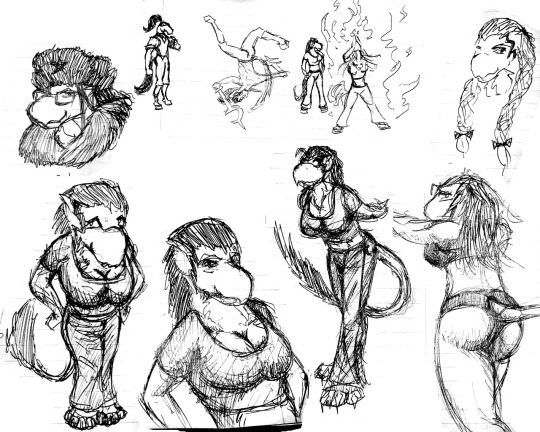
A Retrospective of Role
Or “It really took 15 years to get from that, to this?”

If you’d like to share in my cringe have a look at my progress as an artist, then grab a beverage and a snack, because this is gonna be a looooooooong post.
So to go back to the beginning, I have always liked to draw; in particular I’ve always liked animals, so it isn’t much of a surprise that some of my earliest “original characters” were based on my team in Pokemon Yellow. However, it was another Game Boy game called Dragon Warrior Monsters which provided what turned out to be a lasting inspiration. It also only allowed for 4 letter names.
- 2002 -
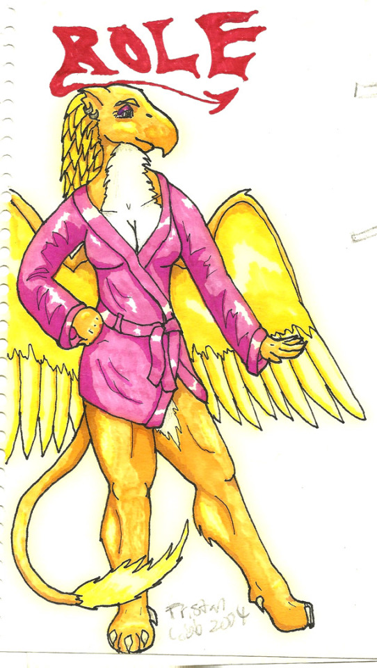
If I recall correctly, I was on vacation at a lake in New Hampshire with CerebralZero, when I drew my first ever pic of Role:

She also apparently had scaly forearms and a distinct beak here too; those didn’t stay, but she did keep the wings for some time.
Given the context of DWM (monster battling), Role didn’t have a lot of background at the time... Though I did have some running gags with my friend Alex who also played the crap out of DWM, I only drew some of our monsters later on in a single rough sketch.
The first continuity I had after Pokemon. [shudder] This shit is really going back in time for me. Note that Role’s outfit makes no fucking sense; but surprisingly, while Sela at the far right looks like some DeviantArt sparkle-bird abomination, she actually is about as ridiculous as the Rain Hawk DWM monster she was based on (I think in-game she actually ended up in part of Role’s lineage because Rain Hawks learn the MEGA MAGIC skill, and thus she would pass it on to Role through monster husbandry.)
- 2003 -

For a while I gave her some kind of SWAT uniform thing. I’m pretty sure I intended her pistol to be the Enforcer from Unreal / UT Classic. She also went blonde for a while.

Using my sick dial-up internet connection at the time I found out that digital coloring was a thing, and I asked my folks to get me Photoshop Elements 1.0 at our local Staples. I also got a scanner, which ushered in an exciting new world of not being aware of the multiply setting, layers, or cleaning up line-art.
However, Role proved pretty good at rocking out in front of crappy jpegs BGs
- 2004 -.
During this time, I went through a bunch of character designs and continuities (itself amusing to look at; perhaps I’ll make a future post for the truly bored.)
All things considered, when I stuck to pens and prismarkers, I don’t think the result was too terrible. Note the blonde again.

IIRC her outfit above is based off of a pinup wallpaper of Jo from Altermeta gen 1. HOW’S THAT FOR DATED?
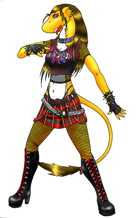
ARRGG back to the horrendous digital coloring. I actually did much worse coloring a little bit earlier, if you can believe it. Some basic digital art tips would have a gone a long way back then. Anyway, it was about this time that Role transitioned to a new continuity with one of the several iterations of Gyr, who was my go-to character for a few years. Note Role’s design stabilized around this time with the garish fuchsia eyeshadow, t-shirt, and brown “hair”.
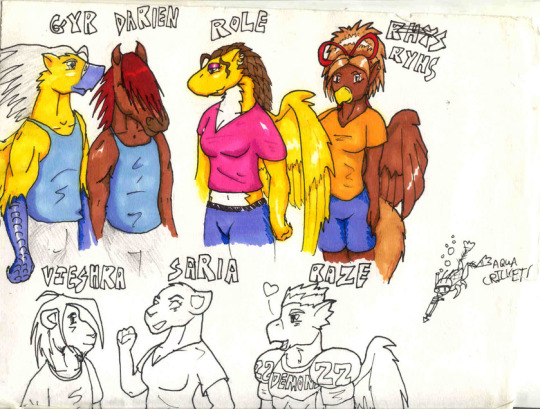
BONUS ROUND: Ryhs Rhys (took me a while to get it straight) is also really fucking old! However, she disappeared for a time, while I kept drawing Role. This cast of characters stuck around for a while, and I drew quite a bit of them, including a number of silly comics, frequently involving my friend’s avatar, Raze, inducing mischief by being a self-important douche.

I certainly drew a lot of pinup art of Role; this habit hasn’t really changed…
2004 had a particularly productive stretch due to me going on vacation to Vermont, again at a lake (similar to where I drew her first pic) and having ample free time to occupy.
This trip was also officially commemorated with a 5 page comic about just that.
- 2005 -
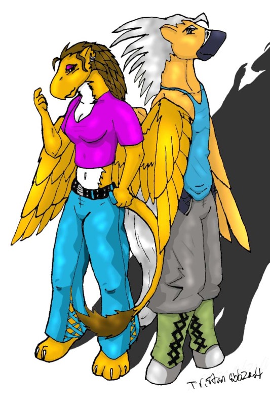
I think this pic was actually late 2004, but either way I still think it stands out as pretty cool for the time. Note Role’s “hair” has transitioned to actual hair from its previous feathery styling. Note the lack of wings too. Also, IIRC the only time she was drawn with closed-toe shoes.
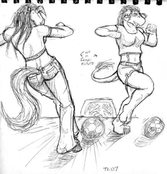
Otherwise 2005 is kinda light on dated pics of Role; probably because I had started drawing Ress more often (another good topic for a retrospective) and had also developed Maru and other equine characters.
- 2006 -

Check it out! Some signs of progress at last! The 2006 iteration of this cast focused on these three (and ditched the wings across the board), as well as folded in the other equine characters to some kind of mid-2000s city life continuity. Role’s shirt also gained a big 01, and might have been her old softball jersey or something.

Around this time, CowBunny, a fellow artist on DeviantArt, also drew me some really cool fanart! CB, if you’re out there, I hope you’re doing well!
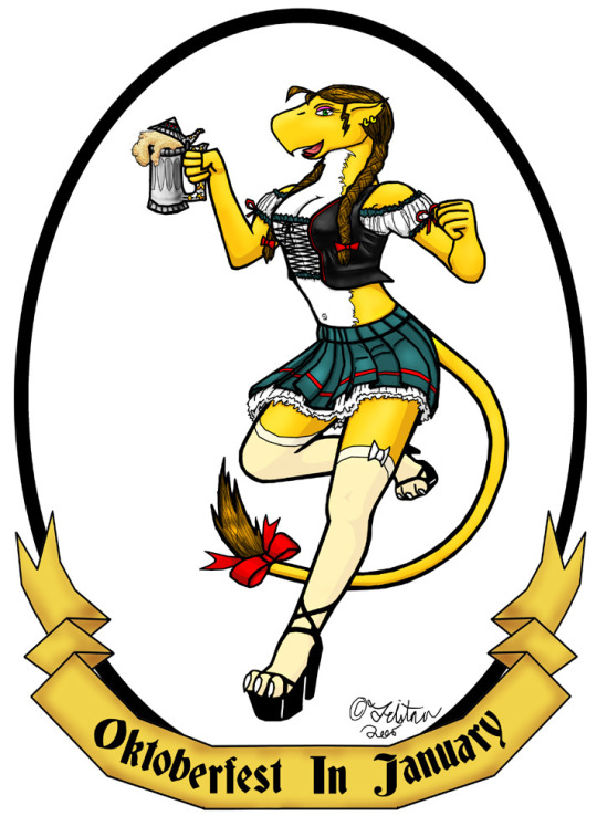
I also drew the first (and a little slim) Oktoberfest Role picture, replete with god-awful shift-clicked mouse lines. Note the braids here.
- 2007 -
I had started school at this point, and IIRC I drew this sketch during my first semester, while riding the D-line from Brookline Village to Riverside, on my way back to my school’s temporary dorms at Regis College.
- 2008 -
Doodles of Role (and Maru and Ress in the upper middle) done in various notebooks from school. Note during this time she also developed a bit of a cleft beak for some reason. You know, I still don’t know why despite having one in the original drawing, I always drew her without a defined bill since then (until 2017.) Inspiration from depictions of Chocobos, perhaps?
- 2009 -

Beergirl Role is back! And dammit if this doesn’t hold up pretty well (which I should be glad of, given that I purposely designed this pic to have tattooed on my side!)
- 2010 -
At this time I was preoccupied with graduating college, and then involved in my first job, so while I have a nice picture of Ress from this time, I didn’t get to Role until the following year.
- 2011 -
But hey, she looked pretty good, so I’d say the wait was worth it. Note that I finally got rid of that fucking eyeshadow. Like, it finally occurred to me that I could use other colors. Or Kelly might have just told me it looked like shit.
- 2012, 2013 -
Didn’t draw Role much (if at all?) during this time, as I started another job, started collecting firearms, and chiefly: Started the modern period of Avania! (The history of how Avania came to be is yet another retrospective topic I could go into detail on, if there are interested persons out there.)
- 2014 -
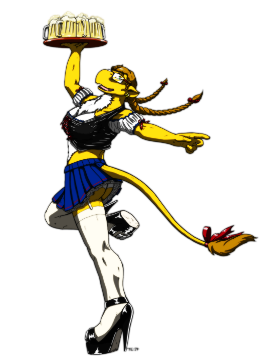
Well, 2013-14 sucked because the start-up I worked for had gone belly-up and money was tight, but never the less I brought Role into the “present” with the third beergirl drawing. Her hair is lighter in this version, but she kept the braids even when not in fraulein-mode, and apparently I liked the way she looked with glasses in that old sketch.
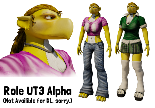
Otherwise I spent most of this time making 3D models of most of the Avania characters to play in Unreal Tournament 3. I even made a model of Role, though I didn’t iron out all the rigging issues, and she was rather out of place among all the other characters I had modeled.
- 2015, 2016 -
I started a new job late in 2014 and I’m still there, so things are looking pretty good. However, I had been working on the Avania comic, and any side art had pretty much been exclusively with those characters. Several times I had thought about adding Role into this now all-consuming continuity, but with one of my design choices being limiting the setting to three sentient races, it meant Role as she was wouldn’t fit neatly into the setting, and so I held off on incorporating her.
- 2017 -
However, early this year I decided that it was high time I found a place for my oldest, continuously drawn character in a setting that I have set out to make a fancy, published (at least digitally) comic out of.

I’ve already been posting sketches of her new design, but say goodbye to the old, and hello to the new Role!
Her old design will always be with me (and I mean literally, given the tattoo) but I’m very happy to actually give her something to do now besides get drawn looking pretty. I’ll probably do some finished art of her new design at some point, and maybe even remake her model for my next Avania UT3 release (though it might end up being UT4 at this point--another project somewhere on the distant horizon.)
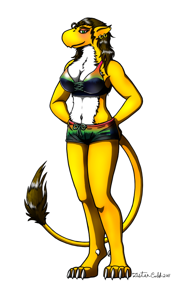
2018 UPDATE: Role’s latest incarnation now has a fully rendered pinup! This is her design for the Avania comic (launching summer 2018) so be sure to stay tuned if you’re a fan!

Though her previous designs haven’t had much in the way of military themes, I wanted to keep her overall look recognizable. As such color color scheme has remained the same, and I figured her braids would continue to be appropriate in the new context. As she no longer has a lion’s tail, I decided to braid that as well so as to keep the tufted and ribboned look. One other thing that has evolved is her personality; though she past wasn’t ever particularly defined, Role always seemed fairly happy, friendly, hard-working, and a little flirty. In light of her new history growing up in dire times and serving during the final days of her country, her old personality has matured to one of responsibility and self-sacrifice, but has not been entirely overwhelmed!
I’ve really enjoyed Role’s evolution over the years, and I’ve especially enjoyed her recent iterations and the depth that I’ve finally got around to developing for her character and backstory.
If you actually read this incredibly long-winded exploration of my artwork, then I hope you enjoyed it too! If that’s the case, let me know if you’re interested in seeing more posts like this exploring some other long-running characters, or all the early concepts that went into making Avania.
It has been a pleasure sharing my drawings with the internet at large, and I look forward to continuing the habit; cheers!
15 notes
·
View notes
Text
The Derrick: Part II - Making Faces With My Friends
Once upon a time, designers were able to make games without graphics. Dungeon Masters rendered breathtaking worlds full of beauty and danger thanks to the amazing power of IMAGINEOVISION, a game engine that required only the human voice and the creativity of its players. Choose Your Own Adventure books and text-only computer games formalized the process into descriptive chunks of text between which the player had to choose, again without relying on a single pixel to aid -- or to hinder -- the player’s imagination. The power of decision-based storytelling was, and still is, one of the most compelling forms of gameplay available, but the introduction of computer graphics into the adventure genre with Mystery House forever changed the game. In order to attract and hold the attention of a modern gamer, even the best text-based adventure usually requires at least a modicum of eye-candy.
As we discussed last time, The Derrick will primarily take the form of a text adventure. In order to illuminate the people and places of Adams, Oklahoma, I’ll be creating not only the story and design for the game, but also the pixel art as well -- a first in my 27 years of game development. Because I’m not a naturally talented artist, it’s taken me several years to develop my art style, and what follows is a brief exploration of how I’ve developed the approach that I’ll be using in The Derrick.
* * *
I’ve always wanted to be an artist. I’ve envied so many of my friends who could sit down with a sketch pad and a pencil and just DRAW anything they wanted. My friend Kenneth Mayfield valiantly spent many hours trying to teach me, and he let me watch as he worked with an airbrush to create the covers of many of the Starfleet Battles strategy games. I picked up as much as I could from him, and even got to the point that I could paint halfway decent nebulae and planets, but mastery with traditional media eluded me. My hand eye co-ordination was poor, and no matter how long I worked at it, I never felt like I was making measurable progress. I might have given up on it entirely if Photoshop hadn’t come along in the early ‘90s to show me another way.
My first experiments with digital photo manipulation were typical surrealism. I cloned my dad and made him sit in his own lap. I placed myself on the cover of important magazines. I did all the silly things that most beginners did with Photoshop, and learned how to blend out scratches and obliterate wrinkles from extant photos. But not too long after I began to experiment with the tool, I began to see it not only as a way to change photos, but also to create entirely new images from scratch. I could make up for my natural deficits in hand eye co-ordination by zooming in and editing pixel by pixel, and I could undo mistakes with a simple keyclick. The program didn’t give me the talent that I didn’t have, of course, but it did provide me with the confidence that I might be able to grow and develop in a way that I hadn’t been possible with mere paint and canvas.
I’ll be the first to admit that my first fully digital “painting” was terrible. I was no better an artist than I had been in junior high, but it wasn’t a bad place from which to start.
WALL OF EYES - As a whole, my first digital painting was terrible, but isolated bits of it revealed that I might be able to do things with digital painting that I hadn’t been able to master with traditional techniques.
When I got to work on my first painting, I’d had no concrete plan for what I wanted to draw. I started with the face of a cyber-punk girl and worked outward, but everything about her showed off my weaknesses as an artist. She had no structure to her face, the balance was wrong, her proportions were deformed -- from head to toe she was a nebulous mess. I’d also put zero thought into her background before starting, and as a result had to retroactively paint in a wall around her rather than painting her over it (a process that would have been a lot easier if Photoshop had had layers, but that feature wouldn’t come along for a few more years). Slowly the wall took on a kind of life of its own, becoming a rotting wood-plank fence. As the gaps and holes began to appear, my mind began to wonder what might be lurking behind them. It became evident to me that the real subjects of the painting were the eyes behind the wall rather than the girl in front of it. “Wall of Eyes” would name itself, and would later lead to two “sequel” images.
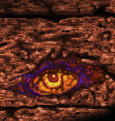
COULD SOMEBODY GET ME SOME VISINE? - Using the power of layers in Photoshop allowed me to “focus” more on fine details of the image.
With the original version of “Wall of Eyes,” I’d felt extreme hesitation at trying to fix any aspect of the image for fear of destroying what few elements I’d liked. The introduction of layers into later versions of Photoshop, however gave me not only a new way to experiment, but it also made me look at the creation process in an entirely different way.
In traditional art, it’s very customary to “build up” an image one layer at a time, painting several coats of translucent paint over each under until a net color or other effect is achieved (a core lesson I’d learned from painting nebulaes). With layers in Photoshop, I realized I could achieve the same effect without running the risk of messing up coats of paint (which would require destroying and painting over flubbed layers.) I could simply lay down different colors and textures and then alter their opacity however I desired. I could also reorder the layers in an instant, and change how they mixed with one another. Ultimately it began to feel more like the process of creating a collage, and it was freeing to realize that I could experiment without fear of messing something up.
My first use of this new feature was to return to “Wall of Eyes” and enlarge one eye that I’d found particularly menacing. Inspired by an old comic book cover, I recolored my “refocused” painting with lurid, pulp comic colors.
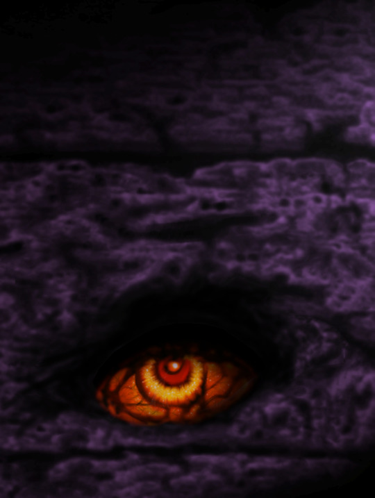
THE THING IN THE BOX - Taking center stage, the eye pops even more with contrasting values of heat and cold, and even greater layers of detail veining its malevolent gaze.
As I continued to toy with it and refine, I “cooled down” the fence with tones of moonlight to draw contrast with that hellish eye, and lavished more details on the eyeball itself. Using layers not only of color but also adjustments to saturation, and contrast, and other elements, I arrived at a final nightmarish image of something that none of us wants to find beneath our beds.
When I started thinking about the character portraits for The Derrick, I realized that a lot of the lessons I’d learned about painting could be used in the modification of existing materials. I could take photos of friends of mine and transform them into heavily stylized portraits that would fit the mood and style of the game I wanted to create. My portrait transformation for Delphine Mack is a fairly good example. I began with a photo of my friend Sarah Berry in vintage clothes appropriate to our 1920s setting.
The original image was black and white, and Sarah was posed against a crowded black background that had to be knocked out in order to make room for a different environment. Finding the boundaries between her dark dress and the dark background were a challenge, but it was an important step in isolating her for modification. Next, I began to hand tint the image for a slightly vintage-postcard look, and applied filters to create a paint-like “surface” to the image.
Next I turned towards the creation of a mysterious background, cloaking her in a graveyard-like fog of blue that fits the mood of the game. It felt as though she should be creeping around in graveyards or down at the riverboat dock.
Once the fog was done, I realized that I liked it, but it seemed to compress the image into a single plane, and the color was too monochromatic. So, for a remedy, I created masks to draw a noirish slash of light across her face, while also creating contrasting bands of orange and red behind and below her for a final mysterious effect.
The irony of Delphine’s portrait creation is that I hadn’t meant for her to be a major character in The Derrick. She was intended only to be one of several non-player characters with whom the player could interact during the course of the game. But as I watched her come alive during the creation of her portrait, I began to see her as a daring and brilliant protagonist that would be very different than your usual Lovecraftian hero, and a perfect centerpiece for the tale.
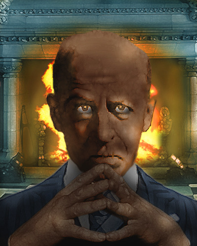
Many of the other characters you’ll meet in The Derrick likewise found their narratives while I was busy “painting” their faces, some of which required a great deal more compositing of elements and layers than Delphine. Phineas Book is a great example of portrait that actually required the combination of several disparate elements -- one man’s face, another person’s hands, a suit that was appropriate for the time period, and a theatrical-looking fireplace that provided the perfect backdrop. The fire itself was hand painted for final effect, as were the eyes and other smaller elements of the scene.
0 notes
Text
the illustration process of Steven Salerno for the new picture book, THE CRAYON MAN
I’m often asked about the process in my creating illustrations, particularly for picture books… So this post will describe how I created the illustrations for the upcoming non-fiction picture book, The Crayon Man -showing the various levels of sketch stages, all the way through to the finished illustrations…
The Crayon Man is the picture book story, wonderfully written by Natascha Biebow, and published by Houghton Mifflin Harcourt -to be released in March 2019. It’s the true story of Edwin Binney who was a chemical manufacturer making black inks, black dyes, black pigments and black paints for various industrial uses, until 1903 when he was inspired to invent one of the most iconic American products ever… The first color crayons made just for children! And his wife Alice suggested a unique name for Edwin’s new product: CRAYOLA -which was derived from the French word craie for stick of chalk, and the word ola from the word oleaginous, meaning oily, like the oily texture of the crayon wax. Crayola Crayons was born, with the first pack having only 8 colors, and costing 5¢. They become an instant hit!
author: Natacha Biebow illustrator: Steven Salerno publisher: Houghton Mifflin Harcourt ISBN#: 978-1-328-86684-4 editor: Ann Rider art director: Sharismar Rodriguez designer: Opal Roengchai
above is a cropped detail view of one of the illustrations for The Crayon Man. Edwin Binney was a chemist and manufacturer producing only black inks, black dyes, and black pigments for various industrial uses… So his daily working life was a dark, smoky, black smudged environment…until he had the idea for creating color crayons just for kids!
Thus far in my career I’ve illustrated 30 picture books… and of the last 12 picture book projects I’ve been involved with 7 have been non-fiction stories. This current string of illustrating non-fiction titles began back in 2012 when I illustrated Brothers at Bat (written by Audrey Vernick, published by Houghton Mifflin Harcourt) which is the true story of 12 brothers who made history as the longest playing all-brother professional baseball team in history! It was the very first non-fiction picture book I illustrated because prior to 2012 all the picture books I had illustrated were fiction titles. I really enjoyed the added challenge of depicting real people in a historic time and place which I stylistically illustrated in a more realistic manner, compared to the much more whimsically stylized look of the illustrations I create for my fiction picture book titles. The success and popularity of Brothers at Bat became the spark for other publishers asking me to illustrate their non-fiction picture book titles, too
Click here to view a complete list of Steven Salerno’s published picture books to date, both fiction and non-fiction.
For those unfamiliar with the relationship working with a publisher to illustrate a picture book, in a nutshell it goes like this: The publisher obtains an author’s story and then the story’s editor, art director, and designer determine who they feel may be the most appropriate artist stylistically to illustrate that specific story, and offers that person the project. So I was contacted by editor Ann Rider at the publishing house, Houghton Mifflin Harcourt, with the offer to illustrate The Crayon Man. After reading the manuscript, pondering the subject matter, and envisioning how I might approach illustrating the text, I readily and enthusiastically accepted the project. We negotiated a mutually agreeable royalty contract and then I proceeded with the long process of creating the original art images for the picture book…
ILLUSTRATING THE CRAYON MAN
FIRST THINGS FIRST: thumbnail sketches & reference search
With a historical non-fiction picture book, in order to create the illustrations that correctly depict the real life people described in the story, as well as to accurately render the appropriate fashions, architecture, time period, etc… the illustrator must spend a great amount of time researching and locating sufficient, historic period photos to use as visual reference to accurately create the sketches and illustrations. However I delay the photo reference search task and instead jump immediately into reading the manuscript while simultaneously drawing tiny, very rough thumbnail sketches directly in the margins of the story manuscript to quickly visualize my thoughts on which actions and events within the story I want to illustrate, which then dictates what specific people, items and places I need to locate reference photos of.
In this early rough stage I create a great many of these tiny thumbnail sketches, and through trial and error work out my basic plan for all the intended illustration images. It can take a couple weeks experimenting with these tiny rough thumbnail sketches just to get a firm grasp on my intended art images for the entire story, and in so doing this also tentatively adresses placement of the text blocking and page turn breaks, too.
My tactic of waiting before doing the photo reference research is merely because at this crucial early stage I just don’t want the reference photo search to possibly distract me from my main task of initially feeling the story and instinctively planning my the art images. These tiny thumbnail sketches are a kind of visual shorthand executed in a quick, rough, simplistic manner indicating the content of the scenes, the dynamic composition of the scenes, and even the general placement blocking of the corresponding text within the scenes. They are only about 1.5” x 3” in size, nearly postage stamp size, and drawn with ball point pen or pencil directly into the story manuscript margins (and on additional sheets of paper when I run out of room on the manuscript!) These rough thumbnail sketches are always just for my eyes only… and never shown to the publisher.
Its only after I’ve completed drawing this wave of tiny rough thumbnail sketches that I then also finalize all my photo reference research. The photo reference material is an essential visual tool to proceed with the next stage in the sketching process: to refine and expand upon theses tiny rough thumbnail sketches into a series of larger format sketches that eventually lead to even further refined final sketches. (It’s the official final sketches that will be formally presented to the publisher’s team consisting of the editor, art director and designer.)
BELOW are some of these tiny, very rough initial thumbnail sketches, drawn directly in the margins of the story manuscript… as well as the corresponding final stage sketch, which you can see expands and refines upon the core idea visualized by the initial thumbnail sketch. Also shown is a cropped detail of the final completed illustration -which of course was directly derived at through the various evolving sketch stages…
STEP BY STEP PROGRESSION OF AN ILLUSTRATION START TO FINISH
(1) initial rough thumbnail sketch (2) small refined sketch (3) enlarged refined sketch (4) final sketch with color (5) final completed illustration
above: STEP (1) ROUGH THUMBNAIL SKETCH
My initial very rough visualization of workers in the chemical factory where inventor Edwin Binney is experimenting with the creation of COLOR crayons for children. In this scene Edwin’s workers are leaving the factory covered in the early crayon colors. This initial thumbnail sketch is tiny… only about 1.5” x 3” in size, and drawn with ink & pencil directly in the margins of the story manuscript
above: STEP (2) SMALL REFINED SKETCH
The more refined sketch stage… wherein the worker characters are more fully defined. At this point I referred to reference photos I researched of workers and fashions from the 1900 to 1910 era to help create an authentic period feel to the sketch. (That’s a circa 1900 lunch pail the man on the far right is carrying) I have also begun to work out the composition relative to the book’s actual proportion, and have also blocked-in where the corresponding lines of text will roughly be placed. This pencil sketch is still relatively small, only approximately 8.5” wide x 5” high.
above: STEP (3) ENLARGED REFINED SKETCH
…in this stage I have scanned the sketch from STEP (2) and brought it into Adobe Photoshop as a layered digital file, where I enlarged it up to the actual full size of the book’s spread format. Now the sketch is at 17.5” wide x 11” high. I also further refined the look of the worker characters and added in gray scale tones, background atmosphere of the factory interior, and a wall clock because in this scene the workers are ending their long work day and heading home… You can see I have also tentatively determined where the text associated with this spread will be blocked in, so I can make sure the art image is allowing sufficient space for the text.
above: STEP (4) FINAL SKETCH with essential COLOR INDICATED
…in this last sketch stage I have added color digitally. This is the official FINAL sketch stage which is then formally presented to the publisher for their review and comments. NOTE: normally when creating final sketches for a picture book project I do not show color at all, preferring to keep the sketches only in B&W. But because with The Crayon Man, since the story IS about color playing an essential role, I was logically compelled to makes the final sketches in color.
above: DETAIL CROPPED VIEW OF THE (4) FINAL SKETCH.
NOTE: Once all the final sketches are shown to the publisher and get their full approval, the corresponding final art is then created based directly on these approved sketches.
above: STEP (5) THE COMPLETED FINAL ILLUSTRATION
above: a cropped detail view of the FINAL ILLUSTRATION
The final illustration shown above was created by using the final sketch as my guide… and briefly described, my final illustration process is: I take the B&W version of the final sketch, place it on top of my light box and then place a sheet of fine-textured cotton rag paper on top of the sketch and use the illuminated sketch underneath as my guide for making the final line drawing of the characters with a dark sepia compressed charcoal pencil as well as a dark sepia crayon pencil. As I am creating these drawings I make further refined adjustments to all the characters as I go along. I then scan all these final charcoal & crayon drawings into a Photoshop file where they are arranged and composed into the final scene, again using the final sketch as my compositional guide. The background textures and other textures seen in the final illustration are derived from gouache textures I paint then also scan into the same Photoshop file. I compose all these various elements comprising the scene in a hierarchy of individual layers (including added digital color layers) to create the final full look of the completed illustrations.
above is a screen shot of one of the final illustrations in progress as a layered digital file in Photoshop. To the left of the art image you can see the LAYERS window with 28 individual layers which comprise all the elements of this particular illustration. Once I have finalized the completed look of the illustration I then save a flattened version of the digital file so that the publisher gets a copy of the final illustration but without access to any of the individual working layers.
NOTE: another sample of working in Photoshop layers to make the completed final illustrations is further ahead in this post…
PHOTO REFERENCE MATERIAL
Above are a couple of the vintage period photos I referred to when making the sketch and final illustration of the workers walking in a line all covered in splotches of pigment colors seen above. The true story of inventor Edwin Binney in The Crayon Man takes place mostly between 1900 and 1910, so my research looking for pertinent photo reference was within that specific time period.
Let me put the photo reference search generally involved with a historical non-fiction picture book story into some perspective… my photo reference search for The Crayon Man involved reviewing an estimated 3,000 period photos to narrow them down to the approximately 130 reference photos that I actually used as printed visual assistance in creating my sketches and final illustrations for the book. It’s generally not too difficult locating the needed pertinent period photos of the people, places, fashions, objects, and architecture from the specific time frame -but obtaining photos that are of a sufficient enough pixel size enabling me to print them out at a reasonable size and use as reference sometimes can be very difficult. And sometimes locating a reference photo of a specific person at a specific age is impossible! I might have to review 50 photos of an item or person before finally selecting just one that meets my photo reference requirements!'
Above is 1 of the only 2 effective reference portrait photos of the real Edwin Binney that I could locate which I used to assist in creating the sketches and final illustrations for The Crayon Man. However there was a problem! …in the story Edwin was only about 36 to 38 years old, however the only 2 reference photos I had of him he was much older, about 53 and 65 years old. So I had to employ my skills of facial characteristic analysis and projection to create the illustrations of him in the picture book at the much younger age of 36 to 38 years old. This kind of necessary manipulation is often the case when using photo reference that isn’t quite sufficient for various reasons.
above 2 images: The top image is a period reference photo of an old hand-cranked grinding machine, circa 1890… which I used to assist in creating the illustration seen above (cropped view) depicting some of Edwin Binney’s workers grinding and sifting various colored minerals and rocks to extract their pigment colors to use in making the initial color crayons which ultimately were named CRAYOLA. You can see that I followed the reference photo quite closely in creating my drawing of the grinding machine… The fashions and various objects seen in all the final illustrations: weight scales, bottles, crates, bins, barrels, machines, buildings, wagons, etc… were all based on photos and diagrams from research within the 1900 to 1910 time frame of the story.
above 3 images: The top image is my initial tiny rough thumbnail sketch of Edwin with his arm draped on Harold Smith’s shoulder, who was his cousin and business partner.
The middle image is a period reference photo that I located, of two unknown workers posing for a candid photo. It immediately caught my attention because it was almost identical to the pose I had already devised in my initial thumbnail sketch, so I referred to this wonderful photo when developing the sketches and final illustration of Edwin and Harold standing together.
The bottom image is a cropped detail view of the refined large sketch. You can see how I used the photo as direct reference for their pose together. Edwin and his business partner and cousin Harold Smith are standing in front of the their chemical works factory which produced only black inks, black dyes and black pigments for industrial uses… until Edwin came up with the idea for color crayons just for kids. Edwin was the chemist, inventor and manufacturer, while his cousin Harold was the company salesman, which is why in the sketch he’s seen next to his travel trunk with labels from around America and the world.
STEPS CREATING THE FINAL ILLUSTRATIONS
As I described earlier in the post, the final illustrations are created first by drawing the characters and objects in the scene. I do this by taking the B&W version of the final sketch, placing it on top of my light box and then placing a sheet of fine-textured cotton rag paper on top of the sketch and using the illuminated sketch underneath as my guide for creating the final drawing(s) using a dark sepia compressed charcoal pencil as well as a dark sepia crayon pencil, and making further refinements to the characters and objects as I draw. These drawings as well as my gouache painted background textures are then scanned into Photoshop where all these various elements are composed in a hierarchy of individual layers, including layers of digital color, to complete the final look of the illustration.
BELOW are some of the final charcoal & crayon drawings created for the opening illustration appearing in the book -which depicts Edwin Binney outside his home in the flower garden appreciating the very colorful world in which he lives, with a red Cardinal flying by against the blue sky. It was his colorful world that inspired the creation of Crayola Crayons. These drawings are then scanned into Photoshop along with painted textures, where I then begin the elaborate steps of creating the completed look of the final illustration.
NOTE: below is the sequential progression for completing the final illustration (once the charcoal drawings seen above have been scanned into Photoshop). This particular illustration eventually was comprised of about 25 individual total layers to make the completed scene. But for sake of brevity in this blog post, I’ve condensed these 25 layers down to just 7 layer groupings. This abbreviated version still allows you to understand the essential process in creating the final illustration.
TIME INVOLVED ILLUSTRATING THE CRAYON MAN
To illustrate this kind of historical non-fiction picture book story I purposely choose to create the illustrations in a decidedly more realistic style (compared to the more whimsical and stylized look of the many fiction picture books I’ve illustrated). Therefore I must accurately portray the likenesses of the real life people in the story as well as accurately render the period fashions, objects, and places. So sketching and rendering these accurate style illustrations (plus conducting all the photo reference research at the start) demands a tremendous amount of time to complete… much more time than completing illustrations for a picture book where I create the characters in a more simplistic, whimsical, stylized manner.
To complete one of the double-page spread final illustrations took about 7 to 10 days, depending on the complexity of the particular scene. The Crayon Man required 17 double-page spread final illustrations for the inside of the book… plus of course, also the front cover art, back cover art, and endpapers art, too.
For The Crayon Man, to conduct the photo reference research and to complete all the sketch stages took me about 3 months. Then once I got full approval of my final sketches from the publisher it then took me almost 4 months to complete all the inside final illustrations, then another few weeks to complete the final cover illustration and conclude minor revisions and tweaks to the interior illustrations. So completing the entire project took me about seven and a half months, working full time.
Hopefully this post gives the viewer a clear impression of the many steps I went through in creating the illustrations for the non-fiction picture book, The Crayon Man. Any questions, please contact me via email. Or just leave a comment on this post.
View many more of my popular picture books for kids on my web site stevensalerno.com
Thanks!
Steve
In 2018 I had 3 picture books released:
PRIDE -The Story of Harvey Milk and the Rainbow Flag (Random House, 2018) written by Rob Sanders & illustrated by Steven Salerno
PASS GO and Collect $200 -The Real Story of How MONOPOLY was Invented (Christy Ottaviano Books/Henry Holt, 2018) written by Tanya Lee Stone & illustrated by Steven Salerno
Tim’s Goodbye (Farrar Straus Giroux, 2018) written & illustrated by Steven Salerno
And in 2019 also look for:
above is the cover of Wild Horse Annie -Friend of the Mustangs (Farrar Straus Giroux, 2019) written by Tracey Fern & illustrated by Steven Salerno
#illustration#picture books#steven salerno#book illustration#children's books#publishing#Crayola Crayons#illustrators#non-fiction picture books#Americana#vintage#historical#Edwin Binney
0 notes
Text
The Best Checklists, Tips, and Templates for Content Marketing in 2019
Have you developed your foolproof plan for getting Alexa, Siri, Cortana, or Google Home devices to speak your brand’s praises when customers come calling for advice?
Are you fighting FOMO with a killer virtual reality app that turns your shopping experience into a garden of unearthly delights for consumers to explore?
Have you budgeted for a new blockchain-based loyalty program or a celebrity-hosted influencer network promising fame and fortune to your audience in exchange for their ongoing engagement?
Don’t panic about keeping up with progressive content trends like these. Remember while it’s tempting to pour all your content team’s energies and resources into the next big thing to hit the digital marketplace, sustainable, long-term success with content marketing first requires a mastery of the fundamentals.
This updated toolkit – featuring some of CMI’s best tips, checklists, and templates – can help you build that solid foundation. Use it to check off some of the critical content marketing tasks on your to-do list more efficiently and use the newly freed brainpower to innovate wisely and purposefully.
Content marketing strategy tips and tools
Everything you do as a content marketer should flow from a deliberately constructed content marketing strategy. This includes determining how to model your content operations as well as outlining why you are creating content (your purpose), who you want it to reach (your audience), and the expected impact of your content efforts on the business (your goals).
Everything you do as a content marketer should flow from a constructed #contentmarketing strategy. @joderama
Click To Tweet
Choose a content business model
Think of your strategy as a road map of the content experience you intend to cultivate and how it will connect your business with your audience – and move both of you closer to achieving your goals.
Of course, anyone who has used Google Maps knows that every destination has multiple routes. And, according to CMI’s chief strategy advisor Robert Rose, the same goes for finding the best content marketing strategy for your organization. In fact, he recently identified four viable approaches that organizations can follow based on their goals, business structure, team resources, and level of content experience:
Player: Content marketing is seen as a contributor to other business communication strategies such as demand generation or product marketing.
Performer: Content functions as a center of excellence, aiming to build an addressable audience through owned media platforms.
Processor: Content is treated as a centralized service offered throughout the organization.
Platform: Content is run as a self-sufficient yet fully integrated media business.
Craft a one-page content strategy guide
You can’t achieve content marketing success unless you understand what success means to your organization. Some of the most common goals marketers pursue through their content programs include:
Brand awareness
Audience engagement
Lead generation
Loyalty and evangelism
Sales and profitability
Of course, content marketing can help your business achieve all these aims and more; but it works best when you focus on one challenge at a time. If your content program could only help your company achieve a single goal, what would you want it to be?
To figure out which goals your organization should prioritize, try the steps in George Stenitzer’s one-page strategy guide.
Build performance-driven audience personas
When you think of your content recipients in broad terms like “audience” or “targets,” it’s easy to lose sight of their needs as unique, complex people with different needs, interests, preferences, and behaviors.
That’s where audience personas come into play. These composite sketches help characterize key segments of your audience in terms of their relevant challenges and concerns and the role they likely play in their company’s purchasing process.
Robert suggests this five-step approach to building more valuable audience personas – ones that put the customer’s needs at the center of your stories:
Define your target: Detail the total addressable audience.
Discover the “so I can”: Uncover the functional and emotional jobs the audience needs to get done.
Decide on your niche: Find your sweet spot of relevance – where your field of knowledge and your skill sets intersect with a passion point of your audience.
Differentiate your content approach: Prioritize the jobs to be done by those that you can and should solve with your unique and distinct point of view.
Design your map of success: Identify as many of the kinds of value you can provide across each step of your chosen jobs to be done.
Take the information you gathered through these steps and assemble your audience persona profile. Here’s Robert’s example:
Write a content marketing mission statement
A unique content marketing mission statement helps you document your company’s reason for creating content and the priorities and perspectives it will uphold in pursuit of that mission.
Your mission statement is a critical component for guiding decision-making throughout the life of your program. As Ann Gynn points out, there’s an art to crafting a useful one – and not everyone gets it right. To avoid providing too much (or too little) detail in your statement, follow these tips:
Be succinct but don’t oversimplify: Describe your editorial mission clearly to prevent your content team and your readers from making assumptions about the purpose of your brand’s content.
Don’t be generic: Distinguish your brand in the statement, whether it’s by geography, industry, niche, etc.
Include your content’s purpose: Explain, in as few words as possible, how it should motivate the readers or viewers, and what you want them to know, think, or do as a result of consuming it.
Pick a niche: Your content can’t be everything to everybody. Pick an area of specialization and ensure that your content efforts all adhere to it.
There’s an art to crafting a useful #contentmarketing mission statement. Not everyone gets it right. @anngynn
Click To Tweet
For more comprehensive guidance on strategic considerations, follow the Road Map to Success: Content Marketing Strategy Essentials
Content planning tips and tools
Repeat after me: “Content marketing works best when you plan for its success.” You need an operational plan that outlines all the insights, actions, people, and procedures necessary to take your content marketing program from a lofty strategic ideal to a fully functional and productive content marketing engine.
#Contentmarketing works best when you plan for its success, says @joderama.
Click To Tweet
Simplify your content inventory and audit processes
Unless your business is just launching, you probably have quite a few content pieces floating around the digital landscape. Some might be worth repurposing; others might no longer fit your goals and should be removed, revised, or replaced. Your first step for activating your strategy should be to take stock of existing content and determine whether it is still shining the best light on your brand.
Two core processes will help with this:
Content inventory – a list of all the content items you’ve created, including the title, type and format, and where each asset has been published
Content audit – an analysis of the data from your inventory that helps you evaluate the relative value of each asset
Content strategist Laura Creekmore shares a streamlined inventory and auditing process, including this template to help you focus in on the most useful data and observations.
HANDPICKED RELATED CONTENT: What Librarians Can Teach Marketers About Weeding Out ROT
Distinguish your brand content
To ensure that your content reflects your brand, its purpose, and its values, enable your team to create each piece of content under a unified standard of quality – which includes maintaining a unique brand voice and consistent editorial style.
Brand voice: Erika Heald has outlined a five-step process to establish and maintain a voice that will set your content apart from its competitors while remaining true to your brand’s core ideals.
Gather a sample of your best content pieces. Include examples of all the types. Cast a critical eye on each piece, whittling the list to a small group of assets that represent what’s unique about your brand and embody the qualities that you outlined in your editorial mission.
Describe your ideal brand voice in three words. Broadly categorize all the assets on your list into distinct themes. Select the three most dominant themes and describe their core qualities based on the characteristics your audience would most likely associate with them.
Create a brand voice chart. Create a form (like the example below) to illustrate how each brand characteristic should be applied in your content.
Walk your content creators through the chart to ensure that your team members all understand how to put your brand voice in action.
Revisit and revise your chart as your business evolves.
Style guidelines: Style dictates the technical mechanics of your brand’s unique voice to help ensure that readers find your content to be consistent, trustworthy, recognizable, and relatable. Sasha Laferte shares a few tips for creating a brand style guide for your team:
Baseline guide: Start with an existing style guide (like AP Style) as a baseline, then customize to align with your brand’s unique communication style.
Formatting: Include details on how to format things like bullets, lists, hyphens, and quotes, and outline when those standards might be different – such as a content format (e.g., video, infographics) or content platforms (e.g., social media).
Colors: Detail your brand’s palette of colors, including function. Make sure to include the hex, CMYK, and RGB codes for each color, as well as Pantone numbers.
Logos: Include all versions of your logo and examples of proper usage in your most likely scenarios.
Fonts: Include all brand fonts for headings, paragraphs, etc., and instructions on their usage.
Templates: Include links to any company-branded templates (such as PowerPoint slideshows) and boilerplate information.
Staff up with the right content marketing skills
To consistently produce high-quality content on multiple channels and platforms, you need to make sure everyone on your team understands your organization’s expectations and has the required skills and know-how to fulfill them.
Use this team framework developed by Michele Linn to identify the skills, mindset, and cultural considerations to account for when running an efficient and effective content marketing program.
Find specialized content creation talent
No matter how creative and talented your team members and agency partners are, there are times when it may make sense to outsource writing – especially when you have a high volume to be done or specialized technical or subject matter expertise is needed but falls outside your team’s comfort zone.
Finding a writer who is the right fit for your team and your tasks can take some time – and a lot of careful vetting. Chris Gillespie offers a few resources to help ease the struggle:
Writer job boards: Forums like Problogger, Writer’s Den, the Freelancer’s Union, LinkedIn Groups, or even Craigslist can be instrumental for connecting with potential writers.
Freelancing platforms: Sites like Upwork, Fiverr, and Freelancer.com add automation to the mix, providing a centralized place for evaluating writers’ profiles, client reviews, and past work.
Content marketing platforms: Content platforms like Contently, Skyword, and NewsCred are pricier than other alternatives but potentially worth the cost because they curate their pool of writers and can provide an editor for quality assurance.
Referrals and word of mouth: As a rule, the best writers rarely have to look for work – they’re inundated with clients starving for their unicorn-rare mixture of writing proficiency and industry expertise. The easiest way to find them is to ask around.
For more comprehensive guidance on processes and teams, follow the Road Map to Success: Turn Your Strategy Into a Stellar Editorial Plan
Content creation tips and tools
Once you’ve set your strategy and outlined your plans for executing it, it’s time to create high-quality, customer-driven stories. Though the creative process is unique to every business, plenty of tools can help with generating story ideas, organizing them into relevant content pieces, and getting them into the hands of your target audience.
Align team expectations with a creative content brief
A great creative brief provides a clear view of the project, the business challenge it is meant to address, and the value it aims to provide to your target audience. If everybody on the team understands their expectations from the get-go, it makes it easier for them to stay focused, channel their creativity, and collaborate effectively.
If everyone on the team understands expectations from the get-go, it makes it easier to collaborate. @joderama
Click To Tweet
Use Duncan Milne’s creative brief template to guide your creative brief execution. Then, make sure to distribute it to everybody on your content team so they all work toward the same vision of success.
Click to enlarge
Generate content ideas designed for success
Brainstorming is a great tool for getting the creative juices flowing and generating a high volume of new content ideas. There are a wide range of ways to approach this task, including the loosely organized free-association process Jay Acunzo recommends, and the five-step improv exercise Cisco Systems’ Tim Washer developed through his experience as a comedy writer.
But, if you are looking for a more strategically guided method – one that prioritizes high-growth content projects over those that only provide incremental returns – consider experimenting with the 10x idea generation framework CoSchedule’s Garrett Moon has used to reach his marketing goals 10 times faster.
Vet your content ideas for viability
Unless you live in a world where time and budget are unlimited, you need to prioritize the creative ideas that result from your brainstorms and determine which are most worth your team’s time and energies in producing.
Michelle Park Lazette suggests asking three key questions before investing in any new content idea – a process she calls her chicken test:
Create content that delivers long-term results
Thanks to search engines, any content you publish online will be findable forever – whether it stands the test of time or not. As you build your ideas into assets, you may want to focus on more evergreen types that will continue to benefit your brand long after it’s initially published.
Mike Murray outlines the evergreen content formats he thinks offer the longest lifespans by design, as well as those that can be easily updated with fresh information as necessary.
Looking to explore additional content types? Check out our most recent content marketing playbook: How to Win at Content Marketing
Support sales and drive increased conversions
While all-purpose content is important to have, you can build your content efforts around specific or specialized business needs – like supporting your sales team’s efforts to address pressing customer challenges or bridging prospects’ critical knowledge gaps.
Follow the technique that Pam Didner has outlined for creating sales-driven (and sales-driving) content – which starts with mapping the customer journey to the sales journey.
Build lasting audience relationships
If your writers are focused on communicating key talking points instead of readable and relatable stories, you might grab the audience’s attention, but you won’t hold it for long – or earn their ongoing interest in what your brand has to say.
As readable.io’s Steve Linney explains, readable content speaks to consumers on their level, using short sentences and simple words, and avoiding unnecessary buzz terms or industry jargon that can make stories feel too complex and confusing to engage with. To strike a good tonal balance between formal and conversational speech without sacrificing your brand’s personality, use Steve’s helpful style of writing chart as a reference tool:
For more comprehensive guidance on content creation, follow the Road Map to Success: Creating the Content of Your Audience’s Dreams
Content distribution tips and tools
Simply creating and publishing content online probably won’t be enough to get it discovered by the right consumers, let alone do so at scale. As a content marketer, you need to make thoughtful decisions about how and where to distribute your content, as well as how you boost your efforts’ chances of building authority and trust.
Promote your blog posts for maximum success
As DivvyHQ’s co-creator Brody Dorland reminds us, without an effective and repeatable process for promoting your blog posts and maximizing their visibility, all the hard work creating them can go to waste. Fortunately, he shares an updated version of his future-proof checklist for promoting your blog that will help you cover all your bases.
Click to enlarge
Streamline your social media marketing
Figuring out the best places to share your content on social media can be puzzling as the rules, opportunities, audiences, and value propositions vary greatly from one channel to another – and can shift gears abruptly without a moment’s notice. But one thing that can make your decisions more straightforward is establishing a channel plan – an advanced directive for how your brand can and should distribute its content marketing efforts on rented channels like social media and what you expect to achieve.
For my post on social media marketing plans, I created a sample template (below) that can help you organize and apply the essential details. Feel free to download a copy and customize it to suit your needs – just open the Google document, go to “File > Download As >” and select the file format you prefer to work with. (Please note: While I used CMI as a reference for this example, the data included does not represent our channel plan.)
Master the basics of link-building
Another way to amplify your new content is by linking to it from your other high-performing content as well as popular and relevant third-party sites. Authoritative backlinks might be harder to earn than organic social shares; but as BuzzSumo’s Susan Moeller points out, they stay around longer than a tweet or a Facebook post, are easier to track than “dark-sharing” mechanisms like email and apps, and serve as a powerful Google ranking factor.
Amplify content by linking to it from high-performing #content as well as relevant third-party sites. @joderama
Click To Tweet
If you are looking to take advantage of this technique, Susan recommends five content formats that won’t steer you wrong:
Authoritative content that answers popular questions, such as “what is?”
Strong opinion posts and political posts
Content that provides original research and insights
Content that leverages a trending topic but also provides practical insights
Authoritative news content on new products or developments
Get started with influencer marketing
Partnering with high-profile industry experts and public personalities for content distribution can help strengthen your company’s credibility and trustworthiness – a must for success. And with brands estimated to see an average ROI of $6.85 for every dollar invested in influencer marketing (Burst Media study), it may be one of the smartest bets around for successful content distribution.
Partnering w/ high-profile experts & celebs for #content distribution can strengthen credibility. @joderama
Click To Tweet
Building a robust influencer marketing program can be a time-consuming and intimidating undertaking, especially for businesses new to the game. Following our eight-step process will prepare you to tackle all the tasks, but you can start with a few lower-touch entry points such as the content roundup.
As Chad Pollitt describes, the content roundup involves collecting the thoughts of several industry influencers on a given topic and compiling them into a blog post (or some other form of content). Chad also shares the checklist below, which outlines everything involved in executing the technique successfully.
For more comprehensive guidance on promotion and distribution, follow the Road Map to Success: Content Distribution Essentials That Win Eyeballs
Content measurement tips and tools
Following the above advice will give your content a strong strategic and creative foundation, but that doesn’t mean your job is done. You need to continually evaluate, strengthen, and grow your content kingdom by identifying what’s working, adjusting what isn’t, and amplifying your content’s power through strategic optimization.
Measure content performance with the right metrics
It’s not enough to create and distribute the content you think your audience will want to read. You must demonstrate that your content is making a measurable impact on the bottom line by driving readers to take action with your brand.
Tracking the right key performance indicators (KPIs) can help provide insight into whether your efforts are moving the needle in the right direction. KPIs can also offer clues as to what steps should be taken to get poor-performing content on track. Use this list shared by Mike Murray to identify the most informative metrics for your specific business goals:
Of course, not all of the above metrics will be meaningful when determining the ultimate measure of success for content marketing initiatives: ROI.
As Global Copywriting’s Sarah Mitchell points out, a single piece of content rarely generates a direct conversion, making data points like unique visits, page views, sentiment scores, or even time on page somewhat irrelevant to the bottom line. However, if you want to demonstrate how your overarching content strategy is contributing to your business goals in other ways, she suggests starting with these content metrics as indicators:
Open rates from email show whether your titles or subject lines resonate with your audience.
Click-through rates (CTR) from your website content and email campaigns can identify consumers’ willingness to answer calls to action and help you understand how customers move through your content.
Time spent. If time-spent figures are changing, it’s worth examining why.
Invitations to contribute at in-person events, in writing, or by making appearances on videos or podcasts are an indication of thought leadership.
Results from research and surveys about your company provide a body of information to track over time.
For more comprehensive guidance on measurement, follow the Road Map to Success: Monitoring and Measuring Your Content’s Performance
Go forth and conquer
While these tips, tools, and templates will help you tackle many of the challenges involved in successful content marketing, they’re no substitute for a thorough understanding of the principles and techniques they represent. If you have questions or would like additional insights on any of these topics, let us know by adding a comment.
Want to immerse yourself in content marketing and gather with thousands of your fellow content marketers? Register by the end of 2018 for the lowest rates for Content Marketing World 2019!
Cover image by Joseph Kalinowski/Content Marketing Institute
The post The Best Checklists, Tips, and Templates for Content Marketing in 2019 appeared first on Content Marketing Institute.
from https://contentmarketinginstitute.com/2018/12/checklists-tips-templates-2019/
0 notes
Note
any art tips?
Oh. Well, I can try to give tips? I’ve never really done that before honestly. My level of arting is nowhere near professional and I haven’t tried a ton of stuff to have opinions on them, but I can try.
This kinda turned into a supply list, but for my own drawing process look at the bottom of the post!
Paper
Since I am a traditional artist over a digital artist, paper is kinda a big deal. My current personal favorite is the Strathmore 400 Series Sketch 9 x 12″ fine tooth surface sketchbook. The thickness of the pages keeps it from getting ripply as you work with it, hard coloring in with pencil does not cause bubbles, and pens/markers do not bleed onto the next page. However, it will leave an indent on the next page if you press too hard.
I highly advise against standard 70 page spiral notebooks for anything more than little doodles. The pages are much thinner than they used to be, and will ripple, bubble, fall apart under heavy marker use, and indent many pages. Heavier paper is honestly just the way to go, plus no annoying blue lines.
Price-wise, I know the standard spirals are usually extremely cheap and easy to buy in bulk, but I can’t remember the price of my Strathmore. It’s not too terribly expensive though.
Pencils
Honestly? Pencils aren’t a big deal to me. I use a variety ofcheap, basic mechanical pencil brands. My current preference however, seems to be Bic. Any brand should work fine, but if the lead constantly breaks, I’d suggest moving up to a larger lead size, or buying a different, stronger brand of pencil.
Personally, I never use 0.5mm lead. It is far too delicate, and I have never found myself needing such a small point to draw with. I find 0.7mm to be the best, as you can achieve both thick and thin lines easily, and press fairly hard with it. I mainly use 0.9mm, as I can press veryhard for dark lines, sketch large and clearly visible soft lines, and it compliments the exaggerated features of my casual art style.
Pens/Markers
So this one is a doozy. I use a very large range of pen products with varying standards of quality. For black pens, the Pilot Precise V5 was my trusty pen for many years before the ink ran out. Now, I currently use a 3 pack of Sakura Pigma Micron pens (specifically 01 (0.25mm), 03 (0.35mm), and 05 (0.45mm)) and previously also had a 005 (0.20mm) Micron as well. The clarity and ease of lines with Microns in my experience is excellent, but the ink quality itself, not so much. It is quite pale compared to other inks, and can be worn away by an eraser even after fully drying. Overall though, it’s quite nice.
My general rule of thumb with pens is that the point shouldn’t indent the page, and if the ink is black,it should shine black under a light and not purple. (Lower quality inks will shine purple when tilted to face a light).
With colored pens my use isn’t as narrow. My favorite is my Uni-ball Vision red pen (I also have a green one), but I also use Bic intensity pens, Inc R-2 Blast pens (careful with these, they release a ton of ink), and even Sharpie pens.
For markers, I can’t really suggest what to stay away fromand what’s good, but I can tell you what I use. On the higher quality end, I have a trio of Prismacolor Premier markers which I’ve found have excellent color, and cover space quickly, but can spread and bleed easily. But what do I mostly use? Sharpies. You have to be careful with these. Sharpies bleed very easily, and will darken very clearly when you overlap it, so coloring has to be very neat and a one-time thing unless a darker color is desired. The color range of Sharpies from what I’ve seen, also isn’t very diverse if you don’t go hunting for the stranger colors, so if you use them, have something to color over them to adjust to the color you desire. In my case, I often use a mixture of Sharpies as a base color, and colored pencils over it to adjust.
I won’t make it’s own section about it, but the brand I use of colored pencils is also Prismacolor, as they work really well with the Sharpies, and can even solidly color over the marker. The larger the set the better, as it gives you more colors to adjust with. However, they’re not cheap.
Technique?
So this is less tips I guess and more my own personal routine with drawing. Feel free to draw your own way, or if you think the way I do it may help you improve your own art, go ahead and try some of the stuff I do! This by no means is any standard of a good art practice, it’s just personally how I draw.
I always start with a sketch, as many artists do. I make sure it’s very light that I can erase it, but clear and visible even after erasing it. Which is the odd thing I do? I erase a sketch immediately after I finish it. My sketches are less posing and positioning than they are quick, sloppy, simplistic versions of my final product. I do not usually draw basic shapes and lines for anatomy and poses, but I do sometimes. If you struggle with anatomy, I suggest still using basic shapes, as they help a lot.
Here this can go one of two ways. If I decide to ink the piece, I do not erase the sketch, and simply clean it up while doing the new lineart. This can be risky, and can result is messy lines or concave shapes that weren’t intended, so redrawing in pencil first can always be helpful. If I decide to not ink the piece, I erase the sketch, leave it visible, and draw a much darker and more visible clean version.
When it comes to colored pens, I usually only use them to supplement the drawing, blood being the most often example. Coloring large areaswith pens is messy, and a waste of ink, and I advise against it. Coloring in a pencil piece with colored pencils is also a big no-no to me personally, as it will cause the colors to blend with the gray lead, can smudge said lead, and they will pop much less against the lead as opposed to ink.
I hope this means something/helps I guess? I’m not very good at the whole tip thing, sorry!
0 notes
Photo
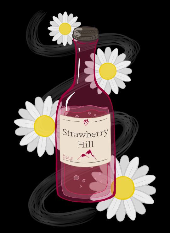
Daises on Strawberry Hill
Well, this looks a bit different from my usual content, doesn't it?
Full disclosure that this art was made primarily as art inspired by one of my favorite books of all time (seriously, I have three different editions of this thing)--Looking for Alaska by John Green--as an excuse to talk about the new Hulu series of the same name that's based on the book.
Because if you know me at all, you know I am notoriously hard on book-to-screen adaptions, particularly those based on books I love as if they were family members.
And originally, this description was going to include a pretty blow-by-blow, lengthy review of my thoughts on the series. However, it's been quite a while since I first started trying to type out said review, and frankly, I've decided instead to, after I talk about the art, to just give some general, spoiler-free thoughts; the most important opinions I have on the series and leave it at that. I am still planning on completing and putting my full-length, in-depth thoughts out, but that'll be at some other time. Perhaps I'll put them in a journal/blog post instead of adding to the description here. Whatever happens, I'll update this description so that those who are interested in my deep-dive can find it when the time comes.
That said, let's talk about the artwork now :)
LfA isn't a fantasy or sci-fi book, so it doesn't have any cool dramatic scenes or neato devices/objects that have a lot of significance to the plot that would be fun to draw, which is why I never made any fan art or inspired-by-art for it before. But I really wanted an excuse to talk about the series, and so I pondered what symbols or imagery the series might have that I could make into art, even if none of it was terribly relevant to the plot or exciting on its own.
This led me to the cheap wine that's mentioned a few times throughout the book: Strawberry Hill. Drawing just a bottle of wine seemed kind of boring and not very specific to the book/series, so I ended up adding in some white daisies since white flowers and daises specifically do have some significance to the plot. (In a way, they're a bit of a crux to it, at least for a key epiphany moment.)
Originally, I was going to make this piece traditionally, and I did start with a traditional sketch of the wine bottle and one daisy to use as a template for more to follow. However, I pretty quickly got the idea for doing something more line-art heavy on a black background, as the cover for the book is black and the sort of chalkboard/blacklight look I was picturing in my head seemed fitting for the tone of the story, and despite my best efforts I couldn't think of a way/combination of media to accomplish what I wanted traditionally without also giving myself a major headache and making the project take infinitely longer than I wanted it to.
So while I stalled in production, I ended up on my tablet for something else and figure I'd scan in my sketches and maybe make a line art to print off and manipulate into what I wanted traditionally later. But then, just as I started working on that, I figured, "You know what, if I'm going to go through all of the trouble to ink/line this digitally and I wanted it to be more line-focused anyway, I might as well take a crack at just doing the full artwork digitally. I'll get the lines done either way, and if it doesn't work out then at least I can say I tried, I know some of what not to do, and I end up with a digital mock-up for the final version."
Fortunately, things ended up working out much better than I expected.
I purposefully wasn't too fussy about the lines, partly because I just didn't have the patience at the time to be super precise about it, and also because for this specific project I kind of liked the idea of a more doodle-ish look (even though it's not super doodle-y in the final product). This also made things move a lot faster, which was nice and pretty satisfying.
I started with the wine bottle from my sketch, including trying a new liquid drawing technique I half picked up from an art Youtuber I just recently started following that makes drawing liquid in a style similar to this look like a lot of fun. I knew I wanted the bottle to be mostly transparent/just lines, so the goal here was more about getting the wine bottle shape/structure familiar enough than it was about anything else.
The label took a bit more though since in my mind, ever since I read the book, I had a pretty specific image of a pinkish bottle with a yellowish liquid and this cream-colored label with dark brown/sepia text, and I had not previously considered the label into that whole primarily line-focused image in my mind. So in the end, I decided the label would be solid so I could get the proper imagery across and the text and stuff could still be seen properly.
Additionally, you'll notice I couldn't help myself being a little on-the-nose and sticking a tiny strawberry and mountain/hill on the label for good measure and to fill some space without having to look up wine bottle references just to stare at the labels for a ridiculous amount of time.
The daises were also infinitely easier to do digitally since I could just copy, paste, and rotate first the petals to make one flower, and then copy, paste, rotate that one flower a few more times, instead of having to draw individual petals and flowers every time. This also gave me a little more freedom in that I could re-size the flowers pretty easily to make it more visually interesting than just a bunch of flowers that were all the same size.
All that ended up being less line-focused than I originally intended, but I acknowledged that happening as I worked, and I'm not upset about the shift in focus. I think what I ended up with still has about the same visual impact I was hoping for, and that's all I really wanted anyway.
And as sort of the icing on the cake, I ended up adding in that wisp/smoke trail in the background because of 1. It seemed kind of empty and unfinished with just the flowers and wine bottle and 2. When I tried adding a green vine to fix that issue, it just wasn't working for me. That's when I realized I could have a stronger reference to the book by putting something similar to smoke in the background since the original cover of the book has a smoke plume front-and-center. It took a few tries and some tweaking to get something I was happy with on that front, but I am so glad I stuck with the idea. It just adds something I can't quite place that the piece really needed before.
The content is pretty different for me--I don't drink and I don't really endorse the idea--and the style is a little beyond my usual realms, but I do really like how it turned out. I feel like it's done well enough that you can appreciate the symbols and references if you know the book, but it also works as just a kitsch art piece if you're completely unfamiliar with the source material too.
I don't think it's super accurate to when a bottle of the stuff shows up in the Hulu series, but it was on screen so briefly and my mind was focusing on other aspects while I was watching, so I didn't get a super good look at it. But I still think it'll suffice well enough despite that.
I'm happy with how it turned out, and that's all that really matters, right?
Now, then, as for the thoughts I have on the Hulu series that I think need to be shared sooner rather than later.
I'll start by going on record to say, as someone that is notoriously hard on book-to-screen adaptions, that I did actually like the LfA series pretty good. I'd say it's about a 7 out of 10, which an exceptionally good score coming from me. It's not my most favorite show of all time, but it's notably better than "just okay," which is historically the highest praise I've ever been able to give a book-to-screen adaption. It had its faults and things I would've done differently if it were up to me, but fortunately, it did an infinitely better job than I was expecting.
My main issues, as with all book-to-screen adaptions, come in the form of some of the changes that were made between the book and the screen. Fortunately, this time around the problems I do have are not egregious offenders. Most changes that were made still make sense within the story and while the overall message isn't quite the same as the book, it didn't totally squander what the book was trying to say. All of which are problems that most book-to-screen adaptions suffer from horribly.
And while I won't talk too much at length about this (that's for the long-form review later ) I think this has a lot to do with the series being roughly 7-8 hours of content, as opposed to the either extremely rushed 2-hours-or-less a movie would've been, or the more-time-than-we-know-what-to-do-with 13+ hours of...certain book-to-screen adaptions that failed miserably at their job. (*cough* 13 Reasons Why *cough*)
As I said, it's not perfect, but I do think as far as allotted time and time-management that they hit something of a sweet spot so that they'd have enough time to give the plot the room it needs to breathe without having so much time that they have to start making stuff up to fill it all.
The other thing I'd like to point out is that, honestly, they did what 13 Reasons Why wanted to do way better than that series could ever hope to. They told the story of teenagers experiencing darker themes and elements of life so much more tactfully, and, in my opinion, more realistically. And they didn't wait for a controversy to spike and then do something about it--they didn't bank on the publicity of a controversy. Right from episode one, every episode starts with a warning that this series is meant for an adult audience (because of its themes) and viewer discretion is advised. And at the end of every episode, as the series does featuring smoking and drinking on more than one occasion, they provide resources to visit if you or someone you know has a problem with either of those things.
I don't know if the people at Hulu saw what happened to Netflix with 13 RW and learned from their mistakes or if they just knew better, but either way, I'm so glad it was handled so much better, regardless of why or how it happened.
As far as recommendations, if you're a John Green and/or Looking for Alaska book fan, I'd say it's definitely worth the watch. For outside viewers...I think you have to really be into the YA drama scene to appreciate it. Just be prepared for some more adult content than you might typically find in a YA movie. It's all done pretty tastefully and the majority isn't there senselessly; most of it serves some kind of purpose to the story, which is why it doesn't bother me (a very prude-ish person) all that much.
I think that's everything I feel like needs to be said right now about the series until I can get the long-form review finished. (It's maybe 1/3 of the way done currently...and already getting on the long side )
I have to admit, this does make me more hopeful for the future of book-to-screen adaptions, at least those that end up being handled the way this one was. In fact, I'm actually really hoping that if Turtles All the Way Down, John Green's newest book, ever sees a screen adaption that it's handled in a series form and is done at least as well as LfA was. Time will tell, I suppose.
In fact, I believe any day now, Let it Snow, a book that John Green wrote 1/3 of is supposed to have its movie adaption dropped on Netflix. I'm not super confident in Netflix's handling of adaptions for reasons mentioned earlier, but maybe just maybe it'll be okay?
____
Artwork © me, MysticSparkleWings
I do not own Looking for Alaska and/or associated content
____
Where to find me & my artwork:
My Website | Commission Info + Prices | Ko-Fi | dA Print Shop | RedBubble | Twitter | Tumblr | Instagram
#lookingforalaska#johngreen#hulu#hulu series#lfa#lfa hulu#book#book adaptation#fan art#art#digital art#photoshop#photoshopcc
2 notes
·
View notes
Text
Local Artists Blend Chaos with Zen in Kokeshi
By Joey Phoenix
When restaurateurs Tim Haigh and Larry Leibowitz begin a new project, they don’t go about it all willy-nilly. Kokeshi Salem is just about to introduce it’s brand of Ramen to the North Shore.
They have a plan.
A good plan.
When they opened local favorite Bambolina in 2015, they didn’t settle for standard street corner pie. No, theirs had to be Neapolitan-inspired, wood-fired, made from local ingredients, handcrafted with culinary personality — it had to wow its audience. Two years later, all the reviews are in, the people are wowed.
Now they’ve set their sights on Asian style street food deliciousness, and Salem has been buzzing about it for months.
This time around, they’ve gone a little off the rails, but in the best way imaginable. With their creative vision, and the help of some ridiculously talented local artists and craftsmen, they’ve transformed the space behind the former Salem laundromat into more than just a restaurant.
They’ve created an experience.
Planning Kokeshi
Tim and Larry’s original plan was on a much smaller scale than what Kokeshi would eventually become. The initial thought was to have a more traditional space with a single bar seating eight-ten guests. Yet, although the physical space was going to be conventional, the ambiance and the food were never going to be.
“Every noodle shop I’ve ever been to has been quite serious.” Larry explains. “It’s very sterile in their approach, the menu is very simple — usually one thing done really well — without a lot of variety.”
Tim and Larry wanted to do things differently. “We’re not looking at classic preparations or to follow a protocol to making the broth.” he continues. “We want to be able to do it our own way with our own spin, like how we approached the pizza.”
When negotiations for the original smaller space fell through, they had to look elsewhere.
“When we saw this new space available it was four times the size of what we envisioned,” he recalls, “and we realized we could do this in a grand way.”
The space adjacent to the former Salem Laundromat used to be an ambulance depot, and the industrial features of the building stood out to the team, including the high ceilings and asphalt floors with exposed cobblestones.
“It had a lot of street vibe to it.” Larry says. “We knew that we could make this industrial raw chic space really complement the food.
“We decided that if Bambolina was Brooklyn, Kokeshi was gonna be the Bronx.”
The two of them shot ideas back and forth, attempting to stitch together a design that would make the most sense. They even toyed around with the idea of bringing in a food truck, sans engine and gas line, as a means to both impart a a working kitchen and add an evocative focal point to the space.
Unfortunately, the logistics of this endeavor proved impossible, and they had to look to other ideas.
So instead, at the suggestion of master welder Scott Lanes, they brought in a shipping container, which Tim converted into a working hot kitchen with the help of a laser cutter.
“What a lot of people don’t realize is that Tim is super dynamic.” Larry explains. “If he doesn’t know something he’ll watch a three minute YouTube video and then become an expert.”
Using the parking lot of Salem Laundry as his workshop, Tim cut out the roof, the back, a pass window for the front, and a door to enter and exit. Then Larry, Tim, and a group of six guys with his truck and dragged it into the building.
The first piece installed, it was time to look to transforming the walls.
The Walls — Danny Diamond
One of the most striking features of the space is the art in the vestibule, on one of the main walls, and on the shipping container. The design of the pieces were a collaboration between Tim, Larry, and mural/graffiti artist Danny Diamond of skribblefish.com, but the implementation was Danny’s alone. Danny is a wizard with paint, and his works can be seen from the garage doors of the North Shore to the industrial spaces of Santa Cruz, CA.
Danny grew up exploring a number of artistic mediums including theatre, graphic design, and creative writing. He graduated in 2006 from UMass Boston with a major in creative writing and a minor in philosophy, and it wasn’t until his late twenties when he realized that painting could be more than just a hobby. He had no idea it would ever become such a lucrative career.
Larry and Tim decided to bring Danny on board after Tim saw some work Danny had done for a mutual friend. Danny has a unique style, and its vibe immediately stood out to both Tim and Larry, so they brought him on board.
“There was such a cool edge to his work, and he works in his own language.” Larry recalls, “So we gave him a shot in the vestibule.”
Danny initially proposed a large graffiti piece with distinctive colors that would fade up to midnight black. He did a sample sketch, Larry and Tim made a few tweaks, including the suggestion that Danny incorporate the Kokeshi logo onto an abstract bowl of noodles.
Larry and Tim enjoyed the work so much that they asked Danny to do a second piece, a mural — but they weren’t certain how they wanted to look just yet.
“I wanted something, whatever it was on the wall,” Larry says, “that when people would come in they would stop and take their picture in front of it.”
Danny brought some ideas to Tim and Larry and the three of them set about finding a concept.
“I always put the onus on the client to put me in the right direction,” Danny explains, “and when they told me about their idea of a samurai with tattoos as a showpiece for the dining room, I set about finding reference pieces to make that happen.”
“It’s been my experience that when you hire an artist, you gotta give them free reign to let them do what they do best.” Larry adds.
It’s such a big deal to see the stroke of someone’s hand in a piece. It was important to me for my work to have this feel, because art like this has a humanizing effect.”Danny Diamond
One of the things Larry discovered was that Danny has a knack for high contrast, elegant murals that look as if they’ve been drawn in charcoal onto a sketchpad. So the three of them came up with the idea of having a female Samurai wielding a large sword. It would be mostly black and white, except she would have a tattoo of a carp on her shoulder, and the tattoo would be in color.
During the process Danny realized that the tattoo idea wasn’t going to be able to work. The shoulder wasn’t quite big enough, and there wasn’t enough curvature.
“So much of how we’ve worked throughout this project is about having faith in the artist.” Larry explains, “I told him, ‘say no more, I trust you.’ And it came out awesome.”
In lieu of the carp tattoo, Danny added detail to the hilt of the sword, as well an an array of beautiful cherry blossoms around the piece. The effect is wonderful.
“Everything is so digital nowadays,” Danny says. “So it’s such a big deal to see the stroke of someone’s hand in a piece. It was important to me for my work to have this feel, because art like this has a humanizing effect.”
The Branding — Andrew Bablo
Another element which plays into the dynamic Kokeshi vision was the branding, which was brought from the heads of Tim and Larry into being by Beverly native and Montserrat Alum Andrew Bablo.
Andrew is a multi-talented tradesman with skills ranging from graphic design to metal work to large scale murals. His work is well-known in Boston and the North Shore, and it’s been featured recently in the Hair of the Dog show at the Cabot, the Letterform Show at Mingo Gallery, and on the walls and silo of Bent Water Brewing, to name a few. He was also the owner and long time editor of Steez Magazine.
“People are looking towards more artists to do more unique work.” Andrew explains.
Andrew’s work is some of the most original and dynamic around, and this has a lot to do with the fact that he hasn’t settled on any particular style or material.
“I try not to do the same thing twice.” Andrew claims. “I have a really hard time when people say I really loved when you did this here, can you do the same thing?”
This drive for newness led him to reach out to Tim and Larry after hearing about the Kokeshi project. He realized that he had done a lot of things in Boston and Beverly, and very little in Salem. Knowing what they had done with Bambolina, Andrew knew it would be a good fit.
After some initial hesitation, mainly due to budgeting reasons, Tim and Larry agreed to bring him on board. It was a match made in culinary branding paradise.
“I would jot things down on a bar napkin and he would polish it.” Larry recalls. “I would ask him, what do you think of this? And he would come back with an idea and we would talk about it.”
“Larry had a pretty good idea about what he wanted to do,” Andrew says. “it was a lot of back and forth, a lot of process.
“It was nice,” he continues, “because I prefer that more than someone who just says yes to the very first thing. It’s not mine at the end of the day, because I want it to evolve to become the best product it can be.”
One of the biggest aspects of the branding — and Andrew did everything from the menus to social media collateral and much more — was the actual logo itself.
“Things kept snowballing.” Andrew recalls. “The beginning process was really long, and when we thought we had it locked down and done, he came back and said it’s not done.” He laughs.
The logo is based off of a Japanese wooden doll known as a Kokeshi. Like the name Bambolina means baby doll in Italian, Tim and Larry landed on the name Kokeshi as the Japanese equivalent.
Yet, even though the doll is traditionally female, Larry didn’t intend to have the doll be female.
“I didn’t want it to be too classic,” Larry says. “So I had this idea of doing a fu manchu with a man bun.”
However, this idea didn’t make it very far. So Andrew and Larry went back to the drawing board, before ultimately landing on the final version some time later.
“The colors changed, the logo changed, and so the doll that we have now is really soft and playful.” Larry describes. “The whole idea behind the logo was that I wanted people to see it and immediately smile. And I wanted them to know that what they’re about to get isn’t classic, isn’t authentic, isn’t serious.”
“I think we came up with something totally unique that’s also really a lot of fun.” Andrew says.
Branding, as a whole, is something Andrew would like to see more businesses consider more seriously.
“Brick and mortar is so hard, so expensive. If you’re going to make this investment in opening up a restaurant or retail location, you’ve gotta be different. You’ve got to be unique enough to pull people in. If you’re not gonna go for it, then why do it?”Andy Bablo
“Brick and mortar is so hard, so expensive. If you’re going to make this investment in opening up a restaurant or retail location, you’ve gotta be different. You’ve got to be unique enough to pull people in. If you’re not gonna go for it, then why do it?”
Fortunately, Larry and Tim agree.
“I see a ton of value in what he does. I really respect his craft a lot.” Larry explains. “He brought our ideas to life.”
In addition to his work with Kokeshi, Andrew is in the middle of a number of other expansive projects — among which is a mural project set to go up beneath the Salem/Beverly Bridge — but perhaps the most significant thing he’s doing is his role as creative partner for Hubweek.
Founded by the Boston Globe, Harvard, and MIT a couple of years ago as a platform to do keynote speaking events on science and tech, they’re looking to expand this year’s Hubweek (October 8–15) to be the intersection of art, science, and technology.
“It’s really going to be a spectacle.” He says.
The Structures — Scott Lanes
Salem State Alum and well known photographer Scott Lanes has been a North Shore resident for almost his entire life. Beginning his career as a set designer and builder for theatre productions, Scott works with endless amounts of odd materials from metal to fiberglass to glass and just about everything between.
“I primarily do metal,” Scott says, “that’s my main medium, but I work in fiberglass, I’ve done casting. I did a project for Roger Williams Zoo and they wanted a tree house, and they asked me to fabricate a whole set of insects cast in clear resin to be up in the walls.”
“We weren’t originally going to use Scott, but he kept coming up with all of these awesome ideas.” Larry recalls.
“I was over at Bambolina one night about a year ago,” Scott says, “and Tim was telling me about this restaurant he wanted to open — something with a real industrial feel to it.”
Tim then told Scott about Larry and his idea for the food truck as a kitchen, and asked Scott if he had any suggestions. They worked the problem for a while before realizing quickly how unrealistic it was. Then they decided on swapping the truck idea for the shipping container.
“I thought that it would look really cool,” Scott says, “like somebody just opened a restaurant Mad Max style at a dock.”
About halfway through the shipping container install, Tim asked Scott if he’d be willing to fabricate some shelving for the kitchen. Then another project came up. Then another.
“I’m halfway through the shelving and Larry’s like we just got a quote for this stairway going up to the second floor, you got any ideas for doing a stairway?” He laughs.
“And I said, yeah, I do. I’ve had that design in my head for a while and I just had no place to put it.” He recalls. “When I showed them the idea, they loved it.”
In addition to his work on the shipping container, the shelves, and the staircase, Scott also fabricated the tables and the table bases, as well as a number of other small metal work throughout the entire restaurant.
“They kept me busy from November 1st until about a week ago.”
“The design comes in day by day,” Larry says. “there are things happening today that I didn’t know about last week.
“Scott and Tim have just done an unbelievable amount of work just stitching the whole thing together.” Larry adds.
The Sign — Concept Signs
Located off Bridge street in Salem, Concept Signs has been crafting signage for businesses around the North Shore for almost two decades. Run by Ken McTague with the help of his production assistant, local artist Dan Gilbert, Concept Signs is the team behind — as you would expect — the Kokeshi sign.
The shop where the sign was made is a marvel in it’s own right. The back alleyway is filled with old vintage signage from the last 60 years, a stripped ’54 ranch wagon is being refurbished in the workshop, double hinged refrigerators from the 40s and 50s are in the workshop and office, and Ken’s art fills the walls of the office.
“Before I came back to Salem,” Dan begins, “I was working in a more corporate sign shop. It was really boring. For example, I was doing awnings for Dunkin Donuts.
“Working here it’s much better,” he continues. “Theres only like one Gulu Gulu. There’s only one Flying Saucer. All the signs have character.”
Concept Signs’ specialty is New England style gold leaf signage, which can be seen from the Devereaux House in Marblehead to Anmol Restaurant in Beverly to Salem Wine Imports on Church Street. So the Kokeshi sign was a bit of a deviation.
“Letters were cut out of this PVC and we made studs for them and spacers,” Dan explains, “So when you look at the Kokeshi sign the letters are lifted above the sign to cast a shadow.”
MEMBERS BONUS CONTENT
Members login for even more photos from inside Kokeshi! Interested in all the premium content and saving money all around town. Click membership at the top of the page.
MEMBERS ONLY
Concept Signs also makes it a point to use automotive finishes on their signs, and the blue paint in the Kokeshi sign is automotive paint as well. The reason for this is durability.
“We did the Devereaux house sign about four or five years ago — the one with the pineapple,” he clarifies, “and If you go by it now it still looks brand new.”
The Future
Kokeshi is having their soft opening this coming week, and it’s certain from day one the lines will be out the door. The team has been working since November to bring about something that will be truly unforgettable.
“Our idea is to whisk you away and make everything tie into it,” Larry says, “but also use a lot of tongue in cheek sense of humor.
“We’ve always said that we don’t take ourselves too seriously and we never want to. We want to have fun and we want the staff to be fun and we want the experience to be fun.”
Also, rumor has it, they’ll be projecting Kung Fu films on the wall. So stay tuned.
Stay tuned for information on menus and hours on the Kokeshi website.
Salem Scene - The Cosplay Affair - Wrap Up
The Cosplay affair at the Hawthorne Hotel was a joint...
Call for Artists and Designers "Celebrating the Urban Environment"
Call for Artists and Designers âCelebrating the Urban Environmentâ Salem,...
Salem Event - Leslie's Retreat Reenactment
Re-engaging with Leslie's Retreat via Streets of Salem
Via Streets of Salem Blog
Salem is gearing up for...
Creative Salem Podcast #23 - Dustin Luca - Salem News
On this episode of the Creative Salem podcast we talk...
Creative Spotlight - Lee Roberts aka Mr. Clever
Meet local creative cosplayer and host of the Cosplay Affair....
Salem Scene - Burns Night 2017 Hamilton Hall
Burns Night was an evening of Fun and Frivolity at...
Salem Film Fest Turns 10! Come see the world
By Shelley A. Sackett When local filmmaker Joe Cultrera, businessman...
“THE BRIDGE AT 211” WELCOMES SALEM ARTS ASSOCIATION
NEW HOME FOR SALEM ARTS ASSOCIATION GALLERIES AND SHOP âTHE...
Salem Photo Gallery - World of Wearable Art at Peabody Essex Museum
WOW® World of WearableArt⢠On view February 18, 2017 to...
#soliloquy-container-17510{opacity:1}#soliloquy-container-17510 li > .soliloquy-caption{display:none}#soliloquy-container-17510 li:first-child > .soliloquy-caption{display:block}
Local Artists Blend Chaos with Zen in Kokeshi was originally published on Creative Salem
#Andrew Bablo#Andy bablo#Concept Signs#Danny Diamond#Joey Phoenix#Kokeshi#Kokeshi Salem#Ramen#Restaurant#Salem Food#Scott Lanes#Salem MA#Creative Salem#Salem Events
0 notes
Text
FMP Proposal
The area of study:
The area of my study is theatre design, which is going to be focused on exploration of an idea ‘what if viewers became actors and performed their own play’. Initially, I was inspired by the fact that starting from the 20th century there has been a tendency to integrate actors into public in order to direct a story from the inside. So there is a question what role do the people play, when they become a part of a performance? Theatre production is a living organism and the main source of life is audience, whose certain emotional state and degree of openness influence their understanding of the plot. They go to the theatre for many reasons: while someone is eager to have fun and show yourself, other treat the theatre as a sacred place and take a chance to confess. How do these people influence each other? How do they behave? In other words, actors introduce an idea and viewers reflect on it according to cultural and social backgrounds. A level of perception is different, that is why one story has multiple interpretations. Nevertheless, the main concept that works for everybody is that the theatre creates special conditions where people show a real essence of their personal characteristics, no matter whether they are positive or negative. This place doesn’t assess, but perceives everyone with a diversity of their moods, actions and flaws.
My aim is to come up with a range of characters and reveal their inner state (to show a bouquet of emotions that people experience during the play and visualise this dumb show) that is an ironic representation of theater audience in Moscow. I would like to give an opportunity to the viewer to look at himself from a different angle and ask a question ‘What kind of theatergoer am I?’
The working title:
Dumb show (‘Немая сцена’)
Research steps:
1. theatre
I have already been to two plays called ‘Rumors’ and ‘№13D’. In the nearest future, I am going to reflect on their structure and plot tricks. Also I consider asking Galina Solodovnikova for advice about visual interpretation and set design.
2. interview+ social survey
I have a friend, who studies at GITIS. So I am going to come up with relevant questions about her life, theatre atmosphere, rehearsals, unusual situations, improvisations and something that happens behinds the scenes and a viewer is not aware of. Moreover, I would like to write a survey questionnaire and make a comparison between actors and viewers’ attitude to theatre and each other.
3. lectures
There is a course of lectures on Contemporary art and theater at MOMMA museum that I am going to attend in order to get a proper overview of theatre development and its influence on a current situation. Also this is a great opportunity to become familiar with significant figures of that time and reflect on it referring to my project.
4. exhibitions
- ‘The Geogian Avant-garde: 1900-1930s’ at The Pushkin State Museum of Fine Arts (‘a major section of the exhibition is dedicated to the theatre’);
- ‘The world is the theatre. Architecture and set design in Russia’ at Schusev State Museum of Architecture.
5. visual language
Theatre aesthetics: Bauhaus, Dmitry Krymov, Vsevolod Meyerhold, Robert Wilson, Oskar Schlemmer.
Artists: Kazemir Malevich, Picasso, Sergei Eisenstein, Fernand Leger.
Contemporary artists: Nenad Cizl, Seripop (refer to posters - its visual clarity and playfulness).
Work format:
1. Theatre branding
This is the main part of FMP that consists of visual identity. I am going to create a set of posters and a booklet (for example, a format of brochure with explanations for the story exhibited). The research might change the final outcome; it will depend mainly on the final idea.
2. Installation (conceptual space)
There is an opportunity to sum up the story and demonstrate it as a panoramic overview of the audience. This structure may have a surface made by plywood/ a piece of fabric and colored with acrylic paints or there will be a big printed illustration.
Materials, processes and outcomes:
I am going to work 50% off-site and 50% at college, because primary research involves observation. In order to develop my characters, I plan to go to the theatre once again and draw people, follow their movements, actions and record their conversations.
I intend to use mixed media in order to achieve as playful and experimental result as possible. So I suggest drawing with pencils, ink and charcoal; also, I would like to refer to a collage technique.
The installation is a big graphic summary of the story that offers an area for a viewer to look at himself from a different angle, feel the environment and be a part of a play.
Is it interactive space or just an atmospheric representation? Is it a flat surface or an illustration transformed into 3d (with elements of integration)? What is the meaning and context of the exhibition place?
Progress measurement and assessment:
A blog will be the main analytical tool that will help to critically review a development process and identify some flaws. All information will be recorded digitally, so I won’t waste my time and retype everything once again. Tutorials will help to identify my strong and weak points and push me further in terms of idea generation and its clarity. References and sources will be combined together and transferred directly to a project log file in order to see everything laid out according to stages. As for project planners, if something goes wrong, I will replace steps with each other or find alternative solutions that will lead to a more successful direction.
Schedule:
Week 1 (30.01- 05.02) - primary research (books, lectures, etc) + first sketches based on research;
Week 2 (6.02- 12.02) - FMP proposal confirmed + research (lectures, books, exhibitions);
Week 3, 4 (13.02- 26.02) – secondary research + idea generation + character design + search for visual identity, trying out different techniques + come up with the plot and identify its ways of development (start drawing);
Week 5 (27.02- 5.03) – visual identity confirmed + character design refinement + experiments with layout and book format + typographic solutions;
Week 6 (6.03- 12.03) - compositions are established for visual identity (posters, brochure) + color palette + start working on final illustrations (different options of representation) + experiments with shapes (a cardboard installation)
(11.03) – performance ‘The Demon. The view from the top’, 19:00, School of dramatic art, Dmitry Krymov (the director of the play);
Week 7 (13.03- 19.03) –developing/drawing FMP + a booklet format is chosen + work on exhibition space (prepare a Photoshop file, if it is a laser cutting + production) + confirm a final structure + come up with a final composition for the installation+ work on the installation, trying out different materials and surfaces;
Week 8 (20.03- 26.03) - developing/drawing FMP (visual identity) + design and lay out the brochure + start working on the final version of the installation;
Week 9 (27.03- 2.04) – assessment preparation (AOM +Size matters); design and lay out the brochure + work on the installation;
Week 10 (3.04- 9.04) – visual identity is ready for print + work on the installation;
Week 11 (10.04- 16.04) – printing/binding FMP + produce additional works for the exhibition place + installation is ready (try out lightning if it is necessary?):
Week 12 (17.04 - 23.04) – FMP crit, Project Log FMP (layout);
Week 13 (24.04 - 30.04) – Project Log FMP (layout);
Week 14 (1.05 - 7.05) – BHSAD closed, Project Log FMP (layout/printing/binding);
Week 15 (8.05 - 10.05) – Project Log FMP (binding), FMP Deadline, Exhibition construction.
https://annbespalova.tumblr.com/
0 notes
Last Seen Blogs
https-al3x
⠀⠀

allirad15-blog
Blinding Chain

the-brawl-girl
Brawlin' Blog

kumaravitandon
Untitled

everyonedeservedbetter
Untitled