#i love being confused by the composition in every single page and panel
Text
Ok i just caught up on chapters 21-22 of aqua and like
Its not as rage inducing as the last batch i read but man ... they're still aqua lmao and i have questions

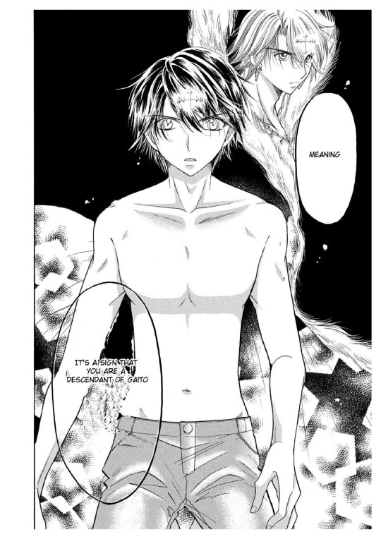
Dont you love explicitly admitting this shit has to be incest? Like also the way its worded implies that kaitos descendants wouldnt count which us weird lol. Also like how the fuck would kaito pass down his blood?? Idc how sexy any of us think he is that man didnt interact with anyone and the like maybe 7 women he even remotely regularly talked to are either dead or revived lesbians
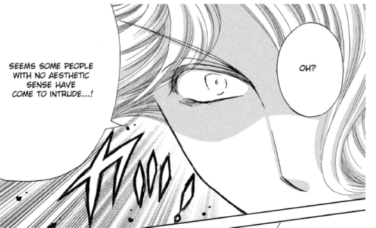
This is genuinely funny to me and like..... i actually think the idea of that disco ball fragmently reflecting its victims inward is really cool ...when you think about it ...and not at how they actually show it ...it still made me laugh out loud at how dumb it looks when it was 1st shown

Ok but like actual real question- which one is which in this page? Like the more i look the more confused i get. Like at 1st i assumed the right one was lucia because it makes sense she would be more agressive than scared and also because they gave her bigger boobs. But then i went a couple of pages back to try to see if there are ANY design differences and it looked like lucia had denser bangs?? This is why you need to make your characters distinct, kids.
Also they didnt explain at all why laurent getting ditched by a girl made him kiss a boy and invite him to his secluded house 13 years after like are you actually going to say that being scorned as a child made him commit gay?? (Can you tell im not excited for this subplot lmao)
#rambelings of el#mermaid melody aqua#liveblogging#cw incest#incest mention#just in case#let me know if i should tag anything else#ykno for filter purposes#i love when this manga just attacks me with word with no structure#i love being confused by the composition in every single page and panel#never change aqua (i am actively praying for change)
4 notes
·
View notes
Text
Eat The Rich #3

Eat The Rich #3
BOOM! Studios 2021
Written by Sarah Gailey
Illustrated by Pius Bak
Coloured by Roman Titov
Lettered by Cardinal Rae
Still uncertain about what she saw in Pip's office, Joey confides in Kitty... but Kitty's response only confuses her more, leaving Joey with no choice but to play along with the family. Until Fourth of July, when at a party Joey suspects what she thought she saw then is happening again. Can Joey come to terms with what is really happening in Crestfall Bluffs... and can she still walk away alive?
This shit is bananas B.A.N.A.N.A.S. and I am eating up every single moment of it. Now if you were paying attention to the last issue, was last night, Joey found out a lot about what’s going on within this community. So the way this issue goes, many of Joey’s questions are answered by an unlikely source who, if you remember, knew she was out and about wandering the house. I love how Sarah tells this issue's story because it really keeps the tensions high and interest piqued up past ten. So Joey has a huge dilemma on her hands but she loves Astor and she’s unsure to what extent things are happening and how deep into all this her boyfriend is.
I’m loving the way that this is being told. The story & plot development that we see through how the sequence of events unfold as well as how the reader learns information is presented exceptionally well. The character development that we see through the dialogue, the character development as well as how we see them act and react to the situations and circumstances which they encounter does this magnificent job in bringing their personalities to the forefront. The pacing is excellent and as it takes us through pages it does a sensational job bringing the events to life.
I am liking the way that we see this being structured and how the layers within the story continue to emerge, grow, evolve and strengthen. The layers open up new avenues to be explored and while some will be and others won’t be, what they all do is add this delicious depth, dimension and complexity to the story. Plus there’s still Astor and his insecurities going on that she has to deal with, oh and his sobriety. How we see everything working together to create the story’s ebb & flow as well as how it moves the story forward is immaculately achieved.
The interiors are more simple than I care for but that doesn’t mean that they aren’t effective because they are. Astor is a big old hunk of man according to what we see. The linework is strong, clean and crisp and with the varying weights and techniques that we see creating the attention to detail throughout the book is extremely well rendered. We see some nice utilisation of backgrounds but I do wish we’d see more because they do wonders in enhancing and expanding the moments. They also work within the composition of the panels to bring out the depth perception, sense of scale and the overall sense of size and scope to the story. The utilisation of the page layouts and how we see the angles and perspective in the panels show an extremely talented eye for storytelling. The colour work we see is solid, packed in and there’s some great use of lighting and highlights happening within these pages. On a side note I do wish the interiors looked like the cover.
This is a crazy story. I love what it is, how we see it and the revelations and repercussions of the actions. This isn’t like you’d expect it to be and it really takes the reader on a journey through this amazing look at how some of the upper echelon live through the eyes of someone who’s naivete is palpable. The writing is spectacular and the characterisation is amazing while the interiors do a nice job in bringing this world to life.

0 notes
Text
August 10th-August 16th, 2019 Creator Babble Archive
The archive for the Creator Babble chat that occurred from August 10th, 2019 to August 16th, 2019. The chat focused on the following question:
What is your process for planning out the paneling/layout of each comic page?
kayotics
I’ve finally gotten my process down to a process that works for me. For Ingress Adventuring Company https://www.ingress-comic.com/ I start with scripting the whole chapter out. Step two is thumbnailing the whole chapter out, so I can figure out pacing and paneling. I started to do thumbnailing on sheets of printer paper, which has been easier to figure out my drawings and to see how the comic flows on paper. Once that’s done it’s pretty straight forward. Panel borders in pencils > rough sketch & balloon placement > letters and tight sketch in pencils > ink letters > ink bubbles and borders > ink the rest of the page. Then I scan it and do the colors. With the thumbnail process I kind of do the chapter twice in pencils but it ended up being way easier in the long run, since I hate doing panel layouts and doing that work in the beginning is way easier.
Steph (@grandpaseawitch)
Afraid there's no scripting for https://oldmanandtheseawitch.tumblr.com/. It's all pretty much in my head but I go over it literally every day, and I have a few roleplays archived to keep things on the right track, but that's about it. Thumbnails are done in big batches. Last batch was about 20+ pages done at once. Thumbnailing is also where I figure out composition and such. Just detailed enough to give me the idea of what I want, with enough leeway to do as I please on the page itself. Thumbnails done, I make a batch of empty pages, and go in and make all the panels for the 20+ pages. Since I already know the composition from the thumbnails and I have digital guides set up on each page, that's super easy. With all of those done, then I just go back in, do rough sketches for each page. Cleaner than the thumbnails but not too clean yet. Once the rough sketches are done, this is actually where I'll add text and balloons, so that I know what the bubbles will be hiding and don't have to waste extra time. After that, I do as much in large batches as I can, usually cleanup sketches, then inks, maybe flat colors. But after that point, I just have to sit down to work on individual pages until they're done. And voila!
authorloremipsum
http://signsofthreecomic.webcomic.ws/comics/ For Signs of Three, I always start with the script, get the basic idea of what I'm going for in the page. Then panel layout and gesture sketches of people and the environment. THEN! BEFORE I START DETAIL SKETCHING! I LAY IN THE SPEECH BUBBLES. Seriously speech bubbles are critical to controlling how readable your page is and so so many people don't seem to see that. They must lead from one bubble and panel to the next in an easy to understand way or your reader will get lost and confused. So I always make sure to put bubbles in during thumbnailing. After that it's just basic refining the sketch, lining, coloring, and shading.
AntiBunny
Typically in AntiBunny http://antibunny.net/ I thumbnail a page first to decide what needs to happen. After that I look at those event and decide panel layout based on how best to depict them, factoring in what needs to fit, who needs to be there, and how time will pass. I'd say time is the most important aspect, followed by emphasis, and then content. Typically bigger panels depict more time passing, but that's not a concrete rule. A big panel can depict a very short moment in time. The amount of population has a big play in that as well. A lot of action in a big panel can be a short moment in time that's just heavily emphasized. A big panel with very little movement depicted is great for dwelling on a single moment, which is great for slowing down the pace of reading.
heroesofcrash
I used to not have a script at all, but now I tend to write out scripts in advance. I keep a four-panel format in mind (2x2) when I write a strip, but I'll sometimes combine or split panels depending on the flow of the story. (I'll place some sample strips below, showing a "default" 2x2 strip, and a few that combine or split panels based on that structure) I then draw guidelines in Manga Studio (I have the CD, not the digital version that became Clip Studio Paint) for where each panel will be. I put the dialogue in each panel, sometimes editing for space or to fit it nicer in a speech bubble. I can usually visualize how a speech bubble will generally fit in a scene; it's easier for me to draw around the bubble than to draw first and add the words later. After I sketch out the panels, I may move the words around to fit in the scene a little better. I may even tweak it a little when I draw the speech bubble around the text, if I don't like how the text fits in the bubble or how the bubble fits in the scene. As I mentioned earlier, here's two strips. One has four panels (which is the most common for me), the other has six. The latter is made by splitting the upper right panel into two skinny panels, and breaking the bottom half into three panels rather than two. Not only does it give me enough panels to do a complicated visual gag, but having panels with a similar layout next to each other makes the action easier to follow, and thus makes the gag flow better.
Desnik
For http://ask-a-warlock.tumblr.com/, I make tiny thumbnails to quickly go through layouts. I tend to have a few different ideas and doing small/quick is a lot easier on the revisions
LadyLazuli
For Phantomarine (http://www.phantomarine.com/) I've gotten into the habit of thumbnailing each chapter extremely roughly in a sketchbook, then bringing the pages into Photoshop and shifting the panels around to improve the flow throughout the chapter. I put in rough dialogue bits to anticipate balloons, then I get going on rough sketches and color placement in Procreate, then clean up and paint the sketches, then bring them back into Photoshop to finalize the page. It's honestly really haphazard, just because I tend to change details and dialogue around a lot, depending on what I feel is working/failing - but that core chapter flow doesn't change too much, just so I don't get caught needing more pages in one part. So... I keep the roughs very rough, but I adhere to them quite strongly? The details are where things get experimental (edited)
JUNK
I am a fool who hasn't been doing thumbnails lately, so my process is the typical script>sketch>inks>tone.
MJ Massey
I start with my storyboards, which are just skethcy first drafts of the pages in a sketchbook. I have a vague genreal story outline, but this is where I really figure things out--both the layouts and the script.
In my head, I tend to see things as if they were an animation, so I am usually trying to catch that sense of movement in the comic panels. I try to keep things interesting and thinking outside the typical grid layout, usually resulting in some pretty crazy stuff. It's easier with action scenes, but I try to mix up everything. I do my final pages on 9x12 bristol (I used to work on 11x14 but that was...too big for markers), but there are many times where I will scrap the storyboard and do something totally different for the final page, or add or take away things. But it's good to have that first draft down as an idea, it's easier to adjust from there if I need to
FeatherNotes
@LadyLazulii love your process ahhh!!!
LadyLazuli
@FeatherNotes MERCIIII
Nutty (Court of Roses)
For Court of Roses http://courtofroses.thecomicseries.com/ I mostly sketch out thumbnails, scan them in, and lineart/color. Like most of y'all, I have a general story outline, and specific scenes get more detail as I work closer to them. If there's a scene that has emotional hits and I want the right dialogue for it, I'll script it. If there's lots of exposition and detail, I'll script it. Just, largely winging it on my end!
Tuyetnhi
I usually work from loose script dialogue for a chapter, to get the feel for the page, then start thumbnailing. After thumbnailing tho, I redraw the thumbnails on csp, sketch, then change/define panel layout or render till finish. Often, my thumbnails don't give me enough info till I start the page. And that's good for me since it's still under a set guideline but I don't feel rigid on "Oh gotta make it exactly like this" or some sorts. Same goes with dialogue/scripts too since I tend to go back and correct panel layout if i don't think it was strong enough on the first go. Idk, I treat it more of a fluid process that I can go back and fix due to how I digitally paint/render things. Still the process depends on the page i'm working on, how strong the thumbnails are, dialogue, and color scheme theme I had with certain pages. Most of it is 40% gut feeling tho. Images shown here how I got OIYD! Ch. 2 - Page 15 to be to its finished form. [thumbnail-> Rough sketch -> add with color -> final render with dialogue]
ErinPtah (Leif & Thorn | BICP)
I took scans/notes about each step of the BICP page-making process back during chapter 5: http://www.bicatperson.com/comic/step-by-step/ ...and then again, seven years later, during chapter 28: http://www.bicatperson.com/comic/the-webcomic-page-making-process/ The art has gotten better, but the actual workflow...basically hasn't changed. (If it ain't broke...)
snuffysam
First I have the script for the entire book, which I'll have finished ahead of time. At the start of each chapter, I'll divide the upcoming script into pages based on how I want the comic to be paced - e.g. making sure the setup and punchline to a joke aren't on different pages, making sure there's not too much dialogue to read on a single page, etc. Then, when it comes time to do the page, I'll split things up into panels. That's pretty easy - I generally want to keep things to one line of spoken dialogue per panel, or one "action" per panel. Sometimes there'll be beat panels, sometimes two people will talk in one panel, but that's the general rule. Next I... put together the panels. I don't really use thumbnails to work this stuff out - important panels or panels with more dialogue are bigger, less important panels or ones with less dialogue are smaller. I try to make sure panels don't intrude on each others' vertical space, because i've always found that complicates things in a web medium - but that just means there's less for me to worry about. I make sure the panel layout is different from the previous page, and if there's an action I need to emphasize I'll do something weirder than just a rectangle. If there's not enough space on one page for the panel sizes I want, I'll make it a double-length or triple-length page. As for the actual artwork - I try to make sure the reader's eye line is led along the page. So panels on the left would have the characters generally facing to the right, and panels on the right would have the characters generally facing downward and to the left. I try to leave enough space for word bubbles - and in general, the characters on right panels will be placed lower than characters on left panels, because i want the speech bubbles to move downward as you read across a row. And, well, that's basically it!(edited)
authorloremipsum
finally someone who considers the eyeflow (am joking, mostly)(edited)
snuffysam
i didn't always, but a reviewer once told me how one specific action scene was really difficult for him to parse because the eye flow was just completely in the wrong direction, nearly every panel. so since then i've been making a conscious effort about it :p it's tough when there's two characters up against a wall and you need the page to flow the other direction from how they're standing though, lol.
#ctparchive#comics#webcomics#indie comics#comic chat#comic discussion#creator interview#comic creator interview#creator babble#comic tea party#ctp
0 notes
Last Seen Blogs

chicofelix
ChicoFelix

hawksward
Dumb Bitch Hours 24/7

eng484dln
Tales From The Observer

m-----fares-blog
mfares

haunted-phoebe
Mt. Pyre's Finest