#i need to get photoshop to make these not ...bad quality lol
Text
4 Seasons Back Yard Remodel + Crystal Yard
My 4 seasons remodels of the Petz 5 Back Yard are now available for download! And because I went on a bit of a side-quest, I’ve also made a bonus version, a fantasy, crystal back yard!
You can read my creator's notes below:
I somewhat wonder if it's fair to criticize the original Petz 5 playscenes too harshly. It's possible that the development team faced tight deadlines or budget constraints, factors that may not have been entirely within their control. However, regardless of the circumstances, the end result was a disappointingly sloppy product, and it's difficult to ignore some of the glaring flaws. While I can understand that the developers were working with dated software, there are certain flaws that can't be attributed to software limitations. Rather, they seem to reflect a clear lack of attention to detail. Here's what I mean.
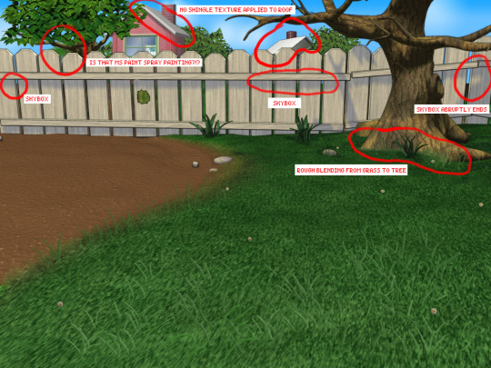
The more you look at it, the harder it is to decide which flaw is the worst. The blatant MS paint spray paint "touch-up" in the upper left, that there was no effort put into blending in the skybox, or that they neglected to add textures to the roof.
Alright, enough ranting there. None of this is to say my playscenes are perfect either, but they were a labor of love and I hope that this is evident in the final results.
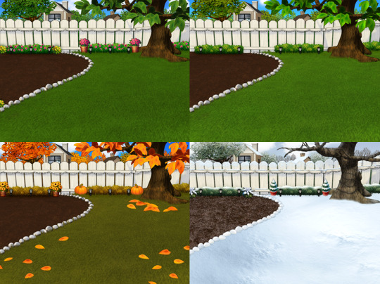
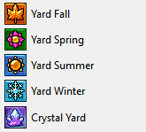
SPRING
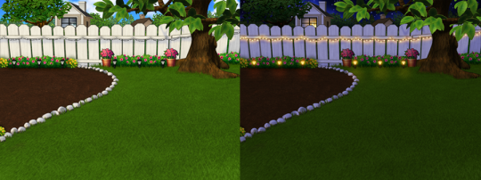
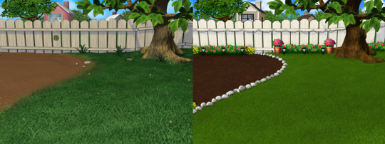
I smoothed out the grass texture to give it a more velvety, manicured lawn appearance. I brightened up the dingy looking fence to a more brighter white. The original playscene had a hole in the fence, and while it might add "character", I opted to cover over it for a more polished look. I added bushes behind the fence to cover up the skybox and to conceal the bottom of the houses.
Speaking of houses. Wow these needed a big work-up. The texture work (or lack of) on these is just bad. I'm no expert in house construction, but even mostly-brick houses will have some accents like trims to break up the monotony of a fully-brick façade.
Because of how fuzzy the brick texture is in the original, I drew in the mortar lines of the bricks to enhance the texture. I added roof shingles, siding, and trim boards to the house to make it look more like a typical suburban house. Despite these edits, it's still not a "great" house - the way it looks through the windows, it looks like the house is one room lol. I wish I could put better houses in the backdrop but because Tinker doesn't allow me to edit the animated blinds, I'm constrained to keeping them the shape that they are. Oh well. We can use our imagination.
I added landscaping rocks to make the flower bed look nicer. I also added some landscaping details like bushes, garden lights, and string lights for ambiance.
[ Enlarged picture of the garden light I made ]
I also worked to improve the skyboxes in all 4 seasons of the of the Back Yard playscenes. It would be lengthy to get into the details of all that but here's a before and after of the night skybox. You got to love them high-quality MS paint stars in the original.
SUMMER
I had a hard time with the summer one because it was hard to come up with ways to make it look different from the spring version. I did make the grass, bushes, and tree leaves slightly more vibrant. Originally I had some flowers by the bushes but I just wasn't really happy with them. At the last minute, I made the decision to remove them entirely. This makes the playscene a little more "plain" but I think some people may want a more "plain", undecorated version so that they can dress it up how they want with toyz.
FALL
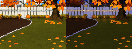
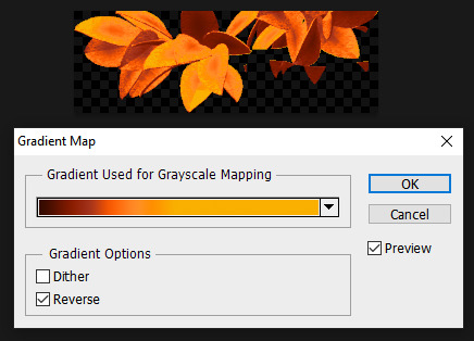
Fall is my favorite season, so this was a joy to make. I toned down the color of the grass and added fall landscaping motifs. Recoloring the tree's leaves was done by using Photoshop's gradient map feature. If time permits, I may do a tutorial on this in the future.
Gradient mapping is a powerful tool for recoloring almost anything. It can give way better results than methods such as hue/saturation, replace color, etc. And thanks to photoshop actions, applying this recolor to all the animation frames took just a couple of minutes.
Unfortunately, the fall leaves look "bright" in the nighttime version of the playscene. There does not seem to be a way to implement a darker version of these leaves for the nighttime playscene. If you look at the sprites in Tinker, you'll see that there are two sets of animations for Leaves A, B, and C and they're labeled "PropsAd" and "PropsAn", which would lead you to think that the developers originally intended for there to be a set of leaves for the day time, and a darker set for the night time. I guess the developers scrapped this idea because this does not work in the actual gameplay. When I experimented with this, the game appears to randomly display the nighttime sprite even during the day time, effectively ruining the intended affect. I'm not sure why the developers scrapped this. Either they had issues coding this properly or were just didn't want to put in the effort to make two sets of leaves.
WINTER
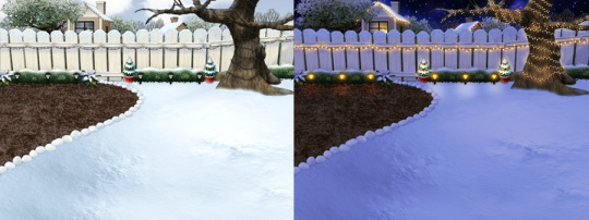
Instead of doing recolored leaves for this scene, I made all the leaves transparent and added holiday lighting to the tree. I know the lights aren't perfect - it was kind of hard to make out which direction a branch was going, so it has hard to maintain 'perfect' perspective.
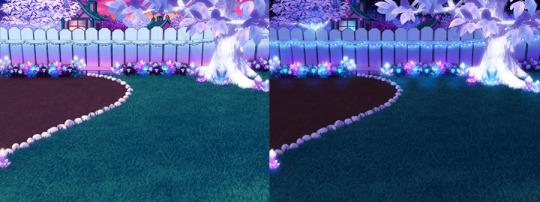
CRYSTAL YARD
This is a bonus playscene that I made because I got a little side-tracked as I was working on the 4 seasons back yards. This is inspired by the Suramar zone from World of Warcraft, so it has a bit of that fantasy, night-elf feel and color scheme. It's been years since I've played WoW but I still appreciate the enchanting aesthetic of the elven zones.
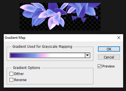
I used gradient mapping again to recolor the leaves to give it this lavender, shimmery, iridescent look. I did a little bit of gaussian blurring and layer effects to make them look a little more "glowy" than the originals.
As before, Tinker won't let me edit the blinds, so it limited what edits I could do to the houses. I would love it if I could have done curtains instead or something. I did my best to make these houses look a little less suburban and more elven. It's not perfect but it was rough working with what I had.
KNOWN ISSUES / THINGS I COULDN'T EDIT
As far as I'm aware, there is no way to turn off the snow effect for seasons like summer where it wouldn't make sense. This probably involves some code-editing that is beyond my technical skillset.
The winter playscene still has the green grass footprint when your petz walk. The sprites for these are not housed within the .env itself but in the Petz 5 Rez.dll file. It would probably involve a bit of tweaking in the code to switch the sprites to something else.
The fall leaves are "bright" in the night time version because there is no way to implement a second, darker set of leaves.
I cannot edit the blinds animation. Tinker gives you an error when you try to edit this sprite. This unfortunately limits what edits I can make to the house and the fence because of where the sprite is positioned.
If anyone does know of solutions to these, do let me know as I'd love to enhance these scenes further!
ICONS
Making the icons for these was also a fun little project. For some odd reason though, the game puts a stray pixel over them when I import them through LnzPro. I did my best to disguise them but there does not seem to be a way to fix that.
BEFORE / AFTER
With all that rambling out of the way, visit my main page over at Magnolia Road > Resources > Playscenes to download the goodies!
30 notes
·
View notes
Text
↬ OC Verse Trading Cards
Here it is! The reason (well, one of the reasons) for why I've been so inactive lately. I saw this super cool trading card template by @squea and @buttertrait and thought it was super fun, so I wanted to make something similar for my mutuals and myself. And, as you can see, I rediscovered my love for art deco on the way, so it's very art deco lol
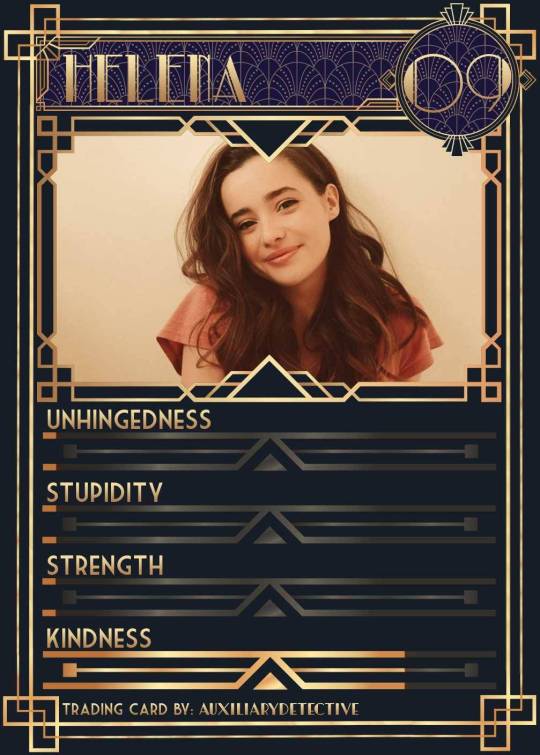
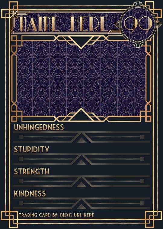
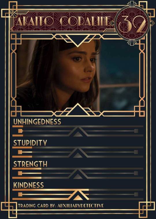
You can find the template to make your own cards here - and I explicitly encourage you to make your own, because I was kinda hoping I would get to see cards of you guys' OCs and we could collect them all in a binder like this one. It would be really fun! (The number next to the name is the power level btw - I wanted to imitate a set of Star Wars trading cards I used to collect as a kid) Make sure to @ me when you do and tag your post with #ocversetradingcards!
I tried to make the template as accessible as possible so that even beginners should be able to use it without any issues. So, I color-coded the layers!
The red layers are ones you shouldn't touch. They make up the main frame of the card. The orange layers are ones where you can play around with the colors, but that's for advanced photoshop/photopea users. The green ones are the ones where you put in text! Edit those freely. Blue ones are ones you have to select and move as a batch - if you don't know how to do that, check below the cut ^^
You'll need to download these fonts:
Park Lane (name & power level)
Market Deco (main text font)
Artisual Deco Black Italic (blog url)
Below the cut, you'll find a tutorial for the template and a list of the image resources I used - Quick info for everyone, including the more experienced Photopea users: Save your image at 50% quality. The template is a big file and the exported image will also be pretty big if you don’t save it at a lower quality. 50% is what you can see above and I think it's a nice size-quality ratio.
Tutorial Time
Opening the File
Step one: Get either Photoshop or Photopea. Photoshop costs money, Photopea is free and runs in your browser. Take three guesses which one I use. Yeah, it's Photopea. As such, this tutorial will be Photopea-centric, and I also have no clue what the Photoshop interface looks like, so I can't really help you if you work on Photoshop. But I'm told they're essentially the same, so...
Step two: Download the fonts listed above from the links in this post.
Step three: Click on the link above to go download the template. It's a bit of a big file, so I put it into a zip file for you. Don't worry, you don't need a special program to open it. Photopea will do that for you.
Step four: Open Photopea. Click on "File" -> "Open..." and select the "TradingCardTemplate" zip file.
Step five: Click "File" -> "Open..." again and select the zip files for the fonts. This will import them to Photopea. There are also preview images included in at least one of the zip files for the fonts, so just close the windows for those projects when they pop up by clicking on the little "x" next to their file name. You only need the "TradingCardTemplate.psd" tab to be open in your Photopea window.
Great! Now you're all set to edit!
Editing the name, power level and blog url
I decided to group these together because they function essentially the same way
Step one: Select the typing tool. It's the little "T" symbol in the toolbar on the left side of your screen.
Step two: Select the layer of the text you want to edit. The blog url one is in plain view. For the name and power ones, you need to open the corresponding folders first. They're the green layers in the folders!
Step three: Click on the text you want to edit. It's easiest to aim for the middle, that way you have the least chances of missing. The typing tool is a bit finicky with that sometimes, especially if the text is small.
Great! Now you can use your keyboard to delete the placeholder text and replace it with your own! The power level will only fit two digits and picking "00" will look bad. Your OC should have at least some power. They need it to breathe.
Changing the size of the name text
As you might be able to tell, the basic text size only works for fairly short names. So, you might have to make it smaller for your OC's name to fit
Step one: Enter your OC's name as described above.
Step two: Select the text as you would anywhere else in your browser.
Step three: Above the little tag where it says "TradingCardTemplate.psd", there's an options bar. You'll find a box there labelled "Size" with a box that says "150px" and a down arrow next to it. Click on the down arrow and a slider will pop up. Play around with that slider until your text has a good size. Then click on the checkmark.
Step four: Switch to the transformation tool. It's the cursor with the directional cross next to it, at the top of your left-hand tool bar. Move your text so that it aligns well with the left side of the frame but make sure it's below the middle.
Step five: You now have to select two layers at once. The text layer and the frame for the name tag. Do do that, either press and hold your control key on your keyboard while selecting the other layer or toggle the control key using the on-screen keyboard at the bottom left of the toolbar. If you use the toggle, don't forget to untoggle it after.
Step six: On your horizontal toolbar above your project window, click on the icon that's a horizontal line with two boxes centered on it.
Congrats, your text should now be centered!
Adding in your OC picture
Step one: Open the "Picture" folder and select the layer beneath "Add picture here". This will make sure your picture will be in the right spot. Also make sure to click on the eye next to the "Pattern" layer tag to make it go invisible.
Step two: Select "File" -> "Open & Place..." and pick a nice image.
Step three: Once the image has been imported, make sure you change the zoom percentage to 100%, that way the image doesn't look pixely or weird. Click on the checkmark.
Step four: Resize your image so your OC fits nicely into the frame. The image should fill the entire space inside the frame and can stick out as much as you want.
Step five: Right-click (or press and hold, if you're on mobile) your image' layer and select "Clipping Mask".
Perfect! Now your image should no longer stick out of the frame. Feel free to adjust your image's coloration, brightness etc. by selecting "Image" -> "Adjustments" and your preferred action.
Changing your stats bars
This works the same for each bar and I tried to make it as simple as possible.
Step one: Open the corresponding folder.
Step two: Select the set of three blue layers together. You can do this by selecting one layer normally, then selecting the other two while holding your control key or while having it toggled using the built-in on-screen mini keyboard at the bottom left of your screen. If you use the toggle, don't forget to untoggle it after.
Step three: Switch to the transformation tool (the one at the top of your left-hand toolbar, it's a cursor with a directional cross) and move your layers. By moving them to the right, you'll reveal more of the gold underneath the overlay. More gold = higher level of the corresponding stat.
Great job! Now adjust the bars to your liking.
Saving your project + card image
To save the project: Click on "File" -> "Save as PSD". This will download the current project under the same name as the file that you downloaded it as. So, it will be called "TradingCardTemplate (1)" or something similar. Make sure you change the name in your files so you know which is which. Alternatively, you can also change the name of the project by double-clicking the little square that currently says "TradingCardTemplate" and type in your new name. If you save again now, it will show the new project name! Make sure to save your project if you want to be able to recover it and/or work on it later!
To save the card image: Click on "File" -> "Export as >" and pick your preferred image file type. I suggest JPG for best results. Make sure to turn the quality slider to 50%, then hit the save button. This will download an image file of your chosen type, under the same name as the project name. To change that name, refer to the bullet point above or go to your files :)
Advanced: Changing the BG color of the pattern
Step one: Select the pattern background of either the name tag, power score or picture and turn it to 100% opacity.
Step two: Color-pick the current background color of the pattern.
Step three: Click "Image" -> "Adjustments" -> "Replace Color..." and click on the colored rectangle in the new pop-up. Replace the default color with your color-picked color. Now use the Hue, Saturation and Lightness sliders to get a new color that you like. Note down your slider values for later so you have them for the other elements.
Step four: Color-pick your new color and select the corresponding solid background layer. For those layers, click "Edit" -> "Fill..." and make sure you have "Foreground" and "Normal" selected, your Opacity is 100% and you have "Preserve Transparency" checked.
Step five: Don't forget to turn the opacity of your pattern layers back down to 60%.
Congrats! You have your colors changed! Repeat this process for the other two patterned elements.
Extra advanced: Changing the card's background color
NOTE: I DON'T recommend this. You can do it, but it's a lot of work.
Step one: Select the background layer and change its color to the new color you want. You can do it with the "Hue/Saturation..." adjustment, with the "Fill" edit as described above, or whichever way you want. Color-pick your new color.
Step two: Open the smart object PSDs for the frames for the frames for the picture, the name tag, and the power counter by double-clicking on the preview image of the layer.
Step three: Select the lowest colored layer of each and change its color to the same as your new card background color. Click on "File" -> "Save (Smart Object)". Close the project windows.
Step four: Open the folders for the various stat bars and select the "Color Overlay" layers. Change their colors the same way you did for the other layers. Warm colors and high-saturation colors will most likely not look good here and you might need to find a different way of making the stat bars look good. Playing around with the "Brightness/Contrast" adjustment layers above might help, but I can't promise anything. This is the main reason why I don't recommend changing the card background color. The stats bars are adjusted to the background color.
There we are! Either your card looks very pretty now or you understand why I don't recommend this. Either way: Good job!
Resources from Freepik:
Corners by tartila
Power counter frame
Picture frame by pch.vector
Stats bar by tartila
Pattern

Taglist (we're bringing out all fandoms today): @starcrossedjedis @oneirataxia-girl @daughter-of-melpomene @bravelittleflower @box-of-bats @fluffle-system @wheresmybloodynauglamir @nanukanal @supermarine-silvally @cody-helix02
#ocversetradingcards#artsy#photopea adventures#oc: akaito coraline#oc: helena#holy freaking shit i finally did it#look everyone!!!
19 notes
·
View notes
Note
mack!!! ik its been a while since you posted your photography portfolio but recently ive found myself going back to it and taking some inspiration from it. i was curious what kind of techniques you used and what processes you kinda went through while making some of the pieces?
OMG REALLY?????? not just being modest but i genuinely think some of it is pretty mediocre, so i'm happy you like it! idk which ones you mean in paticular but some of the more *experimental* ones -
these ones (ignore the bad image quality lol)

are photograms!! my school has a darkroom which is pretty cool and was wonderful to be able to use!! the main objects in these are actually locks of my hair (i kept if after i got it cut), and after i exposed that onto the paper, instead of just submerging it into the developer i painted it in with a big brush to get the sort of splashed effects (photograms are kind of a thing you need a darkroom for, but you can get paper you can expose with just the sun.)
the bottom left ones are a picture of a picture frame printed out onto transparent plastic, top left are just developer onto the paper with no objects.
i scanned them all and put them into photoshop & upped the contrast, flipped the colours of one furthest - the pinkish bits i did in photoshop, they're kind of pixel-ey which i thought was cool
the one with the key and the ribbon - the ribbon was another photo which i photoshopped around badly on purpose so it was super grainy with lots of leftover pixels around the edge, which i then overlaid on the scan of the photogram with the key (below right is close up of the computery texture i managed to get while fiddling around with curves (idk what exactly curves is but it was like... adjusting contrast & colours at the same time)
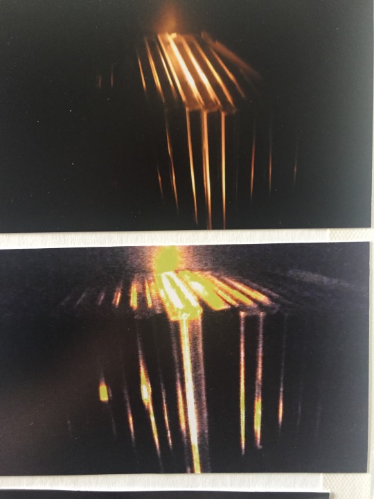

these ones (again sorry blurry picture) are a light shining through cd cases from the back, which i then edited to make look grainier and found-film-ier
most of the other photos are just standard pictures i think - the kind of blurry ones of the hair in the middle of panel two were converted to black and white but with the colour levels in the original image changed?? which made them look cooler but i don't really know how to explain it lol. they were done with a macro lens i think.
also here are slightly better quality pictures of the whole thing lol my original post was pretty los res


#i hope this helps!!#sorry i actually know very little about the technical stuff i was doing photography was not exactly my strongest subject hehe#my art#i'm actually so surprised anyone even remembers about this#flabberghasted you like it tbh#also the key with the ribbon on the guys chest - the guy is the cover of love will tear us apart lol#thank you so so so so SO much for the ask!!!!
12 notes
·
View notes
Note
your gifs are so nice! would you be willing to share your sharpening? and if it's not too much trouble do a quick rundown of your coloring process?
hi anon! it's no trouble at all, if it helps i'm happy to share <3
first i'd like to say that the size and speed of your gifs is key for the sharpen to look good! an incorrectly sized gif will look wonky on desktop (mobile is not very noticeable but desktop is where your gifs can potentially look bad if you size incorrectly) and same for slow-ish gifs, the slower your gif is the more the imperfections show so a correct speed hides the ugly parts lol
these are the standard tumblr photoset sizes

now with that out of the way i'm going to put everything under the cut bc it's probs going to be very long lol if you have any questions after reading all of this, do not hesitate to come back and i'll try to explain better!
okay! first i’d like to point out that i use an older photoshop, simply bc i like how they work lol i work on photoshop cs6 so to enable the same options i’m going to show you here you’ll have to have enabled the legacy option in the smart sharpen filters.
my sharpen varies depending on my source material tbh here are some examples:
source material: music videos
i actually use mvs downloaded from vimeo but these take longer to be up bc the directors don't usually upload at the same time the video is coming out unlike youtube mv, so if i'm working with something from youtube i like to get the biggest format available, so 4k and if it's not available then 1080p will do
i like to do big gifs for mvs so thats 540px width, these are my crop settings (putting it like that i don’t have to manually resize to 540px after cropping bc it’s going to be already the correct size)
and my sharpen for these is this

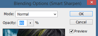
and then i lower the opacity of it to 75/80%, double clicking here

this is the result:


and my gif speed for mvs in particular is this

looks very crispy and ready to color away!
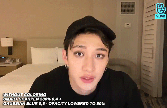
source material: stage videos in .ts format
for stages i like to work with .ts files since they are very high quality recordings of the stages and generally the gifs come out nicer. for stages that are from youtube the next part of this will probs help but this part will be focused on .ts files.
i get my files from kpop24hrs which is invite only right now and invites are a bitch to get a hold of but if you have access it’ll make your life so easy when giffing stages, there’s also twitter to look up files! for stray kids the fastest .ts uploader on twitter is @/STEii_e but if you look up the date + stray kids + .ts the tweets will show! anyway, back to the important thing
for .ts files i work with AviSynth! my computer hates vapoursynth so i use it’s older sibling lol it does the work just fine for what i use it imo bc i usually end up sharpening on photoshop. if you’d like an avisynth tutorial, this is what i used to learn about it and if you’d like to try vapoursynth there’s tons of tutorials from tumblr if you google, the most complete one is from user realstraykids
i modified my avisynth processor for it to have a denoiser (which is a feature from vapoursynth) to have my gifs look a little more smooth but that effect can also be achieved using topaz tbh
these are the output settings i get on the resizer

like i said i modified some things to have a denoiser so it won’t look like this on a regular avisynth
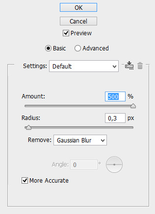
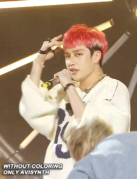
using debilinear usually makes my gif already look a bit sharp, so if i see it’s good i don’t use a sharpen, if i see it need a little push i’ll use a smart sharpen of 500% radius and 0.3px amount, and i’ll use a gaussian blur filter set to 0,3 and i lower it’s opacity to 75/80%


results:

and my gif speed for .ts stages
now it’s all ready to color!
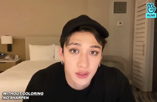
final source material: your regular youtube/twitter/vlive video
anyone that ever worked with a lq-ish video know how they just look ugly no matter how your try to sharpen, specially vlives and now channie’s rooms on youtube (*shaking fist in the air* damn you 720p videos!!) so i found a way to make them look decent, in this case i oversharpen using a 500% 0.4px smart shapen and then i slap a gaussian blur of 0,3 (lowered to 50% opacity) on top of it to smooth things out, more often than not it works very well but some videos are just plain bad (looking at you twitter) so this will work if you tweak the gaussian blur to your liking. i also recommend to work with small gifs if your video is not 1080p bc they’ll look better, but if you like pain like me and love big gifs this is what i do:


my results:


and my gif speed for these kind of videos

that’s about it for my sharpen tricks!
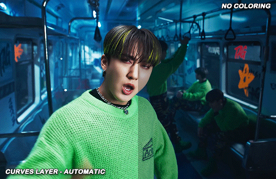
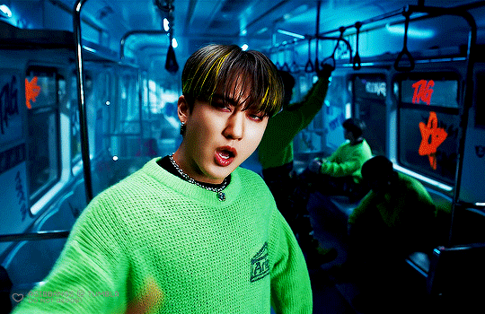
for coloring i like to do vibrant gifs, i adapted my latest method from this and this, and another tutorial that i can’t find rn, but for my base what i do is two curves layers, a levels layer to bring up darks, then i do a hue/sat to fix up colors, then i do vibrance and finally i selective color to fix things up. i’m going to show you on this binnie and minho gifs
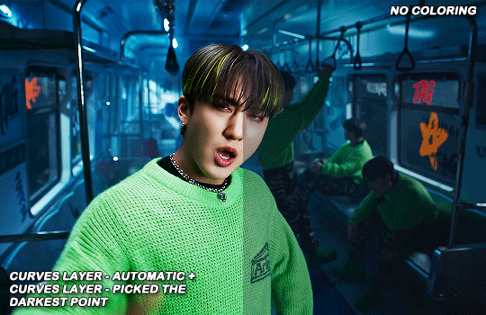
first we use a curves layer and we set it on automatic (no worries if it gets too bright, we’ll be fixing as we go)

now we do a second curves layer, for this one we’ll use the black color picker from the curves layer and pick the darkest point on our gif

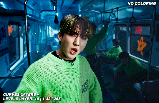
now we fix the darks and we bring some brightness with a levels layer
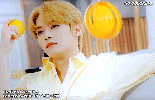
now we do a hue/saturation layer, here i fix up the reds and yellows, sometimes i skip it if the gif already looks good after the first 3 layers if that’s the case i go directly to the next step which is vibrance, in this case i only did minho in this step bc i felt like binnie’s was okay after the first 3 layers
now it’s the vibrance layer, for making the colors pop out more
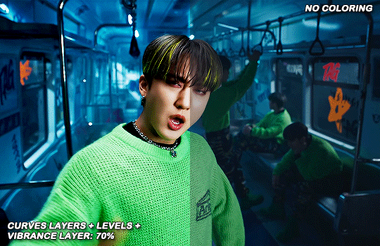

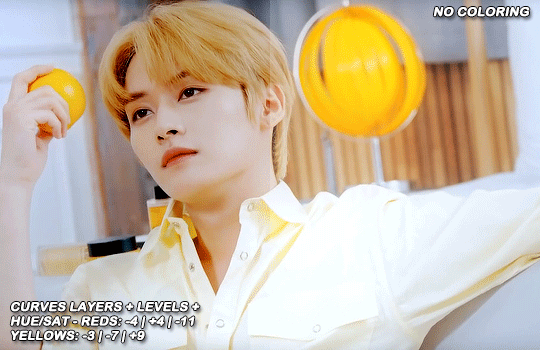
and now the final layer: selective color! here we fix again red and yellows

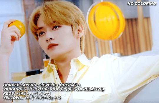
that was my base coloring! sometimes i put in a gradient map in between the curves layers and the levels but only sometimes. after this if i want to mess around with colors i mostly go with another hue/sat layer or just use selective color, hue/sat is great for color manipulation. anyway, this is the finished result and my saving settings!


that was really long lmao, i hope it helps somehow? like i said if anything isn’t clear pls come back and we’ll go around it again <3
113 notes
·
View notes
Note
Hi! How do you make your gifs? Do you have any tips or tutorials for beginners?
Hello! <3
I am really just a beginner myself to be honest, I already knew how to use photoshop a bit and how to download the episodes but this is the amazing tutorial that I followed when starting out: THIS ONE
To download the episodes I use uTorrent (I advise you to search how to make it work faster online by copying the parameters to download faster) and get them in high quality 1080p from this site here and I can connect to that site because I'm using a VPN - mine is called browsec and it's a web extension for Firefox - if you don't know how to use torrent here is an explanation
after I have the files in my pc I downloaded the video player GOM and I use the option to take automatic screencaps and make folders in my pc with the frames I need to make the gif then I follow all the steps you can find in that tutorial
I use Adobe Photoshop cc2015 that I may have taken already cracked from a torrent too if you know what I mean lol search online how to download cracked programs for pc and follow what the internet says because I do not know how to explain this and I don't want to make you break your pc somehow with bad advice
you can find many many photoshop tutorials on youtube on how to make gifs and how to use it in general, after you learn the process it's faster if you learn how to create ''Actions'' on photoshop to do everything faster so that you don't have to repeat all the steps all the time but I just learned this yesterday so like, I'm not the best one to teach others yet lmao
this is one to learn how to blend two gifs in one
for the caption and to make colourful text
to have what they say in the gif faster you can find transcripts of the episodes here, sometimes it's wrong but not often, I usually check the dialogue in the video and see if it's the same before captioning and then make it fit with when they are saying that
hope this helps!! :)
51 notes
·
View notes
Note
maybe 5, 6 and 21?
5. What do you dislike most about making graphics / gifs?
not knowing when/if my photoshop OR laptop will crash in the middle of making something before i’ve made any saves to it. i got a new laptop last christmas but there’s something that makes it crash suddenly at least once a day and it has happened plenty of times while ps is running. luckily, the program manages to recover the unsaved file when i reopen it but it’s very annoying when i’m concentrated lol. other than that, i hate when i’m trying my best to color something and i simply have to give up. or the quality of something is so bad that i can’t make it look good. after you’ve gone through screencapping and waiting for the files to load and convert to frames, some decent time has gone by and it suuuucks to just be like…nevermind. it happens often.
6. Your favourite graphic and or gif creators
my current fave thing on this whole site is this comp @kimtaegis made me for my bday a few weeks ago 😭 annie is in my list of fave gif makers obviously. i also have a huuuge soft spot for @jiniekook’s work!!! @bladesrunner makes some of my favorite tv/film gifs and i recognize her coloring every single time. @userjiminie is incredibly talented and makes some of the coolest conceptual sets i’ve ever seen! @userjungkook97 pours so much love into her gifsets and i get really excited whenever she posts something new. @userarmyhope literally never disappoints with crisp, clean gifs and perfect coloring. of course @jung-koook for her dedication to churning out massive sets almost daily. this is not even close to everyone whose work i adore, but it’s off the top of my head at the moment. <3
21. How much time do you spend on a single graphic / gif?
depends on what it is! a more elaborate comp can take me up to a couple days or more, especially if i have to search for and download a lot of footage. for example, my recent jungkook bday set took me about four days to finish, but i started it early enough that i was just taking my time and i used easily accessible content from youtube. if i need something from a dvd or a concert, that can take me a while to locate. i’ve spent ages reverse image searching very questionable screencaps just to find the origin of something for a tiny gif in a compilation set lol. but a basic gifset can take me a half hour to an hour or longer depending on how many gifs i’m including and how big they are, since bigger gifs take longer for my actions to process.
Ask a graphic / gif maker
9 notes
·
View notes
Note
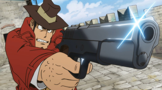
I saw the Lupin recolors you did (they’re amazing btw) and I’m curious how do you keep lineart so clean on your recolors? I’ve been doing some recolors recently but my technique is usually either trace the lines on top of whatever color I’m changing to which results in slightly-sloppy and inaccurate lines or I spend a million years doing masking. But yours look so clean it’s awesome! How do you do it?
Hello, anon- thank you for the kind words and for sending an ask in!!
The screenshots anon is referring to are in this post!
Sorry it took me a while to get back to you-- I wanted to make some example images to go along with this since this is a question I've gotten quite a few times. I'll try my best to answer as concisely I can!
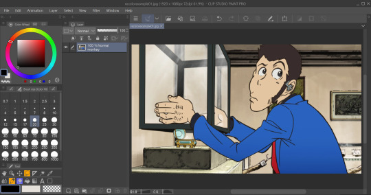
I personally use Clip Studio Paint (which is what I'll be using to explain this), but I've also done this with Photoshop. I'm hoping this method is simple enough so that its usable for whatever program you (or whoever else sees this guide) uses.
We'll see how it goes ¯\_(ツ)_/¯
Some bits to start:
I know this is kind of a no-brainer, but a big thing that always helps is image quality. The better the image quality, the less obvious your changes will be-- so make sure the screenshot you're recoloring has good resolution. This method (in theory) should work for lower res stuff too, but it'll be harder to avoid messy lines no matter how careful you are when selecting. Here's the images I'll be using for this example:
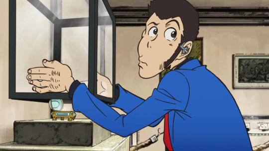
Make sure to have a backup of the original screenshot you're editing!! Even though I didn't include this in these upcoming examples, have the original below the image you're editing so you can check your progress and make sure you didn't miss any changes you wanted to make in your edit.
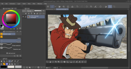
We'll use this pt. 4 screenshot of Lupin as our first example!
Let's say we want to make his jacket red-- it's as easy as it sounds, but it'll still take a bit of time.
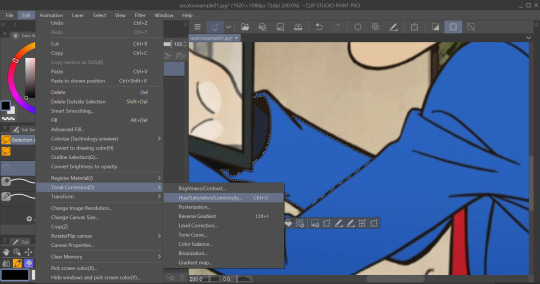
I use selection tools over masking-- primarily the polyline tool. Even after testing with masking and layer overlays, this is the best way I've found to keep line integrity and cleanliness.
When you select with the tool, you'll want to go along the edge of the actual color you want to change, not the linework.

It's going to be time-consuming (which is why I only outlined his sleeve lol) but from all the testing I've done, it's what gives the nicest results. Plus we don't even have to use any layers or masks-- we can just change the color of the screenshot directly!
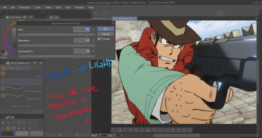
To do that, we'll want to find the option to change hue, saturation, and luminosity.
From here we can tweak the colors in whatever way we want without any of that ugly crunchy outline stuff or having to fiddle with a dozen different layer settings.
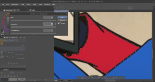
This way of doing it is really good for changing the hue, saturation, and darkness to whatever we want it to be without sacrificing line quality.
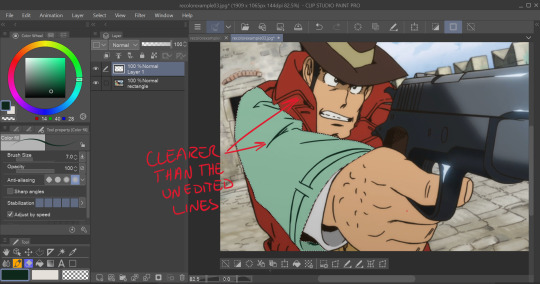
Here's the final:

Even though I eyeballed the color for example's sake, the final change doesn't look half bad!
The only catch I've come across is when you need to make something a lighter color. You can bring the luminosity of an image down, but once you bring it up you start having some unavoidable issues.
We'll use one of my favorite Zenigata screenshots for our second example.
Let's say we wanna change his red pt. 4 trench coat to his green one from pt. 3 (again, only changing the sleeve for time's sake).
This is a tough change since there are a lot of lines and extra details on his coat that get caught and lightened in the change.
At this point we're going to have to do some line tracing.
Yeah, I'm not a fan of this part either, but unfortunately it's another time-consuming necessity if we want an edit to look as unedited as possible. Every other method I've tried to keep the lines dark ends up really corrupting the linework already in the image.

I'm sure you've noticed the edge of the selection we made in this; even though I skipped this part for time's sake you're going to want to go over those outer lines, too.
I recommend using a simple default brush set to a size that is as close to the actual linework as you can get. If the brush you're using doesn't have tapering or line size pressure just make sure it's slightly smaller than the actual lines. Stabilization isn't exactly a requirement; I'd only suggest turning on line stabilization if you aren't very confident with your linework (practice makes perfect and all that).
When we're done, it'll be pretty obvious that we went over the lines-- there's another really simple fix I found that helps to make this a little less obvious.
Messing with the layer opacity and the blur filter helps to bring out the linework beneath what you've gone over and makes the lines look less obviously drawn in.
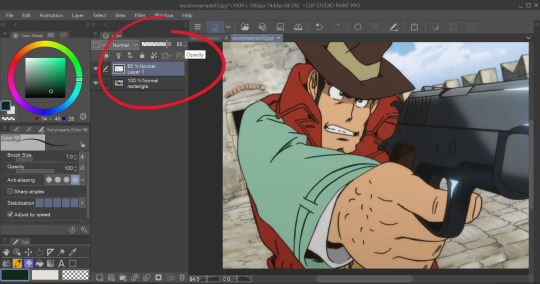
I'm sure you could also tweak the layer's settings until you find something that looks right, too-- it'll be the same sorta "experimenting until it looks right" deal as with changing the colors earlier.
I generally stick within the 2.5/3.5 range when blurring for decent res screenshots. In hindsight I probably went a little too low with the blur for this one, but you get the idea.
I think that it mimics the semi-blurry quality that lines tend to have in screenshots and helps to make it look less like it was drawn over.
Here's the final:
I'm sure if I bothered to do the entire trench coat it wouldn't look half bad, lol.
ANYWAYS that's a crash course on how I make lines not look like doodoo in my edits :3
Hopefully this is helpful!!
Thanks again for the ask, and if you have any more q's don't be afraid to send another ask in!🫡
#lupin iii#lupin iii recolor#lupin iii screenshot#screenshot edit guide#i have no idea what to tag this with lmao#im sure this'll be fine#tackyart#tackyanswers
9 notes
·
View notes
Note
Hiii I just saw your recent gifset and I was wondering if you could share some colouring/quality tips for gifs?? I've been having some issues lately and I'm trying to collect knowledge from people with great skills, thanks in advance!
hiii!! <3 first of all, thanks omg :(( i feel absolutely underqualified to be giving advice but i'll try to tell u some stuff that i think makes gifs look nicer (i'll do it after a read more so that i don't clog up the dash)
idk how much experience you have in making gifs so i'm gonna be all over the place probably lmao sorry!!
first all, in connection to quality, using anything other than photoshop to gif (like websites or stuff like that) is gonna make your gifs look much less hq no matter how nice the actual footage is. sadly no website can beat ps :( also, using 4k/1080p clips is going to make your job much easier. I use 4kdownloader to get videos from youtube and it works great most of the times.
in terms of processing, once i get my video i use vapoursynth but i don't sharpen/denoise there. i think the vs sharpening is a bit too harsh sometimes and the denoising can be too extreme. (i know ppl get great results w sharpening/denoising there tho!! i've never got it to work like that lol) after the clip is opened in ps, i sharpen there. my settings are very basic (amount 500% and radius 0.4px and then i do that again but with amount 10% and radius 10px) if the original clip is too lq and i'm not satisfied with how the gif looks i might use topaz clean / denoise a little bit. but i try to keep that light. in my personal opinion, i think gifs that are too smooth (so much so that their hair gets blurry and stuff) just don't look as nice. i'd rather have a slightly grainy gif over a very very smooth gif where ppl don't look like ppl.
a lil trick i do when i'm not as pleased with the quality and the gifs are from mvs is to add a little bit of grain using the smart filter. so then the grain looks like it's there on purpose and not bc the og clip is bad (other times i just add noise for aesthetics like with my keppie gifset)
another tool some ccs use is high pass. i feel like high pass needs to be used lightly because sometimes it just makes people look like dolls :(( it's like it takes away all texture and it just looks... slightly odd? i tried to use it a few times but in the end i went back to my own sharpening. i just think it's a tool that needs to be used v carefully.
ok, coloring time!! coloring can literally fix a gif sometimes hahah. like a gif that looks kinda grainy suddenly u color it and it becomes ten times better. when i color, i start by messing with the curves and i tend to do this (this pic is just me messing with a random gif hahah)
i obviously play around with that but i love doing this because it makes my blacks darker. i also play around with exposure and i tend to bring the exposure up a little, bring the offset down a little and the gamma correction up (again, me messing around randomly just so u can see how my settings might end up looking visually. the numbers change all the time because it's not that i do it exactly like this all the time)
i've been told (and i can attest to it myself) that having gifs with a lot of contrast is good for quality so i feel like doing these prev things (and also messing with the blacks in selective color) allows me to bring out that contrast and also make gifs that i enjoy (i'm a high contrast gif lover) but you also have to be mindful not to make your subjects too white by upping the exposure or messing with curves too much. whitewashing is a no no, even if whitewashed gifs always end up looking less grainy >:( for skintone i play around with color balance and selective color mostly. if the whitewashing in the original video is too much, i might go to color lookup, use the preset 3strip, set the layer as 'darken' and mess with the opacity and then if it ends up looking too red i might do the same with a 'fall color' layer and lower the opacity even more for that one (or else the gifs looks too yellow). i also play around with the reds and the yellows in hue/saturation
finally, when i export the gifs, i make sure that i pick the saving mode (i'm sure this is not the proper way to call this but anyways sdfasd) that makes the gif looks better. like sometimes i find that with green gifs some settings make the gif look atrocious so i have to use adaptable for those but anyways i usually mess around w that hahah

idk if this was useful in any sort of way??? if u have a question about something that i mentioned here or i want to ask me more u can totally dm me or come back and ask me 'hey girl wtf?' because i'm so so bad at explaining things by text!! also i wrote this under the idea that u are sort of knowledgable on how to gif but idk !!
#ask#anon#gif help#hope this made sense and was kinda useful???#my last piece of advice would be to make the gifs u love and pls don't feel like u have to gif using a certain style or way#if u don't like it#u know?? coloring is a matter of taste (as long as we avoid whitewashing(
5 notes
·
View notes
Note
hi! i cant believe i saw ur post about my tags! (no worries about @ing or not @ing me.) and ur SO RIGHT about the quality being too high for 2013… (id also love an aesthetic writeup)
it really was just a surprise because the number of gif creators has been drastically reduced since this post type has been dying out on all other platforms. for me it gave me the similar vibe of recent dvd movies being redesigned for vhs covers (tho not quite that old). it was super charming!
and i hope i didnt imply that your gif work was bad or outdated! i think the colors are quite fitting and the quality speaks for itself.
im quite new to the fe3h and ferdibert scene, so im having a great time trawling tumblr for all the great posts ive missed since 2019. i was quite happy to see this particular gif post because it felt like such a classic tumblr staple, like all ships need (at least) one dedicated set of gifs/edits, and this was the one i needed 🥰
thanks again, for both your original post AND reply!
Hi! I'm glad there's no worries there, I went back and forth for a bit and I didn't want it to feel like a callout post because. it was very much not! I just wanted to talk about gif stuff a little bit
and I definitely don't feel bad about your comments or anything! At first I was surprised but when I went and looked at the gifset I definitely agreed with you (despite nitpicks about the time period heh.) It did make me think about how, in general, I don't think tumblr gif-making trends have continued changing as much since the mid-2010s, and if they have I stopped really keeping up with them. I think some of that is probably just me, esp due to my never buying Photoshop CC (i remember looking at others' methods in maybe 2016ish and seeing that I just didn't have the tools others did anymore. my old CS6 is still chugging along…) but also due to the site becoming less popular over time and there being less interest and fewer people getting into gif-making. Like you said it's a bit of a dying medium, and it's never really been a popular post type on other platforms, so if not for tumblr who would people be making gifsets for?
Lol I definitely feel you about that style of post being an older ship staple though! It used to be such a common thing that every fandom had (albiet less for video games bc that's often harder - I do not honestly remember really making that series of 3h ship gifs but that was definitely dedication to the cause at the time, there was so little media to work with). Now a bit of a dying art alas (including from me since I don't really make many gifs at all anymore….learning to draw instead for a number of reasons)
Anyway yes that was a fun rabbit hole to go down! Genuinely I would love to read a Tumblr gif/graphic aesthetic writeup - putting framerates aside I don't think people really use textures that much anymore for example unless they need a background, and sharpening has definitely been toned down. And fewer song quotes. And filters still lean more pastel than the really saturated stuff in the early 2010s. But I don't really have the time atm to do some kind of deep dive myself…it would be really neat though!
(Also just in general as someone who never left, seeing the site come back to life a little bit as the twitter BS kicked off has been fun…idk if it will last but i'm enjoying it while it does!)
4 notes
·
View notes
Note
hi how do u make ur live stage gifs so hq? i want to make gifts as well, esp for some underrated groups i follow but don’t know how 🥺 thank u thank u in advanced !!
thank you! and good question.... truth is i still make gifs that look bad so it mostly comes down to the individual stage. do you know how to make gifs in photoshop? because if you use a gif converter website its going to look bad no matter what.
i'm going to assume you are using photoshop and vaporsynth or avisynth but if you are a complete beginner then u gotta start by getting those first. u can dm me if u need help with that.
also if you're a beginner i would recommend starting with variety content from youtube rather than stages bc stages are pretty hard to gif. but i'll give u tips for stages anyway. just know i HIGHLY recommend giffing literally anything else first until you get the hang of it. when i started i also wanted to do stages and it just put me off giffing because i couldnt make them look good.
for live stages make sure you are using .ts files and not .mp3 files ripped straight from youtube. the quality is leagues better. you can find .ts files on kpop24hours.com and from people on twitter. k24 is good especially because it's an archive so its easier to find older stages on there than on twitter, but you need an account for it and they rarely accept new people so unless you have a friend with an account your best bet is on twitter. https://twitter.com/shrghkqud usually has .ts files for all the most recent music show performances. they are interlaced so make sure you pick these options in vaporsynth/avisynth:
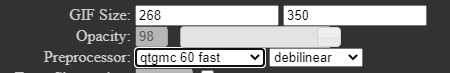
idk how vs looks bc i use avi but i think its the same. you can also choose to add extra sharpening but i usually do that in photoshop. the first option basically means the video will be 60 frames per second and it'll process faster. you can pick qtgmc 60 slow and the quality will be a bit better but its not worth it for how long it takes to process. debilinear is to deinterlace the files, since they are almost always interlaced.
when you are in photoshop, make sure you sharpen and denoise the gifs. i dont use the denoise filter, because in the sharpening there is a denoise option and thats where i denoise. again if you dont know how you can dm me and ill show u. sometimes i use an add-on called topaz denoise which makes faces look a LOT smoother however it takes a very long time to process so its not always worth it.
when you are colouring the gifs, i like to increase the blacks in selective color which not only makes the gif look cleaner, it also makes it so theres less shades of grey/less colours in the gif, which lowers the file size of the gif, which makes it better quality. the higher the file size the less quality it ends up being.
also make sure the gifs are the right size for tumblr! refer to this chart:

they can be any height but the width matters a lot when formatting for tumblr. although when i do 3 gifs beside each other i just make them all 178px wide because im too lazy to do all that lol
i think those are the main things i do. if you are very new it can be hard to understand so if it doesnt make sense or if you have any questions feel free to ask. none of these things will apply if you dont have photoshop and VS/AS tho.
2 notes
·
View notes
Note
hi and belated eid mubarak!! i love your gifs and they have made me interested in gifmaking! i was wondering if you had any advice/tutorials for a photoshop illiterate who wants to make gifs? thanks!
aw thank you anon - both for the kind words and the eid mubarak :)
so I taught myself photoshop and the first bit of advice I would give is to let yourself be bad at it. I deffo think that is easier said than done esp if you're a perfectionist, but you're going to start out with basic things and you're not always going to get it right. and that's fine because ultimately gifmaking is for fun. for me, anyway, it helps keep me sane, lol, so if there are imperfections in my gifs - which there often are - I don't mind so much. I look back on a lot of my earliest gifs and I just hate them. the colouring, the text, the everything basically. it's so bad. but giffing is something that gets better with practice I think.
I've made a couple giffing tutorials here and here but I reckon you'd need to learn the basics before you can start thinking about selective colouring and sharpening and other things like that.
another tip would be to try and download high quality versions of whatever you're giffing. I'd say at a minimum you need 720p but ideally 1080p because it really makes a difference to your gifs' quality.
logos and watermarks - for the love of god, try to crop those out if you can. I'd much rather see less of a character's head if it means I don't have to see an ugly watermark that can ruin a gif. especially if you then add text on top of that.
if you have poc in your gifs, or even if you don't, just be aware that shows can often wash out characters' skin tones etc. you also don't want white characters to be too pink, lol.
when giffing, if you have any sort of "night light" (yknow the setting that reduces blue light to prevent eye strain) on, make sure to turn it off before you start colouring, as that will affect what your gifs look like to everyone.
I'd say start off with making gifs and focus on how to colour them properly, before you start making gifs with text. when you do make gifs with text, feel free to play around with different fonts - there are loads of free font websites on google you can use.
if you want, you can use something like trello or even a word or google doc to keep track of all your giffing ideas, and try to match the scene to the lyric or poem or whatever quote you're using, if it's that kind of text gifset. and of course remember to proofread the text on your gifs and on your captions.
I'm sure there are lots of photoshop tutorials out there for beginners. am not sure where to direct you for those as I mostly learned it by ear, and it was probably over eight years ago that I started messing around with photoshop myself. but I wish you luck, anon, and am flattered that my gifs made you want to start!
1 note
·
View note
Text
Opened my Etsy Shop!
Hello! o/ I mentioned in last night's blog post that THIS post was coming today, so here we are!
It took a while to gain the courage for me to do this, but I finally opened my Etsy shop!
With my Etsy shop open, the path is open for me to place Resin pieces in it whenever I desire to. All my products will be in one place. And like before when my shop was on RedBubble, all items in my Etsy are still using my own self-created art/graphics with no use of AI.
I use a completely outdated freebie version of Photoshop CS2 for my art. I show some of my layer work here on my Tumblr if anyone is ever curious enough to browse through my posts or follow. I might make it a habit to show more of that in the future because the world is becoming more accustomed to using AI and society is becoming split on the matter.
But enough on this controversial topic, I just wanted to make it clear that I do NOT use AI and I'm not a fan of it in the art world.
I knew I wanted a Print-to-Order on-Demand "Partner" and that was something I was looking heavily into for the longest time. Actually I think this was causing me the most anxiety, because this is important! This is where quality of products comes in. I do my homework guys. I research thoroughly.
I found one I'm very pleased with, and it's Printful. Look forward to future blog posts similar to my "RedBubble Product Review Posts", because I've ordered items from Printful with my graphics and I'll be doing reviews on their items. I'll try to do them more often too 👍🏻 (assuming life doesn't get in the way and I have funds to do so, lol)
So far I've added 38 listings to my shop. I don't want to overcrowd it. I feel for the amount of designs I have and the amount of products Printful has available for me to utilize, this is balanced. From here I'll work on new designs.
If there is something OLD that you may have liked (in my RB shop) and is no longer available (in my Etsy shop), I apologize, but I have to put the past behind me and move forward.


There is a fear of "Will this work for me, or not?" on Etsy, because I need to pull in traffic and their rating requirement system is harsh- basically need 5-stars otherwise you drop out of their search engines entirely. But "nothing risked, nothing gained".
I'm putting this at the bottom of the post because it's more on the ranting side, but RedBubble upped their tier fees again which also inspired much of this change.
I mentioned this in a Tumblr post a couple days ago, but to break it down and put it in perspective:
An Artist in "Redbubble Standard" tier who earned a 25$ paycheck in a month used to get charged an 11$ fee. That's 43%. Couldn't change their tier. It progressively scales worse, and all us RB sellers thought that was bad.
Now with their new system, that they tried to play off as "This will include a fee increase of less than $1 for most artists.", is significantly worse. (That's literally how they phrased it in the e-mail)
If you make 25$ a month in "Redbubble Standard" tier, you get charged a 17$ fee. That's 67%. And it continues to rise at an insane rate- in the 70%+ range.
They have a form you can attempt to submit, trying to "get a real person to reevaluate your shop to be placed in a different tier"- but that doesn't work. I tried it. Pretty sure that inspires false hope and it's bogus. I didn't even get an automated basic reply back. Not a "you submitted a form!" or "you've been denied." or "your evaluation is in progress.", nothing.
RedBubble products were okay quality. At times the quality wasn't that great in my opinion but people liked the items I felt that way about and economics is all about supply & demand 🤷🏻♀️. I was fine selling their items because the pricing was on par with the quality. The saying "You get what you pay for." comes to mind. But would I go out of the way to buy their items? No.
And I'm going to apologize again if any or all of this sounds negative or sarcastic or moody... I'm just saying things like I see it 😅🫠
Thank you everyone who has been supporting me all this time! 💖 And to anyone new! 💖
(I know the point of posting on this website is to tag all the things, but I feel bad and weird about tagging all the things 😖)
#jade.blog#etsyseller#etsyshop#accessories#clothing#octopus#ffxiv job stones#konpeito#space#ginkgo#mugs#journals#totebag#bomberjacket#stickers#galaxy#night sky#milky way
0 notes
Photo

The second pixel gif for @sweetpoop !!
Thank you so much! eeee
#commission#pixel#pixelcommission#notmyocs#haruandaki#i need to get photoshop to make these not ...bad quality lol
25 notes
·
View notes
Text
ASTRO OBSERVATIONS [part 5]
— people with jupiter in the 8th may experience an “abundance” of traumatic experiences throughout life, often relating to death; these are the people who truly feel like everyone they love ends up dying. at their worst, they can become desensitized to death— jupiter is ruled by sagittarius, a sign known for being in denial when in difficult situations in favor of optimism. these natives can pretend like nothing actually happened, or minimize the situation in their head so that they don’t have to face it.
— okay this might be a weird one... like, you know in asoiaf when arya was walking through the streets and was always like “i’m as quiet as a shadow”? that’s literally the energy of someone with planets in the 12th house/chart ruler in the 12th house. these people are so stealthy. they’re able to move so quietly and without anyone noticing, both literally and figuratively. on one hand, they’re very quiet about their plans and ambitions to the point where other people only find out when they’re achieving success over it; on the other hand, they just. don’t like making noise while walking idk bitch you’ll only see me coming when i’m right beside you, i even get paranoid that i’m breathing too loud and that other people will hear
— people with moon aspecting mars can be incredibly impulsive when they feel hurt or triggered. yall need to be careful with doing things in the heat of the moment that you know you’ll regret later... but in the moment, you feel so hurt that it clouds your rational side. please be more self-aware about this because you may make decisions that will directly affect you for the worse in the future
— people with leo mars ft. constantly asking you for pictures... about anything. they just wanna SEE LMFAO THEY DON’T CARE WHAT IT IS THEY’RE SEEING. you just got ready to go out? “send pics of your makeup and your full outfit”. you’re waiting in a long boring line to get the covid vaccine? “send pics of the line”. your mom baked cake? “send pics of the cake”. plus they send so many random pictures while texting, it’s their special love language
— having moon conjunct moon/venus in synastry feels insane. you tell them something you’ve been through, and they’re immediately like “that happened with me as well.” it doesn’t even have to be something grand, sometimes just very specific things you thought were particular about you. the amount of understanding that comes with this aspect in synastry can feel very new and intense especially if you’re used to seeing yourself as the “odd one out”, used to feeling isolated in your experiences
— people with pluto in the 1st house often feel the need to erase “traces” of their existence, for example deleting messages that they sent people, deleting all of their social media posts. they can feel anxious and paranoid about other people having access to their past self, even if the past self in question is from, like. a week ago
— people with chiron in the water houses (4th/8th/12th) might’ve suffered bullying to the point where they repress their memories. a lot of their memories of their school years may feel foggy if they were bullied in those years
— also. people with chiron in the 8th house may feel as though they’ve been punished for wanting to experience intimacy. it’s like, the people who were supposed to be the closest to them – for example, their sibling or something – were the ones who hurt them the most.
— people with mercury-neptune aspects and strong pisces/neptune energy in their birth chart might struggle with only remembering things when they’re right in front of them. you should keep things in your peripheral vision to remind you of reality, especially when it comes to feelings— so that you won’t start getting lost inside your own head. like... keep the letters your friends wrote you by your bedside table so you can read them every time your brain starts convincing you that you’re not loved. keep the gifts you’ve been sent on display in your bedroom wall, or sentimental material things that remind you of past happy experiences.
— earth placements and their thing for asmr... omfg. it’s like they’re always looking for things to up their sensory experience/sensitivity. like, earth signs are the ones most connected to worldly experiences so they feel so soothed with the whole asmr experience: just hearing someone gently whispering or tapping on/scratching things calms them down and helps them fall asleep. they love the tingles it’s heaven for them
— moon-saturn aspects might hold and caress themselves while they sleep because their parents never did. yes i woke up and chose violence <3 your secret is NOT safe with me 💋
— while we’re on the topic of sleeping, a majority of the pisces moons i know need to sleep while hugging something, at least a pillow. they can’t just not hug something while they sleep, it’s very instinctive for them. anyways if any pisces moon needs a pillow to hold, i volunteer as tribute 💋
— virgo placements feel sososo soothed by hearing their cats purr. thinking about how my virgo placement friends are always the ones who send me videos of them petting their cats... and then i get soothed by how soothed they feel. it’s a win win situation, if you have virgo placements it’s hereby your duty to send me a video of you petting your cat while they purr. right now. GO
— people with gemini in the 3rd house might have shaky movements of the hands when other people look at them doing things. very specific i know but the third house rules hands and gemini is a sign that has somewhat of an anxious, twitchy quality to it. on the other hand, people with capricorn in the 3rd house (scorpio risings, using whole signs) have the steadiest hands i’ve ever seen lol their movements ooze confidence, these bitches know how to make you feel as thought they know exactly what they’re doing
— people with venus in the 1st house ft. altering their pics with photoshop and hating posting selfies without filters because they never feel like their appearance is good enough. stop it. you don’t need to always look your best and especially not if your ‘best’ isn’t even what you actually look like. also... don’t even think about making self-deprecative jokes about your appearance. next time i find one of yall saying “ahaha im not bad for a 5 without talent” i’m squishing your head between 2 pieces of toast and calling you an idiot sandwich. you’re BEAUTIFUL
— having venus in the 3rd house in composite with someone? do you mean calling each other the absolute ugliest nicknames in the most endearing way?
— leo deals with themes of the ego, and it seems that leo placements often struggle with attracting narcissistic people into their life... leo suns/mercuries can be raised by loud, overbearing, narcissistic parents who see their kid as an extension of themselves and who teach the kid to always be very supportive and caring towards them or else they’ll deny them of words of affirmation-- either by insulting them to shatter their self-esteem or simply never complimenting the kid back. leo moons/mars/venus tend to attract narcissistic partners who only care about serving their own emotional needs and ignore the ones of their partner, and who feed off of their supportive and giving nature. which is why leo placements really need to watch out for being gullible, naïve and dismissing the red flags because my god, you be falling for some shady people.
— people with personal planets in the 12th house/chart ruler in the 12th house might feel like they can’t let go of their past life— they may dream of memories, people or places from another life. it’s like they can’t detach from it, and even if they can’t directly remember their past life, it’s like they feel it in their bones. also, they might’ve felt... estranged from their family ever since childhood; there may have been feelings of being unable to emotionally connect to their (often, distant) parents, and they might’ve even wondered if they were adopted because of how different they felt to the rest of the family.
— okay so, a thing that people with saturn in the 3rd house need to look out for is mentally checking out of conversations while they’re still happening. these people can detect when they’re being manipulated really fast and their way of dealing with it can be to immediately shut down, to grow cold and silent and not even bother answering when you’re expected to respond. and, like, that’s great when someone starts screaming at you or being insulting/trying to coerce you into shit, but take notice if you find yourself shutting your loved ones out as soon as they say anything that triggers you. don’t simply detach from them, communicate what’s wrong
— aries placements, ESPECIALLY aries suns and moons, value generosity so much and they get so turned off by stingy ppl who don’t share with others, especially when others need it. like.. if you’re hanging out in a group with them and someone asks for a bite of your food because they have no money and you say no... espect them to never respect you. ever.
— people with libra placements use soooo many adjectives to describe things. something can’t just be beautiful, it has to be DIVINE and CELESTIAL and INTOXICATING. they can be so expressive god it’s so fcking funny
— capricorn placements HATE asking others for advice because they think no one knows better than them (and they’re not wrong, lol). when they truly care for someone, they might ask the person for advice simply as a sign that they respect, trust and value their judgement. even if they don’t plan on taking it LMFAO
— people with mars in a water sign can have this terrible habit of expecting other people to guess what they want. and then they get passive agressive when you don’t instinctively feel what it is they want... and when you ask them “do you want this?”, they go like “FINALLY. i thought you’d never get there”. stop it. i know that you want people to understand you in a way that transcends words, but you can’t expect people to read your mind and then get disappointed when they don’t, thinking “oh if they loved me that much then they would’ve known that i really want chipotle for dinner :(” GIRL WHAT. COMMUNICATE YOUR NEEDS
#astrology#scorpio mars#pisces mars#cancer mars#libra#aries#aries moon#saturn in the 3rd house#moon-saturn#chart ruler in the 12th house#leo#leo moon#leo mars#leo mercury#leo venus#venus in the 3rd house in composite#venus in the 1st house#gemini in the 3rd house#capricorn in the 3rd house#virgo#pisces moon#taurus#capricorn#mercury-neptune aspects#moon-mars aspects#pisces dominance#neptune dominance#moon conjunct moon in synastry#moon conjunct venus in synastry#chiron in the 4th house
3K notes
·
View notes
Text
Vintage Simlish Graphics Tutorial

requested by @bloomful-ccfinds! <3
Things you need:
photoshop
pinterest
washed & worn textures
simlish fonts
(optional) some text effect tutorials
Step 1: Look up vintage shirts in Pinterest! I found this cute shirt with a nice simple design. I checked the original source and found a high quality photo of the design so this will be really easy to edit!

Step 2: Go to Photoshop and use Select > Color Range to remove the background. Since this the original image looks neat it’s not that difficult to edit, some designs may require a little bit more effort to edit though. I usually set my Fuzziness levels at 66, but you can adjust it to whatever number you like!

Step 3: Place the now background-less design in a dark background. You will see a lot of things to clean up with the eraser tool. To make this job easier, just select the background and it will automatically include these leftover pixels so you can erase them quickly.
Note: You don’t have to remove those white pixelated outlines, they only look noticeable when you have a dark background.

Step 4: Time for the fun part! Adding the Simlish fonts. First, duplicate your cleaned up design so if you have mistakes you have a back up! Then erase all the English text in the design and start adding your Simlish fonts! I mostly use Simlish Lengiza font!

The bottom part is easy to do since its just plain. The arched text however could be difficult to for beginners. Photoshop has a Warp text tool you will find above when selecting the Text tool and it gives you a lot of choices. I mostly use this tool but sometimes the arch style does not match the original design.

But to get the desired effect above, follow this tutorial instead.
Step 5: Adjust your text according to the original design! After adding the correct colors, I see that the text has a black outline so I just add a simple 1px stroke effect on my text.

I also edited the spacing, and made the text Bold. You can do all of this in the Character panel!

Step 6: Did you download the Washed & Worn textures at the beginning of the post? Make sure you do!
Go to File > Place Embedded one of these in your file

Add a mask to your design by clicking this underlined button.

alt+right click that tiny white box beside your simlish design layer and it will take you to a blank page. Paste the Washed and Worn texture in there, and alt+rick the box again to go back to your design. You will see now that it has the vintage worn effect!
If you don’t like how it looks, just right click the mask and use a soft White airbursh to erase some of the distressed parts.

This is what your layer should look like right now. The texture I used was “Washed and Worn 2.jpg”

Congratulations! You did it! Just remove the background and now you have a transparent png of your vintage simlish graphic you can paste on any of your CC textures!

Optional editing stuff: Use some adjustment layers to brighten up your graphic! I like using Vibrance and Color Gradients the most. I do this when some designs look really weird when I edit out the backgrounds because they were taken from t-shirts so the lighting may look weird.
Hope you have fun making your own graphics! I also apologize if I’m bad at explaining lol. If you have any questions please leave me a message!
My ko-fi!💌
477 notes
·
View notes
Text
I have a few different questions in my inbox that revolve around my perspective on being a teen in the 2000s. A few points weren’t relevant for me, but I’ll try to cover some other aspects here in one rambling post since this might be faster...
TECHNOLOGY:
There were no apps, filters, or presets back then. If you wanted to edit a picture, you had to sit down & actually learn how to use photoshop (I think some kids with Microsoft computers used Paint too but idk). Knowing how to use photoshop gave you a huge advantage on myspace and most likely made you popular in online forums because you could actually make icons, wallpapers, & stuff like neopets userlookup profile banners. The kinds of things that kids can do to pictures today with a single tap of a button used to take like an hour + a lot of talent. Also, photoshop didn’t used to have the kind of recurring payment nonsense that Adobe does now. You’d just go to a store, buy the software cd, install it, and then it was on your computer for good.
Selfies weren’t really a big thing until myspace... and a lot of people called them “myspace pictures” for a while if you turned the camera to face yourself lol. Gifs also didn’t have a name... I just called them “animations" at first.
Modern cell phones can replace so much stuff that I used to have to haul around... like my heavy Nokia phone, disposable camera, giant chunky video camera + its gear, a giant binder of cds plus my cd player & headphones, a notepad with pens, and maps I printed out from the internet. My friends would also bring their GPS, a portable dvd player for longer trips, and ipods... except we didn’t have a way to get the ipod to play in a car yet (in 2008-ish I got one of those cords that you could set to the frequency of whichever radio station was pure static and then you’d get to hear part of your song... but you’d have to keep changing the radio station on the cord as you drove because pretty soon another song would start to cut into yours).
I didn’t even get the type of cell phone that could have internet or apps until like 2013. I was def late to that party, but my point is that the few kids who had sidekicks in 2006 weren’t the norm. I had a basic flip phone, but don’t remember texting much until 2007. Most of my friends and I just used our phones to call our parents, and then talked on MSN or AIM on our computers (if you were fortunate enough to have one in the first place... a ton of kids at my school didn’t have internet at home).
I know that videos on youtube from 2006 look like they're "filmed on a potato" and really bad quality or whatever, but part of that low quality wasn't the fault of our video cameras!! It was really distressing how I could have a relatively decent video, try my best to get all the settings right to export it for webstreaming, and then it would look like a garbled mess by the time it finished uploading through whatever hell portal it went through while getting online. Sometimes the process of sharing & downloading video files also lowered the quality. So the quality of the original videos we recorded wasn’t quite as horrid as the final uploaded versions (cell phone videos do not apply to this... those were just atrocious period).
Our tvs were not super blurry & pixelated like the bad quality youtube videos you might see of recordings from 2006 lol. Have you ever seen a movie from 2002? It’s fine. I do remember tvs suddenly becoming REALLY clear towards the end of college, though... maybe around 2010? I don’t remember exactly when. I only remember spending a few months continually pointing out how clear the details were onscreen and being shocked that we could literally see someone’s pores. So I suppose there was some minor improvement, sure.
My random opinion: there was something nice about having fewer choices in entertainment and needing to wait to access something (I’m not saying that having the freedom to do your own thing on your own schedule these days is bad or anything... it’s just different). My high school friends and I had like 5 tv channels to pick from so then everyone watched the same exact shows at the same time because we didn’t know when the next rerun would be (although weekly TV guides that got delivered in the newspaper would list the names of each episode coming up on the schedule and I would highlight the ones I wanted to see). Some kids with cable would leave the tv on for hours in the hope that they’d see their favorite music videos show up. Now people can instantly access an endless range of entertainment on their own time, so some of the excitement that came from anticipation is lost (like even waiting for someone to return the movie you wanted to rent felt like a bigger deal than just clicking on whatever’s next in your Netflix list). I spent a lot of hours of my life waiting in fun lines for midnight Harry Potter book releases, but now I suppose you could just download an e-book right when it’s released.
There weren’t verified social media accounts back then. YFly’s main selling point was the fact that celebrities were verified (that site didn’t really take off, but Brendon still had to sign up for an account in fall 2006). Without verified social media accounts, it was often really hard to tell if someone was real. There were SO many fake accounts for any & every celebrity. I legit believed that one account on Neopets was Emma Watson simply because so many other people were convinced too. There were a lot of fake myspace & facebook accounts for Ryan Ross & Brendon Urie by late 2006, but those always seemed very obviously fake to me (even if they actually managed to spell Brendon’s name right lol). Some newer fans who didn’t know as much about the guys were definitely fooled, though, so that’s yet another place where some harmful and/or inaccurate info came from.
FASHION:
movies from the 2000s aren’t a totally accurate picture of what teens dressed like… it’s more like an adult costume designer’s interpretation.
Most kids I knew in high school just wore a lot of American Eagle, Hollister, Abercrombie, and whatever PacSun sold (like Roxy). There weren’t so many aesthetics back then. The high schools that my friends and I were familiar with (in several different states) mostly had kids who were skater, scene, emo, goth, kind of punk, the generalized preppy look that made everyone into a Laguna Beach clone, or kids who didn’t care & just wore sneakers, flared jeans, and whatever graphic unisex tshirts came with their school activities.
Emo & scene were not the same thing. A lot of scene kids would get really upset if you called them emo. Some emo kids would be offended if you thought they’d ever be scene. Also: in my experience, emo kids were bullied waaaay more than scene kids.
I spent a lot of time at malls and was really into teen fashion magazines in high school like Teen Vogue, YM, Seventeen, Cosmogirl, Teen People, Elle Girl, etc. I just want to point out that styles changed SO much while I was in middle school & high school (2000–2007) and even more when I was in college. The popcorn shirts that I was obsessed with in 7th grade were only around for a short time. Flared sleeves were in towards the start of the decade, but that didn’t last long either. The 1960s came back briefly when I was in middle school, and then the neon 80s had a short comeback a few years later (but now I’m understanding why our teachers grumbled about how we were generalizing an entire decade with the looks of one moment lol). I can’t think of a single style that could possibly represent the whole decade of the 2000s. In 2004 I desperately wanted the flared jeans that Amanda Bynes wore in What A Girl Wants, but I wouldn’t have been caught dead in them in 2008. In 6th grade my favorite outfits were track pants that could snap off, flared jeans with flowers embroidered on them, butterfly clips in my hair, those clunky chunky brown sandals that looked like turtles, the spaghetti strap tank tops that were banned at school, a little triangle bandana thing on my head, foundation as some weird form of lipgloss, and body glitter. I fit in at that point, but I would’ve looked weird by 2002. Trends were super temporary & changed quickly. It’s not like the entire decade was into camo cargo pants, trucker hats, shirts/purses/hats/anything with your initial in rhinestones, madras shorts, platform sandals, jeans that laced up the sides, pants with flares as big as you could possibly get, colored skinny jeans, denim miniskirts with cropped leggings underneath, long camisoles with a lace bottom for layering, boleros, gauchos, striped polo & rugby shirts, that one style of adidas shoes, those velvet tracksuits, massively furry uggs, crocheted purses & shirts, jeans that looked like they were patched together, suede belts with the fringe that hung down to your knee, studded belts, etnies & vans, etc. Those things were from a range of different years. 2008/09 feels like it had way more in common with 2011 than with 2005. I thought the early 2000s had more in common with the late 90s than with 2006. I’m just saying... you can’t generalize the whole decade as a continuous look or sound.
TOXIC ASPECTS OF 2000s FASHION / TEEN CULTURE:
TW: eating disorders
Maybe movies didn’t show the actual types of tshirts that teens wore because those had a giant brand name plastered on them or were inappropriate? There was SO much sexual innuendo on shirts around like 2004. I just tried to google this and I’m shocked at how there are so few examples (I put some in this tag). I mean, it’s awesome that our culture has changed enough to recognize that those should be buried, but they were also so prevalent that it feels strange to see those shirts are just gone as though they barely existed. I’m able to find some examples of Abercrombie shirts still because the brand is popular, but those types of graphic tees were at almost every store in the mall for a season… even Kohls & Target were questionable. For a short time it was such a chore to find a tshirt that didn’t subtly say something sexual, which legit made me anxious as a high school freshman. A 14-year-old girl shouldn’t be walking around in a tshirt with colorful smiling flowers that say “guaranteed to get you up in seconds!” I hate that I was so naive that I wore that shirt to school for a long time, but I also hate that those types of shirts were created for the junior’s section of some stores. The graphics on those shirts were mostly designed to look like ads for things like tropical islands, travel, Asian restaurants, cleaning products, mountain resorts, etc… except it was usually sexual in some way if you stopped to actually read the small text. Other shirts were also surprisingly racist, sexist, and just generally weird for something that was obviously created for underage girls to wear.
Parts of the teen fashion industry basically fostered a bitchy culture where girls hated each other and were striving for male validation. Most stores at the mall (and even Walmart & Target) had those popular attitude tees that pitted girls against each other or reduced our worth to a few physical characteristics. The Abercrombie t-shirt that said “I make you look fat” stands out in my memory (but it’s just one drop in the bucket of all the similar tees they sold). And there were SO many shirts at various stores about blondes vs brunettes that I remember wondering whether my friends who dyed their hair felt like they were switching sides in a battle lol (there weren’t many shirts about redheads, but I remember seeing one at a store like JC Penny or Sears that had some kind of flames & implied something sexual because of course).
There was even a weird trend of graphic tees that made fun of rural populations... like Urban Outfitters had so many shirts mocking states that were stereotypically redneck. Abercrombie and other stores did too.
I still remember a teen magazine (maybe Cosmogirl?) had an article whose condescending tone was basically congratulating Rachel Bilson in The OC for eating cheeseburgers, being ok with her body/weight, and not trying to be skinny (she was probably a size 6 btw). She was legit considered “large” by several magazines back then, whereas Marissa on The OC was the standard of what was supposed to be “normal.” The media would create a culture where you needed to be super skinny to be acceptable, but then they’d blast those same celebrities for possibly being anorexic (and that shaming wasn’t done out of concern for their health… the tone was more like celebrating that a celebrity screwed up yet again). There really was no way to win.
I recently saw a current teen talking about that Senior Year movie on Netflix and how ridiculous it was that the main cheerleader girl claimed to be on an ice cube diet (as though that idea was absurd and Netflix was inventing it as a joke). That was an actual thing, though. I even remember reading the “helpful tip” in more than 1 magazine that the act of chewing on ice cubes would trick your brain/body into feeling a bit more full. I remember a couple girls who’d have cups of ice at lunch complaining about how their dentists told them that chewing on ice cubes was bad for their teeth.
The top & middle shelves of jeans at Hollister & Abercrombie were like sizes 00-5 and then the biggest sizes were at the bottom. You had to kneel on the floor to try to find a size 9 in their limited stock, which was the biggest size some stores sold (others went up to a size 11). Way too many of my friends viewed themselves as “disgustingly obese cows” for being a size 9/10. I was legit ashamed to be a size 5/6. Our world was created through a really narrow lens of magazines & tv & movies, and we mostly saw super skinny white girls.
Another aspect of the one-way dictation of culture was how “poor people” were very much looked down on in the early 2000s. The kiosks at the malls near me were full of counterfeit designer bags, sunglasses, shoes, etc. I’m mostly speaking for the preppy crowd here, but at a lot of high schools you were basically expected to have a small Coach bag and one of those chunky chain Tiffany & Co necklaces with the heart on it. That was just like the bare minimum (and it was embarrassing for the girls who were called out for clearly having knockoff ones… like I felt safer just not having those things than being caught looking like I wanted to, while clearly not being able to afford it). I was watching this youtube video last night (which is seriously funny btw) and the guy points out how Kate calls out Lizzie for being an outfit-repeater and then the characters in that movie look down on blue collar workers and people who might live in a trailer park. That is such a solid example of what our culture felt like back then. I’m glad that those comments seem noteworthy or abnormal now, but it’s hardly like the Disney channel invented that mindset. It was just everywhere. Like I cleaned hotel rooms throughout high school to be able to afford my clothes from American Eagle & Hollister, but that was a serious source of shame (even my mom looked down on me for that job). Sometime around 2009-2011 I started to notice a shift where it started to be more acceptable to admit that you shopped at Target or used coupons, and then shopping at thrift stores became mainstream cool and people were openly talking about their budgets, financial problems, etc. Maybe this shift was partially because of the recession in like 2008, but I really do think that a more connected society via the internet weakened the media’s ability to dictate such a narrow culture as we started to get inspiration & ideas from a wide range of perspectives.
You know how in the movie 21 Jump Street there’s that scene where Channing Tatum & Jonah Hill go back to high school in like 2012 and it’s totally different? That was one of the most relatable scenes I’ve ever seen in a movie lol. Suddenly it was cool for teens to care about things or actually try in school? Admitting that you like Lord of the Rings or anything “nerdy” was no longer an actual risk that might make you lose friends or expose you to ridicule? Wtf I felt so ripped off. You’re not asking to be bullied if you wear your backpack on both shoulders?! I had been willing to give myself back problems because I thought that was the price of survival. I spent a lot of the early 2010s being cranky that the teen culture I had worked so hard to conform myself to was vanishing and being replaced with something that I would have absolutely loved in the first place, thanks.
(I’m definitely not saying that everyone who went to high school in the early or mid-2000s had the same experience I did btw. This is just my perspective).
SOME PAGES FROM TEEN MAGAZINES
Teen magazines were full of “entertainment” in the form of attacking female celebrities. That mindset definitely wasn’t limited to just teen magazines or the audience of teen girls, but I’m more shocked in hindsight by how 12-year-old girls were basically taught to judge, sabotage, and compete against each other. It seemed normal at the time, too. It fostered a culture where a lot of us were super insecure & anxious that everyone was waiting to laugh at our smallest mistake or mock our flaws. Here are some random examples of the culture we were fed in the mid-2000s.
13 notes
·
View notes
Last Seen Blogs

adveni-blog
-UnpredictableMe- :)

modi2266548
Untitled

dingus-bo-bingus
you can call me Bo! :)

flightsuits
AS PLAIN AS A PLANE.

kwezirameses
THE TEMPLE OF RAMESES