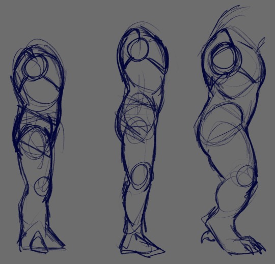
#i tend to draw anatomy as i observe it.
Text
re; hip dips i just realised what it is about some of my Drone drawings (unreleased) that i found odd in that they are not quite comparable to some digital drawings of women, because i draw Drone with hip dips. i assumed the... "diplessness" of digital hips was just an artistic choice. wheeze.
#i am allergic to drawing the hip connecting to the thigh without some kind of dent. it doesn't look right!#in fact i'm... hold on i need to find a specific Valin image.#i was right—EVEN VALIN HAS THEM...#(the nude Valin drawing i posted a long time ago. i was thinking about it as i typed.)#it's an old drawing that i would change a lot about but Even Valin Has Hip Dips. peace and love on planet Earth.#i tend to draw anatomy as i observe it.#my old place had the mirror right across from the bath so i could see myself if i showered.#the indentation between the hip and the thigh is always present in my mind.#the way the neck connects to the collar and the shoulders and the trapezii...#et cetera et cetera.
2 notes
·
View notes
Text
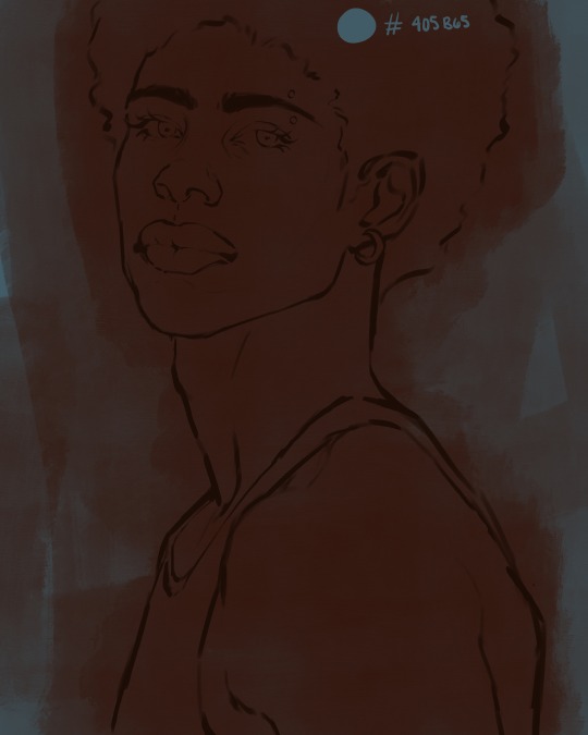
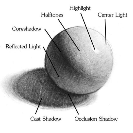
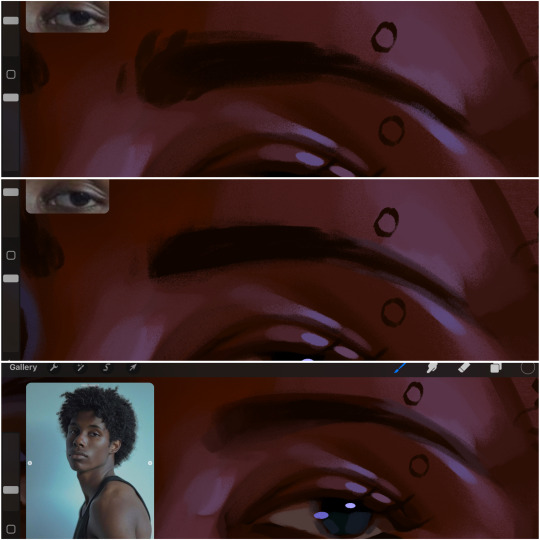
eaudera's detailed tutorial for skin rendering
okay loves i've put together a tutorial in text form detailing my step by step process of shading darker skin + the brushes and techniques I use and why I use them. you will be following along as we shade a piece together, you can find the lineart to the piece here. *turn off your true tone and night shift displays for the most objective viewing.
i wrote a lot on the preview pictures, if you find spelling errors (which you def will) or are unable to read my handwriting, you'll find the typed out version of the writing in the alt text feature.
disclaimer: i'm not an art professor nor am i academically/classically trained in art. a lot of the verbiage and techniques i'm using to teach you all here are from my current self taught and observed understanding of art, light, and anatomy
support me: kofi / ig / twt / commissions
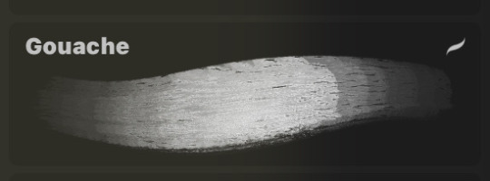
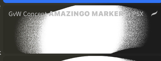
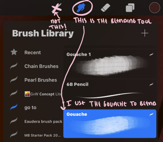
firstly, here are my two staple brushes. you can find the second brush here, i modified it by making it larger.
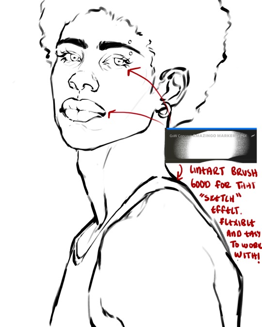
the lineart brush is very good for easy sketching and simultaneously cleaning up that sketch to produce the final lineart you'll be using in your piece. the diffusion from the erased parts/the diffusion created by lowering the pressure of your pen creates a light graphite effect which i enjoy! give it a shot.
you'll notice quickly that there are lighter strokes throughout this lineart, these are simply acting as rendering guides for me in order to remember certain placements. i erase/draw over these lines a lot.
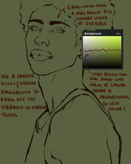
i initially learned to shade skin on a completely grey background with very slight orange undertones, and for a while this was very helpful in providing the most objective view of the base colors you're using (objective as in free of being effected by colors of different values). as you might know, using a white background for dark skin will seemingly darken the value and dim the vibrancy of your base colors, and using a black background will do the opposite. if you're using a darker skin tone, you want your canvas shade to be of a value that is proportional to your skin tone to avoid the same problems created by colors with too light or dark of a value. now if you're using a screened device to draw, you have the extra burden of screen reflections/wavering color output on different screens, so you're never really sure if the exact color you're using will be consistent across the board. priming your canvas with neutral colors will help with that. whereas priming with more vibrant colors will slightly change the undertone of your skintone (especially if you're using a low opacity brush), but it makes for a funner canvas and more creativity with your color palette imo. if you're a beginner i recommend you stay below the wavy line to avoid too light of a canvas shade.
for these same reasons i avoid keeping my lineart jet black. when you lay down the base colors under a black lineart it can look very unfavorable.
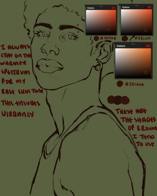
here are some skin tone variants that i tend to use the most, peep how i never wander off too far to the left of the spectrum where the reds are. i definitely favor red-oranges as compared to green-oranges for my skin tones, however, because i stay primarily on the left side of the color spectrum for my rendering, red can quickly become too much too fast. so i make sure to use a skin tone that can work very well with green-orange shadows. for this specific piece i will use the third shade (#2d1606).
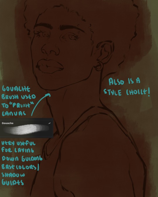
heres where the gouache brush comes in handy. i use it very loosely to "prime" the canvas almost. if you've ever done oil painting you'll realize very few artists draw directly onto a completely white canvas, though i've already primed my canvas essentially by changing the background color, i loosely shade over it with the skin tone color using the gouache brush. i find this gives me a better grasp on the composition of the piece due to increased harmony between the canvas and the skin color. it also looks really cool to me and resembles a real canvas almost.
as stated before, priming your canvas with neutral colors (grey) can help give you a more consistent view of your base colors, when you get the hang of understanding the colors you most often use (i.e, how they interact with other colors), you can start using more vibrant and fun colors to color your canvas with! the gouache brush changes opacity depending on the pressure exerted by the pen, if you zoom in you'll notice patchy areas where the canvas color bleeds through the layer more prominently than it does in other areas. for some people this might throw off the consistency of the shadows, but you should be fine as long as you're using a consistently opaque brush (which we will be doing)
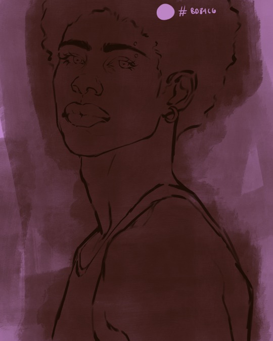
i know i recommended beginners use a grey canvas like i did, but since this tutorial is using my techniques i figured i'd also teach you guys how to use variantly opaque brushes to your advantage. we will be drawing on the pink canvas from here on out.
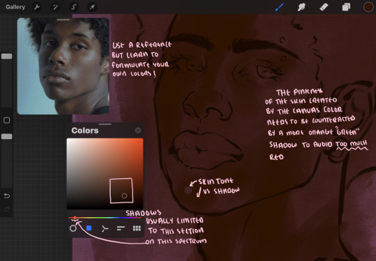
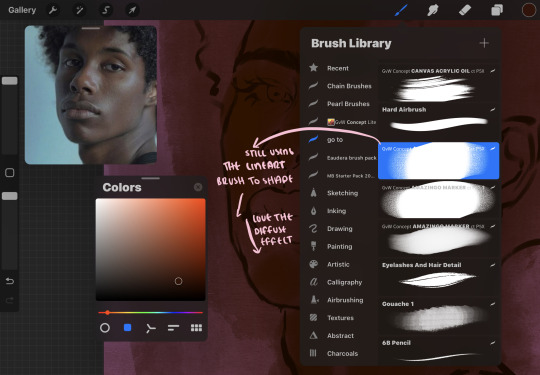
a reference is so helpful, i still rely on references to guide my shadows/lights. i'm past the point of relying on references for exact coordinates for rendering or lineart, but they are still incredibly helpful. in most references of darker skintones you come across, color dropping directly from the picture will give you very grey colors! we want to prioritize vibrancy in this case, so attempt to formulate your own colors or colordrop and increase the vibrancy :)! keep in mind i'm now using the lineart brush to shade. the diffuse/soft corners of this brush allows fewer pixels to be scattered wherever you lessen the pressure, this is perfect for color dropping medium colors to blend two colors together. you'll see how i blend colors later on.
as mentioned previously, red can become too much too fast- so i avoid monochrome rendering as much as possible by using shadows of different undertones. my most frequent combination is using a red-orange skin tone and then using a green-orange shadow.
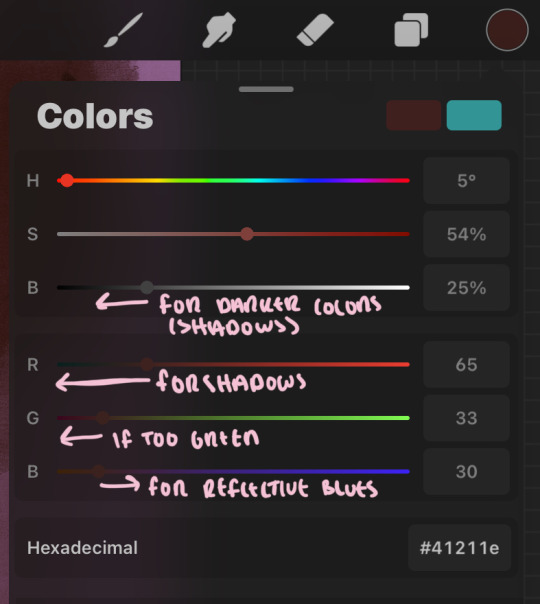
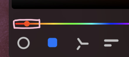
the value spectrum will be your best friend in mixing values and undertones, i use it all the time to formulate the best less saturated darker shadow that is proportional (not too dark, not too grey) to my skintone value. if the shadow is too green simply increase the magenta, if you're looking for a "reflective" shadow, increase the blue.
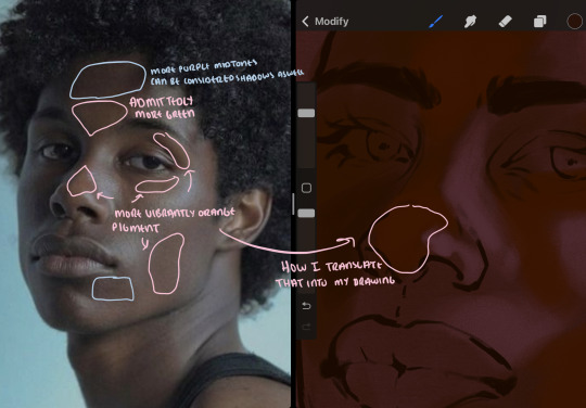
when i begin shading, i always slide the curser to a truer orange color on the spectrum and increase the saturation (slide towards the right) while i decrease the brightness (slide down). heres how it looks when i'm jumping between shadows and highlights while trying to keep my colors proportional (but not identical) to whats happening in the reference ^. i most often times will rely on the value tool, however.
you will notice that a lot of darker skin tones have patches of orange vibrancy, these areas are most common on the nose and cheeks. this is only a detail to pay attention to if you're going for more of a realism rendering style :)
now onto how i prefer to bridge/blend colors together by utilizing the blend tool.
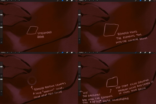
i do not like simply blurring colors in order to blend colors together, it can lead to overblending which can make your portrait look heavily gaussian blurred (think 2010 deviantart art... yea that). the brilliant thing about procreate is you can utilize brushes really efficiently, which include changing the brushes you use for blending. so in reality, artists who use the blending tool on its own can still have portraits that don't look it! there also exists plenty of brushes that have properties allowing it to blend into its surrounding colors are you draw. but in my case, the above photo is 99% of the times how i will bridge two colors together. doing this allows me to keep pretty consistent brushstrokes across the whole portrait, which i enjoy. it also gives me better control of the shapes i use in my rendering, an aspect that is pretty easy to lose when you're using the blending tool directly and solely.
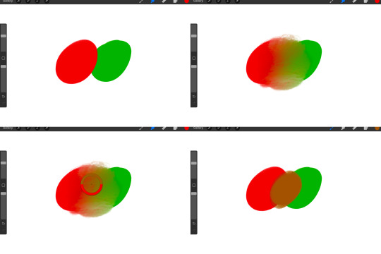
in case the blending process is a bit hard too see, heres that same process recreated with different more visible colors:
now once you've placed your shadows where they generally tend to be (according to the reference photo), let's make those shapes a bit more specific and pick up on smaller details to make your rendering look more complete.
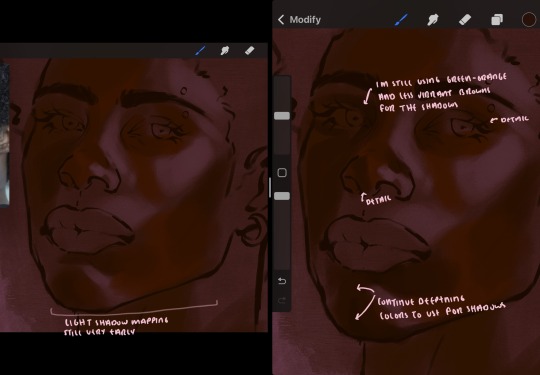
your base colors will never be as dark or as light as you need them to be when you begin rendering, making sure you have a decent contrast between your lightsource highlights and the shadows is key to capturing the essence of a light being cast on your character. it's much easier to keep building upon your shadows before rendering the highlights, i laid down the highlights only to create a guide/help me map my shadows better. do not darken the entirety of the areas affected by shadow, you'll find that shadows are rarely ever the same value, it's a gradual process affected by things like position, height, etc. so make sure the darkest of your shadow colors are preserved only in areas where the shadows are the or should be the darkest.
you'll notice i labeled some areas as "detail", adding very specific shadow placements is a detail. in the reference, the model has a pretty prominent brow bone, creating a shadow over where his eyelid creases just above his lash line, paying attention to feature details like this help enhance the rendering and its realism.
now that i've mapped my shadows i'm going to move onto to rendering my highlights and the region of the face where the lightsource is most prominent.
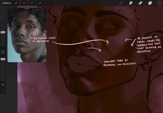
i described shadows as a gradual process earlier, this is because of the lightsource. light tends to spread when its further from the affected surface, creating a larger area affected by the light. of course, this varies depending on how intense and how close/far the light source is. in this case, the light is being casted above him further to the other side of his face, but again, remember that the face is not 2d and more prominent areas are affected more by light. it's due to this that there still exists a, albeit very minimal, shadow beneath his cheekbone. i exaggerate the shadow here for stylistic purposes, but it also helps in keeping me uphold that contrast between the highlight and shadow once again. so i refrain from blending the light into this area like i did in other areas.
midtones are the areas most unaffected by the light source, they're neither shadows nor highlights. and because light spreads, it is brighter in certain areas and darker in others. it is most easiest to blend the darker ends of the highights into the midtones of your portrait. you can emulate this by once again using your blend tool. blend the outer areas of the light and colordrop this color and use it as the darker light more proportional to the midtones. note that before i add even lighter shades to the areas where light is most concentrated, i blend what highlight placements i currently have there.
we're going to switch gears now and focus on the reflective shadow occurring on the darker half of his face.
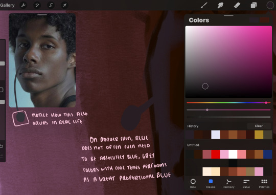
this shadow is a reflection from the lighter background the model is up against, the light being casted above him is allowing for some bounce back from his surroundings, leading to very faint light visible in areas primarily affected by shadows. hence why i'm referring to these colors as "reflective shadows".
in this case, the reflective shadows are blue, or appear to our eyes as blue. on darker skin, "true" blues (blue-purple) are not often times present. what is present rather, is a very grey tone with cool undertones/a grey tone on the blue side of the spectrum, which creates a blue that is much more proportional to the value of the skintone than a true blue. in this case i used a deeper grey on the pink color spectrum, which is more purple. this was intentional, and was done in order to create some sort of color harmony between the contrasted deep oranges im using for the bordering shadows and the blue-grey i'm attempting to emulate.
while i utilize this blue-grey, out've a purely stylistic choice, i still introduce true blues to my rendering. in fact i love using blue/purple reflective shadows in my art, it creates a stunning and colorful render. in this case, i used the blue-grey as a stepping stool to introduce that trueer blue more naturally. you'll see this happening in the second picture above, where i used a slightly more vibrant and slightly more brighter blue, and used it on areas where this reflection was more prominent (and therefore brighter).
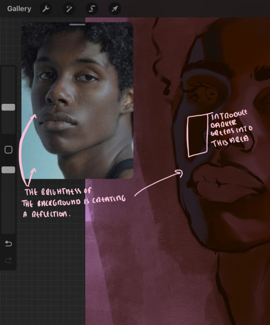
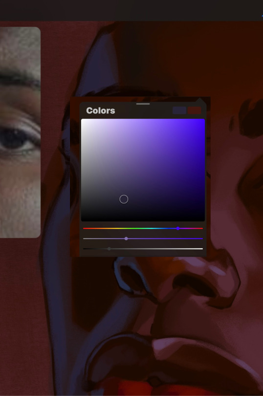
you'll notice how the shadows that border on these reflective colors are less saturated and darker than the shadows on his chin. introduce a darker and less saturated (more green) shadow to that area on his cheek and the darkest shadow of this photo, the sunken area near his nose bridge and inner eye corner. i emphasize this line in the lineart so you can follow this shadow more accurately:
this is also a detail in my opinion and can make your portrait more realistic if you include.
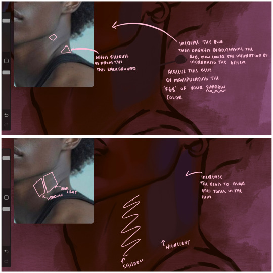
we're going to pivot to his neck area before continuing. you'll find the area of his neck with the most light is also the least vibrant, i laid down a grey base color to emphasize this detail in the portrait. afterwards i added key details. i wanted to stay at least somewhat true to the color dynamics occurring in the reference hence why i used the grey, but i'm not a very big fan of using blatant grey directly on the skin, so i made it more blue.
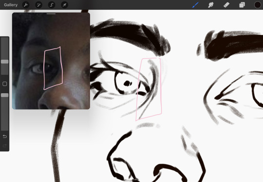
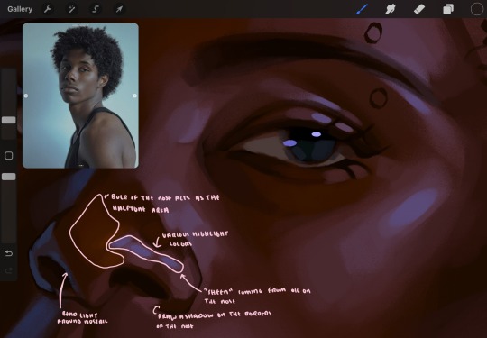
moving forward, the outer eye and the nose can be some of the most "detail focused" areas of the face when it comes to rendering. due to their more "bulbous" anatomy, light tends to curve around them in more complex ways than the flatter parameters of the face.
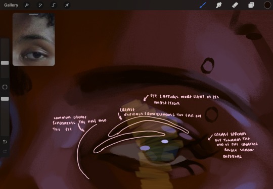
when it comes to the many creases that surround the eye, the skin folding over itself creates a very thin shadow from between the folds. the key to rendering this crease is to concentrate the blending to a very small scale, do not overblend the area because the hill created by the crease very easily captures light, creating an area where the shadow and highlight meet in very close proximity. slight blending is needed for this area, you can deepen the shadows in both horizontal corners of the eye for more accuracy. the midsection of the total eye area (eyeball and socket) tends to capture the most light, remember this is due to how bulbous rounder shapes tend to capture light from whichever direction its coming from.
this is of course the case for the nose as well. highlights are typically placed as a dot on the outermost part of the nose by artists, but highlights also spread on either side of the tip of the nose. the nose tends to collect a lot of oil, creating a sort of sheen on the upper parts of the nostril. when rendering a portrait where the position of the head is more cast to the side, the highlight of the nose changes from the bulb of the nose, to the upper nostril. in this case, the highlight spreads, causing a "half tone", or the remnants of the light on the bulb of the nose. this is the easiest place to blend highlights and shadows together. now for the shadow detailing on the nose, i'm actually drawing on top of the lineart on a separate layer. which i'll go into detail about in the next part. you want to focus the shadow on where your lineart is, the outermost part of the nose.
now were going to really detail your portrait by introducing a new layer, the detail layer! this isn't technically apart of the skin rendering, so i'm gonna keep it very brief. this is the layer you're going to render the lips, eyeballs, and eyebrows. more specifically, the purpose of this layer is to reduce the reliance on lineart. in terms of order, it goes above the lineart layer. we're going to soften and even erase the lineart in certain aspects. i use bolder/thicker lines when creating my lineart, but this can become a nuisance/hinderance when rendering.
starting out with the lips:
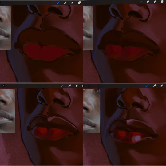
people w brown skin tend to have two toned lips, with the top lip resembling the same skin tone as the face and the bottom lip being redder/pinker and lighter than the upper lip. in my case, i prefer a more vibrant red for the bottom lip. once i lay down these base colors, i begin shading on the second layer.
i personally enjoy the look of a poutier lip shape, this includes emphasizing the middles of the lips as opposed to the ends. i've highlighted the shapes that this lip shape often entails. the small circles on the corner of the lip line are just pockets that occur when the mouth is closed and become emphasized by the fat around the mouth. the parameters of the lip lines do not often meet these round corners, theres often times a "double lip line", that exists around these areas. i love including that in the art, its very easy to emphasize by simply drawing a highlight from the corner of the lips along the curvature of the bottom lip towards the middle.
shadow mapping on the lips tend to go: highlight, shadow, highlight, shadow. the top lip going inward creates a highlight on the most outward part: the top of the lip. and the bottom lip curving outward thus creates a shadow on the bottom of the lip.
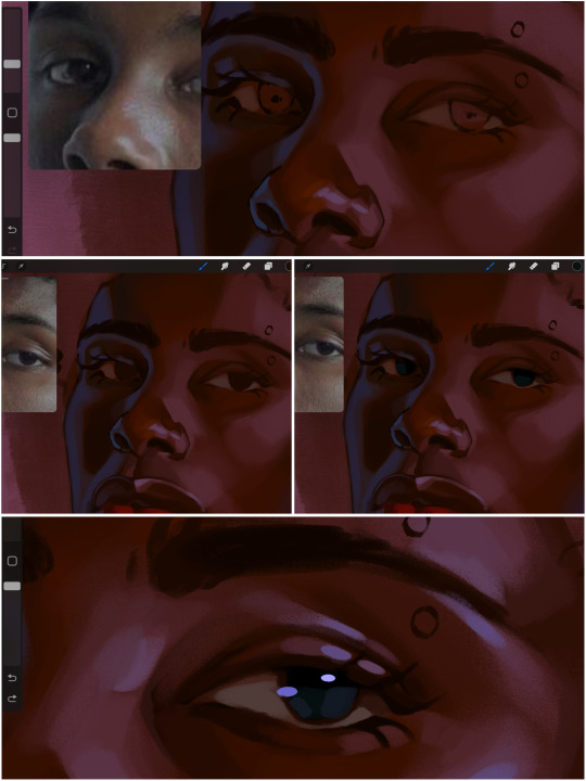
when it comes to the eyeball, i don't draw the white parts as solid white, nor do i make them too bright most of the time. they're most often times an orange grey, i also dont spread this color out if you can notice the uncolored white part of the eye. i do this intentionally to keep some of the shadows that are naturally present on the eye. very specifically right where the upper eyelid sits on the eyeball, it tends to create a small shadow that follows the curvature of the eye. this shadow is crucial, if you can see the first and second picture do not have this shadow, making the iris look more exposed and the eye appears to be held wider.
when it comes to the iris, i do very little. if i'm drawing a dark colored eye i will cover the entire iris brown, before darkening it with an almost black color. i leave the brown sides of the iris exposed to aid in bridging the values between the whiter parts of the eye and the very dark iris. this blended ring also appears on all eyes in real life. lastly, dark eyes tend to show light reflections much easier than lighter eyes. these reflections can be any color in art, in this case i kept it blue-green. i bend these reflections around where the pupil would most likely be depending on the drawing.
next, the eyebrow. i find it tedious to draw individual eyebrow strands when it comes to rendering, i actually prefer to blend the parameters of the eyebrows to create cohesiveness. sparse and fine eyebrow hairs are penetrated by light and shadows more than what you'd find on the scalp. it's harder to see light on someones scalp due to the bulk of hair crowding the scalp, whereas as its easier to see such light on the eyebrow. to introduce this concept to my art, i will initially draw the entire shape of the brow. then when rendering, i erase the parameters, leaving the darkest part of the brow. then i blend. the lower brow bone will be blended the least, whereas the area of the eyebrow connected to the T zone will be the most blended thanks to the shadow following the nose bridge. the far end of the brow by the hairline tends to be the lightest given the light source.
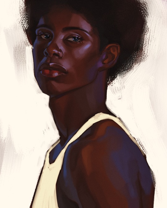
and lastly, i loosely draw a white border around the portrait for stylistic purposes. then i combine the layers (group together your layers, then duplicate and compress the duplicate group so that you still retain your individual layers) to edit. i typically add noise and play with the curve setting. and heres the finished image:
i hope you enjoyed!!
#i didnt proofread this if u find spelling errors pls lmk#black artists on tumblr#digital art#illustration#painting#black art#commissions#tutorial#art tutorial#how to shade#rendering tutorial#brushes
185 notes
·
View notes
Note
Your animal anatomy foundation 100% feels very solid, do you have any books or online sources to recommend to budding artists?
thank youuuu :)))
im gonna be honest... i never really specifically sat down to study drawing animals, or followed any art-oriented books or guides about that or anything. tutorials tend to not be very helpful to me because they rarely deal with gesture and focus more on getting the proportions right, which by itself is only a small part of it. and live drawing classes rarely involve animals...
i think it helps to have an existing, like, sense and confidence when it comes to observation and capturing volume and gesture in general. at the end of the day pretty much everything can be broken down into basic shapes, planes, blobs. actually A Blob is a good starting point to draw pretty much any animal... draw a blob and then put a head and limbs and appendages on it. yknow?
another thing is to just be curious and have an interest in the diversity and minutiae of the animal kingdom. i know it sounds very basic but I Love Animals. there are some real crazy creatures out there. obviously i recommend looking up as many reference pics as you can, not necessarily to copy stuff, but to have a handy guide of where stuff goes. but just looking at pictures honestly isnt quite enough in my opinion... read up on the animal. get a sense of what makes this particular species unique among ones similar to it, how it lives and functions in its habitat... watch a nature docco. watch some footage of weird little shrimp. learn how to tell different species of aeshnidae apart.
also, yeah, youre gonna have to look at and draw some animal skeletons at some point. i dont think you have to like, study the skeleton of every vertebrate you wanna draw, but yknow, its good to have a general knowledge. it really does teach you a lot to draw a horse skeleton and the individual parts in it. ideally of course you would be sitting in front of either the real thing or a 3d model, but sometimes photos and illustrations have to suffice... it's just important that you pay attention to what you're doing.
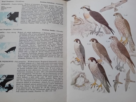
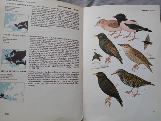
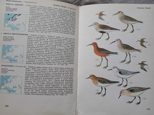
as for books... well, a relevant point here is that photos arent everything. obviously theyll give you a faithful picture of the living breathing animal, but thats the thing, they wont always let you see the exact shape, all the distinctive details, and so on. so this is where i recommend getting into some old timey illustrated books. yeah youre gonna have to do some treasure hunting... but listen. ive got this awesome book from 1979 for example, which lists pretty much every species of bird that lives in my little corner of the world, along with amazing detailed illustrations. it's so inspiring and informative. it is the kind of stuff i really wanna urge everyone to get into.
279 notes
·
View notes
Text
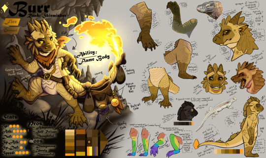
all my homies hate rendering rocks
this went from being an anatomy check to a full-blown reference sheet that took over a week to finish. i really wanted to make a solid guide for drawing my pmd oc that followed function over aesthetic and thusly, this monstrosity of a canvas was born.
there's a ton of info that the sheet references but doesn't fully explain so i'll add it below in case anybody is interested
*Written from the perspective of a pokemon researcher*
Arms & Legs: variant's limbs are very similar to the Feraligatr/ Totodile lineage but with more flexibility than the Kantonian species. variant can move on all fours but they cannot run or sprint while doing so. leaping is fine. variant has a running gait most similar to the Archeops lineage. variant also has an opposable thumb on each appendage but it is mostly used for climbing and grasping onto cliff faces.
Face: variant observed to have varying facial structures; vast majority tend to have gently sloping muzzles with forward-facing eyes. horns are a good indicator of inherited nature, but they do not seem to serve a purpose (?)
Eyes: variant tends to have poor eyesight; males live almost entirely underground- females occasionally go onto the surface to establish territory so their vision is ever-so-slightly better. variant has superb night vision and also possess a third eyelid.
Mouth: variant developed a set of teeth for grabbing and tearing. females possess a full set of canines (presumably due to matriarchal setup) and all teeth are serrated. rotten flesh and leftover food sticks around in the mouth; bites almost always become infected.
Sounds/Cry: a low, rumbling, growling sound is typical; no growling but can hiss (spitting has only been observed once). sound travels for a far distance.
Temperament: hostile (?) males will investigate but never attack; females will attack without hesitation. variant demonstrates crepuscular traits (active during dawn, dusk, and possibly during moody weather).
Skin/Ability: variant has dry skin/scales. variant has been observed to expel steam and flames through their tail and vertebral spines. heat is not enough to sustain a burn unless incredibly agitated. "scales" along face and back appear to be cosmetic and have been observed to be used for defense. can easily be broken off.
Tail: variant's tail can be detached in the same way a Kecleon can; an extinguished tail flame does not immediately kill the variant like the Kantonian species due to channeling pores located beside the vertebral spines.
Dimorphism: males have black scales and females have dark brown scales; shiny offspring are incredibly pale (white to golden in color regardless of gender). females are larger than males and also have longer horns, tails, and bigger limbs. only females possess saber-like canines.
Diet: variant is an omnivore and cannot seem to properly digest berries and/or plants. variant has been observed to consume stones, slag, and various minerals
#pokemon#pkmn#pokémon#mystery dungeon#pokeblogging#pokemon mystery dungeon#pmd explorers#pmd oc#pmd eos#charmander#regional variant#variant
53 notes
·
View notes
Note
Big fan of all ur art☝️☝️i just wanted to know how you approach anatomy? Like with poses and just general shapes? Have a good day :D
hii thank you so much! i’m happy to hear that ☺️
this is kind of a broad question for me to answer but personally, using a lot of photography as references and practicing observational drawing helps me a lot. i’m not picky about what pose i practice with as long as it’s dynamic or helps me understand how muscles, skin, and clothes look in different angles. my goal is always for my work to look organic and natural, and not stiff! i can always always improve on that.
breaking things down in shapes can help a lot if you get stuck but you have to study what they look like in the first place. it’s like cooking a recipe. if you don’t know what it’s supposed to taste like, you’ll never get it right, even if some variation (within reason unless you’re trying to make it unnatural) is to be expected. but that’s the charm i guess.
i’m rambling a bit! but circling back to my first point; when it comes to picking poses, i do my best work when i’m making comics i think. because the dialogue and interactions already give you a place to start, like i’m capturing a moment. and those are the most fun to draw 🙂↕️ i think about the characters’ personality, how they would move, or express themselves, etc. so really…the character should be the one that determines most things for me.
i’m sorry for such a long reply…i tend to get sidetracked…but i hope you found the answer you were looking for. if not, feel free to send another!
29 notes
·
View notes
Note
Do you have any tips for recreating the Hetalia art style?
I'm not sure whether you mean the hetalia anime art style, or Himaruya's style, but I'll assume it's the latter.
I think Himaruya's style has changed quite a lot since the years I used to try to emulate him.
This Antonio from the early 2010s

definitely doesn't look like this Antonio (I ASSUME it's Antonio...? Maybe it's another character? 💀

I suggest you to choose the kind of works you want to recreate (since the style fluctuates and varies a lot) and make a reference folder to observe actively. Pay attention to the way the lines are drawn, the different character faces (their most recognizable features are always their eye shapes) and the way he draws anatomy and hair.
I used to copy and redraw to "understand" the style, and I always observed his coloring and tried to figure out how I could emulate his colour effects (shadows and highlights) with my drawing program. I notice that his shadows tend to be quite soft and he uses a lot of gradients when colouring, and the colours are bright and saturated. Colour picking the colours directly from his art also helped me emulate it better. The lineart tends to be squiggly and sketchy, and the lines slightly textured. Play around with your brush settings until you find the tools that give you the results you want! Overlay layers with different colours will help you achieve the colorful sparkly look his art has. Blurred photos with bookeh effects and sparkles always do the trick for hetalia backgrounds lol
19 notes
·
View notes
Text

TUMBLR ATE THE ASK WHEN I SAVED IT AS A DRAFT SO IM SORRY IT WONT NOTIFY
Sorry for taking so long to reply!
If there is ONE thing I need to stay with you from this, it's study your own body. Its the fastest, most accurate, most easily available way to study anatomy. Crouch, touch your shoulders, hug your legs, raise your arms above your head and try to notice the differences in size between limbs. Put your hand on your face. Look at your reflection in a mirror/window. Especially since we are talking about proportions, those are about the same in all bodytypes and need just minor tweaking to get the feel of a different build. And if you dont draw your bodytype, who will?
Disclaimer:
I'm very honoured you asked me for tips, but I usually dont think abt proportions, since I internalize the things I learn by observing, so its a bit hard to put into diagrams. I will do my best!
Since the ask is pretty general, I just tried to give the first advice that comes to mind.
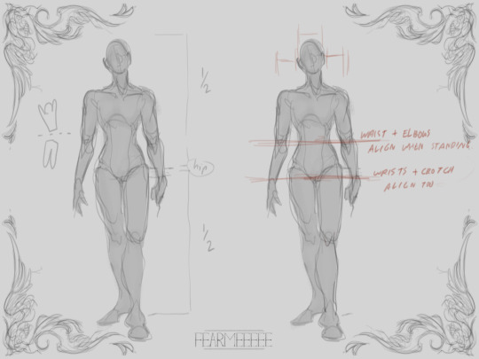
When drawing the body standing up, the top of the hip is the middle of the entire height.
Also when standing, the elbows would align with the waist and the wists with the crotch.

Try touching your shoulder with the hand of the same side. The forearm is shorter than the upper arm, but combined with the hand it exceeds the length. Same for legs (thighs are the longest part) when the foot is pointed down.
When you measure from the base of the foot though, the knee is around the middle.
When the arm is held above the head, it can bend at the elbow around 90 degrees and then it will touch the top of the head with the forearm.
A hand will take up the face of a person, from chin to eyebrow tips, but hand sizes can be pretty varied.

The bodies can have different muscle and fat masses and be exagerated, but the ratios above will still be about the same.
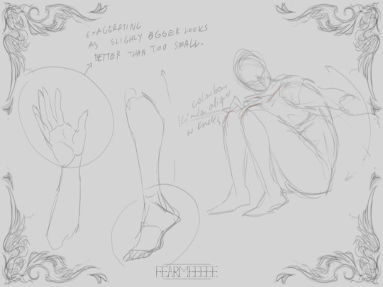
Also when drawing sitting down and hollding the legs , I've found its easy to kinda align the collarbone with the top of the knees (this works because the spine is bent so the torso has less length than when standing).
The tips of the limbs (hands and feet) can be exagerated a bit bigger if you are unsure (or just want to) and they still look correct, whereass being drawn smaller makes them feel off.
Personally I draw hands MUCH bigger than I should because I like the way it looks, it is very much not the right proportion. I also tend to stretch the bodies much more, but it is very important you understand how bodies work and what the proportions are before you start stretching and exagerating the limbs. This is already my interpretation so studying real life is better still.
I hope this makes sense, I'm bad at explaining
Thank you for the ask, and have fun creating💚
#also i screenshot ur ask bcause it stroke my ego n i wanted to brag#asks#anonymous#art tips#anatomy#also the torso is kinda small here but shhhh#i hope this is decent#ALSO i dont believe in gender you can adjust these depending on who you are drawing but no proportion is gender locked thats just silly#Oh oh forgot but personally i do tend to align the shoulder width with the hips too#you can exagerate this too obv#also I learned this anatomy alongside horse anatomy so its such a mess in my brain Im trying to explain it normally#me normally:...#me when i get asked sth art related : a billion paragraphs
92 notes
·
View notes
Note
Hello ! I am a big fan of your art and was wondering if you could give me some tricks.
How did you come up with your current style ? Was it something you searched to developp or did it come naturaly ? If it's the first option, what made you stylize it like this ? Do you have any idea what I could do to stylize my own art ?
I am a somewhat semi-realistic artist (still learning a lot though) and was searching to also developp a more cartoony style like yours alongside it, so I would appreciate some help to understand what to do.
No need to answer this if you don't want to, for any reasons though ! Just wanted to ask you if you are willing to help me, even just a little bit :)
Thank you !
Hello. ^^ Thank you for the detailed ask and taking your time out to write it 🙇♂️.
I developed my current art style through a combination of both exploration (“naturally”) and it being something I searched to develop. In my head, I always wanted to adopt a sharper, blockier art style with bright colours. I was inspired by a lot of different styles, but most importantly I was pursuing an aesthetic I liked.
[1] Trying to introduce new elements in your art takes time, but it was mostly me staring/spending a lot of time looking at people’s art works that I enjoyed. The more you look at the things you like, the clearer the image you have of it is in your mind, so it would be easier to replicate it. The idea is to study what elements you like exactly in a style and then slowly try to transfer them into your own works. Your current style will eventually merge with it to form something that is unique. 🤔
If you are having trouble keeping the image that you want to recreate in your mental space, you can always put your canvas side by side to the thing you want to replicate, if that makes sense. Observing things you like and then devoting time to it was what helped me a lot, but patience tends to get you far in general.
[2] Stylising your own art requires a lot of trial and error. In addition to observing other people’s works, you need to have somewhat of an idea of how things can look like in your own works. If you like something with bright colours, the bright colours you choose for your own work may feel inappropriate or out of place simply because they haven’t been adjusted to your liking yet. A lot about art style is really adjusting things to your own tastes while keeping the courage to experiment. Since you have a semi-realistic style and want a more cartoony one, the idea is to squash/reduce elements of realism and increase the use of shapes that stand out.
^ For example, you can see from this style that the characters have larger, round and doll-like heads, and the colours used to fill them aren’t at all that realistic or “balanced”, more so abstract and played around with (observe how Homura’s leggings are a mixture of blue that bleed to red). If Homura was drawn “realistically”, she would instead have normal colours and her usual palette scheme that don’t seem to jump everywhere. The characters’ anatomy are also simplified, smaller and easier to shape.
The style I have is mainly reducing details on the character and exaggerating their appearance with shapes or certain features. You can choose to make their eyes look more dramatic and detailed, for example, compared to the rest of their bodies. In fact, one way of making things look detailed in a cartoon style is by grouping large shapes together for them to resemble something. You could draw rectangles for fingers and that would still be understood as long as they’re arranged in a way that gives off that impression, not necessarily being a 1:1 real life replica of it.
[3] Overall, experimenting with colours and shapes are important to the style, but it’s not something you have to simply focus on. You can make something look cartoon even just by making the composition look dramatic, which isn’t limited to colours nor shape, but more on your sense of “space” in a drawing.
In summary: you have to first know what you’re inspired by, and then work towards it at your own pace. Attempt to replicate those elements in things you like by observing them and then transferring them onto your own works. Playing with shapes and colours, exaggerating or minimising proportions and anatomy can give you different results, although it may not seem satisfactory at first. The most important thing to developing your style, ultimately, is still giving yourself time and spending time with the things you like o(^-^)o. You can’t exactly rush out a style, so please enjoy the process of drawing!!
I hope this was helpful, if even a little bit, since I’m not good at explaining things, and I’m not a professional 😭🙏🙏. Thank you for the ask!!
22 notes
·
View notes
Note
hi hello! i love your rain world art and i wanted to ask, do you have any tips/tutorials on how to mimic the rain world art style as well as you do? ive been struggling with the way the rain world art style is shaped and the shading and honestly, i thought you were part of the official art team at first until i looked more into your profile
much thanks if you can answer this!!
I have never done a tutorial thingy before, and I unfortunately don't have much time to break down more of the slugcat anatomy into more readable drawings.
Here's the thing I quickly made to point out the main tips about this style. Vanilla art tends to be very moody and vague. Slugcats shapes in an abstract way that most of the time you don't know where their arms and legs are. To puposely blur - or in a way giving up doing some detailing is very important. Don't push yourself hard on detailing and drawing everything cleary. Only put energy on the parts that you want viewers to focus at.
But for me the main thing about doing art is just to observe, to look deeply into the thing you're working on, try to draw over some reference and analyze them for yourself.
A lot of the people think "looking at reference" is just look at them for few seconds, they think they remember and know what it looks like, but its very vague.
Be a teacher of yourself and try to do the "tutorial" for your own use, doesn't need to be good and complete. It is simply to give yourself a clear mind about it, and that can change a lot.
I hope this helps you a little. Thank you for liking my art!
30 notes
·
View notes
Note
any advice for drawing? I'm struggling with anatomy
Observation, but not perfection.
Observation:
Study the people around you, how long are their fingers? Does everyone’s hand roughly measure up to their face? Does your friend have an hourglass shape or a pear? Is their head more like a square or diamond? Study yourself too - nobody knows you better than yourself, and you’ll tend to draw characters with features like your own, I tend to give my characters long thumbs and legs because that’s what I have!
View the world like it’s a low poly ps1 game, break everyone down into shapes! Are you a square or an oval? Or are you more complicated? Do you have an oval chest but rectangular hips? From shapes alone, you can start to build up a good human.
You should also try studying human biology, learning the skeleton and muscles especially can be really helpful for understanding how the human body moves and works, this is also a good option if you’re unable to do life drawing classes (VERY helpful)
References are good, but also don’t develop a dependency on them, learn to be able to draw anatomy completely by yourself when you can.
Not perfection:
Oh it looks bad? Fuck around til it looks good! Sometimes making a mess can make something really cool!
With drawing I like to learn rules so I can break them better, which is a really good thing to learn, even if you don’t intend to develop an abstract style. For example, I learn proportions of the body so I can make them absurdly off if I want something to have an unsettling aesthetic to it (like a neck or limbs that are just a bit too long)
Experiment with EVERYTHING! When I paint, I don’t use JUST acrylic, I use pastels! Colouring pencils! Gouache! What happens if I do this? What about that?
You’re not a celebrity or submitting for Most Legendary Artist Ever, so have fun! Don’t ever get insecure about your art in comparison to someone else. Yes, there will be someone better than you, but there will also be someone better than them. Eventually you reach a point where it completely relies on individual taste, nobody wins, so don’t bother trying to compete.
20 notes
·
View notes
Note
dude your art is so GOOD!!! Do you take any classes or have any tips to share? that resource post you reblogged the other day was helpful but i've felt so stuck in my art. I don't know if you have anything u learned that just made something click for u or anything like that?
Tysm anon!!!👍
In terms of your questions, I apologise i advance for the long answer im about to give and possibly things you already know haha:
I guess in terms of what classes i take, Ive gone from GCSE to A level Art and design (Fine art), and both courses have helped me to learn the importance of observation studies.
However, its moreso all the art i practice in my own time that has played the biggest part in my art improvement journey. I adopted art as a big hobby around 2018, and really ever since then I tend to draw/create for myself every day, however big or small it may be.
I guess my first tip would be to indulge in a 'sketchbook' or space to work in freely, it could be any form but the importance is that its personal and can be picked up whenever. I find that having a sketchbook to draw in has really helped with productivity and creating new ideas. I think you can go into a sketchbook space with any mindset and it can work wonders, like for example if you wanted to focus purely on challenging yourself, you can do that! If you just, want to doodle without thinking, go ahead! After all, its a sketchbook for you and nobody else, so go wild!
My next tip would definitely be, when you are feeling stuck in art, to take inspiration from a wide range of different things be it in real life or on the internet, a building or a really cool tree, since I find it defintiely fuels the creation of new ideas/concepts that can provide a path out of that creative rut. I guess to an extent there may always be periods where you have that 'I have no idea what to draw!' Feeling, and thats okay! Sometimes its refreshing that helps the most. But I often see that the solution to being in a rut is usually REFERENCING, wether it be trying to accurately draw the anatomy of an arm or if I just saw a cool design/pose/style on Pinterest and i drew a bunch of wacky characters from it. In fact, I find that places like Pinterest or Resplash are such good resources to hone imagination and generally most art skills by looking at and drawinf from all the cool images (and get some of that inspo!). And if im not using Pinterest, im usually using an art book as reference! (The itsv and splatoon art book helped me so so much lol)
On the topic of REFERENCING, its mega important! Depending on imagination/memory feels pretty good at times but its always beneficial to have image references in your process when you find its good to have them. I woudl always recommend having a reference when drawing poses/expressions/anatomy because the more you use them, the more you learn about how an object like a face muscle, a torso or even light behaves and looks and the easier it is to draw/depict them.
The next tip is uh YOUTUBE, or any account/person who's art inspires you in particular. I found that certain channels like Ethan Becker, Marc Brunet, Marco Bucci and more have helped me the most to gain confidence in drawing and learning how to practice it better. Of course, theres a lot to learn from a plethora of other channels too, even ones that dont specifically promote themselves as teachers! Also, if theres a certain style/art approach or an artist that appeals to you, study it in any way you like! Analyse an artist's work or ask/find out about their personal process (or even watch a speedpaint/art stream)! Sometimes it can be a big inspiration booster and skill boost to do just that (plus the 'artist' could be any piece of media/thing too!! Like a game or something).
Ok ok last paragraph haha, on the topic of your last question. Thinking back, its hard for me to define any specific moment or thing that gave me a 'click' moment. Its more like a process of growth that starts with learning and understanding a new thing, then familiarizing myself with using it successfully/'correctly' by studying and practicing, so that eventually its like muscle memory or easier to use in my work.
Hope this helps!!! If theres anything else you want to ask, dont be afraid to dm or send another ask!!
#ask#answer#art#im still learning so much but heres all that i can give in its long windedness#theres stuff from like#less than a year ago that i would def redraw haha#but i guess most artists feel that way about some of past work#anywayy#listening to music while sketching away GOES HARD but that might jut be me
14 notes
·
View notes
Note
Hello! first off I just want to say that I love love love your art!!! its so amazing! 💖
So, I’ve been asking this question around online, so I hope you don’t mind! (Please feel free to ignore this ask if you don’t feel like answering!) Anyway, I’ve been drawing for a good while now. It’s always been something that interests me, but, in all the time that I’ve done it, I’ve never once found a style that is unique to me and that I’m good at. So, I was just wondering if you have any tips or advice on how to find your own style? I’ve tried so many though I can’t ever seem to like any of them or actually stick to it. One thing I really have trouble with is proportion. I want my style to be more chibi-esqe, but not completely if you knows what I mean lol. If you have any advice for a fellow artist I’d really like to hear it!! Please share your wisdom :D
Hello and thank you !!
I don’t mind at all ! Let’s see…
For finding your art style:
► Define what you want to tell with your art.
Not mandatory, but i think it helps. What do you want people to feel when they see your art? Do you want them to feel the emotions of the characters you draw? Or be impressed by the technique? the colors? All of the above?- I think your answer will lean you to something more specific in terms of style.
For example, I tend to focus on characters expressions and feelings. So i have a relatively simple artstyle that allows me to focus on facial traits a bit more. (Also... i'm lazy- So i like to tell more with less)
► Observe drawings from artists you love !
Try to analyze what you like so much about it. Is it the lineart? the specific way they draw eyes or any specific part of the body? Is it the colors or the rendering style? And try to reproduce it yourself. Not in a plagiarism kind of way, but more as a study !
► Try, fail and retry again.
Once you have analyzed the things you like, try to incorporate it into your own art. It might come off badly sometimes, but you also might create happy accidents ! Both outcomes are good learning.
And while I don't think it’s possible to have a style 100% original, it doesn’t mean you can’t create an artstyle that you own and feels as uniquely yours !
► Be patient (trust the process and don’t be too hard on yourself).
Defining your artstyle might take years to refine itself. Decades even… With practice and dedication it will come naturally to you ! But as with any discipline you have to be patient, there will be ups and downs and very frustrating moments but you never cease to learn.
For proportions:
► Don’t be shy about using references.
There is no such thing as cheating in art (if used properly). It builds your visual library, so help yourself as much as you can ! Professionals use them all the time too.
► I don’t want to be the bearer of bad news, but…. We can’t really cut anatomy practice-
I avoided it for so long myself and I regret it bitterly. So don’t be like me and practice your anatomy ! Even if you aim for a simple or semi-chibi style. The trap is it seems easy to draw , when in reality a lot of chibi artists already master anatomy to a certain degree.
It’s much easier to simplify shapes when you know a little more about the structure behind them.
There are a lot of websites to help you, here’s a few !
http://reference.sketchdaily.net/
https://line-of-action.com/
https://www.posemaniacs.com/
My advice is to start slow. Most of those websites have a timer by default, but don’t set a time limit for now and take your time on each pose. Try to breakdown body parts into simple geometrical shapes. It helps grow your visual library and it’ll get easier to draw with better proportions !
___
Here you go ! I realize it's very generic sorry - TLDR: don't give up !
If you want anything more specific don't hesitate to ask again, I'll do my best !
Good luck on your art journey ! ♥

13 notes
·
View notes
Note
would you be willing to do a sort of tutorial about how sort through the shapes of charr and asura?
sure thing! i'll go to the absolute basics so folks from any art level might get something from it, so i apologize if i'm explaining something that might be obvious, but bear with me here
soOoo:

i've pulled a couple in-game screenshots! using refs to start with is gonna be the most help tbh, and it's good practice imo to get the hang of everyone's shapes this way. our models today will be Mycologist Seeli and Hazel Steelcrasher
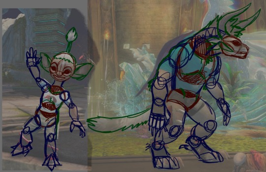
it can help to start by just taking the characters and tracing over top of them to figure out their shapes. the way i tend to do it is with a sort of wooden art mannequin way, separating out the sections into blocks and connecting them with joints, adding median lines that help track the direction different aspects are pointing, things like that! if you're just starting out it might be really helpful to crack some art anatomy books for humans and animals before tackling funky li'l guys like these, as we can take observations from life and apply 'em fictionally


from there I can start to try and eyeball the shapes-- both of these mannequins i've drawn were just by referencing their adjacent images, and all the shapes have done for me is map out my pose as well as the characters sort of volumes so that i can get a feel for where they are in the space i've put them in, if that makes sense. all the extra little lines on the face can help me with proportions and expressions too, but i've gone a little loose with 'em here for the sake of just focusing on structure

then from there, I can apply my sketching process to freehand drawing without references! that said, there's absolutely nothing wrong and it is in fact a good thing to use lots of references to apply to your work, especially for a piece you super wanna polish

and finally!! it's very, Very helpful to figure out how both asura and charr differ from a strictly humanoid anatomical setup! admittedly i draw my charr and my asura slightly more human-proportioned (usually around the legs) but doing studies that compare and contrast certain structures, like the face or the torso and legs like i've demonstrated above, can do wonders in designing characters in the future and translating certain features between body types.
anywho!!! uuh! hopefully that's helpful, thank you for reading! if there's anything y'all can think of that you'd like me to focus on in specific, i can do my best to break it down for ya!
#my art#art reference#charr#asura#gw2#guild wars 2#seeli#hazel steelcrasher#can't sleep post art refs
77 notes
·
View notes
Note
Ur strength is definitely color and line work. Something I would say needs some work is definitely your full body drawings and poses. Your poses are always static and rigid and (especially when in motion) it takes me a moment to figure out what the character is supposed to be doing. Your anatomy is fine, its the stiffness of the over all pose thats the issue. It makes your pieces lack energy and any real umph. Your beautiful use of color and line usually covers for this but for me (someone who also struggles with this) it pops out like a sore thumb.
To practice, id suggest doing gesture drawings (1 minute sketches of action poses) to really understand how the body moves fluidly and to practice capturing that energy. Id also suggest doing 5-10 minute studies of full body figures in which you specifically observe how the pose affects the distribution of weight. How the torso curves in relation to the pose (your torsos are often very vertical and stiff) and how their muscles, fat, and clothing stretch, bulge, or fold depending on the pose.
Try to keep things loose during these studies and focus on capturing the energy of the pose over perfect anatomy. Focusing on anatomy can often be a distraction and can actually detract from capturing the fluid movement of a pose when you are first learning. You dont want to be thinking about anatomy during a 1 or 5 or 10 minute study if that is not what you are trying to learn.
While doing gesture drawings, its important that you move fast and dont get hung up on details. Get the line of action in there and the general shapes of the figure. Focus more on the movement of the figure over anatomy or details. Feel the rhythm in the pose and do your best to capture it. Id suggest doing 10 or 20 of these at a time. Sites like Line of Action are great for studies like this.
For 5-10 minute studies you want to build on the rhythm you developed during the 1 minute studies. Again, you want to focus on the movement of the pose over the details. Keep shapes simplified and force yourself to think in the abstract. A vibe i get from looking at ur art is that you get focused on the small details while losing sight of the big picture (might be wrong bout this but its something i also struggle with lolol) so during studies its important to keep ur mind on the bigger picture. Focusing in on small details adds to the stiffness of a piece as instead of one singular piece, it’s made of many smaller pieces. Idk if that makes sense lololol. Id do 1 hour of these 5-10 minute studies.
But yea id say this is really the main thing holding you back right now. Once you figure out how to capture the rhythm and energy in a pose id say ur golden lololol good luck! I hope this helps XD
oh gods yeah I need to whip some referencing for poses and specially dynamism, I tend to make things a bit too stiff. I think I cornered myself into making very static poses since I do a lot of character ref oriented work, and showing the design and outfits is a priority over the dynamism, and like, I need to get working on that.
It sucks to realize how I've let social media performance guide a bit on what I draw and I practice. People like their fullbody character designs with a grey background, and I've let a lot of What Isn't That fall apart, and it's bad! I gotta get better!
I need to find a way to maybe get a way to do these practices and still post it, bc even when I've done them, they stay in a folder and never get to see the light of the day. (Also, I saw the other ask and I'm gonna check that one soon! I struggle so much finding good refs for that!)
13 notes
·
View notes
Note
Hey! Whats your process with your art studies? What do you tend to look for when doing them , how do you utilize the reference? Stuff like that… basically how are you improving? just wondering bc i’m at a standstill with my art right now but can never seem to get any use out of references….. and you seem to look like you know what youre doing haha
hello ! in terms of my figure studies, it's partly to expand my muscle memory with drawing&understanding forms, especially arms and legs at different poses & angles, this is helped by shading aswell bc limbs r really irregular its a pain. i also try to break the reference down into a 'skeleton'(?) to practise constructing poses, right after doing figure drawings i usually try to draw some fullbodies from imagination, to exercise what ive learned. my proportions are off a lot too so im trying to improve that lol
reference sites that i use include sketchdaily for timed drawing, i draw from life as well instead of only drawing from photos because theyre pretty different
while drawing under a time limit i try to exercise more line confidence although i often fail at that haha, but its very important for effective simplification, im inspired by emilyamiao 's life drawings because you can tell she really knows the structure of the human body and cloth forms even though she only uses a few continuous but accurate lines. all in all accuracy is key imo but retaining the 'life' of the reference is also essential
for faces i try to capture likeness while also stylising them a lot, the forms of the face are also really fun to shade, i recommend drawing an asaro head at different angles and then trying to draw someone's head over that. (i use an app called headmodelstudio for that, also referenceangle.com is great for peoples heads at different angles, wide variety in features!) you could try to paint the face, or map the planes, or simplify it to a line drawing, or study at different lighting environments...etc...the face is ur oyster
i dont do environments much (i need to) but in those cases i try to match colours without using the eyedropper and practise my painting,line of action has an environment study tool that looks cool
@mpekamitzii s sketchbook is a big inspo too! she does some really great creature stuff. for example u can see her process of understanding the anatomy of horses in this post, drawing in action from different angles, breaking them down to the skeleton and then applying that, also making notes on her observations its very cool
all in all studies are really a case of practise makes improvement so recently i've been trying to do some every week! it also helps to go out of your comfort zone, maybe do a landscape or go traditional, focus on one particular thing to study, esp if you feel stuck in a rut. the important thing is to take at least something away from doing them and apply that in your own art
#i didnt know what specifically you wanted to improve so i got genera with it and rambled but hopefully this helps#hellohello
4 notes
·
View notes
Text
picked up a 1953 copy of Fleas, Flukes, and Cuckoos by (Dame) Miriam Rothschild and Theresa Clay today.

I love parasites so of course upon seeing the title, I couldn't say no. The book is focused on parasites affecting birds, of all types, internal, external, brood parasites... invertebrates and vertebrates... I do love to see so many walks of life contained in a single-topic book that isn't just a nature guide.
(You may notice the "R U" contained in the repeating motifs on the cover. This book was a book from the Readers Union, which was basically a subscription service for books)
one of the biggest draws was the plates and figures:
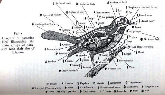
Fig 1: "Diagram of passerine bird illustrating the main groups of parasites with their site of infection."
I love this one, a charming crash-course on both bird anatomy and the diversity of smaller-size parasites the book covers. it covers these in a good level of detail, too.


for example, it gives comparisons of morphological differences one may observe between different modes of parasite life. The plates on the left show the mouthparts of different invertebrates which feed in different ways. The figure on the right shows the attachment organs of different intestinal worms, showing the variety of "anchors" these worms use to avoid being washed out of a host's intestines.
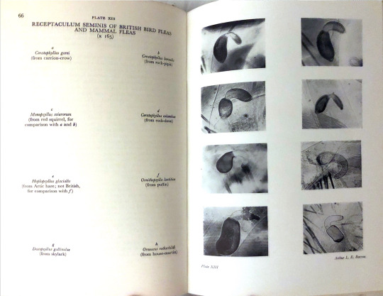
That's quite broad. It goes deeper. For many invertebrate species, the only way to identify one species from another is by observing the shape of its genitals under high magnification... and so they provide:
I'll make an effort to go through and snatch up more of these plates and figures, some of them are beautiful.
it is not a purely anatomical text. There is a good amount of discussion of the ecology of parasites, including multi-host life cycles (which are pretty common to see).

Here we have the life cycle of Cryptocotyle lingua, which seems to be lacking in online presence; the second host of inshore fish does make it a parasite of interest to fish farmers, which is apparent when browsing papers on Cryptocotyle flukes. if you know more about these guys, please add on!!
Of course not all parasites are invertebrates. the book has plenty on vertebrate parasites, such as skuas, and of course the beloved cuckoo mentioned in the title.

I quite like the inclusion of the skua here since kleptoparasites need some time in the spotlight. Cuckoos are amazing, they deserve a post of their own.
With old biology books, though, I tend to have reservations about the actual biology facts provided within. some fields of biology, e.g., palaeontology, are so fast moving that something that was the new trendy hypothesis is old within a few weeks. Usually I get these books for the plates, and for the history, namely, the comparison of what the authors knew and what we now know.
The then-now comparison that struck me immediately was in the first paragraph of the preface:
"An object of the New Naturalist series is ... the encouragement of unusual and original developments of [natural history's] forgotten or neglected facets. One such facet is the study of parasites, a study all too long regarded as curiosity about mere curiousness, or as excursions into backwaters. Some popular books that have been written on the subject have stressed the unusual, the mysterious, often the macabre. Few have taken the subject truly seriously."
...I do feel this thinking persists in a lot of circles. Parasites are always weird gross-out animals, or at least, the invertebrate ones are. even people who are animal-lovers or environmentally-conscious tend to be keen to take to the idea of Kill All Ticks, or whatever (this is not the same as not wanting to have ticks on your body). It sucks that this sentiment is so pervasive, but it did also feel like "The Editors" (as they signed the preface) reached across decades of separation to shake my hand and go hey, yeah, that bothers me too! Let's do something about it (write this book).
Oh, and a lot more than write this book, a whole lot more. While Theresa Clay is a subject of scrutiny for her association with a fraudulent scientist, Dame Miriam Rothschild was from a lineage of accomplished parasitologists, as well as being one herself -- one of the most established flea experts of her contemporaries, as well as a lepidopterist with an interest in mimicry. She was a great scientist, and has many other achievements: working at Bletchley Park in WWII with Alan Turing, pressuring the UK govt to accept more German Jewish refugees, personally housing some of said refugees & providing a hospital for wounded soldiers, advocating for gay rights, and funding research into understanding schizophrenia and helping folks w/ it. amazing!!
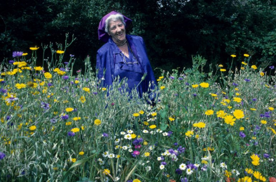
here she is with her wildflowers, grown at the very same house she housed refugees and treated the wounded. You can order packets of seeds from these wildflowers, proceeds go to research to fight cancer, septic shock, and covid-19. She was a pioneer of wildflower gardens as well, creating the "Farmer's Nightmare" seed mix. yet another gift from her. All of these amazing things amplify the need to read this book in full and more thoroughly record all interesting tidbits.
I wish I could have met her, and asked her about this book, and if there was anything she would add or update, or if there were any fun stories. she seems like a real gem of a scientist and activist.
#miriam rothschild#dame miriam rothschild#jewish scientists#woman scientists#parasites#parasitology#ectoparasites#endoparasites#old books#antique books#biology#zoology#ticks#flukes#fleas#miaow#osedax bookblog
12 notes
·
View notes
Last Seen Blogs

epicmomness
Epic-Momness

aftaglow
afterglow posting, same as always~

laptopclinic
Untitled

fatma-alsuqry
فاطمة الصقري
corruptedbonecharm
Dishonored, My Beloved