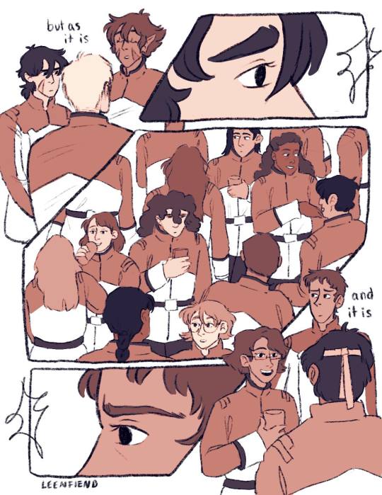
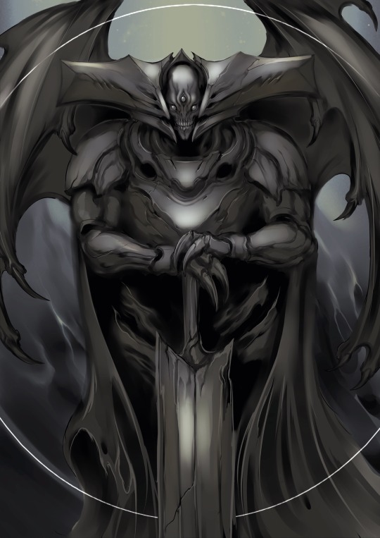
#i went through like three lineart iterations for this
Note
the way you draw ted makes me want to make out with him sloppy style

i doubt he'd be opposed
#ted spankoffski#hatchetfield#id in alt text#definitely art#i went through like three lineart iterations for this#the price i pay for getting bored with my art (my hand hurts)#was going for something looser with this. don't know how well it turned out#but i am proud of it. for the time being#whatever this was basically a warmup anyway#im gonna go to bed
362 notes
·
View notes
Text
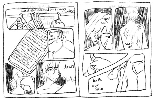
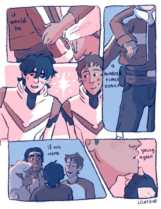
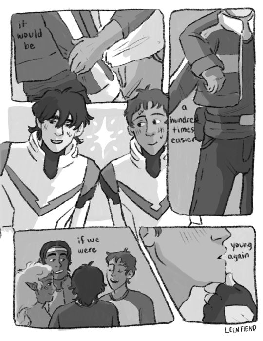
I thought the Two Slow Dancers comic would be a fun opportunity to break down my process a lil bit cause this was a lot of undoing and redoing and adding so for any ppl curious it will be under the cut!!
So to start off I actually only thumbnailed what is now page five and six, the original image in my mind was them reaching out to each other in different seasons clothing, I considered just making an animated version of that but then I connected it to the two slow dancers scene I had imagined in my head a month or so back and wanted to make it part of a small narrative:

(I actually did page six first - u can tell by the way my writing is nearly incomprehensible that this idea came to me like a vision in the night)
But then looking at that i said - well surely that doesn’t tell the story enough. I need more. And then I played two slow dancers on repeat for probably an hour while I thumbnailed a surrounding narrative for those two pages and ended up with this mess:
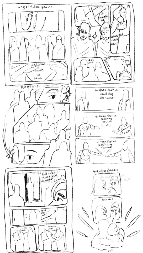
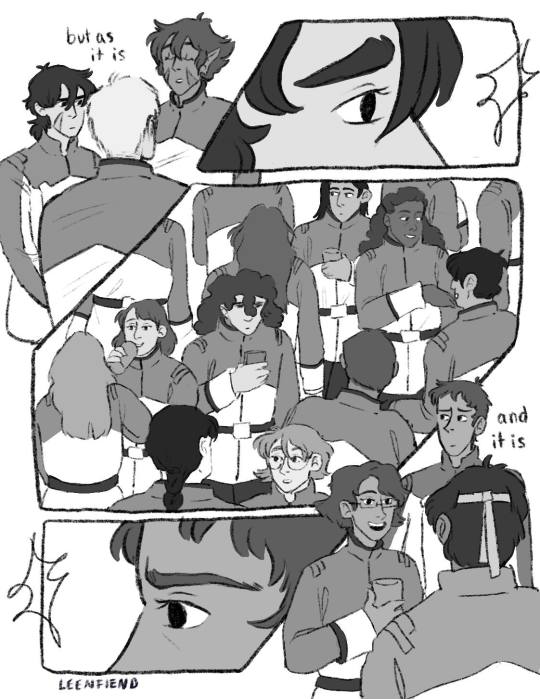
And from there I actually started working on the lineart two pages at a time - I like working on freakishly large two page spreads because to me it helps the flow feel more cohesive, I don’t look at them as isolated pages until I get to the shading part of the process.

But once I sent it to some ppl for feedback and reread it myself a million times I felt like the story still wasn’t reading the way I wanted it to - two out of six pages were “flashbacks/memories” pages and that ratio didn’t really allow for the other four pages to read as a cohesive story in my opinion so I kept trying to workshop two more pages for the front and I went through a few iterations:
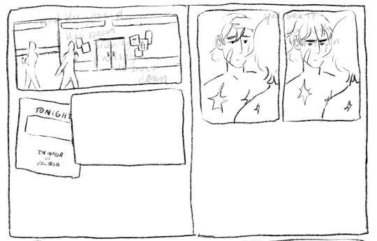
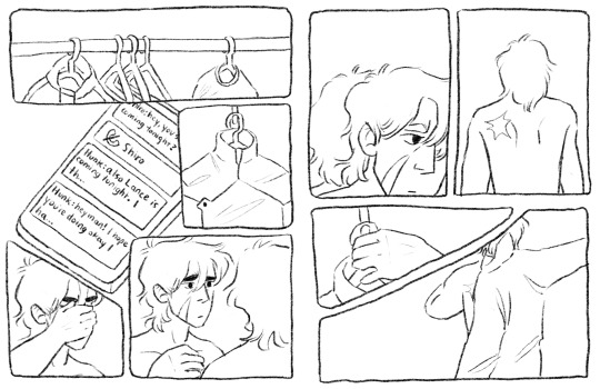
I thought at first I would show the outside of the garrison, give the audience more of a setting, and then show the flyer so we know Keith is getting ready for this celebration. But it was too literal for me (even though what I ended up doing was still pretty literal lmao). So then I started with the phone/text messages as a story telling device:
Also this is an example of how I almost always draw the comic panels before I decide what goes in them haha, unless I’m really sure what images I plan on focusing in on the panels almost always end up informing what goes inside if that makes sense. But I finally ended up here when I decided “that’s good enough”
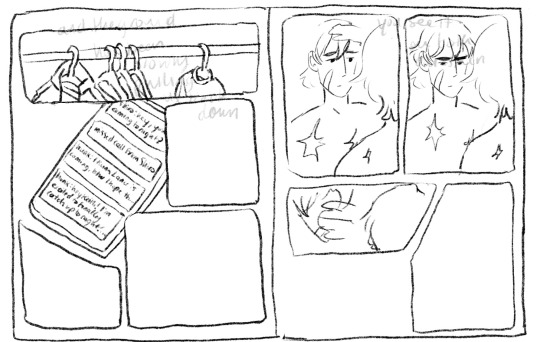
I even did most of the lineart for this composition before I decided the imagery of the jacket was just too repetitive, like we don’t need THREE PAGES of keith putting on a jacket.
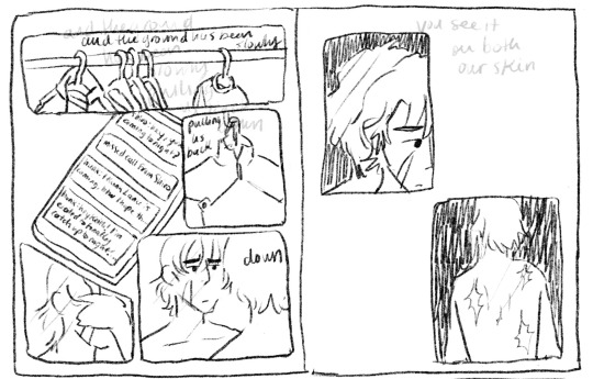
So i kind of just moved the left page over to the right, and left the right page blank for most of the rest of the comic process. I finished most of the lineart on the rest of it before I finally circled back and decided to go with a tweak of what I originally thought was a lame idea (I had this image in my head of the lions silhouette against the glow of the Earth for the first page, but with the lyrics “the ground has been slowly pulling us back down” I thought it was just too cheesy, especially because that’s not what the lyrics mean either in the song or in the context of this comic and I didn’t want them to be perceived as so literal)

So this is the thumbnail I landed on for that which eventually turned into the actual final page.
Once I had all of the thumbnailing done the rest was pretty fun work! Just lots of going back in and detailing out the scribbles I had first put down. Now in terms of color, I actually have a secret. Most times I don’t color much at all? It depends on the piece but for most of my comics what I do is this -
I flat greyscale color everything and then use a color curve adjuster inside of procreate to pick a color pallet:
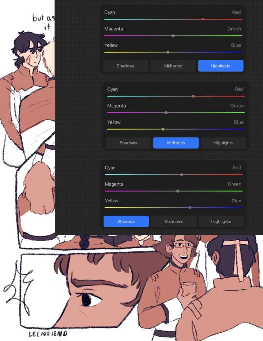
color adjusters are ur friend for picking color pallets i'm TELLING YOU!! I used to have a lot of trouble with cohesive color comps but it's a lot easier for me even without using this method now. Anyway I usually leave it here, in my other comics I don't have any shading or background elements outside of the panels but I figured since I was working so much on this comic anyway, I might as well light it a bit.
So I basically just scribbled over the whole composition with a purple marker set on a multiply layer and then erased out the places I wanted light to hit, and then added a soft light layer with colored lights to give it more of a party look:
The only hang up I had during the coloring process of all this was how to color the "memory" pages. I originally just wanted them to be more pastel/blue, I thought that would make them look distinct enough. So I painted/shaded this whole page before looking at it within the rest of the composition and deciding it didn't read well at all and ended up sliding the saturation down to zero and calling it a day:
But I'm happy with that decision because it allowed for the "coming into color" moment with the other memory page and I think it connects better to the rest of the comic visually that way.
And that was the whole process! There were tons of other little adjustments I made along the way and other composition things I tried out but I do tend to erase instead of iterate in layers so this is the process I have to show you!
As a little bonus behind the scenes, here's the time lapse replay of that initial thumbnail for all eight pages! (it is sideways just because it's so large so if you're on a phone/tablet/laptop just turn ur screen sideways otherwise I'm so sorry lmao)
#my art#this is so long but i like 2 talk about process stuff lol#i also would love to see anyone else do a breakdown like this i LOOOVEEE seeing how other people work.#and feel free to steal any way I do anything ever (it is not stealing it's simply learning and using artistic practices that u are drawn to#colleen thoughts#also i use the 6B pencil in procreate for all of my linework ever and all of my thumbnailing im a one brush type of person#and it's like a default brush too lmao
23 notes
·
View notes
Note
I AM ASKING U ABOUT THE SYMBOLISM IN THE JENNY PATCHES
I am SO glad you asked :D please allow me to ramble for. way too long probably. (original post this is in reference to)
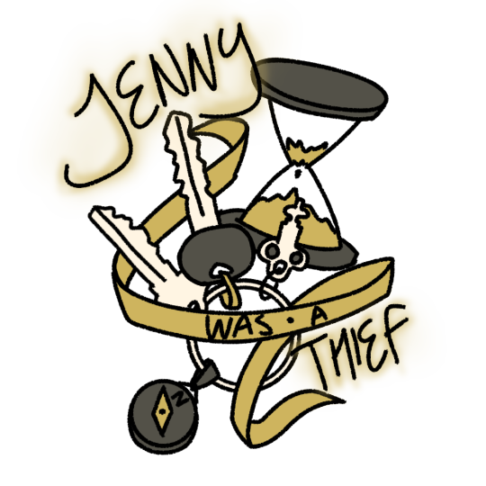
Let's start with Thief because that's the one that I nailed down the design for first. In this design: an hourglass almost out of time, a ring of three keys - a house key, a car key, and a skeleton key - and a compass keychain.
Jenny the Thief is the one who held the gate as long as she could before vanishing into the night, the one who traded in her old car for a custom Kawasaki to leave behind a no-longer-safe house (ring of keys). Thief is the one who didn't know her time was up until it had gone, the one who had to live through everything ending to understand how it happened (hourglass). When she left, it wasn't towards anywhere particular, just away from here, pick a direction and run (compass). Additional note for the skeleton key specifically: that one is mostly for me, because I wear a key like that on a necklace and I thought it fit nicely, but also it's for places and stories we can only guess at, events locked outside the scope of the narrative.

I had a lot more trouble nailing down the design for Warrior - it went through a few iterations. The original one had a sword and a pen: battles to fight and stories to tell. I talked with my friend Sunny @paladinboyfriend for a little while about it, bouncing around ideas; ey said something about Jenny being a bastion of hope glowing like a lighthouse, but burning too bright and consuming herself in the process, and I decided to go with a lighter as a modern analogue to that.
To me, Jenny the Warrior is the kind of person that everybody knows someone like - a couple years older than you and leagues more confident, a steadfast support who's always ready for anything and has just the tool for whatever problem arises ("also jenny is butch, so there's that" - Sunny). She's not an ancient hero, she's here and now, a warrior with a motorcycle and a leather jacket and a house where you can crash for as long as you need. So she gets a pocketknife instead of a sword and a lighter instead of a torch, tools for someone who protects and guides. A pen for countless unknown stories lived and told, for lines drawn and lines held for as long as she could. I added a carabiner attached to the knife (which, yes I know you wouldn't do that irl, it's about the design) because I felt like it filled out the design a little bit, and also, again, in my heart jenny is butch, and it felt like a nice little nod to that.
For both designs, I used the same flat color palette of gold, off-white, and a dark warm gray, since those are the general colors of the album color. I also used a thick and slightly textured brush for the lineart, because I like the slightly more flawed and organic feel it gave the pieces.
I think that's pretty much it, but I can probably come up with more to say about specific aspects of the designs if there's anything else you're curious about! thank you so much for asking and enabling my rambling about this set of drawings :D
#.lyr#ask#the mountain goats#jenny from thebes#long post#i <3 symbolism i <3 things that mean other things#id in alt text#kes tag#<- resident symbolism enjoyer enjoys symbolism; to the surprise of absolutely no one <3
21 notes
·
View notes
Text
“LET US SPEAK OF THE TERRIBLE BEAUTY OF BECOMING OURSELVES”
Illustrating Destiny’s Books of Sorrow with community artist Francine Bridge
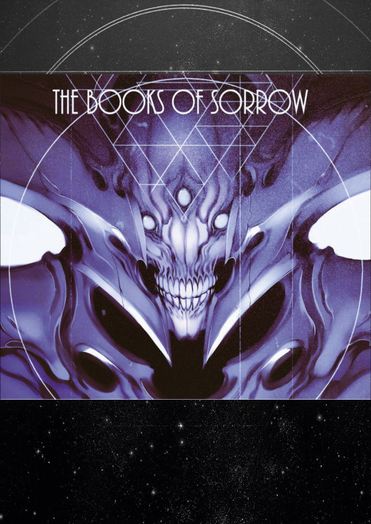
One of the most impressive Destiny fan-projects we’ve seen to date has been Francine Bridge’s incredible illustrated rendering of Destiny’s Books of Sorrow. Francine, otherwise known as Witnesstheabsurd, agreed to take some time to answer a few of our questions about her work, its impetus, and what the project means to her.
Written by Seth Dickinson, the Books of Sorrow tell the story of the Hive - and by extension Oryx and his siblings - and give deep, rich background to one of the game’s largest and most important conflicts. Lyric and evocative, the books offer insight into both the Hive themselves and the universe they inhabit, and remain Destiny’s most impressive and most in-depth piece of lore-building. For those who may have joined the community in Destiny 2, or never had the chance to read the original books, they can be read in their entirety here.
Francine’s project shows the same impressive attention to detail, and most importantly, the same level of empathy as the works that inspired it. We’re ecstatic to be able to share this conversation with the Destiny community, and we hope you’ll take the time to admire the full project.
You can find Francine on Artstation, as well as on Twitter and Tumblr.
Written in Light: To get things started, tell us a bit about yourself. What you're studying, what field you work in, what you like to do for fun - give us a brief summary of who you are and what's important to you!
Francine Bridge: HI! I'm Francine, although I'm better known online as Witnesstheabsurd. I work as a freelance illustrator and concept artist in the UK - you might have seen some of my work in the game Hiveswap or at labels like Killstar. I do album covers, shirt designs, character/monster etc design work for games, comics, private clients. I'm currently in my 4th and final (I took an extra sandwich year to do a supplemental diploma in professional studies) year of my Illustration and Visual Media BA degree in London, after which I'm probably going to look for more permanent studio/contract work rather than the one-off freelance stuff I've been pursuing while I've been in school.
A couple of years ago, prior to starting the degree, I came out as a trans woman, which is probably an important detail, and it's informed a lot of my work. However, my driving impulse has always been monsters - my preoccupation with Destiny started entirely because a friend of mine showed me screencaps of Oryx after the The Taken King release and I was smitten. Pretty much all of the media I consume, the games I play, the art I create is in pursuit of ever greater or more unique creature and monster design, and they're very dear to my heart.
As far as what I do for fun - my day is 90% working at the tablet, but I find time to play some games and build "gunpla" model kits as well as paw through my artbook collection. Almost everything I do is informed by my profession, so I use my hobbies as a means to access and process more referential or inspirational visual material or techniques. I only recently started sincerely learning how to actually "paint," rather than just do some basic rendering under lineart, so that's been a major part of my work lately.
WiL: Was there anything in particular about Oryx that really drew you to him? Did Oryx come across as particularly great and/or unique to you, or is there something else that struck you with his character or design?
FB: Well, as I said, I'm transgender. In the ‘pitch’ my friend made to me about Oryx as a character, the most interesting aspect to me was that he's a transgender man (although I'm a trans woman, the experience has some shared parallels obviously).
In media, it's incredibly difficult to find trans characters not wholly defined by that aspect of their identity, or who aren't constantly wallowing in the Misery and Tragedy of being trans. I want trans characters who occupy all roles - villain, hero, supporting and main - and it's rare to find anyone who's more than a token or like, tragedy porn. Oryx super resonated with me because he was this figure who acquired power and immediately transitioned, asserting his identity in a way that couldn't be defied - Oryx's story is very much one about self-definition and the value of existence under your own terms, which are very important concepts to me.
When I decided to start work on illustrating the Books I actually reached out to Seth Dickinson, the author Bungie contracted to write them (and the Cabal Booklet/odd flavour text, by the way) to get some specific questions answered and he was kind enough to respond and was very cooperative and supportive. Among the things I asked about I wanted to know if Oryx was consciously written as transgender character or if it was just a coincidental "weird alien race" flourish. I was very happy to learn Seth had purposefully written Oryx that way, and that he was happy people took strength from it.
It's very novel to have, like, a "trans power fantasy"... a character who acquires absolute power over the self and instantly rewrites the contract between themselves and their body that so many of us spend our entire lives making adjustments to and renegotiating for some measure of peace. It was satisfying, refreshing.
Oryx is super cool to me on multiple visual levels obviously as well, being a mineral-encrusted deep space insect mummy warlord, but that element specifically sets him apart for me, and always will. It's cool to know that a trans character in Destiny can also be a hideous monster from beyond the stars.
WiL: Nice! I've wondered if Oryx was intentionally written to reflect a transgender person. I'm glad to hear a positive answer to that question, and I'm glad you found strength in it!
My next question is, why did you decide to take on this project? I mean, it's very clear that you love Oryx, so that factor is a given, but you mentioned in your original post that this was something you did for your degree. Care to elaborate on that?
FB: So, the structure of my illustration degree is such that while we’re given specific "briefs," such as topics or techniques, the final year gives us significantly more free rein. We're obligated to complete three "projects" and author a thesis over the course of the final year, but the subject matter, material, everything about those projects is our call. The outcomes are judged based solely on technical and professional development rather than adherence to a specific brief.
This left the field wide open for me to kill two birds with one stone and bring in a project I had intended to do anyhow, but hadn't had the time or space for; something that I was sincerely passionate about rather than an edict handed down by a tutor. Illustrating the Books of Sorrow was something i'd wanted to do ever since I first read them back in The Taken King, and I jumped at the chance. In addition, while i've produced and formatted artbooks before (My first published work, The Occult Supergiant Primer, can be found here ), I've been able to recoup the time invested away from client work in sales and funding. The Books are obviously material belonging to Bungie and I can't justify selling copies, digital or otherwise, of my illustrated version, so I had to find some other reason to make this investment of time and unpaid work worthwhile as well as enjoyable.
Being able to use the work produced to further my degree was the perfect "excuse.” That said, I've received so much attention from the Destiny community at large, including commissioned work from several new clients, that it would have easily been worth it regardless.
WiL: Your work definitely deserves the attention, you clearly have a strong sense of design! Would you be willing to tell us a little bit about the process you went through to make the Books of Sorrow? Do you have any early versions or storyboards that you'd like to share? Or did any of the illustrations go through any major changes from start to finish, and would you be willing/able to show us that process and talk a bit about why you made the changes you made?
FB: The greater part of the Books came together incredibly smoothly and naturally, with very little iteration required on specific pieces. The images had been stewing in my mind ever since I read the original verses a few years ago and they were more than ready to be rendered. What did require a lot of research, development and false starts were the designs for the sisters, Savathûn and Xivu Arath. Both of them have yet to appear ingame in any major capacity (although it's looking likely Savathûn is going to be a Year 2 DLC), so it was up to me to create designs for them that:
Satisfied the descriptions appended to them in the verses, as light as they were, and also matched the info Seth gave me
Satisfied my own personal expectations and interpretation
Conformed to the lore and the existing known morphology of the Hive in a way that would make them recognizable to a player with no prior familiarity with the Books
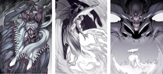
Balancing these principles lead to a lot of internal back and forth - Savathûn was easier because we had already seen her brood in D2 on Titan, so I knew to emphasize ornate crests, bonelike texture and a slightly less mineral, more biological look by comparison to Oryx's brood, the hive we exclusively encountered in D1. She was tough at first but ultimately fell into line with something satisfying for me, which actually drew a lot from the Xenomorph Queen in Aliens.
Xivu Arath was a little trickier because she had to be distinct from Oryx, who kind of already occupies the "big mineral/bone-encrusted bruiser" archetype visually, so I had to take her even further. I spent a lot of time wondering whether she would have any ornamentation like some of the bigger Knights (Alak-Hul comes to mind), given that she represents the "ultimate" Knight morph, but I eventually eschewed all decoration in favour of something reflecting her nature in the narrative: blunt, implacable, spartan. She dispenses with the ritual and hierarchical trappings the other siblings indulge in - notably she decides that all battlefields are her Court, rather than entertaining a court herself, and she tends to default to just brutally bludgeoning whatever stands in her way rather than making an appeal to the Deep or engaging in trickery. I was very satisfied with how she turned out, and the piece featuring her is easily one of my favourites.
WiL: I was going to ask which piece is your favorite! Do you have a Top 3 that you're most proud of?
Is there anything about the Books that you wish were different, or is there something you wish you had the opportunity to draw for this project but couldn't justify including it?
FB: I have a strong tendency to favour whichever the last piece I completed was, because by default I'm always proudest of my most recent work and very rapidly lose favour with pieces even like, a week old. That said, I think overall the strongest piece for me personally would be Oryx slaying Akka, alongside the final Wormfood painting and the Savathun piece, although honorable mentions go to Xivu Arath and Quria, Blade Transform.
I can't say there's anything about the Books specifically I wish was different. The part of me that's purely consuming it as a narrative wishes that they had found Taox, that there had been some confrontation there. I feel like there's a very strong "childhood vengeance" element to the Taox subplot, like when you're put down by an adult for drawing in class and you fantasize about coming back to the school years later as a wildly successful artist and making them admit they were wrong to have stopped you. A key part of that fantasy is recognizing it as a remnant of childhood, this impulse born out of a narrower perspective and inflated self-worth, and realizing you can move past that shit (Although if/when I do become a wildly successful artist there might be a few teachers I'll look up).
Ultimately, I think the arc of the books and what the story is trying to say about distortion of intent and self makes Taox disappearing a much more emotionally resonant and interesting turn. It would be neat if Taox turned up somewhere in-game, and became the focal point of a new Hive offensive. An entire species/culture with such a specific individual grudge is a fascinating concept.
With about a month and a half of time allotted for the project and 50 verses, there was a lot of stuff I had to cut despite how much it hurt - in a complete version I would have wanted a painting for every verse, but specifically I would have liked to draw Akka in full, the Dakaua War Angels, the Harmony/Gift Mast, the Qugu; basically I would have given form to the many species and cultures Seth conjures up with a few phrases and a loose description but still manages to make incredibly evocative.
WiL: Do you think you'll ever return to the project and draw those images, either as standalone pieces or as an update to the PDF you've already made?
FB: An update to the .pdf itself is unlikely. I tend to consider projects released to be complete, and usually by the time I revisit a subject I'm not obligated to work on it will have been a few years at the very least. I tend to have developed my technique and approach enough that new pieces inserted retroactively would look somewhat disjointed in terms of quality and style. The chance of releasing standalone paintings - especially of points of specific interest for me like say, Akka in his entirety, the Dakaua war angels, the Qugu, etc. - is significantly higher. Whether that happens sooner or later depends entirely on what my current workload looks like, and aside from the incredibly generous and supportive response to the project from the larger community the Books are very much a passion project and have to be weighed against, say, contract or school work going forwards.
WiL: That makes sense. What other projects do you have going on right now, if any?
FB: Just this morning I decided on the subject of my final degree project, which I'm also planning to run as my second artbook with an accompanying Kickstarter and print run - something I can actually sell as well as being material that excites me! It's entirely too early to disclose any specific details about it though.
Other than that, I continue to produce odd pieces of fanart in between a regular flow of client work both from private individuals and studios. I guess I can safely say I'll be doing more work on the second Homestuck game after contributing to the first, as well as doing some designs for a music video I was contracted for, and also finishing my thesis for the aforementioned degree.
The key thing, I think, is to keep moving - I get very anxious when I'm spinning my wheels between projects, and the temptation to linger on the threshold a while longer is incredibly strong, especially when there's always the fear your new work will fail to surpass what's come before. Reaching a personal peak like some of the paintings I did for the Books of Sorrow is a double-edged sword, and it can signify both a great accomplishment and a raising of the bar that can be daunting to follow. I'm confident that whatever you see from me next will manage it, though!
WiL: Believe me, after talking with you for a while, I'm confident your next project will meet your expectations. You are a very talented and very ambitious artist, and we can’t wait to see where your career takes you! It’s been a pleasure to talk to you, and we’re looking forward to your next Destiny passion project.
//
This interview has been edited for length and clarity
All images courtesy Francine Bridge
#destiny#destiny the game#bungie's destiny#destiny lore#destinylore#destiny fanlore#destiny fan lore#destiny community#destiny art#destiny fan art#destiny fanar#destiny the zine#written in light#unknownkadath#witnesstheabsurd#the hive#destiny hive#oryx#destiny oryx#xivu arath#savathun#the books of sorrow#the taken king#destiny 2#monster art#monster artists#sci fi monsters#sci fi art#sci fi artists#artist interview
546 notes
·
View notes
Text
Poké Balls in Icebound
As I was linearting recent pages, that showed the modern-day Poké Ball, I suddenly remembered Sammy from the Celebi movie, who had a ‘primitive’ Poké Ball and would have been from roughly the same time period, if not a little earlier, that Franz grew up in.
Needless to say, my desire to learn and apply the knowledge as accurately as I can kicked in, and I went to hunt down some Poké Ball info. I figured I could share what I found out and the conclusions/headcanons I’m going to use in Icebound, since there’s always the chance someone else could find it interesting too, and it’s not going to hurt to shed a bit of light on my thought processes, and the level of detail I reach when writing these things. It’s a bit of a long post, so brace yourself for a wall below the cut. :’D
Starting off with a disclaimer: While I’m trying to be as accurate as I can, and to present this logically, there are a LOT of holes in Pokémon lore, and I work on the basis of believable plausibility, meaning that I try to be accurate right up until I can’t, starting with canon info from the series, then filling gaps with real-world knowledge, and finally any further holes are bridged with my own common sense. This definitely isn’t a be-all-and-end-all, but rather a headcanon that I’ve worked out to be accurate as it can be.
Without further ado, onto the Poké Balls!!
My first order of business was finding out when exactly the modern Poké Ball was initially invented/produced, to know whether or not Franz would’ve been able to use them.
Various relics and artefacts have been used to control and/or seal Pokémon away since the ancient times, such as the relics from Pokémopolis (the giant Gengar/Alakazam/Jigglypuff trio) and the macho-brace-looking armour attached to the Pokémon in the Arceus movie. At approx. 300 years prior to present day, the anime has shown that the concept of the modern Poké Ball was present, although the insides visually appear to lack the mirrors seen in todays ones, implying that they had minimal functionality beyond capturing.
It is a bit hazy when the current version was invented, but the Pokémon Daisuki Club encyclopaedia gives us a development year of 1925 by Professor Westwood at the Celadon University, and a B2W2 Memory Link titled ‘A New Light’ has Drayden stating that Poké Balls “didn’t exist yet,” which would imply that the modern Poké Ball took its sweet time reaching other regions.
Given that Drayden appears to be somewhere around 60-70 years of age, that’d put him roughly in 1940-50 for year of birth. With Franz born in 1968, it can be easily accepted that the modern Poké Ball as we know it had made its way to the regions beyond ‘Japan’ by the time Franz was around to use them.
My next concern however, was with the production of the Poké Ball as a commercial product. Its value, market prevalence and whether variations such as the Great Ball existed yet.
We do know that in the Johto region, Apricorns were hollowed out and fitted with capture-tech, and were commonly in use by most Trainers until Poké Balls became widespread thanks to mass production by companies like Silph.
In all of the games, we’ve known the standard Poké Ball to be 200P or roughly 200¥/$2 USD if we’re talking real-world money. Sammy’s Poké Ball is likely an Apricorn Ball, or an cheaper alternative, implying that Poké Balls were not necessarily cheap when introduced to the markets. All new technology is expensive and takes a long time to become cheaper and more commonplace, so I have no doubts that the Poké Ball was no exception to this. So how much did it cost then? At this point, we have to make a little bit of a logical leap - If each new iteration of Poké Ball strength brought the standard price down, then we could argue that the Poké Ball could have at one stage cost the same or more than the Ultra Ball, which is 1200P (¥)/$11 USD. Doesn’t seem like a lot, so we should probably adjust for inflation and check the value of a dollar back then.
Going through a calculator for commodity worth, $11 in 1975 works out to $50. WHAT? $50 per Poké Ball?! Okay, we need to see if we can find a comparable product to see if that price is justified and how quickly the price dropped over time. Obviously, we do not have monsters or monster balls to capture them with, so I’m going to look at portable music players instead.
Let’s consider the portable transistor radio, first made available in 1954 as our standard Poké Ball equivalent. The next revolution in portable music came in 1962 with the first version of the Cassette player, so let’s make that our Great Ball. The cassette dominated the market for 20 years, but it took the arrival of the Boombox and the Sony Walkman in 1979 to become mainstream, giving us a good idea for when the Great Ball was ‘standardised’ in production and made commonplace. In 1982, CDs, our Ultra Ball equivalent, hit the market with the first Discman player hitting shelves in 1984, and holding pride of place until the MP3 format came along in 1998, and the subsequent explosion of MP3 players being equivalent to all of the specialised Ball variants, like the Timer, Quick and Premier Balls.
Obviously, this isn’t the best comparison, as Poké Ball tech clearly didn’t become obsolete with each new version, but it definitely had the means and reason to drop in price while the technology continued to improve.
Now to initial pricing of this tech (in USD to stay consistent). Brace yourself, this is going to hurt.
1954 - Portable Transistor Radio $49.95 ($450 today) and by 1962, this had dropped to $15 ($119 today)
1979 - Walkman $150.00 ($500 today)
1984 - CD Players $350 ($825 today)
1998 - MP3 Players (MPMan) $400 ($590 today) which by 2001 was the iPod at $399 ($550 today)
...Suddenly $50 per Poké Ball doesn’t seem so unreasonable anymore, especially when you would also have to budget for food and other necessities while travelling. If we go by roughly the same timeframe as the music players for the introduction of each new strength, then Poké Balls were definitely an adult purchase; something that kids would not have been able to easily afford in the ‘70s, starting to becoming reasonable from the early ‘80s with the Great Ball, down to the 200P Price by the ‘90s with the Ultra Ball’s appearance (the ‘90s being the time that the original Pokémon games were set in, coincidentally). They would have continually gotten ‘cheaper’ as well, as places like the Kalos Poké Ball factory automated production, and the price for these three standard Balls hasn’t risen with inflation in the Pokémon world throughout 25 years of games (or about 10-15 years time if we consider the story timeline that’s been thrown around), not to mention the dozens of specialised variants introduced since then.
So at the end of the day, how is this knowledge going to affect my comic?
Well, when Franz started his journey he would have not have had the means to catch a full team right away, and Poké Balls were something precious to only use when you were certain of a capture. That would’ve changed as the years went on, but that mentality of just catching whatever Pokémon you saw and rotating them around on your team was just not an affordable option for most people, and that in itself affects the attitude of the whole world around him. This really puts into perspective the seemingly little prize money Trainers awarded out in the earlier games as well, and why it never seemed to amount to much.
Being a Trainer isn’t cheap.
Sources:
Poké Balls, and History of Pokéballs on Bulbapedia
Inflation Calculator
A Short History of the Evolution of Portable Music
Portable Audio Players on Wikipedia
10 notes
·
View notes
Last Seen Blogs

cyb3rsp1der
Sunni !!

avengingtheowl
Avenging the Owl

mar17flow
Untitled

foodtrippingsa-blog
Untitled

phi-lophobic
learning how to love myself.