#instructional designers
Text
The Three Big Blunders in E-learning Design and How to Avoid Them

E-learning has revolutionized education and training, making it accessible, flexible, and scalable. However, despite its numerous benefits, e-learning can sometimes fall short of its potential due to common design mistakes. These blunders can lead to disengaged learners, poor retention, and ultimately, ineffective training programs. To ensure your e-learning courses are impactful and successful, it’s crucial to recognize these pitfalls and know how to avoid them. Here are the three big blunders in e-learning design and strategies to circumvent them.
1. Overloading with Information
One of the most significant mistakes in e-learning design is overwhelming learners with too much information at once. This "information overload" can lead to cognitive fatigue, reduced retention, and disengagement.
Why It Happens
E-learning designers often aim to cover as much content as possible, thinking that more information equates to better learning. This is especially true when trying to accommodate comprehensive subjects within limited time frames.
The Impact
When learners are bombarded with excessive information, they struggle to process and retain it. This can result in a shallow understanding of the material and an inability to apply what they’ve learned in real-world situations.
How to Avoid It
Chunking Content: Break down information into smaller, manageable chunks. This helps learners process and retain information more effectively. Use modules or sections that focus on a single concept or skill at a time.
Focused Learning Objectives: Define clear and specific learning objectives for each module. Ensure that all content aligns with these objectives and avoid including extraneous information.
Progressive Disclosure: Introduce information gradually, revealing more complex details as the learner progresses. This method prevents cognitive overload and allows learners to build upon their knowledge incrementally.
Multimedia Balance: Use a mix of text, images, videos, and interactive elements to present information. This variety keeps learners engaged and caters to different learning styles, enhancing comprehension and retention.
2. Lack of Interactivity
Another major blunder in e-learning design is creating passive learning experiences. E-learning that lacks interactivity can result in disengaged learners who struggle to stay motivated and absorb the material.
Why It Happens
Designers sometimes prioritize content delivery over engagement, focusing on conveying information rather than involving learners in the learning process. Additionally, there might be constraints related to time, budget, or technical resources.
The Impact
Passive learning experiences can lead to boredom, disengagement, and lower retention rates. Learners are less likely to internalize and apply the material if they are not actively involved in the learning process.
How to Avoid It
Interactive Elements: Incorporate interactive elements such as quizzes, simulations, drag-and-drop activities, and scenario-based learning. These activities encourage active participation and help learners apply what they’ve learned.
Gamification: Use gamification techniques like points, badges, leaderboards, and challenges to make learning more engaging and fun. Gamification taps into learners’ competitive instincts and can increase motivation.
Real-World Scenarios: Design exercises and assessments that mimic real-world scenarios. This contextual learning helps learners understand the practical application of the content and enhances engagement.
Frequent Feedback: Provide immediate and constructive feedback on learners’ performance. This helps learners understand their progress, reinforces learning, and keeps them motivated.
3. Neglecting User Experience (UX) Design
Neglecting user experience (UX) design is a critical blunder that can undermine the effectiveness of an e-learning course. Poor UX design can lead to frustration, disengagement, and ultimately, a failed learning experience.
Why It Happens
E-learning designers might focus heavily on content creation and overlook the importance of intuitive and user-friendly design. Limited UX expertise and insufficient user testing can also contribute to this issue.
The Impact
A poorly designed user interface (UI) can confuse and frustrate learners, making it difficult for them to navigate the course, access content, and complete activities. This can lead to high dropout rates and poor learning outcomes.
How to Avoid It
Intuitive Navigation: Design a clear and intuitive navigation structure. Ensure that learners can easily find and access the content they need. Use consistent menus, buttons, and icons to guide learners through the course.
Responsive Design: Ensure that your e-learning course is accessible on various devices, including desktops, tablets, and smartphones. A responsive design adapts to different screen sizes and orientations, providing a seamless learning experience.
Accessibility: Make your e-learning course accessible to all learners, including those with disabilities. Use alt text for images, provide transcripts for videos, and ensure that all interactive elements are keyboard navigable.
User Testing: Conduct user testing with a sample of your target audience before launching the course. Gather feedback on the design, navigation, and overall user experience, and make necessary adjustments based on this feedback.
Consistent Visual Design: Use a consistent visual design throughout the course. This includes fonts, colors, and layouts. Consistency helps learners focus on the content rather than getting distracted by varying design elements.
Implementing Best Practices
To ensure your e-learning courses avoid these common blunders and deliver effective learning experiences, consider the following best practices:
Start with the Learner in Mind: Understand your audience’s needs, preferences, and learning styles. Tailor your content and design to meet these needs.
Iterative Design Process: Use an iterative design process that incorporates feedback and continuous improvement. Regularly update and refine your course based on learner feedback and performance data.
Collaborate with Experts: Work with subject matter experts, instructional designers, and UX professionals to create a well-rounded and effective e-learning course.
Continuous Professional Development: Stay updated on the latest trends and best practices in e-learning design. Participate in professional development opportunities and communities of practice.
Conclusion
Effective e-learning design requires a balance of well-organized content, engaging interactivity, and a user-friendly experience. By avoiding the blunders of information overload, lack of interactivity, and poor UX design, you can create e-learning courses that not only capture learners' attention but also enhance their knowledge retention and application. Remember to focus on clear learning objectives, incorporate interactive elements, and prioritize intuitive design to deliver impactful and successful e-learning experiences.
#E-learning Design#Information Overload#Cognitive Fatigue#Learning Retention#Chunking Content#Focused Learning Objectives#Progressive Disclosure#Multimedia Elements#Passive Learning#Interactive Elements#Gamification#Real-World Scenarios#Frequent Feedback#User Experience (UX) Design#Intuitive Navigation#Responsive Design#Accessibility#User Testing#Consistent Visual Design#Learner Engagement#Iterative Design Process#Continuous Improvement#Subject Matter Experts#Instructional Designers#UX Professionals#Professional Development#Learning Outcomes#Training Effectiveness#Online Education#Blended Learning
0 notes
Text

They make me insane <3
#all my blorbos in 1 pic#if you're done reading one of these#go for another in here#you're gonna get the same “1 reckless MC + his found-family of people getting heart attacks from MC's shenanigans”#regressor instruction manual#the greatest estate designer#tged#the greatest estate developer#lout of the count’s family#trash of the count's family#sss class suicide hunter#sss class revival hunter#omniscient reader's viewpoint#omniscient reader#orv#lee kiyoung#lloyd frontera#cale henituse#kim gongja#kim dokja
3K notes
·
View notes
Text
Amazing how all the scamming MCs (Cale, Dokja, Gongja, Yoojin, Kiyoung, etc) have a normal type of smile that us considered their scammer smile
And than there's Lloyd

#i love you my bastard man#tged#the greatest estate developer#the greatest estate designer#lloyd frontera#tcf#cale henituse#orv#kim dokja#ssscsh#kim gongja#tsctir#sctir#han yoojin#regressor instruction manual#lee kiyoung
2K notes
·
View notes
Text
Cale Henituse: *pretends to be Jesus*
Kim Dokja: *pretends to be the devil*
Lee Kiyoung: *pretends to be Jesus but is the devil*
Kim Gongja: *is Jesus*
Lloyd Frontera: Can you guys not?
#lcf#lout of the count's family#cale henituse#lcf cale#orv#omniscient reader#kim dokja#orv kdj#regressor instruction manual#lee kiyoung#sss class revival hunter#kim gongja#the greatest estate designer#tged#tged lloyd#lloyd frontera#incorrect quotes
2K notes
·
View notes
Text
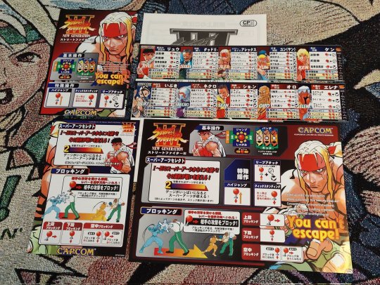


#Three#Capcom#instruction cards#art#design#arcade arts#character art#retro gaming#fighting games#fgc#video games#arcade#arcade gaming
103 notes
·
View notes
Text
Source:@/firstbabyfirst Twitter
(Since we saw how much Khao cherished the Dior pouch First bought him to the point he is still using it till now….here’s FK talking about it a few years ago)
13/08/2024
#also First complaining how stubborn and mischievous Khao is when he spoils and enable him so much 🙂↔️#this comes from the guy who bought his bestie a designer sofa for said bestie brand new house 😂#or giving in whenever Khao wants to eat something else#or instructing his bestie what to wear 🙂↕️#my boys are whipped#khaotung thanawat#first kanaphan#firstkhao#firstkhaotung
45 notes
·
View notes
Text
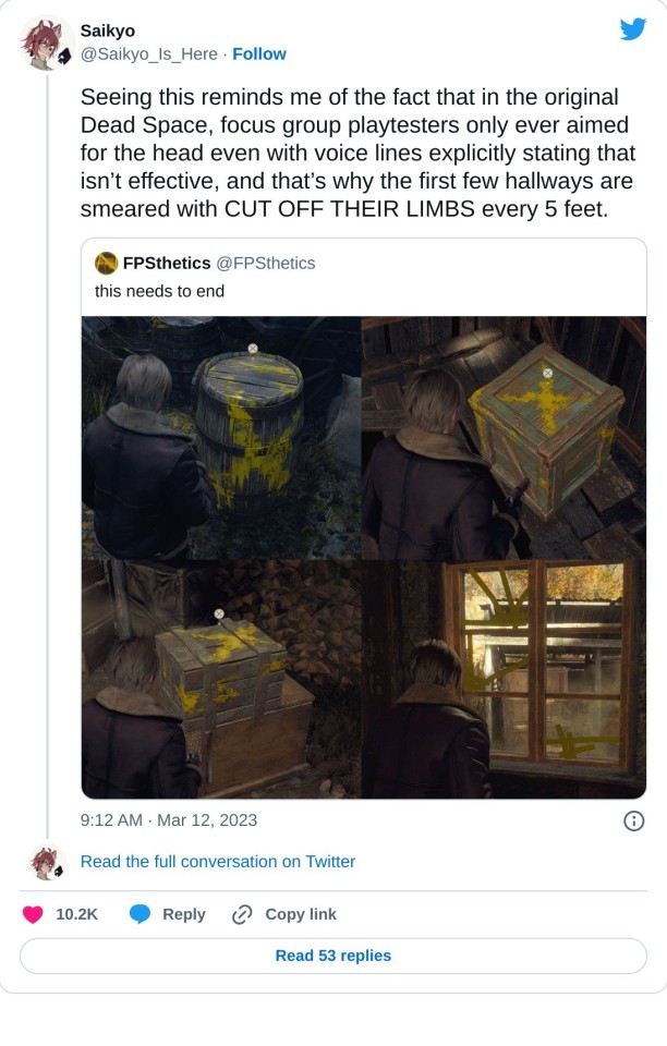
#design#instructional#videogames#environmental design#dead space#re4#play testers#not everyone thinks the same way
1K notes
·
View notes
Text
does anybody else feel like a lot of sso's features aren't fully implemented lately? for example the championship season pass thing, I think that was so hidden. for no reason. i've had multiple people tell me they didn't even know it existed until somebody told them about it. and that seems like such a big flaw for a timed event and brand new feature??
i also felt very thrown into the deep end with the collections lately. both gm bee's bees and erissa's dolls didn't tell you anything about what you had to do! i loved the stars, i adored the spiders, this would be right up my alley. but all the confusion ruins it for me! why doesnt sso tell us how many things we have to collect? what's the diary even for if they don't add the new collection quests to it? i loved it as a way to keep track of your progress and get hints of the areas of the collectables you're still missing. the way it is right now it just incentivizes looking up guides instead of trying :(
#star stable#star stable online#sso#ssoblr#starstable#is anybody else stressed out?#i shouldnt have to make lists for all the collections to keep track myself#right??#it makes it so hard to take your time with that stuff#also not knowing if its a quests you can take your time with or if you're gonna need it to continue the story line next update#ALSO the fact that you cant look up anything about it again!! after talking to bee once theres no way to get the instructions again#let alone MORE info if you need it??#thats basic game design#a quest - especially a long collection quest - should not vanish from the quest log after i start it#i should not be able to forget a quest if i dont play for a month!!
51 notes
·
View notes
Text

Minor characters from The Brothers Karamazov have my entire heart
#these are nikolay parfenovich nelyudov (judge of instruction) and ippolit kirillovich (prosecutor) btw. I had so much fun designing them#you may be able to tell where I got the inspiration to design them + fetyukovich#the brothers karamazov#my art#dostoart#tbk#fyodor dostoyevsky
68 notes
·
View notes
Text


Lego Mech MOC - Type Abyssus
Due to the shortage of bricks of certain colours, the mecha with cockpit is being halted. Looking at my abundant orange and adequate black, an idea of a humanoid mech with slim but long arms came to me.
I actually built the arms first and realized a slender (slimmer than Atlas) would go well with the arms. The idea of the mid section from the unfinished mech is put into this one to balance the proportion. Last but not least, I used the cone shaped pieces into legs.
All these designs required different type of joints, I developed them accordingly.
I literally made a backpack type cockpit but it did not turn out as nice as I liked due to how bulky it is compared to the overall slenderness.
So, WIP continues. Hope to update you all soon here!
#afol#afolcommunity#lego#lego mecha#lego moc#lego builds#lego photography#lego robot#legomania#lego youtube#lego instructions#lego ideas#lego creator#lego design#l
44 notes
·
View notes
Video
youtube
They All Make Me Go Insane 2, Electric Boogaloo
#omniscient reader#omniscient reader's viewpoint#orv#lout of the count’s family#trash of the count's family#the greatest estate developer#the greatest estate designer#my s class hunters#the s classes that i raised#sss class revival hunter#sss class suicide hunter#i woke up as the villain#trapped in a webnovel as a good for nothing#how to use a returner#regressor instruction manual#oh jeez all these names#kim dokja#cale henituse#lloyd frontera#han yoojin#han yujin#kim gongja#choi yuseong#lee kiyoung#my art#i am going back in my cave now#☆ミ(o*・ω・)ノ
303 notes
·
View notes
Text
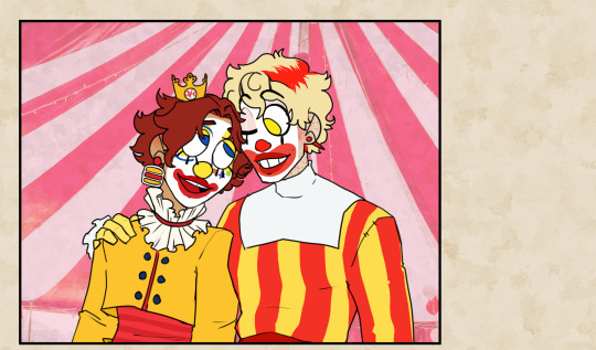

a lot has changed since clown college!
#bailey draws#mcdonalds#mcdonaldland#maccas#ronald mcdonald#hungry jacks#fanart#top surgery instructions unclear added more top#yes it's hungry jacks and NOT burger king#and younger ronald is based off the original hamburger happy clown design
76 notes
·
View notes
Text
i'm getting towards the end of the skypeia arc, & i'd like to say just how much i adore the way the female strawhats have been treated.
just... every aspect of how the way their characters have been previously contextualized influences the story-line is treated with a masterful amount of consideration. we're given so many layers to both of them that enrich not only their characters specifically, but the arc, and the one piece world as a whole. without nami & robin having their specific skills, and their specific values, without those being built upon, the story would have come to a halt.
you could not have skypeia without nami & robin being who they are as individuals. not just because they never would've gotten there without nami, but also because the way these women think is itself foundational to the machinations of the arc as a whole.
to be totally upfront, if you think any other strawhats were more central to the skypeia arc than nami & robin were you are full-on fucking lying to yourself.
#obligatory disclaimer that i’m aware luffy is the protagonist & a lot of interesting stuff is explored w him. this isn’t abt him though.#part of me wonders if this is an aspect of why people will write off this arc sometimes tbh... like that & the political themes.#but yeah anyway i get why people say that for all there are 100% misogynistic tendencies in oda's writing & character design#it is very very hard to say that he as an individual is an ideological misogynist. like the level of care he puts into his female cast mem#-ers generally speaking & how he approaches what existing as a multi-dimensional individual would look like in their specific contexts is#like... in a lot of ways still something that is unprecedented across all forms of media.#but also not the point but anyone who says nami in particular doesnt get real fights/is unskilled um... no you're wrong read her fight in#alabasta & then all of skypeia.#like in alabasta she takes on arguably a stronger opponent than sanji when considering the structuring of BW. not only that but she does s#with a weapon she has never used before while actively reading the instruction manual. and she WINS. she wins based on sheer intellect &#the ability to utilize skills the audience already knows she has. the pre-existing basic fighting skills she's introduced with are elabora#-ed upon by incorporating her skill w navigation. same with the way her cunning is used in skypeia to cover her lack of sheer brute. &#the best part about it is she's fucking tough in a way that makes sense! she isn't strong/weak just for the sake of positioning her as such#it is thoughtful & it strengthens her as a character rather than just like giving the power-scaler types smth to mindlessly chew on.#like do i wish nami got to fight more & take a more active role in that regard even if i don't think she needs to be a fighter in the same#sense as the monster trio? yes absolutely. i'm guessing this is going to be smth that bothers me potentially even more with robin.#but that does not mean her fights are not masterfully written when she gets them or that she isn't tough as a bag of nails.#respect my darling woman or die.#skypeia#nico robin#nami#grey's one piece tag
38 notes
·
View notes
Text

#X-Men vs Street Fighter#Marvel#Capcom#instruction card#art#design#arcade gaming#fighting games#video game
52 notes
·
View notes
Text

guys guysguysguys check out my Smol Lego Potted Plants!!! THEYRE SO <3
#the trashcan speaks#the instruction booklet had little insets like 'we made this part in a new color for this!'#thanks i love you lego designers <333333#and the TINY LADYBUGS...!!!!!
27 notes
·
View notes
Text
ok but in the midst of it all you gotta admit……….the twister song WAS pretty catchy
#even catchier than the instructional boogie which was DESIGNED to be an earworm#signing ‘not talkin bout the movie with helen hunt im referring to the game’ to myself all this morning lol#*singing#clone high
80 notes
·
View notes
Last Seen Blogs

ga-baby
ga baby

amythesailor
amythesailor

hikeric-blog
Untitled

techbo-812-740-11-88
ТЕХБО | Панели и перегородки
