#jerrymoon.net
Text
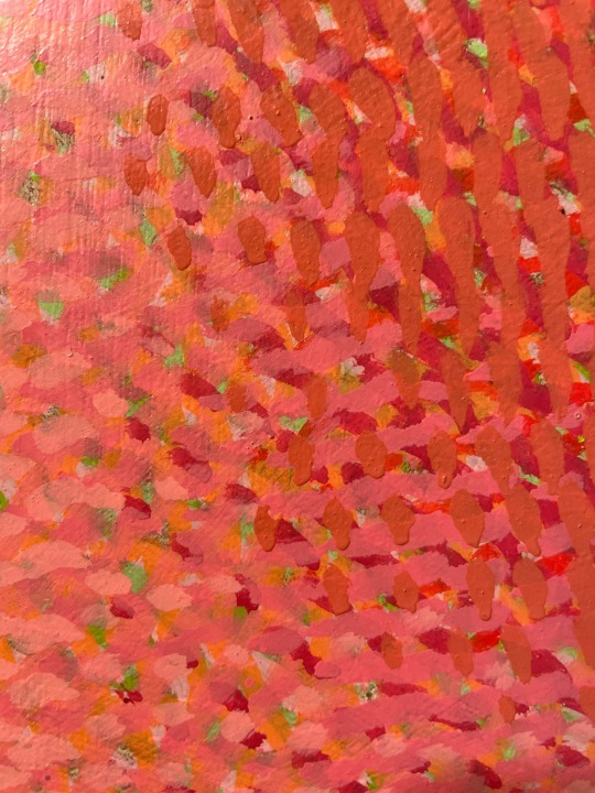
The Night’s Work.
20231229.2124.
“The Portal Of The Avuncular Amaryllis”, 24in x 24in, oil on panel.
Some interesting things emerging.


#gloomweave#jerrymoon.net#abstract#contemporaryart#oilpainting#painting#abstractart#abstractpainting#jerry moon art#portals
7 notes
·
View notes
Text
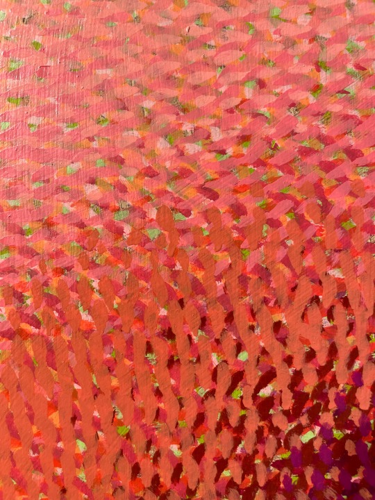
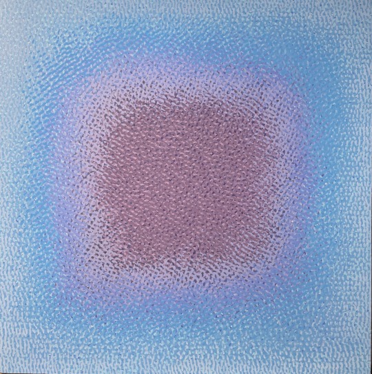
The Day’s Work.
20240804.1842.
“Fifteen”, 48in x 48in, oil on canvas.
I think it’s done. I’ll ruminate on it for a week while building the frame. I am liking it today, though.


#gloomweave#jerrymoon.net#abstract#contemporaryart#oilpainting#painting#abstractart#abstractpainting#jerry moon art#transition
2 notes
·
View notes
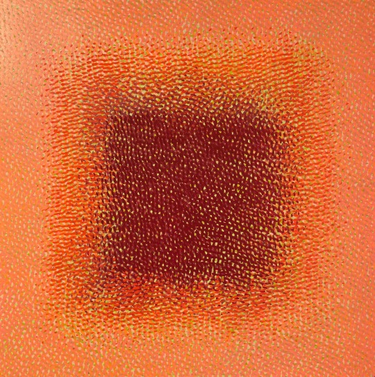
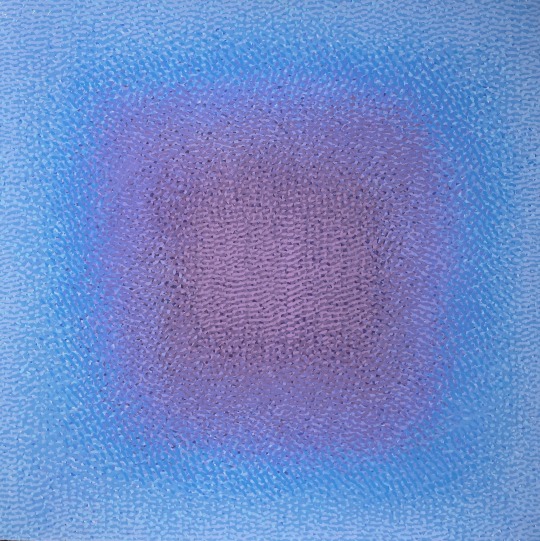
Text
The Night’s Work.
20240706.2341.
“Fifteen”, 48in x 48in, oil on canvas.
This is a commission through Leopold Gallery, due near the end of August. That means I need to touch it virtually every day between now and then, if I want to meet that deadline. I’m probably about one-third done.


#gloomweave#jerrymoon.net#abstract#contemporaryart#oilpainting#painting#abstractart#abstractpainting#jerry moon art#transition
4 notes
·
View notes
Text
Finished redecorating the guest room. The mural is latex paint and gold leaf.


#gloomweave#jerrymoon.net#abstract#contemporaryart#painting#abstractart#abstractpainting#jerry moon art
3 notes
·
View notes
Text
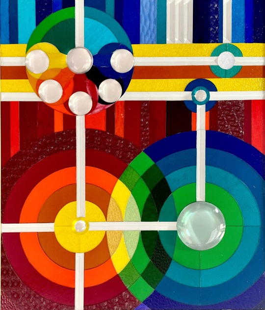
The Day’s Work.
20231007.1220.
“Detonation”, 30in x 35in, stained glass.
Eight days of grinding. All the pieces are done. Time to start foiling this bad boy.
A satisfying warm up piece. I haven’t done stained glass in 30 years.
7 notes
·
View notes
Text
The Day’s Work.
20240423.1953.
“Middle-Earth”, 20in x 28in, ink and watercolor on elephant hide paper.
I’m currently in the process of reading “Lord Of The Rings” to my grandchildren on a (mostly) weekly basis. My copy of the book is beautifully illustrated by Alan Lee, but it does NOT have a fold out map that the kids can examine as the story evolves.
So I made one.
It’s all hand lettered and I deliberately “stressed” it a bit with coffee and sandpaper to make it feel ancient and “real”.
I have a deep new respect for Christopher Tolkien’s mapping abilities. He did his original for his father’s book in one sitting over 24 hours (meeting the publisher’s deadline). My copy took about three weeks, and ~80 hours. His was so iconic that I emulated all I could and still add color.
The kids liked it.
They also found four areas where I missed adding color. Those stinkers have the eyes of eagles.


2 notes
·
View notes
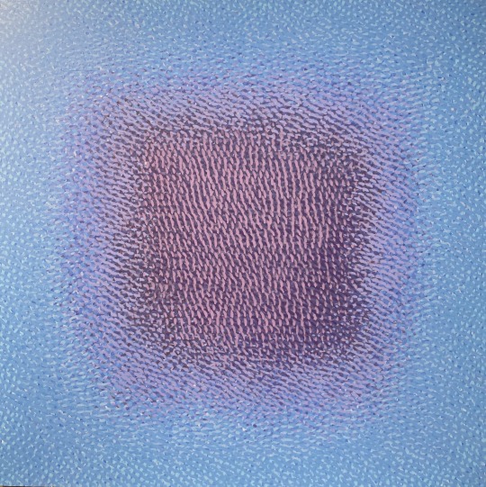
Text
The Night’s Work.
20240328.2017.
“The Portal Of The Panoptic Angel”, 24in x 24in, oil on panel.
I’m totally dumping the sketch on this one. I like the blue version in my head better.
So it goes.


#gloomweave#jerrymoon.net#abstract#contemporaryart#oilpainting#painting#abstractart#abstractpainting#jerry moon art#portals
2 notes
·
View notes
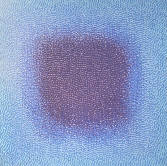
Text
The Night’s Work.
20240318.2154.
“The Portal Of Dutiful Children”, 24in x 24in, oil on panel.
I finished this one on February 2, but was waiting until I got time to retouch varnish it, so I could evaluate the final color of the thing.
I’m feeling “meh” about this series.
I have struggled with getting the color to visually fade into each other as they progress to the center. It’s not “smooth”enough to match my inner vision, and I think it’s because of my handling of the hatchwork and because the color is different when wet.
I add paint, thinking I have it “smooth” enough to satisfy me, only to find a different shade when I begin the next session’s work. Swatches of each color have not helped. They are far from perfect, but I’m willing to accept “close”.
In frustration, I’ve destroyed six of them, as they weren’t even remotely “close”. Six survive (so far). Sometimes you have to kill your darlings.
I may turn away from the crosshatching in the future. I love the look, but it’s compromising my vision.

#gloomweave#jerrymoon.net#abstract#contemporaryart#oilpainting#painting#abstractart#abstractpainting#jerry moon art#portals
2 notes
·
View notes
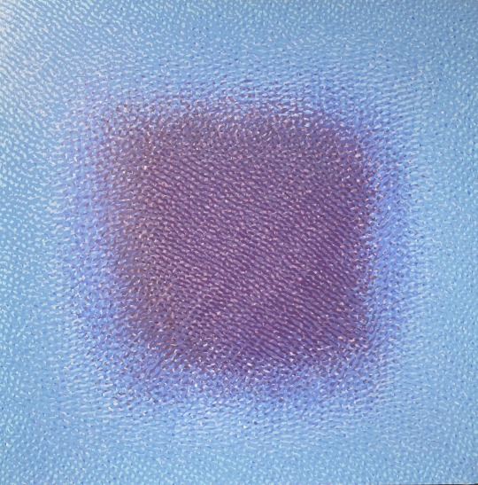
Text
The Night’s Work.
20240318.2132.
“The Portal Of Sanctimonious Error”, 24in x 24in, oil on panel.
I am so close. Need a little more transition between the center and the outside. It will be a relief. I’m in the “dogged perseverance, but hate working on it” phase. That’s fairly normal for me.
I have been working, but the changes each day are subtle enough to be boring, so I neglect posting until I feel there is a visible difference.


#gloomweave#jerrymoon.net#abstract#contemporaryart#oilpainting#painting#abstractart#abstractpainting#jerry moon art#portals
2 notes
·
View notes
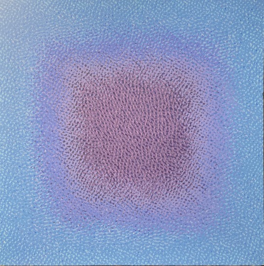
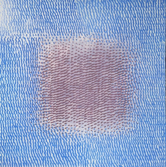
Text
The Night’s Work.
20231209.2205.
“The Portal Of The Panoptic Angel”, 24in x 24in, oil on panel.
The first layer of the portal itself. I intend to gradually darken it using a series of complementary colors, in the hope it will eventually look “black”, without using black. You can see specks of multiple colors peeking through up close.
We shall see.


#gloomweave#jerrymoon.net#abstract#contemporaryart#oilpainting#painting#abstractart#abstractpainting#jerry moon art#portals
3 notes
·
View notes
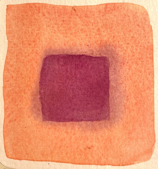
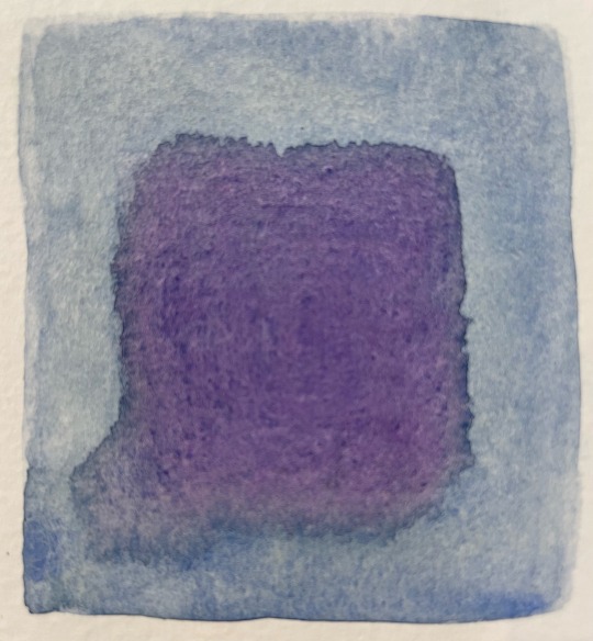
Text
Sketchwurk.
20240114.1351.
“Legends Fall”, 7in x 7in, watercolor on Rives paper.
I sold a couple of big paintings over the holidays, so I indulged in purchasing two watercolor sets that I have coveted for years. One of them is the Kuretake Gambai set. Very smooth and creamy, and a bit opaque. Terrific with the way I crosshatch. And I adore the way the japanese package stuff. No one does it better.
Is it weird that I love making charts of all the colors? It’s my favorite bit about getting new paint.


#gloomweave#jerrymoon.net#abstract#contemporaryart#painting#abstractart#abstractpainting#jerry moon art#watercolourpainting#watercolor
3 notes
·
View notes
Text
I finally updated my website to show off the Radiant series. Have a peek.
https://www.jerrymoon.net

#gloomweave#jerrymoon.net#abstract#contemporaryart#oilpainting#painting#abstractart#abstractpainting#jerry moon art#radiants
2 notes
·
View notes
Text
The Night’s Work.
20240108.2058.
“The Portal Of Gentle But Fruitless Beseeching”, 24in x 24in, oil on panel.
Three more colors added. Mischief managed.


#gloomweave#jerrymoon.net#abstract#contemporaryart#oilpainting#painting#abstractart#abstractpainting#jerry moon art#portals
2 notes
·
View notes
Text
The Night’s Work.
20231229.2253.
“Eleven”, “Twelve”, “Thirteen”, and “Fourteen”, 12in x 12in, oil on canvas or panel.
Stacey wanted me to do a small painting for each of the adult kids for Christmas, so I spent the month of December painting these. How did I know what each kid wanted? I sent them a bunch of sketches and told them I was working on a commission, and asked them to rate their favorites.
They were surprised.


#gloomweave#jerrymoon.net#abstract#contemporaryart#oilpainting#painting#abstractart#abstractpainting#jerry moon art#radiants
2 notes
·
View notes
Text
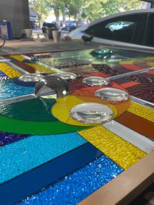
The Day’s Work.
20231013.1713.
“Detonation”, 30in x 35in, stained glass.
It’s in the wall. After the silicone dries, I will trim it with aluminum strips, which ties in with the rest of the decor in the bathroom. It’s weird to me how the photos “flatten” all the faceted pieces to white.


4 notes
·
View notes
Text
The Night’s Work.
20231129.2248.
“The Portal Of Elliptical Conjuration”, 24in x 24in, oil on panel.
Close. Gotta work out the light band and integrate the edge. So close.


#gloomweave#jerrymoon.net#abstract#contemporaryart#oilpainting#painting#abstractart#abstractpainting#jerry moon art#portals
2 notes
·
View notes
Last Seen Blogs

zeyyagiyim
Alışveriş Kanalıma Hoşgeldiniz

pomegranates-and-blood
plura recognosces, pauca docendus eris.

isimsizblogg
İsimsiz

myblogirish
❄아이리스❄

haunted-clowndoll
comms are open i swear