#just the pixelly edges and colored lines
Note
do youm think you could give us some art pointers? like nothing special just somethin cute idk thats onbrand for you. sorry ifthis is incoherent i am stressed about my exam.
ive made two silly little tutorials before (here and here) but here’s another one!
here is how i do a certain effect in mspaint that you can see in some drawings on here. nothing fancy, but i enjoy doing it and it doesn’t take much effort to explain
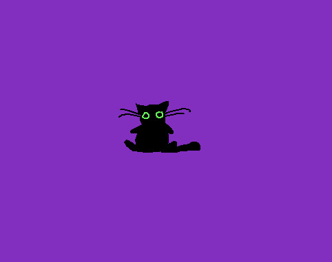
so let’s say we wanna do a shimmery halo around this small black cat
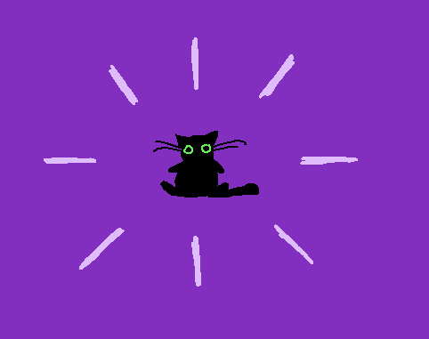
side note mspaint is a lot easier to navigate if you “erase” by just coloring with the background color. it makes the lines look a lot more organic and interesting. also note that i use the pencil tool so things are pretty pixelly (and this makes the images pretty small too, which occasionally necessitates fiddling)
so first i draw the “cardinal directions”, usually with the bigger size of pencil tool
then i fill in between those, making sure i keep the original spokes of the halo still pretty identifiable
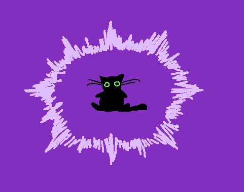
then i go in with a smaller pencil tool size in the background color and “shave off” the blunt edges of the outside so they look sharper. having a bit of debris can look good and interesting
then we do the same for the inside of the halo

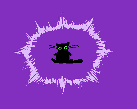
now im gonna fiddle with it a little bit so i can like how it looks a bit better since i wasn’t pleased with the initial pass

you basically just go back and forth between the two colors. i switched back to the larger pencil size occasionally - for the debris around the edges i just did dots of the big pencil size and then chipped away at it with the other color. mostly i just fiddled with the two colors until i was like “that’s good enough!” it gives a certain power to the cat... this one isn’t my favorite of ones ive done but i think it’s good enough and i had fun drawing it and that’s what matters
running this blog has improved my art skills in ways i didn’t really expect because the simplicity makes me feel like i have a lot more freedom.
#i will answer a few more artwork submissions later this evening...#i want to draw responses but they do take time. i am working through them chronologically#so please be patient if you are waiting! thank you :)#crumblings#long post#anonymous
1K notes
·
View notes
Note
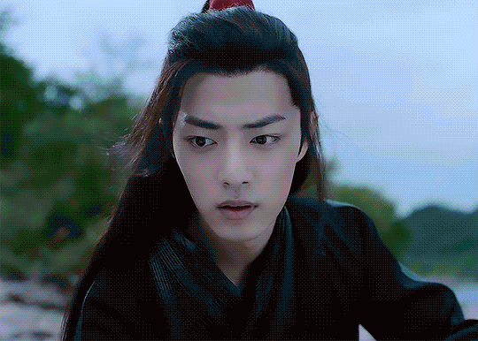
What processes did you use to make your purple/blue wei wuxiain in episode 2 gifset?? The colors are just so gorgeous and vibrant. I'm obsessed.
hello lovely! you are so sweet to say this thank you so much!
i used the same process as i always do for my gifs (im really getting so predictable and boring, maybe that's why i cant be bothered making gifs anymore. huh. now's not the time for that train of thought though) which is a very basic few adjustment layers in the same order every time -

more explanation way down here if ya want it!
i always start with curves ->set white point, especially when editing the untamed, because it does wonders in un-cyan-ing it. sometimes i change the specific lines after white point-ing if i have a specific colour in mind but i didnt this time
then i go levels, and basically increase both the black and white, usually i change the lowest point (idk technical terms) to 20, the midpoint to somewhere between 0.9-1.1 (in this case 0.95) and the high point to 235
then vibrance i always add 70, sometimes change the saturation to +/-10 (in this case -5)
then because i wanted to change the background colours i went hue/saturation and upped the green, cyan, and blue up 50. the second h/s layer with the mask is just +50 saturation for reds for his ribbon! i do that in a lot of my edits (you especially might notice it in lyrics edits) bc i like his ribbon it adds a bit of je ne sais quoi
i almost never use h/s to actually change the colours bc it so easily goes all pixelly at the edges of the colours, so instead i use selective colour for that! and i just messed around with the sliders to make all the blues/greens more pink/purple.
at this point i realised i wasnt gonna get it all the way purple with just selective, however because it's a gif with not a lot of movement i was able to just draw on the parts where i wanted most of the colour, on a new layer, and then set that to color blend at 75% opacity. i also then put a blur on the layer to make it fade in better with the rest of the gif.
then i did more selective colour to make the black go red and the white go cyan!
and then i did my fave ending move which is colour balance! the shadows always go the opposite way to the midtones! it makes the colours so much less flat i tell you it is Magic
here is a before and after!


and here is a weird step by step gif of all my adjustment layers!
thanks for listening! and for being so nice aaaaa
#did u want this? well u got it#seriously it makes me so happy tht you think my gifs are vibrant i love that! all i want to do is make everything COLOURS ALWAYS yknow#lots of love to u anon have a most wonderful day#ask#anonymous
8 notes
·
View notes
Note
Hello! I hope you don't mind me asking but what program do you use? Any brushes you recommend on using?
nowadays i use various programs. for some doodles or even fully colored stuff i will draw them in storyboard pro, because thats what i use for work and its convenient, plus i like the clean vector lines. an example was the amy rose i did recently. however i super dont recommend that. the software was not made for finished pieces lol.
up until a year ago i primarily used photoshop, and i used the pencil tool so that all my lines would have a nice sharp edge, and it would look pixelly at low resolutions. thats a tough thing to work with in terms of printing and doing professional illustrations though, so when i was gifted an ipad and apple pencil i switched to procreate and started using a smoother brush. i just use the uhhhh ... hang on.. studio pen in the ink brush category, with the line-weight variation turned down very low. i prefer to manually carve out any tapering in line-weight.
but i think procreate’s color editing is garbage (and my ipad screen displays colors pretty washed out), so i usually end up taking it to photoshop to edit it.
however i recommend clip studio paint as the alternative to photoshop. i own it and i havent gotten used to it yet, but adobe sucks and clip studio has way more tools that will help you out and can do anything ps can do for sure.
tldr; i use procreate and photoshop, i use simple brushes like the studio pen in procreate without much tapering, and i recommend clip studio paint instead of PS bc its cheaper and better even though im still using PS myself.
19 notes
·
View notes
Note
Lucrecia anon here! TYSM for the icons!! :00 can I ask where you find or how you make transparents? I've always wondered!!
it’s no problem! :D like i said, they were pretty fun to make.
and i coulda sworn we had a post about transparents before, but i can’t find it, so i’ll try my best to explain! :3 under the cut (since i ramble a lot + there’s some pics jhasjg)
when it comes to taz, transparents are pretty hard to find in general, so i took some of the pics from this post! they’re pretty pixelly/rough, though, so i threw the screenshots into waifu2x (weird name but it’s GOOD i SWEAR), which sizes images up and/or reduces noise!!
it’s really helpful, especially when you wanna get a Better Quality Version of a really pixelly image. see? it’s nice n smooth (and 2x bigger!)

anyways, onto the Actual Erasing!
first, of course, you gotta put your character on top of whatever background you want. (UNLESS you wanna just straight up make a transparent! in that case, just feel free to start erasing!!!) for example, here’s a kido that i put on top of a lesbian flag (which, of course, you can’t see atm)

i use firealpaca, so i set the “color” to transparent and i just use the default brush and erase stuff!
though you could totally just use the actual eraser tool in whatever program you use! i just like using the brush tool for some reason.
i just kind of go along the edges of the character/lines and erase it (and the background of the image, of course)

some of the lines look sharp/a bit yellow, so sometimes i like going over those (with the pencil brush in firealpaca) + making them look a bit nicer!

it’s a pretty small difference, but i think it makes it look a bit better! if the lines still look sharp, feel free to add the tiniest bit of gaussian blur! (like .50!) i think the lines are fine in the kido icon i just made, but, just for the example, i blurred it a bit!

also! most people know this, but, just in case! always save your transparents as a transparent png!!!! otherwise, all your hard work’ll be gone!
ONE LAST THING. mekakushi-edits’ tutorial is helpful as well!!! i stole the gaussian blur tip from his tutorial, actually, hehe...
...this kinda turned into a “how to make a pride icon” tutorial, huh? well, i hope it was still helpful when it comes to transparents!! ;w; sorry i rambled on so much, and other mods feel free to add on if you want!
#flower buds!#does tumblr default theme even Show The Cut#i can't remember kjgnjdshgk oh well#anonymous
2 notes
·
View notes
Last Seen Blogs

chickencrosstheroad
Untitled

reehlia
✧ Simple and Clean ✧

ebullientone
The World is Shrinking

xyugs
meEseeks