#limited monochrome colours in some
Text

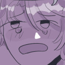
A patchworked Prower :)
#sth#miles tails prower#he looks funky I have been told#idk it’s not something I’d have come up with#we got a trans pallet it on design#drip in another#limited monochrome colours in some#smithy’s design in one#just a big mix#it be fun to do this with like the different prime designs#or with the glitch in frontiers#or all sonics different forms#thank you again to everyone who played#drawing game#request
49 notes
·
View notes
Note
Hi! Newbie writing who loves writing, I just wanted advice for how to write a character who is emotionally numb and distant and how they can overcome it?
Or who to write numbness in general?
Writing Detached Characters: A Guide to Emotional Numbness
Welcome to the latest instalment in my series on ‘how to write different emotions’. Contrary to the series title, today’s blog will be covering how to write a lack of emotion, or rather, emotional numbness. This is an area many writers covering PTSD, depression, or closed-off characters might be interested in. Thank you anon for the request, and I hope this blog helps you with your writing!
Understanding the Motive for Emotional Numbness
Emotional numbness can stem from various sources and they all influence a character's behaviour differently. Understanding the root cause of their numbness is crucial to portraying them authentically.
Trauma-Induced Numbness: Characters closed off due to trauma may appear more disconnected and guarded. Their numbness is a defence mechanism to avoid reliving painful experiences.
Chronic Stress: Prolonged exposure to stress can lead to emotional exhaustion and numbness. These characters might show signs of burnout and a lack of enthusiasm for activities they once enjoyed.
Depression: Characters dealing with depression may exhibit numbness as a symptom. They might struggle with feelings of hopelessness and an inability to experience pleasure.
Each motive ties directly into the character's behaviour, so it’s a good idea to research how numbness varies based on the cause.
How to Showcase Emotional Numbness in Your Writing
When crafting an emotionally numb character, subtlety is key. Here are some ways to show their numbness through various aspects of writing:
Body Language
Closed-off Posture: Crossed arms, avoiding eye contact, slumped shoulders.
Minimal Gestures: Limited use of hand movements, lack of expressive body language.
Tense Muscles: Frequently clenched jaw or fists, indicating suppressed emotions.
Lack of Physical Contact: Avoids hugs, handshakes, or any form of touch.
Facial Expressions
Blank Stare: Eyes that seem to look through people rather than at them.
Neutral Expressions: Rarely smiles or frowns, maintaining a consistently neutral face.
Delayed Reactions: Slow to show any reaction to surprising or emotional events.
Flat Affect: Consistent lack of facial movement or expression regardless of the situation.
Note: remember to not take this too far! This isn’t to say your character doesn’t feel anything at all and will never react to anything but more so that their reactions will be very muted. Yes, they can get happy/surprised, etc. but they won’t have wide grins or loud exclamations of shock.
Appearance
Plain Wardrobe: Clothes that are simple, unassuming, and devoid of vibrant colours; preferences for baggy/shapeless clothing.
Neglect of Personal Grooming: Messy hair, unshaven, or generally unkempt appearance.
Monochrome Outfits: Preference for neutral, muted colours like grey, black, and white.
Practical Over Fashionable: Chooses functionality over style, reflecting a lack of interest in appearance.
Dialogue Cues
Monotone Speech: Flat, emotionless tone without inflection.
Brief Responses: Short, to-the-point answers with minimal elaboration.
Avoidance of Personal Topics: Steers conversations away from personal or emotional subjects.
Lack of Expressive Language: Uses simple, direct language without metaphors or descriptive flourishes.
Adjectives and Verbs
Descriptive Words: Detached, apathetic, vacant, stoic, unfeeling, indifferent, withdrawn, impassive, numb, aloof.
Action Words: Avoids, withdraws, dismisses, isolates, ignores, neglects, shuns, evades, suppresses, restrains.
Emotionally Neutral Verbs: Walks, talks, looks, sits (instead of strides, argues, gazes, lounges) listens, observes, reacts, replies, continues.
Subdued Descriptors: Plain, muted, dull, flat, colourless, bland, lifeless, monotonous, reserved, restrained.
Overcoming Emotional Numbness
Since there are several reasons why someone might be emotionally numb, each cause has different ways to overcome it. Here are a few common approaches:
Therapeutic Intervention: Therapy or counselling can help characters address underlying trauma or mental health issues. Techniques like cognitive-behavioral therapy (CBT) are often effective.
Supportive Relationships: Developing a trusting relationship with a friend, family member, or romantic partner can provide the emotional support needed to open up. This would be a better option for a character who has developed numbness due to past relationships and needs to ‘heal’.
Personal Growth and Self-Discovery: Characters may embark on a journey of self-discovery, engaging in activities or experiences that help them reconnect with their emotions. It would be fun to see a numb character do this with a love interest or close friend. Maybe they’re ‘forced’ to go to an amusement park and the other characters are shocked to see them whoop/yell on one of the rides.
Resources for Understanding and Overcoming Emotional Numbness
Here are some valuable resources to help you better understand and write about emotional numbness:
Books:
The Body Keeps the Score by Bessel van der Kolk
Waking the Tiger by Peter A. Levine
Research Papers:
Emotional Numbness in PTSD
Emotional Numbness Research Papers Directory
More:
Scholarly Resources on Emotional Numbness
Looking For More Writing Tips And Tricks?
Are you an author looking for writing tips and tricks to better your manuscript? Or do you want to learn about how to get a literary agent, get published and properly market your book? Consider checking out the rest of Quillology with Haya Sameer; a blog dedicated to writing and publishing tips for authors! While you’re at it, don’t forget to head over to my TikTok and Instagram profiles @hayatheauthor to learn more about my WIP and writing journey!
#hayatheauthor#haya's book blog#haya blogs#blog masterlist#writing community#writing tools#writer things#writing advice#writer community#writing techniques#writing prompt#writing stuff#creative writing#ya writing advice#writing tips and tricks#writer tools#writers of tumblr#writer blog#writers block#writers on tumblr#writerscommunity#writer stuff#author help#author advice#writing emotions#how to write emotions#emotional writing#writing#author
211 notes
·
View notes
Text
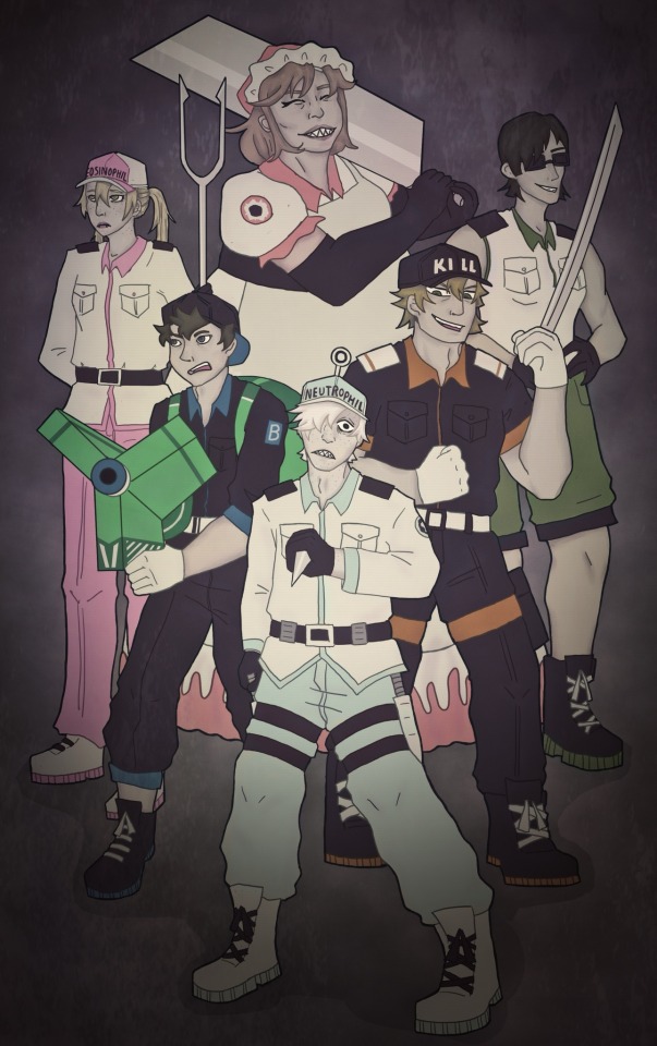
watch out pathogens ‼️
This drawing… has a lot of wrong with it but in my defence digital art is hard
Also fr click for better quality for some reason it’s especially egregious with this one
big ramble about design changes under the cut
Okay so basically my main thing was making them all just look like they are part of the same group since despite what CAW keeps implying design-wise lymphocytes are also WBCs. So NK and Macrophage’s outfits got a bit militarised. I also wanted to give the ‘subgroups’ (ie lymphocytes, granulocytes etc.) some similarities, so neutrophils and eosinophils get the same shirt.
I couldn’t justify having neutrophils being the only ones looking so monochrome but I also didn’t want to stray too far from the og designs so I just settled for desaturating everyone else and giving them grey skin tones to help them match. I also wanted everyone to have some white on them cause yknow WBC.
Basically innate immune system is white with black accents whereas adaptive immune system is black with white accents. Although NK gets black boots to make her match the other lymphocytes. Also I forgot B cell and Macrophage’s epaulettes whoops.
Some cells in the show have their own colour (like eosinophil wearing pink and B cell wearing blue) so I decided to extend that to giving everyone a colour. (Also anything to let the neutrophils wear something that isn’t white it’s hard to draw lol) Killer T got orange since it would give the T and B cells complimentary colours and a neat trio with NK’s green. Neutrophils get that light blue/green colour since it’s close-ish to white and I just thought it looked nice idk. Also I like to think the granulocytes get to rock the pastels.
Macrophage’s pale red was supposed to be a vague allusion to blood since they are the heavy hitters but idk I’m not settled on her design at all and I’m wondering if maybe a purple would’ve been better. That being said I like how the red compliments the neutrophils green/blue since they are the main phagocytes. Idk.
NK has sunglasses cause everyone else has something on their head and it felt weird that she didn’t but I didn’t want to give her a hat. Also eh I think she suits the bouncer vibe.
The granulocytes have freckles and the phagocytes have sharp teeth I don’t make the rules.
1146’s hat now says neutrophil instead of WBC because it’s a real pet peeve of mine since, again, basically all the other immune cells are also white blood cells. Eosinophil also gets her cell type on her hat cause why shouldn’t she. I was too afraid of messing up to put either in Japanese.
I changed the style of trousers for the neutrophil uniform to something which would be more comfortable for high activity admittedly it doesn’t look as good as the og style so idk.
Fun fact: quick google tells me macrophages are around twice the size of the other cells here (give or take a few micrometers depending on which cell) so she is now the tallest. by far.
Everything else is dictated by rule of cool or the limits of my artistic ability.
If anyone actually read all this, I greatly appreciate it. I spent way too long thinking about this lol but talking about character design is fun :D
#cells at work#hataraku saibou#u1146#killer t cell#eosinophil#nk cell#b cell#macrophage#I am incapable of drawing u1146 consistently#undescribed#m’ealaín
31 notes
·
View notes
Text
Anachronism Applications open now til the 18th!
Clarifications from questions asked:
Characters are NOT limited to a certain person. However, we just request that you list a few just in case one character gets saturated with requests and mods suggest you switch to a group piece or switch characters.
Shipping pieces are allowed but must remain PG.
Finished pieces should ideally remain unposted until closer to the zine publication date (February 2024) Posting sneak peeks is fine though!
Guidelines undercut:
General:
This zine is all ages! As a result, please refrain from creating any content that wouldn’t be present in the game. There’s no theme planned, but if you want to find a way to incorporate the title into your piece, props to you!
All communication will be done through Discord due to the nature of this project. Mods will message you within a few days once applications have closed with the link to join.
Please submit the finished piece with the account(s) you want to be credited under and an icon to represent you in the discord during the final check-in (Jan.22) .
We want all characters to be represented! When applying, please submit a few characters you are interested in in the format of first choice, second choice, etc. Mods will contact you in the event that there are too many people requesting the same character. Cut characters are fine as choices as well! Group pieces are exempt from this.
OCs are fine to include in your piece, but please keep the AHIT characters as the main focus of the piece.
Totally optional, but feel free to submit a small blurb about your piece (2-4 sentences)! This will be attached to the piece at the bottom with your icon.
There will be three check-ins, including the submission date. The estimated timeline for them will be a few days during the weeks of Dec. 17th, Jan. 8th, and Jan. 21st. The zine completion date with all pieces submitted, edited, and published is the first week of February. Final dates will be posted in the discord once everyone has applied and we know the general number of people participating. Mods will give ample notice if this publishing deadline moves. Due to this, if you miss two check-ins without notifying mods, you will not be able to participate and will be dropped.
Artists (illustrations/comics):
Pieces should meet the minimum dimensions of 2500px/8.5in by 3300px/11in (letter size paper!) Ideally, send as a .png or .tiff
Pieces must be finished and fully coloured with the exception of comics after the first page. Comics must have the first page coloured but can have subsequent pages be monochrome. This means that unless the piece requires large amounts of white space, the background should not be left blank.
Please keep in mind that pieces that do not fit the dimensions will have to be rescaled and mods cannot ensure image quality will be the same.
Please sign somewhere on the piece! I want the art to be credited correctly. If you don’t, I’ll add a small watermark with the account you want to be credited.
Writers:
Each piece of allotted a space of 5 pages or 2500 words. If you feel as though what you want to write would go over this amount, contact one of the mods and we can discuss it.
All forms of writing are allowed. However, if the piece needs to be formatted a certain way, please send it as a PDF so I can ensure the format is correct. Otherwise, please send as a .doc, .docx, or .rtf
61 notes
·
View notes
Text
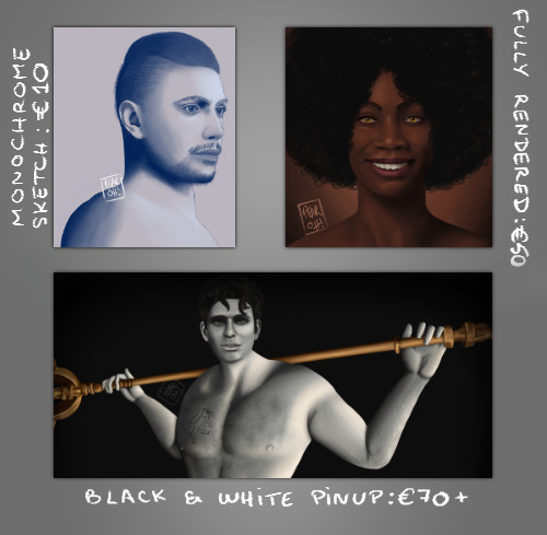
Ko-Fi Commissions
Hi there!
I've made no secret that I've recently become unemployed, and atm pretty much every cent I receive from my unemployment benefits goes into rent, groceries, and bills.
So I've decided to reopen my Ko-Fi and do some art commissions in order to supplement that income. Regular Ko-Fi donations are also welcome, and if you wish to support me in other ways, you can buy prints of my work on Redbubble or on Society6. Reblogs are also highly appreciated.
Monochrome Sketch of your OC: €10
You will get a monochrome (colour of your choosing) sketch of your character from the shoulders up against a single-colour background.
4 slots available.
Colour Portrait of your OC: €50
You will get a fully rendered digital portrait (bust) of your character against a gradient background.
2 slots available.
Black & White Pinup of your OC: starting at €70
You will get a black-and-white digital half-body painting of your character in the nude against a near-black background.
1 slot available.
Terms:
You will need to provide references for your character. These can be screenshots, a faceclaim, fanart, detailed description, moodboard… The more detailed, the better.
The character is nude by default, but I can cover them upon request (this needs to be specified before I start working on the piece, preferably upon ordering).
I can do fantasy, but am limited to humanoid characters. I won't do animals, furry, anthro or mech. Sorry. (If you're unsure whether or not I can do your character, just ask me beforehand)
Note that the final result may differ slightly from the examples shown as I've switched to another software and currently use different brushes.
Commissions may take up to a month or two to complete depending on my schedule and complexity.
This art is for personal use only. You are not allowed to resell it (either on its own, as part of a bundle, on merch, in books, etc).
It doesn't have to be a DA character, I'm just posting on this blog rather than my art blog because it has more followers.
19 notes
·
View notes
Note
I AM VERY INTERESTED I LOVE HEARING THOUGT PROCESSES AND ITS SO CLEAR HOW MUCH PASSION AND CARE WAS PUT INTO YOUR ZINE PIECE
AHH THANK YOU THANK YOU!!!! i have so many thoughts i dont know where to begin LMAO ill start with the outfit designs first!!
to start things off, every design has one specific colour in mind to represent that hermit! pearl - blue, gem - green, impulse - yellow, doc - black/gray, and grian - red! (everyone's nails are painted their colour) every design was deliberately punk-inspired, since during the king arc the soup group was a force of resistance against the monarchy's tyranny :P therefore, the soup group are the main focus of the art and their designs are intentionally made so that they stand out more from the other two, though i made sure they were all unique in one aspect or another :] let's go character by character now! (i'm including all my initial design sketches + some inspo photos too)
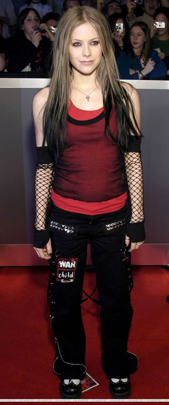
pearl - she's the lead singer of soup group, along with playing the electric guitar! her design features a double tank top + low rise big pant combo, moon motifs of course, and two distinct shades of blue! The darker one is seen throughout her hair and outfit, while the lighter one in her moth antenna is reflected in her guitar. the main inspiration for her look was avril lavigne, which is also what influenced me to add those fun blue hair streaks :D on her shirt i wanted to have a sort of skeletal moth/butterfly design!!

gem - the keytar! i wanted to make sure that gem and pearl's designs looked very distinct from each other, so i went for a slightly different vibe with gem's! her design is based more off of the plaid skirts, big boots, and fishnet looks i found while looking through early 2000s lip service magazine scans (as well as some hayley williams looks!!) :D additionally, shes got vine tattoos over her body to call back to her nature elf vibe this season!


impulse - the drummer of course!! for his look, i wanted to go a little more anarcho-punk (since its a much older punk style and hes the oldest member of soup group LOL), so his vest jacket has got a bunch of diy additions like patches, pins, paperclips, and chains, along with a bunch of spikes!! in my mind, the back of his jacket has probably got a whole lot more patches, spikes, and studs :] beyond that, i made sure to give him lots of piercings (though my options were limited since s9 impy has a beard lol), and stretched earlobes for fun!! ideally his pants would also have a lot more patches and fun bits, but since his legs would be entirely covered by his drums in the final piece i went for something simpler

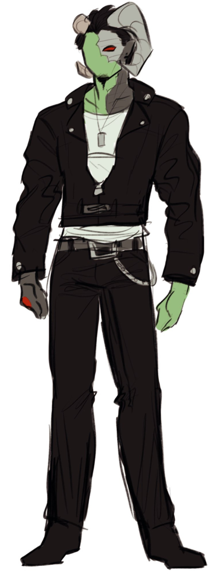
doc - an opener and feature on the song! since he's not part of the soup group, his design is quite a bit simpler than the others in terms of both look and concept :] his look is monochrome save for his robotic red parts and green skin, but still looks interesting thanks to that fun leather jacket :D his look is purposefully more reminiscent of a 50's style greaser, i wanted to go for an older fashion style to make him look more intimidating/mature, as well as set him apart from the look of soup group since the perimeter was an independent nation in the king arc!
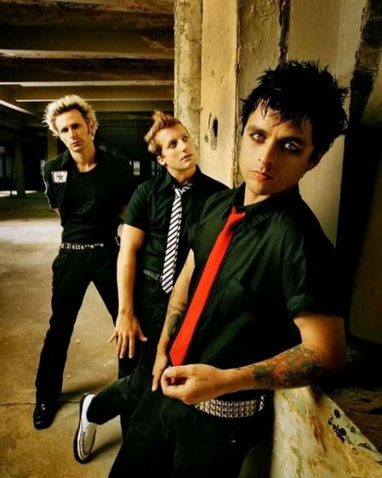
grian - another feature/opener! design wise? hes literally just green day i can't even lie like the pun was perfect and also the black shirt + red tie combo is iconic and also fits his look so effortlessly it had to be done LMAO also, if you look closely in the final piece you can see he's wearing eyeshadow! this of course is again because hes grian day /silly. but to be real, i think this style also fits him really well since the tie + spikes & studs combo gives the look that sorta rebellious vibe that was all over his videos during the king arc :]

AND NOW FOR THE INSTRUMENTS!! this segment is thankfully much shorter
pearl's guitar is of course a nod to my design for her and her moth wings! butterfly guitars are harder to draw than you'd think LOL
gem's keytar has got a vine design all over it to match her tattoos
impulse's drum set has got the soup group punk band logo! the logo design may honestly be my favourite part of the piece, i feel like i really nailed what i was going for :D
and thats it! i'll edit this post or rb with any details i missed if they come to mind! thank u for reading anyone who has made it this far <3
38 notes
·
View notes
Text
hi please bear with me while i go insane about the colours in Hilda (aka I'm looking at the trio's season 3 designs and losing my mind)
SO in most visual media, quite a bit of thought goes into the colours they use and how those colours interact with one another - not in a "the curtains are blue bc [character] is sad" kind of way but in terms of which colours stand out and which are harmonious, and even if the viewer doesn't know any colour theory (like me, lol) and isn't paying attention to it, I think it still helps reinforce what we know about the characters, and influence what we take away from the show. visual design is a language and colour is one of the key aspects of it and if you want to hear about how Hilda uses colour in so many clever ways, to guide the viewer's eye or distinguish important characters, there's a really excellent video on that made by someone who actually does know what they're talking about, but one thing I wanna talk about based on my own limited knowledge is how it tells us about the characters -
FOR EXAMPLE Johanna - so you have Hilda, who is dressed in bright primary colours, especially her signature blue hair which makes her stand out as different even more - and then there's her mother, who has, by contrast, a much more toned down colour palette. she broadly shares the colour red with her daughter, but a less-saturated shade and her standard outfit consists of that, brown trousers and sometimes her yellow coat. Hilda's signature blue is completely absent from her design (and even if the creators didn't want to give Johanna the same hair colour as her daughter, they could have added some small blue accent of clothing if they'd wanted to, but chose not to), leaving her with purely warm, harmonious colours. she has an almost completely different palette to her daughter, but still just enough similarity (particularly with her yellow coat) to reinforce that the two are related in some way. (I'm not saying that Hilda is related to everyone who wears yellow in the show, just that the fact they share a colour helps tie them together on screen)
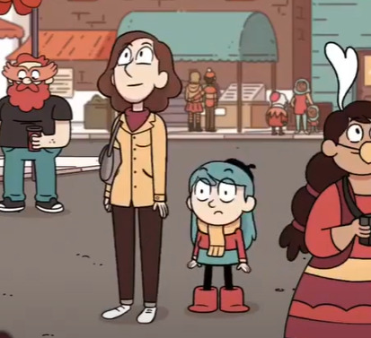
(yep, this is the screencap i'm choosing to illustrate this point it's fantastic)
most importantly (to me, anyway), Johanna's colours are warm. they're safe. to me, the dominance of warm colours and absence of Hilda's blue signify that Johanna is a safe person to Hilda, someone who is supposed to be a respite from her adventures rather than someone who dives into them with her (which, y'know, ties in quite nicely to Hilda's line in Stone Forest about preferring to adventure on her own and then come home to her mum, and how in the show she generally likes to keep her adventures and home life separate... (I could probably write an essay on how Hilda and Johanna's issues in season 2 were kind of a commentary on how Johanna has been coded as the safe stable bg character and how she is actively trying to go beyond that role but I shouldn't tbh)). the point is, they are connected, but Johanna doesn't have the same adventurous streak that Hilda does, so they have some of their warmer colours in common, but not Hilda's unusual, stand-out blue.
(I could also talk about Kaisa here and her copyright claim on the colour purple, but truthfully all I would be doing is paraphrasing the excellent video I linked earlier, so I won't. however I do think its fun to compare her to Johanna, in the sense that here are two adults who Hilda often comes to for guidance, and one is all warm gentle colours that match the home decor and the other all monochrome with two little hints of a colour we rarely see elsewhere in the show, suggesting that this is a character of particular interest.. it kind of hammers in how one is meant to embody the safety and comfort of Hilda's home life and the other is literally there to point hilda at things that might kill her lmao)
that was supposed to be a quick example and it got away from me so uh ANYWAY what I'm getting at here is that in Hilda's friend group, I believe their colour palettes were constructed in a similar way - they work together to tell you about the group
I feel like Hilda as a show is known for making excellent use of a limited colour palette - a lot of the characters have at least one black or brown item of clothing and just one or two stand-out colours, particularly the main trio. you can easily look at Hilda, David and Frida come away with one particular colour associated with them - blue or red for Hilda, orange for David, and...blue again for Frida, which doesn't sound great on paper but works well in the show because Hilda's palette also has a lot of red, so when the two characters are put together it doesn't seem like blue is dominating the colours. I also find Frida's colour palette (basically just her hoodie, lol) super interesting because it used to be different.
now, I haven't spoken to anyone who worked on the show about this, this is purely conjecture, but if you've ever googled the characters you've probably seen an official-looking turnaround page of Frida in a purple hoodie.
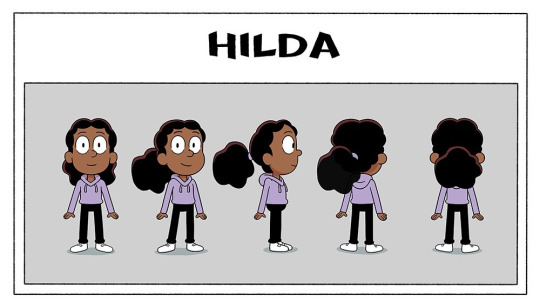
this is real pre-prod show art, and considering the purple hoodie made it all the way through the design pipeline to be included in the turnaround (generally the last stage of character design, as this is what would be given to the riggers to make the character rig)....and was even posted on twitter months before the show aired -
then I think it's safe to say that her hoodie was changed after the fact (2 or 3 episodes into production, by my vague guess looking at the date of this tweet) - not too hard to do, if your show is 2D rig animation, luckily - but if you're me and like reading into things way too hard, this begs the question of why. having purple as Frida's signature colour is perfectly serviceable and sets her apart from Hilda and David nicely. but what her new hoodie colour does is the opposite - it ties them all together
(the other possible explanation is that maybe Kaisa's design was finalised later in production than this turnaround was made (speaking purely from my own experience, secondary characters who appear in later episodes are often finalised later than the main characters, just ahead of the episode they're needed for, and Kaisa wasn't needed until halfway through the first season) and someone noticed that her and Frida sharing the colour purple made them look a little too similar...(I'm sure ppl who like the idea of Frida and Kaisa being witch sisters are yelling through the screen rn that this would've been a good thing and maybe lightly foreshadowed Frida becoming a witch, like Kaisa, but this was all set at the start of season 1, probably a bit too early to start hinting at the witch stuff :') we will come back to this tho)
anyway I love the trio's designs bc if you put Hilda and David next to eachother, they don't visually have much in common, but if you put Frida there then suddenly they're a unit. they got rid of her signature colour and gave her her friends' ones. she quite literally ties the group together so that they look cohesive as a whole
and this is absolutely me digging too deep in things here but her being the one to bring the group's colour palette together also lends itself thematically to their falling out at the end of season 1, and how Frida leaving also caused Hilda and David's friendship to struggle. they are a set and it doesn't work the same if they're not all there. Frida sharing Hilda's signature blue could also lend itself to the idea that Frida shares her love of adventures to a greater extent than David does (though maybe that's closer to 'blue curtains' territory tbh). anyway I love the design of this show so much
SO (if you actually made it this far down I'm so impressed) the thing that sparked all of this was...if this is what the trio's designs are doing in seasons 1-2.....what are the season 3 designs doing
no but this is super interesting to me, Hilda essentially just traded her skirt for leggings and left her colour palette intact, but David and Frida changed theirs entirely and I'm fascinated. both their signature colours are GONE. is it to imply that they've grown and changed in the duration of the time skip? is it David's turn on the 'having a colour in common with Hilda'?? but particularly I want to draw attention to Frida bc now that her hoodie is gone her original purple is BACK and (if there is any weight to my theory that she was changed bc she looked too similar to Kaisa) what's even more interesting is that they doubled down on the witch vibes. she literally has Kaisa's exact colour palette minus the dark purple cape lining. Kaisa's design reflected her personality as this unknowable person with a hint of mystery to her - all monochrome with that pop of an unusual colour - are we to expect the same of Frida? is this a sign that she's leaning further into witchcraft than before? does her contrast to Hilda and David signify that she's come more into her own and has a stronger sense of her own identity (something something closure for her issues in season 1)? or do we take things way too literally and assume that season 3 has her breaking off on her own from the group? or maybe it means absolutely nothing and someone on the design team just thought grey/purple was a neat combo. I know I've talked in this post as if I know things but here I truly don't and I'm obsessed w the possibilities. what does it mean what does it all mean
anyway that's all for this delusional fever dream post, hope you enjoyed and if you made it this far down you deserve some kind of prize
#yeah this is a long post#why did i do this. dear god its midnight i DIDNT MEAN TO MAKE THIS#im so normal about this show as you can see#colour design is my passion#hilda the series#post tag#im sorry if any of this is poorly explained and sounds like nonsense. it is but also im sleepy so blame it on that#alsoo like i said a million years ago im really not a colour expert please dont cite me on anything :'))#i kinda just wrote this to get the thoughts Out of my brain
40 notes
·
View notes
Note
hi sorry if this has been asked before, but i've been looking on your faq page for aska regarding your gifs? especially how yo make them - I'd like to create some too but it's so complicated😅
i use photoshop (not paid for lmao i downloaded a version off here years ago from like. 2016) + kmplayer + if it's game gifs, i use nvidia shadowplay to record
i'll put this under a cut because of images/length
i open my footage in kmplayer, and use the frame extraction function over the timespan of the clip i want to gif. these are the settings for that:
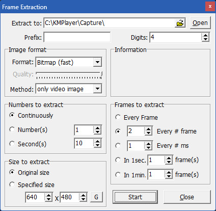
normally for games, i record in 60fps and extract every 2nd frame, but sometimes i extract every frame and scroll through to delete duplicates made from stuttering etc. for everything else like movies/tv, i extract every frame. normally, i try to go for around 100 frames, but you can have more or less depending on your final gif size, and also you can always trim your gif down when you're in photoshop, but more frames = longer import time
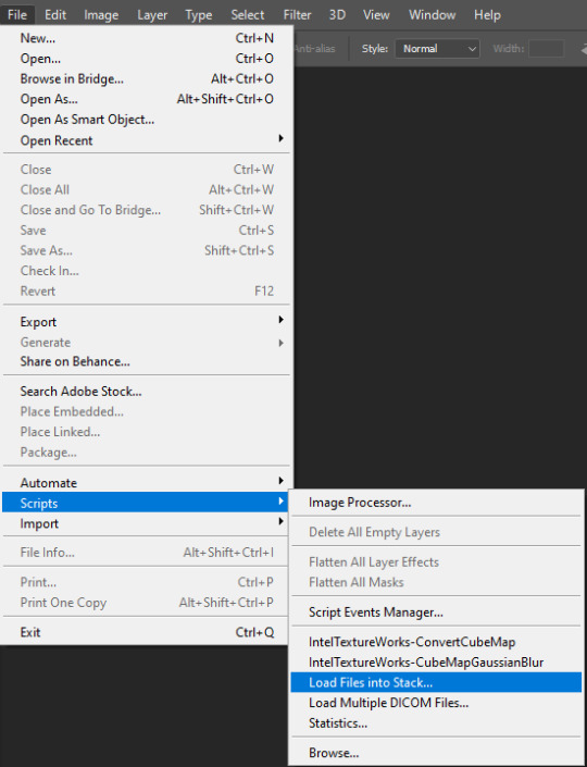
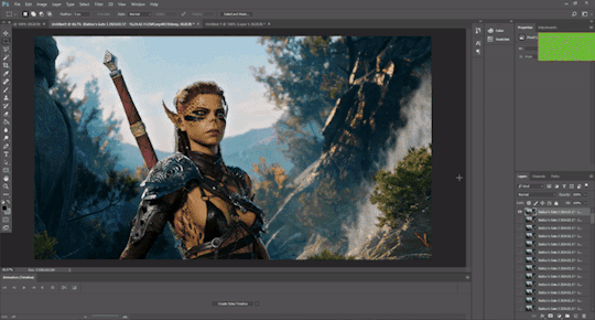
then in photoshop i go to file > scripts > load files into stack and select all the frames i want to go into the gif i'm making
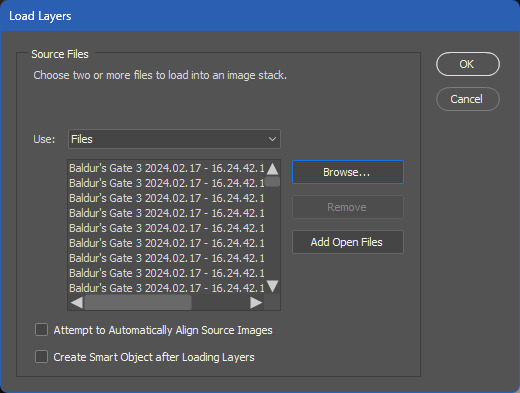
for the method i use, you need a version of photoshop with timeline animation, and make sure the timeline i displayed (window > animation)
now the next part has a lot of little steps, but they're fairly easy to get the hang of once you've done it enough. it's basically muscle memory for me now but i still do sometimes do things in the wrong order lmfao
anyway. the steps are as follows:
click 'create video timeline'
click the 3 little boxes in the bottom left
in the right menu, choose 'make frames from layers'
when thats loaded, open the menu again and choose 'reverse frames'
click the last frame and change from 5 seconds to no delay
make sure you choose 'forever' instead of 'once' in the bottom left
select all frames (you can select the last one, then scroll back to the first and shift click to select them all, or just click 'select all' in the menu, i'm just used to doing it the first way for some reason lmao)
in the right menu, choose 'convert to timeline'
then select all the layers (can use shift click again)
and finally go to filter > convert for smart filters
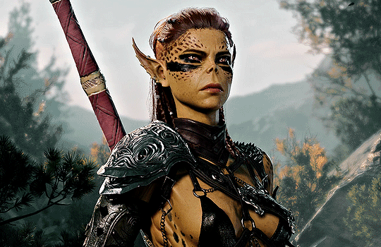
here's a very small shitty gif of the process for a visual aid (a gif of a gifmaking guide... wow)
now you have a gif, basically! but you still need to resize and sharpen and edit, etc. i've posted about some of the things i do before but not really in detail because i mess around every time and don't always do the same things. and you don't have to do much! just do whatever looks good to you :')
tumblr's gif dimensions are 540px width for wide gifs, 268px width for two small gifs, and three small gifs are 177px for the two outer gifs, 176px for the middle one (don't ask me why they did that)
once you're done with that, you can export the gif by going to file > export > save for web (legacy). these are usually my settings:
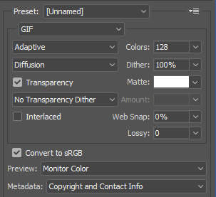
but i might change the colors to 264 if it's a smaller gif, or even to 64 if there are less colours and i can get away with it. for example in these gifs, i only used 64 colours since they were pretty brown/monochrome anyway, but something a lot more colourful would look terrible with 64 colours
the gif needs to be max 9.99MB, but if it goes over, you can always adjust it in the next step. once it's exported, i open it again
select all the frames and click the little arrow on one of the frames, then change the timing. i almost always use 0.05, but you can experiment with what you like the look of
then if the gif's over 9.99mb i just delete frames from the beginning and/or end until it's under the limit. then export it the same way as before (overwrite the old one or save it as a new file if you like) and you're done!
#ask#gif tutorial#kinda. i suck at explanations so maybe this isnt the best LOL#if you need me to clarify anything pls lmk! i always wanna help people learn new stuff if i can
16 notes
·
View notes
Text
Albert Wesker as a caregiver
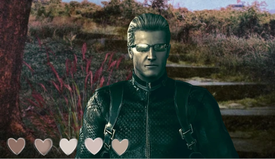
♡ . . . . ♡ . . . . ♡
he thinks youre the only good thing that ever happened to him and will protect and cherish you a way that is unmatched
would really like you to live with him but if you cant or dont yet want to he is the most patient man alive
will answer your texts usually the moment you send them
and will listen to your voicemails and watch the pictures and videos you send him like a live feed/ podcast, no matter when or where
he has kids activity books in his car for you and you can watch movies there or listen and sing along so songs together while travelling
he definitely has a chaffeur but if youd like for only the two of you to be there, he can surely handle the driving
will buy you any toys you had but growing up lost somewhere or gave away if you would like
reminds you that while his favors of this nature are basically without limit you shouldnt compete with other kids on the size or worth of your toys because what really matters and will bring closure is how much you love them and take care of them
the comfiest, finest clothes for his baby only > he will love if you dress all colourful or if you choose monochrome clothes as well, as in one it just shows how you complete him and have all that purity he admires and will protect no matter what or you dress like him and he always appreciates a less-evil, mini him who is full of curiousity and wants to know everything about the world
would love to watch science shows made for kids and try out the experiments
if you are up to it he can show you one with similar mechanisms in bigger (only if you feel brave enough and you can hold his hand, as these ones can be scary)
also animal documentaries (that he totally checks beforehand to be totally safe for you), and later you can recreate the scenes either playing with plushies or with play-pretend as the animals yourselves
any cartoon or series you like he will watch
will have you cuddled up and probably you fall asleep on him very often. then he gently carries you to your bed
im sure he has t-shirts and hoodies from all the places he worked for. you can wear them of course as he really has no desire parading in something meant to show loyalty to the names on them. you can ask all about the different jobs he had and he will gladly tell you some funny stories from there
he definitely has a pool and a separate jacuzzi you can play in
probably made a bedroom and a playroom just for you in his home
downloaded games on his phone just for you, but you have your own as well
will read you any bedtime stories you want. the book was never published in english? no problem he will have it translated and printed so it will resemble to the one you had in days
will learn your native language if it isnt english and try his best to pronounce any terms of endearment you like to be called
goes easy on house rules occasionally, which is really a happy moment for you, and you can sleep on the couch and watch tv a little longer into the night
wont have rules on what you eat as he knows well relationship with food is different for everyone, but will offer you to make it into cute shapes and serve it to you on a kids plate or tray with patterns of your favourite cartoon on them
you can be as energetic around him as possible, him being infected with ouroboros protects him from everything
you are of course always safe from everything he works with, his lab at home too is secured, you cant accidentally wander in there
he understands if you dont like the outdoors or have special triggers and is very attentive of those
he decorates the fridge with your drawings and colored pages but he prefers them to be framed and put elsewhere as the kitchen can be a messy place
you can help him cook if you'd like. lets you eat a little of the raw cookie dough because he works with only the safest and best ingredients
which means he can get you anything you may miss in the country he is currently living in
helps you study if its what you do in little space
will help with little activities as well. carry boxes or toys for you that you find heavy or too far to move yourself, especially if youre very focused
will never question your choice of colours on a drawing or the way things you crafted are. if youd like to, you can tell him all about the idea behind them and he will listen intently and will tell you if its something he saw in fine art as well - he is always amazed when his little imitates something like that
will play with you if the game you like has co-op or multiplayer mode if you invite him
cheers on you and lets you progress in your own pace. (he probably played it before, if not read the guide so he can help immediately if you are lost and of course not to make the game accidentally progress)
#resident evil agere#resident evil x reader#sfw agere#age regression#albert wesker#cg albert wesker#//im looking at you ai sheva who walked into cutscenes more than one time#//and wouldnt use any weapon i bought her#tw food#tw food mention#tw horror#tw horror game#cg resident evil#🦨 talks
111 notes
·
View notes
Text
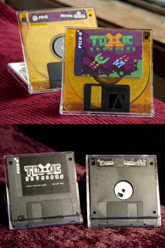
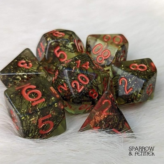
Toxic Invaders Floppies 💾✨
It's now been two years since @sarahbduck and I completed our first game, Toxic Invaders. It's a co-op bullet hell made with the Pico-8!
To celebrate our first big project together, I made these physical copies of the game shortly after the release. The coloured ones are a very limited set while the monochrome have had over 60 made.
Each floppy has multiple builds of the game, the soundtrack, and a tiny HTML page. It was a challenge to fit it all on a 1.44MB disk, but Sarah did some cool compression on nearly all of the files.
12 notes
·
View notes
Text

20% off bust portraits!! details below.
I will be open for ONLY bust portraits from Dec. 01-Dec. 31 :)
(You can apply even if you need time to save up. It can take 2-3 months to finish all the works in my waitlist, which is what you'd be applying for. I will contact you when I'm ready to work on yours, and if at that time you need to put it on hold, I can do that!!)
Included in the price:
$72CAD base charge ($90CAD with 20% off)
Optional (free): "painted texture" or "flat texture" (elect for painted texture if you want it, the default is flat.) [Below: left is "painted" and right is "flat"]


Optional (free): coloured or intense lighting effects, limited colour palette, photo effects (motion blur or bokeh)


Add-ons (cost extra; choose as many as you want):
Add a character - $27CAD
Faster production - $45CAD
Detailed (or complex) background - $45CAD
"Overlay" photo effects - $45CAD [see example below]

Discounts (15% off; choose one):
Greyscale [example below; left]
Monochrome (you choose 1 colour, I may add some small additional hues but they are minimal.) [example below; right]


Note: Commissions bought from DEC. 1ST - DEC. 31ST will probably NOT be fulfilled in time for the holidays.
Apply through my website (link to form under "art commissions"): wabart.carrd.co
#img desc in alt text#i hope i did it right :'')#commissions#open commissions#my commission#commission information#bug words#my art#commission me#commission sale#bust portrait#painted portrait#original character art#oc art#long post
113 notes
·
View notes
Text
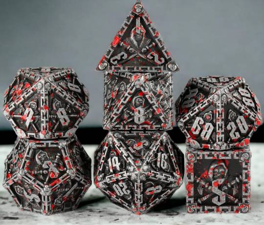
Kid Pirates hcs #4 - Part 2
🌹ꦽꦼ̷ More Kid Pirates hcs 1 | 2 | 3 | 4.1 - 4.2 | 5 | 6 | 7
🌹ꦽꦼ̷ Kid Pirates OC bios — Light | Blaze | Calista | Kira | Eun | Grunge
🌹ꦽꦼ̷ Manda — @silvernyxchariot ; Solace — @ramdeviltart ; Osiris — @/idonthaveacluewhatsgoingonhere
🌹ꦽꦼ̷ Dnd edition ✨️ The shop pages of the dice are linked in the character names
🌹ꦽꦼ̷ Part 1

Hcs under the cut for length ✨️
🌹ꦽꦼ̷ Eun
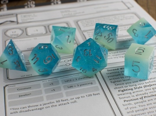
A Chaotic Evil Water Genasi Cleric is their choice of character. They wanted to somehow have their PC be related to water without it being a Fish-kin like themselves. So, Wire had suggested a Genasi instead. They wanted their set to go with the character, so Fishsticks has picked blue as the main colour with silver numbers. To make the dice a bit extra, they also added glow in the dark dye, making it easier for when the lights get a bit dim when they're playing until late at night.
🌹ꦽꦼ̷ Osiris
Osiris would play with this dice set. It simply has everything she needs, blood and skulls. She also likes the colours, and it reminds her of her pet snake. She would definitely play a Dragonborn Barbarian, who is Lawful Evil, because she likes the strength and aggression behind that combination.
🌹ꦽꦼ̷ Grunge
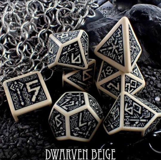
His choice is a Yuan-Ti Bard as one of the limited number of support PCs in their campaigns. He heard that there's the possibility of a snake-folk race, as well as a performance oriented class, and he was sold. His dice are of a rather monochrome theme just like the rest of his belongings, their colours being inspired by dark snakes' scales reflecting the light. His character is most likely Chaotic Neutral, too.
🌹ꦽꦼ̷ Mohawk
A Chaotic Evil Kobold Bard is Mo's choice of PC. He didn't know what else to go for, so he just picked out whatever sounded fun. However, he left picking out his dice entirely up to fate - aka Kid, Mosh Eun, who were tasked with crafting all of the dice. So, Mohawk ended up with a golden and blue metal set. But also, the sound they make when he's rolling, or is just playing around with them scratches the itch in his brain; and he likes that a lot.
🌹ꦽꦼ̷ Oscar
Oscar decided to make a Lawful Neutral Hill Dwarf Druid, giving him his own smarts and other strong suits. Out of everyone's characters, his is the either A) the Most Reliable One, or B) the Actually Most Chaotic One. But it has the tendency to A because of him usually having to be one of the emotionally smartest and calmest people in the crew. And to match his character's Dwarven heritage, he picked a dice set decorated with Dwarven / Norse runes.
🌹ꦽꦼ̷ Noe
Chaotic Neutral Forest Gnome Warlock is exactly what it sounds like: "I am magic mushrooms", and "Fuck around and find out". He asked for a forest inspired set. Eun rejected the "mushrooms inside" request because they thought he'd try to eat the dice if they put mushrooms inside. So instead, his set was made with actual bits of moss, sticks, grass and dried petals molded into the resin.
[a/n: the actual ones above only have copper foil and wire inside. Please imagine them to be described as above! :'3]
🌹ꦽꦼ̷ Mosh
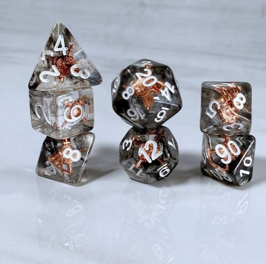
They play a Chaotic Neutral Bugbear Fighter. Mosh just thought they're neat and suit him. Unlike the others, they asked for a crystal clear, undyed resin mold with round edges and some copper elements that align with his PC's class as a Fighter. It had taken them a lot of thinking about what his dice should look like, initially wanting a rather flashy set, but ending up taking Eun's suggestion of the one that can be seen above.

#local starry catboi#one piece#one piece oc#one piece original character#one piece headcanons#one piece hcs#one piece kid pirates headcanons#one piece kid pirates#kid pirates oc#kid pirates hcs#kid pirates headcanons#kid pirates#dnd#dnd dice#dnd hcs
3 notes
·
View notes
Text
@informedimagining threw the Calvinball my way (that is a ref to the Calvin & Hobbes’ game, right?), so here’s a piece from the next chapter of The Lighthouse Keeper (which is getting much longer than I expected it to…)
. . . . .
Shaking his head, he turned back to Sabine, not a modicum of mourning wasted on the abandonment of his previous endeavour.
“You’re drawing,” he noted, some war sparking in his mind between a voice urging him to engage and another yelling at him to abort.
She smiled: it flicked on like she had laughed through her nose and, suddenly, the part of him that had wanted to leave fell silent. “That I am.”
“Can I…?” Weakly, he gestured to the sketchbook.
“Sure.”
She turned it around—not a full 180 degrees, pulling him to cant his head to the side to try put the images the right way round. It didn’t quite work and he had to take a seat.
Sketches littered the pages, all of them produced in monochrome: the black and grey of graphite formed around the white of the paper. It seemed uncharacteristic given that everything she painted overflowed with colours, yet her style, her essence still breathed within these limits.
Some of them were portraits: quick, loose, sharp-angled yet dynamic and flowing, emotions captured in mere strokes. Din couldn’t name any of the people depicted, he wasn’t even sure they were anyone Sabine knew, but they looked like they had lives before and beyond the paper they existed on.
Decals trailed the empty spaces between the people. Geometric flames grew into birds taking flight, feathers and spirals following them across the page.
Methodically, he scanned the sketches from left to right, top to bottom, giving each piece equal attention. He realized at some point he should say something to compliment her work—it seemed like the thing to do but the pressure to coin a coherent phrase derailed his focus considerably.
Before he could come up with anything, one of the sketches near the end captured his eye.
. . . . .
Throwing the ball (without obligation ;) to @seleneisrising @sassygirl579 @desertbeskar @visitbespin and anyone else in range (wanna share a piece of your WiP? Go ahead)
#tag game#WiP#work in progress#my writing#fanfiction#din djarin#sabine wren#the mandalorian#star wars rebels#swr#lift a sail#djarwren
9 notes
·
View notes
Note
What made you decide to create your own color palette for trolls? Genuine question asked with zero judgment, I’m just curious about how you started experimenting with that and what inspired you!!
Honestly, it started off because I'm actually a big fan of mostly monochrome designs - usually just black-grey-white and then an eyecatcher colour.
But fantrolls always had the orange horns/sclera, and it always just... slightly bugged me a bit? I'm not the most experienced with advanced colour theory so whenever I tried to make a more cool-toned image, the warm oranges would always throw it off, even when I tried to desaturate or add blues or purples to them. It'd look muddy.
Back in 2015, I drew two images of Cereba and Aelynn and really only wanted to use monochrome + blood colour, so I ended up with this palette.

I used this a few more times over the years in other drawings as well and honestly, I still like it but I think making the sclera blood-coloured looked. Hm. It just wasn't compatible with some of the stuff I wanted to do and could look bad because of the iris being blood-colour too.
There was a brief time where I had it so the horns were black and the hair was black too, but they just blended in too much, and that's when I experimented with changing the hair. For a little while, I just added a tint of blood colour and then I was like NAH GO HARD
And also! I just got sick of always drawing black hair! I think black hair is nice and all, but it's limiting when it's seen as the rule especially when you have so many characters! I really like bright colours! I like the contrast between the clothes and the hair! I like the ability to have colour or black and have that seen as something not unusual! Having that limited to the clothes only wasn't enough for me!
Most importantly, I just think it looks nice. :D
#i realise i didn't need to type this much but here's my full brain stuff anyway!#ooc#yeah i don't know if you wanted all this but anyway thank you for asking#i've really come to love this palette and it makes me happy to see#sometimes a friend of mine uses it too and it makes me //slide on the floor like i just scored a goal in football#long post
3 notes
·
View notes
Text
[Review] Wario Land 2 (GBC)

Oh yeah, Wario time.
After the boom of Wario spinoffs, things slowed down for him and Nintendo R&D1 in term of raw releases. When Wario Land 2 arrived a few years later, it represented a new direction for Wario Land. Six months to a year after that—depending on region—the series stepped into full colour for the first time with a rerelease for the GBC. This would be the definitive version if not for the lovely Super Game Boy borders that the monochrome release came with.
This is a sequel full of callbacks, to Super Mario Land 2 with Wario living in his ill-gotten castle, and to Wario Land 1 with the return of Captain Syrup and her pirate gang out to steal Wario's treasure. But in gameplay terms it's a clever reinvention of Wario's platforming mechanics. The levels are even more about exploration and nabbing filthy lucre, while Wario has become an undefeatable powerhouse: no more powerups, lives, or timers... and it's about time too.

Virtual Boy Wario Land dabbled in exploratory stages and destructible terrain, but WL2 takes that further to the point where you can consider it a puzzle platformer. A big new mechanic is Wario being affected by enemy attacks and taking on temporary forms or conditions, like being on fire, becoming a zombie, being flattened. These are a double edged sword: they can be carefully succumbed to as fun methods of interaction and traversal for reaching new areas and treasures, or they can set you back or force you to reset a room.
Since Wario can't die, the only penalties the game can enforce on you are a small loss of coins (important for playing the repetitive between-stages minigame and treasure minigame) or a wasting of the player's time. Backtracking through the branching levels is bad enough, but this game makes an art form of tedious setbacks. Now lacking the patience of a child, I was thankful that emulator features let me minimise interruptions of this nature.
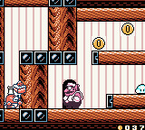
This is the dark side to the new gameplay paradigm, but the bright side is the novelty of this fresh take on the brash comedic anti-hero, the level of environmental interactions and puzzle-solving that called to mind Yoshi's Island, and the integration of the story. Wario's quest to regain his pilfered loot takes him to various locations—a dank forest, cities and factories, a haunted house, undersea ruins—all contextualised with cutscenes far better than VBWL's slapdash whimsical mishmash, and letting new concepts breathe over a number of levels.
The branching narrative, with alternate exits to new sets of levels, seemed intimidating at first but an initial playthrough takes you on a straightforward path, and after the first credits (you'll see them at least five times if you go for 100%) you get access to a user-friendly level select that shows you where new branches can be found, so there's minimal need to replay stuff you've done already. This menu screen also shows you which treasures you've found—one per stage—although I wish there was a pause screen within a level that did the same, as I sometimes forgot if I'd nabbed it already. The sidestories are fun alternate takes on the adventure that also change the final credits sequence appropriately, which was a nice touch.
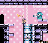
Wario Land 2 is the closest thing to what I was already familiar with: its direct sequel, Wario Land 3, so of course I loved it. But there's more to it... it's where the series really comes into its own; focusing on interactability, streamlining Wario's moveset with a permanent shoulder barge and butt-stomp while adding a bunch of gimmick transformations that can both help and harm, depending on the situation. It really works. The GBC refresh also makes the environments really pop, although it shows its nature as a "retrofit" with the palette limitations imposed on sprites, as Wario's forms and enemies only have a couple of shades each. Some minor growing pains and bland minigames drag it down a bit, but this is easily the best Wario game yet, and I already know the next one along takes it to another level!
3 notes
·
View notes
Photo


MP: Batsford: Gradient map test on night version
I began assigning colours to the values by using a limited palette to create a monochrome effect. By keeping the colouring cohesive I expected it to create a sort of calming atmosphere, but ran into some issues. I originally chose a soft lilac-blue palette inspired by the last line of the poem “the silence of the sands when tides are low”. However, the colours fell flat and made it hard to distinguish details. I experimented with a more vibrant teal, but it resulted in an eerie tonality that didnt suit the theme.
I revisted a blue colour palette, adjusting the contrast between the values to pull some deeper tones from the background. To do this I created a wider gradient in the sky, providing a clear outline for the horizon. The richness of the blue tied the elements of the foreground together nicely without becoming too messy. However, I was still concerned that the monochrome palette would make it hard for the audience to differentiate the time of day shown in the panels.
3 notes
·
View notes
Last Seen Blogs

amazononline1
Amazon online

onlyonedead
cemre

jiyong-on
No. 8
daydream-draws
oh potatoes and molasses

focatisepa
Untitled