#lznkgif
Text
GIF Coloring Guide: An Introduction to Adjustment Layers in Photoshop
This is going to be a super basic guide meant to show you the power of Adjustment Layers in Photoshop. It’s not going to be a step-by-step tutorial, though, in which I dictate what exactly you should do because it will always be different for every gif.
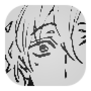
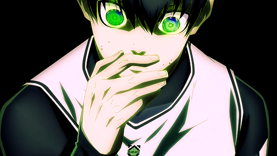
I’ll be turning this Isagi gif:

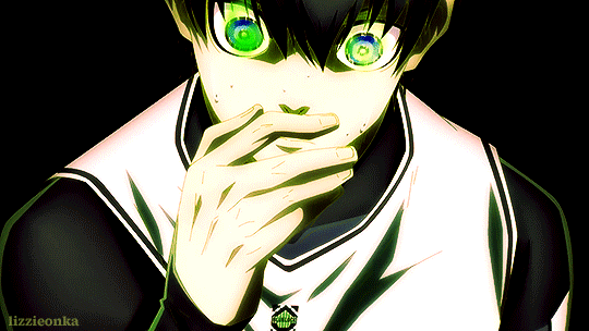
into this:
What you need:
Adobe Photoshop (any version should be fine. I use CC v23)
Basic gif-making knowledge using Photoshop
Basic Photoshop knowledge in general
What this guide is good for: A simple gif where the brightness and colors of each frame are about the same.
I’m writing this guide for those who already know how to make a gif in Photoshop. You’ve imported your frames, deleted the ones you don’t need, and you know how to save it as a gif. I will only be teaching you how to color, so I’m not gonna walk you all through the Photoshop basics. You can google that yourself.
Now, first things first, I want you to keep in mind that the GIF file format can hold only up to 256 colors. Thus, when coloring gifs, I try to “reduce” the colors by making the blacks blacker, the whites whiter, removing color noise, and de-emphasizing colors that are not essential to the overall scene. Otherwise, the final image will just look noisy or muddy because of the gif trying to compensate for all those extra colors—which is not bad in itself, by the way, if that’s the look you’re aiming for. I just prefer my GIFs to look HD.
And from what I’ve noticed, noisy and muddy gifs will also have a larger file size. The uncolored gif above, for example, is at 6.69mb. Meanwhile, the colored gif is at 4.96mb. Both were exported using the same settings. Although we have a 10mb file size limit for gifs here on Tumblr, I still like to keep the file size down as much as I can.
Now, with that out of the way, let’s get to the actual guide—
In the Isagi gif I’m using as an example, I made him look like he’s glowing in the dark and also partly blended him into the background. Here’s a screenshot of all the adjustment layers I used to achieve this effect:

All these layers should be on the very top of your gif layers. I grouped them together for convenience in toggling all changes on and off, allowing me to quickly check the “before and after” of the gif.
Before I explain what those layers do, I just want you to know that the order of those layers matter. I purposely put one Selective Color at the bottom, and that second Selective Color is no mistake. More on this later.
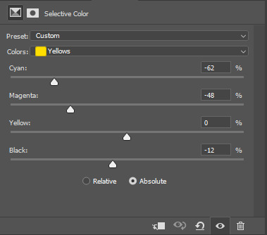
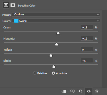
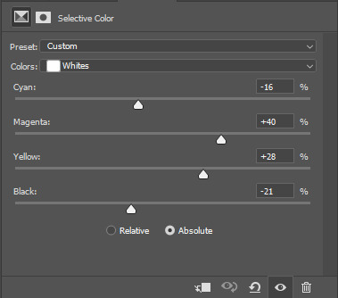
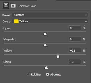
Selective Color 1
Selective Color is my favorite, and it’s also the most important. It lets me fine-tune individual colors without affecting the other colors much. It’s also usually the first thing I add as it lets me pick which colors to emphasize and which to de-emphasize.
Now, let’s look at our unedited Isagi:
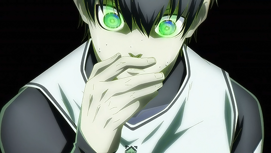
(Above is a still image and not a gif. From hereon, I’ll be using still images coz the gif looks about the same in each frame anyway)
The colors on Isagi look too gray and cold to me. I want to make the black of his suit darker, remove a bit of that green tinge on his skin, make the blue of his eyes bluer, and just give him an overall warmer look.
Here are my settings for Selective Color 1:


Unedited vs Selective Color 1:

Although I said I wanted to remove the green tinge on his skin, I did not touch the “Greens” at all in my Selective Color 1 layer. That’s because doing so would also reduce the greens in Isagi’s eyes, and I didn’t want that. Instead, I tried to counter the green on his skin by adding some Magenta and Yellow on the “Whites” to make it appear warmer and more reddish instead.
Of course, I didn’t come up with the final settings above in one go. As I added more adjustment layers on top, I would go back to Selective Color 1 and play around with the different sliders until I was satisfied. Gif coloring doesn’t have to be a one-way process. With adjustment layers, you aren’t affecting the pixels of the image itself, so you can always go back and tweak your settings.
Dragging the slider to the right for positive values would return darker colors, while dragging it to the left for negative values would return lighter colors.
I want my Isagi gif to be vivid and for Isagi to look like he’s glowing in the dark, so I dragged the sliders in “Blacks” up to the positives. Then in “Whites,” I dragged the black slider down to the negatives.
However, if you want a more muted look like this Isagi gif 2:

...You can slide the black slider under “Blacks” to the negative values instead.
Curves
Curves, along with Levels, is usually the first thing a gif-maker learns to use. It’s good for quickly getting some nice brightness and contrast on your image. I’ve seen some gif-makers refer to Curves as the better version of Levels, but I disagree. Curves and Levels, though both affect contrast in an image, go about it differently and achieve very different effects.
In my Isagi gif, I used both Curves and Levels. But in some of my other gifs, I used only one of them.
Curves is what I usually add in the beginning stages of coloring (i.e. the layer is placed lower) when doing complex coloring. Although I never make Curves the bottom-most adjustment layer, sometimes I add it first just to give the image a burst of brightness or to quickly darken an image that may be too bright. I would then put a Selective Color underneath to make necessary adjustments.
Our Isagi gif, on top of being still muddy, is now also too reddish. I had only added those reds to get some warm undertones in our gif, and now that we have that, it’s time to reduce those reds. We’re not gonna do this via adjusting Selective Color 1 because doing so would only bring back the greens we wanted out. Instead, we’re gonna subtly bring in some whites to the gif by making it brighter with Curves. And while doing so, we can also enhance the contrast on the image.
Here are my settings:
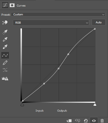
The more S-shaped that curve is, the more contrast and saturation you’ll get. I just want a subtle change, so the curve is nearly flat.
Unedited vs Selective Color 1 vs Selective Color 1 + Curves

See the difference? Now there are darker blacks and less green on Isagi’s skin. The colors are also starting to pop, and the gif looks less muddy.
If you want colors to look muted instead, like in Isagi gif 2, you can do a reverse S curve instead. Well, actually, feel free to play around with Curves. It doesn’t have to be S or reverse S. You can add as many points there as you like and form whatever curve you want.
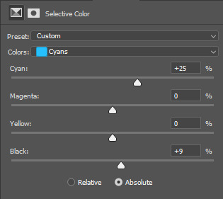
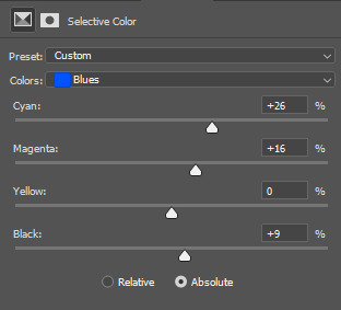
Selective Color 2
Remember when I said that the order of adjustment layers is not random? I’m now going to explain why.
When we added Selective Color 1, the image that layer is editing would be our unedited Isagi with all those greens and grays.
However, when we added Curves on top of Selective Color 1, the image we were editing was no longer the original Isagi but the Isagi + Selective Color 1.
Layers build on top of each other. It’s like when you’re painting. If you add red paint and then put blue above it, you get violet. If you want to put another color on top, you’ll have to work with the violet and not the red that’s no longer there.
That said, our Selective Color 2 here is not going to be redundant. Selective Color 1 was coloring the unedited Isagi, but Selective Color 2 will be coloring the version that has Selective Color 1 + Curves.
Now, I intend to use Selective Color 2 to enhance Isagi’s green aura as well as the blue of his eyes. We weren’t able to increase the “Greens” in Selective Color 1 because doing so would also make Isagi’s skin green. But now that Isagi’s skin is more red than green, we can play with the “Greens” of his aura safely.
Here are my settings:

Unedited vs SC 1 + Curves + SC 2:

Levels
Now, time to make our gif bright and vivid. You can use another Curves layer here or a basic Brightness & Contrast layer, but since the colors of our Isagi gif are predominantly black and white, I’m gonna go with Levels since it works really well with black and white images.
Here are my settings:
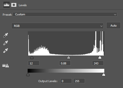
See those 3 sliders under that graph? From left to right, those are sliders for Shadows, Midtones, and Highlights. If you slide them to the right, said shadows, midtones, and highlights would turn darker. Slide them to the left, and they become lighter.
I often get carried away the first time I add Levels, resulting in extra vivid/saturated images which I later have to adjust. So yeah, try not to overdo it. It’s like vanilla extract. A little goes a long way ;)
Unedited vs SC 1 + Curves + SC 2 + Levels:
Beautiful ✨
The image is no longer muddy, but we’re not done yet!
Color Balance
I haven’t used Color Balance much in my gifs because Selective Color often does bulk of the job for me. However, the Isagi we have right now hasn’t quite yet achieved that glow in the dark effect I wanted. I also want to give Isagi that techy Matrix vibe by really emphasizing his green aura, so for that, we’re gonna add Color Balance for the finishing touches.
I think the midtones of the image look okay, so I’ll just tweak with the shadows and highlights. Here are my settings:

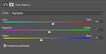
....And with that, we are done!
Before and after:
Compared to pre-coloring, the gif is now more vivid and not at all muddy. We also made his green aura brighter without making him look like Shrek uwu.
I actually also went to all of the 104 frames of this gif and manually reduced the noise for each one so we can have a more HD-looking gif. That’s outside the scope of coloring, though, so I won’t be including it in this guide. I’ve also reached the 30-image limit for posts, so I couldn’t include it even if I wanted to 😩
Anyways, I hoped this guide helped! There are many more Adjustment Layers that were not covered in this guide, but they should be easy to learn once you get the hang of working with multiple adjustment layers. You’ll probably never even need to use every single Adjustment Layer out there, anyway. The ones I mentioned in this post are often more than enough.
Now tagging the mutuals who may be interested in this: @usagi-yoichi and @gachagon
#gif tutorial#gif making#gif coloring tutorial#gif coloring guide#blue lock#isagi yoichi#dailyresources#allresources#photoshop tutorial#coloring tutorial#completeresources#photoshop resources#photoshop adjustment layers#usergif#tutorial#resource#photoshop#miyamiwu.tut#lznkgifs#miyamiwu.src
66 notes
·
View notes
Text

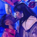
I’m betting on one more game
#the moment I fell in love with finn#cutie <3#high card#finn oldman#high card edit#high card gif#animangaboys#fymanganime#anisource#dailyanime#can you tell that I’m bad at typography kasjdkjahdjkas#flashing#text on gif#fyanimegifs#dailyanimatedgifs#shounenedit#fyanimanga#lznkgifs#miyamiwu.edit#miyamiwu.src
48 notes
·
View notes
Last Seen Blogs