#mine: filmuary
Text
cristalcarrington’s icon tutorial!
a little treat for day 28 of my filmuary challenge!
i’ve honestly lost count of which one this is, but welcome to another icon tutorial! here i’m going to breaking down my icon creation process step by step. i currently am a mac user and all my previous tutorials have been windows orientated (which unfortunately were all lost in the great url loss of 2017). my process hasn’t changed much since then, but i have picked up quite a few new go-to tricks and i’ll be sharing these tips in this post!
anyway! here’s what you’ll need-
photoshop (i currently use photoshop cc so be aware that options and tools may not translate onto other programs/versions of ps) and yes, i do pay for my photoshop but if you’re in need of a decent, safe download i might be able to point you in the right direction so hmu
patience (believe me some of these icons have taken me a painfully long time to create) just don’t feel discouraged if things don’t work out perfectly right away!
a creative mind. please be aware that this tutorial is only for educational purposes. under no circumstance directly replicate my icons! the one involved in this tutorial is clearly fair game, but please try to take creative liberty with your work. what i’ve found a lot of fun is incorporating bits and pieces of what other people do into my own work.
further resources
if you need more reference/help, here’s an icon psd for you to have a look around while reading the tutorial or instead of the tutorial. again, please do not re-upload or redistribute.
please consider reblogging this if you’ve found it useful. or checking out my resources!
starting off
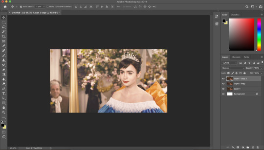
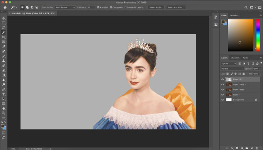
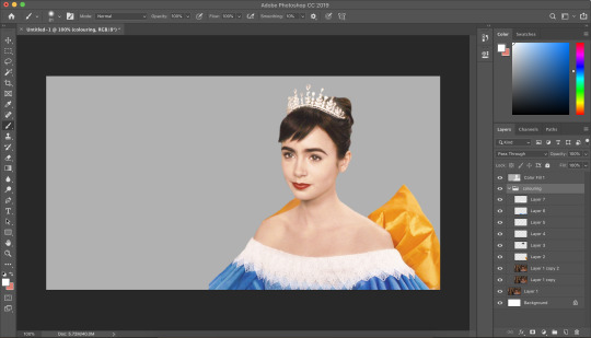
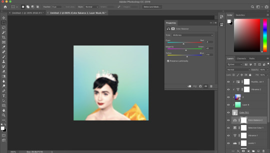
so today, i’m going to tackle a screencap for my ongoing filmuary challenge!
i tend to get my screencaps from google, so for this i literally just googled “mirror mirror screencaps” and selected a image from google images. when i’m not feeling lazy, i tend to go through the whole movie (great screencaps can be found at screencapped or kissthemgoodbye)
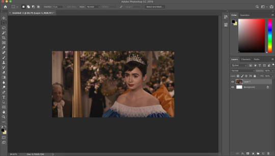
my first move is to open the screencap in the photoshop on it’s default canvas. the one i’ve chosen is normally the sort of screencap i’d go for-- one that has a central focus on the character and allows me to get a solid outline.
i tend to avoid screencaps that cut off the top of the characters head. i also tend to gravitate towards scenes that look easy to colour; if you choose overly saturated screencaps or screencaps that are too dark/light, then you will find it difficult to colour while conscious of the screencap quality.
base colouring
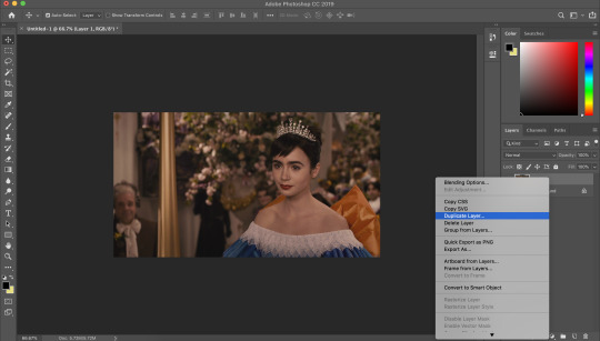
i then duplicate the screencap.
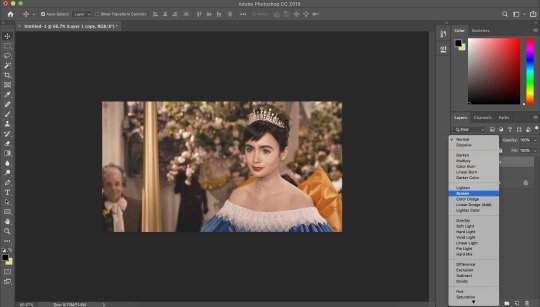
and then i set that duplicated layer to screen.
i like to make my icons super bright so i repeat this. it will vary depending on how dark the scene is. i prefer to do this to the screencaps as i find that it preserves the quality of the cap.
alternatively, you can use a psd-- my favourite as mentioned in previous tutorial is @blairsfelicity‘s icon psd which you can find in her tutorial here. my new method is just a whole lot lazier and i’ve been really enjoying the way my icons have turned out.
outlines
now here comes the menial part-- time for the outline.
remember to add a layer (unless you want to break your own heart by doing it directly onto the cap and being forced to start over (which i would NOT recommend by the way, crying over a screencap is as demoralising as it sounds)).
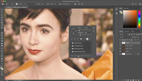
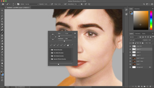
i vary between using the pen tool and a brush/eraser for my backgrounds. i like to shake it up depending on what i feel like doing or what the screencap would best fit. it also completely depends on whether i’m feeling particularly lazy or not-- if i have time to burn, i’ll use a brush. if i’m in a rush, i’ll use the polygonal lasso tool and refine my selection area with masks.
in this tutorial (due to my boredom of doing things over and over, this beautiful filmuary) i’m opting for the brush method. but if you want me to talk through polygonal lasso process which is a lot quicker and really streamlines the process-- then feel free to drop me a message and i’ll be happy to make another talk through.
i like to use a brush for my erasing, on 30-50% hardness. i like to use a diffused/low hardness so my icon doesn’t look too sharp and the background and model seem to go with each other more. i’ll go for a small brush size when it comes to detailing (for example, when it comes to profiles, hair etc).
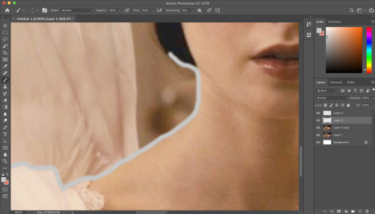
once i’ve outlined the model, i select the area around her with the magic wand tool and fill in the selected area with either a brush or a fill layer. then i merge the outline layer with the new colour layer.
(these two examples are from another icon process bc im dumb and forgot to take screenshots)
there will be a full little line around the model once you’ve merged the layers. i just tend to fill it in manually with a brush.
now here comes the fun part-- the colouring.
make those colours pop!
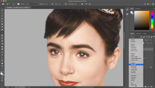
as you can see, the screencap has a lot of colours, but we need to make them pop. i take one of the colours, make a new layer and just paint until it’s vibrant and bold.
once you’re happy with your colour selection, set the layer to soft light and adjust accordingly.
i tend to go for softer brushes when it comes to facial features. the lips, to make them a darker colour, i opt to set the layer style to multiply instead of soft light, and paint over the lip shape with a light pink/red.
i always like to highlight the eyes to aid contrast in the screencap. i also like to fill all eyebrows in with a black (set on soft light) as well as the lashline, just to add further dimension and contrast to the model.
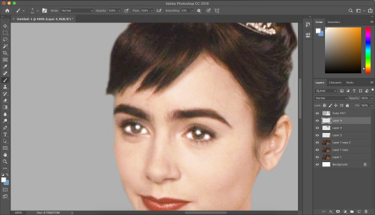
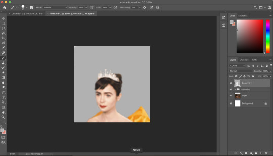
prepping the icon
this is what my screencap looks like with the colouring complete. as you can see, each colour is on a separate layer. this is so i can adjust/duplicate each colour accordingly. once i’m happy, i place everything into a group together.
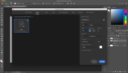
i make all of my icons on a 100x100px canvas.
i like to edit the screencaps on their original canvas as it helps with the quality of the screencap as well as allowing me to outline accurately.
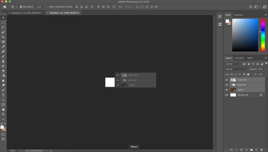
i just drag the files from one tab into another.
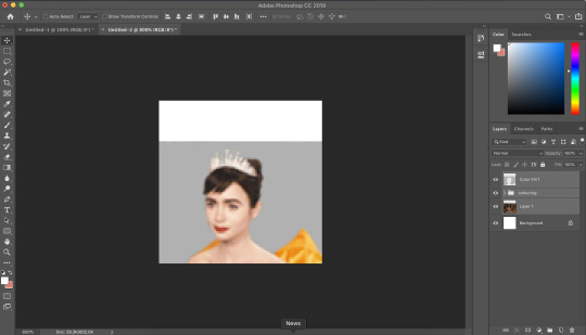
and then you can size it appropriately.
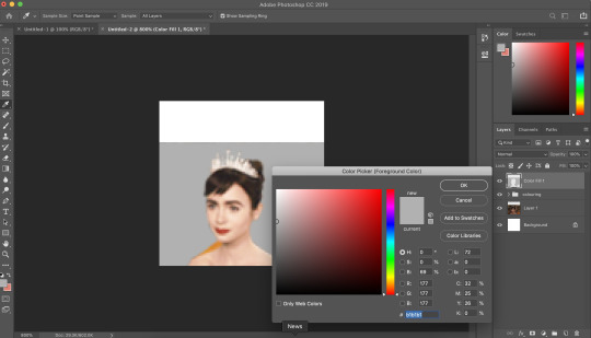
my next step is to select the same colour as the background and to paint over the white strip at the top of the icon. i do this directly onto my outline and then merge the two together. you now have the foundations of your icon to build onto!
final touches in the colouring department
there is honestly no direction that i could give you when it comes to these final colouring steps.
i like my icons to be very bright, so i target the contrast with levels and brightness/contrast layers. I like to also turn up the vibrancy to make the colours pop even more.
my preference is for the skin to be very neutral, so i try to combat the saturation of the skin with colour balance and selective colour layers (as well as another step i will explain later in the tutorial)
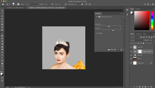
as you can see above, i place the final colouring all underneath the background layer as this makes it easier for me to place textures later on.
if you have problems with the model’s skin appearing too saturated, i’d recommend taking a solid fill layer of a black/white/grey and setting it to colour. place that layer just above the screencap and adjust it so it combats any saturation you might be experiencing.
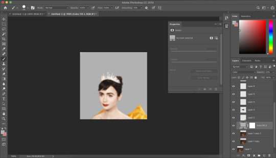
textures and finishing touches!
clipping masks are honestly a god send for me.
you can find them by right-clicking on the layers and selecting clipping masks. as you can see above, i use clipping masks to place a green texture on top of the icon’s background. i then layer above that by using further clipping masks, adding other textures and even layers to adjust the colouring of the background.
my favourite place to find textures are livejournal and deviantart-- soaked on livejournal is my go-to at the moment and i really enjoy evey-v’s icon textures. i also have my own resouces/textures that you can find here!
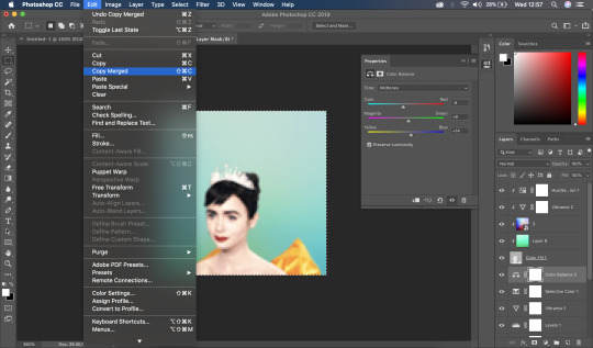

once i’m happy with how the icon looks, i copy all of the layers together and paste them under the background.
this is a super lazy way of sharpening the icon-- an alternative method is explained really well by @jennifergarner (aka the god of icons) on her icon faq page. i have used this in the past but after filmuary i’ve found a few little tricks.
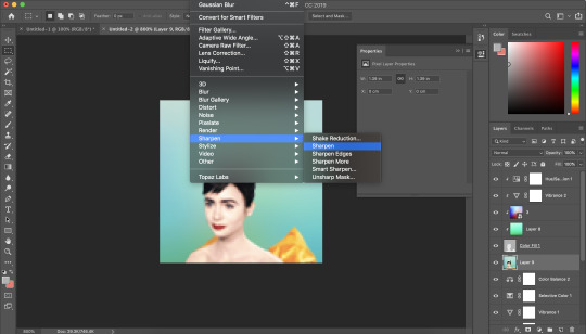
i then just sharpen the icon and adjust the opacity of the sharpened layer depending on my preferences.
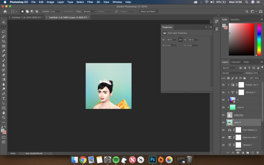
and then there we go---

my chosen export settings are just to go for PNG every time. this helps preserve the quality of the icon and help it look super clean and tidy for whoever wants to use it.
and with that, that’s a wrap up of my tutorial.
for other tips and tricks, here are some of my asks that i’ve responded to;
do you have any tips for cutting short/curly/messy hair?
hey, would you mind sharing a psd icon?
what are some of your favorite icons textures?
can you break down how to use different types of textures?
67 notes
·
View notes
Text
captain marvel icons
Day Twenty-Four of my Film-uary challenge!
Film-uary is where I am aiming to post a movie icon set a day for every day of February! The twenty third movie is a movie I’m sure we’re all hella excited for!
5 icons from the trailer for “Captain Marvel”
Please Like or Reblog if you use
2 icons under the cut, the rest are on my icons page (Marvel)


#marveledit#marvel edit#captain marvel edit#brie larson#marvel icons#yeahps#cappedfandoms#filmedit#mine: icons#mine: filmuary#mine#these are rough omg
49 notes
·
View notes
Text
(some more) wonder woman icons
Day Twenty-Six of my Film-uary challenge!
Film-uary is where I am aiming to post a movie icon set a day for every day of February! Ok, so admittedly for this drop I’m cheating a tiny bit-- this is a request that I recieved at the beginning of the month and it is a revamp of a few icons + a few new ones. This drop is, obviously, iconic-
Icons from the movie “Wonder Woman”
Please Like or Reblog if you use
3 icons under the cut, the rest are on my icons page (DC)


#wonder woman#gal gadot icons#dcedit#dc icons#wonder woman icons#wonder woman edit#mine: icons#mine: filmuary#me
35 notes
·
View notes
Text
legally blonde icons
Day Eleven of my Film-uary challenge!
Film-uary is where I am aiming to post a movie icon set a day for every day of February! The eleventh drop is my favourite feel-good movie--
7 icons from the movie “Legally Blonde”
Please Like or Reblog if you use
2 icons under the cut, the rest are on my icons page (Movies > Others)


#sibylresources#yeahps#chaoticresources#reese witherspoon edit#reese witherspoon#legally blonde#legally blonde musical#movieedit#movie edit#mine: filmuary#mine: icons#mine
33 notes
·
View notes
Text
baby driver icons
Day Twenty-Seven of my Film-uary challenge!
Film-uary is where I am aiming to post a movie icon set a day for every day of February! I’m truly cutting it close with this drop but the movie is hella cool--
12 icons from the movie “Baby Driver”
Please Like or Reblog if you use
3 icons under the cut, the rest are on my icons page (Movies > Others)


#baby driver edit#baby driver#ansel elgort icons#eiza gonzalez icons#eiza gonzalez#jon hamm#filmedit#yeahps#cappedfandoms#mine#mine: icons#mine: filmuary
22 notes
·
View notes
Text
pretty woman icons
Day Twenty of my film-uary challenge!
Film-uary is where I am aiming to post a movie icon set a day for every day of February! The twentieth drop has a hella good song with it-
6 icons from the movie “Pretty Woman”
Please Like or Reblog if you use
2 icons under the cut, the rest are on my icons page (Movies > Others)


#julia roberts#yeahps#woahps#cappedfandoms#pretty woman edit#mine: icons#mine#mine: filmuary#these icons all look so washed out omg but for some reason they just don't want to be bright and colourful
23 notes
·
View notes
Text
gone girl icons
Day One of my Film-uary challenge!
Film-uary is where I’m aiming to post a movie icon set a day for every day of Februrary, so fingers crossed it all goes to plan-- anyone is welcome to join me for a week or even for the whole month! Feel free to tag me in what you make! The first drop is my favourite movie of the moment--
8 icons from the movie “Gone Girl”
Please Like or Reblog if you use
2 icons under the cut, the rest are on my icons page (Movies > Others)


#gone girl#gone girl icons#rosamund pike edit#yeahps#chaoticresources#rosamund pike#emily rajatkowski#ben affleck#mine#mine: icons#mine: filmuary
27 notes
·
View notes
Text
the favourite icons
Day Twenty-Five of my Film-uary challenge!
Film-uary is where I am aiming to post a movie icon set a day for every day of February! The twenty fifth drop is in lieu of tonight’s oscars (This post has been made in advance and saved in my drafts and if Olivia Coleman doesn’t win Best Actress for this role I’m losing faith in humanity)
11 icons from the movie “The Favourite”
Please Like or Reblog if you use
3 icons under the cut, the rest are on my icons page (Movies > Others)


#the favourite edit#rachel weisz#emma stone#olivia coleman#filmedit#yeahps#cappedfandoms#chaoticresources#filmdaily#films#mine#mine: icons#mine: filmuary#these icons will be uploaded later
18 notes
·
View notes
Text
it icons
Day Twenty-Three of my Film-uary challenge!
Film-uary is where I am aiming to post a movie icon set a day for every day of February! The twenty third movie is an iconic remake!
7 icons from the movie “It”
Please Like or Reblog if you use
2 icons under the cut, the rest are on my icons page (Movies > Others)


18 notes
·
View notes
Text
breakfast at tiffany’s icons
Day Ten of my Film-uary challenge!
Film-uary is where I am aiming to post a movie icon set a day for every day of February! The tenth drop is the best romance movie of all time!--
7 icons from the movie “Breakfast at Tiffany’s”
Please Like or Reblog if you use
2 icons under the cut, the rest are on my icons page (Movies > Others)


#yeahps#audrey hepburn#audrey hepburn edit#audrey hepburn icons#audreyhepburnedit#mine: icons#mine: filmuary#mine
19 notes
·
View notes
Text
the breakfast club icons
Day Sixteen of my Film-uary challenge!
Film-uary is where I am aiming to post a movie icon set a day for every day of February! The sixteenth drop is a big favourite!-
5 icons from the movie “The Breakfast Club”
Please Like or Reblog if you use
2 icons under the cut, the rest are on my icons page (Movies > Others)


#the breakfast club edit#the breakfast club#icons#yeahps#chaoticresources#mine: icons#mine: filmuary#mine
15 notes
·
View notes
Text
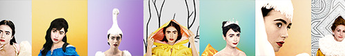
mirror mirror icons
Day Twenty-One of my film-uary challenge!
Film-uary is where I am aiming to post a movie icon set a day for every day of February! The twenty first movie is just a beautifully shot movie that I couldn’t resist-
6 icons from the movie “Mirror Mirror”
Please Like or Reblog if you use
2 icons under the cut, the rest are on my icons page (Movies > Others)


#lily collins#lily collins edit#mirror mirror#julia roberts#lily collins icons#yeahps#woahps#cappedfandoms#mine#mine: icons#mine: filmuary
13 notes
·
View notes
Text
funny face icons
Day Seven of my Film-uary challenge!
Film-uary is where I’m aiming to post a movie icon set a day for every day of Februrary, so fingers crossed it all goes to plan– anyone is welcome to join me for a week or even for the whole month! Feel free to tag me in what you make! The seventh drop is one of my favourite movies of all time--
6 icons from the movie “Funny Face”
Please Like or Reblog if you use
2 icons under the cut, the rest are on my icons page (Movies > Others)


#audrey hepburn#yeahps#chaoticresources#itsphotoshop#fred astaire#mine: icons#mine: filmuary#mine#funny face#funny face icons#audrey hepburn edit
14 notes
·
View notes
Text
anna karenina icons
Day Twenty-Two of my Film-uary challenge!
Film-uary is where I am aiming to post a movie icon set a day for every day of February! The twenty second movie is based on one of my favourite novels!
7 icons from the movie “Anna Karenina”
Please Like or Reblog if you use
2 icons under the cut, the rest are on my icons page (Movies > Others)


#keira knightley edit#keira knightley#aaron taylor johnson#anna karenina edit#icons#mine: icons#mine: filmuary#i decided to leave out the links this time#see how this goes
11 notes
·
View notes
Text
mary poppins icons
Day Nine of my Film-uary challenge!
Film-uary is where I am aiming to post a movie icon set a day for every day of February! The ninth drop is one a homage to the classics in lieu of the new movie-
10 icons from the movie “Mary Poppins”
Please Like or Reblog if you use
2 icons under the cut, the rest are on my icons page (Movies > Others)


#yeahps#chaoticresources#disneydaily#disney edit#disney icons#cappedfandoms#julie andrews#mine: filmuary#mine: icons#mine
12 notes
·
View notes
Text
the devil wears prada icons
Day Nineteen of my film-uary challenge!
Film-uary is where I am aiming to post a movie icon set a day for every day of February! The nineteenth drop is good old Hollywood classic-
6 icons from the movie “The Devil Wears Prada”
Please Like or Reblog if you use
2 icons under the cut, the rest are on my icons page (Movies > Others)


#the devil wears prada#yeahps#woahps#chaoticresources#meryl streep#anne hathaway#can u tell ive given up with previews now lmao#mine#mine: icons#mine: filmuary
11 notes
·
View notes
Last Seen Blogs

cingulomana
whimsical little bug

minscharas
a dumpster fire

nykrants
Ramblings of a Nyk.
minscharas
a dumpster fire

simnopke
simNopke