#mockups
Text
Considering three possible new colorways for our Emergence Maxis..
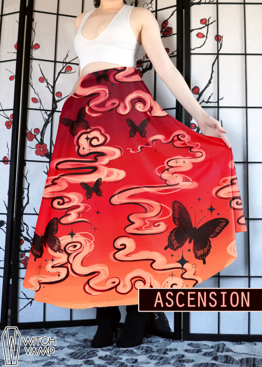
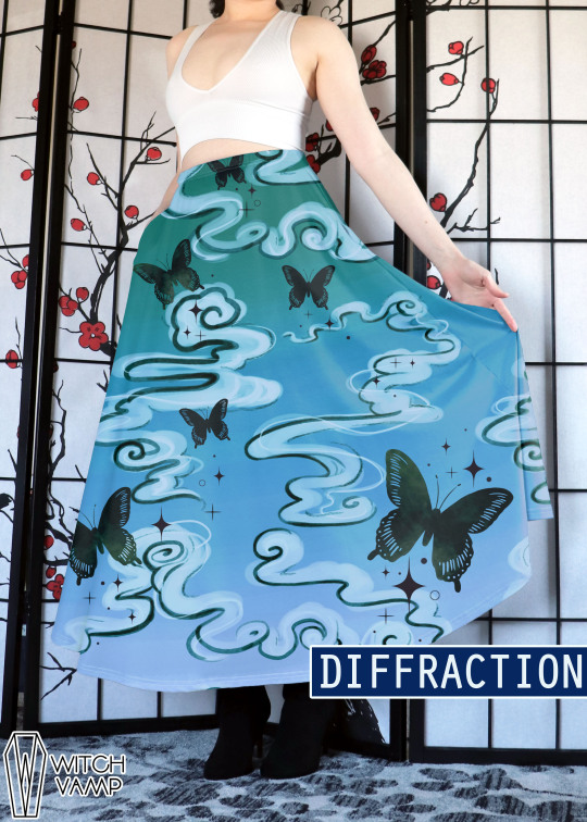
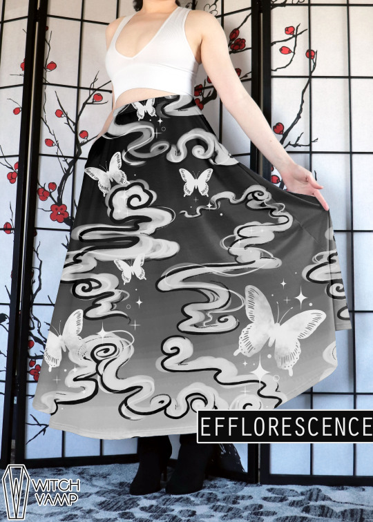
#witch vamp#mockups#new colorways#emergence maxi#new designs#designs#fashion design#maxi skirt#maxi#clothing#clothing design#poll#tumblr poll#colorway#coming soon#maybe#alt fashion#goth#alternative fashion#xxxholic#anime inspired
82 notes
·
View notes
Text


Me? Photoshop stock images to look like fake merch for a video game Iike? I would never.
This is photoshop I cannot emphasize enough not real not real not real!!!!!!!!!!
The thing on the tan totebag
The thing on the black totebag
#i like making mockups#I wanna do more fake merch for stuff i like he he he#isat fanart#isat#designstuffs#mockup#mockups
10 notes
·
View notes
Text


¡Muchas gracias Ro por comisionarme más tablillas! ♥ Me siento muy honraday feliz de que te guste mi trabajo ;w; ¡Espero que la disfrutes mucho! Un abrazo fuerte para ti.
— 𝓡𝓸𝓼𝓼
#entouragethemes#foroactivo#comisiones#comisionwork#rpgforum#entourage themes#tablillas#codigos#mockups
9 notes
·
View notes
Text
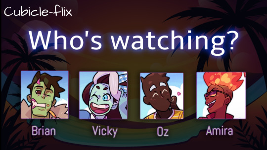
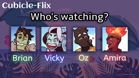
Created a Character Select Screen mockup for Monster Roadtrip.
Who will you be watching with?
#mockups#monster roadtrip#monster prom#cubicle#going under#crossover#nicky grimes#photopea#photoshop#edits#monster prom 3#brian monster prom#vicky monster prom#oz monster prom#amira monster prom
31 notes
·
View notes
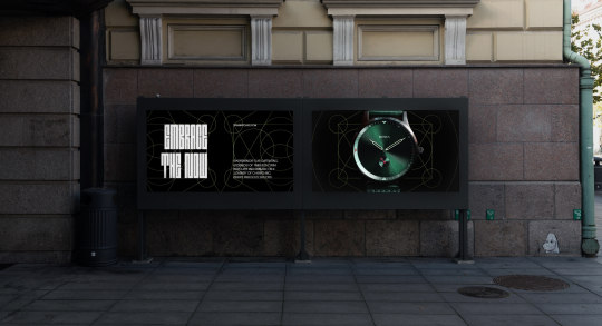
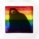
Photo
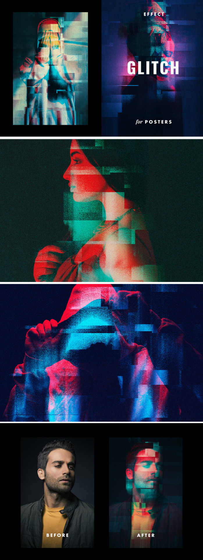
Photoshop Glitch Displacement Poster Photo Effect
Download here.
Follow WE AND THE COLOR on:
Facebook I Twitter I Pinterest I YouTube I Instagram I Reddit
31 notes
·
View notes
Photo
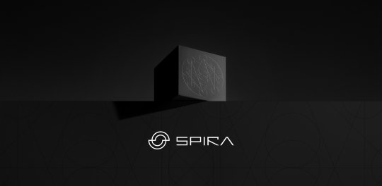

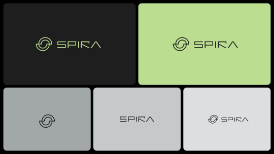
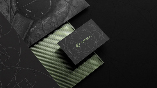

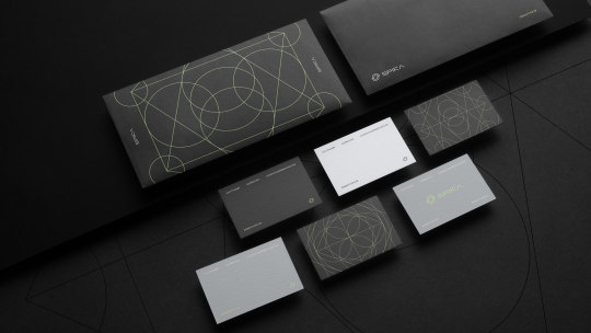
Spira Brand Identity
Download Mockups mockupcloud.com
Design by behance.net/rafaguedes
10 notes
·
View notes
Photo
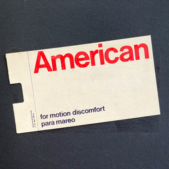
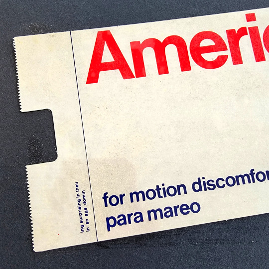
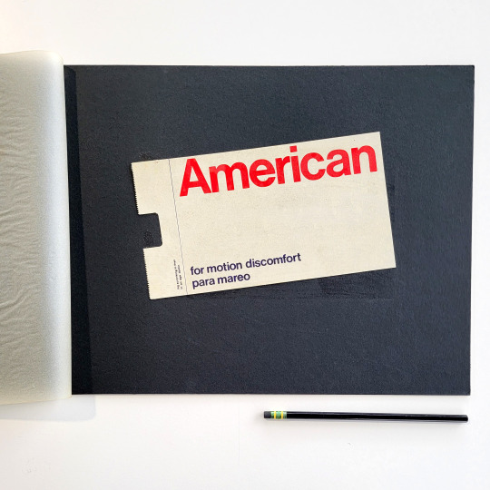


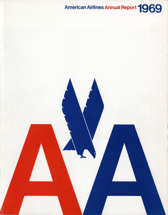
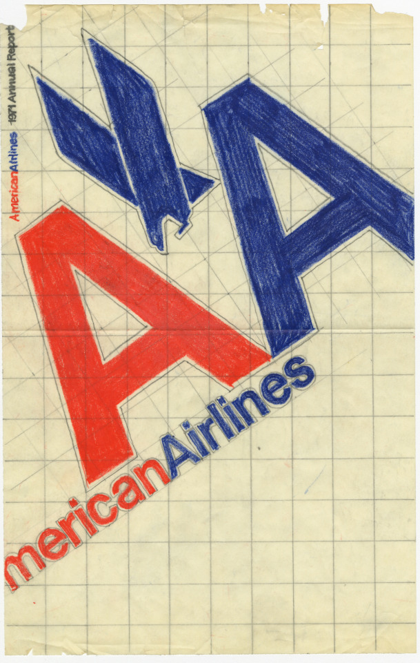
We recently uncovered this mockup pasted on a board for a sickness bag for American Airlines in the archives. We couldn’t resist showing it off along with some of the other ephemera we have for the airlines corporate identity.
Massimo Vignelli designed the American Airlines corporate identity while at Unimark International in 1967. Sadly, they abandoned the system in 2013 after nearly 40 years. Luckily we have lots of examples of the original design in the archives!
Image descriptions:
Printed pasteup of an American Airlines sick bag on a black board. Large red American title type across the top. Text in navy blue lower case sans-serif type says “for motion discomfort/para mareo.” With smaller nonsensical placeholder text in navy blue reads “ing surprising in their in an age domain”
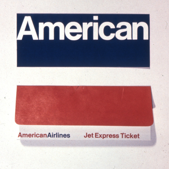
Vintage 35mm slide of two American Airlines ticket envelopes. Back view in navy blue which first says “American” in white type above a a front view of a red envelope with white border along bottom that has American Airlines logotype in red and blue next to text that “Jet Express Ticket.”
Matchbook with double A and eagle logo for American Airlines.
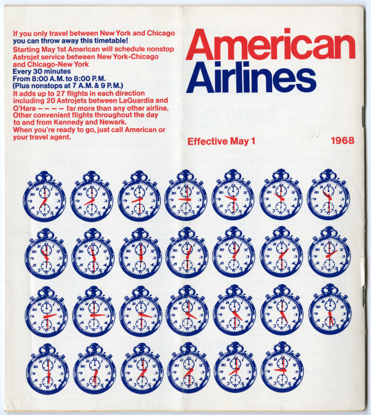
Timetable for from 1968 for American Airlines with rows of clocks on the cover showing every half hour. In 1968, you didn't need this flight timetable according to American Airlines if you were flying from Chicago to NYC, because there was a nonstop flight every 30 minutes!
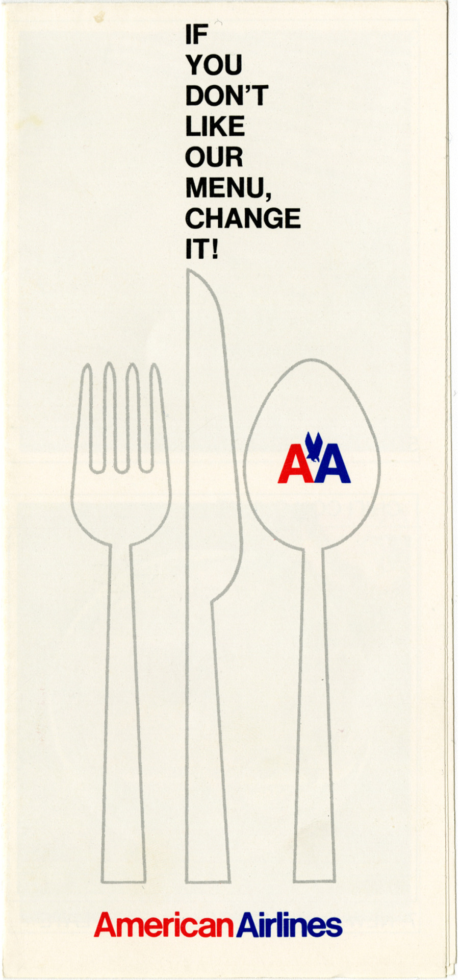
Cover of a brochure white background with back text that says “If you don’t like our menu, change it!” above an outline illustration of a fork, knife and spoon. The spoon has the double A with an eagle logo in red and blue.
Cover of a folded map with the American Airlines logotype in red and blue and the title “Directions” in black text below it. Illustration features blue circles on a red background with various colored pointing arrows, one in each circle pointing in different directions.
Cover of an American Airlines Annual report for 1969. White background text in red and blue and a large double A and eagle logo in red and blue.
Sketch of a 1971 American Airlines Annual Report with large slanting logotype and double A and eagle logo in red and blue. Pencil grid in background.
#archives#vignelli#design archives#graphic design#corporate identity#american airlines#sketches#timetable#annual reports#barf bag#mockups#maps#matchbooks#airline tickets#brochures#1960s#Unimark#modernism#transporation design
68 notes
·
View notes
Note
Can you do a Instagram account post for Momo Yaoyorozu?

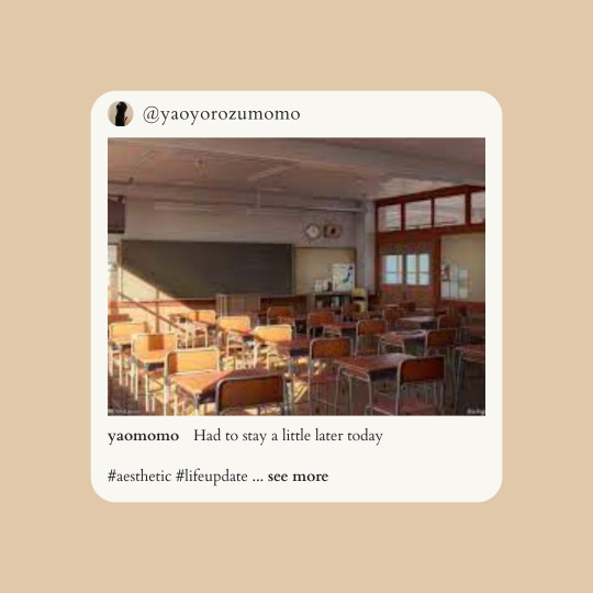
momo yaoyorozu mockup for anon
I hope you like it! I also hope you don't mind me experimenting a little with the second post there (im just trying something new :D)
#requests#mockups#bnha#momo yaoyorozu#instagram au#bnha instagram au#aesthetic#instagram moodboard#social media au#instagram template#instagram mockup#momo yaoyorozu moodboard#momo yaoyorozu aesthetic#aesthetic board#moodboards#moodboard#character aesthetic#boku no hero academia#my hero academia#bnha moodboard#mha moodboard#mha#bnha aesthetic#class 1a#class 1a girls#bnha social media au
25 notes
·
View notes
Text
#wanted to draw something from chapter 7 of pulse#but i thought it would be interesting to make a mockup#im thinking of making more of them for the fic#because it's a good way to visualize things#ill just tag them#uh#mockups
11 notes
·
View notes
Text
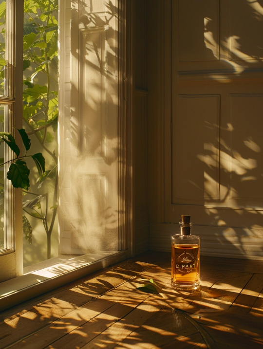
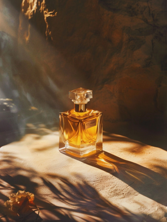
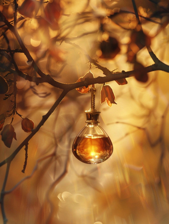

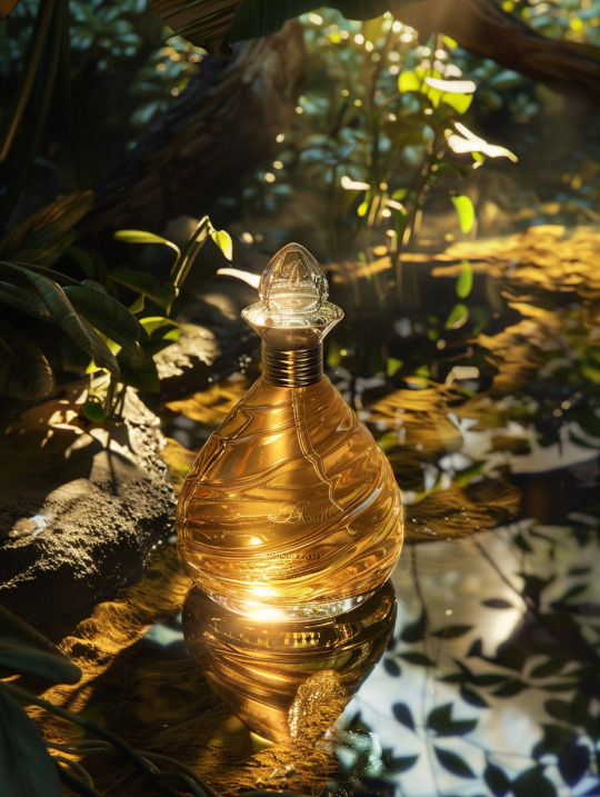
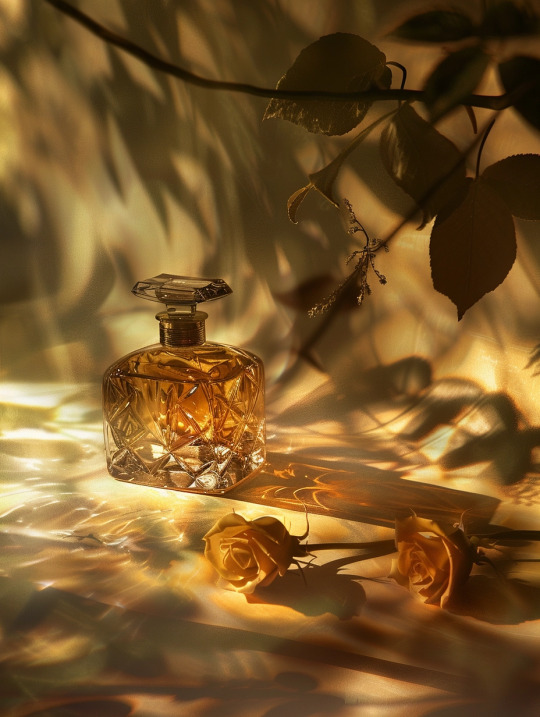
Prompt: paris eau d'amour advert, in the style of naturalistic shadows, gold and amber, massurrealism, magewave, gustave buchet, captures the essence of nature, rollei prego 90 --ar 3:4
#midjorneyart#midjourney#concept art#commercial illustration#ai art#mockup design#mockup#mockups#prompt midjorney#prompt ai#writing prompt#prompt#prompt list
3 notes
·
View notes
Video
Not the most exciting first showcase of an AU, but here! A general Menu Mockup for Kingdomrune! The only menu not showcased is the options menu, because there’s nothing to change with that one imo. Most things are changed from how they originally are in Deltarune, but there’s also some stuff that’s Kingdomrune fresh! Like Noelle’s room, the Dark Journal, the function of the power menu, and other stuff! And, damn, I didn’t expect this would turn out to be like a 4 minute video just showcasing the menus, but I can’t say I’m complaining, either!
#kingdomrune#spriteart#mockups#menusprites#kris#susie#noelle#ralsei#locations#expandedcastletown#it doesnt show off the location itself too well but i thought id tag it anyway#deltarune#deltarune au#deltaruneau
23 notes
·
View notes
Text
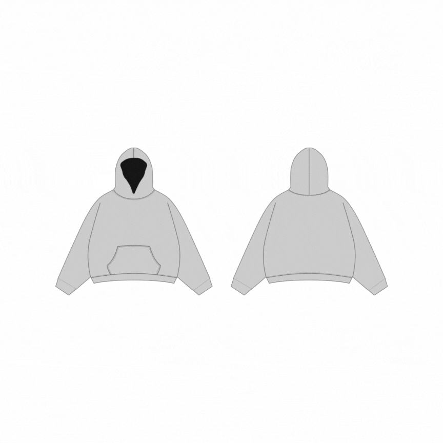
👉DOWNLOAD MOCKUPS HERE⬇️
#art#artists on tumblr#illustration#streetwear#fashion#apparelmockup#appareldesign#streetwearbrands#apparelvectormockups#streetwearfashion#streetwearstyle#streetwearinspiration#streetweartshirt#tracksuit#tshirt#vector#mockup#mockups#template#fashiondesign#clothes#apparelclothing#garment#blank#wear#sportsbra#apparelhoodie#streetwearhoodies#hoodiedesign#hooded
2 notes
·
View notes
Text
mockups
FA224
@uob-funoon
9 notes
·
View notes
Text
Mockups
Here's a Pinterest board of mockups! I'm making pins of mockups that I find interesting
https://www.pinterest.com/context_nk/mockups/
2 notes
·
View notes
Photo

https://099.supply/
#099#mockup#mockups#templates#customize#shop#3D#photo-realistic#black#typography#type#typeface#font#Söhne Mono#2023#Week 13#website#web design#inspire#inspiration#happywebdesign
8 notes
·
View notes
Photo

T-Shirt Mockups for Adobe Photoshop
Download here.
Follow WE AND THE COLOR on:
Facebook I Twitter I Pinterest I YouTube I Instagram I Reddit
12 notes
·
View notes
Last Seen Blogs
julianflora
Julian Flora
rz-things
Stories from a graphic workshop

besargebu
Untitled

ribeirinh0
Alagoano

joupitterhome
JOUPITTER HOME