#mossy art
Text

[ID in Alt Text]
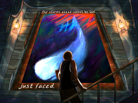
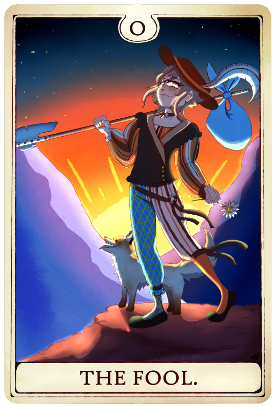
strolling in fashionably late to the two year anniversary of the greatest musical adaptation of Moby Dick of all time, Caleb Hayashida's 'Moby Dick or the Whale'. I've been thoroughly enamored with this album for over a year now and it only felt right to do a tribute for its birthday :)
now, go do yourself a favor and listen to Sea Fever 💙💙
some notes about the details I added under the cut!
Some notes on this as a tribute!
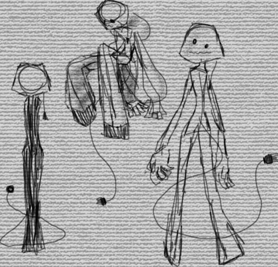
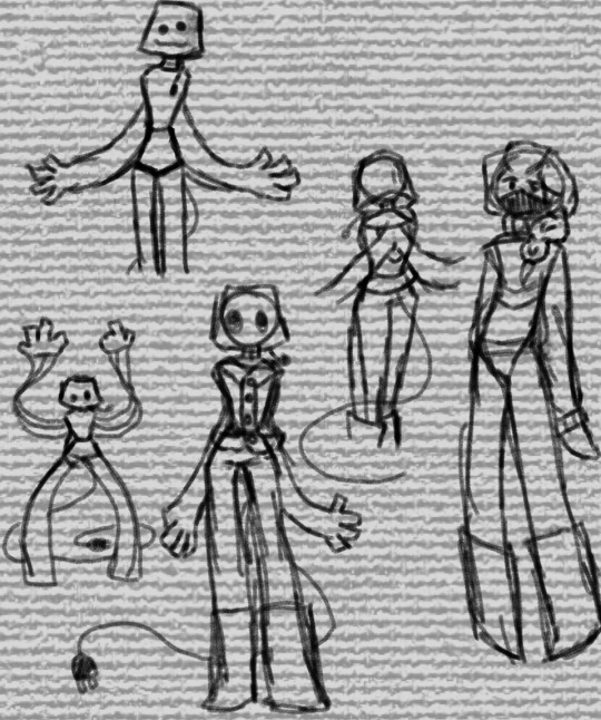
Firstly, as always, my Ishmael design is stolen from the beloved @pocketsizedquasar :3
Secondly, the primary songs captured by this piece are meant to be 'Interpretation', 'Whiteness of the Whale', and 'Whaleman's Hymn'. Interpretation is primary, since that song refers directly to the painting at Spouter Inn, and Ishmael's attempts to interpret it. (Aside: it's a brilliant song that foreshadows chords repeated during the chase, it confuses and delights the listener much like book Ishmael's ramblings do, and it odes to the album itself being an interpretation of a novel. also it's a bop. I fucking love it.) The whale in the picture is, you guessed it, the whale song. That one I felt was important to center as Hayashida himself intentionally put that song at the center of the album as a focal point for the rest to follow around (and for the narrative to break inside - give it a listen, the end is incredible). It's literally the centerpiece. And finally, the lyrics are from Whaleman's Hymn, the gorgeous ode at the end of the album.
Ishmael is also posed as both moving and stagnant in the center as a reference to the cyclical nature of Hayashida's album. It ends with the same lyrics it begins with ("I must be out to sea"), and so here, Ishmael meant to be caught in the space between both of those songs. Moving and yet unable to move from where he is.
The watery effect was particularly inspired by Drifting, as that song fills me with an immense sense of peace and gives me the feeling of laying down at an aquarium watching the light of the water dance around. It also helps make the mood of the piece a bit more dynamic, as the looming painting, dissonant colors, and heavy shading all feel a bit foreboding, and the water effect both enhances that by giving an unnatural feel, and subdues that by communicating a semblance of peace and muting the colors.
The oil effect and jagged colors of the piece itself are references to the official album cover art! The flaming harpoon's colors are mimicked in the red light at the top of the painting, and the bright teal/white is mimicked in the whale at the bottom. They're also positioned over each other, just like on the album cover.
The painting itself is also supposed to be reminiscent of The Chase, in all its chaotic glory. Hayashida has an INSANE stroke of genius with that song where, at a certain point, two different time signatures overlap to show the whale opposing the crew/Ahab. The blend is so smooth that it's easy to miss if you aren't looking for it, and yet so brilliant that it makes you anxious for the buildup and final clash. The saturated opposing colors are supposed to be something of a nod to that, as well as the nature of the painting being a sinking ship and a white whale lol
So, yeah those are my notes! :D thank you for reading and definitely give this masterpiece a listen!! 💙💙
#moby dick#caleb hayashida#mobydick#mobydick art#whale weekly#melville#herman melville#moby dick art#ishmael#ishmael mobydick#ishmael moby dick#moby dick or the whale#classic lit#classic literature#litblr#described#accessible art#mossy art#ONE DAY LATE BUT IT'S FINEE#photoshop was not letting me finish this yesterday rip#Spotify#album recommendation
22 notes
·
View notes
Text
Contributing to his yassification
27 notes
·
View notes
Text

Random turtle doodles
#rottmnt#rise of the tmnt#rise of the teenage mutant ninja turtles#rottmnt leo#rottmnt raph#rottmnt donnie#rottmnt mikey#rottmnt mayhem#my art#the silly billies#I haven’t known what to post so idk HELP#my stuff#mossy art#tmnt#baby turts my love#honk shoo
3K notes
·
View notes
Text
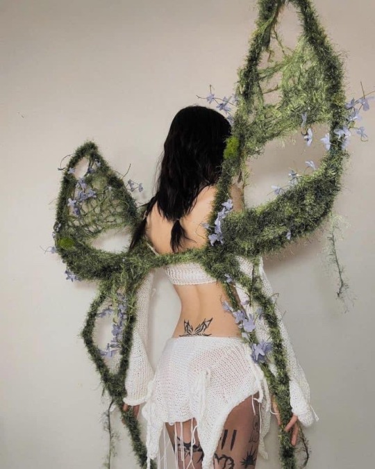

🌱Mossy fairy wings🌱
📸: carolinemoorenc on ig.
401 notes
·
View notes
Text

fōrest spīrīt .:. @earthjournalbyawildrose
source
#nature#Forest#moss#mossy forest#mosscore#mossy log#mossy#mossy woods#mossy trees#mossy art#oracle#treecore#forest witch#forest cottage#english forest#forest spirit#forests#green witch#greencore#greenery#green magick#green aesthetic#green moodboard#roots#faeryworlds#faerycore#natureblr#earthcore#earth aesthetic#spirituality
362 notes
·
View notes
Text
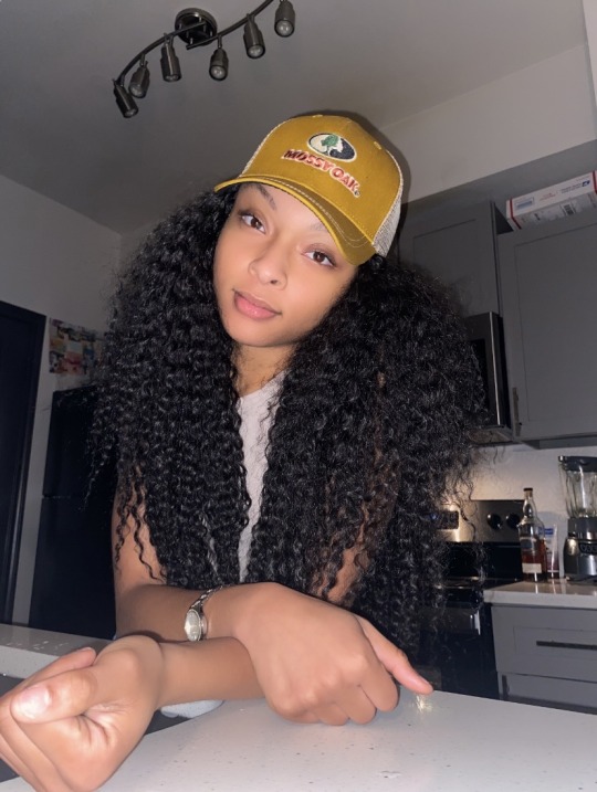

🎃🎃🎃
#moodboard#black girl moodboard#hair#black girl next door#black girls travel#black girls are beautiful#black girl#pink hair#love#long hair#mossy thoughts#mossy woods#mossy forest#mossy trees#mossy art#mossy creek#mossy oak
76 notes
·
View notes
Text


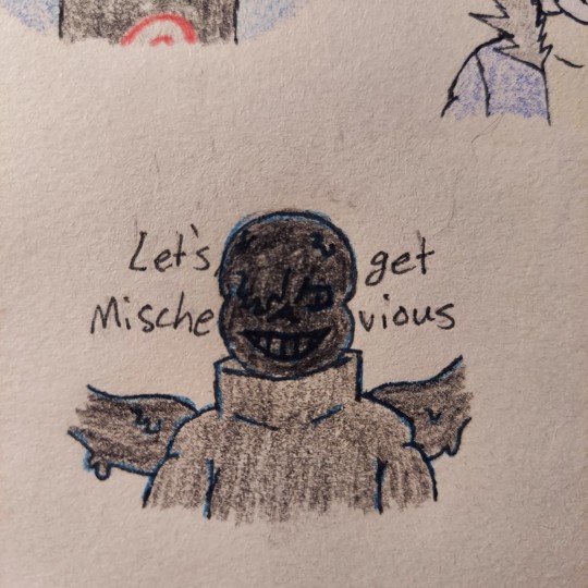
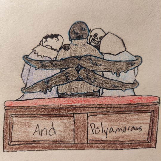
So, I know don't do sanscest often, but like guys. Is Cult of Dionysus not them. How does the song not fit them
Killer belongs to rahafwabas, Nightmare belongs to Joku, Horror belongs to Sour-Apple-Studios, and Dust belongs to Ask-Dusttale.
#mossy art#nightmare sans#killer sans#dust sans#horror sans#bad sans#bad sanses#bad sans gang#bad sans poly#your honor#They're gay#and in love#and they were roommates#the last one is too cute#it warms my gay heart#my cold gay heart#also yes#those are mostly pride flags on killer's pins#i refuse to draw him without them#an annoying amount of pins I mean#same with Nightmare and the back window for the tentacles#it's cute and practical in my head#i love them your honor#Spotify
50 notes
·
View notes
Text
Art dumb time :boom:


had to fight with Tumblr for a sec to let me upload these
These were drawn on my school ipad
#regretevator#regretevator lampert#regretevator poob#regretevator wallter#regretevator mannequin mark#regretevator drretro#my art#mossy art#dont mind how big Wallter's head is in one of the drawings
27 notes
·
View notes
Text


While I was following you, my shoes turned into moss 🍃👞✨
#forestcore#green academia#green witch#forest aesthetic#in the forest#green aesthetic#goblincore#mosscore#moss aesthetic#mossy art#mossyfoot#mossy forest#mossycore
132 notes
·
View notes
Note
mary/starbuck - praise kink
YIPPEEEEEEEEE first attempt at drawing m/f smut lets go 🏃

[full version in RB]
mary deserves to get GOOD goddamn head and starb deserves to get told he's a good boy about it. who said that
#mossy art#moby dick#undescribed#answered#prompts#smut art prompt#LET'S GOOOOOO BISEXUALS#mary is so pretty tf
14 notes
·
View notes
Text
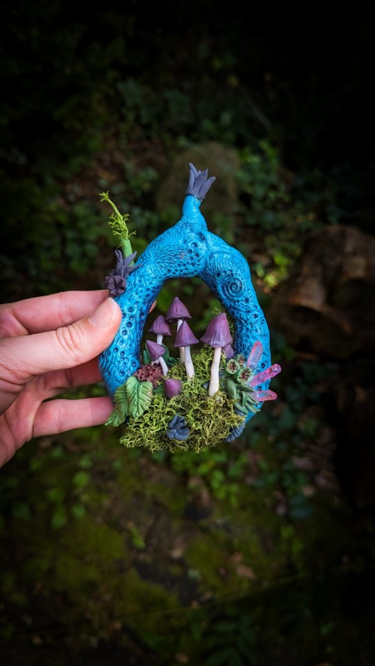

#miniature art#polymer clay#witchy#sculpture#clay sculpting#sculpting#eclectic#mushrooms#mushroomcore#wall hangings#wall decor#fairycore#fairy aesthetic#shroooms#mushroom art#mossy art#my art
14 notes
·
View notes
Text
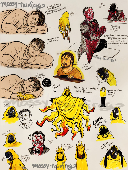

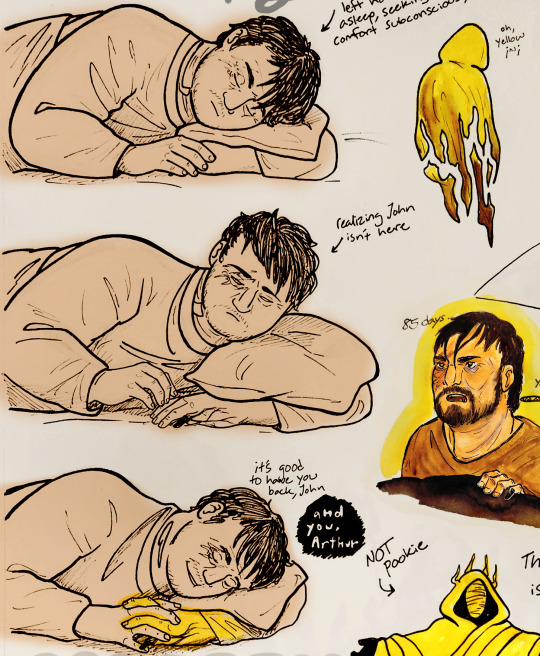
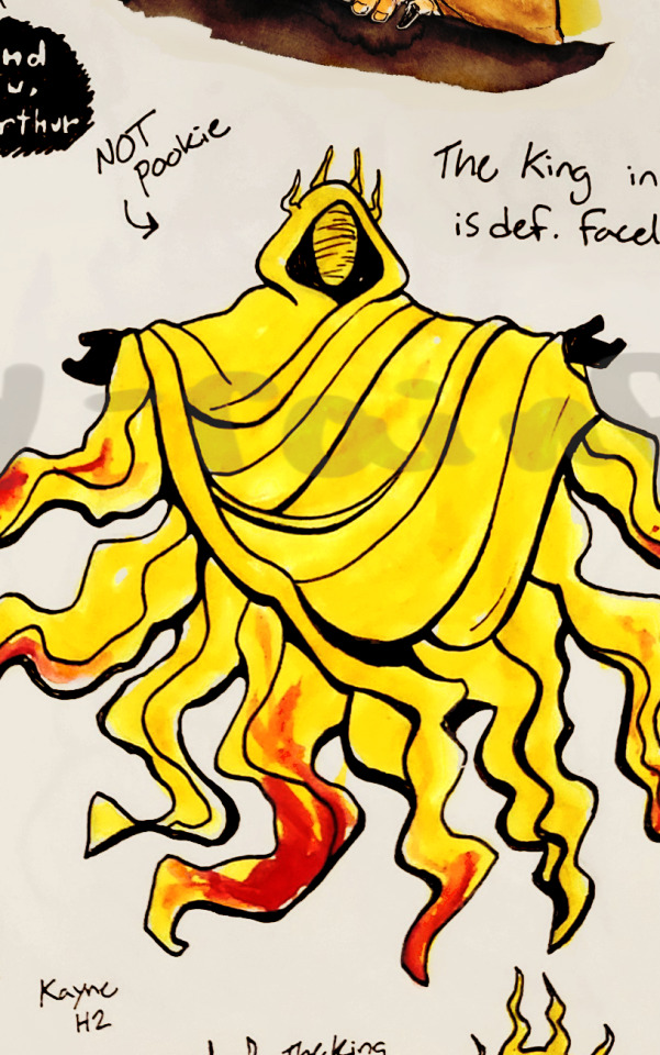

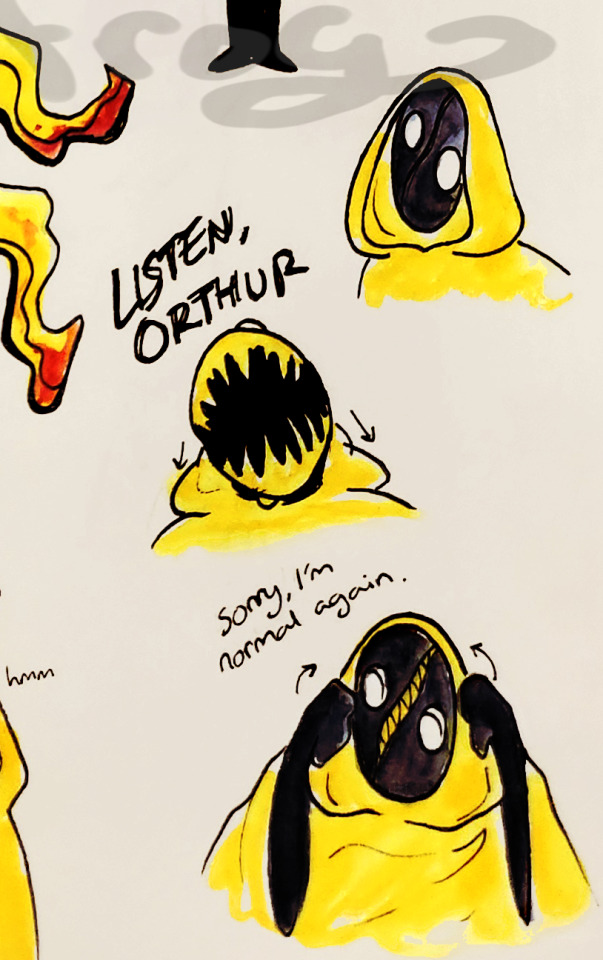
[ID: A doodle page for the Malevolent podcast, featuring several sketches of Arthur, John, Kayne, The King in Yellow, and Yellow. More detailed description in ALT Text.]
Bringing y'all my mid-season 3 Malevolent arts because this podcast has a grip on me. Featuring my Kayne design because I have SOOO many thoughts about that freak <3 his voice sounds a bit similar to Arthur to me and so I thought it might be fun if he was mocking the lads by wearing Arthur's face. As of s3 we have no idea wtf Kayne is supposed to be, anyways, but altering his form doesn't seem to be a power that's off the table. Also the concept of John not recognizing Arthur's face on a happier, less scarred form makes me want to throw up :) hope this helps!
#malevolent#malevolent podcast#arthur lester malevolent#arthur lester#john doe malevolent#john malevolent#the king in yellow malevolent#yellow malevolent#kayne malevolent#malevolent yellow#malevolent john#kayne#malevolent art#the king in yellow#malevolent kayne#malevolent arthur#malevolent fanart#private eyes#accessible art#id in alt#described#mossy art#this took UNBELIEVABLY long to get from the sketchbook to the laptop for No Reason. the time i spent un-blurring this...#blood cw#blood
100 notes
·
View notes
Text


Ngl they were my favorites to make and it shows
23 notes
·
View notes
Text
Gee whizz I love yuri!!
#my art#mossy art#split regretevator#regretevator bive#regretevator#banana…#I love them#roblox#fanart#I’m gonna make a doodle page to hopefully post and this is on it#my stuff#spive regretevator
2K notes
·
View notes
Photo


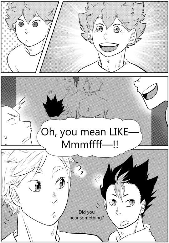

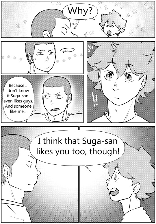
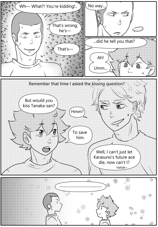
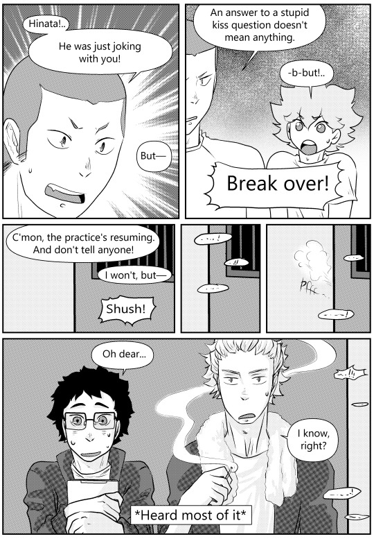
The Answer: Part 6.2: the end of part 6.
FIRST || PREVIOUS || NEXT
#haikyuu#haikyuu!!#sugatana#tanasuga#tanaka ryuunosuke#because I actually planned only two comics for this week#mossy art#long post#sooooo updating once a year huh? what a rate lmao#you can see I completely gave up on backgrounds in this one#ngl it was so hard to motivate myself I'm thinking of finishing all the parts left as cleared up sketches instead of proper pages#at least that would finish the story#I still love this ship and story with burning passion#but last year? oof it sucked so much ugh ugh#comic#changing the links format too it started getting too long haha#there's a random stray tag up there but I'm too lazy to fix it
37 notes
·
View notes
Photo
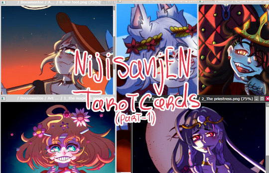


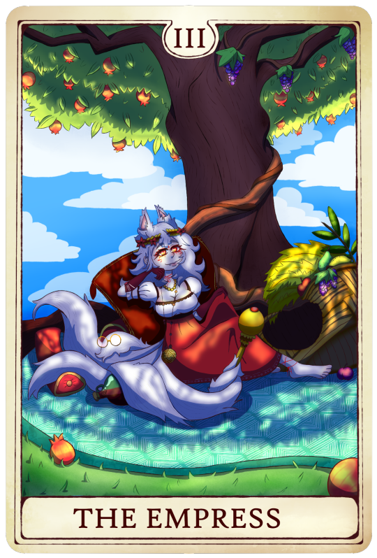

This is part of my tarot card series around Nijisanji EN, I originally posted these on a twitter thread, and along those you guys can also see some post drawing notes I did on each drawing!
I originally planned to post all these together in one post, but decided to post the first 5!
#nijisanji en#nijisanji#nina kosaka#mysta rias#vox akuma#meloco kyoran#millie parfait#tarot cards#v-tuber#mossy art
18 notes
·
View notes
Last Seen Blogs
subspace-t-mine
Behold, my greatest invention!!
travelingshoes-blog1
Traveling Shoes

distributorfrozenfoodmurah
Tanpa judul

aequitaes
Together

blessedsong-blog
HIATUS