#one day I will. write them all
Text
supporting communities & people impacted by the Southport attack and the far-right riots in the UK
here is a list of community fundraisers I found, starting with those aiming to support the Southport community after the appalling attack at a children dance party, to the fundraisers helping those affected by the subsequent racist and Islamophobic far-right/nazi riots
Edited on 5 August to include Middlesbrough fundraisers. Edited on 6 August to correct the link on the Books for Spellow Lane fundraiser, to adjust the name change for the Belfast fundraiser, and to adjust the wording in the second last paragraph.
Southport:
Southport Strong Together Appeal - organised by the community foundation for Merseyside, for those affected by the Southport knife attack
United for Southport families - the funds will be distributed among the nine families of the children who were at the party
Swifties for Southport - a fundraiser for the Alder Hey Children's charity, which supports the victims and the affected families, as well as first responders and clinicians. Extra funds will also support the wider Southport community
Fundraiser for the Southport Mosque - a fundraiser to aid rebuilding or possibly re-locating the Southport Mosque after the damages it suffered during the riots
Rebuilding Windsor Mini Mart - fundraiser to rebuild the locally-owned grocery store that was targeted during the attacks, broken into, and looted
Liverpool:
Fundraiser for the Spellow Hub - the Spellow Hub was broken into, looted and set on fire at night during the riots. The Spellow Hub is a newly created one-of-a-kind (in the UK) institution, which consists of a library as well as a community centre with a mission to help people get education and pathways to work
Books for Spellow Lane - another fundraiser for the library in the Spellow Hub, to replace the books and rebuild the library there edit: included the correct link
Hartlepool:
Fundraiser for the Nasir Mosque - the Nasir Mosque was attacked following Southport riots; this fundraiser is organised by Hartlepool citizens to help the mosque deal with the damages as well as to show appreciation for the role of the mosque in the community. edit: the funds will be also distributed to the local community!
Rebuilding the Farm Shop - the shop was targeted during the riots, and when the owner and his son tried to protect it, they were also violently attacked. The fundraiser is to help fix the damages to the store.
Sunderland:
help rebuild Citizens Advice Sunderland offices after arson - two of the Citizens Advice Sunderland offices were set on fire during the riots, and one of them is completely destroyed.
Hull:
Hull Help for Refugees - a local fundraiser to support the Hull Help for Refugees charity, the donated money will be re-distributed to community members affected by the riots
Fundraiser for Hull Help for Refugees and Welcome House in Hull - collected money will be donated to the two charities
Belfast:
help fix racially motivated damages - originally the fundraiser for the Sahara Shisha Cafe which was targeted by the far right in Belfast during the riots, now a fundraiser for all affected businesses in the area. edited to reflect the change of the name of the fundraiser to avoid any confusion
Middlesbrough:
Supporting residents after the riots - Middlesbrough has suffered so much during the riots, lots of businesses as well as just regular family homes were vandalised, had their windows smashed or even were broken into. This fundraiser wants to distribute the funds between affected people to help them fix the damages, and to generally support the local community. the newest fundraiser, imo potentially the most urgent one
Fundraiser for a Care worker's car which was set on fire - a car belonging to an employee of a care agency was set on fire during the riots while he was on shift at a care home.
If you want to donate locally but there is no fundraiser to support where you live, consider donating to your local charities oriented towards Muslim or PoC communities, or towards anti-racist and refugee organizations! And go support your local Muslim/Arab/Black/Asian/Refugee owned businesses!
If you have any information about other local fundraisers, feel free to add to the post or don't hesitate to let me know and I will add them here! We have seen so much hate in the past few days, we have to stay strong and keep supporting each other!
Stay safe everyone 💛
#uk riots community fundraising#there is a lot more fundraisers for Southport but these are the major ones#it's difficult to find more local riot damages fundraisers however because those tend to be shared locally only and it hasn't been long#since the riots so i assume more will be created in the next few days#so if you know about any and want to add them here please feel free to drop me a link! It'd be good to have them in one place#tumblr has a decently sized uk community so if this post finds at least one person who learns about a local fundraiser i'd be happy#not that you have to donate locally of course. i encourage eveyrone to donate. you dont even have to be british!#southport#uk#uk riots#england#uk far right#far right extremism#uk news#uk politics#ukpol#racism#islamophobia#nationalism#fundraisers#octarine talks#there are other ways you can support your community through all this and i highly encourage that. i thought about writing about that here#but ultimately this is a fundraiser post and you know your community best - just go talk to people and give your support#or help clean up#or attend the antifacist marches and demos and vigils
6K notes
·
View notes
Text

maybe try writing him a note next time idk
#he does but he writes so aggressively it comes out illegible#also scary looking#shouto prob looks at it and is like#is this… a ransom note#katsuki thinks he’s been rejected when theres no response#then shouto just confesses one day#totally unrelated to all of his attempts lol#what a loser#my art#digital art#mha#bnha#tdbk#bktd#todobaku#i like them too#mainly for the no angst fluff comedy scenarios that ensue
3K notes
·
View notes
Text


Thank you all for an incredible 500 days of love and support. I offer you: answers to questions that no one has asked.
(As always, more can be found in the tags <3)
#poorly drawn mdzs#mdzs#wei wuxian#a-qing#jin ling#wen ning#jiang cheng#“Hey wait this feels like there should have been way more content for questions” Yes. There was.#I was not strong enough to redraw *all* of what was lost. Rest in piece the original (lost to tea related accident)#But I'll tell you all the fun other things that would have been drawn out right here in the tags!#Did you know my longest posting streak was 61 days? And my longest hiatus was 6 days?#Did you know I missed posting on 92 days of those 500 days - meaning I posted 82% of the time on a daily basis?#I'm normal about collecting data. I have so much data on this blog for normal reasons. I'm also so normal about art. The normalest.#Honorable mention for the character rankings: Lan Wangji! for “Most improved in rank”.#Sorry Lan Wangji fans but until the audio drama I honestly was...pretty indifferent towards him.#I think a huge part of that was due to the fact he's constantly paired up with WWX; who has *so* much charisma and steals the scene#But I've really come to like him a lot more since starting this project. He rose from mid-tier to being in the top ten!#Dishonorable mention: Nie Huaisang. Who fell out of number 1 spot and out of the top 5.#He just hasn't shown up a lot! And my rankings are fickle! They will probably change once I finish the third season!#My favourite comics are: A lot of them! And the ones I have yet to make!#I'm very sleepy at the moment while writing this but I do want to give a huge shout out to YOU.#Yeah! you reading this! Thank you! If you've been here since the first week or just started reading: THANK YOU!#If you've only ever lurked and never even liked a single post but still read my comics: THANK YOU!!#In creating this blog - I have found 500 days of more happiness that I could have ever imagined.#Thank you for joining me on this journey. Thank you for giving me your time and your support.#It means more than any 'thank you' could say B'*)
864 notes
·
View notes
Text

Intrusive thoughts
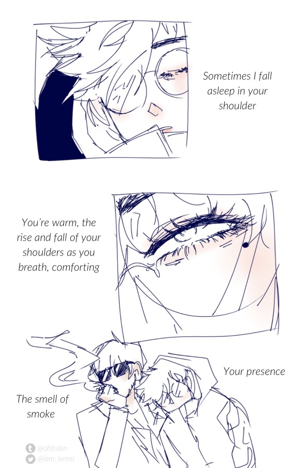
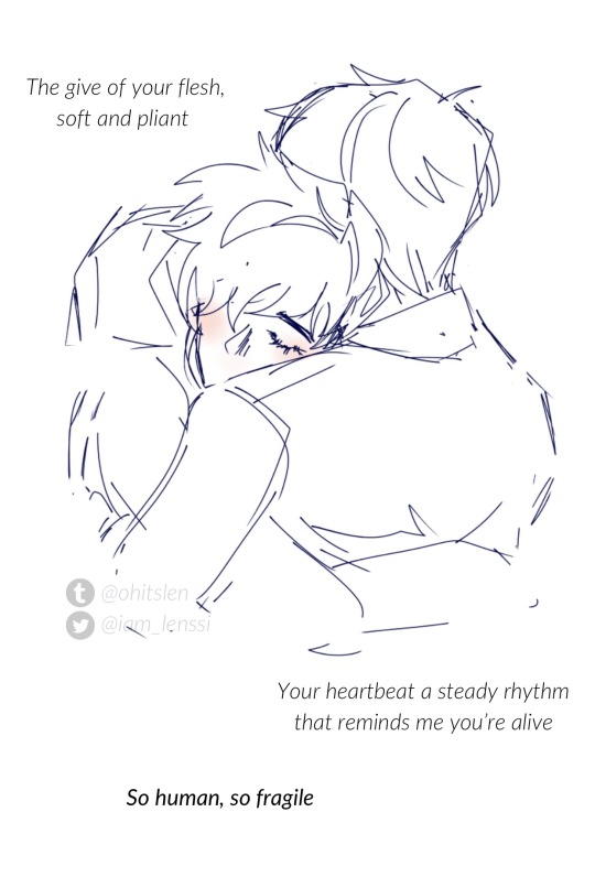
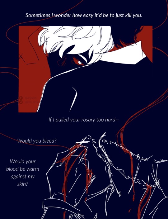
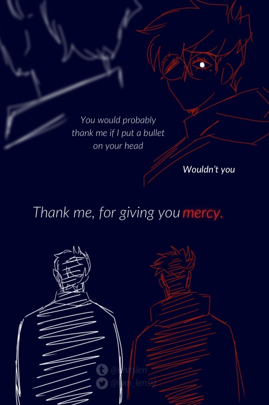
#nothing like thinking about how it’d be to murder your homie. we all do that aaaall the time right#a passion of mine is writing dialogue in a way that you could interchange who says it and it’d still make sense when it comes to Vashwood#they both get insane intrusive thoughts and that’s a matter of fact#they are turbo traumatized so it’s even worse at times. this is what I would say one of the tamest instances if that means anything#Vash would feel so guilty abt them too. bc they don’t feel like his thoughts. it’s almost as if it was someone else’s#they have pointed their guns at each other but never shoot. the thoughts have lost another day <3#Vashwood is: having thoughts and rarely do anything abt them (positive and negative)#everybody who has intrusive thoughts say hell yeah. HELL YEAH!!!#gentle reminder that intrusive thoughts are just that and don’t define you as a person. they are. I’m fact. intrusive#intrusive thoughts#cw intrusive thoughts#tw intrusive thoughts#for those who may need to filter those out#trigun#vash the stampede#nicholas d wolfwood#trigun stampede#vashwood#trigun fanart#vash#wolfwood#nicholas trigun#lenssi draws#lenssi writes#because I wrote the lines first and THEN I did the drawings#still fixated on Vash’s eyes btw if you didn’t notice
2K notes
·
View notes
Text
Okay but the Justice League finds out their new baby hero teammate Phantom is the Ghost King by virtue of the Fright Night showing up while they're in the middle of a meeting, looking terrifying and such and scaring the shit out of everyone- even more so when Constantine starts freaking out over the fact that the sworn night of the King of the Infinite Realms is in the Watchtower what the fuck that's apocalyptically bad Pariah Dark is supposed to be locked the fuck up forever - but instead of trying to smite them all or yeet them into the nightmare dimension he just pulls out a space themed packed lunch??? And gives it to Phantom??
And the mildly eldritch giant murder ghost is talking about how "The Queen Mother commanded me to ensure you ate my Lord, she says you missed your morning meal."
And Phantom is just grumbling about over protective sisters and "there's a cafeteria i would have been fine" what the fuck is happening right now?
What do you mean "oops you forgot" Phantom I thought the ghost thing was just a theme!
#dc x dp#dp x dc#justice league#danny phantom#danny fenton#jazz fenton#fright knight#ghost king danny#fanfic writing prompts#danny at lunch later: aw shit she packed from home now i gotta fight it#justice league watching in horror as his left overs try to kill him: what the fuck what the fuck what the fu-#john constantine#Constantine thinks danny as the ghost king is gonna yell at him about all the soul selling#Danny just thinks it's hilarious and has no intention of interfering#he doesn’t have to deal with that paperwork and thise demons are assholes anyway#danny does get a long lecture after fright knight shows up about sharing need to know information#he gets another one after that about not missing meals#JL member: I don’t *care* if you're the Ghost King you're still growing and need to make sure you're eating enough!#Danny desperately trying to keep them from meeting Jazz because it's all over for his days of eating junk food if that happens
6K notes
·
View notes
Text
everytime i think about ex!bakugo, i get so emotional thinking about how he carries on with his day-to-day like the breakup didn’t happen.
he doesn’t even give himself time to mourn the relationship, to process the loss of you. he throws himself into work, practically drowning in it because he can’t bear staying idle.
you’re everywhere, still—
in the picture frames scattered around his home, in the decorative pieces that each hold their own memory. some of the clothes you returned to him smell like you.
when kirishima asks him how he is, he never answers, always redirecting the subject back to work. deku notices longer bouts of silence during joint patrols, and when he pries, bakugo’s only reply is, “s’not a concern.”
it’s unusual, because bakugo is loud and rough, he barks and barks and barks, but with this, he stays quiet.
#i think about ex bakugo so much if i spent the same amount of time thinkin abt him as writing him i would have finished the fic by now#JOSNXKSJXKSKXJDK#you’re still friends bc same circles and work#but because he throws himself so much into work you don’t really see eachother much a few months after the breakup#you worry for him still because you know his tendencies#you know he’ll push this to the side and keep it to himself until it all spills over one day#you find out he’s been staying completely quiet about it when mitsuki texts you and asks when you and katsuki will come for the holidays :(#he doesnt delete your photos HE DOESNT DELETE THEM. i dont think he has the heart to#bakugo x reader#shotorus.bubble#sigh
586 notes
·
View notes
Text
top/bottom discourse and dom/sub truthers this and that, none of that can touch me because i headcanon them as vers and switch and whatever is best for the bit and therefore always win. look at all the beauty in the world
#all these middle-aged men deserve a good railing and to rail someone good and i will not get in the way of that#in fact i will encourage it because i love them. love reading and writing them fuck in all the different ways keep it up everyone love you#also begging some people to learn the differences between top/bottom/vers and dom/sub/switch#one day i will write them as sides and no one can stop me#📓🐭
485 notes
·
View notes
Text
Steddie idea where Dustin is pressing on Robin and Steve about dating again and Steve decides to just blurt out that he's gay but the kind of gay that likes both and that's why he and Robin can't date (Robin apparently just doesn't count as one of the both in his mind for some reason?) Dustin tries to get Steve to see that but he's also in the 'my brother came out to me I must be supportive' mindset, so he instantly decides to flip to Steve you should date Eddie!
#Someone has probably done this#but just#Dustin neverendingly trying to parent trap Steve and eddie#No one else sees it#ESPECIALLY NOT STEVE AND EDDIe#at first#but on one of their forced dates they start joking about how stupid it all is#and their friendship gets deeper#and they start smoking together on the top of the trailer at nights#and when they get together they adamantly decide Dustin can never know#So naturally he finds out two days later when he accidentally walks in on them making out#Will I write it?#Never#b ut someone needs to#bc I wanna read it#steve#eddie#steddie#steddie hcs
1K notes
·
View notes
Text
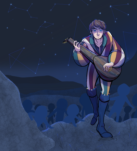
How does the great Sandpiper successfully smuggle 130 children out of the Nilfgaard-occupied territory of Hamm? With the power of a forgotten story, a traditional song, and a masterful lie.
A piece for my upcoming fic, The Piper of Hamm, based on The Pied Piper of Hamelin, next in my fairy tale series.
#FINALLY finished this wip from literally TWO YEARS ago and it only took an HOUR to add the background and stuff#my art#my witcher art#witcher#the witcher#jaskier#The Piper of Hamm fic#I'm basically writing all these fics in order on a sticky note#you can see why I haven't gotten around the the Howl's Moving Castle or Stardust AUs yet because of this#TWO YEARS I had this idea#and it is only now being written#my life is pain lmao#but I've never been invested in a fandom this long so I think I've finally found my forever fandom#and the need to write these aus is still strong#so we'll see them one day
500 notes
·
View notes
Text
If I could hold you for a minute,
Darling, I’d go through it again
For @edsbacktattoo & @stedesearring 💕
Show: Our Flag Means Death - Season 1 & 2
Music: Francesca by Hozier
YouTube
#ofmd#our flag means death#gentlebeard#stede bonnet#edward teach#ofmdedit#ofmdaily#ofmd source#ofmd fanvid#ofmd s2#ofmd edit#blackbonnet#ella’s edit#HAPPY BIRTHDAY JAMS ❤️#AND A BELATED HAPPY BIRTHDAY KAITLIN ❤️#i'm killing two (impossible) birds with one stone by dedictating this video to both of you absolute angels!!#jams i love you so much. you're so incredibly talented and hilarious and kind and amazing. i'm so grateful for you.#if you didn't live halfway around the world i would come over and give you the biggest and warmest hug#thank you for letting me scream in your dms all the time. whether it's about our pirate boys or your writing or cancellation hell™️#and just THANK YOU for being such a wonderful presence in my life#oh and kaitlin. lovely sweet kind kaitlin. the one we all love to call a human ray of sunshine because you're just THAT lovely#your little yellow hearts in the tags brighten my day every time i see them. whenever i talk to you you're just so sweet#thanks for every single lovely word. for every music rec. for every sweet message or ask. what a gift you are. ily!!!#speaking of gifts: i couldn't think of a more perfect song for the two of you than francesca#so i hope you like my little creation that i've put together. once again shoutout to#evil gang 😈
420 notes
·
View notes
Text
Steve lowkey earning himself a reputation for liking guys and girls before he even realizes he does because he keeps interjecting and giving his own answer every time someone tries to ask Robin about guys
At first no one thinks anything of Steve’s interruption and answer when Nancy asks “what even is your type?” quite clearly to Robin and Steve immediately answers “I like girls that are way smarter than me” and everyone just assumes he’s interrupting to hit on Nancy and not to deflect
Then later someone insists some guy was flirting with Robin and she should go for it and Steve immediately goes “Are you kidding me? Robin’s way out of his league. Besides, I had a class with him and he mentioned his stamp collection in it like eight times. Do you really think she wants to sit around and pretend to be impressed by hundreds of stamps?” Still no one thinks much of it yet and if anything they think Steve might be jealous or might just have standards for who they should set her up with
It’s not until it becomes a habit of him answering questions meant for Robin that people start to think there’s a reason, but it’s not Robin they’re onto
Like when they’re having a movie night and Max is going on and on about a shirtless character while Lucas is totally unfazed but Dustin complains and El says which character she liked more and then Max turns to Nancy to break the tie and say which guy is dreamier and Nancy casts her vote, then turns to look over at Robin and ask which guy she’d go for and Steve knows who the question is for but hey he’s sitting right next to Robin so Nancy’s looking in his direction and too and she didn’t say Robin’s name, so Steve doesn’t even hesitate before dropping the name of a character and making sure he keeps the focus off of Robin and keeps everyone distracted from dragging her into that debate by immediately backing it up by saying that Max is right and giving even more reasons to choose him
But even after that, that’s mostly forgotten by the time the older group is drinking and Eddie suggests they play a drinking game and normally Steve would be all over any suggestions, but he turns down truth or dare because he knows how uncomfortable Robin would be and doesn’t want her having to choose between awkwardly lying and deflecting or doing dares she’s not comfortable with or potentially outing herself so he at least manages to change it to never have I ever because that’s a safer bet when he knows Robin hasn’t done anything with any girls
But then Steve ends up drinking significantly more than anyone else while Robin and Eddie are hardly drinking so they end up switching games and somehow they end up playing fuck, marry, kill except Nancy has no interest in getting married or discussing it and she says there’s been enough death in Hawkins and it would be more fun to play with the options as sleep with, kiss, slap. And the game is already started before anyone can ask why marry got changed to kiss and before drunk Steve can figure out how to discretely convince everyone not to. The game goes fine at first with Argyle asking Jonathan about three girls from California. It goes alright when Jonathan asks Eddie about three girls. Steve gets a little concerned when Eddie turns his attention on Nancy that he’ll put Jonathan and him in the list right in front of Jonathan, but Eddie is sober enough still that he at least has enough tact not stir the pot and blow things up on her first turn by throwing them both in in front of them
But then Nancy goes to give Robin a turn and she’s looking right at her and lists the three guys there other than Steve (possibly because she believes Robin on the platonic with a capital P thing and possibly because she doesn’t want to find out if that would waver) so of course Nancy thinks it’s clear that she must be talking to the only other girl there. And before Robin can even try to think of what lie would be the most convincing and least likely to start any awkwardness or drama, Steve’s already jumping in with “Well, I already hit Jonathan and that didn’t go well for me, so I’ll give him a break. And this situation” (gesturing between himself and Nancy and Jonathan) “is finally starting to feel normal so I don’t need to make that awkward all over again by sleeping with your boyfriend. So kiss Jonathan.” And Nancy and Jonathan are looking at him so confused and Robin is grateful for the interruption and relieved but also kind of amused by the level of thought he’s putting into it instead of just throwing out names however. Argyle’s not fazed at all and just waiting to see what he’ll get. Eddie goes from deer in the headlights startled to leaning forward with his elbow on his knee and his chin resting in his hand waiting to see where this will go to abruptly sitting up again and trying to look less interested while his leg nervous bounces and he tries to figure out if Steve is giving a detailed answer to this as a joke or because he’s putting genuine thought into the idea of being with a guy
Steve looks between Eddie and Argyle for a moment, then focuses on Argyle and is like “Sorry, I hardly know you and getting dragged into hitting Eddie or standing around and watching Tommy do it without making any move to stop him is exactly the kind of douchebag bullshit I would have pulled in high school. So I guess slap you and have sex with Eddie.” Eddie’s drink goes down the wrong way when Steve adds “Plus, guitar players are supposed to be good with their hands, right?” and he tries to play it off and not react to the fact that Steve Harrington just said he’d have sex with him and that he thinks Eddie would be good in bed even if it was just in the context of some stupid game. Meanwhile Argyle’s just like “Nah, that’s cool dude. I get it. I would have slapped you too if the roles were reversed.”
After that, a few people start wondering a little more seriously if Steve is into guys too and had his guard down while drinking. But Eddie isn’t going to press his luck without clear evidence and everyone else isn’t going to push it so they just silently wonder a little more every time Steve interjects in the girl talk with his own opinion once again
#Steve later plays a game of FMK with Robin where the options are all girls when it’s just the two of them#I’m sorry but I am not rereading this to check for errors and autocorrects at this hour#I’m just gonna notice things later when I see reblogs and then cringe and edit too late on some other day#Also believe it or not this is a separate idea from the one or two shot I’m going to write at some point where Steve accidentally comes out#before he even knows he’s bi#Stranger Things#ST4#Spicy Six#Fruity Four#ST#Steddie#Steve Harrington#Robin Buckley#Platonic with a capital P#Eddie Munson#Mine
6K notes
·
View notes
Text
why Aurora's art is genius
It's break for me, and I've been meaning to sit down and read the Aurora webcomic (https://comicaurora.com/, @comicaurora on Tumblr) for quite a bit. So I did that over the last few days.
And… y'know. I can't actually say "I should've read this earlier," because otherwise I would've been up at 2:30-3am when I had responsibilities in the morning and I couldn't have properly enjoyed it, but. Holy shit guys THIS COMIC.
I intended to just do a generalized "hello this is all the things I love about this story," and I wrote a paragraph or two about art style. …and then another. And another. And I realized I needed to actually reference things so I would stop being too vague. I was reading the comic on my tablet or phone, because I wanted to stay curled up in my chair, but I type at a big monitor and so I saw more details… aaaaaand it turned into its own giant-ass post.
SO. Enjoy a few thousand words of me nerding out about this insanely cool art style and how fucking gorgeous this comic is? (There are screenshots, I promise it isn't just a wall of text.) In my defense, I just spent two semesters in graphic design classes focusing on the Adobe Suite, so… I get to be a nerd about pretty things…???
All positive feedback btw! No downers here. <3
---
I cannot emphasize enough how much I love the beautiful, simple stylistic method of drawing characters and figures. It is absolutely stunning and effortless and utterly graceful—it is so hard to capture the sheer beauty and fluidity of the human form in such a fashion. Even a simple outline of a character feels dynamic! It's gorgeous!
Though I do have a love-hate relationship with this, because my artistic side looks at that lovely simplicity, goes "I CAN DO THAT!" and then I sit down and go to the paper and realize that no, in fact, I cannot do that yet, because that simplicity is born of a hell of a lot of practice and understanding of bodies and actually is really hard to do. It's a very developed style that only looks simple because the artist knows what they're doing. The human body is hard to pull off, and this comic does so beautifully and makes it look effortless.
Also: line weight line weight line weight. It's especially important in simplified shapes and figures like this, and hoo boy is it used excellently. It's especially apparent the newer the pages get—I love watching that improvement over time—but with simpler figures and lines, you get nice light lines to emphasize both smaller details, like in the draping of clothing and the curls of hair—which, hello, yes—and thicker lines to emphasize bigger and more important details and silhouettes. It's the sort of thing that's essential to most illustrations, but I wanted to make a note of it because it's so vital to this art style.
THE USE OF LAYER BLENDING MODES OH MY GODS. (...uhhh, apologies to the people who don't know what that means, it's a digital art program thing? This article explains it for beginners.)
Bear with me, I just finished my second Photoshop course, I spent months and months working on projects with this shit so I see the genius use of Screen and/or its siblings (of which there are many—if I say "Screen" here, assume I mean the entire umbrella of Screen blending modes and possibly Overlay) and go nuts, but seriously it's so clever and also fucking gorgeous:
Firstly: the use of screened-on sound effect words over an action? A "CRACK" written over a branch and then put on Screen in glowy green so that it's subtle enough that it doesn't disrupt the visual flow, but still sticks out enough to make itself heard? Little "scritches" that are transparent where they're laid on without outlines to emphasize the sound without disrupting the underlying image? FUCK YES. I haven't seen this done literally anywhere else—granted, I haven't read a massive amount of comics, but I've read enough—and it is so clever and I adore it. Examples:


Secondly: The beautiful lighting effects. The curling leaves, all the magic, the various glowing eyes, the fog, the way it's all so vividly colored but doesn't burn your eyeballs out—a balance that's way harder to achieve than you'd think—and the soft glows around them, eeeee it's so pretty so pretty SO PRETTY. Not sure if some of these are Outer/Inner Glow/Shadow layer effects or if it's entirely hand-drawn, but major kudos either way; I can see the beautiful use of blending modes and I SALUTE YOUR GENIUS.
I keep looking at some of this stuff and go "is that a layer effect or is it done by hand?" Because you can make some similar things with the Satin layer effect in Photoshop (I don't know if other programs have this? I'm gonna have to find out since I won't have access to PS for much longer ;-;) that resembles some of the swirly inner bits on some of the lit effects, but I'm not sure if it is that or not. Or you could mask over textures? There's... many ways to do it.
If done by hand: oh my gods the patience, how. If done with layer effects: really clever work that knows how to stop said effects from looking wonky, because ugh those things get temperamental. If done with a layer of texture that's been masked over: very, very good masking work. No matter the method, pretty shimmers and swirly bits inside the bigger pretty swirls!
Next: The way color contrast is used! I will never be over the glowy green-on-black Primordial Life vibes when Alinua gets dropped into that… unconscious space?? with Life, for example, and the sharp contrast of vines and crack and branches and leaves against pitch black is just visually stunning. The way the roots sink into the ground and the three-dimensional sensation of it is particularly badass here:

Friggin. How does this imply depth like that. HOW. IT'S SO FREAKING COOL.
A huge point here is also color language and use! Everybody has their own particular shade, generally matching their eyes, magic, and personality, and I adore how this is used to make it clear who's talking or who's doing an action. That was especially apparent to me with Dainix and Falst in the caves—their colors are both fairly warm, but quite distinct, and I love how this clarifies who's doing what in panels with a lot of action from both of them. There is a particular bit that stuck out to me, so I dug up the panels (see this page and the following one https://comicaurora.com/aurora/1-20-30/):

(Gods it looks even prettier now that I put it against a plain background. Also, appreciation to Falst for managing a bridal-carry midair, damn.)
The way that their colors MERGE here! And the immense attention to detail in doing so—Dainix is higher up than Falst is in the first panel, so Dainix's orange fades into Falst's orange at the base. The next panel has gold up top and orange on bottom; we can't really tell in that panel where each of them are, but that's carried over to the next panel—

—where we now see that Falst's position is raised above Dainix's due to the way he's carrying him. (Points for continuity!) And, of course, we see the little "huffs" flowing from orange to yellow over their heads (where Dainix's head is higher than Falst's) to merge the sound of their breathing, which is absurdly clever because it emphasizes to the viewer how we hear two sets of huffing overlaying each other, not one. Absolutely brilliant.
(A few other notes of appreciation to that panel: beautiful glows around them, the sparks, the jagged silhouette of the spider legs, the lovely colors that have no right to make the area around a spider corpse that pretty, the excellent texturing on the cave walls plus perspective, the way Falst's movements imply Dainix's hefty weight, the natural posing of the characters, their on-point expressions that convey exactly how fuckin terrifying everything is right now, the slight glows to their eyes, and also they're just handsome boys <3)
Next up: Rain!!!! So well done! It's subtle enough that it never ever disrupts the impact of the focal point, but evident enough you can tell! And more importantly: THE MIST OFF THE CHARACTERS. Rain does this irl, it has that little vapor that comes off you and makes that little misty effect that plays with lighting, it's so cool-looking and here it's used to such pretty effect!
One of the panel captions says something about it blurring out all the injuries on the characters but like THAT AIN'T TOO BIG OF A PROBLEM when it gets across the environmental vibes, and also that'd be how it would look in real life too so like… outside viewer's angle is the same as the characters', mostly? my point is: that's the environment!!! that's the vibes, that's the feel! It gets it across and it does so in the most pretty way possible!
And another thing re: rain, the use of it to establish perspective, particularly in panels like this—

—where we can tell we're looking down at Tynan due to the perspective on the rain and where it's pointing. Excellent. (Also, kudos for looking down and emphasizing how Tynan's losing his advantage—lovely use of visual storytelling.)
Additionally, the misting here:

We see it most heavily in the leftmost panel, where it's quite foggy as you would expect in a rainstorm, especially in an environment with a lot of heat, but it's also lightly powdered on in the following two panels and tends to follow light sources, which makes complete sense given how light bounces off particles in the air.
A major point of strength in these too is a thorough understanding of lighting, like rim lighting, the various hues and shades, and an intricate understanding of how light bounces off surfaces even when they're in shadow (we'll see a faint glow in spots where characters are half in shadow, but that's how it would work in real life, because of how light bounces around).
Bringing some of these points together: the fluidity of the lines in magic, and the way simple glowing lines are used to emphasize motion and the magic itself, is deeply clever. I'm basically pulling at random from panels and there's definitely even better examples, but here's one (see this page https://comicaurora.com/aurora/1-16-33/):

First panel, listed in numbers because these build on each other:
The tension of the lines in Tess's magic here. This works on a couple levels: first, the way she's holding her fists, as if she's pulling a rope taut.
The way there's one primary line, emphasizing the rope feeling, accompanied by smaller ones.
The additional lines starbursting around her hands, to indicate the energy crackling in her hands and how she's doing a good bit more than just holding it. (That combined with the fists suggests some tension to the magic, too.) Also the variations in brightness, a feature you'll find in actual lightning. :D Additional kudos for how the lightning sparks and breaks off the metal of the sword.
A handful of miscellaneous notes on the second panel:
The reflection of the flames in Erin's typically dark blue eyes (which bears a remarkable resemblance to Dainix, incidentally—almost a thematic sort of parallel given Erin's using the same magic Dainix specializes in?)
The flowing of fabric in the wind and associated variation in the lineart
The way Erin's tattoos interact with the fire he's pulling to his hand
The way the rain overlays some of the fainter areas of fire (attention! to! detail! hell yeah!)
I could go on. I won't because this is a lot of writing already.
Third panel gets paragraphs, not bullets:
Erin's giant-ass "FWOOM" of fire there, and the way the outline of the word is puffy-edged and gradated to feel almost three-dimensional, plus once again using Screen or a variation on it so that the stars show up in the background. All this against that stunning plume of fire, which ripples and sparks so gorgeously, and the ending "om" of the onomatopoeia is emphasized incredibly brightly against that, adding to the punch of it and making the plume feel even brighter.
Also, once again, rain helping establish perspective, especially in how it's very angular in the left side of the panel and then slowly becomes more like a point to the right to indicate it's falling directly down on the viewer. Add in the bright, beautiful glow effects, fainter but no less important black lines beneath them to emphasize the sky and smoke and the like, and the stunningly beautiful lighting and gradated glows surrounding Erin plus the lightning jagging up at him from below, and you get one hell of an impactful panel right there. (And there is definitely more in there I could break down, this is just a lot already.)
And in general: The colors in this? Incredible. The blues and purples and oranges and golds compliment so well, and it's all so rich.
Like, seriously, just throughout the whole comic, the use of gradients, blending modes, color balance and hues, all the things, all the things, it makes for the most beautiful effects and glows and such a rich environment. There's a very distinct style to this comic in its simplified backgrounds (which I recognize are done partly because it's way easier and also backgrounds are so time-consuming dear gods but lemme say this) and vivid, smoothly drawn characters; the simplicity lets them come to the front and gives room for those beautiful, richly saturated focal points, letting the stylized designs of the magic and characters shine. The use of distinct silhouettes is insanely good. Honestly, complex backgrounds might run the risk of making everything too visually busy in this case. It's just, augh, so GORGEOUS.
Another bit, take a look at this page (https://comicaurora.com/aurora/1-15-28/):

It's not quite as evident here as it is in the next page, but this one does some other fun things so I'm grabbing it. Points:
Once again, using different colors to represent different character actions. The "WHAM" of Kendal hitting the ground is caused by Dainix's force, so it's orange (and kudos for doubling the word over to add a shake effect). But we see blue layered underneath, which could be an environmental choice, but might also be because it's Kendal, whose color is blue.
And speaking off, take a look at the right-most panel on top, where Kendal grabs the spear: his motion is, again, illustrated in bright blue, versus the atmospheric screened-on orange lines that point toward him around the whole panel (I'm sure these have a name, I think they might be more of a manga thing though and the only experience I have in manga is reading a bit of Fullmetal Alchemist). Those lines emphasize the weight of the spear being shoved at him, and their color tells us Dainix is responsible for it.
One of my all-time favorite effects in this comic is the way cracks manifest across Dainix's body to represent when he starts to lose control; it is utterly gorgeous and wonderfully thematic. These are more evident in the page before and after this one, but you get a decent idea here. I love the way they glow softly, the way the fire juuuust flickers through at the start and then becomes more evident over time, and the cracks feel so realistic, like his skin is made of pottery. Additional points for how fire begins to creep into his hair.
A small detail that's generally consistent across the comic, but which I want to make note of here because you can see it pretty well: Kendal's eyes glow about the same as the jewel in his sword, mirroring his connection to said sword and calling back to how the jewel became Vash's eye temporarily and thus was once Kendal's eye. You can always see this connection (though there might be some spots where this also changes in a symbolic manner; I went through it quickly on the first time around, so I'll pay more attention when I inevitably reread this), where Kendal's always got that little shine of blue in his eyes the same as the jewel. It's a beautiful visual parallel that encourages the reader to subconsciously link them together, especially since the lines used to illustrate character movements typically mirror their eye color. It's an extension of Kendal.
Did I mention how ABSOLUTELY BEAUTIFUL the colors in this are?
Also, the mythological/legend-type scenes are illustrated in familiar style often used for that type of story, a simple and heavily symbolic two-dimensional cave-painting-like look. They are absolutely beautiful on many levels, employing simple, lovely gradients, slightly rougher and thicker lineart that is nonetheless smoothly beautiful, and working with clear silhouettes (a major strength of this art style, but also a strength in the comic overall). But in particular, I wanted to call attention to a particular thing (see this page https://comicaurora.com/aurora/1-12-4/):

The flowing symbolic lineart surrounding each character. This is actually quite consistent across characters—see also Life's typical lines and how they curl:

What's particularly interesting here is how these symbols are often similar, but not the same. Vash's lines are always smooth, clean curls, often playing off each other and echoing one another like ripples in a pond. You'd think they'd look too similar to Life's—but they don't. Life's curl like vines, and they remain connected; where one curve might echo another but exist entirely detached from each other in Vash's, Life's lines still remain wound together, because vines are continuous and don't float around. :P
Tahraim's are less continuous, often breaking up with significantly smaller bits and pieces floating around like—of course—sparks, and come to sharper points. These are also constants: we see the vines repeated over and over in Alinua's dreams of Life, and the echoing ripples of Vash are consistent wherever we encounter him. Kendal's dream of the ghost citizens of the city of Vash in the last few chapters is filled with these rippling, echoing patterns, to beautiful effect (https://comicaurora.com/aurora/1-20-14/):

They ripple and spiral, often in long, sinuous curves, with smooth elegance. It reminds me a great deal of images of space and sine waves and the like. This establishes a definite feel to these different characters and their magic. And the thing is, that's not something that had to be done—the colors are good at emphasizing who's who. But it was done, and it adds a whole other dimension to the story. Whenever you're in a deity's domain, you know whose it is no matter the color.
Regarding that shape language, I wanted to make another note, too—Vash is sometimes described as chaotic and doing what he likes, which is interesting to me, because smooth, elegant curves and the color blue aren't generally associated with chaos. So while Vash might behave like that on the surface, I'm guessing he's got a lot more going on underneath; he's probably much more intentional in his actions than you'd think at a glance, and he is certainly quite caring with his city. The other thing is that this suits Kendal perfectly. He's a paragon character; he is kind, virtuous, and self-sacrificing, and often we see him aiming to calm others and keep them safe. Blue is such a good color for him. There is… probably more to this, but I'm not deep enough in yet to say.
And here's the thing: I'm only scratching the surface. There is so much more here I'm not covering (color palettes! outfits! character design! environment! the deities! so much more!) and a lot more I can't cover, because I don't have the experience; this is me as a hobbyist artist who happened to take a couple design classes because I wanted to. The art style to this comic is so clever and creative and beautiful, though, I just had to go off about it. <3
...brownie points for getting all the way down here? Have a cookie.
#aurora comic#aurora webcomic#comicaurora#art analysis#...I hope those are the right tags???#new fandom new tagging practices to learn ig#much thanks for something to read while I try to rest my wrists. carpal tunnel BAD. (ignore that I wrote this I've got braces ok it's fine)#anyway! I HAVE. MANY MORE THOUGHTS. ON THE STORY ITSELF. THIS LOVELY STORY#also a collection of reactions to a chunk of the comic before I hit the point where I was too busy reading to write anything down#idk how to format those tho#...yeet them into one post...???#eh I usually don't go off this much these days but this seems like a smaller tight-knit fandom so... might as well help build it?#and I have a little more time thanks to break so#oh yes also shoutout to my insanely awesome professor for teaching me all the technical stuff from this he is LOVELY#made an incredibly complex program into something comprehensible <3#synapse talks
761 notes
·
View notes
Text
Dick 'my mental stability is hanging by the rope that snapped and killed my parents' Grayson met Bruce 'emotions aren't real if you don't acknowledge them' Wayne when he was 8 years old and he never recovered.
#dick tries to have a normal day but all he gets is mixed signals from his dad and a traumatizing event (very probable)#“I miss you”#“now get out of my house”#← I'm paraphrasing but yes he's said that#I'm so sick of them one day I'll write the longest vent about them and nobody can stop me#their relationship is the definition of 'complicated'#dick grayson#nightwing#robin#bruce wayne#batman#bruce and dick#dc#dc comics
257 notes
·
View notes
Note
I’m literally drooling over the thought of sensitive Bucky whimpering and whining while fucking your tits and thighs he’s so pathetic and needy all he wants is to make you feel good and to fill you with his cum even if it overstimulates him
Okay, tit fucking is great and all but thigh fucking is SO underrated in my humble opinion. Could just be the fact I've got a small chest though lmao
It's so fun when you're already really into it and the insides of your thighs are all slick. I feel like Bucky would lose it, getting to see your face and look in your eyes and enjoy your body.
It's a nice one to do while laid on your side, facing each other. Although the angle isn't quite right for him to slip inside you, it's fun to explore the other ways your bodies can steal pleasure from one another.
"This isn't going to work, sweetheart." You can't help but laugh, having already tried everything you can think of to make the height difference work. There's no way to keep this romantic and intimate in that position because there's just no chance of aligning your bodies properly to allow him to press inside you.
"Maybe not. But it feels nice anyway." His eyes flutter shut, gliding his dick over the smooth, soft, warm insides of your thighs, encouraged by how slick and easy your arousal makes the movement.
You adjust yourself to bring your other thigh on top of his length, closing him in on both sides.
You're wet enough that friction doesn't impede his movement too much and there's something oddly romantic about it. Maybe it's his hand smoothing the back of your head or his other hand up your back, pulling your body closer to his.
It's so intimate, watching his face as he whines your name, rutting senselessly against your thighs. The little flush to his cheeks is beautiful and you can't resist kissing the thin sheen of sweat on his forehead. The thick duvet on top of you both, coupled with your combined body heat means the room is far hotter than you'd planned.
You take a second to reach between your bodies, spreading your wet folds and readjusting his length, letting him drag his cock against your neglected clit with each stroke and oh, that's pretty mind-blowing.
"O-oh my God." He whines, desperately fucking himself against your wet cunt, rather than into it. It's a different kind of pleasure to being inside you and while they're not comparable sensations, it doesn't stop this from feeling fantastic.
"Fuck, that's good." You groan, rolling your hips to meet his. Your fingers dip between you once more, gathering some of your slick arousal, using it to glide your fingertips over the underside of his shaft and over his balls.
"Holy shit, that's - fuck." Bucky's hardly got a coherent thought left in his head. He's closed in on both sides by your wet, soft thighs and now your fingers are giving him a different sensation underneath while pressing him against your soaked sex.
"I know, baby. Feels good, doesn't it?" Your fingertips trail lightly back and forth over the underside of his shaft, focusing on the inch or so beneath the tip.
"I can't... I need to cum." He groans, thrusting frantically, clinging to your body to keep you close. Within a few seconds, you feel his dick pulse under your fingertips, his cum coating the inside of your thighs in hot, thick, messy spurts.
He doesn't waste a second, kissing your forehead before kissing your neck and whispering "Good girl. Now let me watch you get yourself off with my cum on your fingertips."
#asks answered <3#becca writes spice#anon#needy!bucky#Bucky Barnes x reader smut#bucky barnes smut#sub!bucky#was this one something I've been fortunate enough to try? Absolutely.#and has it bounced around in my head ever since?? yep#I've got so many 💦sports asks#and I've been really hesitant to answer them bc I have people I know irl on here now#but honestly if my interests so far haven't freaked you out#those probably won't either#I made the best overnight oats last night I've been thinking about them all day#white chocolate chunks with raspberries and peanut butter#with oat milk#and I'm using that to distract me from the fact I'm locked out of my work emails and I can't do my Sunday evening email clear up#it's freaking me out that I can't get into them#that'll mean I have so much to do tomorrow morning#I'll probably lose my hour home on the train tomorrow trying to catch up#I love my hour to work and my hour home from work on the train#that's my me time#where I read my silly little book and chill
1K notes
·
View notes
Text


#jeeves and wooster#jooster#bertie wooster#reginald jeeves#I have a scene in my head#Bertie decided to become a serious writer#and it took him a long time to come up with an idea for a first novel#but one fine day a bunch of crumpled sheets of paper later#he finally got the idea to write a novel about his and Jeeves' adventures in the past#so he caught Jeeves cleaning up and began to describe his idea in all its colors#I don't think Jeeves would approve of that idea as probably not all the Bertie relatives and friends would be happy to read about themselve#although I think Aunt Dahlia would love to read how Bertie screwed up🥀#anyway#yeah💅✨️#Bertie with glasses and ink stains on his arms and sleeves (Jeeves is going to kill him)#I just realized he looks like a turtle here with this glasses heheh#and I overdid it with the freckles#but he's cute with them I hope🥲#(I've been a little burned out lately sorry💔)#fanart#my art#artists on tumblr
243 notes
·
View notes
Text
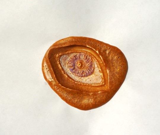
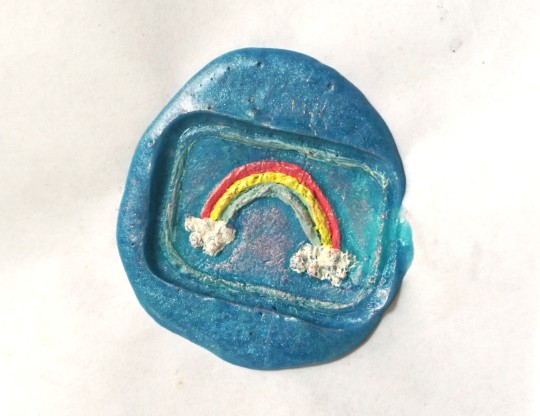
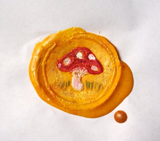
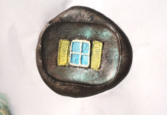
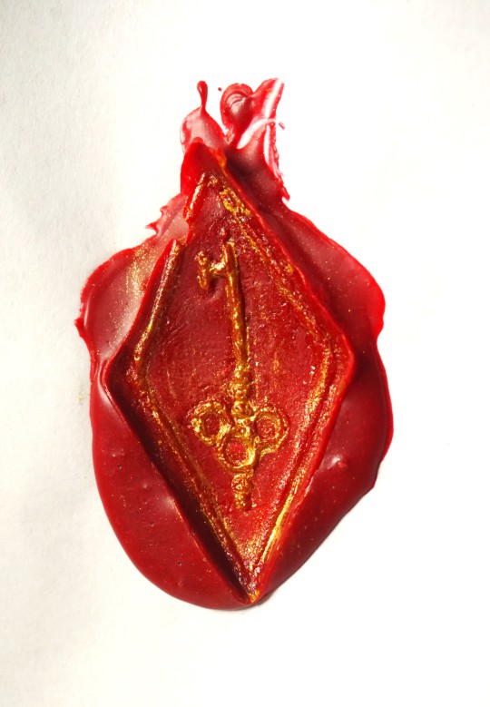
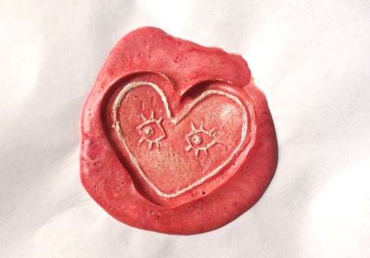
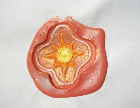
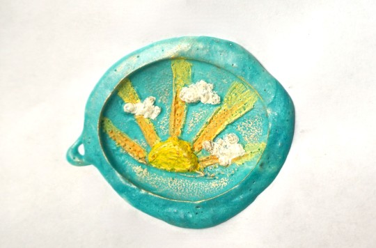
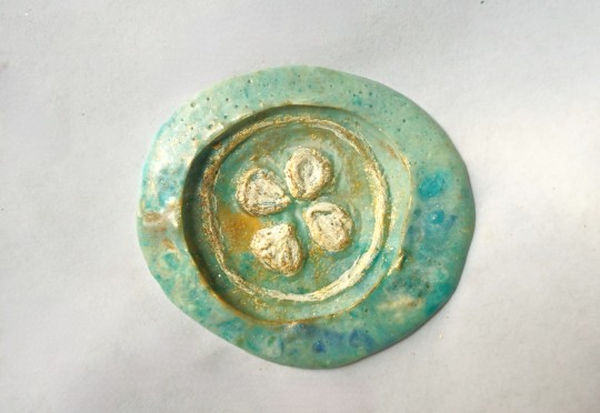
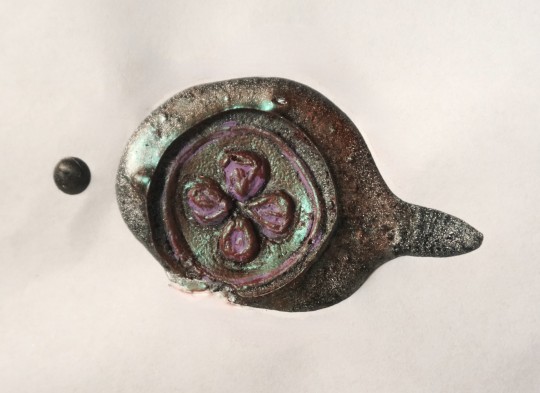
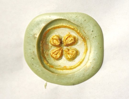
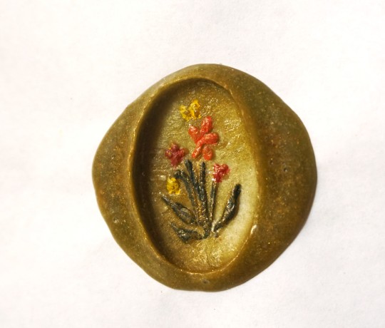
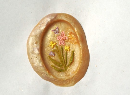
I made a few new wax seal stamps out of clay (like the ones I did for my worldbuilding stuff forever ago), this time just of random symbols that I thought might look good done in the style of painting over the raised part of the wax or etc. :0c Some of them aren't carved deep enough to really show up that well, but overall they worked okay for being clay lol
#wax seal#crafts#wax stamp#stationery#Window one is kind of stinky.. I was imagining like a swirly night sky sort of looking thing so it would be a surreal contrast of a night#sky with a window in the middle that shows a daytime sky - but the silver and purple wax kind of mixed too much together#with the black and it just looks very plain black and not all that starry or anything hjbhj.. Of course the eye is probably my favorite#since all I ever do is draw eyes and still like eye imagery for some reason. The four leaf clover is very lumpy and skrunkty but also it wa#the smallest in size out of all of them so was easier to do multiple stamps of just to try it out.#The heart with eyes wax is actually more swirly in person. I wanted it to be a mix of light pink and red and white. and the wax#did kind of all blend together but in person you can definitely see MORE of the intentional swirlyness. in this it just looks plain pink.#I was going to do one eye in the heart but it looked weird. but now two seems too plain. i could have done 3?? in a pattern.. hmm#alas. I wish I could make actual metal ones. With the clay i have to paint them in a thin layer of olive oil before stamping because#otherwise the wax just kind of gets stuck in the grooves of the clay and then you can't pull it up. Very wacky ''unprofessional'' looking#set up where I'm hot gluing circles of sculpey clay to short stumps of a wooden dowel that I sawed apart with a serrated bread knife#and then using an old paintbrush to put olive oil on them whilst holding a spoon over a yankee candle flame hjbjh#ANYWAY.. I think if I were middle class/rich/etc. this would be one of the main things in my crafting room is like.. SO many colors#of wax. and all different custom made stamps designed by me. which could be much more elaborate in actual metal.. muahaha.... >:)c#RHGghhh... I actually don't want to talk much about it since (this is probably just my Obsessed With My Own World Artist Delusions) I#think I have a really cool idea for a game that could genuinely be successful if i ever get to make it and I don't want to give#everything away and spoil the whole plot/concept in hopes that one day I can actually do it - BUT - a game that I'd like to make after the#visual novel I'm making now has partially to do with the main character working as a sort of writer/scribe/artist assistant in an elven#city (set in my world/with my worldbuilding species and versions of elves and etc) and I was thinking of maybe incorporating#somehow being able to collect little writing type items like these like.. you can get different wax seal patterns or pens or etc. when I do#stuff like this in Real Life it always makes me think of that like.. ouh... this is good research.. what it shall be like to be a littol#elf collecting wax seals and such.. indeed... GRR i need to be finished with my current game NOWWW... i MUST work on other#thingss... aughh... ANYWAY.. yay. accomplishment to do One Single Thing other than Sit In The Summer Heat And Rot#though also hilarious as this was the first cool-ish day that was below 80F in a while hgvh#waking up like 'wow.. i actually feel okay today?? like I could do things?? how mysterious.. I wonder why..?? :0'' Its The Weather You Fool#Tis Always The Weather
155 notes
·
View notes
Last Seen Blogs

dessertbywinata
Dessert Box Winata
dessertbywinata
Dessert Box Winata

steinbecks
☀☀☀

an-angel-for-me
an angel for me

arcanemarion
the world is not enough