#production design
Text
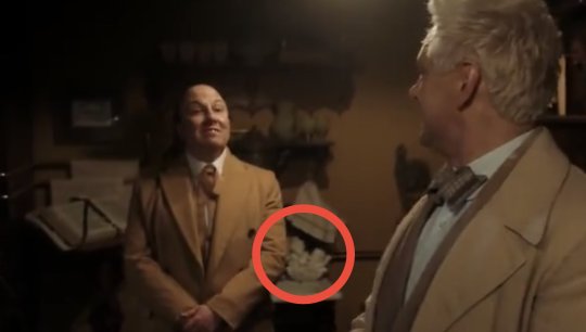


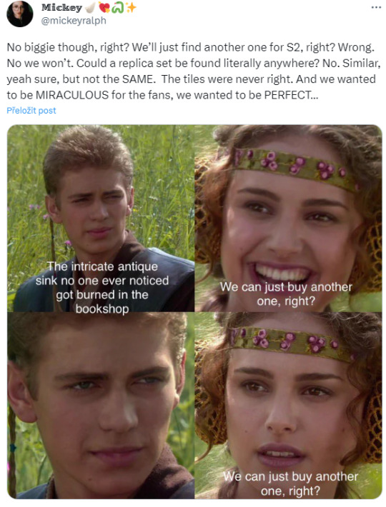

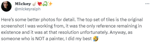


Whoa! 👀Amazing! ❤ (tweet thread)
plus :D

Edit:
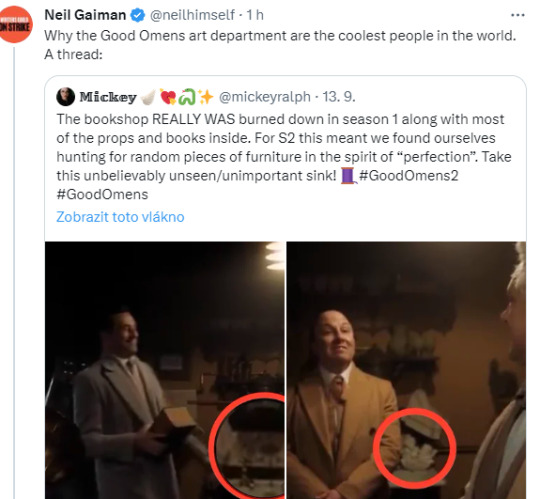
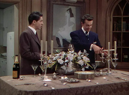
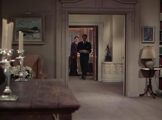
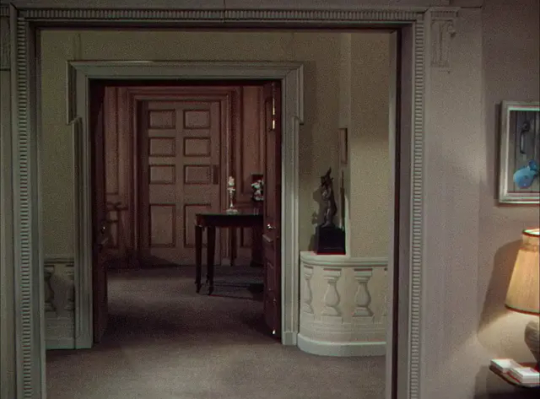
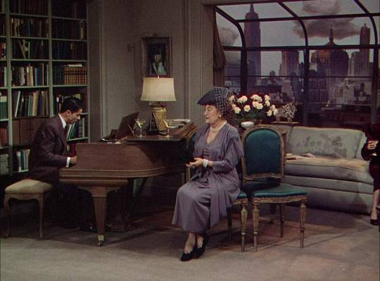
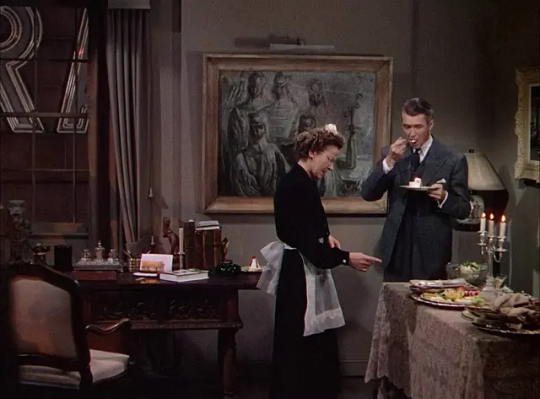
#good omens#gos2#season 2#aziraphale's bookshop#michael ralph#production design#bts#fun fact#aziraphale's sink#👀#gos3#season 3#neil gaiman
15K notes
·
View notes
Text
The Magnus Archives (Season One) Production Design Project

Hello everyone! Let me introduce myself- I'm Tilda (or Tilde), and I'm want to be a production designer.
Production designers create the overall look of a piece of media. From costumes, lighting, environments, props, etc., these designers make sure that everything looks cohesive and sets the mood.
So, I thought it would be fun to put my skills to the test by designing season one of The Magnus Archives. My winter break started as soon as I became interested in the show. Needless to say, a new obsession and an abundance of free time go well together.
You may have seen these illustrations posted separately, this is a master post of the whole project. My thoughts, processes, and critiques are all included under the cut. If you read them, I hope you enjoy! If, not, thank you for supporting my work regardless.
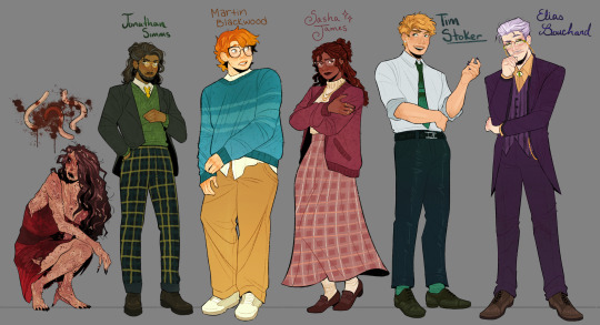
The Characters
When designing these characters, I tried to avoid being influenced by fan interpretations. Though, that was a challenge (especially with Jon and Sasha). I found that I looked to my friends for inspiration. Certain elements (Jon's glasses) were based off of what they wore.
Pinterest was also useful for finding clothing and pose references. Some looks were based off of different actors- in particular, Tim was inspired by Nicholas Galitzine and Elias inspired by Matthew Lillard.
Jane was the most fun to design! I believe in making terrifying characters actually terrifying.
Elias's design needs the most work. Having now finished the show, I see that it doesn't fit him. The purple is overly saturated, especially compared to the set. He looks out of place! I'd reverse the color palette to mostly green/yellow with purple accents instead. Although, I will forever defend the purple tint in his gray hair.
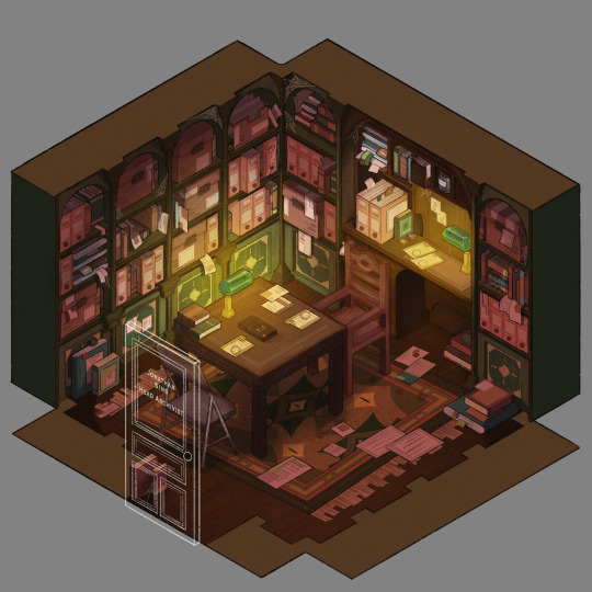
The Set
Jonathan's office was a treat to design! Balancing the color and clutter was especially important. This room is meant to be claustrophobic and uncomfortable, but not overbearingly so.
The wood looks to be full of splinters, but not so worn that it can be thrown out. The chairs offer no back support, and the shelves make the room smaller. The goal was to represented Jon's mind. Intricate, messy, and suffocating (Note: that is more of a season two description).
One goal was to capture the look of an actual archive. Valuable times was spent researching the different kinds of storage, files, paper, etc. The texture and color had to be accurate.
A split-complementary color palette of blue-green, yellow-green, and red was used. Of course, I had to get green in there, and the varying hues and desaturated reds worked well for the wood and filing supplies.
Jane's ashes and the Web lighter on the desk place this set at the end of season one. I find details like this to be important, it's one of my favorite parts of design. There is much needed abundance of eye imagery as well. Most obviously in the carpet, but eyes are carved into the table and watch from the shelves.
My main critique is the lighting- the filters used could be adjusted as to not distort the colors of the boxes. They look inconsistent. The Web lighter could also be more obvious, yet it is small and pixelated.
The Props
I designed these as I re-listened to season one, and it is the most recent piece I finished. Combining the details described in the show with what the objects would have realistically looked like was interesting. That was most useful for the clown, the Ming vase, and Ex Altiora.
Each of these objects came from a specific time with a specific look. Ex Altiora was bound in calf leather from the 1800s, so those books were referenced. Same with the frills on the clown's outfit.
The Ming vase was especially interesting, as it is from the Jiajing period. When looking at photographs of Jiajing vases, I found that many of them lacked handles and had an hourglass shape. That was fascinating to me, as many artists depict a standard oval-shaped vase. Also, the vase's design is described as straight lines that create distorted patterns when looking at it. That effect was achieved using chromatic aberration and the liquify tool (chromatic aberration was used to create a vertigo effect on Ex Altiora).
My critiques are... nitpicky. minimal. The shading on top of the garbage bag is unnatural. The thickness of the gold engraving on Ex Altiora is uneven. The "I" in "Immediate Consideration" is not capitalized. Other than that, I'm happy with how the props look.
Conclusion
First off, if you read everything, thank you!! It is a lot, I know.
My greatest takeaways are that 1) ask for critique, always 2) research skills are necessary for design 3) references are your friend! Seriously guys, use your references.
I hope you enjoyed this project and I'm excited to share more of my work in the future!
#and before anyone asks#i am not doing this for any other season#feel free to ask any questions about this project!#tma#the magnus archives#tma season one#production design#tildexart#tilda rambles
3K notes
·
View notes
Text
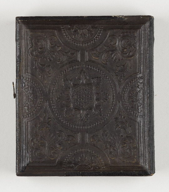


Daguerreotype portrait of Winona Ryder from Bram Stoker's Dracula (1992)
#bram stoker's dracula#dracula#winona ryder#daguerreotype#francis ford coppola#mina murray#production design#*
3K notes
·
View notes
Text
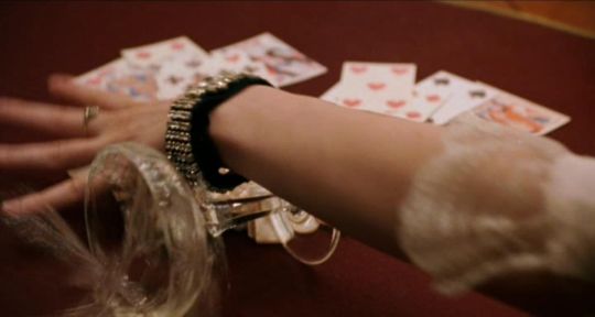
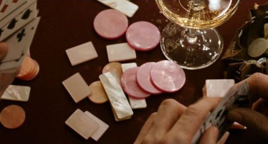
I was always obsessed with the pearlescent pink poker chips in Marie Antoinette (2006)
#marie antoinette#sofia coppola#film stills#champange#pink#coquette#women directors#women filmmakers#films by women#production design#prop styling#set decoration
4K notes
·
View notes
Text
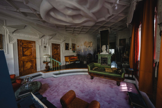


Poor Things Production Design, James Price and Shona Heath
2K notes
·
View notes
Text


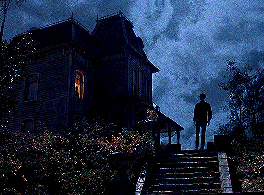
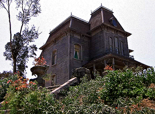
Psycho II (1982) dir. Richard Franklin
#Psycho II#Richard Franklin#neon#movies#production design#*#**#filmedit#horroredit#psychoedit#userbrittany#userelissa#userkarlo#userlenny#uservee#userlenie#usertennant#ritahayworrth#uservienna#usercande
2K notes
·
View notes
Photo
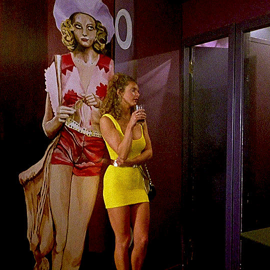

“Taxi Driver (1976)” murals on the walls of The Volcano nightclub in
— TRAINSPOTTING (1996) dir. Danny Boyle
#filmedit#userleo#userangela#underbetelgeuse#usersakshi#userrobin#moviegifs#dailyflicks#chewieblog#userbbelcher#userstream#userfilm#fyeahmovies#cinematicsource#trainspotting#taxi driver#production design#gif#*
4K notes
·
View notes
Text

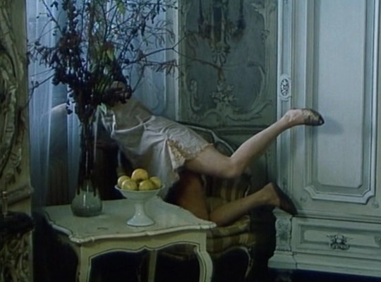

Fruit of Paradise • 1970 • Věra Chytilová
An experimental retelling of the story of Adam and Eve which then progresses into an allegorical depiction of loss of innocence.
#fruit of paradise#Věra Chytilová#czech films#adam and eve#film stills#cinematography#production design#film frames
2K notes
·
View notes
Text
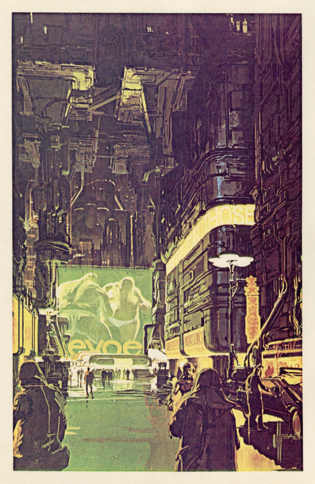
Blade Runner concept art by Syd Mead.
457 notes
·
View notes
Text

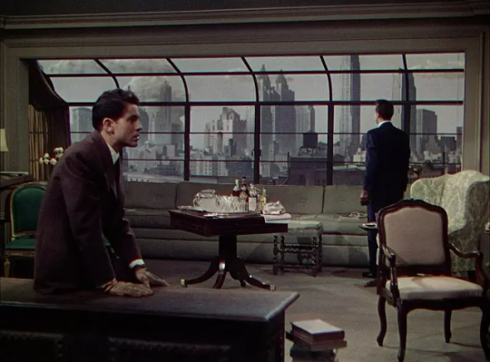

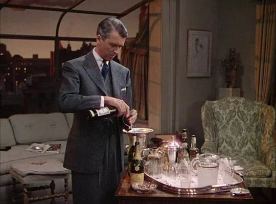
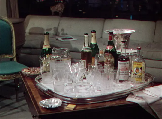


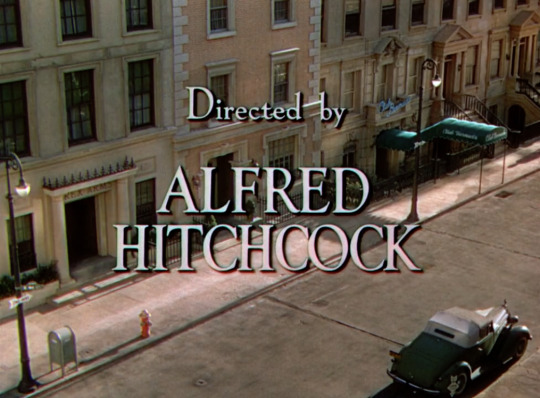
Rope | 1948 | USA
Director: Alfred Hitchcock
Set decorator: Howard Bristol and Emile Kuri
#rope#james stewart#john dall#farley granger#alfred hitchcock#production design#set design#interior design#interior and films#architecture#films#film frames#classicfilmsource#cinema#cinematography#1940s movies#1940s
399 notes
·
View notes
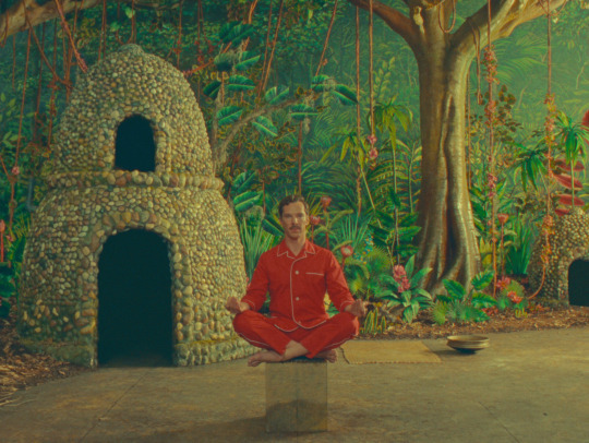
Text

Spotlight: Adam Stockhausen
Production Designer, The Wonderful Story Henry Sugar
Oscar winning production designer Adam Stockhausen (not pictured above, that’s Benedict Cumberbatch), whose work you may know from Wes Anderson films like The Grand Budapest Hotel, Asteroid City, The French Dispatch, Isle of Dogs, and Moonrise Kingdom, as well as titles like Bridge of Spies, and West Side Story (2021), took the time to answer some questions.
Which details from or aspects of The Wonderful Story Henry Sugar did you focus the most on while adapting it to the screen? How did you meld Roald Dahl and Wes’s worlds?
The details on this one started with Dahl’s writing hut! We matched the details pretty carefully and exactly. As soon as we step outside of the hut though we start to move through the world of the story and the world of the stage at the same time. Wes had the idea of how he wanted to do this from the very beginning. My main challenge was trying to figure out how to pull it off—making the parts move and getting each to have the right detail.
What’s a small change you made on a project that ended up having an unexpectedly significant impact?
Lots of times this happens—where what seems like a small thing at the time becomes a very significant turning point. I’m in Berlin now writing this and remembering being here scouting for East Berlin for Bridge of Spies. We were struggling to find a section of town that still felt old enough to show the early 60s, and decided to take a chance on a quick search in Poland. That quick search changed the whole production plan and ultimately gave us the look of our East Berlin.
How has technology changed the way you approach your work?
Technology has definitely changed the way we plan the work. We used to model everything in cardboard or sometimes just plan in two dimensions with pencil and paper. We can now plan in 3-dimensional space using modeling programs and see what real lenses will do. This allows for more accurate planning and makes scenery moves like the casino set in Henry Sugar possible.
Do you have any signature easter eggs you like to leave? Any small details that you are particularly fond of?
I wouldn’t say there are easter eggs in this one. But there are loads of special details! I think my favorite might be the levitation boxes where we painted a perspective view of the background onto a prop box. The actor sitting on the box appears to be floating in a very special and theatrical way.
Did you talk about reflecting the iconic Quentin Blake illustrations in production design? How would you go about doing that?
Not really. They are such incredible drawings and I’d say they’ve been inspiring me since I saw them as a child! But for this the starting point was really the machine Wes devised to move us through the story—and pairing that to specific references scene by scene.
There is such an intentionality to the aesthetics of a Wes world. Is there a set or frame that took you a long time to get perfectly right?
All of them! It’s a very labor-intensive process getting these frames right. Occasionally one will click right away, but usually it’s a process of refining and refining. The jungle for instance went from sketches to models to samples and back again several times before the final look settled.
If you had to present one frame that showcases the best of your work, what would it be?
Oh my. Maybe the jungle? I really enjoyed making the jungle!
With all the moving sets in the trailer for The Wonderful Story Henry Sugar, it feels reminiscent of a theatre production. Are there distinct differences in approach between film and theatre and how much do you blur the lines between them in your work?
I think the lines are blurred completely! Or maybe they aren’t even there. I love that Henry Sugar is so incredibly theatrical in its storytelling. It allows us to show the artifice of the sets all the time which somehow makes them even more satisfying when they finally do line up and create a complete picture. I think the casino set is a perfect example—the pauses where it all lines up for a second are even more enjoyable because we get to see it broken apart and sliding away.
Thanks, Adam!
#spotlight#entertainment spotlight#adam stockhausen#wes anderson#production design#filmblr#wes weaving#web weaving
584 notes
·
View notes
Text
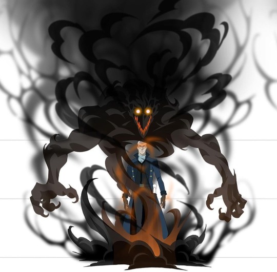

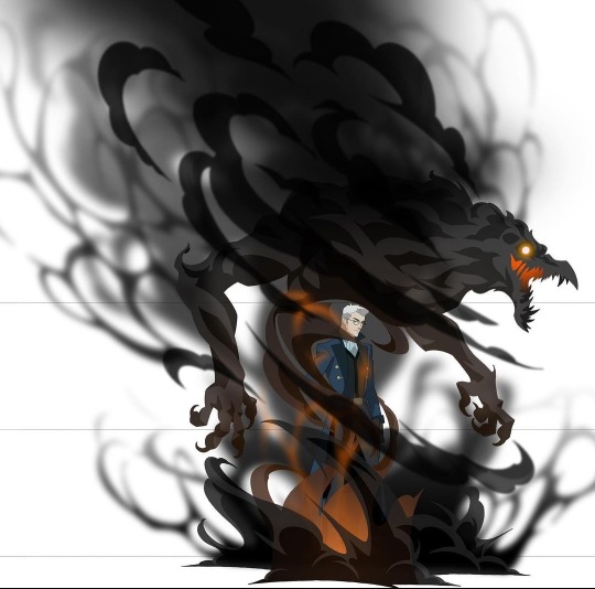
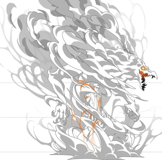
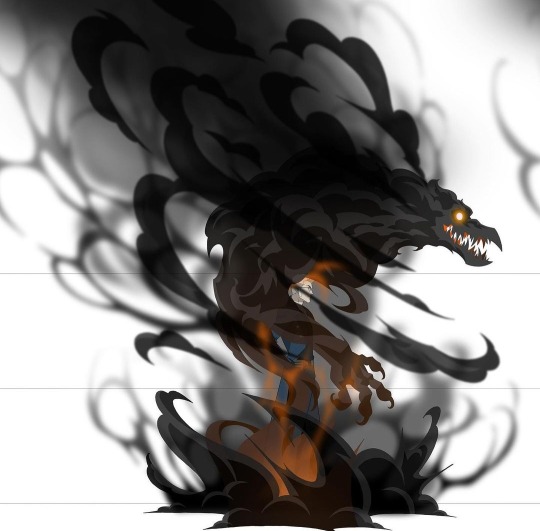
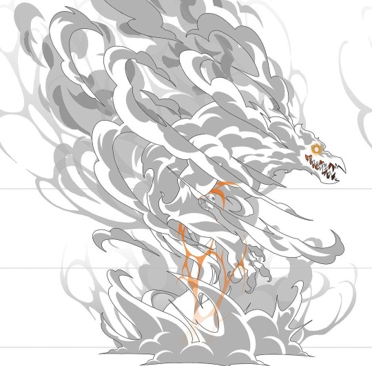

THE LEGEND OF VOX MACHINA | Percy and Orthax Design
By Bertrand Todesco
#vox machina#the legend of vox machina#tlovm#critical role#percy de rolo#percival de rolo#orthax#character design#creature design#concept art#production design#animation#titmouse inc.
2K notes
·
View notes
Text
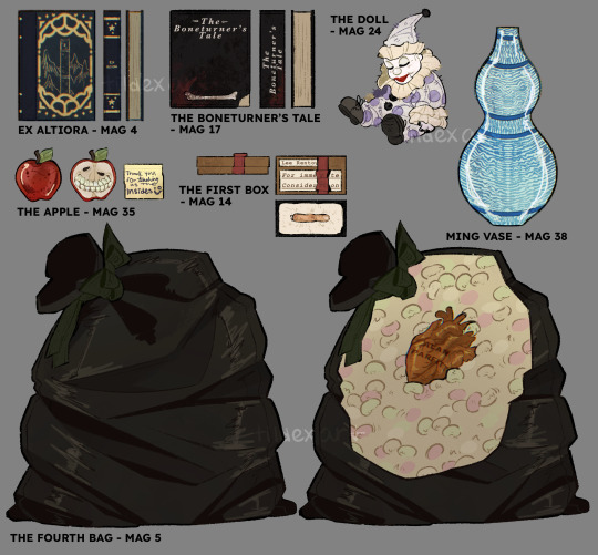
TMA Season One Objects 🕸️📼👁️
#and thus concludes my Magnus archives production design project!#I’ll probably post all three parts in one big post#hope y’all enjoyed :]#tildexart#tma#the magnus archives#prop design#procreate#production design
3K notes
·
View notes
Text

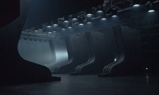

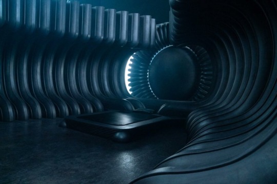


dune: part two sets (via)
292 notes
·
View notes
Text
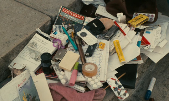
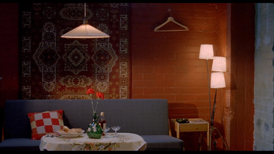
Jane B. par Agnès V. (1988) dir. Agnès Varda
#Agnès Varda#film stills#jane birkin#1980s films#messy chic#beautiful mess#production design#set decoration#whats in my bag
682 notes
·
View notes
Text
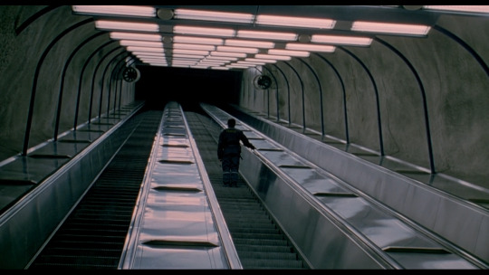
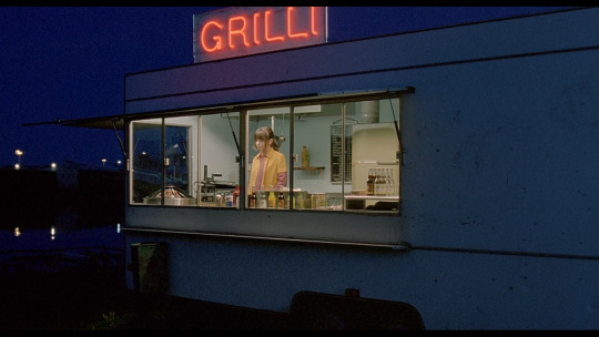


Lights in the Dusk. Aki Kaurismäki. 2006
#lights in the dusk#aki kaurismäki#janne hyytiäinen#maria heiskanen#wide shot#production design#00s#finland#cinematography#movies#cinema
401 notes
·
View notes
Last Seen Blogs
iinthdark
5:58

blackwhitemafia
BLACK WHITE MAFIA

kori-monster-the-ascendite
Find Your Table Lamps Here!
donpietro999
don pietro photography

confessionheroes-blog
"Oh god not another one"