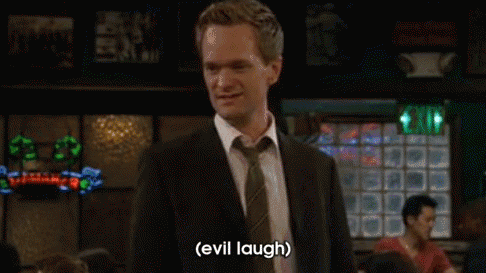
#rescue team is great canyon no contest
Text
im curious what's everyone's favorite dungeon(s) in each pmd game
#rescue team is great canyon no contest#explorers id say northern desert or hidden land/hidden highland#(least favorites are DEFINITELY crevice cave and bottomless sea. hated those ones so much)#gti probably hazy pass but i also like forest of shadows... gti was really cool with having u go through some dungeons at like. not daytime#psmd is tough... it used to be mystical forest but i really like the whole stretch of submerged cave to prehistoric ruins to primeval fores#op#pmd#pokemon mystery dungeon
31 notes
·
View notes
Text
Karzahni
Karzahni is one of the primordial beings created by the Great Beings for the Matoran Universe. He was created alongside his brother Artakha, and were intended to be Creator-Rulers of the Matoran Universe. He and Artakha were made to compete for the Mask of Creation, in a contest of creative prowess. Artakha won, and proceeded to be the Great Being’s main assistant in creating the Matoran Universe. Karzahni was given the experimental Olisi as compensation.
Although Karzahni was a skilled engineer and architect, the Great Beings used Artakha to create such things as the first Toa and their vehicles. Karzahni was left to his own devices, where he mostly showed Matoran labourers how to build more complex machinery. This earned him an amount of praise from those he helped, but Artakha still received renown for the assignments given to him by the Great Beings.
When the Great Spirit Robot was completed and took off, Karzahni had an idea to win renown above his brother. He would turn his realm into a place of repair and healing for the Matoran and the other species that Mata Nui was creating. He set up the appropriate workshop and began inviting the wounded and the poorly constructed to be fixed. Karzahni’s dream was that he would be seen as a kind and welcoming benefactor that help those Matoran down on their luck, while casting Artakha as a land of privileged elitists.
This dream was very abruptly ended when it turned out that Karzahni, while brilliant in purely mechanical areas, had little knowledge on the workings of biomechanical beings. Karzahni panicked, and attempted to figure it out as he went. He failed and reduced the Matoran to deformed, weakened forms. The initial batches were sent away and hidden in the centre of the Southern Continent. As more Matoran were shipped in, his panic only increased, and he resorted to sealing off the island and imprisoning the Matoran there. He was too proud and too panicked by his failure to consider asking Artakha for help.
He continued imprisoning Matoran shipments until the Matoran realms began catching on and began seeking repair elsewhere. He began using his mechanical genius to loosen Mata Nui’s control over his island and have it obey his own whim. When the Hand of Artakha and several Toa teams attempted to liberate the imprisoned Matoran, Karzahni used his control of the environment to great effect in defeating them.
Karzahni’s island was sealed off for some time, until the Hand of Artakha disbanded and the reason for the blockade forgotten. Karzahni seemed to have little interest in leaving the confines of the central canyon, let alone his island’s dome, so nobody was concerned. The identity of the island was also forgotten, simply becoming “that worthless island south of Metru Nui.”
Karzahni was maddened by his failure, and spent great bouts using the Kanohi Olisi to plant himself into worlds where he hadn’t failed. This only made him more bitter at his reality, and began forcing the Matoran into endless pointless forced labour to punish them. He also decided to learn how to modify biomechanical beings through experimentation, including experimentation on himself. This degraded his body and drove him further into insanity, but gave him motivation to perfect the skill so he could fix himself. He was eventually able to master the art, and began rebuilding himself routinely, and creating “art pieces” out of his prisoner’s bodies.
Karzahni remained undisturbed until the Brotherhood of Makuta began assigning their members to watch over certain realms. Had almost any other Makuta been assigned to Karzahni, Karzahni’s actions would have been reported and the Brotherhood’s armies shut would have down his hell-prison. Unfortunately, Makuta Icarax, malicious even before Teridax’s rise to power, found the Matoran’s plight hilarious, and struck a deal with Karzahni. In exchange for continued secrecy and a Rahi Fabricator with dangerous guard species programmed into it, Karzahni agreed to put his Matoran to work producing secret projects for Icarax, and to imprison certain individuals Icarax felt deserved a fate worse than death. When Teridax took over the Brotherhood, Karzahni’s influx of new prisoners and construction orders increased.
His role as the Brotherhood’s lackey wounded Karzahni’s pride further, and he continued to use the Olisi’s fantasies to comfort himself. As thousands of years passed, he became addicted to the illusions and began to forget he wasn’t the supreme dictator of the universe. When a group of uppity Matoran led by Jaller intruded on his realm after the Great Cataclysm, Karzahni was able to dig from them a better picture of not only what was happening outside his realm (which he was already getting from Brotherhood prisoners anyway) but managed to learn of Mata Nui’s impending death, and the consequences thereof.
There was still some loyalty in Karzahni to the creation of the Great Beings, and Karzahni resolved that the universe had to be rescued, by force. While running over simulations of his conquests using the Olisi, Karzahni began reconstructing the beings of his realm. He set the Rahi Frabricator to churn out Manas, reassembled himself to a Makuta-like Titan, and turned all of his prisoners into a legion of warriors. He kept the Brotherhood’s current orders for himself, and began the construction of vehicles and weapons.
Karzahni did not intend the army to mobilise until he had seized the Kanohi Ignika, which he understood was vital to Mata Nui’s survival, and only believed would serve as a great symbol of his authority. He took only a few Manas with him to follow Jaller’s trail and found himself in the waters of Mahri Nui. There he was mutated by the waters, and found himself in battle with Makuta Teridax. In ordinary circumstances, Karzahni would have wiped the floor with Teridax, but his disorientation over his mutation and the fact that he was having trouble distinguishing reality from his Olisi fantasies lost him his edge and he was defeated.
He nursed his wounds and retreated into the Olisi to nurse his pride, until he was discovered and captured by a pair of his old failed repair-jobs and their old Toa friend. He was left incapacitated for the Order of Mata Nui to find and deal with. The Order brought him to Daxia for questioning, but Karzahni had lost all interest in reality and retreated fully into Olisi fantasies.
When Spherus Magna was reformed, Karzahni was brought by the Order to their new prison facilities there. He had to be physically carried, as he exists in a practically-comatose state. Within the visions provided by the Olisi, Karzahni dreams that he is the beloved ruler and savior of the universe. He has no reason to ever wake up, and it’s unclear if he even remembers that it isn’t real.
47 notes
·
View notes
Text
Drawing Critique for the ENF-Sports Contest
Drawing Critique
The following are judge comments on the drawing submissions (for people who drew, and agreed they’d like to see the critique on their work from the judges). The critique isn’t meant to reveal what judge placed you in what spot. The comments and submissions will be in no particular order. Judges were not required to provide comments, but they were allowed to if they felt they wanted to share their thoughts with the contestants.
Even if it’s not your entry, I encourage any artists to look at this critique and consider it. Reading critique of someone else’s work could give you good insight what to do with your own art too!
If your stuff isn’t listed here, but you want it to be, let me know. I can edit your stuff in.
https://thejakebolt.tumblr.com/image/160330008821
- Your piece I felt was very bright vibrant and full of emotion, all very great things to have in your art. It really made it stand out and the attention of the drawing is really drawn to the model themselves as such. There are a few things that I would work to improve as a whole though. Your proportions, especially with the length of your arms could be improved on. The overall stiffness of your model as well, if you improve with making your models feel more real and alive then this will very much help your composition. And lastly I would advise you to put a little more work into your backgrounds. The scene is not to be forgotten in place of the model only. It helps bring everything together and give your model a purpose.
- Another successful cartoon imitation! I took a bit to look at your other art and I think this is one of your best pictures yet. I think the pose and expression can be a bit less stiff and exaggerated without losing the cartoon feeling, but otherwise I think you did a good job with your target picture!
- My favorite expression of the bunch, very expressive and she looks mortified (who wouldn't be!? XD ) about both losing her pants and giving the other team a point (or 2? I don't know how many points you get in soccer/football lol) I enjoy the cartoony look, the anatomy and the lines are done well.
- A bit crude, mixing cartooniness and misproportioned realism. Soccer net is just an uneven plane, soccer ball's movement is a scribble... bottomless exposure is nice, but no explanation as to how it happened...
http://grave17.deviantart.com/art/Bike-Ride-679160703 (link dead I believe, sorry)
- This one I feel bad to have so low on the list because it is done well, the anatomy is good (especially the placement of the arms, at that angle can be a bit tricky to make them look right.). Lines need some work, I like how the background looks faded and there is more focus on the character with her solid dark lines. Her expression is nicely embarrassed. And I really love how you took the time to make her fingers look good and like they are holding the bike handles (Really, I cannot praise them enough!). The shading does need work but I can see you tried. The reason it's low on the list is it is because she just looks like she is posing with the bike and not being very sporty, and by looking at the picture you would not think it was a dare. That all being sad this is a lovely drawing and I loved looking at it.
- I really enjoyed looking at this piece. Your display of knowledge of anatomy was splendid. The proportions are very well off and the fact that you added some foreshortening to your work really shows some depth to the art itself really making it look all the more impressive. That being said there are a few issues at hand I would like to address. For one the background, in pieces like this where there is a theme the background and the scene around the model can be just as important as the model themselves. Where it is okay and encouraged to give a depth of field by blurring a portion of the background I would not encourage you to make the entire background this way, it will generally come off as distasteful. The other thing I would work on improving would be your expressions. Where are the model is drawn very well she does not seem to be reacting very different to the situation to any other common occurrence. Its important with these pieces to remember that all that we have to go off of is the art your present to us, no descriptions, no side thoughts, so we might not know what the model is thinking or feeling unless you can show us so.
- I really liked this picture for how it pops out. The thick outlines and the fluid shading make her look almost like a 3d model. It doesn't look intentional, but seeing the rest of your art, maybe it's something you should try again! Part of the drawing looks rough, but I think you nailed some of the key aspects of the picture to make a solid picture overall.
- Very sweet looking, art brings out her beauty even if it's not perfect. shading is very nice, the blushing and the red on her breasts really sell the scene as an embarrassing thing she has to do. Plus the bike seat between her legs fits right in. background is simple but still works in 3d.
http://electrofoxart.deviantart.com/art/Rock-Climber-In-Distress-681443487
- Your composition was very well done, your proportions are fairly accurate and the way that you did the background really makes it feel like she is actually at some canyon climbing professionally. The places that I would look at improving would be within the face for one. Where as the looks are suitable for an anime style they can always be improved. Also where as your proportions are nice that does not mean that the model you have drawn looks 100% correct. I would work on improving how your breasts look. Getting the shape down and their physics correct goes a long way from making a piece go from good to great. One last thing I would like to commend you on is your shading. All of the shading seems to make sense within the piece given where your light source is, very well done.
- Unusual sport, very good choice. the ENF parts work fantastically, you can see how slipping down has torn her clothes. her sports bra appears to be pushed up, rather than destroyed, but the shorts still on the rope tell the story perfectly. Art is very cute, though it doesn't feel very dynamic physically it is excellent fanservice, and the background looks like a lot of thought was put in despite the skill not quite being there.
- Very cute! It looks like it was very ambitious for you. A few parts look rough, but I think that's a sign of you leaving your comfort zone. The background looks gorgeous but a small comment is that the coloring of the overall piece doesn't look consistent with the different components. Please make sure she gets rescued, though!
- I really liked the idea of using rock climbing rock. Not normally the first thought someone has when it comes to a sport and they did a good job making it quite a predicament. The anatomy and colouring/shading are all done well. I love her expression because she is embarrassed but looks to be giving a bit of a smile. I think the colour palette chosen also gives off a nice desert feel. I am going to be a bit nitpicky, but I wish she had something like gloves on. Who goes rock climbing without hand protection? XD
https://anewenfartist.tumblr.com/image/161186021917
- Overall the work is very impressive but I'm going to highlight some key aspects that really stood out to me. The lighting in this piece is well done but not perfect, there are some areas that seem as though they have been lit without needing to be, be extra careful to know exactly where your source light is coming from and light the models accordingly. The background is something that I feel really pulls the whole drawing together. Where as the models are well done the scene really gives the context of the shot, the depth of field as the background gets further away did not go un-noticed and it really gives it a more real feeling. On the topic of context lets talk about whats happening in the image. I can tell that the women are playing tennis and that one is stripping on her own accord but I cannot discern why from the image alone. I could take a few guesses as to what is happening in this image but the objective was to have the image known without written descriptions to tell whats happening so you lost some credit there. The last thing I would like to bring up is the faces of both the models. The one on the right who is stripping, her features seem off, perhaps it is the shading or just the shapes and sizes of the eyes and mouth but something just feels a little bit off. Now as for the model on the left, I would have liked to see a little more emotion coming from this character, even if she has seen this person naked before or is the reason she is undressing in the first place she would still have more of an emotional response that could been seen in her features. As it stands now her face looks very placid as if nothing at all is going on in front of her. I hope to see you improve more in the future.
- gorgeous shading, especially the hair. very few anatomy mistakes. Covering herself with something like a racquet that does no good really heightens the effect. Net looks good, decent cloth folds. expressions perhaps need a little work, the raven-haired one seems a little neutral and the eyebrows on the other are very misplaced, hard to see, and leave the brow region bare . Also the lower part of the face isn't drawn as if it's turned. Lots of work put into the background.
- I will be honest and admit the only reason why this one is lower on the list is because the poses are rather simple and there isn't much emotion in the piece. The black haired girl could have a bit more expression, with winning multiple times at strip tennis you would probably be more boastful or smug. The anatomy, shading and background are all done extremely well. The embarrassed lady is cute and I like how she covers herself with a tennis racket XD. All in all, a lovely piece of work!
- I follow your art too closely so it's easy to see the flaws, but it's also easy to see the ambition and detail put into your work. The strong anatomy and the attention to detail outweighs any small errors and flaws. Very strong entry.
http://saawaat.deviantart.com/art/Improper-sports-attire-684143641
- The simplistic style really worked for you! I think it's one of your better drawings in awhile. I think there is a bit more room for detail, such as with the background and even just the shading on the dress. However the minimalist style really plays to its strengths and creates a very cute picture that is fun to look at.
- First off I would like to say that your models do look very well shaped, and I especially like the drapery work that you have done with the right models dress. A few other things I would like to point out. I am not sure if you did this on purpose or not but both models seem to have very similar posing, as if you used the same frame for both of them. Where as this is not exactly a problem it was something that I noticed so others might have as well. In the future I would absolutely recommend having your models in noticeably different poses, this will help your art look and feel more alive than simply a composition. As a side note, as for what the models are doing, assuming that they are doing a sporting activity I would firstly assume Frisbee Golf. But from the lack of information on the page they could also just be playing with a Frisbee in the park. Both are fine of course but if you are going one way or the other then I would recommend making the more clear with either sports markers or perhaps more models in the background.
- Frisbee seems to be an afterthought, so it loses points on the sports front. Despite the rather naive art, the dynamics of the dress being pulled off are really good. Also proportions are alright and expressions are great.
- I love this one because it is one of the few entries where the girl becomes nude and embarrassed from another person ( And one of the realest scenarios that could happen at any family picnic :D) and a good lesson as to why you should always dress accordingly! I do like the colour palette chosen but I think the background could be spiced up a little as it feels flat, like the clouds could be more defined. The anatomy is good. The dark haired character I wish had more emotion, but maybe it just happened so fast she hasn't had time to react to the situation. Overall A cute, silly, and embarrassing circumstance.
http://arta-shrike.tumblr.com/image/161431802718
- I like what is being done here, all of the models seem to have a lot of personality and it is very easy to tell what is happening here. That being said there are a few things I would like to point out. Where as your proportions are coming along nicely they could use some more work. Some of the body parts of the models look off and something like that will throw off the entire drawing. Another thing I would work on is the background. In themed drawings the background is very important to know what is happening and where as you did provide a background it has a lot to be improved on. The plane of origin of where the pavement is seems to be set up where it looks like the models are not standing on it. I would practice working with putting down a sight line and marking your points of interest as such to help it look more natural.
- I give a lot of credit to putting so many characters into one scene, especially in a pretty action-y sports scene like basketball. The anatomy needs work, but for every character having a different pose so they aren't just standing around being embarrassed wallflowers I still think they did a good job. Again I wish there was more to the background, it is fairly flat, it may not be the focus but seeing the characters be so unique it's a shame when it comes to backgrounds people do the bare(hehehehe pun) minimum. Another thing is I think a score board should have been added (as well as something to distinguish who's on what team) to help the viewer to understand that it is strip basketball. Without the dialog I could have been confused thinking they were just playing shirts vs. skins. But still a really fun picture and I would not mind seeing this happen at my local park lmao.
- You put a lot of work into to fit all of the characters in your picture. Unfortunately, I feel the effort was more on quantity than quality. Each has very drastic anatomy issues and the posing feels somewhere between that it was for singular people but still meant to be seen as a whole. I feel it was a bit too ambitious and focusing on fewer characters would have left you with a much stronger picture overall.
- despite the art being pretty poor, especially the anatomy, this is really cute and alluring. The idea of a shirts-and-skins game works fantastically into the theme, probably the best use of the concept yet. The fact that the girls vary in body types and visible personalities, the way the front and center girl is so embarrassed and small-chested, and that expression.. the hilarious yanking down of the pants and the way the biggest girl isn't even bothered..
http://ehns-universe.deviantart.com/art/ENF-Spots-Contest-Entry-HOT-DOGS-684551041
- This comic is simply: adorable. I love the contrast between the man yelling and the girl being shy and/or softspoken, even her yelling for help is so cute. I enjoyed the dialogue and the panels were easy to follow. the line work is done well and I like the cartoon look, the simplicity makes sense for a comic. I also enjoyed the little touches like the ad-banners and wieners and buns.
- Your picture was crude, but it was cute and easy to tell what was going on. I think you had a bit more of a focus on scenery than you did on the main subjects of the picture, though. I think with a bit more focus on the girl and the hot-dog sales man, your picture could have been improved for a better standing in the contest. I hope the girl gets helped up, that looks like a huge fall.
- I can't even tell what's going on here. I assume he turned around and knocked her over, but it's not depicted at all. I can barely tell what body parts I'm looking at as she falls. The hot dog hat is drawn really well, which is oddly confusing. Now the situation is pretty good, and the ads are funny, but in the end all that's showing is her oddly protruding asscheeks in a broad thong, so it doesn't even make up for it with nudity.
- I really like the amount of work you put into the piece, I can see that you put a great deal into it. Some things I would advise you to look on would be a general increase in detail. Your proportions are setting are all good, but they could be a lot better. More on adding some of those finer points into the body and the background and your drawings will really turn heads.
http://skylindworm.deviantart.com/art/Pom-Pom-Panty-Streak-684537632
- She's drawn pretty well given the simplicity, even if simple things like the pom-poms aren't. The situation isn't really given away well by the picture, I think if you have to read the description to get it, then it's not quite as good, but at the very least it's clear she's in a kind of uniform and she's embarrassed. For some reason the flag is a nice touch.
- It's a cute picture and I think you succeeded what you went for, but the canvas you used seems small and it gives the picture a very messy look. The cartoon look otherwise seems to fit well together, so it'd be great to see what you can do with less limitations!
- Your model really has a lot of expression and in that you excelled. There are some flaws in the layout though that I would look into. The background could use a touch of refinement and the model themselves, if you add some shading into this drawing it would bring it that much further. Also take a look at developing your model proportions.
- Why isn't this sport part of the halftime show?XD You really need to read the description to appreciate this piece of work. I love the Streaking game, I find it to be very clever. The art style is cute and her expression is quite embarrassed and even I can feel her sense of RUN GO GO GO! D: !!! I am assuming this is done in crayon, so for that reason I think the lines are fine I just wish the colouring wasn't so lazy and you took your time. I think like for the audience it would have been better if you left them as circles instead of doing a light scribble over them(And I am sure the scanner doesn't help with pointing out the random lines). But still I really think this is a cute picture and her expression is perfect! buzzzzz buzzzzzz.
http://gekigamix100assartin.deviantart.com/art/The-Carry-to-Bare-Anew-s-ENF-Sport-Contest-684611715
- So to start off I would love to say that your proportions on the models are very well done. From a glance I don't see many issues with them and that's honestly very impressive. The expressions that they wear are also very well done and thought out, it helps to bring the whole picture to life. Though the things I will look at to improve would be this, work on your backgrounds. Where as this image is very good with the models your background needs a lot of work. I can only assume what is happening here by looking at the image alone and that's not something that your viewers will be wanting. When someone looks at a themed drawing they should know whats happening right from the start. Also adding a more detailed background will not only fill the viewer in but will also make your work look far more impressive overall.
- The expressions are perfect :D I actually enjoy sketchy lines but as this is a contest that judges partially on skill I think it would have been nice to have cleaned them up a bit so it would be less confusing to look at and tell what is going on without reading the description. (But at the same time the messy lines do add to the girls hectic fumbling doing the race. )It would also be nice to see how she lost her bikini, or it 'flying' away would have been a nice touch. The girl that is upside down is my favourite xD Her little butt is really cute lmao. Also I love how of all the sports you could have chosen that were more mainstream you went with wife carrying! XD
- I'm not sure I understand the background of the picture. It does however give a good sense of motion to the rest of the composition. The girls have really cute expressions, and the pose you succeeded in tackling looked really difficult. My only question is why the 'husband' of the girls got to wear clothes when the wife didn't.
- I'm going to take his word for it that this is a real sport, but the nudity isn't worked in very well at all since you can't see it. Skinny limbs are still hot, but.. well this art isn't too bad, but I can't tell what's going on in the background, and the collisions so to speak are definitely bad. the carrier's neck is sinking right into the groin to the spine, the hand is melting into the body, it's a mess. Very cute faces though.
http://rrrrrricossssssuave.deviantart.com/art/In-the-Long-Run-For-ANew-s-ENF-Sports-contest-682803540
- Overall I think this piece looks very good. The proportions on the model are all fairly well done. I do enjoy the fact that the motion blurred background adds to the camera effect you seemed to be going for and it all frames nicely. Some things I would look to improve on in the future would be the breasts, instead of having them being stationary object giving them a weight and physics could bring your drawing a long way and adding some shading into your drawings could really give them some depth.
- great premise, very nice framing device, and a simple background done right. The blur gives the impression she's REALLY trying to hurry up and finish. The body is very stiff, as if a flash poser doll was used, but the anatomy itself is quite sexy, and the running pose is on point
- The presentation of this picture makes it look like it was ripped straight out of a cartoon! I think it looks fantastic. Some details can be improved and the overall ambition could have been larger, but otherwise it looks like you captured exactly what you set to do.
-Some womens are such an inspiration *wipes away tear*. Her posture is actually my favourite, because she is running but still looks quite hunched over with embarrassment trying to not look up XD The anatomy is well, just the arm going forward seems a bit too long. Her legs/feet look wonderful though. I was uncertain what this had to do with a sports theme for a while but running is indeed a sport, my initial thought was she was streaking in town. I think it would have been portrayed better if you seen something like a clothed leg of someone at the edge of a canvas to showcase she is running with multiple people, or silhouettes. I think the girl is very pretty, and a do really like the style :D
http://x-guy5467.deviantart.com/art/Just-an-Accident-684494633
- I see and can admire the style of work that you are going for in this piece and in that it is done very well, but that being said things could definitely be improved upon in ways of detail and liveliness of the models themselves. Something I do admire about this work in particular is their expressions. They do convey a great amount of emotion in this, but their bodies however could display more. The model on the right is fine with their pose but the model on the left seems very stiff for the seemingly sudden loss of her clothing. Giving them a more bodily reaction would help this piece come more to life. And as I final note I would like to say how I do enjoy the work you have done with the background and scene but more work can always be done to it to bring things along.
- Extra points for the irony of the title and some real overt clothes removal by another person. Embarrassment factor is high here. Art looks pretty rushed, you can tell by some of the anatomy that he can do better if he tries.
- This picture is really consistent within itself. The expressions and poses look adorable and I think you used space really well in your picture. I wish there was more contrast. In previous pictures you've used contrast really well in darker situations, and with light, there should be larger contrast!
- This will probably be the last time the brown haired girl plays doubles with the blonde on her side lmao. The lines are done well, anatomy is also good, I think the background works fine, I like how it looks like the inside of a tennis court with the fencing. At first I actually thought the blonde was just taking a peek, I didn't know she accidently tripped and pulled down her shorts until reading the description. But to be fair, I do not know how you could have drawn an accidental tripping. (maybe her saying. '"...wooops.")
https://poprox101.tumblr.com/post/161394775908/official-contest-entry-pro-tip-be-cautious-when
- A few things to start out with. I think your model looks decently proportional, and the posing that you set them in is very interesting to look at and thats a very good thing. Even so I would still work on a few areas of the body in particular. One being the breasts, as they stand in this piece they look like a stationary object where the rest of the body is in motion. The other part I would give another look into is the head proportions, I think raising the hair on the model and there by extending the head would help a lot. Also I would watch your line weight. I noticed that they dont have to much of a rhyme or rhythm. Placing the line weight darkest at the part of the body that has the most weight pressing into an object or the ground will give the drawing a more refined look. And I would also implore you to color the whole drawing if you are going to add color. Leaving it as only partially colored makes the drawing look unfinished.
- Pretty hard to tell what was going on without the description, the action doesn't make sense for the garments.. almost thought she had a dildo up her ass. She also seems to be grabbing her cheeks, rather than her suit. Not sure why there are additional dots in her eyes, but the overall art is alright. The fact that the volleyball dropped like a stone in front of her does add to the humor of the situation.
- I think this was all-in-all my favourite of the contest. It's a really nice minimalist picture that captures summer and enf. The anatomy looks strong in most places, and you use space well. I can't think of much to be critical on otherwise that don't sound like nitpicks.
- This one is adorable! :D I love the style, lines are decent, background is lacking but I do like the minimal use of colour. I like the movement this piece has with the bikini, ball and the girl. One of the reasons why it's kind of low on the list is because she does not look too embarrassed. But a wonderful piece nonetheless! :D
4 notes
·
View notes
Text
Duke Reviews: Indiana Jones And The Last Crusade
Hi Everyone, I'm Andrew Leduc And Welcome To Duke Reviews, Where We Continue Indiana Jones Month...

By Talking About The 3rd Installment Of The Indiana Jones Series, Indiana Jones And The Last Crusade...
This Film Has Our Hero, Indiana Jones, Teaming Up With His Estranged Father, Marcus Brody And Sallah To Find The Holy Grail Before The Nazis Can Get Ahold Of It To Use It For Their Own Diabolical Purposes
So Let's Dive In And Review Indiana Jones And The Last Crusade....
But First, Spoiler Alert And Please Watch The Movie With This As It'll Be Funnier That Way
Our Movie Starts In 1912, Where A Teenage Indy, Played By The Late River Phoenix (RIP) Discovers "Looters" In A Cave, Where They Discover An Artifact Called The Cross Of Coronado...
Indy Attempts To Steal It Off Of The Bandits But He's Not As Slick As Our Indy Yet, So He Gets Spotted By The Bandits...
Indy Rides Off On Horseback As The Bandits Ride In Cars Behind Him...
Now, You Would Think That A Car Would Be Able To Catch Up With A Horse, Right?
But No, Indy Manages To Get On-Board A Circus Train With The Cars Not Even Touching Him!
But After An Encounter With A Lion, The Looters Do Catch Up With Indy...
I'm Not Trying To Be Disrespectful To The Dead But Could River Phoenix Be Anymore Annoying As Young Indy? I Mean, People Complain About Hayden Christensen But I'm Sorry He's Worse In My Book...
Using A Trunk In A Magician's Cart, Indy Manages To Escape The Looters, Racing Home To Talk With His Father, But It's Pointless As His Friend Arrives With The Sheriff...
Years Later, Our Indy Goes After The Cross Again, That's In The Ownership Of The Same Guy...
We Get A Brief Fight, Before The Boat Explodes Killing Everyone Except Indy...
Heading Back To Marshall College, Indy Teaches His Class, We Get Scenes With Marcus And Indy In His Office Where He Recieves A Package Only To Be Confronted Outside By 2 Men Who Take Indy To See Walter Donovan, Who Has Put Together An Expedition To Find The Holy Grail However...
Concerned About His Father, Indy And Marcus Visit His Current Residence To Discover...A Complete Mess Aaa! But Then Indy Remembers He Got A Package Today Which Is Revealed To Be From Venice...
Believing His Father To Be In Serious Danger, Indy And Marcus Contact Donovan, To Tell Him That They're In...
Flying To Venice, They Meet Dr. Schneider...
Who Is More Beautiful Than He Seems...

Schneider Shows Indy And Marcus To The Library, Where Indy's Father Disappeared And It's Here Where Indy Realizes Something After Looking At His Father's Journal
So Much For...

Creating An Entrance, Indy And Elsa Go Down To The Catacombs, Coming Across Gas And Rats Before Coming Across The Knights Tomb...
However, Mysterious Men, Kidnap Marcus And Light Up The Gas In The Cave, Nearly Killing Both Indy And Elsa, But The Two Survive Only To Be Lead Into A Boat Chase Around Venice...
They Take A Captive Who Seems To Know More About The Holy Grail Than He Knows...
I Don't Know How They Found Marcus, But When They Return To The Apartment Both Indy And Elsa's Rooms Are Trashed In An Attempt To Look For The Diary...
So, What Do They Do: Pork Until They Stop Arguing Or Figure Out What To Do...
That Night, Indy And Elsa Go To Bruinwald Castle Where We Hear A Line That Fans Of Justin Scarred's Randomland Adventures Might Recognize...
It's After That, Indy Discovers The Real Threat Behind Everything...
Cause I Can Hear Him Singing
So, Indy Plays Tarzan...
Swinging Into His Father's Room When...OuchKibible!
With Father And Son Reunited, Indy Explains What Happened At The Library Before...
Knocking Out The Guard, Indy And Dad Run Into The Next Room To Get Elsa Only To Face An Ultimatum...

And That's Not Even The Cake Topper, It Turns Out Donovan Is Working With Them, Too!
Though The Nazis Have The Book, Indy Had A Back Up Plan And Gave The Map To Marcus, Who's Already In Iskanduran With Sallah. But, Unfortunately, Marcus Isn't As Smart As Indy Says He Is And Gets Captured By The Nazis
With Indy And Dad Tied Up It Seems Like They're Not Going Anywhere Anytime Soon, However, Getting A Lighter Out Of Indy's Pocket, Dad Accidentally Sets Fire To The Place...
Trapped In The Fireplace, There Seems To Be No Way Out But They Eventually Get Free From Their Bonds And Manage To Escape The Castle....
Before Going Into A Bike Chase...
After Losing The Nazis, Dad Insists On Going To Germany To Get The Diary As It Contains More Than Just A Map...
Indy Thinks His Father's Nuts For Going Into The Lion's Den, But He Realizing He Has No Choice, It's Off To Berlin They Go...
Talking With Elsa, Indy Gets The Book Off Of Her As The Two Talk...
Then Why Are You With Them, You Dumb Broad!?!
Becoming Outlaws, Indy And His Father Board A Blimp Only For Dad To Be Confronted By That General Guy From Earlier, I Don't Know His Name...But Indy Gets The Drop On Him, Throwing Him Out The Window...
And There's A Broken Neck...
Seriously With How High That Window Is General Guy Should Be Dead, Luggage Or No Luggage...
What Do You Think He Was Telling That Guy In German?
Translation: Hey, I Just Met You And This Is Crazy, But Here's My Number So, Call Me Maybe...
Indy And Dad Chat About The Grail And Regrets When Indy Realizes Something...
Indy And Dad Use A Small Plane To Try To Escape But They're Soon Followed By German Fighters Which I Would Say Shoot Them Down But Then It Seems Like Indy's Father Hit The Rotor By Accident So Whichever!
Quickly Taking To A Car, They're Followed By Pilots From Above...
Crashing, They Hit The Beach, Where Dad Comes Up With A Plan...
Both The Nazis And Indy And Dad Arrive In Iskanduran For One Final Fight On The Way To The Canyon, But Indy Is Not As Alone As He Seems As The Brotherhood Of The Cruciform Sword Attack The Nazi Soldiers...
Indy And Sallah Work On Transportation While Dad Attempts To Rescue Marcus To No Success...
But Dad And Marcus Escape With Help From Sallah As Indy Deals With General Guy Who Goes Rolling Off Of A Cliff With His Tank...
Oh, Look He's Buried In The Same Place As Dr. Loveless From Wild Wild West And Thelma And Louise
Reaching The Canyon At The Same Time, Basically And With The Nazis Having No Luck, Donovan Hopes That Indy Will Fair Better By Giving Him A Reason To Help Them...
Going Through All 3 Tasks, Indy Meets The Last Of The Knights That Took An Oath To Find The Grail And Guard It
With Indy Leaving Breadcrumbs. Donovan And Elsa Arrive, With The Knight Telling Them To Choose Wisely, With Elsa
Is It The Right Grail? Let's Find Out As They Play America's Favourite Game Show, Choose....That.....Grail!
That He Did, Mr. Knight, That He Did But Let's See If Our Remaining Two Contestants Can Figure Out The Right Grail Before They End Up Like Donovan Over There On Choose That Grail!
Picking The Right Grail, The Knight Says They Can't Take It Beyond The Seal In The Main Room, Price Of Immortality Or Something, I Don't Know And I Honestly Don't Understand But Dad's Saved, Elsa Takes It Beyond The Seal, Causing A Cave-In, Leading To Her Death And We Say Goodbye To The Knight As Father And Son Have One Last Chat Before This Movie Wraps Up...
And That's Indiana Jones And The Last Crusade And It's Freaking Awesome....
The Story Is Awesome, The Cast Is Amazing, The Effects Are Stunning It's All Together A Great Movie And I Just Love Every Moment Of It...
Till Next Time, This Is Duke, Signing Off...
#indiana jones#Indiana Jones And The Last Crusade#movie reviews#review series#harrison ford#Justin Scarred#Randomland
0 notes
Text
Let the Fur Fly: What Are the Best Cities for Dog Lovers and for Cat Lovers?
Thomas Kelley/iStock
Which side are you on? America is bitterly divided into two warring groups these days. One is welcome in your home and considered family. The other is despicable and makes your blood boil.
So cough it up: Are you a you dog person or a cat person? And don’t give us that independent voter nonsense—we know you have a preference. Everyone does.
Catios or dog runs? Aloof cuddliness or goofy rambunctiousness? Automated litter boxes or hands-free, app-controlled pooper-scoopers?
Surprise: The camp you find yourself in might just help determine where you should live. As the animal-loving realtor.com®data team found out, some metros are particularly welcoming to canines and the folks who adore ’em—while others are hot spots for full-on feline frenzy.
One thing’s for sure: Pet ownership is climbing across the United States. Something about the current state of the nation seems to spur more of us to seek solace in turning to our clawed, furred, or taloned friends. They’re warm, loyal, and—canaries aside—almost never tweet.
In terms of popularity, dog lovers dominate. Around 54 million American households have at least one, compared to 43 million households that have at least one cat, according to the Humane Society of the United States.
“The best cities for pet lovers really take into account the human-animal bond,” says Gina DiNardo, executive secretary of the American Kennel Club. So where should dog or cat lovers go to forge those ties?
We took the 150 largest metros and then analyzed a wide variety of pet data. We only included one metro per state, for geographic diversity. Our criteria included:
Percentage of single-family homes on realtor.com with dog-related home features (i.e., doggie doors) or cat-related features (i.e., catios)
Pet services per capita, including boarding, photography, and stores*
Veterinarians per capita*
Dog walkers per capita*
Percentage of restaurants that allow dogs*
Percentage of realtor.com rental listings that allow dogs or cats
Google searches for “cats” and “dogs”
State dog and cat ownership rates*
We found that, as with politics, pet preference is local. Regional predilections abide. New England is crazy about felines—the region had three of the top five cat-loving cities. Vermont and Maine have the highest rates of cat ownership in the country (those furballs help keep you toasty during those frigid winter nights). Meanwhile, the wide open spaces, mild weather, and outdoorsy/crunchy lifestyles out West seem tailor-made for pooches—three cities on the West Coast ranked highest for canines and the people who can’t live without ’em.
“The West Coast is far more climatically friendly [to dogs], especially if you like going to dog parks and schmoozing with other owners every weekend, even in the winter,” says Marc Morrone, host of “Petkeeping With Marc Morrone” on Martha Stewart Living Omnimedia. “The East Coast is freezing in the winter, and a lot of dogs don’t like to go outside in the cold city streets.”
Oh, and there’s this: “Cats are so much less work than dogs.” They don’t need to be walked and can live happily in itty-bitty spaces.
Got it? Grab your leashes, and let’s take a look, starting with the best havens for hounds.
Best cities for dog lovers
Claire Widman
1. Austin, TX
Dog ownership rate: 44%
Median home list price: $372,000
Cooling off in Austin
The whole “Keep Austin weird” thing isn’t just for homo sapiens—there’s plenty of seductive oddness for canines here as well. Is Humbert the husky seeming a bit angsty lately? Help him achieve a higher level of consciousness with a few sessions of mongrel yoga at Austin Doga. Does Cherry the chihuahua seem eager to strut her stuff and show off that knockoff Louis Vuitton collar? Let her vogue out at the annual Chihuahua Beauty Pageant.
“In Austin, you can take your dogs everywhere,” says Troy Pfeifer, co-owner of the Sit Means Sit dog training branch in the city. “There are no shortage of bars, restaurants that allow dogs.” There are reportedly over 200 eateries and 60 hotels here that allow furry companions (and no, beards don’t count).
There’s even an outlet mall near Pfeifer’s home that allows pups to peruse most of the stores. Let’s hope the majority of visitors aren’t big shedders.
Pfeifer says the dog craze shows no sign of slowing down in Austin. After living here for a year, he decided to quit an office job and open his doggie training center in 2011. The business has taken off, and he now trains more than a 1,000 dogs a year.
A standout among the many dog runs and parks is Red Bud Isle, a sweet spot where canines and their owners bond over refreshing dips in the lake.
It’s also worth noting that this is also the largest no-kill city in the United States for unclaimed pets, according to a local advocacy group, Austin Pets Alive.
2. Reno, NV
Dog ownership rate: 37.1%
Median home list price: $422,500
As the gateway to both Lake Tahoe vacationers and travelers to the annual Burning Man festival, Reno is accustomed to hosting an eclectic crowd. So it’s no wonder that nearly all breeds, ranging from Labrador retrievers to shih-tzus, are popular in this city, according to the American Kennel Club. Diversity rules!
And for owners looking for a fun afternoon and a chance to make a difference, there’s the DogFest Walk ’n Roll, a charity walk whose proceeds go to the Canine Companions for Independence—a group that provides assistance dogs free of charge to adults and children with disabilities.
3. Salinas, CA
Dog ownership rate: 32.8%
Median home list price: $904,500
Need a nosh after a long run through the park? Then stop by SUR at The Barnyard. We highly recommend the poached free-range chicken breast. If it’s a truly special occasion, then try the black-and-blue charred rare filet mignon tips with a wedge of Point Reyes blue cheese. Oh, wait—did we mention that this is the doggie menu?
So the dogs eat better than you do in the area around Salinas (and more than one in five restaurants in the town allow canine companions). Doggie love has a long history in Salinas. The town’s most famous son, John Steinbeck, chronicled a 1960 road trip around the United States with his standard poodle in the book “Travels With Charley.”
“People love walking their dogs on Pebble Beach, which has such beautiful views,” says Billy Quon, founder of SUR at The Barnyard. “There are endless trails here to take your dog hiking.”
Nearby, the charming oceanside town of Carmel is home to the Cypress Inn, an upscale hotel which allows dogs throughout the premises. Co-owned by actress and animal activist Doris Day, the hotel was once named “the most famous dog-friendly hotel in the country” by Sunset magazine. We don’t know exactly what that means, but expect plenty of Akita and Egyptian pharaoh hound sightings.
As for Billy Quon’s miniature schnauzer, named Sport, he has a particular fondness for the half-pound all-beef patty at SUR. Good call, Sport.
4. Denver, CO
Dog ownership rate: 42.5%
Median home list price: $499,500
What better way to relax after a hard week’s work than a trek with your pooch? Dog owners in Denver don’t have to go far. Want to stay near downtown? Head to Platte River Greenway Trail. Looking for snow-capped mountain views? Grab your leash and drive 50 miles to Golden Gate Canyon State Park.
On your hike, you’re likely to run into some noticeably large canines. Denver is something of a hub for Bernese mountain dogs, Great Danes, and Siberian huskies.
The Colorado Kennel Club has hosted dog shows for more than 115 years. Its members know their stuff. When the hiking trails are snowed over in February, head over to the group’s “Dog Days of Denver Showcase of the Performing Arfs.” During the three-day dog show, you’ll see more than 150 dog breeds.
5. Portland, OR
Dog ownership rate: 38.8%
Median home list price: $450,000
Checking out the fine views in Portland
jennagenio/iStock
If Portlanders have a craft beer in one hand, then the other is holding a leash. Who can blame them? The region is among the country’s leaders for dog parks, with 33 major off-leash areas.
Of course, all dog owners thinks their dog is the cutest. So put your Toto or Lassie to the test and compete in Portland’s Next TopDog Model contest, hosted by the Oregon Humane Society. The competition is fierce. In 2012, a poodle with “rasta-poodle dreadlocks” took home the top prize. Last year’s winner was a three-legged, rescue pit bull named Jenny.
Rounding out the top 10 best metros for dog lovers were Seattle, WA; Oklahoma City, OK; Tucson, AZ; Ann Arbor, MI; and Raleigh, NC.
OK, now let’s take a tour of the best municipalities for mousers.
Purrfect cities for cat lovers
Claire Widman
1. Albany, NY
Cat ownership rate: 29.1%
Median home list price: $422,500
Looking for the perfect palace for you and your pussy partner? The capital city of New York deserves a close look. Homeowners here have taken extraordinary steps to making their homes kitten-friendly, with the latest decor. Yes, cat patios are real. Finding those pesky mice is a lot easier from atop your cat ladder. Paw-sitively claw-some, say local felines.
If you’re looking to meet up with other cat lovers, try the Orange Street Cats annual Kitty Bowl, where mavens unite at the local bowling alley to raise money for a local animal shelter. Or swing by Happy Cat Rescue—an animal shelter that brings in abandoned cats from all over the country. “We always have cats looking for new homes,” says Marcia Scott, the shelter’s president.
2. Eugene, OR
Cat ownership rate: 40.2%
Median home list price: $325,000
OK, so raising a kitty isn’t quite the same as a baby, no matter how much cat people might try to convince you otherwise. But that doesn’t mean it is completely effort-free, either. So living somewhere with a lot of pet services, like Eugene, is a big plus.
Leaving town for the weekend? Drop your kitten off at a myriad of boarding facilities, for example, Willamette Valley Dog & Cat Motel, Auntie’s Cat Kennels, or Kitty Cat Hotel. Want some cute pictures of Travis the Turkish angora? Set up a photo shoot with Dream Storm Photography, a local specialist in pet portraits.
3. Seattle, WA
Cat ownership rate: 39%
Median home list price: $485,000
Catio. It’s a patio for cats. Questions?
catiospaces.com
Seattle is more than just the coffee capital of the U.S. It’s also one of the country’s prime cat meccas.
At Seattle Meowtropolitan, those two local favorites can be found in one place: You can order your favorite java and pastry and then snuggle up to a purring cat. And if you like the animal enough, you can take it home. The cat cafe, which opened in late December 2015, partners with a local shelter to find these felines homes.
“Before we opened, we did our research [and found] Seattle is very cat-friendly, the ideal place for this,” says Louisa Liu, co-founder of Seattle Meowtropolitan.
If you’re looking to adopt a cat, you should also mark your calendar for Black Friday: The day after Thanksgiving, Seattle Humane waives adoption fees. For black cats, that is.
4. Portland, ME
Cat ownership rate: 46.4%
Median home list price: $340,000
If you want to stretch out on your yoga mat while an adorable, adoptable tomcat meows in your ear, you’d better be quick. Tickets to kitty yoga go fast. We’re talking Hamilton fast.
“Kitten yoga is something new we started this year. It sells out within a day or two after posting the registration link,” says Jeana Roth, director of community engagement at the Animal Refuge League of Greater Portland. “We have about 15 kittens in the room bouncing and roaming. It’s a lot of fun. And it raises money for our adoption program.” The kittens are all rescue animals.
5. Manchester, NH
Cat ownership rate: 34.2%
Median home list price: $314,900
The region’s love for cats made it easy for Cathy Hilscher to open up a pet store dedicated solely to her favorite animal.
“If you go into a big pet store, only one or two aisles are for cats—meanwhile … nine aisles are for dogs, and sometimes entire rooms are for fish or birds,” says Hilscher, owner of Cats Kingdom. “My store is two stories exclusively for cats. Nothing against dogs; I just have a special place in my heart for these creatures.”
Hilscher offers premium foods and environmentally friendly cat goods. Unexpectedly, her store has become a hot spot for the younger crowd.
“Millennials are not choosing to have kids right away,” Hilscher says, or choosing not to have kids at all. The cat scene, she says, is more the niche for them in Manchester than dogs. “They want their cats to be like their kids.”
The rest of the top 10 metros for cat obsessives are Oklahoma City, OK; Stockton, CA; Austin, TX; Reno, NV; and Lexington, KY.
*Data sources: realtor.com, American Veterinary Medical Association, Census Bureau, Google Trends, and Yelp.com.
The post Let the Fur Fly: What Are the Best Cities for Dog Lovers and for Cat Lovers? appeared first on Real Estate News & Insights | realtor.com®.
from DIYS http://ift.tt/2y4zS0c
1 note
·
View note
Last Seen Blogs

sevenseptember
You are powerful being

dirtysound21
DirtySound_21

livmendez
roses + guns

lovelylittlegoddess13
•Memories Escape From The Corners Of My Eyes•