#rgb to hex color wheel
Text
custom font colors tutorial
note: this is for my bb @tobaccosunbxrst but also just wanted to post it to public for anyone curious on how to do custom fonts w html on tumblr. i originally made this tutorial privately for my mutual @certainlysyko so apologies for the silly choice of example text that i used lol. anyways.
so as we know, tumblr only has the following default color options for text:
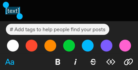
but what if we want some other cool colors like coral pink or cerulean blue or barf green?
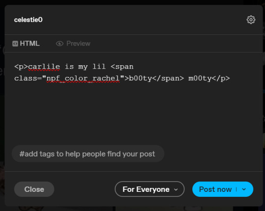
to do custom fonts, it’s very simple, but it needs to be done on pc/laptop (cannot be done on app). we are going to start with a post:
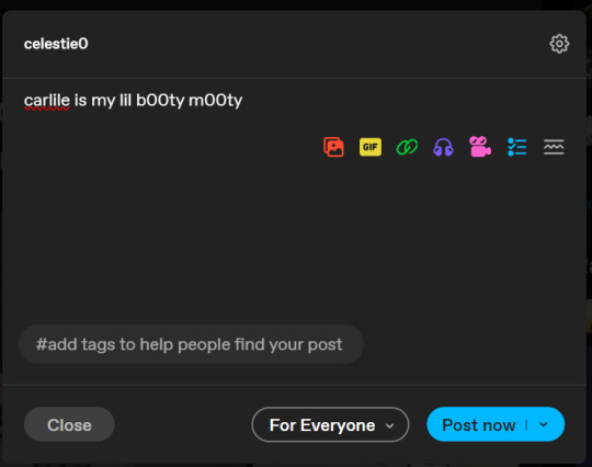
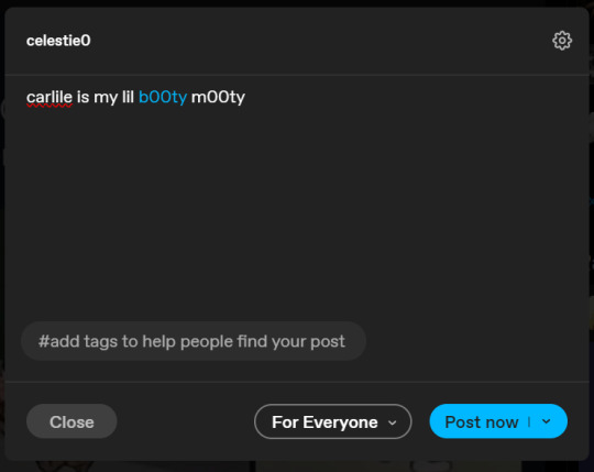
then, you’re just gonna change whatever word that you want the custom color for into one of the tumblr defaults. you do this by just selecting the text with your cursor and then tumblr’s default colors pop up. you can change into any of them, this just establishes the code in the html and makes it easy to spot
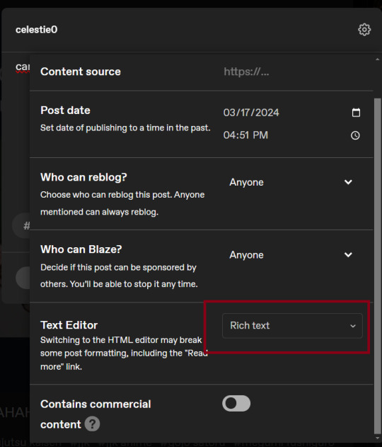
then you're going to go to the little settings thingy at the top right of the post (the settings wheel) and click on this drop down, then click on "html" which will switch it to html
now it's in html. this looks very simple bc there is only one statement here. i’ll touch on how to deal with more lengthier blocks of html code later. but for now, note this section only:
<span class="npf_color_rachel">
this is ALL we need to work with in the code
we're going to change it from
<span class="npf_color_rachel">
to
<span style="color: #[hex code]">
so, for example, something like
<span style="color: #81b7ce">
note. you can also just copy paste the lines above so you don’t have to type it out
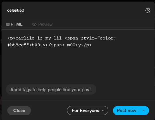
soooo all we did was delete the class=npf_color_rachel part and just replaced it with style=“color: #[hex code]
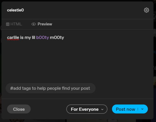
and here's the preview! all done :)
this is the website i use to find the hex codes. a hex code is basically those codes after the hashtag so like #81AACE (don't forget to input the hashtag)
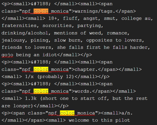
now, for those lengthier posts i mentioned, you can use ctrl+f and search the word "color". it will show up any place on the post where you have a colored font (so do this after you’ve already changed all the places you want custom colors into default tumblr colors, like in the 1st step)
this way, you can easily find the places with <span blah blah> that you need to edit
here is an example of that in one of my posts:
and yeah! that’s basically it. disclaimer, i’m not a software engineer nor so i know much about tech haha, this is just for tumblr aesthetics
alright peace out! 🧚♀️✨ hope this is helpful
#tumblr#tumblr tips#tumblr html#tumblr hacks#tumblr colors#html#tumblr custom colors#tumblr girls#custom colors#tumblr tutorial#custom colors tutorial#html tutorial#hacks
109 notes
·
View notes
Note
I absolutely adore your art, especially the asheiji painting you did. I am new to painting digitally, so if possible, I would love to learn a bit about your colouring process 🥺
ahhh thank you so much friend!! 😭💗 welcome to the digital art gang! i love getting these kinds of questions, so feel free to send another ask if you want to know anything else in particular ᕕ( ᐛ )ᕗ
here's a speedpaint of that asheiji artwork:
my painting is nothing refined! i get a sketch going on my first layer. the sketch is semi-clean (i erase and clean up guidelines as i go), but i will also write out notes on this layer and more strongly define shapes that i want to emphasize, like those little pouch lines under ash's mouth or the crease on eiji's cheek.
underneath this layer, i lay down my flat colors, and sometimes block in accent coloring (the blue and pink i've shaded with). i eyeball all of my colors from the rgb/cmyk wheel. no hex codes or value sliders, we die like men.
what i'll often do next is something i can only explain with respect to the procreate program: i will duplicate my flats layer > clip it down onto my sketch layer > turn the duplicated flats layer to the "hard light" setting > lower its brightness, increase its saturation, and add gaussian blur > merge it with the sketch. this is just a quick way to color my sketch lines, as one would color line art.
now that i have just one layer, i paint. you can check out how i do this in the timelapse. if you'd like to know what brushes i use, i'm not entirely sure how to upload them here on tumblr, but i'll give it a shot if you'd really like me to (FREE RESOURCES WOO 💪💪🔥💯)! the liquify tool is my best friend for tweaking proportions.
finishing touches are also super important to my painting style. here's where i adjust saturation, hues, contrast, and add details like freckles, eye shine, light source, etc. this process combines a variety of techniques and brushes which i could also break down in a longer, separate post. i definitely think this is what makes or breaks my artwork. (also, never doubt your ipad's gallery effect options!!)
thanks for your time! 🥰
26 notes
·
View notes
Text
Sick of colorblindness being ignored by game devs
Title.
But it's absolutely fucking INFURIATING that games like Forza Horizon 5, which gets endless praise for its accessibility features (which are great don't get me wrong) can't seem to fucking implement a color naming feature.
Like, I know what this red is, but I can't for the life of me find your fucking purples so I have to resort to either looking up the fucking hex code for it so I can make it myself (because color wheels are so great to someone who has issues seeing colors) and if that fails you know what I have to do?
I HAVE TO TAKE A FUCKING SCREENSHOT AND ASK SOMEONE
It's 2023 and I have to use an app on my phone that identifies colors in your AAA game that gets praise for accessibility. (thank gods for those apps I never knew that existed until YESTERDAY)
If, for whatever reason, you can't just say what color a paint option is then just add a fucking RGB slider.
NOT HEX CODE
NOT A COLOR WHEEL
AN RGB SLIDER
YOU KNOW LIKE HOW FROM SOFTWARE DOES IT
(the irony that FromSoft gets crit for lacking accessibility features but actually has the most needed one for me will never not be funny)
#accessibility#gaming#colorblind#disability#ableism in media#ableism in gaming#rant#vent#just fucking stop#with the fucking#color wheels#rgb sliders my beloved#colorblindness
8 notes
·
View notes
Text
Color Theory in Practice: Leveraging Elementor's Palette Options for Impactful UI/UX Design
In the ever-evolving world of web design, color plays a crucial role in creating visually appealing and user-friendly websites. As a web designer or developer using Elementor, understanding color theory and effectively utilizing Elementor's palette options can significantly enhance your UI/UX design. This blog post will delve into the practical application of color theory and how to leverage Elementor's powerful color features to create impactful designs.
Understanding Color Theory Basics
Before we dive into Elementor's specific features, let's refresh our understanding of basic color theory concepts:
Color Wheel: The foundation of color theory, showing the relationships between primary, secondary, and tertiary colors.
Color Harmony: Pleasing color combinations based on their positions on the color wheel.
Color Psychology: The emotional and psychological effects different colors can have on viewers.
Color Contrast: The difference in luminance or color that makes objects distinguishable.
These fundamental concepts form the basis for making informed color choices in your web designs.
Elementor's Color Palette: A Powerful Tool
Elementor, a popular WordPress page builder, offers robust color management features through its Global Colors and Color Picker tools. These features allow you to create, save, and apply consistent color schemes across your entire website.
Global Colors
Elementor's Global Colors feature enables you to define a set of colors that can be used consistently throughout your site. Here's how to make the most of this feature:
Create a Color Scheme: Start by defining 4-5 core colors for your brand. These might include:
Primary Brand Color
Secondary Brand Color
Accent Color
Background Color
Text Color
Apply Consistently: Use these global colors for various elements like buttons, headings, backgrounds, and text to maintain visual consistency.
Easy Updates: If you need to tweak your color scheme, changing a global color will update all instances across your site, saving time and ensuring consistency.
Color Picker
Elementor's Color Picker offers advanced options for fine-tuning your color choices:
Opacity Control: Adjust the transparency of colors to create subtle overlays or blend elements with backgrounds.
Color Values: Switch between HEX, RGB, and HSL color models to precisely match brand colors or create specific effects.
Eyedropper Tool: Select colors directly from your design or imported images to maintain consistency with existing visual elements.
Applying Color Theory in Elementor
Now, let's explore how to apply color theory principles using Elementor's palette options:
1. Creating Color Harmony
Use Elementor's Global Colors to set up harmonious color schemes:
Monochromatic: Choose different shades and tints of a single hue.
Analogous: Select colors that are adjacent on the color wheel.
Complementary: Pick colors from opposite sides of the color wheel for high contrast.
Triadic: Choose three colors equally spaced on the color wheel for a vibrant look.
2. Establishing Visual Hierarchy
Leverage color to guide users' attention:
Use your primary color for main call-to-action buttons.
Apply secondary colors to less important elements or hover states.
Utilize neutral colors for large background areas to make colorful elements pop.
3. Enhancing Readability
Ensure text is easily readable against its background:
Use Elementor's Color Picker to check contrast ratios.
Aim for a minimum contrast ratio of 4.5:1 for normal text and 3:1 for large text (as per WCAG 2.0 guidelines).
Consider using a light text on dark backgrounds for a modern look, but be cautious of eye strain for long-form content.
4. Creating Emotional Impact
Utilize color psychology to evoke specific emotions:
Blue: Trust, stability (great for corporate sites)
Green: Growth, nature (suitable for eco-friendly brands)
Red: Excitement, urgency (effective for sales or time-sensitive offers)
Yellow: Optimism, clarity (good for creative or children's sites)
5. Ensuring Accessibility
Design with color accessibility in mind:
Don't rely solely on color to convey information.
Use patterns or icons in addition to colors for colorblind users.
Test your design in grayscale to ensure it works without color distinctions.
Advanced Color Techniques in Elementor
Take your color usage to the next level with these advanced techniques:
1. Gradient Backgrounds
Use Elementor's gradient tool to create depth and visual interest:
Combine two or more colors from your palette for cohesive gradients.
Experiment with different gradient types (linear, radial) and angles.
Use subtle gradients for backgrounds and bold gradients for eye-catching elements.
2. Hover Effects
Enhance interactivity with color changes on hover:
Use complementary colors for dramatic hover effects on buttons.
Subtle changes in shade or opacity can provide elegant feedback.
Ensure hover colors maintain sufficient contrast with the text.
3. Section Transitions
Create visual flow between sections with thoughtful color transitions:
Use analogous colors in adjacent sections for a smooth flow.
Incorporate gradients that blend from one section color to the next.
Experiment with overlapping elements to create interesting color interactions.
4. Color Overlays
Add depth and texture to images or backgrounds:
Use Elementor's overlay feature with semi-transparent colors from your palette.
Experiment with blend modes to create unique effects.
Use color overlays to make text more readable on busy background images.
Best Practices for Color Management in Elementor
To maintain a professional and cohesive design, follow these best practices:
Limit Your Palette: Stick to 3-5 main colors to avoid overwhelming your design.
Document Your Choices: Keep a record of your color values and their intended uses.
Test Across Devices: Colors can appear differently on various screens, so test your design on multiple devices.
Consider Brand Guidelines: If working with established brands, ensure your color choices align with their guidelines.
Update Thoughtfully: When changing global colors, review your entire site to ensure the update works everywhere.
Conclusion
Mastering color theory and effectively using Elementor's palette options can dramatically improve your UI/UX design. By understanding color relationships, leveraging Elementor's powerful color management tools, and applying advanced techniques, you can create visually stunning and user-friendly websites.
Remember, great color design is about balance, consistency, and purposeful choices. Experiment with different color combinations, but always keep your user's experience at the forefront of your design decisions. With practice and attention to detail, you'll be creating impactful designs that not only look great but also enhance usability and engagement.
Visit my Upwork project catalog : Elementor Developer
0 notes
Text
The Color Psychology of Red
From the start of the rainbow to the ubiquitous advertising for Valentine’s Day, red remains one of the most evocative colors on the visible spectrum. As a primary color, red is a color entirely its own – that is to say, no other colors can come together to form a perfect red. In RGB, red is comprised of 100% red, 0% green, and 0% blue.
Associated with energy, war, danger, strength, power, determination as well as passion, desire, and love.
Enhances human metabolism, increases respiration rate, and raises blood pressure.
It attracts attention more than any other color, at times signifying danger.
Colors related to red: Magenta, Burgundy, Maroon.
Red
Red is one of the fascinating colors that uncover various symbolisms, meanings, and associations. It is usually linked with our strong emotions, such as love, desire, and anger. From red hair to the red carpet in events, it is a color that’s regarded as a head-turner due to its warm, bright hues.
Red is a primary color. It represents passion, warmth, and sexuality, but it is also known as a color that stands for danger, violence, and aggression. Red sits between violet and orange on the color wheel. Colors that are similar to red are rose red and red-orange. The hex code for the color red is #FF0000.
The history of red
Red is the first color that humans mastered, fabricated, reproduced, and broke down into different shades. It is also one of the earliest colors used by artists during the prehistoric period.
Throughout the Middle Ages, red had a religious significance. It was the color of the blood of Christ and the fires of Hell. In the Renaissance period, red colors were supposed to draw the viewer’s attention to the most influential figures in a painting.
In the 19th century, red became the color of a new political and social movement such as socialism. So it was also when the color red was used to create specific emotions in art and not just for imitating nature.
Red meaning and psychology
Red is known to have both physiological and psychological impacts on people, thus producing positive and negative effects on us. Studies show that its warm and vibrant hue gives us more energy to take action. Below are some concepts that are linked to the color red.
Love
We may all agree that red is the color of love, which involves passion, sexuality, romance, and lust. Whether we are infatuated, in love, or even broken-hearted, we immediately think of the color red. It communicates strong feelings of attraction that can energize and increase a person’s heart rate.
Since red is associated with romance, it is the chosen color for romantic gifts such as red roses, red balloons, and even chocolates paired with red ribbons. Showering such gifts to the one you love is fluttering!
Power
Compared to the rest of the colors, red provokes the most potent emotions, both healthy and unhealthy. It makes people feel dominant and powerful by boosting their self-esteem. In addition, red is a bold color, which makes one stand out from the crowd and influences the way others see them.
For example, the fastest and most luxurious cars in the world are most often painted in red; famous people are usually given the red carpet treatment, and women that wear red are considered more attractive. Therefore, owning a red car, receiving a red carpet treatment, and wearing red clothing give so much more power than everyone else that doesn’t favor this shade.
Passion
Red gives us the motivation to do our best in doing the things we love. It involves the expression of intense interest and enthusiasm about something. Red excites our emotions, which is why we exert effort to finish a task or achieve a particular goal, especially if it’s something that interests us.
Confidence
Red also conveys confidence, the state of believing in one’s abilities and qualities. Wearing a red dress, red coat, or red lipstick shows that a person is ready to take on the world and make a big difference. Red is an essential color to show people what you’re capable of doing.
Danger
When we look around us, red is found on several road signs. Why? Because red is often seen as a ‘danger cue’. It demands to be noticed, which is why we have red traffic lights and red stop signs. In addition, red is proven to increase our adrenaline rush and helps us act fast.
Popular Shades of Red
There are more than 50 shades of red out there that are widely used for many purposes. Let’s take a look at some of its popular variations.
Maroon
It is described as a dark variation of red. Maroon came from the French word ‘Marron’ which translates to ‘brown’. The shade represents attention and many other things and is often the chosen color of most universities and colleges.
Scarlet
Scarlet red is a shade best described as a very bright red with a hint of orange. Its appearance is like the color of flames, and it embodies authority and strength.
Blood Red
It is an intense hue of red similar to the actual color of blood. Blood red is associated with either positive or negative concepts. For example, it symbolizes life, but it is often associated with death, violence, rage, and the like because of its appearance.
Imperial Red
This kind of shade is a beautiful hue of red, like the inside of a watermelon. It is often used for culinary advertisements and the choice of color for some graphic design projects. Imperial red is seen as a warm and bright red color.
The Red Personality Type
People who favor the color red are generally observed to be extroverts, outgoing, and enjoy spending time with people and living life to the fullest. However, they can also be seen as competitive and unapologetic individuals. Is red your favorite color?
Positive Traits
Enthusiastic
You vibrate a high level of energy, especially in doing the things you love, so you do your best to succeed in pursuing your interests.
Confident
You are optimistic, firm, and not afraid to stand up for yourself. Because you believe in yourself, you are not easily scared of the negative things you hear, like criticisms and bashful comments.
Passionate
Due to your passionate nature, you take things personally and rarely back down. As a result, you have strong emotions about many things and know precisely how to defend your beliefs.
Charismatic
Others quickly notice as you enter the room because of your charming and radiant characteristics. You leave a good first impression that leaves your audience in awe.
Natural Leader
You gain the respect of others by knowing how to recognize the essential things in both your personal and professional life, which makes you a natural leader. With this, you serve as an inspiration to everyone around you.
Negative Traits
Impulsive
Too much passion often leads to impulsivity. Sometimes, you overlook the possible consequences of your action because of your intense urge to just do the things you like.
Unapologetic
Because of your strong emotions, it is hard for you to apologize in a conflict and admit that you’re wrong.
Aggressive
When you don’t get what you want, you can be aggressive and exhibit a violent temper. Although you may calm down pretty quickly, it’s not always easy to be around you.
Overly competitive
Since you strongly believe in never giving up, you like to be in charge all the time, which often leads to disregarding other people’s feelings just to get on top.
While red is a vibrant color, it is also linked to revenge and anger. People often get red in the face when they are angry, which is why red is associated with rage across many cultures. In addition, red color stands for violence and danger because it resembles the color of human blood.
Red is also associated with warning signs. Due to its high visibility, it quickly attracts people’s attention to warning signs. For example, red flags indicate that something terrible may occur, and so they are used to warn people of impending danger.
Too much red can provoke aggression and irritation. It is found that red can cause an increased heart and respiration rate. For this reason, people can feel alert and stressed out when seeing red for a long time.
Color red in business
In reality, the color red is not liked by everyone. Red is a great way to express their sexuality, passion, and lust for life for some people. On the other hand, others see it as too much as it can appear sleazy and overwhelming.
Choosing the color red to represent your business is a risky path. Therefore, it is recommended for use only by the already successful companies or by those who feel sure about their business strategies.
Red stands for motivation that encourages clients to take action, but it doesn’t guarantee a positive response. The best way would be to use it in small doses as a sign of passion and energy for the business.
Color red in branding and marketing
Due to its warm and bright hues, red cannot go unnoticed. It is the most intense color on the color wheel, and it evokes strong emotions. So far, brands have been using it to build excitement and encourage customers to take action.
When targeting bigger crowds, lighter tones of red should do a better job. Softer shades will make a point, and it also helps brands not appear too aggressive and desperate. So instead, already successful brands use darker shades of red to create a more fiery and authoritative effect.
Random Facts about Red
Red is an exciting color with deep meanings and broad characteristics. Although intimidating as it may seem, red has more interesting facts to offer!
Red is the first color a baby sees.
In the Russian language, red translates to ‘beautiful.’
Red doesn’t make the bulls angry because they can’t see the color red.
The planet Mars is also called ‘The Red Planet.’
Red light is often used to help adapt to night vision, such as nighttime and other low-light situations.
Seeing the color red stimulates the human heart.
The color red is considered to have the longest wavelength of colors in the color spectrum.
Red candies taste the sweetest.
According to studies, men in red are more attractive and sexually desirable than women in red.
Red is one of the most common colors used on national flags.
Information about Red / #FF0000
In a RGB color space (made from three colored lights for red, green, and blue), hex #FF0000 is made of 100% red, 0% green and 0% blue. In a CMYK color space (also known as process color, or four colors, used in color printing), hex #FF0000 is made of 0% cyan, 100% magenta, 100% yellow, and 0% black. Red has a hue angle of 0 degrees, a saturation of 100%, and a lightness of 50%.
Burgundy Color
Burgundy is a shade lighter than the color maroon. It is a mix between brown and red that has a purple tint. Many people confuse it with maroon which has a slightly more red-brown tint and lacks the purple hue that burgundy has. The color of burgundy was named after a drink that had the distinctive red shade of color. More specifically, it was named after the color of the red wines coming from Burgundy vineyards in France.
Oddly enough, in Burgundy the color is actually referred to as ‘bordeaux‘ in reference to another wine region producing a similar deep red wine color. The English language picked up the word for the color in the late 1800s. It is possible that this is due to the increased import of French wines in English-speaking countries.
The Psychology of Burgundy
Burgundy is often associated with higher class society. It’s rich hue and red shade are interpreted as signifying sophistication. It is seen as more serious than lighter shades of red and lacks a sense of fun, light energy that shades like pink have.
Burgundy can be viewed as a color indicating power. The combination of it’s psychological seriousness and powerful energy give it a sense of high ambition. Therefore, people who are trying to display their power or wealthy class may use burgundy as a way to show these traits.
0 notes
Text
The Sessions College Color Calculator
Whether you’re designing a logo or painting a house, choosing colors can be frustrating. Where do you start? Which colors work together, and why? How can you creatively explore different moods or directions?
Use the free Color Calculator to explore creative color options for your design project. Simply pick your base color(s), choose a color harmony, tweak/explore as needed, and see results. You’ll get a report of the hex, RGB, and CMYK color values for your project and see your colors applied to design samples. Share or print, rinse and repeat.
#therapists website#website design#branding#marketing#mindful marketing#mindful business#meditation teacher#design
1 note
·
View note
Text
The Color Magenta Meaning
Maroon Variety Beginning and History
The beginning of fuchsia started in the mid 1800s when William Perkin created the main engineered aniline color, mauveine. It ignited a science transformation and enlivened scientific experts in Europe to foster more tones produced using aniline colors.
The Color Magenta Meaning
The two scientists, Chambers Nicolson, and George Maule designed maroon, which was named roseine at that point.
They in the long run changed the name to red in 1860 out of appreciation for the Clash of Red. Subsequent to renaming the variety, it turned into a business achievement utilized by texture producers, in materials, and other beautiful things.
Quick forward to 1935, when quinacridone colors were created. Various shades of fuchsia were made, from light, brilliant, distinctive, and rich, excessively profound red. The physicists formed these shades by adding changing measures of white to quinacridone paint.
Fuchsia Variety Code and Creation
The Hex code of maroon is #FF00FF, made out of 255 red, 0 green, and 255 blue for the RGB variety space. In the CMYK variety space, red is made out of 100 red, 0 green, and 100 blue.
On the off chance that you will make red, you want red and purple, or red with a hint of blue. Adding white will kill the blend and make the final product less extreme. Nonetheless, assuming you add a lot of white, the variety can wind up lighter than standard fuchsia.
In the variety wheel, the correlative shade of fuchsia is green. The two varieties counterbalance each other when consolidated. Blending the two will bring about one or the other dim or dark.
Red Variety Meaning
red variety meaning
In variety brain science, red shouts refinement, sympathy, and secret. This tone is dynamic and addresses general love.
Individuals who love this tone are unconstrained, imprudent, creative, and coordinated. The negative characteristics related with this tone are presumption, over-unwinding, and demandingness.
Other positive things connected to this tone incorporate profound equilibrium, a feeling of cherishing, creative mind, inventiveness, imaginativeness, backing, and generosity.
Since the variety is special or eccentric, individuals who love fuchsia frequently require consideration and confirmation.
To lay it out plainly, maroon empowers sympathy and setting the requirements of others before oneself. The variety advances non-pragmatic reasoning and close to home extroversion. Red additionally empowers receptiveness and beats animosity down.
Despite the fact that individuals who love fuchsia are very incautious, they are commonsense leaning and exceptionally coordinated. They are content with little things throughout everyday life and have creative personalities.
At the point when somebody is excessively fixated on maroon, it could mean they are discouraged or hopelessly. It additionally shows that one might be restless and aggravated. Fuchsia facilitates the psyche and gives a loosening up impact on the mind.
The people who love this tone are additionally known to be creative, charming, amusing, drawing in, and uplifting.
Fuchsia in Plan
In inside plan, fuchsia is involved by a ton of originators for some reasons. Since the variety sticks out, it is utilized as an emphasize or detail.
Since the variety is splendid purplish-pink, it is a decent variety to add a hint of female energy to a space.
Beside paint, fuchsia can likewise be utilized as the variety for rug or ground surface, materials, or in an enriching piece of craftsmanship.
Everything reduces to the subject of the plan and how creators consolidate colors in various rooms and spaces.
0 notes
Text
6 Awesome Websites To Find Color Pallets For Your Next Coding Project
What's the best way to find a color palette for your next coding project? Well, here are six awesome tools that will help you do just that!
colorscouts
ColorScouts is a great website to check out if you're looking for the best color palettes. The site has a large selection of colors that can be used for coding projects, design projects, and web development projects.
A pallet is a set of colors that are used together in a design or project. The color palette can be as simple as one or two colors, or it can be complex and include hundreds of different shades. Color palettes are used in many areas including interior design, fashion, and advertising.
ColourLovers
ColourLovers is a design community where users can share and find color palettes. It's home to over 10 million user-created palettes. The site also offers a number of tools for designers, including the Color Wheel, which allows you to experiment with different colors in order to find complementary colors; and the Color Picker, which lets you choose from a wide variety of colors in RGB, HEX and CMYK formats.
You can browse through other users' palettes or create your own by selecting colors from photos on your computer or using the Color Picker tool that comes pre-installed in most creative software like Adobe Photoshop or Illustrator (to open it click Window > Color). Once your palette is ready, share it on ColourLovers so others can use it too!
Coolors
Coolors is a website that lets you search for color palettes based on the colors in an image. You can upload an image or simply drag one into their search bar and Coolors will find its dominant colors. Once you’ve done this, you can hit “Done” and voila! The palette below contains all the colors of your image in a neat little grid.
Coolors also lets you search for color palettes based on a color wheel, which is useful if you already have some ideas about what kind of look or mood you want to create with your site or app. The only downside is that it doesn't give as many options as some other websites like Color Hunt do (more on that later). That said, Coolors' simplicity makes it easy to use even if someone who isn't too familiar with coding wants to get started creating their own palette right away.
Adobe Color CC
Adobe Color CC is a color scheme generator for web and print design. It's a great tool to use when you need to create color schemes for your website. The website offers beautiful palettes from the most popular websites and brands, so it’s easy to find inspiration from their favorite sites.
Adobe Color CC also has tools that allow you to customize the colors in your palette by adjusting the brightness, saturation, or warmth of each shade. There's even an option to add shadows or highlights so that all of your colors are balanced together as one cohesive unit!
Color Hunt
Color Hunt is a website that allows you to search for color palettes based on your keywords, or upload your own. The site has a fun, minimalist design and makes it easy to find the perfect palette.
You can filter through different types of palettes such as gradients, monochromes, or triadic color schemes. You can also set the number of colors in your palette so that you don't get overwhelmed with too many options at once!
If you want to make sure that none of the colors are clashing with each other - just click on "show only compatible" and voila!
ColRD
ColRD is a community for sharing and discovering color palettes. You can use it to find inspiration for your next design project, or simply browse the palettes other people have uploaded to the site. colrd’s interface is simple and easy to use, making it an ideal resource for finding color palettes if you don’t have much coding experience.
The site also allows users to upload their own palettes, which is a great way to get started if you want to create your own library of colors that can be used in future projects.
Conclusion
There are so many places you can find color pallets, but these websites are my personal favorites. They have a lot of different types of pallets to choose from and some have really cool features like the ability to make your own pallet or share one with others. I hope this list helps you find inspiration when designing your next website!
1 note
·
View note
Text
Adobe color picker

You can remove a swatch by clicking on it and dragging it out of the color picker popup. First, test out our color wheel picker, then you can play around with the various color palettes and work on fine tuning your vision down to the tiniest detail. It’s a super useful way of having all the colors you need in one place. All your swatches will be lined up here and will be available every time you open the color picker, for any artboard within the same. (8) When you click on the “+” icon, the color currently selected will be added as a favourite color (swatch) at the bottom of the popup. You can also adjust the Color Mood of the theme in this example the tones. (7) Click the Eyedropper tool to select a color from the artboard. Adobe Color will automatically pick up a palette of different colors from the image. (6) Set the opacity (Alpha) of the color. One hackis to simply choose your palette in AC - then just manually add the additional. Click on the right color to reset the current color to its. The right color is the color you had when opening the color picker. 3: Current/Previous: The left color is the current color of your color picker. 2: HUE slider: Adjust the hue of your color. (5) Select the color mode that you want to be displayed between: HEX, RGB and HSV. With Adobe Color you cannot choose a palette of more than 5. 1: Color square: Tweak the saturation and the brightness of your color with the selected hue. The change will also be reflected in the “A” (alpha) value just below it. Drag the handle to the bottom to lower the opacity. To select a color that appears elsewhere on your computer screen, click inside your image and drag away from it. To select a new foreground color from an image, click the desired color in your image. (4) The second vertical stripe controls the color opacity. In the Tool Options bar, select where the color picker tool must sample from. (3) The first colorfoul vertical stripe allows you to quickly navigate through different colors (2) The larger square is where you actually select the color you want We’ll see gradients in the next chapter, in this chapter we’ll deal with Solid Colors. Let me show you how I used it for inspiration. Sketch with five different pen tips with adjustable opacity, size and color. There are many different ways to look through a color wheel, but my favorite is using Adobe Kuler. Illustrators, graphic designers and artists can: Zoom up to 64x to apply finer details. (1) Switch between Solid Color and Gradient. Create vector artwork with image and drawing layers you can send to Adobe Illustrator or to Photoshop. Here are the few areas of the color picker we need to pay attention to: Somewhat more sophisticated than the Color palette, Adobe's. As we have seen in the paragraphs above, the color picker is accessible when you have an object selected, by clicking on the little color rectangle next to any fill, border or shadow. WORKING WITH COLOR PICKERS Photoshop enables you to choose a color by using a color picker.
0 notes
Text
I love it when things give you an RGB or HEX input, or a full spectrum color wheel to pick from... I love "pick any color you want" customization. I love having no limits when it comes to colors.
2 notes
·
View notes
Text
Just Color Picker Portable is a small, simple but efficient software especially for designers with which they can use the color picker in any application environment.
Just Color Picker Portable has an interface that makes it easy for users. You can use a keyboard shortcut to store the color you took.
In addition, it is possible to store a list of colors. The number of colors stored in this list may be what you need. You will find the color code in HTML, RGB, RBG [0,1], HEX, HSB / HSV, HSL or HSL, and you can copy its value to the clipboard. This software will use little system resources and will run at high speed. Color averaging to reduce the color noise problem is another feature of this software.
Just Color Picker Portabl Feature:
- Five different color formats are supported.
- 3x, 9x and 15x zoom to capture colors with greater precision
- Average sample of colors
- Make a list of harvested colors
- Find the right wrist colors and color wheel
- Save the color code as you wish
- Translated into different living languages of the world
Release year: 2020
Version: 5.5
System: Windows® XP / Vista / 7/8 / 8.1 / 10
Interface language: English
File size: 5.18 MB
Format: Rar
Execute as an administrator: There's no need
0 notes
Text
Colour
As it happens with typography, colour can also be managed by using css. To change the colour of the text, for example, we use the <color> element. And as mentioned before, we can use text to describe the value or we can use RGB values. RGB represents the colours red, green and blue. Each colour can be given a number from 0 to 255 (this would mean maximum saturation). So, the code would be “color: rgb (255, 200, 10). Another way and the most used one is the hex (hexadecimal) values. There are websites that make it easier to find the hex number. Two of them are:
html-color-codes.info and color.adobe.com/create/color-wheel
Adobe color it also helps making a palette and selecting if we want to apply any Color Harmony rule (such as analogous, triad, monochromatic, etc).
0 notes
Text
★ FILL IN THE QUESTIONS AS IF YOU ARE BEING INTERVIEWED FOR AN ARTICLE AND YOU WERE YOUR MUSE.
TAGGED BY: @autobot-scout-riella and @brainsbehindthebrawn
TAGGING: whoever hasnt done this?
1. WHAT IS YOUR NAME?
Ratchet
2. WHAT IS YOUR REAL NAME?
How many languages can you speak and understand?
3. DO YOU KNOW WHY YOU’RE CALLED THAT?
On Earth, ‘Ratchet’ :
ratch·etˈraCHət/
noun
1.a device consisting of a bar or wheel with a set of angled teeth in which a pawl, cog, or tooth engages, allowing motion in one direction only.
2.a situation or process that is perceived to be deteriorating or changing steadily in a series of irreversible steps."a one-way ratchet of expanding entitlements"
verb
1.operate by means of a ratchet.
2.cause something to rise (or fall) as a step in what is perceived as a steady and irreversible process."the Bank of Japan ratcheted up interest rates again"
Take you pick.
4. ARE YOU SINGLE OR TAKEN?
Im married to my job.
5. WHAT ARE YOUR POWERS AND ABILITIES?
I can strip a mech down to his bare components in three ticks. I’ve saved more lives than Cons have taken, as far as Im currently aware. Im no good infront of others, but put my wrench in my hand and a mech bleeding out on my table and Im home.
6. WHAT COLOR ARE YOUR EYES?
Olympic
Hex:#008ECC
RGB: 0 142 204
7. HAVE YOU EVER DYED YOUR HAIR?
I do not have...hair. I have shifted shades of paint before, as well changed ‘color regions’. I like my colors, it means medic, why would I try anything different?
8. DO YOU HAVE ANY FAMILY MEMBERS?
I have patients. I have the Dinobots.
9. DO YOU HAVE ANY PETS?
I have a cybernetic tiger named Khan. I built his frame myself, as well as did the surgery to transfer him He seems pretty damn happy to me.

10. TELL ME ABOUT SOMETHING YOU DON’T LIKE.
Blind faith. Idiots. Accident prone mechs. War. Losing patients.
11. DO YOU HAVE ANY HOBBIES OR ACTIVITIES YOU DO IN YOUR SPARE TIME?
Keeping my medbay in order.
12. HAVE YOU EVER HURT ANYONE BEFORE?
Yes
13. HAVE YOU EVER… KILLED ANYONE?
Yes
14. WHAT KIND OF ANIMAL ARE YOU?
Autonomous Robotic Organism from the planet Cybertron. Autobot. Cybertronian. Just dont call me a damn Robot.
15. NAME YOUR WORST HABITS.
Insomina, lack of recharge. Im off the drinking, trying to keep it that way.
16. DO YOU LOOK UP TO ANYONE?
I did. Now I dont.
17. GAY, STRAIGHT, OR BISEXUAL?
Im not sure what I am would fit into this category. I am an adult Cybertronian. That in itself should be the ‘sex’ category.
18. DO YOU GO TO SCHOOL?
At one point in time, I went to the Academy. I graduated millennia ago.
19. DO YOU EVER WANT TO MARRY AND HAVE KIDS SOMEDAY?
I already have enough on my plate.
20. DO YOU HAVE ANY FANS?
Dont know. My job description would be odd to have fans.
21. WHAT ARE YOU MOST AFRAID OF?
Losing patients
22.ALLY WEAR?
High grade density Mach 88.9 Battle grade armor, forged from the Core of Cybertron himself.
23. DO YOU LOVE SOMEONE?
Love is a trap word.
24. WHAT CLASS ARE YOU?
Medic, class 44. Vetted and offically in service to the Prime until I extinguish.
25. HOW MANY FRIENDS DO YOU HAVE?
More than I ever expected to.
26. WHAT ARE YOUR THOUGHTS ON PIE?
This is ridiculous
27. FAVORITE DRINK?
Is this a trick question?
29. WHAT IS YOUR FAVORITE PLACE?
My medbay.
30. ARE YOU INTERESTED IN SOMEONE?
Yes.
31. WHAT’S YOUR DICK SIZE?
Patient- Doctor confidentiality.
32. WOULD YOU RATHER SWIM IN THE LAKE OR THE OCEAN?
I am not a fan of water. It causes rust, which can turn septic, and if it gets into your lines...Primus help you.
33. WHAT’S YOUR ‘TYPE’?
Tall, strong. Willing to work through problems, can hold his own in a fight, deep voice. Able to handle long nights and sarcasm.
34. ANY FETISHES?
Biting, consented restraint, voice.
35. TOP OR BOTTOM? DOMINANT OR SUBMISSIVE?
Why not all.
36. CAMPING, OR INDOORS?
Indoors. Less particles to deal with.
37. ARE YOU WAITING FOR THIS INTERVIEW TO BE OVER?
Yes. I have patients to attend to, damnit.
5 notes
·
View notes
Text
Euro Truck Simulator 2 - Raven Truck Design Pack For Mac

Platform: Steam
Euro Truck Simulator 2 - Raven Truck Design Pack For Mac Os
Euro Truck Simulator 2 - Raven Truck Design Pack For Macbook Pro
Euro Truck Simulator 2 - Raven Truck Design Pack For Mac Download
In stock
Dec 8, 2014
Euro Truck Simulator 2 I Raven Truck Design Pack I DLC -Test 60FPS 1080p StreamBAR. TOP 10 Realistic mods for Euro Truck Simulator 2 2019 Toast - Duration: 12:41. Toast Recommended.
Categories: DLC, Most Popular, Most Viewed, New and Trending, Popular Games, Recently Updated, Top Selling, What's Popular
Euro Truck Simulator 2 - Raven Truck Design Pack DLC.
^ „Euro Truck Simulator 2 - Ice Cold Paint Jobs Pack on Steam”. Store.steampowered.com (na jeziku: engleski). ^ „Ice Cold paint job blog posting on SCS Software Blog” (na jeziku: engleski). ^ „Euro Truck Simulator 2 - Raven Truck Design Pack on Steam”.
$1.99
You must be logged in to get this game for free.
Log In or Register
❮❯
Euro Truck Simulator 2 – Raven Truck Design Pack steam key free
Free Euro Truck Simulator 2 – Raven Truck Design Pack steam key. Free Steam KEYS! Free Steam Games. Steam Giveaways. Free CD Key. Games Key. Free games to download. Euro Truck Simulator 2 – Raven Truck Design Pack cd key free
About Euro Truck Simulator 2 – Raven Truck Design Pack free steam key
Customize your truck with a unique set of tuning options:
Raven Art Figure
Raven Emblem LED
Raven Wings LED
Raven Emblem
Front & Rear Rims:
Raven Black
Raven Revolution
Raven Claws
Golden Raven
Raven Custom
Corvus Ex Machina
All of these themes are applicable to any in-game truck except for 8x4 chassis configurations.
How to get Euro Truck Simulator 2 – Raven Truck Design Pack key free
Euro Truck Simulator 2 - Raven Truck Design Pack For Mac Os
1 - First step is to register as the member
2 - Choose an offer available and make sure you choose the one that's giving you lots of coins
3 - Complete the offer you have chosen, you must use real information to complete an offer / survey
4 - Get coins instantly to your account
5 - Unlock Euro Truck Simulator 2 – Raven Truck Design Pack cd key
Source: Source
OS: Windows 7
Processor: Dual core CPU 2.4 GHz
Memory: 4 GB RAM
Graphics: GeForce GTS 450-class
Hard Drive: 100 MB available space
Sound: DirectX compatible
Not available.

Not available.
More games like Euro Truck Simulator 2 – Raven Truck Design Pack
Release date: Feb 29, 2020
$4.99
Release date: Oct 28, 2019
$7.99

Release date: Oct 11, 2018
$4.99
$4.99
Release date: Feb 3, 2017
$4.99
Euro Truck Simulator 2 1.38.1.0
Travel across Europe as king of the road, a trucker who delivers important cargo across impressive distances! With dozens of cities to explore from the UK, Belgium, Germany, Italy, the Netherlands, Poland, and many more, your endurance, skill and speed will all be pushed to their limits. If you’ve got what it takes to be part of an elite trucking force, get behind the wheel and prove it!
Key Features:
Transport a vast variety of cargo across more than 60 European cities.
Run your own business which continues to grow even as you complete your freight deliveries.
Build your own fleet of trucks, buy garages, hire drivers, manage your company for maximum profits.
A varied amount of truck tuning that range from performance to cosmetic changes.
Customize your vehicles with optional lights, bars, horns, beacons, smoke exhausts, and more.
Thousands of miles of real road networks with hundreds of famous landmarks and structures.
World of Trucks
Take advantage of additional features of Euro Truck Simulator 2 by joining our online community on World of Trucks, our center for virtual truckers all around the world interested in Euro Truck Simulator 2 and future SCS Software's truck simulators.
Use in-game Photo Mode to capture the best moments and share them with thousands of people who love trucks.
Favorite the images you like the most and return to them anytime in the future.
Discuss the screenshots with everyone using World of Trucks.
See the best images hand-picked by the game creators in Editor's Pick updated almost every day. Try to get your own screenshot on this list!
Upload and use your custom avatar and license plate in the game.
More features coming soon!
What's New:
Patchnotes v1.38:
Map
Euro Truck Simulator 2 - Raven Truck Design Pack For Macbook Pro
Lille re-skin
Unique Truck Dealerships
Special Transport routes in Road to the Black Sea
Reșița to Târgu Mureș
İstanbul to Edirne
Pleven to Sofia
Vehicles
Automatic transmission improved (shifting points, adaptive modes)
Paintable chassis covers for XF Tuning Pack
New tuning parts added to the FH Tuning Pack
Roof Horns (standalone mountable accessories)
Renault Trucks Range T AI vehicles added (4×2, 6×2)
Features
Visual improvement – procedural ambient occlusion generation (SSAO)
Route Advisor redesigned
Navigation ETA to the next waypoint in route adviser and in world map
Tobii eye-tracking presets
RGB color picker redesigned
Added RGB, HSV and hex inputs
User defined color presets
Sound
Update to FMOD 2.01.01
Individual horn sounds for each truck
Fixed the retarder sound when the engine is off
AI – exclusion of gear-shifts for trains and electric vehicles
Screenshots:
Title: Euro Truck Simulator 2 1.38.1.0
Genre: Indie, Simulation
Developer: SCS Software
Compatibility: macOS 10.13.6 or later, 64-bit processor
Language: Multilingual
Size: 8 GB
visit official website
Euro Truck Simulator 2 - Raven Truck Design Pack For Mac Download
NitroFlare:
0 notes
Text
Colour Theory
Colour Theory - https://theartyteacher.com/color-theory-in-art/ The below link is where the information for these definitions and artist examples came from. Following on from this research into colour theory I will be experimenting inline with every theory to explore colour in more critical way and giving more thought the the colours I chose to use as thus far I have been either choosing colours by eye or by selecting the colour and matching that particular pixel with a colour generated by the iPad programs I have been using.
These elements of colour theory that I have learnt and have been exploring will be experimented in my own practice going forward.
https://negliadesign.com/ask-a-designer/whats-the-difference-between-pms-cmyk-rgb-and-hex/

Colour Theory Definitions
Hue – a colour or shade.
Primary Colour – Red, blue and yellow. All colors can be created by mixing primary colours.
Secondary Colour – A colour resulting from the mixing of two primary colours.
Tertiary Colour – The resulting colour formed when an equal amount of a primary and a secondary colour are mixed.
Complementary Colours – Colours that sit opposite each other on the colour wheel. For example, purple and yellow. Complementary colours will contrast greatly.
Van Gogh used blues and oranges in his painting ‘Café Terrace on the Place du Forum, Arles’, 1888, below. Because he uses complementary colors the colours contrast and are vibrant.

Analogous Colours – Any three colours which are side by side on a 12-section color wheel, such as yellow-green, yellow, and yellow-orange.
Below, Claude Monet uses analogous colours in his tranquil painting ‘Water Lilies’, 1904. He mainly uses dark green, light green and yellow.

Triadic Colours – Three colors that are evenly spaced around the colour wheel.
Monochromatic – Containing or using only one color.
The watercolor painting below, ‘Stripes and Ceramics’ by Britanny Cartie is an excellent example of monochromatic painting as it uses only green. Also find Cartie on Instagram.

Colour Temperature
Colour temperature refers to the level of warmth contained within a colour. Colours can be categorised as warm or cool. Warm and cool colours will contrast well with each other.
Warm colours — such as red, yellow, and orange; evoke warmth because they remind us of things like the sun or fire.
Cool colorus — such as blue, green, and purple (violet); evoke a cool feeling because they remind us of things like water or grass.
The painting below by Erin Hanson uses all warm colors. From dark brown, through every shade of orange and through a variety of yellows, it’s warm colours describe the landscape of the American west.

0 notes
Text
Portable video QC is a suite of audio and video playback and analysis tools with both visual and automated quality checking tools. Portable videoQC will take the media coming into your facility and perform a series of automated tests on the video, audio, and metadata values against a template, then analyze the audio and video. Includes metadata extraction, comparison and template tools, intuitive graphs of audio and video metrics, a complete set of audio and video waveform/vectorscope/phase tools, db and PDF reports, visual file-to-file comparison and crop and export tools.
Portable videoQC's automated server components can run without an interface (no interface) to the analysis tools. Integration with the Net-X-Code suite provides quality control for IP-based workflows. Each level of Portable videoQC is designed to fill a particular part of the QA workflow, from internal operators to QA masters and even back-end servers. The standard database format enables seamless and instant sharing of analysis results. Hot Folders allow for automation, streamlining those in the QA workflow.
The following levels are available:– videoQC workstation – Full QC database view/export, QC data/event generation, with player, SDI I/O, oscilloscopes– videoQC Inspect – QC database view/export with player, SDI I/O, oscilloscopes– videoQC Pro – SDI output plus real-time oscilloscopes, with player– VideoQC View – A player designed for front-end, visual confirmation
The main tools in videoQC include:videoQC Portable provides a complete set of tools for the quality control workflow, including:
Media player with support for everything from streaming to post-production and raw file formatsRTP, UDP, SRT, RTSP and NDI streaming source supportSupport for local, network (NFS, SMB, etc.), and web/http(s) sourcesAutomated metadata generation and comparison to master file or templateAutomated generation of audio and video metrics (levels, legal stream, sizes, types, rep, etc.)Real-time video playback to desktop and SDI/HDMITimecode, subtitles, audio meter displays, and overlaysFull set of scopes for analysis including:Waveform (YCbCr and RGB)vectorscopehistogramH/S (Hue/Saturation) Scope for ChromaDuMonde lighting calibrationChromaticity (601, 709, 2020)real time statusaudio vectorscopeAudio phase meteraudio histogramAudio waveform displayReticles for video display: Action Safe, Title Safe, Graphic Safe, Picture Frame, Active RegionVideo pixel video hex/decimalAudio measurement, RMS, EBU/r.128Audio routing, up to 16 x 16 channelsTrim and export to files, wrapper, or standard streaming formatsDisplay modes: Luma, R, G, B, Zebra Luma/Chroma, Clipping, Edge Difference, Focus assist, Flip/flop, False color, Luma key, Greenscreen/despillCompressed to original video comparison, including:Up down, side by side, difference with threshold, AB, butterfly mirror and moreFlip fonts, horizontal/vertical moving lines, alignment grid3D visualization including interlaced, side by side, anaglyph
Real time playback with optional SDI/HDMI
videoQC Portable is a complete player, capable of playing almost any post-production or broadcast file. Play files in the GUI with computer audio or in SDI/HDMI via AJA, Bluefish444 or Blackmagic hardware. During playback, timecode is displayed in real time, along with audio meters at RMS or EBU r.128 levels. Frame-accurate search, by timecode or absolute position, along with stepping, out-of-speed playback, and forward/reverse playback are available via keyboard, mouse, or an external controller. Loop, palindrome, and audio/video-only playback are also available.Zoom, pan and full screen
Zoom and pan the video in pause or playback mode. Using the mouse's scroll wheel, the image can be zoomed out to cover a larger portion of the screen, or zoomed in for a closer look at individual pixels. Left clicking and dragging will move the image to view different parts while zooming. Clicking the right mouse button will fill the
app with video, and clicking the middle button will set the image pixel by pixel (where each pixel in the image is exactly one screen). pixel). Zoom is available in windowed or full screen mode. It is also possible to change the background color of the video using the mouse wheel.time code display
A dedicated timecode field not only displays the current timecode location, but allows the user to enter a known timecode location within a selected clip and press Enter to indicate that frame. In full screen mode, an optional timecode display can be overlaid. The user can select from the available timecode sources by clicking on the timecode source field. Copy and paste of timecode is also available
0 notes
Last Seen Blogs

healthcareexperts
Healthcare Expert

gh0stcav1ty
ghost

sroloc--elbisivni
I believe in kindness. Also in mischief.

noblleconcept-blog
Affiliate Marketer

kiwkithecat
i draw occasionally, BUT I NEVER POST IT