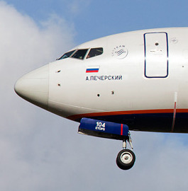
#singapore airlines
Text
20 notes
·
View notes
Text
Singapore Airlines creating an F1 category for their onboard entertainment 👍
27 notes
·
View notes
Text
4th plane i had to get help from a friend to find the motivation to finish this one...
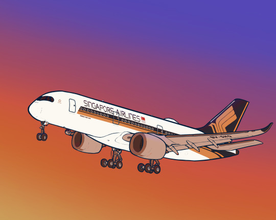
Singapore airlines Airbus A350-900
Neutral colors version under the cut

8 notes
·
View notes
Text
No. 27 - Airline Alliances (oneworld, SkyTeam, and Star Alliance)


@imjustanobsessedjew asked me to follow up on my thoughts on airline alliance liveries, so I'm here to do that.
I struggle to find a good way to describe airline alliances. Examples I've pondered over and ultimately rejected on some or other technicality include fraternities, record labels, and TikToker content houses. But maybe it doesn't matter. I'm not here to talk about how they function broadly. It's not important to this post that you can use American Airlines miles to get tickets on flights operated by British Airways.
Generally, member airlines will have a symbol from their alliance painted on their planes. I showed an example in my SAS post of the Star Alliance logo on an airframe (center), but here are examples for the other two: an Aeroflot plane wearing the SkyTeam symbol (left) and an Iberia plane with a very, very small oneworld logo (right).
But sometimes this isn't enough for them. The three major airline alliances have a habit of painting planes in special alliance liveries. Because who cares if you're flying on Delta, XiamenAir, Kenya Airways, or TAROM - what's important is that they're part of SkyTeam.
I sort of just don't understand the purpose. I don't think anyone is going to see a Star Alliance livery and think "wow, I am reminded to specifically spend my money with these 26 otherwise completely unrelated airlines!" because that's...that's just really silly. While airline alliances can make it a lot easier to use frequent flier miles and neatly book multi-leg trips on the passenger's end, I've always been under the impression that these must do more for the airlines than they do for the end consumer, because otherwise they probably wouldn't exist. I'm not sure what the need is to advertise them to someone who has no say in their existence and probably picks their flights based on what Google tells them is cheapest anyway. Nobody has, like, brand loyalty to alliances, and there's no reason they should, since their member airlines will offer wildly different qualities of service and cover entirely different regions of the world.
So why the special liveries? Is it a hazing ritual? I can't really imagine what benefit they might offer over just putting your symbol somewhere else on the plane. Some kid sitting in the window seat of a plane that's delayed by an hour at a massive airport isn't even going to notice or care about a SkyTeam livery, and I honestly really should have put airline alliances on the questionnaire in some form because I'm not sure how many people know or care that they exist. I don't understand the point, and the only thing I do understand, really, is that I hate it when airlines which have gone through the trouble of designing their own livery, even if that livery is terrible, would then paint a plane in a way which makes it interchangeable with everything else on the tarmac. But they're fully developed (mostly) liveries, so they're the sort of thing I'm here to talk about. Without further ado: SkyTeam, oneworld, and Star Alliance.
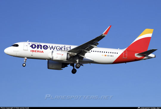
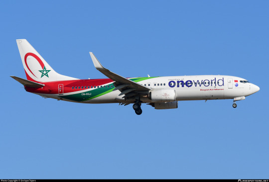
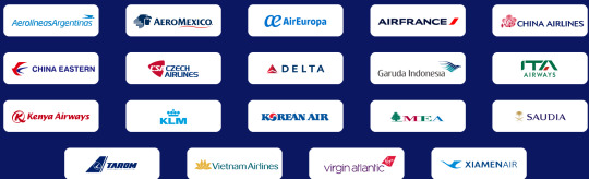
oneworld goes first because it's a bit different from the others. (Yes, the correct way to write it, as seen in all company literature, is with the first half bolded.) oneworld was founded in February of 1999 and is the third-largest of the major alliances.
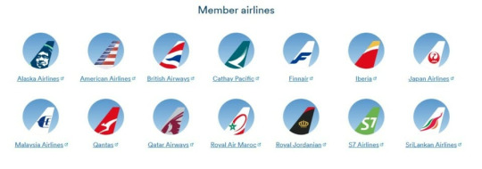
Currently, there are thirteen active oneworld members, shown above, plus their regional subsidiaries; S7 Airlines is currently suspended, as is the case for all Russia-based airlines in major alliances, and Oman Air will be joining the alliance by the end of 2024. Fiji Airways is also nominally involved as a 'connect partner', which as far as I can tell means situational benefits from the alliance when working with its member airlines. It feels like they're scrambling for a foothold a little despite having some absolute powerhouses among their ranks because they keep getting their members bought out by other alliances and/or merged into each other. I think I prefer it that way.
To begin with, the logo is atrocious. Blue-to-white airhrush gradient circle with big yucky sans serif lettering, half of which is bold and half of which is standard width, which leaves you unable to tell which half you hate more. This logo is really painfully early '00s website and not in the cute nostalgic way. It's not stylized in a way that provokes nostalgia, it's just so inept that it could fit in during the era where web design wasn't really a field that had been fully invented yet.
But as a livery, it's sort of hard to review. A oneworld paint job changes less than the average logojet.
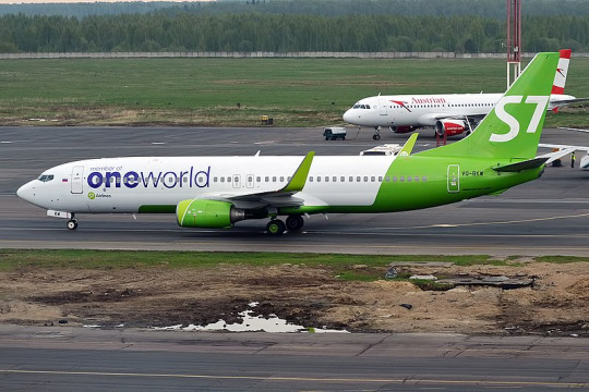
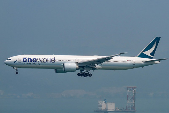
I'm not entirely sure if I can even consider this a special livery. It's just an extra line of text. Ugly text, sure, but I wouldn't call it a different design. This doesn't change the fact that you can immediately recognize these as an S7 plane and a Cathay Pacific plane because none of their livery is fundamentally changed.
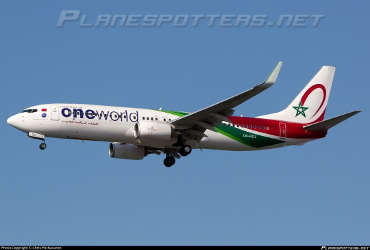
There's just a limited amount I can say about what's a glorified sticker. RAM gets to keep its nice little swirlies, all is right with the world, they get to keep the normal text on their other planes, this is not a big deal. Maybe they keep losing members because they can't tell them apart from other planes in the airport without a big, all-encompassing custom livery to make a select few unlucky planes airline-ambiguous. oneworld, more like...dumbworld.
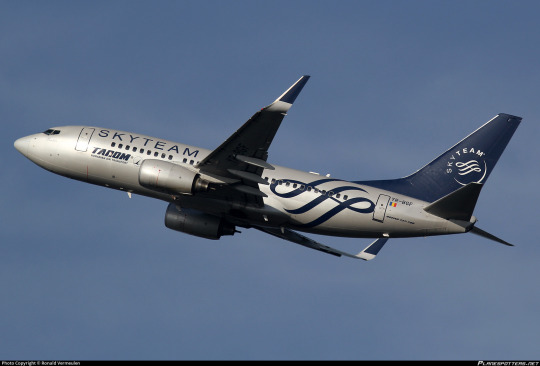
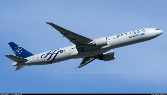
Moving on in alphabetical order, SkyTeam is the second largest of the alliances.
SkyTeam has 20 members: the above pictured, plus Aeroflot, which is temporarily suspended for the aforementioned Russian reasons. It also has its own elaborate system of 'associates' and 'affiliates', and a dedicated cargo alliance, SkyTeam Cargo.
I actually enjoy the SkyTeam logo. The wordmark is just a yucky thin monospace sans serif, but they have that nice flourishy design that's aesthetically pleasing and easy to recognize, and I can't knock that.
Still, this is where we get into proper airline alliance liveries. You have to zoom in pretty close to tell that the above planes are TAROM on the right and Korean Air on the left. I didn't have to specify, when covering oneworld, that the logo was framed by Iberia and Royal Air Maroc, because their branding was left intact. This is not so for SkyTeam, which takes over its hosts in full, creating SkyTeam planes with a tiny mark denoting their actual airline instead of the other way around.
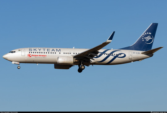
This could be a lot worse. It's got recognizable logos, legible text, and I think most crucially the main fuselage body is painted a mid-light grey. The opposite of something like the SAS belly stripes, which are cheapened by the proliferation of Eurowhite, SkyTeam sort of gets a free boost from the fact that their non-white fuselage is a rarity. I do really like the relatively lowered contrast between the main body and the logo, because this shade of blue is usually paired with stark white. The SkyTeam curlicue is big and visible on the fuselage. I would have made it bigger, but it's not terrible as is. The airline's logo is placed below the window line while SkyTeam's wordmark is above it, hypothetically giving them equal weight (though in reality I think people obviously read SkyTeam's first).
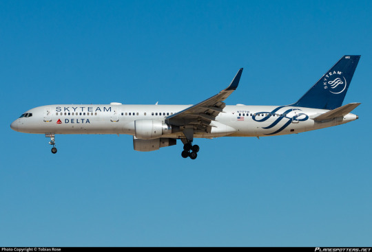
It certainly has Detached Tail Syndrome, but for my tastes the lower contrast and placement of the curlicue make it far more tolerable. Northing here is ostentatious or overdesigned, and while it falls short of true minimal elegance I truly can't say it's ugly and I don't think it's lazy, either. This is one of the few times the detached tail does feel at least slightly deliberate, given the non-blankness of the rest of the fuselage. The bits feel a bit separate sometimes, but it's nowhere near as bad as that effect can get.
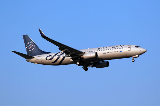
I'm going to give SkyTeam a B-.
I sincerely, earnestly, emphatically do not dislike the way the SkyTeam livery looks. But I still think it should not exist. Airlines should wear their own liveries. If you have 20 airlines, you should have 20 distinct fleets. I would rather have a bunch of mediocre or even bad liveries than one decent livery which doesn't belong to anyone at all.
Regardless, I do have to leave off on a fitting note. SkyTeam...more like WhyTeam.
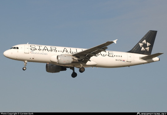
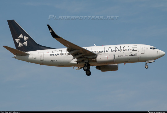
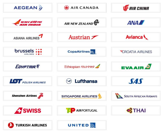
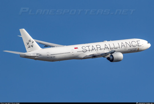
Star Alliance is the largest of the three alliances, with 26 member airlines.
In my SAS post, I introduced the Star Alliance Test, a metric by which I judge the the absolute worst designs which end up on this blog. The test consists of one question: would I prefer that all instances of this livery be replaced with a Star Alliance paint job? As I mentioned there, I chose Star Alliance because, like SkyTeam, it entirely overwrites the original airline's livery. Not only do I like it less than SkyTeam, it is also more prolific, with an entire six more airlines with planes begging to be ruined.
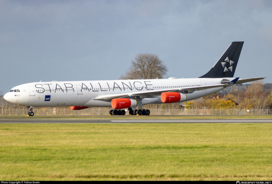
It is inoffensive nearly to the degree that it becomes offensive again. Big, ugly sans serif wordmark, though it at least has the decency to occupy the majority of the fuselage to prevent it from just being a white expanse. Detached tail. Teeny tiny airline logo that you have to squint to see.
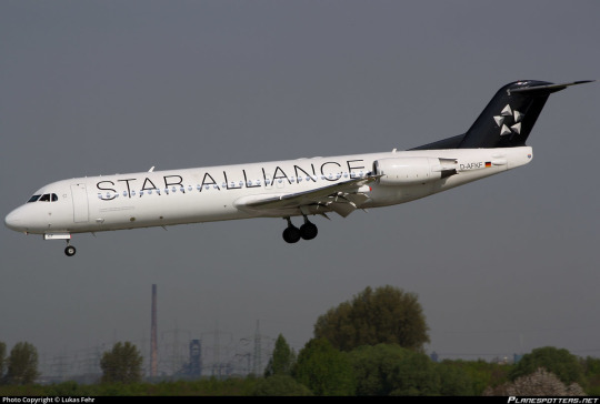
Star Alliance liveries are both functionally identical to blank planes and dangerously close to actually being them. But they have just enough design that to me they avoid being nothing and graduate to minimalist. I think it's the large text and the fact that the actual logo is actually decently designed, but it doesn't evoke the sheer dread in me that something like Lufthansa does. It's not uninterrupted, unbalanced white, it's just...really, really boring.
I...honestly think it's a C-.
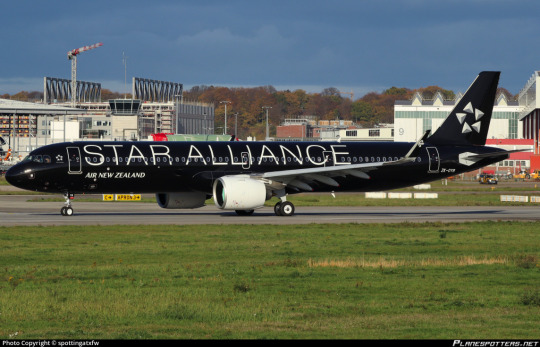
Air New Zealand and Singapore Airlines both have a variant livery, all black and all white respectively. I would rate them the same, I think. Maybe Singapore's is a little more boring while also feeling like more of a statement, while Air New Zealand's makes me very happy by being a primarily black plane (I am one of the few Airplane People who is also a consummate goth) but suffers from thin white-on-black text being fairly eyestrainy. In general, the Star Alliance wordmark is somewhat difficult to read. These two belong with the rest of the liveries, even though I think I ultimately like Singapore's a bit less than the default and Air New Zealand's a bit more.
While not a vehement condemnation, C- is not exactly a shining endorsement. When I devised my scale I did envision it as something of a normal distribution. Most liveries are going to be somewhere in the C range. This is cromulent. This is satisfactory. This does not make me angry.
It just makes me sad, thinking about all these airplanes wearing identical liveries. Sure, Copa and United already match, but this is an extremely varied set. It ranges from the painfully boring to the somewhat ugly to the actively nice, and all of them get replaced with identical stock liveries...an inter-fleet Scar Alliance.
While I rate these as competent liveries in terms of their appearance, I cannot pretend I do not hate everything they stand for. In my opinion, to paint your airplanes in a livery which makes it impossible to tell that the planes flanking the logo fly for Croatia Airlines and Continental respectively without zooming all the way in is the very definition of failure.
#tarmac fashion week#grade: b-#grade: c-#era: 2000s#era: 2010s#era: 2020s#royal air maroc#iberia#air new zealand#singapore airlines#s7 airlines#non-airline liveries#cathay pacific#compilations#requests#I only tagged the airlines that appear in liveries that are noticeably theirs
17 notes
·
View notes
Text
Your Guide to Choosing the Perfect Airline for Your Next Trip
Are you tired of the frustration and inconvenience caused by delayed flights? We’ve all been there – standing in line, anxiously checking the departure board, only to discover that our flight is delayed. It’s not just a minor inconvenience; it can throw off your entire travel plans. From missed connections to disrupted schedules, flight delays can cause a cascade of problems.
Whether you’re…
View On WordPress
#Aeromexico#Africa#airline#Asia-Pacific#Austrian Airlines#Delta Air Lines#Europe#global#Latin America#Middle East#North America#on-time performance#reliability#Safair#Singapore Airlines#Travel
2 notes
·
View notes
Photo

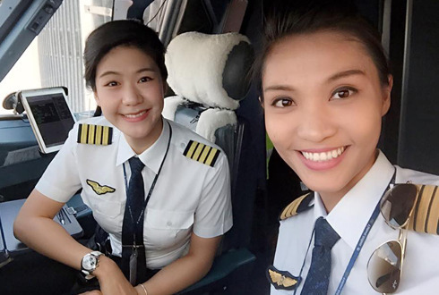
Newbie cadet ready for career take off
#Pilot girl#airline uniform#singapore airlines#woman in uniform#collar and tie#white shirt#idenity#smart girl#air cadet#cockpit cutie#female flight crew
6 notes
·
View notes
Photo
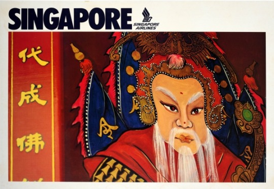
Singapore Airlines travel poster (c. 1970).
17 notes
·
View notes
Text

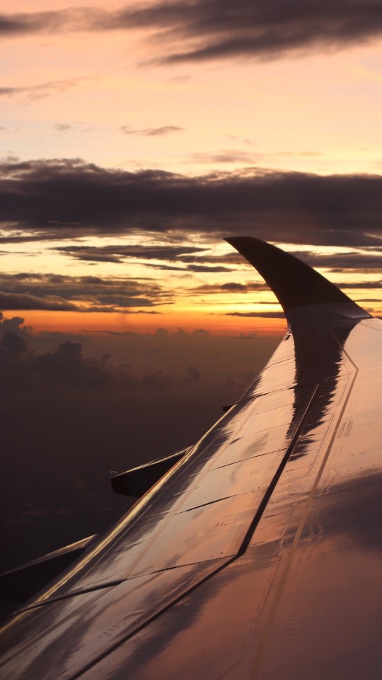
Home for the next 18 hours aboard SQ22.
2 notes
·
View notes
Text
India's Vistara cutting 20 flights a day, likely to cut May pilot schedules, CNBC-TV18 reports
BENGALURU (Reuters) – India’s Vistara Airlines has been cancelling around 20 flights a day and might consider adjusting its pilots’ schedules in May, its top boss told news channel CNBC-TV18 on Friday, amid a surge in flight cancellations by the carrier.
A number of Vistara’s pilots went on sick leave, and some of those who went on leave protested a downward revision to pay ahead of a merger with…
View On WordPress
0 notes
Video
youtube
Watch This Perfect Landing At London Gatwick Airport - Singapore Airline...
#youtube#gatwick#gatwick airport#london gatwick#landing#ariport#singapore airlines#singapore airlines b777#b777#b777-300er#watch this#perfect landing#watch this perfect landing#singapore airlines landing#singapore airlines landing at gatwick airport#msfs 2020
0 notes
Text
72 hours in Singapore's Chic Charms, all you need to know
In the glittering expanse of global travel, few destinations shine as brightly as Singapore, a city-state where elegance and opulence intertwine in a symphony of luxury. As fashion stylist and lover of luxurious escapades, my recent jaunt to Singapore was nothing short of a glamorous odyssey. Here, I offer you an insider’s guide to navigating the Lion City’s chic charms with flair and…

View On WordPress
#best hotel#best sushi#best time to visit#dancing fountains#destinantion#fullerton bay#glam#gourmet#insider guide#inspiration#jet set#lifestyle#luxury#marina bay sands#on the go#opulence#refined style#rooftop pool#singapore#singapore airlines#sophistication#travel like insider#voyage
0 notes
Text
American Sued Over Credit Card Bonuses, How to Meet Min Spend, Best First Class Seats
Welcome to The Morning Shave. We read a ton of travel articles each day for our research to share the best travel tips, tricks, and news with you. Here are the articles for Tuesday, January 30, 2024, that we think you should read.
Don’t miss out on any new posts. Join our email list for the latest tips, tricks, and travel news.
The Morning Shave
How to Meet Your Credit Card Spending…
View On WordPress
0 notes
Text
Weekend Musings: Two to tango
Air India completes two years under the Tata’s today. The most apt phase to describe this column today would be Two to tango. Two to tango has been referred to by both negative connotations and positive words, depending on the situation. The phrase originated from the song “Two takes to Tango” which was written in 1952, a year before Air India – started by legendary JRD Tata , was…
View On WordPress
#Air India#Air India express#AirAsia#Singapore Airlines#Tata group#Two to tango#Vistara#Weekend musings
0 notes
Photo
Eat your heart out Austrilia, with our all female flight crew on Singapore Airlines flight 221 to Sydney
#Hot Asian pilot#female flight crew#cockpit cutie#chinese lady#woman in uniform#airline uniform#white shirt#collar and tie#smart women#singapore airlines#asian aviation#pure aesthetic#asians in uniform
3 notes
·
View notes
Text
Week 5 - This Is How You Critically Analyse Artistic Traditions and Lineages
Introducing the ever-famous batik motif of Singapore Airlines which features native floras from Singapore. The motif has been around since 1968 and subsequently adapted by French Couturier Pierre Balmain. In which was applied in the design of the Singaporean Girl's sarong uniform, which then became the airline's official mark to pay homage to our heritage.

I believe that the batik is our reflection of identity to our Singapore heritage as it represents culture. By wearing the sarong uniform, it gives a feel of Singapore despite being miles away or 30,000 feet up from the small sunny island.
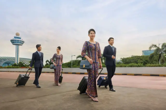

Not only do the airline has the sarong uniforms in 10 floras- batik motif, but they have them in 4 different colours which symbolise different Singapore dollars. In my opinion, I find it rather interesting and touched that Singapore Airlines paid attention to details and ensure that their elements are effectively communicated.
The batik motif has been incorporated on other collaterals such as merchandises sold on KrisShop, which is Singapore Airlines' retail flagship store and the strong focal element of the airline.


This was one of the projects that I was tasked to do during my internship in the branding department of Singapore Airlines back in 2021. (Upcycling Project)
It was important that I applied the batik motif in the backing card and designs. This shows the importance of the batik motif and how the airline has always align the elements into everything.
As a designer, learning about the traditions of the Singapore Airlines' batik motif is fascinating as we can see how much they care about the country's reputation and traditions.
References:
"Desktop Wallpaper (Mac) - Batik Side Blue." Singapore Airlines, 7 Nov. 2022, www.singaporeair.com/en_UK/us/media-centre/multimedia-library/. Accessed 7 Nov. 2023.
"Singapore Airlines Cabin Crew." Singapore Airlines, 7 Nov. 2022, www.singaporeair.com/en_UK/us/flying-withus/our-story/our-cabin-crew/. Accessed 7 Nov. 2023.
"SINGAPORE AIRLINES AVIATION TAG A380." KrisShop, 7 Nov. 2022, www.krisshop.com/en/product/ddf33d3101993a77/singapore-airlines-aviation-tag-a380.html. Accessed 7 Nov. 2023.
296 Words, 1970 Characters
1 note
·
View note
Text
Unlikely Travel Companions: A Tale of Unexpected Turbulence
Read about the unexpected journey of a New Zealand couple who found themselves seated next to a flatulent dog on a Singapore Airlines flight. Despite the challenges, their determination and compassion led to a surprising resolution.
1 note
·
View note
Last Seen Blogs

whatspiscesinspanish
la empatía


saramei
Untitled
hermit-gem-au
The Hermit Gem AU

ateeziny
Edit / wallpaper stuff