#sorry I twinkified them btw
Text
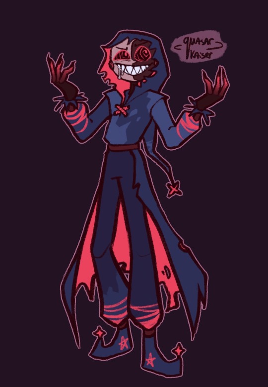
My take on BMs new design!
It took me a while to get used to it but fanart helped a lot
#sun and moon show bloodmoon#sams bloodmoon#fnaf bloodmoon#sun and moon show#the sun and moon show#sams#tsams#astro art#I actually really like the navy#it allows me to play around with neon highlights#also it kinda visually shows it’s not the OG but a copy#sorry I twinkified them btw
640 notes
·
View notes
Photo

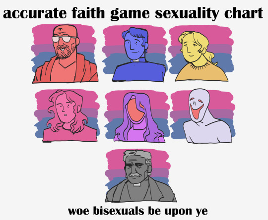
im woobifying the priest game in ways you cant even imagine
#sorry god i will never twinkify john ward#i cant bring myself to do it#LAST ONES A JOKE. taking advantage of them all being bi canonically#faith game#faith the unholy trinity#john ward#lisa pearson#my art#too many to tag sorry#btw i dont ship john and lisa#i guess if thats ur thing then heres food for you
2K notes
·
View notes
Text
Sorry I'm still thinkin about this official Blackquill art...

I've never seen Simon look so much like Simon and then not all at the same time yaknow? Like yes... I can very much see with my own two eyes that this is Simon. But also if I stare at him for too long (like I'm doing right now) I start to second guess myself and ask "Is that really Simon Blackquill?" (The answer is still yes, but.... RAHHH I don't know how to properly put it into words)
Maybe it's because he just looks so... Young? If that makes any sense. Like when I look at his face, what I'm seeing is Simon pre UR-1 which is sort of a bonkers thing to say because we don't even see that much of him past a couple of sprites where his back is usually turned to us so I'd be basing this entirely off the mugshot of him. This could simply be on account of just how his face is drawn or because the tear marks aren't as obvious. (Which btw... I wanna know where that comes from because I don't think I've ever seen an actual official source for that so if someone can share it with me, assuming it exists, that would be much appreciated.) Regardless, I think it would be fair to say that he certainly does look different in comparison to all of the other official art I've seen for him (i.e. original box art for DD and the newer art for the AJ Trilogy).
Another reason he looks odd to me could simply be on account of his general shape. I dunno how to put this in a way that doesn't make me sound crazier than I already am but he just seems a lot slimmer (twinkified if you will) than what I'm used to. And maybe that's on account of being spoiled with fanart where he looks kinda buff or because in game he's sort of ambiguously shaped. What I mean by that is that he doesn't exactly look thin but not super buff in game either? He just kind of looks like rectangle to me with his sprites especially when he's completely facing forward.
In fact, the more I dwell on his shape, the more I realize that one of the reasons why he looks so odd to me is because we can actually see his hips. Like I'm pretty sure in any other depiction of him we don't really see his hips because of his coat so to see them now it's just sort of throwing me off.
There is also one other thing that's making me go O_O and maybe it's obvious by that emoticon alone... The size of Taka. Again this is a situation where in game I'm used to Taka being rather small yaknow. But here he's so... Large? Spherical? I dunno... He looks like he'd be the size of an eagle rather than a hawk here...
Regardless tho, I still think the art is cute. The lil panda button on his vest, the panda ears on the coat, the panda bandana for Taka... Very cute! I just am kinda havin one of those moments of a dog looking at its reflection in the mirror and going "Who is that?" because if I stare at this for too long I get confused.
I only wish that there was new Athena art to go alongside all this.
#baz.txt#🪶⛓️💥#*pray forgive the discourtesy of me rambling about my lawyer game#*also i love that i said 'i don't know how to put this in to words'#*and then proceeded to put it into words
0 notes
Last Seen Blogs

vnunes
Men Beauty
laurakinnney-blog
hiatus

mochamoonbeam
Princess Ken

moonwitch45
Daddys Little goth 23, E.m🥰💛

chaotic3dofshounen
Untitled