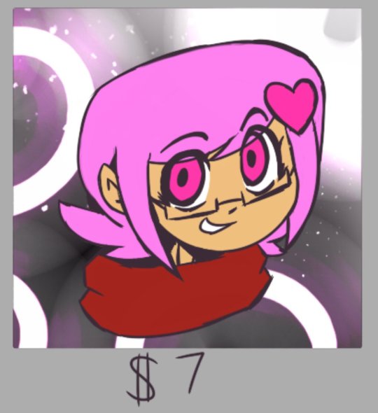
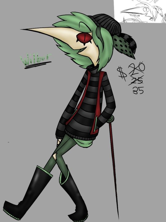
#sorry this isn't shaded and just a colored sketch or whatever
Photo

day 9 - meteor
free money glitch
#pokemon reborn#30dayreborn#ZEL pokemon reborn#lumi seijaya#blake whitaker#jazzart#sorry this isn't shaded and just a colored sketch or whatever#meant to fully line it but then i was cursed with Ailments in every department
60 notes
·
View notes
Note
Hello :D
I have been following you for the last year or so (a few days after I got my Tumblr lmao) and I absolutely love your art!
I have been wanting to study your art style for a while but don't really know where to start,,,
Could you please show me a small portion of your art process, if it isn't too much trouble of course. Thank you and have a nice day!
hello. oh my god. this took forever to find.
im sorry it took 2 WHOLE FUCKING MONTHS for me to respond to this but i wanted to put it off until i felt happy with my art process again, so here it is
my fall 2024 rendering tutorial!
(this will be very very long)

FLATS AND WHATEVER YOU WANNA DO WITH LINES GIRL. then make sure to recolor the lineart to better match your base. trust me it helps, bold dark lines are Not your best friend when rendering. wait for that post-rendering
i start off with a doodle or a sketch, and then filling it in with flats and other details such as blush

FIGURE OUT YOUR LIGHT SOURCE. FIGURE IT OUT GIRL YOU CAN DO IT you can make it as simple as possible, make it as big as possible, dont even THINK about the details.........just make it really fucking big so you at least know where the shadows and the light goes THEN add smaller shading details LISTEN TO ME. LISTEN TO ME OKAY!!!!!!!!
my key point with this is for you to learn lighting fundamentals.
it's SOOO ANNOYING but alas......they are all correct. it helps a lot.
one thing i also really want to point out is that i like creating a big shadow shape first before fixing up the little details (such as folds and whatever) because it helps me focus on the way the lighting actually works instead of tunnel vision-ing into making the shading make sense on the clothing.

contact shadows (i dont remember if thats what theyre called okay) theyre fucking ugly because im not actually thinking sorry 💔
okay so basically:
contact shadows (if that's what they're called) are the spots in shading and lighting where light will NEVER hit.
shadows are still influenced by the colors and lights around it (it's why a blue shadow and a yellow shadow feel completely different, despite both being shadows) so it's not always COMPLETELY dark.
BUT! there are small points in shadows where light never hits, and they're almost always super dark or pitch black.
it's hard to explain shadow and light so briefly for a tutorial, but you'll notice it when watching fundamental studies and when trying it out for yourself


YES i unclipped the multiply layer YES its ugly and terrifying but it makes coloring the multiply layer easier okay
the colors merged w multiply so now it looks cool and has depth
overlaying colors that actually make sense
so basically what i did was color the multiply layer that i used to shade the overall drawing
adding a band of red/orange/yellow around where the light hits, and blue where the shadows get big and wide, gives it a fake ambient occlusion effect in the way that a person would get if they stood under the sun with a clear blue sky
the colors don't have to make sense, especially because i never draw backgrounds, but coloring the shadows really help it give a sense of depth and extra subtle detail and effect that just helps make the painting look nicer
around the end, i also put in colors (in an overlay layer with a low opacity brush) that actually make sense in context of the drawing, which is the lit cigarette and the yellow eyelights
mostly because none of the colors were making sense and i needed to actually make use of the lighting that DOES exist in the drawing lol

adding a muddy golden yellow pin light layer (opacity turned down to like 40-50%) to make the light colors less ugly lol
i SWEAR by the fucking pin light layer style. it's so useful and so so underrated.
i used an almost brown-ish gold color on stop of all the layers, and with the pin light layer, it helped make the bright (almost blue-ish) white colors more warm and more yellow. it just helps make things more warm (something i prefer)
i could probably show what it looks like without adjusting the layer opacity to truly show off what i mean (like in the coming section) but i sadly forgot to do that lol


make a layer on top of your drawing with this color in these ranges YES the drawing is fully merged NO don't be afraid, the base was fucking ugly anyway 💔
make this layer into an exclude/exclusion layer style TRUST
turn down your exclusion layer opacity from a range of 10% to 40% literally until you're happy with the contrast and the way the color over the drawing. use your eyeballs. i know you can do it im so proud of you
this is pretty self-explanatory instruction-wise, so i'll go into why i do this instead
i really like art that seems like it has low contrast, with almost mid-gray shading and lines. i don't personally use dark and bold lines and shading, unless i find it necessary for the tone of the piece, so using this method helps lower the contrast of the art and make it look "pleasantly muddy" in the way that it's easier and softer on the eyes.
the inverted blue color also helps makes things warmer!
the exclusion layer style is still a bit of a mystery to me but i really like the effect it gives, even if i don't completely get how it works lol
if you want an alternative method to this, and if you have access to it (because i primarily use sai and sai only),
i absolutely encourage you to play around and experiment with gradient maps.
there are so many out there you can make yourself or even get from others that just give the painting an extra amount of depth and color variation. they're SO fun.
personally, if sai2 gets a gradient map update, it's over for y'all it will literally be so over no one will be able to stop me


then i merged everything and actually adjusted the contrast back up because it was looking too muddy for me 💔 but the color adjustments are still there so all hope is not lost
here's a comparison of the adjusted contrast in black and white
(adjusted on the left) (newly merged layer without adjusting the contrast on the right)
as you can see, i actually turned the contrast back up (despite talking all about how i liked things with less contrast lol)
i wanted to demonstrate that doing adjustments should be done in moderation, and is why i adjust layer opacity often when making color effects
you are free to play around with colors to help your style, but don't lose your initial idea and colors along the way.
you still need to trust your own colors and intuition!
along with that, i just want to say that it's completely okay to change your mind mid-painting, and it's okay to make somewhat drastic changes.
don't be afraid to change things you don't like or change your mind about certain aspects way later on
that's basically the whole thing of this!!! don't be scared!!!

now im gonna hold your hand when i say this..........but you need to learn how to render by yourself. it seems like i can teach you but i literally can't, because rendering is different on every piece and depending on how clean your base is. i have to render A LOT because of how fucking ugly my sketches are LMAO
to simplify it, think of it as obsessively cleaning up every detail you can see, but with a color picker and a clean, hard edged brush. if you have shit lineart, you don't have to redraw it cleanly over and over, just paint over it. that's basically what rendering is
THIS especially is where you need to be brave and stop being scared.
like i said, i can't teach you how to render, and it's something you have to discover yourself because rendering is something that will always be personal to every single piece you make. the way you render on every piece is different.
on one piece, you will barely need to render, and on another, rendering is more than half of your ENTIRE process.
don't be afraid to paint over your old art.
rendering is a process that's both very perfectionist yet also very careless.
find your balance and just go for it.

and then that's it……..u did it………..now yuo know how to paint and render. it's literally just layering shading and lighting knowledge until you think it makes sense and looks okay lol
additional note: since i render in only one layer (you don't HAVE to do this, but it'll be harder for you…), i also made slight adjustments with the transform (and liquify, if you have it) tool to make things more proportionate. (i drew the head too big lol)

if you compare the finished piece to the final unrendered base, you can see that a LOT changed, including a bit of subtle proportion adjustment.
particularly, the sleeves changed A LOT (because i really didn't like them)
but it's also over all cleaner and more coherent, instead of having haphazard colors and shading just thrown about.
rendering is when you finally use all 100% of your brain to finalize and figure out where the shading should go, where to clean up your lines, where to ERASE or ADD BACK in lines, and make sure all your colors look coherent.
it's not as intimidating as it seems, i only use a hard edged brush with a little bit of color mixing and my color picker.
it's like dragging and dropping colors to cover up mistakes, it's really quite fun when you get used to it
i wish i could explain it clearer but it's hard to describe without visuals!
i hope this helped, and i hope all my yapping isn't annoying (art as a special interest beloved)
have fun studying and trying to render in my art style!
#long post#art tutorial#rendering tutorial#art help#art tips#tutorial#kia doodles shit#artxstic-scr1bbles
124 notes
·
View notes
Note
What’s your art process like?
I'm really bad at verbally explaining so big apologize in advance
It changes each time between each peice but my major differences each time I feel are in the sketching phase. I used to never sketch and go straight into lineart, I still can but it won't produce the best quality I can deliver. So I think that goes to show whatever is considered the most "impressive" option isn't always the best option and artists should focus more on what works well for the individual to achieve a better peice.
Sometimes I block out shapes first, I'm pretty decent at imaging things in a 3D space and shape blocking really helps put that down on the canvas. If the drawing is going to have flat colors with minimal shading I block in the character by shape and clean up the lines later or as I go along.
I should really work on just being messy with it as focusing on the details and every last bit way too early on has really been slowing down my process.
When It comes to coloring I just kinda go on a vibe, nothing really structured or planned out about it
Sorry ik this isn't really helpful
#sorry I've been letting my inbox collect dust#i still appreciate every single ask i swear#drawing process#artist on tumblr#artists
3 notes
·
View notes
Note
I apologize if my ask isn't related a lot to your blog, truly I am sorry.
What program & brushes do you use? And are there MediBang or Ibis Paint brushes like those brushes? How do you do coloring? How did you find out of Rise of TMNT? Your redraws & designs of them are amazing!
Thank you! I'll number my answers so they're easier to read. (also my blog isn't strictly fandom or w/e so don't worry)
I use CSP, and almost always use the thick sketch brush from this pack ^^
https://assets.clip-studio.com/en-us/detail?id=1738915
Similar brushes would be a rough G-pen or pencil brush probably?
For colors, I just use whatever is lying around but I use this brush often.
https://assets.clip-studio.com/en-us/detail?id=1853846
For coloring, I don't have a process most of the time. For simple drawings, I just do flats and slap on a few filters so it looks nice. I'll also use a desaturated purple on a Multiply layer for shadows + yellow on an Add layer for light if I want some easy shading. For my painted art, I don't use Multiply/Add layers and pick out colors myself, but it's kind of hard to explain that process lol. Usually shadows tend toward blue/light tends toward yellow BUT I like using different colors to keep things slightly interesting
I found out about Rise via my amazing friend @submech ^^ we binge-watched it in the span of a week and it was really nice getting to watch it with him
8 notes
·
View notes
Text

~~COMMISSIONS~~
Hoi. See, I do art and I need to fund a project me and a couple friends are working on so let me take a bit to self promote my commission sheet.
~~RULES~~
Ignore Rule 1: Literally it's just to follow the group that this is for but you know if you don't use YouTube or you don't wanna follow strangers I get it. So this isn't mandatory
Money is only in payment: I'm sorry but I've seen WAY too many horror stories of artists being used, manipulated and forced to do manual labor for exposure, only for the guy to just, dip on them.
Money is sent before art is send: Same with Rule#2. I've been in a toxic environment for three years where all I wanted in return was like, $20 or voice lines and the person I was working with kept forgetting to do it, while asking me to draw more. So if you can, are we able to make it so that while I'm working, I show you the progress as you send the money?
NO NSFW: I'm 16
Credit Me: Please. I want my work to be noticed somewhere and so if you can, can you please link or mention either my youtube/tumblr/or twitter whenever you use it
~~OFFERS~~
So before I get to the specifics, I should say, I used CashApp. For me it's just generally better as I heard less stories of people being extorted out of money. But eventually I will get to PayPal and when that happens I should go back to this and make an update.
Now to offers, I have three versions of everything. One that's essentially a clean sketch which is sent both with a white background and one transparent version so you can add your own colors. A clean colored version. And one with my typical shading.
AND WARNING: IF THESE PRICES ARE TOO HIGH, MAYBE WE CAN LOWER SOME THINGS DOWN!
~~ICONS/PFPS~~
An image with anything you want in a 4x4 background. For PFPs and other kinds of icons.

~~BUST/STILL~~
An Image from Head to Waist. Used for youtuber avatar sets.

~~FULL BODIED CHARACTER REF~~
Hey want a full-bodied image in whatever pose you want? Here ya go!


~~DEALS~~
STIMLES PACKAGE: For 4 BUST/STILL commissions, you can get $5 dollars off on everything
so for all sketches, $40 turns to $35
for all the colored, $60 turns to $55
for all with shading, $88 turns to $83
and if you wanna be special. For an extra $12, for each pose, you can have three variants with different expressions!
So if you want to commission me. That would mean a lot! Thanks, Yoi!
And if you're interested. Contact me on Discord: Hypochromia#5901
3 notes
·
View notes
Last Seen Blogs

bender-bending-rodriguez-124667
Eyy! Look'me! I'm bender!

abiesdiary
Abies Diary
a-few-cold-ones
A Few Cold Ones

falconlifeandhealth
Untitled

snousnou
things to jerk to