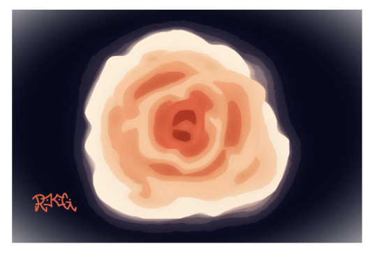
#started a larger one and painted blue background first
Text

Second affirmation piece, just watercolors and pen on watercolor paper
#i wanted there to be blue in the background and then realized#nooope thats gonna mess everything up#but just had to follow my own advice and go with the strokes 🤷🏽♀️#nat creates#watercolors#i enjoyed painting the jellyfish#definitely wanna do more#started a larger one and painted blue background first#not sure how things will show up in the foreground but we shall see
15 notes
·
View notes
Text
Dream Star Daycare vs. Blue Sky Daycare
I’ve already talked a bit about the differences between these two and how the first daycare (Dream Star) was colder than the second daycare that Miri actually gets accepted at (Blue Sky). But, I had a bit more commentary that I wanted to add, especially because that post in general wasn’t really about that topic (it was about Kazuki and Rei really accepting the roles of “Fathers” within the larger societal structure of Japan). This post is just going to be about these two different daycares though.
First we have Dream Star Daycare. The name alone, while cute, is a bit colder already. It’s about nighttime, sleeping, and stars (up in cold space). The outside is doesn’t really tell or say much about the daycare:
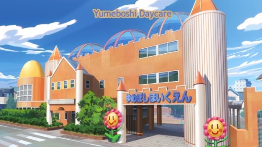
There are two big smiling flowers at the entrance way, but everything else about the building is pointed and sharp. The color is a dull orange-brown, the pillars are white, large, and intimidating, and the windows are void of any children’s artwork or colors or anything that really says, “Welcome children!” in a nice and kind way. You can barely see the (pretty barren looking) playground in the back there, through the walkway entrance. I can see a pair of exercise bars maybe, and that’s pretty much it.
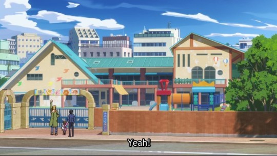
Blue Sky Daycare really lives up to that warm name. When people think of blue skies, they think of nice days outdoors with their family and friends. Warm memories and experiences. Visually, the building is much more welcoming as well. The entrance way has low arches that are rounded, with small pictures of happy animals welcoming the parents and students in.
The playground is front and center with lots of different equipment and things for the children to do. The playground is also very colorful, just like the roof, which is a pretty blue, and the walls of the building, which are painted an off-white color that allows all of the colorful images to be seen (like the flying birds and floating hot balloons). There are some sharp shapes, like the roof tops, but they are evened out with smaller and/or rounder windows that are more frequent as well.
The way the building is structured also allows for the parents to see what is going on inside the classrooms and for the teachers to keep a better eye on the children from the classrooms when they play outside. Dearm Star Daycare didn’t allow for anything like that, because the building was more like a refurbished government building than Blue Sky’s Daycare, which feels more like a home.

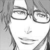
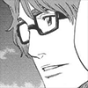
The first thing we are greeted to inside Dream Star Daycare is this woman. She likely is a head teacher or manager - someone higher up that doesn’t actually work with the children. The give away for this is how she is dressed. She’s wearing a very business and professional looking suit outfit that doesn’t allow for much mobility, and around her neck is a necklace that could be a choking hazard and just cause a general mess around actual children (like, if one of them pulled on it and it broke and the pearls went everywhere).
Along with this, we have the stern lines around her lips, which are pulled down in a frown. Her squared jawline, narrowed and smaller shaped eyes, and furrowed brows combined with very bland colored and traditionally shaped glasses makes her come off as displeased, stern, and no funny business right from the start. Her haircut brings this whole look together as well.
In the background we can see some of the pictures the children have drawn...But they don’t look much like drawings the children made to express themselves. Those drawings definitely look more like academic based drawings, focusing on the children learning vocabulary and sight words. Since they are almost all single word images (dog, sushi, rainbow, train, etc.). None of them show true self expression or anything situational that indicates creativity and the children creating them to learn by living and exploring. Seems more rotary, repetition, learn-by-memorizing-sight-words based kind of learning instead.

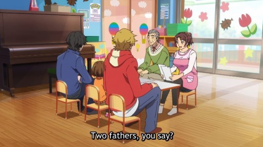
Someone in the comments of my previous post commented on how big the desk is, and they’re totally right. This desk is huge and places a lot of space between Kazuki, Rei, and the lady interviewing them. Miri is also far off to the side and playing alone with blocks. Blocks can help children learn some good social skills, but that’s only when they are playing with blocks with others.
Otherwise, blocks tend to focus more on helping children learn more conceptual ideas (math, spatial awareness, increase attention span, etc.). Concepts that are more beneficial for academics, rather than social learning and building.
Also, let’s take a look at the dialogue here, “We’re your first choice of daycare, then?” I’m sure, in a scene that we didn’t get to see, that the lady did common pleasantries and greetings, but the show decided that this sentence should be the first one that we hear this woman say to Kazuki and Rei. Before she asked this, she made a sort of disgruntled sound, so that combined with this...unpleasant greeting makes it clear that this woman doesn’t want them at her daycare. She is basically saying, “We were your first choice,” with the implication of “I wish we weren’t.”
After that, she goes on to ask them this:
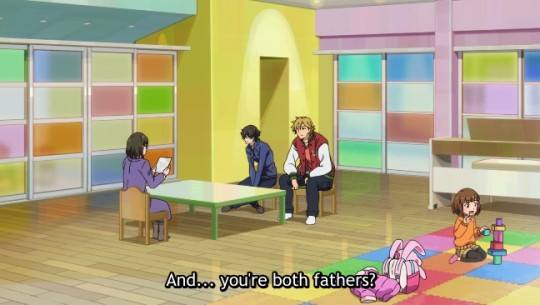
“And...you’re both fathers?” The “And...” is saying a lot here. Right, that pause before a question indicates some level of uncomfortableness with the question you are going to ask. Implies you find something off or wrong with whatever you are asking about. She also starts off only engaging with Kazuki and Rei. Miri has to literally force herself into the conversation, and then the woman only gives one word replies back to Miri (usually as a question). No true engagement.
In the other post I talked about the look of the room, so I won’t go into details with that here, but you can see how barren and cold it looks and feels.
Now, let’s check back with Blue Sky Daycare:
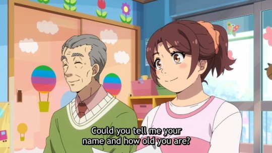
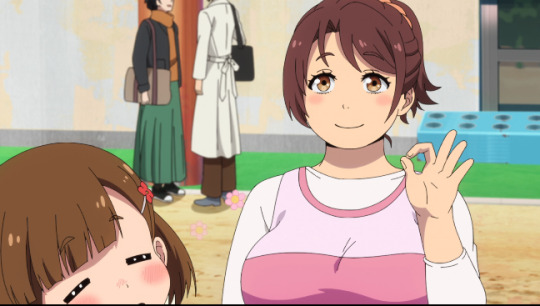
What a difference our first impression of Blue Sky Daycare is! Cute, warm, and inviting pastel colors are everywhere, as are pictures and children’s crafts. You can see the boxes of toys in the back, but Miri isn’t playing with any of them, because she was brought into the interview itself.
Miss Anna starts off the interview by talking to her directly, in fact. Asking for her name and age. She has a pretty smile, button nose, rosy cheeks, and big kind eyes. Her hair is done up in a loose ponytail, and she isn’t wearing any jewelry. The older man next to her has a kind smile on his face too, big bushy eyebrows, and wears very soft colors (pastels of green and pink, a muted red color, and white). Nothing about either characters design is sharp or cold like the other women.
There is also a very prominent wooden piano right next to the table they are sitting at (it’s a dark wood color too, which has a “warm” tone to it). Sunlight is shining in form the windowed doorway behind them, and the desk they are all sitting at is big enough, but also allows the two groups to be closer, and is at Miri’s level.
We also get a nice, full view of Miss Anna’s design here. Her clothes are comfy, she has an apron on with pockets, and she is wearing just socks. All of this indicates that she actually engages with the students. No jewelry anywhere for kids to break and cause a mess or possibly choke on, no stuffy clothes that would be hard to move and play and jump around in, an apron for her to get messy when it is craft time, and pockets to hold materials she might need throughout the day.
When she asks about them being two fathers, she says, “Two fathers, you say?” Things to note: there is no “And” or “...” no pause in asking this question. She also asks it politely. In the Japanese she ends it with “desu ka,” which is a general level of politeness. The English carries this over with the translation of “you say?” This carries over her tone of voice and expression (a nice smile) too, which are far more welcoming than the previous daycare.

Finally, when Miri is talking (and not just introducing herself), Miss Anna bends down and closer to Miri. So she indicates that she is listening closely to what Miri is saying and is doing so more on Miri’s level, rather than Miri having to do so on the adult’s level (like what we see at the previous daycare).
They really do a fantastic job of visually showing why Blue Sky Daycare is not only a perfect fit for this little family of three, but also why it is a good daycare in general.
In a way, Kazuki and Rei really...dodged a bullet.
(Sorry, I’ll end this now, lol).
#Buddy Daddies#Rei Suwa#Kazuki Kurusu#Miri Unasaka#Anna Hanyu#BD spoilers#Buddy Daddies spoilers#meta post#character design post#long post#thought post#image heavy post
470 notes
·
View notes
Text
🦚 TWST OC MITCHELL INFO 🦚
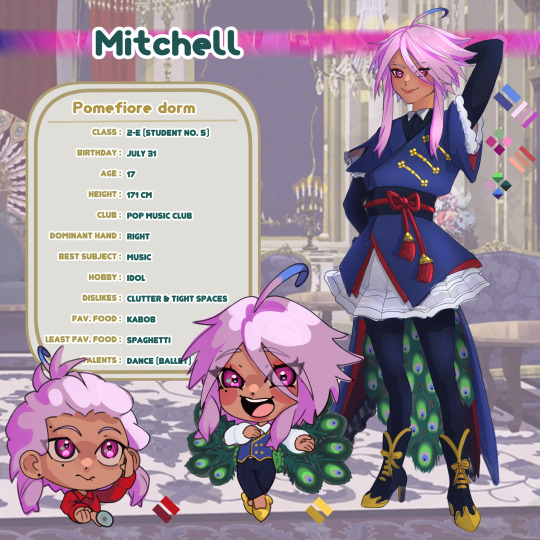
New oc alert! ^v^ getting more used to painting first and then lining so this came out more detailed than Tunas LOL

BASIC INFO
TAG : #twst Mitchell
Name : Mitchell / Mitty
Class : 2-E (Student no. 5)
Birthday : July 31st
Age: 17
Height : 171 cm
Dominant Hand : right
Best Subject : Music
Hobby : Idol
Dislikes : Clutter & tight spaces
Favorite Food: Potato Kabob
Least Favorite Food : Spaghetti
Talents : Dance (Ballet Specific)
Quick Summary:
Mitchell or Mitty, is a micro-celebrity idol. Covering popular songs and trending dances, Mitty is determined to follow his childhood idols footsteps! Even though he couldn't join auditions to be in a group, Mitty has created a good following on his magicam and magitube accounts. As Flamboyant as he is, he still gets shy when complimented or meeting people he looks up to. Overall this peacock beastman is slowly learning step by step how to brainwash everyone to be his fan! (/j... unless?) ^o^
APPEARANCE
A peacock beastman with bright purply-pink hair and eyes. He has an ahoge that is not normal hair, turning blue towards the end. Above his left brow and below his left eye he has beauty marks. His overall body type is thin, toned and with hip dips. Very often Mitty applies red eyeshadow and lipstick as well as applying mascara and contact lenses to make his eyes appear larger. He has lobe piercings, but rarely wears earrings due to his hair covering or getting tangled easily. As for fashion he prefers deep reds and dark cool colors usually in lolita styles. For more casual looks he prefers loungewear like cardigans and loose pants.
PERSONALITY + BACKGROUND
As a child Mitchell was extremely influenced by anime idols and cute idol groups alike. Going as far as performing his favorite songs and dances in school talent shows. However, his obsession with making the crowd feel "awe-inspired" he often used his UM to his advantage. This didn't do well with many of his teachers and other parents... so surprisingly enough Mitty had many detentions in their early years. This record left him in dim lights for group auditions. Mittys mindset got a bit skewed and began to think... I will just have to try harder to rule the crowd! Overtime their hope to inspire morphed into wanting the world to love him (through mostly any means).
Upon entering NRC Mitchell had begun seeking attention online and decided a "debut concert" was most necessary. After the entrance ceremony Mitty went back to the mirror chamber, set up his phone camera and began to perform one of his favorite routines! Thus started his online career! While he is not as popular as others, he does have a few hundred supporting him and in his mind that's the first step to his domination!
Personality wise, Mitty is pretty dense when it comes to anything besides his interests and doesn't take no for an answer. No literally it will go in one ear out the other. Despite this he does take everything surprisingly seriously, ok not rejection, but everything else! However compliments? He will grin from ear to ear, go red and just absoluetly adore you! He can be a bit clingy when he's like this, but he's just happy some one likes him. When it comes to friendship though... well he's not a terrible friend, but he does tend to only think of himself most of the time... at least he will buy you things to make it up to you;; Just don't ask him for emotional advice too much he really isn't good at it. Overall he's a bit of an annoying person, but his shy and bashful bursts at compliments may be something redeemable.
Academically he is average. He does amazing is music but that's about it, everything else is passing at least. He struggles with history most due to his disinterest in remembering about people who aren't his idols.
In his free time, Mitty practices dance and song covers from his favorite medias. Posting them as often as he records and of course running to Cater for help very often. If they're not doing that, he's grooming his feathers or sewing new outfits. Occasionally he will tour around campus and invade dorms to take photos in his newest creations as well as show them off.
ABILITIES
UM- Focus on me! "Let me show you who's the main star!"
-This unique magic allows Mitchell to take on his peacock beast-form. When showing off his beautiful feathers they act as a hypnotizing charm; causing dizziness, crossed vision, and luring people into a trance like state. If used with full force, Mitchell can force the afflicted to follow his movements.
-Movement can not be fast or the afflicted will snap out of the trance.
-strength of effects depends on the amount of magic used in this UM. Less input and you can expect a simple charm and lull effect, but with heavy input the effects will increase.
-Small to medium blot manifestation; long term use at low levels is usually fine, but after a few hours blot formation rate will increase.
RELATIONSHIPS
Relationship chart to be made !
Notable Relationships:
Vil & Mitty : Mitty looks up to Vil and respect him so much! While he isnt into acting, Vils prowess and social media standing are impressive! Mitty is too busy fangirling and stuttering to speak to Vil casually. Vil doesn't seem to mind so long as it doesn't effect his work.
Cater & Mitty : Mitty joined the pop music club and immediately wanted to quit. It was quite contrary to what they expected. Cater and Kalim were quick to talk him into staying. Ever since, Cater has been a big help to Mitty in social media learning and Mitty may have taken to mimicking Caters speech online. Mitty says they're close friends, but Cater only see it as a casual friendship.
Riddle : Currently Mitty is trying to convince Riddle to form an idol duo. Riddle had been one of the first to "compliment" one of his dances, saying "Your dancing nice, however you are trespassing on Heartslaybl property!". Ever since, whenever Mitty visits Cater he doesn't hesitate to try and recruit the house warden. While Riddle does not hate him, he is often dumbfounded by Mittys inability to "read the atmosphere". It is not currently known why Mitty is obsessed beyond the nice comment.
Thanks for reading about Mitchell!! I did not realize until after i made his nickname Mitty that Mitty can mean "a fictional character given to grand and elaborate fantasies" and I think that's very fitting for him LMAOOOO
anyways!!! Thank you for the support and time <3 !
203 notes
·
View notes
Text
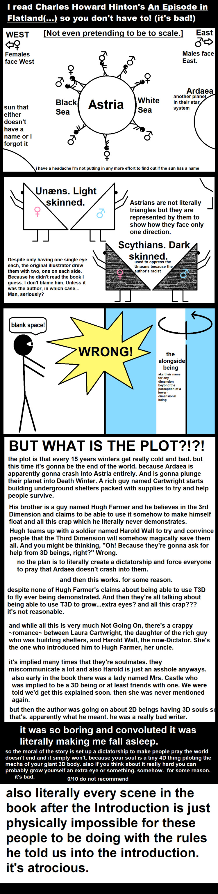
[ID: a long 6-panel MS Paint comic, titled, "I read Charles Howard Hinton's An Episode of Flatland (dot dot dot) so you don't have to! (It's bad!)".
Panel 1 is labeled, "not even pretending to be to scale", and shows a circle in the center labeled "Astria", with the edge covered in stick figures who have both arms on one side of their body, either facing the west for females, or east for males, with a mars or venus symbol over each head to show who is what. The west side of Astria has a darker rim labeled, "Black Sea", and the east has one labeled "White Sea".
On the side of the panel is a cirlce mostly offscreen labeled, "Ardaea, another planet in their star system".
In the lower corner a larger circle labeled, "sun that either doesn't have a name or I forgot it. I have a headache I'm not putting in any more effort to find out if the sun has a name".
Panel 2 shows two sets of people represented by right triangles, with males facing east and females facing west again, with their back to eachother. First we have Unæans, who are light skinned. They are represented by white triangles. Then there are Scythians, who are dark skinned, represented by triangles filled in with black with a crayon texture. Smaller text reads for them, "used to oppress the Unæans because the author's racist".
Text reads, "Astrians are not literally triangles but are represented by them to show how they face only one direction. Despite only having one single eye each, the original illustrator drew them with two, one on each side. Because he didn't read the book I guess. I don't blame him. Unless it was the author, in which case…Man, seriously?".
Panel 3 shows a 2D stick figure looking to the west and saying, "Blank space!". A yellow splat in the middle of the screen reads in all caps, "Wrong!", then shows the stick figure being viewed from another angle so they, and their dialogue box, appear as nothing but a straight line against a light blue background, with a section of white on their Left labeled, "the alongside being - aka their name for any dimension beyond the perception of a lower-dimensional being".
Panel 4 reads in all caps large text at the top, "but what is the plot?!?!", then reads:
"The plot is that every 15 years winters get really cold and bad. But this time it's gonna be the end of the world. Because Ardaea is apparently gonna crash into Astria entirely. And is gonna plunge their planet into Death Winter. A rich guy named Cartwright starts building underground shelters packed with supplies to try and help people survive.
His brother is a guy named High Farmer and he believes in the 3rd Dimension and claims to be able to use it somehow to make himself float and all this crap which he literally never demonstrates.
Hugh teams up with a soldier named Harold Wall to try and convince people that the Third Dimension will somehow magically save them all. And you might be thinking, 'Oh! Because they're gonna ask for help from 3D beings, right?' Wrong.
No the plan is to literally create a dictatorship and force everyoen to pray that Ardaea doesn't crash into them.
And then this works. For some reason.
Despite none of Hugh Farmer's claims about being able to use T 3 D to fly ever being demonstrated. And then they're all talking about being able to use T 3 D to grow…extra eyes? And all this crap??? It's not reasonable.
And while all this is very much not going on, there's a crappy romance between Laura Cartwright, the daughter of the rich guy who was building shelters, and Harold Wall, the now-Dictator. She's the one who introduced him to Hugh Farmer, her uncle.
It's implied many times that they're soulmates. They miscommunicate a lot and also Harold is an asshole anyways.
Also early in the book there was a lady named Mrs. Castle who was implied to be a 3D being or at least friends with one. We were told we'd get this explained soon. Then she was never mentioned again.
But then the author was going on about 2D beings having 3D souls so that's. Apparently what he meant. He was a really bad writer."
Panel 5 is black with white text, reading:
"It was so boring and convoluted it was literally making me fall asleep.
So the moral of the story is set up a dictatorship to make people pray the world doesn't end and it simply won't. Because your soul is a tiny 4D thing piloting the mecha of your giant 3D body. also if you think about it really hard you can probably grow yourself an extra eye or something. Somehow. For some reason.
It's bad. 0/10 do not recommend."
Panel 6 is white with black text again, reading, "also literally every scene in the book after the Introduction is just physically impossible for these people to be doing with the rules he told us into the introduction. it's atrocious."
End ID.]
fortunately, it's public domain, so it's free to read, and you can rewrite it to not be absolutely terrible and mind-numbing and sell your version. the version we deserve.
#long post#very long post#described images#described art#Flatland#2d#Rjalker edits An Episode of Flatland#An Episode of Flatland or How a Plane Folk Discovered the Third Dimension With Which is Bound Up an Outline of the History of Unæa
12 notes
·
View notes
Text
The Magnus Archives Index Card fan art - The Entities

Check out my first index card drawing for TMA here, from back when I had no clue what was going on.
Descriptions and explanations under the cut.
I actually started this one a few weeks ago when I first listened to Episode 111 (aka the worldbuilding infodump) but I only got around to finishing it today. From left to right, top to bottom:
Row 1 Column 1: Two silver lines reminscent of magnetic tape form a helix of eyes against a black background, which also has smaller, floating eyes. Representing The Eye, of course.
Row 1 Column 2: A purple coffin covered in silver chains, against a blue background. Representing the Buried, with the blue representing the "drowning" and "deep ocean" aspects of it.
Row 1 Column 3: A combat knife cutting a red tear across a gauche pattern of colors that is remiscent of both camouflage and abstract country maps. Representing the Slaughter, both at the personal and larger scales.
Row 1 Column 4: A candle emitting gray smoke against a similarly gray background, with a small pile of black ash at its base. Representing the Desolation.
Row 1 Column 5: A black, unmarked gravestone on bare earth, with skeletal hands reaching towards it from a white void. Representing the End.
Row 2 Column 1: A single claw reaching out from a curtain of leaves, blood dripping from the tip. Representing the Hunt.
Row 2 Column 2: A black spider silhouette on a silver web, against a red background. Representing the Web. Not gonna lie, I thought I was so cool making the background the color of blood, and then I realized it just looked like Spider-Man. Oops.
Row 2 Column 3: A gold comedy mask against a multi-colored striped background reminiscent of a circus's color palette. The mask has two red marks on either side, reminscent of the face paint of the famous clown Grimaldi. Representing the Stranger.
Row 2 Column 4: A spiraling pattern of rectangles color yellow, green, and pink, in a pattern that isn't quite a pattern. The center has a circle that might be a doorknob. Representing the Distortion.
Row 2 Column 5: The dark silhouette of a person's head and shoulders against a grey background, with a black silhouette of a dead tree branch hanging over them. Representing the Lonely.
Row 3 Column 1: The upper half of an open mouth, vaguely human but with sallow orange-y skin, and molars at even distances around the rim. Representing the Flesh.
Row 3 Column 2: A sickly yellow-green and blue hive with silver protusions from the lowermost combs, against a purple background. Representing the Corruption.
Row 3 Column 3: A drawing reminscent of the black hole photo, of a black circle with warm colored clouds surrounding it, but with additional black lines akin to rivers of darkness pouring into the center from space. Representing the Dark.
Row 3 Column 4: A lightning bolt against a gradient that goes from black to blue to white. Representing the Vast.
Row 3 Column 5: A circle vaguely resembling planet Earth, with blue oceans and a grey-green continent, overlaid by an interlocking nuclear hazard symbol and three plastic waterbottles. The planet is haloed in fire. Representing the Extinction.
Some of these I'm more proud of than others; the Dark, the Desolation, and the Lonely in particular I think turned out really well. I'm also really proud of the concept for the Eye and the Distortion, although the execution could've been a bit better. (I was actually trying to go for a regular pattern when coloring in the Distortion and just goofed, but then I realized that actually made more sense. Happy accident!) The Extinction in particular looks sloppy, but hey, I'll do better next time.
#tma#the magnus archives#magnus archives#magnus podcast#magpod#tma spoilers#the magnus pod#magnus pod#magnus archive spoilers#magnus archive fanart#tma fanart#tma podcast#the entities#the fears#tma the fears#tma the entities#the dread powers#the eye#the buried#the slaughter#the desolation#the end#the hunt#the web#the stranger#the distortion#the spiral#the lonely#the flesh#the corruption
19 notes
·
View notes
Text
No. 22 - China Airlines
China Airlines, not to be confused with China Eastern Airlines, China Southern Airlines, China United Airlines, Air China Inner Mongolia, China Eastern Yunnan Airlines, Grand China Air, China Express Airlines, China Flying Dragon Aviation, China West Air, China Cargo Airlines, China Postal Airlines, China Southern Cargo, China Air Cargo, China General Aviation, China National Aviation Corporation (CNAC), China Northern Airlines, China Northern Swan Airlines, China Northwest Airlines, China Southwest Airlines, China Xinhua Airlines, China Xinjiang Airlines, China Yunnan Airlines, Great China Airlines, People's Aviation Company of China (CAAC), or China's flag carrier Air China, is the flag carrier of Taiwan.

It's funny. I always thought I loved this livery.
I remember a conversation I had with my mother at the airport in...oh, it must have been 2018. I remember saying "all these planes are so bland I can barely tell them apart - I wish more of them did something interesting or tried to be pretty, like China Airlines".
Back then I wasn't the person I am now. I didn't look at nearly as many pictures of airplanes, and not nearly as closely. Attempting to seriously review a livery actually makes me realize things I never did before. I didn't know I liked the SAS livery before I looked at it critically. And I didn't know that...I don't think I like the China Airlines livery very much.
It makes me sad. It feels a little like growing up to learn that Guinness World Records mean nothing. But I don't blame my past self for thinking so highly of them. This is a situation where the high concept is fantastic and it doesn't fall apart until you look closer.
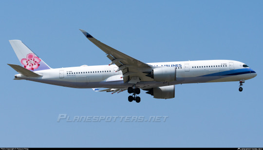
I think the main thing CAL has going for it is the color scheme, which is gorgeous. There aren't really other lavender planes out there and I think the plum blossom motif is very pretty. It's very easily recognizable and very aesthetically pleasing. It's not going for cool or for sleek, it's going for pretty, and that is, strangely enough, an untapped market.
And that's what I liked about it. That's what I still like about it. So it kills me when I say the implementation is very disappointing.
First off, Detached Tail Syndrome. This would have been so easy to remedy because the lavender is already a gradient. Gradients are maybe the easiest thing to ever extend off a tail, especially with a pastel color into a white body.
I feel like just having one blossom on the tail is a missed opportunity as well. A cluster of flowers across the back of the fuselage, growing over it like ivy...I can see it in my mind's eye, but China Airlines apparently can't.
I like the bit of blue, but I do sort of dislike how it's implemented.
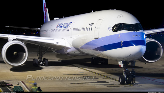
It looks like she's got a bandage wrapped around her nose. I don't at all dislike the sweeping lines, but only having two of them and only at the very front feels strange. Could there not be a handful of ribbon-like lines splitting out from one point to cover a larger part of the fuselage?
And did the background have to be white? Could it not be a barely-off-white lavender, a faint powder pink, anything more dynamic? There is so much you can do with gradients, so much CAL chooses not to do. They take these fantastic colors, this start of a design, and chicken out before it actually covers the fuselage.

Look how bad it looks on a longer plane. Look how much it fades into nothingness. The blue is just vivid enough to be visible, feeling out-of-place on a stretched-out white expanse. The lavender underbelly is difficult to notice unless you're looking for it because it just looks like the shadow on the lowest part of the plane. The tail is on its own. Did you have to fly this plane between coats of paint? This can't really be the final design, can it? This wasn't even the worst example of this I found! There are longer and weirder looking planes out there and the livery looks even worse on them!
Okay. My opinion has been voiced. I have some notes about what can be done better, and both of them are going to be delivered using other China Airlines liveries.
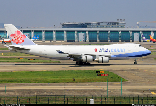
First, this China Airlines Cargo (not to be confused with China Cargo Airlines, which is Chinese) 747. This is hypothetically the same livery, but the shape of the 747's nose makes the blue occupy more of the fuselage, and that instantly makes it so much better. Maybe make some of those lines peek out at the tail end and/or over the wings and you've got yourself a livery there. Give the plane a ribbon hat! Anything. Literally anything.
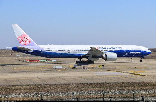
Second, this 'fusion' livery. China Airlines has a line of liveries which include aspects of Boeing and Airbus's default manufacturer liveries (let me know if you'd like to see me cover either those on their own).
To begin with, it's sad the degree to which this overpowers the actual CAL branding. But second, isn't this such an improvement? If you took the Boeing branding off you could mistake it for CAL's colors, and the lavender neatly cuts through the top of the fuselage instead of staying on the tail. The waves of the blue keep the elegant feeling of the blossoms while keeping the rest of the livery interesting. This looks better than the regular CAL livery and it's literally someone else's livery.
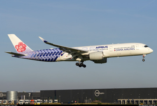
The Airbus livery looks better too, and that's even though I don't like the carbon fiber tails on their own, but make them CAL colors and add a big logo to the blank part of the fuselage and you've got something at least interesting! (Also, she looks so fishlike with this tail. Big fan.)
Now, I don't believe CAL needs that much detail to make a good livery. I think it would only take a couple more details, another element or two and you'd have something nice. It might even be good enough that my past self's statements would be earned.
And one last thing. One very obvious thing that I can't believe they missed.

All those blossoms and you don't even put one behind her ear? For shame, China Airlines.
Grade: C-
#tarmac fashion week#grade: c-#era: 2000s#era: 2010s#era: 2020s#region: east asia#region: taiwan#china airlines#flag carriers
24 notes
·
View notes
Text
A couple people asked how I do my MS Paint nonsense, so I shall explain!
(disclaimer; I did this fast, and the end result won’t be as nice as the stuff I work on slowly)
In particular, regarding roses; first I just make a small center spiral using the pixel pencil tool in MS Paint. I continue adding more shapes for the rose petals, switching between rounded ones and a few that are more angular. When the rose is the right shape, I pick the smallest pixel setting to divide up the outlines with new colors, then fill in the rest of the rose with the little paint bucket tool

The next thing I do is copy-paste the image into a blank doc of MS Paint. Once it is in there, I re-size it (because my original picture is always done on a small scale) so I can get a good look at what I’m doing, and copy-paste it once more at the larger size. Then I right-click on it to see different options, choosing the one called Format Picture.

Within Format Picture are more options, including Artistic Effects. First I pick the setting Paint Brush, this helps smooth-down the edges of the pixels. Sometimes I will combine other Art Effects together by copy-pasting and doing something different each time, but I need to get it just right first

Most of the Art Effects have sliders for their options, usually different forms of “intensity” or “transparency”. Often, I start at a low intensity, copy-paste, then add a higher intensity but make it somewhat transparent, causing the image to have a watercolor-like vibe

Now that all that is done, there is still MORE to do! With the edited image, I open up MS 3D Paint, a newer and slightly more advanced version of Paint that has higher resolution and the option to change the opacity with the various art tools (I LOVE this).
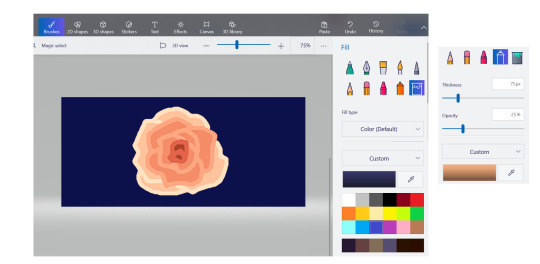
Here, I can add darker shadows for the deeper folds of the rose petals, and highlight shine for the edges. Because this doesn’t have a layers option, this means any lines you “color-over” might need to be re-done (I’ve re-drawn whole entire pictures like this, because I need to make it JUST RIGHT. for more painty stuff like this, I’m going easy on myself and letting it just be soft and a little messy for the aesthetic). I also add a darker blue color for the background (technically you can do this in regular MS Paint, which I usually do, but I’m gonna keep it real with you; I forgot until after I started editing)
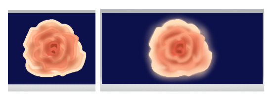
Now I’m putting the image back into Word, but this time I’m going to play around with the Picture Corrections, changing the brightness/contrast, colors and saturation


I continue to copy-paste and edit several times, going back to the Art Effects eventually, using the Cutout setting (and adjusting the number of shades/transparency)


Finally, I copy-paste it back to the original MS Paint file, and save it as a PNG. This is where I will click on the image file, and use the Edit Image option

There are more options for colors and light here (it also used to have really cool filters, but the old ones all got replaced in a recent update, and I HATE the new ones. ANYWAY). The sliders let you play around until it gets where you want it
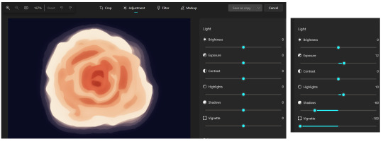
And that’s it! I save, then open it up in MS Paint one more time to add my signature, then save again, and it is DONE!
There are a lot of other options within Word for Art Edits, you just need to find one that works~

34 notes
·
View notes
Note
❝ Happy birthday, Gin. ❞
The words accompanied the placement of three boxes - which had been an unintentional thing initially - upon the low table in his own quarters, knowing how well Gin seemed to prefer his rooms at the Fifth over his own at the Third. It was early enough before dinner (and oh, how Aizen had plans for said dinner) that he felt no shame in providing the gifts now. He had wrapped all three boxes in furoshiki, all three with distinct patterns printed on the soft, light silk that the captain favored when distributing gifts from his own hands. A rare enough thing, those gifts, and presented to specific individuals. But never had he forgotten Gin's birthday since they'd first met; every year on the mental calender he kept, he ticked the days down and waited with firm patience to present the gifts unto his partner.
The smallest box, of a long and rectangular shape, was wrapped in paper patterned with a pale motif of white flowers against a lavender background, the edges of the petals outlined with violet, a simple twine string keeping it neatly shut. The second one was larger, a square wrapped with dark green fabric that could make a lovely scarf if Gin ever desired it, with paler greens and yellows manifesting in the shape of koi. It was, despite its size, nearly as light as the smallest of the boxes. The third box was heavier, however, and wrapped in a cloth that rippled with patterns of silver and blue; both of which seemed somehow to match Gin's own coloration.
❝ I hope you'll enjoy them. ❞
The first box, the rectangular one, was a box with brass hinges on one edge, along with a tiny clasp on the shorter end to help ensure it remained shut. Within laid a kiseru in a bed of dark silk, long and elegant; something that would look at home within that hand bestowed with lengthy fingers. The mouthpiece was the traditional silver as was the bowl, but both had been decorated. There was a depiction of a serpent's tail entwining itself around the mouthpiece, the craftsmanship professing of dozens - perhaps even more - hours of dedicated work with tiny goldsmith's tools used to etch the scales into place; they were even beveled, catching and reflecting the light depending on angle, shadowed where they were not level with the metallic surface. The bowl and its portion of the stem held the rest of the snake, it left to circle up the stem and over it with its head nearly touching upon its own body, the scales here no less detailed but level with the surface so as not to have tobacco ash caught within and thus have to be cleaned out on a regular basis.
It was truly proof of handmade beauty, and the long lacquered section of the pipe was no less impressive for where the bowl and mouthpiece were but parts of the snake, the rest of the body was to be found there, where a brush fine as a few hairs had carefully defined the scales in gold that stood out against the sable field of the pipe itself, cunningly matching where the segments of the snake upon mouthpiece and bowl were set into place. Three pouches of already shredded tobacco were to be found tucked into the box as well, along with cleaning implements for Gin's sake, with four more stems, all painted as well with the same care and diligence set for later use tucked into bands of dark velvet against the lid of the box which was equally meant to be a case for it.
The second box, the square one, held another yukata for Gin; where the last one had been an array of purples, this one featured an ombre of white darkening into indigo. Contrary to how the last one had been short enough to be named indecent if Gin were to bend over ( and how Aizen loved to see him bending over in it ), this one was longer, promising to end just above his calves. But it, too, was oversized ever enough to permit the younger captain to maintain his formlessness if he so desired. The white began along the neckline of the yukata and careful application with dyes saw the color starting to change as the fabric flowed downwards and would wrap around his body.
It began as a nearly subtle darkening of shade, white becoming a nearly translucent blue, before it was a powdery shade and advancing through the spectrum to a shade that'd match the bright summer skies. From there, it started to darken to twilight blues, reminiscent of fall evenings when the air was crisp and the leaves fiery shades or orange and gold against reds and brighter yellows, when the leaves would be changing hues. The sleeves, long enough to cover Gin's hands, were rich indigo blue, nearly black around the cuffs, as was the portion running from just above Gin's knees and down to the hemline. There was a cloud pattern picked out upon it, darker threads of silver grays standing out with a shine of their own, with accompanying waves about the lower edge of the yukata's form forming high cresting peaks. And there, in the dark indigo, a sickle moon was set to rest neatly over one thigh where it would stand out the most. It was accompanied by a sash the shade of Gin's own eyes,
When Gin's hands found that third box, though, Aizen's eyes seemed to sharpen all the more behind those glasses as he watched with anticipation, taking in the vision of those hands moving across the lid. This one was much more akin to a small box. Within were copies of some of Aizen's favorite English books, but if Gin were to pick one up and flick through the pages? He would find there were several notes and sheets of paper to be found in the pages, all carefully annotated by his own hand, his writing still distinct as ever; precise and utterly neat. There were guides on how to pronounce the words, phonetically, as well as translations that captured the spirit of what was being said on those exterior notes. Beneath those books? A far more special prize; jars of dried persimmons were to be found, at least four, sealed up and promising a sweet snack for the younger man to indulge in if he ever so wished to do so.
Finally, Aizen smiled and moved, shifting to lean closer to Gin before seeking a kiss and a soft murmur against his mouth. ❝ Happy birthday; I was thinking I'll take you out to dinner wherever you like. And afterwards, I would love to start off with a massage. I would like to spoil you, Gin, as much as I can. ❞
A pause, before Aizen's lips twitched into a faint smirk. ❝ Though, if you can't decide? ... we could always go back to the yakiniku restaurant. ❞
gin's birthday asks! open from sept. 9 - 16th.
AIZEN SOUSUKE WAS A THOROUGH MAN, GIn often teased him about never leaving a stone unturned -- and that sentiment carried on here, now, with this array of neatly packaged presents left in waiting. Gin lowered down to kneel and sit, fanning his haori out behind him and matching Aizen's own posture (he needn't be chided for slouching) at the table. Hidden gaze briefly surveyed the three gifts before turning back to stay honed on Aizen, as though curious to see what intent laid behind the gleam of those glasses. Difficult as Aizen was to read, this endeavor felt genuine -- not overly sweet akin to a honeytrap, as though the moment he went to reach for an offered box his wrist could be snagged.
No, this seemed... good. Aizen's presence felt warm, and any lingering undertones of expectation didn't feel so insidious as to taint the gesture being made.
❝ Lookit you, bein' all proper 'n nice. What've I done to deserve this? ❞ A languid reply to Aizen's well-wishes, initially, and Gin couldn't help but tilt his head at the matter -- a subtle tease inbound; here I thought I'd been misbehaving as of late, an unspoken murmur that prodded at Aizen's nape akin to scaled coils draped around that proud neck. They had their skirmishes, particularly given Aizen's more forceful desires and Gin's subsequent stubborn evasions.
Nevertheless, slender hands reached to delicately tug upon the first gift's wrappings, undoing the neatly tied twine with a single gesture. The paper crinkled gently aside, Gin wasn't childishly overeager and tearing across the pristine wrapping, no, he was slow and soft with his motions. The small box was a dead giveaway for what the gift within was before he even opened it with a flip of that clasp. Yes, kiseru-length in nature, he wasn't surprised by the gift -- but the craftsmanship and customization certainly brought Gin to a pausing halt.
❝ H'oh, tired of me stealin' yours, huh? ❞ A playful quip, smile wide, whilst fingers traced the texture of the serpent imprinted onto the pipe's bowl and mouthpiece. ❝ Where'd you have this made? It's awfully pretty. ❞ He knew of no craftsmen that did such work, at least in the Seireitei. There was no use for such a skill to craft a luxurious item in the Rukongai, either. So perhaps Aizen did it himself, which wouldn't surprise Gin if it turned out he had -- the man was a perfectionist and overachiever, of course he'd go and learn a new skill and master said skill on a mere whim.
Gin gently lowered the pipe down back into its nest of silk and clasped the box shut once more, knowing he'd soon revisit it once the other presents were unveiled properly, too. The second box beckoned, and once that, too, was tugged open -- well, Gin couldn't help but coo as he dipped his hands down both to tug the yukata out of its neatly folded state, lifting it about halfway upwards to admire the fabric and design.
❝ Ahhh, this one's so elegant. Gonna haveta bump th' kiseru down a notch on th' prettiness scale. Thank you. ❞ A light commentary whilst Gin immersed himself in inspection and subsequent admiration, enjoying those vibrant and beautiful gradients of color, the mountains, the clouds, that sickle moon -- a gorgeous design. ❝ I'll put it on after dinner, wouldn't wanna risk spillin' somethin' on this one. ❞
That said, Gin gently folded the garment back down, neatly smoothing the fabric to settle into its box once more. Set aside, he moved onward to the third and final gift.
❝ Oh, for a second I thought it was gonna contain a buncha your horny poetry. ❞ Flirting quips aside, Gin lifted up the books and their accompanying notes, translations, and aids in pronouncing the words inscribed in Aizen's neat and orderly handwriting. The task at hand seemed rather obvious, then. ❝ You'll haveta endure me tryin' to read these out loud to ya later, hm? ❞ Flashing a more cheeky grin at that, Gin proceeded to let out a little noise of surprise and excitement, setting aside the books in favor of reaching for those persimmon jars. ❝ Fuck yeah -- ❞
Was he already opening one up to snatch a snack for himself prior to dinner? Why yes, yes he was. A few chews in and the glorious sweetness savored, Gin beamed a brighter, less teasing smile the other man's way. ❝ These're great gifts, cap'n Aizen -- Thank you. ❞ The subsequent kiss that followed was soft, short, and Gin couldn't help but grin against those lips. He freshly tasted of persimmons, something he was sure Aizen wouldn't mind.
They lingered close afterwards as Gin let Aizen murmur his plans, another soft coo of intrigue at the mentions of a massage caused Gin to peek one eye open, peering through silver strands. How luxurious indeed, these birthday gifts.
But the mentions of a particular restaurant brought Gin to shift, as though wanting to squirm out from under the abrupt intensity of that gaze, retreating back a scoot or two. He proceeded to lightly smack Aizen in the face with the dark green fabric meant to work as a fourth gift; a scarf, thrown swiftly. Nothing terribly damaging, he doubted he'd even move those black-framed glasses a centimeter askew. ❝ -- you were doin' so well, too, before ya jus' had to get all smug. ❞
A huff, then a grin stretched back out as Gin moved to straighten up into a stand, swaying, hands delving to hide into the lengthy black sleeves of his uniform -- ❝ As good as yakiniku sounds, I got somethin' else in mind. C'mon, don't let up now, Sousuke... y'still gotta spoil me a lil more to get whatcha want. ❞
#[ roleplay ] predator; murder on his mind & hymns on his tongue#[ verse: captain ] butterfly butterfly; shall i tell you a secret?#gin's 2k23 birthday celebration#[ dynamic: gin and aizen ] know this; either i devour you or you devour me
5 notes
·
View notes
Text
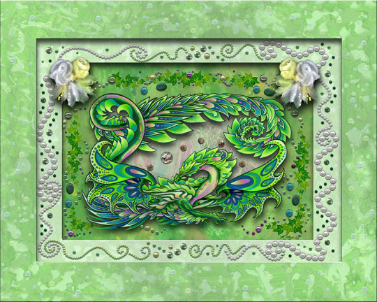
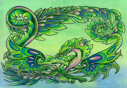
This is Spring Exuberance from a four-seasons-themed trade I did starting in 2013. The unencumbered dragon design is below the text block.
Spring is the simplest of the Four Seasons series, as I was still figuring out how much embellishment I could get away with before it became too much. This was also my first foray into a project that I'd fitted to shadowbox depth, which gave me a great opportunity to play with more pronounced layers and some larger embellishments.
I had orchids somewhat in mind when I worked out the accent colors. I knew that I wanted that fresh, almost golden-green as the color theme; freshly unfurled leaves are one of my favorite things about spring specifically for this color. A touch of blue and a touch of lavender/cream rounded out the palette.
The outer frame was done with acrylic and (though it's very hard to see) "rain dots", which are made of hard acrylic.
The middle frame is also acrylic paint, with acrylic pearls and shiny bits all the way around. There are also nylon flowers.
The dragon was done with ink and Prismacolor pencil over watercolor. I don't think I used any paint pen detailing this time.
The background behind the dragon is acrylic paint. There are ivy stickers, freshwater pearls, shiny and pearly bits, and assorted blue/green jaspers. In the middle of the dragon's coils, there's opalescent mylar with abalone shell beads on top.
Here's the dragon without all the fuss; this is just the ink/waterclor/Prismacolor design:
#dragon#spring dragon#spring green#spring leaves#four seasons#four seasons dragon#mixed media#traditional media#layers#frames#shadowbox#fantasy art#dragon art#dragon artist#fantasy artist#traditional artist#artists on tumblr
7 notes
·
View notes
Photo

License Plate Confetti POODLE, standard poodle, watercolor background, spoo, continental cut, realistic, unique poodle gifts Your favourite breed art print - head or body conformation - groomer gift - Other Breeds Available - dog breeder gift - regional specialty or national specialty prize gift idea Artwork by Ivy Fox Illustration Follow Ivy Fox Illustration on social media https://m.facebook.com/IvyFox.illustration/ https://www.instagram.com/ivyfox.illustration/ Find your dog breed: Personalized Pet Portraits: https://ivyfoxillustrates.etsy.com/ My website: https://ivyfoxillustration.com/ Art Prints Merch Original PaintingsShow off your undying love for poodles with this colorful poodle license plate! The original was painted in watercolors, and features a white poodle with splashes of color in its fur, against a blue and pink background. They're lightweight, and each one has four pre-drilled holes for a super easy installation. .: Lightweight aluminum .: Compatible with License Plate Cover (12.2" x 6.3") .: Pre-drilled holes .: Easy installationContact Email: IvyFoxIllustration@ gmail(dot)com ———— Tags and other miscellaneous info: ———— Ivy Fox Illustration Ivy Fox dog art Museum of the Dog American Kennel Club Showsight - Where Champions Are Celebrated American Dog Fancier InfoDog Best In Show The Canine Chronicle AKC Gazette best pet portrait artist watercolor fine art unique art Akc meet the breeds Westminster kennel club dog show national dog show crufts grooming intergroom superzoo petquest groom expo dog sports well bred dogs purebred preservation breeders ethical breeders breeder of merit akc grand champion Ch – Champion of Record – earned by gaining 15 points in conformation wins. Points awarded is determined by the number of other entries the winning dog defeats. A dog must win at least two majors (by winning at two different shows under two different judges where there are enough entries defeated to equal 3-5 points by the AKC point system. OTCh – Obedience Trial Champion To earn an obedience title, the dog must have a passing score of 50% of possible points or better, and an overall passing score at three different competitions under three different judges. CD – Companion Dog (First Level Obedience Competition, basic obedience exercises) CDX – Companion Dog Excellent (Intermediate Level Obedience Competition, more advanced obedience work) UD – Utility Dog (Advanced Level Obedience Competition, difficult obedience work, including hand signals) UDX – The highest obedience degree AKC presently awards TRACKING TD – Tracking Dog TDX – Tracking Dog Excellent VST – Variable Surface Tracking HERDING HIC – Herding Instinct Certificate HT – Herding Tested PT – PreTrial Tested HS – Herding Started HI – Herding Intermediate HX – Herding Excellent HCh – Herding Champion AGILITY NA – Novice Agility OA – Open Agility AX – Agility Excellent MX – Master Agility Excellent NAJ – Novice Agility Jumper OAJ – Open Agility Jumper EAJ – Excellent Agility Jumper AKC Unofficial Titles CGC – Canine Good Citizen ROM – Register of Merit – A dog or bitch must earn a number of points specified by the DPCA rules, and also meet the numbers of champion and major pointed progeny required by DPCA. The requirements for bitches are less than the requirements for the dogs because males have the opportunity to produce a far larger number of offspring. ROMC – Canadian ROM ROM/C – designates that the dog has earned an American and a Canadian ROM. TT – Temperament Tested TC – Temperament Certified AOE – Award of Excellence-A dog must meet qualifications in conformation, obedience, and also be OFA´d to earn this award. New competitions are being added and rules for competitions change, for the most up to date rules and regulations, check with the AKC and the DPCA. Miscellaneous American titles often seen on pedigrees and in advertising. BIS – Best in Show at an All-Breed Show in conformation. BISS – Best in Show Specialty (where only dogs of the same breed are competing in conformation) BOB – Best of Breed BOS – Best Opposite Sex BOW – Best of Winners (best between Winners Dog and Winners Bitch in breed conformation class competition) WD – Winners Dog – the winning dog overall of the regular classes of his sex. WB – Winners Bitch – the winning bitch overall of the regular classes of her sex. RWD/RWB – Runner up to the winners dog and bitch, if the winner becomes ineligible for the award then the runner up will receive the points awarded from that show. Special – A dog that is already a Champion that is competing for Best of Breed only. A Champion cannot compete in the classes where points are earned (because a Champion has already earned them!) RTD – Registered Therapy Dog TD I- Dog has passed Therapy Dog International´s testing HEALTH CERTIFICATIONS OVC – Ontario Veterinary College OVC Hip Certification – A dog may be preliminary screened at a younger age, but will not receive a certification unless the dog is at least 18 months old. It was told to me by a tech in the radiology department of OVC that they consider hips to either be bad, in which case they are rated on a scale from 0 – 4, with 4 being the worse, or they are “good” in which case the animal will receive a certification number (if 18 months or older. Therefore they do not follow the U.S. rating system which includes “FAIR”, Good, Excellent”. Their exact words were “the hips are either GOOD or they are NOT. OFA – Orthopedic Foundation for Animals OFA Hip Certifications – dogs within a specified range of normal hip x-rays are certified OFA-Excellent, Good, or Fair OFA – Elbow Certification – Certified by OFA for normal elbows on x-ray, only one grade recognized as normal. Check with OFA for proper procedures and positioning for hip and elbow x-rays. A dog may be preliminary screened at a younger age, but will not receive a certification unless the dog is at least 24 months old. OFA is also now doing certifications for other canine health concerns such as normal thyroid levels, check with OFA for accurate data and rules concerning these. CERF – Canine Eye Registry Foundation-dog is certified to have normal eyes. Re-certification must be done annually. vWD – Von Willebrands Disease free-meaning the dog has been tested and found free of vWD, a bleeding disorder, vWD free ratings also are often given with a percentage listed. For the best information on Von Willebrand´s Disease, contact Dr Jean Dodds, who is the leading research specialist in blood disorders. Dog show prize idea
#Dog art#Dog decor#Gift ideas#National Specialty#Akc#Westminster dog show#National dog show#Dog breed#Crufts dog show#Well bred dog#Ethical breeder#Dog groomer#Colorful
0 notes
Text
Discovering Relaxation and Creativity, The Benefits of Oil Painting

Oil painting is a beautiful and long-lasting art form that has been loved by artists and collectors for hundreds of years. It started in the 15th century and uses a mix of colored pigments and oils like linseed or walnut oil. Picture an artist slowly moving a brush, blending colors that become richer and deeper with each layer. Every painting tells a story through light, shadow, and color. Whether you're learning to paint or just enjoy looking at art, oil painting is a powerful way to show emotions and capture the beauty of life. Its ability to create deep, emotional artwork makes it important in the art world.
Oil Painting Made Simple: A Step-by-Step Guide
Oil painting can seem tricky at first, but with the right steps, anyone can learn to create beautiful art.
Gather Your Supplies
Before you begin, you'll need some basic tools:
Oil paints (a beginner set will do)
Brushes (in different sizes)
Canvas or canvas board
Palette for mixing colors
Linseed oil (to thin the paint)
Turpentine or paint thinner (for cleaning brushes)
Palette knife (optional for mixing or applying paint)
Prepare the Canvas
Many artists start by applying a base color (called a ground) to the canvas. Use thinned paint to cover the entire canvas in a light color, such as a soft gray or yellow. This helps the colors you paint stand out and blend well.
Sketch Your Idea
Lightly sketch your subject or idea onto the canvas with a pencil or thin brush and paint. It doesn’t have to be perfect—just a basic outline to guide you as you paint.
Start with the Background
Begin by painting the background. Use broad strokes and a larger brush for this step. This helps to define the space your subject will sit in and makes the foreground pop.
Build Layers of Color
Oil paints dry slowly, so you can blend colors right on the canvas. Start with thin layers (you can add linseed oil to make the paint thinner) and build up thicker layers as you go. This is known as the fat over lean rule—thinner paint underneath, thicker paint on top.
Let It Dry
Oil paintings take time to dry—sometimes weeks! Leave your painting in a safe place where it won’t be touched or smudged.
Clean Your Brushes
After you’re done painting, clean your brushes with turpentine or paint thinner, then wash them with soap and water. This keeps them in good shape for your next painting

The Art of Blending Colors in Oil Painting
Blending colors in oil painting is one of the most exciting techniques an artist can master. It allows you to create smooth transitions, lifelike textures, and depth in your work. The slow-drying nature of oil paints gives you plenty of time to mix and blend colors directly on the canvas, making it a perfect medium for creating realistic effects. Here’s how you can master the art of blending:
Start with a Limited Palette
To make blending easier, start with a limited palette of primary colors. Using just a few shades, like red, yellow, blue, white, and black, teaches you how to create a wide range of tones by mixing. This approach helps you better understand how colors work together.
Use the Right Tools
Your choice of brushes plays a big role in blending. Soft brushes, like filberts and flat brushes, are great for smoothing out colors and blending edges. You can also use a palette knife for a rougher, textured blend or to mix colors on your palette before applying them to the canvas.
Work with Wet Paint
One of the best things about oil paint is that it stays wet for a long time, allowing you to blend colors smoothly. Apply the paint in layers while it's still wet—this technique is called wet-on-wet painting. Lightly brush over where two colors meet to create a seamless transition between them.
Create Gradients
To blend colors gradually, place two colors next to each other on the canvas. Then, use a clean, soft brush to gently move back and forth between the two colors, blending them together. Start at the lighter color and slowly pull it into the darker one, making the transition as smooth as possible.
Layering for Depth
If you want to add depth to your painting, try blending by building up layers of color. Start with a thin, light base, then slowly add darker tones or highlights on top. Gently blend the edges of these new layers into the base color, creating depth and dimension.
Blending with a Palette Knife
For more texture in your blends, you can use a palette knife. Scrape the paint across the canvas, then gently drag the knife back and forth to blend the colors. This creates a textured, yet blended look, adding an extra layer of interest to your painting.
Be Patient
Blending in oil painting takes time and practice. Since oil paint dries slowly, you can keep working on your blends over several days, adjusting and refining them until they’re just right.
Practice and Experiment
Blending is a skill that improves with practice. Experiment with different brush strokes, techniques, and color combinations to see what works best for you. Over time, you’ll develop your own style of blending that brings your oil paintings to life.

Finding Art Inspiration
Every artist, whether beginner or experienced, goes through times when inspiration feels hard to find. But inspiration is everywhere—you just have to know where to look! Here are some simple ways to spark your creativity and find inspiration for your next piece of art:
Nature’s Beauty
One of the best places to find inspiration is in nature. Take a walk in a park, go to the beach, or explore a forest. The colors, patterns, and shapes in the natural world—like the soft curves of a leaf or the bright hues of a sunset—can inspire new ideas and help you see things from a fresh perspective.
Everyday Life
Inspiration doesn’t have to come from grand places; it can be found in everyday life. The simple moments—like a cup of coffee in the morning, the way sunlight hits a window, or a crowded street—can become the subject of your next piece. By observing the world around you with fresh eyes, you’ll notice beauty in even the most routine things.
Art Museums and Galleries
Visiting museums or art galleries is a great way to draw inspiration from both classic and contemporary works. Studying the styles, techniques, and colors of other artists can ignite new ideas. You don’t have to copy their work, but you can explore what moves you and try out similar methods in your own art.
Travel and New Experiences
If you can, travel to new places, even if it’s just to a nearby town or neighborhood you’ve never explored. New environments, cultures, and people can open your mind to different perspectives. The architecture of a new city, the colors of foreign markets, or the people you meet along the way can all inspire unique and meaningful artwork.
Books, Movies, and Music
Art is not limited to visual forms. Books, movies, and music can also stir your imagination. A story in a book, the emotion in a piece of music, or the cinematography in a film can evoke feelings or ideas you want to express through painting or drawing.
Memories and Emotions
Your personal experiences and emotions are powerful sources of inspiration. Reflect on your past, your dreams, or things that are important to you. The feelings that come from these reflections—joy, sadness, nostalgia—can be translated into art. This adds a personal and meaningful touch to your work.
Experiment with New Techniques
Trying new techniques or materials can lead to unexpected inspiration. If you usually paint with oils, try watercolors or pastels. Experimenting with mixed media, collage, or digital tools can break you out of a creative rut and inspire fresh ideas.

How Oil Painting Can Help You Relax and Explore Creativity
Oil painting isn't just a way to create beautiful artwork—it's also a fantastic way to unwind and tap into your creative side. Here’s how engaging with this timeless art form can help you relax and explore your creativity:
A Soothing Ritual
Oil painting involves a calm, methodical process that can be incredibly soothing. From setting up your supplies to applying the paint, each step is a chance to focus on something positive and relaxing. The slow, deliberate motions of painting help you to slow down, breathe deeply, and be present in the moment.
Creative Expression
Oil painting gives you a rich palette of colors and techniques to express yourself. Whether you’re capturing a serene landscape, an abstract idea, or a personal memory, the freedom to experiment with colors, textures, and brushstrokes allows you to explore and express your inner thoughts and feelings. This kind of self-expression can be both liberating and therapeutic.
Mindfulness and Focus
Painting requires concentration, which can help you enter a state of mindfulness. As you focus on blending colors or detailing your work, you’re not worrying about daily stressors or distractions. This mindful focus on the task at hand can reduce anxiety and provide a mental break from life’s demands.
Emotional Outlet
Art is a powerful way to process emotions. Oil painting allows you to channel your feelings—whether joy, sadness, or frustration—into your artwork. The act of creating can be a release, helping you to understand and manage your emotions more effectively.
A Sense of Accomplishment
Completing a painting brings a sense of achievement and satisfaction. Seeing your progress, from blank canvas to finished piece, can boost your confidence and provide a sense of fulfillment. This feeling of accomplishment is both rewarding and motivating, encouraging you to continue exploring your artistic abilities.
Experimentation and Discovery
Oil painting offers endless opportunities for experimentation. With its slow-drying nature, you can mix colors, blend textures, and try new techniques without the pressure of immediate results. This freedom to experiment helps you discover new styles and approaches, expanding your creative horizons.
Connection to Tradition
Engaging with oil painting connects you to a long tradition of artists who have used this medium throughout history. Understanding the techniques and styles of past masters can inspire you and create a deeper appreciation for your own creative journey.
Personal Growth
As you practice oil painting, you’ll likely see improvement in your skills and techniques. This growth is not just technical; it’s also personal. The challenges you overcome and the new abilities you develop contribute to your overall sense of self-improvement and personal development.
A Break from Technology
In a world dominated by screens and digital devices, oil painting offers a refreshing break from technology. The tactile nature of painting—feeling the brush in your hand, mixing colors on a palette—engages your senses in a way that digital activities often do not. This hands-on experience can be grounding and rejuvenating.
Building a Routine
Incorporating oil painting into your routine can provide structure and a creative outlet for your free time. Setting aside regular time for painting can be a calming ritual, giving you something to look forward to and helping you maintain a balanced, creative lifestyle.

FAQ's
Can oil painting really help reduce stress?
Yes! Oil painting requires focus and attention to detail, which can help calm the mind and reduce anxiety. The process is slow and deliberate, allowing you to unwind and enjoy the creative flow.
Do I need to be a skilled artist to benefit from oil painting?
No, you don’t need to be an expert! Oil painting is for everyone, regardless of skill level. The act of painting itself, experimenting with colors, and expressing yourself is what helps you relax and explore creativity, even if you’re a beginner.
How does oil painting improve creativity?
Oil painting encourages experimentation with color mixing, brush techniques, and texture. The medium’s slow-drying nature allows you to revisit and adjust your work, giving you the freedom to explore new ideas without pressure.
What supplies do I need to start oil painting for relaxation?
Basic supplies include oil paints, brushes, canvas, a palette, linseed oil (to thin the paint), and paint thinner for cleaning brushes. You don’t need expensive materials to start—you can enjoy the process with beginner-friendly tools.
Conclusion
Oil painting offers more than just a means of creating art; it provides a therapeutic escape and a powerful way to explore your creativity. Through its calming process, rich textures, and vibrant colors, oil painting helps you unwind, focus, and express yourself. It offers a mindful break from everyday stress, an outlet for emotions, and a chance to experiment with new techniques. As you engage with this art form, you not only develop your artistic skills but also gain a deeper sense of personal fulfillment and relaxation. Embrace oil painting as a journey of self-discovery and creativity, and let it enrich your life with its timeless beauty and therapeutic benefits.
#art#artwork#digital art#painting#oil painting#ai art gallery#drawing#portrait#digital painting#artists on tumblr
1 note
·
View note
Text
Mastering the Art of Watercolor Portraits: A Step-by-Step Guide
Watercolor portraits are a captivating form of art that combines the subtle transparency of watercolors with the intricacies of portraiture. Creating a beautiful watercolor portrait can be a rewarding and fulfilling experience, but it does require some patience and practice. In this blog post, we will explore the world of watercolor portraits and provide you with a step-by-step guide to help you master this exquisite art form.
Materials You'll Need
Before diving into the process of creating watercolor portraits, gather the necessary materials:
Watercolor paper: Choose a high-quality watercolor paper, preferably one with a weight of 140 lb or more, as it can handle the wetness of the paint without warping.
Watercolor paints: Invest in a set of professional-grade watercolor paints, which offer a wider range of colors and better pigmentation than student-grade ones.
Brushes: Have a variety of brushes on hand, including round brushes for fine details and larger flat brushes for backgrounds and washes.
Water containers: You'll need two containers of water—one for cleaning your brushes and another for mixing colors.
Paper towels or a sponge: These are essential for blotting and controlling the amount of water on your brush.
Pencil and eraser: Use a soft pencil for sketching and a kneaded eraser for corrections.
Reference photo: Choose a clear and well-lit reference photo of the subject you want to paint.
Step 1: Sketching
Begin by lightly sketching the outlines of your subject on the watercolor paper using a pencil. Pay close attention to proportions and facial features. It's essential to get the sketch right, as watercolors can be less forgiving when it comes to corrections.
Step 2: Mixing Colors
Watercolor portraits often require mixing colors to achieve the right skin tones and other nuances. Start with a basic palette of primary colors (red, blue, and yellow) and mix them to create the desired shades. Experiment with color combinations until you achieve the right hues for your subject's skin, eyes, and hair.
Step 3: Applying Base Washes
Once you have your colors mixed, apply a light base wash of the skin tone over the entire face. Be mindful of preserving highlights and shadows. Let the first wash dry completely before adding more layers to build up the color and depth gradually.
Step 4: Building Layers
Watercolor portraits are all about layering. Continue adding layers of paint to define facial features, such as eyes, lips, and nose. Work from light to dark, allowing each layer to dry before adding the next. Use a fine brush for delicate details and a larger one for background washes.
Step 5: Paying Attention to Details
Portraits are all about capturing the unique details of the subject. Pay close attention to the eyes—the windows to the soul—adding highlights and shadows to make them appear lifelike. Fine-tune the skin tones, hair, and other facial features as you progress.
Step 6: Adding Background
Consider the background of your portrait. A simple wash or a subtle, abstract background can enhance the overall composition without distracting from the subject. Ensure that the background complements the colors and mood of the portrait.
Step 7: Final Touches and Corrections
Before finalizing your watercolor portrait, take a step back and assess it for any necessary corrections or enhancements. Use an eraser to remove any stray pencil marks and make any last-minute adjustments.
Conclusion
Watercolor portraits require patience, practice, and a keen eye for detail, but the results are often breathtakingly beautiful. Remember that mistakes can be part of the learning process, so don't be discouraged by initial setbacks. With dedication and practice, you can master the art of watercolor portraits and create stunning works of art that capture the essence of your subjects in a unique and captivating way. So, grab your brushes, paint, and paper, and embark on a creative journey that will allow you to express yourself through the mesmerizing world of watercolor portraits.
#portrait#painting#oil painting#acrylic#portrait painting#portrait art#portrait drawing#woman portrait#portraiture#realism#watercolor#watercolour portrait
0 notes
Text
THE HISTORY OF OUSHAK RUGS AND THEIR AMAZING FEATURES
Oushak rugs are known for their unique patterns and intricate designs, but did you know they also have a rich history dating back centuries?
These rugs, also known as Uşak rugs, have been highly sought after for their beauty and craftsmanship! In this article, we will explore the history of Oushak rugs, their traditional techniques and features, and why they continue to be popular today.
Unveiling the Timeless Beauty and Heritage of Oushak Rugs
Oushak rugs, also known as Ushak rugs, are known for their intricate patterns and designs and are traditionally woven in Western Turkey. They feature distinct designs such as large-scale angular floral patterns and are known to evoke a sense of calm and tranquility in a room.
Today, the production of Oushak rugs continues with a modern touch while preserving the aesthetic of their traditional predecessors.
Beginnings
Just south of Istanbul, in the region of Oushak, is where Oushak rugs first appeared.The carpets were initially made by nomads for their own use, but by the 15th century, Oushak had emerged as a major hub for Turkish rug manufacture.
The 17th century saw a fall in the production of Oushak rugs as Europeans started purchasing carpets and rugs from European producers.
The popularity of Oushak carpets, however, returned in the 19th century, and craftspeople in adjacent villages started to recreate them using conventional methods.
Around 40 years ago, anthropologists discovered that the floors of the large mosques in Istanbul, such as the Sultan Ahmet Mosque, were covered with hundreds of floor coverings, mostly from the Oushak region.
Middle Eastern carpets can also be seen in artwork from the Renaissance period, with many paintings depicting them as decorative and colorful focal points. Scientists often use the date of creation on these antique rugs depicted in paintings as a means of dating European artwork.
Materials
The��Oushak rugs for sale were crafted by skilled artisans who prioritized both quality and aesthetic appeal. The materials used to make these rugs include cotton, wool, silk, and sometimes metal threads.
The foundation of the rug is usually cotton while the pile is made of wool.
Weaving
The Oushak weaving tradition is one that is passed down from generation to generation through rigorous training and hands-on experience.
The weavers are highly skilled and experienced, ensuring that the quality and craftsmanship of each rug are of the highest standard. While the process of weaving Oushak rugs is traditional, some weavers may choose to incorporate new or unique knots into their designs, adding a modern twist to the classic technique.
When purchasing an Oushak rug, it's important to consider the density and tightness of the knots.
Loose knots can make the rug appear flimsy and less durable, so it's important to look for rugs with tight and well-packed knots.
One key step in the weaving process is packing down the knots with a comb-like tool known as a Punja. This helps to ensure the durability and longevity of the rug, making it a piece that can be treasured for generations to come.
Designs
An Oushak rug or carpet is easily recognizable for its distinct features.
These rugs often feature a golden or dark ivory background with intricate floral or geometric designs. The colors used, including shades of cinnamon and saffron, are created from natural vegetable dyes and the wool used provides a silky, luminous appearance.
During the late 19th century, floral patterns became increasingly popular in Oushak rugs and artists began creating larger room-size rugs to match European standards.
Today, some commercially made Oushak rugs for sale can be found with a red background and floral patterns within a blue field.
Overall, buy Oushak rugs that are a stunning and unique addition to any home. Its intricate designs, traditional weaving techniques, and use of natural dyes make it a timeless piece that can bring warmth and elegance to any space.
Whether you want to add a pop of color to your living room, create a cozy reading nook, or simply add a touch of tradition to your home, an Oushak rug is a perfect choice.

0 notes
Text
Eureka!
I figured out how to make the process of making these sky pages more consistent and faster: In Ibis, I can cut very specific parts off the original images, and given the original size of the original images, it made sense to slice of 30px chunks. A lot less counting, a lot less losing track of my numbers. Tomorrow, time permitting, I could probably put this entire unit of the book together. I'm thinking about releasing four smaller units, day, dawn, night and dusk, dotted and blank, then maybe two slightly larger units, day and night, those would probably be just blank, and then the whole thing, maybe just dotted.
I love the idea of a patterned background for my sketchbooks; in fact, when I start upcycling this paper, I want to stain it with different random water color patterns.
There is one slight problem with the original colors of the sky: There's a lot of black. I'm going in and touching up most of that black, making the sunset ends more purple and the sunrise ends more blue. I remember doing a painting in like fourth grade and the art teacher nearly had an aneurysm because I painted my attempted night sky black. And when you look at a minimally light polluted sky, it is definitely not black. Plus, visual interest and all that.
Speaking of visual interest, living in the land of UFO sightings, I thought it'd be fun, a cheeky personal touch, to add a little UFO to the night sky, somewhere, maybe with a lil zia. Just one page though; I don't think I'd slide it up and off the page like the rest of the pages, if that makes sense. Just, there and gone.
Anyway, I'm really happy I figured it out and I'm so excited to get on with this project. I can't wait to have this notebook in my hands--not that I need yet another sketchbook, but it can be something I nibble at from time to time until when or if I get to it, unless I just kinda finish it first, y'know?
Anyway, this is the necessary end of my day.
0 notes
Photo


Week 6
Now that the storyboard has been completed, myself and aodhan can really step up and start completing final backgrounds. Aodhan has made a planner to keep us on track of what we are working on, so we don’t work the same thing and we can more clearly communicate between eachother when referring to shots by adding naming conventions and naming each shot individually.
I completed colouring the establishing shot this week, colouring it, which will be a key that we can use as a reference for the rest of our backgrounds if we decide to colour them. I feel that the colour of the grid sky is still something that is up for debate which I will bring up to the group, as I’m not sure that the blue colour works as well as first thought. I also did the line art for the opening shot background, which has yet to be approved by the rest of the group as we are discussing framing, which blocked out the top of the door in the storyboard but which we feel is important to communicate that this is a pop up window door.
As a background artist it is very important for me to understand my role, what is expected of me, and the effect it has on other roles and the rest of the animation pipeline. As such I have researched more experienced background artists who have given their advice based on experience.
youtube
Whilst working on my layouts and this final coloured background, I have been researching the work of Devin Elle Kurtz who is one of my favourite background artists, apart from her personal work, she did the colouring for many backgrounds on the Netflix show Disenchantment. She gave advice on her youtube channel on the 2D animation Pipeline and how it relates to background art. These slides have given me an idea of what to expect from my role within the group, to better prepare me for what’s ahead.

I am trying to take all of these skills into consideration, in my work on this project, with the foreground middleground and background principle being the main one, but also structure/form and shape language in juxtaposing the trees with the birdcage, and using straighter lines for the cage as opposed to the curved lines of the characters and foliage.
I do think my ability to visualise the final scene is something I need to work on and I have been trying to do that so far.

We aren’t using any parallax or panning shots in our animation, so much of this slide won’t be applicable to our project, but these are stages that I would usually have to go through in my work and considerations that I would have to make through communication with the story boarders and animatic department.

I am only taking one black and white background to a finished painting, that is the establishing shot that can be used as an example of what the show would look like finished, and also a key to work from if we did decided to paint the rest.
We are also matching the style of an existing production I chose called Craig of the Creek which is a cartoon network show and have tried to match that painting style and line art style as I have detailed in other posts.

For this project Aodhan and I will be performing all of these tasks, which is more typical of a small studio, where they can’t afford one person to have one task, and you will be expected to chip in in multiple areas. Whereas larger studios will have a layout artist for the black and white drawings and a background painter, and a compositor to put the layers together and carryout any panning or parallax movement etc, although we don’t need to worry about fully painting our backgrounds, we don’t have an allocated compositor yet, so we may do that ourselves, which shouldn’t be to hard are there are no planned pans or parallax in our animation.

I have been creating concepts that haven’t made it further than that, which is something that I’ll have to get used to. Regarding the style matching of the lineart, this is probably what I have tried to work on the most so far, and with aodhan, collaborating on this has been challenging and interesting and a new experience for me. I am also about to experience taking an assigned storyboard panel and trying to interpret that and turn it into a final background which is both challenging and exciting. I have a much better understanding of what roles I will have to carryout having watched this video, and the difference between a layout artist and a background painter, which I obviously knew was a different role but had never had it broken down so much by someone in the industry.
10/03/23
0 notes
Text
Design Principles
Unity- elements in a composition that create cohesiveness and oneness, the principle opposite of variety.
Variety- elements in a composition that differ in order to establish a myriad of things to view, the principle opposite of unity.
A couples times a week I go across the Ringling bridge. The bridge is an example of how an architect can create unity in their work by keeping the proportions of each section the same.
Example:

Balance- elements that combine to create a state of steadiness in a composition by “balancing” each other out. For example, the white house would have symmetrical balance, while paintings like Van Gogh’s Starry night have elements that are shaped in a way where they are different proportions but still fit together to create balance.
Example:

The combination of Emphasis and Subordination: Emphasis is used to establish a focal point in a composition, while subordination assists in making sure the emphasis is obvious. For example, in the Mona Lisa it is clear that she is the focal point as the background is less detailed and has an effect of dullness to emphasize Mona Lisa. The focal point of something doesn’t necessarily have to be in the middle as subordination can still draw the viewers attention to it. For example, when you look up into the sky, the moon is likely not right above you but to the side. Still, dark clouds and the dark sky help draw our attention to the moon.
Example:

Directional Forces: Elements that create either literal or figurative pathways in a composition for the viewer’s eyes to travel across. For example, as a dancer I have performed in a ballet called Serenade. Serenade starts with every corps de ballet girl holding their hand up to a spotlight in the upper left hand corner ( if you are in the audience). This diagonal line draws your attention to the spotlight which is the starting focal point of the ballet as it represents the dawn of the day.
Example:

Repetition and Rhythm: Elements in a composition that create unity by establishing continuous patterns in the piece. Repetition can be seen in buildings like the Ringling Museum, as the pillars, all having the same proportion, repeats continuously to establish a pattern of unity along each beautiful pathway.
Example:

Scale: The principle that determines what the relationship between elements will fit like. For example, in everyday life each car has a different size tire that is the best size for that car. You wouldn’t want to drive in a Ford truck with the tires of a Honda, or vice versa. Sometimes artists play with scales to make them either cohesive or visibly abnormal. An example of an artist playing with scale would be the Big Red Clifford books Clifford has been enlarged to look like a giant compared to humans.
Example:

Writing and Looking:
George Tooker, The Waiting Room, Fig 7.8, pg 121
George Tooker’s Waiting Room incorporates a pattern of repetition through the numbers on and equal proportions of the blue walls, directional lines are implied in the individuals who are specifically turning their head towards the waiting room line or away from it, established unity through the drained coloring of the individuals faces and walls, a vanishing point that leads the viewer to believe the waiting room is never ending, a focal point formed through the subordination of the background individuals suffering and the emphasis being the man who looks in control of their suffering, and the size of the sinister man being larger than every other individual to emphasize his stance in the room.
Connecting Art to your World:
The first time I ever went on a plane was to fly to Ireland. I was younger so I didn’t really have any idea what I was going to see when I got there. I remember we had gotten our rental car and I fell asleep in about five minutes into the drive because I was so jetlagged. When I woke up, Dublin was far behind us and we had been driving in the countryside for about an hour. From the very moment I opened my eyes I was hit with the lushest green I had ever seen. This was the kind of color that even the best of painters would have a hard time creating as the intensity of the green wasn’t the fake kind you see in the faux grass beds sold in stores, but the kind that was so naturally soothing you couldn’t believe it was real. The mountains weren’t as saturated as they are in movies, but that is what made them all so much better. Up until that point I had only ever seen mountains through my television, and seeing the earthy hues Irish mountains fostered made me never want to leave. Ever since that trip I try to incorporate earthy tones into whatever I do, and they have definitely become the color scheme of my life.
Cartoon that represents my trip:

Layout Design:
Good Layout Design:

Amazon has a great logo as it is easy to read, is used throughout all of their services and websites, and is creative. The logo has an arrow going from a to z as a way to advertise the company having everything you could possibly need from a to z. The logo is simple enough where it is easy to register, but also manages to incorporate a fun detail that sets Amazon apart from other delivery services who just use their company name as their logo.
Bad Layout Design:

Kumon is a business that teaches Math and English to younger kids. However, if I didn't know anything about Kumon previously to seeing this logo, I would think the company offered maybe some kind of counseling or therapy. The face of the o, which is supposed to represent someone thinking, looks more like someone who is sad or confused. The logo unfortunately could be off putting as most people wouldn't want to walk up to a building where they are supposed to be getting help that has this logo on the outside.
A good design uses colors and lettering that are bold and easy to read, includes unique details of what the company does, and is used consistently to make a name for the company. For example, anytime you see a flash of yellow and red on the road you immediately know that you have just passed a McDonalds. Though the McDonalds logo design isn't necessarily creative, it does incorporate bright colors and readable lettering to help draw customers in. While both Amazon and Kumon use their logos to help make a good name for their respective company and to invite customers to want to use their services, only Amazon really succeeds in fulfilling this purpose.
0 notes
Last Seen Blogs

beatricestromboli
Beatrice Stromboli

instantbearwombatturkey
Unbetitelt

starlightsaphron
Starlight Saphron
Official beesschnees sales woman

fashion-stashing
Fashion Entertainment

unpeopled-raw
stormy