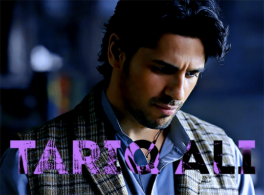
#the buttons are circles now :( i liked the rectangles
Text
sobbing shaking screaming they changed the google docs layout why does this keep happening
#SHAKING THE BARS OF MY CAGE (one of the people with no real power) KEEP APPLICATIONS AND WEBSITES THE WAY THEY ARE DAMMIT#I DO NOT WANT 'modern' AND 'sleek' LAYOUTS I WANT MY OLD FORMAT I'VE HAD SINCE FIFTH GRADE :((#lies down on the floor and cries#the buttons are circles now :( i liked the rectangles#terra is rambling
8 notes
·
View notes
Text
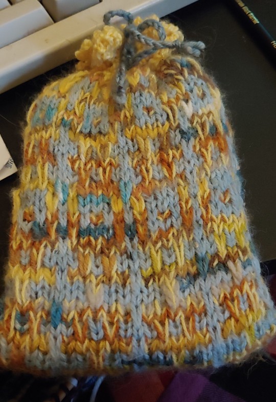
Project: crocheted top
Thanks again to everyone who gave me good crochet 101 resources last year! I've been having a blast learning how to crochet.
Introduction:
I finished this top a while ago. It's kind of improvised, containing various stitches and squares I found in library books. The yarn's a beige cotton I had in my stash.
I used this project as a challenge to try out as many different techniques and stitches I could think of, making it a great learning experience.
The project:
The shape's a very simple T-shape, with buttons at the shoulders to make it easier to slip over my head. It's basically a tube body with a rectangle at the top for sleeves.
I started out by making enough squares for the bottom lace to fit around my hips. Once those were attached together into a circle, I evened out the edge with (US) single crochet stitches while also adding a tiny bit of shaping. I then started my tube for the body, which consists of a strip of lace and a double crochet flower pattern.
Once the tube reached where I wanted the sleeves to begin, I made enough squares to fit the width of the tube plus four extra squares (one for the back and front of each sleeve). I wanted to try and see if I could turn a square into a triangle, so two of those squares ended up being triangles in the front of the top.
Once all that was attached, I built up the rest of the sleeves and the neckline and worked buttonholes into the final rows.
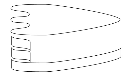
[ID: a crocheted T-shaped top with short sleeves hanging from a wooden hanger in front of a white background. The top is made with beige cotton yarn and consists of multiple different types of floral lace and and squares. Four beige buttons sit at the top of each shoulder.]
Conclusion:
I fell in love with the versatility of crochet! It's such a cool craft if you love improvising as much as I do.
When I struggled making my first chain a year ago, I never thought I'd be creating something like this any time soon. Now when I look at this top, I can already see multiple things I would do differently next time.
That's the beauty of learning new things. If you allow yourself the time and kindness needed to practice and to learn from your mistakes, you'd be surprised by what you can do.
#wasteless crafts#project#diy#crochet#yarn crafts#crochet top#granny squares#check out your local library's craft section if you can#you'd be surprised what you'd find
544 notes
·
View notes
Text
gradient text tutorial
This tutorial is for @ladynephthyss but y’all can have it too xD
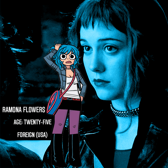
We’ll be adding text so the final gif looks like this:
This tutorial assumes basic knowledge of gif-making, Photoshop, and coloring. I’ve only described the text tutorial in this.
Tutorial under the cut:
Couple things to note beforehand:
There is a lot of trial and error involved when doing any sort of text, and this is no exception! You might have to play around with the colors and the settings before you find something that looks good and readable!
This tutorial is inspired by the difference text effect in these tutorials: one and two by @anya-chalotra (highly recommend checking those out!), just done a different way.
This text effect works better on big gifs (540px width) that have quite a bit of movement below the text so you get that effect.
Find fonts that have bold shapes or some width to them, so you can see the movement.
This is my starting gif, after sharpening and coloring.

First, I position my text where I want it. (this can be moved around later, I just like to get an idea). Remember what I said about fonts? Try to use ones that are thick for this effect so you can see the gradient/movement underneath the letters. I’m using Intro.
It doesn’t matter what color the text is at this stage, I just do white text so I can see it:
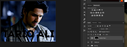
Then, add a gradient map in the color you want your text to be. For this one, I chose black and purple. The more contrast there is in your colors, the better it looks. You’ll be able to change this later though, if you don’t like the way it looks.
This is how it looks with the gradient map:
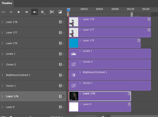
Now, we’re going to go over into our layers panel, and where we have the white box (the layer box), we’re going to select and delete that...
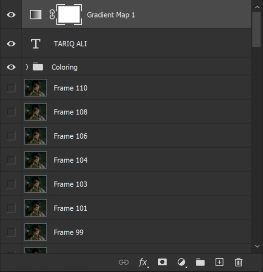
...so it looks like this:
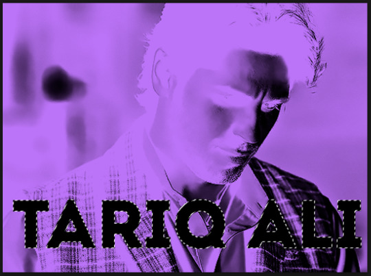
Then, while pressing Ctrl, we’re going to hover our mouse over the T in our text layer. Your cursor should show a white box with a dotted border. Press the T in the text with the specialized cursor, and you should get a dotted line all around the letters, like so:
(I’m not able to get a screenshot of the cursor for some reason but I hope the instruction made it clear!)
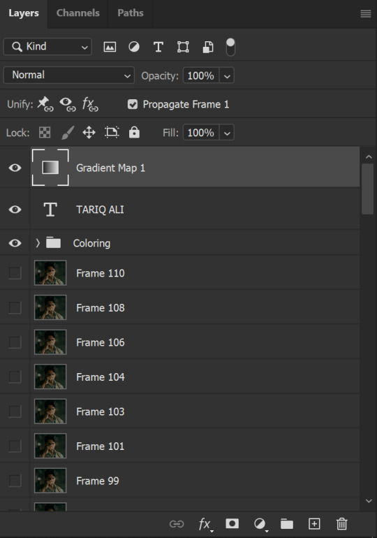
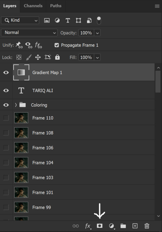
Then, make sure you have your gradient map layer selected, and press the layer mask button (shown by a white arrow in the below image - it looks like a white rectangle with a black circle in the middle.)
This is what it should look like:
Right now, it’ll look like some solid color (which depends on your gradient). This is because we still have the text layer visible. Once we press the eye icon next to the actual text layer to hide it, you can see that this is what it looks like:

(You can also delete the text layer, but I don’t, just because if I decide to put these two words on two lines, or change their spacing or whatever, I don’t want to have to make a new layer. I can just edit that one before re-masking.)
As you play your gif, you’ll see that this is what the whole movement looks like:
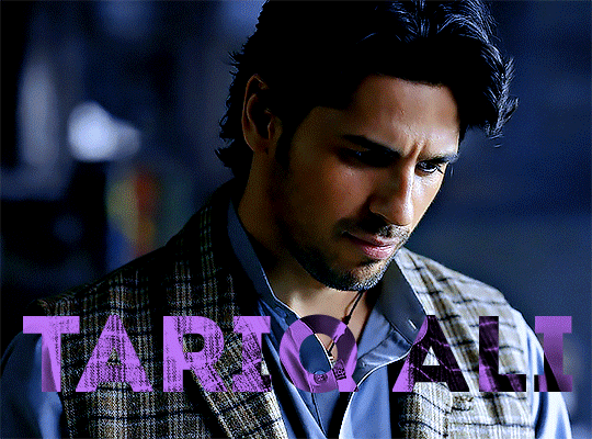
You can see that the movement of him lifting the glass to drink his tea shows through the text, too. Almost like a weird color X-ray type thing, where the lighter color shows on darker shades of the gif, and the darker color shows on the lighter part of the gif.
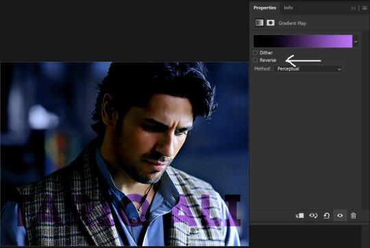
Note: sometimes, depending on the way your gradient is made, you might get text that looks like the picture below. Just hit the reverse button (shown with a white arrow), and you should get the text looking like it does above.
This is the basic way to do it. Now, we can easily edit this, if we feel like there’s too much purple and not enough black. To do that, we go into the gradient, and change the slider positions of the colors. This is purely an aesthetic preference, but I’ll show you how to do it below:
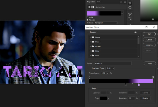
For example, I moved those sliders so there’s more black and less purple, and the gradient feels more like two colors only, instead of all the various hues of dark purple/gray-purple.
This is what the gif looks like:
In the gif before this one, the black was more of a muted gray. In the one directly above, you can see that it looks much more striking. So play around with that until you find something you like.
It still doesn’t look very visible to me, so I’m going to add a drop shadow underneath (again, this is a preference thing). You’d do it just like you would with a regular text layer. Right click the Gradient Map layer and select Blending Options. Add a drop shadow.
This is what mine looks like:
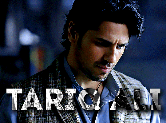
And that’s it! You can keep playing around with the whole thing until you’re happy with it. You can even keep changing the color, and the great thing about that is you’ll be able to preview it as you change it to see what works with your scene. For example, I tried white and black text here:
And that’s it! Feel free to drop me an ask if anything’s confusing! Happy giffing!
#zee's tutorials#tutorials#gif tutorial#typography#gradient text#photoshop tutorial#resources#ps help#dailyresources#completeresources#itsphotoshop#allresources#dailypsd#userisha#userdahlias#alielook
456 notes
·
View notes
Note
hii, megan! I hope everything is going well for you. I was wondering if you'd be willing to share how you created the gifs and images overlay effect in this /post/727210103698259968/scott-pilgrim-2010-lgbtqcreators-bingo pretty set? Have a nice day.
I will do my best!
First and foremost shout out to @nelsonnicks Norah whose beautiful gif set here inspired me!
In order to make this as succinct but also thorough as possible, there are some assumptions this tutorial makes:
We are working in photoshop
You know how to make a gif using photoshop
You know how to use the timeline feature to make/edit gifs
Okay let's learn how to make this gif:

(Due to Tumblr's image number limitations, there is a PART TWO linked where I add that "item" and gif, which you can find by clicking this entire sentence.)
STEP ONE: The Image Overlay
Pick your image! Here's the one I've picked, I cropped a page of the graphic novel:

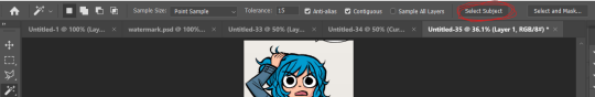
From there, I'm going to click on that magic wand tool:

And select subject (crudely circled for emphasis)
If it's not perfect, you can either use the quick selection tool to refine the selection before or continue on with these steps and use the eraser later. I do both, but it's up to you.
Now I have a lasso around the subject, and I'll click that "Select and Mask" button next to "Select Subject"
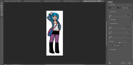
Now I can see what my lasso'd image looks like against a white background, and I see that it's pretty good, nothing I can't fix with an eraser if I really want to later.
If the image looks rougher than you were expecting, use the SMOOTH option and play around with that slider.
If it looks a bit more smooth than you wanted (not clear defined lines where you were aiming for clear defined lines) use the CONTRAST option and play with that.
And if you wanted a little more or less around the edges, you can use the SHIFT EDGE tool to grab like 1px-ish of additional space.
Anyway, I like what I've got, so I am gonna CLICK OK
And I'll either cut or copy it onto a new file, and throw away my scraps.
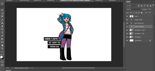
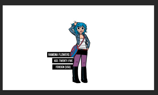
Now it's time to add my character details! I'll use the same format I did for the original set here, and create 3 equal-sized rectangles using this lovely shape tool tool:

So my working file now looks like this:

I move the rectangles closer, I'll want them behind the image of Ramona after but here's just what it looks like while I'm adjusting them.

Then I add the text:
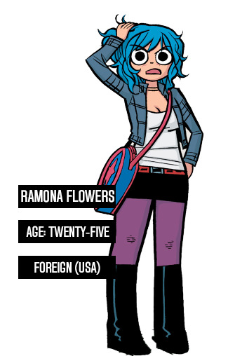
Now, it looks like when I put the bars behind her it'll cut off her name! I don't want that, so I'll adjust the side of the bar for her name and scoot it over....

Nice!
Now I'll adjust those layers to be closer together and behind Ramona...
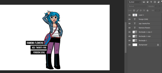
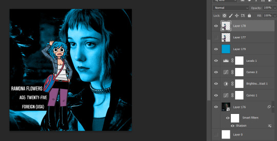
And this is what my screen looks like now!
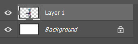
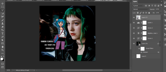
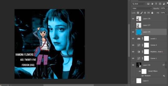
It looks how I want it, so now I'm gonna merge all of the layers EXCEPT the background layer. This makes it so the part that's merged has a transparent background.
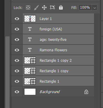
Highlight the layers, right click, and find the "Merge Layers" option
And now it looks like this:
Step one COMPLETE. Great job. Have you been drinking water? It helps you think clearer. Or something.
STEP TWO: Make the gif you want. Sorry I'm not doing this step-by-step it would be so long I'm sorry!!!
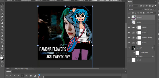
STEP THREE: Put Ramona on the gif!
So I just use the selection tool and make a square around my bestie Ramona here to create this:
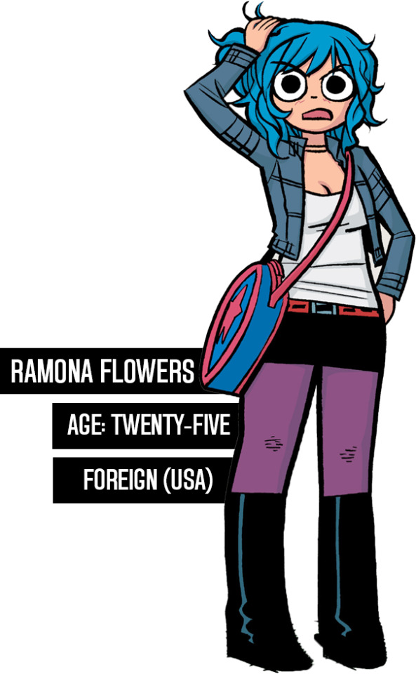
And then paste her right on top of my gif here:
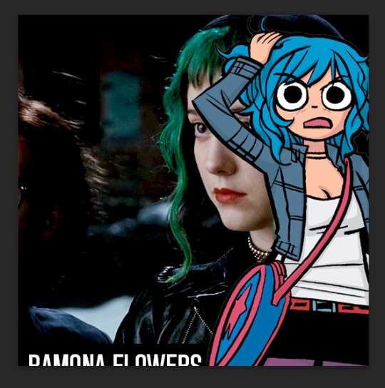
Woah! She's ginormous!
Let's resize her by hitting CTRL+T....
This is where we get a little creative. Personally? I think the font is legible, but doesn't look nice now that I've resized it. So I'm going to back to the original file and UNDO my last action (merging the files):
And hit CTRL + T on the Ramona layer (Layer 1 pictured) and adjust her size:
Time to merge these layers again, and redo the process:
MEGAN SHE'S LARGE AGAIN! I know, I'd rather work with big files I have to make smaller than small files I have to make bigger. Sue me.
Resize the layer, make any adjustments to the gif you have under it in terms of placement/size:
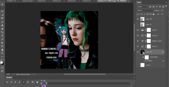
And WHEW we got this part done.
STEP FOUR: Add color overlay
I'm gonna make her color overlay blue like her cartoon hair, so I'll eyedrop tool her hair:
Go to Layer:

Add new, and then using a regular brush at like 5000px just click onto that new layer, and...
Bump that layer under your Ramona cut-out,

Go back to the layer drop-down menu, and select Blending options...
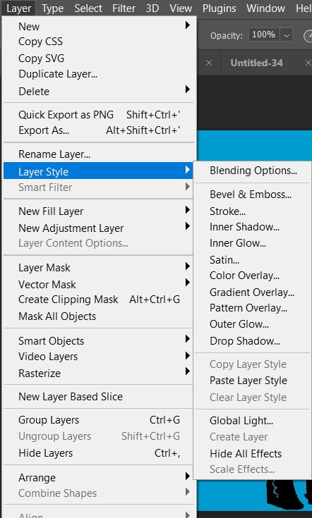
And this little menu will pop up:
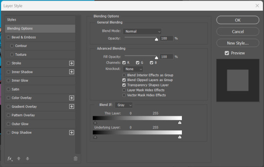
MAKE SURE YOU HAVE THE PROPER LAYER SELECTED FOR THIS. Otherwise you're going to be very confused.
See where it says "Blend Mode" and it has a drop down under normal? For these purposes, I'm gonna use the drop down and select COLOR:
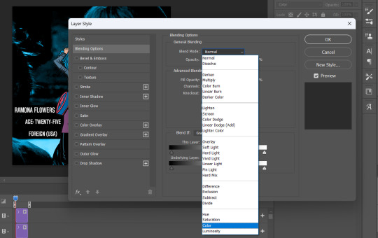
Now you can see that all-blue layer in the background now is showing the original gif behind it, but you know your original gif? "I know of it." It's all blueee. /ref
This is what it should look like:
Before I go any further, I'm going to check my timeline to make sure this is covering the WHOLE duration of the gif:
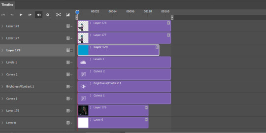
It does, so let's drag that bar on the right to line up with the end of the gif:
All fixed!
So now we've got this:
Oh man! See those white spaces between her arms? I'm gonna go back and fix those now, fortunately I can edit it directly on the full file itself, by just editing that layer.
Using my magic wand tool, I'm selecting those white spaces between her arms and her jacket and deleting them-
She's not perfect but you can always be nit-picky and zoom in really close and refine with the eraser.
PART TWO
#answered#Anonymous#usergif#userairi#usernorah#userbarrow#userhallie#usercats#tuserheidi#tutorial#gresource#gif tutorial#pscentral
49 notes
·
View notes
Text
Anonym hat gefragt:
that map you made is stunning! do you have any tips/programs on how to properly make one? i really love looking at these but i never know how to make them myself
Hello there, happy to help! :)
So if you’re interested in making a map, you have several ways of doing that. Ask yourself some questions first:
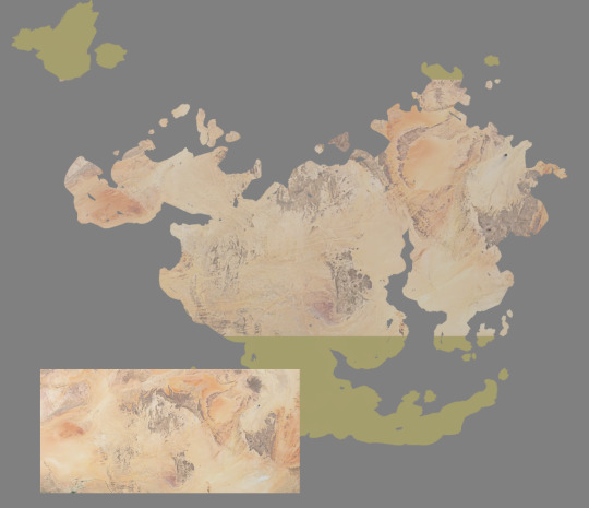
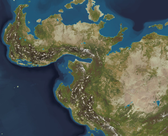
What is the purpose of the map? Do you want/need a scientific representation of a region or planet (example: Satellite map of the Earth), or is it a highly stylized storytelling tool (example: Map of Middle Earth)? Something in between? Think about what you want to communicate with your map and decide on its setup. As you asked about the map I uploaded, I’ll talk about my approach to satellite/physical maps :)
My personal approach to those maps is pretty scientific because I like hard worldbuilding with a lot of logical thought behind it. The satellite map from yesterday functions both as a physical map for the setup of the planet, but it’s also a base for other maps. For example, the climate chart I worked out uses the physical map as its foundation.
There are some pitfalls when it comes to map projections because we’re dealing with the problem of unwrapping a 3D globe onto a flat, 2D surface. With the standard maps we’re seeing today, areas closer to the poles get increasingly distorted. Just look at how huge Greenland appears on world maps - in real life, it’s pretty small. This is important to consider and I didn’t catch my own mistake until yesterday. If you want to be 100% sure, the best way to do it is to use a 3D program and paint your map directly onto the globe. Unwrapping the texture later gives you the correct distortions. If this is a concern for you, I’m happy to elaborate more, but I’ll stick to the visual side for now :) It’s all done in Photoshop, nothing else required. Screenshots are in German, but I added explanations.
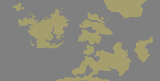
The start of it all is a rough sketch of land and sea areas. It doesn’t need to be perfect or final at this point, just draw shapes you like. You can also add a bit of thought to it - maybe a landmass broke in several parts not too long ago and you still see the puzzle-piece shapes, but that’s another story entirely :) If it’s just about making a nice-looking map, go with what pleases you.
For surface details, I used satellite images and photobashed them onto my surfaces. I had worked out plate tectonics to have an explanation for the location of mountains and plains, but that’s also another story. If you want a mountain range somewhere just because, then put it there :) Collect aerial images which fit what you have in mind. Leave vegetation out for now, it’s just about highs and lows.
Then, roughly lay them over your landmass. I recommend keeping the landmasses on their own layer, separate from the sea, because you can “clip” the satellite image to the landmass layer by hovering your cursor between the layers and pressing alt:
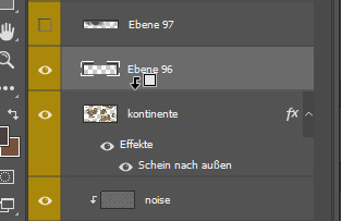
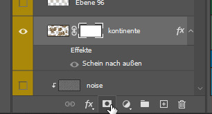
Do this with plains and mountains (no vegation just yet), mix and match and blend until you get a setup you like. Also take a look at satellite images of coastlines so you can use them as a reference for your own. Give your landmass layer a mask on which you can draw to refine your coastline. To add a mask to your layer, select it and then press the button which has a rectangle with a circle on it. Drawing with black subtracts from your image, drawing with white adds to your image. You don’t destroy your base layer by using masks, and if you want to deactivate or delete that mask, right-click it for its context menu.
So now we landed on something similar to this. If you’re having trouble with coastlines, also search for aerial images and use them as references for your own. Where are flat beaches, rugged coastlines, fjords, islands? You can go with science (example: Fjords are valleys of former glaciers, so they’re unlikely to form in warm climates. Rugged coasts in warm areas probably have a different origin) or just do your thing.
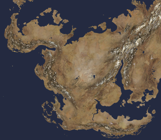
I added the seafloor, basically the borders of continental plates, and a soft edge glow to the continents to simulate shallow water around them.
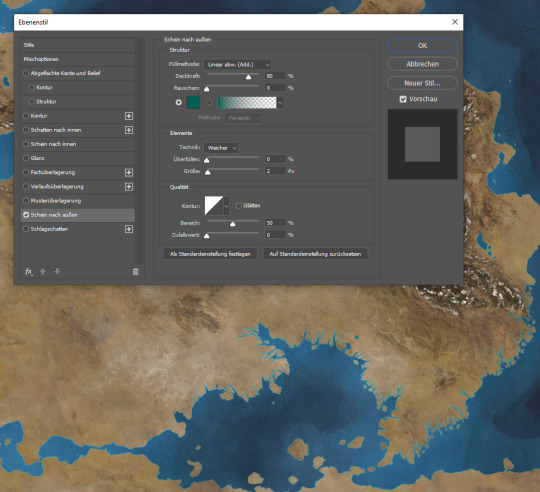
Now, placing vegetation can be a nightmare or ridiculously easy. For a first pass which you can modify later on by using layer masks again, do the following: Duplicate your landmass layer and switch off the layer style if you have one. Now, go to Image > Corrections > Replace color. Use the picker to select a color you want to replace with green. In my case here, I want to have vegetation closer to the mountains, so I pick a slightly darkened brown from my map.
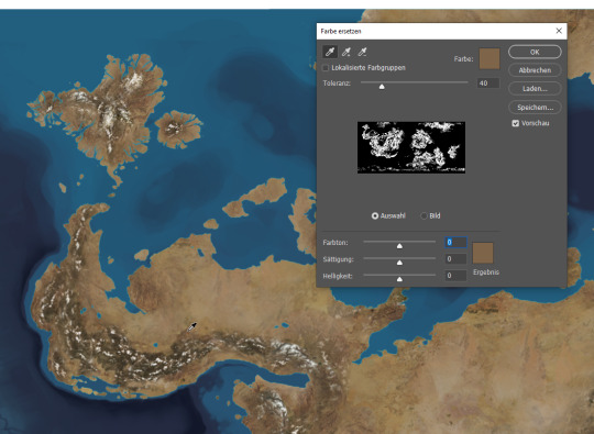
It’s time for the magic :) Now use the three sliders at the bottom of the window to change the picked color to your target color, green in my example. Ho-lee sheeet! :D Use the tolerance slider at the top to narrow or widen the picker’s range, and just go with what you like.
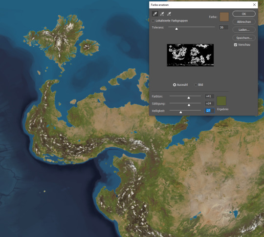
Now you can play around with your vegetation layer as you wish. Add or substract from your layer and/or overlay it with some color variance. Do a second vegetation layer and pick a different color base, maybe the lighter deserts or the darker mountains. Set a different tolerance and color to it... and that’s basically it! Play around with those methods and have fun making maps! :)
171 notes
·
View notes
Note
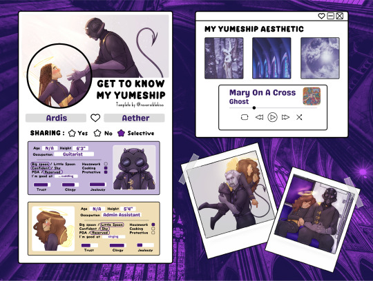
Okay I'm sorry to bug you but I'm so stupid. How are you guys making the yumeship things? Like the background and stuff is there a program y'all are using to get it? I've been trying on my phone and I don't know how y'all get them so perfect looking 😭 please explain it like I'm 5. If that's too much work, feel free to ignore this/delete this no hard feelings I'm just incredibly dumb 🥲😅
No worries at all!
I do it on my computer in my drawing software. If you don't have one, you can probably achieve just about everything that needs doing using this free software:
I'll break it down step by step how I made mine below the cut. there are lots of pictues. i hope this makes sense. we'll be recreating my Aether/Ardis one for this tutorial.
here is what we are going to do today
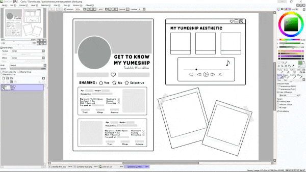
So step 1 is to download the template
I like using the transparent version because I find it easiest to edit for my purposes, but feel free to use the other ones as well if there's one you prefer. you'll just skip the first couple steps of this tutorial. Open it up in your software. I'm using Paint Tool SAI. It should look like this.
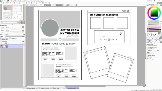
First, I'll drag in the background that I want and put it on a layer underneath the template. It will look something like this (you can also use a flat color, whatever you want)

Now I want to fill in the big boxes so that I can actually read the text, so I'll go back to the template layer and magic wand select the main bit of empty space (blue shows what's selected),
then invert it (there is probably a button for this on your software)
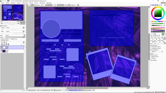
now I'll make another layer under the template and bucket fill what i want to be white

you can color in extra things you want to change the color of on this layer too, or just leave it as-is. I'm going to spruce it up a bit, though.
ok great. now i'm going to change the grey text boxes to be white because the light grey clashes with my pastels. this may not be necessary for yours. you can bucket fill those too on the main template, but I'm going to use what's called a clipping layer on SAI, which basically means that it's a layer that only draws on top of things that already exist in the layer under it (this may or may not exist in the software you're using, but do whatever works for you). so i'm going to make a new clipping layer over the template and color white over all the grey parts.
much better. it's time to cut out where we want our pictures to go. I find it easiest to work when I treat all the boxes like picture frames, kinda like how the ones in the bottom right are. there are other ways to do this, but this is my prefered method. so we're going to go to our template layer and magic wand select everywhere we want a picture to go (once again now highlighted in blue)
and delete those from both our template layer and our white layer. it should look like this now
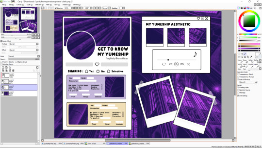
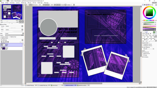
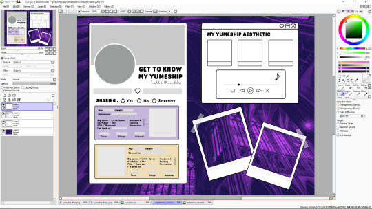
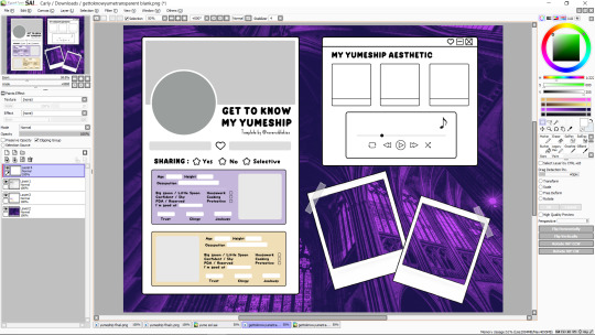
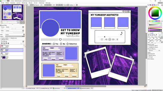
so now all you do is drag in your pictures so that they're underneath your template, erasing any parts that stick out
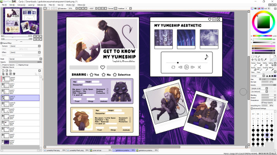
and then you just add text and little rectangles and whatnot! (I added mine in a different program because my art software doesn't have a text feature)
I made a couple other adjustments to mine (black circle around the one photo, getting rid of the line at the bottom of the aesthetic trio) by just editing the template layer.
and that's it! all done! does that make sense? i hope that makes sense. if i skipped over anything vital or if that makes no sense, let me know.
17 notes
·
View notes
Text
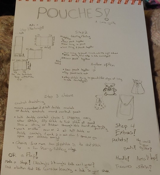
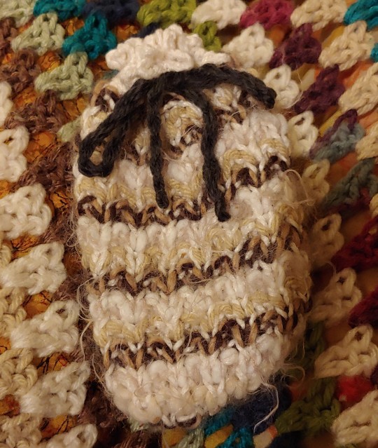
Pouches! A loose guide
I love making little pouches, they take up so little yarn, and there are endless ways to make one. Hopefully this guide will inspire you to make some little pouches of your own!
vague recipe-esq instructions and examples below cut!
You will need:
yarn
the means and know how to turn yarn into a rectangle (be it knit, crochet, or any other method)
a bit of fabric for lining
sewing needle & thread, and a smidge of know how
ribbon or a button (only a maybe on this one (depends on your pouch))
Step 1: Make a Rectangle!
You can knit or crochet it. Most of the pouches in this post as examples were knit, with crochet closures, because that's my favorite way to do it. I like 2 row stripes, or mosaic knitting my rectangles for a bit of visual interest. Mosaic knitting is a technique where you strategically slip stitches while changing colors every 2 rows. I recommend it especially if you are wanting to try out knitted colorwork for the first time, as unlike other methods of knitted colorwork you don't have to worry about floats or working with both colors at the same time. The mosaic knitting charts I use are from Gannet Designs.
Since little pouches are one of my relaxing projects I don't plan them out really, I just make a rectangle and mess around with folding after the rectangle is done. Different ways of folding the rectangle will result in different proportioned pouches, find the shape you like best!
Step 2: Sewing/ Lining
Knit & crochet will stretch, so to prevent losing any treasures I put inside I like to line my pouches. Lining is also a great way to practice your hand sewing so you aren't too rusty when it comes time to repair your favorite shirt that just got a tear.
you can:
sew pouch together
sew lining together
sew lining and pouch together
or
sew lining to pouch (inside out, flip right side out before sewing final edge to hide raw edges)
sew pouch together
or
Sew pouch together
flip pouch inside out
Whip stitch lining to pouch (fold edges of lining to hide raw edges)
Step 3: Closure
If you want to plan out you pouch ahead of time, you can incorporate a flap or drawstring holes while you are making your rectangle.
For knit drawstring holes *knit 2 together, yarn over* where you want the drawstring to be.
For crochet, *half double crochet, chain 1, skipping every other stitch*
I think it looks nicer if there's a bit of fabric on the edge of the pouch after the drawstring hole row. For my drawstring pouches I tend to add all the drawstring stuff at the very end. I crochet around the mouth of my pouch for a couple rows, do the drawstring row, a couple more rows, then finally a round of chaining 5 or more and slip stitching in the next stitch for a fun ruffle at the edge.
you can also knit an after thought drawstring, similar to the crochet one I describe (a few rows, drawstring row, a few more rows, a fun bind off). You will want to work in the round, so having familiarity with dpns or the magic loop method will be useful.
Flaps are also an option! and there's a a lot to explore. Just make any shape, rectangles and triangles are both great picks, but you can get super creative with flaps. Find a beautiful crochet leaf applique? Perfect flap! Circle? Why not! A rectangle where you cast on and bind off stitches on one side for a chunky fringe? I only just thought if it as an example and now I think I gotta try it, cus it sounds super cool!
Step 4 Extras!
Pockets have all the same fun & potential as flaps
String beads on your yarn before you make your rectangle. You can add the beads as you work in a pattern or let it be more random, either way you have a lovely glitzy pouch! You can also add beads to the ends of your drawstring
Give your pouch a face, arms, legs, tail, wings, to turn them into a fun and functional companion for your adventures.
make a long rectangle for a carrying strap, or smaller loops to loop the pouch onto a belt of off the strap of a larger bag. You can make extra long friendship bracelets for a strap that doesn't stretch, and marcrame has a ton of potential for cool patterns!
Examples!


33 notes
·
View notes
Text
Here's my Flatland self insert character in a humanoid design. still making the canon-compliant version since it's not symetrical and also the power keeps flickering.
Editing the draft to say wow. Okay. This image description has now taken six hours to write because the power went out for five of them and my keyboard kept being messed up before that. Lol.
Enjoy. Assuming the power doesn't go out again before I can hit the post button.
Please tell me if the ID is missing any details, I've spent too long reading it to catch mistakes.
And yes, it picked its name itself.

[ID: An MS Paint character reference showing a Flatland style original character.
The image has a white background and thin black border, with the date of "August 29th 2023" written in the lower right corner.
Black text scattered around the image provides extra info for the things displayed, in an old-fashioned looking font with all caps letters and sharply curved lettering.
The character's name is Hauntlight, and it uses it/its/itself pronouns.
"Literal", which is a black forked like with many small zig-zags making it crooked rather than straight, and
"Humanoid", showing a stick figure with three legs, two arms, a round head, and another line straight on top of the head.
A small bullet point list in the bottom left corner reads:
"Class: Criminal
Job: Herbalist
Age: 28
Orientation: Aroace
Gender: Nunya"
The character is vaguely humanoid in shape, with ink black skin with dark brown stripes on the ankles and elbows, a brown heart shape in the center of its chest, and three pairs of matching brown, stripes under the heart to form a rib cage, with the top pair of stripes overlapping with the heart on their points.
Hauntlight has two arms and three legs, each bent slightly at the knee as though floating in the air.
Its head is topped with a sharp point with a swooping, narrow base over its onion-shaped face, with a single large orange eye with a brown slit pupil in the center. It is first shown facing the camera, then turned to show its back, which matches the front.
White cracks are visible on its hip, ankle, foot, shoulders, chest, and wrist.
With its hands behind its back, Hauntlight holds a bright orange and yellow offset walking cane, which is labeled, "mobility aids required to be flourescent to aid persecution by higher classes".
Two slightly smaller copies of its head show it first squinting, making it appear angry, with a question mark next to its face, labeled, "squinting because it's not allowed to wear eyeglass and it can't see".
The next shows it with its eye widened again to normal, now looking off to the side. Around its eye are two circles of black and yellow, held onto its head by a bright orange diagonal strap, forming a giant monocular or single-lensed goggle. This is labeled, "Breaking the law, breaking the law".
In the top right corner, the different colors used in the drawing--black, brown, orange, and yellow--are arrayed in circles and rectangles.
Two copies have been made of its three legs, with the copy for each showing the third leg recolored blue so that it is easier to see, because its skin is so dark it almost matches the black outlines.
End ID.]
anyways can you believe they literally refer to disabled people as the Criminal Class™. And can you further believe there are people who read this book's blatant criticism of fascism and think the fascism is correct?!?!?!
Edit: Feel free to draw :)
#described images#Rjalker does art#Rjalker's OCs#Flatland#Flatland OCs#Rjalker reads Flatland a Romance of Many Dimensions#long post#?#Hauntlight the Irregular Line#Humanoid flatlanders
6 notes
·
View notes
Text
Rise pointed out that the Ghost Shells with the rectangle eye is a different Ghost Shape in general instead of just a shell.
I had decided that they were wearing an extra very-snug ball around their normal body, but the edge of the eye isn't on the edges like the shells that are actually snug like that; they're not looking around with the circle enclosed in the window.
So, I went back to look at Sunny's shells (the original five she picked out) and noticed that all but two were that shape-- Neon Helix and Hareball.
So the only two she's "changed into" are those, so now I'm Headcanoning that she's that make of Ghost with the straps and the slider button instead of the turn-slot in the back.
2 notes
·
View notes
Text
*GOOFY AHHH TUTUORIAL*
lesson 3: aesthetic/moodboards!!
hit "read more" if interested!
ok so first, for a moodboard you are going to need IMAGES. this is a good guide for what to use. idk how many times i have to say this: DO NOT USE PINTEREST. repeat after me:
PINTEREST 👏 IS 👏 FULL 👏 OF 👏 STOLEN 👏 PHOTOGRAPHY 👏 AND 👏 ART 👏 PLUS 👏 EDITS 👏 ANY 👏 MANY 👏 MORE 👏 WEBSITES/SOURCES 👏 ARE 👏 ALIKE.
ONLY 👏 USE 👏 WEBSITES 👏 THAT 👏 HAVE 👏 FREE 👏 STOCK 👏 IMAGES.
STEP 1:
now that i got that out of the way, go to photopea. drag any image you want!! then create a folder and delete it. or you can just open up a psd or whatever lmao.
STEP 2:
NOW CLICK ON THIS SQUARE BUTTON

now you have created a shape!! resize it and stuff!!

i usually make mine white, so if you wanna do that too then go to the top left corner and hit the square thingy and make it the color that you want your rectangle to be!! (the square that has "fill" beside it)

then copy and paste (crtl c + v) and move it
it SHOULD look like this:

now create more rectangles until it looks something like this:

now go to any free stock website or any website thats listed on that link i put and search images you want. im using pexels for this, but you can use anything that you want! ^^
when you find an image you like, drag and drop it into photopea!! now it obviously won't fit into the squares but there is a solution for this.
highlight the thing you want to crop and click the button on the left menu that is circled in red.

then just click hold and move to shape the square to your liking!!

then to actually crop it go down right and hit this button that looks like the japan flag

then do this until all of your squares are full.

now that my squares are full, i usually put my favorite characters and crop it so it looks like they are popping out! like this!

this is optional, but you CAN put a psd over it! i have another tutorial on that, just go to the #goofy ahh tutorials and find it!!
HERE IS WHAT FINISHED RESULT LOOKS LIKE W/ PSD

10 notes
·
View notes
Text
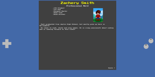
About Me - Commit #1 - NameBoy and Homepage
I've gotten to grinding out the code for my About Me page design, which I've decided to call the NameBoy. The challenging part was building in responsiveness where Bootstrap's features weren't helpful. This happened a lot because I was making a design that does not look like a Bootstrap app. Maybe I need to learn Tailwind.
Here's what it looks like!
Desktop:
Mobile:

The left and right D-Pad keys work! They switch between the pages. I'll show ya how.
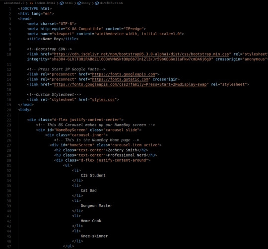
The HTML:
First we have a pretty basic head tag but we cdn Bootstrap and add a font.
Our NameBoy consists of 2 main parts: the screen and the controls. The screen is a bootstrap carousel with controls mapped to the virtual d-pad.
Within the screen, we've written a home screen with centered headings and a flexbox containing my list of titles and a picture of my Stardew Valley character. We use justify-content-around so that it spaces well on all sizes of NameBoy screen.
The navhint at the bottom of the "homepage" has a class because the custom CSS there will be used later-on as well.
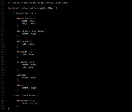
The controls are mapped using the relevant bootstrap classes and targeting the #NameBoyScreen. The data-bs-slide attribute tells it what direction to move the carousel.
The middle, A, and B button are just cosmetic.
And, of course, we have our Bootstrap script.

Now time for the fun part
The CSS:
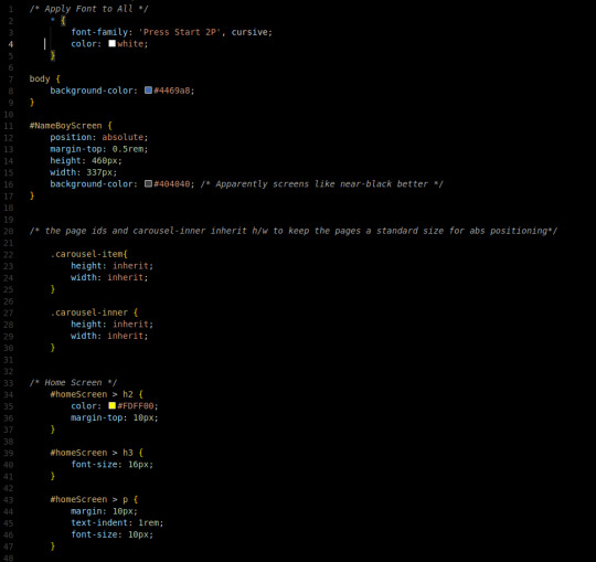


First, our basic font will be white Press Start 2P. It's retro, fun, and free.
Our background color is blue, like the GameBoy color I would emulate on my $20 android phone when I was younger.
Our screen is positioned Absolute, so that it's children can be too. A small margin on top, with a fixed-pixel height and width based on our Figma ratios. A non-jarring black color is used for the background of the screen.
We use inheritance so we can pass that fixed pixel size down through the carousel for convenience with absolute positioning.
The home screen has some basic text formatting. The yellow is a kind of Pac-Man yellow.
The image of my SV avatar has a fixed pixel size as well.
Our navhints will be absolutely positioned near the corner of the screen.
The controls were fun to figure out. They're positioned with fixed positioning on the edges of the screen. The next and back buttons are 60px wide and 35 pixels tall.
They are overriden to be opaque because BS wants their controls to be translucent but I disagree in this situation.
The middle button is a plain rectangle positioned toward the middle of the actual, functional, sideways controls.
The A and B buttons are circles (border-radius: 50%) positioned with the same technique as the other controls and set up so that the text labeling them will center.
Our query changes button positioning, font-sizes, and screen sizes to turn our NameBoy Color into a NameBoy Advance when the controls move too far to the sides of our NameBoy's screen.
Conclusion:
I love when I have a fun idea, and it works. It's been happening more lately with CSS. I also feel that this is a very cumulative project of last semester's skills. I'm excited for it.
The github repo for the project is here, if you wanna look: https://github.com/Xacheri/aboutme
4 notes
·
View notes
Text
Zoey & the TARDIS Scanner
The Doctor was down in the TARDIS engine room. Although he'd once rolled his eyes at her for calling it the "engine room." But that was what he had said. Probably another clever lie. Like that he hadn't actually convinced that Cyberman to self-destruct. He'd just been talking and had accidentally hit a nerve. Or a circuit.
Still, that left Zoey alone in the console room. She'd been reading in her room, but that seemed like a bit of a waste of her time living on a magical space-time machine with infinite hallways and endless possibilities. So now she was circling the bright white hexagon of the central console, trying to remember which button brought up the little TV that the Doctor called a scanner. Just a quick peek to see where the "safe little parking spot" was.
The console was covered in buttons, switches, dials, lights, and, of course, the central column, sitting idle while they were parked. The Doctor was always running around hitting things and flipping things so that it was impossible to get a proper idea of what he was doing. Zoey suddenly had a suspicion that that was why he was always running around and waving his arms. Both in and out of the TARDIS.
There was a button that was big and rectangular, with another grey rectangle a finger's width from the edge. The icon sort of looked like a TV. That could be it, couldn't it? What was the worst that could happen, after all? The Doctor didn't really know how to fly this thing anyway. She was sure he was just making it up as he went along. He seemed to hit a different sequence of controls every time, and with about the same amount of confidence too!
She pushed the button. And for a moment, nothing happened. Then there was a deep, grumbling squeak below and far beyond the sensible bounds of what a police box ought to have. Then the central column began to rise and fall, and that glorious, anxiety-inducing wheezing and groaning began to echo through the whole room.
"What did you do?" asked the Doctor, when he came bounding into the room all suspenders, hair, and anger.
"H-how do you know I did anything? You were the one down there fiddling with the engine!"
"Fiddling! Fiddling? I was tweaking the delicate mechanisms of my immensely complicated and spectacular vehicular abode, young lady. While you have once again abandoned Marcus Aurelius on the bed to wander around the hub of the aforementioned technological wonder. Now tell me what you did."
"Nothing! I just wanted to look at the scanner so I... pushed the scanner button."
"You pushed the-" he marched over to the console and pulled a long toggle switch with a ball on the end. The scanner slowly lowered on the opposite wall. "That is the scanner switch the Doctor explained pointedly and unnecessarily. "What button did you push?"
Zoey walked over and pointed to the button with the TV icon which, funnily enough, was right next to the scanner switch.
"Ah.
"Ah? Why ah? Is it bad? What does that button do? It looks like it has the scanner on it!"
"Well yes, it does. That's because I use it when I don't like what I see on the scanner."
"And- and then what does it do?"
"It's an emergency dematerialisation button. Like an ejector seat. It is designed to hop us through the vortex and jump between time streams to get us as far away from whatever I feel the need to escape from as possible. I installed it the last time the Time Lords were looking for me..." he grew quiet and pensive then. It was never a good sign.
"So where is the TARDIS taking us, Doctor?"
"Mm? Oh. I'm terribly sorry, my dear, but I have absolutely no idea. But wherever we land, we should be ready for anything.
2 notes
·
View notes
Text
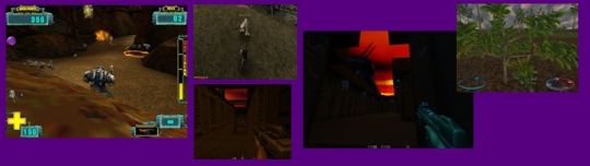
Quake 2 – 3,2,1 countdown and up to generator of a black hole
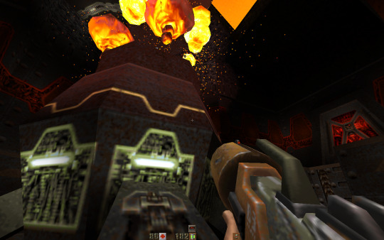
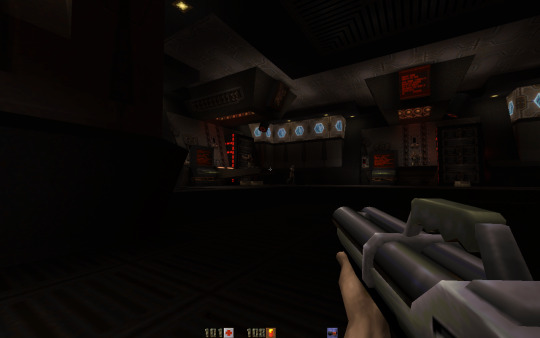
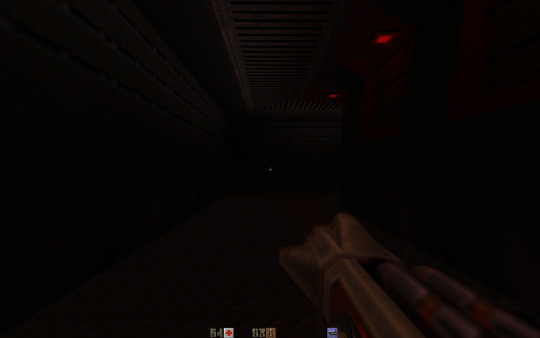
And I continue my summer walkthrough summer, my summer walk in second Quake. From time to time, as a time break, pause, relax. And I, already, solve the reactor moment. Lots of things – I was doing for this. To stop cooler. And next to run different maps and push the buttons. Something to do with water. And, only, after that reactor was destroyed. Of course, it was about very different maps. And different number of enemies. Action is in continue.
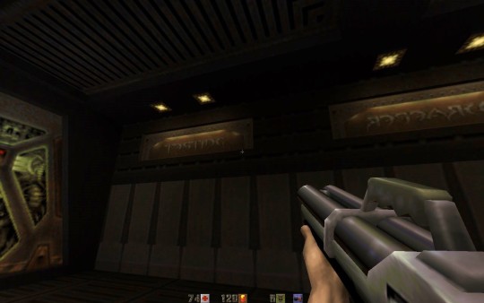
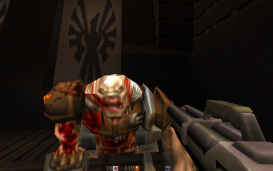
Interesting new moment in game. You run to final computer. And only after that, you get to know, it is final step. And you push the button. And now you need to run fast. And it is start countdown. And you need to run to the very start point of the map. It is not far. But it is winding road, it not straight. There are turns, corridors. I think, about with attempt number ten I do it. And I need to remember a way. To experiment. It is a big gun location. I think so, as I remember that right now. Some nearby storylines segments. It was very exciting.
In Quake, there are such short sequences, short briefings. So, it is everything so computerized, as in action movie. So, reactor is done. Big gun is destroyed. Saying more correct, it was something like rocket attack or artillery ride, something like that it was in a storyline. So, when you play for the first time, you are very surprised. And after first walkthrough, when you are doing one more walkthrough, you are already can pay more attention to the details, so it still interest point to play again. At first, it is simple – surprise point. And just pass the stage. To get to know what to do.
So, I remember a place, when you are in something like mission impossible – and you need to run with time counter back, it was cool! I remember that. Adventure!
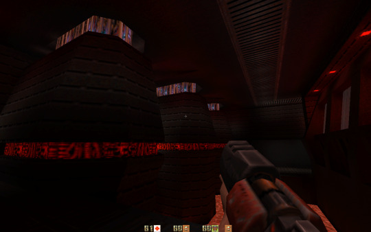
So, one more interesting moment. Near the something black colored and with form like bee hive pillar. Some reactor, maybe it was. It was a lava there. And such a small bridge. It was broken and you go by it. And later you see two computers at the edge. And you need to jump from little bridge to that computer’s small places. One by one to turn them on. Such moment – it is, already, a fragment from style game like Half Life.
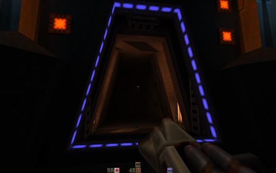
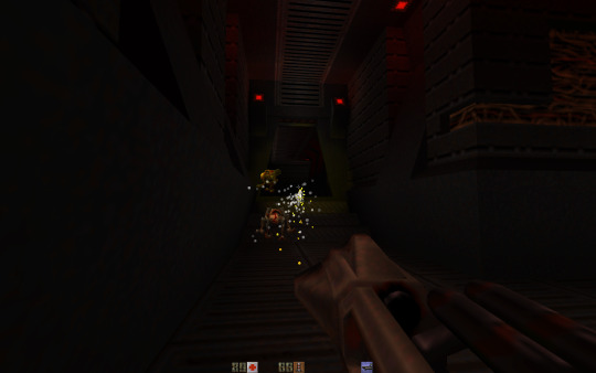
By the way, grenade launcher, of course, it is slow thing, but this thing has some feature. If to hit enemy straight, then explosion is immediately. So, this way it should to be used. Or to throw grenades behind the corner. You see enemy - he is slow. You are doing fast back. And shoot behind the corner with grenade launcher. So, this way it works good.
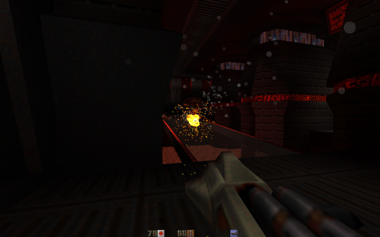
Yes, such a funny moment. In one room, I shoot with rocket launcher. I cannot to hit enemies. They do some move all the time, and move to a different sides. And so, I hit some computer. And it was a secret. I got a message – you find a secret! It was a random thing for me.
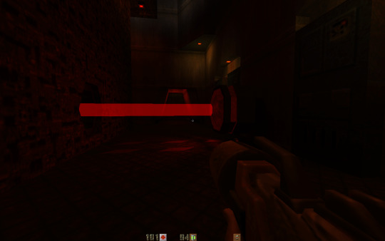
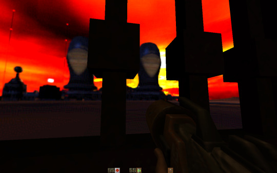
Interesting visual style has a second Quake. It is such from the era of appearing a three dimension graphics. Age of rising three dimensional accelerators for graphics. Everything is such rounded or like squares, it depends from design level. Some special colors, and some smooth effect for textures. Part of textures - it is just like a color, it is stretched to all the wall. Somewhere textures are more detailed, some arts or drawing you can see, even. Smooth, it is a point, that makes a surprise even today. Part of stylization.
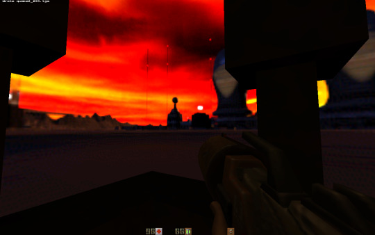
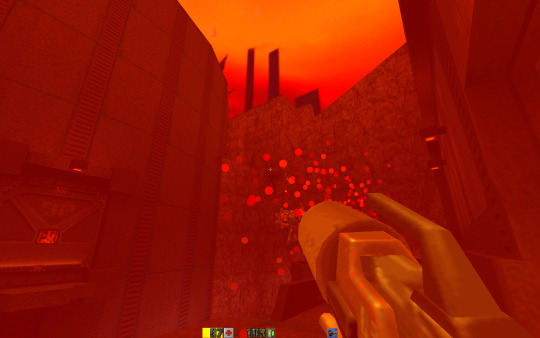
So, there is someway like this, here you have a shotgun, and rocket launcher, rail gun. They have such a circle, rounded forms. It is more often to see. For example. And in some things - it is opposite - a square form. In level design. Explosions are such rectangles style here.
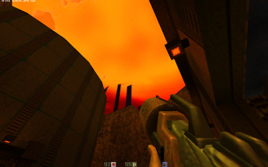
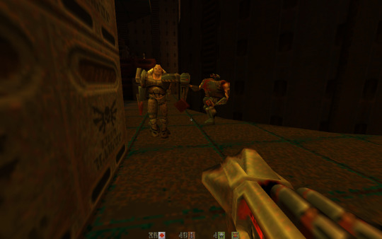
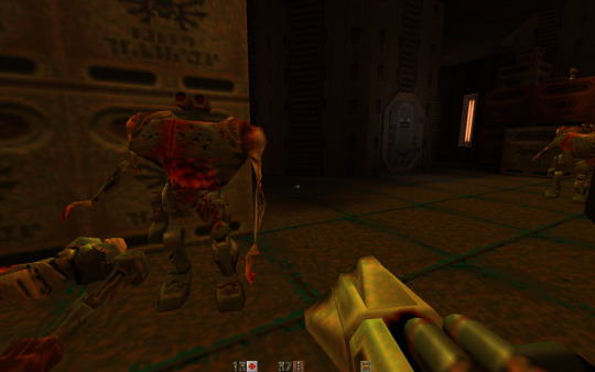
Interesting such action movie. I need to go to hangar. And to destroy a black hole generator. So, not to deactivate it. And certain way to do - destroy it. And, by the way, I find a new enemy on some levels. They are such funny visual rust industrial view robots with green power field. You shoot at them. And it reacts as a bright green shield field. You better to shoot at his legs with something like rockets or grenades. In this case, not from a first attempts, but his shield is breaking. They have a funny visual.
Design, here again, it is, already, like a computer base. So, there are here generators of power field. You need to deactivate them. To run a different maps. To push some buttons at the computers. And, after that to go back to a room with such a dark green computer big thing. And go to a little door. Where before it was a power field.
Playing little games. From time to time i like to play videogames. And write about it.
Dima Link is making retro videogames, apps, a little of music, write stories, and some retro more.
WEBSITE: http://www.dimalink.tv-games.ru/home_eng.html
ITCHIO: https://dimalink.itch.io/
GAMEJOLT: https://gamejolt.com/@DimaLink/games
BLOGGER: https://dimalinkeng.blogspot.com/
#retro game#retro gaming#pc game#videogames 90s#fps#first person shooter#3d action#quake 2#id software#cyborgs#borgs#future#black hole#generator#robots#alien base#videogames#techno gothic#q2#pc windows#countdown#action movie#run like hell#laser#3dfx#3d graphic accelator#Cool game#shooter
0 notes
Text
Week Three
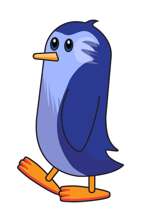
When I meet new people I always tell them about my giant pet penguin... Why? Well, it's a good ice breaker!
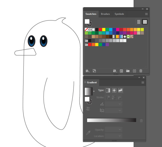
This week in Fundies we took the skills we've been building over the last couple of weeks and put them into practice as we created ourselves a wee penguin friend. Continuing to broaden our Illustrator horizons we learnt new ways to manipulate shapes, we explored the gradient and colour palette tools, and we learnt new shortcuts that make navigating the platform significantly easier.
Starting off with a basic circle that we made using the ellipse tool we selected the bottom points using the Direct Selection tool (A) and cut (Ctrl + X) and pasted in place (Shift + Ctrl + V).

We then held shift and moved the lower half down until we had our desired size. We then selected both open points on one side and used the "Join" function (Option/Alt + J) and then repeated on the other side, leaving us with the base of our penguins body.

Our next step was to give our penguin a tail. To achieve this we added extra anchor points (+) and moved them to give us our desired shape.

When then did the same thing on top to give our penguin a little 'cow lick' for hair.

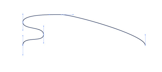
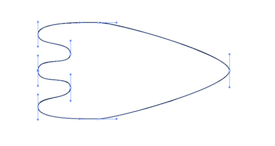
When then went ahead and drew a wing using the pen tool, and then made a beak. To make the beak we started with a rectangle, we adjusted the anchor points using the Direct Selection tool to where we wanted them, and then we used the curve gizmo to round certain points until we were happy with the results. We were then left with something that looks like this:

Moving on to creating some eyes, we used the swatches and gradient palettes (Found in the Window menu) and created a blue to black gradient and then added white circles to emulate shine.
Moving onto the feet, I forgot to screenshot as I went so for the sake of documentation I've gone through and repeated this step on a separate document so just pretend the feet you're about to see are the same as my final image.
We started off by drawing one half of the foot and then using the Reflect tool (O) to create the other half. We selected the outer anchor points that are now overlapping, and joined them together.
During this step it is important to keep our handles straight because it will make it easier to reflect and line up!
We then flattened the foot to the desired height and duplicated, holding shift to raise the duplicate up. We deleted selected lines and then joined certain anchor points together - this is going to give the illusion the foot is 3D eventually.

We then lowered the top down, selected the whole image, hit Shift + X and then chose our colours for the foot.
We now want to add an outline, but because we only want it on the outside we're going to duplicate our foot and then using Pathfinder we're going to use the "unite" button to merge the two shapes together. To check our work and to make sure there's no funny business going on we're going to go into wire mode (Command/Ctrl + Y) and then delete any random points that might be there.
Selecting our now merged shape we're going to go Shift + X to switch to outline, no fill and then we're going to open our stroke palette and adjust the width and colour as well as change a few settings to get our desired look. For today's project we want "round join" and "alight to outside". Then all we need to do is move the stroke on-top of our coloured foot and then voila - we have a completed flipper. To make our leg we used the same process we used to create the body.

Our final step was to colour our penguin, which I also admittedly forgot to screenshot as I went, but I will give the highlights!
First we wanted to make sure we were organised in our working, so we started by creating several layers of what would become the different coloured components and moved the face and arm into "front stuff" and the feet into "back stuff".

Using the pen tool we carved out different shapes that would become our chest colour and then used the pathfinder tool again to "minus front" to delete what we didn't want from the body outline copy we started with. Similar steps were taken to create our shadow and highlight, using Shift + X to switch from outline to fill and then choosing the desired colour. Once we picked all our colours and added a little highlight to the beak we had our final penguin, so without further adieu - meet Pascal!
This lesson was the first time I felt like I "understood" Illustrator. Prior to this I had always been a die-hard Photoshop user, but mainly because I didn't know how to effectively create using this platform.
0 notes
Text
WEEK 9


Started off the lesson working in indesign, specifically looking at paragraph styles. Paragraph styles are very handy. To make a paragraph style you select a group of text - edit it to how you want and then whilst still having the text selected you click the plus sign to create a new paragraph style. Now the paragraph style can be applied to whatever text you want - by selecting the text you want to edit and simply clicking on the paragraph style.


We moved onto character styles, this was the same as paragraph styles it is just for editing characters.

To change the number of columns you need to have the text box selected with the direct selection tool (red box on left) then you can edit the column number by adjusting the number in the red box (top right


On the left is what the bullet points looked like before making changes. On the right is after. The changes I made was increase the left indent by 3mm, decrease the first line indent by -3mm. As you can see there is a huge visual benefit from editing the alignment.


We then starting playing around with images in indesign. When placing a image in indesign, if you open the same image with photoshop and make any changes and save it out, in the links tab a warning sign will appear (saying that changes have been made to the image) so if you click the update link button the changes you've made on photoshop will appear on indesign!

Dragging the image over the text will cover the text, to change this you select the image and under text wrap click the icon in the red box (wrap around bounding box) which makes the text wrap around the image. I then added spacing on the right of the image (shown in the red rectangle).


Say hypothetically I wanted my image to be circular instead of square, I can!! Make the circle you want your image to fit into (NO fill NO stroke) and place it over your image. Click your image and do COMMAND + X (cut). Right click on your circle and click paste into, this will paste your image into the circle.
Now I repeated the same process with text wrap except this time instead of doing wrap around bounding box I did WRAP AROUND OBJECT SHAPE. Then I changed the top offset to 2mm which gave me more space around the image (notice how because the shape we are working with is a circle and has one side you can only change one of the offsets!)
0 notes
Note
Hi!
I recently saw your birthday celebration post, where you show the before and after your coloring for gifs. I wanted to know if you could explain on how to do the double coloring thing on the same gif? like showing the before and after.... hope i explained what im saying ooff!
your coloring os gorgeous btw! and no worries if you cant help with a detailed tutorial, just a quick explanation of steps would do.
thank you in advance!
Hello!!
Oooh sadly I'm not home so I can't attach any pictures but I'll try to explain it as detailed as I can!!
I'm gonna explain the Photoshop steps since I use Photoshop 😅😅 hopefully that's okayy
1. Do your colouring as per usual
2. Shift + click all your colouring layers (so all your selective colour, hue/saturation, color balance layers)
3. There is a lil folder 📁 button on the bottom right of the Layers tab (usually at the bottom right hand corner of the screen)
4. With all the colouring layers selected, click the folder 📁 button. This will form a Group (usually titled "Group 1"
5. With your Group layer selected, go back to the bottom right hand corner of the Layers tab and click the button that looks like the Japan flag 🇯🇵 (it's a rectangle with a circle in the middle)
6. Click the lil Japan flag icon 🇯🇵. This will form a mask on the Group (represented by a chain ⛓️ and white rectangle ⬜)
7. Take the Pen tool ("P") and click three points on your gif to create a triangle. The points should connect to each other. A successful connection will appear as a shape surrounded by a dotted line.
8. Click on the white rectangle ⬜ on your Group layer to select it.
9. Press the 'delete' button on your keyboard. The area in the triangle shape should be deleted.
10. Select the Shape tool ("M") and click anywhere outside the dotted line to deselect the shape.
11. Now your gif should be divided into two triangles - one original and one with your colouring :)
12. BONUS!!
To change the mask placement, click on the white rectangle ⬜ and press Control/Command + "I" (capital i) on your keyboard to invert the triangles :)
😅😅 that's it!! I hope this was explained well enough :) feel free to ask more questions if you have any ❤️
0 notes
Last Seen Blogs

thedorklife
Cold Steel And Stone Hearts
mariberry
Sexy Brain Aesthetic

unicorntrait
UnicornTrait

faundreams
Sleeping with Ghosts
makesims
est. 10.7.18