#the dynamicism of the figure
Text
Drawing Interesting Pose Silhouette, Gesture and Dynamicism Tips
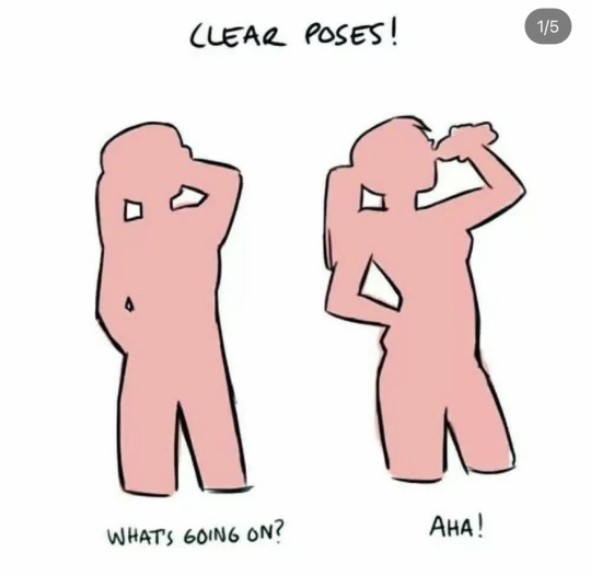

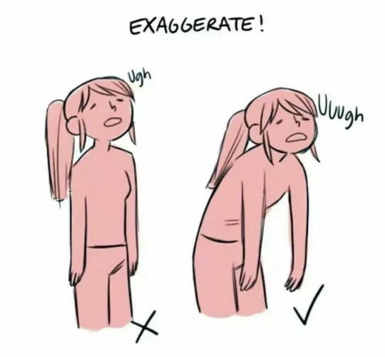

Credit: Lomonte (tumblr)
#random tip#random tips#tip#pose#poses#dynamicism#gesture#figure drawing#life drawing#expressive#line of action#exaggerate#character#atmosphere#mood#silhouette#art tutorial#drawing tip#art tip#art tips#art tutorials#drawing#drawing tips#drawing tutorial#drawing tutorials#art#action#movement
178 notes
·
View notes
Text
Sometimes, I am baffled by the way people choose to write fics and character dynamice when they're doing like, slice-of-life, no thoughts head empty kinda stories, and they make the flawed characters even worse than in canon, or flat-out evil.
Not that they're doing anything wrong, I just don't understand.
Like, I love to read fics where Endeavor does his absolute best for his children, and his children slowly heal and forgive and become a family. I am Dazai Osamu's greatest hater, but of course I would like to read about him regretting what he did to Akutagawa and wanting to fix their relationship because he cares?? Why wouldn't I want to read about Severus Snape realizing that not a single adult cares to actually raise Harry and automatically stepping in as a father figure??
Why would you make them worse than they canonically are, erasing some actions and intentions? Do people not like happiness? I write fics because I usually want my faves to have love and affection, always. To fix past mistakes. To resolve regrets. To be better, to love better.
Might just be me, idk.
#i think this says more about people like me than the writers themselves#like in these situations i would immediately choose love#i would choose to help to do better to fix things#i can't help it#it's my nature to give love a try#bsd#bungou stray dogs#mha#my hero academia#harry potter#bsd dazai#dazai osamu#endevour#severus snape#fics#writer
49 notes
·
View notes
Text
Notes on Comic Art #3: Dynamicism [again]

I've recently been devouring Tim Eldred's writings. Eldred is not a very famous artist, but you're almost certainly familiar with his work. He's been a storyboard artist and / or director on Extreme Ghostbusters, Avengers EMH, Teen Titans (2003), and every Spider-Man show beginning with TNAS, as well as many, many other shows.
But before primarily becoming a board artist, Eldred worked in the comics industry. He did a lot of work on anime/manga-inspired comics, and was a staff artist at Malibu Comics for a few years.
One of the many odd-jobs he did in his career was create art for a few of those Christopher Hart "how to draw X" books you've probably seen. Don't worry, Eldred has credibility; he thinks the books are shit and he only accepted the work to make ends meet. But he thinks an example of good comicbook storytelling that he did for one of Hart's books mostly holds up, if you ignore the writing Hart added around his examples.
I recommend you read Eldred's post about this first, and then come back around here to read my own commentary.

An entire book drawn like this first example would eventually start to feel like those comics laid out by Jim Shooter. Shooter's comics are a many notches above this, but the effect of having few dynamics would basically be the same.
Eldred says he constantly saw direct downshots in pages from beginners during portfolio reviews. I don't think Eldred is lying, but the weird thing is that I can't recall ever seeing a direct downshot in a comic. I guess it's because none of those beginners ever got published. Either way, I do agree that it's an awkward, mechanical angle. There might be an occasion where it's the correct choice, but I can't imagine when that might be.
Anyways, Eldred was trying to make a point by having these pages use six panel grids; he's implying they're boring. I think Hamm's rebuttal to this POV is the best one I've ever read:
Varying the size and shape of panels or their points-of-view doesn't "add drama," it adds visual interest. And narrative is more important than visual interest. Some of the most gripping comics have mostly same-sized panels: Watchmen, V, Toth's work, much of Los Bros Hernandez, not to mention most comic strips.
You can also throw in Steve Ditko, Jack Kirby, and many other gold / silver age artists. The Dark Knight Returns is built using a sixteen panel grid.
There are many other things that can be said about this "worst" example, but my final comment is that the first, fourth, and sixth panels of the first page, and the first panel of the second page, are all completely fine. I'd even argue that there's nothing really wrong with the third panel of the second page. The big problem with most of these panels is that they lazily flatten objects that could've had depth, mostly cars, and I don't really see that problem in the ones I mentioned [aside from 1-4, but that's appropriate].

Here's what Eldred calls the "intermediate" example. Something we start to see here is figures breaking out of panels. Once again, Jesse Hamm has something to say:
Panel borders are a symbol that helps the story move swiftly and clearly. Like punctuation. Each time you break them, letting figures or objects jut out of them, you slightly erode their effectiveness. You can break them occasionally to good effect…but broken often, they lose power, and it looks gimmicky. Be judicious!
I think all of the panel breaks across these two pages are not only completely superflous, but they're also actively detrimental to the artwork. Especially the one in the second panel, which makes the left side of that panel feel more tangent-y than it would otherwise.
I have a lot of problems with the following quote from Eldred:
The big panel in the center is what I later learned to call a “three-quarter downshot.” I learned the term once I made the jump into TV animation and found out that (like the direct downshot) it was a common default angle for storyboards. Everyone used it without understanding what a cliche it was. You almost never see it live-action filmmaking, for example. Once it was beaten out of us, we all learned how to find better alternatives. But until you get that training, you just think of it as a helpful way to convey geography.
Once again, I don't doubt that some people in the storyboarding world think that the "three-quarter downshot" is bad. But it's perfectly fine for comics. There are two reasons you don't often see this kind of shot in live action filmmaking:
-It requires either a crane or a cameraman moving onto a building. One of those things is expensive, and both of them eat up a lot of time, which is always in short supply in filmmaking.
-Because live action filmmaking is live action, our eyes are always being bombarded with a lot of information. It takes too much time for a viewer to spot the relevant figure in a three-quarter downshot composition, and so it's mostly useless in live action.
In comics, budget is not a problem, and time works differently so a reader can have a second to discover where the relevant figure is standing. There are some comics, like RoboCop vs The Terminator, that would've been served quite well by a few three-quarter downshots, because they don't do enough to convey geography.
It's worth mentioning that the first example uses 12 panels to convey what the second example conveys in 9. I haven't said it outright yet, but aside from the panel breaking stuff, I do think the second example is better than the first.
Anyways, here's the "advanced" example:

Whenever I see a book dominated by compositions like this, I always make the same mental note: I'm not reading this. The actual mental note is more of a This artist lacks discernment and this is visually incoherent, but the end result is that I'm still not going to read it. My eyes immediately glaze over; it's too much work to parse the tilted panels and constant panel breaks. Everything is cranked up to 11 and I have no time for any of it.
Canted angles work just fine when the composition is canted while the panel borders are normal; that's easy to understand. But I don't enjoy this Gene Colan-type stuff. This is why I've never read Spawn, or a lot of newer manga.
While I was reading Eldred's post, I kept expecting him to say something to the effect of "You should mix and match stuff from these different levels, because the loud 'advanced' example is not always appropriate", but he never says that. Maybe he just didn't think it needed to be said?
What are the lessons here? Sometimes good artists give bad advice, and sometimes people can try so hard to be cutting-edge and smart that they get in their own way.
Let's look at one last thing, a similar demonstration from How to Draw Comics the Marvel Way. There are a lot of things that can be said about how much of the advice in How to Draw Comics the Marvel Way is destructive, but let's just ignore that larger discussion for now.
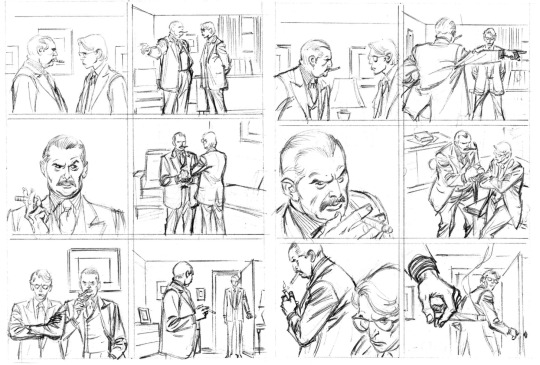
Obviously the left page is the boring, non-Marvel page, and the right page is the Marvel page. Notice how much more dynamic the Marvel page is without changing the panel grid, or breaking any borders. Dynamics, in many cases, really does come down to using high or low angles and creative blocking / composition. And, once again, there are instances where some of the panels on the left page might be more desirable than compositions on the Marvel one; context is key.
Varying the size and shape of panels or their points-of-view doesn't "add drama," it adds visual interest. And narrative is more important than visual interest.
5 notes
·
View notes
Text
i tried to figure out exactly what was bothering me. my new phone stylus is very hard to hold so i had no good grip so the drawings look weird, but i think it conveys the idea for the most part. I PROMISE I DIDN'T TRY TO MISREPRESENT ONE OVER THE OTHER!!! the drawings just accidentally came out goofy 😭 its only to demonstrate the broad strokes anyway
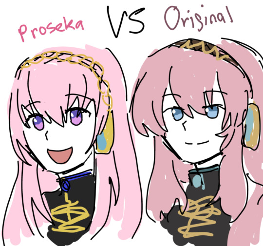
admittedly v4x luka sits in the middle of this scale but they specifically used a """revamped""" version of her v2 design so. v4x doesnt exist and tbh ixima has kept her personality mostly intact in most v4x promotional artwork WHY AM I TALKING ABOUT V4X THIS ISNT ABOUT HER but yes. i think the weirdly saturated color palette is kind of.. i dont wanna say poorly put together but i was surprised by them. theyre quite stark. i think the earthiness of luka's old v2 outfit in comparison contributes a sort of maturity and sophistication. the fluffy hair really helps too. the eye shape is a huge point as well... not to mention the personalities just seem so....different.
the saturation values are surprisingly similar between the two which is sound and correct, its easy to read regardless of which one it is, so i cant continue to nitpick from most technical aspects. itd just be pedantic (tho tbh proseka luka's hair could stand to have more contrast)
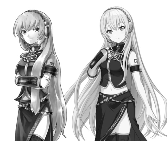
i will say proseka's luka's silhouette is way more ambigious compared to old luka even though its almost the same outfit— i already closed my phone's editing soft of choice and i didn't save the version with the key arts but try for yourself, clip layer and turn both solid, the proseka version of her hair is so shapeless it hurts the overall shape and dynamicism of the design (IMO). i think its closer to ixima's take on it, but i never liked how ixima draws hair, people started making bald miku jokes for a reason.
idk if i have it in me to go blow by blow about why i prefer what and why i dont but im starting to feel grief over how luka is misrepresented.
8 notes
·
View notes
Text
all my sentiments, be it ideas, writings, or merely furtive thoughts, in its dynamicism, unspooling like tape, in a storage room, packed with static pressure, the anxiety in my mind, that it will all combust into flames if i don't figure it out. what is there to figure out?
#log#adhd#'just do it' is such a demonic phrase#however 'get the ball rolling' is something to get the ball rolling
1 note
·
View note
Photo


Originally Posted To My Waterfall
So let’s have a context-copy-paste from there!
one Post Wacom upgrade!!! I love working pen-pressure sensitivity!!
Copy and Paste(s) for Context:
Originally, Batgirl as an identity wasn't meant to be a side-kick (that was a 1990's post-zero hour retcon! And a messy one at that!)
Batgirl was basically meant to stand on equal footing with Batman; she was an ally, not a copy. Inspired by but not working for nor under. That was pretty much established in her debut episode, in fact! She loved what he stood for, but had her own way; a much more empathetic, working-with-the-people approach!
That carries on to the current run today! So, wheras Bruce nowadays is happy to inspire fear and act as a semi-urban-legend, Barbara wants to be right on the street with the people--using a combo of criminal psychology with the most updated tech!
It's fascinating really!
--
When you design super-hero costumes, you have to take into consideration why they are the way they are.
So; the trunks on the outside? The bright colours and capes? Those are all influenced by the 1930's strongman acts! Early circus performers and gymnasts; the tight spandex was meant to really accentuate the body and show the daringness behind those feats!
That translated really, really well in the old Bronze Age Batgirl comics!
--End Flashback(s)
So, bearing in mind the long exposition up there-- ^^^^^ --about costumes and feats? I think about that a lot when I'm ice skating.
I mean, it's a given I guess, right? When we watch skating on TV the first thing we see is the skater's costumes; that's usually what we use to puzzle out the tone and mood they might be going for before they even start to skate!
That reasoning was extra important in classic comic books; i.e, showing off these incredible gymnastic feats in just static images! Unfortunately, in modern times...especially for female characters...there's less emphasis on daring feats and more on the whole 'look.' Not even the fashion.
You know what kinds of 'look' I'm talking about...so I wondered; is that totally lost in modern comics?
I don't think so, not 100% because obviously we're still judging on how well fight scenes are choreographed and how these characters move around a page; but modern narratives mean we're more interested in the characters themselves than solely what they can do--and that is 100% a good thing!
That being said; I wondered if I could get some of my ice-skating moves to work for Batgirl?
What I'm figuring so far? Yes! I can; but it's all in the composition! Which, now that I think about it, is drawing 101 to a T, right? But still, I think it's important to experiment with!
So here's the start of an ongoing series; Batgirl on ice! I want to see how many poses I can frame in various tones/emotions!
The first; the Arabasque Spiral! (Leg up above hip-height.)
I've had a lot of fun with those bat-lines, specifically getting them to 'trace' the pattern my skates leave behind when I change edges in practice; I was surprised how much dynamicism it added to the overall poses too!
Now while I'm proud of my fully painted Classic!Batgirl there--I think the Burnside angle and posing is gonna be the most impactful one. But then, she doesn't have the cape obscuring most of her body; but I could not sacrifice the flow of that in two pictures so...here we are!
#Batgirl#Batgirl of Burnside#Burnside#Classic Batgirl#Batgirl Classic#Barbara Gordon#Babs Gordon#Gotham#Gotham City#Batfam#Batfamily#Batman#Babs#dcmultiverse#DC Comics#superheores#Character design
8 notes
·
View notes
Photo

DSDN101 / P1 / Homework Asymmetry: It was neccessary to use asymmetry to mimic a realistic flame which will not be symmetrical. This constrasts well with the repition of the matchstick. Balance: I wanted a good balance with the shading of the match versus the flame to create cohesiveness, as if the two are one. I did not want the viewer’s eye to be drawn to one specific aspect of the design. Figure/Ground: The constraint of using a black pen meant that I needed to use shading and light appropriately to force the viewer to see the white (traditionally the background) as the flame (aka foreground). The element of speckled detailing in the background added to this as well. Reptition: The repetition of the matchstick in the same position of each frame creates an overall unity between the images, as well as repition of the detailed line style between each frame to help the viewer understand the separate image elements (matchstick, flame, background) Contrast: Although there is a lack of contrast between the matchstick and flame elements, the contrast between the black and white through instricate shading helps develop the dynamicism of the flame, as well as the minor contrast between the “messy” pen work and precise straight lines of the match.
2 notes
·
View notes
Text
Dear Mr Gansa,
Firstly, thank you for having created and sustained Homeland as a truly exceptional, sometimes brilliant show. I feel privileged to be among the show’s huge fandom. I have only recently connected with the social media presence and Homeland community and am thrilled to find many highly intelligent, devoted people with whom I can share my passion for the show. This letter writing initiative is welcome to me as offering a chance to express my deep appreciation for Homeland, but also, sadly, my even deeper disenchantment.
My Homeland journey is in many ways not unusual. I fell in love with seasons 1 and 2, stunned by their boldness and magnificent acting. There were always lulls (in such an intense, gutsy show there have to be) but the writing was so sharp and the characterisation so stunning that I became hooked. Carrie Mathison engaged me as a flawed, multi-dimensional figure far from the mould of stereotypical heroine, beautifully embodied by Claire Danes. New avenues of subtlety and exploration opened up with the arrival of Quinn, thanks to the astonishing chemistry between the two actors, so that seasons 3-4 were fascinating. I was gripped by season 5 but found the plot rather melodramatic and something of the coherence faltered for me; as the torture increased, I found it harder to watch, and couldn’t bring myself to watch the final hour or so. The killing of Quinn seemed gratuitous and cheap.
This proved to be an ominous prelude to season 6 and its relentless, pointless sadism. The show seemed to lose its vision spectacularly, with ever duller backdrop and ever more tedious padding. The plot became incomprehensible and dull beyond endurance. Spasmodic secondary characters clogged up the episodes. Established characters felt extraneous. Only the heartbreaking, fearless performance from Rupert Friend kept me at all interested. He embodied Quinn’s agony and fierce resilience with extraordinary commitment. Carrie simply shrivelled up as a character, with no dynamicism, no spark of genius, nothing of her former self in fact. But above all, I was revolted by the final episode’s pointless despatch of Quinn, and shocking treatment of his character as utterly inconsequential. After so many years of investment and development, a whole arc was casually shut down. Gratuitous and cheap all over again, but this time, much worse, in that real issues of profound seriousness had been raised concerning PTSD, child sexual exploitation, and psychological abuse, only to be curtly dismissed. The potential for something extraordinary to light up the show was simply squandered. Quinn dying believing himself to be devoid of feeling, unlovable, a ‘monkey’, sent out a brutal message about the disposability of those perceived as ‘less than’. The handling of his death was crass in the extreme (e.g. Carrie stuffing his meagre belongings into a rubbish bag in a scene of horrific callousness). There was nothing satisfying about the plot with its dead ends and general lack of direction. All that was left was a sick taste in the mouth.
Suddenly it seems as if Homeland is set on self-destruct.
I am still shocked and dismayed at what happened: how this beloved show has gone totally off the rails. What has also distressed me is the apparent lack of respect for the fans so far exhibited by yourself and the rest of the crew, with a combination of total disregard, or disparaging remarks. Sincere questions have been asked but stonewalled or belittled. I admire hugely the campaign to raise funds in honour of Quinn and urge you to make a public demonstration of your own honourable conduct by matching, as asked, the funds raised (over $5000 so far, I believe). This would seem to be the least you can do.
#letter to gansa#not our homeland#anonymous submission#we write letters we write letters#homeland#ifhf
19 notes
·
View notes
Text
Conversion of Pokemon's theme into a fantasy duel to facilitate card game play:
Pokemon are fighting styles/paths/schools.
Moves are techniques part of the style/path/school
Switching is changing to another stance.
Type effectiveness has individual styles have different levels of resistance against physical/elemental/arcane damage, each technique is one of them.
Offensive stats are subsumed into learnset which is unique, defensive stat into damage resistance. Speed is tied to techniques instead of styles.
Move BP is technique power, move PP becomes energy cost. Move accuracy is luck counters?
Statuses become player-based and technique-based rather than mainly style/pokemon-based.
The main issues I've had with making games with mechanics similar to Pokemon are
Too much arithmetic. Video games can cope with giant equations, people don't like to do them much. Even "add up 3 numbers, subtract 2" is too much hassle for many people including me.
More generally, too many details. Which Pokemon can learn Hydro Pump? What of the 18 types are super effective against each other?
More specifically, too many counters. For each of your 6 pokemon you need a pool of health. This is a lot to keep track of on paper, and it would still be bad with proper counters.
Too easy decisions. This is the problem preventing the solution to the above 3 from just being "simplify everything". Game situations where both players are using the same move over and over again (or cycling) are not fun. There need to be dynamicism and contextually-informed judgment calls.
I think the above transformation into a fantasy duel, while losing some of the charm of pokemon as pets, is much better able to transfer the mechanics into a tabletop setting.
Types are greatly reduced (though if I could come up with a good classification I'd make there be 5 instead of 3) and there's no more need of a type table since all the relevant interactions are printed on the Style board. Move learnset also doesn't need to be looked up, because there aren't shared moves any more.
Math can be reduced to a single X - Y calculation, and two numbers are sinple enough to expect players to be happy playing with them.
HP is consolidated into the player (this is the one thing I need to figure out whether it's problematic) so you don't have many fiddly careful distinct pools.
And though I desperately need to playtest it for real, the sample scenes in my head seem to have interesting decisions at least.
0 notes
Text
Art Terminology & Tip: Using Squash & Stretch

Credit: 21Draw
#random tip#random tips#tip#squash#stretch#dynamicism#gesture#figure drawing#life drawing#motion#movement#art tutorial#drawing tip#art tip#art tips#art tutorials#drawing#drawing tips#drawing tutorial#drawing tutorials#art#posing#construction
9 notes
·
View notes
Text
Extra Typology Vol #2 - 8. Bouncing around the Enneagram, or, the Type Energies in daily life
Dynamicism
As with all typology first here comes the statement that we’re usually not aware just how much we act “within” our home type (particularly when we’re not making an effort to petrend) & the danger to assume everyone is or should be like that / misunderstand that others may want different things.
Also, the dangers of “when all you have is a hammer” approach even in well-adjusted individuals - & recommendation to observe type patterns in yourself to be more self-aware, have more compassion for others & vary your reactions more to be situation-appropiate.
You can access the other “modes” as we all have all “energies”, & might in fact wildly bounce around between them situationally throughout your day, but while your home type feeds/replenishes you with the others you can run out of energy & tire yourself out/frustrate yourself - nonetheless, a lot of people aren’t true to themselves because of society (duh; But I wouldn’t say that started with the modern age, at all, if anything its becoming better) & may prolongedly act “out of type” because of their own insecurities or job requirements.
Also, it is said that when we do the other “modes” we still do them through the lens & perspective of our “home” type (I wish they’d elaborated)
Another thing they went into is stress reactions, (usually Mars or Lunar) though I didn’t think it makes sense to equate universal regression or defensiveness coping respones with whole other types; Though they probably felt it fit into, and kinda overdid their “situational reactions/energies” construct; I did not buy it especially as the other book didnt have such a thing.
Integration Lines
As with the 9gram, there is a progression of “integration lines” alongside the enneagram symbol itself, as well as characteristics that they recomend we acquite to be more grounded, this time along the circle, though the lines, aside from the primary triangle, tell us where the types are on the symbol.
The triangle itself supposedly doesn’t represent types, but instead “karmic forces” that affect us all. For all fans of symbolism: 9 represents the completion of cicles and unity, 3 the conservative force of stasis and preservation and the personal microcosm, and 6 represents the principle of change and movevent as well as the collective/non-personal.
Either way, it goes like this:
1 (Lunar) ---> 2 (Venus) (learns self care & emotional responsibility)
2 (Venus) ---> 4 (Mercury) (speeds up thinking, learns to complete tasks by themselves)
4 (Mercury) ---> 5 (Saturn) (gaining depht & comitment)
5 (Saturn) ---> 7 (Mars) (getting out of the headspace & into action)
7 (Mars) ---> 8 (Jupiter) (focus on benevolence)
8 (Jupiter) ---> 1 (Lunar) (playfulness, limits on responsibility, tolerance for solitude )
For the hybrid types, it’s suggested that they ‘finish’ the motion toward the more ‘advanced’ type and also try acessing the next ‘full’ type, ie, a Venus-Mercury should cultivate some Saturn-y skills.
What you see here is that there’s not much overlap with the 9 type system, 2 and Venus might be sliiiightly comparable but for example 4 and Mercury couldn’t be more different & they seem to be measuring different things altogether. BTW, the systems that add Solar give it the number Zero & place it in the center of the circle, although it can also be treated as exiting the circle sucessfully or a “continuation” on Jupiter.
The author would also describe this as a continuous progression, that is, every type starts the journey with their “home” type as starting point, acquiring all the life lessons along the way.
A little aside for Symbolism fans:
At this point the book has a little explanation for the enneagram symbol itself & what it supposedly represents, arguing that it’s made up of 3 components:
- The circle - represents unity
-The triangle - represents duality/ trinity not just in the christian sense but universally as in “Yes/No/Neither”, “man/woman/child” etc.
- The remaining six pointed figure - represents transformation
I’ve seen one 9gram publication interpreting the gap at the bottom as being the “void” or darkness, the counterpart to the completion found at 9 & using it to explain why us 5w4 and 4w5s are so damn emo, while others place the supposed gap between intuition or rational though there; I’ve also seen some relate the “bottom” but that’s a lil inconsistent, for if they were sorted by level of energetic-ness, 3 or 7 ought to be at the top, instead 9 is there and 3 is right next to 4 XD
Of course, in the context of the 12gram/ essence types, the gap at the bottom instead represents ‘The Divide’ (and by now you can probably imagine that the author takes it seriously enough to consistently capitalize it) between the personal and non-personal types, that is, the individual & the collective.
The symbolic Progression of the types
The types/modes described here are heavily based on basic archetypes, as reflected in the deity-names, as such the author has a lot of fun relatic the basic archetypes to all kinds of everyday ‘progressions’ (I’d argue that this is applicability not objective truth, as with most symbolism things)
The Energies as your Day:
Lunar - dreaming, waking up
Venus - chosing what to wear, chatting with your family
Mercury - getting ready for the day, preparing to get to work
(a lot of people stop here)
Saturn - thinking about the world while reading the morning newspaper, deciding what to do
Mars - laboring hard to make your goals happen
Jupiter - chilling out with your friends after work, spending your money on yourself & others
As ‘awakening’/maturing/gaining awareness:
(or the ‘progression of the soul’ if you believe in reincarnation & such, but can also be personal maturation)
Lunar - being inexperienced in your surroundings, existing in your own niche
Venus - becoming comfortable in your surroundings, how to life skills
Mercury - awakening to the larger world, looking to archieve in it
Saturn - stopping to think & understand the reasons & mechanics of the larger world/system, greater awareness
Mars - taking action based on that understanding, making changes within the system
Jupiter - using the results of those actions for good, enjoying the rewards
According to the various additions to the System you could add Earth/Ceres between Mercury & Saturn (not the same as a mercury-saturn hybrid tho), a grounded practical person that knows ho to navigate their personal surroundings, and the Solar after Jupiter (someone who has completed the cycle & doesn’t really fit into this world anymore, being only here to radiate their light, or just reaching the state of believing in one’s new ideals); Some iterations also add about 3 other types “after” Solar representing highly exceptional lifetimes or an understanding from seeing beyond/above the system, kind of more modern archetypes
The types can also be assigned further distinctios:
‘Ages’
Child/Younger: Lunar (”dreamer”) and Mercury (”trickster/mischief”)
Adult/Earth: Venus and Mars (best suited for the current world)
Elders/Parental: Saturn (the ‘Lord/Lady’) and Jupiter (the giving, jolly old man/ “mother earth”)
Makes sense in terms of archetypes or individual differences (some ppl feeling like they are ‘old souls’ or ‘young at heart’), though I’d be wary of making ‘better than’ statements out of it
‘Classifications’
thinking feeling doing
personal Lunar Venus Mercury
non-personal Saturn Jupiter Mars
2 notes
·
View notes
Text
How to draw Stick Figures to make Poses & Gesture


Credit: Etherington Brothers
#139#140#stick figure#pose#construction#body#people#anatomy#poses#silhouette#gesture#human anatomy#dynamicism#plumb line#balance#art tutorial#drawing tip#art tip#art tips#art tutorials#drawing#drawing tips#drawing tutorial#drawing tutorials#art#tip#figure#head#angles#posing
5 notes
·
View notes
Text
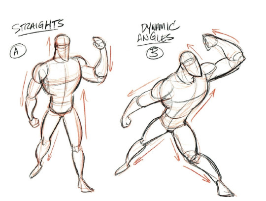
Art Tip for Drawing Dynamic Poses: Using dynamic angles rather than boring straight angles
Credit: 21Draw
#random tips#random tip#tip#angle#straight#dynamicism#posing#figure drawing#gesture drawing#life drawing#pose#poses#ref#reference#references#construction#character#atmosphere#mood#expressiveness#dynamic#angles#art tutorial#drawing tip#art tip#art tips#art tutorials#drawing#drawing tips#drawing tutorial
5 notes
·
View notes
Text
Avoid Stiff Poses: Avoid Parallel Lines in your Figure Pose


Credit: 21Draw
#random tip#random tips#tip#figure drawing#gesture#dynamicism#posing#pose#poses#line#parallel#art tutorial#drawing tip#art tip#art tips#art tutorials#drawing#drawing tips#drawing tutorial#drawing tutorials#art#human#body#life drawing#construction#character
2 notes
·
View notes
Text
Tip for drawing Looking Back Pose: Move/twist the body back a bit as well

Credit: Santastor Art
#random tip#random tips#tip#twist#looking back#pose#poses#pose references#pose reference#pose ref#movement#dynamicism#gesture#figure#art tutorial#drawing tip#art tip#art tips#art tutorials#drawing#drawing tips#drawing tutorial#drawing tutorials#art#body#posing
1 note
·
View note