#these are all my favorite colors to start with but the combos and gradients and I just hnnnnnnnnng it's so pretty
Text

Seriously, False, this is one of the most beautiful castles I have ever seen in this game. Every time I see these colors and gradients I just go a little bit nuts. I can't get enough of it, it's freaking gorgeous.
#falsesymmetry#hermitcraft#mcyt#these are all my favorite colors to start with but the combos and gradients and I just hnnnnnnnnng it's so pretty
1K notes
·
View notes
Note
Do you think France's real hair color is blonde, dirty blonde or light brown?
I tend to lean dirty blonde with some golden highlights. Think his hair color anywhere from The Beautiful World to World Stars. I think my favorite way to think about his hair is the way it looks is very dependent on the lighting. If he's outside it'll look like there's some gold woven in there, but when he's inside or in a dimly lit place, the darker parts of his hair appear to be a light brown.
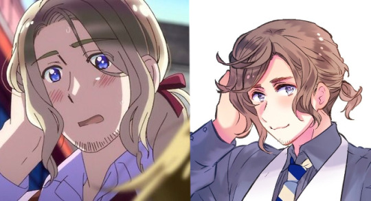
I'm not a fan of anything season 1-4 France, which includes his bright ass yellow hair

I think the appeal of Francis' hair season 5 onwards just comes with the change in style. Seasons 1-4 was all cell-shaded when it came to color; Everyone had a base color for everything in their design with one color for shading and one color for highlight. The clothing is still rendered the same in the anime during and after season 5, but in addition to the cell shading on the hair, there's a gradient. While I'm not a fan of the gradient because it makes color picking harder (and whether or not I decide to do that is debatable), it looks more appealing to me. The image I also selected of Francis above and color picked from also isn't... the best considering he's also in shadow, but that image of him... appeals to me.
I think something the later seasons have going for them is the general color cohesion. While there's still a lot of cell shading in the clothing (because that's just easier to animate), there's more of it. There's more attention to folds in fabric and more attention to where shadows lay on the body, which helps Seasons 5-7 feel less flat in comparison to Seasons 1-4. I also think the colors in the later seasons appear more unified? I mean, considering now that most of the strips we see getting animated put the characters in clothing that aren't their early-mid 20th century uniforms, we don't get the garishly bright colors that are all different and a lot of them wear clothing similar in color palette (more neutrals). Thinking of France specifically with that blue coat/red pants wombo combo. We do still get some vibrant colors, which is nice, but the hues they choose now vs back then feel much more lively.
Here's a Sketch of Francis I started that I don't think I'll ever finish. When I color I tend to start with more muted colors and I work in more vibrant colors at the end so the whole image isn't super saturated.

31 notes
·
View notes
Text
Casual Outfits Discussed
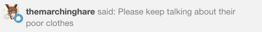
@themarchinghare Ok >:3c
These hot takes analyses and opinions are based entirely on the concept art of the demon brothers’ casual outfits. So any in-game features not present in the concept art aren’t discussed. We’re looking at the outfit as a whole, but occasionally we do talk about individual features.
Also please don’t take this seriously, we just had a lot of fun shitting on the Seven Power Avatars of Sin, Rulers of Hell Itself™’s questionable fashion sense. I would still die for these boys, terrible taste in shoes or not.
Participants in the discussion were
Jo ( @jodaneko ), my roommate and an art major with storyboarding and character design experience
Justin ( @justinlester0629 ), my go-to fashion expert for at least a decade and very possibly a future male model
Noodle (Me), untrained eye and resident fashion decade disregarder
With the exception of a few choice quotes, our thoughts and conclusions are all mixed in with each other. Quotes are mildly paraphrased.
Lucifer:

The colors are good; the blacks and grays are all in the blue-gray family, and there’s a pop of color with the gold belt and red vest.
But he paired a black suit with brown shoes???? SIN
“You should always match your belt with your shoes and those shoes are not gold.” —Justin
Justin on the coat: “I love it, the pattern of the inner lining is throwing me off but it’s not bad, and the fur is perfect because it’s associated with power.”
Me on the coat: “I don’t know about you but I bet that coat looks dumb as shit if you put your sleeves through it.”
WITHOUT the coat though his cuffs scream “I am dealing for blackjack and rolling craps.” Lucifer looks like he could walk into and out of a casino whenever he pleases and everyone would assume he works there.
“Dress shirts don’t work like that. He got a size too big.” —Jo
The belt isn’t doing anything functionally, but it’s very important because it balances things out from being too top-heavy.
Out of the belt, shirt cuffs, and coat cuffs, two of them should have matched.
We’re nitpicking because in general it’s a good design. Lucifer has no taste in shoes but that aside is capable of dressing himself.
Mammon:
“That’s western Danny Phantom if I’ve ever seen it.” —Justin
Very nice coat 10/10 would wear.
The colors are odd, he mixes black and brown too, but the other colors mixed in makes it work in a cute way.
“The only things that clash are the shirt and jeans, he could replace the gray shirt with either a black one or a lighter one to match the boots.” —Justin
He’s got a cat toy on his belt. I admire his preparedness for feline encounters.
The cat toy also balances out his rings nicely, since the toy is on his left hip and the rings are on his right hand.
The yellows in the shades, belt, and cat toy are placed very nicely and are the best part of the outfit.
Honestly except for the shirt color and the fact that fur-lined boots are out of style we don’t have much bad to say about his design. Mammon’s casual outfit lives up to his model career.
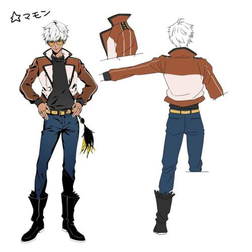
Leviathan:
“Ugh, god.” —Justin
The headphones don’t match with anything, and ever color he’s wearing is so bright they REALLY don’t match.
Headphones aside he chose ok colors to supersaturate, but also like, supersaturation is very very loud.
It kind of looks like he bought two different tracksuits and forgot they were two different outfits.
The pants don’t match themselves.
“He color coordinated his pant cuffs and his shirt and thinks it makes it ok.” —Jo
The jacket itself is nice, the pins are really good and I appreciate that they’re opposite the stripes in his shirt.
Justin hates the gray stripe though because it looks like either part of the jacket or a girl scout sash.
“That shirt should not be collared.” —Jo
“The shoes look like what Kanye West would design but if they were sold on Wish.” —Justin
It’s kind of just… he took the RGB color wheel and went with it. It’s just loud. If he just changed some colors he’d be fine. Leviathan please I have hope for you.
Satan:

“He looks like a gay prep school person.” —Justin
Satan wore 100 shades of green and said “yes this is peak fashion.” And you know what, it objectively sucks but I’m kind of living for it?
Rip off jeans that can’t actually be ripped off because of the VERY stylish belt? Iconic.
Green deep v-neck sweater over a gradient t-shirt and a jacket with the sleeves too short, this man only shops at Goodwill.
The one-shoulder jacket look gives the outfit some personality and I’m really glad he isn’t wearing it properly because looking at it alone I wouldn’t be caught dead in that jacket.
“While good for the design, it’s a mix between business and athletic and I’m not sure how I feel about that.” —Jo
(Jo also said some jackets are designed with sleeves like that but with the color choices it’s just… not good. Justin pointed out that the sweater and jacket do match though.)
The chocolate loafer-style shoes take away from the rest of the outfit.
“Any other shade of green besides Crayola green would have been better for his nails.” —Justin
Listen it’s so bad it’s good, Satan’s fashion sense is “blue-green.” We basically ripped into it the whole time but I’m pretty sure it was the universal favorite.
Asmodeus:
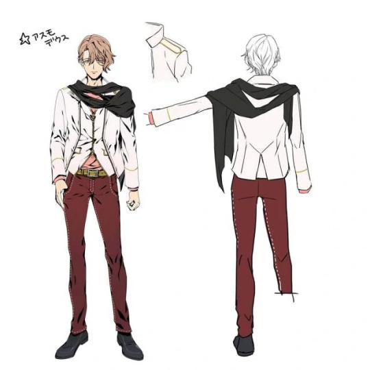
“Just from the back he looks like a cool dude and then the front of him screams douche.” —Jo
Asmo’s outfit is actually ok, but he has one fatal flaw: If he takes off his jacket it’s way too plain, but with the jacket it’s kind of too much.
It’s also kind of confusing, because it looks both casual and formal from different angles. “I’m not sure I like the cut in the front with the t-shirt showing underneath.” —Justin
The shirt is nice but a color that contrasted his skin more would have been nice.
The pants are killer, and the white stitching matches the jacket really well.
The gold accents on the jacket are also good and would match the belt really nicely if the belt wasn’t some ugly mustard color.
This boy is wearing mustard belt and ketchup pants.
Inoffensive shoes which is really the best I can ask for with these boys.
“The scarf. I like it, but I’m not sure how I feel about it because there’s just so much going on with both it and the jacket.” —Justin
“That’s not a scarf, it’s too long. It’s like. A really long strip of cloth.” —Jo
Anyway all in all there’s a little much going on in the front but it’s one of the better looks, good job Asmo.
Beelzebub:

Justin looked at the picture and immediately put his phone down.
“First impression is he looks like Naruto if he got his head lodged in Doritos.” —Justin
“He looks like he’s the carpet of the arcade portion of a skating rink.” —Jo
“He shouldn’t be wearing orange tones.” —Justin
Legitimately we were at a loss for words for a considerable time. We just kept staring at it.
To start he’s got a lot going on but it feels like he looked in the mirror before leaving his room. Not saying he did the best job but at least he looked at himself.
The jacket alone is great, but why is it fur-lined? It throws off the urban design.
But finally some good fucking shirt. We have mixed opinions on the triangles (I like them, Justin doesn’t but appreciates that the pattern continues on the back) but all like the cut.
Living for the necklace-bracelet combo.
Jo says the biggest problem is that there’s color-matching but in weird places and not enough of it.
Jo hates the pink belt and Justin hates the green suspenders; we concluded that one of them should have been excluded.
His choice in sneakers is not as bad as Levi’s but still not very good. The laces shouldn’t be green.
This sounds like a lot of complaining but if he cleaned up the belts and ditched the fur it’d be a fine look.
Belphegor:
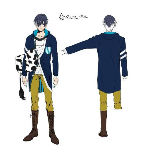
“Oh shit oh god.” —Justin
“The top half is for sleeping and the bottom half is for riding.” —Jo
Absolutely disgusting, mustard yellow pants tucked into brown lace-up combat boots? Disgusting.
The shoes alone are nice but the mustard pants don’t work at all. There’s no cutoff between blue and mustard.
Also he has really broad shoulders, just noticed that looking at this. That has nothing to do with this but it does affect how his cardigan sits on him.
I personally would wear that cardigan, a hooded cardigan? Everything I’ve ever wanted.
Justin pointed out that the button lining is weird, and the inside is a weird contrast with the pocket. He’s right, but I think it’s an endearing mess.
Why do I look at him and feel like he needs to do laundry? I think it’s the t-shirt. It would have been better as a collared shirt, taking the hood off the cardigan in return.
You can’t convince me the avatar of sloth laces those boots every day, he sleeps with his shoes on and that’s a worse sin than sloth.
“The pillow’s not part of the outfit? Oh thank god.” —Justin
Jo said we were being too mean and that it’s not the worst outfit out there, and from the waist up they’re right.
But damn Belphegor the condiment war called and they want the bottom half of their uniform back.
#obey me#obey me one master to rule them all#obey me shall we date#shall we date obey me#obey me swd#swd obey me#obey me!#obey me lucifer#obey me mammon#obey me leviathan#obey me satan#obey me asmodeus#obey me beelzebub#obey me belphegor#obey me outfit analysis#image
1K notes
·
View notes
Note
hi! 🌈🗓💕☕️ i hope you're having a great day
Hello!! Ah it’s been a really rough couple of days but it’s better with an ask from you! :)
🌈Do you find yourself gravitating towards certain colors?
Yeah I’d say I gravitate a lot to pastels. I just really like them, my favorite pastel combo is pink/yellow/blue and I like to make gradients of pink and orange a lot too. It’s ironic as well because my wardrobe is all black and white with usually dark purple makeup. So looking at me you wouldn’t think I’m a big fan of the color pink 😅
🗓How many works in progress do you usually having going at once?
Not many usually. I have a handful of wips just sitting in procreate right now that I’ve given up/haven’t touched in months. But usually when I start a drawing I get very into it and I just work on that one specifically until it’s done. The only time I have a wip left unfinished is usually if I just can’t get something to work right and I can’t stand to work on it anymore
💕Do you have a favorite character to draw?
Right now it’s probably Lan Wangji actually. I just really love him and his micro expressions. Also his hair is very fun to draw. lwj pretty brain go brrr
☕️What is something about your art that you think is underrated/goes unnoticed?
I think my lineart is a bit underrated although I also have a lot of issues with it. It’s usually pretty clean/stylistic and I put a lot of effort into it but it’s just not something you really see in colored drawing and that’s just the way it be sometimes.
Thanks for asking I hope you’re having a good one too!
4 notes
·
View notes
Text
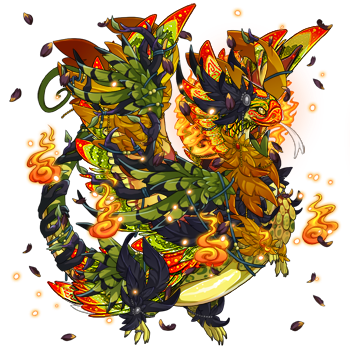
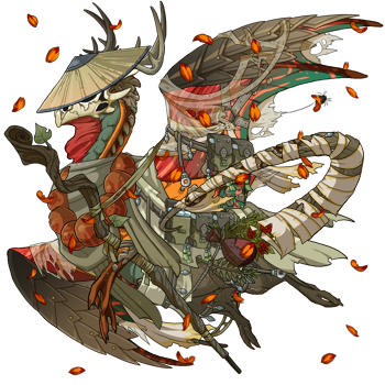
Lair Review for Kesten
Kesten is up next, y’all know where to look vv
@heckling-hydrena
Ok wow your lair, with all the tabs and small descriptions is so well organized AND beautiful. Reading the little snippets in your hibden tab descriptions was entirely captivating. I also really like the name you’ve chosen for your city-- and the lore you seem to have written about its origins.
Let’s begin:
Johnny
with the amount of stars she has she seems to be a fan favorite! And I can see why. You really made the wine secondary work well by using the accent and dried flowerfall items. The fern and celadon silks are and equally amazing combo, but I especially like how the ringlet gene matches with this whole flowery theme. The hints of gold also marry the two colors well, and overall helps create such a regal and unique looking dragon.
Keegan
Keegan’s design and outfit matches SO well with the Yellow-Throated Sparrowmouse familiar that if I didn’t know any better, I would’ve figured the staff of FR designed this dragon themselves. The pure chaotic energy of this dragon was only confirmed when I scrolled down to the bio and found whispers of “tax fraud” and “he means well but he is also a little evil”. I love him and any mini atrocities that he may be involved in.
Tempest
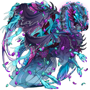
If I had to describe this dragon with just one sentence it would be “a refreshing, tall glass of cold, sparkling water-- grape flavored of course.” She is elegance with a side of fierce (I mean look at those spikes) and wow I’ve seen double halos layered nicely but this really takes the cake with three whole halos. The top layering of all the purple apparel pieces helps with giving her outfit more depth. I could stare at her all day.
Aoulie
This story teller looks like he came right out of The Never Ending Story. The accent you’ve given him makes me feel like whatever story he’s telling is interwoven with magic to make it come alive, and the moon in the middle really draws the eye in--it’s quite an excellent centerpiece. The layering of the hat and the ghastcrown is incredible. I love how the glowing eyes match with the flowerfall, giving it an overall starry look.
Antigone

Another incredibly looking regal dragon. I want to immediately point out the amazing gradient this dragon has. Even though the majority of the details of Falcon and Peregrine are covered, they’re still doing a fantastic job for the majority of this Look. I love the combination of the golden seraph and the haunted flame sets, but what really draws this all together is the halo and the accent. Sappho and Antigone make quite the stunning team
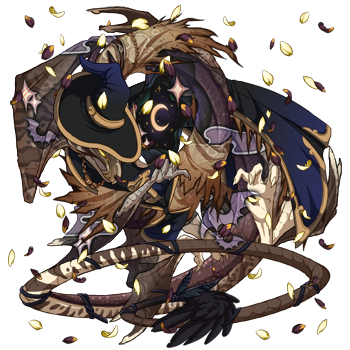
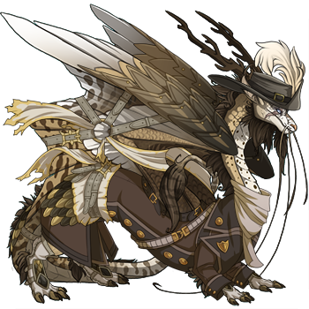
Hurste
The wanderer that really brings home the “straight out of a DnD campaign” vibe. You don’t see a lot of dragons that take a FR-made skin and turn it into something completely off the wall good. And with a color palette consisting of four colors, no less. Hurste's design makes use of great contrast and camouflage. I really enjoy what you’ve done with this dragon.
Delphina

Delphina may be a non-lore dragon but she is incredibly stunning. The combination of green and cerulean are always eye-catching. I love the aviation pilot look, while still seeming as tho she may have crash landed into a bramble patch it lets my imagination kind of run wild with her design. And I’m such a sucker for matching eyes. Delphina gets a 10/10 from me.
Sandstone
Sandstone looks like a mystic nomad who is perhaps annoyed that the wind keeps blowing away his tea leaves which are carried in the pouch at his side. It looks like he’s found a home near the altar (that he maybe tends to?). In all seriousness I enjoy how the reds and oranges bring a flash of color to his look. It keeps him interesting while not overwhelming the senses. I would love to accompany him on any journey or listen to any stories he may offer.
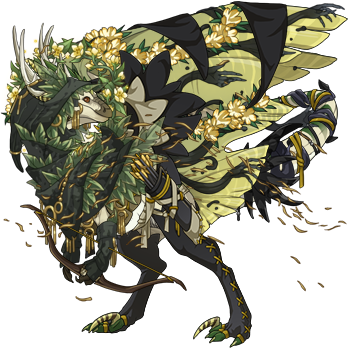
Eurydice
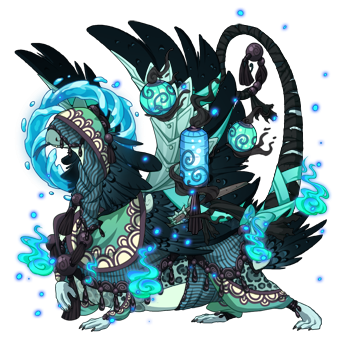
Yet again another familiar/dragon combo that just knocks my socks off. I love Eurydice’s ghostly appearance, what with all the lanterns, blue flame, and watery halo. The sage cover combine with the previously mentioned apparel items really give her a mysterious charm. I must also add that I’ve never really liked Edged much before, but in her case it almost looks like little embers floating up and out from the blue fire.
Elijah
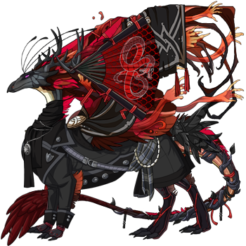
Red and blacks will never cease to be a fantastic color combo. But I really must commend you on Elijah’s outfit. I’m going mad over the excellent layering choices, with the sash, the scarf and necklace, fan, banner, and grasp. I need a mop to clean up all my drool over here. Capsule was an excellent choice to use with the grasp, and I like how the throat matches the color of the banner’s button. It’s the little things that make his whole outfit flow.
Honorable Mention: Sawyer
Sawyer is just too good looking NOT to mention. The owlcat skin really works well here, and I love how the feathers poke out just from under the wing armor.
Thank you, Kesten, for getting me to review your lair. You’ve taught me to appreciate FR-made accents more, and I can’t wait to start using them in the future. Good luck on getting some lore written down. Everything seems so fleshed out and well written so far!
5 notes
·
View notes
Text
Back in April of this year, I gave you a quick overview on a recently-announced (at that time) watch, the Mido Multifort GMT. When I wrote that article, I was pairing what I was seeing from photos and the press release, along with my then-recent experience with a non-GMT Mido Multifort. Now we’re a little bit down the road, and we’ve recently had a loaner in of the Mido Multifort GMT, so we can give you our hands-on thoughts.
What struck me first when I opened up the Mido Multifort GMT was the color combo. The brand here has gone with a rose gold tone on the case, handset, and indices which is then set off against a rather lovely, almost midnight-blue, dial. This might sound a bit too dark, but when you consider the Geneva stripes present on the dial, it actually gives you a variety of shades, from lighter to darker. Think of something like a gradient dial, except it repeats from left to right. It’s tricky to capture in photos, and even tougher to describe, but take my word for it if you haven’t seen it – this is a lovely, lovely dial treatment.
When you see the 42mm case of the Mido Multifort GMT, you may immediately call to mind any number of compressor-style cases, one of which we just recently reviewed (here, along with a lesson on what a compressor case is). For me, it actually brings to mind the very first automatic watch that I had, the Magrette Regattare 2011 which was later followed by a dual-time iteration. While I may not have any dual-crown watches kicking around know, it’s a format I’m rather familiar with.
Here, the lower crown of the Mido Multifort GMT controls the winding and hand-setting for the movement, which is derived from an ETA 2893-2. The that means the upper crown has but a single job – adjusting that chapter ring with the 24-hour scale printed on it. Sure, with a fixed bezel, you could just adjust the hand, but this (ostensibly) gives you quick changes in either direction, or, if you’re adventurous, actually tracking three time zones (with the hand just working a 24 hour scale that doubles the regular indices). This upper crown was the one weak point of the watch, in my time with it.
Specifically, I noticed that, when I got the Mido Multifort GMT loaner in, the scale was not quite lined up. Easy enough, just unscrew the crown, adjust, and then screw back down, right? And it started out that way, for sure. However, pushing the crown in wasn’t quite disengaging the stem, so as I was tightening things down, the chapter ring was moving over slightly. So, it took some playing around with to get it to align as I wanted. Now, in all likelihood, this action was due to the nature of a loaner watch shipping around and changing hands of reviewers, and heading out on the show circuit. And, a good watchmaker could probably sort it out easily enough. In the off chance it’s not due to that, though, I thought it would be worthwhile to call out as something a potential buyer should look out for.
Due to the rose gold / dark blue combo, multitude of polished surfaces (on the case, hands, and indices) as well as the croc-embossed leather strap, the Mido Multifort GMT definitely presents as a dressier sort of a GMT (or travel) watch. With a measurement of 42mm, the watch has some presence (even with the relatively thin bezel), but the overall thickness (just 10.6mm) means it slips under a cuff easily, helping to maintain that dressy look. Which, frankly, is what the Mido Multifort GMT is intended for. Once you move that GMT bezel under the sapphire crystal, you’ve gone away from the aesthetic of the sportier GMTs, and that’s ok. Different styles for different situations, and all that.
For me, that meant that the Mido Multifort GMT was a easy selection for heading into the office, or even with a suit here and there. Sure, the polished rose gold PVD is a bit flashier than I might personally prefer, but it did not feel like it was ostentatious (if there was a matching bracelet, though, that would be too, too much). In other words, it felt like just the right amount of flash, particularly if you’re going for a more upmarket look in your style. In practical terms, all that reflective against the more matte, darker dial, meant reading the time was a breeze, and the red GMT hand is simple to pick out. The date was easy to read as well, what with the bright white date disc jumping out of the dark dial (yes, a darker wheel would be preferred).
Now, if you think you want to head for that more upmarket look that the Mido Multifort GMT affords, this is a watch that is very much in the realm of affordable luxury. The price for the version we just reviewed comes in at $1,290, which feels right for this particular example. I’d just recommend you check out that upper crown when you’re at the shop considering the watch before you get mesmerized by the dial. While I would not go far as to say that the Mido Multifort GMT is my favorite Mido or favorite GMT, it was a watch I was more than happy to spend time with. midowatches.com
Review Summary
Brand & Model: Mido Multifort GMT
Price: $1,290
Who’s it for? You like GMT, and you like your compressor-style dual-crown cases. This is the peanut butter cup you’ve been waiting for.
Would I wear it? Very likely, though I’d go for some different case tones
What I’d change: Wouldn’t mind some alternative brushed/polished finishing on the dial and a darker date disc
The best thing about it: Geneva Stripes are amazing on a dial, and with this deep shade of blue, they really shine
Tech Specs from Mido
Movement
Mido Caliber 1193 Automatic Movement (ETA 2893-2 base), 111⁄2’’’, Ø25.60 mm, thickness: 4.10 mm, 21 jewels, 28,800 vib/h, NIVACHOC and NIVACOURBE anti-shock system, NIVAFLEX NM mainspring.
Finely decorated Elaboré-grade movement, oscillating weight decorated with Geneva stripes and Mido logo.
Functions: HMSD + GMT.
Adjusted on 4 different positions for high accuracy.
Minimum 42 hours of power reserve.
Case
Stainless steel 316L with rose gold PVD treatment, Ø42 mm, 2 pieces
Sapphire crystal with an anti-reflective treatment on both sides
Transparent case back revealing the finely decorated Elaboré-grade movement
Engraved serial number
Screwed crown and case back
Water-resistant up to a pressure of 10 bar (100 m / 330 ft).
Strap: Brown crocodile-look genuine leather strap and stainless steel folding clasp with rose gold PVD treatment.
Dial: Blue, vertical Geneva stripes, individually applied faceted indexes, date at 3 o’clock.
Hands: Diamond polished hour and minute hands, polished seconds hand and red varnished second time zone hand.
Spending time with the Mido Multifort GMT #dualcrown #gmt #travelwatch #review #over$1000 #mido Back in April of this year, I gave you a quick overview on a recently-announced (at that time) watch, the…
1 note
·
View note
Text
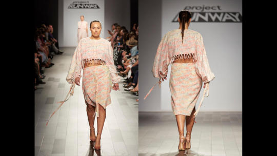
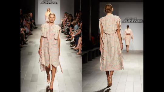
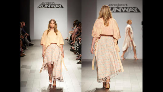
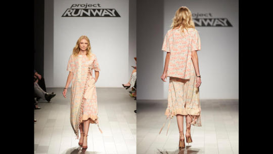
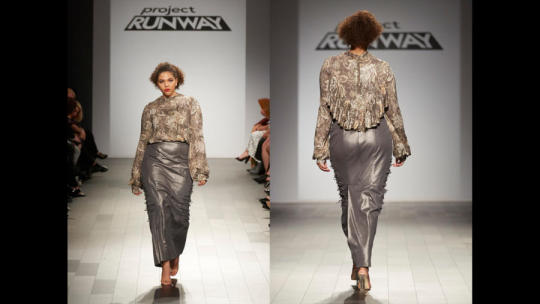
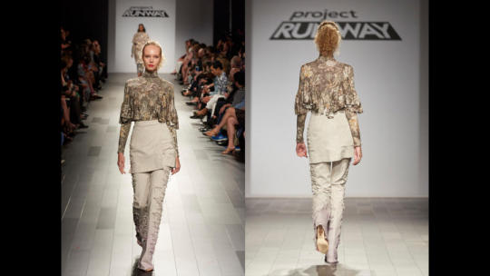
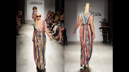
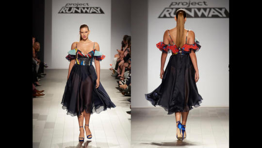
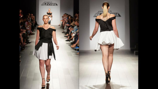
Season 16 Episode 14- A Fitting Finale
This finale was one of my favorites in quite a few seasons. I truly had no idea who was going to win, and I could see any of the four of the designers winning. The last time that I could see any of the designers in the finale legitimately winning was way back in season 7 with Mila, Emilio and Seth Aaron. I also believe that any of these collections is superior to every collection from the past twos seasons, with only Kelly and Erin’s coming close.
Do I agree with the winner? Well you will have to see my rankings, but in short I think I would have been happy with any outcome. Onto the rankings:
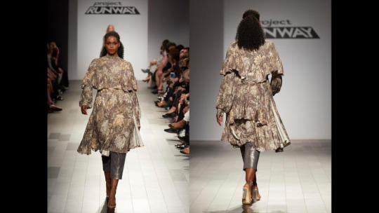
4. Brandon
I loved the flamingo print and most of his silhouettes, but as a collection is was very one note. There is a hint of teal/aqua in the flamingo print and I would have loved to see him use a really saturated form of the color like he did with the pink leather in a few looks.
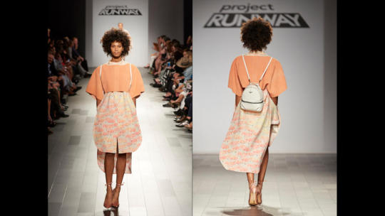
This is my favorite look from his collection. The leather shirt over the dress gives an interesting silhouette and layering effect. The print works very well here because it was broken up and his styling is on point.
The play on the shirt construction on the skirt is fun, but it is starting to become an old and worn out trend. The top is very Brandon in every way possible.
I love the shirt dress underneath. For all of the menswear Brandon has done he never made a shirt dress until the finale which I found interesting. The proportion of the vest to the dress is all wrong and the vest looks a bit tortured. I also wish it was in a different fabric.
The top is a snooze fest and it needs to be a color far more different than the flamingo print. I really like the skirt with the closures at the bottom and extreme asymmetrical hem.
I am still trying to figure out what is happening here and if I like it. From the front it is a long coat dress but from the back it looks like a shirt over a dress. I do like the ruffling along the hem and the you can see the gradient of the flamingo print because it such a long piece of fabric.
This look I love. It is a simple shirt dress but the details make it special. The oversize sleeves balance out the relative shortness of it from the front, but I also like that it is longer in the back. I can take or leave the straps, but the don’t feel over superfluous here.

This piece lacks balance. I like everything individually, it just so happens that everything draws your eye to her right thigh and not her upper body. I’ve seen the shirt before in his collection so I would have likes something different on top to balance it out. The bottom just looks messy.

That paper bag waster is still not working but I am glad he got rid of that tortured top from last week. Too bad he just added a basic tank instead. I like to imagine this look with an aqua/teal shirt like in his first look. The waist down is great and I wish he did more pants in his collection.
This is my second favorite look of the collection. I love the play on a paper doll dress, and I love the crispness of the leather juxtaposed with the flow and busyness of the dress underneath. The proportions are right as well.

This is quite underwhelming as a finale piece. From the back it gives his model a much better shape than the front. Overall it’s just a bit bland and more of the same from his rest of his collection.
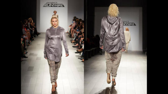
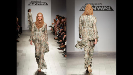
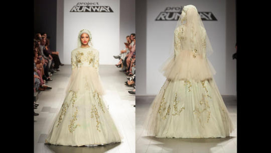
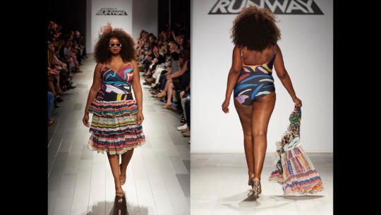
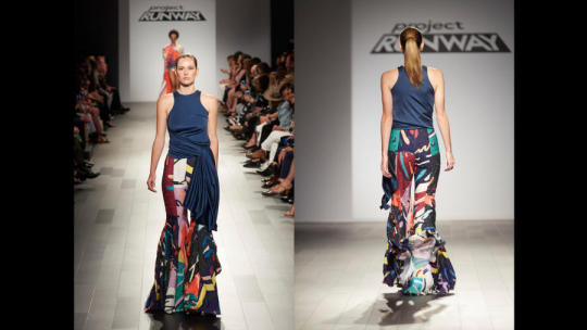
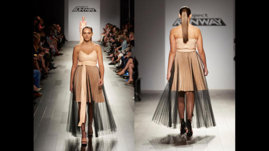
3. Ayana
It was tough to decide between 2nd and third place because I genuinely liked both collections. Ayana ultimately came in 3rd for two reasons, repetitiveness and the fact that were a few looks I thought were wasted spots in her collection. In the end I truly thought the judges would award her the win because she really showed her modest aesthetic and probably would have done the most with the money.

I love this geometric lace and that she decided to make an entire look out of it. The pants could be a bit more fitted and I don’t understand why she hs basically the same top on twice (I know one is a shirt and one is a jacket but still).
I’m not well versed on hijab traditions but I think a hijab out of that lace on this look would have been killer.
I don’t need this hoodie at New York Fashion Week and I don’t understand it within the context of the collection. the pants are essentially the same cut as the previous look but fabric blocking in a hexagonal pattern mimicking the lace was shows Ayana’s fabrication genius.
If she would have put this top with her pants from look 2, scrapped these velous pieces and created a new top and skirt combo I’d be happy. The top is gorgeous and unabashedly Ayana. The skirt is a throw away. There isn’t much of a market for that length and that cut of skirt.
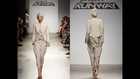
I sang the praises of this look last week and I will sing them again. every single piece is gorgeous on its own and together they are even better. The lighting last week didn’t really show off the shine of the shirt which plays well the matte jacket and pants. I love how loose the jacket is from the front yet it is still fitted in the back. J’dore.
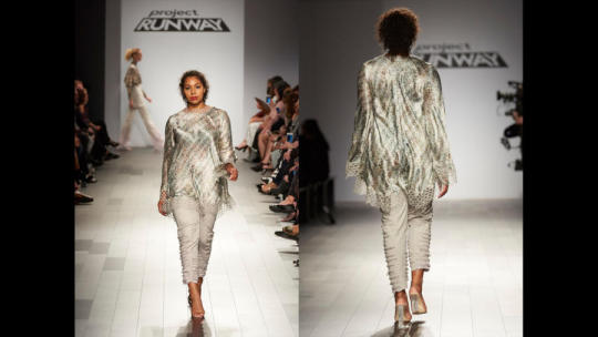
I like this marginally better than when she showed it last week. The greens are definitely popping more, but I still wish it was injected with even more color. I think this model may be a few sizes smaller than her model last week and I think it definitely moves better on this one. It’s just boring.
I love this look. This is her fifth pant in six looks yet it is different than of them. This is a master class in proportions. The ruffles on the sleeves hit in the right spot and the skirt hits at the right point on the thighs to lengthen the model while also making your eyes move around her body.
This is the only look in the collection where I can feel Ayana trying to make a modest look. There is no reason to have pants on under this dress unless it is to create a modest look. This is also just too much of this fabric, I think the shinier print would have worked better.
This is so luxurious. I love the asymmetrical ruffles on her waist and thighs which make this special. It is also her only jumpsuit which is impressive considering we live in a world of jumpsuits right now. (Though it may be a shirt and pants)

When Brandon said this looks like an amphibian I totally agreed. Not only is it because of the fabric, but when it moved down the runway it reminded me of a newt swimming through the water. What I’m saying is I loved it.
This may be the single best piece that ever walked down the runway. There really is just nothing else to say because that says it all.
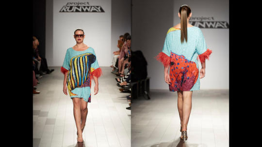
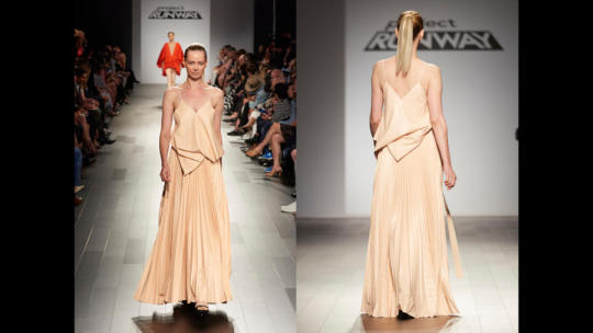
2. Margarita
Margarita’s collection came down to one thing, taste. I love how she went full force into tropical island girl style and didn’t neuter her collection like others (Candice) have in the past. From head to toe, beginning to end, this collection was a Margarita moment.
You know what you are getting from a collection when this looks turns the corner. From print, to cut, to color, to the feathers this is a wow look without going over the top. I love the sunglasses she designed as well. I wish she used this blue throughout her collection more.

It felt a little odd to have the only gown in the collection be in the middle, but then again this also feels a bit like a cover up. The print and color are vibrant and the up close beading detail is gorgeous.

The judges disliked the feathers but i am all about them. She mixed all three of her prints in one look and it worked out fabulously. The way she used the striped print from front to back is fabulous.
I agree with the judges, this is the one piece I could do without. It does make her model look thin and tall, but it’s just a bit busy yet underwhelming at the same time.
Yes. Bitch. Work. This look was a moment with a capital M. the suit is gorgeous on its own and very flattering to Jazzmine, and the cover-up converts it into a cute part dress. I could see a lot of girls wearing that as a dress on a summer day.
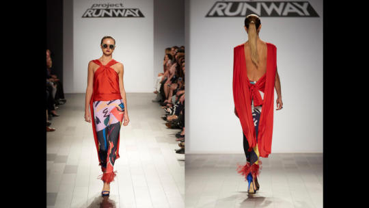
This is where I think the feathers go to far. Other than that I think this is pretty great. the cut of the pants is sublime, it is not easy to line up that pattern like that across her thighs. I’m not sure how the top works and if it would fall off if the drapes came around front.
The dress I can live without but that bomber is the star. I love it.
This may be my favorite piece in Margarita’s collection. it is unabashedly latina in its silhouette and print, but the sheer skirt takes it from costume to fashion. It’s a dramatic silhouette and different from the rest of her collection.
Honestly, this look was one of my favorites last week, but it is a bit of a low note in her collection as a whole. The pants are still great, but the top is too heavy for the pants. They have a sense of humor and he shirt is just to serious.
I love every piece here, but the problem is that this is not a finale piece. I understand it in the context of the collection, but this is not a memorable final piece. the trench is everything but the clothes underneath are just that, clothes. I almost wish her bathing suit was the finale piece.
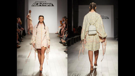
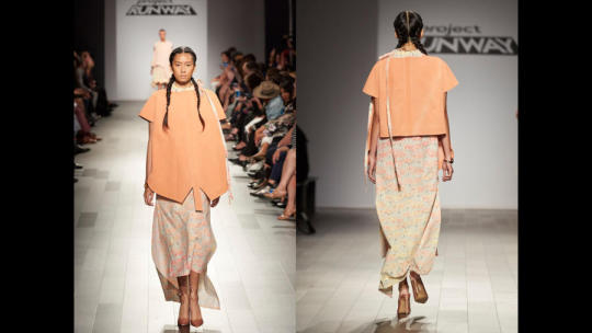
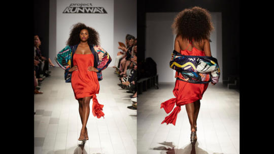
1. Kentaro
Was there any other option? I guess the answer yes because every designer sent down a strong collection, but this was the most FASHION we have seen on this show since the Christian and Leanne back to back knock out collections of seasons 4 and 5. There were a few low notes, but over all this collection hit all the right notes. I’m glad that, like Margarita, Kentaro just went for it with reckless abandon.

If anyone ever asks you how to open a show, this is it. The silhouette from behind the screen was breathtaking, if not a bit comme de garcons. he would have gotten further away from that with a different sleeve length.
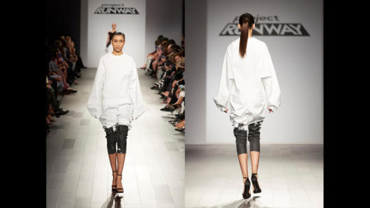
A wonderfully simple note. The painted/dyed leggings were perfect with the bagginess of the top, and the sleeves work better here than in look 1.
Made in one day, but that doesn’t mean that I can give it a pass. The front is boring and the back is awful.

I love everything about this. the cut out tee is a fresh note in the collection and I love the double sided pants. They shouldn’t work but they do.
Kentaro showed a real color story through his collection and it looked almost like a Japanese ink painting, utilizing black, white and red. The nudes are like the red bleeding into the rest of the collection. This is such a simple dress but extremely well executed. The proportions are perfect.
This dress sings. It still have the proportion issue in the top from last week, but the concept is so strong and because the flaw isn’t egregious this ends up being on of the stars of his collection.

AB-SO-LUTELY! The note of red works perfectly in the context of the collection. Once again it is a bit Comme de Garcons however it is still very Kentaro and not a knock off. The v is so low cut but the rest of her is so covered it works perfectly. It is like this top was made for his model, it sits perfectly on her. I want this.

I shouldn’t like this, but at the same time it is amazing. I love the layering of the fabrics and it fits her like a glove. It is a new silhouette for the collection but still remains part of the story.
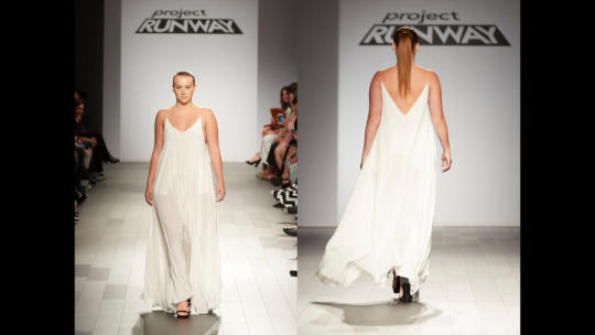
We’re pretending this didn’t happen right? He made a slip dress. I’m surprised the judges didn’t mention this look (or his finale) at all during judging.
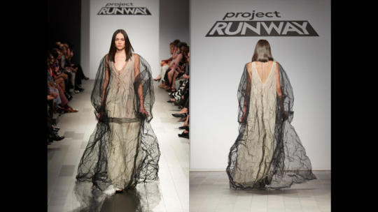
Because this finale look is everything I have ever wanted from project Runway. It’s so odd and quirky yet hits a perfect note of sophistication. For me this look won him the competition.
Not since season 3 has the show had 4 finalists who so clearly showed their point of view in stunning finale collections. Faith restored in this show.
Winner: Kentaro
2nd, 3rd, 4th: Ayana, Brandon, Margarita
77 notes
·
View notes
Photo


Before-After Series #3
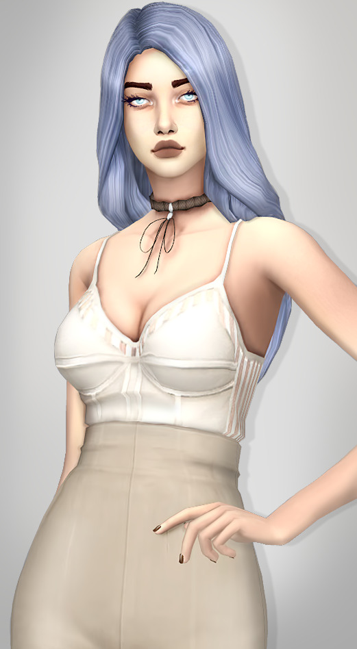
(つ >ω ・ )つ Here’s one of my very recent pics and it will show how I edit my pics on this present day.
Note: Both pics are done the same way. I don’t have Reshade. I use Aren&LLS CAS light overhaul (the neutral spot light) My CAS background is replaced with Solid gray color. I use in game camera. My editing is done with Photoshop and Topaz studio. And most importantly, I’m not a pro at all but a simple hobbyist (∩。・o・。)っ.゚☆。’`
1. I began by using my favorite color palettes as my inspiration. You see, I have some sort of strange obsession for colors. I get all giddy when I see perfect color combos/palettes (perfect for my taste that is). One of my top favorite color palettes are from Seeds design. I usually find them in Pinterest. I had a fascination to the “blueberry” palette so I went with it.

2. The outfit and necklace I found were perfect. But in order to get all the pieces match the palette closely, I had to recolor the hair and eyes and eyelashes. The colors weren’t exact, but good enough.
3. Once I took the CAS pictures of the model, I started removing the background. Usually I duplicate the picture so I have 2 of them. From the duplicate A I remove the background with magic Eraser tool or/and with polygonal lasso tool. Then I select the image A with the removed background to create a mask layer to the duplicated image B (which still has the background intact). This way I’ll still have the background which is only hidden with the mask. If I need to fix something later, the layer mask will always let me return to the original image.

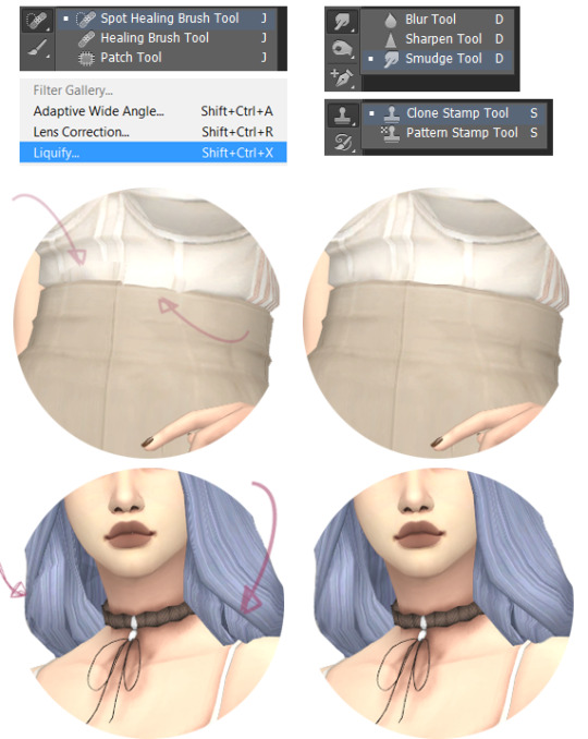
4. Next I’ll fix most of the little details that bother me such as sharp body parts, clipping, and other weird stuff. With regular paint brush, smudge tool, clone stamp brush, spot healing brush, and liquify tool. Below are the parts I fixed for these images. The waist had clipping issues, the hair had very odd shadows and clipping, there was hard edge on the cheek under the eye, odd mouth corner shadow, and straps of the top were deformed.

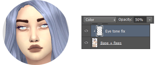
5. I also edited the eyes by making them stronger sky blue. I painted a dot of the selected color over the eyes and changed the layer mode to color. Also, later, I adjusted the strength of the new eye color to 50% opacity since it was way too strong. I realized I also needed to fix the eyelashes so I used a paint brush to paint thicker eyelashes and added some around the eyes, too.
6. Then I applied unsharp Mask with an amount of 90% + used the sharpen tool to slightly sharpen the eyes and brows by hand. Next I added topaz noise filter with strength of 0.04 (everything else default setting) BUT I used mask layer to remove the effect from the eyes, lashes, lips and other small areas which needed to stay sharp. Then I duplicated the layer to add more topaz noise onto the hair with strength 0.22. (keeping it only on the hair with mask layer) This was an exception to my editing process because this hair’s specific texture happened to have some irritating noise (like static hair strands all over, or something).
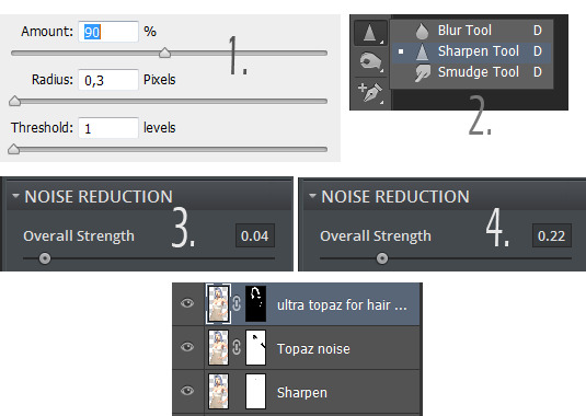
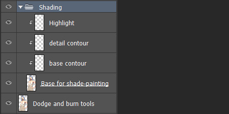
7. Then my favorite part of editing: shading! (if that’s what it’s called). As before, I duplicated a new layer of the previous finished step. On the new layer I used dodge and burn tools to get some stronger shadows and highlights. My burn tool is usually set to 50% or less, and I switch between the ranges depending how the tool affects the image. Also, I keep protect tones on most of the time. Same with Dodge tool. When I use these tools, I mostly avoid the skin, only touching it a bit, and mainly shade rest of the model.
7.5. Afterwards I use the method I learnt from Citrontart, but somewhat with my own way since I need more brush and layer control. So I create 3 layers and set them as clipping masks.
The first layer is set to 50% opacity and multiply mode. On that layer I paint the shadows with soft and large brush strokes.
The second layer is set to 60% and multiply mode. I paint with the same brush but make smaller, sharper and stronger shadows.
The third layer is set to 100% opacity and soft light mode. I paint with white brush gently on the areas I want to highlight. It’s almost unnoticeable to be honest.

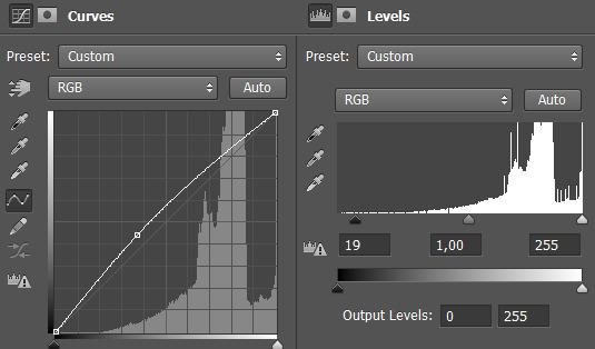
8. Lastly I add couple of adjustment layers. I did not feel like adding much for these pics since I was mostly content with what I had. So Curves and levels:
9. Oh, and of course, I quickly made a gradient background and added drop shadow effect behind the model.
(σ≧∀≦)σ Done and done. So, the finished results can be seen on the very top of this post
One thing for sure, I don’t do anything simply ¯\_(ツ)_/¯ I over complicate everything I do, lol. Well I hope this was helpful, or at least fun to see.
~Thanks for checking this out~!
#sorry for the super long post!#beforeandafter#before and after#the sims 4#ts4#myts4memories#beforeandafterseries
234 notes
·
View notes
Photo
The cost of JavaScript frameworks, LCH colors, and Tailwind CSS 1.3
#437 — April 22, 2020
Read on the Web
Frontend Focus
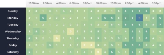
Inside a Dev's Mind: How To Plan Out a UI Feature — A look at how to approach building a new frontend feature in a thoughtful, considered way, based on one developer’s own thought process. It’s neat to see how he’d approach the task of building a basic heatmap (above).
Johannes Kettmann
The Cost of JavaScript Frameworks — Using data from the HTTP Archive, Tim explores the performance cost of using various popular frameworks as a starting point. Some good analysis here.
Tim Kadlec
Free Guide: 6 Steps to Improving Your Embedded Analytics UX — You don't have to be a UI/UX designer to create impressive dashboards for your application. Use these 6 principles to enhance your application’s analytics and delight your end-users.
Logi Analytics sponsor
LCH Colors in CSS: What, Why, and How? — An introduction to LCH colors (Lightness, Chroma, Hue), a new feature in CSS, which Lea refers to as a “game changer”. There’s a related LCH color picker tool too.
Lea Verou
▶ 'We've Ruined The Web. Here's How We Fix It.' — An interesting hour-long chat with Jeremy Keith, a ‘philosopher of the internet’, on the imbalances found in the modern the web:
"All the evidence staring us in the face is that faster websites will make you more money – yet for some reason, that’s just ignored in favor of weirdly prioritized stuff."
Gerry McGovern podcast
Version 1.3.0 of Tailwind CSS Is Here — We've linked to this popular utility-first CSS framework a fair few times over the years and it continues to improve. This latest release brings with it declarative layout utilities, transition-delay support, font-size/line-height pairings and more.
Tailwind CSS
💻 Jobs
Frontend Developer at X-Team (Remote) — Join the most energizing community for developers. Work from anywhere with the world's leading brands.
X-Team
Find a Job Through Vettery — Vettery specializes in tech roles and is completely free for job seekers. Create a profile to get started.
Vettery
ℹ️ Interested in running a job listing in Frontend Focus? There's more info here.
📙 News, Tutorials & Opinion
13 Places to Find Front-End Challenges — “My favorite way to level up as a front-end developer is to do the work. Literally just build websites,” says Chris Coyier. If you’re short of ideas on how to level up, these other sites will help.
Chris Coyier
Listboxes vs. Dropdown Lists — An in-depth look at the advantages and disadvantages of using two HTML form components, one much more common than the other.
Anna Kaley
📅 All Day Hey! Live: An Online Conference for Designers & Frontend Devs — This all-day conf is now fully digital, and will be live-streamed early next month. The lineup is looking good, with speakers from Netlify, Smashing Magazine, and Microsoft to name a few. Tickets are affordable, and those currently out of work can attend for free.
Hey!
Creating Morphing Animations with CSS clip-path — Learn how to implement morphing, a technique for transforming one appearance into another, using CSS.
Mikael Ainalem
Pseudo-Randomly Adding Illustrations with CSS — Eric’s personal site has recently been redesigned, bringing with it a collection of Japanese illustrations - used to add a bit of flourish and decoration between bodies of text. Here’s how Eric got one of the set of illustrations to display at random with just CSS (no PHP or JavaScript here).
Eric Meyer
Try It for Free: The Perfect Partner to MongoDB Atlas — Use MongoDB Atlas? Try the perfect partner for it. Save hours with our GUI & unlock the power you need, with Studio 3T.
Studio 3T sponsor
Wes Bos Shares His Personal Site's Stack — Always nice to see folks update a personal site (more of this please!). Here’s how Wes Bos moved away from WordPress over to a Gatsby set up.
Wes Bos
Minimum Viable Dark Mode — How to create a ‘quick and dirty’ dark mode for simple apps/sites using pure CSS.
Chase McCoy
Re-creating a Macintosh with Gradients and Box-shadows — Sarah runs through a quick explanation of how they created an original Macintosh using CSS.
Sarah L. Fossheim
Are You using SVG Favicons Yet? A Guide for Modern Browsers
Antoine Boulanger
🔧 Code, Tools and Resources
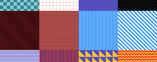
patern.css: Fill Empty Background with Beautiful Patterns — A neat collection of CSS-only backgrounds. You can see them in action on the demo site.
Jiten Bansal
Good Email Code: A Library and Guide for Writing HTML Email — This seems to be in early development but contains some snippets with explanations for cross-browser HTML email code.
Mark Robbins
Isomorphic Layout Composer — An SSR layout service that composes a web page from fragment services.
Namecheap
Poolors: Generate Unique Color Palettes — This generates deep-linked color combos not often used by developers. Not sure how they determine least-used, but the example combos are indeed interesting and not-so-common.
poolors
by via Frontend Focus https://ift.tt/3axyWjQ
0 notes
Text
12+ Best Sports Team Logos to Quickly Make Online
Create a logo for a champion team. Check out this collection of high-quality templates from Placeit and Envato Elements.
The new sports season is just around the corner, but you still need a new logo. So find a quality design you can customize easily with online logo makers.
Are you ready to rule the competition with your epic sports logos? Just choose the mascot, color, and text design in a few simple steps!
13 Best Sports Team Logos to Quickly Customize Online
Whether you're creating a new sports team logo for little league groups or adult teams, your fans are ready to rally behind an inspiring lineup. Discover the perfect symbol to match your team spirit with Placeit's Sports Logo Tool.
Placeit Logo Tool
New to logo design? No problem! Placeit's smart logo maker pairs creative badges with awesome text and colors for a complete logo design.
Aggressive Animals Logo Template
Let's start with this Aggressive Animals logo template. Packed with dozens of creative animal mascots, this template makes it easy to change the original Oregon Grizzlys logo to something more ferocious.
In this case, I stuck with the brilliant blue color palette but changed the accent color to aqua. After just a few more edits to the main and subtitle texts, here is my revised design, the Milwaukee Hounds.
See how simple that was? Let's check out a few more you can quickly customize!
Basketball Team Logo With Wolf Icon
Howl at your competition with a winning logo. This awesome basketball logo features a wolf icon design that is stunning and clean. Browse additional basketball icons to pick from characters like tigers, grizzly bears, and more. It's a truly stunning design that is easy to set up!
Baseball Logo Maker With Dinosaur Clipart
Or create the perfect dinosaur mascot for your kid's baseball team! This baseball logo maker features colorful clipart you can easily customize with more adorable characters. Need something more basic? Just replace the mascot with a simple baseball and bat combo instead.
Dragon Gaming Logo Maker
The sports arena of the 21st century belongs to online gaming. And you can create an epic team logo with this dragon gaming logo maker. Customize the background with a gradient or vignette, and update the color scheme to match your new brand.
Soccer Logo Maker
Would you call this a football or soccer ball? No matter where you're from, you can easily update this logo to fit your local team's preferences. Replace the colors with exciting new ones, and then download this logo in minutes! Try out various soccer ball symbols to get the most out of this template.
Fantasy Creatures - Gaming Team Logo
In the competitive arena of eSports, will you come out on top? Intimidate your rivals with a menacing logo from this fantasy creature set. Choose from various popular creatures like monsters, vampires, and skulls. Great for Halloween themes or sports all year round. Check it out!
Human Characters Sports Team Logo
Would you prefer a human character as a logo instead? Then give this amazing set of creative human sports team logos a shot. Explore dozens of well-designed characters from pirates to knights, and even cowboys. Get inspired by this awesome set!
Sports Logo Templates From Envato Elements
Want even more variety? For one monthly fee, you can subscribe to Envato Elements and get access to unlimited design asset downloads, including exceptional sports team logos.
Since these templates are created with the industry-standard Adobe Illustrator software, they'll easily transfer from computer to print with absolutely no hassle.
Here are a few of our favorites.
Wolf Sports Logo
Mix and match your favorite colors to customize this epic wolf sports logo. A 100% vector logo file, this template is easy to edit with Adobe Illustrator. Enjoy additional documentation included to help you pair it with the right fonts. Great for outside and indoor sports!
Spike Sport and eSports Logos
Next up is the epic Moardam logo. Easily replace the team name in only minutes to preview this design fast. Get access to well-organized files and exceptional design quality in one amazing download. Give it a try today!
Spartan Sports Logo
Or claim your next victory with this strong Spartan sports logo. This versatile logo can be used for sports team logos or for your official apparel brand. Sell online merchandise and build a massive sports gear identity with this awesome design. Check it out!
Medalion Sport and Esports Logo
There's nothing more dominating than an impressive lion logo. The incredible Medalion logo is great for sports teams online and off. Included in this download are both AI and EPS files for efficient logo customization. Also included is additional font information.
Warriors Basketball Team Logo Template
Sometimes, logos only need symbols with the official sport icons you'll be playing. That's why this Warriors basketball logo is perfect for a minimalist sports-themed design. Switch out the accent colors to one you prefer for a complete logo package. You'll love this one!
Bulls Team Mascot & eSport Logo
Bulls are common logo symbols in sports because of their immense strength and power. So dominate your sport with this bulls team mascot and logo template. Enjoy an easy-to-use Illustrator logo template that is fully editable and reliable. Try it out on apparel, stationery, and more.
Conclusion
A logo design says a lot about your team. So what energy will you be putting out? Try these exceptional competitive logos to bring out the best in your team or league. Explore more creative options from Placeit to find additional great designs.
Interested in logo design? Check out these articles:
Adobe Illustrator
New Course: Mastering Logo Design in Adobe Illustrator
Andrew Blackman
Branding
25 Premium Abstract Logo Designs
Melody Nieves
And let us know your favorites from this selection in the comments!
This has been a collection of resources hand-picked from Placeit and Envato Elements. For more sports logo templates, check out Envato Market. Happy designing!
from Envato Tuts+ Design & Illustration https://ift.tt/2IodqS8 via http://www.webmasterforum.ws/rankwyz-discount-code-2015-coupons/
0 notes
Last Seen Blogs
inhan---inhan
InHan
marienhoffecher-blog
MARIENHOF Fecher
holycrapraewth
this is just crap lol

leyunyaokong
Selfila Hexagon Splicing RGB Lights

hothothotmen
Untitled