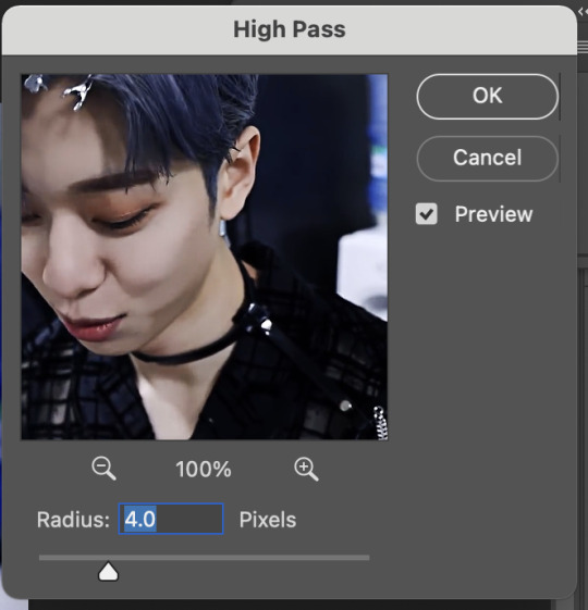
#these feel... a little bit oversharpened ?
Text


rome gifs [1/?]
#hbo rome#rome hbo#romeedit#marcus brutus#learning to gif so i can have some nice rome sets on my page....#of course i start with him LMAO#these feel... a little bit oversharpened ?#idk#not experienced enough to know :(#*mine
351 notes
·
View notes
Note
🦋 - hi! If u can't recall, I was the anon who asked you about gifmaking before.
I know some of the raw videos of jannik/tennis in general may or may not have good video resolution. But your end-result of your gifs are usually sharpened but not that grainy either. How do you usually adjust your gifs' adjustments when it comes to low quality videos? Bcs your gifset tends to be in 540px wide, so it makes me wonder as well how you retain/enhance the quality of the gifs. I hope I delivered my question well 😂
i remember u omg hiiii! now i may have gone a little overboard on details here under the cut but i suppose you’ll appreciate it anyway haha
disclaimer, for a lot of these settings, i can’t remember where i first found them but i had seen them used in gif tutorials when i was just learning how to make them. i’ve basically stuck with these ever since!
so join me as i go through the process of making this jannik gif (exclusive content, never before seen on my blog, etc etc):

okay so first of all, ofc as much as possible i try to get the best quality version even if the video itself is bad. like, if it’s on streaming i would screen record but otherwise i try to download the original file. it makes the end result much better imo
i generally go for 540px width bc i read somewhere that that’s the ideal size for tumblr gifs. if the cropped video is smaller than that or needs to be portrait oriented, i would usually just put two gifs side by side (like in this gifset) bc it’s better than trying to resize it bigger
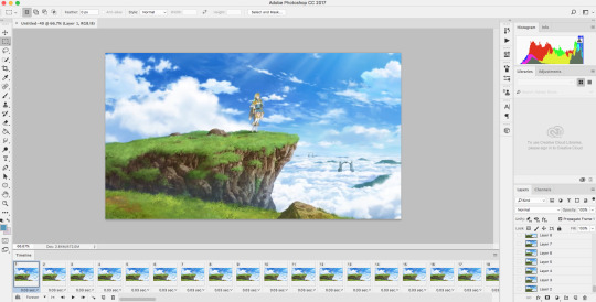
but when a source video is around 720p, i can generally work with it! so here’s a sample that i trimmed from a fairly low quality jannik video from youtube. he's presumably on webcam here, which explains the bluriness
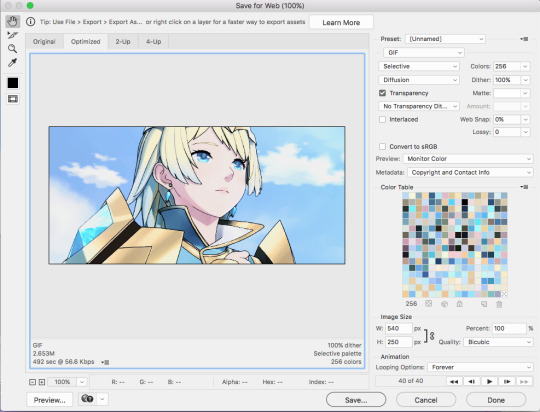
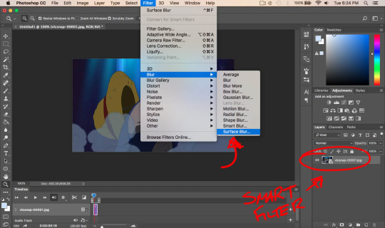
i loaded it in using video frames as layers. this pic shows it already cropped on my photoshop, with a frame delay set to 0.08 (my personal default, which i realized after everything was saved was still too fast for my liking but oh well i’m not redoing it):
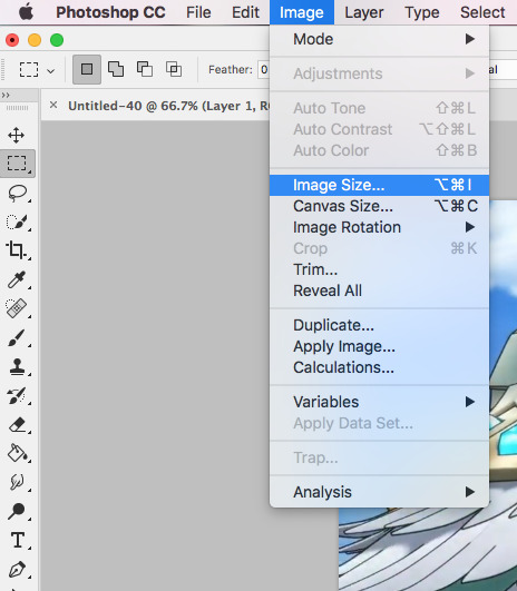
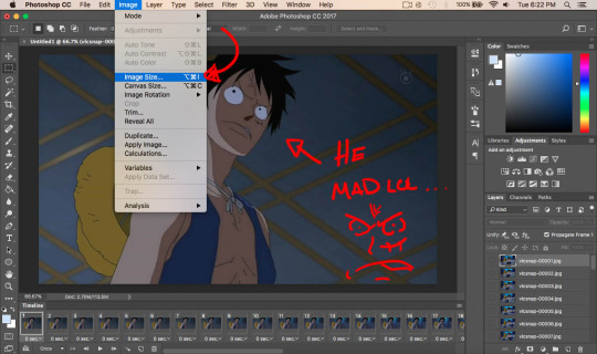
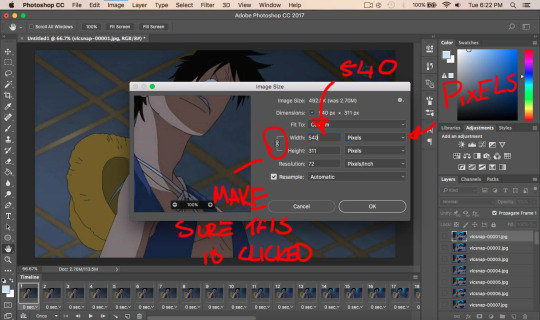
as you can see on the bottom left corner, it still has a width slightly over 540px. so then i can proceed with the next step: resizing. what i do is go to the image tab and select image resizing, which brings up this window:
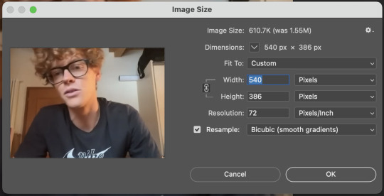
i change only the width to what i want (in this case 540px) and i use bicubic (smooth gradients) resampling
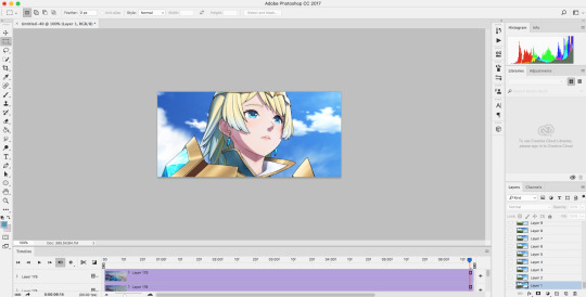
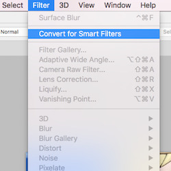
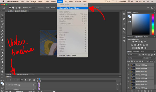
when that’s done, i convert to video timeline on the timeline window. then i select all the layers on the layers window and convert into smart object
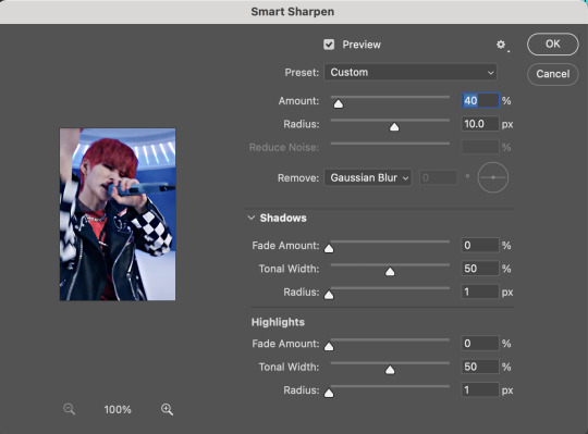
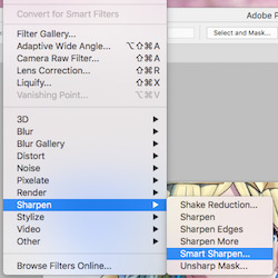
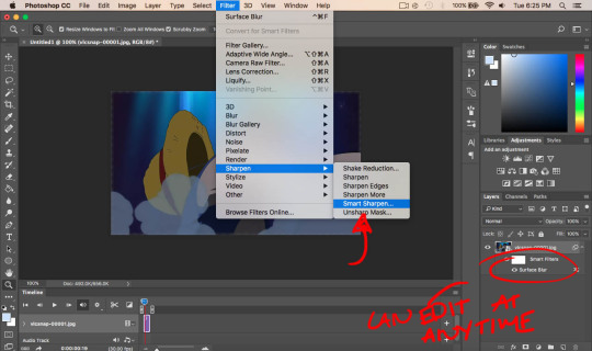
now we can move on to sharpening! under the filter tab, i select sharpen and then smart sharpen. that gets this window to open up:
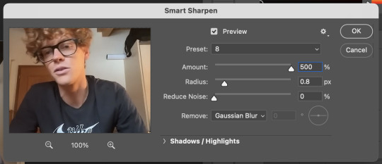
my presets have the amount at 500%, reduce noise at 0%, and remove gaussian blur. as for the radius, that depends on the video. by default i have it set to 0.5px, but i change it as needed. in this case, since it’s a close-up of jannik’s face, i feel comfortable using 0.8px (my highest setting). usually, if the video is shot from afar, i use something lower like 0.3px or 0.4px. i tend to find that oversharpening some really blurry videos makes them look worse, so i prefer to keep it looking a bit blurry if i really have to. thankfully, in our case right now jannik looks fine with high sharpening!
then i adjust the color and lighting as i wish. i would say that creating more contrast between the black and white levels of the gif helps it to appear sharper! though personally, i just like having more vibrant and contrast-y gifs so yeah
the final important thing happens when i save it. here are my settings in the save for web window:
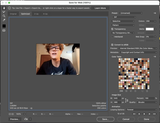
i set max colors to 256, color reduction to selective, and dither to pattern. the last bit there is what i think is most important for keeping my gifs looking non-grainy! i looooove pattern dither, and i find that the other settings do make my gifs look more grainy so i never use them
and that’s it!! this is the process i use for all my gifs tbh, the main thing i play with for low quality ones is cropping and resizing + the smart sharpening radius
hope this helps 🫶
#theres also smth abt MB sizes and whether or not tumblr will compress a gif further based on that which probably affects the quality too#but i didnt rly. pay attention to it LMAO sometimes u just cant make certain gifs any smaller yknow#asks#anon#*#*gifs#<- sorta????
5 notes
·
View notes
Note
how do you make your gifs so HD
my dream ask tbh i'm glad u think they look HD 😭 there are a few steps i take to try and make my gifs "pop" that i'm happy to share with you. one thing to keep in mind is that not every setting will work in the same way for every gif, it largely depends on the original file and the size of the gif, so if you want any specific settings / layers / filters or even full psds for any specific gifsets, feel free to let me know and i'll pull what i did for that one in particular. but in general, my go-to steps for trying (and i rly mean trying - i know it doesn't always work out haha) to make my gifs look high quality includes some coloring and sharpening tricks that i'll throw below the cut.
⏤ boost your blacks - i do this in selective color by going to the blacks channel and increasing the last slider anywhere between +5 and like, +60 depending on the original video. this boosts up contrast and adds depth and i swear by it.
⏤ my current sharpening settings are most often a combo of unsharp mask + high pass as indicated by the below settings in photoshop (sometimes for bigger gifs i will use high pass on overlay instead of soft light, but i find that usually makes it too sharp for my particular taste unless i'm working with hq closeups, so play around and see what works and what you like!). for stage gifs, i also use the denoise and finesharp in vapoursynth each on the lowest setting before importing to ps. here is my usual for high pass:

sometimes, high pass doesn't look good to me for the particular set, so instead i'll use my usual unsharp mask settings and the following smart sharpen. here is my usual unsharp mask, + what i'd use for smart sharpen:
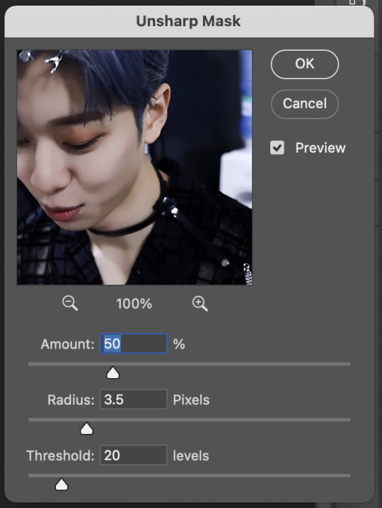
but this also depends on the video i'm starting with so the 'amount' may be anywhere between 10-50% for smart sharpen, or 30-75% for unsharp, again playing around is key!
⏤ in general i try to work with high quality videos, 1080p or above. for any big gifs (540x400+) 4k is really the way to go, but when i want to make big gifs with lower quality videos and it's looking a little pixely, my go-to is oversharpen a little bit and then add some noise to compensate
⏤ there are also other coloring tricks and adjustment layers that i think probably support more of an HD look, but i guess it really depends on exactly the style you are going for and everyone has their own ways of accomplishing what they like. so again if there's any specific set you really want all the details on, just let me know and i'm more than happy to grab it for you. i hope this helps !! <3
4 notes
·
View notes
Note
Hi! Your gifs look super crisp and high quality, especially the little gridded effect makes them look so good! Do you have some tips on how you make them so beautiful? Hope you have a nice day!
hiii! thank you so much for your kind words, we're glad that you like our gifs ♡ most importantly, we always use 1080p or higher quality videos to make our gifs!
for other tips i can give you; do not oversharpen/blur bc oversharpening etc will make your gifs look more grainy; do not overcolor because if you use bunch of colors ps makes it look extremely grainy when you save it for web, don't use so many layers when you're coloring but of course feel free to experiment with ps tools! for me if a gif looks too grainy for my liking i always use textures/overlays to cover it :)
that's all i can think about right now, hope it helps a little bit :)
18 notes
·
View notes
Note
i’ve never made gifs before and i have absolutely no idea where to start T-T can you share your process or is that top secret lol? and dw i’m not using you instead of google lol it’s just i’m very picky about what looks good and your gifs have such a nice frame rate and sharpness and stuff so i was wondering how you go about making them (i have photoshop which i’ve heard is what most people use i think? idk) sorry if you get this question all the time feel free to ignore!
hi!! dont worry i had no idea where to start either and it took me a while and looking at several tutorials to figure out what i was doing cus its unfortunately not something u can just google and find all the steps to lol,, but anyway no my process is definitely not top secret!! i think most people use mostly the same process and then things like sharpening + coloring are all about personal preference! but heres some things that might help u out!! 🥺
heres a couple tutorials that could help u get the hang of the actual technical process and steps of converting a video file to a gif which for most people is about the same, kookyjin’s tutorial, sugajimin’s tutorial
you don’t have to use vapoursynth but it does make the process a little easier by cropping and resizing the video for u, and it also has a denoise filter which will make your gifs look smoother, it can be a little tricky to install but heres the link for that
as for my personal way of sharpening i use smart sharpen, and sometimes unsharp mask if i want it just a little bit sharper. the basic sharpening for tumblr gifs is 500% at 0.3px, but u can use more or less depending on the quality of the video. lower quality videos (like youtube videos) usually cant take more sharpening before they start to look oversharpened so u can lower it to 0.2px. but for things like my music video gifsets where the source video file im using is higher quality and hasnt been compressed the way youtube videos are (i get them from other websites where people have access to higher quality versions of the mv), for those i’ll often use 0.4 or even 0.5px, so it really depends! i also sometimes change the opacity of the sharpening filter to fine tune it a bit more. what i like to do lately is start off at an amount thats like obviously too much and oversharpened, and then gradually work my way down until i think it looks ok! i think its just something you have to build up a sense for over time :] but yea those r just some tips
as for coloring, its even more up to personal preference than sharpening is! i personally like a really natural coloring that just brings out the colors that were already in the video. so i cant give tips about other coloring styles but if u like mine id say the most important thing is creating contrast. and the best layers ive found to do so is with levels and curves. i ALWAYS start my coloring with a levels layer and darken the shadows and brighten the highlights as much as i think looks natural. this creates a good base to make the rest of the coloring on, gets rid of the “gray cast” (you’ll notice it if you click the little eye next to the levels layer and turn it on and off and see the difference with and without it), and makes the colors in the gif look more vibrant and saturated without actually using a vibrance saturation layer. i rarely ever use a vibrance saturation layer and if i do its actually to lower the saturation. after a levels layer ive been using (in order) two curves layers (its kinda hard to explain how to use those u just have to mess around with it until it does what u want), a brightness contrast layer, an exposure layer, sometimes a selective color layer (just to darken the blacks a little which is another good way to create contrast), and a gradient layer at about 10% opacity of just the white to black one to add a little bit more contrast :)
for frame rate i also prefer it to look natural and almost as fast as the original video. i will usually do 0.01 seconds above what the frame rate was when i originally imported the frames. so for 25 fps videos i would use 0.05, for 30 fps 0.04, and 60 fps 0.03
i hope all of that made sense and u find at least some of it helpful🥺 if u have any questions please feel free to send me another ask id be happy to answer!! even if u think it might be a dumb question i probably had it too at some point and might be able to help<33 good luck i promise giffing is really fun n worth sticking thru the first little bit of confusion!! ^_^
#mail#gif help#oh and yes photoshop is what most people use i think there might be alternatives out there but everything i said here is about photoshop!
10 notes
·
View notes
Note
hi! sorry if this is a bit out of nowhere but i love your gifs! they're so clear and crisp! and i was just wondering if you had any tips on how to achieve the quality that your gifs manage to have?
ooh thank you so much. nonnie! i’ll leave some tips under the cut. if you’re ever interested in a full tutorial, please lmk! i always thought about doing one, but there are already 5 million on this site... but so many are different from each other, so hey, who could it hurt. anyways here’s some stuff i thought of :)
1. ALWAYS use 1080p. Others say 720p or 1080p, but I don’t think i’ve ever used 720p unless the show/movie is literally not available in 1080p. you can see the difference! i’ve used 2160p as well, but that’s not necessary at all, and you’ll only find that on much newer stuff.... besides, 1. most computer monitors/phone screens only go up to 1080p anyway, and 2. once you resize the gifs to tumblr dimensions, there is literally no difference between those two)
2. know your sharpen settings! for me, it’s almost always .3 radius, 500%, gaussian blur & more accurate. however, once in a while, this can change, depending on the camera used when filming the show/movie (i.e. an indie film with a lower quality cam) or the quality of the file itself. for example, for my recent set here, i had to do that setting, and then an extra, lighter smart sharpen layer on top of that, because it still wasn’t crisp enough, due to the lower-budget camera quality. ALSO: PLEASEEEE DON’T OVERSHARPEN! equally, don’t skip sharpening. it is probably the base essential component, and your gifs will look amateur if you don’t have it, no matter how good you are at coloring :)
3. don’t be afraid to experiment. even if you think something will be too dark, too bright, too dull, too vibrant... try it! every show/movie is vastly different to color and edit, so always try out new things. ALSO a really good method is to upload the gifs you made into a new post, and save it as a draft. this will show exactly what the gifs will look like when posted, which is always quite different than what you see in your photoshop workspace. this will allow you to know your gifs are at the quality you want before posting
4. always upload every frame of a recording. don’t only capture every other frame, and definitely don’t skip two or more frames in between. this makes the gif jerky and definitely seem lower quality. i see this a lot with newer gifmakers. just use every frame, and make the giffed clip shorter if it’s over the size limit! better to have a smoother, shorter gif than a long, jerky one, any day. ((some people may argue that deleting every other frame doesn’t make a difference, but if you want a smooth gif... trust me, it does).
5. 98% of the time, my time delay between frames is .05. a lot of people say .06, but i find this a bit too slow, unless the gif is very small, in which case the frames move faster, so they need a slower delay (idk the logic okay just work with me!!). also, i’ve noticed a trend (esp in the pale community, even though i’m not a part of it anymore), is to put a lower frame delay, so the clip moves really quickly. i don’t like this personally, as i find it super distracting to watch gifs move at a fast forward pace, but it’s your choice. .05, i’ve found, moves closest to the natural pace of the source material, if not the TEEEEEENIEST bit slower, but in a very nice, natural way, and barely noticeable at all (.04 is just too fast imo).
6. this one is a complete and total preference thing, and you don’t at all need to follow it. but if you’d like an insight into how i like to make my gifs... i always like the coloring of the gif to be naturalistic and just slightly bright. meaning: i don’t make my gifs overly vibrant, i like to keep my colors natural. this isn’t to say i don’t change the coloring up from the original scene - if a someone is lit very blue, or red, or too much of any color, i like to try to adjust the colors so their natural skin tone shines through more. if a scene is extremely pale, i like to bring up the vibrance a bit - not unnaturally so, but so there is more color tone to look at. and in terms of the ‘slightly bright’ part, i like to up my exposure/levels/curves/brightness (the combos of those four change with every set... some gifs look Bad with adjusted levels, some look washed out with higher exposure, etc) so it pops a little bit more on the dash. again, not in an unnatural way.
7. in #6, remember when i said if something is lit too much of a certain color, i like to try to get natural skin tones back (if it’s a shot of a person)? sometimes, this isn’t possible. in this case, embrace your colors! for example, if a scene takes place in a darkroom with the intense red light on, your not getting any skin tone out of that... so embrace those reds! up the vibrance a bit, get your red selective color layer out, make the red pop. it’ll look lovely in a set!
8. very similarly, if a scene is extremely dark, a lot of the time it will diminish the quality if you try to brighten the whole thing up. embrace those darks, while finding the light areas to bring up. for example, that same gifset i linked above. there is a gif in there where he is standing in complete darkness, with only one side of his face lit up. not only is this a symbolic shot and there is a reason for one half of his face being in darkness, even if you did try to brighten the whole thing, alllll of that black space will become gross and pixel-y, and the light spots on his face will be overexposed. instead, what i did was take that black space and make it even blacker, while using curves to keep that area dark and bring up the brightness in his face, which gives it a lovely contrasting effect. i love this look in gifs... dark vs. light!! embrace what the scene gives you!
9. this may be obvious, but know tumblr’s dimensions. if you upload a gif at the wrong size, it will either shrink or stretch it, completely ruining the quality. (my most used dimensions are 540px for single gifs rows, and 268px for double gif rows)
10. always put a final BLACK selective color layer at the end of your layers, and up the blacks slightly until they are True Black. this will make sure everything has a good level of contrast, and appear as smooth and hq as possible!
hmmmmm i think this is all i can think of for now.... there is some other more subjective stuff as well i guess, but most of it doesn’t have to do with gid “quality” or “crispness”, so they’re prob beside the point. these are the important points i can think of. if you need anymore specific help, feel free to shoot me another ask/message!
28 notes
·
View notes
Text
Hello dear Warriors!
I‘ve been following this Blog for a while now and really appreciate your work guys! Keep it up! :)
Now I feel like I can finally contribute something useful to the community.
I love the new song and video of „Animal“ (just as much as anything else from aurora), and would like to share some information about the Chinese/Japanese characters (I think aurora told somewhere she studies Japanese, and some time ago she also posted the picture of a bird, commenting „tori“, which means bird in Japanese, so I am sure she knows the vocabulary she uses, and it is not random). Anyway, here it goes, to the best of my knowledge:
First, around 1:29 there is a symbol on the wall, 塩, if I see it correctly (it’s a little blurry), which commonly translates to „salt“, which is shown shortly after her kissing/biting the man and licking the mirror.
Then, around 1:42 she enters the corridor, which leads to the dancing club, and under the number 908 a red symbol appears that reads 好, which usually translates to „being fond of“ or „loving“ (not the noun „love“, which would be 愛 instead, so I think she wants to convey feeling of „desire“, a rather selfish concept maybe, instead of the idea of something like „(pure) Love“ between people maybe?
Also when she posted the countdown to animal, at 30 minutes the used this character ㊙️, which translates to „secret“.
I have not seen any other Chinese characters, so in case I missed them, feel free to tell me.
Have a nice day everyone and enjoy Aurora! :)
Thank you very much, Darlene, for your submission, it was very cognitive and interesting to know such peculiarities in meanings (as someone who admires learning languages, I’m just in awe with all of this information *_*) and pretty much applicable to the theme of the songs and video! Dear warrior, you’re truly amazing! And, surely, she conveys the knowledge she gains in one or another form, so learning a language and not applying it somewhere wouldn’t be in her nature either, imo.
Let’s make this more pictorial for the followers as well!
“First, around 1:29 there is a symbol on the wall, 塩, if I see it correctly (it’s a little blurry), which commonly translates to „salt“, which is shown shortly after her kissing/biting the man and licking the mirror.“
I think you meant this one in that scene and it was actually on the door, right? (I oversharpened here on purpose and changed colours a bit)
Also talking about the mirror: every time we see in a reflection this character:

But I can guess it reads like this:

Do you happen to know what it means?
“Then, around 1:42 she enters the corridor, which leads to the dancing club, and under the number 908 a red symbol appears that reads 好, which usually translates to „being fond of“ or „loving“ (not the noun „love“, which would be 愛 instead, so I think she wants to convey feeling of „desire“, a rather selfish concept maybe, instead of the idea of something like „(pure) Love“ between people maybe?“

It’s about this one. It’s an interesting digging about the meanings. Considering the overall context and the fact that in this corridor the couples were kissing, we can surely say that she wanted to convey the feeling of desire / lust aka that rather selfish concept, like you’ve said. But here’s also the question: do you know what does number 908 mean in rather Chinese or Japanese culture? I read somewhere that in numerology it’s a so-called “angel number” that conveys a message about an ending cycle “but that we should not be afraid as when one door closes, another will open". So, guys, if any of you know about this moment, please, let us know!
Also we have this interesting sign when she enters there as well:

Also about that corridor - we can see such character as well, do you happen to know what it means as well?

Thank you so much again and for following and appreciating our work here, have a great day as well and don’t hesitate to tell more, if you know!
- Nikol
50 notes
·
View notes
Photo

How to make a GIF
I’m using Photoshop CC 2017 (though any Photoshop version will do)
Time used: Less than an hour
Difficulty: Easy
Note that I’m using a Mac, so the PC interface will look different!
Firstly, download the episode or video. Try not to download any videos from Youtube as it tends to kill the quality of videos. Also, try to find videos that are 1080p. 720p is okay, but it may not look good in some cases. If it’s any lower, your gif will likely look bad.
Once you got that down, let’s get into the actual gif making:
First, go to File > Import > Video Frames to Layers
Note that this only works if your video is .mp4!
It’ll bring you to a window that looks like this:

Select the part you want to gif using the arrows I’ve circled above. Always select a little before, and a little after the part you want to gif. Next, click on Limit to Every 2 Frames.
Next, it should bring you to a window that looks like this:
You might have extra frames you don’t want in your gif, so just hold shift + click the frame you don’t want (this selects all the frames you don’t need) and drag it to the trash.
Resizing
Go to Image > Image size
And it should bring you to a window like this:

Gif dimensions
If there’s just only one gif, make your width dimensions 540px. If there are two, make your width dimensions 268px. If there are three, make your two outside gifs’ width dimensions 177px, and the middle gif 178px. The height doesn’t matter. This is really important so your gifs won’t look bad.
Since I’m making a single gif, I’ll be making the width 540px. Also, do you notice the Resample part when resizing your image? I tend to use Bilinear, although sometimes I use Bicubic (smooth gradients). It’s really just a matter of preference, so use whatever you like. I recommend playing with the resample settings a bit to see what you like best.
Let’s move on to the frame delay!
Select all your frames (hold shift + click the very last frame) and click on the number that says 0.03 sec or something similar. It’ll bring you to something that looks like this:

Click on other, and set your frame delay to whatever you like. Personally, I think that 0.03 sec is too fast, so I generally set it to 0.07 sec. This really depends on what you think looks best. But never set it to something more that 0.1 sec, or else your gif will look extremely choppy and really bad overall.
Sharpening the gif
Next, click the video timeline button (it’s this guy right here)

It’ll bring you to a page that looks like this:
Select all the layers over here (hold shift + click the last layer)

And go to Filter > Convert for Smart Filters
This converts your layers into a smart object. Now (almost) all the options in the filter tab should be available.
Next, go to Filter > Sharpen > Smart Sharpen
It should bring you to a window that looks like this:

These are typically my settings, but feel free to adjust anything depending on your preference! But please do not oversharpen your gif! When it’s oversharpened, your gif starts to form a white line, making it look Very Bad 🅿️lease Don’t Do This:

I also like to set my sharpening settings to Darken. This way, the lines tend to look a lot cleaner.
Double click this little circled guy:

It brings you to a window like this:

Click on Mode > Darken. Of course, the darkening method is optional, I just like to do it since your lines would look smoother!
Surface blur
In some cases, surface blur is optional. I wouldn’t use surface blur when there is a lot of detail in your scene, since blurring it would take it all out. I almost always use surface blur when giffing anime, but I almost never use it when giffing video games or movies.
To use surface blur, go to Filter > Blur > Surface Blur
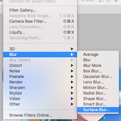
It’ll bring you to a window like this:
^ These are usually my settings, but as always, feel free to change it however you see fit. But don’t overuse this setting, since too much detail would be taken away.
Gif coloring
Coloring is a difficult topic to explain since every gif has different colors and every person has a different style.
Generally, I would start with a layer of curves. Go to Layer > New Adjustment Layer > Curves. I pretty much always use auto curves.
After that, I go to Brightness/Contrast. Go to Layer > New Adjustment Layer > Brightness/Contrast. Depending on the scene, your adjustments might be different. I try not to turn up the brightness since (almost) every gif is already bright, but in some cases, it’s necessary to turn it up (but only by a little bit!).
^ Those are the two layers I normally start with. Then I adjust all the colors manually depending on what look I’m going for. These are the adjustment layers I use the most:

I’m not going to write out all the steps since it would be very long. I might make another tutorial later for coloring gifs, though, so keep an eye out!
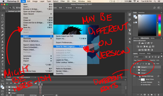
After you get your coloring done, it’s time to export!
Go to File > Export > Save for Web (Legacy). It should bring you to a page that looks like this:
Don’t forget to change your looping options to forever!

Now, do you see this part?
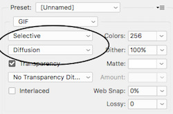
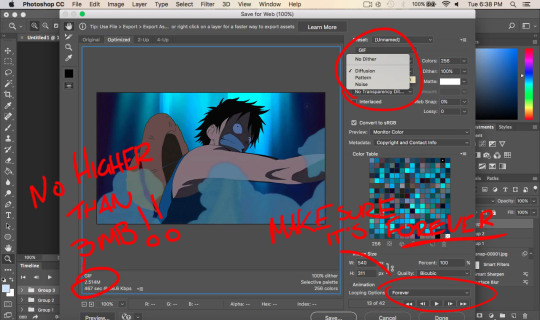
Since gifs can only have 256 colors, these are different color algorithms you can have for your gifs. Selective tends to create broader areas of colors. Adaptive creates colors by sampling colors most used in the image. These two are the options I use most (though I tend to use selective more). Next is the dithering algorithm. Diffusion randomizes the colors in adjacent pixels. Pattern creates a half-tone square pattern.
These settings really just depends on the scene. If you notice blobs, play around with the settings a bit until you find the one that works best. For beginners, adaptive and pattern is widely used and highly recommended.
Also! Make sure that your gif is under 3M! Don’t go any higher than 3M or else your gif won’t play when uploading it on Tumblr!
After you’re finished, save and you’re done!
Final product:

#gif tutorial#itsphotoshop#yeahps#chaoticresources#quirkyresources#peachresources#mine#mine:tutorial#if you need anything clarified lmk anon!#hoo this took the whole day
156 notes
·
View notes
Text
Gif Tutorial!
Since I’m sure some of you are wondering how to make some nice gifs (and since I’ve seen a few people want one), I’ve made a gif tutorial! It’s really, really long and that’s probably because I do it an inefficient way but hey it works. So let’s get started!
Before starting off, the programs that I use are VLC and Photoshop CC 17. I’m also using a mac so some things will be found via different means. You don’t have to have the exact version be be aware that some things may be placed just a little differently depending on the version.
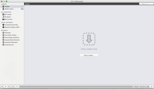
Starting off, once you have VLC, open it up and it should look something like this:
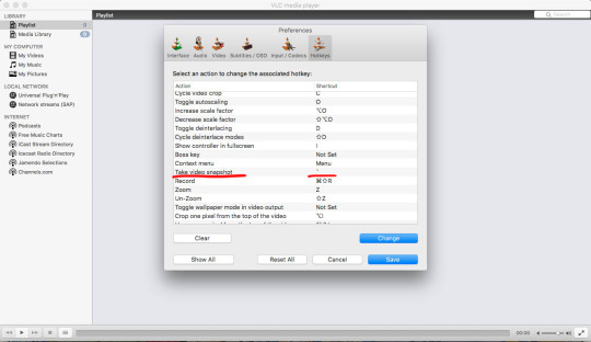
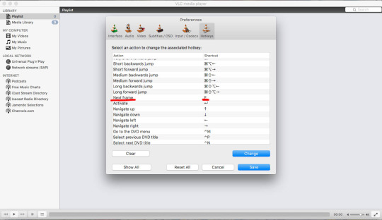
You want to go to preferences located towards the top left hang corner after clicking VLC (in bold). Something like this should then pop up:
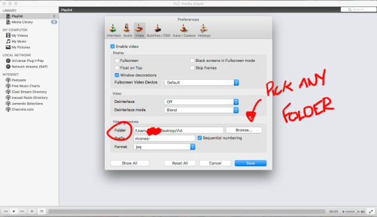
Click onto the ‘Video’ tab and select where you want your frames to be saved. Next move onto the ‘Hotkeys’ tab and find ‘Take video snapshot’ and ‘Next Frame’, setting them to which ever keys you like. Mine are set to E and ` (for no particular reason)
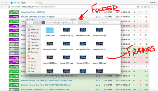
When making a gif, you’ll obviously need to have a file of whatever you wish to gif (since I’m an OP blog I’ll stick to using OP as an example). The website to torrent these from is nyaa.si. This is what it looks like:

(Me being the horrible OP nerd that I am have all episodes and movies downloaded....)
Once you have the desired episode you want, open it up in VLC.

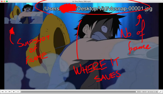
Once you reach the part you want to gif, click your ‘Take video snapshot’ hotkey. This is what should appear once you do so:
Next, you’ll have to click your ‘Next Frame’ hotkey and go through all the frames, snapshotting the ones you desire. I know it’s a really long and tedious process, especially if you’re doing large gif sets but it helps in the long run. Chuck on some tunes as to not get bored!
All of your frames will save in the desired folder, with the frames being individual images.
Now to put them together! Open up Photoshop and go to File>Scripts>Load Files into Stack.
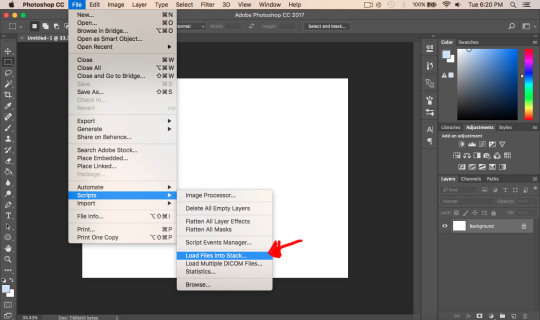
Don’t go to Import>Load files into frames (or something like that) as this makes the whole process a lot more difficult. When going through this way, you are only limited to 500 frames which can limit what you’re working on (especially if it’s a large gifset with more than 500 frames). When importing through Scripts, it will allow you more than 500 (I haven’t hit a limit yet so I’m not sure if there is one or not but so far I haven’t experienced one).
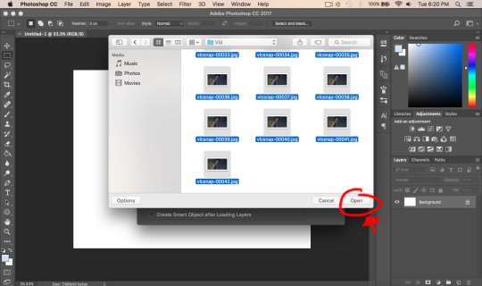
Click ‘Browse’ and find the folder with your frames, selecting all of the ones you wish to convert into a gif and click ‘Open’ and then ‘Ok’. It should look something like this:

Next, we want to display the ‘Timeline’. To do this, we have to go to Window>Timeline
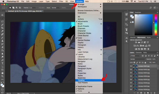
A grey box should appear on the bottom of your page. Click the little arrow where it says ‘Create Video Timeline’ and click ‘Create Frame Animation’
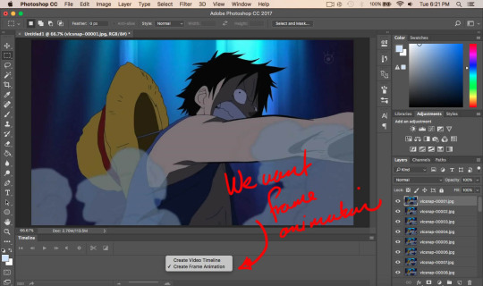

When done, click on the little box to the right hand side of the timeline window and click ‘Make Frames From Layers’.
Because of the size of the file, it’s too big and is lagging down Photoshop a bit, plus we need to adjust the sizing for Tumblr. To do this, go to Image>Image Size
Make sure that the width is at 540 pixels (not cm, inches, etc.) if you want a standard size. (I don’t remember the exact dimensions for Tumblr but if you want to know, do a quick google search). Also be sure to click the link to ensure it is fitted proportionately and click ‘OK’ once done.

Once again, click the little dropbox on the top right hand side of the timeline window and click ‘Reverse Frames’ (only if your frames have loaded backwards which mine always do although this may be different to you, to check just play through the frames)
Play around with timing to how you wish. I usually have mine at ‘0.08′ seconds. You can change the time down next to the small arrow where it has ‘0.00′ (Make sure all frames are selected if you want all frames to have the same time delay) Remember that when played at 0.00, it may appear normal but once saved it is a lot faster so be sure to change it
Now we want to select all frames in both the timeline and in the layers, this is important for the next step. Once selected, click the small icon at the bottom of the the left hand corner (next to ‘Once’)

Once this is converted to a video timeline, go to Filter>Convert for Smart Filters. This essentially merges all your frames/layers together and still plays as a video in the timeline. It also allows us to edit the batch of frames together instead of going through each individual frame to edit it.
This bit of editing really helps blend colours together which helps in saving them later on. It does get rid of details here in there depending how you apply it. Go to Filter>Blue>Surface Blur and experiment around with the settings.
I usually keep mine at Radius: 5 and Threshold: 10. I recommend not going too far from these numbers.

Because the surface blur has blured the colours together slightly, the defining lines of the character are slightly lost. To fix this we go to Filter>Sharpen>Smart Sharpen.
I tend to keep my radius quite low and the amount relatively low as well, it depends on the gif I’m making.

I tend to see this a lot when people make gifs and that is that they oversharpen their frames which can be quite jarring to the eye and it also doesn’t look very nice. An example of oversharpening is when white pixels surround the black like this:

Less oversharped but still so:

It makes the lines all jagged and unsmooth which is what we want to avoid.

That’s a lot better (and it could be better but notice the distinct lack of white pixels)
Now you can play around with different filters and such! I definitely recommend using some sort of filters, the anime colours are very dull and unsaturated. Once you’re happy, save your gif by going to File>Export>Save for Web
This is what the next window will look like. You can experiment with either Diffusion and Pattern. This is how the pixels on your gif will appear. I usually alternate between the two, depending on what works best with the particular gif I’m making. In this case, I’ll use Diffusion.
When saving, make sure that the size of the gif is no higher than 3mb, that is tumblr’s restriction on the size of gifs (as of making this tutorial). Also make sure that Looping Options is selected as ‘Forever’. Click ‘Save’ when you’re done! And there you go, you have your gif!
Filter 1:

Filter 2:

Filter 3:

Anime:

Notice the different palettes you can create? If you only wanted to make a gif, you’re done! However, if you want to know some more tricks, keep on reading! (I say as if this tutorial isn’t long enough)
This part is if you want your gifs to look more clean and crisp.
If you notice in my example gifs, they all have these square like patterns on there. That’s because Photoshop can only allow 256 colours, so to make up for those lack in colours, it adds pattern/diffusion to essentially replace them (or something like that lol)
To fix this, go back to your gif (before saving) and select the lasso tool and select the colours that are most important in the frame.
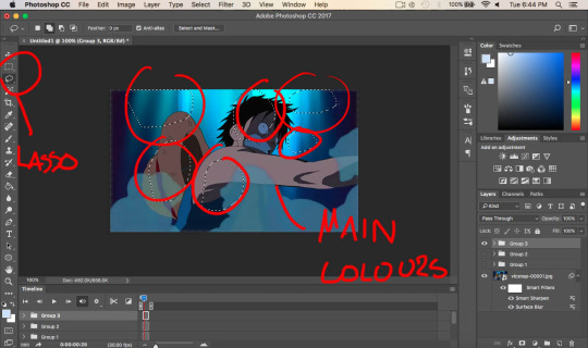
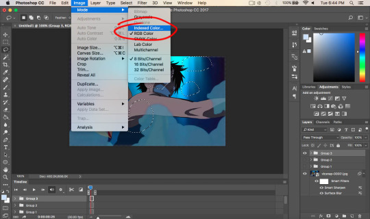
Once done, click Image>Mode>Indexed Colour (make sure you have the history window ready)
Make sure your settings are set like this (they may be by default but I don’t remember) and click ‘OK’

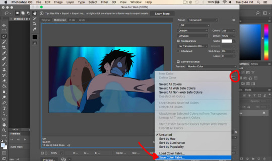
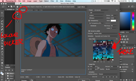
Now go back and save it as if you were saving it as a gif by File>Export>Save for web. This time, click the drop box and click ‘Save Colour Table’ and call it table. It will ask if you want to replace it, click ‘OK’. Once saved, click cancel and return to your gif.
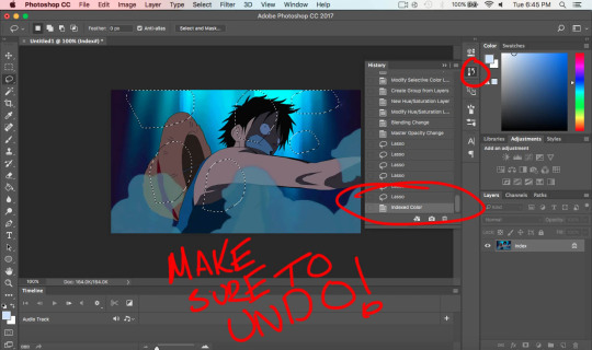
Click on the history window (if it’s not there, look under ‘Window’) and undo the ‘Indexed Colour’. When we did this, the layers all merged together and the frames have gone, meaning no more motion/movement. Make sure to undo this step!
Click the same little icon when we were saving the colour table and click load table, and select ‘table’. Similar colours will come up however now they are the most important ones. Play through the gif to ensure the colours look nice and look smooth. if not, delete some colours on the colour table by selecting the colour you wish to delete and the little trash can in the bottom right hand corner. To add colours, go to the ‘original’ tab and select the colour picker, clicking the little page icon left of the trash can. This will add the colour to the table.
This can be incredibly tedious but it changes the colours on the gif and makes it look as if it is straight from the anime. Gifs like this one needs a lot of time since the colours in the back change quite a lot.
Before:

After:

It may not look like much to those who don’t make gifs (or any difference at all) but things like these can help increase the quality of the gif. It seems like a really long and tedious process (to which it is trust me) but I think it’s worth it in the end!
For comparisons sake, here’s diffusion (first) compared to pattern (second)


If anyone has any questions regarding this tutorial, feel free to message me and I can try help you out!
If you read this far, thank you so much! I spent a lot of time on this tutorial so I’m grateful if you took time out of your day to read this. Have a good day!!
#gif#tutorial#anime#opgraphics#one piece#monkey d. luffy#GOD#this took 3 hours to make#more than that#I'm lowkey embarrassed#oh well#I hope it wasn't too confusing#but yeah making gifs is tiring#blegh#mine
62 notes
·
View notes
Photo

New Post has been published on https://magzoso.com/tech/honor-9x-review/
Honor 9X Review

Honor rang in 2020 by launching the Honor 9X in India, alongside the Honor Magic Watch 2 smartwatch and the Honor Band 5i. The Honor 9X succeeds the Honor 8X, and brings some notable upgrades such as a faster SoC, a full-screen display, better cameras, and a larger battery, to name a few. Starting at Rs. 13,999, the Honor 9X offers a compelling package in terms of hardware and design. However, it goes up against some well-received rivals from Xiaomi, Realme, Nokia, and Vivo. Does the Honor 9X have what it takes to stand out and disrupt the segment? Read our in-depth assessment of the phone’s merits and demerits to find out.
Honor 9X design and build quality
Design is one of the key selling points of the Honor 9X. The 3D geometric pattern on the Sapphire Blue review unit that we have looks like an X when light falls on it. Each adjacent line appears to be a different shade of blue, creating a depth effect, and it does look unique compared to the gradient patterns on a wide range of phones out there. On closer inspection, one can see small diamond-shaped blocks across the whole rear panel that shimmer under the light. While the aesthetics are undoubtedly flashy, this does give the Honor 9X an identity of its own. The company also offers the Honor 9X in a more sober Midnight Black finish as well.
Honor 9X’s rear panel is made of plastic with a glossy finish, and it gets smudged quickly
The rear panel is made out of plastic and has a glossy finish. Needless to say, the entire back can get smudged easily, and our unit had fingerprint marks all over it in no time. The sides are curved and meet smoothly with the rim, which also has a glossy finish in a matching colour. Thankfully, the phone is not too slippery. The three camera lenses are housed in a vertical strip, and the entire module protrudes ever so slightly.
The fingerprint sensor is positioned comfortably within reach, and was pleasantly quick at unlocking the phone. The USB Type-C port, speaker, and 3.5mm jack are at the bottom, while the SIM tray is at the top. The volume buttons have a clicky feel, but the power button is a bit too small in proportion and feels a little mushy.
Over on the front is the 6.59-inch full-HD display that has a notch-free design. In this price bracket, the Honor 9X is among the only few phones that offer a full-screen experience, and we are definitely not complaining. Honor told Gadgets 360 that the display is protected by a material developed by Huawei and used in its phones, but did not reveal the name. The phone comes with a pre-applied screen protector, but it got scratched and picked up smudges all over really quickly. Also, we found it a bit difficult to reach all parts of the screen with one hand.
Honor 9X specifications and software
The Honor 9X suffers from an identity crisis of sorts, which can be attributed to the Huawei-Honor relationship and some confusing marketing decisions. As we pointed out in our first impressions of the phone, the Honor 9X is almost identical to the Huawei Y9 Prime (2019) which was launched in India in August last year, the only difference being rear camera resolutions, and even shares the same model number.

Honor 9X comes equipped with a 16-megapixel pop-up selfie camera
It also shares hardware similarities with the Huawei P Smart Z sold in China, and even has the exact same dimensions. To complicate things even more, the Honor 9X sold in India is the phone’s global variant, and has completely different specifications compared to the device of the same name sold in China.
Talking about specifications, the Honor 9X packs a 6.59-inch full-HD (1080 x 2340 pixels) display with a notchless full-screen design. This is an IPS LCD panel certified by TÜV Rheinland for reducing blue light exposure. The phone is powered by Huawei’s in-house Kirin 710F processor, and has up to 6GB of RAM and 128GB of storage which is expandable by up to 512GB using a microSD card. The base 4GB 128GB variant is priced at Rs. 13,999 in India, while the 6GB 128GB configuration will set buyers back by Rs. 16,999.
The rear camera setup includes a 48-megapixel main shooter with an f/1.8 aperture. There is also an 8-megapixel wide-angle camera with a 120-degree field of view and a 2-megapixel depth sensor for portrait shots. On the front is a 16-megapixel camera housed in a pop-up module. The juice is provided by a 4,000mAh battery, and there’s 10W charging support.
On the software side, the Honor 9X runs EMUI 9.1 based on Android Pie. Honor has told Gadgets 360 that an Android 10 update should be released soon, “maybe by next month”. It is interesting to note that this phone doesn’t report the software name as Magic UI, which is the rebranded version of EMUI that Honor models usually run. The UI is similar to what we came across in our Honor 20 review. To start with, there is no app drawer. Swiping left opens the Google feed, while swiping right shows more pages of app icons.

Honor 9X has a triple rear camera setup with a 48-megapixel primary camera
Some of the preinstalled apps such as Ride Mode, Downloads, and Optimiser for file management are useful. However, there is way too much bloatware. First-party apps such as App Gallery, Honor Club, Honor Store, and iTips are barely useful. As for the third-party apps, the likes of Opera News, Booking.com, Wego Flights & Hotels, and Helo aren’t going to appeal to everyone.
Thankfully, the third-party apps can be uninstalled, but the in-house ones can’t. The navigation gestures worked flawlessly for us, and there’s an App Twin feature for creating two instances of an app.
Honor 9X performance
Performance is an area in which the Honor 9X proved to be a mixed bag. App-switching was smooth even with 10-15 applications running in the background. Apps loaded quickly as well, but some jitter was were noticeable when games were running in the background. The UI was generally lag-free, but the RAM management proved to be a bit too aggressive on a few occasions.
The Kirin 710F feels underpowered in terms of graphics. PUBG Mobile defaulted to the Medium graphics preset, but the visuals looked choppy, and frame drops and stutters were easily noticeable. Call of Duty: Mobile was set to the low graphics settings by default, and even though the experience was better than PUBG Mobile, we have seen better performance from other phones in this price range. We wish Huawei had gone with a more powerful SoC.
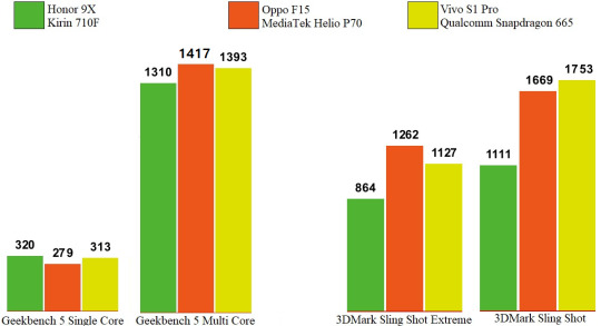
This lack of firepower reflects in synthetic benchmarks as well. The Honor 9X scored 320 and 1,310 in Geekbench 5’s single-core and multi-core tests. This performance is comparable to that of the Qualcomm Snapdragon 665 and MediaTek Helio P70. However, in the graphics-intensive 3DMark Sling Shot and Sling Shot Extreme tests, the Honor 9X could only muster up scores of 1,111 and 864 respectively, which are significantly lower than those of the two aforementioned chips. Here’s a chart to depict the Kirin 710F’s benchmark performance:
Honor 9X’s Kirin 710F SoC lags behind when it comes to graphics power
As for display quality, Honor 9X’s LCD display is among the better ones on phones we have seen in this price bracket. The full-HD resolution means that this panel is sufficiently sharp. Colour reproduction is on point, and viewing angles are acceptable as well. The notchless design is great for watching videos and playing games.
The only shortcoming is sub-par brightness, which hampers outdoor visibility and makes colours look muted under direct sunlight. The display section in the Settings app lets users adjust the colour profile and temperature, but we found that the ‘Vivid’ mode imparts a bluish tinge to whites, and makes colours appear washed-out.
The Honor 9X comes equipped with a sufficiently long-lasting 4,000mAh battery. With our regular usage, which involved intermittent social media usage and messaging all day, a couple of hours of music streaming, and around an hour of gaming, the Honor 9x lasted a day and a half on average. When paired with a smartwatch with Bluetooth and location tracking enabled throughout the day, the phone’s battery life went down but it still had around 20-25 percent left at the end of the day.
Your mileage will vary depending upon usage patterns, but even with heavy usage, the Honor 9X will easily sail past a day on each charge. In our HD video battery loop test, the Honor 9x lasted a slightly underwhelming 12 hours and 37 minutes before the battery discharged completely. The phone comes with a 10W charger, which takes over two hours to fully charge the phone. We have seen phones from Xiaomi and Realme offer faster charging in the same price bracket.
Honor 9X cameras
On paper, the Honor 9X offers fairly impressive cameras for its price, but the actual output is a mixed bag. The main 48-megapixel camera takes 12-megapixel pixel-binned photos by default. These shots looked okay, with decent contrast and dynamic range, but average details at best The camera app’s AI mode tends to boost contrast and saturation, so we had to manually turn it off to capture accurate colours.
In the case of actual 48-megapixel photos, details were better, but at the cost of noise. What we didn’t like was the oversharpening done to the photos, making them appear noticeably soft. We also often got blander colours in photos captured at the full 48-megapixel resolution under direct sunlight. Autofocus was reliable in daylight, but in low-light scenarios, we had to deal with some focusing errors.

Indoor sample taken with the Honor 9X (tap for full-sized image)
Close-up HDR sample taken with the Honor 9X (tap for full-sized image)
Daylight sample taken with the Honor 9X (tap for full-sized image)

Selfie sample taken with the Honor 9X (tap for full-sized image)
We have seen noticeably better colour reproduction, sharpness, and dynamic range captured by the 48-megapixel cameras on the Redmi Note 8 and the Realme 5 Pro. Honor has not specified the make of the sensor it has used.
The 8-megapixel wide-angle camera comes in handy for bringing more objects into a frame. The images captured are again just average, but there was a noticeable difference between the colour tone of photos captured by the main camera and wide-angle shots of the same scene, particularly when it came to handling greenery and bright colours. Distortion was also an issue. Honor says that the Honor 9X uses distortion correction algorithms, but warping was evident in wide-angle photos. They also turned out less sharp.
The 2-megapixel depth sensor does a decent job at delivering a depth-of-field effect in photos. There is a dedicated aperture mode in the camera app that lets users adjust the intensity of the blur effect. It does a good job of highlighting an object or person in the foreground, but edge detection is not always accurate. Other camera modes include slo-mo, light painting, moving picture, and stickers.
The biggest surprise to us was the dedicated night mode. Photos captured using the night mode exhibited better details and colours were brought out more, but they look grainy on zooming in, and are soft around the corners. Depending upon the ambient light, the night mode takes up to four seconds to capture multiple exposures at various levels, and delivers a final composited image that is significantly better than what you could capture in the standard photo mode.
The standard photo mode can also detect low-light scenarios and raise the ISO level, but this blows away the real colours. In fact, the Honor 9X’s night mode is one of the better implementations of this feature in the sub-Rs. 15,000 price bracket.

Low-light sample taken using the standard photo mode (tap for full-sized image)
Low-light sample taken using the night mode (tap for full-sized image)

Low-light sample taken using the standard photo mode (tap for full-sized image)

Low-light sample taken using the dedicated night mode (tap for full-sized image)
The 16-megapixel pop-up selfie camera is again just average. We noted that the camera module pops up slower than what we have seen on the likes of the Realme X and the Redmi K20, although these models are more expensive. As for image quality, selfies have a healthy amount of detail, but even with beautification and AI deactivated, the Honor 9X does smoothen skin textures. In the case of portrait selfies, the camera sometimes erratically blurred parts of our ears. Portrait shots, despite looking vibrant, lacked depth and often had background elements blown out, especially those shot in sunlight.
The main camera can capture video at up to 1080p at 60fps, while the wide-angle one is limited to 30fps. Thankfully, the primary camera does not struggle with focus hunting and the AIS (“AI image stabilisation”) does a decent job at negating movements. However, dynamic range could have been better and colours appear slightly warmer than those of the real objects. Yet again, videos shot by the main camera and the wide-angle one showed a discernible difference in colour profiles.
Verdict
The Honor 9X’s notchless full-HD display is a welcome feature at its asking price, and the phone’s design also stands out. However, it is a bit on the larger side which could make handling a little awkward for some people. The performance of the Honor 9X is good for day-to-day tasks, but a better processor with more graphics prowess would have improved the gaming experience.
Despite packing three rear cameras, the Honor 9X does not offer anything noteworthy in terms of photo quality or features. Photos turned out just about average in terms of quality, except for those taken in low light. This is where this phone rises above similarly priced competitors. Battery life is good, and users can easily get over a day of regular usage.
The Honor 9X is a good enough phone and will appeal to those who value style, but it lacks what it takes to decisively edge out its rivals, and even some models priced a bit lower. The likes of the Redmi Note 8 (Review), Realme 5 Pro (Review), Vivo U20 (Review), and Nokia 7.2 (Review) are better all-rounders and offer more value for money.
0 notes
Text
Best Phone Under 20000 In India (September 2020)
Best Smartphones Under 20000: Top Phones To Buy In India Under Rs.20,000 In September 2020
India's top smartphones under Rs.20,000.
(adsbygoogle = window.adsbygoogle || []).push({});
The sub-Rs. 20,000 value fragment today includes a scope of amazing cell phones which offer anything from spring up selfie cameras, in-show unique mark sensors, and 64-megapixel cameras to ground-breaking processors that can even adversary some mid-level telephones. We have as of late surveyed some entirely perfect increments to the section.
Best phones under 20,000:
Phones under Rs. 20,000
Our rating (out of 10)
Price in India (as recommended)
Samsung Galaxy M31s
8
Rs. 20,499
Realme 7 Pro
8
Rs. 19,999
Motorola One Fusion+
8
Rs. 16,999
Redmi Note 9 Pro Max
8
Rs. 16,999
Poco X2
8
Rs. 17,499
Realme 6 Pro
8
Rs. 17,999
Samsung Galaxy M31
8
Rs. 16,499
Realme X2
8
Rs. 17,999
(adsbygoogle = window.adsbygoogle || []).push({});
Realme dispatched the 7 Pro as a component of its new 7-arrangement, which has a large group of cool overhauls over the Realme 6 Pro. Samsung likewise dispatched the Galaxy M31s, which sports a cutting edge gap punch show and quicker charging contrasted with the Galaxy M31. We've additionally refreshed the remainder of this list by resigning from a portion of the more seasoned models.
(adsbygoogle = window.adsbygoogle || []).push({});
On the off chance that you have a spending plan of Rs. 20,000, here are probably the best cell phones that you ought to consider for your next buy.
Samsung Galaxy M31s
Samsung dispatched the Galaxy M31s at Rs. 19,499, yet at the hour of refreshing this guide, its cost has expanded to Rs. 20,499 on its online store. Samsung has a propensity for continually tweaking its costs, so when you read this article, we wouldn't be shocked if the cost has expanded or diminished just barely once more.
(adsbygoogle = window.adsbygoogle || []).push({});
We think the Galaxy M31s a not too bad update to the Galaxy M31. It has a higher beginning cost, yet for this additional cash, you get an Infinity-O AMOLED show, a higher limit packaged charger, and a marginally changed plan. It holds huge numbers of the things that made the Galaxy M31 extraordinary, for example, the huge 6,000mAh battery, yet additionally conveys forward certain negatives, for example, the dated SoC. This isn't to imply that that the telephone can't deal with Android well, yet contrasted with what the opposition offers at around this value, the processor certainly feels feeble.
(adsbygoogle = window.adsbygoogle || []).push({});
The cameras are fair yet video adjustment isn't incredible and low-light photographs don't have the best subtleties. Nonetheless, in the event that having the best battery life is the first concern for you, at that point, the Galaxy M31s is still among the best in its group.
KEY SPECIFICATIONS
DISPLAY
6.50Inch
OS
AndroiD 10
RESOLUTION
1080x2400P
REAR CAMERA
64MP+12MP+
5MP+5MP
FRONT CAMERA
32MP
STORAGE
128GB
RAM
6GB
BATTERY
6000mAh
PROCESSOR
Exynos 9611
ALSO SEE
amazon.in
Realme 5 Pro 4GB/64GB Crystal Green – Click Here To Go The Page
amazon.in
Redmi Note 9 Pro 4GB/64GB Interstellar Black – Click Here To Go To The Page
amazon.in
Redmi Note 9 Pro 6GB/128GB Interstellar Black – Click Here
Realme 7 Pro
The more exceptional model in Realme's 7-arrangement, the Realme 7 Pro highlights some huge updates over the Realme 6 Pro, for example, the utilization of an AMOLED show, 65W quick charging, and sound system speakers. With a higher beginning cost of Rs. 19,999, the new model has a one of a kind blend of highlights that a couple of others coordinate in this portion. 65W charging helps charge the battery rapidly and the sound system speakers make observing any substance sound more vivid. The new telephone is likewise slimmer and lighter contrasted with the 6 Pro, which is a pleasant reward.
(adsbygoogle = window.adsbygoogle || []).push({});
Nonetheless, you don't get a 90Hz showcase which is a bit of frustrating. The 7 Pro additionally has the equivalent Qualcomm Snapdragon 720G SoC as the 6 Pro, so there's no genuine exhibition gain either. The essential back camera has improved a piece, yet by and by, you miss out on the ultra wide-edge selfie camera and the back fax camera of the 6 Pro.
(adsbygoogle = window.adsbygoogle || []).push({});
While there's no uncertainty that the Realme 7 Pro is a decent telephone, it makes a stride in reverse in certain zones, which is the reason the Realme 6 Pro is additionally still a suitable alternative in this fragment.
(adsbygoogle = window.adsbygoogle || []).push({});
REVIEWS
⓼
DES
IGN
⓼
DIS
PLAY
⓽
SOFT
WARE
⓼
SHO
W
⓾
BATT
ERY
⓼
CAM
ERA
⓽
FOR MON
EY
✔GOOD
✘BAD
☞ Great Built, Pleasing Design
☞ Nice Camera
☞ Vivid AMOLED Display
☞ Fast Charge
☞ Battery Is Good
☞ Camera Is Average Under Low-Light
☞ 60Hz Display
KEY SPECIFICATIONS
DISPLAY
6.40-Inch
PROCESSOR
Snapdragon 720G
FRONT CAMERA
32MP
REAR CAMERA
64MP+8MP
+2MP+2MP
OS
Android 10
RESOLUTION
1080x2400p
ALSO SEE
amazon.in
Vivo V17 8GB RAM, 128GB Midnight Ocean – Click Here To Go The Page
amazon.in
Samsung Galaxy A31 6GB RAM, 128GB Prism Crush Blue – Click Here To Go To The Page
amazon.in
Samsung Galaxy M31s 8GB RAM, 128GB Mirage Blue – Click Here
Motorola One Fusion+
The Motorola One Fusion+ is an invite expansion to the sub Rs. 20,000 value portion. While the cost is serious, Motorola has not held back as far as equipment. The Motorola One Fusion+ sports a major 6.5-inch show without an indent. This board is HDR10 affirmed and has excellent survey points. It additionally has a noisy base terminating speaker that praises the fresh presentation. Fueling the Motorola One Fusion+ is the truly fit Qualcomm Snapdragon 730G SoC.
(adsbygoogle = window.adsbygoogle || []).push({});
It scored very well in our benchmarks. The One Fusion+ is accessible in one arrangement just, with 6GB of RAM and 128GB of capacity. You do have the alternative to extend capacity further utilizing the crossbreed double SIM plate. Motorola has likewise pressed in a 5,000mAh battery, and this telephone accompanies an 18W TurboCharger.
(adsbygoogle = window.adsbygoogle || []).push({});
It runs clean stock Android and we didn't experience any preinstalled bloatware. Fortunately, it despite everything holds Moto Actions which are valuable motion-based highlights. The Motorola One Fusion+ sports a four cameras at the back and a spring up selfie camera. It has a 64-megapixel essential sensor, an 8-megapixel super-wide edge camera, a 5-megapixel full-scale camera, and a 2-megapixel profundity sensor. The camera execution was acceptable in sunlight, and the telephone rushed to bolt shine and meter light effectively. Low-light shots were normal however utilizing Night mode had a colossal effect. Video recording maxes out at 4K and the telephone works admirably at settling film in the daytime.
(adsbygoogle = window.adsbygoogle || []).push({});
KEY SPECIFICATIONS
DISPLAY
6.50 Inches
FRONT CAMERA
16MP
PROCESSOR
Qualcomm Snapdragon 730
RAM
6GB
STORAGE
128GB
OS
Android 10
BATTERY
5000mAh
REAR CAMERA
64MP+16MP+
5MP+2MP
RESOLUTION
1080x2340p
ALSO SEE
amazon.in
Motorola One 4GB RAM, 64GB Black – Click Here To Go The Page
flipkart.com
Motorola One Vision 4GB RAM, 128GB Sapphire Gradient – Click Here To Go To The Page
amazon.in
Infinix S5 Pro 4GB RAM, 64GB Click Here To Go To The Page
Redmi Note 9 Pro Max
The Redmi Note 9 Pro Max is the most recent cell phone to join this rundown of the best telephones under Rs. 20,000. When Xiaomi dispatched this cell phone, it was evaluated beginning under Rs. 15,000, yet the GST climb has made costs go up. The Redmi Note 9 Pro Max imparts a great deal of equipment to the Redmi Note 9 Pro – the two telephones sport 6.67-inch shows which are useful for video observing however not for courageous use.
(adsbygoogle = window.adsbygoogle || []).push({});
The Redmi Note 9 Pro Max has a side-mounted unique mark scanner that lets you open it rapidly. Adhering to current patterns, the Redmi Note 9 Pro Max has four back cameras yet the module juts a considerable amount. The Redmi Note 9 Pro Max is working on the Qualcomm Snapdragon 720G SoC. Xiaomi offers it in three variations: the base variation has 6GB of RAM and 64GB of capacity and is estimated at Rs. 16,999; the center one offers 6GB of RAM and 128GB of capacity and is evaluated at Rs. 18,499. The top variation is evaluated at Rs 19,999 which is scarcely under as far as possible for this rundown.
(adsbygoogle = window.adsbygoogle || []).push({});
The Redmi Note 9 Pro Max packs in a 5,020mAh battery and conveys excellent battery life. It additionally fared very well in our HD video circle test. Xiaomi packs a 33W charger in the crate and this telephone charges more rapidly than the Redmi Note 9 Pro. The camera execution of the Redmi Note 9 Pro Max is very acceptable, yet photographs will in general be oversharpened now and again. Low-light camera execution is normal however Night mode assists catch with bettering yield.
(adsbygoogle = window.adsbygoogle || []).push({});
REVIEWS
⓼
DES
IGN
⓼
DIS
PLAY
⓼
SOFT
WARE
⓼
SHOW
⓽
BATT
ERY
⓼
CAM
ERA
⓽
FOR MON
EY
✔GOOD
✘BAD
☞ Solid & Powerful Processor
☞ Great Camera Quality
☞ Nice Battery Life
☞ Supports Fast Charging
☞ Video Quality Is Average In Low-Light
☞ Pre-Installed Bloatware
☞ Little Heavy
KEY SPECIFICATIONS
DISPLAY
6.67 Inches
FRONT CAMERA
32MP
PROCESSOR
Snapdragon 720G
RAM
6GB
STORAGE
64GB
OS
Android 10
BATTERY
5020mAh
REAR CAMERA
64MP+8MP
+5MP+2MP
RESOLUTION
1080x2400p
ALSO SEE
amazon.in
Redmi Note 9 Pro Max 6GB RAM, 128GB Interstellar Balck – Click Here To Go The Page
amazon.in
Infinix Note 5 4GB RAM, 64GB – Click Here To Go To The Page
amazon.in
Infinix S5 Pro 4GB RAM, 64GB Click Here To Go To The Page
Poco X2
The first cell phone to emerge from Poco after it turned into an autonomous substance is the Poco X2. The isn't the replacement of the Poco F1, yet does a ton of things directly in its own particular manner. It is tall and has a major 6.67-inch show with a 20:9 viewpoint proportion. The board likewise gloats of a 120Hz invigorate rate which isn't exceptionally basic at this cost. The Poco X2 has a double camera punch-opening on the front, and a side-mounted unique mark scanner, the two of which are gradually getting more normal. The Poco X2 feels huge and massive. It is fueled by the Qualcomm Snapdragon 730G which is a ground-breaking chip that can deal with gaming very well.
(adsbygoogle = window.adsbygoogle || []).push({});
The Poco X2 has different variations: 6GB of RAM with 64GB of capacity, 6GB of RAM with 128GB of capacity, and 8GB of RAM with 256GB of capacity. The costs of the Poco X2 have move since its dispatch and the base variation currently begins at Rs. 17,499 while the center one is estimated at Rs 18,499 and the top variation is still at Rs. 20,999.
(adsbygoogle = window.adsbygoogle || []).push({});
Poco has pressed in a 4,500mAh battery and you get a 27W charger in the crate. This telephone sports a quad-camera arrangement at the back and we saw that the photograph quality in light is very acceptable. Low-light photograph quality was additionally generally great however not as itemized as during the day. Low-light video quality wasn't as acceptable.
(adsbygoogle = window.adsbygoogle || []).push({});
REVIEWS
⓼
DES
IGN
⓼
DIS
PLAY
⓼
SOFT
WARE
⓽
SHOW
⓼
BATT
ERY
⓼
CAM
ERA
⓽
FOR MON
EY
✔GOOD
✘BAD
☞ Great Show/Performance
☞ Great Battery Life
☞ Great Camera Photo Quality Under Good Light
☞ Little Heavy & Bulky
☞ Irrelevant Ads & Bloatware In The UI
☞Bad Video Quality In Low-Light
KEY SPECIFICATIONS
DISPLAY
6.67Inch
OS
Android 10
RESOLUTION
1080x2400P
REAR CAMERA
64MP+2MP+8MP+2MP
FRONT CAMERA
20MP+2MP
STORAGE
64GB
RAM
6GB
BATTERY
4500mAh
PROCESSOR
Snapdragon 730G
BUY AT
amazon.in
Redmi Note 8 Pro 6GB Slam 128GB Capacity Gamma Green – Click Here To Go The Page
amazon.in
Oppo F11 128GB Capacity Thunder Black – Click Here To Go To The Page
amazon.in
Poco F1 6GB Slam 64GB Capacity Graphite Black – Click Here To Go To The Page
Realme 6 Pro
The Realme 6 Pro was dispatched close by the Realme 6, and both cell phones have made it to our rundowns at their individual costs. The Realme 6 Pro has a 6.6-inch show with a double camera opening punch for the selfie cameras. It is fueled by the Qualcomm Snapdragon 720G SoC simply like the Redmi Note 9 Pro Max. The gadget is all around planned yet is somewhat tricky as it has a glass back. This telephone is likewise somewhat hefty at 202g. One exceptional component of the realm 6 Pro is its 90Hz screen revive rate. It likewise has a side-mounted unique mark scanner that is anything but difficult to reach and brisk to open the telephone.
(adsbygoogle = window.adsbygoogle || []).push({});
The Realme 6 Pro is offered in three variations: 6GB of RAM with 64GB of capacity, 6GB of RAM with 128GB of capacity, and 8GB of RAM with 128GB of capacity. The base variation begins at Rs. 17,999 while different variations are valued at Rs. 18,999 and Rs 19,999 individually.
(adsbygoogle = window.adsbygoogle || []).push({});
There's a quad back camera arrangement are given. Camera execution was tolerable in sunshine and for close-ups, yet low-light camera execution needs some improvement. The Realme 6 Pro has a 4300mAh battery which isn't as large as a portion of different telephones in the rundown however it conveyed astounding battery life when we surveyed it.
(adsbygoogle = window.adsbygoogle || []).push({});
REVIEWS
⓼
DES
IGN
⓼
DIS
PLAY
⓽
SOFT
WARE
⓼
SHOW
⓽
BATT
ERY
⓼
CAM
ERA
⓽
FOR MON
EY
✔GOOD
✘BAD
☞ Decent Show/ Performance
☞ Premium Design & Build Quality
☞ Nice Front Selfie Cameras
☞ Large Battery Backup & Charge Fast
☞ Little Heavy
☞ Camera Quality Is Not Good At Low Light
KEY SPECIFICATIONS
DISPLAY
6.60Inch
OS
AndroiD 10
RESOLUTION
1080x2400P
REAR CAMERA
64MP+8MP+
12MP+2MP
FRONT CAMERA
16MP+8MP
STORAGE
64GB
RAM
6GB
BATTERY
4300mAh
PROCESSOR
Qualcomm Snapdragon 720G
ALSO SEE
amazon.in
Realme 6 Pro 6GB/64GB Lightning Blue – Click Here To Go The Page
amazon.in
Realme 6 Pro 6GB/128GB Lightning Blue – Click Here To Go To The Page
amazon.in
Realme 6 Pro 8GB/128GB Lightning Blue – Click Here To Go To The Page
Samsung Galaxy M31
Samsung has been zeroing in on the sub Rs. 20,000 market with its Galaxy M-arrangement, and the Galaxy M31 is right now the best in the setup. This model has a 6.4-inch full-HD+ AMOLED show that conveys distinctive hues and generally excellent review points. There is a quad-camera arrangement at the back with a 64-megapixel essential camera. It additionally packs a major 6,000mAh battery and a competent Exynos 9611 SoC.
(adsbygoogle = window.adsbygoogle || []).push({});
Samsung offers the Galaxy M31 with 6GB of RAM and two stockpiling choices, 64GB and 128GB. Costs start at Rs. 16,499 for the base model while the higher model is evaluated at Rs. 18,999. The enormous battery offers phenomenal battery life and this telephone could without much of a stretch continue for two days. The cameras are acceptable in light, the wide-point one offers a more extensive field of view yet misses out on subtleties contrasted with the essential camera. We noticed that the camera AI can go over the edge as far as immersing hues. The essential camera is somewhat moderate while centering and you can see minor grain in the yield. With Night mode empowered, the Galaxy M31 conveys better low-light shots. We discovered video adjustment to be normal also.
(adsbygoogle = window.adsbygoogle || []).push({});
The Exynos 9611 SoC isn't as ground-breaking as the Snapdragon 720G driving the Redmi Note 9 Pro Max and the Realme 6 Pro yet it is fit for taking care of everyday errands easily. The battery is the feature of the Galaxy M31 as it can beat most gadgets on this rundown.
REVIEWS
⓼
DES
IGN
⓼
DIS
PLAY
⓼
SOFT
WARE
⓽
SHOW
⓾
BATT
ERY
⓻
CAM
ERA
⓼
FOR MON
EY
✔GOOD
✘BAD
☞ Nice Crisp & Amoled Display
☞ Great Battery
☞ Great Camera Quality
☞ Nice Show/Performance
☞ Camera Is Not Good At Low-Light
☞ Notifications Is Irrelevant.
☞Unstable Videos (Lacks Stabilisation).
KEY SPECIFICATIONS
DISPLAY
6.40Inch
OS
AndroiD 10
RESOLUTION
1080x2340P
REAR CAMERA
64MP+8MP+5MP+5MP
FRONT CAMERA
32MP
STORAGE
64GB
RAM
6GB
BATTERY
6000mAh
PROCESSOR
Exynos 9611
ALSO SEE
amazon.in
Redmi Note 8 Pro 6GB/64GB Gamma Green – Click Here To Go The Page
amazon.in
Honor 9X 4GB/128GB Sapphire Blue – Click Here To Go To The Page
amazon.in
Motorola Moto One 4GB Slam Black 64GB Capacity – Click Here To Go To The Page
Realme X2
The Realme X2 is one of the more established telephones on this rundown, however, has figured out how to hold fast this while. It has a 6.4-inch AMOLED show with an in-show unique mark scanner, something that the others pass up. It likewise packs in a Qualcomm Snapdragon 730G processor like the Poco X2. The telephone is sensible for everyday use and isn't as large as the Poco X2 or the Redmi Note 9 Pro Max. The Realme X2 has a quad-camera arrangement at the back and arrives in an assortment of hues.
(adsbygoogle = window.adsbygoogle || []).push({});
Realme has pressed in a 4000mAh battery and boasts a 30W quick charger in the crate which makes charging snappy. The Realme X2 could deal with everyday errands and gaming effectively, and the battery endured us longer than a day and a half. Realme sells three variations of the X2 in India: the base variation with 4GB RAM and 64GB stockpiling is estimated at Rs. 17,999, the center variation with 6GB of RAM and 128GB of capacity is evaluated at Rs. 19,999, and the 8GB RAM, 128G capacity variation is evaluated at Rs. 20,999.
(adsbygoogle = window.adsbygoogle || []).push({});
The quad-camera arrangement lets you take great photographs in the sunshine. We enjoyed our picture shots, as the devoted profundity camera assists with edge location. Low-light camera execution is additionally acceptable however there is some clamor in the yield. The Nightscape mode improves low-light photography. The low-light video execution wasn't however we would prefer when we investigated the Realme X2.
REVIEWS
⓼
DES
IGN
⓼
DIS
PLAY
⓽
SOFT
WARE
⓽
SHOW
⓼
BATT
ERY
⓼
CAM
ERA
⓼
FOR MON
EY
✔GOOD
✘BAD
☞ Great Build Quality, Premium Looks
☞Great Cameras
☞ Strong Show/Performances
☞Fast Charging
☞ Video Recording Is Not Good At Low Light
KEY SPECIFICATIONS
DISPLAY
6.40Inch
OS
AndroiD 9 Pie
RESOLUTION
1080x2340P
REAR CAMERA
64MP+8MP+2MP+2MP
FRONT CAMERA
32MP
STORAGE
128GB
RAM
8GB
BATTERY
4000mAh
PROCESSOR
Snapdragon 730G
BUY AT
flipkart
Realme X2 4GB Slam Pearl Blue 64GB Capacity – Click Here To Go The Page
flipkart
Realme X2 4GB Slam Pearl White 64GB Capacity – Click Here To Go To The Page
flipkart
Realme X2 4GB Slam Pearl Green 64GB Capacity – Click Here To Go To The Page
For Regular & Fastest Tech News and Reviews, Follow TECHNOXMART on Twitter, Facebook, Instagram, Google News and Subscribe Here Now. By Subscribing You Will Get Our Daily Digest Headlines Every Morning Directly In Your Email Inbox. 【Join Our Whatsapp Group Here】
(adsbygoogle = window.adsbygoogle || []).push({});
from https://ift.tt/3mkkS4i
0 notes
Text
Nokia 5.3 first impressions: Too much for too little August 25, 2020 at 07:49PM
Announced way back in March, the Nokia 5.3 is finally hitting Indian shores. A decidedly mid-range smartphone, the Nokia 5.3 is once again championing HMD Global’s cause of a clean and secure Android experience.
However, with Xiaomi’s stranglehold on the spec-crazed mid-range segment, and Samsung making moves to regain traction as well, the ho-hum spec sheet of the Nokia 5.3 might not hold up.
Is the Nokia 5.3’s user experience enough to offset the value for money offered by the competition? Let’s find out in Android Authority’s first impressions of the Nokia 5.3.
Design: More of the same
Credit: Dhruv Bhutani / Android Authority
The Nokia 5.3’s design isn’t exciting by any means. Unless you have a preference for simplistic, low-key hardware, there are much better options to be had. In fact, the materials used aren’t particularly inspired either.
Credit: Dhruv Bhutani / Android Authority
The back of the phone is made of polycarbonate, which, in of itself, is not really an issue. But the plastic doesn’t feel very premium and is a smudge magnet despite the matte finish. Meanwhile, the competition is far ahead with its copious use of glass and metal.
Credit: Dhruv Bhutani / Android Authority
The circular camera module houses four sensors with a centrally placed LED flash. Meanwhile, a fingerprint scanner is available below. The phone was fast to unlock and there’s a face-unlock option available as well.
The phone gets basics like weight distribution right, but there’s better hardware to be hard. I found the unsegmented volume rocker a bit too small and had to shuffle around to adjust the loudness setting. Meanwhile, the power button sits a bit too high in the frame.
Credit: Dhruv Bhutani / Android Authority
The notification LED hidden away in the power key, however, is a very nifty addition that I wish more manufacturers would adopt.
The notification LED in the power button and dedicated Google Assistant key are useful additions.
In my time with the phone, I really came to appreciate the handy access to Google Assistant with the dedicated shortcut key placed on the left side of the Nokia 5.3.
Elsewhere, there’s a headphone jack at the top and a USB-C port along the bottom edge for charging and data transfer. The single speaker sounds tinny and you wouldn’t want to use it for anything other than phone calls.
Credit: Dhruv Bhutani / Android Authority
Over at the front, the Nokia 5.3 continues its last-gen look with large bezels and a waterdrop notch. Here’s where things get a bit perplexing. Not only does the front look last-gen, Nokia has opted for a 720p panel with Gorilla Glass 3 here.
The 720p panel isn't particularly bright and the default color tuning veers too much towards cooler tones.
The default color tuning is set on the cooler side and the phone doesn’t go particularly bright either. I found myself squinting at the screen when out in sunlight.
Additionally, there is significant light bleed around the edges. Basically, if media consumption is a priority for you, I’d consider looking at our list of the best mid-range hardware in India instead.
Of course, the Nokia 5.3 lacks any IP rating but that’s to be expected at this price point. Overall, the Nokia 5.3 doesn’t excite and the boring design, coupled with the below-average display disappoints. Additionally, the haptic feedback on the phone is right up there with the worst I’ve come across in recent years.
Software: Pure and secure
Credit: Dhruv Bhutani / Android Authority
Nokia really wants to drive home the idea that the near-stock build of Android 10 it runs is superior to the competition. There are a few tweaks to the camera app and a customer support app is included on the phone, but by and large, this is as clean as it gets.
Part of the Android One initiative, Nokia is promising two years of major updates as well as security patches. However, with Xiaomi and Realme’s Android skins getting surprisingly good, and delivering on fast updates, I’m not sure if this is as big a selling point as it used to be.
Read more: Are there any truly bad Android skins out there anymore?
I certainly don’t mind the lack of third-party bloatware though.
Performance: Lackluster
Credit: Dhruv Bhutani / Android Authority
The Nokia 5.3 is powered by a Snapdragon 665 chipset with 4GB or 6GB of RAM depending on the variant. This is backed up by 64GB of storage that can be further expanded via a microSD card.
The octa-core chipset really isn’t competitive against the likes of the Snapdragon 720G used by the Poco M2 Pro and Redmi Note 9 Pro. The performance difference was noticeable not just in games, but even in day-to-day usage.
Choppy frames and stutters are very noticeable while navigating the interface.
Chalk it up to a lack of optimization, but choppy frames and stutters were very noticeable when navigating the interface. On the gaming side, the phone tops off at the HD setting in PUBG. The game runs fluidly for the most part, though I did notice a few dropped frames.
Elsewhere, there’s a 4,000mAh battery onboard that’s good for a full day of intensive use with juice left over to get you into the next day. Unfortunately, charging speeds are capped at 10W which is just woeful in this day and age. It took close to three hours to charge the phone from 0 to 100.
Camera: An average shooter
The quad-camera setup on the Nokia 5.3 is par for the course in the category. The primary shooter sports a 13MP sensor, which is paired with a rather lackluster 5MP ultra-wide camera. Additionally, there’s a 2MP macro sensor and another depth sensor.
Credit: Dhruv Bhutani / Android Authority
Images from the primary sensor come across as dull, with limited contrast. The shot above has been overexposed and close inspection reveals smearing and a distinct loss of detail.
Nokia 5.3 Primary Camera Nokia 5.3 Ultra Wide
Outdoors, things improve a bit and the primary shooter captures vibrant-looking images. The exposure, however, still isn’t quite right, and there continue to be significant traces of noise reduction. The 5MP ultra-wide shooter on the Nokia 5.3 just isn’t competitive and captures dull-looking shots with signs of oversharpening and heavy noise reduction.
Credit: Dhruv Bhutani / Android Authority
The dedicated night mode on the Nokia 5.3 takes far too long to capture images, which means that more often than not, you’ll end up capturing a blurry mess. I just wouldn’t bother with it. Similarly, the macro mode doesn’t inspire much confidence, and cropping into a shot from the primary camera yielded better results than shooting a macro. I’m not a big fan of the selfie camera either. The 8MP camera adds a lot of retouching and gives skin an unnatural look.
You can take a look at full-resolution Nokia 5.3 camera samples here.
Nokia 5.3 specifications
Nokia 5 Display 6.55-inch IPS LCD display
1600 x 720 resolution
450 ppi
2.5D Corning Gorilla Glass Processor Qualcomm Snapdragon 665 Mobile Platform GPU Adreno 610 RAM 4GB/6GB Storage 32GB/64GB MicroSD Yes Cameras Rear:
13 MP, f/1.8, PDAF
5MP ultra wide
2MP macro
2MP depth
Front:
8 MP, f/2.0 Battery 4,000 mAh
Non-removable
10W charging Networks GSM: 850/900/1800/1900
WCDMA: Band 1, 2, 5, 8
LTE: Band 1, 3, 5, 7, 8, 20, 28, 38, 40 Connectivity USB-C
Wi-Fi
Bluetooth 4.2 Software Android 10
Part of Android One Dimensions and weight 164.3 x 76.6 x 8.5 mm
180 g Colors Cyan, Sand, Charcoal
Is the Nokia 5.3 worth buying?
Nokia 5.3 Nokia 5.3
The Nokia 5.3 is a lackluster option from HMD Global. The design is uninspired and the spec-sheet uncompetitive. The quad-camera setup doesn't inspire much confidence either. The only thing going for the phone is the stock-Android build and a promise of two years of updates, but that might not be enough anymore.
£129 at Amazon
Rs13999 at Amazon India
The Nokia 5.3 is a lackluster play by HMD Global. Android One aside, there’s little that stands out here and the company would be well served by taking a long hard look at its hardware strategy.
The phone is priced at Rs. 13,999 (~$187) for the 4GB RAM, 64GB variant and Rs. 15,499 (~$207) for the 6GB RAM variant. In the UK, the phone is priced starting £129.99.
This puts it squarely against vastly superior options like the Poco M2 Pro, Xiaomi Redmi Note 9 Pro and the Realme 6. All three phones offer better designs with glass and metal construction, significantly better cameras, and in some cases even fast 30W charging.
I can forgive the lack of a more recent chipset on the Nokia 5.3, but the lack of optimization on the software side is inexcusable. A smooth, stutter-free experience at this price point is table stakes and the Nokia 5.3 just doesn’t deliver.
Add to that lackluster cameras and the uninspired design, there’s little here to really recommend. Your money would be better spent elsewhere.
Source:- Android Authority https://ift.tt/3gsz5bp
from Blogger http://freepcsoftwarehub.blogspot.com/2020/08/nokia-53-first-impressions-too-much-for.html
0 notes
Text
DJI Mavic Mini Drone With Camera Review
DJI proceeds its world supremacy for customer best drones with camera: the Mavic Mini provides a great deal in a sub-250g bundle for a really affordable price.
Should I purchase the DJI Mavic Mini?
It omits some key attributes in order to strike its reduced weight and also rate, the Mavic Mini is, however, a great starter drone for those that want good video and also images under $400.
DJI Mavic Mini full review
Since the rumors began, I've been wishing they were true. Some were: the Mavic Mini is a 249g drone that does not have to be registered in the UK, US as well as various other nations. You can fly it without any kind of permit, so long as you appreciate local guidelines.
The trouble is that it doesn't have any challenge avoidance and can't fire a 4K video clip. Most people will be really pleased with 2.7 K video as well as 12Mp pictures at this rate. And also, it will fly for up to 30 minutes on a solitary battery, which is remarkable for a tiny drone.
DJI Mavic Mini: Rate & accessibility
You can purchase a Mavic Mini from DJI for ₤ 369/ $349/ EUR399 and also the Fly Even more Combination pack is ₤ 459/ $449/ EUR499. It will be available from retailers such as Apple and Heliguy later on.
Even if you choose the more affordable drone-only pack, you still obtain the remote control, a number of spare propellers and also spare controls sticks for the remote (they're removable, so you'll most likely misplace one or both eventually).
The Fly Even more combination is much better worth as it comes with three batteries (usually ₤ 45/ $39/ EUR45 each), a bring instance, propeller guards for novices/ indoor flying, a two-way battery charger and also 3 extra sets of propellers.
The charging hub charges three batteries one after another - not all simultaneously - and also is 'two way' due to the fact that it can likewise be used as a USB power bank to bill other gadgets such as your phone, although the remote controller likewise charges you phone.
Due to the more youthful target market, there are a couple of uncommon devices: a snap adapter which lets you mount little playthings on top of the drone, and also an Innovative Set which is essentially a youngsters' color-in collection of stickers which can be stuck on the Mini.
DJI Mavic Mini: Quality & layout
In numerous means, the Mini is a scaled-down version of the Mavic Air, folding to a little 140 × 82 × 57 mm and is only 245 × 290 × 55 mm when unfolded (including unfolding the propellers).
To get down to the 249g weight, there are some build top quality concessions. The four legs have plastic only on 3 sides, with the fourth primarily covered by a sticker.
On the whole, it really feels fairly difficult however an inadvertent examination of the Mini's collision resistance resulted in a broken gimbal, so the best recommendations I can provide are to fly thoroughly as well as do not crash.
Because there is no barrier evasion at all, that's made a little bit more difficult than on DJI's much more expensive Mavics. Although the Mini dreams Setting System, it's just for launch as well as a touchdown.
The little battery ports into an area at the back, listed below which are the microSD port as well as an antique micro USB port which is for billing and file transfer.
The Mavic Mini gain from a three-axis gimbal as opposed to the 2-axis one on the Glow.
The electronic camera is really similar to the one you'll find on the Osmo Pocket, with a 12Mp 1/2.3 in sensing unit but it tops out at 2.7 K video clip at 30fps. If 2.7 K isn't a familiar style, that's 2720x1530 pixels. A little weird, yet it's something DJI drones have actually offered for some time.
If you fall to 1080p, you can increase the structures per second to 60, yet in any video mode, the Mini is restricted to a somewhat disappointing 40Mpbs bitrate. Contrast that to also the Osmo Pocket which can shoot at 100Mpbs, and also it's clear that DJI wishes to make certain the Mavic Mini doesn't cannibalize sales of the various other Mavic versions. It is higher than the 24Mbps bitrate of the Glow.
According to its beginner audience, you can not take images in RAW, either shoot video in D-LOG.
DJI Fly app
Remarkably, rather the usage of the DJI Mimo app (which is what the Osmo Pocket utilizes) or DJI Go 4, there's an all-new application for the Mavic Mini: DJI Fly.
This is essentially a cut-down version of DJI Go 4 which is meant to be much easier to use for amateur leaflets as well as offers presents on screen only the information you truly require such as the present flying setting (Sport, CineSmooth or the conventional Position mode) as well as which mode the cam remains in.
There are also tutorials which must help newbie flyers reach grasps with the controls, and also some behind the scenes settings for the camera and security setups, such as restricting the optimum elevation as well as range from the controller.
Mentioning range, the Mavic Mini can practically fly as much as Maintain a connection as well as 4km yet in the UK, it's limited to 500m on the 5.8 GHz because of regulations. Usage 2.4 GHz as well as you can rise to 2km, however once more, you have to still abide by local guidelines which, in the UK, suggest keeping your drone in your line of vision and also 2km is method past that.
Getting back to the application, the only automatic flying modes are QuickShots. They consist of:
- Rocket: cam factors straight down as the drone flies straight upwards
- Dronie: cam factors at you while the drone flies up and away from you
- Circle: electronic camera locks onto topic while the drone flies in an orbit
- Helix: electronic camera stays on the topic while drone spirals up and also away around it
With each, you select the item you wish to focus on from the video sneak peek and afterward set the range as well as/ or direction. Considering that there's no challenge evasion, you must see to it the Mavic Mini will not strike anything while implementing these manoeuvers.
I could not examine these as they weren't operating in the beta variation of the app but have actually used them on other DJI drones in the past, and the resulting short videos (which are quickened) look wonderful as well as are excellent for sharing on social media.
In the Cd section of the application, you'll find the pre-made themes similar to in DJI Mimo. You pick the called for a number of video clips and also can then adjust which sector of each is used in the decorative video. You can not, nevertheless, edit or eliminate the default titles that are overlaid, which is strange.
A 'Pro' editing and enhancing mode allows you to take clips and also cut them, pick transitions, include filters, text and other effects. In both modes, you're in fact making use of low-res versions of the video clips: it's far better to make use of the original data from the microSD card and edit them on a COMPUTER or Mac.
In terms of control, the remote has the anticipated dial on the left shoulder for regulating the camera's tilt angle, and also there are switches left as well as right for starting as well as taking pictures/ quitting video recording.
Images are restricted to solitary shots or Timed Shot: there's no panorama for immediately sewing pictures together, yet you can of course shoot by hand and utilize a photo editor if you're prepared to put in the job.
Another missing attribute is ActiveTrack, so the Mavic Mini can not follow someone as they stroll, run, cycle, or ski.
There are a number of functions for tracking down the Mini needs to its land (or collision) concealed. One is a sign at the end of the display which reveals you in which direction the drone is located in relation to the controller, and the various other is a button which you can press to make the drone beep and flash.
Efficiency
Flying the Mini resembles nearly every other recent DJI drone. It hovers exactly and also is really easy to regulate. It's important to start in P or CineSmooth mode that makes the controls much less delicate than Sporting activity mode.
The 'boosted Wi-Fi' connection functioned well, although you do have to ensure the two antennae are encountering the drone. Otherwise, once the Mini is around 50m away you'll start to get cautions of weak signal and the video feed may begin to come to be rough.
It's respectable enough at its 720p resolution, too.
Because the video camera has actually taken care of emphasis, you do not have to remember to tap to concentrate before taking pictures or starting to videotape video clip: touching on the display establishes exposure only.
Photos are of high quality. They're about on a par with an Apple iPhone a number of generations old, yet you won't mind that considering the raised point of view you obtain. It's likewise rather tough to grumble at this price.
Video is as smooth as you would certainly expect: it's simply a pity there's no option for 60fps at the greater 2.7 K setting as there's a noticeable increase thoroughly compared to 1080p, which looks fuzzier.
You can see just how the 60fps video footage considers the top of this evaluation. If you can not see a video clip, disable your ad blocker!
Assessing footage on a 50in TV and a 27in 4K monitor, colors were natural and there was just enough detail. The TV's intensity control was established too expensive which made it show up that the video was oversharpened, yet that's not the case: it's really fairly soft.
Dynamic range isn't outstanding, which suggests you really require to fly in overcast weather for the very best outcomes. Or else skies are burnt out or whatever else looks as well dark.
In suitable problems, top quality is completely acceptable at this price.
Verdict
For some people, the Mavic Mini best drones with camera will certainly be the ideal drone. It doesn't require to be signed up and is DJI's many budget-friendly version. It shoots suitable photos as well as video clips for the cost, as well.
For others, there will certainly be a lot of compromises to make it a good buy: there's no challenge avoidance, no car follow as well as the brand-new Fly app lacks features.
Specs
DJI Mavic Mini: Specs
- Trip time: Up to 30 minutes
- Range: 4km (2.4 miles) with the controller, yet limited by local laws
- Cam specs: 2.7 K at 30fps, 1080p at 60fps, 12Mp images in JPG
- Max speed: 29mph
- Stable flight in winds up to 17.7 miles per hour.
- Obstacle evasion: No.
- Weight: 249g.
0 notes
Link
HIGHLIGHTS
The Honor 8C is the first phone powered by the Snapdragon 632 SoC
While battery life is solid, the cameras are underwhelming
Honor 8C is priced starting at Rs. 11,999
Huawei's sub-brand Honor has been very aggressive in India of late, with numerous smartphone launches across multiple price segments. The Honor 8C arrives just six months after the Honor 7C, and features a sizeable 4,000mAh battery, an expansive 6.26-inch display with an aspect ratio of 19:9, AI-enhanced cameras, and Android 8.1 Oreo out of the box. The first phone with the Qualcomm Snapdragon 632 SoC under its hood, the Honor 8C is offered in two variants: one with 4GB of RAM and 32GB of storage priced at Rs. 11,999, and the one we have on hand, with 4GB of RAM and 64GB of storage, which retails for Rs 12,999.
The Rs. 10,000 to Rs. 15,000 segment is incredibly cut-throat and is populated by capable smartphone such as the Asus ZenFone Max Pro M1₹ 8,199 (Review), Nokia 5.1 Plus₹ 10,999 (Review), Xiaomi Redmi 6 Pro₹ 10,999 (Review), and Realme 1 (Review). Let's see if the Honor 8C can compete with such heavy hitters.
Honor 8C design
The body of the Honor 8C is all plastic and the build quality is satisfactory, but this smartphone does not feel as premium as its glass- and metal-backed rivals. In fact, even the older Honor 7C (Review) has a metal backplate with plastic inserts on the top and bottom.
This phone is also a bit too tall to be used comfortably with one hand. The notched display is not exactly borderless, and the chin is pretty significant. There is an option in the settings menu to mask the notch, which basically darkens the screen area on either side of it. Users can choose between on-screen buttons and EMUI's gestures, which we found to be slightly difficult to use.
The glossy plastic back attracts a ton of fingerprints and makes the phone very slippery. A soft TPU case is included in the box. It's not of the highest quality, but does help protect the phone from scratches and improve grip. The retail box also includes a 10W charger and a Micro-USB cable. A headset is not included, which might disappoint a few users.
The rear panel houses the vertically stacked cameras and a centrally located fingerprint sensor. Honor has tried to replicate the color gradient used on its pricier glass-backed offerings such as the Honor 10₹ 24,999 (Review), but hasn't succeeded fully. The black and blue gradient on the back of our review unit looked a little garish to us.
The left of the smartphone houses the SIM tray, which has two Nano-SIM slots and a dedicated microSD card slot. The right side is home to the power button and volume rocker, both of which are small but tactile. On the bottom of the phone is a Micro-USB port, flanked by the primary microphone and a speaker that is loud but tinny. The secondary microphone and 3.5mm headphone jack are placed on the top. The use of a Micro-USB port is a disappointing at a time when the industry has started transitioning to the USB Type-C standard.
Honor 8C specifications and display
The Honor 8C is powered by Qualcomm's new 14nm Snapdragon 632 SoC, which has four high-performance cores and four cores tuned for power efficiency. The review unit we tested was the top-end variant with 4GB of RAM and 64GB of storage, priced at Rs.12,999. A cheaper variant with 4GB of RAM and 32GB of storage is also offered, which has been priced at Rs. 11,999. Both support storage expansion via a microSD card (up to 256GB).
The smartphone has a sizeable 4,000mAh battery and runs EMUI 8.2 atop Android 8.1 Oreo. Connectivity options include Wi-Fi 802.11b/g/n, Bluetooth 4.2, GPS, GLONASS, a Micro-USB port, and a 3.5mm headphone jack. It supports dual SIMs (Nano) and both can simultaneously latch onto 4G networks.
There's a 6.26-inch HD+ (720x1520 pixels) TFT IPS LCD panel up front with an aspect ratio of 19:9. The display is nothing to write home about. While the viewing angles are decent and colours are punchy, the maximum brightness level is not enough, and text and images appear fuzzy due to the HD+ resolution, which is a bit low for a screen of this size.
First-party applications are built to accommodate the notch, and EMUI allows you to stretch third-party applications that do not natively support the 19:9 aspect ratio.
Honor 8C performance, software, and battery life
Performance is a bit of a mixed bag. The smartphone handles day-to-day use quite well but struggles a bit when pushed. We also experienced slight lag and stutter while navigating around the UI and scrolling through heavy websites in Chrome. As the Honor 8C is the first smartphone with the Snapdragon 632 SoC, it's hard to say whether the performance issues are a result of this processor or a lack of optimisation on Honor's part.
Games like Asphalt 9 and PUBG exhibited a few dropped frames here and there, but were playable on the whole. You will need to reduce the graphics settings though. The Honor 8C managed 103,258 points in AnTuTu, 1265 and 2465 respectively in Geekbench's single-core and multi-core tests, 5,673 in PC Mark's Work 2.0 benchmark, 14fps in GFXBench Manhattan 3.1, and 36fps in GFXBench T-Rex.
Face recognition is almost instantaneous when there's an adequate amount of light, but you do need to point the smartphone directly at your face. In low light, the phone increases the screen brightness so as to illuminate your face before attempting to scan it, and this helps to a degree. We also found the fingerprint sensor to be quick and accurate.
The Honor 8C runs Honor's EMUI 8.2 custom skin atop Android 8.1 Oreo. EMUI is feature-packed but feels cluttered and has plenty of bloatware. There's an odd mix of Google's own apps and Honor's as default. For example, there's the Chrome browser and Android's default messaging app, but the Dialer, File Manager and Gallery are Honor's custom versions. Facebook, Messenger, Netflix, and Camera 360 come preinstalled, along with a bunch of first-party apps from Huawei such as HiCare, Huawei Health, Themes, Honor Store, and Honor Club, which require a ton of permissions to run.
On a positive note, EMUI also has a one-handed mode, a powerful theming engine, and the ability to run two instances of the same application. There is no information as of now regarding any potential Android P update for this phone.
The Honor 8C lasted 14 hours and 30 minutes in our HD video battery loop test, which is quite impressive. Real-world performance was solid as well, with the smartphone powering through a day of moderate use. EMUI has a host of power-saving features, one of which reduces the screen resolution when you're running low on power. The smartphone does not support quick charging, and takes more than two and a half hours to charge fully when using the included 10W charger.
Honor 8C cameras
On the imaging front, the Honor 8C features a 13-megapixel primary rear camera with an aperture of f/1.8, and a 2-megapixel depth sensor with an aperture of f/2.4. At the front, the Honor 8C has an 8-megapixel fixed-focus camera with an aperture of f/2.0. Both the front and rear cameras feature single-LED flashes.
The iOS-inspired camera app is well laid out and has a fully featured Pro mode, which allows you to alter the ISO, exposure, shutter speed, and white balance. The smartphone can recognise certain objects or scenes being shot, and optimise image settings accordingly. At the moment, the smartphone can detect 22 different types of objects and over 500 types of scenes. We were not too pleased with the AI enhancements on offer. Most photos shot in AI mode were oversharpened and had oversaturated colours. With AI turned off, photos taken in adequate light had more natural colours and a reasonable amount of detail. The wide aperture mode allows you take shots with depth-of-field effects, which are above average with decent edge detection. However, the image quality is a bit behind the competition.
In unfavourable lighting situations, the photos we took with this phone came out looking dark and murky, and the autofocus also struggled at times. The AI enhancements can help the app set itself to pull in more light, but the level of detail suffers and plenty of noise creeps in.
The front camera is also just about adequate. In our experience, most images were soft and overexposed. Low-light performance was also quite poor. The front LED flash helps to an extent, but images lack detail, are over-sharpened, and have inaccurate colours. A beauty mode is available for both the front and rear cameras, but the results appear very artificial. AR stickers are also supported, and these are well implemented. Video recording maxes out at 720p for the front camera while the rear one is capable of 1080p recording. Our test videos lacked detail and were shaky due to the lack of any sort of stabilisation.
Verdict
The Honor 8C does little to stand out in a segment populated by highly competent smartphones such as the Asus ZenFone Max Pro M1 (Review) and Nokia 5.1 Plus (Review). Honor has tried to deliver a solid all-rounder, but in doing so, has produced a phone that does not excel in any particular area.
This phone does not look or feel as premium as its rivals. Its low-light camera quality is disappointing, general performance is a mixed bag, and the user interface is cluttered. There are a few spots of sunshine - the battery life is solid, there's a dedicated microSD card slot, and the fingerprint sensor is fast and accurate. Manufacturers including Xiaomi, Nokia, Asus, and Realme have raised the budget smartphone game, and Honor needs to do more if it wants to come out on top.
0 notes
Text
Asus ZenFone 4 Selfie Review
New Post has been published on http://secondcovers.com/asus-zenfone-4-selfie-review/
Asus ZenFone 4 Selfie Review
(adsbygoogle = window.adsbygoogle || []).push();
Asus launched its ZenFone 4 series in India earlier this year, with the ZenFone 4 Selfie Pro, ZenFone 4 Selfie Dual Camera and the ZenFone 4 Selfie all aimed at selfie-loving buyers. We have already put the range-topping ZenFone 4 Selfie Pro (Review) to the test, and now we have our hands on the entry-level model, the ZenFone 4 Selfie. This smartphone is the entry point into Asus’ latest series and is priced at just Rs. 9,999. While this lower price makes it accessible to a lot of people, does it deliver on the promise of its name, and measure up to its competition? We review to find out.
Asus ZenFone 4 Selfie looks and design
The Asus ZenFone 4 Selfie carries the family look and has a familiar design. In fact, the ZenFone 4 Selfie, Zenfone 4 Selfie Dual Camera and the ZenFone 4 Selfie Pro would look the same to a casual observer. Asus offers this model in Deep Sea Black, Rose Pink, and Sunlight Gold. We had a Sunlight Gold review unit which is nice enough to look at.
While the body of the smartphone is made of plastic it does look and feel premium. The 5.5-inch IPS display has 2.5D curved glass. Asus hasn’t specified any sort of protection for the display so you might want to be careful while handling this phone. Below the screen is a fingerprint sensor with capacitive touch buttons on either side. The front camera has its own flash, and the usual sensors are positioned right next to it.
At the back, the primary camera is positioned at the centre, with a single LED flash next to it. The phone has curved sides and rounded edges which makes it comfortable to hold. The power and volume buttons are placed on the right. We found the volume buttons to be placed a little too high, which forced us to shuffle the phone in our hand to reach them.
There’s a Micro-USB port and speaker grilles at the bottom, while the headphone jack and secondary microphone are placed on the top of the phone. It weighs 144g and measures 7.8mm in thickness which is manageable. The finish on the body makes the phone easy enough to grip, and we never dropped it accidentally.
Asus ZenFone 4 Selfie specifications and software
Smartphones in the sub Rs. 10,000 segment come packed with good hardware these days, and the ZenFone 4 Selfie is no exception. Asus has equipped this phone with a Qualcomm Snapdragon 430 processor, which is efficient and is found in the likes of the Nokia 6 (Review) and Moto G5S (Review). The processor has four CPU cores clocked at 1.1GHz and another four clocked at 1.4GHz. The Zenfone 4 Selfie also has 3GB of RAM and 32GB of storage which can be expanded by up to 2TB using the dedicated microSD card slot.
The ZenFone 4 Selfie is a dual-SIM device and has two Nano-SIM slots. It has support for 4G and VoLTE on both SIMS but only one can latch onto a 4G network at a time. Asus has packed in a 3000mAh battery which is the average capacity we expect from most smartphones today. You get a 7W charger in the box, which takes over two and a half hours to charge the battery fully.
The screen measures 5.5 inches and has a resolution of 720×1280 pixels. It has good colour reproduction and viewing angles, and we even found it to be usable under sunlight. However, if you like saturated displays, you might be left wanting as there is no way to tweak the output. The fingerprint scanner is fairly accurate and apart from a few misses, we were able to unlock the smartphone easily. The phone is quick to register a fingerprint but takes a little longer than we would like to unlock itself.
Shop On SecondCovers
Asus ships the ZenFone 4 Selfie running Android Nougat with Zen UI 4.0 on top. We found Zen UI to be easy to use as it has minimal changes compared to stock Android. Asus has chosen a bright theme which makes it look different, but you do have the option to change themes as per your liking. The company has also integrated shortcuts that let you launch apps and interact with the phone using only touch and motion gestures. These are disabled by default and you will need to enable them through the Settings app if you choose to use them.
You can also enable a one-handed mode by double-tapping the Home button, which shrinks the contents of the screen such that it is easier to reach everything with one thumb. The phone lets you run two instances of several apps, and has a mode called Game Genie which clears RAM before launching a game. Asus has also integrated Go2Pay into the Settings, which is a payments app that can be used to pay for bills and recharges.
There are a few preinstalled social media apps such as Facebook, Messenger and Instagram. Asus also has its own Mobile Manager app which gives you details of resource usage for the RAM, battery and storage. Selfie Master is a simple shortcut that launches the camera in beautify mode directly. The same app also includes BeautyLive which lets users stream to Facebook and YouTube with beautification on. Our review unit also had a few preinstalled Japanese apps, and hopefully, retail units will not have these.
Asus ZenFone 4 Selfie performance, cameras, and battery life
While the ZenFone 4 Selfie is an entry-level phone, it does pack in powerful hardware. The Snapdragon 430 is good enough to handle day-to-day tasks without any lag or stutter. With 3GB of RAM, we rarely saw apps getting closed. The phone could multitask even with games running in the background. The ZenFone 4 Selfie managed to run most of our usual games without any issues.
We also ran this phone through a few benchmarks to see how it fares against the competition. In AnTuTu, it managed to score 44,276, and the single-core and multi-core tests in Geekbench 4 gave us 668 and 2,563 respectively. We got 10,020 in 3DMark Ice Storm Standard. Battery life is decent and the phone could deliver one day of light to medium use. In our HD video loop test, the phone managed to clock 10 hours, 3 minutes.
The Asus ZenFone 4 Selfie sports a 13-megapixel camera with phase detection autofocus at the back, and a 13-megapixel selfie camera with an f/2.0 aperture at the front. The camera app has shortcuts for HDR, Portrait mode, the timer, and the flash. There are multiple modes including panorama, time-lapse, beauty, pro, and super resolution. Pro mode gives you complete control of the camera which includes the ISO, shutter speed, exposure, white balance, and focus.
Tap to see full-sized Asus ZenFone 4 Selfie camera samples
The phone takes some time to focus and we found it to have a bit of shutter lag. Photos taken with the ZenFone 4 Selfie were just average. We observed that daylight shots lacked detail and some also had a bit of purple fringing. Zoom into a shot and you can see a watercolour-like effect to it. Taking macros is slow as you have to wait for the phone to lock focus. With portrait mode enabled, the smartphone blurs backgrounds digitally in an attempt to make subjects stand out. We found this mode to be inconsistent but it could manage good separation when it worked.
Night shots are barely usable – the phone keeps noise in check but oversharpens photos, resulting in poor output. Selfies are good though and have a good amount of detail. Selfie beautification is somewhat helpful and can improve photos. The selfie flash makes it easy to take shots in low light. Video recording maxes out at 1080p at 30fps, and there is electronic video stabilisation but we did not find it to be very effective.
Verdict
With the Asus ZenFone 4 Selfie, the Selfie series is accessible to a lot of people. Users get a decent front camera and live beautification mode can be useful if you are into vlogging or doing Facebook Live videos. For the price, the ZenFone 4 Selfie has decent hardware, but the performance of the rear camera is below average. If you intend to take a lot of selfies or use the live beautification mode, then the Zenfone 4 Selfie works as a good tool. If you don’t mind spending more, the ZenFone 4 Selfie Dual Camera at Rs 14,999 has dual front cameras consisting of one 20-megapixel selfie shooter and another 8-megapixel one with a wide-angle lens. You also get more RAM and storage, though we haven’t tested the phone out yet, so we can’t speak for its real world performance. If you are on a strict budget and looking for an all-rounder, the Xiaomi Redmi Note 4 (Review) would be our pick.
(adsbygoogle = window.adsbygoogle || []).push();
0 notes
Photo
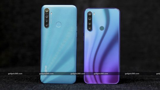
New Post has been published on https://magzoso.com/tech/realme-5i-vs-redmi-note-8-which-one-should-you-buy/
Realme 5i vs Redmi Note 8: Which One Should You Buy?
Realme just launched its first smartphone for 2020, the Realme 5i, which is positioned as a replacement to the Realme 5 (Review). The 5i brings minor design tweaks and specification changes compared to the Realme 5 and even the Realme 5s (Review), but nothing has changed too drastically. Naturally, this begs the question — is it the best phone you can buy for under Rs. 10,000 right now? And how does it compare to its peers?
One of its competitors is the Redmi 8 (Review), which is priced a bit lower, but looking at the specifications of both phones side-by-side, it seems as though the Realme 5i (Review) offers better value in many aspects. The Redmi Note 8 (Review) is another competitor, priced against the Realme 5s, which is very similar to the Realme 5i but with slightly better specifications. You can have a look at just how similar all the Realme models are in this quick comparison.
The Redmi Note 8, however, offers a higher resolution display, a glass back, and a USB Type-C port with fast charging — all features that are missing from the Realme 5i. So, does it make sense to buy the Realme 5i or put in a bit more money and get the Redmi Note 8? We decided to find out.
Realme 5i vs Redmi Note 8 design
Realme has tweaked the design of the 5i a bit, compared to the 5 and the 5s. It’s a tad slimmer at 9mm and a bit lighter at 195g. The back is still made of laminated plastic but the design is different. Instead of its trademark diamond-cut pattern, Realme has used a new ‘Sunrise Design’ which also looks good. In fact, we like it better, as the matte finish isn’t reflective and fingerprints aren’t easily visible.
The Redmi Note 8 on the other hand is slimmer and lighter than the Realme 5i, measuring 8.35mm in thickness and weighing 188g. The back has a glossy finish, which does attract fingerprints easily, but it’s the same Gorilla Glass 5 as the display, which gives it a premium look and feel.
In terms of connectivity, both phones feature two Nano-SIM slots plus a dedicated microSD card slot. Both also have a headphone socket but the Redmi Note 8 scores a few extra points here as it has a USB Type-C port, versus the Micro-USB port on the 5i. The Redmi Note 8 also has an IR blaster on the top, which the 5i lacks. Both phones have a single speaker on the bottom. Button placement is good on both and they both have an equally thick bump on their backs, due to the camera modules.
The Realme 5i (left) and the Redmi Note 8 (right) both look good, but the latter feels more premium
The Realme 5i and Redmi Note 8 have similar sized displays, measuring 6.5 inches and 6.3 inches respectively. However, there’s a big difference in the resolutions. The 5i has an HD+ (1600×720) display with a 269ppi density, but the Redmi Note 8 has a Full-HD+ (2340×1080) which works out to 403ppi. The difference in sharpness and image quality is evident when you look at images and videos on the two phones side-by-side. The default colour tone of the Redmi Note 8 is a little cooler, but you can tweak this in the Settings app.
Both phones have rear capacitive fingerprint sensors. The Redmi Note 8 offers a slightly better bundle in the retail package. You get a silicone case and an 18W fast charger, which don’t come with the 5i.
Realme 5i vs Redmi Note 8 specifications and software
The Realme 5i and the Redmi Note 8 are both evenly matched when it comes to the SoC. Both phones use Qualcomm’s Snapdragon 665 processor, which is decently powerful and is a slight upgrade over the popular Snapdragon 660 SoC.
The 5i is only available in one configuration, with 4GB of RAM and 64GB of storage for Rs. 8,999. The Redmi Note 8 starts with the same amounts of RAM and storage, but at Rs. 9,999. There’s also an option with 6GB of RAM and 128GB of storage for Rs. 12,999.
The Realme 5i has a 5,000mAh battery, which is larger than the 4,000mAh one in the Redmi Note 8. Both phones have dual-band Wi-Fi ac, Bluetooth 5, FM radio, and the same sensors. The Redmi Note 8 supports Google’s Widevine L1 certification, so apps such as Netflix can stream content in higher-than-HD resolutions.

The Realme 5i runs on ColorOS, based on Android 9 Pie. It’s lean and isn’t spammy as Xiaomi’s MIUI
Realme and Xiaomi both use customised Android skins for their respective smartphones. Realme’s ColorOS has become leaner over the years and the version on the 5i has an app drawer and a system-wide dark mode. There are plenty of preinstalled apps from Realme and third-party vendors. Thankfully, Realme’s OS doesn’t spam you too much with ads or unwanted notifications. The spammy notifications that do come in from apps can be disabled.
The Redmi Note 8 runs on MIUI 11, which is also based on Android 9 Pie. The interface is polished and you get plenty of options for customising the look and feel of the UI. The problem with MIUI is that you get a lot of unwanted ads that spam your notifications shade and within the stock apps, which cannot be stopped. This can get very annoying after a while. Both phones are yet to receive the Android 10 update.
Realme 5i vs Redmi Note 8 performance
As everyday workhorses, the Realme 5i and the Redmi Note 8 did a decent job in handling multitasking, and both loaded apps fairly quickly in our tests. Even though we were using the 6GB version of the Redmi Note 8, we got similar numbers in benchmarks. In AnTuTu, the 5i returned a score of 170,480 points while the Note 8 returned 174,277. In Geekbench 5, we got 310 and 1,308 points for the 5i and 309 and 1,324 from the Redmi Note 8, for the single and multi-core tests respectively. As for graphics tests, the Realme 5i took the lead since it has to render games at a lower resolution. Here, the 5i gave us 49fps while the Note 8 returned just 32fps in GFXbench’s T-Rex test.
The Realme 5i performs slightly better in games, due to the lower-resolution display. The Redmi Note 8 is not bad either, but we had to scale down the graphics settings a bit in games such as PUBG Mobile in order to get similar framerates, as on the 5i. We didn’t notice any heating issues on either of the phones.
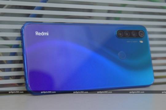
The Redmi Note 8 has a more premium finish and features a better display
Face and fingerprint recognition were quick on both phones, however we did find the Realme 5i to be a tad quicker at both. The fingerprint sensor on the Note 8 is a little smaller too, and so it isn’t as easy to hit as the one on the 5i.
The Redmi Note 8 offers a better video watching experience, thanks to the higher-resolution display. You’ll be able to stream full-HD videos from YouTube and other sources, which look crisp and vivid. The 5i will only stream at up to 720p resolution from YouTube and videos looked a little choppy at times. Both phones’ speakers don’t produce any semblance of bass, but the one on the Realme 5i sounds a bit louder.
The Realme 5i is clearly better than the Redmi Note 8 when it comes to battery life. Not only is the capacity higher, but it also lasted a lot longer (more than 24 hours) than the Redmi Note 8 (about 13 hours) in our HD video battery loop test. Both phones will easily last you through an entire workday on a single charge, even with heavy usage, but the Realme 5i will let you go for a bit longer before having to recharge it. The Redmi Note 8 offers much quicker charging (18W), compared to the slower 10W charging on the 5i.
Realme 5i vs Redmi Note 8 cameras
Both phones feature a single selfie camera and four rear cameras. The primary sensors are the only real big differentiating factor here. The Realme 5i has a 12-megapixel sensor, while the Redmi Note 8 features a 48-megapixel one. The rest of the rear sensors are the same on both phones: an 8-megapixel wide-angle camera; a 2-megapixel macro camera; and a 2-megapixel depth sensor. For selfies, the 5i has an 8-megapixel camera, while the Note 8 has a 13-megapixel one.
In daylight, the Redmi Note 8 did a better job with landscapes, capturing better dynamic range, details, and white balance. It did oversharpen images, but as long as you don’t crop them too much, you should be fine. The 5i shot comparatively softer images and didn’t quite correct the yellowish tone in front of the buildings. Even in close-up shots, the Redmi Note 8 managed better contrast, and whites looked as they should. The Realme 5i once again had a slightly softer image with a warmer colour tone.
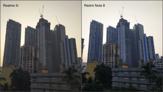
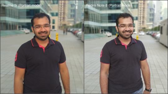
Tap for full-sized image
In Portrait mode, the Redmi Note 8 produced more natural-looking skin tones and better detail on our subject. The Realme 5i tended to smoothen skin a bit too much, and the tone was a bit too warm for our liking. Edge detection was handled decently on both phones though.
As for the wide-angle cameras, we found that the Realme 5i did a much better job with details and colours. However, when it came to the macro cameras, it was the Redmi Note 8 that managed better details.
The Realme 5i did a slightly better job with selfies, as HDR on this phone worked better than Xiaomi’s implementation, especially when shooting against the light. Portrait mode on the selfie camera works well on both phones, but the Redmi Note 8 produced slightly sharper and more vivid pictures.
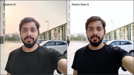
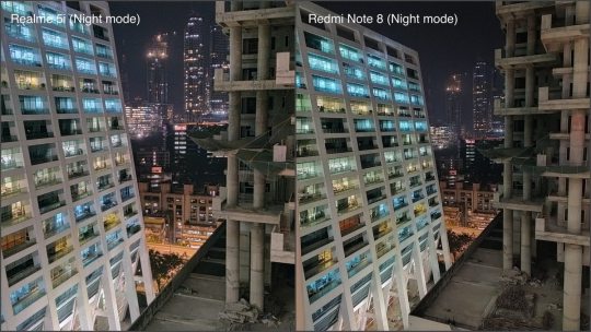
Tap for full-sized image
Video recording goes up to 4K on both phones, but neither one supports stabilisation at this resolution. Video quality is good and colours look punchy in footage shot with both phones. Videos are stabilised at 1080p, and here the Realme 5i offers slightly better stabilised footage compared to the Redmi Note 8. The wide-angle cameras on both phones can be used to shoot videos too, and here the Redmi Note 8 offers better colours, but the 5i does a better job with stabilisation.
In low light, the Redmi Note 8 gave us better detail in general. Objects appeared shaper and noise wasn’t as pronounced as with the Realme 5i. Using the ‘Night’ modes on both phones, the Redmi Note 8 continued to deliver better overall pictures, with sharper details and less noise. The Realme 5i also crops images heavily in this mode to compensate for hand shake, so you get less of any scene in your frame.
Even selfies shot with the Redmi Note 8 in less-than-ideal light looked better. For videos shot at night, the Redmi Note 8’s output had less noise at 1080p compared to the Realme 5i. However at 4K, both phones produced a lot of colour noise, making the footage somewhat unusable.
Verdict
Realme has once again modified its formula just a little bit to create yet another very good budget smartphone. The Realme 5i’s (Review) tweaked design looks good, and at its asking price of Rs. 8,999 for the sole 4GB RAM configuration, it offers good value. Plus, the relatively lean software, excellent battery life, and decent gaming performance all work in its favour. A few things that could have made it even better would have been the use of a Type-C port or at least fast charging. A full-HD+ display might be asking for too much at this price, but this is where paying that Rs. 1,000 more for the Redmi Note 8 makes a lot of sense.
Xiaomi’s offering is one of the very few phones at Rs. 10,000 to offer a Type-C port, fast charging, a glass back, decent cameras, and a crisp full-HD+ display — all in a very stylish and premium-looking package. If you can live with the spammy nature of MIUI, then spending a Rs. 1,000 more for the Redmi Note 8 (Review) is well worth it.
There’s no clear-cut winner here, that’s for sure. If you wish to save a bit of money, then the Realme 5i is a good option, else for a bit more, you can get a more premium experience with the Redmi Note 8. Realme also has the 5s (Review) at Rs. 10,000 with a 48-megapixel camera, but it still lacks features such as a glass back or a full-HD+ display, which is what makes the Redmi Note 8 a better offering.
0 notes
Last Seen Blogs

socionicsdatabase
Socionics Database

vanellopez
-Vanellopez-

passiflora-red
Passiflora Red


swamqpueen
little gypsy princess ♚