#they look more unique and stylized now i think :)))
Text
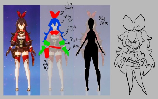
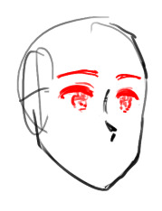
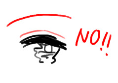
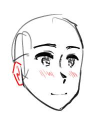
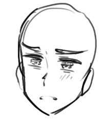
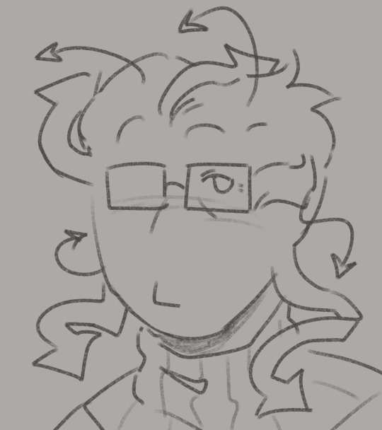
doodling mochi outfit concepts again
#the cat witchs guild#the misc adventures of mochi and lime#tcwg#tmaomal#art#mochi#ocs#original#beta#outfits#cat bow....but better#actually positioned in way that makes it look like a cat bow#smad genshin thought of the cat bow too but they did it better by putting it in the back#anyway. i wanted to try doing that for mochi#part of me wants her to have a more stylized hat because so many witches in my head have cool unique hats#and hers is basic in most art i draw..#im returning again to (what would i do for her if she was not the mc)#oh yeah and thinking about putting a ``tail`` on her skirt#god she looks so cat-like now heuehueueeu#does that tail get in the way during fights??? nah it just whips around looking cool#i want so bad for mochi to grow into her own witch and find her style#im always so wishy washy bc her spiky hat is so og but a more stylized hat is what she would have...if she were not my mc
317 notes
·
View notes
Text


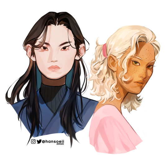
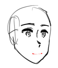
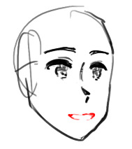
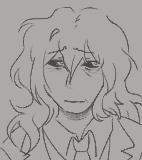
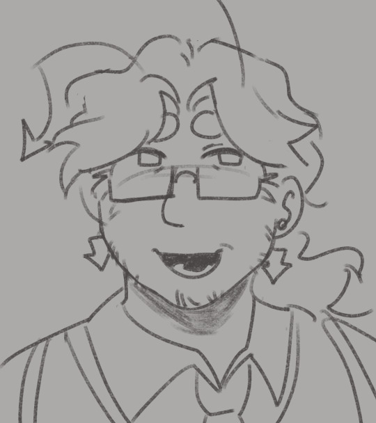
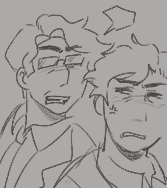
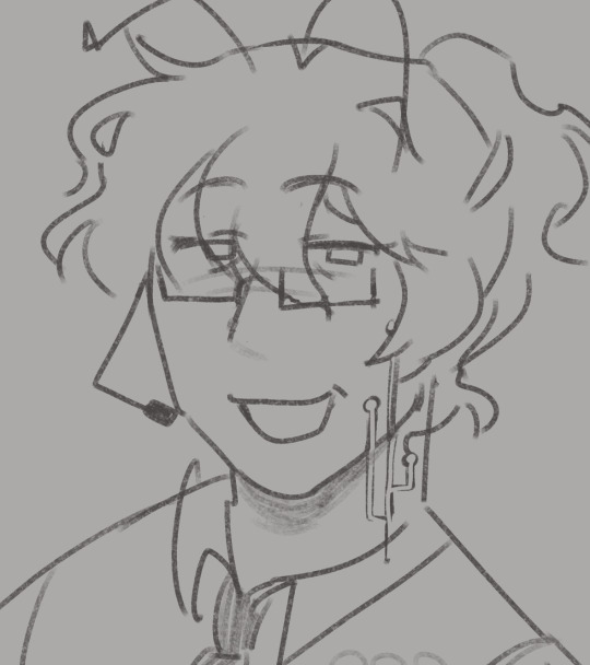
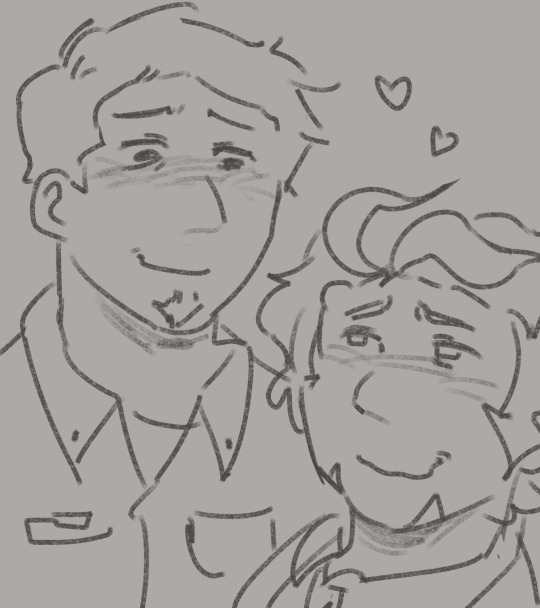
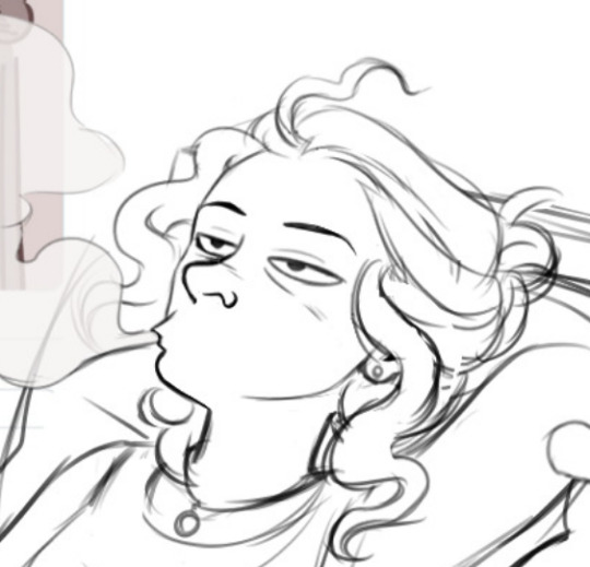
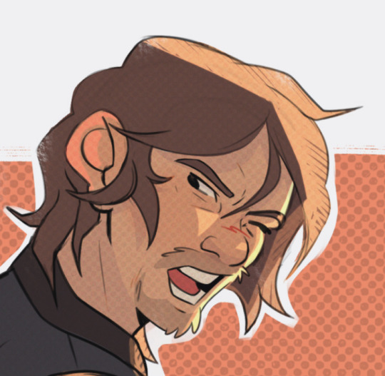
finally drawing (and redesigning!!!!) my babies (i havent drawn them in over a year) (ive been drawing ruikasa daily for over a year) (no correlation)
also ignore that theyre just floating heads it makes sense for And but i just wanted to be able to see their hair
#and tag#are tag#my art#they look more unique and stylized now i think :)))#like Are is meant to be a kinda copy of And but. ill be real they looked too damn similar in their old designs i think these look better#AND FOR THE RECORD: ARE IS NOT MY SELF INSERT‼️‼️‼️‼️ I JUST LIKED THEIR NAME SO MUCH I STOLE IT‼️‼️‼️‼️#self inserts arent cringe or anything but i just want to make that clear mk?#ill be drawing the rest of my freaks later hopefully
10 notes
·
View notes
Text
N i Know actiblizz isn't technically blizzard and it's not Technically the overwatch team, n while I do think actiblizz sucks (OBV), my beef has always been w blizzard and the overwatch team specifically, like to be fair i Don't have experience w other fps communities (so maybe i am wronggg) but im still p confident in saying that ow is one of the Most Toxic, which sounds crazy right, u have this insane cast of characters, half of which are clearly gay iykyk, n u can't even like. Acknowledge how shitty your community is, u can't even openly make a statement that yes, we love and support our lgbt playerbase. U refuse to say it!!! The audacity to make your mascot a LESBIAN n u can't even openly support gay ppl, christ forbid u risk pissing off the homophobes their feelings matter too right :'(
#talk#n their dollars matter MORE right???#AND TO BE FAIR i kno they just did smth re: pride in ow2 n also tbf i dont kno that much abt it#maybe they r being more open MAYBE they are not i dont rly kno how to go abt fact checking#n i am mostly talking abt my last interraction w ow in general#bc while the actiblizz lawsuit Was the catalyst for me finally putting the game down#i was p unhappy w ow for Years n it was specifically bc of the ow team#n tbh i think theyre still p shitty like just look at the pve news like they r constantly fuckin up n then immediately being like#oh but look over here we're adding this r u happy now?#but like. can u rly do this every time n expect ppl to believe ur word means anything??#it sucks i believe ow is still super unique n fun as a concept (a brightly colored stylized fps w a wide cast n fun abilities)#like who else is rly doing it#but ur dev team sucks SOOOO BAD GOD#like ffs apex legends was doing the pride stuff YEARS AGO#blizzard is consistently years late n a few promises short how exhausting
1 note
·
View note
Text

consequence / shopping
price x f!reader | 1.5k words
series directory
tags: stalking mention, white lies, jp fears no 'friend zone', entitled cats
a/n: john price vs. his feelings. john price vs. old man allegations. john price vs. his barista . ☕
john’s grip tightens on the wheel as he turns onto her street. he’s imagined this moment since he set her in his sight. possessing the patience of a sniper comes in handy with endeavors such as this, and it’s good to pull a trigger that isn’t lethal for once.
she’s waiting outside. good girl.
nose-deep in her phone, she doesn’t notice him until he’s a building away. his heart jumps into his throat when her eyes lift, and her face follows. she squints, then shades her eyes with a hand. a smile breaks the mild confusion, and she rises to her feet from the steps outside her door.
he forces himself to relax, painfully aware of the intensity of his gaze. he can’t risk running her off, but he has to see it—the moment of realization.
~~
it cannot be the same car. calm down, you order yourself, plastering a small smile on your face as john rolls to a stop, grinning back through the window. it’s statistically impossible. there are thousands of cars in town, plenty of the same make and model. this is just the universe’s idea of a cruel joke: giving your favorite customer the same car you smashed your face and arm into. your good hand shakes as you open the door and sink into the passenger seat.
coincidences happen.
~~
“hey.”
“afternoon. you look nice.”
“yeah? i was worried you wouldn’t recognize me without the apron.” she says wryly, draping her bags over her lap.
i’ve memorized your face and more. which one would think would help decipher the minutiae of her expressions. does she recognize the car? remember it? she was drunk and crashed hard enough to break bone—fuck, he hadn’t thought of the effects of the impact. too caught up.
he watches her buckle, eyes falling to her cast. it’s filling with signatures fast. the space that held his number is covered in a drawing of a cat. all that remains is ‘john’.
“did you draw over my number?”
“i didn’t think you’d want the free advertising.”
smart girl. the number isn’t traceable further than falsified records, but it's best to avoid nuisance. he lets the doodle eclipse his grand scheme and pretends to adjust the mirror. he’ll wait until the time is right. “that i don’t.”
the drive to her preferred market is ten minutes by car. she might’ve managed alone, but he’s done some of his best work in ten minutes. performed miracles and misdeeds. he spends this bit on recon.
he susses out a little more information about her life: she’s worked, on and off, as a barista for nearly a decade. she recently took in a kitten, the very one depicted on her arm, and named her chicken cutlet a tortoiseshell.
“it's all i had for food. now cece’s a snob.”
“points for uniqueness.” he grins and gestures at the doodle on her arm. though he doesn’t have much of an eye for art, it’s obviously stylized. “and creativity. bet you did her justice, like a regular artist.”
the comment, meant as a compliment, makes her wince. she ducks her head in poorly concealed shame, pretending to check something in her wallet. it comes out casually, like a weather report—she dropped out of an mfa program to move here, for the ex, a year ago.
the details resurrect his anger.
the tremble in her hand tells him to leave it. he will. for now.
the car park is packed, and it’s all he can do to not celebrate when he finds a space on the first go. he cannot be much older than her, but he’d rather avoid feeding the ‘old man’ reputation his sergeants encourage.
she separates her reusable bags as they climb out of the car. “do you have any pets?”
he circles to her side and takes them without asking, “no. afraid my schedule doesn’t allow for it.”
“oh.”
he beats her to the baskets, tossing her bags into the bottom, and she strolls past him. he traipses behind, head on a subtle swivel, inwardly tickled at how normal it feels. it’s not often he shops, let alone in the company of a bird. it makes him puff up. go a bit softer in the face, especially when a woman roughly his mother’s age gives them a long, wistful look in produce.
it’s nice playing house, even in the middle of a bustling supermarket, dodging the less spatially aware and rogue children. it strokes his ego to flex an arm over her head to reach the shelves she can’t and carry a bag of cat litter in the other. he cracks a joke about tinned fish, and though she doesn’t laugh, he can tell she wants to. how she ignores his suggestions and color commentary on other shoppers. it’s fascinating to watch her, all business, as if she were behind the coffee bar. tapping items off the list on her phone, triple-checking a recipe.
while she’s distracted, slowly loading the conveyor belt one item at a time, john pushes his luck. he slips his card and pays.
her focus breaks when she sidles up, reaching for her wallet, only for the cashier to offer the receipt. she takes it, confusion turning to understanding, and her jaw clenches. her thanks are muttered, and she promptly joins him in bagging what’s left.
he knows she’s upset before she speaks, practically punching items into the bag.
“please don’t do that again.” she whispers. “my wrist is broken. i am not broke.”
angry as she is, she sails out the doors without waiting. clearly expecting him to tote her bags like a porter and follow.
which he does, of course. it’s what he signed on for.
good view, at least.
the ride back to her place is quiet, but he feels the tension burning away with the light. it’s damn distracting how the sun plays off her skin and hair. ten minutes fly by. she turns to him as the car idles, a storm of thoughts in her eyes. severe, tempestuous, and pretty.
“park. you’re not off the clock.”
“yes, ma’am.”
the bag handles loop into one fist, and the litter rests on his shoulder. he beams, and with the complete confidence he usually carries himself, he starts up the steps of her building.
“uh…john?”
he glances over his shoulder and sees her fidgeting at the bottom of the stairs.
“that’s…not actually my address.”
his brows raise, fall, and pinch in rapid succession. the minx. a fake address. smart.
she sheepishly apologizes on the walk to one street over and explains.
“i mean, this part’s weird.”
“what part?”
“befriending regulars,” she shrugs. “the counter’s there for a reason—to sling espresso, yeah, but it’s also a social barrier.”
“do you often befriend regulars?” he hopes not.
“god, no.”
thank christ. he’ll start memorizing faces on his next trip, just in case.
“but being polite to people is part of my job.”
he cracks a careful grin. “do you get reprimanded for that?”
her eyes roll. “ha. ha. no. my manager’s a coward and afraid of me. what i mean is, it’s a tightrope. be nice, but don’t be too nice to the wrong people, else they’ll stalk you or something.”
john’s gut tightens. what was his plan again? expose her? he manages a chuckle. “and am i one of those…wrong people?” effortless.
“well, you’re a minute from my kitchen with an invitation. so.” she smirks after a second. “are you fishing for a compliment? for me to say you’re special?”
heat shoots up his neck and colors his cheeks. “i am not–”
“relax. i’m joking. but you are the first customer i’ve brought back to my place.”
the phrasing instantly sets him on high alert. it could mean nothing. it could mean anything.
her place is markedly worse than her fake one. he does not like the look of the neighbors, but the exterior light reaches the walk. he bites his tongue when she veers to the side, cutting down a set of steep stairs to the basement. it won’t do, not long-term.
but the interior of her flat—it’s everything he did and did not expect.
it’s sensibly furnished and lit to compensate for its floor plan and limited windows. it’s cozy and colorful, with artwork fixed to the walls and littering various surfaces. some pieces are more notable than others: tiny statuettes of women, a diptych of a cow, and a collage of what looks like found notes. in the living area, there is a console and a headset, a small collection of games and dvds, and ten too many knickknacks. a stuffed backpack occupies a seat at the table.
he moves mechanically behind her, toeing off his shoes and treading straight into the surprisingly decently sized kitchen. he sets the bags and litter down, rolling his shoulder as he soaks it all in.
might be his only chance, after all.
something bumps his shin. two big amber-colored eyes stare up at him, unblinking.
“you must be the famous cece.”
“the one and only.”
the young cat weaves through his legs, then jumps, immediately sticking her pointy head into the bag containing the chicken. she meows, indignant, when her human automatically hooks her around the middle without looking and returns her to the floor.
“bad.” she murmurs, unpacking. “would you mind setting the litter next to the door down the hall?”
john obeys, though he lingers outside of said door, staring through a crack into the dark of her room. she has a big, comfortable-looking bed. a shudder passes over him. an unhelpful throb. christ. feels like a fucking teenager. he pulls himself together, retreating toward the door to leave. probably overstayed his welcome.
just as he turns to say his goodbyes, she glares from the kitchen. around her neck, untied, hangs an apron—don’t be afraid to take whisks.
“where are you going? i’m making dinner.”
it’s not an invitation. it’s an order.
he slips his shoe off.
“yes, ma’am.”
#price x reader#price x f! reader#john price x f!reader#john price x reader#loser barista#me pingponging back and forth between writing The Horrors and comedic smut and this fluff like a fic obstacle course
521 notes
·
View notes
Note
Hello! Hope you're having a great day/night! I absolutely adore your art, you are one of my favourite artists. I love the way you shade and do backrounds. Also everytime I get into a new show I immediately see your art for it??
I was wondering if you had any advice on drawing more realistically (backrounds, anatomy etc) but still keeping a style?
Hey hey!
Thank you so much!
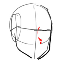
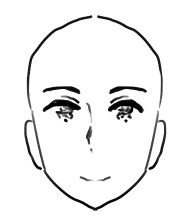
I have a pretty good understanding of facial structures, because before I got into drawing more semi-realisticly, I heavily focused on realistic portraits. Here are some example, these are from around 2019!
(yes, I was really into danmei and kpop back then, haha)
I just always loved drawing/painting faces and it was all I did. But at some point I realized that I wanted to do more than that because just portraits felt super restricting. So it took me around 2-3 years to somewhat find my style. Thought it would be fun to show a little timeline! Advice will follow afterwards :)
2020
I began working on my OCs in 2020 and since I didn't have an exact reference to work off of, I struggled a lot. My art from this year is super wonky.
2021
Still wonky, but the Lokius obsession was the jumpstart into finding my style! My work from this year is all over the place haha, I was experimenting a lot.
2022
This first ofmd piece is pretty much the first drawing where you can see where my style is gonna go, which I think is pretty cool! This is the year I made the biggest progress cos I was drawing SO much. These two pieces are only six months apart. The one on the right was the first time I gave drawing a background a proper go, too! It was a good year.
2023
And this is where I am now! I'm still constantly learning and improving, but I'd say I have a style you can recognize now!
Now here comes some actual advice, haha:
What I highly recommend you to do is to study your favorite artists as much as you can! I have like 5 A4 sketchbooks all from 2020 that I filled with sooooo many studies, where basically all I did was look at artists I like and copy how they draw stuff, to try and figure out how to stylize certain things. Some of my favorite artists are Ami Thompson, Velinxi and TB Choi. But I also liked to just scroll through pinterest and study all the art I came across that I liked! For example, if I saw a really great drawing of a pair of pants I would copy it many times in my sketchbook and try to learn how they stylized the folds. Doing this for a prolongued period of time will naturally improve your own work! It'll be difficult at first, but you gotta push through, it's gonna be worth it!
I also highly recommend studying unique faces to try and avoid the same-face syndrome. Find some cool looking people and try to draw them as simple as you can! Maybe even draw a little timeline where you first draw them as cartoon-y as you can, and keep going until you end up with a more detailed, realistic drawing. Maybe in the middle of it you find a step that feels the most fun to you, so you can try to build on that! It's a great way to figure out what kind of style might be the best for you.
Here are some cool faces I found on pinterest!
I have a pinterest board with many more!
One REALLY important part of learning how to draw all kinds of things is to understand forms and shapes and how to manipulate them. I have so many pages in my sketchbook filled with just shapes that I drew from all kinds of angles without any references.
This is a great video on it:
6 Ways to Draw Anything by Proko
Learning how to do this is so crucial! Young artists often think they first have to learn all kinds of detailed anatomy before doing anything else, but all that's gonna do is make you tired and hate drawing. Shapes are where it's at! Once you understand how shapes work and which ones to use for certain parts of bodies or objects, drawing is gonna get so much easier! Once you understand them, you can get into details such as muscles and bones!
And honestly the most important point is to just absolutely love what you're doing! I wouldn't be doing this if it wasn't for the fact that I get extreme hyperfixations on certain media that turn me into some kind of beast where I can suddenly draw 10 detailed illustrations a week, haha. Just be passionate about what you do, find something you REALLY love and go crazy!
I really hope this was somewhat helpful! My inbox is always open if there's any more questions :)
#responding to these has made me realize how much I love helping you guys out#it's genuinely really fun and I just hope it's actually helpful haha#my art#art advice#art resources#ask#anon
447 notes
·
View notes
Note
I know it would probably bring a lot of hate comments but I am begging you to roast the hazbin character designs because I'd love to have someone properly articulate why they don't work so I could send it to people who won't believe me when I tell them. 🫠 Understandable if you don't want to get into it though.
I don't think there's that much there to roast, honestly?
Those designs are clearly an extremely specific stylistic choice, and because that style is consistent throughout the show, it ultimately feels coherent with itself.
There are trade-offs being made. Because Hazbin's design style is SO stylized and so heavy on decoration and detailing, because it puts a lot of emphasis on costuming, it isn't as good at communicating specific character storytelling as a more grounded style could be (it's kind of the same tradeoff that stuff like Genshin Impact makes).
Like, why does Sir Pentious' hat have an eye and a mouth on it that makes its own expressions? Apparently not for very much reason at all, except that Pentious has a bit of an eyes-motif going on in his design and it was one more place to put an extra eye. And that's a valid criticism of his design, but also the entire show is designed like that, so frankly it would be weirder and more out of place if his design alone didn't have that kind of overelaborate decoration going on.
It does create a situation where I have a hard time "reading" the character designs sometimes. For example, Vox, Alastor and Pentious all wear a similar style of suit with upwards-turned shoulders, butterflies and pinstripes. Now, am I meant to read that as Vox imitating Alastor due to his crippling need to replace and outdo him, and Pentious imitating the style of powerful Overlords because he thinks that possessing their level of power will finally give him relief from his paranoia and self-loathing?
Or is it just a design fixation of the creator who keeps putting their characters in suits because that's just what they like? I can't really be sure, because sometimes design elements are used to intentionally tell stories about how characters relate to themselves, their world and one another, but plenty of other times designs look the way they do Because Of Vibes.
But again, that lack of clarity is clearly an intentional trade-off - and the benefit of that trade-off is a design style that is extremely varied, wild, expressive and memorable. Hazbin Hotel seems like a very easy show to draw fanart of, and a very fun show to draw fanart of. Those designs (especially the hyper-expressive faces) are begging to be the subjects of traumatic headcanons, unbearably cotton-candy soft fluff fantasies and weird, taboo, homoerotic power dynamics. Slaps roof of character design, this bad boy can express so much vicarious emotional intensity.
It's very exuberant, very excited about itself and very self-indulgent, it's a style that prioritizes visual impact and visual interest over readability (something which the animators of the show navigate with real skill, props to them) and individual aesthetics over worldbuilding.
And I don't blame anyone for being turned off by that (I certainly was the first time I started seeing those designs going around), but I would struggle to call the show's designs "bad" when they are clearly achieving exactly what they want to achieve.
I have some criticisms, especially re: how the show treats skinny bodies as an unquestioned, desirable default, and employs fatness as a means of alienating and abjecting the audience. That sucks very badly, and is a serious disappointment, and one of the few places where the show feels like it is being cowardly in its design philosophy. But I don't have it in me to do some kind of Hazbin Hotel Sucks And Here's Why takedown, its problems are not unique or extreme enough to warrant it, at least not as I currently understand them.
598 notes
·
View notes
Note
Hi!!!!!!
I really love your art and I was wondering if you had any art tips?
I'm pretty good at drawing realistically, but I struggle with more stylized or cartoon-y stuff...
Here I’m going to talk about the two, in my opinion, the most important aspects of stylization is: ‘Simplification’ and ‘Exaggeration’
First, simplification,
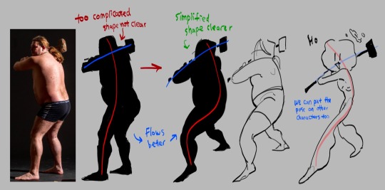
I took this picture of a man holding a hammer, if you just look the silhouette, it is very complicated the pose is stiff
Try summarize the pose with only two simple lines, one representing the head, torso and the leg, the other representing the arms. This is the line of action. Now you got the two lines, play around with it try make it flow better. (Google ‘line of action’ you can find a lot more better examples)
The next step is to simplify the previous drawing throw away all the bumps and little details, take what you think is the most important and draw it based off the line of action you just acquired. this step might take a lot of practices so look at tutorials and draw a lot you’ll get there (Go on YouTube and search ‘life drawing tutorial’ they teach this step really well)
This is how you simplify a complicated pose! I’ll talk about how to simplify character after the next point
Second is exaggeration
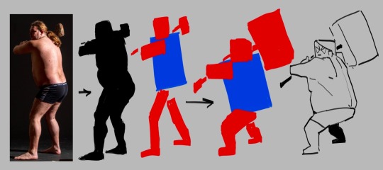
I’m using the same photo here again blocking the person black so we can see the silhouette clear. This time we’re not finding the line of action, we’re reducing this person into a simple shape, to me, he looks like a rectangle.
great, now we try drawing this man with only rectangles
After blocking out the simple rectangles, exaggerate them, make the big ones even bigger, the small ones even tinnier.
Make the main focus of the drawing clear and easy to see, the audience needs to be immediately on that thing the moment this drawing shows up! What’s the focus point of the drawing? The hammer, it’s too small for one to find so let’s exaggerate it make it huge.
Tada, now you have a clear and cartoony silhouette, the rest you can fill in however you like
To cartoonify a character is easy, similar to how you cartoonify poses, you take out the little details and leave what you think is the most important, the things that makes the character unique, and exaggerate them
((Here I’m using a genshin character because their character designs are known for being a hell to animate (genshin fans don’t come for my ass this is only for educational purposes))))
I’m… not the best at explaining things so if you can’t understand any of these please let me know!!!!!!!!!!
695 notes
·
View notes
Note
How do you recreate the Hetalia artstyle so well
ok so.. .uhhhhhhhhhh honestly i dont even know how. which is why i am obviously qualified to make YOU, yes you, the person reading this, a tutorial
i psoted an incomplete tutorial on the hetalia art style some few months back and when i look back at it now, some things are just straight up wrong or need clarification (also its the same post where i accidentally sent multiple death threats to a random sex worker thinking they were just a porn bot oopsies) so if you guys still remember that, forget about it! all of it!!! this is a brand new, more accurate guide on how to draw himas style!
(quick warning though im just a weeb not a professional teacher by any means so dont take this as gospel and dont get mad if i got something wrong or something is confusing)
himastyle tutorial! (the better one) part 1
(link to part 2 here)
ok lets start off with the
HEADS

this is just the way i start drawing my heads personally. if i had to describe it, its basically a simplified stylized version of the loomis head method. proko has a good video on it! just give that a quick watch then take a look at my step by step guide
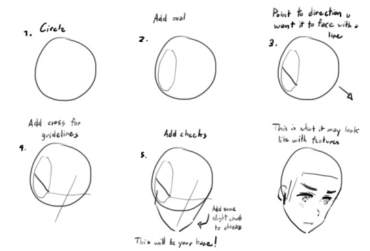
but besides this, there are some important things about the head that you should remember
the shape of the head is generally rectangular
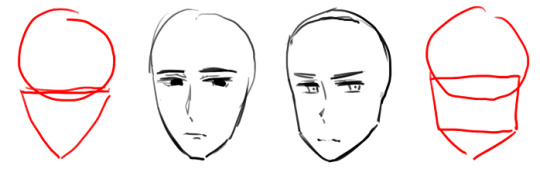
compared to more typical ikemen styles, hetalia characters have a more rectangular head. HOWEVER their chins taper off to a very triangular shape. rarely do the chins flatten out like the guy on the left.
2. shorter face = younger/more feminine appearance

well... self explanatory. you can see in the diagram how changing the length of the face gives a character a more feminine/childish look.
if you feel that something looks kind of off, feel free to change it, but if it looks okay then lets move onto facial features!!!
NOSES:
ok so this might seem a little weird but i like drawing the nose first. its right in the middle of the face and is generally the easiest to get right. it also kind of acts as a divider between the eyes, especially useful when you're drawing in a 3/4 angle

which kind of look something like that i guess.....
or that if you want something less extreme
anyways while hetalia noses are kind of inconsistent they generally have the shape of these three lines. feminine/childlike characters have a smaller and subtler nose though
noses also never face fully straight ahead, so when drawing a front view, the nose slightly faces right or left (tbh himas characters rarely face the camera head on, so id refrain from drawing frontal views altogether but thats just me)
anyways lets move on to my second favorite part of the hetalia art style
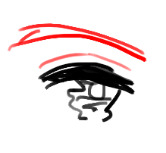
EYES:
the eyes are the most important part of himas style. if all else fails, you can always recognize the style by the eyes. luckily for you, the eyes really arent complicated compared to other anime styles :D here is how i do it:

(feminine and childlike characters have bigger eyes)
you have probably noticed this but the pupils hima draws now has a more squiggly teary-eyed look compared to the pupils he drew then...

i subcounciously do a mixture of the two because i got used to drawing the old type, but if you wanna draw the new type of pupils just take note of their squigly shape and that they have one dominant highlight in the upper-middle area. uhhh.. or if youre like me just draw the old eyes as if you have parkinson's
anyways heres a step by step guide

and some fun eye variations!!! you can try using variants if youd like to give an oc a more unique look (you can also try making your own variants too but be careful of straying too far from the style)
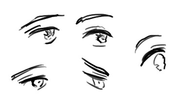
so now about the eyebrow and the eyelid.... uhhh the eyelid doesnt really have a consistent length so just draw it however. feminine and childlike characters have thinner eyebrows but even then eyebrows should never be drawn as just a single line
we are close to finishing the face!!! now we can move onto
MOUTHS:
if you know how to draw a typical anime mouth, then hima mouths is easy peasy!
for closed mouths just draw a curved line with two dark blots for the corners of the mouth

i think that giving them a shaky look makes them look more expressive
open mouths are just random blobs, dont close off the bottom though, and theys till have those dark blots at the corner of the mouth

now then i'll move onto the
EARS + CHEEKS:
i decided to combine these two since these are probably the easiest parts of the face
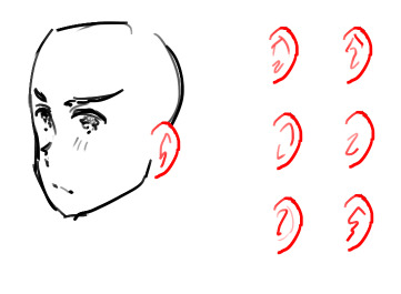
hima's ears are pretty round and don't really vary in shape. inside the ears though....
it isnt very consistent, so don't think too hard about "getting them right". above are some ear variations i drew from one of the latest chapters of the manga

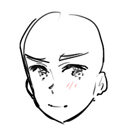
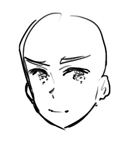
the cheeks are just a bunch of lines that can appear fully, or only on one cheek, or don't appear at all. i think it depends on level of detail, angle, or the character's emotion
these lines do not appear on rendered pieces
also if a character feels especially displeased they will gain heavy eyebags

so yay! we're pretty much done with the face!! look forward next time to where i cover hair, the body, and other stuff idk... i'll link the other parts to each other when i complete them
120 notes
·
View notes
Text


I love the think tanks so much all of the scientists were such interesting characters and I'm obsessed with them. Soon I'll draw them prewar but for now I tried really hard to stylize their think tank bodies to make them look more unique from each other. I'm sure I'll modify these designs more in the future
#fallout#fallout new vegas#fallout fanart#fanart#fallout new vegas fanart#old world blues#dr klein#dr 0#dr 8#dr dala#dr mobius#dr borous#think tank#art#traditional art
119 notes
·
View notes
Text
Here’s the first batch of drawings I have done!
@robygoonn I love him so much you have no idea omg…. He’s a pathetic wet cat in the best way possible and needs SO much more love I swear. One of my favorite interpretations of the narrator I might even say
@bugenthusiast0 (from discord) I’ve already drawn this guy quite a few times FOR GOOD REASON I might be in love. I love love love him so much please tell him to not eat me 🥺🙏 /silly i do NOT taste good we should cuddle instead
@an-theduckin these guys were actually so much fun to draw and idk why,, I love how tired Stanley looks btw hehej z
@unorchido your narrator is so unique and silly I LOVE how stylized he is!! The arrows were really fun to draw, I had a really good time making this guy <3
@genericusername422 (from discord!) I actually tried drawing him a while back but I totally forgot to finish it,, agh. His HAIRR and I love his robotic markings those are SO cool. Anyways throws him at a wall really hard
@employee052 YOU KNOW HIM YOU LOVE HIM. VIRGIL MY BABY (old man)…. I’ve definitely been familiar with this guy for a long while, I’m really surprised I didn’t draw him sooner but honestly it was a good thing since I can really do him justice now… though I may need to draw him again in the future..
@machathecat another really pretty design! I love seeing more animal like designs in characters. I just think his horns are really neat……… 🥰
@dirtylittlemuffin THEY ARE SO IN LOVE. AAGH I love your Stanley and the little arrow goatee it actually drives me crazy bro.. and this narrator design is really neat to me <3 I love them
@sketchygoober MY BABYYY I’ve always loved your narrators, they’re so iconic to me.. drawing your characters is always so fun and I LOVE drawing wings!!! Ahhfjriehwkakdkf he is so pretty..
@bookshopsandtea last not DEFINITELY not least! Your coloring is so soft with them and it’s so so so soooo <€{£{£\¥\ ♥️♥️♥️ interpreting your characters into my style was definitely really cool!
and that’s it for now, but there’s still a lot more to go so don’t worry we’re not done yet ahah. Drawing everyone’s different face shapes and nose shapes and body types and hair styles is really helping my art skills <3 so thank you for the submissions!
109 notes
·
View notes
Note
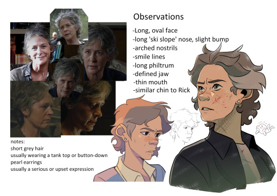
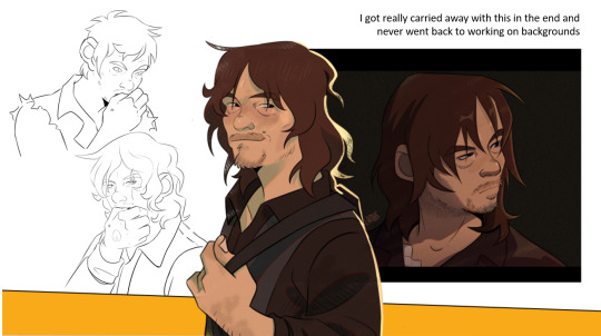
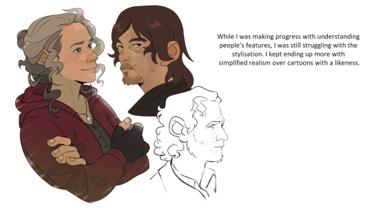
Hello! Do you have any tips on stylizing/drawing real people?? recently ive been trying to draw from my favorite shows but they either look too realistic or just not like the person at all. I love all your twd art and its really inspiring!
Omg thank you so much, it’s actually so funny you should ask this because this is exactly what I’ve been struggling with/researching for like 6 months. In fact I had an independent research project at uni that I told my prof was gonna be all about learning how to make background art for my final film project. But I got SO into learning how to stylize real people that I forgot to do the project at all and just submitted all of my walking dead fanart and stylization research and somehow got a B+
So strap in, you are about to get blasted with a hyperfixation that was so strong it almost lost me my bachelors degree but instead (somehow!!) got me one of the highest grades this prof gave out this semester
I’m still learning and trying to get better, this hyperfixation isn’t over it just has to be on pause because I WILL fail my final year of university if I let it take me lmao
First of all, here are my project slides (PLEASE ignore my cringe-ass writing, most of that shit was done in a panic at 5am)

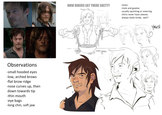
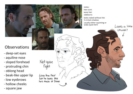
this was a good leaping off point and now I know their features like the back of my hand, but they're missing a lot of character imo
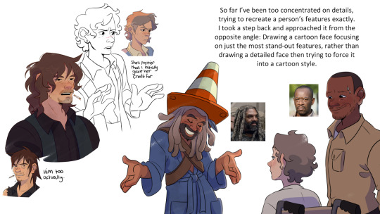
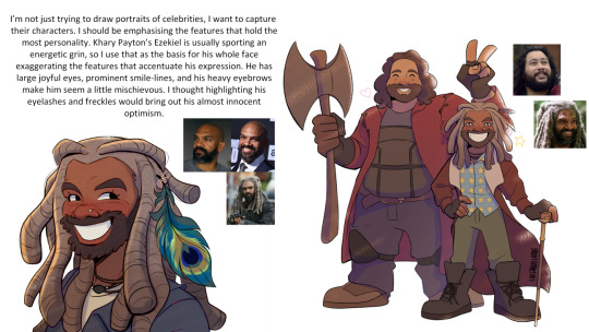
"I thought highlighting his eyelashes and freckles would bring out-" blahblabla, truth is I just think he is very Eyes and his freckles are cute but I can't just be saying ''it's about the VIBES sir''
I highly recommend looking at an artist called @geitonas. They were actually my biggest inspiration in this project because personally I think they’ve mastered stylizing real people and their art is how I want my walking dead fanart to be. They know exactly which features to push and which to downplay, so if you’re familiar with the subjects you can recognize them immediately.
But the biggest thing to note is that their features aren’t replicated exactly, they just have the right energy.
I guess my biggest advice is pick a focus feature. For Carol I think her most defining feature is her nose. It's an odd thing to say but she has very distinctive nostrils. So no matter how stylized I draw her I try to keep this feature in mind, even if everything else goes out the window
Keeping an eye on someone's unique mannerisms and facial expressions can go a long way too. Rick's squint, Michonne's stare, Daryl's scrunch...
This turned into a ramble. My thoughts were more coherent but too many of them wanted to come out all at once. Hope this was helpful anyway!
#asks#twd#the walking dead#scribbles#edit: these images were aranged better but I guess the ask format forces them into one long line sorry
74 notes
·
View notes
Note
Well since you reviewed Pinsir, how about Haracross too?

Heracross is the counterpoint to Pinsir, though ironically the two couldn't be more different design-wise. Pinsir is very much a monster that looks vaguely like a stag beetle, while Heracross is pretty straightforwardly a rhinoceros beetle (stag beetles and rhinoceros beetles being some of the most popular pairings in Japanese bug fights, which is what Pokemon is based off of). Sure, Heracross is bipedal and there are some anatomical differences here and there, but it's not quite as wildly different from the IRL insect compared to Pinsir.

Visually, Heracross is a fairly rare example of an almost completely monotone Pokemon, being a nice shade of blue with only its white claws and yellow eyes to break things up. The body has a plated look to match actual beetle exoskeletons, and includes details like the spikes on the forelegs that actual beetles have. I like Heracross' face in particular—the face is divided into its own section that looks around and under the eyes, creating a short of :3 mouth shape. It's both cute and a unique way to handle the tricky subject of how to stylize bug mouthparts for Pokemon in a way that isn't just humanoid. Overall, a very straightfoward design, but a pretty decent one.

The degree to which Heracross' design is straightforward is a bit of its time, so Mega Heracross adds a ton of detail, some of which works and some of which I think just clutters things. It also progresses the rhinoceros beetle idea by making it into a Hercules beetle specifically, one of the biggest beetles out there, as emphasized by the particular double horn shape.

I do really like the addition of the red bands around the body, which is now a slightly darker blue for higher contrast. I don't mind Heracross being monocolor, but the red bands add just the right pop of color without being too much. The progression of the theme and the overall changes to the body shape make it very distinct and give it a good sense of progression. There's also a few neat mechanical things in there, like the way it can pop open its arms to fire things like seeds

However, there's also some parts of the design that feel a bit overworked. For example, I don't get what that giant red splotch across the forehead is supposed to be; it's pretty distracting and really doesn't add anything to the design. (I also miss the :3 expression, but that's not the point.) Likewise, it has yellow on its back, which feels like too much color—yes, it looks like a Hercules beetle, but I feel like it gets that across perfectly well without the unnecessary color.

White it's less of a problem, I also don't love the vents on the stomach. It's probably supposed to look a bit mech-like because bugs are a big superhero thing in Japan, but I feel like this pushes it too much into looking mechanical instead of insect-like. I think if the vents were just changed to straight line divisions and the yellow elytra and red on the forehead were removed, you'd have a much more cohesive and less busy design.

As a whole, Heracross is a pretty straightforward but nicely designed rhinoceros beetle. Mega Heracross has the right idea, but has just a few too many things going on with it that bog down the design a bit.
42 notes
·
View notes
Text
no pokemon game will ever come close to beating pokemon colosseum
set in the deserts of pokemon-arizona
playable character, Wes, is a criminal who opens the game by stealing valuable tech, and then riding off into the sunset on his mad max motorbike while the bombs he left in an occupied building destroy it to rubble
you don't catch wild pokemon. instead, with the help of a kidnapped psychic, you steal pokemon from other people. you just throw pokeballs at other peoples pokemon during battle and then leave with their pokemon. how are they going to stop you? with what pokemon? your city now, bitch
the villains in this game have been torturing pokemon to insanity. you have to therapy these pokemon back to health by... forcing them to fight for you.
the music. look up pyrite town theme right fucking now.
miror b........
there's an entire underground bladerunner-esque city hidden from almost everyone. it contains a gang of independent child criminal hackers who do far more to help you than the cops.
i just love the wild west/high tech mashup vibe. its sUCH a choice aesthetic.
DOUBLE BATTLES ONLY
wes the hardened badass edgy criminal and his two main pokemon, espeon and umbreon, a pair of cute dogs who love him so so so so much
the battle system in this game is choice.
because there aren't wild pokemon or random battles, and you can only steal certain pokemon, you actually have really limited options for battles. you'd think this would be annoying, but i really enjoyed it - its a very good foil to the other pokemon games where you have infinite possibilities. it forces a casual player to strategize a lot harder.
especially if you're trying to heal all the shadow pokemon - you have to use pokemon in battle you never normally would have.
this is such an old game, iirc one of the first 3D pokemon games ever? and the graphics are understandably clunky, but even then there is so much heart and care put into it that it doesnt feel outdated, just heavily stylized.
EVERY POKEMON has unique animations that are just so much fun and really shine in the battles. especially their K.O. animations. its just so much fun. modern pokemon, take notes
54 notes
·
View notes
Text
SPOILERS FOR TF ONE. PLEASE DO NOT CLICK READ MORE IF YOU DO NOT WANT SPOILERS. ALSO TF ONE WAS GOOD.
disclaimer: i dont have good memory and for that there is likely some inaccuracy to what i claim, wrong terms, etc. also very out of order but i enjoy rambling
somewhat intentionally vague things i liked about the movie
1. the music was swell
-the score as to when the main group was on the surface was cool, when they were going between diff. environments
-the ending scene with Optimus being granted the Matrix had a very fitting background score. + also was surprising fitting with the execution of Sentinel Prime that was also occurring atm
-I am not knowledgeable about music, but I assume synths were used a lot, and they were lovely........
2. The animation for high action scenes
-was soooooo amazing! in particular There was a lot of creative liberty taken with how the bots would transform parts of their body to fight. Which had shone in Elita's fighting andd i am unsure beyond that. Airachnid's fighting, using her legs to spin and shred and stab aggressively was great too
also I'm biased towards like. them ripping parts off eachother i.e. the fight between Armada Megatron and Optimus is a good exemplar of this. all the greater to see that again in the fight between TF ONE MegOp in their third forms aaaaaaaaa. Seeing Optimus rip Megatron's tank cannon off, almost oxidize his metal by burning it to shit, and so on, that is WONDERFUL. I cannot recall what Megatron did though of course it involved him trying to explode Optimus' face
-not a fight scene but actiony, the Mecha gore of taut wires just wrenched apart w/ the splitting of Sentinel Prime's torso was delectable ha-ha
3. few minor details
-seeing D-16 wipe the dust off of Orion yayy
-Orion (remember from their first meeting!!!!) knows D-16 is a huge fan of Megatronus and so for him to get that sticker, for him, was very cute and loving of him. what a friend. only made it as horrible to see that sticker used to demean and punish D-16 by Sentinel Prime
-the stylization of optics is LOVELY. their repeating shape of iris is great. the different eyes across the characters = great. the fact that they spin around during high times of emotion is sooooooo -------! great. i loved seeing this in D-16, when Sentinel Prime's treachery was revealed! his optics spun very much which i inference as emotional
the eyelid for optics is not a traditional blink, like a whole eye covering shutter. it looked very unique and complex, and you could really observe the design of it in that close up shot of Elita waking up and i found it very nice
-the way post t-cog Orion Pax leaned down to be on equal height / level / eye contact with his fellow mining buddies was a good display of character. showed his genuine heartfelt intent in connecting with them, helps to trust in the incoming truth! just because he has a t-cog now does not mean he will carry himself as if he were greater than them
4. Sentinel prime was cool
-his con-man shtick and unadulterated "I want power" was refreshing and is further bettered if you take into account his status as an Autobot and previous prime. there should be eviler Autobots in the movies
-i dont understand why he has TFP inspired characters as lackeys but fun
-nod to Bayverse Sentinel Prime with his choice of weapon is good
5. Alpha Trion
It was unexpected to see him have an alt mode that was animal-like. i loved it. he is normally a character i dont think much of in terms of any continuity, so it was nice to see him shined on in that brief time
6. models
-the models for the dilapidated figures of the 13 Primes were soooo goood i am in love with them. i am a big fan of the Transformers, as strong and terrifying as they are, painted so frail and weak when left to the sands of time. the overgrowth, the missing parts of their body. the vines. the moss. Delicious !
-i appreciate that they bothered to model t-cog transformations for background characters at the end, even if they wouldn't have been on the screen that long for TF ONE ^_^ although ofc that may be because they'll be reused in the (hopeful) later movies. im going to say that last sentence a lot. their new forms are also crumbs for fans of those characters
7. that one place the main team encountered on the surface?
-so, there is that portion of the movie where they are trying to get to the coordinates of the matrix. but a Quintesson ship appears
maybe i am being delusional but the area reminded me a bit of the Sea of Rust level in CH 4 of Transformers: Fall of Cybertron so that was pleasant
8++++++.
There are tons of other things in TF ONE that I think were great!!!!! I would go on too long to mention them all. Now here is stuff I think would be better.
stuff i think would be better
-more screentime for the Decepticons would have been nice. yet i presume in the later movies in the trilogy that this will be touched on. given that we GET a trilogy
the high command did not get to do much ( i am bitter that Starscream did pretty much nothing out of this group)
-wish there was furthered display of Cybertronian culture? Say like being taken into a scene where we get to view the exterior and interior of a flying bot's home, or any other type of home. anything. see a higher-caste bot's berth? do they all sleep upright?????! fun
as well as food :] was interesting to see Alpha Trion get fed that little cube of energon, or Orion crashing into that establishment into a pile of energon. but what about if they process energon into any other form? if they drink oil? etc? awww? if they take showers????? idk
itd be funny to see D-16/Orion go to a party lol
-more environments beyond the few on the surface and more plants, animals
-i don't prefer Steve Buscemi's voice for Starscream. i mean, in the credits they had Steve Blum? but he voiced minor characters?? ....bummed they did not ask him to voice ......oh...
-the action of the scenes i praised earlier. however thinking about it again, there is slightly too much going on, too many sparks, too much blur, maybe that is just me, it is hard to parse what is going on during fight scenes sometimes. a little more clarity would be amazing. but again i still loved it and was very excited as i was viewing and didnt care too much
--------conclusion
Overall. it is a lot to expect so i understand they couldnt touch on all of this! just a far dream of themes I'll have to collect into a ball from the other outputs of the franchise. I thought it was a pretty good movie in comparison to all preexisting Transformers movies and would pick it over those any day. sorry 1986
good time i recommend seeing it
19 notes
·
View notes
Note
Hello hello!!
I would like to place a request for the traffic light tiro!!
This is pre relationship. Like pining from the trio, and I mean hard pinning. So s/o is someone who (preferably has long hair) normally has their hair up all the time. It’s more convenient that way. But one day they needed to go to a party a friend invited them too. So they let their hair down too look good for the party. But they left something at each respective tiro’s place. So they run by to go get it still dolled up so they can run straight to the party after getting what they left. Mei/Mk/Red son see s/o with their hair down and more pretty compared to their normal appearance for the first time and they get shot with more then one of Cupid’s arrows. They just got promoted from simp to hardcore simp
Do what you will
Thank you :D!!
Hi! Hi! Sorry it took me a while, I was busy with school and such! And aside from that I have a lack of motivation:')

Mk
He was.. wow amazed, your hair looks beautiful before and it's even more beautiful now.
He can't help himself! He just can't! He'll fall deeper for you and your beauty's.
He's not one to look at someone's base of looks and prefer their personalities. But when he looks at you he can't help himself.
He'll be all over you! Always around you and such.
When you come to his work with your hair tied up, he'll ask you to let your hair down cuz he thinks it's more beautiful that way.
Mei
Oh my gosh, you're so cute! She loves your hair! She adores it.
She asks if she can stylize it. At one point she definitely makes your hair match like her's.
She adores you with your hair bun now she adores you more!
I like to think she loves someone with long hair preferably because she plays with it and helps style it.
From then she sometimes asks you to let your hair down cuz she likes it that way more. And you sometimes catch her playing with your hair
She can't help herself ok! It looks soft! She'll definitely play with it at times.
Red son
He has long hair himself, and often has it in pony tail. He likes yours too, a unique one he must say.
The first time he saw your hair down amazed him, not only did your hair look super soft and fluffy it did suit you well.
He's falling hard for you, he's kind of a tsundere to me.
He denied himself to fall further for you but he can't when you look very beautiful and appealing.
He'll definitely help you style your hair, even both of you having matching hair style.
Sometimes you would copy his hair style, he thinks it's funny but doesn't express it much.
#lego monkie kid#lmk#lmk x reader#mei#mk#red son#lemon writes#mei x reader#red son x reader#lmk mk#lmk mei#lmk red son#x reader
161 notes
·
View notes
Note
LR is really, really good but I just wanted to say something- this is probably more about the readers than LR itself, but when it's said that LR is so much better than LO artistically (which it is!!), like say in terms of writing, pacing, and art - I think it's also not an apples to apples comparison, since LR has LO to draw inspiration from and a lot of external reactions to LO to learn from for what to do and not to, while LO is both time-constrained and (when it started out), didn't have much basis to compare to.
(The SA plotline is one example.. many criticize RS and say she shouldn't have written it in the first place but that's the thing - she actually didn't know. While I agree it's really shitty and RS has definitely ignored a lot of criticism she should take into consideration, the conclusion that she shouldn't have written it in the first place wasn't something that she knew about until after fans pointed it out. She definitely is mishandling it now, but I think writing that in at the start was born out of actual ignorance - different from her problems now, since she's now actively ignoring and shutting down the feedback she does need to get better. This blowing up educated a lot of people- probably not you specifically- and opened up a lot of dialogue for things that Rachel likely didn't have access to at the start of LO. and has no excuse for now.)
Anyway, yeah - Love Lore Rekindled, thank you for creating it! Genuinely, I do - this ask isn't meant to be a bad thing against you at all, nor do you need to reply to it.
Not a bad thing in the slightest, I honestly agree with you! The reality is that LR wouldn't exist without LO, so to try and compare them feels kind of like... it defeats the point?
Like obviously Rekindled was made with similar intentions, I'm not gonna sit here and pretend like Rekindled wasn't made out of spite over what could have been, but at the heart of it all, it doesn't exist to 'flex' on LO, really it's just to help recapture that joy and beauty that the original comic had that I fell in love with in the first place. It's only because I loved the original concept and foundation of LO so much that it exists. That's also why I call it an "AU" of sorts, as a sort of "alternate reality where LO didn't turn out the way it did" experiment lmao Mostly by maintaining the consistency in the original art style and paying off those earlier plot threads that didn't payoff the way we were anticipating or were dropped entirely. Sure, it's trying (and in some ways succeeding) to be "better" than LO, but that definition of "better" and how it's applied was what we were hoping to get out of LO in the first place.
So yeah, when people say "the art/writing is so much better than LO's!" part of me tries to take it as the compliment it's undoubtedly intended to be, but also I'm like "ack, that's not the point!! the art still doesn't look exactly like LO, I'm failing!!" LMAO I suppose that's part of the magic, but it doesn't fully align with my original goals or intentions. That's the struggle of art stylization, you can try and mimic another person's work as much as you want, but you can never mimic the them that's in their work, just like how you can't remove the you that's in yours. I want to be at peace with my own work and what I put into it, so I try not to compare them too much and just treat them as their own unique separate things (even if one of them is directly trying to resemble the other). It's okay that Rekindled doesn't look or read exactly the same as LO, but in saying that it's 'better' defeats the point of why Rekindled exists in the first place and diminishes LO's part in the process. LO has to exist - all of its best and worst parts - for Rekindled to exist, so putting LO down just to raise LR up... isn't that kind of what we criticize all the time within the comic, how it can't seem to hold up its best parts without putting down others? Why can't they both have their own things worth appreciating on their own exclusive of one another?
This is also why I generally ask people to not share Rekindled with the general Lore Olympus hashtags or post about it in the fan groups (and why I don't mirror it on Webtoons) because I just like... don't want it to come across as some "booo you like LO??? go read this instead!" type deal. I want people to be able to enjoy Rekindled as its own standalone story as an extension of LO, in the form of what could have been. There's a very thin line in the sand between Rekindled being just what it is and it being used against the fans as if it's a crime for them to still genuinely enjoy LO. I can't enjoy LO in good faith anymore, but that doesn't mean I make Rekindled for the sake of ruining that good faith in others. I was a fan too, once upon a time, so Rekindled is just as much for the fans as it is for the people like me who started off loving this comic just to be disappointed in the end and yearning for the "what if" that could have been.
And yeah, it's absolutely an advantage that I have in my court that I have the knowledge of knowing what LO started as and where it went wrong to work off of, an advantage that Rachel didn't have. It's like when I look back on my original pages in Time Gate: Reaper and think "man, I wish I had known xyz when I made these so they could be better!" but if I hadn't made them like that the first time, I wouldn't be able to reflect on them now knowing I've improved. In that same regard, Lore Olympus had to run so that Lore Rekindled could crawl. And I'm forever thankful to LO - and Rachel - for giving us something we could all connect over to such an extensive degree that Rekindled could exist at all.
#ama#ask me anything#anon ama#anon ask me anything#lore olympus critical#lo critical#anti lore olympus#lore rekindled#lore rekindled ama#lore rekindled comic
71 notes
·
View notes
Last Seen Blogs
blsnaps
BL Snaps

rodolfogarabot
I believe in the freedom of speech.

foodat88
Food@88
bbreaddog
little lord fuckleroy
ricep0d
ricep0d bits