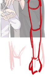
#this one was actually sketched out my plan was to complete it in 10 layers or less. i failed. but it still looks nice <3
Text
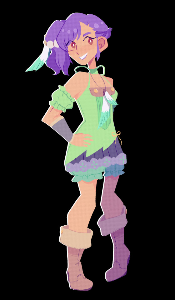
more experimenting with lineless art!
#rune factory#rune factory tides of destiny#odette#rftod#i'm going to have to draw violet at some point to round this out huh#message in a bottle#lineless#this one was actually sketched out my plan was to complete it in 10 layers or less. i failed. but it still looks nice <3
211 notes
·
View notes
Note
Hey there!
I love how you draw backgrounds, and I was wondering what your process for that is?
ahh i'm almost not sure how to answer, i feel like i haven't done a proper background in a while!
i think the most important part is to go into drawing a background with its purpose already in mind. even if you're not drawing a dedicated background, and it's just a backdrop for your characters, there should still be a reason why it's there. like, maybe the character(s) are interacting with it (leaning against a door frame, sitting in a chair, having their hair swept by the wind), maybe it provides a certain dramatic lighting that you want the character(s) to be cast in, maybe it adds a physical barrier between two characters who really need to talk something out, etc.
i feel like this is much easier in a comic because 9 times out of 10, the background is already woven into the setting and movement of the scene so you already know what you need from it, but you can also do the same for a single illustration. if i know i want a character to be shelving a book in a bookstore, and to have a ray of morning sunlight come in from the right that just catches the edge of her face and her neck, then I know that I need to draw a bookshelf near an implied window, and then maybe a few more books that she hasn't shelved yet, another bookshelf or two to imply there's an abundance of them, and then a few things i think a bookstore would need to have: a checkout counter, the counter is by the entrance/exit, the entrance/exit has large glass windows, additional light is coming in by the counter.
after i decide what elements i need in the environment, i sort out how i'm going to separate those elements out into layers--foreground, midground, background--and then i start working on composition. i value composition right after context because even if you can draw an environment with technically correct perspective, if it lacks a pleasing composition that completes the piece, it just feels dissatisfying. of course it's nice to have both a pleasing composition and correct perspective, but if i had to sacrifice one i would always sacrifice perspective. composition is hard to give tips on, because all i can really say is rule of thirds, feel it out, trust your gut, do your best, and remember that color and lighting affects composition too so try to plan with those in mind as well. at this point i usually try to start a color sketch and add in all the lighting effects i had in my head in order to get a full picture of the environment so far, so that i can judge if the composition & the colors work well together or not.
for coloring, i start by coloring everything its base color, which means the background starts out looking very flat. you can add depth into this base--and i sometimes do by just adding a few washes of darker color using normal mode layers--but for my comic backgrounds i actually prefer to add depth by relying on the lighting that i apply through layer modes, to keep my layer count down. for lighting, i like to stick with one main source of light that i can use to justify glowy highlights, and then i'll use a soft brush to airbrush some ambient light in the background. i'll mess around with my favorite layer modes, like multiply, linear light, and add glow, and i'll also try to have different gradients of light going in the foreground, midground, and background to maintain some contrast and depth between them. sometimes, if you're pushing something further into the background, and you're tempted to add more shadow and make it darker because you think that'll push it back, the right move is actually to focus on reducing contrast. like, if you look at a landscape, the hills in the far distance almost just blend into the sky; it's objects that are close to you that have the most distinct shadows and high contrast.
as for perspective, you can always fudge perspective, and should feel free to mush and squish it around if it benefits other aspects of the piece (composition, eliminating tangents, symbolism, whatever). messing around with it too much can break the illusion (unless your style completely supports that), but a little bit is healthy. everyone has an innate sense of perspective, and as long as that sense says "yeah feels good to me," then you don't necessarily need to pull out the formal perspective tools for every single background. a huge part of faking perspective without many tools is just to get so familiar with different angles that you can just toss them out on demand, and for that you can study a bunch of photo refs of different angles from real life, or you can do what i did and get a freecam mod for your favorite game and fly around taking screenshots of environments of interest from different angles.
23 notes
·
View notes
Text
Mybrushes license coder

MYBRUSHES LICENSE CODER UPDATE
MYBRUSHES LICENSE CODER FOR WINDOWS 10
MYBRUSHES LICENSE CODER WINDOWS 10
MYBRUSHES LICENSE CODER SOFTWARE
MYBRUSHES LICENSE CODER PC
Has the Xbox One SmartGlass app reinstalled itself on one of your devices? Do you think a simple glitch is behind this or could Microsoft be planning something else for the classic Xbox app? Share your thoughts with the community in the comments below and then follow us on Twitter and Facebook for more Xbox gaming news. Any attempt to log in simply results in an error. Strange thing is though, the app doesn't appear to work. One potential reason for the re-emergence of the Xbox One SmartGlass app could be to help gamers complete Xbox Achievements that require its use. Something on Microsoft's end seems to have pushed the app out to users. It's a newer model that I got just over a year ago.
MYBRUSHES LICENSE CODER UPDATE
Seeing its app icon in the update list was definitely a surprise but what was really odd was the fact that I'd never actually had the SmartGlass app installed on my Surface Pro. I noticed it downloading when I went to manually check for app updates in the Microsoft Store app, something I like to do every now and then so that I have an idea of what apps have updated with new features.
MYBRUSHES LICENSE CODER WINDOWS 10
Last week, on Christmas Day to be exact, the old app began reinstalling itself on some user's Windows 10 devices despite the fact that it had been replaced by the newer Xbox app several years ago. Pc and xbox at same time Microsoft office catalina.Ģ1 April have been putting quite a few crazy predictions on their 2020 bingo card but I doubt anyone saw the return of the Xbox One SmartGlass app coming. It simply doesn't launch and crashes without any error codes. Well Yes, Its A Great App But The Downloading thoĪfter spending hours with Microsoft Support, reinstalling the windows, etc., I've been told, it's not compatible with Windows 10. It be great if they would fix this, i'd really like to use this App. it gives me this Error code: 0xc101008e (0xc101008) if that helps.
MYBRUSHES LICENSE CODER PC
I've checked on the 360 and have set to allow my PC to connect but it fails to connect soon as i launch the App, and i'm also using the same account and email address between the two. I have 2 accounts and it signed in on the wrong one and it wont let me change my account. Keeps saying Network problems and I made sure that wasnt the problem.
MYBRUSHES LICENSE CODER FOR WINDOWS 10
Specially designed for Windows 10 and 8.1 operating systems, Windows Phone smartphones, iOS devices and Android mobile phones, Xbox 360 SmartGlass is a great companion for Xbox 360 and Xbox One. Items per page Previous Next A World of Keflings. Toshiba's solution aims to work with Windows 10, instead of a stand-alone.
Toshiba's newest smart glass for Windows is for enterprise and field work, not everyday consumers.
Xbox one smartglass beta for windows 10 freeload - Xbox One SmartGlass for Windows 10, Xbox 360 SmartGlass for Windows 10, Xbox One SmartGlass, and many more programs.
The SmartGlass 'second screen' app originally written for Windows Phone migrates to Windows 10 and the Xbox app, as all Windows devices tie closer together in the upcoming OS.
One of the features I don’t use often is the popup pallete (I know alot of people like it, I find it not working for me) but I do use the “Import Reasources” feature (I have a bunch of custom brushes including Rakurri’s brushes), the Palette docker (im in the process of making palettes based on copic marker colors) and the move/resize/transform tool pretty often. I also use references of animals and people often throughout the process. I use layers for a sketch, lineart, basic colors than shading.
MYBRUSHES LICENSE CODER SOFTWARE
I know some basic information about using the software (navigation, zoom in/out, layers, color selector, color palettes etc.) however I am looking to see if there are any other useful features that makes the entire process more fun/easier as I recently found out about the reference image tool (great tool if you never found or used it).Įdit: thanks everyone for the information, to elaborate on some information how I work. Hellow people, I have been using Krita since Christmas 2021 (at first, I was not a big fan of digital art as I always did traditional art) and I am a big fan of the software.
0 notes
Text
At Home with You
Happy @inoshikachoweek week and happy best friends day! I love every incarnation of Team 10 so I really wanted to write something at least for the last day. Thank you to @thespookymoth and @pewpewpew for hosting this week! Hope that you enjoy!
Prompt: Best Friends
Summary: When you’re best friends home and family can take many different forms.
*
**
At Home with You
**
Ino
“There you are!” Curious brown eyes looked up hearing a familiar voice. Inojin grinned watching the deer trot over towards him excitedly.
Inojin pet the deer’s fur affectionately, thankful that he seemed to still remember him. “I’m sorry I haven’t been around a lot lately.” The animal didn’t seem to mind and welcomed the loving touches.
“Come on buddy, let’s take a walk. I’ve got some time before I have to go home.” Inojin could have sworn there was some understanding in those soft eyes as the animal fell into step with him.
The peace and solitude the dense forest provided was much needed after so many difficult and grueling missions. He found solace in the twilight with his faithful companion by his side.
The pair took breaks along their walk to eat and drink. Their gait relaxed and steady with no goal or end in sight. Inojin would feed the animal treats and pet his soft fur. All the while the deer nuzzled in familiarity into his gentle hands.
Coming to a stop they relaxed by the water. Inojin reclined into the deers side to sketch the landscape. Nestling into the deer’s soft fur and comforting warmth. It was this quiet slice of heaven away safe from the noise.
“So this is where you’ve been running off to?”
Inojin looked startled, surprised by the amused looks on his Uncle and Aunt’s face.
Subconsciously Inojin stepped forward placing himself between the deer and them.
“We don’t mind you coming here but you need to let your parents know where you are.” Temari gently scolded him.
Shikamaru looked curiously behind Inojin. A familiar deer posed as though it was ready to defend its friend if necessary.
“I assume your visits have to do with the deer behind you?”
“I come by when I dont have missions to see him.” Inojin admitted with a sigh. There was no way to lie his way out of this.
Temari and Shikamaru were surprised by the revelation. Shikamaru recognized the deer as the injured one that Inojin had found and he had treated. He remembered Inojin being terrified and distraught, hoping the deer might make it through. They didn’t quite realize how much of an impression the experience had made.
Temari had seen him earlier heading towards the forest where he was able to walk about freely. It seemed odd though that he was going there alone.
“Why didn’t you tell us?”
Inojin shrugged, not really having a response. He thought it might be embarrassing to admit having grown attached to the deer.
“I couldn’t…I couldn’t save Akkun. So when I was able to save this one I felt connected to him I guess.”
They knew all about that little creature that he’d bonded with during the mission in Iwagakure. Ino and Sai had considered getting him a pet to help with his grief but worried it might be too soon.
Shikamaru moved forward towards them, kneeling in front of him. “Your grandfather used to love walking through here too.”
“Really?” Inojin asked surprised but always happy to learn anything he could about his grandfather.
“The Yamanaka jutsu can be very difficult mentally and spiritually. He always found reconnecting with nature as a way to reset. He even had his own favorite deer. Shikadai’s grandfather would complain that he was out here more than him.” Shikamaru remembered when his father would go out into the dense forest to check on his friend.
“Inojin attachments and bonds are a wonderful thing. Companionship and friendship make life meaningful. They aren’t something you ever have to hide.” Inojin smiled up at Temari, her words having a lifetime of experience behind them.
“Did you give him a name?”
“Aki, I found him on the first day of Fall.”
“Well thank you Aki for taking care of Inojin here.”
Shikamaru kindly rubbed the deer’s head. Sure the Naras were known for their connection with these animals but he was thankful that Inojin saw their value as well.
“Let your mom and dad know, okay kid. That way they won’t worry.” Temari guided him gently. She could understand his draw towards the Nara forest. She would often escape there just to have some quiet.
Inojin nodded, grateful that he didn’t have to keep his trips a secret. That he could tell his parents and his teammates about his friend. He’d been wanting his parents to come join him for a while now.
“Let Shikadai know you’re coming out here. He’s supposed to be guarding and keeping this place secure. Seeing as you’ve been able to come in and out undetected means he’s not doing his job.” He laughed but hoped his friend wouldn’t be too upset.
The trio remained out there in the fading sunlight as more deer came forward recognizing the clan heads. Enjoying the mystery and wonder of it all.
Inojin at times was just like his father. He struggled with certain social cues and norms. Often finding himself confused by some customs. But he found there in the quiet of the forest, with his faithful friend, and family a feeling of home.
Shika
Shikadai took a tentative taste before a thoughtful look crossed his face.
“It needs something.”
Karui took a spoonful of the broth before nodding. “You’re right. Go ask your Uncle Chouji for more tomatoes.”
Shikadai went into motion and made his way over to where the Akimichi was prepping the ingredients. ChoCho would often complain about her parents but Shikadai found them to be warm and welcoming. Always genuinely happy to see him.
“We’re gonna need more diced tomatoes.”
“You got it, kid.”
Shikadai wasn’t sure when it happened exactly. He’d been over at the Akimichi’s one night for dinner and had been roped into helping. Despite his silent complaints, he’d actually enjoyed the cooking process. It was almost like a science experiment. Mixing the ingredients to get the perfect reaction. After that day he’d come by ever so often to learn more techniques and to try out various recipes. Who better than an Akimichi to teach him to cook? ChoCho loved it when he came over, as he often made enough for her to try a new dish.
Today he had something special planned. His uncles had sent him a recipe for his mom's favorite dish from Suna. He wanted it to be a surprise so he’d made his way to the Akimichi kitchen.
“My dad taught your grandfather how to cook,” Chouji told him with a grin. Shikadai looked up, never having heard this story.
“When they were younger your grandmother was just as good of a cook as she is now. Uncle Shikaku wanted to impress her. It was a complete failure. Apparently, he managed to burn through not only the food but multiple pots and pans. He was banned from cooking on Akimichi lands for a while. After my dad forgave him he gave him a few less-flammable lessons. It wasn’t too helpful but there was some improvement. Your father is no better. For being geniuses they sure are useless in the kitchen. You might be the only hope for the Nara line.”
Shikadai smiled at the thought. His mother had mentioned something similar to him when he’d helped her a few times. It wasn’t a skill that Naras were known for nor would it be one that he advertised. Still, it was a useful ability and oftentimes a needed distraction.
Karui yelled a few additional items they needed and he stood next to Chouji prepping the additional items.
They added the required ingredients, checking the flavor as he went along. The two Akimichis watched him with a smile at his attention and precision. Temari’s look of pure determination on his face and his movements were all Shikamaru. Like the dish he made, he was a perfect mix.
“I’ve got to hand it to you kid. You’re a natural. You’re always welcomed in my kitchen.” Karui praised him after tasting the completed recipe.
She affectionately ruffled his hair. “Your mom is going to love it.”
Shikadai recalled those precious times together around a table with warm food between them.
A home-cooked meal was the perfect reminder of home.
Cho
“Thanks again for coming by! Your wife is going to love the flowers.” ChoCho yelled out to the customer.
She then worked to spray down the counter then watered a few of the plants. It was a quiet day at the store but she loved it nonetheless. The Yamanaka flower shop was one of her favorite places in the village. She was getting older. Their team missions were more complicated and layered. For her. working at a place that was so normal was a needed reprieve.
It started a few weeks ago. Inojin had begged her to cover his shift while his parents were off on a mission. She agreed only after he offered her a king’s ransom in snacks and a no-questions-asked favor to be cashed in the future. After getting a quick training session and learning the ropes she thoroughly enjoyed her time there. She was in the company of flowers and got to meet and interact with people all over the village. It was a natural fit. From then on ever so often Inojin would ask her to fill in. She’d whine and complain which increased Inojin’s offerings but she’d ultimately agree.
“ChoCho!” She smiled brightly seeing the Yamanakas walk in. They knew that she was there for the afternoon but assured her they’d be back as early as possible.
ChoCho idolized Ino. The Yamanaka Clan head was strong, wise, and beautiful. ChoCho loved her mom but she was still an authority figure. Ino was her cool Aunt. Since she could remember the blonde had assured her that she’d be a willing confidant and support. There were a few times that she elicited her help and advice.
“We appreciate you coming by to help us,” Sai thanked her with a soft smile. He wasn’t a man of many words but he was always kind and welcoming towards her. His smile reminded her very much of her teammate.
“I love it here. I get to see so many people and hear a lot of different stories.” Her favorites were always of nervous individuals hoping to find that perfect bouquet to impress a special someone.
“It’s a pretty special place. Your grandfather still buys your grandmother flowers every month on the 7th. When I'd come here to help my dad I always loved seeing him come in. I'd help him pick out the flowers to give her.” ChoCho fondly thought about the blossoms that would consistently fill their home. She couldn’t help but love how connected their families were.
Sai helped her move a few buckets of flowers to refill the shelves. “When your father started dating your mom he didn’t know what her favorite flower was so he ended up just buying all of them,” Sai recalled that day.
He’d come to spend time with Ino when the Akimichi had come in a panicked state. Their team had argued back and forth about the best arrangement of flowers until Shikamaru convinced Chouji to just buy them all and figure out Karui’s favorite later.
ChoCho grinned surprised by the sweet story. Surprised that the old man had some moves back in the day.
Her father had come by earlier to her embarrassment but they had worked together to arrange a beautiful bouquet for her mother. She often wondered at their relationship but their love was something undeniable. ChoChohoped that her teammates took notes about how to treat those they loved.
ChoCho fell into step with the Yamanakas helping to clean up before she was set to leave. And of course, she was on her way to see her team.
“You’re always welcome here, you know that right?” Ino assured her. She had a special bond with the Akimichi. It wasn’t always easy being the female in their trio.
Surrounded by a melody of flowers and the warmth of family, this was just like a second home.
“I know.”
*
**
The 17th generation of InoShikaCho sat together in the cramped booth talking about everything and nothing all at once. A similar scene of love and familiarity having occurred many times in the past.
At times the pressure to uphold their family’s legacy could be suffocating. Certain heavy expectations and hopes were placed on their shoulders. But they knew at the end of the day they were luckier than most. They were teammates and best friends. Not just by circumstances but by choice. No matter what happened in this life, because of that bond they’d always have a home.
*
**
Did you see what I was trying to do here? I love the customs that each family has but I like to see them interacting with each other.
Life got pretty hectic so writing needed to take a back seat. I’m thankful that I was able to write what little I could. I hope to be posting more regularly soon. Thanks for your support and good vibes.
My sincere love, thanks and admiration for everyone who supported this week! You are all amazing! Love, love to you all!
#inoshikachoweek#inoshikachoweek2021#day 7#best friends#best friend day#nartuo fanfic#team 10#inojin yamanaka#shikadai nara#chocho akimichi#shikatema#saiino#chokarui#sangriaslips#Sunflowerstalks
70 notes
·
View notes
Note
I really love the way you draw anatomy - you are literally perfect. Would you mind one day if you make a simple tutorial on how to draw anatomy, particularly hands and just keeping things in proportion. Sorry if this sounds like a demanding ask - u can definitely decline or not answer no offence taken x
First of all, thank you so much! <3 I’m so happy to hear that you think my anatomy looks good. I’m not sure if I can teach you anything, but I’ll try! And sorry it took me so long to reply.
I wouldn’t call this a tutorial, more like an outline of what I usually do (maybe with some tips here and there). Hope it’s at least a little bit helpful 🙏
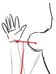
I’ll start with how I draw the hands. Well, as you’ve probably seen on my previous post about this topic, I used to have a hard time with hands because I didn’t understand the logic behind them + my only reference was my own small and blobby hands. Practice helps a lot, but imo mostly because as you draw more hands, it becomes easier for you to break them into simpler shapes (this is important!) and imagine them in 3d in your head or as you draw.
When I draw hands, I start with a rough sketch. Basically I just draw a fingerless block first. It’s a bit illegible right now, but bear with me.
After this I add fingers. Once again, they’re all broken into shapes: a finger is just 3 short tubes connected to the block we just drew. Sometimes some parts of the “tubes” aren’t visible because of the perspective of the hand, sometimes you can clearly see all of them. As I already said, it’s all about learning how to imagine these things in 3d.
Since my sketch is so rough, I tried to make the shapes more clear here. I hope it makes sense.
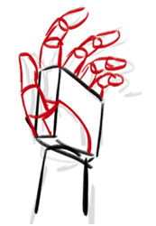
After the sketch is done, I basically just… draw hands. Remember that this is skin and meat, there are going to be folds (??? Idk if this is the correct word) and stuff. And nails, oh nails… I scream when I remember the times when I used not to draw them lol They help to convey the perspective and the angle of the fingers, so for me it’s better to have them than not. I’m not drawing them the exact correct way, though, but still.
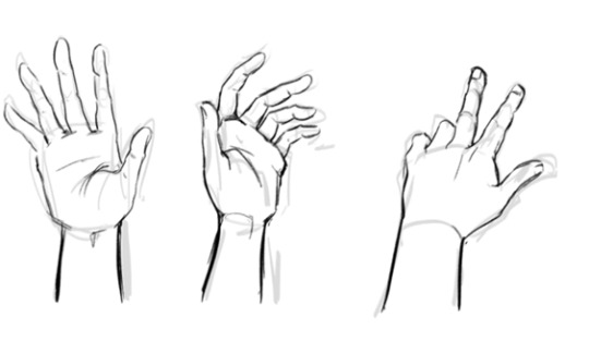
And once again, it took me a long time to start drawing hands more or less properly, and I still fix them all the time. For example, a thumb of the first one on the left is too short. In fact, I’d make all the thumbs bigger…
So yeah, something among the lines. It’s not perfect, but this is the basic idea of how it works, at least for me.
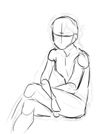
About proportions… Well, I’m one of those artists who like to make 1000000 sketches before I move on to the inking phase, it’s just more comfortable to me. This way, I give myself more control of the pose and proportions and have a lot of time to adjust and fix whatever feels off to me. Many good artists don’t do that because they don’t really need it.
First, I make a very quick sketch just to grab the “feel” of the pose I’m going for, plus it helps with the overall composition of the drawing. It isn’t detailed at all, so it takes about 5-10 minutes to draw, even less if I’m confident about what I want and don’t try to find the pose that would work the best. At this stage I try to keep the proportions in mind, but I don’t think about them too much.
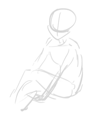
When I’m more or less satisfied with the basic idea, I draw my first sketch. At this stage I’m err building the body. There are a lot of ways to do that, I’m drawing something similar to a mannequin that is made out of meat. Oh no, that sounded horrible…
As you can see, this time I pay more attention to proportions and sketch all parts of the body properly. I make sure that both arms are the same length, both legs are the same length, that the shoulders are on the same level, stuff like that. At this stage I don’t think about the character, just about the body: I’m trying to make it make sense lol
Also you might’ve noticed, but I changed the position of the arms on this sketch because my initial idea didn’t really work (I tried to sit in the same pose and it was uncomfortable lol)
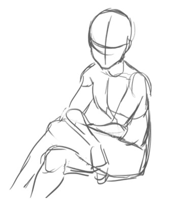
And then I draw yet another sketch. Sometimes this can be the last stage and I ditch the inking altogether and just colour this sketch instead, but more often than not it looks too messy and I have to make another sketch… (This is also where Katsu usually tells me to chill because we were planning to draw something simple and quick and I’m already making it complicated lol)
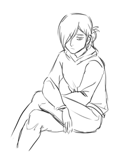
Here I’m adding more details, like face, hair, clothing, anything else that I need to sketch before inking/colouring. After this sketch is done, I look at it again and see if anything looks off. If it does, I try to fix it, adjust it, sketch it again, whatever works and whatever makes my sketch less stiff and more proportional. It doesn’t have to be super realistic proportions-wise though.
Things that I pay attention to when I check the proportions on my drawings:
Shoulders: they should be the same size (although the perspective can create a distortion, but this is a whole other can of worms) + ideally they should be able to fit two heads in them length-wise.
Arms: I check if they’re the correct length (the hand part should start ~at the crotch level). If the arm on the drawing is bent, I try to visualize how it’d look like if they were straightened up. If it’s difficult to imagine, I just sketch it.
Oh, and the size of hands. I always check if they’re the correct size by comparing them to a face of the character: they should be about the same size (of course some people have larger hands and some of them have smaller hands).

Legs: same with arms, I try to make sure they are not too long and not too short. Also, when drawing arms or legs, you can draw this thing. The shoulder/hip and the hand/foot have the same distance from the elbow/knee. This… sounds confusing, I hope it at least looks understandable lol
There are a lot of ways to check if everything is correct: sometimes I just put my fingers on the screen to check if all of the lengths make sense lol and sometimes I draw these lil lines to check if the lengths of the parts that are supposed to be the same match.
If your drawing looks off, just create another layer and sketch the body (the meaty mannequin thingie) over it again. It might help you see some obvious mistakes if there are any. Some people might say it’s too much work, I call this practice lol
There are instances when I redraw some parts of the body completely. There are situations when it’s easier to do it all over again than to fix the existing sketch.
Another thing that I do is flip the image as I draw. Not very often though, you need not to get used to the flipped version of your drawing, it should be somewhat new to your eyes, this way your mistakes will be more visible to you. At least I think so…
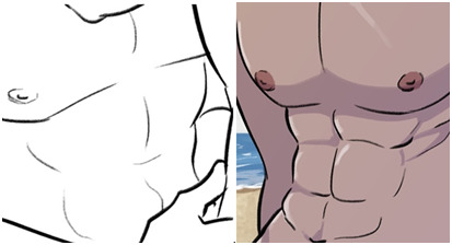
It also helps to pay attention to details as much as you can, they make a huge difference. I still have a lot to learn about how the abs work, but like a year ago I knew nothing about them aside from “err I think there are 6 or 8 of them?? And they start below the boobs” (my boobs were also more square). After I started drawing them more often and learning how they actually work, my drawings changed accordingly. I think the right one is at least slightly better haha
So yeah, this is more or less my process. It isn’t necessary to draw 10203100 sketches and to go through all these stages, but I personally feel much more comfortable doing that because this way I can be sure that I would’ve noticed if there was a major fuckup somewhere.
To be honest, if we’re talking proportions, this image is literally the only thing you need to know.
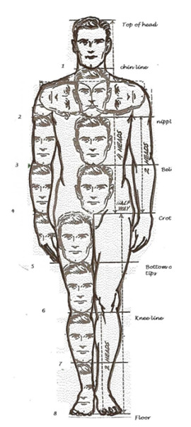
Just keep in mind how many heads are in the human body length, how many heads can fit inside one’s torso, etc. Compare body parts to each other accordingly. Just make a habit out of checking if the proportions on your drawings are correct: make a shoulder bigger, make sure that the legs are the same size. It might be too much at first, but it’ll literally become a subconscious thing very soon, and you won’t have to actively think about all of this every time you draw. I google this image from time to time just to make sure that I’m fixing everything correctly lol
You don’t have to be exact with these proportions, but they still need to have some logic behind them. Like here, if we look at Osomatsu, who is clearly very stylized, we can still see that his body is proportionate. His shoulders are too small for his head, and his body surely doesn’t have 8 heads in its length, but he still doesn’t fall apart because there is logic behind his stylization: his arms are still long enough for him to put his hands in his pockets; they aren’t too long or too short. Hope that makes sense…

Sorry for the long read. Once again, I hope it was somewhat helpful or at least interesting. If you have any more questions, please feel free to ask!
Although I’m still learning myself of course, so there are things that I probably don’t know or forgot to mention…
86 notes
·
View notes
Text
Assignment 3: Information Design
In this last assignment, I was tasked with creating an infographic based on a certain set of data. If I am being honest, I chose to do an infographic on Netflix because it was a mature company and because I was watching Stranger Things prior to this assignment which really gave me the inspiration.
Conceptualisation
Before planning out what I wanted to include in my infographic, I went to Pinterest to do some quick searches for design inspiration and what I could potentially include in this infographic. Something that caught my eye was this infographic that I found had a mixture of words and pictures with Netflix’s signature colour, emblem and stats which gave me things to work with and potentially expand on that (Fig.1):

Fig.1: Netflix old stats: http://www.tommiemedia.com/diversions/netflix-by-the-numbers/
As the stats were a little outdated, I decided to make something similar and update it with the current stats.
Sketch
After getting the rough information down, I made a quick sketch on what I wanted to include in the infographic as shown below (Fig.2)

Fig.2: Sketch of Netflix Infographic
Firstly, I knew that I wanted to arrange my infographic in a top down, left to right manner which is why I had the big label of Netflix heading the infographic to give audiences an idea of what they’re looking at.
Next, I knew that I wanted to incorporate the Netflix logo and give some background information on the company. To show this list, I mainly did it in a diagram form so it is easier to absorb. To the right of it, I wanted to present the stats of the number of people (in millions) who are making use of the service in the different regions. To best represent this information, I decided to do it in a bar chart form.
Finally, from the 2/3 of the page down, I wanted to include some statistics on Netflix’s revenue, most streamed acquired series, most viewed original film, Popular Netflix Original series Viewership, most viewed Netflix movies in the US in 2020 and it’s competitors. These stats as a whole aim to tell the readers how well the company is doing financially, how they are doing against their competitors and what kind of content do people want to watch as well as how much they are averaging for the most popular original content that they have put out. This is so as to continue knowing their audiences and making content for them to enjoy which ultimately results in revenue for the company as well.
Inspiration and Tracing
In my infographic, I was initially thinking about what I can use to symbolise the different aspects that I wanted and therefore, I decided to use a dollar sign for revenue, clapperboards for films, TV sets for television shows and for the competitors I decided to use versus (V/S) in the same colour as Netflix’s branding colours. After having the rough idea of what I wanted to portray in my infographic, I decided to use the trusty search engine google to look for images that I could trace and edit. Below are some of the inspiration pictures and samples that I have from google (Fig.3).

Fig.3: Images from Google
After acquiring these images, I traced them out on Adobe Illustrator and these are some of the drawings that I obtained (Fig.4).

Fig.4: Final traced images exported in PNG from AI
From Tracing to Colouring
After getting the drawings out, I wanted to colour them in to make it look more realistic and stand out from the background.

Fig.5: TV in AI
After tracing the TV using the pen and curvature tools, I selected the layer I wanted to colour in by tampering around with the fill and stroke icons. Afterwards I just repeated that for all the different layers and before I knew it, I had a TV straight out WandaVision in the first 2 episodes (Disney did it better though but I’m pretty content with the fact that I could actually draw). This similar process was repeated for all the visual elements that I had (Fig.6,7,8 and 9).

Fig.6: Dollar sign to symbolise revenue on AI.
For this sign, the original image was in greyscale and as I wanted my image to represent wealth. Hence, I went with the colour green as it is universally associated with money and coupled with the dollar sign, it instantly signals to the viewers that I will be dealing with numbers in the section below as well.

Fig.7 Clapperboard on AI
For this clapperboard, I purposely chose to leave the space there blank as I knew I was going to be dealing with 2 movie titles, The Secret Life of Pets and Extraction and therefore, I wanted to keep the space there so I can use typography (for the movie titles) to fill in the blanks. This was the same for the TV graphic that I had drawn as I was going to fill it in with the popular TV shows when I have laid it all out in the graphic.
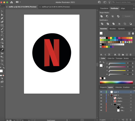
Fig.8: Netflix logo on AI

Fig.9: Netflix full logo on AI
In the colouring for the Netflix logos, I decided to use the eyedropper tool to select the shade of red on the original Netflix logo as shown in Fig.3 and that was the colour I used to fill in the letters to complete the drawing.
From AI to InDesign
After getting all the visual elements that I needed for the infographic, I decided to open up InDesign to lay them out better for me to see and this was the final product that I came up with (Fig.10)
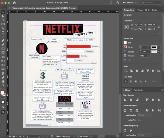
Fig.10: Infographic layout on InDesign
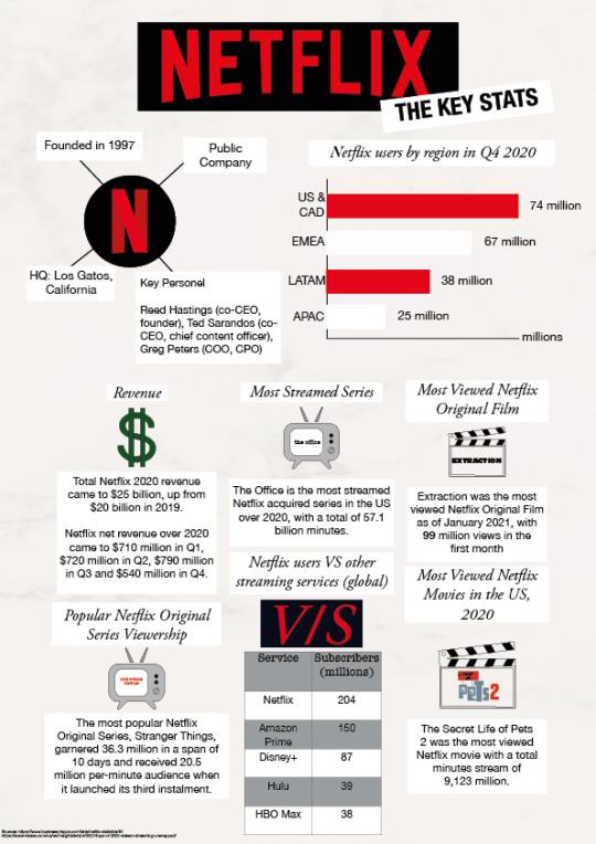
Fig.11: Infographic in PNG form.
In this layout, I have used a white background but adjusted the shade I have made some changes to the placement of the graphics (i.e. Competitors and Popular Netflix Original Series Viewership) and text as I lacked space if I stuck to my original plan and I felt that this layout worked the best. I kept the header the same and added a white rectangle with black text titled the Key Stats at the side and angled it up. The purpose for doing that was to allow the readers to know what they can expect from the infographic. I used a san-serif font (Helvetica Neue) and (condensed) bolded the letters in 24pt. This was to allow the readers to easily read the header and move on as I don’t want them to dwell too long on it. On the top left, I made use of the Netflix logo that I traced previously and added a white background and using the same san-serif font (Helvetica Neue) in 12pt so that I have more space at the bottom in the later sections. On the top right, I created a bar chart using the lines and shapes function on InDesign and purposefully chose the colour red and white to show a clearer distinction between the graphics. As red is the main colour of the Netflix logo and a colour that demands for attention, I decided to incorporate it into the graph so that viewers would give it equal attention like they do for the traced Netflix logo.
In the bottom 2/3 of the graphic, a 16pt serif (Garamond) font was used for the headers and for the other information (body text), I kept the san-serif Helvetica Neue text in 11pt. This is mainly because I wanted the body text to be easily read and it has thicker strokes which is easier on the eyes. The second reason was so as to save space as I had a lot of information to try to fit in as well as wanting to give the text more “breathing space”. I chose to use a white (#FFFFF) rectangle border around my texts so that they would stand out from the shaded white background. I kept the text in black because I thought it was elegant and classy as well as overall easy to read. Even though centre-aligned, as taught in the lecture, was a weak way to get readers to read the text, I still went ahead to centralise my header texts in the boxes as well as the columns of content in the centre using the align tool in InDesign as the left-aligned text made it look aesthetically unpleasing. When I had a solo text in the last line, I was also careful to not leave it hanging at the bottom as it was not supposed to be orphaned according to a rule in design.
Moreover, I also made the careful decision to put the icons in the middle of the texts (i.e. header, icon, description) so as to break them up so it didn’t look too chunky so that it was easier for the reader to absorb. For the V/S icon, I did it a little differently compared to the rest of the icons as the rest were traced on AI but this was solely using the Garamond font in Semibold Italic at 57pt. Initially the kerning looked a little too close to one another and a little uneven. Hence, I made the decision to give the V and S more breathing space by going to the VA settings on the right and adjusted that to 50.
Furthermore, to represent the part on Netflix users VS other streaming services (global), I decided to represent that in a table form as it was easier to understand and people could instantly see the figures which is the important part of that section.
Lastly, in the bottom left part of the infographic, I included the link to my sources in San Serif Helvetica Neue 4pt as it was not as much of importance but it was more for the reason that I did not want to be thrown out for plagiarism.
Challenges
Throughout this entire infographic process from conceptualisation to design to the final product, I realised my biggest mistake was not organising my layers as I was dealign with so many especially when it came to text because everything will go out of alignment if I accidentally selected something else by mistake which I will take on board with me for my future design assignment.
Apart from that, I also realised that the part addressing the key people in the company actually needed a lot of space which might have played in to the factor where I had limited space for the bottom 2/3 of the infographic and it may not be as neatly aligned. Therefore, I had to go through several adjustments and scaling options by expanding the width of the white text box and make the text fit before finally settling on the best option.
Critique
During the critique session, I received really helpful feedback such as:
Bolding the stats (i.e. 74 million) so that it stands out more from the background because these are important figures.
Improving on my visual hierarchy as the white background that helps the text stand out was pretty unevenly drawn. (alignment issue)
By putting all my texts in white boxes, it gives all the information that I have provided similar intensity and symbolises the fact that they have similar importance.
Post-Critique
Fig.12: Updated Infographic in InDesign

Fig.13: Infographic in PNG format.
To rectify the issues that were being brought up during the critique, I decided to bold the numbers at the side of my graph so that it stands out as I wanted to highlight the important statistics.
With regards to the alignment issues, I have tried to align or draw my white text box so that they will be the same width. This also includes the table as I have attempted to do the same by scaling it up so that it aligns with the width of the white text box. Afterwards, I centre-aligned it again so that it flows better.
Moreover, to address the critique on my information having a similar intensity, I decided to go ahead and play around with the colour by changing it to the Netflix red, E3051A. I have also increased the font size to 13pt and bolded the stats. Hence, all these elements work together to aid the important statistic stand out in the body text.
Other amendments
I realised that for the bar chart I was missing an axis titled region so I decided to add that in and shifted the graph down. At the same time, I decided to change the rectangle graph color from white to black as white was already used a header background option and i didn’t want to confuse the audience even more which was why I made the switch.
5 notes
·
View notes
Text
Things i didn't like about the little women 2019 movie.
Hello my lovelies! I am back today with my second part of my previous little women review, this section as you could probably tell is based around all the issues I had with the movie, but I do want to put a little disclaimer. I am sure some of my points will have explanations if not, more detail about the points I will be making but due to the fact I haven't read much of the book I am looking at this with no previous knowledge and just the information and story I was provided with from the film, I also want to make clear majority of these issues are with the story not the actual movie creation and direction. So with that in mind, please be kind and lets dive in!
Laurie's character development.
Now before I start I want to make it clear, I liked the character of Laurie initially, the first few scenes we see him in he is fun loving, carefree and just a big kid. We see him absolutely flourish within the girls company but yet the huge 180 in his over all character was a little alien to me and left me feeling very confused and if I'm honest, a little irritated. His demeanour in the second half of the movie is so very different. We see him change from his childish self to this very self absorbed and self destructive person, for example when we attends the ball and sees Amy, he is sloppily dressed, drunk and extremely ill mannered, completely disregarding the stress and repercussions that this situation will later cause Amy. Which is so contradictory to his earlier caring nature we grew to love.
Another prime example is again, when he approaches Amy in the gardens when she is sketching, he comes across so egotistical and smarmy. Almost expecting Amy when faced with his advances to fall to her knees and become so grateful he has even graced her by seeing her in a romantic light. Which is a disgusting trait in any male or female character. Are we expected to believe that years later, Jo's rejection is still playing so heavily in his mind it has caused him to spiral? We have all faced breakups, rejections and unrequited love and while yes they are hard to deal with and can see, soul destroy at he time we inevitably move on and learn from them which Laurie clearly hasn't. Which leads me to my next point.
Amy.
Yes, Amy hands down is my favourite character as I see her as the most layered out of all the girls but the story line with Laurie just frustrated my inner independent woman.
Going back to the garden scene with her and Laurie, we see her completely tear him down, we see her show him strength regardless of how hard it was for her to contain her feelings, feeling which we are told have been building for years, we see her explain to him the hurt and offence he has caused her while confessing his so called feelings to her because when you think of it from her point of view, she has had feelings for him from a very young age, but has accepted that is her burden to carry and that she has no hand in his feelings for Jo which is a hard situation but is out of her control and sadly, is out of his. A typical and heart breaking case of unrequited love. so really there is no blame and no insult shared, yet when Jo rejects him he decides that Amy is his next best shot and he begins to play on his knowledge of her feelings for him and use this to his own personal advantage by manipulating her feelings and falling back onto plan B.

All of this she is aware of an refuses to subject her self to such degrading actions, which is something we rarely see happen in movies, and had me really feeling for her. Stuck in a hard place of heart break and inner strength BUT hard cut to the ending of the movie, we find that she had disregarded all those facts and feelings by giving into Laurie and we learn they have in fact married. Which just left me very shocked and disappointed in her. I expected this from Laurie but not Amy.
Laurie's confession.
Now this, this scene hurt my heart and angered my soul for many reasons. When Laurie informs Jo of his marriage my heart broke for her, because he did it in such a heartless way, which in turn solidified my belief that Laurie's intentions were to hurt Jo in this scene and that was all that was behind it. When you really look at it, you can say he didn't know of Jo’s feelings towards him, but why then tell her he will always have feelings for her, because if he genuinely believed that he wouldn't have felt the need to soften the blow by confessing that. It makes no sense! He continues to tell her his love for Amy is very different, that's it's real love, not puppy love. Knowing of their past, and knowing the intense relationship romantic or not his delivery boarders on nasty in it's careless delivery.

Yes, I am aware Jo made it clear she had no romantic feelings for Laurie but It was so very obvious that Jo was just scared, she was scared of loosing who she was to a man so much so that she rejected him and if he really knew her as well as I know he did he could see the situation for what it really was, a scared young girl pressured into making a decision that she felt would change not only her life but herself. He could always see through her lies, so why not now? No. Laurie was hurt by her rejection and whether it was subconsciously or not, he wanted to tell her the news see her reaction and hurt her the way she hurt him.
Have you ever made a joke about something to someone and they pretend they're fine with it but really you know it's caused offence or upset because they keep referring to it and bringing it up? Yeah, well Laurie brings up his past relationship with Jo two three times in the space of about five minutes, in front of a variety of people which include his wife. Not only does that show he has not moved on as he so clearly claims, but that again he disregards his wife's feelings and upset through this specific comment.
The timing of said confession.
Can we also take a second to talk about the god damn timing?! He decides to tell her, on the day of her sister funeral, are you joking?! How entitled do you have to be to think your new marriage takes precedence over the death of a person and not just anyone, a close friend and sister of you, your wife and your life long friends. if i have by chance got my timelines messed up please correct me because this was just a shock to me when watching.
Now don't worry, I'm going to stop ripping these characters apart now and move on to one other issue I had. I know all of these will most probably be a little controversial and I remind you, this is just an opinion post so please be respectful, but...
Jo and Friedrich Bhaer.
While I am of the opinion Jo and Laurie should of been together, I promise in spite of the beginning of this post I'm not bitter about it. But this was another match I wasn't feeling. I understand that relationships aren't perfect, and sometime you can't force what may appear to be the perfect and ideal match but these two were a bit of stretch.
The fact that this was the man who was supposed to change Jo’s mind about marriage(something her unofficial childhood sweetheart couldn't manage)and he had about as much chemistry with our girl as I have with my current diet was just straight up disappointing. I mean, Something's just aren't meant to be and this, is one of them. Throughout the movie, their relationship seemed strained, and not in the cute love hate cliche we see a lot of, but In a very fractured and unhealthy way. The whole thing I felt was a stretch, there is no time spent developing their relationship apart from an exchange of a few minor looks between the two of what I'm assuming is supposed demonstrate some type of affection and longing. Eye roll.
I am aware the movie does make fun of this ending and mock its absurdity due to the way it portrays the publishers pushing for a perfect if not cliche romantic ending and while I do appreciate that that initial forced ending is something I just couldn't get over and had to include.
And that my friends, are all the issues I had with little women. Although, regardless of these issues I still did love this movie with my whole heart and the affection I felt for this film completely over shadows this negativity. No movie or story will be perfect. Movies and books are so personal and everyone will have a difference of opinions which is what I love about them so please let me know your thoughts below. Until next time have a fantastic week!
Over all rating : 8.5/10.
Love, love, love love.
#little women#little women 2019#little women movie#little women movie 2019#little women movie review 2019#the march girls#jo march#meg march#beth march#amy march#timothee chalamet#emma watson#Florence Pugh#Eliza Scanlen#little women book#movie review#things i didnt like about
21 notes
·
View notes
Text
PDP
1 to 2 weeks
Working on how I can incorporate my FMP concept practices and context to be my main focal point / concept within my proposal, this is hugely important to me and the project – this element matters (the site)
Consideration with me FMP with these key elements.
1. Does the project need to be personal? Subjective? Informative?
2. Does the work need to relate to the physical outcome or can the artwork be a place that is informed and a realisation occurs?
3. Conceptual? How do I want the audience to engage with it – a rather important area that needs to proposed and reasoned with – due to the restrictive natures.
Practice aims – start to explore methods and approaches.
Identifying that I need to piece together my research – to help root and identify what is important to me as an artist. It will become a platform in which I can utilise and gain clarity. Contextual ref will
Horn
Hansen
https://www.egon-schiele.net/
https://www.tate.org.uk/whats-on/tate-liverpool/exhibition/life-motion-egon-schiele-francesca-woodman/five-things-know-egon
https://www.bing.com/videos/search?q=egon+schiele&docid=608031077067591259&mid=C00B7CAE90E28FB31915C00B7CAE90E28FB31915&view=detail&FORM=VIRE
According to art historian Albert Elsen, Schiele used Auguste Rodin's continuous drawing technique to create his loose, fluid figurative sketches. It required constant eye contact with the life model, making Schiele's process of drawing an intimate experience between him and his subject.
http://www.visual-arts-cork.com/famous-artists/schiele-egon.htm
https://m.youtube.com/watch?v=BN73JesYJhc
https://m.youtube.com/watch?v=0iDr2netauc
https://m.youtube.com/watch?v=4YS3gGpnPe8
SHIRIN https://www.bing.com/videos/search?q=sherin+neshat+video&docid=608047453806005638&mid=0992FC2039EBDCC6A8B90992FC2039EBDCC6A8B9&view=detail&FORM=VIRE
MARIANA https://www.bing.com/videos/search?q=abramovic+artist+exhibition+room+iterview&ru=%2fvideos%2fsearch%3fq%3dabramovic%2bartist%2bexhibition%2broom%2biterview%26FORM%3dHDRSC3&view=detail&mid=671F0980512934941E96671F0980512934941E96&&FORM=VDRVRV
.
How to push and expand mark making and a visual research practice – how does one enable a piece of artwork to be encompassed within its own rights it identity and environment incorporating the documentation of the processes / intermix and dematerialisation
Understand my strengths within art practice BUT identify that I need to be open minded with materials and how the surface is utilised – within the chosen areas to where the work is being placed or will I work on the physical artwork - a malleable piece of artwork or nomadism. In addition, to highlight that the actual process of approaches and methods to art
1. Planning presentation 1 - statement and presentation to the group
2. Start experimenting with materials that can easily be used within a workshop-based session – restrictions of artwork and filter as layers – collaged artwork
3. Looking at the importance of mark existing and not existing within artwork works for this project ?? questionable if I need to include colour or to keep it clinical and sterile (white)
4. Mark making examples in sketchbook working in squares.
3 to 4 weeks
Using my reading materials and taking contextual ref form my previous project I can broaden my understanding and knowledge on monochromatic and pushing this further within my FMP. At this point as my starting objective for the project – I can identify that I would like the project and responded in a particular way.
1. How art, materials, surfaces can cause clashes with visual research and method approaches?
2. Does the work need to feel complete?
3. opposite ?
with each other and how one (audience) sit with engaging with my outcomes – do they feel comfortable?
4. Should my artwork realistically depict the subject of methods and therefore should the artwork matter as much>
5. or is it the documentation of artwork?
Investigate different artist and artwork that has this same feel or effect.
Looking at works that use materialistic views or engagement with mixed media approaches towards artwork.
Understand the relationship between materials and biodiversity.
I need to identify a specify narrative structure for my work – so it does not become muddy (my presentation needs to be clear and get a feel for what it is I am wanting to ultimately investigate)
Concepts ideas;
Fabrication
Human connection
Sustainable materials
Space
Environment
Mono
Expanding connections
Collision
Again are areas that I like to explore – but how have artist used this in the way that they approach their artworks?
How will I build a solid project?
1. Does it have to have a meaningful ending? On the other hand, could it be merely an experimental project or process that involves materials, processes and technique?
Research further into the ideology that visual representation can be translated within mixed media work has a greater manifestation than the context. –
Presentation complete draft to be sent over by week three (email across)
5 to 6 weeks
I think I need to scrutinise the project and see if it will hold up with some substance – methods and approaches work and give it time to develop.
I know I am going to enjoy working on my FMP project and experimenting with it.
This week I also would like to create some collages, photography elements to the project and some screen-printing to try to figure out what medium and practise I would like to use within the project – or a combination of it all. I must document all examples in my big journal.
Build up a sketchbook with: 1. Collage
2. mark making
3. photograms
4. screen-prints
5. Photographs
6. filming and documenting
7. illustrations
Monochromatic and structure – ONLY using white. I want to explore the idea that lines, structure, mark making can interact with each other but also repeal one another very much like the Filtered layers, socialism and connecting with human ology – using text and type to communicate this is vital
Asses the scoop of the project at this stage and assess is the practical work in marring up to the theoretical but the relationship it has within the restrictive artwork and installation of artwork. There are some monochromatic / theories that artist use that I would like to use to lean on for visual representation and ideology
Horn
Kausama
Barneby
Hanesen
Mark Rothko
Bolatinski
Franz
Richard Long
Fiona Banner
Rebecca Horn
Robert Motherwell
Wool
Marian
Shirin
Working and keeping up with the MA are demanding = keeping a PDP going and making documentations of links and where I am with my FMP is really important.
The demand for stretching myself with work, children and MA are really challenging at times.
7 to 8 weeks
I have decided to create combinations of work for this project – how can I show case when I am merely working in one medium or one process to fit in with different sizes ( I am really enjoying working on a smaller scale for my FMP) The point of the project is to create a feeling of things shifting, fabrications, and layers, connecting with human presence and shaping through experimentation the restrictive art forms - I feel this connection can be completed with collage and type imager SEE EXAMPLES
I will work with
Mixed media mark making and introducing typography and advertisements from magazines and newspapers. – Illustrations & imagery (drawings of places, people, and locations)
Some expressive experimental artwork using boxes and circles.
All the above to be in ONLY black and white BUT predominantly white the idea of something in-between – clinical, absorbed – bleached.
I need to work on a smaller scale and I need to broaden the range of materials and the way that they are manipulated within the restrictions of the artwork – a fabrication of materials that can be caught, trapped e over time building up another layering – double exposure. I may also explore photography this week – working with light and creating a series of works at home and in the dark room.
More time is needed and spent doing my contextualisation and keeping up to date with the documentation of all practical work.
NOTE* I must add analysis to the journal and underline how the.
(BLOG)
8 to 9 weeks
Understanding of my practical work and where it is going.
1.A discussion about how has the project been questioned?
2. Analogue and engagement of physicality within art practice
Aim – this week my aim was to create a series of works based images mark making in response to media and personal expression
Building up photomontages / collages created from last week
Here I will assess where I am with work. I know I need to apply myself with theoretical research – and research theory and thinking behind
I have really enjoyed the freedom of creating artwork but also restricting myself on the type of artwork that is produced. I would like to start to investigate surface area and materials – such as multi layers and clusters of artwork. The works that I am producing in either B+w are interesting me and inspiring me to develop these further through miniature square windows (see sketchbook) I like the idea of looking into a window or viewfinder Being able to push the ink through and explore the notion of time, matter and
10 to 11 weeks
Methods explored and applied in the development of my concept and towards the final outcome;
“Nietzsche claimed the exemplary human being must craft his/her own identity through self-realization and do so without relying on anything transcending that life—such as God or a soul. This way of living should be affirmed even were one to adopt, most problematically, a radical vision of eternity, one suggesting the "eternal recurrence" of all events”
How can we interface this into methodology of artwork and practices?
Marina Abramovic
The Abramovic Method developed over decades of research on performance and immaterial art. Created by Marina Abramovic, the Method is an exploration of being present in both time and space. It incorporates exercises that focus on breath, motion, stillness, and concentration
DO THEY NEED TO PHYSICALLY see the photographic evidence as viewers? Synopsis? Or does the artwork justify the act of breaking boundaries
The question I need to identify is:
2. If this work was created in sections and was cut up and put back together would it make the.
3. viewer uncomfortable?
4. Was there a greater need to create tension to the viewer?
5. Can the work be a cluster?
6. A series of piece?
7. Does it have to be an installation piece?
8. Can it be a piece over tine that it forms itself?
9. A realisation of materials?
10. What and why?
11. They must matter.
Can the project be a contradiction between contemporary theory and nostalgic lifestyles and life cycles?
Does the documentation of work matter more than the physically artwork?
Restricted yourself as an artist – does this help and aid the work more?
Create and generate a series of books - monochromatic with lots of mark making but explore individual LINES sensitive marks, controlled marks, expressive marks, raw and virgin marks not touches …etc.
Print off all my contextual artist I have been researching and analysing add them to my little journal
12 to 13 weeks
HALF WAY
Go through checklist:
· Print all photographs
· Thumb nails size and add to a sketchbook
· Bibliography
· Portfolio – add everything and present it professionally
· Photographs of outcomes are printed out and analysed in my journal
· All practical sketchbooks have been completed
· PDP printed out and put into a folder along with
· Artist statement
· Proposal
· Bibliography
· PDP evaluation
· All contextual material printed out too
My choice of mediums and project concepts have been applied and analysed in my journal- I have considered how my choice of material and art practices reflect and respond with the concept. To summaries I feel at this stage I could have worked faster and organised myself better however I am working fulltime with two young children I am hoping I have done a good enough job – but also installing some belief and confidence back into my own art practices.
Learning material and contextual ref has been vital along this project and I have been introduced to many artist who take on the notion of journey and form of experimentation within their artworks as their outcomes rather than the physical piece itself.
Specific deadlines and independent thinking has allowed me to action plan and organise my work for the first project.
I have met all the above targets and completed them through written analysis in my journal (PLEASE SEE VIDEO AND TUMBLR TO SEE EVIDENCE)
Artist; They are all relatable and connect in some shape within my research and theory based investigation. I do need to identify that these artist have given a greater understanding of art and how to conduct yourself as an artist Having the audience get you and understand you I think is important even if they agree or disagree.
Project Topic or Theme: Mixed Media – Adaptability with medium and environments
-Understanding how artwork can have an impact on the environment, firstly I would like to begin by researching and contextualising on how and why artist work onsite. The idea of exploring a space is intriguing. Complexity is something that I would like to bring into an installation space / exhibition. Using natural materials and elements but pushing the boundaries of mark making and construction.
-Exploring materials through various manipulations and transitions through spaces, For the final major project I would like to trial and experiment with lots of media / mediums but only working in monochromatic (black and white) I am also keen to select material that are seen as sustainable materials and applications. The idea of sourcing recycled materials will be an area to work on.
-Identifying how artwork can adapt and be negotiated through environmental factors, Visualising how work would work aesthetically on different spaces really intrigue me. Can one piece of work be adaptable and change the interface of the concept and theme? The theme I N T E R M I X is where I see the project having multilayers of exploration and conceptualism.
-Understand how artwork can be viewed in different spaces,
I know I would like to install pieces of work and a large space will be necessary – it would be exciting to see how the one theme can be altered depending on space, light and height. How the artwork is viewed too is also of key importance to me,
-Explore the relationship between materials and the audience,
How the relationship is explored and used between material and audience is important because the work that I am hoping to create is about connection. I want to feel a connection / physically and mentally. The work needs to approachable and through the materials that are sourced – humanity
-Identify different surfaces and negotiation,
Identifying surfaces and working to a large scale is where I would like to take the project but negotiation is also just as important. Not overpowering a space so the concept gets lost.
Dominique White weaves together the theories of Accelerationism and Afrofuturism with the nautical myths of Black Diaspora into a term she defines as the Shipwrecked; a reflexive verb and state of being. Her sculptures demonstrate how Black life could extend beyond its own subjective limits and act as beacons or vessels of an ignored civilisation defined as the Stateless.
White uses her personal perplexities towards her artworks and large installation places – what is fascinating is the scale of her work and intricacy. The idea of hanging and plastering fabrics suspended is an area I would really like to explore.
Portfolio and practical work will be at uni.
Collate and make sure all written items for the project have been printed out and are easy to locate in the portfolio.
Visual aid and sources of materials are clear, highlighted in small journal, and large.
COVID - having a huge impact on my personal and professional life (trying to juggle the two with my FMP) now home-schooling and teaching my students from home
I will need to have a BREAK from the FMP over Easter
14 to 18 WEEKS hand in week ( timetable varies depending on work pattern and COVID)
Weeks 18 to 21 FMP project time (crit meeting via zoom / GC and Veronique LOTS of handing in planning and realisation of the project going digital
Weeks 22 to 24 September (back teaching and working schedule has become stressful hand in 25/09/20
Practical work is at a stage where I want to start a new concept or take it to another level. I have had to change the outcome of the work to suit the space and LOCKDOWN COVID– I very much enjoy challenges where it comes to changing and shaping the malleable form of my practical artwork.
Start my PDP evaluation.
Artist; They are all relatable and connect in some shape within my research and theory based investigation. I do need to identify that these artist have given a greater understanding of it.
• Original Proposal as a digital document
• Digital documentation of completed works, work in progress and anticipated outcomes/ mock-ups
• Digital documentation of supporting and experimental works
• Copy of Mid-Module presentation, revised following feedback for the start of Tri 3
• Degree show plan - an enhanced professional document, as a virtual project that presents your ideas for exhibition, outlining curatorial considerations, plans for exhibition and selected work.*
• (Don't forget to complete and include a Risk Assessment). See this example. N.B. In this you should consider any risk factors, also including contingency measures regarding Covid 19
• Digitised Research Journal/ Workbook
• Digitised Sketchbooks and preparatory work
• Completed MA Masters Project PDP as a digital document
• Digital Sample folder of 4 selected artworks.
My journal has become a big part of my project ad I feel slightly connect to it. It has become a great source of me writing and analysing the practical work and my journey from A to B. I am hoping it will give you an insight into my thinking with the project.
I hope it comes across well in my blog via tumblr ( I will digital documenting this)
Exhibition or installation space – photograph / plan and mock ups the findings and the different outcomes and stages of the work – with the group working together we have come up with a plan and how it is going to take shape (please see my DEGREE SHOW PLAN) .
Objectively I would like to create different fragments of the work in different states, open sides, and stretch it over the wall WITH MY COLLECTION OF COLLAGES extended the artwork from the wall and located space I have decided to go (hypothetically RUS 103)
Seeing the outcomes transferable and malleable is important to me along with the concept of the project
LAST WEEK – FMP project MA
Go through checklist:
• Print all photographs
• Thumb nails size and add to a sketchbook
• Bibliography
• Portfolio – add everything and present it professionally
• Photographs of outcomes are printed out and analysed in my journal
• All practical sketchbooks have been completed
• PDP printed out and put into a folder along with
• Artist statement
• Proposal
• Bibliography
• PDP evaluation
• All contextual material printed out too
• Photographs and work 4 IMAGES added to my journal so Veronique can find them
• Outcomes ready and bound together – SEE BLOG
• Make sure that journal is up-to-date wit notes and practical analysis
• Hand in date ALL ONLINE AND DIGITAL FORMAT COVID May
• Plans and drafts / evidence of all site specific and exhibition pieces
Fabrication
Human connection
Sustainable materials
Space
Environment
Mono
Expanding connections
Collision
BAKCK to the importance of the my FMP
My choice of mediums and project concepts have been applied and analysed in my journal- I have considered how my choice of material and art practices reflect and respond with the concept and that the relationship between site and space is JUST as important. To summaries, I feel at this stage I could have worked in the site space more BUT due to time and working fulltime, I could only visit this space on a weekly basis. I feel I could have planned and organised myself better! However, I am working fulltime with two young children I am hoping I have done a good enough job – but also installing some belief and confidence back into my own art practices (fingers crossed) I have really enjoyed the personal developments and creative flow within my FMP project.
Learning material, how to curate and contextual ref has been vital along this project and I have been introduced to many different views and ways of seeing space and theory who take on the notion of journey and form of experimentation within their artworks as their outcomes rather than the physical piece itself. – WHEN FACED WITH LINITATION due to covid and lockdown my work has become even more sensitive and personal
Reference to videos and artwork that I have been looking at in prep for the next stage of my FMP
http://www.erikmarinovich.com/
http://www.davidcarsondesign.com/
https://cb-smith.com/
http://misprintedtype.com/
https://www.bing.com/images/search?q=tarantino+graphic+design&qpvt=tarantino+graphic+design&form=IGRE&first=1&scenario=ImageBasicHover
https://www.youtube.com/watch?v=yI4shGV1EsM
https://www.youtube.com/watch?v=0MV13C0RnVc
https://www.youtube.com/watch?v=0MV13C0RnVc
https://www.youtube.com/watch?v=lQKiLYEqVq4
https://www.egon-schiele.net/
https://www.tate.org.uk/whats-on/tate-liverpool/exhibition/life-motion-egon-schiele-francesca-woodman/five-things-know-egon
https://www.bing.com/videos/search?q=egon+schiele&docid=608031077067591259&mid=C00B7CAE90E28FB31915C00B7CAE90E28FB31915&view=detail&FORM=VIRE
According to art historian Albert Elsen, Schiele used Auguste Rodin's continuous drawing technique to create his loose, fluid figurative sketches. It required constant eye contact with the life model, making Schiele's process of drawing an intimate experience between him and his subject.
http://www.visual-arts-cork.com/famous-artists/schiele-egon.htm
https://m.youtube.com/watch?v=BN73JesYJhc
https://m.youtube.com/watch?v=0iDr2netauc
https://m.youtube.com/watch?v=4YS3gGpnPe8
SHIRIN https://www.bing.com/videos/search?q=sherin+neshat+video&docid=608047453806005638&mid=0992FC2039EBDCC6A8B90992FC2039EBDCC6A8B9&view=detail&FORM=VIRE
MARIANA https://www.bing.com/videos/search?q=abramovic+artist+exhibition+room+iterview&ru=%2fvideos%2fsearch%3fq%3dabramovic%2bartist%2bexhibition%2broom%2biterview%26FORM%3dHDRSC3&view=detail&mid=671F0980512934941E96671F0980512934941E96&&FORM=VDRVRV
plan to use RUS 103 as FMP exhibition
Specific deadlines and independent thinking has allowed me to action plan and organise my work for the first project.
I have met all the above targets and completed them through written analysis in my journal and BLOG
Outcomes
Crit
Presentation
Ref
Artist statement
Ass criteria
Run through and check everything of the list
July to August in six week break I was able to pick my FMP again
I have located and visited varies locations during this project. Write up analysis on findings and photographs as back up evidence.
Gather all visual aid and material at this stage of the project. – with LOCKDOWN LIFTED
0 notes
Note
How do you make the manga caps transparent?
oh, i have been waiting for this question.
before i start, i’d like to say that i make all of my transparents on my iPhone. my tool of choice? my finger, and the app ibispaint x. i’m sure there are quicker and better ways to make transparents (scratch that: i know there are quicker and better ways to make transparents), but this way is fun for me. feels a bit like i’m coloring a coloring book.
the tutorial is under the cut because i go into quite a bit of detail!
alright, here we go!!
(i blocked out everything in this image outside of the part that we actually care about, because this is a page from a recent chapter.)
STEP 1: alright, so we got a page from the manga with this adorable little shinsou, which we’re going to make transparent. ideally, get a page that has solid black lines, and that doesn’t have little stray fuzzy bits outside of the lines. otherwise your life just becomes a whole lot harder. the reason i prefer not to do earlier chapters is because the website that i use to get pages doesn’t have good quality images of the first hundred or so chapters, and i’m too lazy to find another website. so what we’re gonna wanna do is…

STEP 2: crop the manga page to the part you actually care about! you can also do this in the app that i’m going to use, but i just prefer to do with the photos app. nice and easy.

STEP 3: when you open ibispaint x, there’ll be three options, “my gallery”, “collection”, and “online gallery”. pick “my gallery”, and it’ll take you to a screen that looks something like what’s pictured above. click that fancy little plus button indicated in the image to start a new canvas!
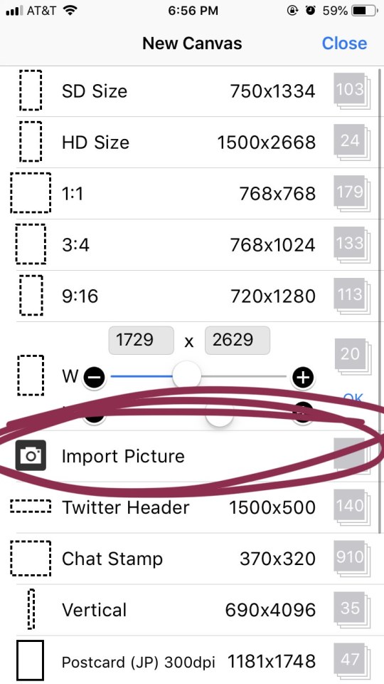
STEP 4: the option you want to pick is import picture.
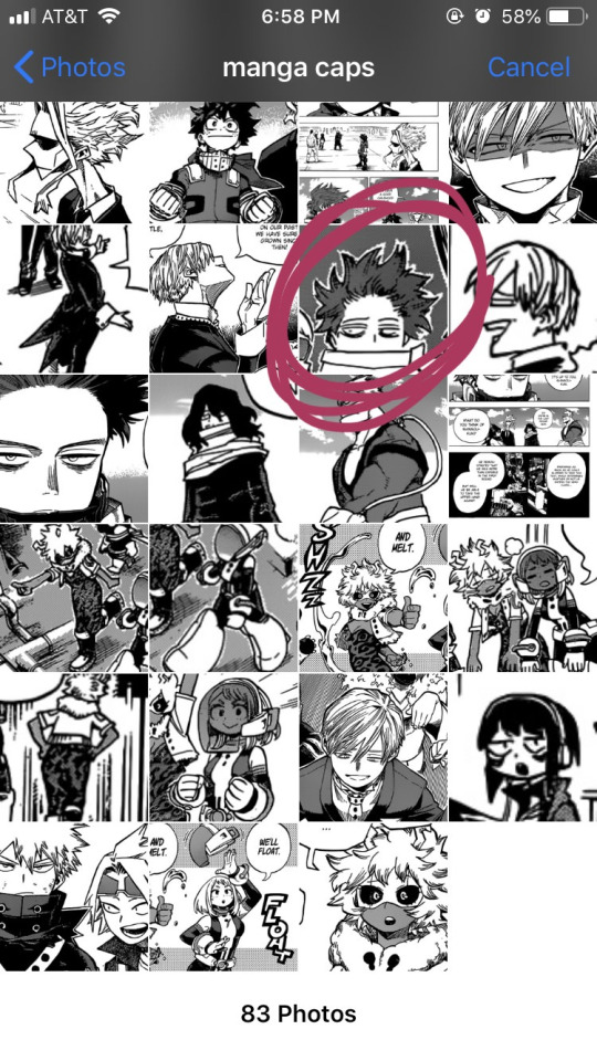
STEP 5: alright, there’s our shinsou! we’re just gonna click on him, pretty easy, right? also yes, i have an album on my phone dedicated solely to manga caps that i plan to make transparent.
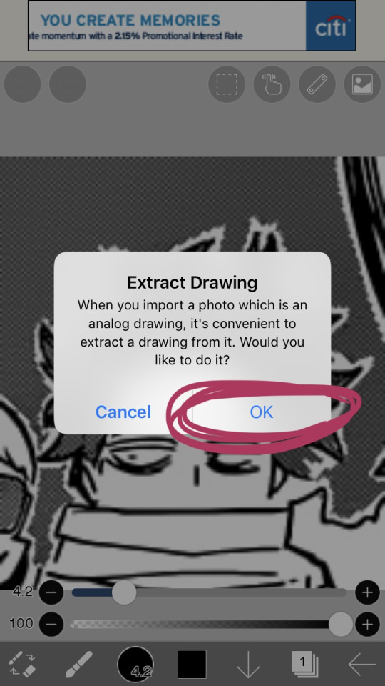
STEP 6: the moment you click the image, it’ll take you to a canvas and ask if you want to extract the drawing. you’re going to hit “OK”, because extracting the drawing makes it so that all the white areas in the image become transparent, leaving only the black and grey.
NOTE: this won’t quite work properly if the background isn’t pure #ffffff white! if you are making a transparent from someone else’s manga cap, make sure that the manga cap has pure white values. if it does not, there will be a very light, barely detectable film of nearly transparent grey values, but it isn’t full transparency. this means if someone uses your transparent over something like…say, a solid colored background, the colored background will appear darker in the final image. there’s a way to get rid of this film, but it’s hard to explain, so please ask me if you want to know how to do this. heroacacaps is a very popular blog that editors get their manga caps from, but their images do not have a pure white background. (it’s kind of funny, i can often spot when someone made their transparents using a manga cap from heroacacaps.)
OPTIONAL STEP: if you are using ibispaint x for importing anything that you don’t want to make transparent, then 99% of the time, you are going to want to hit “cancel”. also, this ONLY works well for black and white images, and trying it on a colored image with make the image turn monochrome. you can still use it on some colored images with white backgrounds, but it you need a few extra steps to make it work (hint: clipping layers, if you know how to use those. duplicate the extracted layer until it is completely black without creating black values outside of the lines, and merge the layers down into one layer. clip the original image over this layer. ask me if you ever want me to go further into detail!)
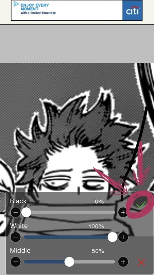
STEP 7: once you hit “OK”, this will pop up!! if you are using a good image where the lines are solid black values, the default option will be perfect for you.
click the green checkmark once you’re satisfied with the appearance of the image!
OPTIONAL STEP: you can manipulate these numbers if you need to. i find this useful for making the lines on sketches clearer. increasing the black percentage makes middle grey values appear darker, and decreasing the white percentage makes middle grey values appear lighter. the white percentage cannot be lower than the black percentage. i’m…not quite sure how to explain what the middle percentage manipulates, but you can mess around with it and see what happens.

STEP 8: so we’ve got the image on the canvas, but now we have a bunch of stuff in the background. to get rid of it, hit the little brush icon, and click the eraser icon. if you’re not sure what the eraser icon looks like, the next image has an image of it in the location where the brush icon was.
next, just…use your finger (or a stylus if you’re fancy) and erase away all of that outside stuff!
OPTIONAL STEP: some manga caps require the extra step of drawing any parts that were covered by things like text bubbles and other characters. it’s sometimes the most tiring part of the whole process, and i can’t really tell you how to do it. you just have to experiment with the available tools. there are lots of brush options you can try to imitate the way the lines look, if you click the button to the right of the brush icon, and there are also (painful and tedious) ways to replicate more complicated textures. i often have to do this step which is why i have an entire goddamn tag dedicated to transparents i needed to patch up.
if there was only one reason i had to pick for why you should respect the people who give you manga caps without backgrounds for you to use in their edits, it’s because a lot of times, they patch up manga caps without any comment. some replicate the actual style so well that you’ll have never realized that the person you got the manga cap from added in their own bits. here’s an example. this transparent? it took an hour. just look at the original, and consider how many different areas are covered by text. imagine how many different textures and lines that have to be replicated.
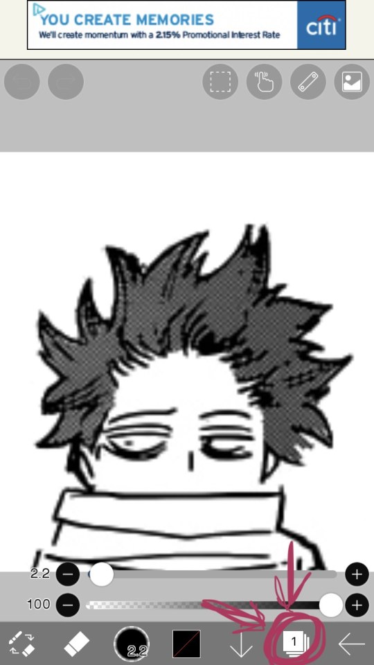
STEP 9: alright! now we’re ready to actually make this sucker a proper transparent image. this image is actually just lines, and if you stop here, you’ll only have the outline of the image! what we’re going to have to do is take parts that we don’t want to be transparent, and color them white. unfortunately, this is the bulk of the work, most of the time. to do this while still keeping the outline intact, we’ll have to use layers. hit the button with the rectangles stacked on top of each other to open the layers menu.
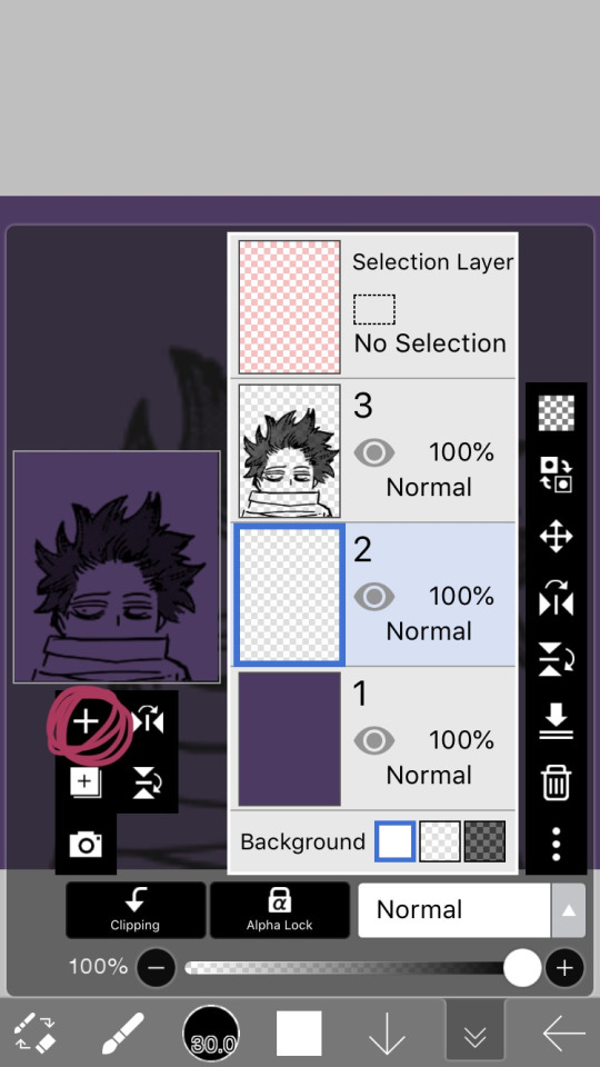
STEP 10: hit the plus button to create a new layer, and make sure to move it underneath the layer with the manga cap. i actually like to make two layers, with the lowest one having a color that’s dark, but not too dark. this added layer makes it easier for me to see what i’m coloring, and i really recommend it. if you don’t do this, you’ll have to hit one of the checkerboard patterns next to the word “Background” located underneath the layers. ideally the darker one, it’s easier to see the white on it.
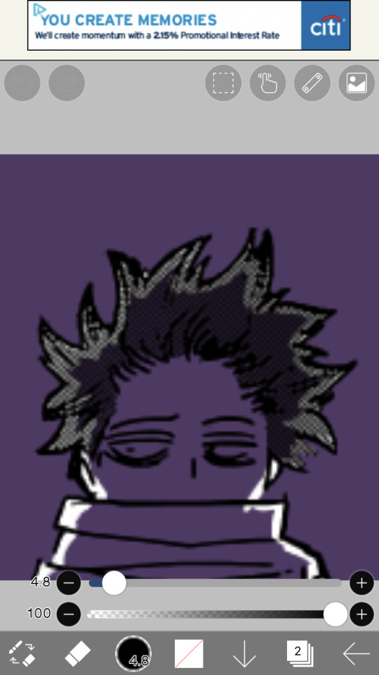
STEP 11: hit the eraser icon and click the brush icon again to be able to draw! and now, it’s just simple coloring. if you’ve ever used a coloring book, then this might evoke feelings of nostalgia within you, because this is basically just a glorified digital page of a coloring book.
i like to color the parts closest to the line first with a small brush size capable of getting in corners (use the little slider next to the text that says “4.8″ in the image to change the brush size). it’s not that helpful for a transparent as simple as this, but more complicated transparents with lots of corners to color make this step a blessing. or maybe that’s just me.
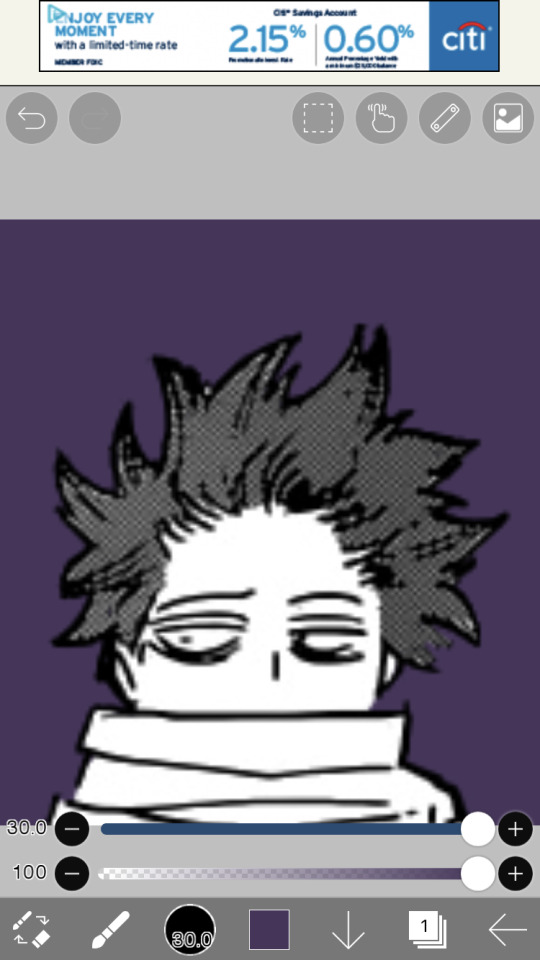
STEP 12: aaaaand finish coloring all of it, with a bigger brush size. if you colored near the lines first like i mentioned in the previous step, then this will feel a lot more like using a coloring book than the previous step.
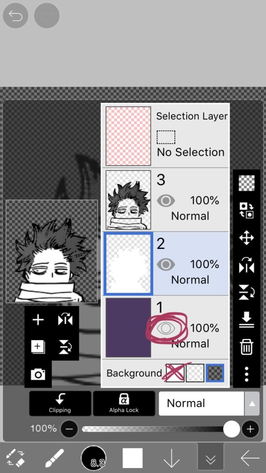
STEP 13: alright! if you used a colored layer underneath to help you see the white, then you’re going to want to hit the little eye button on the colored layer to make it invisible. after all, we do want the image to be transparent.
STEP 14: next, there are three background options underneath the list of layers, next to the word “Background”. if you want your image to actually be transparent, do not pick the solid white option. pick either of the checkerboard options, both will give you a transparent image.
STEP 15: you’re done! now just to save the image. click the little arrow pointing left on the bottom right of the screen. this will exit you out of the canvas, and back to your gallery.
STEP 16: click the button indicated in the above image.
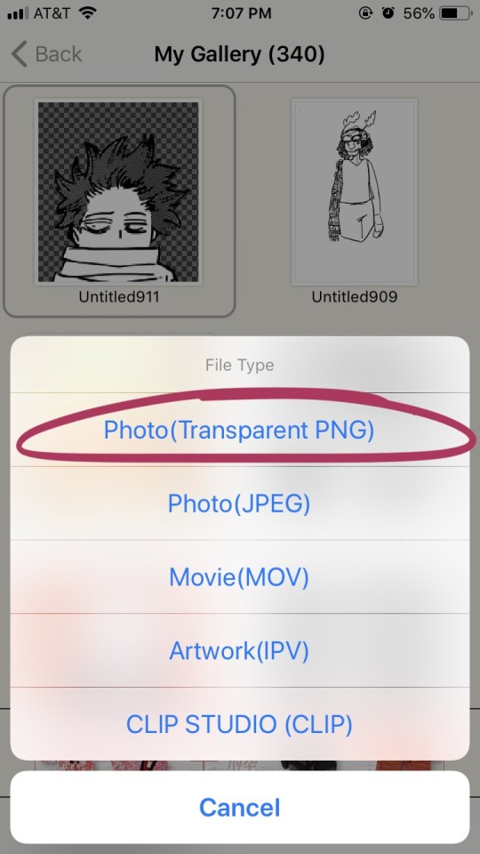
STEP 17: the above will pop up, click “photo (transparent png)” to save the image as a transparent image.
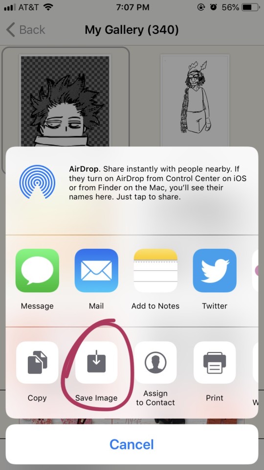
STEP 18: click save image!
and that’s it. you should have yourself one gorgeous transparent in your photos. i would probably suggest checking the image to make sure that it isn’t transparent in areas that you don’t want it to be.
208 notes
·
View notes
Text
Preparations For a Body That Will Accept Anything
At the 3-story leather bar, I was took with the passing memory of the woman at the suburban street art fair who sold prints of her digital collages which mostly layered closeups of leaves with washed out details of a shiny face or medium shot of a nude body, turned away. “These are all digital collages made with my original images” she explained. A lily pad leaf with holes and computerized discoloration was placed over the muscled ass and lower back of a blonde man with his profile clipped in atmospheric glow filters. I completed the perimeter of her booth, which stood out from the woodworking/practical crafts and cityscape photos on wraparound canvas that dominate these kinds of events. In her space, a nymph-like quality and color palette you might associate with the lives of nymphs predominated, communicating the highest rigor of a paganistic fashion shoot. She turned to a woman approaching her booth and said “these are all digital collages made with my original images.”
The 3-story leather bar had its own approach to nature. Importantly, it was named after an animal, and the animal most critical to the identity of the United States. Conventional urinals were replaced with a long trough, bringing to mind rustic farm life and the day to day experience of domesticated animals. High on the priority list of the men filling the space was the task of infinite looking around. Evaluating a face and body in a swarm of people and occasionally speaking to the face and body evaluated. This was prime nature: silent looking, but not silent in fact as usually a mouth accentuated the other direction of an eye. A man approached me leading with his lit phone, “has anyone ever told you you look like him?,” the image of a famous and often arrested young actor on his screen. “Yes, a few times.” Being spoken to is obviously less interesting than silent looking in a place like this. Humans enjoy staring at animals, at vistas, at trees, I won’t accept they abuse with curiosity alone, ahahaha, nature’s voyeur, “I’m gay” I thought, as an older man attempted to place his hand in my pee stream before it reached the piss trough. Our eyes didn’t meet before I said “no” in the tone of disciplining a pet and jerked my cock away. I did not want his hand in my pee stream and did not even give myself a chance to think about it.
When I was able to observe it, I observed that my neighbor Rob went out a lot. I usually preferred to stay in and experienced going out by not moving and then by watching people move for me. Some part-memorized quote on the longevity of the action movie guided this habit of mine, that action movies remain popular because they convince a viewer’s mind that they themselves are catapulting their bodies then holding a gun sideways, punching a face that deserves it until its new form is noticeable, screaming at an approaching animal villain or rock. The action movie takes our bodies back to a primeval routine of violent exercise and the bodies react by pretending we did something crucial. My experience of watching men reveal both their well-exercised and freely ignored bodies through a sexual broadcast was equivalent to being in the same room as a TV showing the poorly received 9th season of a popular police drama watched by a cousin I hadn’t seen in 6 years, its audio annihilating the interesting chirps of two sparrows outside the window, that I turn and look at directly only once before I decide it’s time to leave the room. But in some cases such broadcasts were enough surreptitious movement for my body to feel a moment free from the control of my memory and mind. I noticed Rob coming back at various times: 2:33, 1:02, 1:35, 4:21, always in the AM, 1:56, 3:22, 3:06, 5:10, 2:09. The men coughed, rotated, considered viewers “weak little faggots who need my cock,” 3:46, 12:47, some laid on their sides for several hours, shirtless but not totally sexual in their presentation, some kinda hesitation in their eyes as if testing the world to see if the world thought them attractive. I felt shanked by what I interpreted as hints of stapled longing in their faces, all of my senses indicated that I was living in the Koyaanisqatsi of porn. Keeping secrets in the era of social media is an aggressive method of remaining unshared. Yet the spills from certain years stay sticky and even sometimes find a way to tower over me. Until they are presented to other people, the gore associated with those lost frenzies remains uncleared, yes, freedom fries mist in freezers past like Chrysippus' ass, who made him laugh to death, mhmm.
Since there had to be an afterimage to the disappearance of an old life, it had to be this: relaxed by the hands off finesse of fate, I lazily controlled myself to decide there wasn’t any other choice but fate. Always available to the world was my face, to just hide it with a mask or veil would only bring more charged glances or wild guesses. To be conceived of as sexy was blood-curdling. I looked up the plastic surgeon with the lowest cumulative online rating, it was Gabe Jenkins and I called the office. After hearing a high octave off-phone grunt, a voice said
“Dr Jenkins office?”
“Hi do you” I experienced a brisk intake, “Do you do all kinds of” here I laughed like I was trying to encourage someone I thought of as insecure after they made a difficult-to-react-to joke during a conversation “plastic surgery?”
“Yes we offer a number of options,” they responded without interest.
My lack of response gave the woman some go ahead to list the procedures, “breast enhancement, fillers, nose reconstruction, face lift, buttocks enhancement, some men like the calf implants, pec implants, jaw reshaping. What are you looking for exactly?”
“I have some — a few ideas. I” I looked at a long strand of black hair that hung from the stationary ceiling fan and was not mine “want to…look like — is it possible to make my face look older? I specifically would like forehead lines and crow’s feet. And if there is a way to get my neck to sag lower than it is now that would be great. I am 27, I would like to look at least 78 if possible, hello?”
The voice had interest in it, “please don’t call here again if you are going to waste our time.”
“I am being very serious. I would like plastic surgery to look older,” and there was silence.
I considered what I could say to make it real. “Please, I would like the procedures done as soon as possible, there is a big gala I will be attending in Singapore next month” but I fear-laughed and the woman exited.
I had no thoughts to live for, and then suddenly in a breakthrough moment I discovered that, after many many months, I had a thought: I should slowly begin to get plastic surgery to look older. Now I needed money to make this happen. Because then my disappearance would appear more accurate. With the jowls of a 92 yr old man I would feel liberated. But that wasn’t enough — I wanted more than anything to reproduce the appearance of a man well over 100. In fact my thought revealed to me that I was a futurist because I would only settle for looking as old as someone whose life expectancy extended to at least 173. I wanted to be old in a way no one had yet even imagined. This would involve a lot of planning, sketching, file-saving and interviewing, and would likely be the type of initiative that lasts an entire life, and I would start with forehead lines. An ease-in for the body and for the eyes of those that recognized me, and achievable with a budget eyebrow pencil for now. Keeping costs down was a second thought that entered exactly behind the first thought that appeared after many months. The eyebrow pencil could also be used for crow’s feet, frown lines, liver spots; but the application of frail sag on my neck, the indistinct recognition of the world suggested by the droop of eyes, the tint play of bald spots under white hair that is shiny and limp, the lowered vocal octave and general bodily slackening were all protruding costs. If I could not formulate, participate in or witness a revolution then I would elect to suffer a much more minor revolution that you might try to call a celebrolution. As, though the actions and voices that built up the center of what we celebrate as a ‘political climate’ had shifted in an obvious external pivot towards a ‘something totally else,’ it still stood despite the panic that the country needed to focus on the opinions and physical movements of celebrities, and actually not ‘despite’ but ‘because of.’ And plastic surgery was often used by celebrities to command and maintain the public’s focus by recreating a version of themselves they believed responsible for their entry point into wealth and unhinged visibility. Since I was not known for anything and in fact could even be summarized as a loser or more accurately lost, and that I could barely string a sentence together and sometimes ate peanut butter sandwiches and then looked at my hands to discover I had actually eaten an entire pen — this meant my use of plastic surgery could be a revolution in my opportunities. That is, the opportunities that trickle down from achieving grotesque notoriety. A celebrolution to solve a chunky lil personal puzzle.
I knew the lines in my palms very well, and so I looked forward to the inevitable submission of lines all over my face because I wanted to know those lines just as well. I wanted to know them as well as I knew the tone of no worries found in the whoosh sound effect that separates two segments of an entertainment news TV show. It became a sound I carried with me everywhere, I’ve looked at birds fly past me and heard the sound, communicating that something is leaving. It gave me a short leak of light, in a moment, and then I could not wait to see what came next. It was a sound I would need as a score for the before/after of my first forehead-aging and chest droop surgery. I can definitely say that I’ve had a bird fly past me before. I simply wanted more free time to formulate a plan for my future appearances, it filled my thoughts all day long. Monetarily I was forsaken, choked out and in need of unbound frondescence. I never stopped thinking I had some level of luck, I had two lamps, but then there was the job which was just about all I could handle, and, full-time-as-part-time to its core, it tossed me about, took time away from my obsessions, and so I repressed and regularly said ‘yes’ to survive. At work there was Rachel, who had been entranced by Tom Hiddleston and who first introduced the word ‘clopening’ to me, and Gifford, whose name I could not disassociate from Gabrielle Giffords, and Steven, whose quick rescuing reaction to an elderly customer’s near dive over an uninhibited bag of packing peanuts resulted in the customer’s maximum level of comfort and safety, considering the stakes. That lack of hesitation in making a decision, and in making the right decision, the most helpful and societally selfless decision, caused me to immediately respect Steven. So when he found the time to comment on something to me, I tried very hard to engage. As he explained to me during a lunch break, “The USA does not exist. The White House does not exist. They are using holograms to deceive everyone. God destroyed Earth by fire. And these demon parasites knew it and fled and hid from God and God’s army. Well, they lost. God rules and is in control. Stop watching media. They are lying to everyone. The media all sold their soul to Illuminati demons and are no more. There is nothing more than demons and clones using holograms to run deception. Better wake up. The Heavenly Bodies are right above your head.” And then he would laugh like he didn’t care if it was true.
2 notes
·
View notes
Text
11/11/11 tag game
Answer 11 questions, make 11 new questions, tag 11 persons!
I was tagged by @waterfallwritings for this! Thank you, your questions were really interesting and fun to answer! o(^▽^)o
(Sorry if I got a bit lengthy, it was just so nice to do something not university related after exams!)
1. How do you come up with ideas for your WIPs?
The heavy artillery from the get go, eh? *cracks knuckles* Okay, to be honest, I'm not sure. I've never really thought of it, they're just there, clamoring for attention (plot bunnies are my best ally and worst enemy). I definitely have bouts of very intense inspiration and days when I just,, can't. Even if I know where the scene is going, how it's going, and why, the words aren't there. Or they're all wrong. (This is when I default to writing ugly-crying emotional breakdowns or sex. Likely both.)
Working out a story is a game of association laced with concepts and core elements for me. Like this: dragons (core element) + mountains (association) + tribe/clan (concept) + shapeshifting (association/concept) + relocation/settlers (core element). And that's basically my dragon wip.
Eld's story is based on a Doctor Who quote "demons run when a good man goes to war". Ren and Kuro grew up with me; at some point they just started acting on their own - I just throw shit at them and sees what shakes loose at this point. (They have five kids! How???? did that?? happen???)
(I'm a sucker for prompts. My brain can see a single word and just, run of with it hollering in glee.)
2. How do you get past gaps in the plot?
Urrrrgh, I have to get past them??
I struggle, is what I do. Typically I let it sit, soundly on the back-burner in my mind, until I've mulled through my story to the point where the hole is gone. (This takes months, and with my sci-fi wip I ended up rewriting the dang thing completely at the third draft after eight years of working on it. Scrapping it was painful.)
Or I try a different angle. Sometimes it works.
3. What motivates you to keep writing?
I love writing. There's really no more significant reason than that. Writing allows me to express myself, create and explore worlds and characters who wouldn't exist otherwise. And it lets me just exist without any layers. When I've been hurting, writing has helped me get the pain out with no more than tears.
And I love words and languages; the way we have about 10 different words to say "snow" (partly because Swedish mesh several words into one but still) and maybe 2 (3?) for heat. That there are groups of languages with the same ancestors that are so close; how absolutely amazingly different they can be (I just learned "y" is not considered a vowel in English and I'm???? Completely blown. What. What do you mean it's not a vowel. Are you sure???). And languages with different alphabets and ones that use pictures to represent ideas instead of sounds! And sign languages!!
And idioms! It's so cool how idioms can carry words of wisdom, caution and reassurance, and rarely can be translated (classical examples from Swedish "There's no danger on the roof" and "The rain is standing like sticks in the ground") because they lose their connections to the cultures they are used in.
The universes in my head are as full of life as the real world and not nearly as anxiety-inducing. I have stories to tell. And you know that feeling when you’re in the zone and everything is flowing and you’re writing 10′000 words in a go? That.
4. Do you do any other kind of creative writing?
I dabble in poetry? Like, very sporadically and with mixed results. I have a friend into slam poetry who opened my eyes to it, too.
(Would fanfiction go here too?)
5. Do you have any other creative hobbies besides writing?
Urngh, yeah, too many. If I’m not reading, my hands need to be moving or I’m an unhappy bean. Though, writing is the only thing I never put down. Ever.
Okay, so, I draw (badly), both on paper and digitally. Mostly landscapes. I also try to make house sketches/plans. And I paint (a bit better than I draw), prefer oils or acrylics over water colors. My partner and I also paint miniature models when there is time.
I also crochet and knit, and I love origami. I roleplay (Dungeons & Dragons, whenever the DMs have time), and I play the violin (and piano) and write simple music for myself.
I garden if there's time in the spring and during summer, and I absolutely love these little fairy-gardens that have been popping up everywhere. On that note, I have more houseplants than I have space for.
I'm also thinking to start up a little thing making bracelets and bead strings for fidgeting. I needed some kind of stim toy to be able to focus and I wanted something silent with many different sensations to keep me entertained. I hunted around a bit but eventually made my own and they turned out pretty nice!
(I also like to bake, especially pies and breads.)
6. What do you do when you’re stuck on a scene and don’t know how to get it out / write it?
I slam the key words in. And then I ignore it until it stops fighting back so much.
Or I backtrack. Sometimes I've written myself into a corner unknowingly.
Sometimes I drop a wip that's giving me grief and work on another, or I use word/idea prompts to get me started.
7. How do you decide how to end your WIP?
God, please tell me because I don't hecking know. Should I do an epilogue? Should I leave it open/ambiguous? Should I just cut it off and leave the next step to the reader? Should there be a "true" ending, with goodbyes (actual or metaphorical)?
Urrrrrrrrgh. Good Lord, endings.
8. When in the process of writing do you decide how its going to end? Or do you kind of just wait til you get there?
Either I know from the start, before I write the first words, or I wait. Which tends to mean frustrating the hell out of myself. I have started to go through my wips (whether original or fanfiction) and give them all bare-bones outlines, because not having endings is a big problem for me.
9. Why did you decide to join writeblr?
Basically when I decided I had had enough of the "join to see more" button or the "sensitive material" warning. And when I realized there was a really nice writing community here I could maybe become a part of. (A major reason was actually @concerningwolves advice posts.)
10. What’s your favourite food?
(CW: Maybe skip if you’re vegetarian/vegan/you’d rather not read about meat.)
Chinese deep-fried chicken with sweet-and-sour sauce (not the spicy chili kind, the actual pineapple and tomato juice based kind) with rice. No question about it.
Mom's "blodbröd med fläsk" is a close runner up though, but we only eat it once a year, at the midwinter solstice. It's homemade Swedish tunnbröd (hard thin-bread) with blood instead of water in it that you dip in boiling water to make it soft, with white sauce, and fried, thoroughly salted pork.
(Believe me, some country-side Swedes in the northern parts are still pretty pagan about the sun coming back, me included. It's a big deal when you go between no night/darkness and then very little/no sun.)
11. If you had to kill off a character in your WIP, who would it be and why?
People are dying right and left in most of them already, since three include large-scale wars, so there's no shortage there.
But if I had to choose a main-character or a directly supporting character? (MY BABIES! NO.)
I think Ren, from the sci-fi wip, because he would be free from both responsibility and physical and mental pain. (My boi is a wreck.) It wouldn't be unlikely either. But at this point it would destroy my story! 😂 Less story-destroying would be their foster-guardian Sandra. It would still force me to write a completely new arc, but it would be do-able.
Although, regarding the fantasy wip Firestorm, Kebarock dying in their war would crush Sunling. That could be done without losing the plot entirely. Hmmm.
Puh, that was a lot of thinking! Okay, I'll be tagging.. @concerningwolves @weaver-of-fantasies-and-fables @adorhauer @focusdumbass @sleepy-and-anxious @els-writes @meteorwrites @sebastian-writer @telvivere @thescribesloft and @aceymichaelis No obligation to do this of course! <3 (And if I tagged you and you’d rather not be tagged in games, I apologize, please let me know)
And here are your questions if you want to:
1. What about your wip makes you smile?
2. What's the hardest decision you've had to make in regards to a wip?
3. What text font do you prefer writing in? Or do you write by hand?
4. Are there pets in your wip? If not, what pet might your character(s) keep?
5. What AU would you love to see/write for your wip?
6. Is there any type of music/a song in particular that you associate with your wip?
7. Are you a night owl or an early bird/When do you write?
8. Favorite beverage?
9. Where do you prefer to write? At home? In a library? On the bus/train?
10. What are your first 3 to 5 associations with the word 'writing'? Why those?
11. What do you do when you're bored?
Hope you enjoy! o(^◇^)o
#11/11/11 tag#11 asks tag game#tag game#ask game#writing related#writing community#writeblr community
1 note
·
View note
Photo

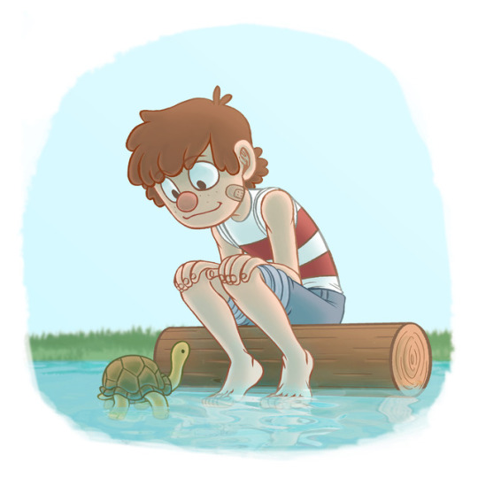
@ancientouroboros FLATTERY WILL GET YOU absolutely everywhere I drew an entire picture just for you. Actually I drew two because the first time I tried to record the process Bandicam shit itself halfway through without me realizing until I was already finished. Which is why I made the starry Stan pic.
Here’s the video and a description under the readmore:
youtube
Hopefully it isn’t too fast. It took longer than expected, and I didn’t want it too be too long, but I can upload a slower one if anyone wants me too. Basically my process consists of:
1) Having a video in the background to help me focus, usually Achievement hunter or something similar. Something I can listen to and only have to check back on occasionally. I have a hard time drawing in silence unless I’m in a public place like at uni. 2) Work flow. The reason I use photoshop primarily is because I know all the shortcut keys and it allows me to switch between tools really fast. I tend to stick to something I know because I like to have a flow and being familiar with my tools helps with that. 4) Cheating. If I can achieve an effect without painstakingly creating it from scratch I will. I use filterforge myself (even though it’s expensive it has a HUGE filter library), but there are lots of other options. I also have a lot of special brushes I use for textures and other stuff. And if you’re like me and you have shaky hands I highly recommend LazyNezumi! It’s a stabilizer that works with Photoshop, and It also has other cool features like perspective line rulers.
My sketches are messy as hell, as you’ve probably noticed. I’m usually trying to get a feel for the pose without getting too stiff. I like to use the pencil tool instead of the brush tool, since I work at sizes big enough that it doesn’t look weird, and it makes colouring a lot easier. Of course this video also shows how much of a god damn perfectionist I can be, erasing and redrawing and erasing and redrawing, and resizing and flipping, and backtracking, etc. I cut out like half an hour of me redrawing his feet like 10 times. God I hate feet!
Sometimes I get lucky and lineart turns out how I want right away, but sometimes it takes several tries. Because of this I like to space my lineart out on multiple layers to let me isolate elements more easily. Sometimes I’m a little layer happy tbh, like I needed 21 layers just for the sketch of my Stan WIP I posted a while back. If it’s something quick for a response or a joke it’s not so bad, when it’s a bigger picture, or sometimes just by chance, I can get really anal. How organized my layers get is completely random. Some pictures are meticulously labelled and named, and some are a complete mess. I also like to flip the picture a lot to check for weirdness or inconsistencies. If I can’t get something to work I’ll often just scrap it and redo it from a slightly different angle or with a different pose. I’ll sometimes have a series of action snapshots and chose which one I like the best. I do this with colours too where I save a bunch of different looks/styles, and try to figure out which one I like best by cycling through them.
I have a folder filled with slightly different coloured versions of one pic that was particularly difficult for me to decide on.
When it comes to colouring sometimes I have it planned out in advanced, but generally I just go with what feels natural. I will often fiddle with hue, saturation, colour balance, and all sorts of things, with different composition modes for layers and stuff like that, just to see if I can add some extra pop to whatever I already have.
So now you can blame @ancientouroboros for both pictures and this wall of text. If there’s anything you guys want me to elaborate on let me know cause I’d be willing to make a more in depth post on a certain topic. Here’s the video of the lineart for the other pic before it crapped out, for anyone who’s interested.
265 notes
·
View notes
Note
Hiyya! For the artist asks, 1, 5, 7, 15, 16, 18, 21, 27, and 30?
i fghfhkh forgot about streaming today bc i ended up going somewhere, BUT i got my computer stuff sorted so i’m gonna stream in a couple hours at 7am CST i hope that works for folks. also! i’m gonna be doing more palette character designs as like a warmup so send me some hex-codes and i’ll design some characters with em!!
i put the answers under the cut because they got wordy eeee
1. Do you prefer traditional drawing, or digital?
i think i do prefer digital just for convenience, and i fnd it harder to actually finish a drawing traditionally. like my sketchbook is literally just... rough sketches. I do really like using acrylic paints though!
5.What’s your favorite thing to draw?
i really really like drawing faces and my ocs! i think figuring out different facial features can be the most fun part of drawing someone, and faces are the most interesting part of a character to me! which i guess is a good thing because it means i avoid same face syndrome better (or at least i hope so)
7. How often do you use references?
i am really bad about using references and don’t use them hardly at all, which is something i need to work on because i think it’s part of why i sometimes feel my poses aren’t very dynamic or fluid. usually i just kinda... make the pose myself and then draw how it feels?
15.How long does an average piece take you to complete?
mmm i work with a lot of breaks, so i can start a piece and not be done for a day or two but really the elapsed time is something like 3 or so hours?
16.Do you draw more today than you did in the past, or do you draw less?
i deffo draw more now than i used to! when i was finding pieces to use for my “art of 2017″ collage, i usually only had a piece or two for each month, but i feel like i’ve been doing a lot more recently!
18.What are you currently trying to improve on?
i’m currently trying to improve on moving out of my comfort zone when it comes to poses, making them feel more natural and weighted and fluid? and also on stylization a lot! i’m trying to move away from more anatomical correctness and more on like cartoony stuff
27.For digital artists: how many layers does a typical piece require?
ooh hmm. usually i sketch once or twice so that can 2 layers (give or take, depending on how many characters and background stuff), then i line which usually gets condensed into one layer but as i’m doing it can be something like 10+ layers since i like to keep things separate so i can fix them easier. then with my old coloring style i would do a seperate folder for each block of color, which would have a base layer and 5+ layers for shading, details,etc, but that got excessive so i boiled it down to just doing one base color layer and then however many clipping layers i need for details,shading,etc. so in total, it all comes down to smth like 20 layers i think?
30. What inspires you to not just make art, but to be a better artist?
this is a tough one. i think just this overarching goal of, one day my art is going to impact someone and i’m going to make characters that make people happy and i have to keep working at this skill until i get there. plus i love validation so theres that
#i'm gonna do it!!#i'm not gonna chicken out of it!!#this will be my first livestream oh boy.#it'll be on youtube btw#7 am sounds like a weird time but it's like 9pm for me#and i can't stay up late bc i have class tomorrow.#anyway i hope some folks tune in and it'll be fun!#tol-coolbean
2 notes
·
View notes
Text
AMA Transcript: Tenderly Touched by the Massively Muscled
For our next AMA, @sandmancircus, @peregr1ne & @sojustifiable (Amanda on Discord) stopped by to chat about their Resbang, Tenderly Touched by the Massively Muscled! Here’s some of what went down:
*Please be advised that this AMA contains spoilers!*
Q: What inspired the title? :D
Sand: I wanted something touching and relatable.
Q: Which was the hardest scene for you to write, do you think?
Sand: The last battle scene was hard, just coordinating everything and getting it down so it was smooth.
Peregrine: You did so good, it was a whole lot of characters to keep track of.
Q: Artist-chan/kuns, what made you pick the scenes you chose to art for?
Amanda: Ahh, I guess it was just things where the image stuck out and I felt like I needed to see it. With Eruka's tantrum scene, I also thought it would fit well with the style I wanted to use, with lots of swirly swirls and dramatic colors.
Peregrine: Well, for my first I wanted to do like a good intro iconic scene, so their first meeting was a good choice to set the stage and such. For the other two, I just wanted to do cool group shots because I wanted to draw all the characters but not 10 different pictures. Especially the last picture, I just really like drawing like… ‘epic’ scenes.
Q: Sand, what was your writing process like?
Sand: Uh, for this Resbang I mostly wrote in chronological order, which is unusual for me. When I had time, I just sat down and stared at the screen until something came out. I also kept a joke doc for jokes I wanted to use.
Q: Speaking of jokes, can you explain dog farting all the time?
Sand: Farts are funny.
Q: LOL. Do you have any funny/iconic comments that betas or artists left that you want to share?
Sand: Kat kept getting mad every time a penis happened. A bunch of "I’m too ace for this."
Amanda: Same.
Sand: Also the pinching of the clover got a bunch of yells.
Q: What was the inspo behind the pomegranates?
Sand: The pomegranates were just a throwback to the original myth.
Q: How did you come up with Soul's role in your fic? I thought it was really cool and imaginative.
Sand: I thought it would be funny if Soul was a soul, like Dog is a dog.
Q: What inspired so much peen? Cause like, there's much peen.
Peregrine: Sarah thinks dicks are funny.
Sand: I honestly can’t remember why I chose to write him as a nudist. I just think it’s a nice role reversal having the man be hyper sexualized.
Q: Somewhat related: how was it writing the smexies!!! And will we see more smexies????
Sand: The smexies were very hard to write, would not recommend. Will maybe try again in future.
Q: Also, for the artists -- how long did you spend on each piece?
Amanda: The first piece too a long time cuz I used masking fluid and had to wait a long time for different layers to dry to do details. The other pieces I did more quickly just because of the style. The time taken mostly depends on waiting time which there is less of if you do everything wet.
Peregrine: I don't remember how long I spent on my pieces because I break them up a lot? Usually I'll spend a while doing the rough sketch because I'll move things around and erase the whole thing and start over a lot because if it doesn’t feel dynamic super rough, it's not going to look good when I clean it up. That takes a while to plan out I guess, but it’s also the funnest part because I can draw a lot more freely. I'll usually then leave it for a day to see if it's still solid later and then lineart can take anywhere from 3 hours to like a week depending on how frustrating it is, and then I usually colour in a day (by a day I usually mean like 3 or 4 hours because that’s how much time I’m usually able to spend when I have time to draw). But yeah idk, in general pics usually take me like 3 days unless they're group shots, like 2 of these were, because lineart takes forever.
Q: Were there any scenes that came out way differently than you'd initially planned?
Sand: The whole fic changed as I wrote it tbh, which usually happens with me. I have an original idea of what things will be like, and it gradually shifts and alters to become something new, or at least very different.
Q: Has anyone already asked you what inspired this bad boi???? I remember there was an art.
Sand: Yeah I did art for Freeruka a year and a half ago for Freeruka week which was supposed to be for the prompt "myth". The idea just stuck.
Q: Which was your favorite scene?
Sand: My fave scene was probably the one where Eruka got back talked by Free because of her stalking after she went bananas.
Q: Amanda did you have a fave piece between the three?
Amanda: I think Eruka's tantrum scene was my favorite to do and fave as an end product, though that free style of painting in general is really fun.
Sand: That was also the piece that we got to see Free's booty.
Peregrine: It was an interesting challenge for us artists to draw for this fic trying to position the characters so we wouldn’t have to draw a dick.
Sand: Amanda threatened to leave if I described her art as sezual.
Peregrine: But yeah, it was very deliberate for every piece like 'alright how do I draw this scene without Little Free?'
Q: Where did your inspo for Jackson come from???????
Sand: I needed a sassy side character, and he just kinda grew into something super fun to write. And it’s very hard to write a character without arms, so I gave him arms.
Q: How did you come up with the mythos? It was a neat spin. I liked that the positions got filled when someone dies.
Sand: Well, I needed a reason to call Eruka ‘Eruka’ and not ‘Hades,’ so it turned out to be more of a title, which led to "oh, well then could someone else be hades," and it kinda grew and grew from there.
Q: Kinda in love with Maka as new Zeus, not gonna lie.
Sand: That was actually Pere's addition.
Peregrine: I based Maka's outfit off one of the ones from the Wonder Woman movie that’s Zeusy and she was part of Zeus's crew and after Zeus died the position was open so I suggested it to Sarah because I thought it would give some good closure - and also Maka as Zeus would be super badass.
Q: Was there a scene that was really surprisingly easy to write?
Sand: The opening scene was really easy to write, surprisingly. It kinda all just flowed out really well and really easily.
Q: What drew/draws you to Freeruka?
Sand: I love Eruka, I like that she's sassy and that she's a morally grey character and that she's a complete coward, and I love her dynamic with Free. He's this big macho guy who is incredibly loyal and also a bit of a klutz and is a fucking WEREWOLF (heyo!) and they just mesh really well in this weird way that I adore. Witches are cool, wolves are cool, smoosh them together please.
Q: Is there anything you wish you could've done differently?
Sand: I think I would've liked to give them more time to get to know each other before everything goes down - at least a few months, just to make their connection more believable. But time, man.
Q: Pere did you have a favorite piece??
Peregrine: I think I like how the first pic came out the best. It's a nice standalone. But the last battle scene was the funnest to do because I just like drawing action poses and snarls the best.
Q: What are you working on next?
Sand: Nothing so far.
Peregrine: Uhhh Reverb I guess? Right now I'm doing a commission tho.
Q: For Peregrine: Do you feel like you grew in your art skills through this bang? If so, how?
Peregrine: Uhhh not really? I think I grow in my skills by doing experimental pieces but I don't do experimental stuff when it's like for someone else, I do that on my own time. The stuff I did for this was the kind of stuff I just always do.
Q: Doing Resbang next year Sarah????
Sand: Unfortunately, I probably will be suffering again, yes.
[a chorus of cheers]
---
Thanks to the team for stopping by! More transcripts coming soon!
8 notes
·
View notes
Last Seen Blogs

simuooo
Yokonori Life

ashuambli
Untitled

mrllcmt
Untitled
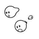
bulkyphrase
Fandom Stuff
singereden
EdenSinger