#using only prismacolor or blending some prisma with my crayolas really helped
Text

Finished my 911 pinset!
#911 on fox#911#my art#i might do more characters later but for now im sticking with the fab five#chim warped a tad and some had some smudging but overall im happy with them#using only prismacolor or blending some prisma with my crayolas really helped#not sure what to seal it with tho
194 notes
·
View notes
Photo
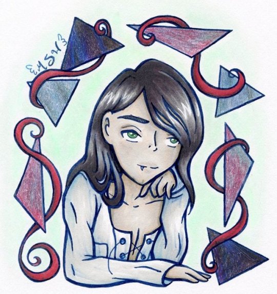
The Intrigue (Brush Marker Test)
So per my poll from a few days ago, the first of my drawings made testing new supplies going up is this one!
Thanks to a ton of stuff getting the glorious "Clearance" tags and stickers at my local Michaels, I finally got my hands on a 6-set of Spectrum Noir Illustrator markers, which I've been wanted to try for a long time, and thanks to a well-timed sale, I also finally got my hands on four sets of 6 and a 2-pack of the Winsor and Newton Brushmarkers that I've been wanting to try for an equally long time.
I decided to put the two different kinds of markers together for this test because even with 26 markers by Winsor and Newton, I felt I was still lacking just enough colors to get a good range to work with, (this is also the reason I usually grab whatever markers from just whatever sets I have when I'm just drawing to make art and not to test specific supplies) and only having 6 Spectrum Noir markers to use...well, that would've made for a very challenging drawing, now wouldn't it?
After swatching the markers out, I was really drawn to some of the colors in the Portrait set from Winsor & Newton, and after staring at my options for a while, I felt like drawing a long-haired vampire dude would be fun and get the best use out of the colors I had. So I did
I will say that the one major problem I had during this process, and it's actually fairly obvious (although I did choose to accentuate it on the shirt) is that the markers kept smearing my lines. Which is strange and confusing because I used a cobalt Copic Multiliner, which is supposed to be "water and Copic proof." So you'd think since these markers are alcohol-based like Copics, that everything would be okay. Apparently not!
My best guess is that this ink (mostly the Winsor and Newton markers; the Spectrum Noir markers seemed to fair a bit better) dries more slowly or has more dye/pigment in it, or something. My original thought was that I had just made some of my lines too thick, but then I had the same problem a couple of times in areas where the lines were thinner/their original weight, so there went that theory. (Although the thicker lines probably didn't help, but I did that before I knew that was going to be a problem and it wasn't like I could suck the pen ink back up to fix it.)
Anyway. Other than that, I liked both kinds of markers pretty well. The Winsor and Newton markers remind me a LOT of the Prismacolor Brush Markers, which are actually my favorite of all the alcohol-based markers that I've tried. Other than visual differences between markers, and the Prismacolor markers having a brush tip and bullet tip while the W&N markers have a brush tip and chisel tip, the main thing is the tips of the W&N markers are a tiny bit softer than the Prismas, and the Prismacolor markers have slightly more friction on the paper; they "stick" a bit more, but it's a very very veeeeery subtle difference.
My only issue with the Spectrum Noir markers is I'm a little concerned about how long the brush nibs are going to last. They seem like they could be in very early stages of desalinization--a thing that can happen to all alcohol-based markers, including Copics, but tends to happen more commonly in older markers or markers with a very short shelf life just because of the formula used to make the ink. In this case, I'm inclined to believe it's more to do with how long the markers have been sitting in the store, unsold. There was a thin layer of dust across the top of the box, and this was the one set of about five options available that got a clearance sticker. And so, if that is the case, I will forgive it.
The other part of the nib problem though is that the nibs do seem pretty spongey/foam-like instead of more of a nylon/silicone feel like Copics or Prismacolor markers have. This isn't necessarily a bad thing, but it does point to the nibs potentially wearing out more quickly over time and/or with heavy use. I didn't have any issues while swatching or working on this drawing, but I will be exceedingly careful to try and not push my luck going forward, just because I'm a paranoid little potato after the hot mess that was the one set of Artist Loft markers I bothered to pick up. (Those nibs, for context, were awful and have started to collapse with very little use).
Other than that, I don't really have much more to comment on. Both markers blend really well, and the Winsor and Newton markers, in particular, seemed to be very forgiving in terms of not being patchy if you laid them down inconsistently, and they soften out to a smooth blend pretty well, especially if you use more of a flicking technique while layering up the colors.
The shadows aren't terribly dark in part because I only had so many colors to pick from and also because I am notoriously skittish about accidentally getting my shadows too dark on my alcohol marker pieces anyway. But I think Mr. Vampire here turned out pretty good despite that.
I did have to touch up a few colors in Photoshop because my scanner kinda messed them up, but I think that's more user-error and my scanner being finicky than it is any fault of the markers.
Speaking of which, I did the soft green background with a Pan Pastel to tie in with the green in his eyes, and the triangle-border thing saw the triangles filled in with some tri-tone pencils (a couple by Koh-i-noor and a couple by Crayola) that I acquired recently. I thought it would breathe a little more life into things, and I think I was right. I think it also ties the otherwise random colors together a little bit more.
I added the border at all because I had kinda already decided on the pose I wanted to try for a vampire character, since the kind of character was where my color options led me, and while I could have just left it without, it felt kind of lacking without something to more formally ground the character, and as I said the colors feel a bit random without something to strengthen their presence. Which is ironic because the structure of the border was almost completely random, and yet my brain looks at it and just kind of glosses over that knowledge .
Overall, I like the markers and I'm happy without how my tall, pale, and mysterious character turned out. Though for some reason I get "hypnotism" vibes from the final product; I think maybe it's the pose, the nature of triangles, and the seductive part of vampire lore combined that's giving me that impression? I'm not really sure.
He's not terribly original, but I may end up using this character again in the future since I do like his general design so much and how nicely he turned out here, we'll see.
____
Artwork © me, MysticSparkleWings
____
Where to find me & my artwork:
My Website | Commission Info + Prices | Ko-Fi | dA Print Shop | RedBubble | Twitter | Tumblr | Instagram
1 note
·
View note
Last Seen Blogs

tiredd-writer
tiredd_writer
lopsushi
I Won the Award for Laziness

abruxalua
witch 🌙

tsleggings
tsLEGGINGS