#vexillologi
Text
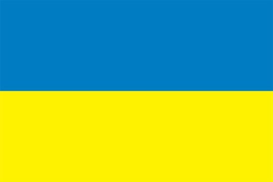
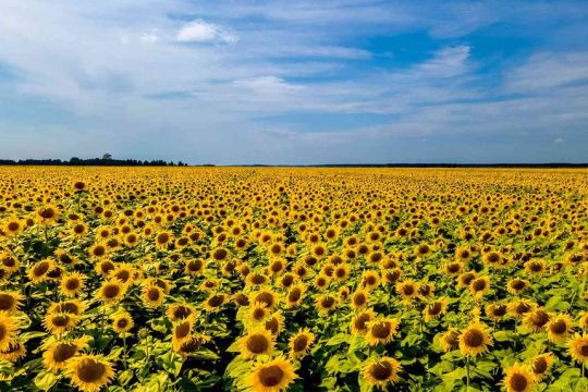
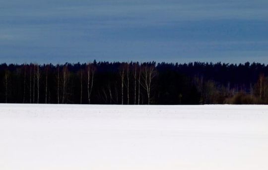
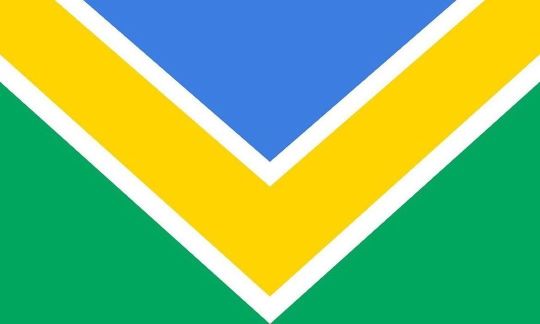
shoutout to flags that look like landscapes fr gotta be one of my favorite genders

59K notes
·
View notes
Text

93K notes
·
View notes
Text
#flags#poll#tumblr polls#vexillology#where are my flag nerds?#please arrive flag nerds?#rb for sample size#lol
3K notes
·
View notes

Text


Flag Wars Bonus Round
1K notes
·
View notes
Text


TIL that Italy has a war flag... That's exactly the same as their regular flag, just with the aspect ratio changed.
Watch out, it's time for war... I'm shifting into 4:3.
2K notes
·
View notes
Text
I made this months ago and posted it to r/vexillologycirclejerk but I figure tumblr might like it too, so

trans pride flag in the style of the 2001-2017 city flag of Pocatello, Idaho
3K notes
·
View notes
Text

intersex miku because i realised i haven’t done the intersex flag yet on this blog
#hatsune miku#vocaloid#piapro studio#doodle#no one asked but i remembered when i saw a variant of the pride flag with the intersex flag baked in and then i went ‘oh *shit*’#vexillology is cool. i’ll probably dedicate a wiki deep dive into lgbt flags some time soon.
747 notes
·
View notes
Text
I'm so frustrated by every flag redesign using blue and green.
"This green represents our land, and this blue represents our sky" please! Every state has land and also sky! Please pick something that actually represents your state and not every state ever!
This post brought to you by the Minnesota state flag redesign finalists.

Oh yeah, plants, rivers, the existence of stars in the sky, these sure are things that scream "Minnesota" to me.
I actually do want to give the stars specifically a pass because "The star of the North" is Minnesota's state epithet.
But like you compare these to, for instance, Washington's proposed flag redesign:
Come on, please, I beg of you, find some colors to represent your state more interesting than "it has land, and also it has sky".
2K notes
·
View notes
Note
the city of baltiysk, kaliningrad oblast, russia has a sturgeon in a crown on both the flag and the coat of arms. thought you'd like to know


Do you understand that my two special interests are sturgeon and vexillology
Do you understand what tbjs means to me
to me sturgeonposting
I died because of this (good thing)
441 notes
·
View notes
Text


i have transified many country flags.. sorry not sorry
the files:


made this for my trans friends... hahahahhahaha
#transgender#vexillology#shitpost#sillyposting#silly#shitposting#random shit#transed them motherfuckers#trans stuff#flags#pride flags#pride flags??#maybe
432 notes
·
View notes
Text
European Flag Showdown Round 3

Finland

Estonia
Reminder that this is not about the countries the flags represent, just the flags themselves.
330 notes
·
View notes

Photo
Happy World Vexillology Day from the Portland Flag Association! How are you celebrating? Reply below or post with hashtag #vexiday/#vexiday2022. #vexillology #funwithflags #flags #flagstudies #vexilología #vexilologia #Vexillologie #vessillologia #ভ্যাক্সিলোলজি #veksilologija #вексилология #血管学 #血管學 #vexilologie #vexillologi #veksilloloogia #ვექსილოლოგია #κτηνοτροφία #वेक्सिलोलॉजी #vexillológia #旗章学 #ವೆಕ್ಸಿಲ್ಲಾಲಜಿ #haurangi #weksylologia #вексилология #veksilologija #וקסילולוגיה (at Portland, Oregon) https://www.instagram.com/p/CjMcgE9rarY/?igshid=NGJjMDIxMWI=
#vexiday#vexiday2022#vexillology#funwithflags#flags#flagstudies#vexilología#vexilologia#vexillologie#vessillologia#ভ#veksilologija#вексилология#血管学#血管學#vexilologie#vexillologi#veksilloloogia#ვექსილოლოგია#κτηνοτροφία#वेक्सिलोलॉजी#vexillológia#旗章学#ವ#haurangi#weksylologia#וקסילולוגיה
1 note
·
View note
Text
My zine, 'Label Coining as an Artform', is finally done! Transcript/Image ID underneath (warning: it's long). Printed version in a reblog.
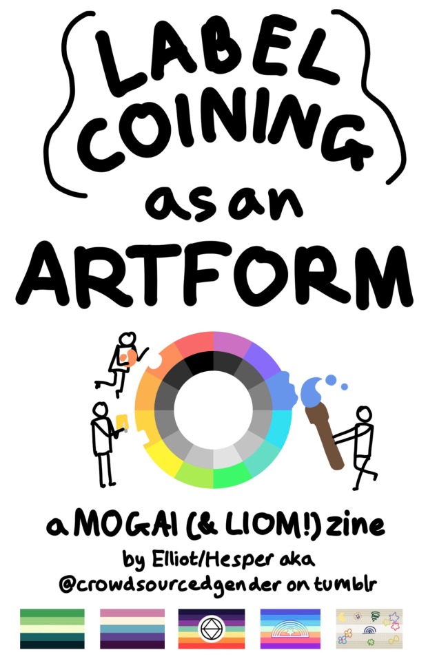
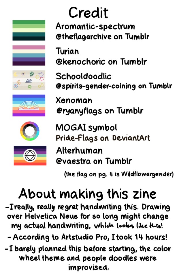

[Image ID: A series of pages in a zine. The text is handwritten, and all figures described are simplified stick figures.
Page 1: ‘LABEL COINING as an ARTFORM in large text. Below is the multicolored MOGAI wheel, with three figures taking pieces of the colors and using them for art: sculpting, cutting a piece of paper, and painting. Below is ‘a MOGAI (& LIOM!) zine by Elliot/Hesper aka @ crowdsourcedgender on tumblr. Under the text are five pride flags: aro-spec, veldian, alterhuman, xenoman, and schooldoodlic.
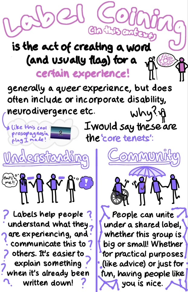
Page 2: ‘Label Coining’ in large pink text. ‘(in this context) is the act of creating a word (and usually flag) for a certain experience!’. Next to this text is a figure filled in with pink with a speech bubble full of pink shapes, talking to someone using a cane holding out a hand and expressing a question mark. Below reads ‘generally a queer experience, but does often include or incorporate disability, neurodivergence etc.’ A figure asks ‘Why?’ and the text reads ‘I would say these are the ‘core tenets’:’. In a cloud next to this text is a blue and purple pride flag with purple text reading: ‘like this cool prosopagnosia flag I made!’.
The bottom half of the page is split into two columns: ‘Understanding’ and ‘Community’. The first column has a purple arm amputee explaining a purple rectangle to another purple person who is thinking ‘that’s me!!’. Next to them another purple person is explaining the same rectangle to a blank person, who has a purple-filled thought bubble with a white exclamation mark. Underneath the drawing is text surrounded by question marks: ‘Labels help people understand what they are experiencing, and communicate this to others. It’s easier to explain something when it’s already been written down!” The second column has a purple person holding a purple umbrella. They are waving to a purple person in a wheelchair. A purple person is leading another one to the group. Underneath the drawing is text surrounded by connected dots: ‘People can unite under a shared label whether this group is big or small! Whether for practical purposes (like advice) or just for fun, having people like you is nice.
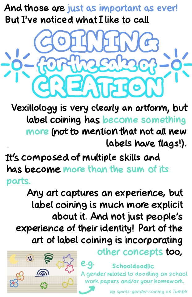
Page 3: ‘And these are just as important as ever! But I’ve noticed what I like to call COINING for the sake of CREATION’. This last phrase is in large, dark and light blue text. Two sun symbols are on either side. Below is the text: ‘Vexillology is very clearly an artform, but label coining has become something more (not to mention that not all new labels have flags!). It’s composed of multiple skills has become more than the sum of its parts. Any art captures an experience, but label coining is much more explicit about it. And not just people’s experience of their identity! Part of the art of label coining is incorporating other concepts too, e.g. Schooldoodlic A gender related to doodling on school work papers and/or your homework. By spirits-gender-coining on Tumblr.’ The text about Schooldoodlic is small and light teal. Next to the text is its flag.
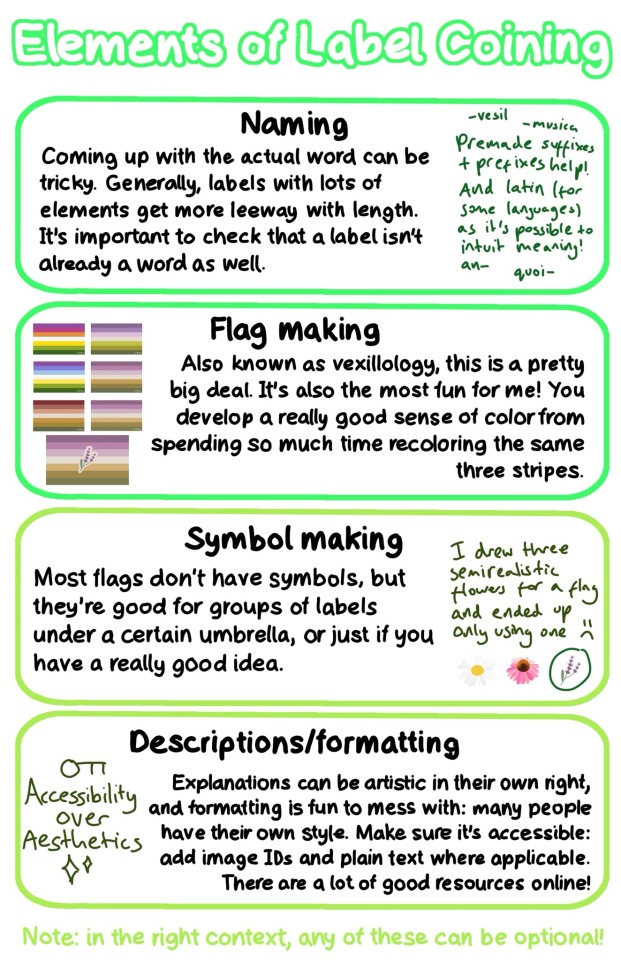
Page 4: ‘Elements of Label Coining’. The text on this page is separated into four green boxes.
‘Naming: Coming up with the actual word can be tricky. Generally, labels with lots of elements get more leeway with length. It’s important to check that a label isn’t already a word as well.’ Next to this text is more rough, dark green text reading ‘Premade suffixes + prefixes help! And latin (for some languages) as it’s possible to intuit meaning!’ Around the text is a few examples: ‘-vesil’ ‘-musica’ ‘an-’ ‘quoi-’
‘Flag making: Also known as vexillology, this is a pretty big deal. It’s also the most fun for me! You develop a really good sense of color from spending so much recoloring the same three stripes.’ Next to the text is 6 versions of the same pride flag, each with slightly different colors, with a 7th final version with a symbol.
‘Symbol making: Most flags don’t have symbols, but they’re good for groups of labels under a certain umbrella, or just if you have a really good idea.’ Next to this is rough, dark green text reading: ‘I drew three semirealistic flowers for a flag and ended up only using one’ with sad face. Under it is a drawing of a daisy, a pink coneflower, and lavender, which is circled.
‘Descriptions/formatting: Explanations can be artistic in their own right, and formatting is fun to mess with: many people have their own style. Make sure it’s accessible: add image IDs and plain text where applicable. There are a lot of good resources online!’ In dark green text is the phrase ‘Accessibility over Aesthetics’ with an image of a key on top and sparkles below.
Underneath the boxes in light green text is ‘Note: in the right context, any of these can be optional!’
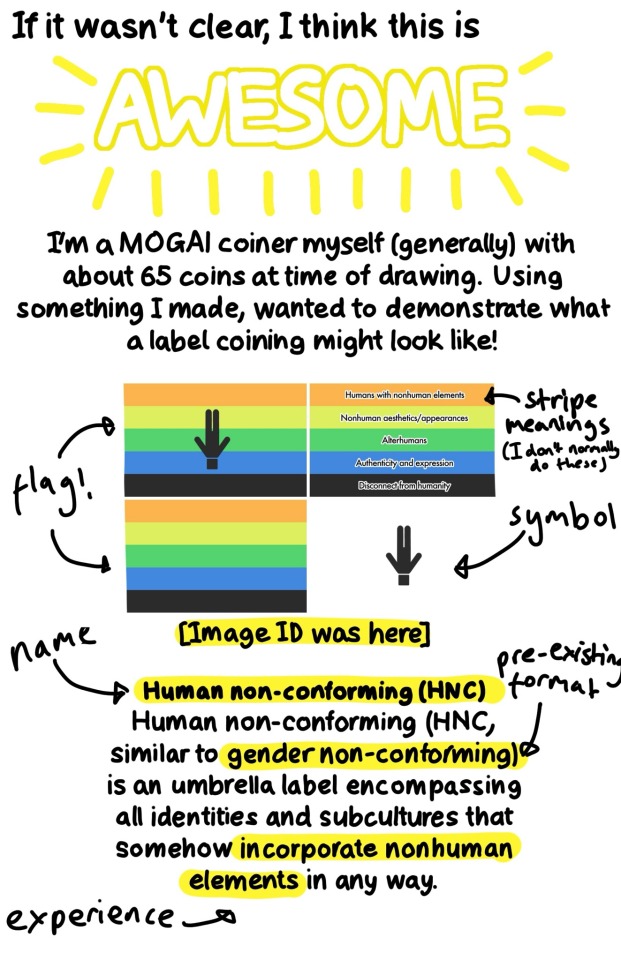
Page 5: ‘If it wasn’t clear, I think this is AWESOME’. Awesome is in large text with yellow radiating lines. Underneath is ‘I’m a MOGAI coiner myself (generally) with about 65 coins at time of drawing. Using something I made, I wanted to demonstrate what a label coining might look like!’ Underneath is four versions of the same pride flag as well as a description, with ‘flag!’ ‘stripe meanings (I don’t normally do these)’ ‘symbol’ ‘name’ ‘pre-existing format’ and ‘experience’ labelled. The description reads ‘[Image ID was here] Human non-conforming (HNC). Human non-conforming (HNC, similar to gender non-conforming) is an umbrella label encompassing all identities and subcultures that somehow incorporate nonhuman elements in any way.’
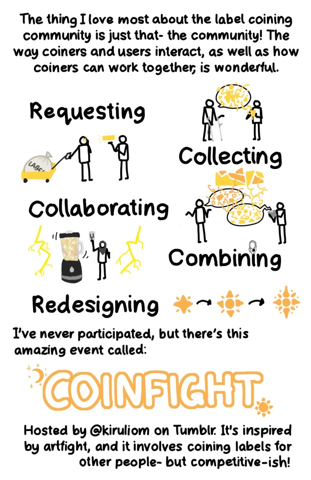
Page 6: ‘The thing I love most about the label coining community is just that- the community! The way coiners and users interact, as well as how coiners can work together, is wonderful. There are 5 large words each with an associated doodle.
‘Requesting’: A figure leaning on forearm crutches has a speech bubble with yellow shapes exploding out of it. Another figure is taking shapes down from the bubble and forming it into a ball.
‘Collecting’: A figure is pulling a yellow cart with a large cloth bag labelled ‘LABELS’. They have stars in their eyes, and are looking at another person who is gesturing to a yellow rectangle.
‘Collaborating’: Two figures, one with orange speech and one with yellow speech and an AAC tablet are discussing, with many shapes and lines intermingling to make a fragmented rectangle.
‘Combining’: A figure in a grey hijab pulls down a lever. They are standing next to a large blender mixing orange and yellow liquids. On either side is bright yellow lightning.
‘Redesiging’: A small star with four radial lines coming out of it becomes more and more complex, indicated by black arrows.
Under the words is the text: ‘I’ve never participated, but there’s this amazing event called: COINFIGHT. Hosted by @ kiruliom on Tumblr. It’s inspired by artfight, and it involves coining labels for other people- but competitive-ish!’ Coinfight is in large, text with a crescent moon with stars at the top right corner, and a star at the bottom left.
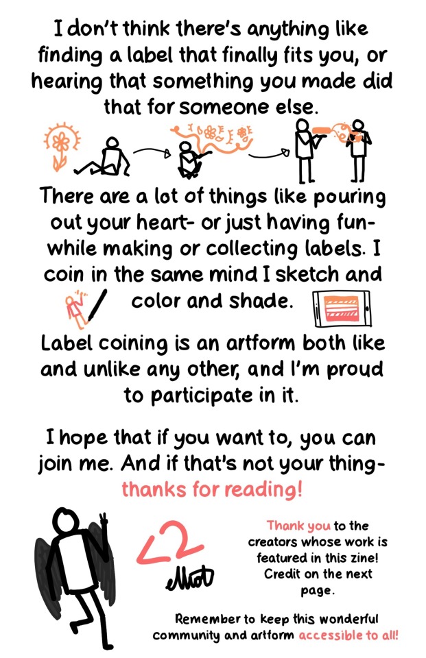
Page 7: ‘I don’t think there’s anything like finding a label that finally fits you, or hearing that something you made did that for someone else.’ Under is a figure looking at an orange flower with light lines, then forming elements of the flower into a bubble, then showing an orange rectangle to another figure, with orange tendrils reaching towards them, forming the shape of a heart. Below is the text ‘There are a lot of things like pouring out your heart- or just having fun- while making or collecting label. I coin in the same mind I sketch and color and shade.’ On each side is a pen drawing an orange figure with a red shirt, and a tablet with an orange and red flag. Under this is ‘Label coining is an artform both like and unlike any other, and I’m proud to participate in it. I hope that if you want to, you can join me. And if that’s not your thing- thanks for reading!’ There is a drawing of a figure with dark grey wings holding up two fingers. Next is a ‘<2’ heart and ‘elliot’ as a signature. In smaller text next to these is ‘Thank you to the creators whose work is featured in this zine! Credit on the next page. Remember to keep this wonderful community and artform accessible to all!’
Page 8: ‘Credit’: This section has a pride flag next to each label. ‘Aromantic-spectum, @ theflagarchive on Tumblr. Turian, @ kenochoric on Tumblr. Schooldoodlic, @ spirits-gender-coining on Tumblr. Xenoman, @ ryanyflags on Tumblr. MOGAI symbol, Pride-Flags on DeviantArt. Alterhuman, @ vaestra on Tumblr. (the flag on pg. 4 is Wildflowergender). ‘About making this zine’: ‘I really, really regret handwriting this. Drawing over Helvetica Neue for so long might change my actual handwriting, [more rough:] which looks like this! According to Artstudio Pro, I took 14 hours! I barely planned this before starting, the color wheel theme and the people doodles. /End ID]
#mogai#microlabels#mogai coining#lgbtq#lgbtqia#zine#art zine#lgbtq zine#queer zine#label coining#queer vexillology#queer#queer community#long post#described#image described#image id#not coining
558 notes
·
View notes
Text

Flag Wars Bonus Round
4K notes
·
View notes
Last Seen Blogs

retard4846
Retard4846

ootort
silhouette dreams.

thekaiandyamaobsession
Kai & Yama Obsession
nirvasna
venus

blsnkman998877
Untitled