#we need to bring back hockey players narrating their every day
Text
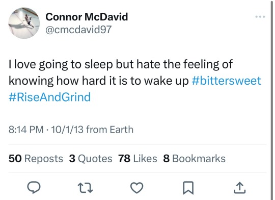
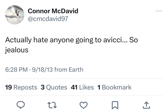
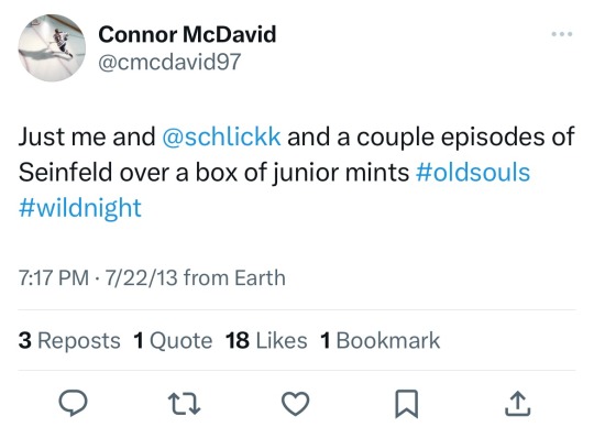
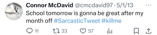
Some of my favorite Connor McDavid tweets:


#connor mcdavid#hockey#oilers#we need to bring back hockey players narrating their every day#cmd#97#edmonton oilers#archives
457 notes
·
View notes
Text

(Originally written on October 8, 2020)
🎵Bang, Bang Bangedy Bang
I said a Bang Bang Bangedy Bang🎵
My How I Met Your Mother Thoughts
I just spent the last nine seasons in New York with the gang that spends all their time in MacLaren’s Pub. SELF FIVE! I have to say, this binge of How I Met Your Mother brought me so much happiness. I started watching this show for the first time back in high school, and I ended up watching the last six seasons as they aired. I remember loving this group of characters, and now I am reminded why. There’s so much chemistry between the five, and it makes for one of my favorite Comedies/Sitcoms of all time. If you’ve read any of my previous Show Thoughts, then you know I’ve been watching several over the course of this lovely Pandemic That Will Just Keep Going. After this rewatch, I’ve decided HIMYM is my third favorite Comedy/Sitcom, right after Boy Meets World and Scrubs.
Now, I know that the Finale is infamous. It’s in the Mount Rushmore of Terrible Endings, and people end up getting a sour taste in their mouth when they bring up the show. Well, it’s been some years. There’s been time to reflect and look back. And, while I’m not in favor of the Finale, I also don’t hate it anymore with the passion of a thousand suns. I just loved watching and growing with the gang, seeing them experience their highs and their lows, their triumphs and their failures. It just hits harder as an adult, like most of these shows assuredly do, and I cherish so many of these episodes and moments.
And now, my rankings for the seasons!
Seasons Rankings
1. Season One
2. Season Four
3. Season Two
4. Season Six
5. Season Eight
6. Season Five
7. Season Three
8. Season Seven
9. Season Nine
My rankings for the girlfriends, purely on how much I like them as a character
The Girlfriends Rankings
1. Robin
2. Tracy
3. Victoria
4. Zoey
5. Stella
6. Jeannette
And now, a ranking of my favorite episodes. From 1-50, these are the ones that stand out above the rest. I consider every single one of these enjoyable.
Favorite Episodes
1. Slap Bet (S2E9)
2. Come On (S1E22)
3. The Limo (S1E11)
4. The Best Burger in New York (S4E2)
5. Ten Sessions (S3E13)
6. The Pineapple Incident (S1E10)
7. Bachelor Party (S2E19)
8. Game Night (S1E15)
9. Oh, Honey (S6E15)
10. Glitter (S6E9)
11. The Duel (S1E8)
12. The Pilot (S1E1)
13. Arriverdverci, Fierro (S2E17)
14. The Over-Correction (S8E10)
15. How Your Mother Met Me (S916)
16. Intervention (S4E4)
17. The Magician’s Code, Part II (S7E24)
18. The Autumn of Break-Ups (S8E5)
19. The Ducky Tie (S7E3)
20. The Best Man (S7E1)
21. The Leap (S4E24)
22. Blitzgiving (S6E10)
23. Three Days of Snow (S4E13)
24. The Scorpion & The Toad (S2E2)
25. Bass Player Wanted (S9E13)
26. The Final Page, Part 2 (S8E12)
27. Duel Citizenship (S5E5)
28. Happily Ever After (S4E6)
29. Farhampton (S8E1)
30. Bro Mitzvah (S8E22)
31. Robin 101 (S5E3)
32. The Magician’s Code, Part I (S7E23)
33. Last Words (S6E14)
34. The Playbook (S5E8)
35. The Time Travelers (S8E20)
36. Splitsville (S8E6)
37. Subway Wars (S6E4)
38. Showdown (S2E20)
39. Drumroll, Please (S1E13)
40. Front Porch (S4E17)
41. Twin Bed (S5E21)
42. Who Wants to be a Godparent? (S8E4)
43. Girls vs. Suits (S5E12)
44. Something Borrowed (S2E21)
45. As Fast As She Can (S4E23)
46. The Wedding Bride (S5E23)
47. The Bracket (S3E14)
48. The Sexless Innkeeper (S5E4)
49. Third Wheel (S3E3)
50. Spoiler Alert (S3E8)
And now, just some thoughts on the show and on the gang!
Ted - I know people don’t like Ted. I don’t actually like Ted all that much. And yet, I found myself rooting for Ted just like I did the first go around. He’s not the worst person in the world, and I would be scared to see half of the decisions we’ve made in the dating game stringed together into a TV show. I know people wouldn’t like me very much for those decisions. Then again, I also don’t get super crazy about details about buildings, I don’t pronounce encyclopedia that way, and he tends to stick his foot in his mouth with this White Man confidence that I just don’t have. With all that being said, I still find Ted being a great friend, a man who is just trying to find the love of his life, and someone who really drives this story with great tales and narration (Bob Saget is the Sixth Man of the Show for just always bringing it). I think Ted does stupid things and he pretty much admits it after the fact. He learns, sometimes, and also doesn’t much like most of us. When he finally found the Mother, when he finally found Tracy, I cared. I cared so much, and I still do. Even though they just shit on her character and don’t give us enough time with her, I almost wonder if that’s a metaphor for the fact that you won’t always have enough time with your loved ones.
Robin - Let’s go to the mall! Yeah! Robin Sparkles is a Canadian Treasure, and so is Robin Scherbatsky. She is one of the best things about this show, and I love her so. Played by Cobie Smulders who I need to see in more stuff, Robin is who we all wanted Ted to maybe be with first. Then we go through all the loops of the HIMYM roller coaster, and a lot of us still wanted them to be together. I was one of them. Yet, she was more than just a romantic plot line for Ted. She was a part of the group who we got to see join it and evolve into a member of their family organically. Robin is fun, loud, full of fun quirks that we get to learn over the course of the series. I was heartbroken when we found out she can’t have children. I was loving the back and forth between her and Barney (the first time), and kind of mad at Barney about being such a crazy ass prankster the second time. Robin shows us just how amazing some gun loving, hockey obsessed Canadian news anchor can be, and how much she cares for her friends.
Lily - Justice Aldrin ends up being one of my favorite characters, even if that gets some curious looks. Yeah, she left Marshall for a summer. Yeah, she had some hesitancy with the marriage and everything. That happens. Lily was also always there for her friends, even if she ends up going a little overboard. She wants Ted to find happiness, and does whatever she can to help. She is there to listen to Robin at all times, and her and Marshall are easily one of the best relationships in TV I’ve ever witnessed. Then we have Lily and Barney which is honestly super underrated. Barney trusts Lily, even though she can’t keep a secret, with all of his emotional problems. Lily is who thought Barney could change before anyone else, and I love seeing their friendship grow from eye rolls to eye tears.
Barney - Oh, Barney. He honestly brings so much annoyance and fun to the show. He’s the friend of the gang who everyone tolerates. He’s the one in the gang who everyone ends up loving just as much as everyone else. Barney shows such a terrible face to the world, sleeping with over 250 women and lying to most of them. He has all these rules that aren’t very ethical. He gives us most of the Misogynism in this show, which is definitely prevalent and makes the show not as strong as it was in the first watch. Still, we get to see Barney grow into someone who wants real love and a happy life. Sure, they show us that his marriage to Robin only lasts three years, but at least they tried. Barney just couldn’t make it work, and that’s honestly who Barney really is. A person who just enjoys sleeping with different people. I was very warmed to see the baby reveal and that Barney becoming a dad was what would change him more than anything. Barney is an underrated friend, and his importance to the gang is legendary.
Marshall - I. Love. Big Fudge. He’s just so fun, caring, goofy, loyal, and everything that I aspire to be in life. For some reason, when watching the show the first time, I related to Ted the most. I was definitely a bit more selfish then. But now, I see that I am a Marshall. He wants to do good in the world, and it drives him so much. He only loves Lily, and his loyalty to their relationship is just Goals. He is also the most fun to watch having a crisis. He gets the big eyes and covers his mouth and just gets obviously super uncomfortable. Some of my favorite moments of the show are also Marshall’s talks with Ted about his feelings for Robin. Any one-on-ones with Marshall and someone else are probably my favorite moments. And yes, I will always root for him over those damn machines!
Last Thoughts:
Sure, the writing wasn’t as sharp or as witty in the later seasons, but I loved the story lines and seeing the gang just live.
Tracy was an amazing character as The Mother, and I truly wonder what could have been if they had given us two full seasons of story with her instead of any episodes of Jeannette.
I really can’t believe Ted told his kids all those stories. A fun premise for a show, but really, not very realistic telling them all that jazz.
Ranjit and Carl are such fun recurring characters that I always enjoyed seeing every time they popped up.
Out of all the recurring jokes and gags, which there are many (y’all said Community has so many, but HIMYM really swings for it), I love the Major/General salute joke. Idk if I just didn’t care for it the first time around or forgot about it, but I just love how silly it is and how they kept it through to the very last episode.
Watching the gang sit at their table in MacLaren’s just hanging out will always make me smile.

#how i met your mother#himym#himym finale#ted mosby#marshall eriksen#lily aldrin#himym barney#himym robin#reviews#recaps#br&r
7 notes
·
View notes
Text
Friendship Four Tournament Analysis
I decided to explore this event because it’s one of the only ice hockey festivals I can find held in the UK. I aim to figure out how they communicate with their audiences and how they promote the tournament. So I can gain an understanding of what I could do with my own festival.
Friendship Four is the only college tournament that runs outside of North America. The aim of the two-day tournament is to strengthen the cultural, economic and academic relationships between Northern Ireland and America. They use ammeter sports to showcase the talent of up and coming players but it also brings communities together to revitalise their ties.
Friendship Four has increased in popularity, with games now shown live on TV in the US and Canada. The teams are competing to win the Belpot Trophy but all the games count towards the teams’ league standing, expect a hard-hitting and fast-paced hockey in all the matches.
Friendship Four Logo

The colour scheme of the logo is a dark blue, turquoise and white. The use of the different shades of blue suggests a cold environment which could link back to ice hockey. However, blue also has connotations of reliability, trust, coolness and peacefulness. This suggests that Friendship Four is a safe and well-built tournament that embraces the best of amateur ice hockey.
The words ‘Friendship Four’ is emphasised by the two shades of blue outlining the lettering. The contrast between the two shades of blue creates a hierarchy as it clearly defines the main focus of the logo. This helps guide the viewer to the key piece of information.
The logo uses a silhouette of a stadium and a hockey player. By including these features people would be aware of where the event is taking place as well as hinting at the topic to those that may not have heard of it before.
The silhouette of the stadium could be paying homage to the SSE Arena in Belfast where the tournament takes places. This could be a subtle hint to the city itself and to the location of the tournament.
This logo changes to fit the year beside the word ‘Belfast’. By including this feature it helps to emphasise the date of the event. It adds a sense of excitement because it only shows part of the date so it could be used to build up to the announcement of the full information. However, this could be used to differentiate from the previous years. They may do because each year (so far) different teams play in the schedule so it could help to show the progression of the tournament.
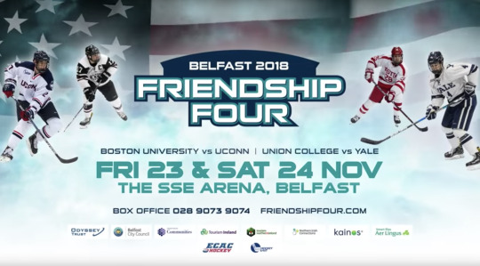
Advert for the 2018 Friendship Four Tournament
I found an example of how they communicate using moving images. It’s unclear whether this would have been streamed during television programmes or in-between online shows.
The advert was posted to the Belfast Giants Youtube Channel. By using this channel it helps to spread the word faster because the team has a big following on the platform. This would ensure die-hard fans would become aware of the event and hopefully be persuaded in going.
Example: https://www.youtube.com/watch?v=lG7PF6aQokE)
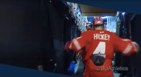
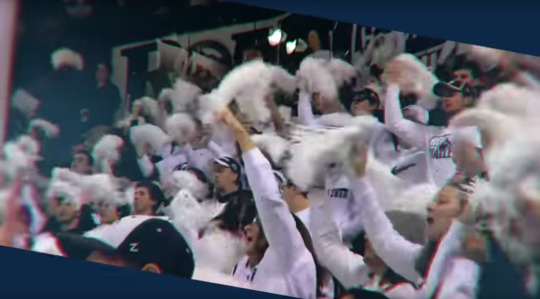
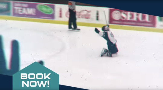
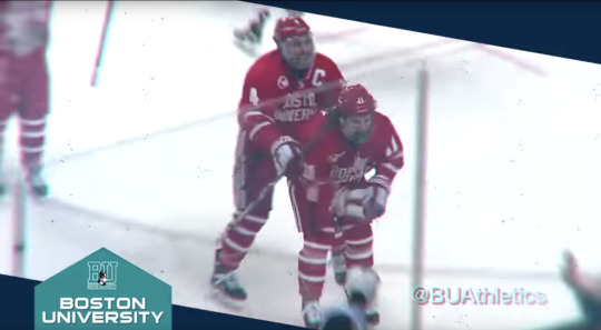
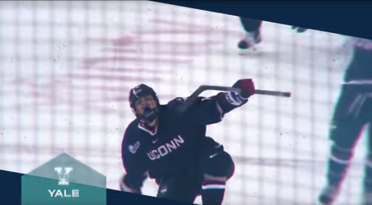

Stills from Friendship Four advert
The advert starts off with highlights from last year. Players and teams are shown celebrating after their team's scores. Throughout the advert small captions of the phrase ‘book now’, the teams involved and the date can be found in the bottom left-hand corner.
The same colour scheme in the logo can be found throughout the video. The colour of the background is dark blue while the caption shape is a turquoise. In addition, the caption font is the same as the logo. This creates a consistent visual identity for the tournament. By having a consistent identity it helps to suggest that the event is well organised and trustworthy. This would give their audience the confidence to attend the event and bring along family as well as friends.
By showing the players and the fans celebrating it hints at the possible atmosphere the viewer could experience. Both of these scenes suggest an energetic and interactive environment. This suggests that the Friendship Four will showcase competitive college hockey that’s engaging and exciting for both the players and fans.
Throughout, the advert a narrator commentates on the tournament while detailing the key information the viewer needs to know. The phrase that stood out was ‘coolest college tournament’ because of the alliteration used. By including such a rememberable phrase it ensures that the viewers’ attention is focused on the key points about to be presented. It also provides them with a sense of what to expect from the tournament. In addition, the narrator repeats the date and location several times. By doing this it emphasises the main take away points the viewer needs to know and remember.
The small captions in the bottom left-hand corner move with every new piece of information. It moves out of the frame and jumps back into frame with a new caption. By adding this movement it creates an advert that’s visually interesting for the audience. This ensures they engage with the information and take it in. However, the size of the shape changes depending on the caption. When ‘book now’ and the dates are being displayed the shape and the font size looks larger, compared to when the colleges are being shown. This creates a hierarchy that helps the audience would become aware of the main information that they need to take away.
The video footage is an angled shape. I think they did this to create a dynamic and unique outlook for their tournament. By doing this it makes the event more rememberable compared to similar tournaments. In addition, I think the shape suggests the movement that will occur during the two days. The shape is angled and sharp this could be paying homage to how hockey players skate because they need to fast but also precise.
The footage has a grainy texture and some parts have a 3D red and blue effect. The texture could be used to suggest the footage is from the previous year. We associate this texture with old film and photos. I think the 3D red and blue effect could be used to bring in more of the event’s colour scheme into the footage. However, the blur to the effect could be used to highlight the fast-paced movement viewers will see if they attend the two-day festival.
The way the advert ends is clever because it summarises all the information given. This helps to draw the viewers’ attention to the main take away points and what they could do next if they’re interested. They included contact information and the sponsors of the event. Therefore, if they want to find out more they can.
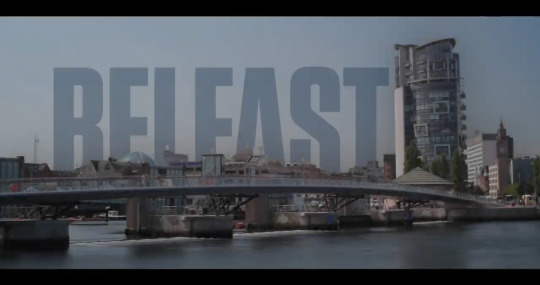
And lastly, the design of the end scene hints to what the event is all about. By including a segment of the American flag the viewer immediately becomes aware of the purpose of the event, which is to build stronger links to North America using ice hockey.
Highlight Reel from 2018 - The Legacy
I also found a highlight reel for the 2018 tournament. It was posted in February this year on the Belfast Giant Youtube channel. This video acts as a promotion for this year’s tournament because it builds up the hype and portrays what the audience can expect from this year’s lineup. It’s unclear if the video was shown elsewhere other than Youtube.
Source: https://www.youtube.com/watch?v=yHs6h1nZta8

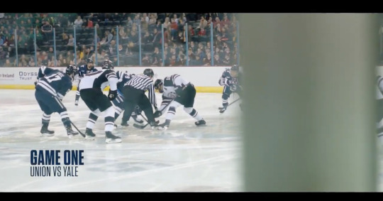


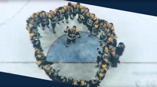
Stills from the highlight reel of the 2018 tournament
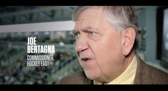
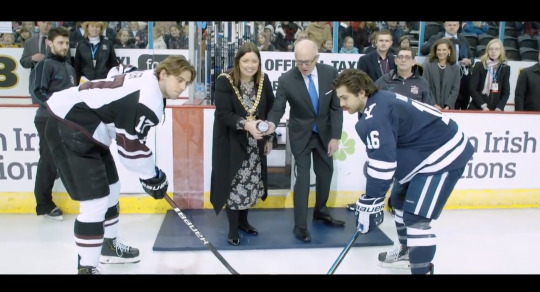
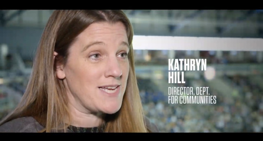
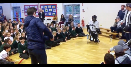
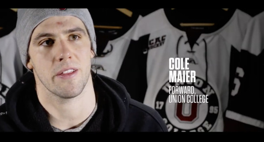
The highlight reel starts off with an opening sequence that sets the scene in Belfast. To then begin showing snippets from the first and second games followed by interviews from the Lord Mayor of Belfast, commissioner and department heads about their thoughts of the event. After we’re shown the other side of the tournament, the educating school children about hockey. This is followed by interviews from players and coaches about the interaction. To then continue showing highlighting from the other two games.
The opening sequence features a time lapse of a landscape with the word Belfast rising up as it fades in. This transitions to another time lapse of people walking and a shot of the stadium. This helps to show the audience more of the location which helps them get a sense of the city. By making the word ‘Belfast’ move it helps to create a strong visually interesting start to the video. This would draw the audience’s focus making them continue watching. The time-lapse elements also help to create a strong opener to the video. They suggest that Belfast is a fast-moving city similar to the tournament, highlighting more about the host city.
The highlights from the matches act as a promotion of what this year’s tournament would look and feel. This would show the audience what they could experience in the hope of persuading them to attend the event.
The highlight reel has several interviews that show both sides of the event. They show key figures (such as the Lord Mayor and the commissioner) and hockey players who took part in the event. By showing both the players and organisers we gain a better understanding of the purpose and the experience that could be gained from going to the event. We see both sides of the tournament. We find that the event isn’t just about winning a trophy but educating future hockey players and experiencing the culture of Belfast.
There is a movement around the scenes of the speakers. The text slides and fades into place. The movement helps the video to engage more with the audience and keep their focus on what makes the event what it is.
However, the font used looks different from the advert and the logo. This creates an unclear identity for the tournament which can confuse the audience and make the event harder to recognise.
Friendship Four Ticket Design
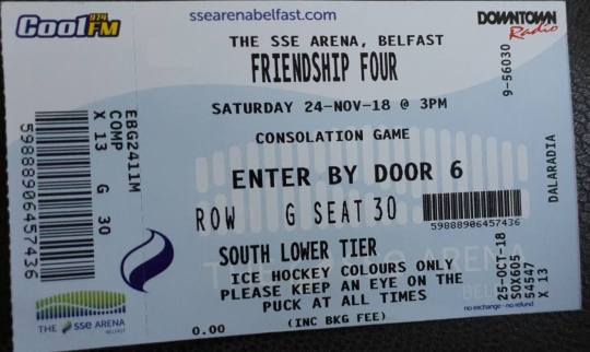
An example of the ticket design
The ticket does achieve its purpose of showing the consumer to their seat and where they need to enter through but it could be a tiny bit easier to navigate through the information. There’s quite a lot of information on the ticket. Below are points I think they need to consider next time:
No clear links to the logo or colour palette.
No element of Friendship Four Branding
Focuses a lot on the sponsors for the game - their logo covers the majority of the ticket.
Very crowded - could have used a better type hierarchy. It gets very confusing especially on the part under ‘South lower tier’. For the rules and safety advice, they could have used a thinner typeface or changed the size of it to show the importance compared to the rest. Could have also spaced out the information more - easier to navigate through the information.
Unclear what the wave or the towered lines mean behind the ‘consolation game’ and ‘enter by door 6′ - could be the branding for the stadium
Merchandise (old example)
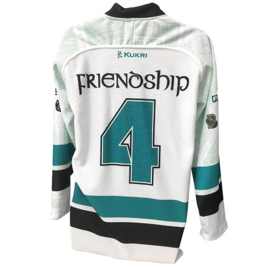

Source: https://www.belfastgiants.kukrisports.com/teamshop/belfastgiantsshop/retrieveProdNg?prodId=443168
I wanted to find examples of how the brand merchandise but all I could find was an example from 2015. This is a youth hockey jersey they sell for the event which can be found on the Belfast Giant’s website. By using their website it ensures that the tournament is more likely to be heard about by people who are interested in hockey. This ensures fans from the city or in the UK attend the game. In addition, the tournament takes place in the stadium that hosts the Belfast Giants it makes sense to use their website.
I think this product incorporates the tournament’s branding more because there are noticeable links to it. The logo and the colour palette are the centres of the jersey which is the perfect place for both to be noticed by the audience. Our eyes naturally gravitate to the centre so we’ll immediately know what the products for.
The jersey also incorporates the college teams that are playing. This links back to the event because it shows the lineup and what to expect from it. In addition, it pays homage to the teams and ensures the people attending know exactly who's playing.
In the shoulder and sleeve design, it looks like they incorporate a map of Belfast. This could pay homage to the host city and the location of the event. By including this it suggests the community and the heritage of the city. In addition, it makes the jersey more visually interesting. I don’t think any jerseys incorporate maps as well as the team branding. So it gives a unique touch to the tournament and product.
Ticket prices from 2018
Single game tickets
Adult = £15
Child = £5
Concession (students and over 65s) = £10
Weekend tickets
Adult = £50
Concession (students and over 65s) = £30
Evaluation
Overall, I think the idea behind Friendship Four is clever because they use amateur sports to build and strengthen ties with North America. It uses something everyone’s interested in, sports, to bring together different culture and people together. In addition, it allows the British audience to watch talent of up and coming hockey players that may be drafted into the NHL. I also feel the event is reasonably priced considering the stadium size and the teams attending.
However, I feel the branding of the tournaments needs a bit of work. I think they need to have more consistency in the ticket design, the type used in moving adverts and how they incorporate the colour scheme as well as the logo. The event doesn’t really have a defined design style like the NHL All-Star Games 2019. I know both events are completely different as one has a larger budget and a bigger following than the other. But the consistency and the way the All-Star Games incorporated the theme as well as the logo into every aspect was amazingly done. I don’t expect that level from the Friendship Four I just think they need to define their identity more and continuously use it throughout all their communications.
This festival was useful to look further into because I gained an understanding of how a festival about ice hockey communicates with their audience in the UK. I also have seen what I need to work on which is how to brand my festival and how to keep to it. In addition, I gained an idea of the possible prices I could charge for my event. This will help guide me during the next few weeks of what I need to work on to achieve my deliverables.
0 notes
Last Seen Blogs

alumiinikuu
The only water in the forest
calvmhands
say you want me

askmatsudathings
The-Matsu-Matsuda-Show!

musicistheair-blog
Music Is The Air