#webcomic help
Text
whats that webcomic where some tv head dude takes a girl with him to dreamland because she's the chosen one again? I remember it left me with a lot of feelings
11 notes
·
View notes
Text
💭What is your creative schedule like? How much time do you put aside to work on your projects?
#qotd#webcomic creators#webcomics#webcomickers#webcomic resources#screen tones cast#webcomic creator#webcomic help#webcomic qotd
9 notes
·
View notes
Text

Perfectly Comfy
47K notes
·
View notes
Text
Hi everyone, I came across this free info website for comic techniques and devices.
This is my first attempt at making Reels. My goodness, editing videos on Facebook mobile is clunky!
To visit the catalog, see this link.
https://comicsdevices.com/about/
#comics devices#webcomic help#free art info#what are comics#cartoonist websites#making comics#reimena yee
1 note
·
View note
Text
can anyone give me good webcomic recs?? I need sm more comics to read but I'm not sure where to start, I prefer more fiction oriented than autobiographical/non fiction but tbh I'll give any a go!!
1 note
·
View note
Text

The Creator's Guide to Comics Devices is OPEN!!!
comicsdevices.com
An online library of visual-narrative devices that are used in the medium of comics and other sequential art.
Happy Halloween! I'm really excited to be finally launching* what is maybe one of my most ambitious, largest work yet.
This online library is the next phase of a research project that began in May 2020, when I first mused on how comics as a field doesn't have a resource that catalogues devices used in the medium. Like, theatre has devices, so does literature, and film! So why shouldn't comics?
I always had an interest in comics studies and analysis. I love reading, making and thinking comics. However most of my knowledge was intuitive - I learned comics from osmosis and experience. This is true for many of my peers. Speaking about comics as a creator is hard, because we don't have a robust system of language. When we had to speak, many of us tend to reach for the language developed for film by film practitioners. If there is language specific to comics, it's either scattered in multiple blogs or hidden away in academic journals.
The Comics Devices library is meant to aggregate everything and everybody into a single hub! After exploring some multiple resources, alongside some original, independent research, here is the first edition!
* The Comics Devices project is still a work-in-progress! It's not final, nor will it ever be. This is why I am seeking contributors to help build this library. Translations, comics examples, etc. There is a lot of work to do! If you are interested, reply to this post or submit an expression of interest on this page.
Have fun everyone!!
(Now time for me to melt x_x)
#webcomics#comics#comics devices#resources#good god there is still a lot to clean up even in this public state fhskjfhsd#anyway hope yall enjoy reading through this!!#also please help me build up the library lol
11K notes
·
View notes
Text
shaking rn how do ppl do webcomics and like,, work consistently?? i am Suffering over here
#if any webcomic creators out there or artists can offer me some advice for making like a work schedule and sticking to it id appreciate it#webcomic help#looking for art help
0 notes
Text


So these last few days has been.. Turbulent. DIFFERENT
I think I may be a System? Infact I KNOW I am a system at this point, but Im also not ready to accept that. Well a part of me isnt, and the other parts of me are like… uh duh of course you are.
*A system in this context refers to the collective consciousness under the DID / OSDD Umbrella, I dont know the correct terminology in all of this, so im so sorry If i I mess up.
I don’t necessarily want to give myself a label, there's .. brain scans and stuff I can get to prove it. And I need those, thats the only way I know this is real.
But for now, for my own mental health I am treating it as if it were.. “real “
And I dont really know… what to expect…? I want to find something, ANYTHING, on I guess.. Systems waking up? But I cant find it. So I’ll just do this here Im gonna dump out all our thoughts onto some comic pages and we will figure it out.
I had a bit of an awakening roughly.. 5 days ago, and for the sake of convenience gonna use Plural/System terminology - There are alters, I have met them, the have names and personalities and some of them are really fuckin annoying i just want to punch him in his TEETH
Anyways, since the alter awakening moment, my brain has been in TURMOIL parts of me accept this, parts of me dont, i keep feeling like my face is like shifted 2 inches to the right and everything gets fuzzy in the real world. Not that these alters have names like.. Files are getting sorted into these proper figures and everything is getting explained and figured out. And its making me feel like I'm not me anymore?
Like I always would argue and barter and fight with my own thoughts, but that's the thing, they wer thoughts, voices in my head with just like, distinct personalities. I just saw it as a different part of me?? Figured that was normal.
But now they are.. stronger ? OR maybe because i'm more aware of them and the personalities I can tell whos out now and like.. Obviously they are happy to get some facetime with the world properly?? But like.. Am *I* just aware of it, aware of them now, aware that it is not just *I* but *We* and so noticing it more, I'm resisting even harder? We feel more fractured than ever.
I have a good friend helping me out, another system, I owe them everything, maybe my life. (PLEASE FOLLOW @transpanda-1 BTW THEY DESERVE IT) They had a few amazing tips, but I cant keep bugging them about every anxiety on my mind thats not fair, so I’ll ask the whole community.
I guess what I want to know is.. Like is this normal? Do all systems go through this? What should I expect in the future and how do I make this more streamlined and stop.. Fighting it? I guess?
I thought I finally had myself figured out, just be the girl who makes the funny relatable trans comics… it was simple.
#did/osdd#osdd system#did osdd#did system#did community#osddid#alters#PLEASE HELP#webcomic#comics#original comic#comic art#web comic#Welldrawnfishcomic
984 notes
·
View notes
Text
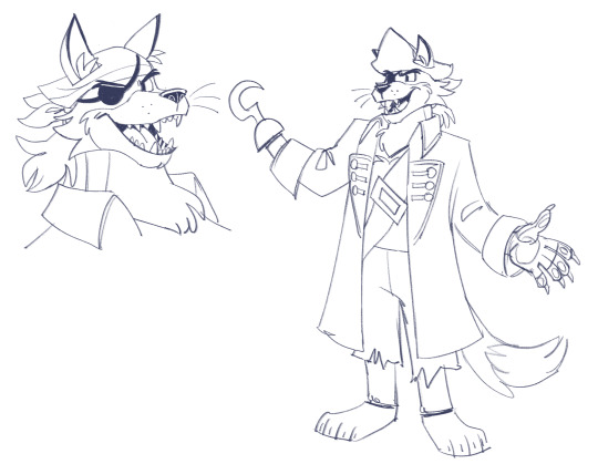
captain foxy concept design for glitch in the code!
#hes so fun to draw i love him#couldnt help not having foxy in it#pirate man!!!#art#fnaf#fnaf security breach#fnaf au#captain foxy#glitch in the code webcomic
593 notes
·
View notes
Text
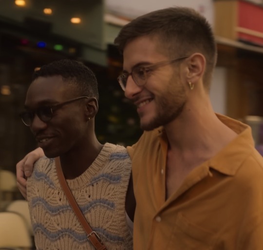
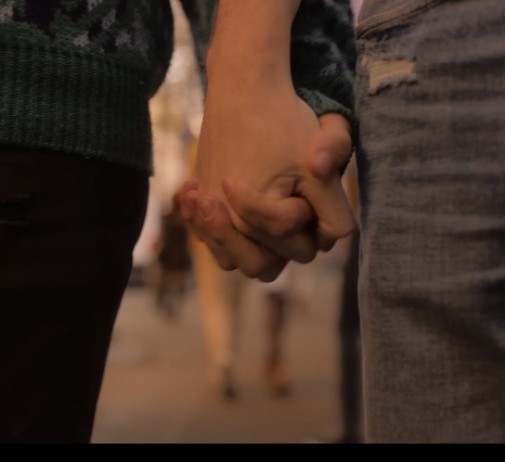
nick seeing this queer couple then having the courage to grab charlie’s hand reminds me so much of him seeing tara & darcy kiss in s1 then getting the sudden urge to kiss charlie senseless
#heartstopper#heartstopper netflix#heartstopper webcomic#nick nelson#charlie spring#nick and charlie#narlie#heartstopper s2#tara and darcy#SOMEONE HELP ME I AM AT THE BRINK OF GOING ABSOLUTELY INSANE
2K notes
·
View notes
Text
why Aurora's art is genius
It's break for me, and I've been meaning to sit down and read the Aurora webcomic (https://comicaurora.com/, @comicaurora on Tumblr) for quite a bit. So I did that over the last few days.
And… y'know. I can't actually say "I should've read this earlier," because otherwise I would've been up at 2:30-3am when I had responsibilities in the morning and I couldn't have properly enjoyed it, but. Holy shit guys THIS COMIC.
I intended to just do a generalized "hello this is all the things I love about this story," and I wrote a paragraph or two about art style. …and then another. And another. And I realized I needed to actually reference things so I would stop being too vague. I was reading the comic on my tablet or phone, because I wanted to stay curled up in my chair, but I type at a big monitor and so I saw more details… aaaaaand it turned into its own giant-ass post.
SO. Enjoy a few thousand words of me nerding out about this insanely cool art style and how fucking gorgeous this comic is? (There are screenshots, I promise it isn't just a wall of text.) In my defense, I just spent two semesters in graphic design classes focusing on the Adobe Suite, so… I get to be a nerd about pretty things…???
All positive feedback btw! No downers here. <3
---
I cannot emphasize enough how much I love the beautiful, simple stylistic method of drawing characters and figures. It is absolutely stunning and effortless and utterly graceful—it is so hard to capture the sheer beauty and fluidity of the human form in such a fashion. Even a simple outline of a character feels dynamic! It's gorgeous!
Though I do have a love-hate relationship with this, because my artistic side looks at that lovely simplicity, goes "I CAN DO THAT!" and then I sit down and go to the paper and realize that no, in fact, I cannot do that yet, because that simplicity is born of a hell of a lot of practice and understanding of bodies and actually is really hard to do. It's a very developed style that only looks simple because the artist knows what they're doing. The human body is hard to pull off, and this comic does so beautifully and makes it look effortless.
Also: line weight line weight line weight. It's especially important in simplified shapes and figures like this, and hoo boy is it used excellently. It's especially apparent the newer the pages get—I love watching that improvement over time—but with simpler figures and lines, you get nice light lines to emphasize both smaller details, like in the draping of clothing and the curls of hair—which, hello, yes—and thicker lines to emphasize bigger and more important details and silhouettes. It's the sort of thing that's essential to most illustrations, but I wanted to make a note of it because it's so vital to this art style.
THE USE OF LAYER BLENDING MODES OH MY GODS. (...uhhh, apologies to the people who don't know what that means, it's a digital art program thing? This article explains it for beginners.)
Bear with me, I just finished my second Photoshop course, I spent months and months working on projects with this shit so I see the genius use of Screen and/or its siblings (of which there are many—if I say "Screen" here, assume I mean the entire umbrella of Screen blending modes and possibly Overlay) and go nuts, but seriously it's so clever and also fucking gorgeous:
Firstly: the use of screened-on sound effect words over an action? A "CRACK" written over a branch and then put on Screen in glowy green so that it's subtle enough that it doesn't disrupt the visual flow, but still sticks out enough to make itself heard? Little "scritches" that are transparent where they're laid on without outlines to emphasize the sound without disrupting the underlying image? FUCK YES. I haven't seen this done literally anywhere else—granted, I haven't read a massive amount of comics, but I've read enough—and it is so clever and I adore it. Examples:


Secondly: The beautiful lighting effects. The curling leaves, all the magic, the various glowing eyes, the fog, the way it's all so vividly colored but doesn't burn your eyeballs out—a balance that's way harder to achieve than you'd think—and the soft glows around them, eeeee it's so pretty so pretty SO PRETTY. Not sure if some of these are Outer/Inner Glow/Shadow layer effects or if it's entirely hand-drawn, but major kudos either way; I can see the beautiful use of blending modes and I SALUTE YOUR GENIUS.
I keep looking at some of this stuff and go "is that a layer effect or is it done by hand?" Because you can make some similar things with the Satin layer effect in Photoshop (I don't know if other programs have this? I'm gonna have to find out since I won't have access to PS for much longer ;-;) that resembles some of the swirly inner bits on some of the lit effects, but I'm not sure if it is that or not. Or you could mask over textures? There's... many ways to do it.
If done by hand: oh my gods the patience, how. If done with layer effects: really clever work that knows how to stop said effects from looking wonky, because ugh those things get temperamental. If done with a layer of texture that's been masked over: very, very good masking work. No matter the method, pretty shimmers and swirly bits inside the bigger pretty swirls!
Next: The way color contrast is used! I will never be over the glowy green-on-black Primordial Life vibes when Alinua gets dropped into that… unconscious space?? with Life, for example, and the sharp contrast of vines and crack and branches and leaves against pitch black is just visually stunning. The way the roots sink into the ground and the three-dimensional sensation of it is particularly badass here:

Friggin. How does this imply depth like that. HOW. IT'S SO FREAKING COOL.
A huge point here is also color language and use! Everybody has their own particular shade, generally matching their eyes, magic, and personality, and I adore how this is used to make it clear who's talking or who's doing an action. That was especially apparent to me with Dainix and Falst in the caves—their colors are both fairly warm, but quite distinct, and I love how this clarifies who's doing what in panels with a lot of action from both of them. There is a particular bit that stuck out to me, so I dug up the panels (see this page and the following one https://comicaurora.com/aurora/1-20-30/):

(Gods it looks even prettier now that I put it against a plain background. Also, appreciation to Falst for managing a bridal-carry midair, damn.)
The way that their colors MERGE here! And the immense attention to detail in doing so—Dainix is higher up than Falst is in the first panel, so Dainix's orange fades into Falst's orange at the base. The next panel has gold up top and orange on bottom; we can't really tell in that panel where each of them are, but that's carried over to the next panel—

—where we now see that Falst's position is raised above Dainix's due to the way he's carrying him. (Points for continuity!) And, of course, we see the little "huffs" flowing from orange to yellow over their heads (where Dainix's head is higher than Falst's) to merge the sound of their breathing, which is absurdly clever because it emphasizes to the viewer how we hear two sets of huffing overlaying each other, not one. Absolutely brilliant.
(A few other notes of appreciation to that panel: beautiful glows around them, the sparks, the jagged silhouette of the spider legs, the lovely colors that have no right to make the area around a spider corpse that pretty, the excellent texturing on the cave walls plus perspective, the way Falst's movements imply Dainix's hefty weight, the natural posing of the characters, their on-point expressions that convey exactly how fuckin terrifying everything is right now, the slight glows to their eyes, and also they're just handsome boys <3)
Next up: Rain!!!! So well done! It's subtle enough that it never ever disrupts the impact of the focal point, but evident enough you can tell! And more importantly: THE MIST OFF THE CHARACTERS. Rain does this irl, it has that little vapor that comes off you and makes that little misty effect that plays with lighting, it's so cool-looking and here it's used to such pretty effect!
One of the panel captions says something about it blurring out all the injuries on the characters but like THAT AIN'T TOO BIG OF A PROBLEM when it gets across the environmental vibes, and also that'd be how it would look in real life too so like… outside viewer's angle is the same as the characters', mostly? my point is: that's the environment!!! that's the vibes, that's the feel! It gets it across and it does so in the most pretty way possible!
And another thing re: rain, the use of it to establish perspective, particularly in panels like this—

—where we can tell we're looking down at Tynan due to the perspective on the rain and where it's pointing. Excellent. (Also, kudos for looking down and emphasizing how Tynan's losing his advantage—lovely use of visual storytelling.)
Additionally, the misting here:

We see it most heavily in the leftmost panel, where it's quite foggy as you would expect in a rainstorm, especially in an environment with a lot of heat, but it's also lightly powdered on in the following two panels and tends to follow light sources, which makes complete sense given how light bounces off particles in the air.
A major point of strength in these too is a thorough understanding of lighting, like rim lighting, the various hues and shades, and an intricate understanding of how light bounces off surfaces even when they're in shadow (we'll see a faint glow in spots where characters are half in shadow, but that's how it would work in real life, because of how light bounces around).
Bringing some of these points together: the fluidity of the lines in magic, and the way simple glowing lines are used to emphasize motion and the magic itself, is deeply clever. I'm basically pulling at random from panels and there's definitely even better examples, but here's one (see this page https://comicaurora.com/aurora/1-16-33/):

First panel, listed in numbers because these build on each other:
The tension of the lines in Tess's magic here. This works on a couple levels: first, the way she's holding her fists, as if she's pulling a rope taut.
The way there's one primary line, emphasizing the rope feeling, accompanied by smaller ones.
The additional lines starbursting around her hands, to indicate the energy crackling in her hands and how she's doing a good bit more than just holding it. (That combined with the fists suggests some tension to the magic, too.) Also the variations in brightness, a feature you'll find in actual lightning. :D Additional kudos for how the lightning sparks and breaks off the metal of the sword.
A handful of miscellaneous notes on the second panel:
The reflection of the flames in Erin's typically dark blue eyes (which bears a remarkable resemblance to Dainix, incidentally—almost a thematic sort of parallel given Erin's using the same magic Dainix specializes in?)
The flowing of fabric in the wind and associated variation in the lineart
The way Erin's tattoos interact with the fire he's pulling to his hand
The way the rain overlays some of the fainter areas of fire (attention! to! detail! hell yeah!)
I could go on. I won't because this is a lot of writing already.
Third panel gets paragraphs, not bullets:
Erin's giant-ass "FWOOM" of fire there, and the way the outline of the word is puffy-edged and gradated to feel almost three-dimensional, plus once again using Screen or a variation on it so that the stars show up in the background. All this against that stunning plume of fire, which ripples and sparks so gorgeously, and the ending "om" of the onomatopoeia is emphasized incredibly brightly against that, adding to the punch of it and making the plume feel even brighter.
Also, once again, rain helping establish perspective, especially in how it's very angular in the left side of the panel and then slowly becomes more like a point to the right to indicate it's falling directly down on the viewer. Add in the bright, beautiful glow effects, fainter but no less important black lines beneath them to emphasize the sky and smoke and the like, and the stunningly beautiful lighting and gradated glows surrounding Erin plus the lightning jagging up at him from below, and you get one hell of an impactful panel right there. (And there is definitely more in there I could break down, this is just a lot already.)
And in general: The colors in this? Incredible. The blues and purples and oranges and golds compliment so well, and it's all so rich.
Like, seriously, just throughout the whole comic, the use of gradients, blending modes, color balance and hues, all the things, all the things, it makes for the most beautiful effects and glows and such a rich environment. There's a very distinct style to this comic in its simplified backgrounds (which I recognize are done partly because it's way easier and also backgrounds are so time-consuming dear gods but lemme say this) and vivid, smoothly drawn characters; the simplicity lets them come to the front and gives room for those beautiful, richly saturated focal points, letting the stylized designs of the magic and characters shine. The use of distinct silhouettes is insanely good. Honestly, complex backgrounds might run the risk of making everything too visually busy in this case. It's just, augh, so GORGEOUS.
Another bit, take a look at this page (https://comicaurora.com/aurora/1-15-28/):

It's not quite as evident here as it is in the next page, but this one does some other fun things so I'm grabbing it. Points:
Once again, using different colors to represent different character actions. The "WHAM" of Kendal hitting the ground is caused by Dainix's force, so it's orange (and kudos for doubling the word over to add a shake effect). But we see blue layered underneath, which could be an environmental choice, but might also be because it's Kendal, whose color is blue.
And speaking off, take a look at the right-most panel on top, where Kendal grabs the spear: his motion is, again, illustrated in bright blue, versus the atmospheric screened-on orange lines that point toward him around the whole panel (I'm sure these have a name, I think they might be more of a manga thing though and the only experience I have in manga is reading a bit of Fullmetal Alchemist). Those lines emphasize the weight of the spear being shoved at him, and their color tells us Dainix is responsible for it.
One of my all-time favorite effects in this comic is the way cracks manifest across Dainix's body to represent when he starts to lose control; it is utterly gorgeous and wonderfully thematic. These are more evident in the page before and after this one, but you get a decent idea here. I love the way they glow softly, the way the fire juuuust flickers through at the start and then becomes more evident over time, and the cracks feel so realistic, like his skin is made of pottery. Additional points for how fire begins to creep into his hair.
A small detail that's generally consistent across the comic, but which I want to make note of here because you can see it pretty well: Kendal's eyes glow about the same as the jewel in his sword, mirroring his connection to said sword and calling back to how the jewel became Vash's eye temporarily and thus was once Kendal's eye. You can always see this connection (though there might be some spots where this also changes in a symbolic manner; I went through it quickly on the first time around, so I'll pay more attention when I inevitably reread this), where Kendal's always got that little shine of blue in his eyes the same as the jewel. It's a beautiful visual parallel that encourages the reader to subconsciously link them together, especially since the lines used to illustrate character movements typically mirror their eye color. It's an extension of Kendal.
Did I mention how ABSOLUTELY BEAUTIFUL the colors in this are?
Also, the mythological/legend-type scenes are illustrated in familiar style often used for that type of story, a simple and heavily symbolic two-dimensional cave-painting-like look. They are absolutely beautiful on many levels, employing simple, lovely gradients, slightly rougher and thicker lineart that is nonetheless smoothly beautiful, and working with clear silhouettes (a major strength of this art style, but also a strength in the comic overall). But in particular, I wanted to call attention to a particular thing (see this page https://comicaurora.com/aurora/1-12-4/):

The flowing symbolic lineart surrounding each character. This is actually quite consistent across characters—see also Life's typical lines and how they curl:

What's particularly interesting here is how these symbols are often similar, but not the same. Vash's lines are always smooth, clean curls, often playing off each other and echoing one another like ripples in a pond. You'd think they'd look too similar to Life's—but they don't. Life's curl like vines, and they remain connected; where one curve might echo another but exist entirely detached from each other in Vash's, Life's lines still remain wound together, because vines are continuous and don't float around. :P
Tahraim's are less continuous, often breaking up with significantly smaller bits and pieces floating around like—of course—sparks, and come to sharper points. These are also constants: we see the vines repeated over and over in Alinua's dreams of Life, and the echoing ripples of Vash are consistent wherever we encounter him. Kendal's dream of the ghost citizens of the city of Vash in the last few chapters is filled with these rippling, echoing patterns, to beautiful effect (https://comicaurora.com/aurora/1-20-14/):

They ripple and spiral, often in long, sinuous curves, with smooth elegance. It reminds me a great deal of images of space and sine waves and the like. This establishes a definite feel to these different characters and their magic. And the thing is, that's not something that had to be done—the colors are good at emphasizing who's who. But it was done, and it adds a whole other dimension to the story. Whenever you're in a deity's domain, you know whose it is no matter the color.
Regarding that shape language, I wanted to make another note, too—Vash is sometimes described as chaotic and doing what he likes, which is interesting to me, because smooth, elegant curves and the color blue aren't generally associated with chaos. So while Vash might behave like that on the surface, I'm guessing he's got a lot more going on underneath; he's probably much more intentional in his actions than you'd think at a glance, and he is certainly quite caring with his city. The other thing is that this suits Kendal perfectly. He's a paragon character; he is kind, virtuous, and self-sacrificing, and often we see him aiming to calm others and keep them safe. Blue is such a good color for him. There is… probably more to this, but I'm not deep enough in yet to say.
And here's the thing: I'm only scratching the surface. There is so much more here I'm not covering (color palettes! outfits! character design! environment! the deities! so much more!) and a lot more I can't cover, because I don't have the experience; this is me as a hobbyist artist who happened to take a couple design classes because I wanted to. The art style to this comic is so clever and creative and beautiful, though, I just had to go off about it. <3
...brownie points for getting all the way down here? Have a cookie.
#aurora comic#aurora webcomic#comicaurora#art analysis#...I hope those are the right tags???#new fandom new tagging practices to learn ig#much thanks for something to read while I try to rest my wrists. carpal tunnel BAD. (ignore that I wrote this I've got braces ok it's fine)#anyway! I HAVE. MANY MORE THOUGHTS. ON THE STORY ITSELF. THIS LOVELY STORY#also a collection of reactions to a chunk of the comic before I hit the point where I was too busy reading to write anything down#idk how to format those tho#...yeet them into one post...???#eh I usually don't go off this much these days but this seems like a smaller tight-knit fandom so... might as well help build it?#and I have a little more time thanks to break so#oh yes also shoutout to my insanely awesome professor for teaching me all the technical stuff from this he is LOVELY#made an incredibly complex program into something comprehensible <3#synapse talks
743 notes
·
View notes
Text
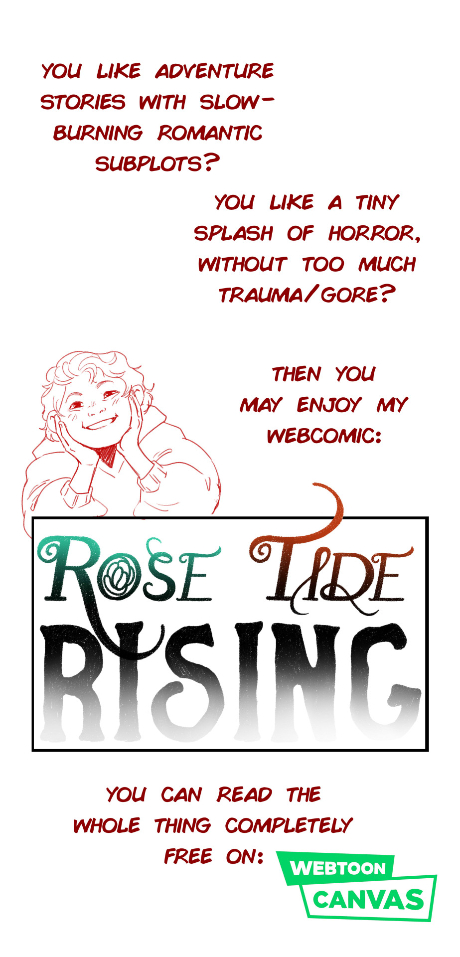
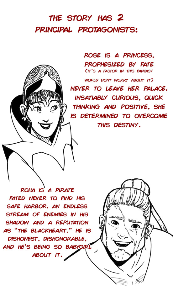
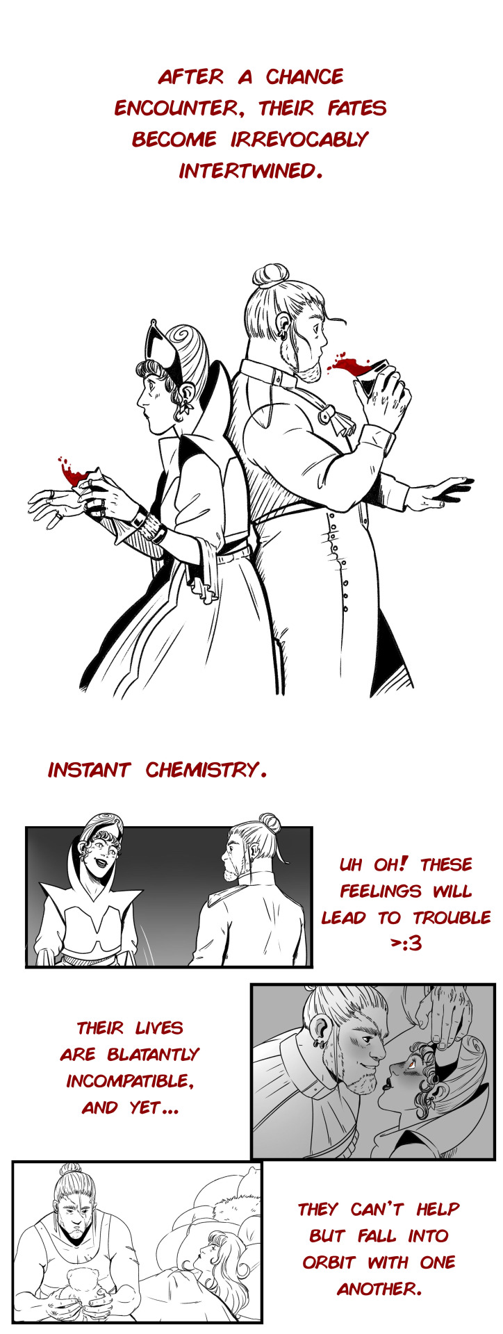
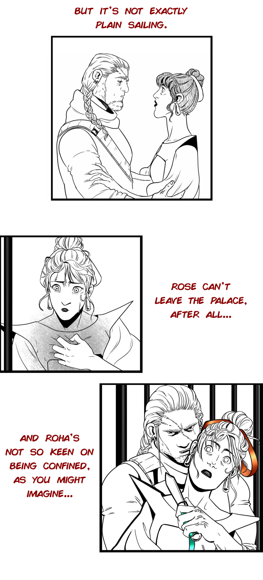
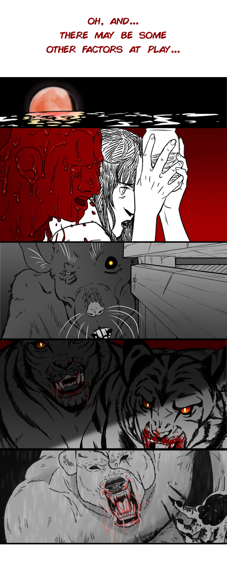
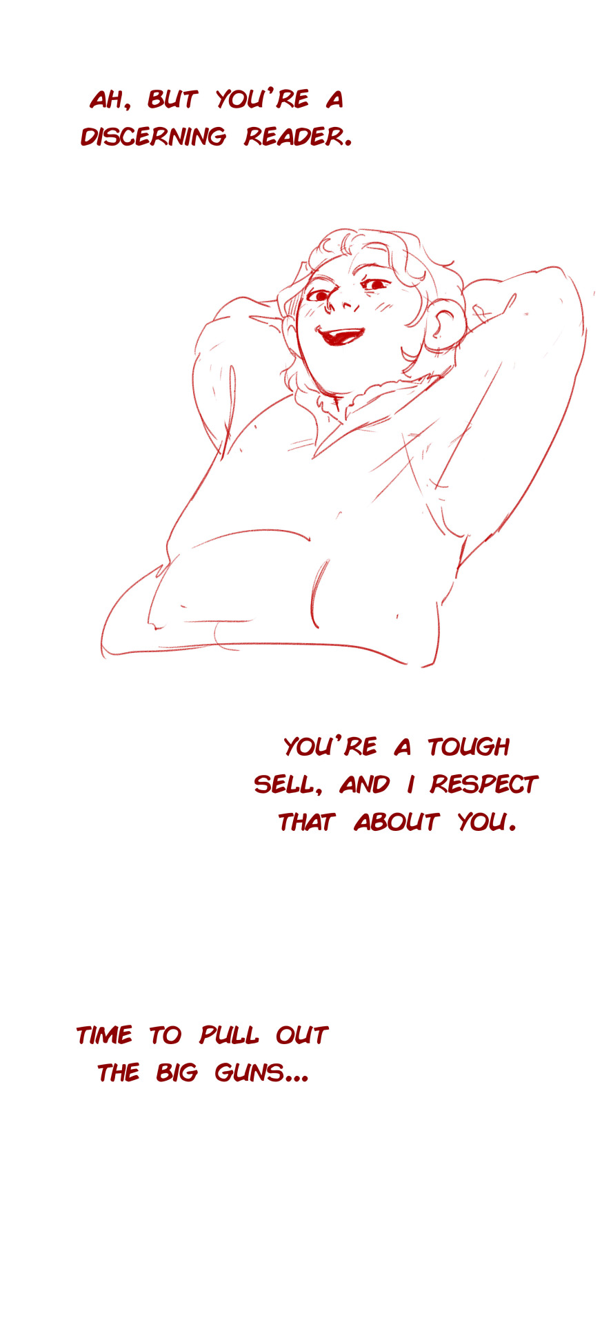
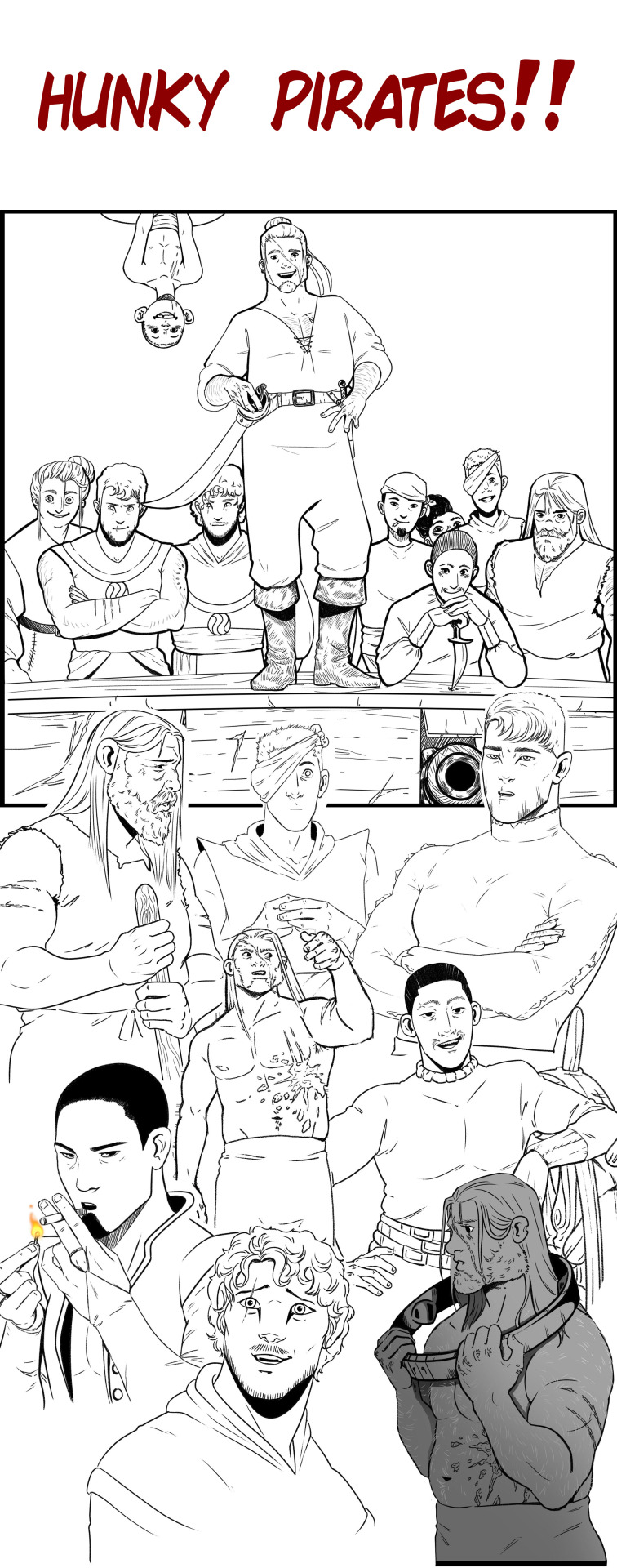
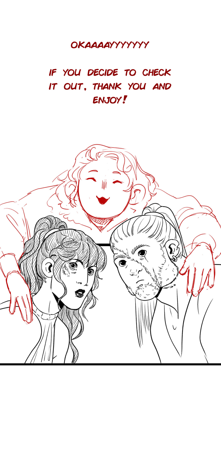
[This is a story about Fate and Agency... And sexy pirates and monsters and the most reckless Princess alive]
Read the comic for free here! Hope you enjoy ^_^
#long post#long post warning#my art#rose tide rising#rtr comic#webcomic#webtoon canvas#webtoon#free to read#(reblogs are appreciated to help the comic spread <3)
570 notes
·
View notes
Photo


in this world, my vision for vampires was that they have two animal forms: a bat and 1 other creature (often a carnivore/predator)
darcy’s is a raven/crow
so when emeryne starts getting visits (after the gala) from a friendly corvid who brings her shiny things and berries (hence the name blueberry), she thinks she’s made a new friend but rly its just darcy being socially awkward
5K notes
·
View notes
Note
Hi I understand if you don't reply, but I was wondering if you have any advice to beginners who want to start making their ocs a reality? (Like in the sense of having Charecters that have been in your thoughts for a while, but it's hard to encapsulate them into physical form?) As I have some that id like to make either into a game or comic but I'm a little stuck..
Also I'm curious if there will be any other content with the best boy himself rire?? : 0
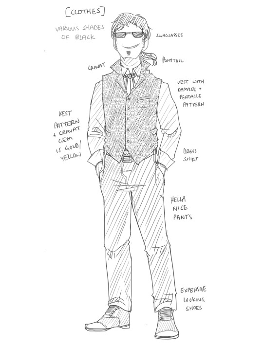
Hullo! Ah, (physically) designing characters, how fun ❤️ - there is part of a reason why I only have a handful of them lol XD; ANYWAY here are three things that help me, so hopefully they can help you as well :)
(I'll use Demon!Rire as an example as unless you are an old guard of mine, he will probably be the most recognisable of my characs.)
--------------
❓What do you know about them?
First of all since you already have your character in mind, congratulations you are most of the way there already! It's helpful to know the general vibe of them. And I don't mean the super detailed things that may arise from like..."Get to know your OC" quizzes - we are more looking for the core feeling of a character here. If you dumped this character into different AUs what things are going to stay the same/similar? Some things you should consider are:
What is their personality like? Why do they do the things they do?
Do I already have any physical traits for them in mind? Hair/eye/skin colour? Body type? Age? Name??
📝 Write a simple paragraph or some dot points about your character with these things in mind.
---EXAMPLE---
Sophisticated and charming, Rire outputs an aura of power and elegance. His pleasing physical appearance and gentlemanly demeanour usually enchants or commands people. Realistically, he is extremely manipulative and sadistic, and finds entertainment in the reactions of others.
---/EXAMPLE---
🤔 Make informed choices
Ok cool, you know something about your charac! Now build upon what you know to make them real - it is important here to try and match your design choices with the characterisation and "why"s of the character, and less with what you personally think will be cool/cute/whatever. What I mean by this is just pretend they are a person you are describing to a forensic sketch artist - you are giving "facts" as to what you think they look like not making stuff up (eg you would NOT be like "oh yeh she was totally a punk rocker however i'm going to say she wore a long flowing gown cos I think she'd look prettier in it?"*)
*Note that designing a character with opposites in mind can work out if you can at least answer the cursory "why" of it being a part of the character design. For eg maybe the punk rocker is secretly the alter ego of a socialite - flowing gowns and high fashion by day, grunge by night. Like Batman.
📝 Feel free to use dress up doll games and image searches for particular types of clothes/hairstyles/etc if you need inspiration. Thumbnail a bunch of different designs and see what works.
---EXAMPLE---
In my prev example paragraph I highlighted a few things in red. Here I'll break down how they can help craft a physical appearance:
Sophisticated and charming / elegance - to me, these combined make me think of ballrooms and black tie functions and nice suits. A well tailored outfit and someone who knows how to wear them.
Gentlemanly demeanour (well to some degree lol) - since I already know he's hundreds of years old (973 to be exact) I decided that an aristocratic Victorian-esque aesthetic would suit him. Somewhere in between a modern look and something with a bit more fantasy steampunk flair. He smiles quite genially until he's doing it with all his teeth.
Aura of power - he's got to be a bit of an imposing character so he's quite tall (or at least taller than all of my other characs) and carries himself confidently. Hooray for the ability to loom. Dark colours for this character, to cut an impressive figure.
Pleasing physical appearance - kinda stereotypical type of good looks that aesthetically most people would be like "yeh he's pretty". Athletic build - muscular but not bulky, broad shoulders, tapered waist etc etc.
Extremely manipulative - first of all, he looks rather human, for a demon - his entire species is designed very particularly like that. Then there's the sunglasses. The "why" [does he wear them] is they function to hide his eyes (one of the main parts of him that give away his demon-ness), but also as a bit of a red flag to the audience that something isn't quite right with him. I mean, look past his charm and he wears them all the time. The black and yellow colour scheme also ties in as warning colours ⚠️
Put them all together and this was one of my first sketches of Demon!Rire.
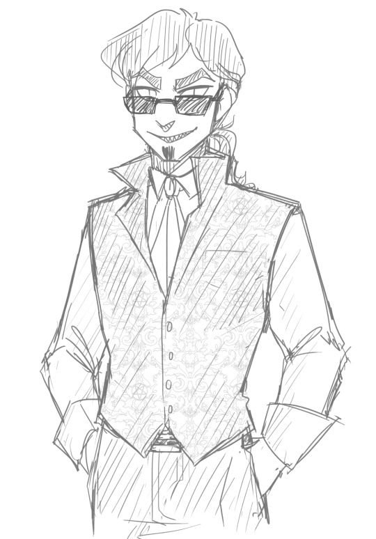
*Note that I already more or less knew how he looked other than his outfit; you will probably have a lot more sketch duds as you figure out what your character looks like.
---/EXAMPLE---
🔐 Don't lock yourself in
Despite the fact I've just said "pretend your character is a person", remember you're still their creator so obviously you have final say over them. Sometimes you'll find that they grow and change from what you initially thought of them (or you just evolve in how you draw them). Don't be afraid to make the tweaks and changes that enhance these - whether they be physical or core characteristics - and you'll get closer to the true character you always had in mind.
---EXAMPLE--
I now draw Rire with a more pronounced V-shape, longer, wavier hair, and somehow he ended up with way more pronounced eyelashes than I usually draw on my male characs. Which works out quite well considering how I tend to draw his eyes. Anyway the point of this is that these things developed over time as I kept drawing him.
---/EXAMPLE---
🍀 Try it out with your own characs! Have fun and don't force yourself to try and get it "right" on the first go.
#prettyboysmakegravezz#character design#ref#character design tips#hope this is kinda helpful!#also honestly have fun aye#long post#also as for other content with rire there kinda is but he's not really the main charac lol#also who knows when that will come out im a bit pedantic planning a webcomic#sz
579 notes
·
View notes
Text
A Thoughtful Customer
1K notes
·
View notes
Text
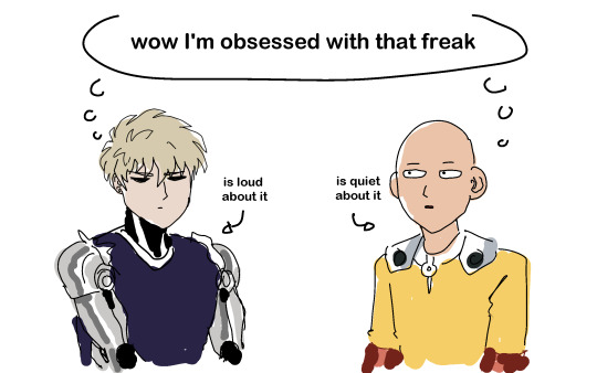
POV: You just got into One Punch Man and you wanna understand the main dynamic
#opm#one punch man#opm spoilers#saitama#genos#saigenos#Me in 2015: man genos is weirder than Saitama. He's weird himself but he's not obsessive like genos#Me after chapter 168: oh#is it a plot twist? Maybe. Reading the webcomic certainly didn't help hence why I'm blindsided#but to think Saitama turns out to be way more obsessed w Genos certainly did reignite my interest in Saitama#me @ Saitama: omg there is SOMEthing wrong with u *twirls my hair8 ur soooo unhinged go off king#one art man
5K notes
·
View notes
Last Seen Blogs
tousledot
Tousle-tumblr
veatomis
it was an honest loss
isa-solasun
ALIVE

goblinstudios
Goblin Studios
huatli-warriorpoet
magic sideblog of technofinch.tumblr.com