#would have little descriptions under the pixel character link like
Text
DO YOU GUYS REMEBER PIXEL FAMILYS ON HERE?
I don’t remeber if that’s what people actually called them but all of them used almost exclusivly homestuck characters
#josh screams#it was always using that one HS artists pixel art#if you dont know what I'm refering to#like there would be little pixel art of you friends fav character and either you would hover over the art and it would say#the friend's name and you clicked to go to the blog. or it#would have little descriptions under the pixel character link like#'bob. my best friend I love him so much!''#abd you'd click the thing to go to the blog#like it wasn't allways homestuck characters. but this one artist on here made some small HS character sprites#and a lot of people used them for the post. there was other pixel art too from other media#ig people still do this but in carrds. it's just... not the same
10 notes
·
View notes
Text
How to Get Roleplay on F-List: A Guide
Hey all. So I’ve had a few people ask me how on earth to get RP over F-List, or for those that have tried, say its too confusing. While F-List is a much different format than I think a lot of people are used to, it’s a pretty reliable source of RP once you get used to it. So I’m going to walk you through, step by step, how to start from nothing and get a profile set up to start RPing. F-List is 18+ Only and is a Restricted To Adults® Verified website. You can learn more about it by clicking the RTA logo at the bottom of f-list’s main page.
F-list’s main landing page can be located at https://www.f-list.net/.
Note that my f-list may look different from yours because I’m using dark mode (which can be set in the account tab) and I’m a subscriber, so I don’t see ads.
Step One: Make a Profile
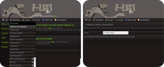
Making a profile, or as they’re known on F-List, a character, is your jumping off point for getting started. There are three main factions on F-List: Anthro Characters, Canon Characters, and Original Characters, with subcategories of each. You also have hub profiles. There is a right way to make a hub profile, but that’s not something I’ll be talking about on this post. Hub profiles are pretty universally disliked on F-List and are often seen as a mark of laziness, and I do not recommend making one to look for RP on. You should make a separate Profile for each character you want to play as. If you have a normal account, you can make up to 150 different characters. If you’re a subscriber, you can make significantly more than that depending on your tier.
Choosing a name for your character is very important! You want something attention grabbing, but since each character has to have a unique name, this can get a little tricky. Today I’m choosing to create a Link from the Legend of Zelda Ocarina of Time. As this is a popular character, it can be difficult to track down a good name. You can be clever with naming conventions, while making it obvious who you’re playing, or you can add in underscores, hyphens, numbers, etc. It’s really up to personal preference. I advise not getting too abstract with your character name. Just pick something easy to read and to the point. Once you’ve decided on a name, click the create character button to open up the character editor.
Step Two: Holy Fuck Dude That’s a Lot of Shit To Fill Out
Take a deep breath. The character editor is very intimidating to those that haven’t used F-List before. Perhaps you have used F-List for it’s old intended purpose, just to list your kinks to link people to when RPing on other sites. Your first instinct might be to scroll down there and start picking kinks willy-nilly. Stop. In the grand scheme of things, this is not as important for getting Roleplay and if you do it incorrectly you might actually hurt your chances.
Now that we’ve calmed down you’ll notice two things at the top of the page. A big white text field, and this guy:
This, more than anything on your profile, is the most important thing. If you have this on profile, you will almost never get any roleplay. This is your character icon, and it’s the first step on your journey to doing this whole thing correctly. All you need to do is find an image that’s 300x300 pixels or smaller and upload it with the Choose File button. Then scroll down to the very bottom of the page and hit save. Search on google, and if you have a hard time finding something of that size, A great site to use is https://lunapic.com/ to edit pics if you don’t have Photoshop or Gimp. Choosing or creating an image with some sort of transparency layer is recommended because it makes your icon look more polished, but you don’t really need to do that. This isn’t an image software guide so I’ll leave that to you to figure out. If all you can do is crop an image into a square, that will do perfectly. But you need to have something here. Besides your character name, it’s the first impression you’re going to give to people when using the site. I have honest to god had people message me on empty profiles that having nothing but a character name and an icon.
Sourcing your images is a bit of a grey area on f-list. It’s not really an art sharing site, but if you choose fanart that someone doesn’t want to be reposted, it can be removed by the mods if you’re reported for it. So we’ll just use some official art that already has a transparency channel and crop it using Lunapic.

Step Three: How To Set the Profile Up
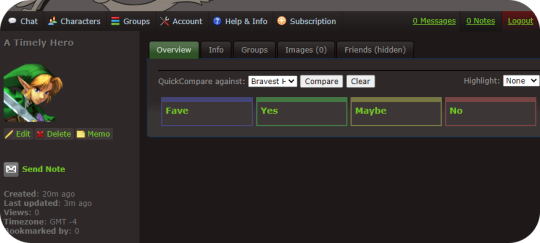
If you’re following along, you should have something like this by now. This already gives us an idea of who you’re playing, and what they look like, and while you might get a couple of weirdos messaging you already, there’s still a lot to do. So let’s go over what to do next.
Now that you’ve already created a character, it will be listed under the character tab. Further characters will be listed in alphabetical order. Navigate to your character and click the “Edit” button underneath their icon.
We’re back to the big scary page. Remember that big text field? We’re going to ignore everything else and focus on this first.
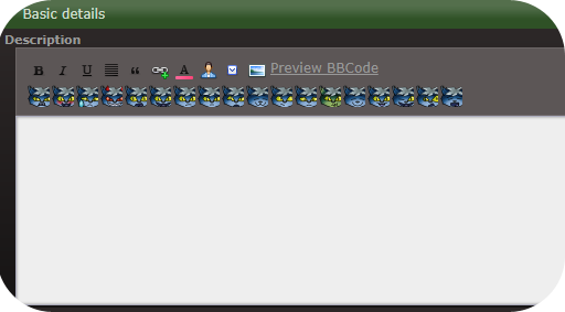
F-List uses standard BBC code tags with [square brackets.] You can find some buttons that will give you tools like bold, italics, color, hyperlinks, and quote blocks. There are many different ways to create eye-catching descriptions. I would say the three basic ways are minimalist, inline based, and heavy BBC code. We’ll go through the first option in detail but if you’re interested in the the latter, there is actually a few F-List profiles that teach coding and even have a few templates to use. User beware, though. Many F-List users use these templates and they can sometimes look a bit generic as they are overused.
Templates: https://www.f-list.net/c/profile%20templates
Coding Help: https://www.f-list.net/c/profile%20references
If you want to make an inline based profile, having access to software like Illustrator, Photoshop, GIMP, and similar content is good to have as well. You can also make a blend of the three styles of profiles. I’ll link some examples of my own profiles for reference. Some of these have text included in the inline. Some of them just have an image with the text written out underneath. Again, it’s really up to your personal preference.
https://www.f-list.net/c/Rival%20II/
https://www.f-list.net/c/Lion%20Heart/
https://www.f-list.net/c/The%20Fire%20of%20Tamaran/
Now would also be a great time to familiarize yourself with the rules. Keep an eye on these, especially if you play contentious content.
https://wiki.f-list.net/Code_of_Conduct
Some big things to look out for and not to do: Photographs and realistic images of animals are not allowed. Even Nonsexual ones. Photographs and 3D renders of minors (even nonsexual images or nonsexual profiles) are not allowed. If there is even a hint of the character being a minor, do not use photographic or 3D renders. (For example: Tom Holland’s depiction of Spiderman. Even though Tom Holland was an adult when he played the role, the character is a minor.) Sometimes these can run into a lot of grey areas, but it’s better safe than sorry!
Step Four: Creating A Minimalist Profile
We’ll start with a short description. It’s really important to make sure your character’s name is present in your descriptio, especially if it’s not the profile name. If you’re feeling particularly lazy, you can copypaste something from a wiki or official description. Let’s start with something like this.
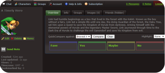
Link had humble beginnings as a boy that lived in the forest with the Kokiri. Known as the boy without a fairy, Link led a simple life until one day, the dying Guardian of the forest, the Deku Tree, set him upon a Quest to save the Kingdom of Hyrule from darkness. Arming himself with the elemental powers of Hyrule and the legendary Master Sword, Link journeyed through time to the Dark Era of Hyrule to challenge the evil Ganondorf and save his Kingdom from evil.
Shoving this into the Description box and hitting save will generate something like this.
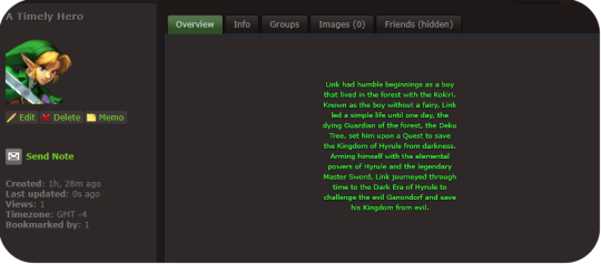
You might notice that this looks like crap. And it does! however, we can very easily fix that with the power of just three simple BBC tags. Those being [center], [color], and [sub]. plus a little something extra I’ll explain in a moment. Let’s add those in like so.
[center][color=green][sub]Link had humble beginnings as a boy that lived in the forest with the Kokiri. Known as the boy without a fairy, Link led a simple life until one day, the dying Guardian of the forest, the Deku Tree, set him upon a Quest to save the Kingdom of Hyrule from darkness. Arming himself with the elemental powers of Hyrule and the legendary Master Sword, Link journeyed through time to the Dark Era of Hyrule to challenge the evil Ganondorf and save his Kingdom from evil.[/sub][/color][/center]
Instead of hitting save at the bottom of the profile this time, we’re going to click “Preview BBC Code” to get a look at what our coding has done.

Fancy.
But it could use a little work. When I’m making minimalist profiles, I like to make the lines of text a little shorter so it’s a little easier to read and looks nicer. Make sure each line of text is about the same length as the previous (minus any BBC tags)
[eicon]blank[/eicon]
[center][color=green][sub]Link had humble beginnings as a boy
that lived in the forest with the Kokiri.
Known as the boy without a fairy, Link
led a simple life until one day, the
dying Guardian of the forest, the Deku
Tree, set him upon a Quest to save
the Kingdom of Hyrule from darkness.
Arming himself with the elemental
powers of Hyrule and the legendary
Master Sword, Link journeyed through
time to the Dark Era of Hyrule to
challenge the evil Ganondorf and save
his Kingdom from evil.[/sub][/color][/center]
[eicon]blank[/eicon]
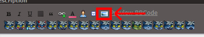
You’ll also notice that I placed an eicon tag with a “blank” body. Eicons are essentially image macros that can be used all over the site. Using the blank one here is a good way to put a block of empty space on the top and bottom so the text isn’t too crowded by the frame of the description box. Another couple to keep in mind are [eicon]under construction[/eicon] or [eicon]WIP[/eicon] if you want to save your work now and get right to chatting and exploring the site. This signifies that you’re still working on your profile and more will be added later. You can create your own eicons by going to Account > Icon gallery. Keep in mind each eicon must have a unique name across all users. Inputting this into the description and checking how it looks in the preview, we end up getting something that looks like this:
Looks like we got a bookmark while we were setting the profile up. That means someone saw us while browsing new characters and decided they want to keep an eye on our profile and are likely interested in RPing! If you like, you can disable bookmarks per character in the character editor under settings. Generally speaking though, bookmarks are your friend and it’s how people will find you to RP later.
Optionally if you want to add an inline, just upload an image of your choice in Account > Inline Images. You can then add it in the character editor using this button.
This isn’t a tutorial for creating inlines, but a general rule is to make sure it’s sized well, and transparent images tend to look better than non-transparent images.
Step Five: Character Details
Opening the Character Editor once more, a couple basic things should be filled out. We will take this section by section.
Settings: Some general tweaks to change and edit. Personally, I like to turn my timezone off, and besides that, I like to have my Guestbook and Bookmarks turned on as well, but all of these settings are up to you. A big one a I suggest turning on is “Custom Kinks Sort First.” This will come up later but it’s good to turn it on.
Character List: For now, you can ignore this part. You can use this to have certain characters grouped together and will show up in the sidebars of these characters. I haven’t run into any limits for how many character lists you can have, but keep in mind a character can only belong to one list at a time.
Images: If you have any images you want to upload, this is the place to do it. Headcanons of body types, additional art you’ve drawn or found, can be added here. You can add descriptions to each image that will appear when a user hovers over the image. Keep in mind, again, that usage of fan art is a grey area on F-List. It’s not an image posting site, but some artists do not want their art reposted at all.
Profile Info: You don’t need to fill out every single detail here. Bits that aren’t filled in will just not appear on your profile. It’s a good idea to fill out your gender, and in many cases, your orientation. Both are under General Details. Filling out RPing preferences is also a good idea. It’ll keep people from approaching you IC using first person posts if that’s not your thing.
Step Six: Kinks and Custom Kinks
This is probably one of the most overwhelming parts of the process. My first tip: Ignore the Kink section for now. Instead, skip ahead to the Custom Kink section.
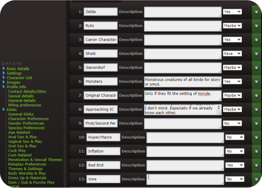
Custom Kinks are a good way to tell people what you really want. Click the Add +1 Custom Kink button to make a new custom kink. You can fill out the basic title of the kink, and a description. Or if you prefer to leave the description blank, just press the spacebar. Select what category you want the kink to appear in (Fave, Yes, Maybe, No.) Try to avoid using inflammatory language against different races, genders, identities, and don’t kinkshame. This is a site based primarily around finding rpers that have the same interests and kinks that you do. Save the profile when you’re done and we’ve got something like this.
And really, you can probably start roleplaying like this. Maybe add a couple of images, and tweak a few things. So if you like, skip to the next step. But for now, I’ll go over the kink list.
The most important think to remember is you don’t have to add every single kink to your profile. Try to select the most relevant things, and avoid redundancies.
For example, I’m not interested in Vore of any kind. So I can put the kinks Vore (Being Predator) and Vore (Being Prey) Into my No category. Or, if I want to make it even more simplified, I can add a custom Vore kink and put that in my No category. Likewise, if I don’t want to do any sex driven play, I can probably go ahead and just put sex driven there and ignore most of the kink list. Kinks that are not relevant such as Vaginal Sex (Receiving) on a cis male can also be ignored. Kinks are broken up into sections, and while it is a lot, just take your time, go through it sensibly, and take a break if you want to. Remember you don’t have to add every single one to your profile. This will ultimately be easier on you and make your profile easier to read.
After a bit of editing, this is what my kink list ends up looking like:
You can try exploring the Subfetish editor but it’s a little confusing to navigate and isn’t very necessary. And now, your profile is done!
Step Six: Using F-Chat
So now that we have a profile set up, it’s time to find some partners. Regardless of what way you want to connect, if you prefer script or para, the main place you’re going to find RP is through F-Chat. There is currently both a desktop and mobile client. if you select Chat you’ll see the option for both, and clicking on them will take you to instructions on how to set those up. We will however be using the Browser client in this example. Go ahead and select F-Chat 3.0.
You will be taken to a landing page with a drop down of your characters, with the first character you created selected as the default. (You can change your default character in your account settings.) You can have up to three characters online at once. Keep in mind this goes by IP address, so if you have a roommate that also uses F-List, those will count towards your total number of online characters. If this becomes a problem for you, just use a virtual machine or connect to the internet via a different method, such as with data. (F-List is not that much of a data drain.)
Here is what you’ll see when you open F-Chat. You’ll see I already have people in my friends list and my bookmarks (that I’ve blurred out for courtesy.) These will appear the same on all the characters you sign in as. I will be notified whenever one of my friends signs in or sets a status. You can set these notifications to show only on the console if you’d like to in the settings. Let’s set a status first.
Here, you have the options of selecting from the default Online status to Looking, Away, Busy, and Do Not Disturb. These all do what you’d expect, with Do Not Disturb turning off the sound that would play when you get notifications from personal messages or pings.
The Status Message is an optional addition, and it’s great for if you’re looking for specific things or want your friends and bookmarks to know what you’re doing. Be careful not to post anything that breaks F-Lists code of conduct. F-List does have an aggregate of every status you ever posted logged on their server, so throwing a temper tantrum and posting something inappropriate and then taking it back later might still get you in trouble.
While the Character Search Option is available to you, I’ve personally never found it very effective. You can search users by kinks, but keep in mind it doesn’t search by gender or orientation, or what species or even if they’re canon or original. Instead, we’ll go right to the settings tab.
General: Just your general settings. You have a few options here to tweak and while most of it is personal preference, I’ll highlight a few to keep in mind.
Disallowed BBC Code Tag: good for if you find a particular colour particularly garish as a text colour, or if you find an eicon that you no longer want to see anymore.
Enter Sends Messages: I have this set to off so I can avoid accidentally sending a message for when I post. When this is enabled, just press the send button on screen to send messages. Otherwise, if you want to linebreak in one post, just press Shift + Enter.
Animate eicons: If you’re running a slow computer, or have a slow connection, turn this to off. Eicons are used as memes a lot in F-Chat, and some of them can get a little ridiculous. (Someone has compressed the entire Shrek movie into an eicon and uploaded to the site in very poor quality for example.) There can also be bright flashing colours or even nsfw images. In general these eicons are all 100x100 pixels in size, but some users like to tile them together to create bigger images so it can sometimes get out of hand. This is something up to personal preference, and while I have Animate eicons turned on, I can see why some people wouldn’t like it.
Idle Timer: If you are the kind of person that walks away from your computer without changing your status, or you have fallen asleep with F-Chat open, it’s good to set this to a reasonable time. If you’re in Online or Looking, after you’ve been inactive for the depicted number of seconds, your status will be set to Idle. This is so other users know that you’re not ignoring them if you don’t respond to their messages. A downside to this is if you’re tabbed out or multitasking, it’ll set you to idle when you may not intend it to and going back to the window switches you to Online again. It can be a little spammy if you’re constantly switching between Online and Idle.
Font Size: If you find F-Chat’s font too big or too small, you can edit that here.
Notifications: While this section is pretty self explanatory, I’d like to specifically go over the Custom Highlight Notify Words.
Now, because each profile has to have a unique name, you might want to select additional pings. For example I might want to add Link,Zelda,Hyrule,Hero,Hero of Time to my list. Everything is comma seperated and not case sensitive. There are a few things to keep in mind.
Common word pings: If I add Link to my list of pings, I might get pinged whenever someone talks about a url link, or a chain link, or any other common use of the word link. It therefore might be better to not use the word. If you have a profile name that is a common word, it might be better to also uncheck the option for Notify Messages Containing your name.
Similar Profiles: If there’s another Link in chat, then I will be notified everytime someone refers to him by name as well. This is less of a problem on more niche characters, but it’s something to keep in mind! You can set pings by room, so perhaps a solution to this is using Link as a highlight word in the Canon Characters room, but not using it as a highlight word in the Nintendo room. More about how to do that later.
Hidden Users: Pretty self explanatory once click over. If you keep seeing an ad you dislike, you can hide all advertisements from said user (re: character) going forward. Keep in mind this is not your block list.
Import: If you make two profiles and want to have these settings copied from one to the other, just log into the profile you want to import to, and select the profile you want to import from. Make sure to go back to change your pings if needed.
Lastly, we’ll be looking at the channel section.
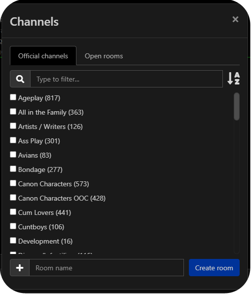
You might be starting to be overwhelmed again, and that’s okay. There are a lot of options, but most of the time, you’ll only want to select the options that are relevant to us. Check off the list of rooms you want to open a tab for. These will begin to be added to your sidebar. the number in brackets signifies the number of users thats joined that room. By default, this list is most popular to least popular, but I personally prefer alphabetical. There may be some channels that you find inappropriate, offensive, or contentious, but your best bet is to ignore those parts of the site. It’s an Adult site that is heavily moderated by a mixture of paid and volunteer staff. Every effort is made to ensure that no real people get hurt, but it is understood that as an adult, you are responsible for curating the content that you consume. This is one of the fundamental principals that F-List is built upon.
For now, I’m going to go with Canon Characters and Canon Characters OOC from this list.
You will also notice an Open Room tab. Unlike the Official Channels which are moderated by F-List staff, Open Rooms are chat rooms created by the userbase, and moderated by the userbase. While the standard F-List code of content is applicable to all areas of the site, special rules may apply in these rooms, and you’ll find things like rooms dedicated to certain kinks, species, and fandoms. I can try searching for a few things I think might be applicable to me, such as Hyrule, Zelda, Nintendo, and Elf. Some of those get hits, and some of those don’t. I can also check them off to add them to my list. (Note that search terms have to be entered one at a time. I cannot search for multiple things at once.)
Once you’ve selected the channels and rooms you want to join, you can click and drag on the tabs to reorder them on the sidebar. If you’d like to pin a chat, You can just press the little push pin symbol, which will then turn green. (You can do this for User Messages as well.) This means when you sign out, these chats will still be there when you sign back in. Note that settings and pinned chats are device by device only, and furthermore, channels and logs will not carry over between characters.
Make sure to read the description of each room you join. There are often specific rules (such as no ooc talk in the canon characters room, and no male characters in the lesbians room.) Clicking the gear will allow you to change settings on a per-room basis.
Step Seven: Actually Finding some RP
Now, after all that effort, we’re finally ready to find some RP. You have a few options on how to do this.
You could just join a few rooms and set your status to looking with a status message on what you want, but this is considered very passive. You may get some people that reach out (As you saw, someone had bookmarked my Link less than an hour after I made the profile before logging into f-chat.) But your best bet is one of three options.
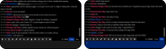
Look at the Ads: Whenever you’re in a room that allows ads, you will sometimes notice a differently coloured message fly by looking for roleplay. This is an ad. If you see one that seems to fit what you have to offer, you can right-click on their username and select “Open Conversation.” A chat window will be open under the PMs section on your sidebar. You can view this conversation like you would a channel. Keep in mind that users are not notified if you open a conversation with them, only if you send them a message.
Create an Ad: Make sure you are in a room or channel that allows ads by checking the description, you can select the ad tab in the lower right hand corner above the text input box to write an ad instead of a chat message.
Making a normal chat post saying “hey does anyone want to roleplay with me” is considered spam and could result in the mods having a word with you.
You have similar tools to what you do in the character descriptions, and clicking each one will automatically place the tags in the text box, with the eyeball being a preview and the question mark being a how to. You want your ads to stand out, but you don’t want them to be too obnoxious. Take a look at what kind of ads other people are posting to get an idea of what’s expected.
Talk to Others: And lastly, you can just play in public rooms or chat with people in ooc channels. This is a great way for others to sample what you’re like to play with and vice versa, or even just to get to know potential partners. In my general experience, you’ll have more luck finding people to play with long term in the user created Open Rooms than in the Official Channels, but ever case is different. There are a vast number of styles, methods of RP, and types of partners you can find.
That’s basically the ins and outs of F-List! The more you’ll use it, the more you’ll understand how it works and the social etiquette on the platform. Like many sites, it certainly has it’s share of dark corners and flaws, but all in all it’s a pretty good website to find people to play with! Have fun!
#cherp#mxrp#rp#tumblr rp#flist#no tea no shade for tagging other RP sites#just giving people more options and I've been asked about it a few times
60 notes
·
View notes
Photo


description under cut
Now that the phone situation has been handled, I’m remaking my commissions post. I’m providing both sketch commissions and small little pixel commissions now!
Sketch Commission Pricing:
For a black and white sketch, I’m charging 5$ flat. It doesn’t have to be black and white, it could be black and any color you’d like, but they’ll be colored in differently than how I would color in the color commissions, without the colored in by hand look.
For sketches with color, I’m charging 5$ to 8$ depending on complexity.
For each added subject, I’ll add 1$ to 4$ to the overall picture, again, depending on how complex each subject is.
Pixel Commission Pricing
They’re all 7 dollars, but they’re also all single subject. Adding another subject will be another 7 dollars.
Some more information:
I’m willing to draw from pretty much anything, given it’s not something morally wrong (or something i have personal issues with). I’m willing to draw OC’s, furry art, fan characters, any of the sort.
I will not draw NSFW and some gore.
My default will be transparent pictures, but if you’d like a flat color background or a simple pattern, I’ll gladly add it before or after.
Typically it takes me a day or two to get a commission done, depending on what is going on. I’ll be sure to tell you if there’s any delays.
Prices are always negotiable.
Some of my completed commissions can be seen on my blog if you search #commission stuff, if you’re interested
You can get ahold of me at [email protected] or on tumblr’s messaging system. Thank you so much for reading and sharing! I really appreciate it.
[ image 1: a creature with chicken-like feet, obscured by a black sheet draped over it, stands in a field in front of a small white fence. it says ‘Commissions?’ and has my commission information underneath, which will be in the post proper. the speech bubble looks like a decorated stone slab.
image 2: a set of four different pixel creatures: a large, living ribbon, held up with three red and grey eyes on stalks; a golden pig, with the body of a chain-link coin purse; a clown teapot, with the clown's head emerging from the lid; and a ballerina frog, juggling knives and balls with a blue butterfly on the top of their head. they're labeled at costing 7 dollars.]
#commissions#god im sorry for all the commission posts recently!#thank you all for your patience#i'm almost done with the coloring book too so look forward to that!
399 notes
·
View notes
Photo
Series: of Silver
Part 14
Attending a performing arts university, you’ve been managing just fine until the fall semester of your third year starts off by making out at a party only to realize the random guy was actually transfer Jeon Jeongguk, whom you had previously agreed to help get used to the city.
Pairing(s):
Jeon Jeongguk x Y/N
Below the cut is a written scene from the story, but you don’t need to read it to follow the plot for the fake texts portions!
masterlist link is in blog description
disclaimer: any character depicted do not represent the actual personality of the respected idol in real life.
Warning(s)/genre(s): College!au, fluff, developing relationship, love triangle(s)??, some angst/drama here and there– Jeongguk has a dog this series isn’t allowed to be too tragic.
Tag(s): @butterflylion @rjsmochii @mahakookie @dammit-jjk @joanc24 (note: @zamasus-sugarbaby , it won’t let me tag you! :( if you have a different url I can use to tag lmk!!) (if you would like to be tagged send me an ask to let me know!)
If you enjoy, let me know!! : )
set after the events of this chapter.
wc: 1145
warning(s): none
The other two students said their goodbyes first, thanking once more for the job as they excited the cafe. Jeongguk grabbed at his backpack strap that lodged itself under a table leg, shimmying it gently away while also saying a thanks, “I’ll keep practicing on film, so don’t be too worried.” The professor smiled down to her notes as he spoke with assurance that felt more aimed at himself than her. She removed her glasses as he stood upright, doing a better job at easing Jeongguk’s tension,
“I’m not, and you don’t need to be either. From the photography samples you brought today, I don’t think you have any issues with perspective and have a good eye for the image overall. It’ll be a good chance to practice, try to relax about it.” Jeongguk nodded his head, looking at her organized notebook, and closed folder that previously held aspects of the wedding that she passed out. He thought of her mentioning the close friendship between her and the bride, saying everyone was genuinely overjoyed by the news. A lot to document appropriately for such a happy event. But like she was coaxing now, he knew that the couple themselves were okay with students using this as a large scale practice.
“I’ll try, yeah.” He nodded, a hand fiddling with the sleeve hem of his sweatshirt, “Thanks again.” She nodded her head at his words, something about her graceful, but imposing enough without the added stipulation of this job Jeongguk signed up for. He shrugged the thought away, starting a goodbye as the front door chimed open. Vibrancy walked in as a man about Jeongguk’s age-- another student given the proximity of the cafe to campus. He glanced around, while Jeongguk turned his attention back to his professor,
“I’ll see you at the next meeting.”
“Yeah,” She nodded, waving a hand in the direction of the student, “Hopefully next time we can use a studio to map out the choreography they’ll be using,” Jeongguk shifted as the man walked over, his head nodding once in greeting though he had no idea who he was. “This is Jung Hoseok, he’s arranging the choreography for the wedding party.” Hoseok in question smiled at Jeongguk, the two opting for a small handshake as professor Choi continued, “Choreography apparently so difficult the groom thought he accidentally hired a professional instead of an undergrad.”
“The bride wants it to be big, so,” Hoseok gestures with his hands to match the cheerful expression, “Can’t argue with that. What was your name, by the way?”
“Jeon Jeongguk.”
“Haven’t seen you around campus before, I don’t think.”
“He just transferred this semester.” Professor Choi interjected, gesturing her head to one of the empty seats, “Sorry to cut in on the introduction, but I need to go over a few things with him and get to a class.”
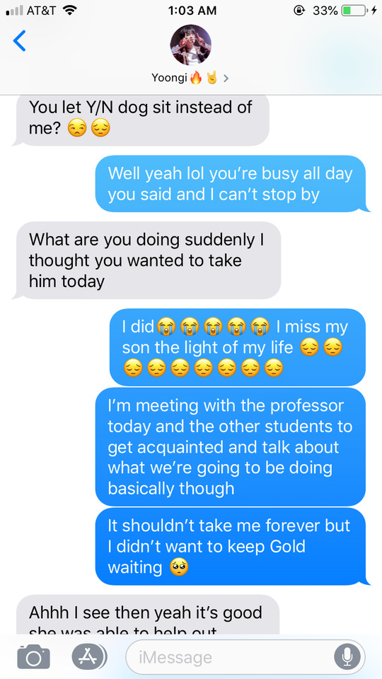
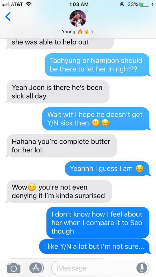
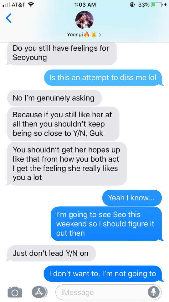
Jeongguk exhaled in the crisp air, starting a descent down the sidewalk. He skimmed down at his phone at the first crosswalk, wondering how else to improve to match up better with the actual filmography student, whom brought a sample of an incredibly crafted video she made for some competition over the summer. His eyes caught the red bubble of attached to his messaging app. The one from Jimin started off in a ramble of anger towards a situation that must have happened in a class, but Jeongguk clicked open the thread he shared with you first. His lips pursed, seeing a video sent earlier. Clicking play chuckling almost immediately fell as your voice grumbled from off screen, “The light quality in here is crap-”
“My head hurts don’t turn on anymore just to film the dog-” Gold barked at that point, eager in anticipation of the ball Namjoon’s hand while he sat huddled in blankets on the couch, “He cursed at me-”
“Throw the ball, Joon!” A half-hearted toss that sent the puppy’s nails clattering against the floor as he raced off to retrieve it. “Look, he’s an athlete- Jeonggukie,” Jeongguk bit onto his bottom lip an unabashed smile aimed at the pixelated video on his phone, “I’m going to have to be his trainer, you know? Like, I’ll just adopt him-”
“Hell has to freeze over for him to agree to that-”
“Joon, this isn’t your moment.”
Jeongguk’s laughter continued as the video concluded there, typing in a series of emojis, then startling as a car somewhere off-beside him honked. He rolled his eyes at his own shock and clicked to your contact information and hit to dial.
“Jeonggukie?” He smiled at the confused tone of your voice as you answered, “I’m writing up the adoption papers-”
“You’re never getting my puppy, babe.” You laughed on the other end. Wind hit against the receiver into his ear. “Are you out with Gold, right now? I’ll meet up with you both.”
“Ah, the meeting’s already over?” He moved from the center of the sidewalk to the wall as you spoke on, “Yeah, I’m at the park with him, but I’m getting cold. I didn’t know the wind would be this strong.”
“Let’s go to a cafe, I don’t want you to get sick.” He considered the park he usually takes Gold to be where you were as well and thought of different places around there. “Yoongi and I went to a nice one before, I’ll send you the location?”
“Okay,” Your voice distanced from the receiver, “Listen,” He covered his free ear to tune in better, hearing a little series of barks as you started talking nonsense to get Gold to speak. Jeongguk smiled at the odd sound you were making, “He said he loves me most.”
“Did he? I heard him say save me from this iPhone girl, dad; didn’t you?” You snickered on the other side,
“No, he actually said let’s get out of this weather.”
“I’ll get you both something to warm up with then, okay?” Gentle tone as he started walking to the general location of Yoongi’s apartment complex. “Before you say no, just agree because I will anyways.”
“Well,” Your sentence fell away as he called out what your response would’ve been, “Only if you admit that Gold likes me more than Yoongi.”
“How does that correlate?” Jeongguk laughed, listening to your own giggling on the other end, “I can’t say, Yoongi will sue me if I do. I like you more than Yoongi, is that good enough?”
“Wow,” You sounded taken back with a higher voice, “Yeah, I’ll gloat to him about it the next time I see him.” Still seeming like you were scrambling for a sarcastic reply. “What an honor.” Quieter, sort of shy, Jeongguk thought. He smiled, looking down at the concrete as he travelled along. Even smaller as you barely voiced, “Really?”
“Yeah,” He didn’t need to think before he was mumbling a reply, “Much more.”
#jeongguk#jungkook imagines#jungkook fake texts#jungkook smau#jungkook au#jungkook social media au#jungkook fluff#bts#bts imagines#bts fake texts#bts smau#bts social media au#bts au#bts fluff#all#series of silver
75 notes
·
View notes
Photo


LIVEJOURNAL FOR SCOOBIES #5: HOW TO POST AN ENTRY (TO SEASONAL_SPUFFY)
Join me on a new voyage of the mind as I make 2 mock posts for the LiveJournal community seasonal-spuffy, taking screenshots all the way.
This post might be of use to people who want to know how to make LiveJournal posts in general, but most of the specifics will be Seasonal Spuffy guidelines. If you’re only interested in Seasonal Spuffy guidelines, try the community profile.
Note: the LiveJournal version of this post might be easier to read.
https://seasonal-spuffy.livejournal.com/631381.html
STEP 0: Things to do before posting to Seasonal Spuffy
Create a LiveJournal account (sometimes, we’ve allowed participation elsewhere, but the Fall 2018 round only happens on LiveJournal);
join the community (currently optional, but makes posting easier);
(optional!) sign up for a posting day;
or wait for the free-for-all days: Nov. 22&25, Dec. 1&2 for Fall 2018;
create a new Spuffy work of almost any kind (detailed guidelines here).
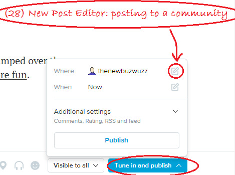
STEP 1: Open the post editor
Click “Post to Community” or a pencil icon at the top of the recent entries page of the comm, or click “Post New Entry” in the top right corner of any LJ page.
There are currently 2 post editors.
The new post editor may look like home if you’re used to tumblr. It looks like in screenshots 27-28, and it produces posts that are formatted like this. If you start in the new post editor and change your mind, click "Switch to old version" at the bottom of the page. Your post-in-progress will open in the legacy editor. You cannot switch back with the same post.
The legacy editor has 2 modes - visual editor and HTML. You can switch between them freely, using tabs at the top of the area where you write your post. In the mobile version of the site, you only get the HTML editor. Compared to the new post editor, the legacy editor gives you much more control over formatting, and it lets you preview the entry before you post.
Most of the screenshots in this tutorial post are from the legacy editor.
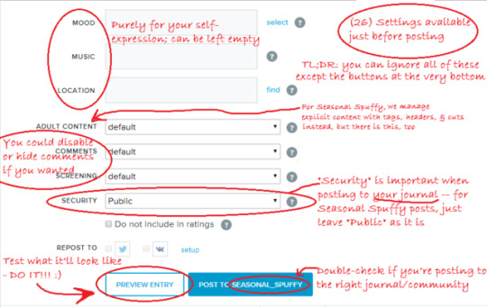
STEP 2: Select the community
See screenshot 18. If the community isn’t set, click “To Community” above the subject line of your entry-in-progress and select seasonal_spuffy.
STEP 3: Write a title (”subject”)
Ideally, the title describes your entry. Here are three good examples:
Four Banners
Icons: Night & Day
Fic: Buffy and the Bloodmobile (2 of 4)
However, any entry title you like is fine as long as the entry has a header.
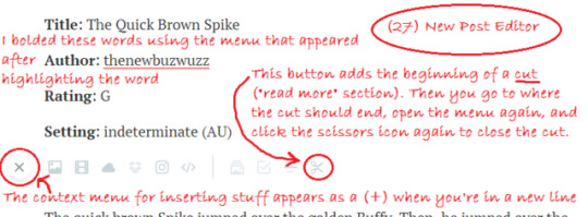
STEP 4: Fill in the header (the version for fic)
If you're posting fic, please fill out this header at the top of your post:
Title:
Author:
Era/season/setting:
Rating:
See screenshot 20. For "title" and "author", please give us the info that you’d like us to use when we link to your entry.
You might need to add another header line for warnings:
if your entry includes Spike/Other or Buffy/Other pairings;
if your entry is explicit/ not safe for work.
You can continue the header if you want, e.g. add a line for "Author's Note".
STEP 4: Fill in the header (the version for art etc.)
If you’re posting art or other work, the basic header is only 2 lines:
Title:
Creator:
We will use this title and name when we link to your entry.
You might need to add another header line for warnings:
if your entry includes Spike/Other or Buffy/Other pairings;
if your post is explicit/ not safe for work.
You can continue the header with other info if you want.
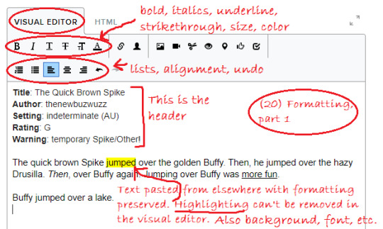
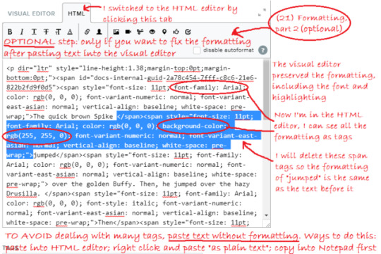
STEP 5: Insert your work (the version for fic)
The visual editor preserves formatting if you paste text into it. Sometimes, it keeps too much, like the font or the background color. If you want to find out whether this happened, scroll to the bottom of the page and PREVIEW. If there’s too much formatting and you feel like cleaning the post up, you have 2 options:
paste text without formatting instead (paste in the HTML editor, or right-click in the visual editor and Paste as Plain Text, or copy from Notepad),
or, after pasting into the visual editor, switch to the HTML editor and remove the formatting tags that you don’t want.
See screenshot 20 and 21 for an example.
STEP 5: Insert your work (the version for artwork)
See screenshot 22. After clicking the image icon in the toolbar, I dragged and dropped the image from my computer, set image size to 600 pixels, and put a checkmark in “Add a link to fullsize picture” so that people can click my image to view it in full size. I left the other settings as they are. Then, I clicked “Insert Pictures”.
The visual editor now shows an image in the entry, while the HTML editor shows some link code where I can insert descriptive alt text and hover text for the image if I like.
As an alternative to uploading, you can insert an image from various hosting sites by selecting “Paste URL” or one of the other options.
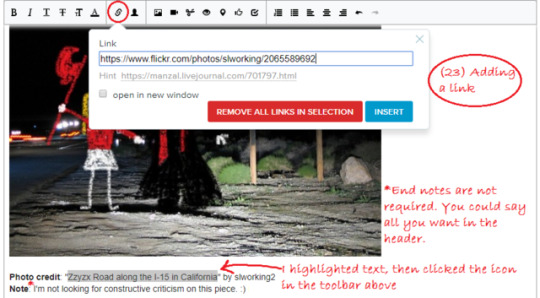
STEP 6 (optional): Add some end notes
If you like, you can add some notes below your work, like credit for images used. Screenshot 23 shows how to add a link.
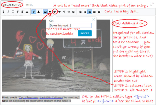
STEP 7: Add a cut
Cuts are “read more” links that will hide parts of the entry when people see the entry in a feed. Cuts are a big deal on LiveJournal, and you should use them.
For Seasonal Spuffy, cuts are required for all stories, large graphics, and NSFW content. You can’t go wrong if you just “cut” everything except the header.
Unlike tumblr, where a “read more” link hides everything from that point onwards, LiveJournal cuts have both a beginning and an end.
To add a cut in the visual editor:
Highlight the part you want to hide.
Click the scissors icon "Insert Cut" in the toolbar (screenshot 24).
Change the "Read more" text if you like or just click Insert.
See if there are cut lines now: dotted lines with little scissor images (screenshot 25).
To add a cut in the HTML editor:
Add before the part you need to cut and after it,
OR highlight text and click the Insert Cut icon. This will add the cut code.
To add a cut in the new post editor:
Go to an empty new line at the start of the section you want to hide.
A toolbar should open (see screenshot 27). Click the scissors icon to add the start of the cut.
Then go to an empty line where the cut should end.
In the toolbar, click the scissors icon again to add the end of the cut.
STEP 8: Add tags
Please add these kinds of tags to your Seasonal Spuffy entry:
creator (creator: yourusername with your username)
form (form: banner/wallpaper/manip, form: fanmix, form: fic, form: icons, form: meta/recs, form: other art, form: poetry, form: vid)
era (era: ats s5, era: btvs s1,..., era: btvs s7, era: comics canon, era: indeterminate, era: post-series, era: pre-series)
rating (rating: nc-17, rating: other)
(optional) genre - for fic if applicable (genre: alternate reality, genre: amnesia, genre: baby/kid/parent fic, genre: crossover, genre: holiday, genre: post-apocalyptic, genre: shanshu!Spike, genre: time travel, genre: vamped character, genre: wishverse)
You don’t have to memorize these tags. If you type the first part of the tag, like “era”, the available options will show in a dropdown. See screenshot 25. You can also click “select” and see all the available tags for the community.
If you're posting for the first time, your creator tag might not be available yet. That's okay - we will add it later.
If tags bewilder you, it's okay to skip this step or skip some kinds of tags. The mods can clean the tags up for you. If there’s enough time, it’s also okay to ask for help. :) You can contact one of the mods, like thenewbuzwuzz or Rebcake, or email [email protected], send us an ask here, etcetera.
STEP 9 (optional): Preview
Once you're done, it's a good idea to click the white button "Preview Entry" at the bottom of the post editor (see screenshot 26). This option is only available in the legacy editor. The preview will open in a new window, and you'll have to close it and return to the editor to finish posting your entry.
You can't see cuts when you preview a post, because they won’t be visible when your post is open. This is normal.
If you have time and you want to make absolutely sure everything is fine before making the real post, you could make a private test post on your journal. The option to make the entry private is under Security near the bottom of the window, and you’d have to edit the “Post” settings at the top to post to your journal. After that, if you see everything *is* fine, you can open that post for editing, go into the HTML editor, and copy everything for posting to the community.
STEP 10: Post
Double-check the text on the blue “post” button right before you post. The button caption should say “POST TO SEASONAL_SPUFFY”.
For Seasonal Spuffy entries, we don’t require you to do anything with the various settings that are available directly before posting. See screenshot 26 for an explanation of what some of them would do if you did use them.
If your entry is finished but it’s not yet your posting day/ not a free-for-all day, you can schedule the entry to be posted on the right day.
To schedule, use the setting "Date" at the top of the post editor.
Right after you schedule, LiveJournal will offer to view the post, and it will kind of look like it's already posted. If you go to the main page of the community, you should be able to see it's not there yet.
If we're between rounds and we've turned entry moderation on, you won't be able to schedule an entry. You can contact us (message a mod, e.g. thenewbuzwuzz, email [email protected], or get in touch with us elsewhere), and we can change the setting. Currently, in November 2018, you can schedule.
STEP 11 (optional): Check and fix as needed
It’s a good idea to look at your entry in the recent entries page of the community, so that you can see if the cut worked.
To edit your entry if necessary, hover over its title in the recent entries page and select the pencil icon on the right, or click the title to open the entry, then select the pencil icon in the row of icons above the title. After editing, click the blue button "Save Entry" at the bottom of the page.
In case of urgent problems posting, message one of the mods, for example, thenewbuzwuzz or teragramm; or email [email protected], or comment on one of the latest mod posts on LiveJournal.
If you have time and you prefer to figure things out on your own, try the LiveJournal FAQ.
See the community profile for more information on how the community works.
If you have other questions about the event or posting, please feel free to ask!
#sorry about that optimistic promise on Sunday. ''a day or two''#long post#seasonal spuffy#mod post#livejournal#tutorials#btvs
13 notes
·
View notes
Text
so you want to make a twitter (part 2)
tweeting
i’ve seen a few guides on twitter for new twitter users, which is nice, but something about having the posts being things you had to finds on twitter--a new site for the people who needed those guides--seemed unhelpful to me. so, i figured id make a small series of guides of my own here for anyone considering a move (or just making an account) who dont know how
this is a series of posts, since im going to be sort of detailed, so feel free to use just the pieces you need. ill tag them all “lews twitter tutorials” so you can find them on my blog
this is written under the assumption that youve read part 1 of this mini guide series, and dont know anything about twitter or any other social media site but tumblr
ill put it under a cut to save your space, but here’s the most important feature of twitter: tweeting!
so, tweeting. this is something you obviously have to know how to do. this is how to make a tweet, differences between tumblr and twitter, and how to interact with a tweet
so, making one! when you make a new tweet on mobile, the screen looks like this
(the icons are p much the same whether you use mobile or desktop, so it doesnt matter which i use)
first, the tweet itself! tweets can only be up to 280 characters, and cant be edited once you post them. theres no feature to bold, italicize, underline, or add linked text in twitter, so its not as good as tumblr for stuff like that, unfortunately.
here’s what the icons at the bottom do, from left to right
- pictures! this is sort of straightforward: it lets you add pictures. a tweet can only contain either 4 pictures, 1 gif, or 1 video. you cant have a gif and a picture, or a picture and a video.
a note for artists! twitter is known to compress image quality when images are uploaded, BUT there is a workaround! if you have even one single transparent pixel, your image wont be compressed.
a note for everyone! you can enable image transcription captions in settings (Settings > Accessibility > compose image descriptions). this allows you to type a short image description to any image you post, if you choose to. it’s a feature i recommend you have on and try to use for your followers who might have worse vision!
- gif keyboard! this image is a search for reaction gifs, basically. i almost never use it bc i can usually never find the specific gif im looking for...
- polls! tis is a feature i like about twitter! it allows you to conduct anonymous polls with up to four options. you can set a time limit and leave it up to allow people to respond. settle arguments between you and your friends or get opinions!
you cant post an image and a poll in the same tweet, so if you want opinions on something in an image, just have the poll be a reply to your tweet
- location! you can add your current location to any tweet. ive had this disabled for so long i genuinely dont know like... anything about this.
listen, im trying my best
- the little circle at the bottom which is grey with a dot of blue is the character counter. the circle is grey when empty, and gets bluer as you tweet. it wont count out how many characters you have left until youre within 20 of being full, in which case itll let you know so you dont go over the limit.
- finally, theres the + icon, which is for making threads. it lets you edit multiple tweets at once, connected in a string. threads are helpful for a lot of reasons!
if you have information to share, then put it together in a thread! if one tweet in a thread is retweeted, it’s marked as being part of a thread. this will encourage readers to look at the rest!
if you like to livetweet series, put it in a thread! this allows you to keep all your livetweets in one place, and also allows people following you to mute the thread if they arent interested
- i also know on mobile if you close out with the X, you can save a tweet to drafts to edit and post later. i dont know if you can do this on desktop because i never use desktop, and when i have, i couldnt ever find the drafts thing. i know if you delete the app, all your drafts are deleted, too
WELL, now that youve got the basics on a tweet....
interacting with the tweets of others
okay, heres a bit on what buttons do what, and some Twitter Manners
here’s our sample tweet, posted. this isnt how it appears on the timeline, but how it appears once you click it, so i can show the full range of things you can do with a tweet.
you can see the tweet, who posted it, and the date/time, and other stuff
- profile. top left. if you click the icon/display name/handle of the op, you can go to their profile!
- menu. see the little arrow in the top right corner? thats a menu.
on your own tweet, you can delete the tweet here, pin it to your profile, or mute it. muting a tweet means you no longer get notifications when someone interacts with it
on someone else’s tweet, you can follow or unfollow the op of the tweet, mute the op, block the op, or report the tweet
in the bottom row....
- theres tweet activity. it only shows up on your own tweet, and lets you see how many people have seen your tweet.
- below this would tell you how many likes and retweets your tweet got, but no one liked or retweeted my wonderful tweet for some strange reason, so i cant show you
worth noting, if your account is on private, you wont show up in the notifications of people who arent following you
now for the buttons
- the speech bubble is replies! that lets you repy to the tweet
worth saying, if you reply to a retweet or conversation, its important to be sure to un-@ the people who you arent talking to. when you reply to someone, at the top of the reply it will list everyone youre replying to. click the little names and unclick the check boxes by the names of those not involved, and youre good to go! not doing this is considered rude/annoying
- next, retweeting! retweeting is sort of like reblogging. you retweet another tweet so it shows up on your own account. you can retweet without comment, which brings the tweet as is, or with comment, which allows you to add your own sort of caption. the op of the tweet will nto be notified for any replies, likes, or retweets on a comment retweet
a note! people often do retweets with comments on stuff like news stories to add their own commentary/jokes
another note! DO NOT do this to art by artists, even if youre doing it to be nice! a lot of artists, especially international artists, find this incredibly rude, as it takes away attention and retweets from the art itself. if you want to share art, just retweet. if you want to say something nice, just tell them in replies!
its not uncommon for people to retweet something without comment, then make a tweet of their own to comment on them.these tweets generally start with LRT (last retweet)
- likes are pretty simple. you press the like button and you like the post. one thing thats different from tumblr to twitter, though, is twitter has a feature that shows your likes (and that you liked them) to your followers (if they havent disabled it).
- the share button allows you to share tweets! you can DM them to your friends, bookmark them (this is good for articles and such), or copy the link to share elsewhere.
and... that concludes tweeting!
4 notes
·
View notes
Text
YouTube SEO: Tips to Optimize Videos to Gain Top Results
Not more than a decade ago, inbound marketing was introduced as a brand new concept. Marketers were starting to realize that they just can’t go publishing a sheer amount of content online – they also need to produce high-quality content and then optimize it in ways that made it as visible as possible across search engines.
There was also a time when content was confined to a text-only format, which of course isn’t the case anymore.
Today an all-encompassing content strategy comprises text-based content such as blogs, articles, and eBooks to multimedia such as videos, podcasts, and other visual assets.
However, the first one, i.e., the videos, are still flourishing. In fact, as per reports, approximately half of the marketers around the world have begun investing more in YouTube compared to all the other marketing channels available to them.
As the other content formats continue to grow, the need to optimize them for search is also on the rise. And when it comes to videos, YouTube, the second largest search engine and a top-rated video distribution platform, is one of the most influential places to start with.
That being said, a major question arises – how does YouTube SEO work?
How can YouTube channel owners optimize their videos to rank better on the search and gain top results?
That’s precisely what this blog will discuss. Here are a few proven YouTube SEO tips that will help you get started. Let’s begin!
Insert a Target Keyword in Your Video File
Just the way you use an SEO tool to pick out the target keywords that you want your written content to focus on, video content is no exception.
As soon as you identify your main or primary keyword, the first place where you should insert it is in your video file name, even before you publish it on YouTube!
Why? Because YouTube can’t literally “watch” your videos to determine their relevance to your target keyword(s). And as you continue to read this blog, you will find out that after publishing a video, there are hardly any places where you can safely enter your keyword on your video’s viewing page. However, YouTube can read your video file name and all the code that accompanies it once it is published.
Keeping that in mind, change your “video_ad_Final004.mp4” video file name and rename it by adding your target keyword in it. There’s nothing to feel awkward about; almost all of us have been there, done that in the course of post-production.
For example, if your main keyword is “cooking tips,” then your video file name should be “cooking-tips,” accompanied by your chosen video file type. Some of the most common video file types compatible with YouTube are .mp4, .mov, .wmv, etc.
Include Your Keyword Naturally in the Video Title
When users perform a search for videos, the first thing that they see is the video’s title. Usually, that’s what determines whether the user will click on your video to watch it or not, which is why your video’s title shouldn’t be just persuasive but also clear and succinct.
Even though your target keyword plays a significant role in your video’s title, it would be a lot more helpful if the title is a close match to what the user wants to see. As per recent research, videos that have an exact keyword match in their title only have a bit of an edge over videos that don’t.
Therefore, inserting your target keyword in your video titles might help it rank for that particular keyword. Still, the relationship between keyword-rich titles and search rankings is not invariably a solid one. Nevertheless, optimizing your video titles for your target keywords is a good idea as long as it fits naturally in the title and conveys what the audience will be seeing in this video.
Last but not least, try to keep your video titles as short as possible to avoid them from getting cut off in the SERPs. The best practice is to keep it within a 60-70-character limit.
Optimize Your Video Description
While YouTube provides a video description limit of about 1000 characters according to Google, and it’s fine if you decide to take up all that space, using it all doesn’t really make sense. Because the viewer probably came there to watch your video, not to read an article.
However, even if you decide to go with a longer description, remember that YouTube will only show the initial 2-3 sentences, roughly estimated to approximately 100 characters. If a user wishes to read the rest of the description, they’ll have to click “show more” to expand the section. Therefore, it is highly advisable to include all the crucial information, call-to-action, or links in the initial lines only.
Now considering the video optimization, it won’t hurt to include a brief summary of the video, particularly for those users who can’t watch it with sound on. Having said that, as per a study, there is no definite connection between a description optimized for a specific term and the rankings for that keyword.
However, this doesn’t mean you should discard optimized descriptions at once as they help your videos to show up in the “Suggested Videos” sidebar, which is a prominent traffic source for many YouTube channels.
Tag Your Videos With Popular Keywords Relevant to Your Topic
YouTube Creator Academy itself recommends the creators to use tags to tell the essence of their video to the users. However, by doing so, you aren’t just passing on this information to the users but also to the platform itself. YouTube uses tags to comprehend your video’s content as well as context.
In this way, YouTube deciphers how to connect your videos to other similar videos, which thus helps expand your video’s reach. However, be wise in picking your tags. Do not use an unrelated tag just because you assume it will help you acquire more views. This is frowned upon, and Google can even penalize you for it. In addition to this, just like your video descriptions, start with your main keywords and use a good mix of common and long-tail keywords.
Categorize Your Video Content
When uploading a video, besides the other options such as adding video titles, descriptions, and tags, you can spot a section “Advanced Settings.” Click on it to categorize your videos.
Categorizing your videos is just another way of grouping them with similar content on YouTube so that it lands up in multiple playlists and gets more exposure to more viewers that fall within your target audience.
However, it may sound simple now, but in reality, it is quite tricky. YouTube Creator Academy advises the channel owners to put some thought into this and follow a thorough process to ascertain which videos belong to which categories.

Upload a Custom Thumbnail for Your Video’s Result Link
Thumbnails are the images that users see beside your video’s link on the results page. Together with the title, the video thumbnail also conveys to the users what the video is all about; therefore, it impacts the total clicks and views your content receives.
YouTube also offers auto-generated thumbnail options once you upload the video. While you can find it pretty easy just to choose one of those, it is highly recommended to use a custom thumbnail image for your videos. Moreover, reports also suggest that most of the best performing YouTube videos have custom thumbnail images. The ideal thumbnail images should have a resolution of 1280×720 with a minimum of 640 pixels width and 16:9 aspect ratio and should be saved under the 2MB limit and in the .jpg, .png, or .gif formats. Following these guidelines will help make sure that your thumbnail shows up as the same high-quality image across different viewing platforms.
However, keep in mind that you can only upload a custom thumbnail if your YouTube account is verified. Therefore, be sure to complete your verification process with YouTube right away if you haven’t already to unlock additional features.
Add Subtitles and Closed Captions Using an SRT File
Similar to the most text-based optimization we have discussed earlier, adding subtitles and closed captions can help boost your YouTube SEO by highlighting the main keywords.
To insert subtitles and closed captions in your videos, you need to upload a supported text transcript or timed subtitles file. However, for adding closed captions, you can also enter the transcript directly into your video so that it auto-syncs with it.
The process of adding subtitles is also quite similar; however, you get the option to limit the total amount of text that you want to show up. To add either, go to your “Video Manager” then click on “Videos.” Locate the video to which you want to add subtitles or closed captions, and then click on the drop-down arrow present beside the edit icon. Click on “Subtitles/CC” and then choose how you want to add subtitles or closed captions.
Boost Your Channel’s Viewership With Cards and End Screens
Cards
Have you ever noticed a tiny white circular icon with an “i” in the middle displaying in the corner of your screen or a semi-transparent text bar asking you to subscribe while watching a YouTube video? These are called cards.
Cards can be described as preformatted notifications that get displayed on desktop and mobile devices, which you can set up to advertise your own brand and other videos published on your YouTube channel.
YouTube lets users add up to five cards to one video. There are six types of cards – channel cards, Fundraiser cards, link cards, fan funding cards, video or playlist cards, and poll cards.
End Screens
Just like cards, end screens also show similar information. However, as you might have guessed by now, these aren’t displayed until the video is over. Plus, end screens are a little more visually detailed inherently.
Adding end screens will depend upon the type of platform you want to design them for and the multiple content types YouTube has allowed for them.
The important thing to keep in mind here is that YouTube is continuously testing end screens in an attempt to optimize the user experience, so there may be times when the end screens you have nominated don’t show up. Therefore consider all these factors before determining whether you should use cards or end screens.
Conclusion
Although these tips might appear a little too complex and time-consuming, you need to remember that over the past couple of years, people have increasingly started spending more time watching YouTube, whether, on their TVs, laptops, or mobiles, and this “time” has more than doubled.
There is an audience present there yet undiscovered waiting for you to tap into, so when you optimize your videos for YouTube, you are actually increasing your chances of getting discovered by them.
So keep creating engaging videos, take time to perform thorough keyword research, implement these tips, and promote your videos as much as possible to boost its reach. You may also take the help of some free or paid YouTube SEO tools available online.
Hariom Balhara is an inventive person who has been doing intensive research in particular topics and writing blogs and articles for Tireless IT Services. Tireless IT Services is a digital marketing, SEO, SMO, PPC, and web development company that comes with massive experiences. We specialize in digital marketing, web designing and development, graphic design, and a lot more.
SOURCE : YouTube SEO: Tips to Optimize Videos to Gain Top Results
0 notes
Photo

New Post has been published on https://www.simicart.com/blog/pwa-add-to-home-screen/
How to integrate Add To Home Screen into your PWA
Add to Home screen (A2HS for short) is fundamental to the Progressive Web App experience as it allows for a full native-app experience, which includes the launching of apps from the user’s home screen. In this guide, we’ll go over the reasons why A2HS is necessary, how it is used and how to make an app A2HS-ready, both on mobile and on desktop.
Supporting browsers
A2HS is very close to being a universal feature between browsers. Currently, it is currently supported by Mobile Chrome/Android Webview (from version 31 onwards), Opera for Android (from version 32 onwards) and Firefox for Android (from version 58 onwards). For a more detailed view, you can check CanIUse website.
PWA Add to Home screen in action
When coming across a site that’s PWA Add to Home screen enabled (A2HS-Enabled), a banner notifying that the site can be added to your Home screen can be seen at the bottom of the user interface:
Soomzone – one of SimiCart’s proud projects
The banner used to be a lot bigger but fortunately, the newer versions of mobile browsers have made it less intrusive for the user experience. The notification itself won’t be shown for a second time if the user choose to close it.
How to make your web app A2HS-enabled on mobile
For your web app to be A2HS-enabled, first there are a few criteria that need to be satisfied:
Your website must be served from a secure (HTTPS) connection.
A service worker registered (which is vital for offline capability and performance improvement)
A properly configured manifest.json file.
Once these criteria are met, a beforeinstallpromt will be fired asking for the user’s permission to install Progressive Web App.
Configuring your manifest.json file
Usually located deep in the root folder of a web app, your web manifest file is a file that contains all of your website’s necessary information—such as your app’s title, paths to different icons, background color, etc—in a JSON format. A web manifest file is crucial to a functional web-app as it allows for proper presentation of your web app on various stages of the user experience.
Your typical manifest file for a web-app with functional Add to Home screen feature should look something like this:
"background_color": "orange", "description": "Cute and random little cat pictures.", "display": "fullscreen", "icons": [ "src": "icon/cat-icon.png", "sizes": "192x192", "type": "image/png" ], "name": "Cute cat pictures", "short_name": "Cats", "start_url": "/pwa-examples/a2hs/index.html"
It should be noted that within a JSON (JavaScript Object Notation) structure, properties are also known as ‘members‘. They’re the fields that indicate the type of information you want to provide. Usually, a property/member contains a key-value pair, with key being the name of the property and value being, well, the value of the property.
For instance, you could see that in the example below ‘background_color‘ is the name of the type of information that you want to provide and ‘orange‘ is the value of said information.
"background_color": "orange"
Required members
For a manifest.json to be functional, there are five required members:
name, short-name, icons, display, start_url
name: Indicates your app’s name which is displayed under the icon of your app on the home screen and various other places. Keep the value of your name property short and simple.
short-name: When the value of your ‘name’ property fails to fit within the user’s screen, the value of this property is then the replacement to it. It’s recommended that your short-name should be under 20 characters and lower. In fact, shoot for 10 characters.
icon: Indicates your app’s icon image, which can consist of several images for different OSs and devices. It’s always better to have an array of variables as your icon member’s value as you don’t want your app to fail to present itself.
For example, iOs alone requires 4 different sizes for 4 of its device:
iPhone: 120 x 120 pixels & 180 x 180 pixels
iPad Pro: 167 x 167 pixels
iPad & iPad mini: 152 x 152 pixels
Even Google Chrome requires at least 2 different sizes for full usability on iOS and Android:
512 x 512 pixels
192 x 192 pixels
A safer approach, however, is to provide a large icon (512 x 512 pixels) and a smaller icon (192 x 192 pixels). As Google has put it, a192-pixel icon is always the optimal choice as your app user’s OS can scale down the icon—should the need arise—with reasonable accuracy.
In order for your image icon to be called, a set of properties is used, namely src, types and sizes.
src: is used to provide the path to the icon’s image.
types: is used to provide the kind of file type of the image.
sizes: is used to provide a width x height description of the image’s dimension.
"icons" : [ "src" : "/imgs/icon152.png", "type" : "image/png", "sizes" : "192x192" , "src" : "/imgs/icon215.png", "type" : "image/png", "sizes" : "512x512" ]
display: Indicates how the app should be displayed. For an immersive and app-like experience, it’s recommended that you should set it to fullscreen (no UI is shown). However, options such as standalone. minimal-ui is also available which is less costly performance-wise but at the cost of losing the immersive experience (status bar might still be shown).
start_url: Indicates the path from which your application starts. Your start_url value could be a simple ‘/’ if your application starts from the same .root directory where your manifest.json is stored.
background_color: Indicates the background color in certain app contexts. More specifically, this field can be used to set the background color for splash screen, which is the initial screen when the user first launches the app from the Home screen icon.
Optional members
Going by the book is one thing but there’s always room for you to try to be better. Below are our recommended members for a better more detailed manifest.json:
background_color: The background color in certain app contexts. More specifically, this member can be used to set the background color for splash screen, which is the initial screen when the user first launches the app from the Home screen icon.
scope: limits the extent a user can go. With this scope member, you don’t have to worry about some quick-witted users who use your app to browse other websites for god knows what reason. To scope your website, simply put a slash (‘/’) or put in your website’s full URL.
description: This one is self-explanatory.
Link the HTML to the manifest
When you’re done configuring your manifest file, save it in your website’s root directory so that it can later on be called with a relative path, i.e /manifest.json.
To finish setting up your manifest.json file, reference it in your HTML header.
<link rel="manifest" href="manifest.webmanifest">
Test your A2HS
There are many ways to go about testing your A2HS. One of them is by manually triggering the beforeinstallprompt event with Chrome DevTools. By doing it this way, you get to see first-hand the user experience, which is fundamental for an understanding of how the flow works.
How to test
On Chrome for Android:
Create a remote debugging session on your phone or tablet
Head over to the Application panel
Choose the Manifest tab
Choose Add to Home screen
Another less complicated way to test your A2HS feature is to use Lighthouse to audit your app. Lighthouse offers a variety of options and tests for developers to choose from, one of which is the “User Can Be Prompted To Install The Web App” criterion in “Progressive Web App” audit.
How to make your web app A2HS-enabled on desktop
A2HS is a feature that is no longer uniquely mobile. Desktop users now can install and launch PWA-enabled site from their desktop, just as how mobile users would from their Home screen.
Creating an install button
In order for your PWA to be made available on desktop, it’s important to have a button since it is not readily available in Chrome and the installation process have to be trigged by a user getsure.
<button class="add-button">Add to home screen</button>
Some simple styling should also be added:
.add-button position: absolute; top: 1px; left: 1px;
Listen for beforeinstallprompt
Once the beforeinstallprompt has been fired, the code below will save a referrence to the event and update your user interface accordingly to show that the user can add your app to their home screen.
let deferredPrompt; window.addEventListener('beforeinstallprompt', (e) => // Stash the event so it can be triggered later. deferredPrompt = e; // Update UI notify the user they can add to home screen showInstallPromotion(); ... );
The installation process
A general way of dealing with the installation process is demonstrated in the code below:
window.addEventListener('beforeinstallprompt', (e) => // Prevent Chrome 67 and earlier from automatically showing the prompt e.preventDefault(); // Stash the event so it can be triggered later. deferredPrompt = e; // Update UI to notify the user they can add to home screen addBtn.style.display = 'block'; addBtn.addEventListener('click', (e) => // hide our user interface that shows our A2HS button addBtn.style.display = 'none'; // Show the prompt deferredPrompt.prompt(); // Wait for the user to respond to the prompt deferredPrompt.userChoice.then((choiceResult) => if (choiceResult.outcome === 'accepted') console.log('User accepted the A2HS prompt'); else console.log('User dismissed the A2HS prompt'); deferredPrompt = null; ); ); );
Upon closer inspection, you could see that:
The variable Event.prevenDefault() is there to stop Chrome 67 and earlier from automatically calling the install prompt
Event-related objects are placed in deferredPrompt for future uses.
The button for installation is set to display: block for the user to click.
Within the click handler, there are also actions such as:
display = ‘none’: hide the button once the installation process is over.
Take advantage of the prompt() method that comes with the beforeinstallprompt event to trigger the install prompt.
Take advantage of the userChoice property that comes with the beforeinstallprompt event to respond to the user’s interaction with the prompt.
deferredPrompt: is set to null since it is no longer useful.
With proper execution, your user should see something like this once the button is pressed:
Upon clicking install, a standalone desktop app will instantly be created on the user’s desktop and the install button will be hidden from then on.
One thing to note
It’s important that you should know this is only the initial process of setting up a functional Progressive Web App. A Progressive Web App, by definition, not only functions like a native app but also better, thanks to its offline capability and performance improvement.
By allowing your users to add your app to their Home screen, you’re only expanding your app’s accessibility but not actually making any progress in the offline world. For a better reach, it’s recommended that you should take advantage of the Service Workers API for a full PWA experience.
Closing words
Even though PWA Add to Home screen is a feature that’s been around for quite a while, not that much people know and take full advantage of this feature. With Add to Homescreen, PWA can reliably offer its users an experience comparable to that of native apps or even better.
For Magento merchants looking for an all-around perfect Progressive Web App solution, here at SimiCart we offer a complete package for you and your store:
Explore SimiCart PWA
0 notes
Text
Tips on how to Create a Pinterest Pin Your Followers Will Flock To
Once you first be part of Pinterest, pinning appears easy. You add a picture and a hyperlink to a board you could have, and voila — you’ve got acquired a pin. The fervor units in and you start to pin all of the issues you’ll find: images, infographics, logos, icons. So long as it is a picture, it will get pinned.
However for those who’re making an attempt to develop your corporation by Pinterest, that technique will not allow you to in any respect.
Sadly, you’ll be able to’t pin one million issues and count on individuals to click on by to your content material each time. You have to make every pin rely.
Optimizing pins as an alternative of posting willy-nilly is not onerous. It simply requires extra thought into your model: What precisely are you pinning? What does it say about your corporation? Why ought to your viewers (and in the end, your prospects) care?
Maintain studying to learn to create your personal pin, in addition to a very powerful components of a pin your viewers will wish to pin themselves.
Tips on how to Create a Pin on Pinterest
Click on the plus signal (+) on the prime of your Pinterest profile.
Choose “Create Pin” from the dropdown menu.
Add a picture file out of your laptop and add a vacation spot hyperlink.
Enter a vacation spot hyperlink from which to avoid wasting a picture from that web site.
Title your pin.
Add a pin description.
Select a board so as to add your pin to.
Choose “Save” to create your Pinterest pin.
1. Click on the plus signal (+) on the prime of your Pinterest profile.
To create your first pin, navigate to your profile by clicking your identify and/or profile image on the top-righthand nook of Pinterest.
2. Choose “Create Pin” from the dropdown menu.
In your profile web page, above the curiosity boards you chose when creating your Pinterest profile, click on the plus signal icon (“+”) and choose “Create Pin” from the dropdown menu that seems, as proven under.
three. Add a picture file out of your laptop and add a vacation spot hyperlink.
Should you’re utilizing a desktop laptop, clicking “Create Pin” out of your Pinterest profile web page will carry you to the pin-creation type proven under.
The very first thing you may do is add a picture to symbolize your pin. You are able to do this in two methods:
By importing a picture file you could have saved in your desktop and including a vacation spot hyperlink (for those who use this methodology, maintain studying by this step)
By coming into the URL of the web site internet hosting your picture after which deciding on your required picture (for those who use this methodology, skip to step four)
To add a picture file from a folder in your laptop, merely click on the grey field and choose the picture file from the window that seems in your display screen. You can too drag the picture file itself instantly into this grey field.
As soon as your picture is uploaded, click on “Add a vacation spot hyperlink” on the bottom-righthand nook of the shape and enter the web site you need this pin to hyperlink to when customers click on on it.
four. Enter a vacation spot hyperlink from which to avoid wasting a picture from that web site.
If the picture you wish to pin already lives on-line someplace, click on “Save from website” beneath the grey image-upload field, and enter the URL of the web site. This would be the web site your picture routinely hyperlinks to when your pin goes reside.
Within the window that seems, you may see a couple of picture to select from — these are all the pictures Pinterest discovered dwelling on the webpage you are linking to. Scroll till you discover the picture you wish to pin, and choose it.
5. Title your pin.
Together with your picture efficiently uploaded, it is time to optimize your pin with acceptable textual content. Click on the “Add your title” preview textual content and provides your pin an attractive preview that finest represents the content material of your pin — and the web site to which the picture hyperlinks.
For instance, for those who’re pinning a picture of a denim outfit, and linking to the acquisition web page of that outfit, you may title your pin “New Denim Put on by [Company Name].”
6. Add a pin description.
Add an outline to your pin beneath your title, as much as 500 characters. Have in mind solely the primary 50 characters of your pin description will seem beneath the picture in consumer’s Pinterest newsfeeds. We’ll discuss optimize your pin description within the subsequent part of this weblog put up.
7. Select a Pinterest board so as to add your pin to.
Your ultimate activity earlier than saving your pin is so as to add this pin to a “board.” As a Pinterest consumer, you’ll be able to create boards that kind your pinned content material based mostly in your numerous pursuits.
To pick out or create a board for this pin, click on “Select a board (required)” beneath your pin’s vacation spot hyperlink. You will be taken to the web page proven above, the place you’ll be able to select or create a board that finest represents the kind of content material you are at present pinning.
eight. Click on “Save” to create your Pinterest pin.
As soon as you’ve got chosen a board so as to add your pin to, return to the pin-creation type and hit the purple “Save” button on the prime of your display screen. Observe the prompts to push your pin reside, and you will be all set.
The Anatomy of a Completely Optimized Pinterest Pin
1. Excessive-High quality Picture
This looks as if the obvious of all of them … nevertheless it must be mentioned. Photographs needs to be about 736 pixels vast (when expanded) with no pixelation. Basically, tall pictures work finest as they are going to seem on the display screen longer whereas individuals are scrolling by their feed, however you don’t need your pictures to be overwhelmingly lengthy.
There are many methods to make your pins look extra lovely, however for those who’re simply getting began, sticking to a big, high-resolution picture will work. You do not have to create each picture you pin (although if you wish to, listed below are some free instruments that can assist you), however it is best to avoid pinning tacky inventory images — Pinterest customers love inspirational, lovely images or graphics, or pictures which can be extraordinarily useful, intelligent, or informational.
2. Accompanying Title and/or Descriptive Image
Moreover being top quality, the picture needs to be indicative of what is on the pin’s hyperlink. You do not wish to mislead your Pinterest followers with a picture that does not match up with the accompanying hyperlink — it appears like a bait-and-switch.
As a substitute, select a picture that displays the hyperlink’s contents. Should you’re struggling to convey an summary idea, be at liberty so as to add textual content to your picture to explain it. The above instance did not want that — the icons themselves conveyed what was behind the hyperlink: free downloadable icons. If you would like an instance of a fantastic pin with textual content on it, examine the one out under. With out the title on the picture, the pin would not practically be as sturdy — individuals would don’t know that this was an e book they may obtain.
Ethical of the story right here: guarantee that individuals know what’s contained in the pin in order that they really feel enticed to click on. Should you really feel just like the picture is not pulling its weight by itself, add textual content. That little little bit of textual content may make the distinction between somebody clicking in your pin or not.
three. Hyperlinks With UTM Parameters
Though you may present a hyperlink to the content material you are selling within the pin’s description (which we’ll discuss in step 5, under), it is simply as necessary to incorporate this hyperlink within the picture you are pinning. If the picture you are pinning already lives someplace on-line, that is straightforward to do — you may merely add the web site hyperlink first, then choose the picture you wish to pin as soon as this hyperlink has been entered.
What Pinterest will not immediate you to do, however it is best to do anyway, is add a UTM code to the tip of this hyperlink. UTM codes, also called monitoring tags, permit you to determine the place your web site site visitors got here from if it did not come organically from a search engine. On this case, you’ll be able to add a UTM code indicating when your web site site visitors got here from a Pinterest pin.
New to utilizing UTM monitoring codes? Get the low-down on how they work right here.
four. Attribution
Attribution goes each for pins you create your self and pins you put up from different individuals’s content material. It is very easy to get content material stolen on Pinterest, so that you wish to be sure you’re at all times giving credit score the place credit score is due and defending your self if others will not do the identical for you.
It is fairly easy: Should you’re pinning another person’s content material, give them credit score within the description or the hyperlink you are connecting to your pin. Should you’re pinning your unique content material, add your emblem or web site URL within the photograph — if of us share your content material with out attributing it to you, individuals will nonetheless know the place it got here from. Within the instance above, this can be a design HubSpot made, so we threw up our emblem within the background — it is not intrusive, nevertheless it helps determine the picture as ours.
5. Snappy, Search engine optimization-Wealthy Description
A pin’s description is likely one of the most missed components of a pin — scroll by Pinterest and you may see numerous pins with none in any respect. Regardless that others are doing it, you should not. Should you’re making an attempt to make use of Pinterest to construct your corporation, you’ll be able to’t overlook the outline — it may have too huge of an affect in your outcomes.
Maintain your copy concise, but attractive. Inform readers what they’re going to get in the event that they click on on the pin. Pinterest allots as much as 500 characters of area for a pin description, reserving the primary 50 characters for what’s going to seem on most consumer’s Pinterest newsfeeds. All issues thought of, pins with descriptions round 100 characters are sometimes very best to keep up brevity whereas attractive customers to click on your pin.
Additionally be sure you’re utilizing Search engine optimization-friendly phrases to explain the content material behind the pin so your pins can efficiently rank in search engines like google and yahoo. Discover within the instance above we additionally embody the phrase “we’re hiring” in Spanish to optimize the pin for key phrases utilized by Spanish-speaking professionals — the audience for this explicit pin.
6. Name-to-Motion
Even on Pinterest, the place it is an ordinary follow to click on on hyperlinks, individuals want slightly overt reminder to click on. Regardless that you could have a hyperlink within the pin itself, add slightly call-to-action within the description to the pin’s hyperlink — it may repay big-time for you.
*Wealthy Pin Data
I do know what you are pondering: Why is that this one a star as an alternative of a quantity? Did Ginny make one large typo in the midst of her weblog put up?
Nope — this can be a particular placeholder for Wealthy Pins. You will discover that the picture is not one. Wealthy Pins pull additional information right into a pin everytime you or another person pins particular issues out of your web site. Should you’re an online developer, you’ll be able to apply to Pinterest for permission to characteristic data on merchandise, motion pictures, articles, recipes, or locations. Here is an instance of a Wealthy Pin that includes an lovely greyhound:
See that data proper under the title of the pin? You possibly can see that this wall artwork is in inventory and prices $15 with out having to click on by.
The rationale I included this as a star is as a result of not all companies can realistically use Wealthy Pins … but when your corporation can, you completely ought to. Wealthy Pins can carry out a lot better than their not-so-rich counterparts. In reality, based on Shopify, 39% of “pinners” on Pinterest usually tend to be energetic customers than non-pinners, and 93% of Pinterest customers are on the platform to discover potential purchases.
Should you’re trying to optimize your Pinterest presence to the fullest and have content material that might fall in a Wealthy Pin class, work out get them enabled to your web site’s content material.
7. A Lot of Different Nice Pins
That is type of a trick component as a result of it is not technically within the pin itself, however due to the best way the pin format appears to be like when expanded, I needed to embody it right here. Strive clicking on a pin in Pinterest — if you develop the pin, all the opposite pin pictures from the consumer’s board are pulled in. This offers you extra alternatives to interact together with your Pinterest followers all with out doing a factor.
To be sure you’re optimizing the opposite pins on the board, all you must do is comply with the entire ideas above for every pin. With slightly extra mindfulness when pinning, you may have an increasing number of alternatives to develop your corporation by Pinterest. Feels like a candy deal to me.
from Easily Maker Money https://easilymakermoney.com/2019/03/27/tips-on-how-to-create-a-pinterest-pin-your-followers-will-flock-to/
0 notes
Text
The Big Pearl Lemon Guide to Getting More YouTube Views for Free
So, you create YouTube videos. Great idea. Done right YouTube videos can be one of the best ways to promote a product, build your brand, establish yourself as an authority on some of your favorite subjects or just make a little extra cash.
The opportunity to do all of the above is certainly there. Although YouTube is now nearly fifteen years old – and has more than a few almost viable competitors in the video space in 2019 – it is still the granddaddy of video sites and the place most people – from all over the world and across almost every popular dynamic – head when they are looking for something interesting to watch.
How big is it still? Here are some facts to consider (accurate as of the time of writing and the numbers are YouTube’s own)
Total Number of Monthly Active YouTube Users:
1.9 billion
Total Number of Daily Active YouTube Users:
30+ million
YouTube TV Paying Subscribers:
300,000
Number of Videos Shared to Date:
5+ billion
Number of Users Creating Content Shared to Date:
50 million
Average Viewing Session
40 minutes, up 50% year-over-year
Number of Videos Watched Per Day
5 billion
Number of mobile YouTube views per day:
500 million
Number of Videos uploaded per minute:
300 hours
There is, as you can see, a huge audience just waiting to be tapped. In theory that is. Knowing all of this is very frustrating if the views on your own videos struggle to make it past double digits. So naturally you want more views on YouTube. For free. But how? Here are some pointers to get you started.
Ask People to Subscribe
That sounds very simplistic doesn’t it? And yet you would be surprised by just how many content creators on YouTube don’t actually bother to do it. They create videos that have fantastic information, are really entertaining and informative but then forget to make it clear to the audience that there is more of the same to come and so they should subscribe to be notified as soon as it does.
Once people subscribe, they can choose to be notified every time you upload new content and this will bring you instant views every time you release a new video. Add a call to action at the end of your video asking users to subscribe to your channel. And include a link in your video description that makes it easy for them to do so.
Use Playlists To Keep Those Eyeballs on Your Videos
According to YouTube’s own numbers s “top-performing brands on YouTube build and promote twice as many playlists as the bottom 25%.”
That’s because those top-performing brands understand the magic of auto-play. It’s much harder to pull yourself out of the YouTube rabbit hole when the videos just keep playing. Users might not actually be motivated enough to keep watching if they have to click play every few minutes, but if the ‘hits keep coming’ the chances are very good that they will just keep going. When you have a little more time head to one of our favourite YouTube entertainment channels – Watch Mojo UK – and we can almost guarantee that you’ll be there for a while. As soon as one video stops the next one starts. And people are often there for hours.
So, how do you create a playlist? Here’s a video that explains it very simply:
youtube
TLDW? Here’s the quick explanation:
Navigate to the first video you want to include in the playlist.
Click Add to.
Select an existing playlist, or choose Create a new playlist (and then name that playlist).
Choose your playlist’s privacy setting. Since you’re aiming for YouTube views, you’ll likely want to keep it Public.
Click Create.
Ten minutes, tops, and provided you are creating good content this will almost certainly increase your views on YouTube.
Make Use of YouTube Cards and End Screens
The card and end screen functionalities on YouTube offer you another way to get your viewers watching more of your videos while also helping them get more familiar with your brand every time they do.
Cards are those pop ups you see in the body of the video itself. This video explains how to add them.
youtube
Since at this point your focus is getting more YouTube views for free, you will probably get most mileage out of a channel card that just links to the rest of your videos. However you could use a video or playlist card to point viewers to specific related videos that it would make sense for them to watch next.
Making end screens for your videos is almost as simple as adding cards. Here’s how it’s done:
From your YouTube account, click the Creator Studio link under your account icon.
Click Video Manager > Videos.
Click Edit on the video you want to add the end screen to, then click End screen.
Choose whether to copy an existing end screen, create one using a YouTube template, or create one from scratch using the Add element option.
When you’re happy with your selections, click Save.
Make Your Video Titles and Descriptions Search AND User Friendly
Before you can get new eyeballs on your videos they actually have to be able to find them, which means your YouTube SEO has to be on point. However, those efforts have to cover two slightly different ‘audiences’; YouTube’s search bots and actual human viewers.
YouTube SEO is actually a discipline all unto itself, and there’s a lot to learn (which is why you might want a YouTube SEO specialist to help you at first) But here are some of the basics:
When you are writing your descriptions and titles try out your potential keyword ideas in the YouTube search box itself. As the autocomplete populates you may get ideas for related terms you hadn’t thought of. Or even ideas for new videos (score) You can also click on a few of the videos that show up for keywords right now to get an idea of your current competition.
Where can you find high potential keywords? Google Keyword Planner and Google Trends are both potentially great sources of them, but do not include anything that isn’t relevant to your video’s content just because it’s a high volume keyword. YouTube knows that ‘trick’ and they will eventually penalise you for it.
As we mentioned, you have to keep your users in mind too. According to YouTube “Titles that perform best are often those that tell a story.” Search bots are not interested in stories but humans are, so you have to figure out a way to achieve this balance. Within 60 characters, to ensure that your full description is displayed in search.
Thumbnail Images Count
Most people just don’t read when they are online, they scan instead. And when they are scanning their way through the search results of a list of videos they might want to watch they are far more likely to click on the one that has an interesting/eye catching thumbnail image to draw them in.
YouTube will, of course, auto-generate a thumbnail but why let them? Take control of the first impression you want to make and upload a custom image. Make sure that image complements both the subject matter of your video and your brand.
Your custom thumbnail should be 1280 x 720 pixels and less than 2 MB in size, in JPG, .GIF, .BMP, or .PNG format. And you probably want to know how to add one, so here’s a video that explains that:
youtube
Optimize Your Channel
Almost as important as optimizing each video you create is optimizing your channel. Yet SO many people just do not bother to do that. YouTube’s top performing creators do though, and since your ambition is to get more views and actually become one of them it is something that you should be doing as well.
Visuals are important here of course. You need to take the time to create a great channel icon, one that helps accurately portray your brand and your content, especially as this icon will be used by both YouTube and Google Search. It also needs to be an 800X800 image that will also display well at 98×98 pixels. A tall order perhaps, but there are a lot of tools and tips in the YouTube Creator Academy that can help.
Then there is the channel description. You have up to 1,000 characters to create a compelling brand pitch for your YouTube channel, letting viewers know why they should care about the videos you’re posting, what you have to offer, and how often they can expect to see new content. It’s not much, but take the time to make it count.
If you are up for a little more work you can even choose to create a channel trailer. We’ll let this video explain this (and as you watch, learn, this lady has a lot of views and subscribers!)
youtube
Understand the Way the YouTube Algorithm Works
‘A search and discovery system’ is the way that YouTube officially describes its algorithm. This is what determines which videos are seen first in a user’s search results, in the suggested videos tabs and in those trending streams.
The algorithm has an awful lot to do with watch time. Primarily this refers to how much time someone spends watching your videos, measured in cumulative minutes watched. According to YouTube itself, “each video uploaded—as well as every channel on YouTube—is ‘ranked’ by watch time.”
But “watch time” is not as simple as it sounds. Yes, it includes the actual time people spend watching your videos. But channels also earn “watch time credits” for driving viewers to watch videos on other channels.
This means that YouTube is more likely to showcase your videos when people spend more time watching your videos, and when they spend more time watching videos by other users that you refer them to. It’s complex stuff sometimes, and working with a Youtube marketing specialist can help you, but getting a better grasp on what you have to do to please YouTube – versus pleasing Google – is something it pays to do.
Take the Time to Go Through Your YouTube Analytics
One of the biggest keys to the success of any marketing strategy – on or offline – is to continuously test, track and tweak according to watch you learn as you go. And this is where analytics come in.
YouTube itself offers a pretty robust analytics panel that will tell you a lot of what you need to know. It lets you know which of your videos performs the best, how engaged your viewers really are and, to a certain extent, just who those people actually are.
These are all things that you not only need to pay attention to in order to increase the views on your current videos but also to act as a guide when creating future content. Once you know who is watching, and what seems to be resonating with them the most you can make a point of creating even more of the same kinds of content to keep them coming back for more.
Promote Your YouTube Video to the Outside World
Finally, it’s important that you promote your YouTube videos to the outside world to draw them over to you channel to watch (and hopefully keep watching) your content. Embed them on your website, share them on your social channels, include them in your emails (even in your email signatures)
All of these tips should help you increase the number of views your YouTube videos get and, for the most part, are free. There is one thing that has to be noted here though. As is the case for anything else in the world of content creation all the tips, tricks and hacks in the world aren’t much use if the content isn’t good.
Take the time to learn from others, to test and tweak and invest what you need to to ensure that what you are creating is good, not just a thirty second filler you are using to try and ‘increase your visibility online’.
The post The Big Pearl Lemon Guide to Getting More YouTube Views for Free appeared first on Pearl Lemon.
source https://pearllemon.com/the-big-pearl-lemon-guide-to-getting-more-youtube-views-for-free/
source https://pearllemon.blogspot.com/2019/03/the-big-pearl-lemon-guide-to-getting.html
0 notes
Text
The Big Pearl Lemon Guide to Getting More YouTube Views for Free
So, you create YouTube videos. Great idea. Done right YouTube videos can be one of the best ways to promote a product, build your brand, establish yourself as an authority on some of your favorite subjects or just make a little extra cash.
The opportunity to do all of the above is certainly there. Although YouTube is now nearly fifteen years old – and has more than a few almost viable competitors in the video space in 2019 – it is still the granddaddy of video sites and the place most people – from all over the world and across almost every popular dynamic – head when they are looking for something interesting to watch.
How big is it still? Here are some facts to consider (accurate as of the time of writing and the numbers are YouTube’s own)
Total Number of Monthly Active YouTube Users:
1.9 billion
Total Number of Daily Active YouTube Users:
30+ million
YouTube TV Paying Subscribers:
300,000
Number of Videos Shared to Date:
5+ billion
Number of Users Creating Content Shared to Date:
50 million
Average Viewing Session
40 minutes, up 50% year-over-year
Number of Videos Watched Per Day
5 billion
Number of mobile YouTube views per day:
500 million
Number of Videos uploaded per minute:
300 hours
There is, as you can see, a huge audience just waiting to be tapped. In theory that is. Knowing all of this is very frustrating if the views on your own videos struggle to make it past double digits. So naturally you want more views on YouTube. For free. But how? Here are some pointers to get you started.
Ask People to Subscribe
That sounds very simplistic doesn’t it? And yet you would be surprised by just how many content creators on YouTube don’t actually bother to do it. They create videos that have fantastic information, are really entertaining and informative but then forget to make it clear to the audience that there is more of the same to come and so they should subscribe to be notified as soon as it does.
Once people subscribe, they can choose to be notified every time you upload new content and this will bring you instant views every time you release a new video. Add a call to action at the end of your video asking users to subscribe to your channel. And include a link in your video description that makes it easy for them to do so.
Use Playlists To Keep Those Eyeballs on Your Videos
According to YouTube’s own numbers s “top-performing brands on YouTube build and promote twice as many playlists as the bottom 25%.”
That’s because those top-performing brands understand the magic of auto-play. It’s much harder to pull yourself out of the YouTube rabbit hole when the videos just keep playing. Users might not actually be motivated enough to keep watching if they have to click play every few minutes, but if the ‘hits keep coming’ the chances are very good that they will just keep going. When you have a little more time head to one of our favourite YouTube entertainment channels – Watch Mojo UK – and we can almost guarantee that you’ll be there for a while. As soon as one video stops the next one starts. And people are often there for hours.
So, how do you create a playlist? Here’s a video that explains it very simply:
youtube
TLDW? Here’s the quick explanation:
Navigate to the first video you want to include in the playlist.
Click Add to.
Select an existing playlist, or choose Create a new playlist (and then name that playlist).
Choose your playlist’s privacy setting. Since you’re aiming for YouTube views, you’ll likely want to keep it Public.
Click Create.
Ten minutes, tops, and provided you are creating good content this will almost certainly increase your views on YouTube.
Make Use of YouTube Cards and End Screens
The card and end screen functionalities on YouTube offer you another way to get your viewers watching more of your videos while also helping them get more familiar with your brand every time they do.
Cards are those pop ups you see in the body of the video itself. This video explains how to add them.
youtube
Since at this point your focus is getting more YouTube views for free, you will probably get most mileage out of a channel card that just links to the rest of your videos. However you could use a video or playlist card to point viewers to specific related videos that it would make sense for them to watch next.
Making end screens for your videos is almost as simple as adding cards. Here’s how it’s done:
From your YouTube account, click the Creator Studio link under your account icon.
Click Video Manager > Videos.
Click Edit on the video you want to add the end screen to, then click End screen.
Choose whether to copy an existing end screen, create one using a YouTube template, or create one from scratch using the Add element option.
When you’re happy with your selections, click Save.
Make Your Video Titles and Descriptions Search AND User Friendly
Before you can get new eyeballs on your videos they actually have to be able to find them, which means your YouTube SEO has to be on point. However, those efforts have to cover two slightly different ‘audiences’; YouTube’s search bots and actual human viewers.
YouTube SEO is actually a discipline all unto itself, and there’s a lot to learn (which is why you might want a YouTube SEO specialist to help you at first) But here are some of the basics:
When you are writing your descriptions and titles try out your potential keyword ideas in the YouTube search box itself. As the autocomplete populates you may get ideas for related terms you hadn’t thought of. Or even ideas for new videos (score) You can also click on a few of the videos that show up for keywords right now to get an idea of your current competition.
Where can you find high potential keywords? Google Keyword Planner and Google Trends are both potentially great sources of them, but do not include anything that isn’t relevant to your video’s content just because it’s a high volume keyword. YouTube knows that ‘trick’ and they will eventually penalise you for it.
As we mentioned, you have to keep your users in mind too. According to YouTube “Titles that perform best are often those that tell a story.” Search bots are not interested in stories but humans are, so you have to figure out a way to achieve this balance. Within 60 characters, to ensure that your full description is displayed in search.
Thumbnail Images Count
Most people just don’t read when they are online, they scan instead. And when they are scanning their way through the search results of a list of videos they might want to watch they are far more likely to click on the one that has an interesting/eye catching thumbnail image to draw them in.
YouTube will, of course, auto-generate a thumbnail but why let them? Take control of the first impression you want to make and upload a custom image. Make sure that image complements both the subject matter of your video and your brand.
Your custom thumbnail should be 1280 x 720 pixels and less than 2 MB in size, in JPG, .GIF, .BMP, or .PNG format. And you probably want to know how to add one, so here’s a video that explains that:
youtube
Optimize Your Channel
Almost as important as optimizing each video you create is optimizing your channel. Yet SO many people just do not bother to do that. YouTube’s top performing creators do though, and since your ambition is to get more views and actually become one of them it is something that you should be doing as well.
Visuals are important here of course. You need to take the time to create a great channel icon, one that helps accurately portray your brand and your content, especially as this icon will be used by both YouTube and Google Search. It also needs to be an 800X800 image that will also display well at 98×98 pixels. A tall order perhaps, but there are a lot of tools and tips in the YouTube Creator Academy that can help.
Then there is the channel description. You have up to 1,000 characters to create a compelling brand pitch for your YouTube channel, letting viewers know why they should care about the videos you’re posting, what you have to offer, and how often they can expect to see new content. It’s not much, but take the time to make it count.
If you are up for a little more work you can even choose to create a channel trailer. We’ll let this video explain this (and as you watch, learn, this lady has a lot of views and subscribers!)
youtube
Understand the Way the YouTube Algorithm Works
‘A search and discovery system’ is the way that YouTube officially describes its algorithm. This is what determines which videos are seen first in a user’s search results, in the suggested videos tabs and in those trending streams.
The algorithm has an awful lot to do with watch time. Primarily this refers to how much time someone spends watching your videos, measured in cumulative minutes watched. According to YouTube itself, “each video uploaded—as well as every channel on YouTube—is ‘ranked’ by watch time.”
But “watch time” is not as simple as it sounds. Yes, it includes the actual time people spend watching your videos. But channels also earn “watch time credits” for driving viewers to watch videos on other channels.
This means that YouTube is more likely to showcase your videos when people spend more time watching your videos, and when they spend more time watching videos by other users that you refer them to. It’s complex stuff sometimes, and working with a Youtube marketing specialist can help you, but getting a better grasp on what you have to do to please YouTube – versus pleasing Google – is something it pays to do.
Take the Time to Go Through Your YouTube Analytics
One of the biggest keys to the success of any marketing strategy – on or offline – is to continuously test, track and tweak according to watch you learn as you go. And this is where analytics come in.
YouTube itself offers a pretty robust analytics panel that will tell you a lot of what you need to know. It lets you know which of your videos performs the best, how engaged your viewers really are and, to a certain extent, just who those people actually are.
These are all things that you not only need to pay attention to in order to increase the views on your current videos but also to act as a guide when creating future content. Once you know who is watching, and what seems to be resonating with them the most you can make a point of creating even more of the same kinds of content to keep them coming back for more.
Promote Your YouTube Video to the Outside World
Finally, it’s important that you promote your YouTube videos to the outside world to draw them over to you channel to watch (and hopefully keep watching) your content. Embed them on your website, share them on your social channels, include them in your emails (even in your email signatures)
All of these tips should help you increase the number of views your YouTube videos get and, for the most part, are free. There is one thing that has to be noted here though. As is the case for anything else in the world of content creation all the tips, tricks and hacks in the world aren’t much use if the content isn’t good.
Take the time to learn from others, to test and tweak and invest what you need to to ensure that what you are creating is good, not just a thirty second filler you are using to try and ‘increase your visibility online’.
The post The Big Pearl Lemon Guide to Getting More YouTube Views for Free appeared first on Pearl Lemon.
source https://pearllemon.com/the-big-pearl-lemon-guide-to-getting-more-youtube-views-for-free/
source https://pearllemon.tumblr.com/post/183496048874
0 notes
Text
Google Posts: The Free and Simple Way for SMBs to Leverage Local Search
New Post has been published on https://britishdigitalmarketingnews.com/google-posts-the-free-and-simple-way-for-smbs-to-leverage-local-search/
Google Posts: The Free and Simple Way for SMBs to Leverage Local Search
On the final day of my brother’s visit to Boston last week, we decided to cap off his vacation with a visit to the best seafood restaurant in the city. After a quick Google search — one that pleasantly kept me on the results page instead of forcing me to click on links — we were able to enjoy the best meal of the entire week.
Nowadays, finding places on Google is incredibly fast and easy. The search engine gives you all the information you need without making you visit a store’s website, crowning Google as the top tool for discovering and vetting almost any type of merchant.
In fact, 82% of people find information about local businesses on search engines, which demonstrates that one of the best ways to promote your brand is by customizing your business’ information on Google with a free Google My Business profile, like the one pictured below.
Since Google My Business profiles are free, it’s logical to assume that Google would try to monetize the surging popularity of local search by selling ad space on a company’s branded keyword search results.
But Google actually decided to do the opposite — they gave every company with a Google My Business account access to a tool that lets them advertise on their branded keyword search results for free. It’s called Google Posts.
What are Google Posts?
A Google Post is content that promotes a business’ announcement, offer, event, or product update on their branded keyword search results. Depending on the nature of your customers’ search query and your content, your Google Post will either show up on Google’s search or map results.
Picture Credit: Search Engine Land
When crafting your Google Posts, you’ll have ample opportunity to grab your audience’s attention. You can describe your offer, product, or event in up to 300 words, upload an image, video, or GIF, and add call-to-actions to prompt product purchases, reservations, and newsletter signups. Your audience can share your Google Posts on social media too.
Picture Credit: Search Engine Land
Google Posts also has an analytics feature, which shows you how many impressions and clicks your posts get. This might seem like a limited amount of metrics, but they ultimately provide enough information to help you grasp which Google Posts resonated with your audience and which ones did not.
To make sure your business is constantly publishing fresh content on their search results, Google sets a seven day life span on each of your Google Posts. The only posts that won’t expire after seven days are ones promoting events, but they’ll disappear after the events end.
Google Posts: An SMB Marketer’s Dream Come True?
Originally launched as “Candidate Cards” in 2016, Google Posts would only show up in relevant search queries for political candidates who wanted to promote their brand on the search engine.
A few months later, Google decided to roll them out to a select group of small businesses. And by July 2017, the search engine made Google Posts available to every business with a Google My Business account.
Giving every business the opportunity to use Google Posts levels the playing field in the digital marketing space. SMBs without much SEO expertise are now able to leverage the massive reach of local search to grow their business.
For example, PatientPop, a healthcare practice growth platform with under 400 employees, generated an 11% increase in appointment bookings this year just by optimizing their Google Posts.
But even though new distribution tactics like Google Posts are incredibly innovative, they still aren’t able to pull average content out of the abyss of mediocrity.
If your content isn’t engaging, regardless of the strength of your marketing strategy, it won’t produce results. Crafting captivating content is the only way you’ll attract your audience’s attention and gain their trust. To effectively connect with people and inspire action using Google Posts, here are three copywriting tips you can follow.
3 Copywriting Tips for Crafting Captivating Google Posts
1. Craft headlines that appeal to people’s self-interest or give news.
With only 58 characters to spare in your title, you must get to the point of your offer. But to get people to click, you also need to clearly communicate your offer’s value, benefits, and relevance. How do you grab someone’s attention with such a little room to work with?
According to John Caples, one of the most successful copywriters of the 20th century, headlines that strictly focus on appealing to people’s self-interest or giving news are scientifically proven to be the best way to capture attention. And there are certain words and phrases that can pull your customers in and prompt them to read the rest of your copy. Here’s a list of them to help you craft sharp headlines void of any fluff.
2. Publish Google Posts that are clear, concise, and compelling.
Even though you technically have up to 1,500 characters to describe your offer, only the first 100 characters show up in Google’s knowledge panel.
To immediately hook people and persuade them to click on your offer or read the rest of your description, try sticking to one message per Google Post. Spotlighting your offer’s main benefit or feature, especially in the first 100 characters, will make it easy for your customers to understand its value and increase the likelihood of their click-through.
Another way to boost your Google Post click-through rate is by leveraging the scarcity principle. People value objects and experiences that are rare — having something that most people want, but can’t have, boosts our self-worth and sense of power.
And since each Google Post has a seven day lifespan, you can also align your offer’s deadline with your post’s expiration date and use words and phrases that evoke a sense of urgency, like “Exclusive offer” or “Limited availability”. These psychology-backed tactics will skyrocket your offer’s perceived scarcity and, in turn, its consumer demand.
3. Use a large, high-quality visual to make your Google Post stand out.
On a website that’s dominated by text, vivid visuals are refreshing and eye-catching. But supplementing your copy with a standard stock photo or amateur iPhone picture won’t grab anyone’s attention. Vibrant photos will make your Google Post stand out — the brain is programmed to respond to striking visuals — so make sure you take photos or record videos with good framing, lighting, and a decent camera.
You also want your visual to take up most of the space on your post, so make sure your photos have the minimum image resolution of 720 pixels by 520 pixels.
Content marketing without good content is just marketing.
As a free and relatively easy way to leverage the popularity of local search, Google Posts might seem like a cheat code for marketers. But when countless brands are fighting for a limited amount of attention, you must resist the urge of leaping onto the latest, hottest marketing trend before considering how you’ll create content that’s actually worthwhile.
There’s already enough mediocre content saturating our industry. To stand out from the crowd of brands hollering the same exact message, crafting compelling content should be your highest priority. Marketing comes after.
Source: https://blog.hubspot.com/marketing/google-posts
0 notes
Audio
MINISTRY DESIGNS
Youtube: https://www.youtube.com/watch?v=kLrVf0uxBYw
Website: https://ministrywebsitedesigns.com/scottsdale-bible-church-website-review/
Hi everybody, Tyler Rominger here from Ministry Designs. Hey, a couple of—I guess it was last year around this time—we produced a pretty exhaustive list of some of the best church websites. And so what I want to do this year, is I want to take a little bit of a deeper dive into what makes those websites great. So what we've done is we're going to go ahead and do an over the shoulder looks at some of the websites, some of the design aspects, some of the technical aspects of those websites. And hopefully this will give you an idea of some of the concepts and some of the strategy that you can reference to make your church website a little bit better.
So today we're looking at ScottsdaleBible.com and we're just going to do kind of a quick run through of the home page. They've done a phenomenal job— their graphics are beautiful; their branding colors are consistent. I love the way that they've built their menu. They're obviously a larger church and so they have a lot going on. Looks like two campuses. And this is a really well done navigation. Typically I like to see navigations a little shorter, a little more condensed but a lot of times when you have a larger church, you don't really have a choice. And so it gives a little intro here. And a quick subject heading and then you can kind of dive in to find specifically what you want. Everything is organized phenomenally. There's no reason you can't find what you're looking for on this website. It makes it super easy to get the information you're trying to find. So as we scroll down a little bit, I like some of this background texture. You can find these all over the Internet. It adds a little something to your website. A lot of times you'll see a lot of white space; the minimalist design is still really big but I think when you add a texture to the background of the website, it helps give you a little bit of distinctive compared with what everybody else is doing with white backgrounds. So, we'll continue to scroll down here. Obviously this is thought through. And the majority of people who are coming to your website are going to want to find kind of a snippet of what you've got going on with your church so you can read it here. And then if they like that it's really simple to find what the upcoming series is going to be about. Scroll down—News and Stories—this is wonderful because it highlights what's happening in your church right now. Makes it really easy for people to find; love these little icons. Then Upcoming Events—this is really well done. Let's go ahead and take a look, and let me highlight this section really quick.
So this is "Subscribe to our Weekly Newsletter". So in the digital communications or digital market space, there's a tactic that I'm sure you're all familiar with and I'm sure everybody that's watching this video has downloaded one. It's called a lead magnet???? and basically what that does is it gives you the opportunity to exchange something of value for somebody's email address. And so, although a newsletter is valuable to most people, somebody that's visiting your site may or may not be concerned about what's going on in the newsletter because they feel they may be able to find the information that they're looking for on your website. So if I had a recommendation for the folks at Scottsdale, I'd try to find something that would be of value to people visiting their website for the first time, and maybe revamp this section a little bit, but it's still predominant, it's well-placed, it get's to the point, "hey, we want to continue to communicate to you. We're going to go ahead and send you our weekly updates and let's go ahead and get to know each other here." I love that they have the map--easy to find, easy to navigate. They know based on these two locations specifically where their campuses are, so that's well done as well. And it makes it super easy for you to contact them, with their phone number here, their address, and their social icons there. So their home page is well done. Again, the navigation is phenomenal, very easy to understand, very easy to find what you're looking for. As far as the overall layout goes, there really is not a lot of critiquing that needs to be done here. I think that it is a well-designed, up-to-date, relevant site.
So, what I want to do is I want to jump into some of the technical aspect of the site and see how they've done on some of their marketing components and some of their...like the technical on-page things that make a site really great. So one thing I've noticed, is they could ..???? .. you know the majority of websites have one. This is going to be a place holder, it's going to be an identifier, most likely it's going to be their logo. Really super easy to add and it should probably be included.
Let's see ... I also notice, that there's no SSL certificate. Now, the reality is, an SSL certificate stands for Secure Socket Layer???? and basically what that is, is it's an additional layer of security for your website. The reason that they are becoming more and more important is because as the search engines are ... when the search engine identifies the site is secured by an SSL certificate, it's going to show it favoritism. So your search engine rankings will increase when your site is covered with an SSL.
So let's jump over to a website called GT Metrics, it's GTmetrics.com. Basically what this is, is a site speed audit. Right so, you type your URL on there and it will audit the load speeds of your site and it looks like probably because their site's so large that they could have done a little bit of a better job here. We want to see these load speeds on the very high end, you know three seconds, four seconds, and then on the low side, as quickly as one second. It's most likely that they're using a content management system and it wasn't fully optimized for load speeds. So, you know we can get into some of the technical aspects here but I don't want to waste a lot of time on that. What's important is, is that we see good grades here, As and Bs, and we do that by working through their suggestions down here. And then obviously increase or I'm sorry, decrease the load speed of the website.
So I use a tool for Search Engine Optimization audits and things like that, called SEMRush.com. And they've got a phenomenal amount of traffic going to their website and it looks like it's about eight thousand two hundred visitors per month which is wonderful it looks like they're ranking for about 3000 key terms. And if they were to buy the traffic it would actually cost them about $18,000 a month.
So one thing that I did notice is their Stephen Ministry. So in their specific location or in their general vicinity there's four thousand four hundred searches per month for that specific term. And it looks like they're ranking eleventh on the search engines which is the top rank on the second page. So if I could make a recommendation for this church I would say hey let's put some emphasis, create some content around the Stephen Ministry and really try to optimize that particular page because it's going to increase the ranking. Maybe you know, shoot some videos and point some YouTube links back to that page, really kind of increase the load speeds of that, that particular page, because what it's going to do is it's going to give you the opportunity to grab another 4000 visitors per month to your website. Google has a wonderful mobile-ready tool. Looks like their site is optimized perfectly for mobile. So that's wonderful.
So a tool that I use for on-page SEO or on-page development optimization in general is a tool called Click X greater. It's a phenomenal tool that comes with a whole suite of digital marketing insights. And one of the more powerful things that they do is it's called their website grader and what it does is it gives them a detailed report of everything that they've got going on with their digital marketing side of things. So if we take a quick look, you know they've got their landing page, their title tags are well-placed. It's 70 characters or less which is exactly it's supposed to be. The reason for that is because that's what the search engines will display. We've got, the description tag is ... is well done it's under 150 characters which is what we're looking for. Links and images: there are 14 images on the page. There are 86 internal linkings, links to individual pages, so these are all good things. Again this audit brought to the attention the SSL certificate which, again is a simple thing to add. Wonderful socials. So it looks like they're doing pretty good. They're not doing any pay-per-click which is fine. Something that they could leverage however is the Google Ad Grants , which would then allow them to drive up to $10,000 in free traffic to the website on a monthly basis. This report here is similar to what we got at GT Metrics. They could do some things with leveraging the browser cache to increase the load speeds, reduce the server response time, minify the css this will all increase those load speeds. But I want to bring you back to the report at SEM Rush??. The reason that we want to do these things is because not only does it help you eliminate your bounce rates—so the quicker the site loads, somebody is going to stay on there significantly longer. But it also helps in the search engines and so it looks like they're already doing a pretty good job in the search engines with some of their rankings and some of their search terms and things like that. So really the only thing that I would recommend or the reason why I would you recommend increasing those load speeds is because it's going to help with traffic retention.
So jump right back here over to the site. This is a little tool here that I have that tells me when I'm getting pixeled by Facebook. And I notice I'm not doing any pixeling. And so they get a tremendous amount of traffic coming to their website. But it doesn't look like they're doing anything to follow up with that traffic that's coming there. So if I could make a recommendation, add a Facebook pixel? and even if they're not running ads to these individuals, you can still pixel them and up to six months later if you want to target a specific group of people or the people that have been visiting your website, it gives you that opportunity. It's highly targeted advertising because it's people that already know who you are. They have already been on your site and it would be advantageous for you to be able to do that and ultimately, grow your leads.
So so that's just my quick evaluation of Scottsdale Bible overall, it's a phenomenal site. They've done a wonderful job. Their design is beautiful. Again, just a couple of tweaks: increase those load speeds, maybe get an SSL certificate on the site, add and possibly do some Facebook pixeling. Hope this video is valuable. Again I'm Tyler Rominger, from Ministry Designs.
Thank you for watching. Subscribe to the YouTube channel. We plan to produce these videos pretty consistently. What we want to do is educate the church as a whole on what to do and when to do it as it relates to a church website. Thanks and have a great day.
0 notes
Text
Section 8 image descriptions
Page descriptions for all pages in section 8 with flashing images! Trigger guide is [link: here]!
2662: Wake up!
The cursor clicks on the girl a couple of times, then clicks and tries to move her around. She flashes red every time the cursor interacts with her.
Narration: You try to roust Farmstink from her slumber, but she is really down for the count!
It looks like she is holding some sort of NOTE.
2663: Retrieve arms from...
The girl’s arms flash red.
Narration: THEY’RE RIGHT THERE.
IN PLAIN SIGHT.
LOOK, THEY ARE FLASHING RED.
2664: Drop pumpkin on Farmstink.
The cursor grabs the pumpkin, drags it up above the girl, and lets it go. It falls almost on top of her, but before it hits her head, the screen flashes and the pumpkin disappears in a green circle and the word “-IFY”.
Narration: What pumpkin?
You see no pumpkin, and frankly it is hard to imagine there ever was a pumpkin, in plain sight or otherwise.
Anyway, that would be a really terrible thing to do to poor, sweet Farmstink.
2685: ==>
The flute goes into the first captchalogue card, then the screen fades into a whole screen of purple captchalogue cards, 3x6. The image of the flute flashes on various cards, then all the cards flash into a question mark.
Narration: You set your modus to MEMORY, and captchalogue the FLUTE. You allot 9 cards to the modus from your deck, since that will be more than enough for your needs at the moment. The modus grabs 9 more cards for matching purposes.
The FLUTE is split up on two blank cards, and mixed randomly into the grid. To retrieve the item you must first pick one card, and then pick its matching card.
For the typical sylladexer this modus presents a frustrating guessing game and a lot of wasted time on mismatching. But you like it because you seem to have a knack for always guessing right on the first try!
Narration: Modus fun aside, you feel it is impossible to have too many fresh fruits and vegetables on hand.
2686: Jade: Go upstairs to bedroom.
Jade stands on a pad between the stairs, bearing the alchemical symbol of triangles we have seen before. There is a green flash almost like a flame, and then Jade disappears.
Narration: You almost never use the stairs.
2687: ==>
Jade appears on a pad in a flash of green. There are stairs above her and below, and a metal fridge-like apparatus with an atom symbol on it. On top of this apparatus are four metal spires with red orbs on top.
Narration: You TRANSPORTALIZE upstairs. Just above is your room.
2695: Jade: Captchalogue nearest Squiddles doll and hug it.
A pink and blue squiddle draw toward each other and meet by the bellies, getting their tentacles tangled up in each other. The words “TANGLE BUDDIES!” flash. Jade claps her hands.
Narration: Just before you can grab one, the powerful ELECTROMAGNETS concealed in their underbellies become activated, and two of them get all tangled up with each other playfully.
2706: Jade: Captchalogue refrigerator.
Jade captchalogues the COOKALIZER and REFRIGERATOR, which expels the flute, which flips out of the first card in the deck. All the items flash in the 3x6 grid of cards.
Narration: You take the REFRIGERATOR.
You might as well grab the COOKALIZER too. No portable kitchen is complete without it.
You take your LUNCHTOP too, because obviously you’re going to be using that pretty soon.
2725: Jade: Get down to business.
The small box inside Jade’s lunchtop with a few alchemical-looking overlapping squares creates a little yellowish flash of what looks like flame, and then a 3d image that looks like a gear floats up, spinning, and flashes different colors and sizes. The entire room flashes green and then a background appears of a dragon, then some spacey stuff overlayed over it and more gears all around. A holographic keyboard is projected out of the grey box and several applications float around Jade, such as Echidna the web browswer, FRESHJAMZ! the music app, and of course Pesterchum. There is a disembodied arm in the image.
2726: Jade: Activate Pesterchum.
Jade opens the Pesterchum application by waving her fingers in the air. The emoticons float all over the screen, then organize themselves into the screen, which is taken up by ‘Pesterchum Enamel (Much shinier!)’ There are more emotions on this version than just four shades of happiness and rancorous, which is less funny if you ask me, but whatever. The Chumroll lists John, online, Rose, offline, and Dave, who has sent a message. Below that, interestingly, is the Trollslum, denoted by a rancorous face, which lists various usernames. Only CarcinoGeneticist is online.
Narration: Hey look, John is online! Hooray!
Also it looks like Dave pestered you about something yesterday but you missed it.
2733: [S] MIDNIGHT CREW: ACT 1031
A large machine made mostly of gears with a red pair of stage curtains in the middle sits in the middle of the screen, with the sky as the background. It has two protruding symbols, a sun and a crescent moon, which flip in position, and the sky background turns from day to night.
We zoom in on the moon symbol, which lights up yellow, and pan down the streets of a city, then to a manhole and, beneath it, the Midnight Crew gathered around a table, each with a card in front of them and the plans in the middle of the table (with a hole cut in the center).
In turn each reaches for their card and holds it up (an ace in their respective suits) and their names flash as the card turns into a weapon—Diamonds Droog, Clubs Deuce, Hearts Boxcars, and Spades Slick. Each weapon seems suitable for beating.
A CASINO sign flashes, with each suit symbol around it; then, flames, and a few green characters with numbers on their hats appear, labelled The Felt. We see Spades beating the 1 member with his weapon in front of a safe, while 4 and Clubs look on. Then a shot of 15 looming with a background of flames; then Diamonds shooting a cowering 2 with two assault rifles. 3 slowly comes up behind Diamonds and he turns and beats 3 with a cue stick while 2 escapes.
We see a club with all the members of the Midnight Crew playing instruments, while the Problem Sleuth crew dances. The flash finishes with a spade bearing the words Midnight Crew and shiny blood spatters around it.
[S] Dave: STRIFE.
Dave squats with his katana on the roof, the sky still burning red behind him. A menu appears with options: in green, >AGGRIEVE and >AGGRESS; in blue, >ABJURE and >ABSTAIN; in yellow, >ABUSE and >ACCUSE; and in red, >ASSAIL and >ASSAULT. They flash for a moment, then are sliced in half by Bro, who then turns toward Dave, and then flashsteps away and leaves Cal sitting across from Dave. The music starts, with the text ROUND 1, then “STRIFE!”
Cal’s head nods, moved by Bro as he flashsteps back and forth across the screen. The picture zooms in on Dave and he flips in the air, striking down with his sword, but Cal disappears and appears on the other side of the screen, upright; Dave rushes at Cal but he appears to duck onto the floor, and appears behind Dave, catching him by surprise.
Cal appears behind him and nudges Dave, who turns around and attacks, missing again. When Dave strikes Cal goes to the left of the screen, apparently chattering with his mouth and then kicking Dave in the head to the other edge of the screen, until Dave rolls under him to the left; Cal plays dead on the right.
The same kind of thing goes on for a while; at one point Bro puts Cal on Dave’s head and Dave flails around, then waves his katana at a Cal who has already disappeared. Cal appears and then knocks Dave over; Dave jumps at Cal and we see Bro in slow motion holding Cal out before making him kick Dave over. The flash ends with Cal on top of Dave, Bro dashing from side to side and manipulating him to flail his legs on top of Dave, with no end in sight.
2743: [S] Jade: Descend.
Jade stands in the room with the safe, then the image zooms in on a blue reminder on her pinky finger. If clicked, the screen pixellates and switches to a Crude Ogre holding Sassacre’s text. John stands between it and another ogre, and the word “STRIFE!” appears. John slams the pogo hammer back and forth with BOING until a green background with slimers appears, then flips toward the ogre on the right, which deflects with the text—a picture of Sassacre and the word ‘Sassacre’ appear.
John flies into the other ogre and bounces off, then hits the ground. The ogre on the right hits him with the text, then the ogre on the left swings the tire swing and catches John in it, hitting him to the floor a few times, then swings him around in the air faster and faster. It swings John down into the other ogre’s Sassacre text, and John goes flying, up above and then off the roof, and down onto a bed provided by Nannasprite. His health vial is very low, but she heals him. John sits up, shakes his head, pulls out his pogo hammer, and then starts the process all over again, swinging the hammer from side to side between the ogres.
Narration: Try as you might, you can't stop your mind from drifting to the fate of your friends. You dwell on a particular configuration of REMINDERS on your finger.
2747: ==>
Rose stands bathed in green flashing light, casting a long shadow behind her. In that direction is a door with a sign above marked EXIT, and a much larger sign above that with a large green SN on it. In the lower curve of the S is a spirograph.
Narration: You enter the LABORATORY.
2748: Rose: Look for mad scientists.
Rose walks on a path. There are many small green boxes, much like Jade’s grey boxes, with flashing lights on top, what appear to be small outlets, and lock symbols in the corner. There is what appears to be a control panel facing Rose so that we see it from the back.
Narration: There are no scientists to be found, mad or otherwise. Or anyone for that matter. The lab appears to be deserted.
There is a KIOSK though.
2749: ==>
The page zooms out to show Rose standing at the beginning of a path, which shows many more boxes, in giant squares of lighter and darker green.
2750: ==>
The page zooms out even more to show even more boxes. Rose is dwarfed by the size of the grid. Two paths, one of which Rose is standing on, intersect at the center of the grid, which has a green circle on the ground.
Narration: It looks like the kiosk monitors the lab’s enormous HUBGRID.
2752: Jade: Proceed.
Jade descends more stairs into a room mostly populated with suits of armor, including an Iron Man suit, as well as more animal trophies. Flickering orange light shines in from the hallways.
Narration: You hop down a level.
Granddad also likes to accumulate VALIANT KNIGHTS from his travels. These are pretty cool, you guess.
2753: Jade: Keep going.
Jade makes a face as she is faced with one of those fake mummified monkey-mermaids.
This room, with flickering pink light shining in, is full of knights, big game trophies, AND horrible mummies.
Oh yeah. How could you forget about his stash of DECREPIT MUMMIES.
God you hate these things.
2754: Jade: Don't stop.
A stuffed wolf and bear are crammed into a room also containing a sarcophagus and vintage pictures of women tinted blue. Light blue light flickers on the walls.
Jade stands among more of these blue portraits and trophies with an o: face.
2755: ==>
A zoomed-out picture of the same thing.
Narration: This is your grandfather’s collection of what he refers to as his BEAUTIES. No lovely lady will be fit for his collection unless her portrait has spent at least 20 years bleaching in the front window of a beauty parlor, a sort of establishment he’s plundered no less frequently than ancient tombs.
You guess they were sort of like your sisters while growing up, and you were always encouraged to look up to them. They are all awfully pretty ladies you suppose, but it was always hard to get as excited about them as grandpa.
“Jade, study hard and keep your rifle at the ready. When adventure summons, I know you will rise to the task and take your rightful place among the DAUGHTERS OF ECLECTICA.”
That old coot sure is a bag of wind!
2757: ==>
Jade stands at the foot of the stairs making a DX face. Torches around the room flicker in fire. There is a huge snake-like creature sitting with its base on the transportalizer and the rest of its body outside the room. The creature has a blank :0 face, with fangs. The top part of its body is white, presumably human, and the rest of it is green, like a naga. There is a mysterious splotch of oil in the top corner of the image.
Narration: You reach the ground level. This is the stupid thing blocking the transportalizer. It is unspeakably hideous.
Down the southeast hall is the GRAND FOYER. You’ll have to cross through it to leave the house.
2758: ==>
Jade’s LUNCHTOP sits at her feet, with a speech bubble coming out of it with “…” in it. Two torches flicker on either side of her, and the large monster is behind her.
Narration: Looks like someone’s pestering you.
Even though you thought you logged off… ?
0 notes
Photo

Image of my adopted character, Cassiopeia, enjoying a starry night sky with a cup of tea and some company from a gaggle of fireflies and a few fruit flies (though the latter seems to be more preoccupied with Cassi's lantern). I think the song, "Stars" by Andy Hunter goes perfectly with this picture. The timing of this drawing is interesting, since the eclipse is going on right now, and I was in a perfect position to view the full eclipse (I got pics of the eclipse, and will be uploading some, although I missed an opportunity to capture the full thing due to piss-poor planning on my part). I'm glad I finished this drawing when I did; a major celestial event is the perfect time to post a piece like this.
Cassiopeia was designed by and adopted from SilverChaim
--About Cassiopeia: Cassi is a rabbit-themed Bellaboushi (I'll link a description of the species at the end of this post, for anyone who is interested in learning more). Starry skies are her absolute favorite thing in the world, and she has thusly developed a strong affinity for astronomy. She has proven to be a natural talent in this field, as she pioneered a light-refracting technique that allows miniature telescopes to function on par with full-sized telescopes. This achievement greatly extended the Fae Folk's access to quality astronomical tools, and led to Cassi being the youngest-ever inductee into the Fae Folk Astronomical Society. Currently, her greatest ambition is to earn a spot on the board of directors.
Her personality is exuberant and carefree. She is a naturally happy and upbeat person, though she can be a bit naive and sometimes comes across as lazy, due to her nonchalant attitude. She likes to relax with coffee and tea, and loves to try new, exotic varieties and brewing methods. She believes that these drinks taste even better when enjoyed under a starry sky. In contrast to her easygoing personality, she is a big dreamer, and longs for adventure. She always jumps at the chance to go see something exotic and interesting. She is also very skittish around others, and doesn't make new friends very easily. Despite this, she has made friends with one rather odd person. This friend suffers from horrific nightmares, and Cassi helps chase them away with her singing and music. This friend is also incredibly strong and very protective of Cassi. It could be said that Cassi defends her friend in the dream world, while this friend defends Cassi in the real world.
Cassi also works as a nighttime employee at a shop owned by Miranda (my other Bellaboushi character). Cassi respects and admires Miranda, but is sometimes annoyed by her businesslike and hardworking personality. Miranda sees a lot of potential in Cassi, and is constantly trying to push her to live up to it. Cassi, however, finds herself aggravated by Miranda's lectures, and prefers a more easygoing lifestyle. She also fears that Miranda is working too hard, and often tries to convince her to relax and take some time off. Despite their personality conflicts, they generally enjoy each other's company. They go on stargazing trips together, and frequently engage in lengthy conversations about what might lurk within the "final frontier". Because of this, they also share an affinity for science fiction. Cassi will sometimes refer to Miranda as, "Prez", alluding to Miranda's status as president of the FFAS. In more casual settings, Cassi will sometimes call her, "Manda", though Miranda dislikes this nickname. Miranda is secretly designing a new house for Cassi. Miranda loves architecture, and she wants to put her own ideas into practice. She also believes that Cassi deserves a nice house, and thinks that this would be the best way to make her architectural debut.
--About Her Powers: Like Miranda, Cassi has a "dash" ability, where she is able to propel herself forward at incredible speeds for a brief amount of time. Unlike Miranda, however, she does not have the physiological adaptations for a goring attack. Instead, she could use this ability as part of a shoulder tackle attack, or as an evasive maneuver. She is also a naturally-gifted fighter. There is a little backstory necessary here: A little known fact about rabbits is that even though they're shy and skittish, they are vicious and strong; like, DECEPTIVELY strong. They'll usually run away, but they will MESS YOU UP if you make them feel trapped. Cassi is the same way. She prefers to run and hide from threats, but she will fight if cornered. She isn't very strong due to her small size, but the element of surprise usually allows her to get the best of any ordinary human enemy. For instance, she once got cornered by a fairy poacher, who in turn, got the surprise of his life when she panicked and beat the garbage out of him. For stronger enemies, she relies on her friend for protection. Her main active power is to bend and refract light (I think this would be called "photokinesis", but I'm not sure). For instance, she can bend outgoing light to make herself temporarily invisible. However, it is incredibly difficult to make others invisible, and she can only use this ability on one object at a time. She can also bend oncoming light, allowing her to see around obstacles, and to extend her vision over incredible distances. This allows her to detect threats before they detect her. She can even trap light in a sphere (similar to a black hole). She likes to place these spheres into Chinese Lantern plants (Physalis alkekengi), and carry them around as a light source. For an attack, she can also fire a barrage of star-shaped projectiles which explode on impact. These projectiles don't do any more damage than ordinary firecrackers, however, so they're more suited to creating a distraction or stunning an enemy.
--About this Drawing: This was actually a re-color of a much older drawing. This piece was MUCH better than the original. Even the flat colors looked better (as a side note, Cassi had an interesting "pastel" look before I added the star decorations and shading to her outfit). It's definitely better than any of the other drawings that I've done with Cassi. I still had a bit of difficulty with this one, because I made the linework for it before I knew anything about canvas size or pixel count. The result was that the canvas size was too small, and I had a hard time with some of the finer detail. It looks a bit janky when zoomed out (zoom in for best results). It's too bad, because I really had high hopes for this piece. On a lighter note, I noticed that her right eye (our left) was a little gippy in the original linework. When I fixed it, her facial expression looked a bit sinister; like she had a dirty little secret. Although that may have been a trick of the mind, since I was listening to Rob Zombie at the time (One time, Cassi saw a Filipino cab driver cut out a cancer with a rusty butter knife. XD). Her gaze did soften when I added the eye detail, so it's fine. I'm also not sure if I like the way I drew the wings. I think I'm just over-complicating it, so next time I draw a Bellaboushi character, I'll try a much simpler style for the wings. But at any rate, I'm glad I finally uploaded artwork and a short bio of her. She has a really fun design, and I'm so excited about all the story and art ideas that I have for her. It's kinda bitter-sweet, though, considering how long I've been working on this piece.
About Bellaboushi species
#fairy#fantasy#anime#animegirl#starry night#starry sky#nightscape#bellaboushi#oc#original character#art by op#mine#my characters
0 notes
Text
Improve your Google search results right now
Because so many people presumably make so much money “doing SEO,” there’s a lot of confusion as to what Search Engine Optimization is and all the little things that you can do right now, today, to improve your the results on your SERP — search engine results page. OK, let’s start:
Go Rewrite As Many Titles as You Have Time For Right Now: According to Moz, “Google typically displays the first 50-60 characters of a title tag. If you keep your titles under 60 characters, our research suggests that you can expect about 90% of your titles to display properly.” You should keep the titles concise, but also descriptive. Don’t be cute. All of my titles are cute and I waste them. Remember, all anybody knows about any of your pages — including Google’s spiders and bots — is the title of your pages. So, if your title currently is Check Out My Latest Project you really should actually describe subject of the blog post or site page.
Don’t Let Google Define Your Page Descriptions for You — Do It Yourself: You don’t have to care about the description of your page. There’s two ways to get a little control: rewrite your first paragraph to describe what your page is about exactly the way journalists and reporters are supposed to, in the first paragraph. According to Moz, “Meta descriptions can be any length, but search engines generally truncate snippets longer than 160 characters. It is best to keep meta descriptions long enough that they’re sufficiently descriptive, but shorter than that 160-character limit.” So, if you don’t actually write a meta description, Google will always steal your first 160 characters. If your site allows you to write a summary or your page allows you to define a description, do it. And, if you come up with an excellent summary for your page, that description should include similar turns of phrase and keywords in both your title and your full content. And, if you really like your summary description, then please be sure to integrate it into your writing. Make it better, make it newer, and take it out of “archive,” which is what Google does if you don’t update your site’s content and copy every once in a while.
Add 500 Words to a Product or Service Page by COB: Over 90% of all the outdated, over-synthesized, or over-edited sites I have seen just don’t have enough text for Google to really get a handle on. Everybody’s trying to be so succinct. I blame the elevator speech for this. We’ve boiled our business plans and our visions and mission statements down so far — a réduction, if you will — that they’re worthless to both Google and to someone who actually wants to use your website — your corporate site, your only cornerstone, your online HQ, your Internet everything! Why are you keeping it so brief? Why are you being so sneaky? Why don’t you sit down, fire up a stogie, pour yourself a deep one, and let’s talk about who you are, what you really do, why you’ve been so inspired, and what your real and true capabilities are. Like in long form. And, if all of this text and all these words break the aesthetics of your proper website, then be sure to share all of these cigar and rum moments on your blog or on a deeper, secondary page.
Links Keyword Phrases from Content Pages to About and Offerings Pages Immédiatement: You probably haven’t done the most effective thing you can do on your own site right now: every time you see a mention of your products, your services, or the names of your employees, executives, and cast of characters, you should hyperlink them all to the pages on which they live. For example, if I mention Mike Moran, I link him to his page here on Biznology; and, if I am doing this right, I will link my name, Chris Abraham, to my page here, as well. See, I also linked Biznology above. See, it’s as easy as that. You should really do it.
Add ALT Text to All Your Photos and Images Right this Minute: All modern content management systems (CMS) have someplace to customize all the images on your site. Even if you don’t know how, ask your geek. If you still have your website designer on speed dial, maybe you can encourage your web designer or your template-developer to help you out. Most downloadable templates these days make it easy to associate words with photos and words with images. Now, baby we can do it take the time, do it right, we can do it, baby, do it tonight! Why didn’t your web developer do it? Laziness. It’s probably even in your contract. You didn’t care at the time. The more pretty images, the better. But now you need to care. Why? Because Google can only read — and index and return results for — text so if a lot of your site is made up of images and graphics and graphics of text (are you kidding me), then they’re all invisible to Google. You always need to look at your site as if you were blind or visually impaired.
Connect Your Site Immediately to Bing Webmaster Tools and Google Webmasters: You really should have done this already. Click me: Bing Webmaster Tools and Google Webmasters — also, if you don’t have an SEO tool for your site, look into Yoast SEO for Drupal or Yoast SEO for WordPress. They have the tools required to make it super-simple to make all the proper connections you need. Also, bonus points: Google Analytics.
Optimize Your Images If That’s Something You Can Easily Do Soon: Don’t assume that your CMS automagically takes your 4MB and 2MB and 10MB and 14MB(!)images and squishes them down from your crazy 8 megapixel cameraphone photos to images that are especially optimized for the web. All of your 5184 × 3456 pixel images really need to be brought down to 1600×800 pixels — or even smaller. If you can’t get your images under control via your server or your CMS then you’re going to need to use Photoshop or something else. If your images are too big, your site will take too long to load; and, if you make your visitors’ experience shitty, then Google will tax you and your search results will suffer.
Get a Faster Web Hosting Company and Learn About Caching and CDNs: Google be taxing! If your site isn’t mobile native or friendly: TAX! If your images are huge and fat and take forever to load: TAX! And, if your site isn’t responsive in the “hand-off” between when someone clicks on your Google Search result, then TAX! Is all your JavaScript and CSS cluttering up the page (instead of actual content): TAX! So, you’ll need to spend some money on getting the fast server, the server with RAM and an SSD HD, super-close access to the Internet Backbone, with the ability to scale if you get a flood of visitors, or don’t get flooded if someone else on your shared server scores a sticky meme. More than the $3.95 that you’re spending now or the half-assed server setup that your CMS website service providers have you on (they need to make as much delta as possible, right, we’re capitalists, after all). And, even then, you need to learn about how to make your slow-ass database-backed websites, your WordPress or Drupal or whatever site, faster through caching. WordPress caching’s pretty easy. And then, since you can’t be in all places at once, a content delivery network (CDN) allows you to distribute your site and all its contents across the globe. I have sorted out how to use CloudFlare for free over on my “I don’t want to be fat, sick, and weak forever” blog, RNNR. Not only do CDNs help quicken up your site, they also make proximity to the server a non-issue. If your servers are in Northern California and someone’s checking out your site in London would need to burrow through MAE-East to get to it. But, with a CDN, presumably there’d be a working copy of RNNR somewhere in the UK. All of this is worth looking into. At least for SEO, at least for Google. Because, if all things are equal, then the speed, quickness, and responsiveness if your site is going to be the x-factor.
Write a Blog Post About Everything On Your Site As Soon As You Can: See what I am doing right now? You might thing that we’re doing all of this to help you. Naw, I am doing these blog posts once-a-week, on Biznology, for close to six years, for me and for my SEO and for Mike Moran and for his SEO. Do you like my posts? Yes? Good! Because Google loves engagement and popularity and visits and social shares and reshares and retweets. I have been taking my own advice since 1999. I don’t do this for you, I don’t do this for Mike, I don’t do this for anyone besides as a burnt sacrifice and offering to the altar of Google Search. You should start blogging. Not for me, not for fame, not to pursue your writer’s life, and not to scratch your mentor’s it, but for Google. To Google Be the Glory Forever and Ever, Amen. And, don’t start your blog in WordPress.com or on Medium.com or on Blogger/Blogspot, but on your own domain. Like, on Gerris Corp’s site, the blog post is gerriscorp.com/blog — you should do it like this.
Good luck. This should get you through today. Let me know if I missed anything down in the comments. I hope it’s useful for you. If you won’t do it, make me! I actually consult on SEO — check me out over on www.chrisabraham.com or email me at [email protected].
Via Biznology
#SERP#SERPs#Search#Google Search#search engine services#search engine optimization#search marketing#SEO
0 notes
Last Seen Blogs
xxmedium
x x m
xxmedium
x x m

gonetogether
i want my @#*& back.
gonetogether
i want my @#*& back.

hieeyo
제목 없음