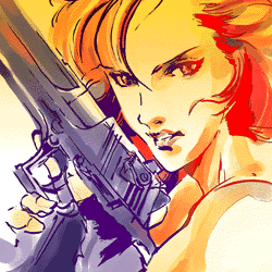
#yoji shinkawa archive
Text
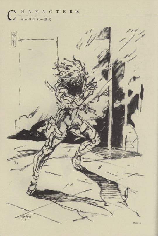

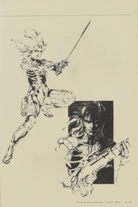
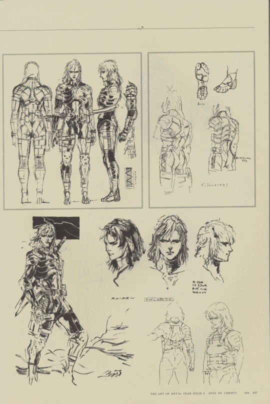
Yoji Shinkawa (2001)
#yoji shinkawa#yoji shinkawa archive#mgs#metal gear solid#metal gear solid 2 sons of liberty#raiden#2001#character#concept art#design#grunge#sketch#illustrations#japan
1K notes
·
View notes
Photo

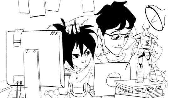
yay otacon ^_^ based on this teeny concept sketch:

#otacon#mgs#hal emmerich#metal gear solid#sorry for all the otacon. no im not#i found that sketch in a yoji shinkawa art book i just found it all on the internet archive i couldnt believe it#also i realised halfway through that this is just how i dress#also im gonna startg posting on this blog more i just havent really done a lot of drawing drawing mostly just sketching and animating#my art
886 notes
·
View notes
Note
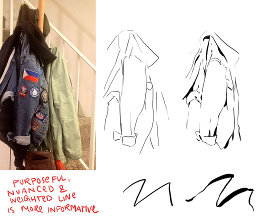
sorry if this has been asked before, but i wanted to ask about your lineart! the weight and line economy are just so nice, i get stars in my eyes looking at your lineart and doodles. could i ask what your approach to lineart is and what tips you might offer?

Wow I love these questions - Line is so interesting!!! It's a really big topic so I feel like any tips I give will be just barely scratching the surface. It's like deceptively simple...any given line drawing is essentially taking all the information we glean from seeing something irl ie light, shadow, dimension, texture, perspective, etc and boiling it down to the simplest possible visual information.
I think most commonly my line is informed by light source so like. thicker more continuous lines face away from the light and thinner more broken lines towards. and a lot of my spot blacks r simply cast shadows.

here's a more extreme example

BUT like everything to do with art there's no hard and fast rules. I use blacks when I think it'll be effective or interesting and I leave them out when I don't need em. umm couple things I find myself doing a lot... using spot blacks to make the separation between characters clearer. I like casting shadow in between characters so its easy to separate and read their silhouettes even when they're mashed together.

u can go even further to purposely create a silhouette like

to draw attention to a finger or tongue LOL. There's some comic book artists who are absolute masters at this type of stylization. Alex toth and his spiritual successor Chris samnee come to mind for me right away.
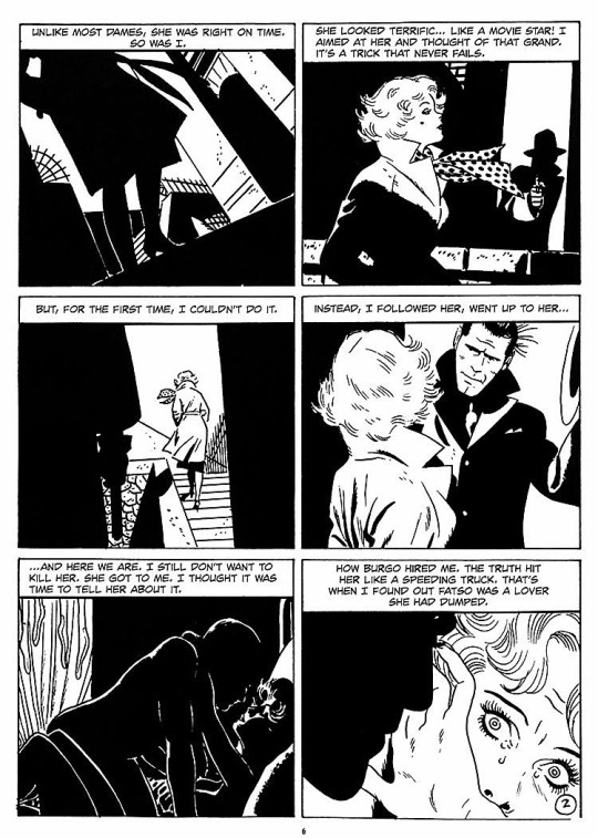
(toth)
(samnee)
I feel like I'm also often using line weight to separate planes receding in space

im naturally a really heavy handed and scribbly drawer(...?) draftsman. and im nearsighted so when i see things i percieve and break it down into big shapes over thin contours. so stuff like spot blacks and shadows came easy to me, the tricky part was making the rest of the lines lighter when they needed to be so the blacks could actually have impact LOLL. a lot of effective visual communication is about balancing contrasts. like I had to really train myself to press less hard on the pen. I think this is actually really evident if u go back in my archive to older sketches LOL


I actually feel like a lot of how I trained my hand to tackle line weights was thru stuff like hand lettering where you rly have to focus on being sensitive to that kind of thing.. contrasting strokes etc.

also exercises like figure drawing will have you flexing those muscles constantly

I'm starting to just regurgitate lessons from freshman year of art school so I'll stop here with the demos but yeah...I hope this was helpful!? I love line!!! I want to get even better at line work so I can feel confident posting work that's only line no color or value... I'll leave you with a bunch of artists who I think have particularly expressive and beautiful linework (not including toth and samnee who I already mentioned and who's work I love so much). You can probably learn much more from them than you can from me...!

Charles dana gibson LOL


Matias bergara
tonci zonjic

naoki urasawa

Daniel warren johnson


shiyoon kim

michel breton
also yoji shinkawa, tomer hanuka, leo romero, I feel like I'm gonna post this and think of so many more. there's so many good artists...!
1K notes
·
View notes
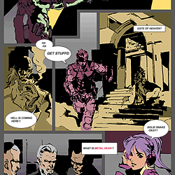
Text
I'm so happy to announce that the chapter "Dating" has this beautiful, amazing head illustration! I really love how handsome Hal looks and also Snake and Sunny 💖! She's so pretty! Do you want to know what is happening? Read the fic!
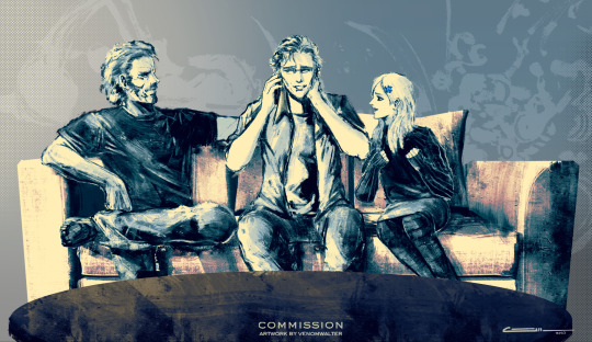
As always, this was made by the talented @VenomWalter_Art!! Please consider him if you want a beautiful commission!
#otacon#mgs fanfic#theemmerichscurse#the emmerich's curse#hal emmerich#solid snake#sunny#sunny emmerich#this happens after mgs4#jupiter family#wattpad#ao3
15 notes
·
View notes
Text
1998 Metal Gear Solid art commentary from Yoji Shinkawa (revised translation)
Source:http://web.archive.org/web/20050109031649/http://www.konamijpn.com:80/products/metalgear/art/index.html
The following is a translation of various artwork commentary by Metal Gear Solid illustrator Yoji Shinkawa that were posted on the game’s official Japanese website on July 9, 1998. These pages remained online until 2008, when Konami decided to relaunch the website in order to promote the digital download release of the game on the PlayStation Store.
I posted an earlier translation of these blog posts on March 8 of this year (2019) that was missing most of the illustrations being described, since the image files were not archived. I’ve since found the missing image files on another website and took the liberty of revising my translation to fix mistakes or clarify certain statements. I’ve tried to edit the original blog post, but for some reason tumblr didn’t allow me to upload any new images, so I decided to delete it and post the revision as a new blog post.
I’ve also found the images of the scratch Metal Gear REX model sculpted by Yoji Shinkawa that were uploaded on the official site, but unfortunately they were watermarked by a fansite that copied them back in the day. With that said, it’s still better than nothing, so I added them at the end of this blog poster.
Unfortunately, I still haven’t found any of the photos used on the seventh blog post, so that will still remain untranslated for the time being.

Interviewer: First of all, it’s a pleasure to talk to you Mr. Shinkawa.
Shinkawa: Please to meet you too.
Interviewer: I’ll start by asking about the game’s protagonist Solid Snake. What kind of details were you paying attention to when designing his character.
Shinkawa: Well I talked about this before in Konami Magazine Vol. 2, but there were two Metal Gear games prior to this one, so I struggled to find a balance between them. The Snake in the original Metal Gear looked like a young musclebound guy, while in Metal Gear 2 he was more of a bitter middle-aged man. This time Mr. Kojima’s image of Snake was one of having a tough and athletic body like Jean-Claude Van Damme combined with the middle-aged nature of someone like Christopher Walken. As a result, he became something of a middle ground between the two.
Interviewer: I see. What was your work after Snake’s image was decided on?
Shinkawa: The truth is I had trouble designing his costume. At the beginning I was thinking of a conventional military uniform in blue urban camo. But then I thought it might had been a bit too careless to have Snake swim underwater wearing such a uniform. Since the story takes place in the near future, he ended up wearing a costume made of leather and waterproof material.
Interviewer: It’s an amazing attention to detail that you kept in mind Snake’s infiltration route when designing his costume. So there’s a scene where Snake is underwater? What happens if the Ninja lands in a pond or something?
Shinkawa: What would happen? Huh... He would spark up and then yell something like “Water! My weakness!” (laugh) Just kidding.
Interviewer: (laughs) I guess not.
Shinkawa: It’s hard to know when it comes to Mr. Kojima though...
Interviewer: Don’t worry about it. By the way, is there any behind-the-scenes stories about the game’s development.
Shinkawa: Yes. It’s not much of an inside story, but I drew Ninja in a train.
Interviewer: During a train ride?
Shinkawa: Yes, I drew him while riding a commuter train. I was stationed at Osaka at the time. Most of the people there not friendly, so I would spent time observing the college girls.
Interviewer: That’s pretty nice.
Shinkawa:I guess so. But the friendliness here is good though. But Tokyo doesn’t have such a thing, so it feels a bit lonely. How I should say this, but there’s something that could be described as “enjoying the reaction of people watching in my direction” that could be seen not just over there, but here too.
Interviewer: So that’s how you train your sense of observation!
Shinkawa: No, that’s not what I meant. (laughs)
Interviewer: Is there a type of woman that you like?
Shinkawa: I wonder about that.
Interviewer: I’m sorry, that was such a trite question. Let me rephrase that. Is there a particular celebrity that you like?
Shinkawa: I guess I have no choice. My type would be someone like Shinobu Nakayama.
Interviewer: Is that so? Personally I’m a fan of Yuki Uchida if you’re curious to know...
Shinkawa: Yeah, she’s not bad.
Interviewer: Ah!
Shinkawa: Well, let’s put that subject aside. The truth is that the character of Mei-Ling was actually modeled after Nakayama herself. I used to watch her drama series.
Interviewer: Ah! That’s such an interesting thing to learn. Now that you say that, Mei-Ling really does resemble Nakayama looking at her closely, doesn’t she?
Shinkawa: Mei-Ling was written to be a bubbly college girl. She tends heavily to my taste, since she’s in the right age range and has my ideal image.
Interviewer: That’s nice. Having your preferences tied directly to your job.
Shinkawa: It’s not just mine. The character of Dr. Naomi Hunter was made to suit Mr. Kojima’s preferences too.
Interviewer: I see. Huh? At this rate, will you have a type for everyone?
Shinkawa: That wasn’t the intention, but... (laughs)
Interviewer: When was this drawn?
Shinkawa: I think it was around the end of last year. Huh? Around six months ago. Time sure fly quickly! I drew it for a magazine ad.
Interviewer: I heard the Ninja was your idea.
Shinkawa:That’s right. But originally there was a trio. They would say something like “Worya! Trinity Attack!” and they were going to have random kanji characters on their backs such as flame (炎) or horse (馬) without any particular significance.
Interviewer: “Fire” doesn’t seem so unreasonable, but why “horse”?
Shinkawa: I’ve mentioned “horse” as a joke, but that sort of thing happens very often, doesn’t it? When it comes to the image of Japan from a foreign perspective, while the outline is the same, the finer details differ. I like that kind of thing. The finalized design of the Ninja is and isn’t a ninja. If nobody told you he was a ninja, you wouldn’t think of him as one. But if someone points out that he must be a ninja because he has some ninja-like parts if you look at him closely, then you might think of him as one.
Interviewer: Is that so? That’s the Shinkawa magic!
Shinkawa: (laughs) What’s that?
Interviewer: I think I’ve seen this artwork a long time ago.
Shinkawa: It was first published around a year ago.
Interviewer: I see. So why did you draw it like an American comic book?
Shinkawa: Well, in reality I was going for a BD-style. Doesn’t it look like that?
Interviewer: I’m sorry, but what does BD mean?
Shinkawa: It stands for bande dessinée, which is the term for graphic novels in France. It means “sequential art”.
Interviewer: Huh, I did not know. So, is there a particular reason why you chose the BD-style?
Shinkawa: Of course! There is a reason. While talking to Mr. Kojima during the early stages, he said “Alright! Let’s turn Metal Gear into B.D” as a conceptual image. So I drew a few illustrations like that. This one was used as promotional art.
Interviewer: I see. So that’s the reason. And this one was perfect for a promotional artwork. Huh! Why is Gatse Becker [the BCPD chief from Policenauts] there?
Shinkawa: That’s not him. (laughs) It’s the Secretary of Defense [Jim Houseman]... Jeez... (While saying this, Shinkawa’s mouse keeps hovering on Mei-Ling for some reason.)
Interviewer: (nervous face) Uhh... Mei-Ling’s skirt seems awfully short... By the way, will you be able to shake the female characters’ breasts like in Policenauts?
Shinkawa:...That’s classified information!
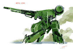
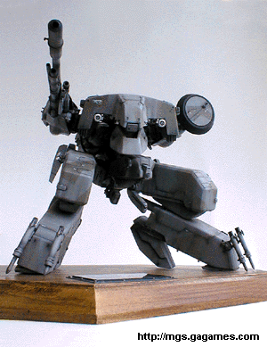
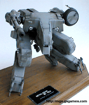
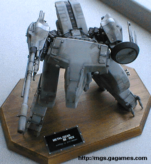
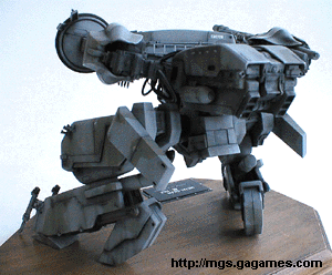
Interviewer: Well, here’s REX. Is there anything particularly different about this Metal Gear model?
Shinkawa: The Metal Gears in the previous two games had weak legs, so this new version has a strengthened lower body. During the initial planning I came up with several illustrations and settings, but the finalized version was settled pretty quickly.
Interviewer: How so?
Shinkawa: Since it was going to be turned into a polygon model, I made it into an actual model in order to solidify its conceptual image and verify its functions.
Interviewer: Is that so? Please show the model to me.
Shinkawa: Of course! REX was designed purely as a weapon, so it’s not exactly a heroic mecha. I decided on a dinosaur-like design like this one, since it conveyed a scary and grim image.

Shinkawa: There are three types of enemy soldiers shown here. From left to right: we have the light infantry, the heavy infantry and the arctic warfare soldier (nicknamed Yukinko by the developers). There’s also a gas mask-wearing fourth type.
Interviewer: Were you given any sort of references to use?
Shinkawa: I had books and photos that were given to me by Mr. Motosada Mori (MGS’s military advisor).
Interviewer: All the enemy soldiers have their faces covered up. Was that decided because they were terrorists?
Shinkawa: That’s certainly something that could be think of, but there’s actually more important reasons.
Interviewer: Huh? Explain!
Shinkawa: Simply put, we needed to reduce the number of polygons.
Interviewer: Is that really the reason?
Shinkawa: If you want to draw faces on your characters, you have to use quite a few polygons to get them to a satisfactory level, which ends up consuming too much resources. When taking into consideration the game as a whole, you got no choice but to trim certain parts. It’s a shame, but in the end I think the finalized designs suit the enemy soldiers better.
Interviewer: It’s a matter of balancing supply and demand. By the way, I really like the helmet worm by the Heavily Armed Troops. You don’t see them often in the game though.
Shinkawa: Well that helmet is an original design. Like everything, I try to keep things intuitive for game-playing purposes. The enemy soldiers are color-coded from left to right: brown, green and white, plus yellow for the gas mask-wearing soldiers.
Interviewer: There are indeed a variety of schemes. By the way, the arctic warfare soldiers are layered with clothing. Snake spends most of the game in arctic environments, but he isn’t wearing that much. Why is that?
Shinkawa: He’s wearing a high-tech suit.
Interviewer: You said it so bluntly... (laughs) One last nitpicky question. Who does the laundry in the base?
Shinkawa: They use a laundry machine. (laughs)
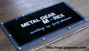
Metal Gear REX Model Photos
12 notes
·
View notes
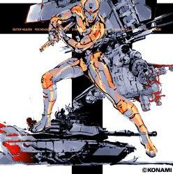
Photo

“1998's Metal Gear Solid, art director Yoji Shinkawa is one of the most important and consistent elements of the beloved series. His bold illustrations define the look of Metal Gear Solid's mechanical and character designs and his direction of the in-game art has helped each entry stand heads and shoulders above its competition. “
source: https://www.gameinformer.com/b/features/archive/2014/02/12/sketching-snake-inside-the-art-of-yoji-shinkawa.aspx
1 note
·
View note
Text
GamePlay: Left Alive στο PS4!
Επιβίωση stealth!
Οι Βετεράνοι Developers της βιομηχανίας, Toshifumi Nabeshima (σκηνοθέτης Armored Core Series), Yoji Shinkawa από την Kojima Productions (σχεδιαστής χαρακτήρων Metal Gear series) και Takayuki Yanase (σχεδιαστής mech Ghost in the Shell: Arise, Mobile Suit Gundam 00, Xenoblade Chronicles X), ενώνουν τις δυνάμεις τους για να δημιουργήσουν το σκοτεινό και θαρραλέο κόσμο του Left Alive.
Διαβάστε περισσότερα στο Gamer's Lair The Videogame Club.
source https://www.gamers-lair.gr/archives/5567
0 notes
Text

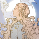
The Art of Metal Gear Solid 2: Sons of Liberty (2002), Olga Gurlukovich artwork illustrated by: Yoji Shinkawa
#metal gear solid#metal gear solid 2 sons of liberty#olga gurlukovich#paintings#illustrations#concept art#character#sketch#yoji shinkawa#新川洋司#yoji shinkawa archive#japan
609 notes
·
View notes
Last Seen Blogs

jump-the-shark
A certain darkness is needed to see the stars...
meowrgan
♡

foundandcaptured
Found & Captured

flowerpunkx
muddy honey