Don't wanna be here? Send us removal request.
Statistics
We looked inside some of the posts by tannervd and here's what we found interesting.
Average Info
Notes Per Post
0
Likes Per Post
0
Reblog Per Post
0
Reply Per Post
0
Time Between Posts
4 days
Number of Posts By Type
Photo
17
Last Seen Tumblr Blogs


Fun Fact
Tumblr has been banned in Indonesia for providing people with access to pornographic content.
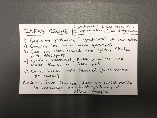
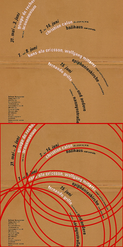
Photo
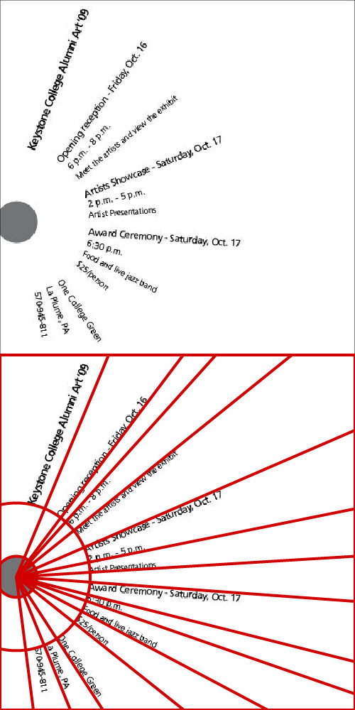
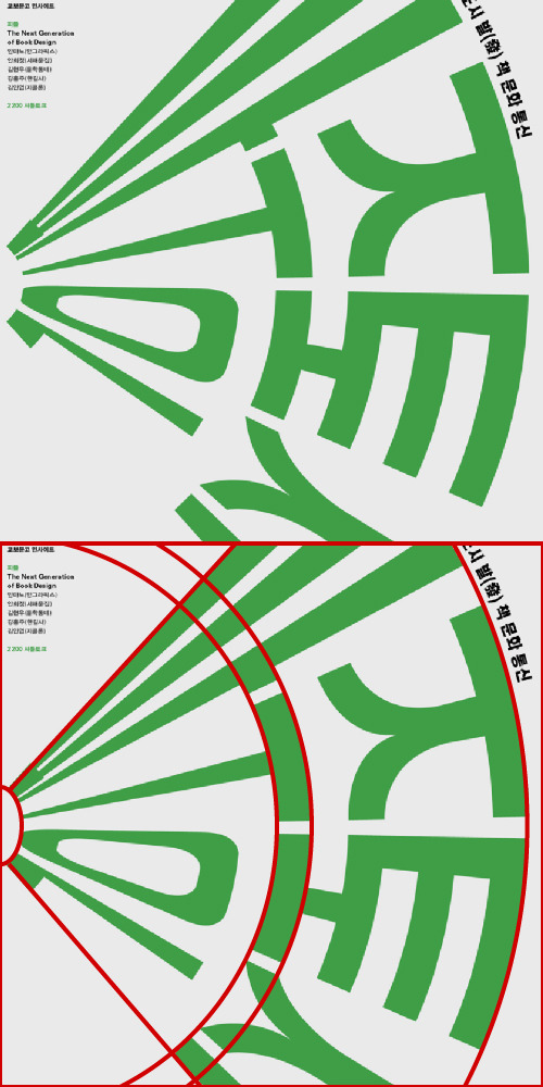
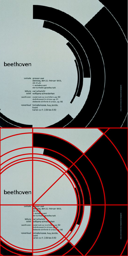
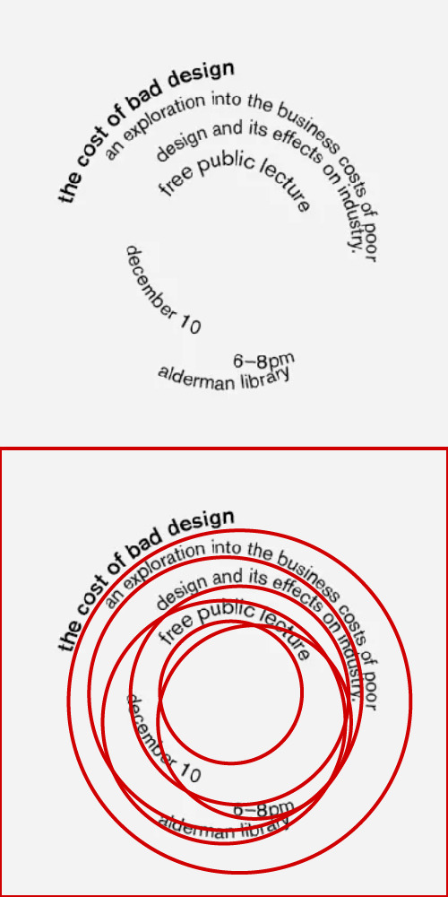
Radial Grid Examples
1) The first image was found on Google images. Though the design is bland overall, it successfully uses a radial grid. Each chunk of text is aligned on an axis coming from the center of the base circle. Could use some color, or something else.
2) The second image was also found on Google images. This one was actually questionably successful. Though the text is aligned with a radius, it seems a bit odd and I’m not too sure how directly this piece correlates with the radial grid brief.
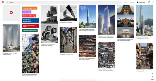
3) The third example was found on Pinterest. This is the most successful radial grid example I found, as based on my tracing over top, it is the most structured. I particularly like the use of 45 degree angles in this one.
0 notes
Photo
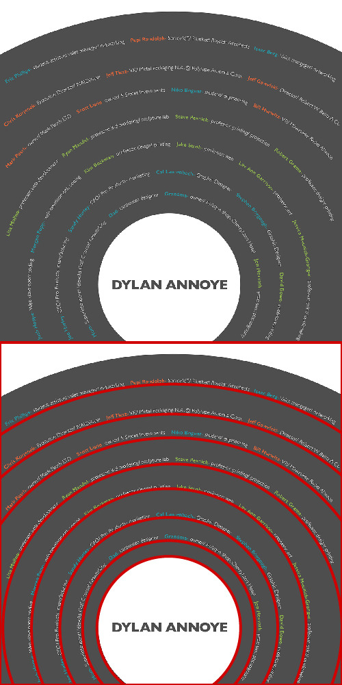
Dilatational Grid Examples
1) The first example is from Pinterest. It successfully uses the dilatational grid brief, although it’s kind of hideous overall. I don’t think it looks structured or visually interesting.
2) The second example was found on google Images. It uses the dilatational grid nicely, and there is a nice structure in the design. I’m glad the creator made the circles bulge outward more towards the top, otherwise the design may be bland or too repetitive.
3) The third example was also found on Pinterest. This is my favorite of the bunch from an overall standpoint. Good use of dilatational grid, good color, good movement, and overall looks more refined than its predecessors.
0 notes